ESCI 386 Scientific Programming, Analysis and...
32
ESCI 386 – Scientific Programming, Analysis and Visualization with Python Lesson 13 - 2D Plots 1
Transcript of ESCI 386 Scientific Programming, Analysis and...

ESCI 386 – Scientific Programming, Analysis and Visualization with
Python
Lesson 13 - 2D Plots
1

Contour Plots
• Contour plots are created using the contour() pyplot function or axes method.
• The only required argument is a 2-D array of values, z. – plt.contour(z)
2

Basic Contour Example
• Note: We used transpose(z) because NumPy stores arrays in [row, column] format whereas this data set assumes [column, row] – Keep this in mind if your plots display as rotated.
• ‘heights.npy’ is in the ‘\\cyclone2\shared\ESCI 386’ directory.
3
import matplotlib.pyplot as plt import numpy as np z = np.load('heights.npy') plt.contour(np.transpose(z)) plt.show()
File: contour-basic.py

Basic Contour Result
4

Contour Plots
• Optional arrays x and y can specify the locations of the z values. – plt.contour(x,y,z)
• The arrays x and y must also be 2-D arrays of the
same shape as z, or must be 1-D arrays where x has the same length as the first dimension of z and y has the same length as the second dimension of z. – Including the arrays x and y allows irregularly spaced
data to be contoured.
5

Contour Plots
• A fourth argument that can be included is the number of contour levels to draw.
– plt.contour(x,y,z,7) would draw seven evenly spaced contour levels.
• The contour levels can also be specified with the levels keyword, which will be set to a list or arrayof contour values to be drawn.
6

Contour Line Colors and Widths
• The colors of the contour lines can be specified with the colors keyword, which can be either a single color, or a list of colors, one for each line. – If colors is set to ‘black’ and no linestyles are
set, then negative contours will be drawn with dashes lines while positive contours will be solid.
– To make all contours solid and black just set colors = 'black' and linestyles = 'solid'.
• The linestyles and linewidths keywords
control the line plotting styles and sizes.
7

Contour Labels
• Labels are controlled by creating a ContourSet object when calling the contour function/method – cs = plt.contour(z)
and then using the pyplot.clabels() function or axes.clabels() method which allows label positions and formats to be specified.
8

Contour Label Example
import matplotlib.pyplot as plt import numpy as np z = np.load('heights.npy') cs = plt.contour(np.transpose(z),levels = range(5400,6000,60), colors = 'black', linestyles = 'dashed') plt.clabel(cs, fmt = '%.0f', inline = True) plt.show()
9
File: contour-label.py

Contour Label Result
10

Keywords for clabel()
11
Keyword Purpose Values
fmt Controls formatting of labels Standard Python format specifiiers (preceded by ‘%’
fontsize Controls font size of labels Point value for font.
colors Controls colors of labels Any valid matplotlib color. Can be a single color or
a list of different colors.
inline Controls whether labels mask or block
contour line
True | False
inline_spacing Controls blank space on either side of inline
labels.
Number of pixels to leave blank.
manual Allows manual placement of contours using
mouse clicks.
True | False
rightside_up Controls whether labels can be placed upside
down.
True | False
capsize Controls size of error bar caps Floating point. Default is 3.
align Controls alignment of bars with axis labels ‘edge’ or ‘center’
orientation Controls orientation of bars ‘vertical’ or ‘horizontal’
log Sets log axis False or True

Contour Exercise
• Play around with plotting the contours from the example. Try:
– specifying different level
– specifying fixed spacing of contour interval
– manual placement of contours
12

Filled Contour Plots
• Filled contours are created using contourf() in place of contour().
• contourf() does not draw the contour lines.
– If you want both filled contours with contour lines you have to use both contourf() and contour().
13

Adding a Colorbar
• A color bar can be added to the filled contour plot using either the pyplot.colorbar() function or the figure.colorbar() method. – There is no axes method for a color bar.
• If using the pyplot.colorbar()function the colorbar will be automatically be applied to the current image or contour set, and so specifying a ContourSet cs is optional.
• If using the figure.colorbar() method you must specify the ContourSet to which the colorbar will be applied.
• The orientation of the color bar is controlled using the orientation keyword, which takes the values ‘vertical’ or ‘horizontal’.
14

Adding a Colorbar
• The colorbar can be labeled by creating a colorbar instance and then using the set_label() method, e.g.: – cb = plt.colorbar(cs)
– cb.set_label(‘meters’)
• There are several other keywords for controlling details of the color bar, including whether it has square or pointy ends, etc. Consult the online documentation for details.
15

Filled Contour Exercise
• Create the figure shown.
16

pcolor() Plots
• pcolor stands for pseudocolor
• pcolor plots are often better looking than filled contour plots, but they take longer to create
• They are created using the pcolor() pyplot function or axes method.
• colormaps are created the same way they are using contourf()
17

pcolor() Example
import matplotlib.pyplot as plt
import numpy as np
z = np.load('heights.npy')
nx, ny = np.shape(z)
cs = plt.pcolor(np.transpose(z))
cb = plt.colorbar(cs, orientation = 'horizontal')
cb.set_label('meters')
plt.xlim(0,nx)
plt.ylim(0,ny)
plt.show()
18

pcolor() results
19

Available Color Maps
20
The colormaps can be reversed by appending the name with ‘_r’.

Selecting Different Color Maps
• To change the color map, you must first import matplotlib.cm
• Then, you can use the get_cmap() function and pass in the name of the color map you want.
• In the call to contour (), contourf (), or pcolor() you pass the name of the color map using the cmap keyword.
21

Changing Color Map Example import matplotlib.pyplot as plt
import numpy as np
import matplotlib.cm as cm
z = np.load('heights.npy')
nx, ny = np.shape(z)
cmap = cm.get_cmap('BrBG_r')
cs = plt.pcolor(np.transpose(z), cmap = cmap)
cb = plt.colorbar(cs, orientation = 'horizontal')
cb.set_label('meters')
plt.xlim(0,nx)
plt.ylim(0,ny)
plt.show()
22

New Color Map Results
23

Plotting Wind Barbs
• Wind barbs are plotted using the barbs() function/method.
• barbs(x,y,u,v) takes four arrays as arguments: – x is the x-coordinates of the barbs – y is the y-coordinates of the barbs – u is the u-component of velocity – v is the v-coordinate of velocity
• The barb positions do not have to be uniformly spaced.
• To get color-coded barbs based on speed, a fifth array containing the speeds at each position can be included.
24

barb() Example import numpy as np import matplotlib.pyplot as plt h = np.transpose(np.load('heights.npy')) V = np.load('uandv.npz') x = np.transpose(V['x']) y = np.transpose(V['y']) u = np.transpose(V['u']) v = np.transpose(V['v']) cs = plt.contour(h, levels = range(5400,6000,60), colors = 'black') plt.clabel(cs, fmt = '%.0f', inline = True) speed = np.sqrt(u**2+v**2) plt.barbs(x,y,u,v,speed) plt.show()
25
File: windbarb.py
Plots wind barbs
Loads wind data

barb() Results
26

Keeping Barbs from Being Clipped at Edges of Plot
• To prevent barbs at edges from being clipped, first create a BoundingBox instance and then use set_clip_box(None)
27
bb = plt.barbs(x,y,u,v,speed)
bb.set_clip_box(None)

barbs() Results (no clipping)
28

Southern Hemisphere
• The barbs can be flipped to the opposite side (for the Southern Hemisphere) by setting the flip_barb keyword to True.
29
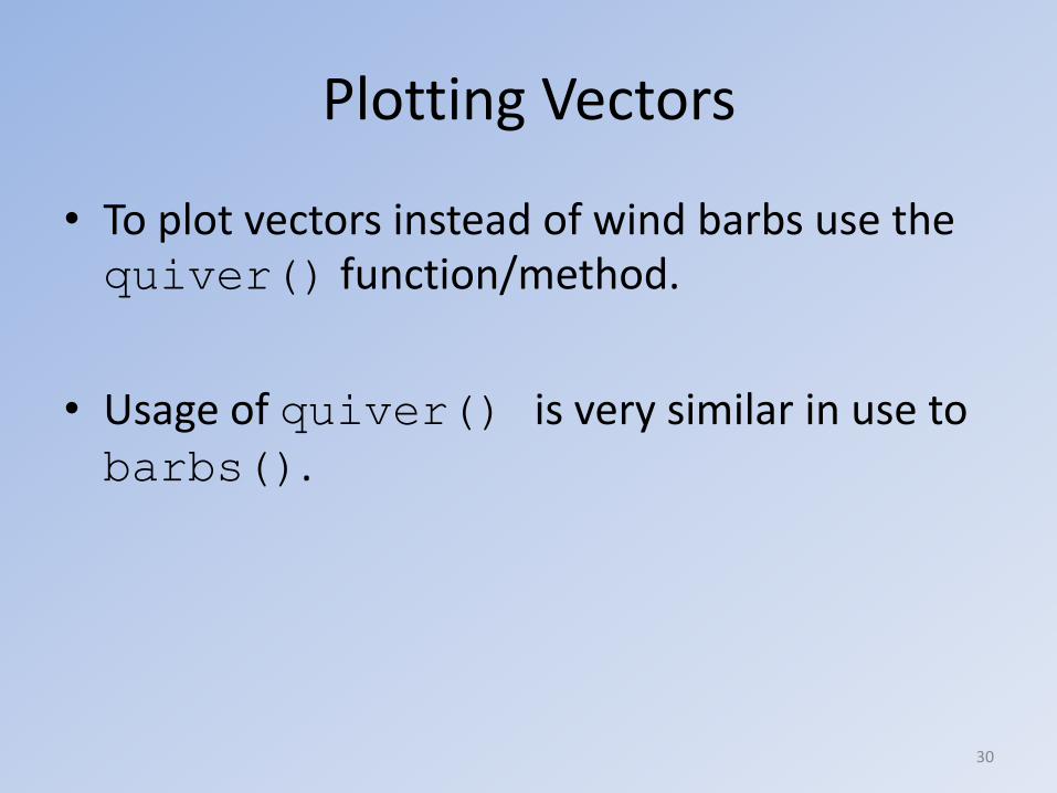
Plotting Vectors
• To plot vectors instead of wind barbs use the quiver() function/method.
• Usage of quiver() is very similar in use to barbs().
30

Streamlines
• Newer versions of matplotlib can plot streamlines.
– Our version currently cannot.
31

Creating 2-D arrays of x and y values from 1-D arrays.
• Often we need 2-D arrays of x and y coordinate values.
• We can create them from 1-D arrays of x and y using the numpy meshgrid() function.
>>> x
array([0, 1, 2, 3, 4, 5, 6, 7, 8, 9])
>>> y
array([-3, -2, -1, 0, 1, 2, 3])
>>> x2,y2 = np.meshgrid(x,y)
>>> x2
array([[0, 1, 2, 3, 4, 5, 6, 7, 8, 9],
[0, 1, 2, 3, 4, 5, 6, 7, 8, 9],
[0, 1, 2, 3, 4, 5, 6, 7, 8, 9],
[0, 1, 2, 3, 4, 5, 6, 7, 8, 9],
[0, 1, 2, 3, 4, 5, 6, 7, 8, 9],
[0, 1, 2, 3, 4, 5, 6, 7, 8, 9],
[0, 1, 2, 3, 4, 5, 6, 7, 8, 9]]) 32
>>> y2
array([[-3, -3, -3, -3, -3, -3, -3, -3, -3, -3],
[-2, -2, -2, -2, -2, -2, -2, -2, -2, -2],
[-1, -1, -1, -1, -1, -1, -1, -1, -1, -1],
[ 0, 0, 0, 0, 0, 0, 0, 0, 0, 0],
[ 1, 1, 1, 1, 1, 1, 1, 1, 1, 1],
[ 2, 2, 2, 2, 2, 2, 2, 2, 2, 2],
[ 3, 3, 3, 3, 3, 3, 3, 3, 3, 3]])