Elite Printest (eng)
46
Massimo Cremagnani The new way to see the digital print version 1.0 eng december 2006 Digital test prints over the standards © Foreword by Luca Magnoni
-
Upload
massimo-cremagnani -
Category
Documents
-
view
226 -
download
8
description
A way to test digital prints over the standards
Transcript of Elite Printest (eng)

Massimo Cremagnani
The new way to see the digital printversion 1.0 eng december 2006
Digital test prints over the standards
©©
Foreword by Luca Magnoni
©
Massimo Cremagnani
Thanks to
This research is dedicated to each person who teached me something about graphic arts and any other context.
It is also dedicated to everybody who listened to me, contraddicted me, suggested me, spurred me, informed me, flattered and encouraged me.
Finally I dedicate it to every researcher, aesthetes, misunderstood geniuses looking for a better view
and interpretation of facts.
01100110 01100001 01101110 01100011 01110101 01101100 01101111 00100000 01100001 00100000 01110100 01110101 01110100 01110100 01101001 00100000 01100111 01101100 01101001 00100000 01100001 01101100 01110100 01110010 01101001
©
Massimo Cremagnani
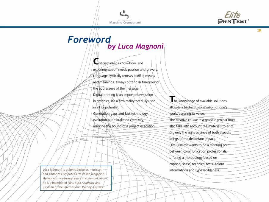
Foreword
Criticism needs know-how, and
experimentation needs passion and bravery.
Language cyclically renews itself in means
and meanings, always putting in foreground
the addressees of the message.
Digital printing is an important evolution
in graphics, it’s a firm reality not fully used
in all its potential.
Generation gaps and fast technology
evolution put a brake on creativity,
marking the bound of a project execution.
The knowledge of available solutions
allowes a better customization of one’s
work, assuring its value.
The creative course in a graphic project must
also take into account the materials to print
on; only the right balance of both aspects
brings to the deliberate impact.
Elite PrinTest wants to be a meeting point
between communication professionals,
offering a metodology based on
consciousness, technical tests, colour
informations and type legibleness.
by Luca Magnoni
Luca Magnoni is graphic designer, musician and editor of Computer Arts italian magazine. He works since several years in communications, he is a member of New York Academy and juryman of the International Webby Awards.
3

©
Massimo Cremagnani
©
Introduction to Elite PrinTest version 1.0 English - december 2006© Massimo Cremagnani - All rights reserved
4

©
Massimo Cremagnani
IntroductionElite PrinTest are graphic projects specially
developed as a severe test for a digital printer.
Elite PrinTest holds a mix of visual impact
elements constructed with the highest
freedom allowed by the digital imaging
tools, unlike conventional calibration and
linearization targets.
The basic principle of this research is that if
we can create any kind of image, we also
need to be able to print it keeping the main
message. The practical evaluation with
Elite PrinTest is perceptive and subjective,
giving designers and printing professionals
the consciousness of their work and a
self-validation beyond common standards,
based on one’s experience and style.
Designers can check feasiblity of their
projects in accordance with the technical
features they used (transparence, blending,
shading, chromatic and tonal contrast,
font readablity, perception of raster
and vectorial elements...), optimizing
graphics for a specific workflow,
if necessary.
Printers have at their disposal, in a
unique solution, several parameters to
evaluate a project printablity according to
specific print supports and dimensions; if
necessary, they can optimize print settings
or carry out project fine tunings.
5
©
Massimo Cremagnani
Lorem ipsum dolor sit amet, consectetuer adipiscing elit. Ut vitae nisl vel ligula egestas egestas. Cras aliquam luctus est. Mauris sodales. Cras lectus sem, volutpat id, porta facilisis, rutrum vitae, nisi. Sed mollis justo vitae tortor. Nunc porttitor odio in urna. Cras accumsan tempus sapien. Praesent pharetra nisl. Morbi pretium diam id purus. Donec rutrum hendrerit risus. Cras a urna ac tortor fringilla bibendum. Pellentesque vestibulum. Quisque ante. Nunc adipiscing elementum pede. Mauris id felis. Fusce fermentum facilisis nibh. Duis quam dolor, porttitor ut, adipiscing ac, vulputate sed, dui. Cras in diam ut arcu varius volutpat. Vivamus eu neque eu nibh suscipit congue. Aenean commodo magna id felis consequat porta.
Maecenas suscipit mauris pellentesque nisl. Morbi magna enim, facilisis eu, pulvinar lacinia, laoreet sit amet, nibh. Nulla facilisi. Curabitur sed ligula. Proin blandit urna non dolor. Nulla auctor, magna sed convallis egestas, velit mauris dapibus justo, et pulvinar massa ipsum nec metus. Cum sociis natoque penatibus et magnis dis parturient montes, nascetur ridiculus mus. Nullam posuere gravida ipsum. Nulla bibendum ultricies risus. Donec metus massa, fermentum id, tincidunt ac, consectetuer placerat, massa. Morbi tempus feugiat ante. Nulla tempor. Donec aliquet luctus purus. Aenean eleifend lorem vel lacus lobortis posuere. Donec vulputate. Aliquam convallis venenatis metus.
Times New RomanLorem ipsum dolor sit amet, consectetuer adipiscing elit. Ut vitae nisl vel ligula egestas egestas. Cras aliquam luctus est. Mauris sodales. Cras lectus sem, volutpat id, porta facilisis, rutrum vitae, nisi. Sed mollis justo vitae tortor. Nunc porttitor odio in urna. Cras accumsan tempus sapien. Praesent pharetra nisl. Morbi pretium diam id purus. Donec rutrum hendrerit risus. Cras a urna ac tortor fringilla bibendum. Pellentesque vestibulum. Quisque ante. Nunc adipiscing elementum pede. Mauris id felis. Fusce fermentum facilisis nibh. Duis quam dolor, porttitor ut, adipiscing ac, vulputate sed, dui. Cras in diam ut arcu varius volutpat. Vivamus eu neque eu nibh suscipit congue. Aenean commodo magna id felis consequat porta.
Maecenas suscipit mauris pellentesque nisl. Morbi magna enim, facilisis eu, pulvinar lacinia, laoreet sit amet, nibh. Nulla facilisi. Curabitur sed ligula. Proin blandit urna non dolor. Nulla auctor, magna sed convallis egestas, velit mauris dapibus justo, et pulvinar massa ipsum nec metus. Cum sociis natoque penatibus et magnis dis parturient montes, nascetur ridiculus mus. Nullam posuere gravida ipsum. Nulla bibendum ultricies risus. Donec metus massa, fermentum id, tincidunt ac, consectetuer placerat, massa. Morbi tempus feugiat ante. Nulla tempor. Donec aliquet luctus purus. Aenean eleifend lorem vel lacus lobortis posuere. Donec vulputate. Aliquam convallis venenatis metus.
Pellentesque libero. Fusce quis massa. Vestibulum nec est. Ut varius. Morbi mattis fermentum sapien. Praesent condimentum, mauris et pulvinar auctor, urna lectus hendrerit elit, sagittis varius elit justo sed libero. Lorem ipsum dolor sit amet, consectetuer adipiscing elit. Aliquam nec eros sit amet eros dignissim ultrices. In viverra iaculis ligula. Vestibulum tincidunt scelerisque dolor. Quisque quis magna ac lectus volutpat lobortis. Pellentesque iaculis lorem non nisi. Class aptent taciti sociosqu ad litora torquent per conubia nostra, per inceptos hymenaeos. Etiam lectus.
Maecenas suscipit mauris pellentesque nisl. Morbi magna enim, facilisis eu, pulvinar lacinia, laoreet sit amet, nibh. Nulla facilisi. Curabitur sed ligula. Proin blandit urna non dolor. Nulla auctor, magna sed convallis egestas, velit mauris dapibus justo, et pulvinar massa ipsum nec metus. Cum sociis natoque penatibus et magnis dis parturient montes, nascetur ridiculus mus. Nullam posuere gravida ipsum. Nulla bibendum ultricies risus. Donec metus massa,
Lorem ipsum dolor sit amet, consectetuer adipiscing elit. Ut vitae nisl vel ligula egestas egestas. Cras aliquam luctus est. Mauris sodales. Cras lectus sem, volutpat id, porta facilisis, rutrum vitae, nisi. Sed mollis justo vitae tortor. Nunc porttitor odio in urna. Cras accumsan tempus sapien. Praesent pharetra nisl. Morbi pretium diam id purus. Donec rutrum hendrerit risus. Cras a urna ac tortor fringilla bibendum. Pellentesque vestibulum. Quisque ante. Nunc adipiscing elementum pede. Mauris id felis. Fusce fermentum facilisis nibh. Duis quam dolor, porttitor ut, adipiscing ac, vulputate sed, dui. Cras in diam ut arcu varius volutpat. Vivamus eu neque eu nibh suscipit congue. Aenean commodo magna id felis consequat porta.
Maecenas suscipit mauris pellentesque nisl. Morbi magna enim, facilisis eu, pulvinar lacinia, laoreet sit amet, nibh. Nulla facilisi. Curabitur sed ligula. Proin blandit urna non dolor. Nulla auctor, magna sed
Lorem ipsum dolor sit amet, consectetuer adipiscing elit. Ut vitae nisl vel ligula egestas egestas. Cras aliquam luctus est. Mauris sodales. Cras lectus sem, volutpat id, porta facilisis, rutrum vitae, nisi. Sed mollis justo vitae tortor. Nunc porttitor odio in urna. Cras accumsan tempus sapien. Praesent pharetra nisl. Morbi pretium diam id purus. Donec rutrum hendrerit risus. Cras a urna ac tortor fringilla bibendum. Pellentesque vestibulum. Quisque ante. Nunc adipiscing elementum pede. Mauris id felis. Fusce fermentum facilisis nibh. Duis quam dolor, porttitor ut, adipiscing ac, vulputate sed, dui. Cras in diam ut arcu varius volutpat. Vivamus eu neque eu nibh suscipit congue. Aenean commodo magna id felis consequat porta.
Maecenas suscipit mauris pellentesque nisl. Morbi magna enim, facilisis eu, pulvinar lacinia, laoreet sit amet, nibh. Nulla facilisi. Curabitur sed ligula. Proin blandit urna non dolor. Nulla auctor, magna sed convallis egestas, velit mauris dapibus justo, et pulvinar
Lorem ipsum dolor sit amet, consectetuer adipiscing elit. Ut vitae nisl vel ligula egestas egestas. Cras aliquam luctus est. Mauris sodales. Cras lectus sem, volutpat id, porta facilisis, rutrum vitae, nisi. Sed mollis justo vitae tortor. Nunc porttitor odio in urna. Cras accumsan
Lorem ipsum dolor sit amet, consectetuer adipiscing elit. Ut vitae nisl vel ligula egestas egestas. Cras aliquam luctus est. Mauris sodales. Cras lectus sem, volutpat id, porta facilisis, rutrum vitae, nisi. Sed mollis justo vitae tortor. Nunc porttitor odio in urna. Cras accumsan tempus sapien. Praesent pharetra nisl. Morbi pretium diam id purus. Donec rutrum hendrerit risus. Cras a urna ac tortor fringilla bibendum. Pellentesque vestibulum. Quisque ante. Nunc adipiscing elementum pede. Mauris id felis. Fusce fermentum facilisis nibh. Duis quam dolor, porttitor ut, adipiscing ac, vulputate sed, dui. Cras in
Lorem ipsum dolor sit amet, consectetuer adipiscing elit. Ut vitae nisl vel ligula egestas egestas. Cras aliquam luctus est. Mauris sodales. Cras lectus sem, volutpat id, porta facilisis, rutrum
Lorem ipsum dolor sit amet, consectetuer adipiscing elit. Ut vitae nisl vel ligula egestas egestas. Cras aliquam luctus est. Mauris sodales.
Lorem ipsum dolor sit amet, consectetuer adipiscing elit. Ut vitae nisl vel ligula
Lorem ipsum dolor sit amet, consectetuer adipiscing elit. Ut
Lorem ipsum dolor sit amet,
Lorem ipsum dolor sit amet,
3 pt 4 pt 5 pt 6 pt 8 pt
10 pt 12 pt 14 pt 18 pt
24 pt 30 pt 36 pt
Lorem ipsum dolor sit amet, consectetuer adipiscing elit. Ut vitae nisl vel ligula egestas egestas. Cras aliquam luctus est. Mauris sodales. Cras lectus sem, volutpat id, porta facilisis, rutrum vitae, nisi. Sed mollis justo vitae tortor. Nunc porttitor odio in urna. Cras accumsan tempus sapien. Praesent pharetra nisl. Morbi pretium diam id purus. Donec rutrum hendrerit risus. Cras a urna ac tortor fringilla bibendum. Pellentesque vestibulum. Quisque ante. Nunc adipiscing elementum pede. Mauris id felis. Fusce fermentum facilisis nibh. Duis quam dolor, porttitor ut, adipiscing ac, vulputate sed, dui. Cras in diam ut arcu varius volutpat. Vivamus eu neque eu nibh suscipit congue. Aenean commodo magna id felis consequat porta.
Maecenas suscipit mauris pellentesque nisl. Morbi magna enim, facilisis eu, pulvinar lacinia, laoreet sit amet, nibh. Nulla facilisi. Curabitur sed ligula. Proin blandit urna non dolor. Nulla auctor, magna sed convallis egestas, velit mauris dapibus justo, et pulvinar massa ipsum nec metus. Cum sociis natoque penatibus et magnis dis parturient montes, nascetur ridiculus mus. Nullam posuere gravida ipsum. Nulla bibendum ultricies risus. Donec metus massa, fermentum id, tincidunt ac, consectetuer placerat, massa. Morbi tempus feugiat ante. Nulla tempor. Donec aliquet luctus purus. Aenean eleifend lorem
TahomaLorem ipsum dolor sit amet, consectetuer adipiscing elit. Ut vitae nisl vel ligula egestas egestas. Cras aliquam luctus est. Mauris sodales. Cras lectus sem, volutpat id, porta facilisis, rutrum vitae, nisi. Sed mollis justo vitae tortor. Nunc porttitor odio in urna. Cras accumsan tempus sapien. Praesent pharetra nisl. Morbi pretium diam id purus. Donec rutrum hendrerit risus. Cras a urna ac tortor fringilla bibendum. Pellentesque vestibulum. Quisque ante. Nunc adipiscing elementum pede. Mauris id felis. Fusce fermentum facilisis nibh. Duis quam dolor, porttitor ut, adipiscing ac, vulputate sed, dui. Cras in diam ut arcu varius volutpat. Vivamus eu neque eu nibh suscipit congue. Aenean commodo magna id felis consequat porta.
Maecenas suscipit mauris pellentesque nisl. Morbi magna enim, facilisis eu, pulvinar lacinia, laoreet sit amet, nibh. Nulla facilisi. Curabitur sed ligula. Proin blandit urna non dolor. Nulla auctor, magna sed convallis egestas, velit mauris dapibus justo, et pulvinar massa ipsum nec metus. Cum sociis natoque penatibus et magnis dis parturient montes, nascetur ridiculus mus. Nullam posuere gravida ipsum. Nulla bibendum ultricies risus. Donec metus massa, fermentum id, tincidunt ac, consectetuer placerat, massa. Morbi tempus feugiat ante. Nulla tempor. Donec aliquet luctus purus. Aenean eleifend lorem vel lacus lobortis posuere. Donec vulputate. Aliquam convallis venenatis metus.
Pellentesque libero. Fusce quis massa. Vestibulum nec est. Ut varius. Morbi mattis fermentum sapien. Praesent condimentum, mauris et pulvinar auctor, urna lectus hendrerit elit, sagittis varius elit justo sed libero. Lorem ipsum dolor sit amet, consectetuer adipiscing elit. Aliquam nec eros sit amet eros dignissim ultrices. In viverra iaculis ligula. Vestibulum tincidunt scelerisque dolor. Quisque quis magna ac lectus volutpat lobortis. Pellentesque iaculis lorem non nisi. Class aptent taciti sociosqu ad litora torquent per conubia nostra, per inceptos hymenaeos. Etiam lectus.
Maecenas suscipit mauris pellentesque nisl. Morbi magna enim, facilisis eu, pulvinar lacinia, laoreet sit amet, nibh. Nulla facilisi. Curabitur sed ligula. Proin blandit urna
Lorem ipsum dolor sit amet, consectetuer adipiscing elit. Ut vitae nisl vel ligula egestas egestas. Cras aliquam luctus est. Mauris sodales. Cras lectus sem, volutpat id, porta facilisis, rutrum vitae, nisi. Sed mollis justo vitae tortor. Nunc porttitor odio in urna. Cras accumsan tempus sapien. Praesent pharetra nisl. Morbi pretium diam id purus. Donec rutrum hendrerit risus. Cras a urna ac tortor fringilla bibendum. Pellentesque vestibulum. Quisque ante. Nunc adipiscing elementum pede. Mauris id felis. Fusce fermentum facilisis nibh. Duis quam dolor, porttitor ut, adipiscing ac, vulputate sed, dui. Cras in diam ut arcu varius volutpat. Vivamus eu neque eu nibh suscipit congue. Aenean commodo magna id felis consequat porta.
Maecenas suscipit mauris pellentesque nisl. Morbi magna enim, facilisis eu, pulvinar lacinia,
Lorem ipsum dolor sit amet, consectetuer adipiscing elit. Ut vitae nisl vel ligula egestas egestas. Cras aliquam luctus est. Mauris sodales. Cras lectus sem, volutpat id, porta facilisis, rutrum vitae, nisi. Sed mollis justo vitae tortor. Nunc porttitor odio in urna. Cras accumsan tempus sapien. Praesent pharetra nisl. Morbi pretium diam id purus. Donec rutrum hendrerit risus. Cras a urna ac tortor fringilla bibendum. Pellentesque vestibulum. Quisque ante. Nunc adipiscing elementum pede. Mauris id felis. Fusce fermentum facilisis nibh. Duis quam dolor, porttitor ut, adipiscing ac, vulputate sed, dui. Cras in diam ut arcu varius volutpat. Vivamus eu neque eu nibh suscipit congue. Aenean commodo magna id felis consequat porta.
Maecenas suscipit mauris pellentesque nisl. Morbi magna enim, facilisis eu, pulvinar lacinia, laoreet sit amet, nibh. Nulla facilisi. Curabitur sed ligula. Proin blandit urna non dolor. Nulla auctor,
Lorem ipsum dolor sit amet, consectetuer adipiscing elit. Ut vitae nisl vel ligula egestas egestas. Cras aliquam luctus est. Mauris sodales. Cras lectus sem, volutpat id, porta facilisis, rutrum vitae, nisi. Sed mollis justo vitae tortor. Nunc porttitor
Lorem ipsum dolor sit amet, consectetuer adipiscing elit. Ut vitae nisl vel ligula egestas egestas. Cras aliquam luctus est. Mauris sodales. Cras lectus sem, volutpat id, porta facilisis, rutrum vitae, nisi. Sed mollis justo vitae tortor. Nunc porttitor odio in urna. Cras accumsan tempus sapien. Praesent pharetra nisl. Morbi pretium diam id purus. Donec rutrum hendrerit risus. Cras a urna ac tortor fringilla bibendum. Pellentesque vestibulum. Quisque ante. Nunc adipiscing elementum pede. Mauris id felis. Fusce fermentum facilisis nibh. Duis
Lorem ipsum dolor sit amet, consectetuer adipiscing elit. Ut vitae nisl vel ligula egestas egestas. Cras aliquam luctus est. Mauris sodales. Cras lectus sem, volutpat id, porta facilisis,
Lorem ipsum dolor sit amet, consectetuer adipiscing elit. Ut vitae nisl vel ligula egestas egestas. Cras aliquam
Lorem ipsum dolor sit amet, consectetueradipiscing elit. Ut
Lorem ipsum dolor sit amet, consectetuer adipiscing elit. Ut
Lorem ipsum dolor sit amet,
Lorem ipsum dolor sit amet,
3 pt 4 pt 5 pt 6 pt 8 pt
10 pt 12 pt 14 pt 18 pt
24 pt 30 pt 36 pt
Lorem ipsum dolor sit amet, consectetuer adipiscing elit. Ut vitae nisl vel ligula egestas egestas. Cras aliquam luctus est. Mauris sodales. Cras lectus sem, volutpat id, porta facilisis, rutrum vitae, nisi. Sed mollis justo vitae tortor. Nunc porttitor odio in urna. Cras accumsan tempus sapien. Praesent pharetra nisl. Morbi pretium diam id purus. Donec rutrum hendrerit risus. Cras a urna ac tortor fringilla bibendum. Pellentesque vestibulum. Quisque ante. Nunc adipiscing elementum pede. Mauris id felis. Fusce fermentum facilisis nibh. Duis quam dolor, porttitor ut, adipiscing ac, vulputate sed, dui. Cras in diam ut arcu varius volutpat. Vivamus eu neque eu nibh suscipit congue. Aenean commodo magna id felis consequat porta.
Maecenas suscipit mauris pellentesque nisl. Morbi magna enim, facilisis eu, pulvinar lacinia, laoreet sit amet, nibh. Nulla facilisi. Curabitur sed ligula. Proin blandit urna non dolor. Nulla auctor, magna sed convallis egestas, velit mauris dapibus justo, et pulvinar massa ipsum nec metus. Cum sociis natoque penatibus et magnis dis parturient montes, nascetur ridiculus mus. Nullam posuere gravida ipsum. Nulla bibendum ultricies risus. Donec metus massa, fermentum id, tincidunt ac, consectetuer placerat, massa. Morbi tempus feugiat ante. Nulla tempor. Donec aliquet luctus purus. Aenean eleifend lorem vel lacus lobortis posuere. Donec vulputate. Aliquam convallis venenatis metus.
Pellentesque libero. Fusce quis massa. Vestibulum nec est. Ut varius. Morbi mattis fermentum sapien. Praesent condimentum, mauris et pulvinar auctor, urna lectus hendrerit elit, sagittis varius elit justo sed libero. Lorem ipsum dolor
Monotype Corsiva
Lorem ipsum dolor sit amet, consectetuer adipiscing elit. Ut vitae nisl vel ligula egestas egestas. Cras aliquam luctus est. Mauris sodales. Cras lectus sem, volutpat id, porta facilisis, rutrum vitae, nisi. Sed mollis justo vitae tortor. Nunc porttitor odio in urna. Cras accumsan tempus sapien. Praesent pharetra nisl. Morbi pretium diam id purus. Donec rutrum hendrerit risus. Cras a urna ac tortor fringilla bibendum. Pellentesque vestibulum. Quisque ante. Nunc adipiscing elementum pede. Mauris id felis. Fusce fermentum facilisis nibh. Duis quam dolor, porttitor ut, adipiscing ac, vulputate sed, dui. Cras in diam ut arcu varius volutpat. Vivamus eu neque eu nibh suscipit congue. Aenean commodo magna id felis consequat porta.
Maecenas suscipit mauris pellentesque nisl. Morbi magna enim, facilisis eu, pulvinar lacinia, laoreet sit amet, nibh. Nulla facilisi. Curabitur sed ligula. Proin blandit urna non dolor. Nulla auctor, magna sed convallis egestas, velit mauris dapibus justo, et pulvinar massa ipsum nec metus. Cum sociis natoque penatibus et magnis dis parturient montes, nascetur ridiculus mus. Nullam posuere gravida ipsum. Nulla bibendum ultricies risus. Donec metus massa, fermentum id, tincidunt ac, consectetuer placerat, massa. Morbi tempus feugiat ante. Nulla tempor. Donec aliquet luctus purus. Aenean eleifend lorem vel lacus lobortis posuere. Donec vulputate. Aliquam convallis venenatis metus.
Pellentesque libero. Fusce quis massa. Vestibulum nec est. Ut varius. Morbi mattis fermentum sapien. Praesent condimentum, mauris et pulvinar auctor, urna lectus hendrerit elit, sagittis varius elit justo sed libero. Lorem ipsum dolor sit amet, consectetuer adipiscing elit. Aliquam nec eros sit amet eros dignissim ultrices. In viverra iaculis ligula. Vestibulum tincidunt scelerisque dolor. Quisque quis magna ac lectus volutpat lobortis. Pellentesque iaculis lorem non nisi. Class aptent taciti sociosqu ad litora torquent per conubia nostra, per inceptos hymenaeos. Etiam lectus.
Maecenas suscipit mauris pellentesque nisl. Morbi magna enim, facilisis eu, pulvinar lacinia, laoreet sit amet, nibh. Nulla facilisi. Curabitur sed ligula. Proin blandit urna non dolor. Nulla auctor, magna sed convallis egestas, velit mauris dapibus justo, et pulvinar massa ipsum nec metus. Cum sociis natoque penatibus et magnis dis parturient montes, nascetur ridiculus mus. Nullam posuere gravida ipsum. Nulla bibendum ultricies risus. Donec metus massa, fermentum id, tincidunt ac, consectetuer placerat, massa. Morbi tempus feugiat ante. Nulla tempor. Donec aliquet luctus purus. Aenean eleifend lorem vel lacus lobortis posuere. Donec vulputate. Aliquam convallis venenatis metus.
Lorem ipsum dolor sit amet, consectetuer adipiscing elit. Ut vitae nisl vel ligula egestas egestas. Cras aliquam luctus est. Mauris sodales. Cras lectus sem, volutpat id, porta facilisis, rutrum vitae, nisi. Sed mollis justo vitae tortor. Nunc porttitor odio in urna. Cras accumsan tempus sapien. Praesent pharetra nisl. Morbi pretium diam id purus. Donec rutrum hendrerit risus. Cras a urna ac tortor fringilla bibendum. Pellentesque vestibulum. Quisque ante. Nunc adipiscing elementum pede. Mauris id felis. Fusce fermentum facilisis nibh. Duis quam dolor, porttitor ut, adipiscing ac, vulputate sed, dui. Cras in diam ut arcu varius volutpat. Vivamus eu neque eu nibh suscipit congue. Aenean commodo magna id felis consequat porta.
Maecenas suscipit mauris pellentesque nisl. Morbi magna enim, facilisis eu, pulvinar lacinia, laoreet sit amet, nibh. Nulla facilisi. Curabitur sed ligula. Proin blandit urna non dolor. Nulla auctor, magna sed convallis egestas, velit mauris dapibus justo, et pulvinar massa ipsum nec metus. Cum sociis natoque penatibus et magnis dis parturient montes, nascetur
Lorem ipsum dolor sit amet, consectetuer adipiscing elit. Ut vitae nisl vel ligula egestas egestas. Cras aliquam luctus est. Mauris sodales. Cras lectus sem, volutpat id, porta facilisis, rutrum vitae, nisi. Sed mollis justo vitae tortor. Nunc porttitor odio in urna. Cras accumsan tempus sapien. Praesent pharetra nisl. Morbi pretium diam id purus. Donec rutrum hendrerit risus. Cras a urna ac tortor fringilla bibendum. Pellentesque vestibulum. Quisque ante. Nunc adipiscing elementum pede. Mauris id felis. Fusce fermentum facilisis nibh. Duis quam dolor, porttitor ut, adipiscing ac, vulputate sed, dui. Cras in diam ut arcu varius volutpat. Vivamus eu neque eu nibh suscipit congue. Aenean commodo magna id felis consequat porta.
Maecenas suscipit mauris pellentesque nisl. Morbi magna enim, facilisis eu, pulvinar lacinia, laoreet sit amet, nibh. Nulla facilisi. Curabitur sed ligula. Proin blandit urna non dolor. Nulla auctor, magna sed convallis egestas, velit mauris dapibus justo, et pulvinar massa ipsum nec metus. Cum sociis natoque penatibus et magnis dis parturient montes, nascetur ridiculus mus. Nullam posuere gravida
Lorem ipsum dolor sit amet, consectetuer adipiscing elit. Ut vitae nisl vel ligula egestas egestas. Cras aliquam luctus est. Mauris sodales. Cras lectus sem, volutpat id, porta facilisis, rutrum vitae, nisi. Sed mollis justo vitae tortor. Nunc porttitor odio in urna. Cras accumsan tempus sapien. Praesent pharetra nisl. Morbi
Lorem ipsum dolor sit amet, consectetuer adipiscing elit. Ut vitae nisl vel ligula egestas egestas. Cras aliquam luctus est. Mauris sodales. Cras lectus sem, volutpat id, porta facilisis, rutrum vitae, nisi. Sed mollis justo vitae tortor. Nunc porttitor odio in urna. Cras accumsan tempus sapien. Praesent pharetra nisl. Morbi pretium diam id purus. Donec rutrum hendrerit risus. Cras a urna ac tortor fringilla bibendum. Pellentesque vestibulum. Quisque ante. Nunc adipiscing elementum pede. Mauris id felis. Fusce fermentum facilisis nibh. Duis quam dolor, porttitor ut, adipiscing ac, vulputate sed, dui. Cras in diam ut arcu varius volutpat. Vivamus eu neque eu nibh suscipit congue.
Lorem ipsum dolor sit amet, consectetuer adipiscing elit. Ut vitae nisl vel ligula egestas egestas. Cras aliquam luctus est. Mauris sodales. Cras lectus sem, volutpat id, porta facilisis, rutrum vitae, nisi. Sed mollis
Lorem ipsum dolor sit amet, consectetuer adipiscing elit. Ut vitae nisl vel ligula egestas egestas. Cras aliquam luctus est. Mauris sodales. Cras lectus
Lorem ipsum dolor sit amet, consectetuer adipiscing elit. Ut vitae nisl vel ligula egestas
Lorem ipsum dolor sit amet, consectetuer adipiscing elit. Ut vitae
Lorem ipsum dolor sit amet, consectetuer
Lorem ipsum dolor sit amet,
3 pt 4 pt 5 pt 6 pt 8 pt
10 pt 12 pt 14 pt 18 pt
24 pt 30 pt 36 pt
User agreements Elite PrinTest is a research project devote to enhancing executive capabilities of digital imaging. The files and the related documentation are downloadable from www.capitolouno.com/printest for internal tests. Applicants are requested to join the related forum speaking about their results and other useful reports. The files, the prints and the text of this research can not be modified, sold or published, broadcasted, rewritten or redistributed in whole or part without the express written permission. For customized material or more information please contact [email protected].
6

©
Massimo Cremagnani
PresentationDigital printing is different from
traditional techniques for different reasons.
Most important are the direct connection
with the contents source, meaning the
computer and graphic softwares, the
versatility in quick parameter setup and
the variety of print supports. In order to
obtain the best results in respect of the
original project’s characteristics, is of
common use to linearize the workflow with
high precision calibrations. That consist
in several print tests fit to identify the
characteristics of the printer, the inks and
the support to reach a perfect tuning.
The feedback of this test is valued by
reading instruments as spectrophotometers
or densitometers. They are electronic
eyes, absolutely impartial and broad
minded towards human senses, able to
evaluate numerically every feature of the
print. These processes are a heritage of
the world of traditional printing, bigger
and more complex systems with higher
productivity and quality power. The tools
make them reach the technical decoration
called certification. Certification processes
need expert operators, sophisticated (and
expensive) equipements and a lot of time
and supplies.
Let every eye negotiate for itself
and trust no agent.
(William Shakespeare)
Linearization with a spectrophotometer is fundamental for basic settings of printers and monitors. When instruments are set,
you can trust in your own eyes.
7

©
Massimo CremagnaniDigital printing offers
quicker executions and higher versatility
Linearization
Compensation process of chromatic variations. Linearization works comparing the product like it is (vision, print, scan) and the way it should be (unambiguous chroma values). This comparison originates an interpolation file that identifies the differences and explains the instruments the way and the steps for the right corrections. Linearization is specific of each instrument, also with hardware of the same brand and model. Environmental factors as temperature and damp can influence it. It is also called zero point, such as a starting point for following adjustments.
8

©
Massimo Cremagnani
Virtual instruments derive from resources that are not compatible
with real physics, arising in addition to creative inspiration
with highest freedom.
In short, digital printing is more immediate,
both in terms of process and commercial
applications: small productions (often one-
copy editions) for commercial use, an area that
needs higher visual impact. Graphic projects
rise wholly digital, allowing higher freedom to
designers’ fantasy. They work on a virtual level,
and they are not always conscious of the
limitations in production phases. That freedom
heavily affects on choosing printer, inks and
supports, leaving the printer the responsibility
of putting all in order to work. These
instruments keep on evolving and, thus
positively, they continuously modify relations
between print elements. We speak more and
more about constant experimentation, a need
to satisfy customers by maintaining quality and
personality in our products and in our actions.
Digital printers’ pace is more frantic than
traditionals, with lot of jobs of different kind
and for small series. The resources needed for
a perfect certification (in terms of time and
cost) are not always available nor fully
functional. In many circumstances the main
value is impact, the way costumers and
people in general perceive the prints, and not
objective values. With a bit of accurateness
and know-how, prints can offer specific
effects in ink drafting, screening, chroma
space and brightness. Besides, several digital
printing are not as stable as offset or flexo
systems, in terms of wheater and external
agents resistance and to other environmental
factors. Finally we have to consider the
possibility to easily make improvements on the
original document, in respect of output
features.
9
©
Massimo Cremagnani
Versatility needs experimentation
UsefUl links:www.taga.it Associazione Tecnici Arti Grafiche Italiawww.boscarol.it Mauro Boscarol, italian expert in digital colour
10
©
Massimo Cremagnani
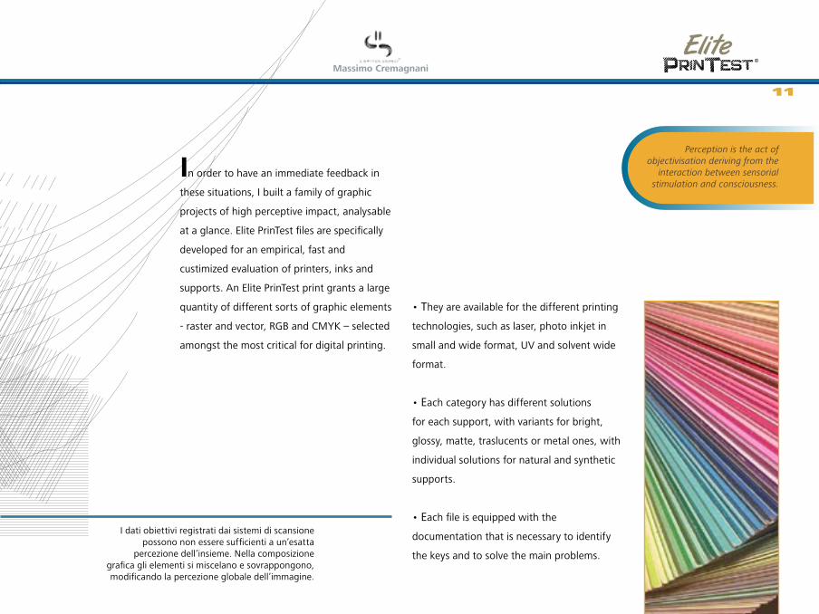
In order to have an immediate feedback in
these situations, I built a family of graphic
projects of high perceptive impact, analysable
at a glance. Elite PrinTest files are specifically
developed for an empirical, fast and
custimized evaluation of printers, inks and
supports. An Elite PrinTest print grants a large
quantity of different sorts of graphic elements
- raster and vector, RGB and CMYK – selected
amongst the most critical for digital printing.
• They are available for the different printing
technologies, such as laser, photo inkjet in
small and wide format, UV and solvent wide
format.
• Each category has different solutions
for each support, with variants for bright,
glossy, matte, traslucents or metal ones, with
individual solutions for natural and synthetic
supports.
• Each file is equipped with the
documentation that is necessary to identify
the keys and to solve the main problems.
Perception is the act of objectivisation deriving from the
interaction between sensorial stimulation and consciousness.
I dati obiettivi registrati dai sistemi di scansione possono non essere sufficienti a un’esatta
percezione dell’insieme. Nella composizione grafica gli elementi si miscelano e sovrappongono, modificando la percezione globale dell’immagine.
11
©
Massimo Cremagnani
Details make the difference
The possibility to choose Several typologies of Elite PrinTest files are available, categorized by dimension, kind of printer, graphic project and support. Each file covers a wide variety of cases, or at least the most recurrent and problematic. In case of specific needs for a particular project, support or print technology please contact the author at [email protected], to verify the customized files realization possibility. On top of graphic elements customization, it is possible to add headings, personal archive codes, commissioned artworks, and to acquire copy and publishing rights of the prints.
12
©
Massimo Cremagnani
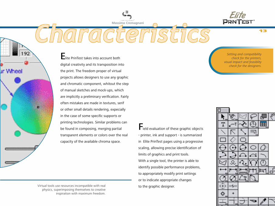
Elite PrinTest takes into account both
digital creativity and its transposition into
the print. The freedom proper of virtual
projects allows designers to use any graphic
and chromatic component, whitout the step
of manual sketches and mock-ups, which
are implicitly a preliminary verification. Fairly
often mistakes are made in textures, serif
or other small details rendering, expecially
in the case of some specific supports or
printing technologies. Similar problems can
be found in composing, merging partial
transparent elements or colors over the real
capacity of the available chroma space.
Field evaluation of these graphic objects
- printer, ink and support - is summarized
in Elite PrinTest pages using a progressive
scaling, allowing precise identification of
limits of graphics and print tools.
With a single tool, the printer is able to
identify possible performance problems,
to appropriately modify print settings
or to indicate appropriate changes
to the graphic designer.
Characteristics
Virtual tools use resources incompatible with real physics, superimposing themselves to creative
inspiration with maximum freedom.
Setting and compatibility check for the printers,
visual impact and feasiblity check for the designers.
13

©
Massimo Cremagnani
Variety sharpens wits
The art of the modification Until the sheet - or any other material - flows out from the printer, the project is virtual. It does not exist. It’s a set of datas and instructions worked out by digitalization, elaboration and publishing software. Then it becomes a semifinished product, ready to be rasterized, profiled, converted into pulses and ultimately into ink. Each of these steps requires very little time and small effort, especially when compared to traditional techniques. There is always time for additions, second thoughts, for a touch that gives a higher added-value to the final result. Elite PrinTest wants to help in practical and aesthetical choices, but the magic ewand is always in our own hands.
14

©
Massimo Cremagnani
Unlike conventional certification systems,
Elite PrinTest also works in favour of
creativity, including typical and of higher
impact elements used in graphic design.
With full consideration of the different
media used in printing, the files provide
solutions over normal certification limits,
mainly considering the CMYK workspace
chromatic standards.
Colour workspaces can have a gamut higher
than expected. Any arbitrary adjustment
can cause the loss of valuable tones, most
of which can also be reproduced in prints
through some tricks.
The digital prints and inks wide variety
allows, through appropriate settings, to
overcome these wrongly imposed limits,
achieving high aesthetical results and graphic
solutions over the expectations, which are
normally achievable with alternative printing
techniques.
The application of each Elite PrinTest
file – print technology and support
– is a prescription based on documented
experimentations. but also a spur towards
countless available variants.The spot colours use, not reccomended in
traditional printing due to the high costs, allows with some digital systems a perfect corrispondency
and a distinctive visual impact. At no cost.
Converting “mistakes” in styling refinements,
merging practicalness and aesthetic sensibility
15
©
Massimo Cremagnani
Beauty is in watcher’s eye
Points of view Printing control technologies, from spectrophotometers to proof stations, offer objective and unquestionable control parameters over the printed object, working implicitly in optimal conditions. But the print will be enjoied in different conditions, by different people who will dedicate a relatively and subjectively necessary time. These are further parameters to be taken into account, human factors related to social and aesthetical culture that only man can evaluate with good sense. Perfection is for instruments, sensations are for users.
16
©
Massimo Cremagnani
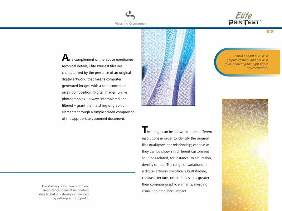
As a complement of the above mentioned
technical details, Elite PrinTest files are
characterized by the presence of an original
digital artwork, that means computer
generated images with a total control on
pixels composition. Digital images, unlike
photographies – always interpolated and
filtered – grant the matching of graphic
elements through a simple screen comparison
of the appropriately zoomed document.
The image can be shown in three different
resolutions in order to identify the original
files quality/weight relationship; otherwise
they can be shown in different customized
solutions related, for instance, to saturation,
density or hue. The range of variations in
a digital artwork specifically built (fading,
contrast, texture, other details...) is greater
then common graphic elements, merging
visual and emotional impact.The starting resolution is of basic importance to maintain printing
details, but it is strongly influenced by settings and supports.
Thinking about pixel as a graphic element and not as a
fault, confering the right paper representation.
17
©
Massimo Cremagnani
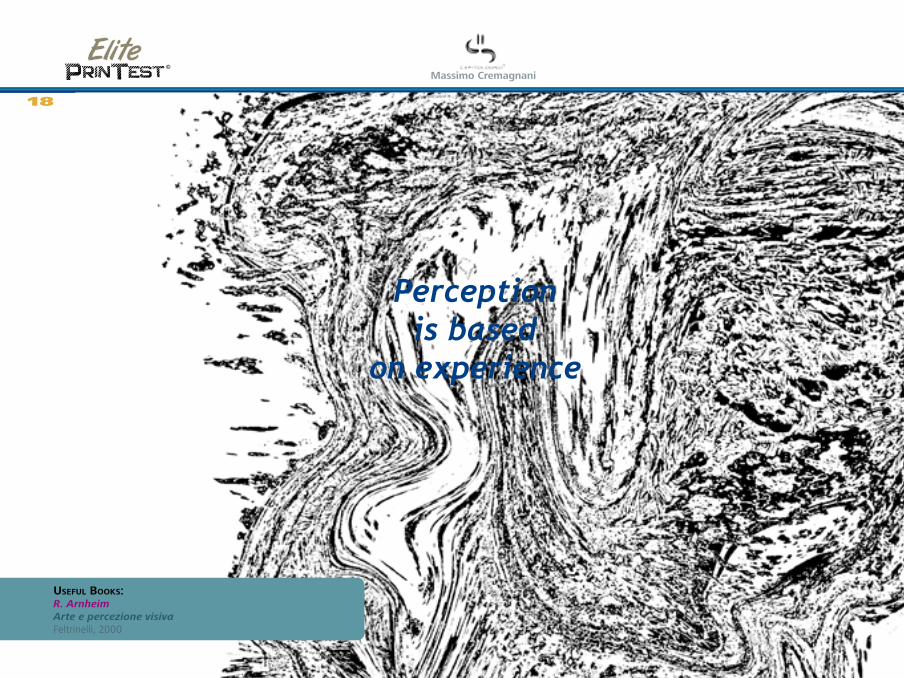
Perception is based
on experience
18
UsefUl Books:R. Arnheim Arte e percezione visiva Feltrinelli, 2000
©
Massimo Cremagnani
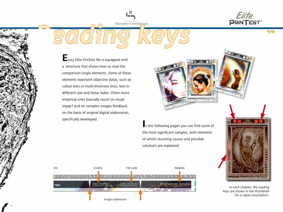
Every Elite PrinTest file is equipped with
a brochure that shows how to read the
comparison single elements. Some of these
elements represent objective datas, such as
colour bars or multi-thickness lines, text in
different size and linear fades. Other more
empirical ones basically count on visual
impact and on complex images feedback,
on the basis of original digital elaboration,
specifically developed.
In each chapter, the reading keys are shown in the thumbnail
for a rapid consultation.
In the following pages you can find some of
the most significant samples, with elements
of which recurring causes and possible
solutions are explained.
Artwork’s title Credits File code Weblink
Image subdivision
Reading keys 19
©
Massimo Cremagnani
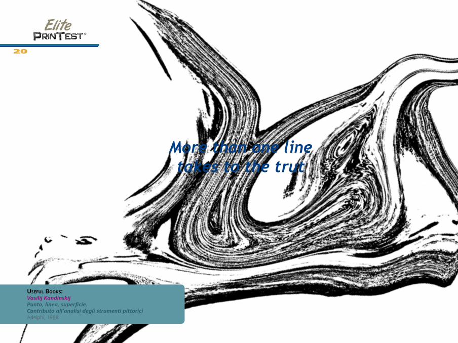
More than one line takes to the trut
20
UsefUl Books:Vasilij Kandinskij Punto, linea, superficie. Contributo all’analisi degli strumenti pittorici Adelphi, 1968
©
Massimo Cremagnani
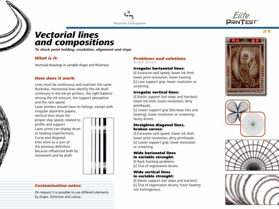
Irregular horizontal lines: [I] Excessive rack speed; lower ink limit; lower print resolution; lower heating. [L] Low support grip; lower resolution or screening.
Irregular vertical lines: [I] Elastic support (set steps and traction); lower ink limit; lower resolution; dirty printheads. [L] Lower support grip (decrease inks and heating); lower resolution or screening; faulty drums.
Straighten diagonal lines, broken curves: [I] Excessive rack speed; lower ink limit; lower print resolution; dirty printheads. [L] Lower support grip; lower resolution or screening.
Wide horizontal lines in variable strenght:[I] Rack tracking problems. [L] Out of registration drums.
Wide vertical lines in variable strenght:[I] Elastic support (set steps and traction).[L] Out of registration drums; fusor heating not homogeneus.
On request it is possible to use different elements by shape, thickness and colour.
Vectorial lines and compositions
Customization notes:
To check point holding, resolution, alignment and steps
What is it:
How does it work:
Problems and solutions[I]=Inkjet [L]=Laser
Vectroial drawings in variable shape and thickness.
Lines must be continuous and maintain the same thickness. Horizontal lines identify the ink draft continuity in the ink-jet printers, the right balance among the ink amount, the support absorption and the rack speed. Laser printers should have no failings, except with irregular absortion papers. Vertical lines show the proper step speed, related to profile and support. Laser prints can display drum or heating imperfections. Curve and diagonal lines work as a sum of the previous definition, because influenced both by movement and by draft.
21

©
Massimo Cremagnani
Character expresses sincerity
22
UsefUl Books:Lewis Blackwell Caratteri e tipografia del XX secoloZanichelli, 1995
©
Massimo Cremagnani
a B b C c D d E e F f G g H h I i J j K k L l M m N n O o P p Q q R r S s T t U u V v W w X x Y ya B b C c D d E e F f G g H h I i J j K k L l M m N n O o P p Q q R r S s T t U u V v W w X x Y y
10pt:AaBbCcDd8pt:AaBbCcDd 12pt:AaBbCcDd 18pt:AaBbCcDd24pt:AaBbCcDd30pt:AaBbCcDd10pt:AaBbCcDd 8pt:AaBbCcDd12pt:AaBbCcDd18pt:AaBbCcDd30pt:AaBbCcDd24pt:AaBbCcDd
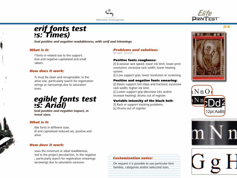
Optical positive and negative readableness, with serif and trimmings
Serif fonts in related size to the support. Positive and negative capitalized and small alphabets.
Serifs must be clean and recognizable. In the negative one, particularly search for registration smearings or narrowings due to saturation excesses.
Positive fonts roughness: [I] Ecxessive rack speed; lower ink limit; lower print resolution; excessive rack width; lower heating system. [L] Low support grip; lower resolution or screening.
Positive and negative fonts smearing:[I] Elastic support (set steps and traction); excessive rack width; higher ink limit.[L] Lower support grip (decrease inks and/or increase heating); drums out of register.
Variable intensity of the black belt: [I] Rack or support tracking problems.[L] Drums out of register.
Legible fonts test (es: Arial)Optical positive and negative impact, in different sizes.
Legible fonts in different sizes. Small and capitalized reduced set, positive and negative.
It shows the minimum or ideal readibleness, related to the project peculiarities. In the negative one, particularly search for registration smearings or narrowings due to saturation excesses.
Serif fonts test (es: Times)
On request it is possible to use particular font families, categories and/or seleccted sizes.
[I]=Inkjet [L]=Laser
23
Customization notes:
What is it:
How does it work:
Problems and solutions
What is it:
How does it work:
©
Massimo Cremagnani
The colour is the mirror of the soul.
The soul can see herself reflected in colour.
24
UsefUl Books:Claudio Oleari Misurare il colore Hoepli, 1998
©
Massimo Cremagnani
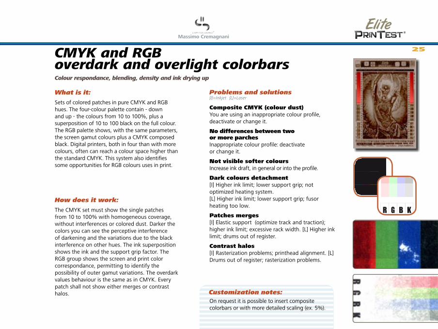
CMYK and RGB overdark and overlight colorbarsColour respondance, blending, density and ink drying up
Sets of colored patches in pure CMYK and RGB hues. The four-colour palette contain - down and up - the colours from 10 to 100%, plus a superposition of 10 to 100 black on the full colour. The RGB palette shows, with the same parameters, the screen gamut colours plus a CMYK composed black. Digital printers, both in four than with more colours, often can reach a colour space higher than the standard CMYK. This system also identifies some opportunities for RGB colours uses in print.
The CMYK set must show the single patches from 10 to 100% with homogeneous coverage, without interferences or colored dust. Darker the colors you can see the perceptive interference of darkening and the variations due to the black interference on other hues. The ink superposition shows the ink and the support grip factor. The RGB group shows the screen and print color correspondance, permitting to identify the possibility of outer gamut variations. The overdark values behaviour is the same as in CMYK. Every patch shall not show either merges or contrast halos.
Composite CMYK (colour dust)You are using an inappropriate colour profile, deactivate or change it.
No differences between two or more parchesInappropriate colour profile: deactivate or change it.
Not visible softer coloursIncrease ink draft, in general or into the profile.
Dark colours detachment[I] Higher ink limit; lower support grip; not optimized heating system.[L] Higher ink limit; lower support grip; fusor heating too low.
Patches merges[I] Elastic support (optimize track and traction); higher ink limit; excessive rack width. [L] Higher ink limit; drums out of register.
Contrast halos[I] Rasterization problems; printhead alignment. [L] Drums out of register; rasterization problems.
KYMC
KBGR
[I]=Inkjet [L]=Laser
On request it is possible to insert composite colorbars or with more detailed scaling (ex. 5%).
25
Customization notes:
What is it:
How does it work:
Problems and solutions

©
Massimo Cremagnani
See the difference between tan and tint.
UsefUl links:www.colorblender.com Palette generator in different formats.www.colourlovers.comForum about colours and their matching.
26
©
Massimo Cremagnani
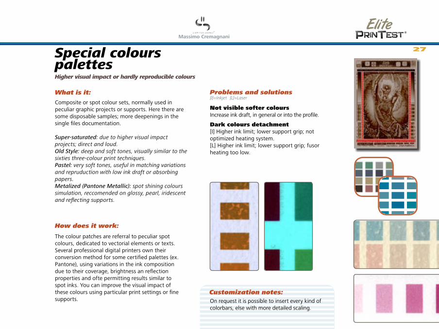
Special colours palettesHigher visual impact or hardly reproducible colours
Composite or spot colour sets, normally used in peculiar graphic projects or supports. Here there are some disposable samples; more deepenings in the single files documentation.
Super-saturated: due to higher visual impact projects; direct and loud.Old Style: deep and soft tones, visually similar to the sixties three-colour print techniques.Pastel: very soft tones, useful in matching variations and repruduction with low ink draft or absorbing papers.Metalized (Pantone Metallic): spot shining colours simulation, reccomended on glossy, pearl, iridescent and reflecting supports.
The colour patches are referral to peculiar spot colours, dedicated to vectorial elements or texts. Several professional digital printers own their conversion method for some certified palettes (ex. Pantone), using variations in the ink composition due to their coverage, brightness an reflection properties and ofte permitting results similar to spot inks. You can improve the visual impact of these colours using particular print settings or fine supports.
Not visible softer coloursIncrease ink draft, in general or into the profile.
Dark colours detachment[I] Higher ink limit; lower support grip; not optimized heating system.[L] Higher ink limit; lower support grip; fusor heating too low.
On request it is possible to insert every kind of colorbars, else with more detailed scaling.
[I]=Inkjet [L]=Laser
27
Customization notes:
What is it:
How does it work:
Problems and solutions
©
Massimo Cremagnani
Blend slowly to keep flavours
28
UsefUl Books:M. Brusatin Storia dei colori Einaudi, 1983

©
Massimo Cremagnani
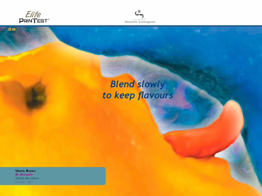
Complex and mixed gradientsTonal continuity, blendings and moireè.
Transition bars among primary CMYK and RGB colours.
Transitions imply a gradual colour mix, providing to hundreds of intermediate hues in the project’s colorspace. The printing system differently perform these tones, due to the used technology and the number of inks. The rone fading must be continuous, without steps or repetitions.
Not visible softer coloursIncrease ink draft, in general or into the profile.
Dark colours detachment[I] Higher ink limit; lower support grip; not optimized heating system.[L] Higher ink limit; lower support grip; fusor heating too low.
A dominant colour not included in the gradientExcessive ink in the dominant color profile setting.
StepsLow quality profile; project rendering at low resolution; project colours not compatible with the printing inks; excessive print speed.
Repetitions (some tones come out more times)Low quality or unsuitable profile; project colours not compatible with the printing inks.
On request it is possible to insert every kind of gradient palettes.
[I]=Inkjet [L]=Laser
29
Customization notes:
What is it:
How does it work:
Problems and solutions
©
Massimo Cremagnani
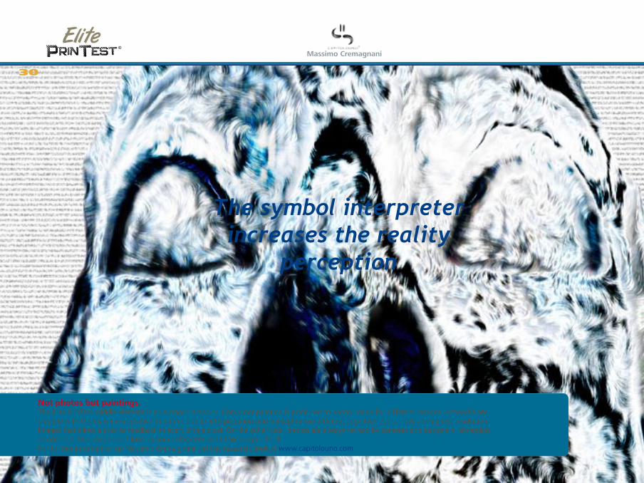
The symbol interpreter increases the reality
perception
Not photos but paintings, The Elite PrinTest middle element is an author’s artwork. Computer painting is preferred to photo image for different reasons. Artworks are created with the maximum creative freedom, due to interpretation and perception on different cognitive levels. They are highest resolution images that allow a precise feedback in every single pixel. On the other side, photos are always revised by cameras and designers, emerging as not-objective images and loosing some elements useful for a right check. For further information on Massimo Cremagnani’ artistic research, look at www.capitolouno.com.
30
©
Massimo Cremagnani
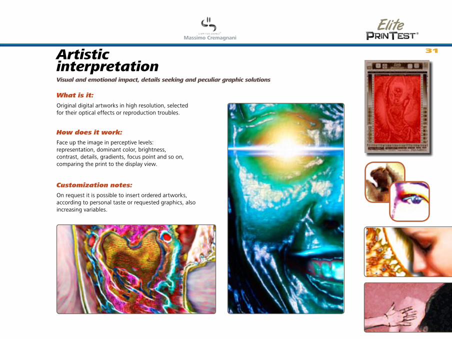
Artistic interpretationVisual and emotional impact, details seeking and peculiar graphic solutions
Original digital artworks in high resolution, selected for their optical effects or reproduction troubles.
Face up the image in perceptive levels: representation, dominant color, brightness, contrast, details, gradients, focus point and so on, comparing the print to the display view.
On request it is possible to insert ordered artworks, according to personal taste or requested graphics, also increasing variables.
31
Customization notes:
What is it:
How does it work:

©
Massimo Cremagnani
The correct resolution for many problems
Resolution: Device or support (film, paper...) ability in the image reproduction based on the ratio among the costitutive elements and the measure unit. • Printers: amount of points that can be defined on the paper. The measure unit is DPI. • Scanners: the resolution is expressed in SPI (Samples Per Inch), that is the CCD sensor ability in the two dimension recording of the image elements reflexed light (ex. text or photos). As convenience measures may be expressed in DPI, expecting a print of the scan. • Displays: measure unit is PPI (Pixel Per Inch) or DPI, usually set to 72 pixel per inch. Due to a best image sharpness, displays may present a reduced dot pitch (or stripe pitch). These terms mean the distance in millimeters amon a phosphor and the same colored next one, according to the different technologies. A good sharpen display usually get a 0,25 mm dot pitch. A display resolution is also expressed by the horizontal and vertical pixel amount that a video adapter can show in the screen.
32

©
Massimo Cremagnani
Three different image resolutions:Evaluation of the minimum detail in an image
Elements in the artwork shown in different resolution.
Founding on visual perception, locate the differences among the different resolution items (fit by white triangles). Lower resolution among the properly printed ones represents the optimal setting.
On request it is possible to insert ordered artworks, according to personal taste or requested graphics, also increasing variables.
33
Customization notes:
What is it:
How does it work:
©
Massimo Cremagnani
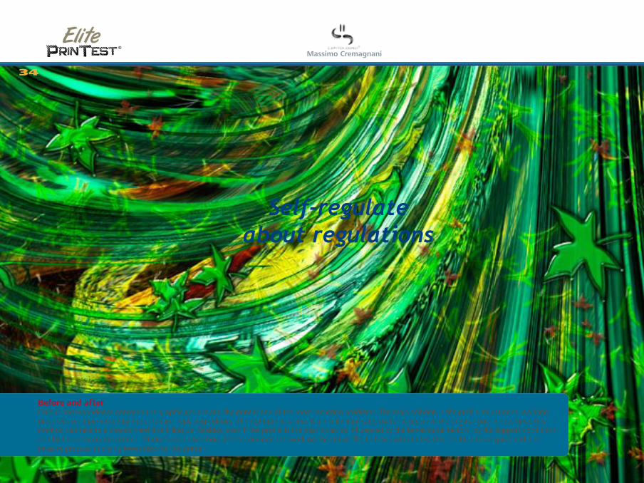
Self-regulate about regulations
Before and after Colour correspondence between the graphic project and the print is one of the most recurring problems. The main solution is the profile adjustment, working on curves or, if permitted by the software, replacing colours. The right process entails a profile duplicate, useful to preserve the original one; in few time, this method can take to a chaotic hard disk filling up. Besides, even if the profile is the best it can be influenced by the behavioural factors, by the support conditions and by the wear on the printer. At one’s own discretion, it’s reccomended to work on the native file, to reach wish tones; this can be a more quick and less invasive process, implying lower risks for the printer.
34
©
Massimo Cremagnani
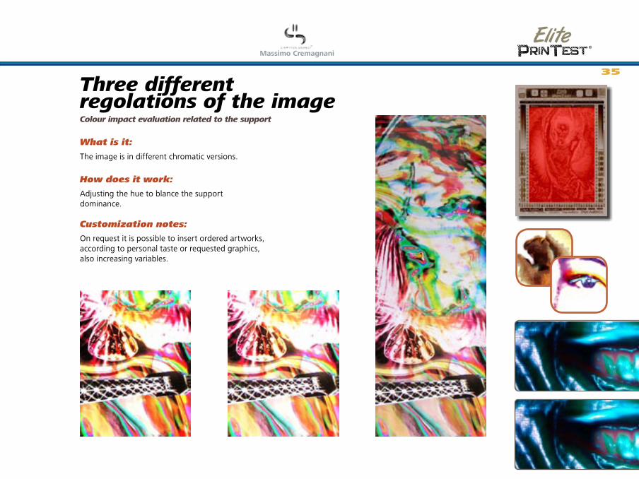
Three different regolations of the imageColour impact evaluation related to the support
The image is in different chromatic versions.
Adjusting the hue to blance the support dominance.
On request it is possible to insert ordered artworks, according to personal taste or requested graphics, also increasing variables.
35
Customization notes:
What is it:
How does it work:
©
Massimo Cremagnani
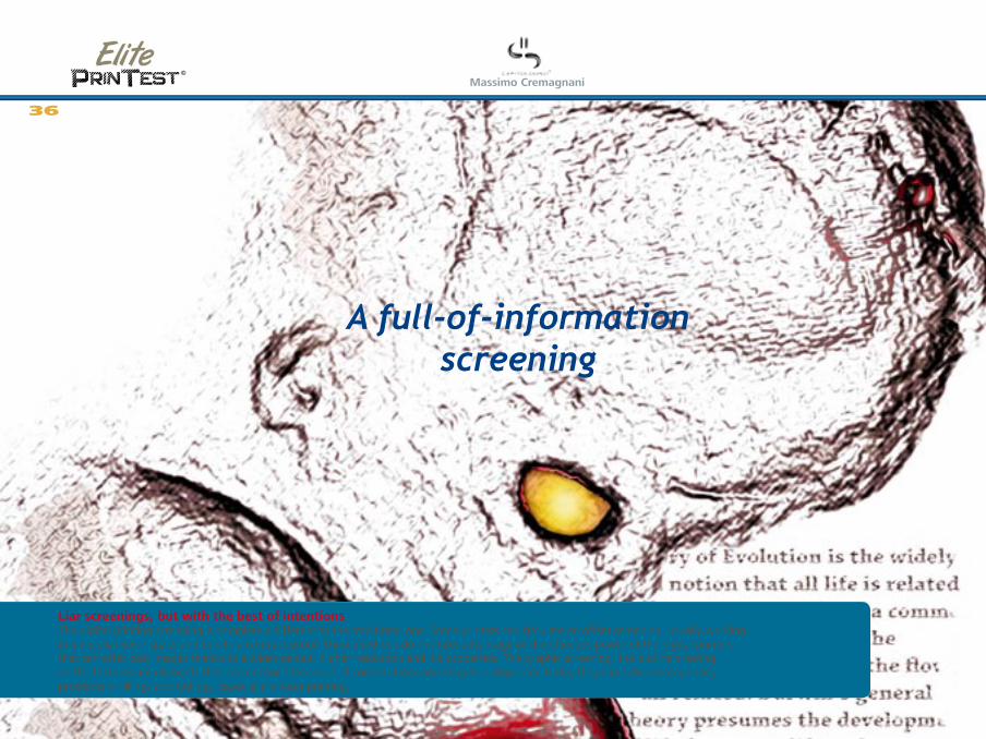
A full-of-information screening
Liar screenings, but with the best of intentions The digital printing screening is completely different to the traditional one. Some printers can simulate an offset screening, usually working in a peculiar color space and due to a contract proof. These methods do not take advantage of the effective power of the digital printers, that can offer best images thanks to a wider gamut, higher resolution and ink properties. The graphic screening, the outline drawing an the textures are elements that can enhance the value of compositions and images. Using some tricks, they can solve homogeneity problems in fillings and fadings, especially in laser printing.
36

©
Massimo Cremagnani
Three different image screeningsStroke evaluation related to the support
Hard-screen image with hue and brightness variations.
Screening shows a direct comparison to the support. Search for the best union related to the ink density in different strokes and hues.
On request it is possible to insert ordered artworks, according to personal taste or requested graphics, also increasing variables.
37
Customization notes:
What is it:
How does it work:
©
Massimo Cremagnani
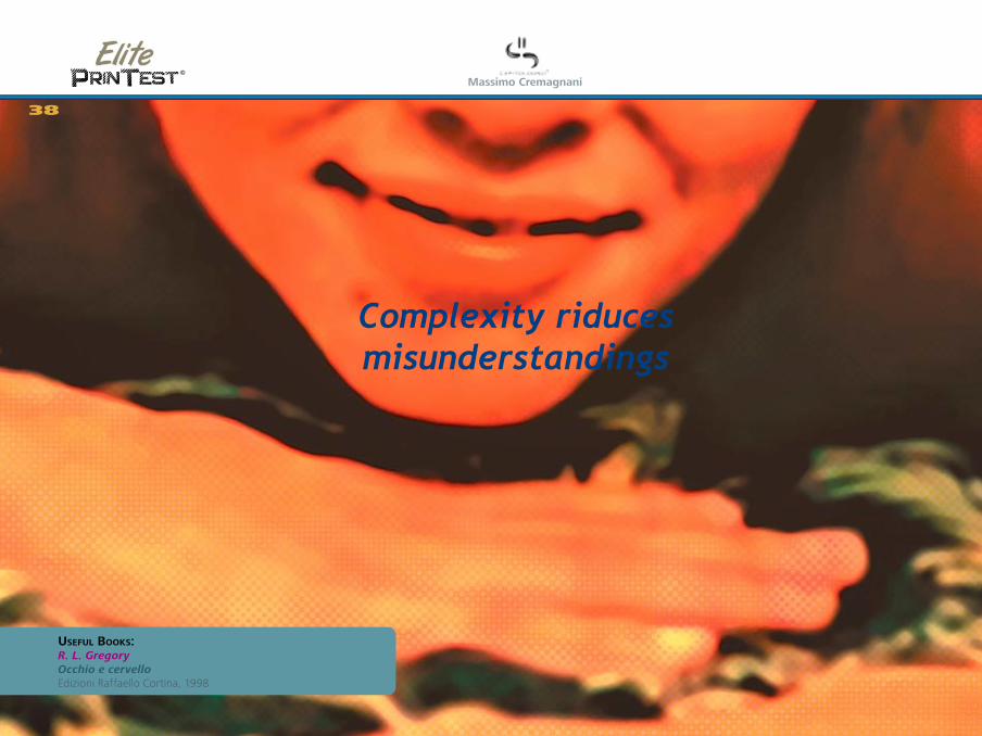
Complexity riduces misunderstandings
38
UsefUl Books:R. L. Gregory Occhio e cervello Edizioni Raffaello Cortina, 1998
©
Massimo Cremagnani
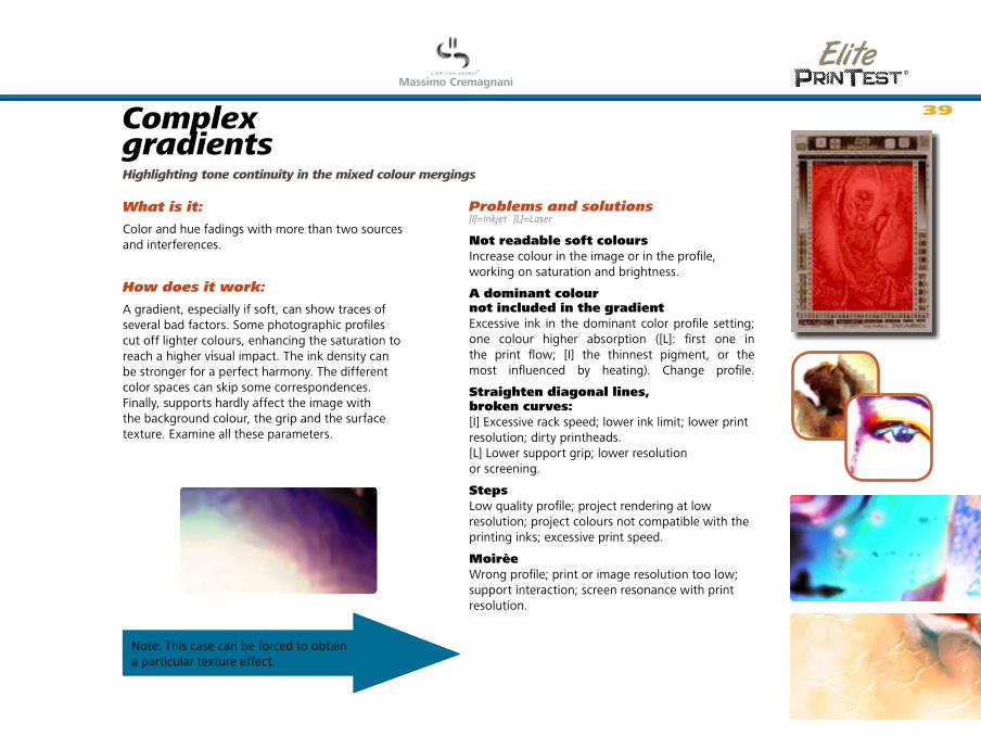
Complex gradientsHighlighting tone continuity in the mixed colour mergings
Color and hue fadings with more than two sources and interferences.
A gradient, especially if soft, can show traces of several bad factors. Some photographic profiles cut off lighter colours, enhancing the saturation to reach a higher visual impact. The ink density can be stronger for a perfect harmony. The different color spaces can skip some correspondences. Finally, supports hardly affect the image with the background colour, the grip and the surface texture. Examine all these parameters.
Not readable soft coloursIncrease colour in the image or in the profile, working on saturation and brightness.
A dominant colour not included in the gradientExcessive ink in the dominant color profile setting; one colour higher absorption ([L]: first one in the print flow; [I] the thinnest pigment, or the most influenced by heating). Change profile.
Straighten diagonal lines, broken curves: [I] Excessive rack speed; lower ink limit; lower print resolution; dirty printheads. [L] Lower support grip; lower resolution or screening.
StepsLow quality profile; project rendering at low resolution; project colours not compatible with the printing inks; excessive print speed.
MoirèeWrong profile; print or image resolution too low; support interaction; screen resonance with print resolution.
Note: This case can be forced to obtain a particular texture effect.
[I]=Inkjet [L]=Laser
39
What is it:
How does it work:
Problems and solutions

©
Massimo Cremagnani
The contrast highlights
the information
UsefUl links:http://photoshopbrushes.com Special effects brushesDave Nagel Series Brush libraries, Google it.
40

©
Massimo Cremagnani
Chromatic and tonal contrastFake screenings or digital channels and inks merges
Irregolari pictorial elements.
A brush stroke, also digital, naturally holds complex and undefined colour mixes, in order to give to the viewer an interpretable element. The transposition naturalness can be misunderstood by digital tools, specially due to the color space translations crossed by the file during the workflow. The hue and chroma variations in a painted work help to identify pros and cons in the different digital strokes. These elements can individually attend also in photos or graphics, as peculiarities ordered to a more specific message.
Evaluate the visual impact on the whole and in single details, referring to the test’s objective elements in order to modify colour, density, stroke and other corrections.
41
What is it:
How does it work:
Problems and solutions
©
Massimo Cremagnani
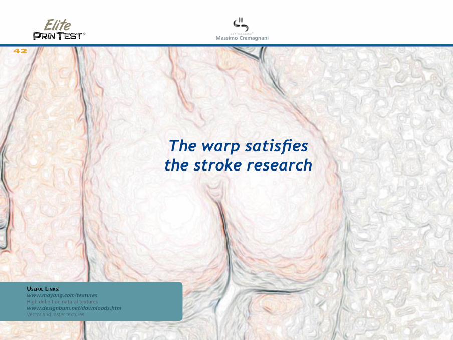
The warp satisfies the stroke research
UsefUl links:www.mayang.com/textures High definition natural textureswww.designbum.net/downloads.htm Vector and raster textures
42

©
Massimo Cremagnani
High definition textures and detailsScreening evaluation related to digital resolution, ink holdout and support absorption
Digital created graphic elements, alone or recurring, natural or geometrical.
Evalue the whole and detailed visual impact, in different distances. Textures can show a general figure or highlight some areas in order to deepen the image. The area and detail equilibrium is needed since the project beginning, referred to the message and the viewer point of view. The painting mix offers a lot of colour cornerstones, referring to the sharpness or the merges due to the ink superimposing or the support surface characteristics. In these situations it’s better adjust the main file than profiles.
Confused textureLower starting resolution: recreate the pattern in higher resolution; enlarge the image balancing hues and contrasts as possible Lower print resolution: set a higher print resolution (commonly defined as “best” or “photo”.Excessive support absorbing: use a less porous support; try to contrast the image; change profile.Lower contrast related to the destination color space: increase the contrast, softly reducing the saturation; change profile.
Contrast halosBalance tone levels; reduce maximum and minimum levels; use a glossy paper profile.
Unrelated colour dominationIncrease the contrast, softly reducing the saturation; change profile.
StepsRender the file in a different resolution (+/- 10% at a time); change profile.
MoirèeSoftly enlarge the texture; render the file in a different resolution (+/- 10% at a time); balance tone levels; reduce maximum and minimum levels.
[I]=Inkjet [L]=Laser
43
What is it:
How does it work:
Problems and solutions

©
Massimo Cremagnani
The Website44
The Elite PrinTest research is shared at
www.capitolouno.com/printest.
The website shows basic infos about this
new aesthetic tool and its peculiarities. You
can find the free downloadable low-res
version of this handbook and some test files.
A discussion forum is under construction,
in order to directly face up the print and
contemporary depiction problems.
English version coming soon.
In the website you can find the test print previews and some tips to understand the digital print tipologies.
©
Massimo Cremagnani
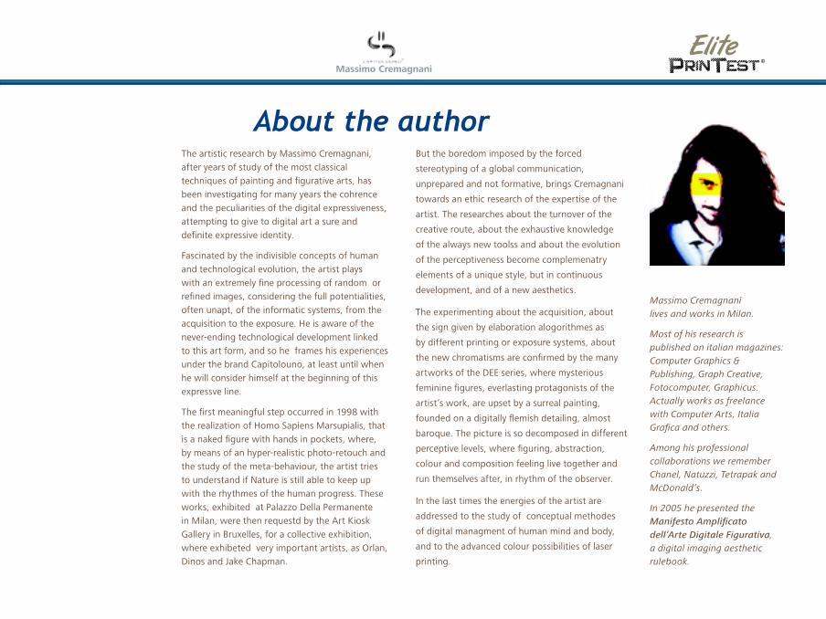
About the authorThe artistic research by Massimo Cremagnani,
after years of study of the most classical
techniques of painting and figurative arts, has
been investigating for many years the cohrence
and the peculiarities of the digital expressiveness,
attempting to give to digital art a sure and
definite expressive identity.
Fascinated by the indivisible concepts of human
and technological evolution, the artist plays
with an extremely fine processing of random or
refined images, considering the full potentialities,
often unapt, of the informatic systems, from the
acquisition to the exposure. He is aware of the
never-ending technological development linked
to this art form, and so he frames his experiences
under the brand Capitolouno, at least until when
he will consider himself at the beginning of this
expressve line.
The first meaningful step occurred in 1998 with
the realization of Homo Sapiens Marsupialis, that
is a naked figure with hands in pockets, where,
by means of an hyper-realistic photo-retouch and
the study of the meta-behaviour, the artist tries
to understand if Nature is still able to keep up
with the rhythmes of the human progress. These
works, exhibited at Palazzo Della Permanente
in Milan, were then requestd by the Art Kiosk
Gallery in Bruxelles, for a collective exhibition,
where exhibeted very important artists, as Orlan,
Dinos and Jake Chapman.
But the boredom imposed by the forced
stereotyping of a global communication,
unprepared and not formative, brings Cremagnani
towards an ethic research of the expertise of the
artist. The researches about the turnover of the
creative route, about the exhaustive knowledge
of the always new toolss and about the evolution
of the perceptiveness become complemenatry
elements of a unique style, but in continuous
development, and of a new aesthetics.
The experimenting about the acquisition, about
the sign given by elaboration alogorithmes as
by different printing or exposure systems, about
the new chromatisms are confirmed by the many
artworks of the DEE series, where mysterious
feminine figures, everlasting protagonists of the
artist’s work, are upset by a surreal painting,
founded on a digitally flemish detailing, almost
baroque. The picture is so decomposed in different
perceptive levels, where figuring, abstraction,
colour and composition feeling live together and
run themselves after, in rhythm of the observer.
In the last times the energies of the artist are
addressed to the study of conceptual methodes
of digital managment of human mind and body,
and to the advanced colour possibilities of laser
printing.
Massimo Cremagnani lives and works in Milan.
Most of his research is published on italian magazines: Computer Graphics & Publishing, Graph Creative, Fotocomputer, Graphicus. Actually works as freelance with Computer Arts, Italia Grafica and others.
Among his professional collaborations we remember Chanel, Natuzzi, Tetrapak and McDonald’s.
In 2005 he presented the Manifesto Amplificato dell’Arte Digitale Figurativa, a digital imaging aesthetic rulebook.

Elite PrinTest is a digital printing research project useful in
every condition, with every technology and every kind of image,
dedicated to professional graphic designers and printers.
It’s a set of test files, specially made out in order to a perceptive
evaluation of the print possibilities, extremely quick in pros and
cons items evaluation in every situation.
The Elite PrinTest files combine objective and empirical elements
for an executive graphic project check, relating to different
supports and print settings.
Several files are available according to print technology, support,
graphic style, size and visual impact requests.
Every file is accompanied by a documentation with basic theory,
reading keys and the identification and solutions to the most
common problems.
The files are available for free, for not commercial use.
On request it is possible to obtain customized versions.
Elementi vettoriali ad alta densità: Per verificare la tenuta del punto, la risoluzione, l’allineamento e il passo.
Test di caratteri 1 (es. Times):Per la leggibilità ottica in positivo e in negativo, con grazie e filetti.
Barre CMYK e RGB overdark e overlight:Per il controllo della corrispondenza colore, ma anche della sovrapposizione, della densità e dell’asciugatura dell’inchiostro.
Colori speciali (es. supersaturi):Set di colori ad alto impatto visivo o di difficile riproducibilità.
Test di caratteri 2 (es. Arial):Per la leggibilità in positivo e negativo. Impatto visivo in diverse dimensioni.
Sfumature complesse e incrociate: Per evidenziare continuità tonale, sovrapposizioni ed effetti moirè.
Contrasti cromatici e tonali: Per la valutazione della retinatura offset o della sovrapposizione digitale.
Tre differenti risoluzioni dell’immagine: Per la valutazione del dettaglio minimo necessario nelle immagini.
Texture e dettagli ad alta definizione: Per valutare la retinatura offset o la risoluzione digitale, la tenuta del punto e l’assorbimento.
©
Massimo Cremagnani
www.capitolouno.com/printest
free
sha
ring
th
e file
s, t
he p
rint
s a
nd t
he t
exts
ca
n no
t b
e m
od
ified
, so
ld o
r p
ublis
hed
in w
hole
or
pa
rt w
itho
ut t
he e
xpre
ss w
ritt
en p
erm
issi
on