
Eindhoven University of Technology MASTER layout and ... · H.2 Example ... 5.4 Scaling an image...
100
Eindhoven University of Technology MASTER GLASS layout and styling system Golsteijn, B.J.T. Award date: 2007 Disclaimer This document contains a student thesis (bachelor's or master's), as authored by a student at Eindhoven University of Technology. Student theses are made available in the TU/e repository upon obtaining the required degree. The grade received is not published on the document as presented in the repository. The required complexity or quality of research of student theses may vary by program, and the required minimum study period may vary in duration. General rights Copyright and moral rights for the publications made accessible in the public portal are retained by the authors and/or other copyright owners and it is a condition of accessing publications that users recognise and abide by the legal requirements associated with these rights. • Users may download and print one copy of any publication from the public portal for the purpose of private study or research. • You may not further distribute the material or use it for any profit-making activity or commercial gain Take down policy If you believe that this document breaches copyright please contact us providing details, and we will remove access to the work immediately and investigate your claim. Download date: 15. Jun. 2018
Transcript of Eindhoven University of Technology MASTER layout and ... · H.2 Example ... 5.4 Scaling an image...

Eindhoven University of Technology
MASTER
GLASS
layout and styling system
Golsteijn, B.J.T.
Award date:2007
DisclaimerThis document contains a student thesis (bachelor's or master's), as authored by a student at Eindhoven University of Technology. Studenttheses are made available in the TU/e repository upon obtaining the required degree. The grade received is not published on the documentas presented in the repository. The required complexity or quality of research of student theses may vary by program, and the requiredminimum study period may vary in duration.
General rightsCopyright and moral rights for the publications made accessible in the public portal are retained by the authors and/or other copyright ownersand it is a condition of accessing publications that users recognise and abide by the legal requirements associated with these rights.
• Users may download and print one copy of any publication from the public portal for the purpose of private study or research. • You may not further distribute the material or use it for any profit-making activity or commercial gain
Take down policyIf you believe that this document breaches copyright please contact us providing details, and we will remove access to the work immediatelyand investigate your claim.
Download date: 15. Jun. 2018

TECHNISCHE UNIVERSITEIT EINDHOVENDepartment of Mathematics and Computer Science
Master’s Thesis
GLASS
Layout And Styling System
B.J.T. Golsteijn
Supervisors:
Ir. W. Dees (Philips)Dr. A.T.M. Aerts (TU/e)
Eindhoven, August 2005

ii

Abstract
As more and more electronic devices become connected to a network, applications will nolonger be bound to a single device. They can run on and be run from different devices inthe network. Because of the variation in device characteristics, one single user interface foran application will not suffice anymore. However, creating a distinct user interface for eachspecific target device quickly becomes infeasible as the number of target devices that can beadded to a network grows. To deal with this looming problem, a UI generation frameworkis being created within Philips Research that allows the (semi-)automatic generation of userinterfaces for different target devices. The aim of the GLASS project is to implement oneof the steps in this framework, the ‘Augment AUI’ step. This encompasses the creation of agraphical layout and styling editor, as well as the design and implementation of a data formatto store layout and styling information for graphical user interfaces in such a way, that it canbe used to create user interfaces for multiple target devices without the need to specify theuser interface for each target device in full detail, preferably in form of a multi-level stylesheet.
‘Multi-level Stylesheets’ is an experimental technique for storing layout and styling informa-tion of graphical user interfaces. This technique involves clustering device capabilities andinterrelated style attributes on different levels of abstraction in order to enable the creation ofattractive and intuitive user interfaces for multiple target devices, without the need to specifythe user interface for each target device in full detail.
This document describes the design and implementation of a data structure that uses themulti-level stylesheet technique for storing layout and styling information of graphical userinterfaces. Further, an editor that uses this data format to add layout and styling informationto Abstract UI models is described. Finally, some conclusions are drawn about the feasibilityof using multi-level stylesheets to create attractive and intuitive user interfaces for multipletarget devices without the need to specify the user interface for each target device in fulldetail.

iv Abstract

Acknowledgements
This master’s thesis completes my Computer Science study at the Technische UniversiteitEindhoven (TU/e). My graduation project is carried out at the Information ProcessingArchitectures (IPA) group at the Philips Research Laboratories Eindhoven.
First I would like to thank my supervisors Walter Dees and Ad Aerts for the pleasant cooper-ation during my final project. We had interesting discussions and they gave critical commentsand valuable suggestions on my work.
Further, I would like to thank my colleagues at Philips who made my stay at Philips a pleasantone.
Also, I want to thank Jack van Wijk and Marc Voorhoeve for their willingness to be a memberof my examination board and Paul de Bra and Harold Weffers for reviewing my thesis.
Finally, I would like to thank my girlfriend Nicole, my parents and my girlfriend’s parents fortheir love and support during this project.
Bart GolsteijnEindhoven, August 2005

vi Acknowledgements

Contents
Abstract iii
Acknowledgements v
1 Introduction 1
1.1 Context . . . . . . . . . . . . . . . . . . . . . . . . . . . . . . . . . . . . . . . 2
1.1.1 UI-Application modeling . . . . . . . . . . . . . . . . . . . . . . . . . . 3
1.1.2 Abstract UI modeling . . . . . . . . . . . . . . . . . . . . . . . . . . . 3
1.1.3 Augment AUI . . . . . . . . . . . . . . . . . . . . . . . . . . . . . . . . 4
1.1.4 Conversion and Implement Application . . . . . . . . . . . . . . . . . 4
1.2 Document Structure . . . . . . . . . . . . . . . . . . . . . . . . . . . . . . . . 4
1.3 Used Terms, Abbreviations, and Acronyms . . . . . . . . . . . . . . . . . . . 5
2 Layout and Styling of Graphical User Interfaces 7
2.1 Layout . . . . . . . . . . . . . . . . . . . . . . . . . . . . . . . . . . . . . . . . 8
2.1.1 Layout Descriptions . . . . . . . . . . . . . . . . . . . . . . . . . . . . 8
2.2 Style . . . . . . . . . . . . . . . . . . . . . . . . . . . . . . . . . . . . . . . . . 10
2.2.1 Cascading Style Sheets . . . . . . . . . . . . . . . . . . . . . . . . . . . 11
2.2.2 Multi-level stylesheets . . . . . . . . . . . . . . . . . . . . . . . . . . . 11
2.2.3 Existing Layout and Styling Editors . . . . . . . . . . . . . . . . . . . 13
3 Requirements 15
3.1 User Characteristics . . . . . . . . . . . . . . . . . . . . . . . . . . . . . . . . 15
3.2 General Capabilities . . . . . . . . . . . . . . . . . . . . . . . . . . . . . . . . 15
4 Design and Implementation of the Multi-level Stylesheet Data Format 17
4.1 Requirement Analysis . . . . . . . . . . . . . . . . . . . . . . . . . . . . . . . 18
4.2 High-level Structure . . . . . . . . . . . . . . . . . . . . . . . . . . . . . . . . 19
4.3 Layout . . . . . . . . . . . . . . . . . . . . . . . . . . . . . . . . . . . . . . . . 19
4.3.1 Layout Structure . . . . . . . . . . . . . . . . . . . . . . . . . . . . . . 19
4.3.2 Position and Size . . . . . . . . . . . . . . . . . . . . . . . . . . . . . . 20
4.4 Styling . . . . . . . . . . . . . . . . . . . . . . . . . . . . . . . . . . . . . . . . 20
4.5 Device Characteristics Descriptions . . . . . . . . . . . . . . . . . . . . . . . . 21
5 Design and Implementation of the Layout and Styling Editor 23
5.1 Design Considerations . . . . . . . . . . . . . . . . . . . . . . . . . . . . . . . 23
5.2 Graphical Editing Framework . . . . . . . . . . . . . . . . . . . . . . . . . . . 24

viii CONTENTS
5.2.1 Risks . . . . . . . . . . . . . . . . . . . . . . . . . . . . . . . . . . . . . 24
5.3 Analysis . . . . . . . . . . . . . . . . . . . . . . . . . . . . . . . . . . . . . . . 25
5.4 Plug-in Structure . . . . . . . . . . . . . . . . . . . . . . . . . . . . . . . . . . 26
5.5 GLASSEditor . . . . . . . . . . . . . . . . . . . . . . . . . . . . . . . . . . . . 26
5.5.1 Model . . . . . . . . . . . . . . . . . . . . . . . . . . . . . . . . . . . . 27
5.5.2 Controller . . . . . . . . . . . . . . . . . . . . . . . . . . . . . . . . . . 27
5.5.3 View . . . . . . . . . . . . . . . . . . . . . . . . . . . . . . . . . . . . . 29
5.6 Design and Implementation of the Widget Viewer . . . . . . . . . . . . . . . . 29
5.6.1 Architecture . . . . . . . . . . . . . . . . . . . . . . . . . . . . . . . . 31
5.6.2 Non-resizable areas . . . . . . . . . . . . . . . . . . . . . . . . . . . . . 33
5.6.3 Implementation . . . . . . . . . . . . . . . . . . . . . . . . . . . . . . . 34
5.6.4 Limitations . . . . . . . . . . . . . . . . . . . . . . . . . . . . . . . . . 34
5.7 Creating a New Multi-level Stylesheet . . . . . . . . . . . . . . . . . . . . . . 35
5.8 Editing the Multi-level Stylesheet . . . . . . . . . . . . . . . . . . . . . . . . . 35
5.9 Updating the Multi-level Stylesheet . . . . . . . . . . . . . . . . . . . . . . . . 36
5.9.1 Unanimity Strategy . . . . . . . . . . . . . . . . . . . . . . . . . . . . 37
5.9.2 Average strategy . . . . . . . . . . . . . . . . . . . . . . . . . . . . . . 37
5.10 Handling Inconsistencies . . . . . . . . . . . . . . . . . . . . . . . . . . . . . . 38
5.11 Case Study . . . . . . . . . . . . . . . . . . . . . . . . . . . . . . . . . . . . . 40
6 Conclusion 43
6.1 Future Work . . . . . . . . . . . . . . . . . . . . . . . . . . . . . . . . . . . . 44
7 Project Evaluation 45
7.1 Project Overview . . . . . . . . . . . . . . . . . . . . . . . . . . . . . . . . . . 45
7.2 Reflection . . . . . . . . . . . . . . . . . . . . . . . . . . . . . . . . . . . . . . 46
7.2.1 Time Spent . . . . . . . . . . . . . . . . . . . . . . . . . . . . . . . . . 46
7.2.2 Requirements Phase . . . . . . . . . . . . . . . . . . . . . . . . . . . . 46
7.2.3 Prototype Phase . . . . . . . . . . . . . . . . . . . . . . . . . . . . . . 47
7.2.4 Intermediate Presentation . . . . . . . . . . . . . . . . . . . . . . . . . 47
7.2.5 Design Phase . . . . . . . . . . . . . . . . . . . . . . . . . . . . . . . . 47
7.2.6 Implementation . . . . . . . . . . . . . . . . . . . . . . . . . . . . . . . 47
7.3 Lessons learned . . . . . . . . . . . . . . . . . . . . . . . . . . . . . . . . . . . 48
7.4 Final Remark . . . . . . . . . . . . . . . . . . . . . . . . . . . . . . . . . . . . 48
A Requirements 49
A.1 Functional Requirements . . . . . . . . . . . . . . . . . . . . . . . . . . . . . . 49
A.1.1 General . . . . . . . . . . . . . . . . . . . . . . . . . . . . . . . . . . . 49
A.1.2 Task List . . . . . . . . . . . . . . . . . . . . . . . . . . . . . . . . . . 51
A.1.3 Layout . . . . . . . . . . . . . . . . . . . . . . . . . . . . . . . . . . . . 52
A.1.4 Screens . . . . . . . . . . . . . . . . . . . . . . . . . . . . . . . . . . . 58
A.1.5 Styling . . . . . . . . . . . . . . . . . . . . . . . . . . . . . . . . . . . . 59
A.1.6 Preview and code generation . . . . . . . . . . . . . . . . . . . . . . . 61
A.2 Non-functional requirements . . . . . . . . . . . . . . . . . . . . . . . . . . . . 61
A.3 Additional ideas during development . . . . . . . . . . . . . . . . . . . . . . . 62
B Analysis Model 63

CONTENTS ix
C GEF Overview 67C.1 Introduction . . . . . . . . . . . . . . . . . . . . . . . . . . . . . . . . . . . . . 67C.2 Architecture . . . . . . . . . . . . . . . . . . . . . . . . . . . . . . . . . . . . . 67
C.2.1 Model . . . . . . . . . . . . . . . . . . . . . . . . . . . . . . . . . . . . 67C.2.2 View . . . . . . . . . . . . . . . . . . . . . . . . . . . . . . . . . . . . . 67C.2.3 Controller . . . . . . . . . . . . . . . . . . . . . . . . . . . . . . . . . . 68
C.3 Editing the Model . . . . . . . . . . . . . . . . . . . . . . . . . . . . . . . . . 68
D Packages Overview 71D.1 com.philips.glass . . . . . . . . . . . . . . . . . . . . . . . . . . . . . . . . . . 71D.2 com.philips.glass.actions . . . . . . . . . . . . . . . . . . . . . . . . . . . . . . 71D.3 com.philips.glass.dnd . . . . . . . . . . . . . . . . . . . . . . . . . . . . . . . . 72D.4 com.philips.glass.editors . . . . . . . . . . . . . . . . . . . . . . . . . . . . . . 72D.5 com.philips.glass.editparts . . . . . . . . . . . . . . . . . . . . . . . . . . . . . 72D.6 com.philips.glass.editpolicies . . . . . . . . . . . . . . . . . . . . . . . . . . . . 72D.7 com.philips.glass.figures . . . . . . . . . . . . . . . . . . . . . . . . . . . . . . 73D.8 com.philips.glass.figures.widgetviewer . . . . . . . . . . . . . . . . . . . . . . . 73D.9 com.philips.glass.layout . . . . . . . . . . . . . . . . . . . . . . . . . . . . . . 73D.10 com.philips.glass.misc . . . . . . . . . . . . . . . . . . . . . . . . . . . . . . . 73D.11 com.philips.glass.model.auimodel . . . . . . . . . . . . . . . . . . . . . . . . . 73D.12 com.philips.glass.model.mlss . . . . . . . . . . . . . . . . . . . . . . . . . . . . 73D.13 com.philips.glass.model.mlss.commands . . . . . . . . . . . . . . . . . . . . . 73D.14 com.philips.glass.model.mlss.updater . . . . . . . . . . . . . . . . . . . . . . . 74D.15 com.philips.glass.model.targetdevice . . . . . . . . . . . . . . . . . . . . . . . 74D.16 com.philips.glass.model.taskmodel . . . . . . . . . . . . . . . . . . . . . . . . 74D.17 com.philips.glass.views . . . . . . . . . . . . . . . . . . . . . . . . . . . . . . . 74D.18 com.philips.glass.wizards . . . . . . . . . . . . . . . . . . . . . . . . . . . . . . 75
E Task Model DTD 77
F Abstract UI Model DTD 79
G Multi-level Stylesheet DTD 81
H Device Characteristics Description Language 83H.1 DTD . . . . . . . . . . . . . . . . . . . . . . . . . . . . . . . . . . . . . . . . . 83H.2 Example . . . . . . . . . . . . . . . . . . . . . . . . . . . . . . . . . . . . . . . 83
Bibliography 85

x CONTENTS

List of Figures
1.1 UI generation framework . . . . . . . . . . . . . . . . . . . . . . . . . . . . . . 2
2.1 Layout . . . . . . . . . . . . . . . . . . . . . . . . . . . . . . . . . . . . . . . . 82.2 Sample structure of a multi-level stylesheet . . . . . . . . . . . . . . . . . . . 12
4.1 Layout and styling structure from requirements analysis . . . . . . . . . . . . 18
5.1 Simplified Analysis Model . . . . . . . . . . . . . . . . . . . . . . . . . . . . . 255.2 Layout and Styling Model used in the editor . . . . . . . . . . . . . . . . . . . 285.3 Model for the Tasklist View . . . . . . . . . . . . . . . . . . . . . . . . . . . . 295.4 Scaling an image versus resizing a widget . . . . . . . . . . . . . . . . . . . . 315.5 Nine-part tiling technique . . . . . . . . . . . . . . . . . . . . . . . . . . . . . 315.6 Widget Viewer architecture . . . . . . . . . . . . . . . . . . . . . . . . . . . . 325.7 Non-resizable area . . . . . . . . . . . . . . . . . . . . . . . . . . . . . . . . . 335.8 Bands mapping . . . . . . . . . . . . . . . . . . . . . . . . . . . . . . . . . . . 345.9 Two sample UI trees . . . . . . . . . . . . . . . . . . . . . . . . . . . . . . . . 375.10 Average UI (I) . . . . . . . . . . . . . . . . . . . . . . . . . . . . . . . . . . . 385.11 Average UI (II) . . . . . . . . . . . . . . . . . . . . . . . . . . . . . . . . . . . 385.12 The GLASS Layout and Styling System while editing a 640x480 user interface 415.13 The 320x240 and the 240x320 user interfaces . . . . . . . . . . . . . . . . . . 415.14 The generated user interface for a 480x360 screen . . . . . . . . . . . . . . . . 42
C.1 GEF Editing Overview . . . . . . . . . . . . . . . . . . . . . . . . . . . . . . . 68

xii LIST OF FIGURES

Chapter 1
Introduction
As more and more electronic devices become connected to a network, applications will nolonger be bound to a single device. They can run on and be run from different devices inthe network. Because of the variation in device characteristics, one user interface (UI) foran application will not suffice anymore. A user interface built for a 17-inch PC monitor cannot simply be used on a mobile phone, as the result would be a user interface in which thescrollbars play the leading role. Linear scaling provides a slightly better result when thedifferences in available screen size are quite small, but in case of a PC and a mobile phone,the result would be a user interface with unreadable small texts and buttons too small towork with, which is clearly undesirable. On the other hand, creating a distinct user interfacefor each specific target device is undesirable as well, as this quickly becomes infeasible as thenumber of target devices that can be added to a network grows.
To deal with this looming problem, a UI generation framework [2] is being created withinPhilips Research that allows the (semi-)automatic generation of user interfaces for differenttarget devices. The aim of the GLASS (GLASS Layout And Styling System) project is toimplement one of the steps in this framework, the Augment AUI step, which is describedin more detail in section 1.1.3. This encompasses the creation of a graphical layout andstyling editor, as well as the design and implementation of a data format to store layout andstyling information for graphical user interfaces in such a way, that it can be used to createattractive and intuitive user interfaces for multiple target devices from a single layout andstyling description, preferably in form of a multi-level stylesheet [3] [4]. Because the multi-levelstylesheets technique is still in an experimental phase, the GLASS project will also serve asa feasibility study of using multi-level stylesheets for the creation of attractive and intuitiveuser interfaces for multiple target devices.
One application domain for such reusable user interface descriptions is the in-home networkingenvironment. Within the Philips Ambient Intelligence vision, all consumer electronics will beconnected to a wireless network. This creates for example opportunities for remote UI (a userinterface that is provided by an application on one device, but is shown on another device(UI device) that is physically separated from the device on which the application runs) andnomadic UI (a user interface that supports session migration from one display to another andcan adapt to the UI capabilities of a wide range of UI devices, in order to provide access tothe underlying application from anywhere). It is obvious that the current device specific UIdefinitions are unsuited for remote and nomadic UI. The data format for storing layout and

2 Introduction
styling information described in this document can be used within a UI generation frameworkto create attractive and intuitive user interface for multiple target devices, without the needspecify the UI for each target device in full detail.
In-home networking however, is not limited to Philips. Also in other companies, in-homenetworking is gaining importance, as can be noticed in forums like UPnP [6] and DLNA [7],in which many different companies participate.
1.1 Context
Within Philips Research Eindhoven, a UI generation framework is being created that al-lows the (semi-)automatic generation of graphical user interfaces for a variety of differentdevices. [2]. As mentioned in the previous section, the aim of the GLASS project is to im-plement the Augment AUI step of this framework. A visual overview of the UI generationframework is shown in Figure 1.1.
Figure 1.1: UI generation framework
In this figure, the rectangles depict models, the ellipses depict phases, and the cylinders depictdatabases. The lines and arrows depict the connections between them.
The Widget Database contains widget descriptions in a meta widget description language andpreview images of the widgets. These images can be used inside a generic layout and stylingeditor to preview the widgets without the need to implement every widget within the editor.An example of such a widget description can be found in Section 5.6. The Repository containsthe labels, texts and images that will be associated with the UI and the Device CapabilitiesDatabase contains descriptions of the characteristics of various target devices. Note that theexact format of device capabilities descriptions is not yet defined and can be defined accordingto the needs of the GLASS project.
The different phases of the framework are described in the following subsections.

1.1 Context 3
1.1.1 UI-Application modeling
During the UI-Application modeling phase, a task model and a data model are created.
• The task model describes the tasks a user can perform with the underlying application.GLASS uses a simplified task model as input, in which for each task only the inputsand outputs are described. The data format for the final task model (and the othermodels of the framework) have not yet been defined.
Here is an example of a (simplified) task model:
<?xml version="1.0" encoding="UTF-8"?>
<!--Simplified taskmodel (can also be called execution model or UI-application model)
without any preconditions, groupings, links to datamodel, alerts, etc. This model specifies
the input/output variables that are relevant for this task which can be changed by the user,
which are mapped onto widgets in the abstract UI model. -->
<!DOCTYPE taskmodel SYSTEM "C:\GLASS\taskmodels\taskmodel-student.dtd">
<taskmodel name="MP3 Player" version="1.0">
<task id="t1" name="Search song" autoexecute="true">
<input id="i1" name="searchstring"/>
<output id="o1" name="songlist"/>
</task>
</taskmodel>
The DTD [16] for the task models used in this project can be found in Appendix E.
• The data model contains all data relevant for the UI. Within the GLASS project how-ever, the data model is ignored and therefore it is not further described here.
1.1.2 Abstract UI modeling
During the Abstract UI modeling phase, an Abstract UI model is created. An AbstractUI model contains look-and-feel definitions and mappings from the task model’s inputs andoutputs to platform specific widgets. Note that more than one widget can be defined for aspecific input or output and that one widget can implement more than one input or output.Again, GLASS uses a simplified model.
Here is an example of such a (simplified) Abstract UI model:
<?xml version="1.0" encoding="UTF-8"?>
<!-- Abstract UI model: contains, for each target platform that the designer wants to focus
on, a mapping from each input/output element of a task in the task model to a list of target
specific widgets (described on a meta-level) that will be used to implement that task.
Note 1: for each input, output, and trigger there can be more than one widget possible. And
multiple inputs, outputs can be combined and mapped onto a single widget.
Note 2: this version does not support multiple look & feels, doesn’t include alerts and uses
simple navigation widgets unrelated to task links.
Note 3: the target devices are specified independently and saved under a certain name, which
is assumed to be uniquely identifiable.-->
<!DOCTYPE uimodel SYSTEM "C:\GLASS\auimodels\uimodel-student.dtd">
<uimodel version="1.0" taskmodel="taskmodel-student.xml">

4 Introduction
<lookfeeldefinitions>
<!-- contains the various look & feels (i.e. widget sets) to which the tasks in the task model
can be mapped -->
<lookfeel id="awt" name="Java AWT"/>
<lookfeel id="swing" name="Java Swing"/>
<lookfeel id="pocketpc" name="Windows PocketPC"/>
</lookfeeldefinitions>
<targetdevice id="pc" deviceref="C:\GLASS\devices\px.xml" lookfeel="awt">
<widget task="t1" input="i1" widgetref="C:\GLASS\widgets\textfield-meta.xml"/>
<!-- This has to be repeated for each input and output variable. Multiple occurrences
possible per input/output variable.
Note: input and output are comma-separated list of input and output IDREFs, can be mixed
in whichever way you want, since the same widget can perform input and output or multiple
input/output functionality at the same time-->
<trigger task="t1" widgetref="C:\GLASS\widgets\button-meta.xml"/>
<navigationlink widgetref="C:\GLASS\widgets\button-meta.xml"/>
</targetdevice>
<!-- This has to be repeated for that device with a different value for attribute lookfeel,
if more than one look & feel (i.e. widget set) to which the tasks in the task model can be
mapped for that device is available -->
<targetdevice id="ipaq" deviceref=C:\GLASS\devices\ipaq.xml" lookfeel="pocketpc">
<widget task="t1" input="i1" widgetref="C:\GLASS\widgets\textfield-meta-pda.xml"/>
<trigger task="t1" widgetref="C:\GLASS\widgets\button-meta-pda.xml"/>
<navigationlink widgetref="C:\GLASS\widgets\button-meta-pda.xml"/>
</targetdevice>
</uimodel>
The DTD for the Abstract UI models used in this project can be found in Appendix F.
1.1.3 Augment AUI
During the Augment AUI phase, layout and styling information are added to the Abstract UImodel, preferably in the form of a multi-level stylesheet (MLSS) [3] [4]. This is the step theGLASS project implements and which will be discussed in the remainder of this document.
1.1.4 Conversion and Implement Application
During the conversion phase, concrete, device specific user interfaces are created. During theImplement Application the non-UI parts of the application are created. As these two phasesare outside the scope of the GLASS project, they are not further described here.
1.2 Document Structure
Chapter 2 describes layout and styling techniques for graphical user interfaces. Chapter 3gives an overview of the requirements for a generic layout and styling editor. Chapter 4discusses the design of the created data structure for storing layout and styling information.Chapter 5 describes the design and implementation of the created graphical layout and styling

1.3 Used Terms, Abbreviations, and Acronyms 5
editor. In Chapter 6, a summary of the project is given an some conclusions are drawn on thefeasibility of using multi-level stylesheets to create user interfaces for multiple target deviceswithout the need to specify the user interface for each target device in full detail. Finally,Chapter 7 gives an evaluation of the GLASS project.
1.3 Used Terms, Abbreviations, and Acronyms
CSS Cascading Style Sheets [18]. CSS is a mechanism for defining style information. CSS isdescribed in Section 2.2.1.
DTD Document Type Definition [16]. In a DTD, the structure of a class of documents isdescribed via element and attribute-list declarations. Element declarations name theallowable set of elements within the document, and specify whether and how declaredelements and runs of character data may be contained within each element. Attribute-list declarations name the allowable set of attributes for each declared element, includingthe type of each attribute value, if not an explicit set of valid value(s).
GLASS GLASS Layout And Styling System, the name of this project.
GUI Graphical User Interface
Layout The position of the various UI elements in a graphical user interface.
Look-and-feel General appearance and operation of a user interface.
MLSS Multi-level stylesheet
Mock-up A model of something that has not yet been built, which shows how it will lookor operate.
Navigationlink UI element that allows the user to switch to another screen. Within theGLASS project, navigationlinks do exist, but they are not functional.
Style Appearance of the UI elements
Task Unit within the Task model. Defines a task that the user can perform with the systemand is characterized by its inputs and/or outputs. See section 1.1.1 for more informationabout tasks and the Task model.
Trigger UI element that initiates an action to generate the output values from its inputvalues for a task.
TU/e Technical University Eindhoven
UI User interface. A UI defined how a user can interact with a system. Typically a userinterface translates user events to events that can be understood by the underlyingapplication and translates feedback from the application to a form that can be perceivedby a user.
UI elements Elements that make up the user interface: widgets, images, texts, etc.

6 Introduction
UI part Part of UI: screen, area, or UI element.
Widget A mediator between the user and the functionality offered by an application/system,taking input from and/or providing output to the user.
WYSIWYG Acronym for ‘What You See Is What You Get’. A WYSIWYG UI creationsystem displays a (more-or-less) accurate image of what the user interface rendered onthe target platform will look like while editing the user interface.

Chapter 2
Layout and Styling of Graphical
User Interfaces1
As argued in Chapter 1, using one single user interface on multiple target devices with differentcharacteristics is undesirable, as this may lead to unattractive or even unusable user interfaces.On the other hand, to create a tailored user interface for each specific target device becomesinfeasible when the number of target devices grows. This suggests that a solution has to befound in which as much user interface information as possible can be reused in an automatedway, but still with the ability of tailoring the user interface for each specific target device intoan attractive and intuitive one.
But what is an attractive and intuitive user interface and how to create such a user interface?An answer to the first question could be: an intuitive user interface is a user interface inwhich a user can perform his tasks without much mental effort. Attractive is a term that isharder to define; it is quite a subjective measure which has to do with colors, fonts, layout,etc. and is rather time and function dependent. In case of UI design, it is up to a designer todecide what is attractive and what not. Unfortunately, the process of determining whetheror not a UI is attractive can hardly be automated2.
Now the second question on the creation of attractive and intuitive user interfaces. Manyfactors influence the attractiveness and intuitiveness of a user interface. Some of those factorscan be controlled, others cannot. Among the controllable factors, layout and styling playan important role. For example, a user interface with a well-designed layout can guide theuser in performing his tasks, which raises the user’s efficiency and reduces the number oferrors made, whereas a bad layout can actually prevent the user from being able to completehis tasks. Styling obviously influences the attractiveness of a user interface, but styling canalso influence the intuitiveness of a user interface. A button clearly recognizable as a buttonalmost asks for being pressed, whereas a transparent button without any border will hardlybe recognized as a button and therefore decreases the intuitiveness of the user interface.
1This chapter is a (partial) summary of Survey of Layout and Styling Tools and Techniques [1], a documentcreated at the beginning of the project.
2There have been some attempts to automate the evaluation of the attractiveness of user interfaces. Seefor example [21]

8 Layout and Styling of Graphical User Interfaces
2.1 Layout
When talking about the layout of graphical user interfaces, many terms are used, but there isno common consensus about what these terms mean. In the rest of this section, the followingterms are used to describe layout definitions. The virtual screen is the top of the layouthierarchy. In most cases, the virtual screen will be equal to the physical screen, although thisis not necessary. For example, when using four virtual desktops, the virtual screen is largerthan the physical screen. Areas are placed within a virtual screen and consist of a virtualdrawing area. This virtual drawing area can be larger than the visible part of the area, whichis called the viewport. When the virtual drawing area is larger then the viewport, typicallysome kind of scrolling facility is provided to access the non-visual parts. An area can containsub-areas and UI elements.
A graphical overview of these terms is shown in Figure 2.1.
Physical Screen
Virtual Drawing Area
Area
Viewport
(Sub) Area
Widget Widget
Area
Virtual Screen
Widget
Widget Widget Widget
Figure 2.1: Layout
Note that often the term container is used instead of area. This term is not further used here,as this assumes that a container widget concept is available, which might not always be thecase. Within the GLASS project, areas will be used, which might be converted to containerwidgets when the target platform supports container widgets.
2.1.1 Layout Descriptions
Unfortunately, there is no universal way to describe layout. In general, there are two kindsof layout descriptions:
• In an absolute layout description (aka. null-layout or XY-layout), all position informa-tion (and often also size information) is stored in terms of absolute (x,y) coordinates.
• In a relative layout description, the layout is described in terms of various relations.These can be relations between two UI elements, between an area and a UI elementwithin that area, or between two areas. In order to be able to use such relative layout

2.1 Layout 9
descriptions, a so-called layout manager is necessary to perform the layout task. Amongthe relative layout descriptions, two major categories can be distinguished:
– Relative layout descriptions based on areas divide the available screen space into anumber of areas. The layout manager determines how the available screen space isdivided into areas and each area can have its own layout manager. This ‘separationof concerns’ is an advantage for building reusable layout descriptions, as area de-scriptions can be reused. Examples of layout managers that use layout descriptionsbased on areas are BorderLayout [26], GridBagLayout [27], and GridLayout [28].
– Relative layout descriptions based on constraints use guides and/or relations todefine a layout. A guide is a line to which UI elements can be attached or aligned.A relation between two UI elements A and B can for example state that the leftedge of B should be placed 5 pixels from the right edge of A. A disadvantage ofusing constraints to define layout is that splitting a large screen into a numberof smaller screens is difficult because the relations between the different UI ele-ments tie the complete screen together. Examples of layout managers that uselayout descriptions based on constraints are FlowLayout [29], SpringLayout [30],and FormLayout [31].
One problem with most layout managers currently available, is that they do not takeminimum and/or maximum sizes into account. This is a serious problem, as manycustom-made widget sets for CE devices (e.g. TVs and DVD recorders) are not arbi-trarily scalable, as they are in Java for example.
With respect to reusability, relative layout descriptions have one advantage over absolutelayout descriptions: relative layout descriptions can cope better with changes in availablescreen size than absolute layout descriptions. In case of an absolute layout description, anincrease in available screen space can be handled either by adding empty space around theuser interface or by scaling the complete user interface. In the first case the extra space is notused and the result is a larger empty border around the original user interface. In the secondcase the user interface rapidly becomes less attractive or even unusable. For example, verylarge buttons with very large texts on it are not visually pleasing in most cases. And whenthe available screen space decreases, either the whole user interface is scaled down, whichleads to unreadable texts and too small UI elements, or a part of the user interface is cut offand can only be reached by scrolling. And things become even worse when the aspect ratioof the screen changes.
In case of a relative layout description, it is possible to define which parts of the user interfaceare allowed to grow or shrink and where the UI elements should be placed when the amountof available screen space changes. This is a great benefit, as it allows you to specify the waya user interface should react to changes of the available screen size in a more fine-grainedway, which in turn leads to user interfaces that can cope much better with changing screensizes. Note however that the variations in screen size a relative layout description can handleare limited. When the variations in available screen size become too large, more drasticmeasures have to be taken, like changing a row orientation to a column orientation, adjustingthe number of UI elements that are displayed on the screen, or even changing the number ofscreens a UI consists of. At the moment, there are no layout managers that can handle suchlarge variations in available screen size.

10 Layout and Styling of Graphical User Interfaces
Just like absolute layout descriptions, relative layout descriptions have some disadvantages.One major disadvantage is that there is no standard for relative layout definitions. Forexample, there are more than 25 different layout managers for Java alone. This indicatesthat there is no ultimate layout manager that is the best solution for all layout problems.Another disadvantage is that most layout managers do not allow visual editing in an intuitiveway. Because of the way most layout managers work, UI elements may jump around whilethe designer edits the user interface. And the majority of all layout managers are inherentlynot suited for pixel precise editing of a UI.
And this is exactly how UI designers work [22]. They position and size UI elements onlyin absolute terms and not in relative terms. The resulting UI design can therefore not beconverted to a reusable UI for different screen properties. Designers deal with different screenproperties by creating a new UI design when the properties of a screen differ. However, [22]shows that designers sometimes use grids and guides to align UI elements, at least in theirminds. These grids and guides can act as constraints and may help software engineers toformulate layout algorithms.
Within the GLASS project, areas and guides will be used as main layout primitives. Further,the default layout manager will store position and size information in terms of in terms of permills (parts per thousand) for the top, left, bottom, and right side of the UI element, relativeto the parent’s drawing area. This approach has a number of advantages:
1. It is possible to edit UIs in an visual, pixel precise, and intuitive way. There is no needto think in terms of layout constraints and UI parts do not jump around while editingthe UI.
2. It is relatively easy to detect similarities between different UIs based on proportions.For example, an area that occupies the complete width and one third of the total heightof a screen will have the same layout description for different screen sizes when per millsare used to store layout information, whereas the absolute coordinates will probably bequite different.
3. Linear scaling is provided for free.
2.2 Style
Style refers to the appearance of the UI elements. A lot of different style attributes can bedistinguished. Here is a list of common style attributes:
• colors (background, foreground, border, ...)
• images (background, foreground [e.g. on a button])
• text attributes (font, style, size, color, alignment)
• size3 (height, width)
3Note that size can also be treated as a layout attribute and not as a styling attribute. This is especiallythe case when the layout manager determines the sizes of the UI elements.

2.2 Style 11
There are number of ways to style a GUI. One way is to hard-code the style information inthe program code. Another way is to use an external file to define style information. Anadvantage of this approach is that style information can be changed without the need torecompile the entire program. Yet another way to style a GUI is creating custom widgetsthat are drawn by calling methods like ’drawline’, ’drawrectangle’, and ’fill’. Skinning is anextreme form of styling in which all UI elements are rendered from (replaceable) image files.An example of a program with a skinnable user interface is the MP3 player WinAmp4.
2.2.1 Cascading Style Sheets
The most well-known styling technique is probably Cascading Style Sheets (CSS) [18]. CSSis a mechanism for adding style information to Web documents. Different style sheets can bespecified for different types of devices and it is even possible to create more than one stylesheet for type of device, in order to let the user choose one. CSS is supported by all majorinternet browsers and has become the de-facto standard for styling HTML documents. Thebig advantage of using CSS for styling instead of including style information in the HTML fileitself, is reusability. A single CSS file can be used to style a complete website, and when youwant to change a style attribute, you only have to make one change to the CSS file, insteadof changing all occurrences of that style attribute in all HTML files.
The reusability of CSS styling attributes is accomplished by using selectors. Selectors deter-mine the target element(s) of a certain styling attribute. The most used selectors are elementselectors, class selectors and id selectors. Element selectors work on all elements of a certaintype, for example on all tables. Class selectors work on all elements that are member ofa certain class, as specified by the element’s class attribute. And id selectors work on onecertain element with a unique id.
Cascading style sheets are obviously a step into the right direction, as they provide a basisfor reusable layout descriptions. However, CSS is not enough to be able to specify styleinformation for many target devices. For instance, using CSS it is not possible to definedifferent style information for two different types of PDAs, as there is only one device type‘handheld’.
2.2.2 Multi-level stylesheets
Multi-level stylesheets [3] [4] are an (experimental) extension of the existing stylesheet lan-guages, which makes it possible to define style information at different levels of abstraction.This technique involves clustering device capabilities and interrelated style attributes. Bystoring style information in a hierarchical way, it is possible to reuse style information fordevices with overlapping characteristics. General information is stored at a high level in thehierarchy, whereas device specific information is stored at a low level in the hierarchy.
A sample multi-level stylesheet structure is shown in Figure 2.2.
The clustering of style attributes across device capabilities can be done according to severalcriteria [3]:
4WinAmp homepage: http://www.winamp.com/

12 Layout and Styling of Graphical User Interfaces
Graphics
Landscape Portrait
4x3 16x9
800x600640x480
LayoutStyle attributes
Layout
Style attributes
Layout
Style attributes
Layout
Style attributes
Figure 2.2: Sample structure of a multi-level stylesheet
1. If a style attribute always has the same value for all intended target devices, the styleattribute can be placed on the highest level of abstraction.
2. If a style attribute has the same value for a set of devices with a certain capability, asub-tree can be introduced with this device capability and the related style attributedefined as the root of the tree.
3. If a style attribute has the same value for the majority of devices with a certain capability(i.e. only a few exceptions), the same can be applied as for criterion 2. But now the“default”-value is overridden in sub-nodes of this subtree for the exceptions. Similarly,a lowest common denominator could be defined at the root of the subtree as a defaultvalue, which can be overridden in the sub-nodes. Note that if the style attributes donot significantly affect the user interface or if the devices with these exceptions are rare,overriding the default value is often not needed.
4. If the value of a style attribute can be automatically adapted (i.e. derived from anothervalue) across the range of values that is relevant for a cluster of devices, the styleattribute can be placed higher in the device capability tree. Examples of style attributesthat could be automatically adapted for a range of target devices are:
(a) resizing a bitmap to fit the size of the display
(b) transcoding an image from one format to another (e.g. a GIF-image to JPEG)
(c) going from color to grayscale.
To support clustering according to this criterion, thresholds could be defined that holdfor a specific range of target devices, for example to specify that a certain X can beminimally 30 and maximally 100 pixels wide.
Of the available layout and styling techniques, the multi-level stylesheet technique offers thebest perspective for storing layout and styling information for multiple target devices, without

2.2 Style 13
the need to specify all layout and styling information for each device in full detail. Therefore,it will be used as storage format in the GLASS project.
Note however, that that multi-level stylesheets were still in a conceptual phase at the startof the project. There was neither a complete specification nor an implementation. Themulti-level stylesheet data format used in this project is discussed in Chapter 4.
2.2.3 Existing Layout and Styling Editors
A number of existing layout and styling editors are discussed in [1], but none of them is suitablefor creating reusable layout and styling descriptions for a wide range of target devices. Themain problems with these editors are that they are mainly focused toward one target platformand that the ways to specify layout are not suited for this project. Either they use absolutelayout descriptions or they use layout descriptions using complex constraints, which resultsin an editing experience that is unintuitive for UI designers. Therefore, a completely newlayout and styling editor has been created as part of the GLASS project. An overview of therequirements for this editor is given in the next chapter.

14 Layout and Styling of Graphical User Interfaces

Chapter 3
Requirements
3.1 User Characteristics
GLASS will be used by software engineers and by UI designers.
Software engineers have a technical background and think about how to translate the ideasof the UI designer into software by implementing user interfaces on a target platform, andalso how the user interface is linked to the application, as an aspect of the overall softwarearchitecture. In addition, they influence the UI designer with respect to resource constraintsfor the user interface design.
In general, UI designers have a non-technical background. They are used to designing a userinterface for one particular target device. To design a user interface they use a graphicaldesign environment in which they can freely ‘play’ with the user interface by dragging UI ele-ments and changing colors and backgrounds. Further, they think about things as ergonomics,usability, user-centered design, etc.
3.2 General Capabilities
GLASS will add the following features to the generic features available in many of the availablelayout and styling editors as described in [1]:
• Structured input in the form of tasks with inputs and outputs.
• Easy switching between the user interfaces for different target devices.
• Generic editor: different native widget sets can be used to create user interfaces
• Based on two layout primitives: areas and guides.
• The system can use information of existing user interface definitions to create new userinterface definitions for different target devices.
The editor has to be as WYSIWYG as possible, since UI designers work in a graphical,preferably pixel precise, way. The editor consists of four main parts:

16 Requirements
• The Canvas is the place where the actual drawing of UI screens takes place.
• The List of Target Devices lists all target devices defined in the abstract UI model.Selecting a target device in this list will bring the editor into the current editing statefor the selected target device.
• The Task List contains all tasks defined in the task model, together with all widgetsdefined in the abstract UI model for the inputs and outputs of these tasks. Thesewidgets can be dragged from the task list into onto the canvas.
• The List of Screens lists all screens of the current layout and styling description. Select-ing a screen in this list brings the editor shows the selected screen in the canvas. Thelist of screens also provides options to add and remove screens from the current layoutand styling description.
Based on the analysis of Section 2.1, areas and guides will be used as main layout primitiveswithin the editor. Areas can be placed within a screen or within another area. Guides canbe placed within an area. Further, the following types of UI elements can be placed withinan area: widgets, triggers, navigationlinks, images, texts, lines, circles, and rectangles. Eacharea has a layout manager to determine the exact placement of the UI elements it contains.The available layout manager types are: XY layout (default), flow layout, and card layout.When the XY layout manager is used, several tools are available to align and resize selectedUI elements.
To preview widgets, triggers, and navigationlinks as WYSIWYG as possible, widget descrip-tions from the widget database are used to render widget previews. Styling information canbe added for a number of built-in styling attributes, as well as for all the styling attributes de-fined in the widget description1. Further, the content areas defined in the widget descriptioncan be filled with textual or graphical content.
When a screen for a UI has been created, it is stored in such a way that (parts) of this screencan be used within the UIs for other target devices. When a UI screen is used for a devicewith another screen size than for which the screen was designed, the editor can perform anautomatic re-layout.
Finally, mockups can be generated for Java SWING [25] and SWT [13].
A complete list of all collected functional requirements can be found in Appendix A.1. Allnon-functional requirements are listed in Appendix A.2.
1Note that it is not possible to generate a WYSYWYG preview for all styling attributes, as this wouldrequire semantical knowledge of all possible styling attributes.

Chapter 4
Design and Implementation of the
Multi-level Stylesheet Data Format
Multi-level stylesheets (MLSS) [3] [4] [5] is a technique for storing information in a hierarchicalway. As indicated in Section 2.2.2, the multi-level stylesheet technique provides the bestperspective for storing layout and styling information for multiple target devices, withoutthe need to specify all layout and styling information for each device in full detail. However,neither a (complete) specification nor an implementation was available at the start of theGLASS project. Only a partial specification was available from [5]. This partial specification,however, has a number of limitations for the GLASS project:
• All layout and styling attributes are bound to one fixed level in the multi-level stylesheet1.This implies that it must be known beforehand which group of target devices has willhave the same value for a certain attribute and which group of devices will not. This doesnot seem to be a reasonable premise for the GLASS project, as MLSS is a completelynew technique without any available implementations, so there is no prior experience torevert to2. A further consequence of this limitation is that it is not possible to overrideattribute values. For example, when the ‘background-color’ attribute is bound to thehighest level of the MLSS, it is not possible to define different background colors fordifferent devices.
• The means for specifying layout are very limited. It is impossible to specify the layoutof a UI in terms of areas as specified in the requirements.
• Only a limited set of abstract widgets is supported, without any references to theabstract UI model used in the UI generation framework described in Section 1.1.
Because of these limitations, the decision was made to create a completely new multi-levelstylesheet data format for the GLASS project. This data format is based on XML [17],because the rest of the UI adaptation framework [2] uses XML to store data.
1Note that this is not a limitation of the MLSS technique, but only of this particular specification2It is possible that after building enough UIs, fixed levels can be determined for some or all of the layout
and styling attributes. This however, is certainly not the case for the GLASS project and therefore, the levelson which layout and styling attributes are stored will not be fixed in the GLASS project.

18 Design and Implementation of the Multi-level Stylesheet Data Format
4.1 Requirement Analysis
A straightforward analysis of the requirements leads to the diagram in Figure 4.1 for thestructure of a layout and styling description. This diagram shown the elements that constitutea layout and styling description and their attributes. In addition to the attributes shown in
Figure 4.1: Layout and styling structure from requirements analysis
Figure 4.1, additional attributes (e.g. widget specific styling attributes) can be defined forwidgets, triggers, and navigationlinks in their associated widget descriptions.
The analysis of the requirements for the multi-level stylesheet data structure further led tothe following observations:
• Because of requirements with respect to reusability, storing layout and styling informa-tion in a fine-grained way (i.e. small chunks of information) is probably a good idea, asthis enhances the reusability of the layout and styling information.
• The requirement that layout and styling information should be stored in a robust wayimplies that layout and styling information can not be stored as annotations of theabstract UI model, as the annotations would be lost when the abstract UI model isupdated.

4.2 High-level Structure 19
4.2 High-level Structure
A multi-level stylesheet is built as a tree of nodes, each node representing a certain devicecharacteristic or capability. These nodes will be represented by CAP (capability) elementsand correspond to the capabilities in the device characteristics description files (Section 4.5).For example, the sample MLSS structure shown in Figure 2.2 leads to the following CAPstructure:
<?xml version=’1.0’ encoding=’UTF-8’?>
<MLSS>
<CAP type=’modality’ capability=’Graphics’>
...
<CAP type=’orientation’ capability=’Landscape’>
...
<CAP type=’aspect-ratio’ capability=’4x3’>
...
<CAP type=’resolution’ capability=’640x480’>
...
</CAP>
<CAP type=’resolution’ capability=’800x600’>
...
</CAP>
</CAP>
<CAP type=’aspect-ratio’ capability=’16x9’>
...
</CAP>
</CAP>
<CAP type=’orientation’ capability=’Portrait’>
...
</CAP>
</CAP>
</MLSS>
A CAP element can contain three kinds of child elements: LAYOUT elements, PROPERTYelements, and other CAP elements. LAYOUT elements specify the containment relationbetween the different UI parts that constitute the UI. PROPERTY element specify all otherinformation: size and position information, as well as all styling information.
For the sake of simplicity, the CAP structure (i.e. the hierarchy of capabilities) of the multi-level stylesheets will be fixed in the first version of GLASS. A later version can change thenode structure depending on the occurring similarities between the UIs for different targetdevices.
When desired, the data structure can be cut into pieces (e.g. a file per CAP node) andXInclude [20] can be used to combine them again.
4.3 Layout
To enhance the reusability of layout information, layout information is separated into twoparts: (1) layout structure and (2) position and size information.
4.3.1 Layout Structure
The layout structure describes the containment relations between the UI parts that constitutethe UI. In order to maximize the reusability of the layout structure information, it will be cut

20 Design and Implementation of the Multi-level Stylesheet Data Format
into small, reusable chunks of information. For example, an about screen containing threeareas can be described as follows:
<layout>
<screen name="aboutScreen">
<area name="titleArea" />
<area name="textArea" />
<area name="dismissArea" />
</parent>
</layout>
Such a chunk defines exactly one level of layout information. The layout of the child elementsis stored in separate chunks of layout information. When these layout chunks are combined,they form a layout tree that follows the parent-child relationships defined in Figure 4.1.
The layout definition for a UI can contain a number of screens and each screen can containa number of areas. An area can contain other areas and UI elements. By overlapping andnesting areas, it is possible to create almost any layout. In addition, guides can be placedinside an area. A guide can be used to define the way a group of UI elements should be placedon the screen with respect to each other. Note however that strictly speaking, guides are notpart of the layout structure, as they can be turned off and even removed without affectingthe attached UI elements.
4.3.2 Position and Size
As discussed in Section 2.1, storing position and size information using absolute coordinatespractically limits the applicability of a UI description to one screen size, which is clearlyundesirable from a device independence point of view. On the other hand, most relative layoutdescription methods do not allow visual editing in an intuitive way, which is a requirementfor a graphical editor used by UI designers. Therefore, the default XY layout manager willstore position and size information in terms of per mills (parts per thousand) for the top, left,bottom, and right side of the UI element, relative to the parent’s drawing area. For the flowand card layout managers, only index information needs to be stored for each UI element, asthese layout managers determine the position of the various UI elements based on this indexinformation3.
To allow for more layout managers to be added in the future, no exact format will be prescribedfor the storage of position and size information. Each layout manager can use its own wayfor storing layout descriptions using the property elements described in the next section.The default XY layout manager will use four property elements with the names ‘top’, ‘left’,‘bottom’, and ‘right’.
4.4 Styling
Each UI part can be uniquely identified by its name4 attribute. All styling information isstored in property elements. Similar to CSS [18] style attributes, property elements come in
3In addition, the flow layout manager may need to store information about its orientation and the horizontaland vertical spacing between the UI elements.
4Due to limitations on XML IDs, it is not possible to use XML IDs and ID-refs for the identification of UIparts.

4.5 Device Characteristics Descriptions 21
three variants:
• properties that define information for one UI part with a specified name:
<property nameref=’name’ name=’propertyname’>value</property>
• properties that define information for all UI parts within a certain group (class)
<property class=’class’ name=’propertyname’>value</property>
• properties that define information for a certain type of UI parts
<property element=’parttype’ name=’propertyname’>value</property>
Using these property elements, it is possible to store values for all kinds of styling attributes:the predefined attributes shown in Figure 4.1, but also the additional attributes defined inthe widget descriptions. Note that in order to maximize the reusability of structural layoutinformation, the references to a (often platform dependent) widget are also stored as propertyvalues and not in the widget tree.
An alternative was to couple the UI parts and their attributes in a stronger way, but thiswould make the UI part definitions less reusable. By using separate property elements, it iseasier to reuse some attribute values and to overwrite others.
The DTD for multi-level stylesheets can be found in Appendix G.
4.5 Device Characteristics Descriptions
Although the list of target devices must be extensible, the format in which device capabilityinformation is described will be fixed to keep the system as simple as possible. This meansthat a fixed set of target device capabilities will be described in a fixed format. Although anumber of device capability description formats exist, GLASS will use its own format becauseof the close link of the device capabilities description with the multi-level stylesheet structure.
Below is a list with a number of possible target device characteristics for devices within thetarget domain of GLASS. This target domain consists of devices able to present a graphicaluser interface to the user and allow the user to interact with the system using this graphicaluser interface. This list is (partially) based on [37] and [38].
• Device group (PC, PDA, TV, mobile phone, remote control, . . . )A problem is that more and more devices become available that belong to multiplegroups. Consider for example a mobile phone with built-in camera and PDA function-ality.
• Device name (i.e. a device specific type number, for example P-900 or Brilliance 107P)
• Screen (colordepth, orientation, aspect ratio, resolution)
When this becomes a requirement at a certain moment in future, a separate declaration section listingall used UI parts must be added to the MLSS. However, to keep the current MLSS data format as simple aspossible, it has no such declaration section.

22 Design and Implementation of the Multi-level Stylesheet Data Format
• Input types (remote control, touch, mouse, pc-keyboard, phone-keyboard, . . . )
• Processor
• Memory
• Graphical capabilities (hardware acceleration, video blending, image processing, vectorgraphics, 3D support)
• Storage
• Network support
• Multi-media support
• Plug-in support
• Operating System
• UI Toolkit
Since the widget database with its widget descriptions provides a way to abstract from par-ticular UI toolkit implementation in the editor, the only device capabilities that actuallyinfluence the editor are the screen resolution (and thus also the orientation and the aspectratio) and the color-depth. The other capabilities don’t directly influence the editor, but canbe used to create clusters of devices with similar capabilities.
For the sake of simplicity, the first version of GLASS will use only a subset of the above devicecapabilities:
1. color-depth (in bits)
2. screen-orientation (portrait or landscape)
3. min-screenwidth (minimal screen width in pixels)
4. min-screenheight (minimal screen height in pixels)
5. max-screenwidth (maximal screen width in pixels)
6. max-screenheight (maximal screen height in pixels)
7. deviceimage (image of the device and/or the non-usable part of the screen)
Minimum and maximum values are stored for the screen size as there are devices that supportmultiple resolutions. The first 6 characteristics are used to create the node structure of themulti-level stylesheet, the last characteristic is only used within the editor to show an imageof the device and/or the non-usable part of the screen.
The DTD for the device characteristics descriptions and a sample device description can befound in Appendix H.

Chapter 5
Design and Implementation of the
Layout and Styling Editor
This chapter describes the layout and styling editor created during the GLASS project. Thiseditor has been created as a plug-in for the Eclipse [12] platform, as this was a requirement.
5.1 Design Considerations
• Designers do not want to be bothered with a hierarchic data structure and thinkingabout the implications of placing certain information in this data structure at a certainlevel. On the other hand, software engineers want full control over the use and reuse oflayout and styling properties. Therefore, the editor will provide an option to low-leveledit the MLSS.
• It is impossible to offer a true WYSIWYG editing environment to create UIs for morethan one target device at once, as differences in target device characteristics may causethe UIs to look different. Although it is possible to define ’meta’ devices that correspondto nodes higher in the MLSS hierarchy, this introduces a great risk. Editing the UI forthis ’meta’ device feels WYSIWYG, but probably no ‘real’, device specific UI will exactlylook like the UI you created!
• There should be no annoying ‘pseudo-intelligent’ features. Although the goal of MLSSis to reuse as much layout and styling information as possible between the UI definitionsfor different target devices, reuse of layout and styling information should not lead tounintuitive or unpredictable behavior and should leave the user in control.
• Changing a layout or styling property for one target device should not change thatproperty for another target device of which the UI has been edited before. This impliesthat modifications to the UI should (also) be stored at device specific level, such thatthey won’t be overruled by modifications to other target device’s UIs.
• In order to enable the reuse of UI information, especially when the MLSS is only editedat device specific level, some algorithm is required to factor out commonalities betweenthe UI definitions of the different target devices and lift that data to higher levels in

24 Design and Implementation of the Layout and Styling Editor
the MLSS. More information about the design of this algorithm can be found in section5.9.
5.2 Graphical Editing Framework
The Graphical Editing Framework (GEF) [8] [9] [10] [11] for the Eclipse platform [12] is aframework that allows developers to create a rich graphical editor within the Eclipse platform.The framework provides a lot of built-in functionality like selection and resizing support,undo/redo support, zooming support, and alignment support. Using GEF as basis for GLASSsaves a lot of developing time compared to building all the low-level editing features fromscratch. An overview of some of the core concepts of GEF can be found in Appendix C.
5.2.1 Risks
Using a relatively new, open source framework entails some risks:
Lack of documentation
Apart from some small articles and the JavaDoc, there is little (up-to-date) documentationabout GEF. This results into a rather steep learning curve for this quite large and complexframework.
Of great help are the example applications delivered with the framework and the GEF news-group, in which the authors of the framework participate very actively in replying to user’squestions. This makes the newsgroup a very useful source of information on GEF.
Stability
For an open source framework, stability is not guaranteed. However, GEF is around for morethan 3 years and is used for a number of commercial1 and non-commercial projects. Further,as GLASS is part of a research project, stability is not a primary concern.
Licensing issues
Some open-source licenses, like GPL [23], oblige you to release your software under that licenseagain, when your software uses software under that license. GEF and Eclipse are licensedunder the EPL[24] license, that permits creating commercial and/or closed-source softwareand does not require you to use the EPL license for your software.
1For example the Omondo UML tool, available at http://www.omondo.com, is built using GEF.

5.3 Analysis 25
5.3 Analysis
In order to get an overview of the system that has to be created, an analysis model hasbeen created. The first version of this analysis model was a rather straightforward copy ofthe requirements into a number of classes with some methods and attributes and connectionbetween them. Subsequently, this model has been refined a number of times. During these re-finements, a number of unnecessary connections (i.e. connection between objects who alreadyhave an indirect connection) have been removed and some classes where merged.
Globally, the analysis model consists of four parts: the editor, input models (the task modeland the abstract UI model), the multi-level stylesheet, and some external data sources (thetarget device capabilities, the widget database, and the repository). A simplified versionof the Analysis model is shown in Figure 5.1, the complete analysis model can be found inAppendix B.
Figure 5.1: Simplified Analysis Model

26 Design and Implementation of the Layout and Styling Editor
5.4 Plug-in Structure
Eclipse contains two kinds of visual components: views and editors. A view is typically usedto navigate a hierarchy of information, or display properties for the active editor. Only oneinstance of a view can be open at a certain point in time. An editor is typically used to editor browse a document or input object. Multiple editor instances can be open at a certainpoint in time.
To make it possible that multiple editors can be opened in the plug-in with their own models,state information will be stored in each editor instance, instead of in a separate object inthe plug-in. Further, the List of Target Devices and the Task List have been combined intoone view because of their close relation. This leads to an plug-in architecture with threecomponents:
GLASSEditor: a GEF-based editor containing a drawing canvas and state information.The drawing canvas represents the screen of the selected target device. The stateinformation includes the current layout and styling description, the currently selectedtarget device, the current CAP node (i.e. the CAP node in the layout and stylingdescription that corresponds with the current target device), an input model for thetask list, and selected screen being edited in the drawing canvas. Further, the stateincludes the internal editor state (e.g. the undo stack, the zoom manager, etc.). Moreinformation about the GLASSEditor can be found in Section 5.5.
TaskListView: contains the List of Target Devices and the Task List.The List of Target Devices shows all target devices defined in the abstract UI modelfor the layout and styling description that is being edited in the active editor. Whena device is selected in this list, the editor state is updated. When another editor isactivated, the content of this list is updated.The Task List shows all tasks of the task model and all associated widgets from theabstract UI model for the layout and styling description that is being edited in theactive editor. When another editor is activated, the content of this list is updated. Thewidgets of the Task List can be dragged into the drawing canvas of the GLASS Editor.
ScreensView: shows a list of all screens defined in the layout and styling description for thecurrently selected target device. When another editor or target device is selected, thecontent of this list is updated. The screens view also contains options to create a newscreen within the UI of the currently selected target device and to remove the currentlyselected screen from the UI of the currently selected target device.
Further, the Properties View provided by the Eclipse Platform is used to provide an easy wayto edit the properties of the object currently selected in the editor. Figure 5.12 on page 41contains a screenshot of the editor and the views.
5.5 GLASSEditor
Being a GEF-based editor, the structure of the GLASSEditor is largely determined by GEF.The GLASSEditor is build using an MVC (Model-View-Controller) architecture [15]. This

5.5 GLASSEditor 27
means that there is a separation between the data model (model), the visual representationof the data model on the screen (view), and the control logic in between (controller). In GEF,there is no direct connection between the model and the view.
5.5.1 Model
The layout and styling model used in the editor is quite similar to the model shown in Figure4.1. The only differences are that a common super-class MLSSElement has been addedand that some abstract classes such as ‘UIElement’ have been added to factor out commonattributes. The MLSSElement super-class provides each element with a name attribute, anupdate notification mechanism, and methods to get and set property values. These propertyvalues can be values of predefined properties or properties defined in widget descriptions. Theupdate notification mechanism is required by GEF and provides a way for interested objectsto register them self as a property change listener to the model element in order to be notifiedof model modifications. A graphical overview of the layout and styling model used in theeditor is shown in Figure 5.2.
More information about creating a new layout and styling model for an existing abstract UImodel can be found in Section 5.7. More information about editing a layout and styling modelcan be found in Section 5.8. As described in Section 5.1, an updating algorithm is required toupdate a MLSS after the layout and styling description for a certain target device has beenchanged. Updating a MLSS is described in Section 5.9.
In addition to the layout and styling model for the editor, the editor also contains a modelthat serves as input for the List of Target Devices and for the Task List. This model is createdby combining the task model and the abstract UI model. The model structure is chosen insuch a way that it contains all devices that serve as input for the list of target devices, andthat the child objects of a device object form the input for the Task List when that particulardevice is selected as active target device. The structure of this model is shown in Figure 5.3.The ‘description’ attribute of tasks, widgets, triggers, and navigationlinks contains a labelthat is used in the task list. The text of this description is based on the name of the task,task input(s), or task output(s) in the task model.
5.5.2 Controller
The controller forms the heart of the editor. The structure of the controller is largely deter-mined by GEF. One root controller (RootEditPart in GEF terminology) is created for theeditor, to which sub-controllers are added for all models elements. These sub-controllers formthe bridge between the model elements and the graphical figures that represent them on thescreen. These sub-controllers (EditParts in GEF terminology) perform the following tasks:
• Creating a view for a model element
• Creating commands to update the model
• Updating the view when the associated model element is changed. In order to knowwhen the view has to be updated, the controller is registered as property change listenerto the associated model element to receive update notification when the associated modelelement is changed.

28 Design and Implementation of the Layout and Styling Editor
Figure 5.2: Layout and Styling Model used in the editor

5.6 Design and Implementation of the Widget Viewer 29
Figure 5.3: Model for the Tasklist View
In addition to these editparts, the controller contains the state information2 of the editor anda number of tools (e.g. arrow selection tool, marquee selection tool, and area creation tool)and actions (e.g. alignment actions, actions for changing the spacing between selected UIparts, and actions to enable layout aids, such as a grid) the user of the editor can use.
More information about the internal structure of GEF-based editors can be found in AppendixC. An overview of all packages created for the GLASS Layout And Styling System is includedin Appendix D.
5.5.3 View
A number of graphical components have been created for rendering a WYSIWYG previewof the model to the screen. Most of these components are quite simple, but there is onecomplex one: the Widget Viewer, used to create WYSIWYG widget previews. The designand implementation of this Widget Viewer is described in the next section.
5.6 Design and Implementation of the Widget Viewer
In order to make the widget previews in the editor as WYSIWYG as possible without theneed of an actual widget implementation for all widgets, widget previews are based on the
2This is edit-session specific information, such as the undo stack and the current zoom-level, that has notto be persisted and is therefore not part of the model.

30 Design and Implementation of the Layout and Styling Editor
widget descriptions from the widget database. These widget descriptions contain:
• A description of the ‘real’, platform specific widget (e.g. UI toolkit, implementationreference, documentation reference, rendered and generated data types, etc.)
• A screenshot description, which contains the non-resizable areas, the content areas, andthe subitem areas of the widget screenshot. A non-resizable area is a part of a widgetscreenshot that should not be resized when the widget is resized. A content area is apart of a widget screenshot where textual or graphical content can be placed. A subitemarea is a part of a widget screenshot where subitems can be placed. A subitem can forexample be an item in a list and is defined by another screenshot description.
• Resource attributes, which describe the content-type and default values of the widget’scontent areas.
• Styling attributes, which describe the available styling attributes for the widget. Notethat not all style attributes are interpreted and used for the WYSIWYG preview, asthis would require semantical knowledge of all possible style attributes.
Here is an example of such an widget description:
<?xml version="1.0" encoding="UTF-8"?>
<widget name="Swing Button">
<implref>javax.swing.JButton</implref>
<implrefpackage>javax.swing</implrefpackage>
<uitoolkit>Java Swing</uitoolkit>
<uitoolkitlibref osdependency="none">rt.jar</uitoolkitlibref>
<targetlanguage minversion="1.2" maxversion="unspecified">Java</targetlanguage>
<docref>http://java.sun.com/j2se/1.4.2/docs/api/javax/swing/JButton.html</docref>
<supportslookfeel>name of look and feel</supportslookfeel>
<inputmodality>mouse/touch</inputmodality>
<inputmodality>keyboard</inputmodality>
<renderdatatype showlabel="true">none</renderdatatype>
<generatedatatype associatedevent="javax.swing.event.ChangeEvent">none</generatedatatype>
<attribute type="resource" name="label" defaultvalue="caption">xsd:string</attribute>
<screenshot state="normal" lookfeel="Swing">
<name>C:\GLASS\images\button.bmp</name>
<nonresizablearea>
<x>0</x>
<y>0</y>
<width>2</width>
<height>2</height>
</nonresizablearea>
<nonresizablearea>
<x>52</x>
<y>21</y>
<width>3</width>
<height>3</height>
</nonresizablearea>
<contentarea contentref="label"
minwidth="contentwidth" maxwidth="unspecified"
minheight="contentheight" maxheight="unspecified">
<x>3</x>
<y>3</y>
<width>47</width>
<height>17</height>
</contentarea>
</screenshot>
</widget>

5.6 Design and Implementation of the Widget Viewer 31
To see the need for non-resizable areas, content areas, and subitem areas, consider the differ-ence between scaling an image and resizing a widget, which is shown in Figure 5.4. The reason
Figure 5.4: Scaling an image versus resizing a widget
for this difference is the non-linear scaling behavior of the widget. Some parts scale only inhorizontal or vertical direction and some parts of the widget do not scale at all. Further, thecontent of the widget (for example the “OK” text in Figure 5.4) does not scale when a widgetis scaled3.
Therefore, the widget descriptions from the widget database are based on the nine-part tilingtechnique described in [32] and [33]. The basic idea of this technique is that a widget screen-shot is divided into 9 areas with different scaling possibilities as shown in Figure 5.5. Anarrow in this figure indicates a scaling possibility in the direction of the arrow. Although the
Figure 5.5: Nine-part tiling technique
nine-part tiling technique works fine for ‘simple’ widgets, it cannot cope with more complexwidgets. Therefore, in the UI generation framework, this technique has been extended toallow for more complex widgets, for example widgets containing multiple content areas orsubitem areas.
In order to be able to create widget previews from such widget descriptions and to manipulatethem in the editor, a new component has been created: the Widget Viewer.
5.6.1 Architecture
The architecture of the Widget Viewer is shown in Figure 5.6. Each widget viewer is assigneda widget description. This widget description is parsed and a screenshot is created to handlethe screenshot part of the widget description. The screenshot draws the main screenshot andcreates child objects to draw the content areas and the subitem areas. The specX, specY,
3When a different text size is required, the value of the text-size style attribute of the text has to be changed.

32 Design and Implementation of the Layout and Styling Editor
Figure 5.6: Widget Viewer architecture

5.6 Design and Implementation of the Widget Viewer 33
specWidth, and specHeight attributes define the location and size of the content area orsubitem area within the screenshot image. The x, y, width, and height attributes define thelocation and size of the content area or subitem area in the actual widget preview. Thisactual size and location is computed by the screenshot object that contains the content areaor subitem area.
The connection between a content area and the widgetviewer object is necessary to allow thecontent area to fetch its content. The widgetviewer contains a list of all attributes definedin the widget description and their values, including the resource attributes used to fill thecontent areas. When the content or content reference of a resource attribute is updated,the refreshContent() method of the content area is called to let the content area update itscontent.
5.6.2 Non-resizable areas
As mentioned above, a non-resizable area is a part of a widget screenshot that should notbe resized when the widget is resized. However, simply resizing ‘the rest’ of the widgetscreenshot would lead to holes and/or overlaps in the widget preview. Therefore, the completehorizontal band in which the non-resizable area is located is considered to be non-resizable invertical direction and the complete vertical band in which the non-resizable area is located isconsidered to be non-resizable in horizontal direction. This is shown in Figure 5.7, in whichthe arrows indicate scaling freedom. Using this approach eliminates the holes or overlaps
Figure 5.7: Non-resizable area
that would arise from scaling the complete image with just the non-resizable areas excluded.Further, this approach guarantees that each complete horizontal band has one single verticalscaling factor and that each complete vertical column has one single horizontal scaling factor.
An alternative would be to compute horizontal and vertical scaling factors for each of theareas in Figure 5.7, but apart from a complex algorithm, this probably leads to distortedimages because of the many scaling factors that are used in the image.

34 Design and Implementation of the Layout and Styling Editor
5.6.3 Implementation
When a screenshot is created, the non resizable areas are stored as non-resizable horizontaland non-resizable vertical bands, where horizontally or vertically overlapping non-resizableareas are combined to one non-resizable band. A one-dimensional version of this process isillustrated in the left part of Figure 5.8. From these bands, band mappings are created that
Figure 5.8: Bands mapping
map a source band (from the widget screenshot) to a target band (that will be used to createthe on-screen widget preview). Such a band mapping might for example state that horizontalsource bands4 [0-4], [5-14], and [15-19] are mapped onto horizontal target bands [0-4], [15-144], and [145-149]. These mappings are illustrated in the middle part of Figure 5.8. Next,the an image is drawn on the screen, according to these band mappings. Finally, the contentareas and subitem areas are scaled according to the band mappings5 and are drawn on topof the drawn image.
5.6.4 Limitations
• The Widget Viewer cannot produce adequate WYSIWYG previews for widgets con-taining a textured background or other repeating patterns, for this would require exactknowledge of the repeating patterns.
4The notation ’horizontal source band [m..n]’ denotes the m-th until the n-th row of pixels in the sourceimage
5Note that minimum and maximum sizes might limit the scaling freedom of the content areas and subitemareas. The minimum and maximum sizes take precedence over the band mappings

5.7 Creating a New Multi-level Stylesheet 35
5.7 Creating a New Multi-level Stylesheet
The creation of a new multi-level stylesheet is based on the devices defined in the the associ-ated abstract UI model. For each device, CAP nodes are added to the MLSS that correspondwith the device’s capabilities, as defined in the device characteristics database. Since the nodestructure is fixed, adding CAP nodes for a new device to the MLSS is quite straightforward.For each capability in the MLSS, the value for that capability in the device characteristics isread and a corresponding CAP node is created, when no CAP node for that capability-valuepair already existed. In case no value is defined for a capability in the device characteristics,the device apparently is a meta-device6.
5.8 Editing the Multi-level Stylesheet
Chapter 4 describes the multi-level stylesheets data structure. This structure, however, isnot really suited for visual editing, because there is no clear 1:1 relationship between modelelements and the elements in a visual editor. To illustrate some of the problems that arise,consider the following piece of layout code:
1 <LAYOUT> +------------------------------------------------+
2 <UI name="myUI"> | mainScreen |
3 <SCREEN name="mainScreen"/> | |
4 </UI> | +--------------------------------------------+ |
5 </LAYOUT> | | topArea | |
6 <LAYOUT > | +--------------------------------------------+ |
7 <SCREEN name="mainScreen"> | |
8 <AREA name="topArea"/> | +--------------------------------------------+ |
9 <AREA name="mainArea"/> | | mainArea | |
10 </SCREEN> | | | |
11 </LAYOUT> | | +--------------------+ | |
12 <LAYOUT> | | | subArea | +------+ | |
13 <AREA name="mainArea"> | | | | | nav1 | | |
14 <AREA name="subArea"/> | | | +---------+ | +------+ | |
15 <NAVIGATIONLINK name="nav1"/> | | | | widget1 | | | |
16 </AREA> | | | +---------+ | | |
17 </LAYOUT> | | +--------------------+ | |
18 <LAYOUT> | | | |
19 <AREA name="subArea"> | +--------------------------------------------+ |
20 <WIDGET name="widget1"/> | |
21 </AREA> +------------------------------------------------+
22 </LAYOUT>
When editing this screen in a graphical editor, to what XML elements should myUI, main-Screen, mainArea, and nav1 be mapped?
When adding mainArea to a screen, mainArea maps to the area element in line 9. Whenadding children to mainArea, mainArea maps to the area element in line 13. When deletingmainArea from mainScreen, the element in line 9 must be deleted, as well as the layout blockfor mainArea in lines 12-17 and the layout blocks defining the layout of children of mainArea,in this case lines 18-22.
Next, consider the various levels of the MLSS. UI information can come from all levels in theMLSS. When the UI for a specific target device is edited, it is not always desirable that this
6See also the third consideration of section 5.1 for more information about meta devices.

36 Design and Implementation of the Layout and Styling Editor
UI information is changed at the indicated level, because then it is changed for all sub devices.This behavior may be very confusing for users of the editor unaware of the underlying multi-level stylesheet structure. This implies however, that in some cases a property value can bechanged directly and in other cases a new property element has to be created to overrule theold property value.
To avoid these complications that arise from taking the input file’s structure as input for thevisual editor, an intermediate model is created. Each CAP element will provide a methodto create a layout and styling tree for that CAP element. This method will for exampletransform the above piece of layout into the following tree:
<UI name="myUI">
<SCREEN name="mainScreen">
<AREA name="topArea"/>
<AREA name="mainArea">
<AREA name="subArea">
<WIDGET="widget1"/>
</AREA>
<NAVIGATIONLINK name="nav1"/>
</AREA>
</SCREEN>
</UI>
This tree allows a 1:1 mapping between the input model and the elements in the visual editor.
The only implication of using this intermediate model is that at certain times, the changesmade to this intermediate model have to be incorporated into the original MLSS structure.This will happen when the user switches to a new screen, a new target device, or when theuser closes the editor.
5.9 Updating the Multi-level Stylesheet
When the intermediate model has been incorporated into the original MLSS model, an updat-ing algorithm is executed to detect commonalities between user interfaces and store commoninformation at higher levels in the multi-level stylesheet.
Some possible updating strategies are:
Unanimity: lift only that data values that are the same for all neighboring nodes.
Majority: lift those data values that are the same for more than 50% of the neighboringnodes.
Most occurring: lift the data value that occurs most in a set of neighboring nodes.
Average: lift a data value that is the average of the values of all neighboring nodes.
Filtered average: same as the previous, but without taking extremely different values beingfiltered out.
Two updating strategies have been implemented during the GLASS project: the unanimitystrategy and the average strategy. To allow for more updating algorithms to be added infuture, the Strategy Design Pattern [39] is used in the editor to update a multi-level stylesheet.

5.9 Updating the Multi-level Stylesheet 37
5.9.1 Unanimity Strategy
The unanimity strategy is probably the simplest strategy, but it has two serious disadvantages:
1. Very little information is actually lifted, as it is uncommon that certain layout or stylinginformation is exactly the same for all neighboring CAP nodes.
2. Only incomplete UIs are lifted, unless the UIs for all neighboring CAP elements areexactly the same. This implies that in general, you have to create a separate UI foreach new target device.
5.9.2 Average strategy
The average strategy does not suffer from these disadvantages, as this strategy always liftsinformation. The information lifted are average values, but what are ‘average values’? Whena collection of numeric property values is considered, the average value is of course the math-ematical average of these values. But what about string property values and (structural)layout information?
For string property values, each different property value is stored, together with the numberof occurrences of that value. The most occurring value is defined to be the average value.
For layout information, the most straightforward option would be to compare complete lay-out trees. But unfortunately, many layout commonalities between different UIs will remainundetected using this approach. Consider for example two simple UIs, both consisting of onescreen. Both screens contain five areas, of which four are exactly the same and one area isdifferent. As the UIs are not exactly the same, no commonalities are found, although four ofthe five areas are common to both UIs.
To enhance the commonality-detecting capability, smaller layout pieces have to be consid-ered. Now consider that parent→child relations are compared. In this case, four commonscreen→area relations would be detected in the above example, which is a great improvementover the previous situation in which no layout commonalities where detected.
This approach however, is still not satisfying. Consider the two UI trees shown in Figure5.9. When these two UIs are used as input, the resulting average UI is the ‘UI tree’ shown
Figure 5.9: Two sample UI trees
in Figure 5.10. As you can see in Figure 5.10, there is an Area 3, but it has no parent

38 Design and Implementation of the Layout and Styling Editor
Figure 5.10: Average UI (I)
and therefore, it will not be part of the rendered ‘average’ UI. The reason of this undesiredbehavior is that there is no common parent element for Area 3. To solve this problem, notthe parent→child relations will be stored, but the child→parent relations. For each UI, allchild→parent relations are stored, together with number of occurrences of that child→parentrelation in all UIs. The most occurring parent for a child is considered to be the averageparent for that child and a layout element containing the child→parent relationship for thesetwo elements is created. The resulting average UI tree for the two UI trees of Figure 5.9 usingthis method is shown in Figure 5.11.
Figure 5.11: Average UI (II)
Whether Area 3 belongs to Screen 1 or Screen 2 is not specified, the algorithm determinesthis in a way which is not further specified here.
Note that this strategy always creates complete trees without dangling branches, as a parentis defined for each element, except for the root UI element.
5.10 Handling Inconsistencies
A number of inconsistencies between a MLSS and its associated models and databases canoccur, when changes are made to the latter. These inconsistencies and reactions from theeditor to these inconsistencies are listed in Table 5.1.

5.10 Handling Inconsistencies 39
Table 5.1: Possible inconsistencies between a MLSS and itsassociated models and databases
Inconsistency Reaction
A widget has beenadded to the abstractUI model
Do nothing.The new widget will automatically show up in the task list andwill be marked as not used.
The widget informationhas changed for a cer-tain widget.
This cannot be detected directly by the editor, as the informationfrom the widget database is not cached between different editingsessions.When a screen is opened in the editor, a check is executed for eachwidget on that screen whether the associated layout and stylinginformation is consistent with the constraints (e.g. minimum andmaximum size) defined in the widget information database. Al-ternatively, this check can be executed at once for all widgets ofa UI when a target device is selected or for all widgets in a MLSSwhen the MLSS is opened.
A widget has been re-moved from the widgetdatabase.
When the user opens a screen containing a removed widget, awarning is shown and a red cross is drawn instead of the widget.Optionally, the editor can check the abstract UI model for otherwidgets implementing the same task inputs and/ or outputs andoffer the user a choice to use one of these widgets instead.
A widget has been re-moved from the ab-stract UI model.
[Same as previous inconsistency]
A task has been addedto the task model.
Do nothing.The new task and its associated inputs and/or outputs automati-cally show up in the task list.
A task has been modi-fied.
Do nothing.The modifications to the task will show up in the task list.
A task has been re-moved from the taskmodel.
Do nothing.The removed task and its associated widgets will not be shown inthe tasklist anymore. For the associated widgets the inconsistencyA widget has been removed from the abstract UI model applies.
A target device hasbeen added to the ab-stract UI model.
Do nothing.The new device will show up in the editor and the user can editthe UI for this device when desired.
A target device hasbeen removed from theabstract UI model.
Do nothing.The removed device will not show up in the editor anymore and theuser will not be able to edit a UI for that target device anymore.Note that no information is removed from the MLSS.
A target device hasbeen removed from thedevice characteristicsdatabase.
[Same as previous inconsistency]

40 Design and Implementation of the Layout and Styling Editor
Table 5.1: (continued)
Inconsistency Reaction
The information in thedevice characteristicsdatabase has changedfor a certain device.
This cannot be detected directly by the editor, as the informationfrom the device characteristics database is not cached betweendifferent editing sessions.When a screen is opened in the editor, a check is executed whetherthe screen is compatible with the device characteristics defined inthe device characteristics database. Alternatively, this check canbe executed at once for the complete UI when a target device isselected or for the complete MLSS when the MLSS is opened.
References to unavail-able items in the repos-itory are made.
Warn the user when he opens a screen using an unavailable re-source.Optionally, a check for unavailable resources can take while select-ing a target device or when opening a MLSS.
5.11 Case Study
A user interface for a simple audio player has been created for three different devices withdifferent screen sizes: 640x480, 320x240, and 240x320. These user interfaces are shown inFigures 5.12 and 5.13. From these user interfaces, a user interface for a 480x360 screen hasbeen generated. This user interfaces is shown in Figure 5.14.
It is clear that the generated user interface is quite usable. The generates user interface isthe result of using the average updating strategy to update the MLSS after creating the firstthree user interfaces. It is not really hard to find out that the generated user interface is theaverage of the two other landscape (640x480 and 320x240) user interfaces. The multi-levelstylesheet structure prevented the layout and styling information for portrait devices fromdisturbing the generated landscape user interface with ‘wrong’ portrait information.
This case study shows that, even when a not very advanced updating algorithm is used, themulti-level stylesheet technique is well suited for describing layout and styling information ina device independent way. However, the quality of the user interfaces generated using thelayout and styling information from the multi-level stylesheet will be largely dependent onthe quality of the updating algorithm that is used.

5.11 Case Study 41
Figure 5.12: The GLASS Layout and Styling System while editing a 640x480 user interface
Figure 5.13: The 320x240 and the 240x320 user interfaces
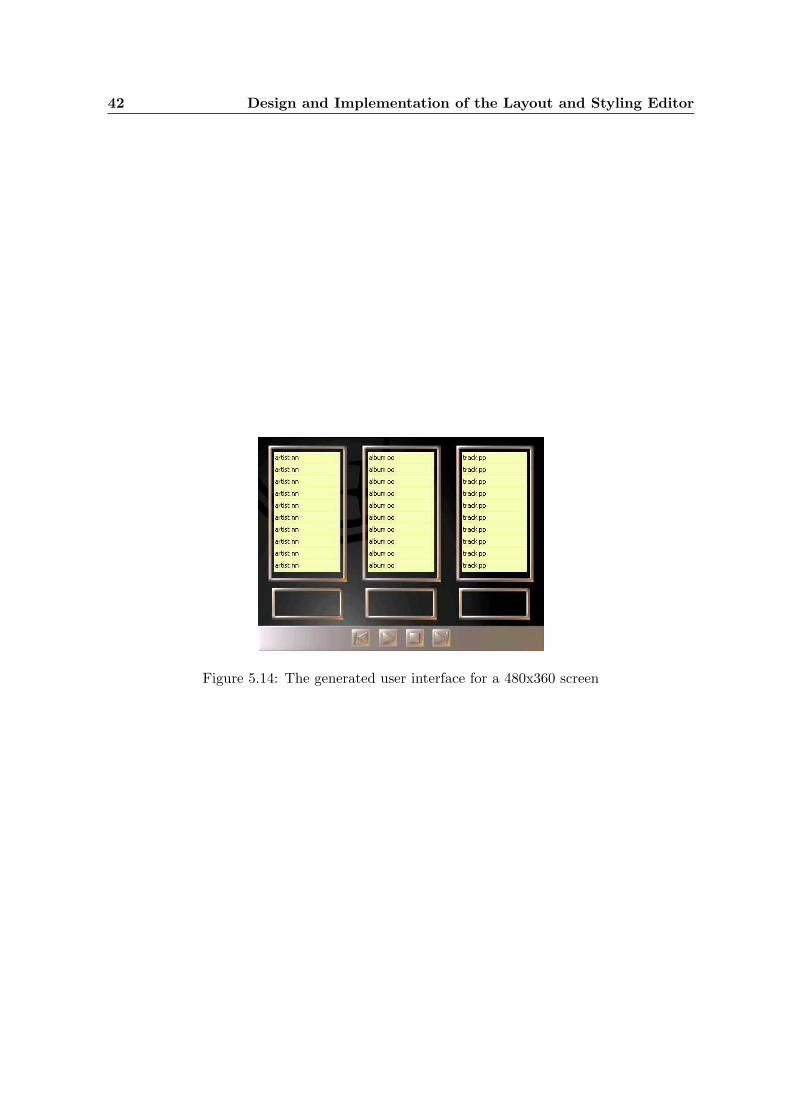
42 Design and Implementation of the Layout and Styling Editor
Figure 5.14: The generated user interface for a 480x360 screen

Chapter 6
Conclusion
At the start of this project, a survey [1] of the most important layout and styling tools andtechniques has been created. In this document, special attention is paid to their usefulnessfor creating reusable layout and styling descriptions. The results of this document were usedin determining the requirements for the data structure and the editor.
The created data structure makes it possible to describe the layout and styling of graphicaluser interfaces in such a way, that these descriptions can be used to easily create user interfacesfor multiple target devices, without the need to specify the UI for each target device infull detail. This is a major step forward compared to the current approaches, in which auser interface is either described in a device specific way or in an abstract way resulting inunattractive and unintuitive user interfaces due to the lack of control on the layout and stylingof the user interfaces. The created data structure tries to maximize the reusability of layoutand styling information by storing it in small, reusable chunks of information.
The created editor makes it possible to add reusable layout and styling information to a givenabstract UI model in a WYSIWYG manner. This editor adds the following features to theexisting user interface editors described in [1]:
• Structured input in the form of tasks with inputs and outputs.
• Easy switching between the user interfaces for different target devices.
• The editor is a generic editor, which means that different native widget sets can be usedto create user interfaces.
• The system can use information of existing user interface definitions to create new userinterface definitions for different target devices.
In order to make the widget previews in the editor as WYSIWYG as possible without theneed of an actual widget implementation for all widgets, widget previews are based on widgetdescriptions coming from the widget database that is part of the UI generation framework. AWidgetViewer component has been created to render widget previews based on these widgetdescriptions.
Since the levels at which layout and styling attributes are stored in the created data structureis not fixed, two algorithms have been implemented to factor out commonalities between thedifferent layout and styling descriptions to make this data available for new target devices:

44 Conclusion
• A simple algorithm that only factors out layout and styling information common to allexisting descriptions.
• A more advanced algorithm that creates an ‘average’ layout and styling description fromthe existing descriptions.
The case study described in this document shows that, at least for relatively simple cases,this average updating algorithm factors out sufficient layout and styling information fromexisting layout and styling descriptions to be able to generate a usable user interface for newa device with a different screen size. More research is required to see whether the this averageupdating algorithm is sufficiently advanced to handle more complex UIs.
The described case study further shows that the multi-level stylesheet technique is, at leastfor the relatively simple example that is described, well suited for describing layout andstyling information in such a way, that it can be used to create user interfaces for multipletarget devices without the need to specify the user interface for each target device in fulldetail. When a user interface is generated for a new device, the hierarchical structure of themulti-level stylesheet causes that layout and styling information from devices with relatedcharacteristics is reused, and that possibly disturbing information from devices with unrelatedcharacteristics is not reused. However, the quality of the user interfaces generated using thelayout and styling information from the multi-level stylesheet will be largely dependent onthe quality of the used updating algorithm and the amount of information from tailored userinterfaces that the the multi-level stylesheet contains.
Unfortunately, little can be said about how well the created editor and data structure fit intothe rest of the UI generation framework, for the rest of this framework has not been built yet.
6.1 Future Work
As mentioned above, more research is required to see whether the created average updatingstrategy is sufficiently advanced to handle more complex UIs. Possible extensions for theaverage updating algorithm include filtering out extreme values or taking the semantics ofsome of the layout and styling attributes into account. Another possibility is to consider otherupdating algorithms as mentioned in the document.
Also, more research is needed in order to determine how the created system behaves whenmore complex UIs are created.
Another possible field of research are the layout managers. When the requirement that theeditor should work intuitive for UI designers is dropped, much more advanced layout managerscan be considered, which can generate even more reusable layout descriptions.
When the rest of the UI generation framework have been built, the created data structureand editor can be integrated into the framework. Also, the functionality of the editor can beextended based on the ideas of Appendix A.3.

Chapter 7
Project Evaluation
7.1 Project Overview
At the start of the project, the project’s assignment was formulated as:
Create a system that adds layout and styling information to a given Abstract UIModel.
This indicates that the project is a design project, although the project also serves as afeasibility study of the multi-level stylesheets technique.
At the start, the project has been divided into seven phases and an initial schedule was made.This initial schedule is shown in table 7.1.
Phase name Tasks #hours planned
Intro Initialization, define assignment, create projectplan
80
Literature Survey Gather information, read papers and create asurvey of existing layout and styling tools andtechniques.
180
Requirements Create requirements document 120
Prototype Create a prototype / mock-up 160
Design Create design document 120
Code Create system ↔ Test system ↔ Document sys-tem (incremental process)
660
Documentation Create project reports and presentations 240
Margin 120
Total: 1680
Table 7.1: Initial schedule
The times actually spent on each of the phases can be found in Section 7.2.1.
Two presentations were given during the project: an intermediate presentation at Philips anda final presentation the TU/e. Further, this master’s thesis was created at the end of theproject.

46 Project Evaluation
7.2 Reflection
7.2.1 Time Spent
Table 7.2.1 gives an overview of the time actually spent per phase. Almost all planned times
Phase name #hours planned #hours spent
Intro 80 120
Literature Survey 180 250
Requirements 120 230
Prototype 160 240
Design 120 200
Code 660 460
Documentation 240 300
(Margin) 120 (n/a)
Total: 1680 1800
Table 7.2: Time actually spent per phase
were too optimistic, which resulted in less time for the actual implementation. The timesplanned for the intro phase, literature survey phase, design phase, and documentation phasewere simply insufficient. The requirements phase is different story, this phase has simplytaken too much time. 7
7.2.2 Requirements Phase
During the requirements phase, a list of requirements for the layout and styling editor hasbeen created in cooperation with the customer. All collected requirements where assigned apriority between 1 and 3, in decreasing priority. The intention of this 100+ items list was notthat all requirements should be implemented during the GLASS project, but rather to createa more or less complete list of requirements for a generic layout and styling editor that is partof the UI generation framework.
A combination of my desire to create a requirements document that would completely satisfythe customer and the long periods of time between subsequent reviews of the requirementsdocument due to the limited availability of the customer made that the requirements phasehad a run time of 4 months, which is, with hindsight, way to much for a 9 month project.And after those 4 months, the requirements document was still not ‘perfect’. Importantrequirements to create a new multi-level stylesheet for a given abstract UI model and theability to open an existing multi-level stylesheet where still lacking.
After the requirements phase, a number of ideas for additional functionality where expressedby the customer. These additional ideas have not been added to the list of requirements, butthey can be found in Appendix A.3.
Another problem that arose from my desire to completely satisfy the customer is that morethan 50 requirements where assigned a priority 1 status, which turned out to be infeasible toimplement in only three months.

7.2 Reflection 47
7.2.3 Prototype Phase
The prototype phase large coincided with the requirements phase. Most of the time betweenthe successive reviews of the requirements document was spent on performing research onEclipse and GEF and creating a prototype. Unfortunately, it was only after the intermediatepresentation that it became clear that the prototype was not really what the customer hadin mind.
7.2.4 Intermediate Presentation
The intermediate presentation turned out to contain too much detail for an audience whichappeared not to know what the project was about. Also, one of the main subjects was theeditor, as the project’s goal described in the requirements document is to create an editor.It was only after the presentation, that I was told that there is some kind of ban on editorswithin the research environment, especially when it is not very clear what this editor adds tothe already existing editors.
Further, I got the impression that the requirements document was not an appropriate re-flection of the customer’s wishes after the intermediate presentation. However, the customerassured me that the requirements document was still a good reflection of his wishes and thatthe ‘ban’ on editors is something for him to worry about.
Some lessons learned from this presentation:
• Before the presentation, analyse the audience’s the knowledge level of the subject andanalyse what aspects of the subject the audience is interested in.
• Do not rely on ‘generally known’ information, refresh the audience’s knowledge.
• Watch whether the right message is conveyed during the presentation.
• Do not go into the details to much, but try to provide a high-level overview.
7.2.5 Design Phase
Too little time was planned for the design phase. Probably, the complexity of creating agood design has been underestimated when the initial schedule was made. Especially thedesign of the multi-level style data structure, the updating algorithms for this data structure,and the widget viewer took quite some time. Although the GEF framework took quite sometime to master, it provided a good structure for building a graphical editor. Without thestructure handed by the GEF framework, the design phase would probably have even longer,as a graphical editor is a very complex thing and creating a graphical editor is certainly nottrivial.
7.2.6 Implementation
Despite the large number of priority 1 requirements and the little time available for imple-mentation, only two priority 1 features have not been implemented: guides and SWING

48 Project Evaluation
code generation. Further, a few easy-to-implement priority 2 and 3 requirements and therequirements of creating a new MLSS and opening an existing MLSS that are not part of therequirements document have been implemented. An overview of all created packages can befound in Appendix D.
In Section 5.2.1, three possible risks of using the GEF framework where described. Thelicense and the stability risks have not affected the project. The lack of documentation riskdid effect the project in the sense that quite some time has been spent on mastering theframework. A good manual or tutorial covering the complete framework would shorten thistime significantly.
Because the complete plug-in is based on the Eclipse platform and the GEF framework, it isinevitable that somebody who wants to extend the plug-in has to master the fundamentalsof the Eclipse Platform and the GEF framework.
Unfortunately, time constraints prevented more use cases to be implemented in order to createa better grounded conclusion about the feasibility of the multi-level stylesheets technique.
7.3 Lessons learned
• Monitor and control the project and do not let the project control itself.It is a well known fact that the requirements phase of a project almost always takesmore time than expected. Although some flexibility is desirable, the time spent on therequirements phase must be limited and this has to be discussed with the customer.
• A lack of communication is often a major source of errors and misunderstandings.
• Consider using an incremental approach instead of the traditional waterfall model.For a research project, it is even more difficult to determine all requirements beforedesign and implementation than it is for a ‘regular’ project. An incremental approachin which initially not too much time is spent on collecting requirements might be a bettersuited to this kind of projects then the traditional waterfall model in which all projectphases are executed sequentially. When using an incremental approach, requirementscan be added during the project when needed. For this approach to succeed however,regular contact with the customer is a prerequisite.
• The planning made at the start of this project was too optimistic. Studying the dif-ferences between the planned times and the times actually spent on all of the project’sphases can help to make better schedules in the future.
7.4 Final Remark
It was a really useful experience to carry out my final project within one of the major Dutchresearch laboratories. Although not everything went as planned, I really learned a lot fromthis interesting project.

Appendix A
Requirements
A.1 Functional Requirements
A.1.1 General
Name: (1.1) CanvasDescription: There should be a canvas on which the user can draw screens for a user
interface.Priority: 1
Name: (1.2) Selection using point and clickDescription: It should be possible to select a widget by pointing the mouse pointer at
it and pressing the mouse button. This functionality should be availablein the canvas, as well as in the task list.
Priority: 1
Name: (1.3) Multiple selection using point and click.Description: It should be possible to select multiple widgets using the method de-
scribed in requirement 1.2 by pressing the <Ctrl> button on the key-board while clicking on subsequent widgets.
Priority: 1
Name: (1.4) Selection using marquee toolDescription: It should be possible to select widgets by drawing a rectangle around
them using a marquee tool. This functionality is only needed in thecanvas.
Priority: 2
Name: (1.5) Select all.Description: It should be possible to select all UI elements in the canvas.Priority: 1
Name: (1.6) Support loading widget imagesDescription: GLASS should be able to load images associated with the widget de-
scription from the widget database and show them to the user in orderto make the editor as WYSIWYG as possible.
Priority: 1

50 Requirements
Name: (1.7) Support loading of Java widgetsDescription: GLASS should support Java widgets by loading the Java-classes specified
in the abstract UI model.Priority: 3
Name: (1.8) Moving widgets within an areaDescription: It should be possible to move a selected widget within an area.Priority: 1
Name: (1.9) Moving widgets between different areasDescription: It should be possible to move a selected widget between different areas.Priority: 1
Name: (1.10) Deleting widgetsDescription: It should be possible to remove the selected widgets from the canvas.Priority: 1
Name: (1.11) Undo supportDescription: GLASS should provide undo support, up to 100 operations.Priority: 1
Name: (1.12) Redo supportDescription: GLASS should provide redo support for redoing previously undone op-
erations.Priority: 1
Name: (1.13) Zooming supportDescription: GLASS should provide zooming support.Priority: 2
Name: (1.14) Zoom to areaDescription: It should be possible to show only the currently selected area and its
children.Priority: 3
Name: (1.15) List of target devicesDescription: A list of the target devices specified in the abstract UI model should be
available. Selecting a target device in the list of target devices shouldbring the editor in the current editing state for the selected target device.
Priority: 1
Name: (1.16) Link to task model editing softwareDescription: GLASS should provide a link to software capable of editing the task
model.Priority: 2
Name: (1.17) Link to abstract UI model editing softwareDescription: GLASS should provide a link to software capable of editing the abstract
UI model.Priority: 2

A.1 Functional Requirements 51
Name: (1.18) Link to repository editing softwareDescription: GLASS should provide a link to software capable of editing the reposi-
tory.Priority: 2
Name: (1.19) Link to widget database editing softwareDescription: GLASS should provide a link to software capable of editing the widget
database.Priority: 2
Name: (1.20) Link to device capabilities editing softwareDescription: GLASS should provide a link to software capable of editing the device
capabilities data.Priority: 2
Name: (1.21) Link to multi-level stylesheet editing softwareDescription: GLASS should provide a link to software capable of editing the raw
multi-level stylesheet.Priority: 2
A.1.2 Task List
Name: (2.1) Task listDescription: There should be a list of all tasks (from the task model) with their
associated input and output widgets within the editor.Priority: 1
Name: (2.2) Widget preview in task listDescription: A preview of the widgets mentioned in the previous requirement should
be shown to the user in the task list.Note that if more than one widget is specified to be capable of processingan input or output data type in the abstract UI model, all matchingwidgets should be displayed.
Priority: 1
Name: (2.3) TriggersDescription: For each task that has defined a trigger, that trigger should be shown
in the task list.Priority: 1
Name: (2.4) Navigation widgetsDescription: To support navigation between screens, a selection of navigation widgets
should be available as defined in the abstract UI model.Note that although these navigation widgets can be added to a UI, theywill remain inactive in the mock-ups GLASS generates (requirements 6.1and 6.2), as navigation between screens is considered outside the scopeof this project.
Priority: 1

52 Requirements
Name: (2.5) Drag task input from task list to canvasDescription: It should be possible to drag a task’s input widgets to a canvas repre-
senting the target device’s screen. The widget should be dropped on thecanvas.
Priority: 1
Name: (2.6) Drag task output from task list to canvasDescription: It should be possible to drag a task’s output widget to a canvas repre-
senting the target device’s screen. The widget for that output should bedropped on the canvas.
Priority: 1
Name: (2.7) Drag complete task from task list to canvasDescription: It should be possible to drag a complete task to a canvas representing
the target device’s screen. All input and output widgets of that taskshould be dropped on the canvas.
Priority: 1
Name: (2.8) Drag trigger to canvasDescription: It should be possible to drag a trigger to a canvas representing the target
device’s screen. The widget associated with the trigger will be droppedon the canvas.
Priority: 1
Name: (2.9) Drag navigation widget to canvasDescription: It should be possible to drag a navigation widget to a canvas representing
the target device’s screen. The navigation widget will be dropped on thecanvas.
Priority: 1
Name: (2.10) Indication of used widgetsDescription: Within the task list, each widget should be marked with an indication
whether or not it is used within the user interface for the currentlyselected target device.
Priority: 3
A.1.3 Layout
Name: (3.1) Add layout informationDescription: GLASS should be able to create layout information for an abstract UI
model, i.e. for each area and widget dragged on the screen, it should bepossible to store position information.
Priority: 1
Name: (3.2) Draw areas on the canvasDescription: It should be possible to draw rectangular areas on the canvas. An area
is a part of the screen that has its own layout manager and can havea border, background color or background image. The default layoutmanager will be the XY layout (as defined in requirement 3.32).
Priority: 1

A.1 Functional Requirements 53
Name: (3.3) Nesting areasDescription: It should be possible to draw an area within another area.Priority: 1
Name: (3.4) Area Z-orderDescription: It should be possible specify a z-index for areas order to determine their
layering.Priority: 2
Name: (3.5) Bring to back / bring to frontDescription: There should be options to place a selected widget or area behind (bring
to back) or before (bring to front) other areas or widgets.Priority: 3
Name: (3.6) Moving areasDescription: It should be possible to move an area.Priority: 1
Name: (3.7) Resizing areasDescription: It should be possible to resize an area. The layout of the UI elements
in the resized area will be updated according to the layout policy of thelayout manager of that area.
Priority: 1
Name: (3.8) Resizing areas to add space at the left and/or the top of that area.Description: When the user holds the <Alt> key when resizing an area and the user
enlarges that area to the left or to the top, the children of that areashould stay on their places and free space should be added to the leftand/or the top of that area.
Priority: 2
Name: (3.9) Removing areasDescription: It should be possible to remove an area. All UI elements within the
removed area will be removed as well.Priority: 1
Name: (3.10) Handling too small areasDescription: It should be possible to define the behavior of an area when it is too
small to contain all its UI elements. The possible options are ‘cropping’and ‘scrolling’.
Priority: 2
Name: (3.11) Non-rectangular areasDescription: It should be possible to create non-rectangular areas.Priority: 3
Name: (3.12) Add widgets to an area.Description: It should be possible to place widgets within an area.Priority: 1

54 Requirements
Name: (3.13) Dropping locationDescription: The location where the widgets that are dragged as described in require-
ments 1.8, 1.9 and 2.5-2.9 will be placed is determined by the locationwhere they are dropped and the layout manager of the area in which theyare dropped. In case of a XY-layout (as defined in requirement 3.32),the drop location exactly determines where the widgets are placed.
Priority: 1
Name: (3.14) Widget Z-orderDescription: It should be possible specify a z-index for widgets in order to determine
their layering.Priority: 2
Name: (3.15) GuidesDescription: It should be possible to use guides to align widgets. A guide is a (se-
lectable) line to which widgets can be attached or aligned.Priority: 1
Name: (3.16) Alignment pointsDescription: Each widget should have 5 alignment points, top-left, top-right, bottom-
left, bottom-right and center. When at least one of the alignment pointsof a widget is within the attraction range of a guide, the alignment pointclosest to a guide will be placed on that guide. When a widget is movedoutside the attraction range of a guide, it will de-snap again.Note that using these alignment points, it is possible to left, center, andright align a widget on a vertical guide and to top, center, and bottomalign it on a horizontal guide.
Priority: 1
Name: (3.17) Straight line guidesDescription: It should be possible to create a guide that has the form of a straight
line.Priority: 1
Name: (3.18) Arc guidesDescription: It should be possible to create a guide that has the form of an arc.Priority: 3
Name: (3.19) Guide Z-orderDescription: It should be possible specify a z-index for guides order to determine their
layering.Priority: 2
Name: (3.20) Moving guides (as a whole)Description: It should be possible to move a selected guide as a whole.Priority: 1
Name: (3.21) Moving guides (edge-points)Description: It should be possible to move an edge-point of a guide.Priority: 2

A.1 Functional Requirements 55
Name: (3.22) RealigningDescription: When a guide is moved, all attached widgets should be realigned.Priority: 2
Name: (3.23) Removing guidesDescription: It should be possible to remove a guide.Priority: 1
Name: (3.24) Toggle activity of a single guideDescription: It should be possible to activate or deactivate a single guide An active
guide is shown to the user and is magnetic, i.e. a widget is aligned andattached to the guide when it is dragged sufficiently close to the guide.Note that no widgets are moved when the guides are activated, therestrictions only apply when a UI element is moved or resized.
Priority: 3
Name: (3.25) Toggle activity of all guidesDescription: A ’activate guides’ toggle should be available to activate or deactivate
all guides at once.Note that no widgets are moved when a guide is activated, the restric-tions only apply when a UI element is moved or resized.
Priority: 1
Name: (3.26) Configurable attraction rangeDescription: It should be possible specify the attraction range of guides and the grid.Priority: 3
Name: (3.27) Adjust space between widgets on a guideDescription: It should be possible to easily increase or decrease the amount of spacing
between two adjacent widgets on a guide using Powerpoint-style spacingincrease and decrease buttons.
Priority: 1
Name: (3.28) GridDescription: It should be possible to show a grid consisting of equidistant points. The
grid will start in the upper-left point of the canvas and cover the entirecanvas representing the target device’s screen.
Priority: 3
Name: (3.29) Activate grid toggle.Description: A ’activate grid’ toggle should be available. When the grid is active,
it is shown to the user and is magnetic, i.e. the locations of the fourcorner alignment points (top-left, top-right, bottom-left, bottom right)of a widget are restricted to points of the grid, when a widget is movedor resized.Note that no widgets are moved when the grid is activated, the restric-tions only apply when a UI element is moved or resized.
Priority: 3

56 Requirements
Name: (3.30) Grid configurationDescription: It should be possible to define the density of the grid, i.e. the amount
of space between to grid points.Priority: 3
Name: (3.31) Layout managersDescription: A layout manager is a piece of code that controls the layout (i.e. position
of UI elements) within an area. It should be easy to switch between theavailable layout managers, leading to a re-layout of the widgets insidethe area, using the default values of the selected layout manager asconfigured by the user.
Priority: 1
Name: (3.32) XY-layoutDescription: A XY-layout manager that stores absolute positions in terms of x and
y coordinates should be available.Priority: 1
Name: (3.33) Flow layoutDescription: GLASS should support flow layout. Within a flow layout, UI elements
are placed one after another in a row or column, and when the row orcolumn is full, a new row or column is created. Whether the flow layoutarranges its UI elements in a row or column and the space between twoadjacent UI elements needs to be configurable.Note that flow layout should not resize UI elements or areas.
Priority: 2
Name: (3.34) Drag within flow layoutDescription: If a UI element is dragged within a flow layout, it will be inserted before
the UI element on which it is dropped.Priority: 2
Name: (3.35) Card layoutDescription: GLASS should support card layout. Within a card layout, UI elements
are placed within an area of fixed size, which can contain different UIelements at different times. A tabset is shown to navigate betweendifferent cards.
Priority: 3
Name: (3.36) Layout conversion.Description: It should be possible to convert layouts between different layout man-
agers. The new layout should resemble the old layout as much as possi-ble.
Priority: 3
Name: (3.37) Align the UI elements within a selectionDescription: It should be possible to align UI elements within a selection. Possi-
ble alignments are left, right, top, bottom, center vertical, and centerhorizontal.
Priority: 2

A.1 Functional Requirements 57
Name: (3.38) Resize UI elements to be equally sized.Description: It should be possible to horizontally or vertically resize all UI elements
within a selection, such that all UI elements will take the size that is asclose as possible to the size of the largest UI element.
Priority: 3
Name: (3.39) Adjusting the spacing between currently selected UI elementsDescription: It should be possible to easily increase or decrease the horizontal or ver-
tical space between the currently selected UI elements using Powerpoint-style spacing increase and decrease buttons, provided the layout managerallows this.
Priority: 1
Name: (3.40) Create an area from currently selected UI elementsDescription: It should be possible to create a new area with a specified layout con-
taining the currently selected UI elements. The bounds of this area willbe the bounds of the outmost UI elements within the selection.
Priority: 2
Name: (3.41) Automatic re-layoutDescription: If the target screen size is changed, the user should be offered three
choices on how to cope with this change: (a) do nothing and use theold layout definition, (b) simple re-layout that includes scaling all UIelements, and (c) advanced re-layout that tries to create an optimal UIfor the new screen size
Priority: (a) and (b): 1 (c): 2
Name: (3.42) Respect minimum sizesDescription: GLASS should respect minimum sizes of widgets while performing au-
tomatic re-layouts.Priority: 2
Name: (3.43) Respect spacing constraintsDescription: GLASS should respect spacing constraints between UI elements while
performing automatic re-layouts.Priority: 2
Name: (3.44) Warn on probable design errorsDescription: GLASS should warn its user in case of probable design errors, for ex-
ample when the different screen size of another target device causes twobuttons to overlap.
Priority: 3
Name: (3.45) Correction suggestionsDescription: GLASS should suggest corrections for probable design errors, for exam-
ple adjusting the font-size of the text on a button when this text is toowide.
Priority: 3

58 Requirements
A.1.4 Screens
Name: (4.1) List of screensDescription: The user interface for each target device can consist of a number of
different screens. In GLASS, there is no restriction on the number oftasks on a screen or the number of screens a task uses. A list of allscreens for the current target device should be available. Selecting ascreen in the screen list will show that screen in the editor and allow theuser to edit that particular screen of the user interface for the selectedtarget device.
Priority: 1
Name: (4.2) Visual list of screensDescription: The list of screens should provide visual previews of all screens.Priority: 2
Name: (4.3) Creating a blank screen.Description: It should be possible to add a blank screen to the user interface definition
for the currently selected target device. The size of the screen can bechosen by the user to be somewhere between the minimum and themaximum size specified in the target device capabilities.
Priority: 1
Name: (4.4) Creating a screen with the areas and guides of an existing screen.Description: It should be possible to add a screen to the user interface definition for
the currently selected target device, which (initially) has the same areasand guides as an existing screen that can be from an other target device.When the screen size of the new and the existing screen don’t match,GLASS does a suggestion.
Priority: 2
Name: (4.5) Deleting screens.Description: It should be possible to delete a screen from the user interface definition
for the currently selected target device.Priority: 1
Name: (4.6) Clear screen.Description: It should be possible to remove everything from a screen at once.Priority: 2
Name: (4.7) Usable screen area.Description: It should be possible to specify the usable screen area for a target device.
Several target devices have a part of the screen reserved for system orother information that can’t be used to define the UI and is thereforecalled the unusable part of the screen.Note that the usable screen area is not part of the target device charac-teristics, but an option within the editor.
Priority: 2

A.1 Functional Requirements 59
Name: (4.8) Background image for whole screen.Description: It should be possible to show a background image larger than the us-
able screen area, including the unusable part as defined in the previousrequirement. This image can contain a screenshot of the system infor-mation part of the screen and/or an image of the device itself, to enhancethe WYSIWYG feeling.Note that this background image is not part of the UI and that the UIthat is edited on top will have its own background image or backgroundcolor for the usable screen area as part of its UI styling information.
Priority: 2
Name: (4.9) Switch between complete screen and usable screen.Description: There should be an option to choose whether the image as defined in
the previous requirement should be shown or that only the usable partof the screen should be shown.
Priority: 3
Name: (4.10) New screen from selection.Description: It should be possible to create a new screen filled with a copy of the
currently selected UI elements.Priority: 3
A.1.5 Styling
Name: (5.1) Add styling informationDescription: GLASS should be able to create and edit styling information for an ab-
stract UI model, as described in section [1.1.2]. This information shouldbe stored in such a way that it can be used to create user interfaces formultiple target platforms.
Priority: 1
Name: (5.2) Read texts from repositoryDescription: It should be possible to read texts out of the repository and place them
in content areas of widgets.Priority: 1
Name: (5.3) Read images from repositoryDescription: It should be possible to read images out of the repository and place
them in content areas of widgets. The following image formats shouldbe supported: BMP, JPG, GIF, and PNG.
Priority: 2

60 Requirements
Name: (5.4) Specify font rendering informationDescription: It should be possible to specify font rendering information (such as font
family, font size, and font attributes) for texts in content areas of wid-gets.Note that the following two problems are ignored: (a) which fonts areexactly available on the target device and (b) does each font cover thecomplete Unicode character set?
Priority: 2
Name: (5.5) Area background colorDescription: It should be possible to specify whether or not an area should have a
background color and which background color in the latter case.Priority: 2
Name: (5.6) Area background imageDescription: It should be possible to specify a background image for an area. The
following image formats should be supported: BMP, JPG, GIF, andPNG.
Priority: 2
Name: (5.7) Area borderDescription: It should be possible to define whether or not an area has a border and
what kind of border.Note that this border should be independent of the border that appearswhen the area is selected.
Priority: 2
Name: (5.8) Drawing imagesDescription: It should be possible to draw images in a user interface. The following
image formats should be supported: BMP, JPG, GIF, and PNG. Theseimages can be moved and removed.
Priority: 2
Name: (5.9) Drawing textsDescription: It should be possible to draw texts in a user interface. These texts can
be moved, styled as defined in requirement 5.4, and removed.Priority: 2
Name: (5.10) Drawing shapesDescription: It should be possible to draw lines, circles and rectangles on the canvas
representing the target device’s screen. These shapes can be moved,resized, and removed. Further, the color of the shape can be specified.
Priority: 3
Name: (5.11) Resizing widgetsDescription: It should be possible to resize a selected widget.
Note that size constraints can be defined for widgets that prevent themfrom resizing partially or completely.
Priority: 1

A.2 Non-functional requirements 61
Name: (5.12) Resizing of a widget’s content areasDescription: It should be possible to resize the content areas of a widget (in case of
a widget with multiple content areas).Priority: 3
Name: (5.13) Automatic resize of widgetsDescription: GLASS should automatically try to resize a widget’s content area when
the size of that widget’s content area does not match the size of its actualcontent.
Priority: 3
A.1.6 Preview and code generation
Name: (6.1) Swing previewDescription: It should be possible to generate a UI for Java Swing.Priority: 1
Name: (6.2) SWT previewDescription: It should be possible to generate a UI for SWT.Priority: 3
Name: (6.3) Preview for target device with different characteristics.Description: It should be possible to generate a UI for a target device with different
characteristics than the device for which the UI was created.Priority: 3
A.2 Non-functional requirements
Name: (NFR1.1) Target MS Windows 2000Description: GLASS should run as a stand-alone application on a desktop PC running
Microsoft Windows 2000. Stand-alone means that there is direct accessto the editor from the OS and that it will show the GLASS logo onstartup.
Priority: 1
Name: (NFR1.2) Target Eclipse plug-in.Description: GLASS should run as a plug-in for an existing Eclipse installation.Priority: 1
Name: (NFR1.3) Target LinuxDescription: GLASS should run as a stand-alone application on a desktop PC running
Linux.Priority: 3
Name: (NFR1.4) Component based developmentDescription: GLASS should be built using component based development.Priority: 1

62 Requirements
Name: (NFR1.5) Fit into UI adaptation frameworkDescription: GLASS should fit into the framework introduced in section [1.1]. As this
framework uses a multi-level stylesheets approach, GLASS should usemulti-level stylesheets to store layout and styling information. Further,GLASS should be able to read and process the task model and abstractUI models as described in section [1.1.2].
Priority: 1
Name: (NFR1.6) Robust data formatDescription: Layout and styling information should be stored in such a way that if
changes are made externally to one of the other models or databases,the user is not required to start designing the UI from scratch again.
Priority: 1
Name: (NFR1.7) Extensible set of layout managersDescription: It should be possible to add new layout managers to GLASS.Priority: 3
A.3 Additional ideas during development
• Display the screen size of the screen currently being edited in the editor.
• Create two states in the editor, one for editing UIs and one for viewing UIs usingdifferent screen sizes
• Make it possible to define abstract target devices that define UIs for devices with screensizes between certain boundaries. [NOT completely WYSIWYG]
• Make it possible to define the UI for 24 bit color, and let GLASS compute the colorsfor devices that are more constrained in their color viewing capabilities.
• Create a feature that automatically detects the minimal screen size for which a UIdefinition is usable and maybe also the maximum size.
• Extend the editor with a skeleton view in which only the contours of the areas andguides are shown.
• Extend the multi-level stylesheet implementation with a means to specify device char-acteristics in terms of ranges. For example, for all screens having a width between 120and 320 pixels, . . . . . . .

Appendix B
Analysis Model

64 Analysis Model
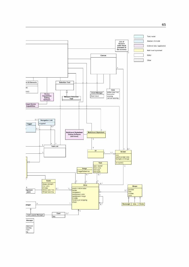
65

66 Analysis Model

Appendix C
GEF Overview
C.1 Introduction
The Graphical Editing Framework (GEF) [8] [9] [10] [11] for the Eclipse platform [12] is aframework that allows developers to create a rich graphical editor within the Eclipse platform.
C.2 Architecture
GEF is built using an (kind of) MVC (Model-View-Controller) architecture [15].
C.2.1 Model
The MVC architecture makes it possible to use any data or model as input for the editor, aslong as
1. the model contains all information that must be persisted, since only the model ispersisted.
2. the model provides a notification mechanism for model changes.
3. the model is updated using undoable commands.
In GEF, there should not be a direct connection between the model and the controller or theview.
C.2.2 View
The view is a visual representation of (a part of) the model on the screen. A view is builtusing one or more Draw2D1 figures. Figures are the building blocks of Draw2D and can benested to create more complex figures. In the editor, the WidgetViewer used to render widgetdescriptions is a complex figure.
1Draw2D, the drawing plug-in GEF uses to render its views, is a lightweight toolkit hosted on a heavyweightSWT [13] canvas and manages the painting and mouse events that occur in the host canvas by delegating themto Draw2D figures.

68 GEF Overview
C.2.3 Controller
The controller, known as EditPart in GEF, ties the model and the view together. Whenyou open the editor, a top-level EditPart is created for your model. If the model consists ofsubparts, GEF is informed about that fact and child EditParts are created for the subparts.If these subparts again consist of subparts, the process is repeated.
Another task of the controller is to create the view. This is performed by asking the EditPartsfor an associated figure. Since the view knows nothing about the model, it is the controller’stask to keep the view consistent with the model. The controller registers itself as a changelistener on the model and receives notifications each time the model is changed. The controllerthen updates the view to reflect these changes.
C.3 Editing the Model
Figure C.1: GEF Editing Overview
The palette (toolbox) contains a number of tools. A tool, e.g. selection tool or creation tool,is an object that translates low-level events such as mouse-down or key-pressed to high-levelrequests, such as an SelectRequest or an AreaCreateRequest. Usually, the tool sends therequest to the EditPart whose figure was underneath the mouse cursor when the mouse-downevent occurred. An exception is for example the MarqueeSelectionTool, which sends requeststo all EditParts whose figures are contained within a given area.
EditParts don’t handle the requests they receive themselves. They delegate this task toregistered EditPolicies. An EditPart can install a number of different EditPolicies for differenttasks, called roles. When an EditPart receives a request, each installed EditPolicy is askedfor a command that handles the request. EditPolicies not wishing to handle the request mayreturn null. Using EditPolicies to handle requests has a number of reasons:
• Avoid the limitations of single inheritance

C.3 Editing the Model 69
• Keep both EditPart and EditPolicies small and specialized. This results in better main-tainable code that is easier to debug.
• Separate unrelated editing tasks.
• Allow sharing of certain types of editing behavior.
• Allow editing behavior to be dynamic (e.g. diffent layout policies for different layoutmanagers).
Rather than modifying the model directly, GEF requires you to use commands to change themodel. Each command should implement applying and undoing changes to the model. Thisway, GEF editors automatically support undoing and redoing of changes to the model.
Figure C.1 gives a graphical overview of what happens when a user uses a tool within theeditor. As you can see, all editing functionality is bound together by the Edit Domain, whichalso contains the state information for the editor.

70 GEF Overview

Appendix D
Packages Overview
This appendix gives an overview of all packages created for the GLASS System.
D.1 com.philips.glass
The main components of the GLASS system: the GLASS plug-in and the RCP application.The RCP application is the stand-alone version of the system, which is built using the EclipseRCP platform [14].
D.2 com.philips.glass.actions
Actions used in the system. An action is a piece of code that performs a certain task. Actionshave been created to:
• Create a new MLSS (NewMLSSAction).
• Open an existing MLSS (OpenAction).
• Increase the horizontal space between the selected UI elements (IncreaseHorizontalSpacin-gAction).
• Decrease the horizontal space between the selected UI elements (DecreaseHorizon-talSpacingAction).
• Increase the vertical space between the selected UI elements (IncreaseVerticalSpacin-gAction).
• Decrease the vertical space between the selected UI elements (DecreaseVerticalSpacin-gAction).
Action for alignment and resizing selected UI elements are provides by GEF.

72 Packages Overview
D.3 com.philips.glass.dnd
Drag and drop functionality to enable dragging widgets or tasks from the tasklist to thecanvas. This package contains three classes for:
• handling the drag part (AbstractAUIModelWidgetDragSource)
• handling the drop part (AbstractAUIModelWidgetDropTargetListener)
• defining the data format of the actual transfer (AbstractAUIModelWidgetTransfer)
D.4 com.philips.glass.editors
The GLASS editor providing the drawing canvas, the toolbox (palette in GEF terminology),and the editor state (GLASSEditDomain).
D.5 com.philips.glass.editparts
The controllers (EditParts in GEF terminology) that mediate between the model elements(com.philips.glass.model.mlss) and the views (com.philips.glass.figures). Controllers havebeen created for:
• Screens (ScreenEditPart)
• Areas (AreaEditPart)
• Widgets (WidgetEditPart)
• Triggers (TriggerEditPart)
• Navigationlinks (NavigationlinkEditPart)
Further, this class contains an factory class that generates a controller for a given modelelement.
D.6 com.philips.glass.editpolicies
Controller plug-ins that create commands for modifying the model based on editor requests.Most of these editor requests deal with creating, moving, resizing, and deleting UI parts.More information about the how and why of EditPolicies can be found in Appendix C.

D.7 com.philips.glass.figures 73
D.7 com.philips.glass.figures
Components that create a visual representation of a model element. This package containsviews for:
• Screens (ScreenFigure)
• Areas (AreaFigure)
D.8 com.philips.glass.figures.widgetviewer
The WidgetViewer component used to render widget previews based on a widget description.This component is described in more detail in Section 5.6.
D.9 com.philips.glass.layout
The per mille layout manager used within the editor.
D.10 com.philips.glass.misc
This package contains one convenience class with an instance of an empty screen. Used asinput for the drawing canvas when no screen is selected.
D.11 com.philips.glass.model.auimodel
Contains a XOM [36] elementfactory and specialized classes for the elements of abstract UImodels.
D.12 com.philips.glass.model.mlss
Contains a XOM [36] elementfactory and specialized classes for the elements of multi-levelstylesheets. These element classes are also used for the internal model representation withinthe editor. For this purpose, the UITreeElement class has been added to the package.
D.13 com.philips.glass.model.mlss.commands
Undoable commands for modifying the model. The following commands have been created:
• AbstractWidgetsCreateCommand adds widgets, triggers, and/or navigationlinks to anarea. Used when drag-and-drop from the task list takes place.

74 Packages Overview
• AreaAddCommand adds an existing area to a screen or an other area. Used when anarea is moved to another parent within the drawing canvas.
• AreaCreateCommand creates a new area and adds this to a screen or another area.Used when a new area is created within the drawing canvas.
• AreaSetConstraintCommand modifies the size and/or location of an area.
• DeleteCommand deletes a UI part.
• OrphanChildCommand detaches a UI element from a parent. Used when a UI elementis moved from one parent to another within the drawing canvas.
• ScreenCreateCommand creates a new screen within the layout and styling descriptionfor currently selected target device.
• UIElementAddCommand adds an existing UI element to an area. Used when a UIelement is moved from one area to another within the drawing canvas.
• UIElementCreateCommand creates a new UI element and adds this to an area. Usedwhen a new UI element is created within the drawing canvas.
• UIElementSetConstraintCommand modifies the size and/or location of a UI element.
D.14 com.philips.glass.model.mlss.updater
The MLSS updating algorithms. Two updating algorithms have been implemented:
• UnanimityUpdater
• AverageUpdater
More information on these updating algorithms can be found is Section 5.9.
D.15 com.philips.glass.model.targetdevice
Contains a XOM [36] elementfactory and specialized classes for the elements of the targetdevice characteristics description files.
D.16 com.philips.glass.model.taskmodel
Contains a XOM [36] elementfactory and specialized classes for the elements of task models.
D.17 com.philips.glass.views
The TaskListView and the ScreensView. More infromation about these views can be foundin Section 5.4.

D.18 com.philips.glass.wizards 75
D.18 com.philips.glass.wizards
The wizards used in the editor:
• NewMLSSWizard for creating a new multi-level stylesheet.
• NewScreenWizard for creating a new screen.

76 Packages Overview

Appendix E
Task Model DTD
<?xml version="1.0" encoding="UTF-8"?>
<!ELEMENT taskmodel (task)*>
<!ATTLIST taskmodel
name CDATA #REQUIRED
version CDATA #REQUIRED
>
<!ELEMENT task (input*, output*)>
<!ATTLIST task
id CDATA #REQUIRED
name CDATA #REQUIRED
autoexecute CDATA #REQUIRED
>
<!ELEMENT input EMPTY>
<!ATTLIST input
id CDATA #REQUIRED
name CDATA #REQUIRED
>
<!ELEMENT output EMPTY>
<!ATTLIST output
id CDATA #REQUIRED
name CDATA #REQUIRED
>

78 Task Model DTD

Appendix F
Abstract UI Model DTD
<!ELEMENT uimodel (lookfeeldefinitions, targetdevice+)>
<!ATTLIST uimodel
version CDATA #REQUIRED
taskmodel CDATA #REQUIRED
>
<!ELEMENT lookfeeldefinitions (lookfeel+)>
<!ELEMENT lookfeel EMPTY>
<!ATTLIST lookfeel
id ID #REQUIRED
name CDATA #REQUIRED
>
<!ELEMENT targetdevice ((widget | trigger)*, navigationlink*)>
<!ATTLIST targetdevice
id ID #REQUIRED
deviceref CDATA #REQUIRED
lookfeel IDREF #REQUIRED
>
<!ELEMENT widget EMPTY>
<!ATTLIST widget
task CDATA #IMPLIED
input CDATA #IMPLIED
output CDATA #IMPLIED
widgetref CDATA #REQUIRED
>
<!ELEMENT trigger EMPTY>
<!ATTLIST trigger
task CDATA #REQUIRED
widgetref CDATA #REQUIRED
>
<!ELEMENT navigationlink EMPTY>
<!ATTLIST navigationlink
widgetref CDATA #REQUIRED
>

80 Abstract UI Model DTD

Appendix G
Multi-level Stylesheet DTD
<?xml version="1.0" encoding="UTF-8"?>
<!-- Multi-level stylesheet DTD used for the GLASS project -->
<!-- Author: Bart Golsteijn -->
<!-- Version 1.0, 30-05-2005 -->
<!ELEMENT MLSS (CAP+)>
<!ATTLIST MLSS
auimodel CDATA #REQUIRED
>
<!ELEMENT CAP ((LAYOUT | PROPERTY | CAP)*)>
<!ATTLIST CAP
type CDATA #REQUIRED
capability CDATA #REQUIRED
>
<!ELEMENT PROPERTY (#PCDATA)>
<!ATTLIST PROPERTY
nameref CDATA #IMPLIED
class CDATA #IMPLIED
element CDATA #IMPLIED
name CDATA #REQUIRED
>
<!ELEMENT LAYOUT (UI | SCREEN | AREA)>
<!ELEMENT UI (SCREEN*)>
<!ATTLIST UI
name CDATA #REQUIRED
class CDATA #IMPLIED
>
<!ELEMENT SCREEN (AREA*)>
<!ATTLIST SCREEN
name CDATA #REQUIRED
class CDATA #IMPLIED
>
<!ELEMENT AREA ((AREA | WIDGET | NAVIGATIONLINK | TRIGGER | TEXT | IMAGE | CIRCLE | RECTANGLE | LINE | GUIDE)*)>
<!ATTLIST AREA
name CDATA #REQUIRED
class CDATA #IMPLIED
>
<!ELEMENT WIDGET EMPTY>
<!ATTLIST WIDGET
name CDATA #REQUIRED
taskref CDATA #REQUIRED
inputs CDATA #IMPLIED
outputs CDATA #IMPLIED
class CDATA #IMPLIED
>
<!ELEMENT NAVIGATIONLINK EMPTY>

82 Multi-level Stylesheet DTD
<!ATTLIST NAVIGATIONLINK
name CDATA #REQUIRED
class CDATA #IMPLIED
>
<!ELEMENT TRIGGER EMPTY>
<!ATTLIST TRIGGER
name CDATA #REQUIRED
taskref CDATA #REQUIRED
class CDATA #IMPLIED
>
<!ELEMENT TEXT EMPTY>
<!ATTLIST TEXT
name CDATA #REQUIRED
class CDATA #IMPLIED
>
<!ELEMENT IMAGE EMPTY>
<!ATTLIST IMAGE
name CDATA #REQUIRED
class CDATA #IMPLIED
>
<!ELEMENT CIRCLE EMPTY>
<!ATTLIST CIRCLE
name CDATA #REQUIRED
class CDATA #IMPLIED
>
<!ELEMENT RECTANGLE EMPTY>
<!ATTLIST RECTANGLE
name CDATA #REQUIRED
class CDATA #IMPLIED
>
<!ELEMENT LINE EMPTY>
<!ATTLIST LINE
name CDATA #REQUIRED
class CDATA #IMPLIED
>
<!ELEMENT GUIDE (ATTACHEDELEMENT)*>
<!ATTLIST GUIDE
name CDATA #REQUIRED
class CDATA #IMPLIED
>
<!ELEMENT ATTACHEDELEMENT EMPTY>
<!ATTLIST ATTACHEDELEMENT
nameref CDATA #REQUIRED
>

Appendix H
Device Characteristics Description
Language
H.1 DTD
<?xml version="1.0" encoding="UTF-8"?>
<!-- DTD for target device information -->
<!-- Version 1.0 - June 13, 2005 -->
<!-- Author: Bart Golsteijn -->
<!ELEMENT device (color-depth, screen-orientation, min-screenwidth, min-screenheight,
max-screenwidth, max-screenheight)>
<!ATTLIST device
device-name CDATA #REQUIRED
>
<!ELEMENT color-depth (#PCDATA)>
<!-- Color depth in bits. 1 bit = black and white, 8 bits = 256 colors,
24 bits = 16.777.216 colors -->
<!ELEMENT screen-orientation (#PCDATA)>
<!-- Screen orientation: portrait or landscape -->
<!ELEMENT min-screenwidth (#PCDATA)>
<!-- Minimal screen width in pixels -->
<!ELEMENT min-screenheight (#PCDATA)>
<!-- Minimal screen height in pixels -->
<!ELEMENT max-screenwidth (#PCDATA)>
<!-- Maximal screen width in pixels -->
<!ELEMENT max-screenheight (#PCDATA)>
<!-- Maximal screen height in pixels -->
<!ELEMENT device-imageref (#PCDATA)>
<!-- Reference to an image of the device and/or the non-usable screen area -->
H.2 Example
<?xml version="1.0" encoding="UTF-8"?>
<!DOCTYPE device SYSTEM "devcaps.dtd">
<device device-name="test PC">

84 Device Characteristics Description Language
<color-depth>24</color-depth>
<screen-orientation>landscape</screen-orientation>
<min-screenwidth>640</min-screenwidth>
<min-screenheight>480</min-screenheight>
<max-screenwidth>1024</max-screenwidth>
<max-screenheight>768</max-screenheight>
<device-imageref>C:\GLASS\devices\pc.jpg</device-imageref>
</device>

Bibliography
[1] Survey of Layout and Styling Tools and Techniques for the Creation of Reusable GUIsBart Golsteijn
[2] Automatic Generation of User InterfacesWalter Dees(To be published)
[3] Handling Device Diversity through Multi-Level StylesheetsWalter DeesProceedings of the 9th international conference on Intelligent user interfaceACM 1-58113-815-6/04/0001
[4] Device Independent User InterfacesWalter DeesPosition paper for the W3C Delivery Context Workshop 2002http://www.w3.org/2002/02/DIWS/submission/Wdees-position.htm
[5] UI interoperabilitycreating user interface interoperability with AVMLWalter DeesNat.Lab. Technical Note TN 2001/351 (Company Restricted)
[6] UPnP ForumTM
http://www.upnp.org/
[7] Digital Living Network Alliancehttp://www.dlna.org
[8] GEF homepagehttp://www.eclipse.org/gef/
[9] A Shape Diagram EditorBo Majewskihttp://www.eclipse.org/articles/Article-GEF-diagram-editor/shape.html
[10] GEF In Depth (slides from EclipseCon 2005)Randy Hudson and Pratik Shahhttp://www.eclipse.org/gef/reference/GEF Tutorial 2005.ppt

86 BIBLIOGRAPHY
[11] Eclipse Development using the Graphical Editing Framework and the Eclipse ModelingFrameworkWilliam Moore, David Dean, Anna Gerber, Gunnar Wagenknecht, and Philippe Vander-heyden.http://www.redbooks.ibm.com/redbooks/pdfs/sg246302.pdf
[12] Eclipse homepagehttp://www.eclipse.org/
[13] SWT homepagehttp://www.eclipse.org/swt/
[14] Eclipse Rich Client Platformhttp://www.eclipse.org/rcp/
[15] Model-View-Controller in Wikipedia, the free encyclopediahttp://en.wikipedia.org/wiki/Model view controller
[16] Document Type Definition in Wikipedia, the free encyclopedia.http://en.wikipedia.org/wiki/Document Type Definition
[17] Extensible Markup Language (XML)http://www.w3.org/XML/
[18] CSS homepagehttp://www.w3.org/Style/CSS/
[19] CC/PP homepagehttp://www.w3.org/Mobile/CCPP
[20] XIncludehttp://www.w3.org/TR/xinclude/
[21] Evaluation of Visual Balance for Automated LayoutSimon Lok, Steven Feiner, and Gary Ngaihttp://www1.cs.columbia.edu/∼lok/papers/balance.pdf
[22] Bridging User Interface Design and Software ImplementationMichel Alders, Reinder Haakma, and Matthias RauterbergPaper presented at First Conference for the Software Engineering CommunityJACQUARD 2005, 3-4 February 2005, Zeist, The Netherlands.
[23] GNU General Public Licensehttp://www.gnu.org/copyleft/gpl.html
[24] Eclipse Public Licensehttp://www.eclipse.org/legal/epl-v10.html
[25] The SWING tutorialhttp://java.sun.com/docs/books/tutorial/uiswing/
[26] The Java Tutorial: How to Use BorderLayouthttp://java.sun.com/docs/books/tutorial/uiswing/layout/border.html

BIBLIOGRAPHY 87
[27] The Java Tutorial: How to Use GridBagLayouthttp://java.sun.com/docs/books/tutorial/uiswing/layout/gridbag.html
[28] The Java Tutorial: How to Use GridLayouthttp://java.sun.com/docs/books/tutorial/uiswing/layout/grid.html
[29] The Java Tutorial: How to Use FlowLayouthttp://java.sun.com/docs/books/tutorial/uiswing/layout/flow.html
[30] The Java Tutorial: How to Use SpringLayouthttp://java.sun.com/docs/books/tutorial/uiswing/layout/spring.html
[31] Understanding Layouts in SWTCarolyn MacLeod and Shantha Ramachandranhttp://www.eclipse.org/articles/Understanding%20Layouts/Understanding%20Layouts.htm
[32] Supporting Dynamic Downloadable Appearances in an Extensible User Interface ToolkitScott Hudson and Ian SmithProceedings of the ACM Symposium on User Interface Software and Technology 1997
[33] Providing Visually Rich Resizable Images for User Interface ComponentsScott Hudson and Kenichiro TanakaProceedings of the ACM Symposium on User Interface Software and Technology 2000
[34] Eclipse Platform Plug-in Developer Guide - Platform architecturehttp://help.eclipse.org/help31/topic/org.eclipse.platform.doc.isv/guide/arch.htm
[35] Eclipse Workbench User Guide - Editors and Viewshttp://help.eclipse.org/help31/topic/org.eclipse.platform.doc.user/gettingStarted/qs-02b.htm
[36] XOM homepagehttp://www.xom.nu
[37] Authoring Challenges for Device IndependenceW3C Working Group Note 1 September 2003http://www.w3.org/TR/acdi/
[38] Diversity Aspects for Networked User InterfacesPaul ShrubsolePhilips Report 2003
[39] Design Patterns, Elements of Reusable Object-Oriented SoftwareErich Gamma, Richard Helm, Ralph Johnson, and John VlissidesThe Strategy Design Pattern, pag. 315-324Addison-Wesley Publishing Company