Edited by Susan Longworth/media/others/region/community...Grand Rapids (e.g., Amway, Meijer, and...
30
Edited by Susan Longworth
Transcript of Edited by Susan Longworth/media/others/region/community...Grand Rapids (e.g., Amway, Meijer, and...

Edited by Susan Longworth

Acknowledgements
The Industrial Cities Initiative (ICI) is a project of the Federal Reserve Bank of Chicago’s Community Development and Policy Studies Division, led by Alicia Williams, vice president. Susan Longworth edited this document.
We would like to acknowledge and thank government, private sector, and civic leaders in all ten ICI cities who agreed to interviews for this publication. The individuals interviewed for the ICI are listed in Appendix D.
We gratefully acknowledge the many individuals from the Federal Reserve Bank of Chicago who contributed to this publication: Michael Berry, Jeremiah Boyle, Mary Jo Cannistra, Daniel DiFranco, Emily Engel, Harry Ford, Desiree Hatcher, Jason Keller, Steven Kuehl, Susan Longworth, Helen Mirza, Ryan Patton, and Marva Williams. Special thanks to Katherine Theoharopoulos and Sean Leary for art direction and graphic design work.
©2014 Federal Reserve Bank of Chicago
The Industrial Cities Initiative profiles may be reproduced in whole or in part, provided the profiles are not reproduced or distributed for commercial gain and provided the source is appropriately credited. Prior written permission must be obtained for any other reproduction, distribution, republication, or creation of derivative works of The Industrial Cities Initiative profiles. To request permission, please e-mail [email protected] or write to the following address:
Industrial Cities InitiativeCommunity Development and Policy Studies DivisionFederal Reserve Bank of Chicago230 South LaSalle StreetChicago, IL 60604-1413
The views expressed here are those of the contributors and are not necessarily those of the Board of Governors of the Federal Reserve System or the Federal Reserve Bank of Chicago. The description of any product or service does not imply an endorsement.

Industrial Cities Initiative Grand Rapids, Michigan 1
Introduction
The Community Development and Policy Studies (CDPS) division of the Federal Reserve Bank of Chicago undertook the Industrial Cities Initiative (ICI) to gain a better understanding of the economic, demographic, and social trends shaping industrial cities in the Midwest. The ICI was motived by questions about why some Midwest towns and cities outperform other similar cities with comparable histories and manufacturing legacies. And, can ‘successful’ economic development strategies implemented in ‘outperforming cities’ be replicated in ‘underperforming cities?’
The effort to improve the economic and social well-being of these cities and their residents occurs in an environment shaped by:
• Macroeconomic forces: Globalization, immigration, demographic trends including an aging population, education and training needs, and the benefits and burdens of wealth, wages, and poverty impact these cities, regardless of size or location.
• State and national policies: Economic development leaders contend that state and national policies pit one city against another in a zero-sum competition for job- and wealth-generating firms.
• The dynamic relationship of city and region: Although cities remain the economic entities, regional strengths and weaknesses to a large extent determine the fate of their respective cities.
As a first phase, we profiled ten midwestern cities whose legacy as twentieth century manufacturing centers remains a powerful influence on the well-being of those cities, their residents and their regions. However, the objective of the ICI was not only to look at the individual conditions, trends and experience of these places, but to also explore these cities in comparison to peers, their home states and the nation.
Therefore in addition to reviewing an individual profile that may be of particular interest, we also advise reading the Summary of Findings (http://www.chicagofed.org/ICI_Summary.pdf) which explains further the motivation and context for the ICI and provides thematic observations that emerged from the interviews, as well as supporting data. Overarching trends, relating to human capital – its quantity and quality, industry concentrations, employment and productivity outlooks, educational attainment, diversity and inclusion, housing and poverty, and access to capital that are described in each of the profiles are coalesced in the Summary of Findings to arrive at conclusions and next steps. They constitute an essential component of the overall narrative.
In addition, attached to each profile is a series of appendices. These important documents provide insight into the data methodology and resources used, and a data summary for each city.

GRAND RAPIDS

Industrial Cities Initiative Grand Rapids, Michigan 3
GRAND RAPIDS, MIOverview
Grand Rapids is the second largest city in Michigan with a population of 188,040. It is the county seat of Kent County, and the hub of an eight-county region of approximately 1.5 million people in Western Michigan.1 The city’s population has fluctuated over the past 40 years, peaking in 1970, bottoming out in 1980, and peaking again in 2000, before falling again through the most recent decade.
Grand Rapids has experienced a degree of “resurgence”2 through aggressive and coordinated economic development efforts. However, trends in some measures of well-being have been uneven. For example, population growth, especially during the decade of the 1990s, seemed to indicate that Grand Rapids might withstand the economic turmoil in the rest of Michigan. Grand Rapids lost almost 5 percent of its population over the last decade and its overall growth since 1970 has been flat (charts 1 and 2). However, while the percent of the city’s population with a college degree has increased since 1970, the city’s real median family income has dropped from 101 percent of the national level in 1970 to just 75 percent of the national level by 2010 (chart 3).3
In the early 1980s, the city’s unemployment rate spiked. The furniture industry – for which Grand Rapids had become known nationwide – had moved out, and the downtown was blighted.4
Grand Rapids’ resurgence since that time derives from the leadership and investment of philanthropic families that founded and grew business empires with roots in Grand Rapids (e.g., Amway, Meijer, and Steelcase), and who remain committed to revitalizing the city from the downtown out by providing catalytic investments and the vision necessary to ensure the city’s economic future.
Regional presence
Grand Rapids places a high priority on promoting the regional economy. Greg Northrup, former president of the West Michigan Strategic Alliance (WMSA), stated that “The most important thing we do is to create a ‘regional mindset.’” Northrup’s point was echoed in interviews with the Grand Valley Metropolitan Council, The Right Place, and Grand Action. Financial institutions participating in a community development forum also indicated a high level of regional collaboration driven by local foundations promoting collaboration as a funding requirement. In 2006, WMSA applied for and received one of the 13 First Generation Workforce Innovation in Regional Economic Development (WIRED) grants. The three-year, $15 million grant helped West Michigan
Chart 1. Total population: Grand Rapids, 1970-2010Chart 2. Total population (indexed, 1970=100): Grand Rapids and comparison areas, 1970-2010
Year Year
Grand Rapids MI U.S.Source: U.S. Census Bureau (A-1).

4 Federal Reserve Bank of Chicago
address many of its workforce, education, and economic challenges by providing the funding to advance several initiatives throughout the region. The Emerging Sectors Skill Analysis led to the creation of TALENT 2025, a “talent supply chain management model,”5 that “shifts the thinking from ‘They need to fix the schools and workforce system’ to ‘We are working together to improve our talent supply chain.’”6
Health Care Regional Skills Alliance (RSA) is another regional effort that the WIRED grant helped advance. In 2004, the Alliance for Health (AFH) organized area workforce agencies to “assure a supply of qualified employees for health care employers and systematically provide health care careers for displaced workers.” The 2006 WIRED grant allowed the RSA “to align the workforce development and education systems around the emerging skill requirements of the health sector.”7 As with TALENT 2025, AFH continues to focus on “building a stronger talent supply chain,” that now includes a “more accessible and less expensive” career coaching process for health care professionals in the region.8
The Right Place is a regional nonprofit economic development organization that engages in business attraction, retention, and development throughout West Michigan. The Right Place describes its role as “the single source of services, information, and support for companies that want to grow in West
Michigan,” building collaborative networks in order to build high growth industry clusters and promote workforce development.9
The Right Place is now taking the lead for a 13-county Western Michigan region that is one of ten, statewide regions announced under Governor Snyder’s “Regional Prosperity” initiative. That initiative began as a hypothesis in the West Michigan Strategic Alliance: “Aligning economic development, workforce development, adult education, and transportation systems all serving a common regional geography would make more efficient use of resources and result in more value-added synergies.”10 Although the work of the West Michigan Strategic Alliance has been absorbed into several other organizations, the “creation of a regional mindset” continues to serve Grand Rapids’ Western Michigan region and the state well.
Finance professionals convened by the Federal Reserve Bank of Chicago in 2012 for a community forum discussed the challenges and opportunities of meeting the credit needs of residents and businesses in Grand Rapids. Participants suggested that demand for commercial credit is down as measured by small business lending volume, and larger businesses hold onto cash, not adding debt to the balance sheet. They believe that some small businesses may not be seeking credit for fear of denial, and even the cost of losing the loan application fee.11
Participants also indicated that the number of businesses located in Grand Rapids has declined as a result of the recession. “There are [fewer] tool and die shops and coffee houses,” reported one participant. However, those businesses that survived the recession are stronger. Younger people, in general, and Hispanics, in particular, are opening businesses. One lender indicated that more requests for technical assistance are coming from small businesses. Participants agreed that there is a broad network offering support and resources through the Small Business Administration (SBA), Small Business Development Centers (SBDC), and Grand Rapids Opportunities for Women (GROW). GROW’s microlending program offers flexible loans to borrowers that do not meet the tighter underwriting standards of banks. Also, changes in SBA products have been positive for small businesses. Some participants cautioned that though resources exist, minority-owned businesses do not trust these
Chart 3. Median family income (MFI) relative to the U.S. versus college education: Grand Rapids, 1970-2010
Year
MFI as percent of U.S. MFI Percent some college and college gradSource: U.S. Census Bureau (A-1).

Industrial Cities Initiative Grand Rapids, Michigan 5
offerings, and do not take advantage of these products and services.
Development and resurgence within Grand Rapids is due in large part to philanthropy from high net worth individuals and family foundations. Those same community and civic leaders, who began the process of revitalizing downtown in 1991, remain drivers of development. David Van Andel, son of one of Amway’s founders, is frequently quoted saying, “If you want to be a player in this community, it’s give first and get later.”
According to Grand Rapids Mayor George Heartwell, “Nothing happens in Grand Rapids without a public/private partnership.” In Grand Rapids’ downtown core, that public/private partnership is Grand Action. In 1991, Dick DeVos assembled a group of business, civic, community, and labor leaders to stem the tide of economic decline in Grand Rapids by redeveloping and solidifying the downtown. Over 20 years, Grand Action, now a 250-member nonprofit organization, has been responsible for the development of Van
Andel Arena, DeVos Place Convention Center, Meijer Majestic Theatre, Michigan State University Medical School, Grand Rapids Downtown Market, as well as the Grand Rapids Art Museum, Grand Rapids Public Museum, Urban Institute of Contemporary Art, the Meijer Gardens and Sculpture Park, the renovation of the Amway Grand Plaza Hotel, and construction of the JW Marriott Hotel.12
In 1996, Jay Van Andel, a co-founder of Amway, created and funded the Van Andel Institute.13 The success of the Institute, just outside of downtown, led to the rapid development of the Medical Mile. The Medical Mile now includes the Butterworth Hospital complex, Helen DeVos Children’s Hospital, Michigan State University’s Secchia Center Medical School, the Cook-DeVos Center for Health Sciences, and Grand Rapids Community College’s Calkins Science Center.
The Medical Mile, now “the largest concentration of employment in Kent County,”14 in turn, anchors a broader Western Michigan life sciences cluster. According to The Right Place, within the eight-county
Table 1: Top 5 industries in Kent County, MI by 2011 location quotientKent County, MI U.S.
Location Quotient Employment Employment Output
Industry 2001 2011 2001 2011 % Share Annual Rate of Change,
2001-2011
Annual Rate of Change, 2000-2010
Annual Rate of Change, 2010-2020 (Projected)
Annual Rate of Change, 2000-2010
Annual Rate of Change, 2010-2020 (Projected)
Furniture and related product manufacturing
6.49 6.03 11,947 5,743 1.95% -7.06% -6.30% 0.90% -2.60% 2.10%
Plastics and rubber products manufacturing
2.55 3.18 6,535 5,488 1.86% -1.73% -4.10% 1.40% -2.30% 2.90%
Machinery manufacturing
2.60 2.37 10,113 6,812 2.31% -3.87% -3.80% -0.20% -1.10% 3.50%
Miscellaneous manufacturing
1.13 2.01 2,301 3,134 1.06% 3.14% -2.50% -0.90% 1.60% 2.30%
Chemical manufacturing
2.01 1.91 5,486 4,077 1.38% -2.92% -2.20% -0.70% 0.50% 2.90%
Total, top 5 industries by location quotient
36,382 25,254 8.57% -3.59%
Total, all industries
312,782 294,604 100.00% -0.60%
Source: U.S. Bureau of Labor Statistics (A-2).
6 Federal Reserve Bank of Chicago
region, this life science cluster includes the Midwest’s fourth largest cluster of medical device suppliers and the country’s eighth largest biopharmaceuticals cluster. Western Michigan’s life sciences cluster has seen employment growth of 27 percent and 32 percent growth in the number of life sciences companies.15
Closer to the region’s center, Kent County’s industry mix is shown in tables 1 and 2. Table 1 shows the top five industries by location quotient. The top five industries by LQ in Kent County account for almost 10 percent of the workforce in Kent County. Of the top five industries by LQ, all are engaged in some form of manufacturing, while only two are gaining employment share, and four are losing overall employment.
Table 2 shows the top five industries in Kent County by number of employees in 2011. The top five employment industries in Kent County account for more than 35 percent of the County’s total workforce. Three of those industries have a smaller share of employment in Kent County than in the national economy, as demonstrated by a LQ of less than one. These three
are also non-traded, service industries dependent on the health of the local economy for growth. Of note is that the hospital industry is growing in both LQ and total number of employees reflecting investments in the Medical Mile detailed above and appear to further support the region’s investments in support of the life sciences cluster.
Notably, while overall employment in Kent County declined by almost 6 percent between 2001 and 2011, employment in the top five industries grew by more than 20 percent. Leaders in the Grand Rapids area emphasize the need to diversify their economy to be less dependent on manufacturing. Although none of the top five industries by employment in Kent County are manufacturing industries, there is a trend toward greater concentration of employment in these non-manufacturing sectors, perhaps leaving the economy less diverse.
Grand Rapids leaders know the city needs growing and emerging industries to build on the momentum created by the downtown development. In spring
Table 2: Top 5 industries in Kent County, MI by 2011 employmentKent County, MI U.S.
Location Quotient Employment Employment Output
Industry 2001 2011 2001 2011 % Share Annual Rate of Change,
2001-2011
Annual Rate of Change, 2000-2010
Annual Rate of Change, 2010-2020 (Projected)
Annual Rate of Change, 2000-2010
Annual Rate of Change, 2010-2020 (Projected)
Administrative and support services
1.20 1.68 25,497 33,516 11.38% 2.77% -1.10% 2.00% 0.90% 3.40%
Food services and drinking places
0.90 0.85 21,332 22,264 7.56% 0.43% 1.30% 0.90% 1.40% 2.50%
Hospitals 1.25 1.55 14,314 19,688 6.68% 3.24% 1.70% 1.70% 2.30% 2.30%
Ambulatory health care services
0.84 0.88 10,755 14,720 5.00% 3.19% 3.30% 3.70% 3.40% 3.30%
Professional and technical services
0.72 0.67 14,093 13,989 4.75% -0.07% 1.00% 2.60% 2.50% 3.60%
Total, top 5 industries by employment
85,991 104,177 35.36% 1.94%
Total, all industries
312,782 294,604 100.00% -0.60%
Source: U.S. Bureau of Labor Statistics (A-2).

Industrial Cities Initiative Grand Rapids, Michigan 7
2012, Rick DeVos (grandson of the Amway co-founder, Richard DeVos) began an initiative called Start Garden, a new venture capital fund that will invest $5,000 in one idea each week, then continue to invest incrementally as the ideas gain momentum. The fund is backed by a $15 million commitment from the DeVos family. The Start Garden fund is designed to remove the barriers for an idea to become a project and a project to become a startup business. “It’s about focusing on the next step.”16
Human capital
As depicted in chart 4, the unemployment rate in Grand Rapids began to surpass that of the state and national rate beginning in the late 1990s. The unemployment rate for the city peaked in June 2009 at 16.2 percent.17 Individuals interviewed expressed that workforce development resources for Grand Rapids residents are good, though financial cuts pose a threat to these services.18
Interviewees indicated that the real concern lies in the city’s education attainment levels. Beginning in 2000, for the first time at least since 1970, the percent of Grand Rapids’ population without a high school diploma exceeded state and national levels. According to the 2010 census, 18 percent of Grand Rapids residents do not have a high school diploma (chart 5). This compares less favorably to the state rate of 13 percent. In a Grand Rapids Press article, Grand Rapids Public School Chief Academic Officer Carolyn Evans stated, “Grand Rapids Public Schools’ loses one-third of its freshmen before graduation” and that, “in some schools, over half of freshmen have cumulative grade point averages of less than 2.0 on a 4.0 scale.”19
Chart 6 shows that Grand Rapids has been ahead of the nation for several decades with regard to the portion of its population that has at least attended college.
Chart 7 consolidates these two trends and shows that while Grand Rapids made strong strides in the 1970s and 1980s in both reducing the percent of its population without a high school diploma and increasing the percentage that had at least attended college, if not graduated, since 1990 those trends have slowed dramatically.
According to Diana Seiger, president of the Grand Rapids Community Foundation, the number one
problem in the city of Grand Rapids is academic achievement. Her sense is that elected officials and the corporate community have taken the position of “Let somebody else do that.” Efforts are being made to address this concern. In August 2010, a community coalition launched a grassroots initiative called “I Believe, I Become,” with the goal of improving high school graduation rates and eliminating the achievement gap between White and minority students by 2020. The initiative, also known as Believe 2 Become, offers kindergarten readiness programs,
Chart 5. Percent without high school diploma: Grand Rapids and comparison areas, 1970-2010
Year
Grand Rapids MI U.S.Source: U.S. Census Bureau (A-1).
Chart 4. Percent civilian unemployment: Grand Rapids and comparison areas, 1970-2010
Year
Grand Rapids MI U.S.
Source: U.S. Census Bureau (A-1).

8 Federal Reserve Bank of Chicago
after school and summer learning opportunities, and community gatherings in four Grand Rapids neighborhoods where parents and neighbors can come together in support of their children’s success.20
Race and diversity
The population of Grand Rapids is becoming increasingly diverse. The percentage of Grand Rapids’ population that is Black has almost doubled since 1970 and the percentage of the population that is Hispanic is more
than three times that of the state of Michigan. Further, the percentage of the population that is foreign born increased from 4 percent to 10 percent of the population during the 1990s, alone (chart 8).
At the Grand Rapids Community Development Forum held by the Federal Reserve Bank of Chicago, participants indicated that Grand Rapids is diverse but remains somewhat segregated. Some participants expressed that the city’s segregation may be based more on income than race. Grand Rapids index of dissimilarity indicates that while the level of segregation in the city is slowly moderating, there is still a significant level of segregation in Grand Rapids (chart 9).
Participants in the community development forum further indicated that the city is having a hard time maintaining its level of diversity. Young educated minorities leave the area for bigger cities with more amenities. When asked to describe the impact of the city’s Community Relations Committee, whose duties include fostering mutual understanding and respect between all racial, religious, and nationality groups, forum participants indicated that the committee is not as active as it was five years ago. However, other groups have stepped in.
One such alternative group is the Grand Rapids Area Chamber of Commerce’s Inclusion and Community Leadership Initiative. This initiative includes efforts to engage the Chamber’s member businesses with minority communities and identify and develop future leaders in
Chart 6. Percent some college and college grad: Grand Rapids and comparison areas, 1970-2010
Chart 7. Percentage point changes in educational attainment: Grand Rapids, 1970-2010
Year Cumulative change, 1970-2010
Grand Rapids MI U.S. 1970-1980 1980-1990 1990-2000 2000-2010Source: U.S. Census Bureau (A-1).
Chart 8. Percent foreign born: Grand Rapids and U.S., 1970-2010
Year
Grand Rapids U.S.Source: U.S. Census Bureau (A-1).

Industrial Cities Initiative Grand Rapids, Michigan 9
those minority communities. The Intensive Leadership and Community Development Program begins with a two-day Institute for Healing Racism that strives to “build a shared understanding of racism and discover tools to create an inclusive workplace and community.”21
Banking
While Grand Rapids lost almost 5 percent of its population in the past decade, the number of banking institutions and branches of those institutions has increased slightly. Grand Rapids is primarily served by national and regional institutions, although some community banks retain market share that places them in the top ten for the city.22
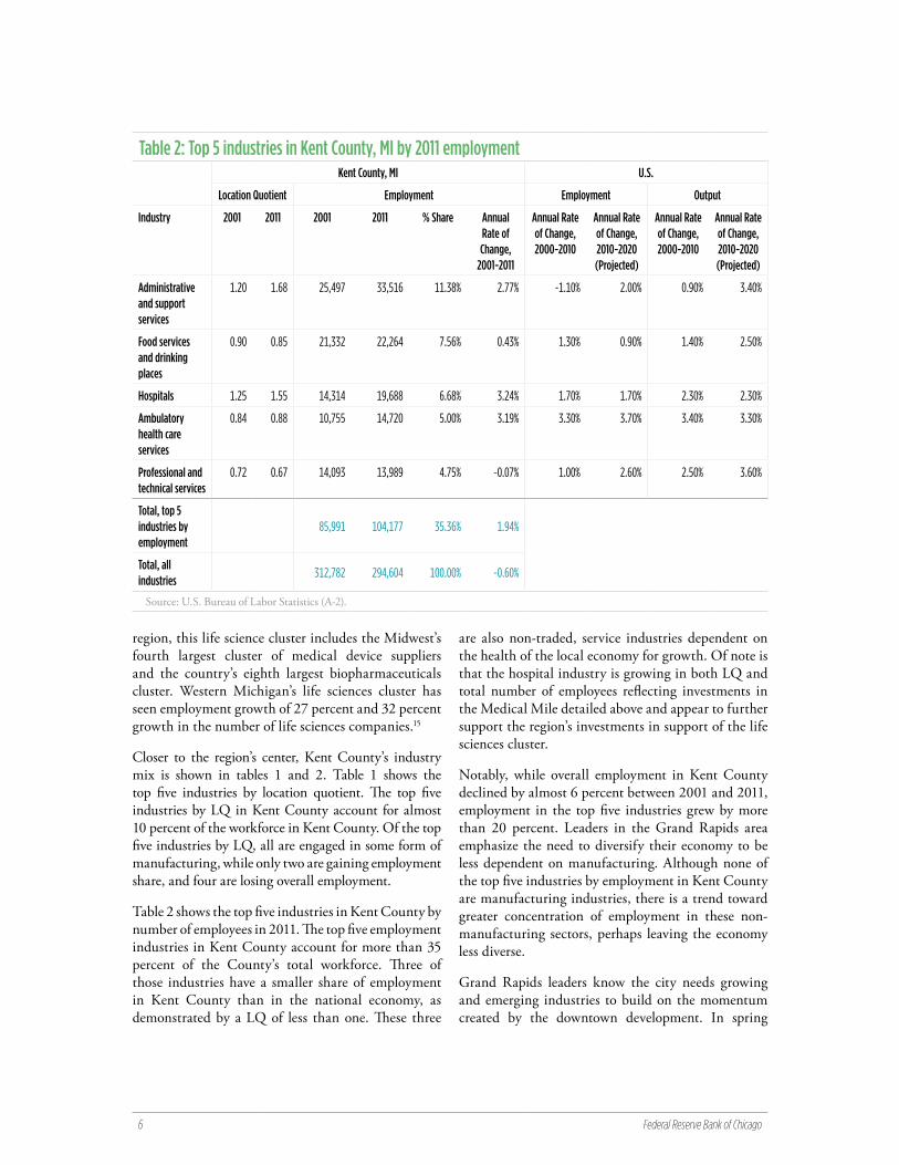
Over the past decade, Grand Rapids has seen an uneven increase in real bank deposits, despite a slight decline in its population (chart 10).
The real value of CRA loans was already falling in 2006. The number of loans declined sharply until 2010, after which both the number and value ticked up slightly (chart 11). However, despite these recent increases, CRA lending in Grand Rapids is still below what it was in 2009, when measured as a percentage of lending in 2006. This slow recovery tracks closely what is happening at the national level (chart 12).
Bankers participating in the Federal Reserve Community Development Forum felt that demand for mortgage loans was increasing primarily due to applications for refinances. Another lender agreed, indicating that 80 percent of his bank’s mortgage loan requests were for refinances and 20 percent were for new purchases. Conventional mortgage loans had become less popular due to higher credit standards and risk aversion, while Federal Housing Authority (FHA) loans had grown more popular. Chart 13 reflects that lower conventional lending levels are due to continuing low levels of demand, as denials and originations have closely tracked each other since 2009.
Housing and poverty
According to the 2010 census, the city of Grand Rapids has a total of 80,619 housing units. Of these, 56 percent are owner-occupied. The real median value for owner-occupied homes is $125,233.
According to Grand Rapids’ Consolidated Plan prepared for the U.S. Department of Housing and Urban Development, 13 percent of the housing in lower-income areas is vacant. More than 3,500 families are on the Section 8 Housing Choice Voucher list, while 9,500 families and seniors are on the Grand Rapids Housing Commission waiting list.23
The Consolidated Plan also highlights the impacts of foreclosures in Grand Rapids. “Grand Rapids has been hard hit by the foreclosure crisis. Data from January 2004 through December 2010 show that 15.3 percent of all 1-4 unit residential structures in the city were foreclosed
Chart 9. Dissimilarity index: Grand Rapids, 1980-2010
1980 1990 2000 2010Source: Brown University (A-8).
Chart 10. Total deposits (thousands of real $, 2010=100): Grand Rapids, 2000-2010
YearSource: FDIC Summary of Deposits (A-6).
10 Federal Reserve Bank of Chicago
upon in that time period. Eight neighborhoods with lower income and higher minority concentrations had foreclosure rates in excess of 25 percent.”24 The southeast side of the city was significantly impacted. Participants felt that the city had been proactive responding to the foreclosure crisis, and the county referred foreclosure cases to community organizations to mitigate the impact of those foreclosures.25
Grand Rapids has also seen a significant rise in families paying more than 35 percent of income for housing (chart 14). As real household incomes decrease, the demand for affordable housing increases, placing pressure on the supply. Availability of affordable housing options is likely to remain a significant challenge for a growing proportion of Grand Rapids residents.
Conclusion
Grand Rapids clearly benefits from the presence of philanthropically engaged families. Those families have been largely responsible for reversing the decline of downtown Grand Rapids and developing a strong regional economic development strategy. Grand Rapids also has a burgeoning system to support small business innovation and growth.
However, despite an engaged private sector and strong public/private cooperation, economic indicators relating to income, education, and poverty lag. The city has made some limited progress in mentoring young, diverse leaders, but has room to grow in these efforts.
Chart 11. Number and value of CRA loans (thousands of real $, 2010=100): Grand Rapids, 2005-2011
Chart 12. Value of CRA loans (thousands of real $, 2010=100) in all case study cities as a percentage of 2006 levels
Year
Number of CRA loans Value of CRA loans 2009 2011
Limited to loans made to businesses with less than $1M in annual revenues
Source: CRA (A-5).
Chart 13. Value of HMDA loan originations and denials (thousands of real $, 2010=100): Grand Rapids, 2003-2011
Year
Denials OriginationsSource: HMDA (A-4).

Industrial Cities Initiative Grand Rapids, Michigan 11
Notes
1. Ottawa County shines as West Michigan shows relative strength in latest U.S. Census figures. Available at http://www.mlive.com/news/grand-rapids/index.ssf/2011/03/ottawa_county_shines_as_west_m.html.
2. Kodrzycki, Yolanda, et al. 2009. Reinvigorating Springfield’s Economy: Lessons from Resurgent Cities. Federal Reserve Bank of Boston, p. 19. Available at http://www.bos.frb.org/commdev/pcadp/2009/pcadp0903.pdf.
3. Ibid.
4. Changes in the Grand Rapids Furniture Market. Grand Rapids Historical Commission. Available at http://www.furniturecityhistory.org/article/2172/changes-in-the-grand-rapids-fu.
5. Guest, Bill, and Tom Karel. 2010. Talent Supply Chain Management: Vision 2025. Available at http://talent2025.org/files/documents/misc/Talent-Supply-Chain-Management-Vision-10-10.pdf.
6. TALENT 2025. 2011. An Integrated Talent System for West Michigan. Available at http://talent2025.org/files/documents/misc/TALENT-2025-WHITE-PAPER-FULL.pdf.
7. Alliance for Health. 2012. Over 60 Years of Community Impact. Available at http://afh.org/about/community-impact/.
8. Alliance for Health 2012 Annual Report. Available at http://afh.org/wp-content/uploads/2013/05/38213-Annualrpt.pdf.
9. The Right Place 2012 Annual Report. Available at http://rightplace.org/CMSPages/GetFile.aspx?guid=ee589f88-97ed-443c-9a7b-700508ef805e.
10. West Michigan Strategic Alliance Regional Service Delivery Project at http://wmsa.miottawa.org/index.php?initiative_id=26.
11. CDPS Grand Rapids Community Development Forum. September 20, 2012.
12. Author interview with Jon Nunn, executive director of Grand Action. Available at http://grandaction.org.
13. Van Andel Institute, History and Legacy. Available at http://www.vai.org/about-vai/about-resources/history-and-legacy.aspx.
14. Author interview with Jon Nunn, executive director of Grand Action.
15. The Right Place, Advancing the West Michigan Economy. Available at http://www.rightplace.org/Industry-Sectors/Life-Sciences.aspx.
16. Start Garden. Available at http://startgarden.com.
17. U.S. Census Bureau (see Appendix A-1). Full citations and descriptions for datasets used throughout the ICI profiles are provided in Appendix A. These include data from the U.S. Census Bureau, U.S. Bureau of Labor Statistics, HMDA, CRA, Summary of Deposits, Lender Processing Services, Brown University, and Living Wage Project.
18. CDPS Grand Rapids Community Development Forum. September 20, 2012.
19. Reinstadler, Kym. Grand Rapids Public Schools hopes online courses will boost poor graduation rate. The Grand Rapids Press. April 30, 2010. Available at http://www.mlive.com/news/grand-rapids/index.ssf/2010/04/grand_rapids_public_schools_ho_1.html.
20. LINC News Bureau. What’s Behind the Believe 2 Become Initiative. Available at www.believe2become.org.
21. Grand Rapids Chamber of Commerce Inclusion and Community Leadership. Available at http://www.grandrapids.org/diversity.
22. FDIC Summary of Deposits (A-6).
23. Grand Rapids City Commission. 2011. Consolidated Housing and Community Development Plan: Five Year Strategy – July 1, 2011, to June 30, 2016. p.153. Available at http://grcity.us/community-development/Documents/080111crb0403.pdf.
24. Ibid, p. 50.
25. CDPS Grand Rapids Community Development Forum. September 20, 2012.
Chart 14. Rent burden and median household income (real $, 2010=100): Grand Rapids, 1980-2010
Year
Percent with rent burden Median household incomePercent rent burden represents the proportion of renting households whose gross rent exceeds 35% of income. Source: U.S. Census Bureau (A-1).

12 Federal Reserve Bank of Chicago
Appendix A: Overview of key data sources and compilation methods
[1] U.S. Census Bureau
The U.S. Census collects information on the American population and housing every ten years for use in policy-making and research. Until recently, it was distributed in two forms: a short form that counts all residents as mandated by the Constitution, and a long form that samples the population for characteristics such as income, housing, and education. After the 2000 Census, the long form was replaced by the American Community Survey (ACS). All three are discussed below.
With a few exceptions, the Census-derived time series presented in these profiles represent an amalgamation of data points from these three sources. While we made every effort to ensure comparability between figures over time, in some cases – detailed in table 2 – this was not possible and/or was difficult to assess. Furthermore, for the sake of narrative efficiency, we indicated all ACS data as corresponding to 2010 throughout the text and charts, even though the majority of it actually corresponds to the five-year timeframe between 2005 and 2009.
Please note that, for tabulation purposes, the Census treats cities as political units rather than spatially-fixed communities. As such, apparent changes over time may reflect changes caused by annexation, as well as changes within the original city boundaries. The table below indicates the extent of annexation for each of the ten case cities between 1970 and 2010.
Table 1. Change in land area by city, 1970-2010
CityLand Area in Square MIles
Percent Change1970 2010
Fort Wayne 51.5 110.6 115%
Gary 42.0 49.9 19%
Grand Rapids 44.9 44.4 -1%
Pontiac 19.7 20.0 1%
Aurora 14.1 44.9 219%
Joliet 16.5 62.1 276%
Racine 13.1 15.5 18%
Green Bay 41.7 45.5 9%
Cedar Rapids 50.7 70.8 40%
Waterloo 59.2 61.4 4%
Notes: 1. Data for 1970 come from 1972 County and City Databook as accessed through ICPSR.2. Data for 2010 come from the U.S. Census Bureau State and County Quickfacts.

Industrial Cities Initiative Appendix A: Overview of key data sources and compilation methods 13
Inset 1: Census data and the business cycle
For most characteristics, observed changes over time neatly capture the long-term trends that interest us. For a handful of characteristics, however, historically meaningful structural changes may be somewhat obscured by short-term fluctuations in the business cycle. To illustrate, Census data indicate that real median family income in Green Bay increased by just over 12 percent between 1990 and 2000. This probably understates the true gain, however, insofar as the first measurement reflects income closer to the peak of a business cycle than the second one.1
This concern mainly applies to income- and employment-related characteristics. Ideally, in the interest of holding cyclical change constant and thereby isolating structural change, comparisons between these types of characteristics should be made between measurements taken during the same stage of the business cycle (e.g., peak-to-peak or trough-to-trough). When not possible, however, such comparisons should at least take into account that differences in timing with respect to the business cycle may be relevant.
These differences are captured in chart 1, which displays the timeframe for income questions (Census frame) from the Census and ACS in relation to fluctuations in the business cycle. Note that both the formal definition of business cycles (in shading, and an informal measure depicted by the output gap (i.e., the difference between actual GDP and potential GDP), are depicted. The output gap rises during economic expansions and falls during contractions. We express it as a percent of real potential GDP to isolate this cyclical effect from long-term, structural increases in GDP. In the context of our example, the red line in 1989 highlights the period for which income was reported in the 1990 Census and the red line in 1999 highlights the same for the 2000 Census. Visually, we can see that the 1990 frame is closer to a recession and decline in the output gap; indicating it occured closer to the peak of a business cycle.
Lastly, in addition to the official U.S. Census website for sharing recent data (American FactFinder), for historical data we relied on two intermediary venues that organize the myriad older Census products into a coherent framework. In particular, for the period 1970-1990, we relied heavily on the National Historical Geographic Information System (NHGIS) maintained by the University of Minnesota. As a supplement, we also used data provided by the Interuniversity Consortium for Political and Social Research (ICPSR) maintained by the University of Michigan. Accordingly, the full citation for any specific Census-derived figure should be considered as “[the source] as obtained through [the venue], [the year]”. Additional detail for each of these venues is provided below.
Chart 1. Real U.S. output gap as a percent of real potential GDP
Recession Output gap Census frameSource: Congressional Budget Office/Haver Analytics.

14 Federal Reserve Bank of Chicago
Sources
[i] Short Form
Citation: U.S. Census Bureau, Decennial Census, Short Form.
In contrast to the long form or ACS, all persons complete the short form. All households and group quarters receive a questionnaire by mail every ten years. It asks for the age, sex, and race/ethnicity for each person living at the address, as well as whether the residence is owned or rented.2 Addresses are primarily obtained from the Master Address File from previous Census years and the Delivery Sequence File from the U.S. Postal Service. Follow-ups are conducted by telephone and personal interviews for nonrespondents. Missing data are imputed. Since the published figures are enumerations and not estimates from a sample, there are no calculable margins of error associated with sampling bias. However, the decennial Census is accompanied by a post-enumeration survey to assess coverage error.4 The post-enumeration survey for the 2010 Census did not find a significant percent net undercount or overcount for the household population.5
[ii] Long Form
Citation: U.S. Census Bureau, Decennial Census, Long Form.
For Censuses 1970-2000, one in six residents received a long form questionnaire with detailed questions on population and housing. Though results from the long form are technically estimates (not enumerations), the Census Bureau considers the figures sufficiently precise that it does not publish margins of error.
[iii] American Community Survey
Citation: U.S. Census Bureau, American Community Survey.
The Census Bureau officially introduced the ACS in 2005 as a replacement for the Decennial Census long form. Instead of sampling the population at one point in time every ten years, the ACS draws monthly rolling samples from U.S. households and group quarters for release every year. Because these annual samples are smaller than the long form samples (about 1 in 40), geographies with smaller populations require greater than single-year periods to achieve appropriate margins of error. Thus the ACS also releases rolling three-year and five-year estimates, where the multi-year estimates are constructed by pooling data from all years. For our analysis of industrial cities, appropriate margins of error were typically only obtainable from 5-year data. In some cases, our assessment of the standard error relative to the estimate allowed us to use three-year data (this measure is known as the coefficient of variation (CV); see discussion below for additional detail). It should be noted that we only considered margins of error when selecting the timeframe for an estimate. We did not test whether differences in estimates are statistically significant. Comparisons of ACS data made in the profiles may not be statistically significant when the estimates are very close or from a small population.
[iv] County and City Data Book
Citation: U.S. Census Bureau, County and City Data Book [United States] consolidated files, 1944-1977.
The County and City Data Book is a compendium of local-area data compiled by the U.S. Census Bureau from a variety of sources. It was published as a supplement to the Statistical Abstract of the United States in 1952, 1956, 1962, 1972, 1977, 1983, 1988, 1994, 2000, and 2007. For budget reasons, the Bureau terminated the program in 2011.

Industrial Cities Initiative Appendix A: Overview of key data sources and compilation methods 15
Venues
[i] American Factfinder
Citation: U.S. Census Bureau, American FactFinder, http://factfinder2.census.gov/faces/nav/jsf/pages/index.xhtml.
American FactFinder provides access to data about the United States, Puerto Rico, and the Island Areas. The data in American FactFinder come from several censuses and surveys.
For more information see “Using FactFinder” and “What We Provide.”9, 1
[ii] NHGIS
Citation: Minnesota Population Center. National Historical Geographic Information System: Version 2.0. Minneapolis, MN: University of Minnesota 2011, http://www.nhgis.org.
The National Historical Geographic Information System (NHGIS) provides, free of charge, aggregate census data and GIS-compatible boundary files for the United States between 1790 and 2012.
[iii] ICPSR
Citation: The Interuniversity Consortium for Political and Social Research. Ann Arbor, MI: University of Michigan, http://www.icpsr.umich.edu/.
The Interuniversity Consortium for Political and Social Research maintains an extensive archive of data sets in the social sciences. Data are available to researchers at no charge.
[iv] Miscellaneous
Percent manufacturing in 1960 and two other national figures for 1970 were not found in the above venues and thus obtained elsewhere, as indicated below.
• Percent Manufacturing from University of Virginia Library Citation: University of Virginia Library, County and City Data Books, http://www2.lib.virginia.edu/ccdb.
• Median Family Income from Current Population Reports Citation: U.S. Census Bureau, U.S. Department of Commerce, Current Population Reports, Consumer Income, Series P-60, No. 78. May 20, 1971, http://www2.census.gov/prod2/popscan/p60-078.pdf.
• Median Value of Owner Occupied Homes from Historical Census of Housing Tables Citation: U.S. Census Bureau, U.S. Department of Commerce, Historical Census of Housing Tables, Home Values, http://www.census.gov/hhes/www/housing/census/historic/values.html.
16 Federal Reserve Bank of Chicago
Table 2. U.S. Census figures by Decennial Form
Order Figure DescriptionCensus Form Notes
1 Total population Total number of persons Short --
2 % < 19 % of total population aged 19 and under Short --
3 % 20-24 % of total population aged 20-24 Short --
4 % 25-44 % of total population aged 25-44 Short --
5 % 45-64 % of total population aged 45-64 Short --
6 % > 65 % of total population aged 65 and over Short --
7 % Black % of population that identified themselves as Black
Short To ensure comparability with earlier years, universe is constrained to persons who identified with only one race.
8 % White % of population that identified themselves as White
Short To ensure comparability with earlier years, universe is constrained to persons who identified with only one race.
9 % Hispanic or Latino (of any race) % of total population that reported a Hispanic country of origin
Short Not found for 1970 and 1980. Unlike race figures, universe includes the entire population.
10 % Less than HS % of population aged 25 and over that did not graduate from high school
Long See % HS Grad note.
11 % HS Grad % of population over 25 who graduated from high school but never attended
college
Long In 1970, there is no explicit distinction between high school graduate and non-high school graduate. Individuals assumed to have gradu-ated high school if and only if they completed 4 years of high school.
12 % Some College & College Grad % of persons aged 25 and over that ever attended college
Long --
13 % Manufacturing % of employed population aged 16 and over that work in the manufacturing industry
Long Figures for 1970 appear to omit approximately 3-8% of eligible universe. Figures for 1960 come from County and City Data Book.
14 Civilian Work Force Full civilian work force, including the unemployed
Long --
15 % Civilian Unemployed % of individuals who are in the labor force but not employed
Long --
16 Real Median Family Income Real median family income, adjusted using CPI-U-RS (2010=100)
Long See extended note to figure 16 below.
17 % Families Below Poverty Line % families below poverty line Long --
18 Mean Commute Time Mean travel time to work (minutes) Long Only found for 2000 and 2010.
19 % Married (individuals 15 years and over) % of population aged 15 and over that are married
Long In 1970, includes persons 14 years and over.
20 Average HH size Average number of persons per household Short Only found for 2000 and 2010.
21 Average Family Size Average family size Short Not found for 1970 and 1980.
22 Total Units Total number of housing units Short --
23 % Owner Occupied % of occupied housing units that are owner occupied
Short --
24 Real Median Value of Owner Occupied Homes
Real median value of specified owner occupied homes
Long See extended note to figure 24 below.
25 % homes w- 0 Vehicle % of occupied units with no vehicles Long --
26 % homes w- 1 Vehicle % of occupied units with exactly 1 vehicle Long --
27 % homes w- 2+ Vehicles % of occupied units with 2 or more vehicles Long --
... continuted on next page

Industrial Cities Initiative Appendix A: Overview of key data sources and compilation methods 17
Table 2. U.S. Census Figures by Decennial Form28 % Foreign Born % of entire population that was born
abroad to non-native parentsLong See extended note to figure 28 below.
29 Real Median Household Income Real median household income, adjusted using CPI-U-RS (2010=100)
Long See extended note to figure 29 below.
30 % Rent Burden % of renting HHs whose gross rent is greater than or equal to 35% of income
Long See extended note to figure 30 below.
General notes
In all cases:
• All data from 2000 and after were obtained through American FactFinder.
• Non-ACS figures that take into account income (median family income, median household income, and rent burden) are based on income from the year immediately prior to the indicated year (e.g., 1970 income data corresponds to 1969); the timeframe for ACS income-related figures is also offset by one year (e.g., income data from the 2005-2009 timeframe corresponds to 2004-2008).
• Real dollar amounts were adjusted using the CPI-U Research Series (CPI-U-RS, 2010=100).
Unless otherwise indicated:
• Figures indicated as deriving from the “Short Form,” do in fact derive from the Decennial Census Short Form for all years.
• Figures indicated as deriving from the “Long Form” derive from the Decennial Census Long From for all years except 2010; in that case, data were derived from the 2005-2009 American Community Survey.
• All figures from 1960-1990 were obtained through the NHGIS.
Extended notes to figures
16 In 1970, city- and state-level figures were taken from the County and City Data Book as obtained through the ICPSR, while the U.S. level figure was taken from a Current Population Reports publication (see http://www2.census.gov/prod2/popscan/p60-078.pdf). We were unable to find sufficient documentation to confirm comparability between 1970 and later years.
24 The following caveat applies to comparisons between 1970 and later years: For 1980-2010, the population of units includes only “specified” units, which represents a subset of single-family homes (see http://quickfacts.census.gov/qfd/meta/long_HSG495210.htm for the definition of “specified” as employed in the ACS). In 1970, however, city- and state-level figures were taken from the County and City Data Book as obtained through the ICPSR. The codebook entry for that year is indicated as “OOU.SINGLE FAMILY MEDIAN VAL. $1970.” We were unable to determine if this contains all single family homes, or just a subset thereof. The U.S. level figure for 1970 was obtained from Historical Census of Housing Tables (see http://www.census.gov/hhes/www/housing/census/historic/values.html), and appears to subset the population of units in a manner consistent with the definition of “specified.” Any potential difference in the underlying universe should be mitigated by our using the median rather than the mean.
28 For 1970 and 2000: We assume, but cannot verify, that “foreign” excludes individuals born abroad to native parents. In Joliet in 1970, 2.3% of the eligible universe appears to be missing. For the last data point, we used a narrower three-year timeframe (2009-2011), as the coefficients of variation were generally acceptable. The CV for Gary, however, straddled the informal threshold between “Good” and “Fair”.
29 We assume, but cannot verify, that the population includes all households, as opposed to a subset of households that meet a certain criteria. For 2010, we used ACS data from the 2009-2011, as all coefficients met the informal criteria for “good” reliability.
30 2010 figures correspond to ACS five-year estimates from the 2007-2011 timeframe. Due to changes in the universe, comparability might be problematic for 1970, and is definitely problematic for 2007-2011. Figures relating to 1980-2000 all take into account “speci-fied renter occupied housing units,” while 1970 takes into account “renter-occupied units for which rent tabulated,” and 2010 takes into account “renter-occupied housing units.” The Census Bureau makes the disclaimer that the ACS data is not suitable for comparison with earlier long form data due to this change in the universe. By this logic, 1970 may be problematic as well. Renters who did not pay rent or who had a non-positive income are omitted from all calculations. Although we cannot verify the definition of gross rent for all years, in recent years “Gross rent is the contract rent plus the estimated average monthly cost of utilities...and fuels...if these are paid for by the renter.” (For example, see http://www.socialexplorer.com/data/ACS2012/metadata/?ds=Social+Explorer+Tables%3A++ACS+2012+(1-Year+Estimates)&table=T102B.)

18 Federal Reserve Bank of Chicago
Inset 2: Detailed discussion of ACS reliability and the coefficient of variation
Inherent in the design of the ACS is a tradeoff between timeliness, accuracy, and geographic specificity; given limited resources and therefore a limited sample size, it’s impossible to have all three of these desirable properties simultaneously.
To give researchers better control over how exactly these tradeoffs are calibrated, the ACS provides estimates of demographic characteristics in terms of 5-year, 3-year, and 1-year timeframes. The 5-year estimates are the most reliable because they have the largest sample size. Furthermore, 5-year estimates are available for all geographies for which the ACS tabulates data. The obvious downside of the 5-year data is that it applies to a long period, and may therefore be unsuitable for understanding short-term trends and/or the current picture. The 1-year data, on the other hand, is suitable for analyzing short-term dynamics. The downside is that it is only available for larger geographies, and that estimates may have a high margin of error. The properties of the 3-year data are somewhere in between those of the 1-year and 5-year data. Given that we are dealing with midsize cities, the choice was really between the 3-year and 5-year estimates. (1-year estimates are available for most cities, but omit Pontiac as well as several cities used for comparison. Further, as will be explained below, cities that barely met the population thresholds for inclusion in the 1-year data may suffer from high margins of error that would make their use questionable.)11 To make the decision between the 3-year and 5-year data, we follow the Census Bureau’s advice and look at a metric known as the Coefficient of Variation (CV). The Bureau emphasizes that an acceptable CV should ultimately be a function of the estimate’s intended use, and declines to provide specific interpretive thresholds. However, an informative user guide compiled by the Washington State Office of Financial Management suggests that, as a general rule, estimates with CVs less than 15% may be considered “good,” estimates with CVs between 15% and 30% may be considered “fair,” and estimates with CVs in excess of 30% should be used “with caution.”12
Throughout, we only used 3-year data when the CVs were acceptable for all case study cities.
[2] U.S. Bureau of Labor Statistics
[i] Quarterly Census of Employment and Wages
Citation: Bureau of Labor Statistics, U.S. Department of Labor, Quarterly Census of Employment and Wages [www.bls.gov/cew/].
Employment and location quotient data by industry are from the Quarterly Census of Employment and Wages as obtained through the Location Quotient Calculator. Employment is calculated from quarterly reports filed by nearly every employer in the U.S.
When used in the profiles, these data reflect annual averages for the county corresponding to the case-study cities. Please see below for the definition of “location quotient.” Information on living wage calculations, which generally accompany these data in the profiles, is provided in A-9.

[ii] Occupational Employment Statistics
Citation: Bureau of Labor Statistics, U.S. Department of Labor, Occupational Employment Statistics, (www.bls.gov/oes/).
Employment, location quotient, and wage data by occupation are from the May 2012 release of the Occupational Employment Statistics for Metropolitan and Nonmetropolitan Areas. These estimates were calculated based on a rolling sample of establishments from May 2012, November 2011, May 2011, November 2010, May 2010, and November 2009.1 The Employer Cost Index is used to express wage data across the timeframe in terms of May 2012 constant dollars.
When used in the profiles, these data reflect figures for the CBSA or Metropolitan Division corresponding to the case study cities. Please see below for the definition of “location quotient.” Information on living wage calculations, which generally accompany these data in the profiles, is provided in A-9.
[iii] Employment Projections
Citation: Bureau of Labor Statistics, U.S. Department of Labor, Employment Projections (www.bls.gov/emp/).
All employment and output projections by industry are at the national level, and were taken from table 2.7 of the 2010-2020 Employment Projections Program.16
Inset 3: Location Quotient Definition
A location quotient (LQ) measures the concentration of a characteristic in one level of geography relative to that same concentration in a reference geography. In the profiles, we employ location quotient to examine employment by industry between county and U.S., and employment by occupation between MSA and U.S.
LQs greater than one indicate that the characteristic is more concentrated in the local geography than the nation, while LQs less than one indicate it is less concentrated. For example, the 2011 LQ of paper manufacturing in Kane County, IL, is 2.43. This means that the share of paper manufacturing employment in Kane County is 2.43 times greater than the national share.
Mathematically, a LQ is a representation ratio defined by:
Where:
ei = Local employment in industry i
e = Total local employment
Ei = Base area employment in industry i
E = Total base area employment
Industrial Cities Initiative Appendix A: Overview of key data sources and compilation methods 19

20 Federal Reserve Bank of Chicago
[3] CPI-U-RS
Citation
• For 1978 and onward: U.S. Bureau of Labor Statistics, Consumer Price Index Research Series Using Current Methods (CPI-U-RS), U.S. city average, all items, December 1977=100 (see http://www.bls.gov/cpi/cpiursai1978_2012.pdf).
• For years prior to 1978: extrapolations as calculated by the U.S. Census Bureau (see http://www.census.gov/hhes/www/income/data/incpovhlth/2012/CPI-U-RS-Index-2012.pdf).
All values presented in real dollars were adjusted for inflation using the Consumer Price Index research series (CPI-U-RS) as employed by the U.S. Census Bureau. The CPI-U-RS is officially published by the Bureau of Labor Statistics (BLS) for a period beginning in 1978.1 The Census Bureau derives values for prior years by applying the ratio of the CPI-U-RS and CPI-U in 1977 to the 1947-1976 CPI-U. Though the index is published such that December 1977=100, we transformed the series to present values in terms of 2010 dollars.
The CPI-U-RS tracks historical changes in the cost of living more consistently and accurately than the commonly reported Consumer Price Index for All Urban Consumers (CPI-U). It is more consistent because it applies current methodology to all years in the series, while the CPI-U – despite improving over the years – is not adjusted retroactively. Incorporating these improvements, in turn, improves accuracy. Current methods have reduced upward bias, which the Boskin commission reported to be 1.1 percent per year. For example, the CPI now accounts for lower-level substitution bias (i.e., substitutions made among purchases within the same class of good.) Accordingly, the research series exhibits lower rates of inflation than the CPI-U. These improvements are especially significant for longitudinal analysis where rates compound over time. The CPI-U estimates that the price level rose by 462 percent between 1970 and 2010, whereas the CPI-U-RS estimates the increase at 401 percent.20
It should be noted that the CPI-U-RS, while an improvement over the CPI-U, still does not represent the BLS’ best measure of a cost-of-living index because it does not accommodate for substitutions made between classes of goods (aka, upper-level substitutions).21 To appreciate the significance of this type of substitution, it’s helpful to note that a cost-of-living index should estimate the increase in income necessary to make a consumer just as happy after an increase in the price level as before. As an example, if the price of pork increases relative to beef, a consumer may be just as happy purchasing more beef and less pork. Thus an index which presumes the consumer purchases the same amount of pork at a higher price is upwardly biased. The BLS produces a series that accounts for this effect, the Chained CPI-U, but it only extends back to year 2000. Examining the change in price level between 2000 and 2010 (years for which all three indices are available), the Chained CPI estimates an increase of 23 percent, while the CPI-U and CPI-U-RS both estimate an increase of 27 percent.23
It should also be noted that the CPI-U-RS is a national index and may not reflect regional differences in the cost of living across the 10 cities. Thus readers are cautioned against interpreting cities with comparatively lower median incomes or median incomes that fail to keep pace with the CPI-U-RS as strictly worse off.

Industrial Cities Initiative Appendix A: Overview of key data sources and compilation methods 21
[4] HMDA
Main Citation: Federal Financial Institutions Examination Council (FFIEC), Home Mortgage Disclosure Act (HMDA) loan application register flat files (http://www.ffiec.gov/hmda/hmdaflat.htm).
Tract-to-City Crosswalk: 2000 U.S. Census Bureau boundary data, as obtained through Maptitude Version 5.
The Home Mortgage Disclosure Act (HMDA) requires that certain lending institutions publically report information pertaining to loan applications for home purchases, improvements, and refinancing. Policymakers and regulators use the resulting report – which includes borrower characteristics such as race and income – to assess whether institutions are meeting the credit needs of the community, as well as to deter discriminatory practices. In addition to these regulatory purposes, the data are well suited to place-based analysis in general because they include the Census tract of the property.
In the profiles, we limited our data to home purchase loans that were either originated or denied by the lending institution after a full review of the application. Preapprovals and withdrawn applications were not considered. Data were aggregated by Census tract and then converted to city-level data using 2000 Census boundary data as obtained through Maptitude. All dollar values were adjusted for inflation using the CPI-U-RS.
[5] CRA
Main Citation: Federal Financial Institutions Examination Council (FFIEC), Community Reinvestment Act (CRA) aggregate flat files (http://www.ffiec.gov/cra/craflatfiles.htm).
Tract-to-City Crosswalk: 2000 U.S. Census Bureau boundary data, as obtained through Maptitude Version 5.
The Community Reinvestment Act (CRA) requires certain depository institutions to report data on business lending for the public.25
Data include loans made in amounts of less than $1 million; to better focus on lending to small businesses we further limit the data to loans made to businesses with less than $1 million in revenues. Tract-level data was converted to city-level data using 2000 Census boundary data as obtained through Maptitude. All dollar values were adjusted for inflation using the CPI-U-RS. Note that, unlike HMDA, CRA does not provide data regarding applications.
[6] FDIC Summary of Deposits
Main Citation: FDIC Summary of Deposits (http://www2.fdic.gov/sod/).
Geocoding-related Citations:
• Maptitude Version 5.
• 2000 U.S. Census Bureau boundary data, as obtained through Maptitude Version 5.
• The Google Geocoding API, Version 2 (https://developers.google.com/maps/documentation/geocoding/).
• Federal Reserve Bank of Chicago calculations.

22 Federal Reserve Bank of Chicago
The Federal Deposit Insurance Corporation (FDIC) Summary of Deposits is an annual report that reflects, among other things, the geographic distribution of deposits held by all FDIC-insured institutions. Information in the report is obtained from two sources: 1) a mandatory survey required of all FDIC-insured institutions that operate two or more branch locations, including foreign institutions that operate in the U.S. and 2) the Call Report, which may be used in place of the survey in cases where an institution operates in only one location. These data comprise the vast majority of deposits and deposit-like instruments held in the U.S.; credit unions – whose deposits collectively summed to about 12 percent of that of commercial banks in 2004 account for the remainder.27
In the survey, institutional respondents are asked to allocate total deposits to physical bank locations in a manner consistent with their respective internal practices. For example, the allocation of a certain account to a certain branch office for SOD purposes might derive from matching the account holder’s address to the nearest branch, where the account is most active, or where the account was opened.
Furthermore, respondents are instructed to consolidate the deposits of limited-service outlets (such as ATMs) into more substantial branches located nearby (preferably in the same county). The sum of deposits distributed over the various locations should match the analogous figure in the Call Report or Report of Assets and Liabilities.29
The subsequent availability of detailed address fields in the report can be used to pinpoint the exact latitude and longitude of bank locations (and their corresponding deposits), thereby making this source particularly useful for the sort of place-based analysis employed throughout the profiles. This process of converting addresses to coordinates is known as “geocoding”, and is implemented by a piece of software called a “geocoder.”
We used two geocoders to match deposits with the profiled cities: Maptitude (v5) and the Google Geocoding API (v2). After determining the coordinates of bank locations, we then used Maptitude again to determine the corresponding city with respect to boundaries from the 2000 Census.
It is important to note that all geocoders rely on matching techniques with degrees of uncertainty in order to reconcile text-based address fields between multiple data sources. Consequently, any geocoding procedure is subject to multiple types of error including: 1) failure to match at all, 2) matching to the wrong location, and 3) matching to a correct but imprecisely defined location (e.g., a zipcode as opposed to a building).
Regarding the first type of error, our geocoding success rate generally fell between about 90 percent and 95 percent, depending on the year. The second type of error, while important, is difficult to quantify. Since our goal was to link banking data with a relatively large target (cities), we imagine that the third type of error is insignificant.
A few general caveats are worth mentioning given how deposits are reported and geocoded:
• First, note that deposits figures reported throughout the profiles relate to deposits corresponding to bank locations in the cities, not residents of the cities. Throughout the profiles, however, we implicitly presume that these two measures are highly correlated, and use them interchangeably.
• Second, between the survey instructions and Banks’ internal practices, an area’s figures may be skewed upward if it contains a central location within which large amounts of deposits from nearby limited-service locations are consolidated. (This effect was particularly noticeable in the case of Green Bay, WI, where one location with consolidated deposits drove per-capita deposits to a level nearly three times higher than that of the next highest case study city.)
• Lastly, given that geocoding outcomes tend to be more successful for recent periods than for earlier periods, estimated growth in deposits may be subject to upward bias. Using two geocoders mitigates but does not eliminate this bias.

Industrial Cities Initiative Appendix A: Overview of key data sources and compilation methods 23
Miscellaneous notes:
• While all discussions pertaining to deposits amounts draw from geocoded data, discussions relating to institutional characteristics and market structure (e.g., number of branches, market share, community versus non-community bank) draw from Summary of Deposits data as assigned to cities based on their zipcodes. This assignment, in turn, was based on 2000 city and 2007 zipcode boundaries from the Census, as obtained through Maptitude.
• The FDIC began including the results of its internal geocoding procedure starting with the 6-2012 release. All deposits figures in our analysis, however, are entirely based on geocodes obtained through Maptitude and Google as described above.
• Data were aggregated by Census tract and then converted to city-level data using 2000 Census boundary data as obtained through Maptitude. All dollar values were adjusted for inflation using the CPI-U-RS.
[7] LPS Applied Analytics
Main Citation: Lender Processing Services (LPS) Applied Analytics.
Zipcode-to-City Crosswalk: 2000 U.S. Census Bureau boundary data, as obtained through Maptitude Version 5.
Proprietary loan-level microdata furnished by LPS Applied Analytics details the monthly performance of mortgage loans in the residential housing market. LPS collects this data from large mortgage servicers, who collectively represent about two-thirds of this market.
The underlying raw data include numerous mortgage types including first mortgages, second mortgages, and various grades of home equity lines of credit. In an effort to better align our measures with properties as opposed to loans, however, we take into account only first-lien mortgages. Furthermore, we used Census data (as obtained through Maptitude V5) to assign loans to case study cities using the zipcode of the underlying property.
A variety of possible metrics may be derived from mortgage performance data to help gain insight into the health of a given housing market, including but not limited to: the foreclosure start, transition, and inventory rates. Throughout the profiles, we focus exclusively on the foreclosure inventory rate, a static measure that represents the number of mortgages in foreclosure as a proportion of all mortgages. The start and transition rates, on the other hand, are dynamic measures that provide insight into the flow of loans into and out of foreclosure status.30
It’s important to note that foreclosure inventory rates are highly sensitive to state laws that govern how foreclosures are processed. A foreclosure in Illinois, for example, takes about 300 days and often longer because every foreclosure must be processed through the courts. However, some states, like Michigan, do not require foreclosures to go through the courts. Still, depending on the situation, certain states like Iowa and Wisconsin employ both methods. All things being equal, foreclosure rates tend to be lower in states that rely primarily on non-judicial procedures, as any potential buildup resulting from new foreclosures in these states is tempered by the speed with which they can be resolved.31
Given this sensitivity to various legal procedures, foreclosure inventory rates should only be compared among states with similar process periods. In the profiles, we compare the foreclosure inventory rate in a given city with its home state and the average of a group of reference states. The four reference groups were constructed based on the quartiles of the process period, as shown in table 3.

24 Federal Reserve Bank of Chicago
[8] Brown UniversityCitation: Spatial Structures in the Social Sciences, Brown University, US2010 Project, (http://www.s4.brown.edu/us2010/Data/data.htm).
Measures of residential segregation and racial/ethnic composition are from US2010, a project of Spatial Structures in the Social Sciences at Brown University, and based on data from the Decennial Census and the 2005-09 American Community Survey.
The dissimilarity index measures the extent to which one group is distributed proportionally across census tracts in a city relative to another group.32 The index ranges from 0 to 100 and equals zero if every tract exhibits the same ratio between groups as the city as a whole. The index equals 100 if the two groups are entirely segregated by census tract. Values of 60 or above are considered fairly high. It means that 60 percent of one group must move to a different tract to achieve a proportional distribution. Values between 40 and 60 are considered moderate, while values less than 40 are fairly low.
More generally, the index for two racial groups is defined as:33
Where:
xi = the population of group X in census tract i
X = the total population of group X in the city
yi = the population of group Y in census tract i
Y = the total population of group Y in the city
Table 3. Typical foreclosure process period for reference statesGroup Process Period (days) States
1 < 63 AL CT DC GA MD MI MO NH RI TN TX VA WY2 63-136 AK AR AZ CA FL KS MA MN MS NC NV VT WA WV3 136-180 CO IA ID KY LA MT ND NE NM OR SC SD UT4 >180 DE HI IL IN ME NJ NY OH OK PA WI
Source: RealtyTrac (see http://www.realtytrac.com/real-estate-guides/foreclosure-laws/).

Industrial Cities Initiative Appendix A: Overview of key data sources and compilation methods 25
[9] Living Wage ProjectCitation: Poverty in America, Massachusetts Institute of Technology, Living Wage Project, Living Wage Calculator (http://livingwage.mit.edu/).
Estimates of living wages are from the Living Wage Calculator, a tool provided by the Living Wage Project under the Poverty in America program at the Massachusetts Institute of Technology. A living wage represents a minimum cost of living for low wage families in a particular area based on cost estimates for food, child care, healthcare, housing, transportation, other necessities, and taxes. It is intended to highlight that working families may not earn enough to live locally, even if they earn more than the minimum wage and are not officially in poverty.
All estimates cited in the profiles are for one adult raising one child. The calculator uses data from a variety of federal sources to estimate costs, including the Bureau of Labor Statistics, the U.S. Department of Housing and Urban Development, and the U.S. Department of Agriculture. Estimates are made with respect to the latest source data that was available in June 2012.
Though the calculator allows users to select estimates for either place or county, it does not detail the various levels of geography represented by the source data. Therefore we cannot distinguish which cost estimates, if any, are particular to the place or county, and which represent some broader level of geography. Estimates cited in the profiles were selected by place, and these are likely more representative of the MSA or metropolitan division, where one exists.
Additionally, the calculator does not report whether values are given in constant dollars. Given the latest update in June 2012, we speculate that all values can be generally assumed to be in “recent” dollars.
26 Federal Reserve Bank of Chicago
Notes
1. As the table below indicates, please note that income reported in the 1980 and 1990 Census corresponds to income from 1979 and 1989, respectively.
2. U.S. Census Bureau, Explore the Form, available at http://www.census.gov/2010census/about/interactive-form.php.
3. U.S. Census Bureau, Summary Population and Housing Characteristics, Selected Appendixes, May 2012, available at http://www.census.gov/prod/cen2010/cph-1-a.pdf.
4. U.S. Census Bureau, Coverage Measurement, available at https://www.census.gov/coverage_measurement/.
5. U.S. Census Bureau, Census Coverage Estimation Report, May 2012, available at http://www.census.gov/coverage_measurement/pdfs/g01.pdf.
6. U.S. Census Bureau, American Community Survey, Design and Methodology, available at http://www.census.gov/acs/www/methodology/methodology_main/.
7. Basic information on sample size and data quality by state can be found at http://www.census.gov/acs/www/methodology/sample_size_and_data_quality/.
8. U.S. Census Bureau, County and City Data Book: 2007, available at http://www.census.gov/prod/2008pubs/07ccdb/ccdb-07.pdf.
9. U.S. Census Bureau, Using FactFinder, available at http://factfinder2.census.gov/faces/nav/jsf/pages/using_factfinder.xhtml.
10. U.S. Census Bureau, What We Provide, available at http://factfinder2.census.gov/faces/nav/jsf/pages/what_we_provide.xhtml.
11. U.S. Census Bureau, American Community Survey, Guidance for Data Users, available at http://www.census.gov/acs/www/guidance_for_data_users/estimates/.
12. Washington State Office of Financial Management, American Community Survey User Guide, May 2012, available at http://www.ofm.wa.gov/pop/acs/userguide/ofm_acs_user_guide.pdf.
13. Bureau of Labor Statistics, Quarterly Census of Employment and Wages, Location Quotient Calculator, available at http://data.bls.gov/location_quotient/ControllerServlet.
14. Bureau of Labor Statistics, Quarterly Census of Employment and Wages, Frequently Asked Questions, available at http://www.bls.gov/cew/cewfaq.htm#Q14.
15. Bureau of Labor Statistics, Occupational Employment Statistics, Overview, available at http://www.bls.gov/oes/oes_emp.htm.
16. Bureau of Labor Statistics, Employment Projections, available at http://bls.gov/emp/ep_table_207.htm.
17. Bureau of Labor Statistics, Help & Tutorials, available at http://www.bls.gov/help/def/lq.htm#location_quotient.
18. Bureau of Labor Statistics, CPI Research Series Using Current Methods, available at http://www.bls.gov/cpi/cpirsdc.htm.
19. Bureau of Labor Statistics, Price Measurement in the United States: a decade after the Boskin Report, Monthly Labor Review, May 2006, available at http://www.bls.gov/opub/mlr/2006/05/art2full.pdf.
20. Calculated from the annual averages of the national CPI-U, All items as obtained from http://www.bls.gov/cpi/data.htm.
21. Bureau of Labor Statistics, Frequently Asked Questions about the Chained Consumer Price Index for All Urban Consumers, available at http://www.bls.gov/cpi/cpisupqa.htm
22. Bureau of Labor Statistics, Note on the Chained Consumer Price Index for All Urban Consumers, available at http://www.bls.gov/cpi/superlink.htm.
23. Calculated from the annual averages of the national Chained CPI-U, All items as obtained from http://www.bls.gov/cpi/data.htm.
24. Depository and non-depository institutions alike are covered by HMDA, subject to their asset size, presence in the MSA, and whether they are involved in the business of residential mortgage lending. See page 3 of the HMDA reporting guide (http://www.ffiec.gov/hmda/pdf/2010guide.pdf) for details.
25. Subject to asset thresholds updated annually (for example, see: http://www.ffiec.gov/cra/pdf/Explanation%20of%20the%20Community%20Reinvestment%20
Act%20Asset%20Threshold%20Change%20121712.pdf), all state member banks, state nonmember banks, national banks, and savings associations are required to report. Institutions that do not meet these thresholds have the option of reporting voluntarily.
26. Federal Deposit Insurance Corporation, Summary of Deposits Reporting Instructions, available at http://www2.fdic.gov/sod/pdf/SOD_Instructions.pdf, page 1.
27. Federal Reserve Bank of San Francisco, Are credit unions regulated or supervised by the Federal Reserve System?, Dr. Econ blog, March 2005, available at http://www.frbsf.org/education/publications/doctor-econ/2005/march/credit-unions-regulation-supervision.
28. Federal Deposit Insurance Corporation, Summary of Deposits Reporting Instructions, available at http://www2.fdic.gov/sod/pdf/SOD_Instructions.pdf, page 1
29. Ibid, page 3.
30. For a detailed discussion of how these rates interrelate, please see our guest blog at http://midwest.chicagofedblogs.org/archives/2011/10/emily_engel_for.html.
31. Lower inventories, however, do not necessarily translate into healthier housing markets. Properties that moved through foreclosure quickly in Michigan, for example, may show up subsequently as real estate owned (REO) by the mortgagee. We do not track post-foreclosure statuses like REO because we’re unsure to what extent LPS tracks them.
32. Spatial Structures in the Social Sciences, Brown University US2010 Project, Interpreting a Data Set, available at http://www.s4.brown.edu/us2010/Data/Explanation.htm.
33. Population Studies Center, University of Michigan, Racial Residential Segregation Measurement Project, available at http://enceladus.isr.umich.edu/race/calculate.html.

Industrial Cities Initiative Appendix B: Fact sheets 27
Gran
d Rap
idsMi
chiga
nUn
ited S
tate
s
1970
1980
1990
2000
2010
% ch
ange
, 19
70-2
010
1970
1980
1990
2000
2010
% ch
ange
, 19
70-2
010
1970
1980
1990
2000
2010
% ch
ange
, 19
70-2
010
Tota
l Pop
ulatio
n 19
7,649
18
1,843
18
9,126
19
7,800
18
8,040
-4
.86%
8,87
5,083
9,
262,0
78
9,29
5,297
9,
938,4
44
9,88
3,640
11.
36%
203,2
11,926
22
6,545
,805
248,7
09,87
3 28
1,421,
906
308,7
45,53
8 51.
93%
Age
% < 1
938
.60%
32.20
%31.
04%
30.86
%28
.50%
-26.1
6%40
.44%
33.64
%29
.67%
29.02
%26
.80%
-33.73
%37.
99%
31.98
%28
.68%
28.60
%26
.97%
-29.0
2%
% 20
- 24
8.84%
11.63
%9.2
4%9.3
1%10
.70%
21.02
%7.7
9%9.6
6%7.5
9%6.4
8%6.7
7%-13
.11%7.9
3%9.4
1%7.6
5%6.7
4%6.9
9%-11
.78%
% 25
- 44
20.19
%24
.97%
32.58
%31.
50%
28.60
%41.
68%
23.49
%27
.47%
32.07
%29
.79%
24.71
%5.2
0%23
.61%
27.68
%32
.47%
30.22
%26
.60%
12.67
%
% 45
-64
20.20
%17.
77%
14.07
%16
.72%
21.20
%4.9
6%19.
77%
19.39
%18.
75%
22.45
%27
.95%
41.34
%20
.58%
19.64
%18.
64%
22.01
%26
.39%
28.26
%
% > 6
512.
18%13.
44%
13.07
%11.
61%11.1
0%-8
.85%
8.51%
9.85%
11.92%
12.27
%13.
78%
61.91
%9.8
9%11.
28%
12.56
%12.
43%
13.04
%31.
85%
Race
% W
hite
88.05
%80
.96%
76.39
%67
.30%
64.60
%-2
6.63%
88.26
%85
.22%
83.44
%80
.15%
78.95
%-10
.55%
87.42
%83
.44%
80.29
%75
.14%
72.41
%-17
.18%
% Bla
ck11.
28%
15.84
%18.
54%
20.41
%20
.90%
85.27
%11.1
7%12.
93%
13.90
%14.
21%14.
17%26
.88%
11.16%
11.69
%12.
06%
12.32
%12.
61%13.
00%
% Hi
span
ic or
Latin
o (of
any r
ace)
--
4.97%
13.05
%15.
60%
--
-2.1
7%3.2
6%4.4
1%-
--
8.99%
12.55
%16
.35%
-
Educ
ation
% Le
ss th
an H
S47
.17%
32.91
%23
.55%
22.05
%18.
24%
-61.3
3%47
.24%
32.01
%23
.22%
16.59
%12.
65%
-73.22
%47
.66%
33.53
%24
.76%
19.60
%15.
42%
-67.6
4%
% HS
Grad
30.32
%33
.35%
28.29
%26
.03%
25.80
%-14
.92%
33.66
%38
.03%
32.30
%31.
34%
31.81%
-5.52
%31.
08%
34.59
%29
.99%
28.63
%29
.31%
-5.71
%
% So
me C
olleg
e & Co
llege
Grad
22.51
%33
.74%
48.15
%51.
92%
55.96
%148
.63%
19.10
%29
.97%
44.47
%52
.07%
55.54
%19
0.86%
21.26
%31.
88%
45.25
%51.
77%
55.27
%159
.95%
Indus
try, E
mplo
ymen
t, &
Incom
e
% Ma
nufac
turin
g29
.93%
27.60
%24
.01%
22.36
%17.
11%-4
2.85%
36.02
%30
.29%
24.63
%22
.55%
18.26
%-4
9.32%
26.10
%22
.44%
17.69
%14.
10%
11.24
%-5
6.92%
Civilia
n Wor
k For
ce 81
,495
85,84
2 92
,704
98,64
4 10
2,387
25
.64%
3,45
5,346
4,
211,99
7 4,
540,5
37
4,92
2,453
5,
001,5
03
44.75
% 80
,051,0
46
104,4
49,81
7 12
3,473
,450
137,6
68,79
8 15
2,273
,029
90.22
%
% Civ
ilian U
nem
ploye
d6.3
7%8.4
9%7.3
6%6.3
4%10
.88%
70.83
%5.8
6%10
.95%
8.24%
5.79%
10.44
%78
.08%
4.37%
6.52%
6.31%
5.77%
7.20%
64.89
%
Real
Media
n Fam
ily In
com
e $5
2,599
$5
2,833
$5
4,412
$57,8
69
$47,5
51 -9
.60%
$57,9
88
$61,8
76
$62,2
27
$69,9
51 $6
1,636
6.2
9% $4
9,581
$55,7
47
$59,8
04
$65,4
87
$63,3
92
27.86
%
% Fa
milie
s Belo
w Po
verty
Line
8.91%
10.28
%12.
63%
12.01
%17.
20%
93.14
%7.3
1%8.2
5%10
.24%
7.47%
10.30
%40
.97%
10.67
%9.5
8%9.9
7%9.2
2%9.9
0%-7.
26%
Mean
Com
mut
e Tim
e -
- -
19.20
18
.80
- -
- -
24.10
23
.70
- -
- -
25.50
25
.20
-
Hous
ehold
Com
posit
ion
% Ma
rried
(ind
ividu
als 15
year
s and
over
)56
.19%
49.62
%46
.44%
44.20
%38
.88%
-30.81
%62
.27%
56.91
%54
.01%
53.87
%50
.37%
-19.11%
61.48
%57.
30%
54.79
%54
.37%
50.29
%-18
.19%
Aver
age H
H siz
e-
--
2.57
2.49
--
--
2.56
2.49
--
--
2.59
2.58
-
Aver
age F
amily
Size
--
3.20
3.24
3.20
--
-3.1
63.1
03.0
5-
--
3.16
3.14
3.14
-
Hous
ing
Tota
l Unit
s 68
,206
69,88
8 73
,716
78,00
3 80
,619
18.20
% 2,
954,5
70
3,58
9,912
3,84
7,926
4,
234,2
79
4,53
2,233
53
.40%
68,67
9,030
88
,411,2
63
102,2
63,67
8 11
5,904
,641
131,7
04,73
0 91
.77%
% Ow
ner O
ccupie
d65
.15%
63.02
%59
.90%
59.65
%56
.00%
-14.05
%74
.43%
72.67
%70
.99%
73.78
%72
.13%
-3.08
%62
.86%
64.43
%64
.20%
66.19
%65
.10%
3.57%
Real
Media
n Valu
e of O
wner
Occu
pied H
ome
$74,0
37
$83,8
92
$94,2
81 $1
15,72
3 $1
25,23
4 69
.15%
$88,1
43
$98,2
52
$98,0
01
$146
,363
$149
,935
70.10
% $8
5,186
$1
19,162
$1
27,91
8 $1
51,42
7 $1
88,46
1 121
.23%
% ho
mes
w- 0
Vehic
le18.
39%
15.79
%14.
72%
11.89
%11.
63%
-36.76
%12.
16%
11.58
%10
.06%
7.67%
6.96%
-42.7
3%17.
47%
14.75
%11.
53%
10.30
%8.8
0%-4
9.62%
% ho
mes
w- 1
Vehic
le49
.00%
48.61
%38
.85%
40.56
%38
.33%
-21.7
8%48
.86%
46.53
%33
.13%
33.75
%33
.64%
-31.14
%47
.71%
46.57
%33
.76%
34.25
%33
.21%
-30.38
%
% ho
mes
w- 2
+ Veh
icles
32.61
%35
.61%
46.42
%47
.55%
50.04
%53
.46%
38.98
%41.
89%
56.82
%58
.58%
59.39
%52
.35%
34.83
%38
.68%
54.71
%55
.46%
57.99
%66
.50%

Edited by Susan Longworth
Cover art by
Donald K. LakeIndustry: ChamberTransparent Watercolor
For addtional information about the artist and other works by Donald K. Lake featured in this publication please visit: www.donlakeart.com