Dynamics of Housing Debt in the Recent Boom and Bust v9 · Dynamics of Housing Debt in the Recent...
66
Dynamics of Housing Debt in the Recent Boom and Great Recession Manuel Adelino, Duke University and NBER Antoinette Schoar, MIT and NBER Felipe Severino, Dartmouth College May 31, 2017 Abstract This paper documents a number of key facts about the evolution of mortgage debt, homeownership, debt burden and subsequent delinquency during the recent housing boom and Great Recession. We show that the mortgage expansion was shared across the entire income distribution, i.e. the flow and stock of debt rose across all income groups (except for the top 5%). The mortgage expansion was especially pronounced in areas with increased house prices, and the speed at which houses turned over (churn) in these areas went up significantly. However, the average loan-to-value ratios (LTV) at origination did not increase over the boom period. While homeownership rates increased for the middle and upper income households, there was no increase in homeownership for the lowest income groups. Finally, default rates post-crisis went up predominantly in areas with large house price drops, especially for high income and high- FICO borrowers. These results are consistent with a view that the run up in mortgage debt over the pre-crisis period was driven by rising home values and expectations of increasing prices. We thank the editors, Martin Eichenbaum and Jonathan Parker, and our discussants, Erik Hurst and Gianluca Violante, for very insightful comments and suggestions. We also benefited from many helpful discussions with participants at the NBER Macro Annual Meeting. All mistakes are of course our own. The views expressed herein are those of the authors and do not necessarily reflect the views of the National Bureau of Economic Research.
Transcript of Dynamics of Housing Debt in the Recent Boom and Bust v9 · Dynamics of Housing Debt in the Recent...

Dynamics of Housing Debt in the Recent Boom and Great Recession
Manuel Adelino, Duke University and NBERAntoinette Schoar, MIT and NBER Felipe Severino, Dartmouth College
May 31, 2017
Abstract
This paper documents a number of key facts about the evolution of mortgage debt,
homeownership, debt burden and subsequent delinquency during the recent housing boom and
Great Recession. We show that the mortgage expansion was shared across the entire income
distribution, i.e. the flow and stock of debt rose across all income groups (except for the top 5%).
The mortgage expansion was especially pronounced in areas with increased house prices, and the
speed at which houses turned over (churn) in these areas went up significantly. However, the
average loan-to-value ratios (LTV) at origination did not increase over the boom period. While
homeownership rates increased for the middle and upper income households, there was no
increase in homeownership for the lowest income groups. Finally, default rates post-crisis went
up predominantly in areas with large house price drops, especially for high income and high-
FICO borrowers. These results are consistent with a view that the run up in mortgage debt over
the pre-crisis period was driven by rising home values and expectations of increasing prices.
We thank the editors, Martin Eichenbaum and Jonathan Parker, and our discussants, Erik Hurst
and Gianluca Violante, for very insightful comments and suggestions. We also benefited from
many helpful discussions with participants at the NBER Macro Annual Meeting. All mistakes
are of course our own. The views expressed herein are those of the authors and do not necessarily
reflect the views of the National Bureau of Economic Research.

The lasting impact of the mortgage crisis of 2008 on the U.S. economy and international
financial markets has spurred an intense debate among economists and policy-makers about the
origins of the crisis. The collapse of collateral values post 2007 led to a large increase in defaults,
which in turn disrupted banks and the shadow banking system and was a leading cause of the
deep recession that followed. Even after large government stabilization programs, low house
prices and depressed expectations held back investment and consumption. The rapid increase in
household debt over the 2000s, especially mortgage credit, has been widely documented but
views differ on what drove this expansion in credit. This paper outlines the two major narratives
that have been proposed to explain the crisis and lays out the evidence that aims to differentiate
them. We call these the subprime view and the expectations view of the boom and bust. We
provide new facts and confirm several prior findings on the evolution of debt, homeownership
rates, debt-to-income (DTI) ratios, and loan-to-value (LTV) ratios during both the housing boom
and the housing bust.1 The results support the idea that house prices and house price expectations
played a central role in both the expansion of credit and the subsequent housing market bust.
One view of the housing boom and bust is that financial innovation and deregulation in the pre-
crisis period led to increased securitization and delegation in underwriting, which in turn
exacerbated agency problems within the mortgage origination chain and led to distortions in
underwriting (the subprime view). A number of theory papers have laid out particular channels
by which these distortions might have affected mortgage lending, such as Parlour and Plantin
(2008), Dang et al. (2010), and Chemla and Hennessey (2014). Popular narratives (such as
Michael Lewis’s The Big Short (2015) and the 2010 movie Inside Job) put forward the idea that
1 Our data come from numerous sources, including the American Community Survey (ACS), the Home Mortgage Disclosure Act (HMDA), the Lender Processing Services (LPS) loan-level dataset, and Corelogic deeds record data.

increased misalignment of incentives led financial institutions to provide unsustainable credit to
low-income and poor-credit-quality borrowers, so-called subprime borrowers, who previously
might have been rationed out of the mortgage market (see, e.g., Mian and Sufi (2014)).
The alternative view emphasizes the role of house price expectations in explaining the increased
credit supply (the expectations view). According to this view, inflated house price expectations
led banks to underestimate the potential for losses and the losses given default. Inflated house
price expectations might also have led borrowers to increase demand for housing and exploit the
expanded credit supply.2 However, heterogeneous priors about house prices by themselves do
not lead to boom-and-bust cycles because prices would immediately adjust, and the impact of
optimistic agents in the housing market must vary over time in order to generate those cycles.
One channel through which the role of optimistic agents changes endogenously over the
business cycle are changes in collateral lending standards.3 Looser collateral standards after
periods of good performance in the housing market (higher combined loan-to-value ratios, or
CLTVs) can allow more optimistic agents to hold a larger fraction of assets and as a result drive
up house prices.4 An alternative channel proposes that the number of optimistic agents changes
with the credit cycle. For example, if house price expectations are extrapolative or adaptive,
initial increases in house prices can feed on themselves, see for example Barberis et al. (2015),
2 Case and Schiller (2003) analyze how house price expectations form during housing bubbles, and Kaplan, Mitman, and Violante (2016) present a structural model that lays out the implications for consumption, homeownership, and leverage decisions. 3 An earlier literature assumed that credit-constrained borrowers need collateral to borrow because of information asymmetries or limited contract enforcement (see, e.g., Bernanke, Gertler, and Gilchrist (1999); Kiyotaki and Moore (1997); Gertler, and Gilchrist (1994); and Rampini and Vishwanathan (2014)). If agency problems vary over the business cycle, it can lead to flight to quality and with it reduced collateral values in the bust. These models of the collateral lending channel assume rational homeowners and banks, and thus would not predict a crash in mortgage markets. 4 See Geanakoplos (2010) for a model of the collateral lending channel that produces endogenous boom and bust dynamics.

Lo (2004), Gennaioli, Shleifer and Vishny, (2015), or DeFusco, Nathanson, and Zwick (2016).
Burnside, Eichenbaum, and Rebelo (2016) provide a different micro-foundation via social
contagion, where optimistic agents with tighter priors can convince less optimistic agents to
change their beliefs.
What might have triggered these initial changes in house prices and expectations? The savings
glut that led to increasing capital inflows to the US and lower interest rates is often seen as a
trigger for increasing house prices, see in particular Bernanke (2007), Rajan (2011), or Bhutta
(2015). These might have been exaggerated by demographic trends in mobility (Ferreira and
Gyourko (2011)), or gentrification trends (Guerrieri, Hartley, and Hurst (2013)).
It is important to understand the primary drivers of the recent boom-and-bust cycle in household
leverage, since it not only affects the diagnosis but also suggests different policy changes to
guard against future crises. If the first view dominates, then regulations that force lenders to have
more skin in the game, reduce securitization, and impose stricter screening of (marginal)
borrowers are central. Under the second view, the focus needs to be on macro-prudential
regulation and rules that support the stability of banks even when asset values change or may be
overinflated.5
The discussion above illustrates the challenges of differentiating between the subprime view and
the expectations view of the crisis. The explanations are not mutually exclusive and may even
reinforce each other. If, for example, market participants believe that house prices can only rise,
5 Several studies also suggest that the housing boom led to broader allocative distortions, e.g., on structural labor market imbalances, small business starts, or even students’ educational outcomes (see, e.g., Charles, Hurst, and Notowidgo 2015, 2016; and Adelino, Schoar, and Severino 2015).

they may not see a need to screen borrowers, because higher house prices protect the lender. As a
result, changes in house price expectations may themselves trigger changes in lending standards,
and the loosening of credit standards might be the result of rising house price expectations rather
than the cause of those increases. 6 The challenge of cleanly testing these models lies not only in
the common problem that economic outcomes are endogenously determined but also in that
expectations are generally not observed.
We show, however, that the expectations view and the subprime view have several defining
differences. A central prediction of the subprime view is that a relaxation in credit standards
leads to cross-sectional dislocations in credit flows toward poorer and subprime borrowers, as
Mian and Sufi (2009) point out. As a result, aggregate credit flows, DTI ratios, and even LTV
ratios should increase disproportionately for these marginal groups, independent of house price
increases. We show that, instead, and in line with the expectations view, areas with rapid house
price increases saw the bulk of the credit expansion and similar increases in homeownership
rates. In these areas, homeowners also took on more credit by accelerating the speed with which
they sell and buy homes (churn) and obtain cash-out refinances. Importantly, though, the credit
expansion was not particularly concentrated in low credit score or low income borrowers. At the
same time, the distribution of LTV ratios at origination (i.e., the LTV ratios of the new
purchases) remained unchanged over the boom period, suggesting that lenders took the higher
house prices at face value and lent in response to higher house values (higher “V”s)7. After the
6 A number of papers present evidence of the loosening of credit standards and increased lending over the boom period (see, e.g., Loutskina and Strahan (2009); Keys et al. (2010); Demyanyk and Van Hemert (2011); Dell’Ariccia, Igan, and Laeven (2012); Nadauld and Sherlund (2013); and Agarwal et al. (2014)). Although these studies are important in documenting the effects of the crisis, they do not speak directly to its origins. 7 Consistent with this fact, Greenwald (2016) argues that a cap on debt-to-income ratios, not loan-to-value ratios, is the more effective macro-prudential policy for limiting boom-bust cycles.

onset of the crisis, however, defaults went up disproportionately in areas where house prices
dropped most significantly, and middle income and average credit score borrowers saw a very
large increase in their share of total defaults. In what follows, we provide a comprehensive
analysis of the credit dynamics of the recent boom-and-bust cycle.
Credit Flows, Stock, and DTI: We first document that there were no significant cross-sectional
dislocations in either aggregate credit flows or the stock of household debt across income or
FICO bins. Using loan-level data from HMDA and LPS we confirm that the flow of new
(purchase) mortgage credit across the income and credit score distribution was stable over the
period 2001–2007 (consistent with evidence in Adelino, Schoar, and Severino (2016)). Of
course, the dollar amount of purchase mortgage credit grew significantly over this time, but it did
so for all income and FICO score groups. Credit flows, however, may tell only an incomplete
story of the stock of household leverage if households across income groups: (1) differentially
retire or refinance existing debt; (2) increase how quickly they buy and sell houses (churn); or (3)
change the likelihood of entering into home ownership. Therefore, we first use Survey of
Consumer Finances (SCF) data, which track the entire stock of mortgage debt, including
purchase mortgages, second liens, and other home equity lines to show that that the stock of DTI
at the household level increased proportionally across the income distribution. Foote,
Lowenstein, and Willen (2016) confirm this finding using Equifax data. We then use data from
the ACS to create a proxy for the household’s debt burden. We look at housing cost as a
proportion of income as a measure of the household’s mortgage debt burden, including second
liens and other home equity lines. We show that housing costs as a share of income moved

together for all homeowners in the data with the exception of households at the very top of the
income distribution.
The ACS data also allow us to break out the increase in homeownership cost by states with
above- and below-median house price appreciation. We find a much higher increase in the cost
of ownership for people in high-appreciation areas compared to low-appreciation areas; for
example, for the middle 60% of households by income, the cost of owning increases by 6–8
percentage points of income more in these areas than in low-appreciation areas between 2001
and 2006. This increase is entirely reversed by 2011. These results suggest that the changes in
the cost of homeownership are fundamentally tied to area house price movements. A very similar
picture emerges when we look at house values as a share of income.
While this is separate from the subprime view of the crisis, one might wonder whether DTI ratios
and observable characteristics of households capture the full story of the mortgage expansion.
For example, did credit flow to households that were “marginal” borrowers on unobservable
dimensions, for example their future income risk or other household factors. Testing for
unobservable characteristics is difficult by definition, but we can analyze whether mortgage
acceptance rates within DTI bins increased during this period. In Figure A1 of the Appendix we
show that the acceptance rate of mortgage applications within DTI bins did not go up during the
boom. In fact, we see a slight downward trend especially for the higher income groups. Given
that approval rates conditional on income bins did not change significantly, it is unlikely that
there was a massive change in the selection on unobservables at the same time.

Homeownership rates: Second, using ACS data on homeownership rates, we show that the
boom made homeownership less accessible for the lowest-income households. Starting in 2001,
low-income households entered homeownership at lower rates than middle- and high-income
households, and households above the 20th percentile all saw similar increases in
homeownership over the period. When we break out the results by areas with fast and slow
house price growth, we find that the results hold similarly in both types of areas. But the steep
decline in ownership rates for the lowest-income group already starts in 2001 for areas with low
house price appreciation. These results are consistent across three large-scale Census surveys
(the ACS, the American Housing Survey, and the Consumer Population Survey). The patterns
are also consistent with Acolin et al. (2016), who show that subprime lending was not associated
with increases in homeownership rates, and with Foote, Loewenstein, and Willen (2016), who
use the SCF and find no increases in homeownership for low-income households. These results
contradict the view that distortions in credit originations occurred at the extensive margin (Mian
and Sufi (2016)), and that lax lending standards allowed low-income households, who previously
were rationed out of the market, to become homeowners. It also suggests that in the post-2000
period the Community Reinvestment Act did not achieve its goal of increasing homeownership
of lower-income households.
Cost of renting relative to the cost of owning: Third, using ACS data, we show that the gap in
the cost of renting versus that of owning (for recent movers) was relatively close at the beginning
of the 2000s, but it increases to 4 percent of income on average at the peak of the boom. After
the onset of the crisis, this gap drops by a full 10 percent of income. For households in the
second income quintile, rental costs jump the most and become higher than the cost of owning.

These patterns are consistent with the expectations view as in Kaplan, Mitman and Violante
(2016), where future house price appreciation sustains the divergence between costs of renting
and owning. The results also suggest that, once the crisis started, large parts of the housing stock
were tied up in foreclosures and drove up rental costs especially for low income households.
Churn: Another channel through which households can lever up is by increasing how quickly
they move into new (potentially larger) homes. Each time a household moves, it typically repays
an older (and usually lower LTV and DTI) mortgage and gets a new mortgage, which resets the
mortgage to a new and higher level. We show that the rate at which owners moved into new
homes peaked in 2006, with approximately 8% of households moving in each year. This rate
increased in lockstep across the income distribution. Low-income households had lower levels of
churn relative to higher-income ones during the boom, 6% versus 9%, respectively. For all
income groups, the rate of movement drops to about 5% during the crisis period and returns to
about 6% by 2015. This is in line with the notion that optimistic homeowners exploited
increasing house prices by flipping houses more quickly and using the capital gains in one
property as a down payment for a larger home (Stein (1995)). For example, Piazzesi and
Schneider (2009) show that the fraction of homeowners who are very optimistic about house
prices doubled between 2004 and 2006 (from 10% to 20% of the population).
LTV: To better understand the role that house prices played in increasing DTI levels during the
boom period, we analyze CLTV levels, a central parameter in determining the tightness of
collateralized lending.8 We use data from Corelogic (formerly Dataquick) for this analysis.
Interestingly, the distribution of CLTV levels at origination between 2001 and 2007 was very 8 This is the combination of all loans taken out on a home divided by the value of the asset.

stable, with almost no changes over time. The median home purchase had at a CLTV of 90%,
and loans at the 90th percentile of leverage had a CLTV of almost 100% even at the beginning of
the 2000s. Maybe even more surprisingly, there are no pronounced differences in the evolution
of CLTV ratios when we split the data by areas with high and low house price growth or by level
of house price. These results are consistent with Ferreira and Gyourko (2016), who use similar
data and track CLTVs of households at origination and over time. Taken together, these results
do not support a view that lenders relaxed collateral constraints by significantly changing CLTV
ratios. Instead, lenders seem to have lent against increased home prices without factoring in the
risk that house price levels could be too high or that there might be a house price downturn. This
view is supported by Cheng, Raina, and Xiong (2014), who use personal home transaction data
to show that midlevel managers in securitized finance did not seem to anticipate the housing
downturn. Also in line with the idea that lenders passively lent against increased house prices
but otherwise did not significantly increase access to finance for marginal borrowers, we find
that households in all income quintiles who purchase homes have similar (and small) drops terms
of the stability of employment over the boom. While higher income households are more likely
to have at least one member of the family employed full-time, these differences between income
levels did not change over the boom. However, at the onset of the mortgage crisis, we see a
sudden spike in the share of households with full time employment, which most likely reflects
the tightening of credit during the Great Recession.
Defaults: Finally, when looking at ex post defaults, Adelino, Schoar, and Severino (2016) show
that middle-income and prime borrowers all sharply increase their share of total delinquencies in
the crisis compared to pre-crisis patterns. This sharp increase, moreover, is concentrated in prime

borrowers in high house appreciation areas in the boom (see also Albanesi, Di Giorgi, and Nosal
(2016) using Equifax data).9 This set of facts is most consistent with the expectations view,
where borrowers took out mortgages against inflated house price values and defaulted when
house prices dropped.
In light of the evidence presented above, it is important to understand why some of the earlier
empirical literature about the housing crisis arrived at different conclusions to rule out the
relevance of the expectations view. The subprime view as proposed in Mian and Sufi (2009)
relies on two main findings. First, the authors suggest that there was a disproportionate flow of
new mortgage debt to low-income households. This finding seems to be in direct contrast to the
findings documented above. The discrepancy stems from the fact that MS (2009) use mortgage
and income data aggregated up to of the zip code level, and not the household level. At the zip
code level, mortgage credit can go up for two reasons: either because there is an increase in
average mortgage size (DTI) or because of an increase in originations in a zip code due to
quicker selling and buying of houses (churn).10 As shown in Adelino et al. (2016), the negative
correlation between mortgage growth and income growth at the zip code level is entirely driven
by the increase in the rate of churn across neighborhoods.11 Therefore, once we decompose these
different margins of credit flows, there is no cross-sectional dislocation in either credit flows or
homeownership rates to lower income or marginal households.
9 It is a separate (and open) question whether there were “knock-on” effects from early defaults by one type of borrower, particularly subprime borrowers, on higher income and prime borrowers later on. While this could have happened, the aggregate evidence does not show clear lead-lag patterns in the delinquencies by different groups. 10 Take, for example, a situation where the fraction of households that buy homes in a given year increases from 6% to 8%, as we saw happened in the boom. If we sum the total new purchase mortgage debt at the zip code level, it would look as if mortgage debt doubled even if DTIs and LTVs for all households stayed the same. 11 In addition, Mian and Sufi (2009) look at credit flows only between different zip codes within the same metropolitan statistical area (MSA) rather than across the country as a whole.

A second major argument to rule out that expectations were the key driver for the credit
expansion is that it was instead subprime lending in a zip code (as a proxy for distorted
incentives) that drove house price growth. On average, it is the case that neighborhoods with a
higher share of subprime lenders (and loans) had quicker credit expansion, since these lenders
tend to be in neighborhoods that saw quicker house price growth. However, there is significant
heterogeneity in house price growth and the share of subprime loans between neighborhoods. If
we do a simple double-sort of zip codes by the market share of subprime lenders and the growth
in house prices between 2002 and 2006,12 we see that growth in mortgage origination sorts
strongly with house price growth, independent of the level of subprime lenders in the zip code.
This means that credit went up significantly even in areas with a small fraction of subprime
lenders but high house price appreciation. The correlation is much weaker in the other direction:
Once we control for house price growth in an area there is only a weak correlation between
mortgage growth with the share of subprime lending. This suggests that, even though subprime
lenders tend to be located more often in neighborhoods that experienced higher house price
growth in the boom, they are unlikely to be driving the growth. While it is of course not possible
to establish causality with this type of cross-sectional analysis, the results again point to the role
of asset prices even when explaining where subprime lending expanded and where not.
In sum, a careful review of the major trends in mortgage markets leading up to the 2008 crisis
casts doubt on a one-sided explanation of the events as a subprime crisis. The results presented
here support a view of the boom in which financial institutions and banks bought into increasing
house prices because of overly optimistic expectations. This broad-based increase in borrowing
and housing prices might have been triggered initially through lower interest rates at the 12 Subprime lenders are defined by the Department of Housing and Urban Development, or HUD.

beginning of the 2000s. In turn, credit standards may have fallen as a result of higher house
prices, because lenders were too willing to rely on collateral values alone.
Our results also show why it is important to understand the drivers of the crisis. We show that,
after 2008, credit to lower-income borrowers dropped dramatically and prompted a significant
decline in homeownership rates for low-income households. Seen through the lens of the
subprime view, one might have welcomed the change in mortgage markets, as a sign that
marginal or low-income groups were now successfully being screened out. Under the
expectations view, however, these facts raise the concern that regulatory changes which more
significantly affected lower-income households, prevented them from buying houses when prices
were historically low, without improving the stability of the mortgage market.
Data Description
We use four main sources of data. First, for all household-level survey data we rely on the
American Community Survey (ACS 1-year and 5-year public use microdata samples, or PUMS),
an annual survey conducted by the Census of U.S. households. This is the most reliable data
source that allows us to jointly analyze a household’s homeownership and employment status,
financial situation and demographic situation. We also use Census data from 1980, 1990 and
2000 for computing historical homeownership rates in Figure 7. (similar to, among others,
Acolin, Goodman and Wachter ,2016). Census data is obtained from the Integrated Public Use
Microdata Series made available by the Minnesota Population Center at the University of
Minnesota (Ruggles et al, 2015).

In the appendix, we also confirm the reported time series patterns of homeownership using the
American Housing Survey and the Current Population Survey / Housing Vacancy Survey (CPS /
HVS), all from the Census. The CPS / HVS is a widely-cited survey on the aggregate
homeownership rate in the U.S., but it relies on a much smaller sample than the American
Community Survey. As a result, estimates of the homeownership rate in subgroups over time are
more reliable using the ACS, which is what we focus on. The appendix shows that, while there
are differences in the baseline levels of homeownership between the different samples, our main
results hold in all three data sets, (ACS, AHS and CPS / HVS).13
Second, we use data from the Home Mortgage Disclosure Act (HMDA) data set, which contains
the universe of U.S. mortgage applications in each year. The variables of interest for our
purposes are the loan amount, the purpose of the loan (purchase, refinance, or remodel), the
action type (granted or denied), the lender identifier, the location of the borrower (state, county,
and census tract), and the year of origination. We match census tracts from HMDA to ZIP codes
using the Missouri Census Data Center bridge. This is a many-to-many match, and we rely on
population weights to assign tracts to ZIP codes. We drop ZIP codes for which census tracts in
HMDA cover less than 80% of a ZIP code’s population. With this restriction, we arrive at
27,385 individual ZIP codes in the data.
13 The CPS / HVS sample includes approximately 72,000 housing units, versus 500 thousand to 1.5 million households in the ACS, depending on the year. The AHS is approximately the same size as CPS / HVS. For a more detailed comparison of the ACS, AHS and CPS / HVS datasets, please refer to https://www.census.gov/housing/homeownershipfactsheet.html. The CPS / HVS sample is discussed in https://www.census.gov/housing/hvs/methodology/index.html and the ACS sample is described in http://www.census.gov/acs/www/methodology/sample-size-and-data-quality/sample-size/index.php.

Third, we obtain house price data from both the FHFA (for state-level house prices) and from
Zillow. The ZIP-code-level house prices are estimated using the median house price for all
homes in a ZIP code as of June of each year. Zillow house prices are available for only 8,619
ZIP codes in the HMDA sample for this period, representing approximately 77% of the total
mortgage origination volume in HMDA.
Fourth, we also use a loan-level data set from LPS that contains detailed information on the loan
and borrower characteristics for both purchase mortgages and mortgages used to refinance
existing debt. This data set is provided by the mortgage servicers, and we have access to a 5%
sample of the data. The LPS data include not only loan characteristics at origination but also the
performance of loans after origination, allowing us to look at ex post delinquency and defaults.
One constraint of using the LPS data is that coverage improves over time, so we start the analysis
in 2003 when we use this data set. Coverage of the prime market by the LPS data is relatively
stable at 60% during this period, but its coverage of the subprime market is lower (at around
30%) at the beginning of the sample and improves to close to 50% at the end of the sample
(Amromin and Paulson 2009).
Finally, to look at the role of collateral and loan-to-value in the housing market, we use a dataset
from Corelogic (formerly Dataquick) that includes all ownership transfers of residential
properties available in deeds and assessors records over 17 years (from 1996 to 2012) across
metropolitan areas in all 50 states. Each observation in the data contains the date of the
transaction, the amount for which a house was sold, the size of the first, second and third
mortgages, and an extensive set of characteristics of the property itself.

Summary Statistics
We show summary statistics for the 2000 Census and the ACS 5-year sample in Table 1. The
first set of statistics refer to real median income in each sample (2000, 2005, 2010 and 2015), as
well as the maximum nominal income for quintiles 1 through 4. The income threshold for
households in the lowest quintile is 18 thousand dollars as of 2000, and about 23 thousand
dollars as of 2015, both well below half the median income of households in those periods (note,
again, that we report real median income, the median nominal income as of 2015 in the ACS was
55 thousand dollars). This is important to keep in mind when we introduce the results on the
share of income spent on housing for each income group.
While we discuss the evolution of homeownership rates in much more detail below, this table
shows the level of homeownership for each quintile over time. The main takeaway is that
homeownership rates sort strongly with income levels. Households in the lowest quintile hover
around 40%, those in the second are about 15 percentage points higher, and households at the
very top have a homeownership rate that is above 85% in all years in the data since 2000, and
reach close to 90% at the peak of the boom.
We also show summary statistics on the share of homeowners that move in the twelve months
prior to the survey year. About 8% of homeowners move in each year during the boom period
(2000 and 2005), and this drops significantly during the crisis to about 5%. This pattern is
generally visible for all income quintiles.

Finally, Table 1 shows that the average cost of housing as a proportion of household income for
homeowners that moved over the last 12 months. Housing costs include, according to the Census
Bureau, “payments for mortgages (…) (including payments for the first mortgage, second
mortgages, home equity loans, and other junior mortgages); real estate taxes; [all] insurance on
the property; utilities (electricity, gas, and water and sewer) (…). It also includes, where
appropriate, the monthly condominium fee for condominiums and mobile home costs”. The
average for all homeowners is between 25 and 31% over our sample, with significant variation
across income quintiles. Households in the bottom quintile of the income distribution spend over
50% of their income on housing, whereas those at the top are at 20% or below. Variation in the
share of income spent on housing tracks the evolution of house prices during this period.
Distribution of Purchase Mortgages
We first report a direct measure of the dynamics of purchase mortgage origination between 2001
and 2015. We focus on the 8,619 ZIP codes for which we have house price information from
Zillow, the same sample used in Adelino, Schoar and Severino (2016). We split the sample into
quintiles based on the median household income from the IRS in each ZIP code as of 2002 so
that ZIP codes do not move across quintiles over time.
In 2001, the top quintile of households by income represented approximately 35% of the total
purchase mortgage volume originated in the U.S. (Figure 1). The top two quintiles made up 60%
of the total, while the bottom quintile accounted for less than 10%. As the housing boom
progresses, the share of the bottom three quintiles increases, especially in 2004-2006, to a peak
of 47% in 2006 (from 40% at the beginning of the period). This increase is shared across the

bottom three quintiles and is not concentrated in the poorest households. This trend reverses in
2006, when the share of the top ZIP codes by income starts expanding significantly. This is
especially pronounced for the top quintile of the distribution, where the share of purchase
mortgages goes from 30.3% in 2006 to 38.7% in 2012 and 2013. All bottom three quintiles
suffer a reduction in approximately equal proportions. This is consistent with other evidence on
the contraction of mortgage credit to low income households described in the literature
(including, among many others, the quarterly Federal Reserve Bank of New York’s Household
Debt and Credit Reports). Panel B shows the pronounced increase and decrease in overall
volume of purchase mortgage origination during this period for the 8,619 ZIP codes in our data.
Figure A2 in the appendix shows that the distribution of purchase mortgage was also stable
across the FICO score distribution.14
In Table 2 we show that the growth in mortgage lending between 2002 and 2006 is strongly
driven by house price movements, and much less so by variation in the fraction of loans that
were made by subprime lenders as of 2002. To show this, we sort ZIP codes into quartiles based
on the fraction of loans in a ZIP code that are originated by subprime lenders as of 2002 (based
on the HUD subprime lender list), as well as the house price growth in the ZIP code between
2002 and 2006.15 This allows us to consider the separate roles of the presence of subprime
lenders (as a measure of aggressive supply of mortgages) and house prices in the growth in
mortgage origination in the 2002-2006 period. In Panel C we show that the house price
dimension is much more important for explain the growth in total mortgage origination than the
share of lending done by subprime lenders.
14 LPS data is only available to us until 2009, thus we focus on the 2003 to 2006 period. 15 The HUD subprime lender list is available at https://www.huduser.gov/portal/datasets/manu.html.

Stock of debt
The distribution of purchase mortgage could potentially tell us an incomplete story of the stock
of household leverage if households across income groups (1) differentially retire or refinance
existing debt, (2) increase the speed at which they buy and sell houses (churn) or (3) change the
likelihood of entering into home ownership. Figure 2 uses data from the Survey of Consumer
Finances tracking the entire stock of mortgage debt, including purchase mortgages, second liens
and other home equity lines. It shows that that the stock of DTI at the household level increased
proportionally across the whole income distribution.
Housing costs
We next focus on the sample of movers in the American Community Survey (ACS) and show
that the cost of owning a home increases for all quintiles during the housing boom and that it
closely tracks the evolution of house prices (Figure 3). We use housing costs as a percentage of
income for recent movers as our measure of debt burden. We focus on recent movers to proxy
for individuals that recently obtained a new mortgage to avoid confounding what happens with
the stock of homeowners with the flow of new credit. Housing costs in the ACS include
mortgage payments and any other costs associated with owning a home (taxes, insurance,
utilities, among others). Figure 3 shows the evolution of housing costs for the top four
quintiles16. The increase in housing costs is somewhat higher for the second quintile (at about 6
percentage points) between 2001 and 2006, and it is about 2-4 percentage points for the other
16 Appendix Figure A3 shows the same figure including the bottom quintile. We exclude the bottom quintile for ease of reading the figures, as the housing costs for this group are much higher than for the rest of the distribution. For example, the cost of housing as a percentage of income in 2001 is approx. 50% for the lowest income quintile and only 30% for the second quintile.

groups. This cost drops significantly for all income groups starting in 2006, and in all cases is
below the 2001 level by the end of the sample period (2015). One caveat to this analysis is that
we cannot control for changes in the geographic composition of the sample in each income
quintile. If areas with different housing costs increase or decrease their weight in the sample of
movers over time (which likely happens over the house price cycle), this can change the
interpretation of the results.
For comparison, Panel B shows the cost of renting a home for recent movers. The cost of renting
increased consistently throughout the whole sample period, including during and after the
financial crisis, for all income quintiles in the data. Panel C shows the difference between the
costs of owning and renting. The gap in cost for the second income quintile starts at zero,
meaning that recent movers spent the same fraction of income on housing irrespective of whether
they owned or rented. This gap increases to 4 percent of income at the peak of the boom, and
then drops by a full 10 percent of income by 2013, consistent with a model as in Kaplan, Mitman
and Violante (2016). For the top 60% of households, ownership is associated with a higher cost
of housing (by about 4-5 percentage points). This increases slightly by the peak of the boom, and
then drops in the bust, to where the cost of owning and renting is the same within each bin.
Figure 4 shows these patterns broken out by states with above and below median house price
appreciation. Overall, the message from this figure is that the patterns from the previous figure
are significantly more pronounced for areas with a larger boom-bust cycle. Panel A shows that
households in quintiles 2 and 3 experience an increase of about 8 percentage points in the cost of
housing as a share of income during the housing boom. Quintile 4 has an average increase of 6

points, and the highest quintile of about 4 points. In contrast, Panel B shows smaller increases for
all groups of households in states with smaller house price increases, as well as smaller
reductions in the crisis.
Table 3 shows regressions of the household-level cost of owning a home on a linear time
variable (“Year”), as well as its square. All regressions control for age and the number of
children, as well as state fixed effects. We see a large increase in the burden of housing for all
income quintiles, but the results show significantly different patterns for quintiles 3 through 5
during this time period. The difference in the predicted values from this regression amounts to
about 1-2 percentage points per quintile at the very peak of the boom. These differences
completely disappear at the end of the sample, consistent with the patterns in Figures 3 and 4.
Columns 2 and 3 split the sample into “boom” and “non-boom” states, and we see that quintiles
1 through 3 are relatively homogeneous in their behavior in boom states, and that quintiles 4 and
5 exhibit statistically different patterns.
Value of housing as a proportion of income
We next consider the evolution the value of homes as a proportion of household income (the
value-to-income ratio). We use value-to-income rather than debt-to-income because data on
mortgage balance is not available in the American Community Survey. However, in light of the
evidence provided in the next section about the stability of the proportion of housing that was
financed with debt, particularly over the boom, and especially for low-priced homes, it is
reasonable to assume that debt to income followed a similar path to value to income. We
calculate the value to income for households that purchased a home in the previous 12 months.

This avoids confounding the stock of households with the flow of purchases, and provides a
better picture of the availability of credit and the decisions made by both financial institutions
and households.
Value to income increased for households across the whole income distribution (Figure 5). The
average increase is the same for all households above the 20th percentile up to 2005, and 2006
shows a somewhat larger increase for the second quintile than for the rest of the households. A
similar pattern emerges when we focus only on the states with above-median increases in house
prices, where the 2005-2006 increase is particularly pronounced for the second quintile than for
the rest, but where otherwise both the run-up and the fall in the ratio of housing to income is
similar for all quintiles. Panel B also shows that the cycle in this ratio is much stronger in high
house price appreciation areas, consistent with the evidence in Figures 3 and 4 on the cost of
owning homes. We show the value to income ratio for households in the bottom quintile in
Figure A4 in the appendix. The burden of housing for the lowest income households is clearly
much higher than that of the top 80%, but the general pattern again closely tracks the variation in
house prices.
Table 4 performs a regression analysis that is similar to Table 3, but using the value of housing
as a proportion of income as the dependent variable. Similarly, to the regressions in Table 3, we
again see a strong boom and bust cycle that coincides with house price movements. The
predicted values from the regression again show that there is a large increase in the multiple of
house value over income for all households, with a particularly strong cycle for quintiles 1 and 2.
This is especially pronounced for boom states (column 2).

Homeownership
We next turn to the evolution of homeownership rates during the housing boom and bust.
Homeownership rates provide a good measure of the net effect of the expansion of mortgage
credit to different households over time (see also Foote, Loewenstein and Willen, 2016). To the
extent that credit availability increased for certain groups in the population, we would expect
those groups to switch at a higher rate from renting into owning, particularly in the case of
groups with lower average homeownership rates. We calculate homeownership rates as the
number of households who own their home as a share of all households in each income quintile.
The data comes from the American Community Survey 1-year surveys and it covers the 2001 to
2015 period.
Households in the bottom quintile experienced a reduction in homeownership rates during the
whole period between 2001 and 2015 (Figure 6, Panel A shows the evolution homeownership for
all quintiles of the income distribution.). The increase in homeownership rates is almost
monotonically increasing in income in the period before the crisis. In fact, households between
the 20th of the 40th percentiles experienced a noticeably smaller increase in homeownership rate
than all three quintiles above. The cumulative change in the homeownership rate is about 1
percentage point for the second quintile, whereas it peaks at 2-2.5% for quintiles 3 through 5.
Panel A includes all states, Panel B focuses on states with above-median increases in house
prices, and Panel C restricts the sample to just the four “sand states” (Arizona, California, Florida
and Nevada), where the housing boom was particularly pronounced.

The crisis and recession period is clearly associated with an overall reduction in the rate of
homeownership. Our analysis shows that the reduction was widely shared across the income
distribution. The lowest income households experience a very strong reduction that starts in
2006 and flattens out by 2011. All other quintiles experience a steadily lower homeownership
rate that undoes the whole increase of the boom and ends up 2-3 percentage points below their
level in 2001 by the year 2015.
Panel B shows that states with rapid house price appreciation experienced similar moves in
homeownership rates as other states. Specifically, households in the lower two income quintiles
seem to have generally smaller increases before the crisis, and a significant reduction in
homeownership rates after the crisis. It is notable, however, that the three top quintiles show a
fast reduction in the rate of homeownership after the housing bust. In Panel C, we find generally
similar patterns as before.
In order to verify the robustness of the overall patterns shown in Figure 6, we turn to the
American Housing Survey (AHS) and the Current Population Survey / Housing Vacancy Survey
(CPS / HVS) and perform the same analysis.17 We show those results in figure A5 in the
appendix. Both the AHS and the CPS / HVS show smaller cumulative increases in the rate of
homeownership for households with below-median income before the crisis, and large drops
after 2007-2008. These results are also consistent with the evidence in Foote, Loewenstein and
Willen (2016) who use the Survey of Consumer Finances and find no evidence that increases in
homeownership were concentrated in low income or marginal borrowers.
17 All three surveys (the ACS, the AHS and the CPS / HVS) are administered by the Census, and there are some differences in the levels of homeownership rates obtained across the three. For a detailed discussion about the pros and cons of each dataset, please see https://www.census.gov/housing/homeownershipfactsheet.html.

Table 5 shows regressions of homeownership status at the individual level on a linear and a
quadratic time variable (“Year”), as well as interactions of the years with each quintile. Figure
A6 shows a plot of the predicted values of this regression for ease of interpretation. These
regressions include age of the head of household and the number of children as controls, as well
as state fixed effects. The coefficients show that the increase in homeownership rate is
significantly higher for quintiles 3 through 5 relative to quintiles 1 and 2. The quadratic term is
also significantly different for quintiles 2 through 5 relative to the lowest income households,
which closely mirrors the evidence shown in Figure 6. Columns 2 and 3 show that the
differences across groups stem mostly from non-boom states. In fact, we find that only quintiles
4 and 5 are significantly different (with larger increases in the boom) in the boom states relative
to the lowest income quintile. Panel B re-runs the same specification as in the regressions
described above, but we form income quintiles within states, rather than for the full (pooled)
sample. The conclusions are the same as in Panel A.
Figure 7 shows a longer time series using data from the decennial census in 1980, 1990 and
2000, combined with American Community Survey 5-year PUMS data for 2005-2015. The 5-
year ACS samples produce more reliable estimates in subgroups than the 1-year samples, but
they are only available starting in 2005, which is why we use the 1-year samples for our year-by-
year estimates above.18 Panel A shows that there was a significant increase in homeownership
rates overall in the 1990’s, more so than during the 2000-2005 period. The post-crisis period was
associated with a large drop in homeownership rates in the U.S. Panel B confirms the results
18 Please see http://www.census.gov/programs-surveys/acs/guidance/estimates.html for a description of the 1-year, 3-year and 5-year ACS public use microdata samples.
using the 1-year ACS data in Figure 6 for the post-2000 period, and it also shows that households
in quintiles 2 through 5 had already experienced a large increase in homeownership during the
1990’s.
Table A1 in the appendix uses the 5-year ACS PUMS sample for the 2005-2014 period as an
additional yearly check on the estimates described for Figure 6 (obtained with the 1-year ACS
sample). The table shows that there is a difference of between 0.5% and 1% for 2005 between
the homeownership rates obtained in two samples, but no evidence that this is different for the
bottom two quintiles relative to the rest. The difference becomes smaller at 0-0.2% for all other
years and income quintiles.
These patterns in homeownership rates may seem surprising given the increase in overall
mortgage origination during the boom period, including in the number of purchase mortgages
(Adelino, Schoar and Severino, 2016). Our results show that the increase in mortgage origination
in the aggregate during this time period did not lead to greater access to homeownership by
individuals at the bottom of the income distribution, and led to relatively modest increases at the
middle and the top of the distribution. These results are consistent with Acolin, Bostic, An and
Wachter (2016), who show that subprime mortgage use at the county level was not associated
with changes in homeownership rate, including for low income and minority households.
Movers and Churn
The evidence on purchase mortgage originations shown in Figure 1 is based on ZIP codes rather
than individuals. We use data from the ACS to measure the fraction of homeowners moving
homes in each year by income level of households rather than ZIP codes. We show these results
in Figure 8. We find that already in 2001 about 8% of households in income quintiles 3 and 4
moved homes in each year. This figure was closer to 7% for quintiles 2 and 5, and just below 6%
for the lowest income households. We observe an increase in the share of movers during the
boom, with a peak in 2005 that is close to 1% higher at all income levels.
The housing crisis is associated with a dramatic reduction in the rate of movers in the data, with
all quintiles showing an average of between 4 and 5 percent share of movers per year, with an
increase in this rate starting in 2011. Importantly, all income levels seem to move in lockstep in
both the boom and the bust, which again runs counter to the idea that the housing cycle was a
phenomenon that was particularly pronounced at the bottom of the distribution. Panel B of
Figure 8 shows similar evidence for states with above-median house price appreciation.
Although the shares of movers are slightly higher than those for all states (Panel A), all the
conclusions hold for high-house price appreciation areas and the cycle follows a very similar
path.
Loan-to-value ratios
We next consider the evolution of combined loan-to-value (LTV) ratios of home purchases using
data from deeds records between 2000 and 2012 (from Dataquick, currently Corelogic). We
focus on arm’s length transactions and include first, second and third liens for computing LTVs.
This analysis means to capture how the debt capacity of housing as an asset class changes over
time, and addresses one of the main parameters used in a wide class of models to capture

changes in credit constraints. Recent evidence from the Federal Reserve Bank of New York
shows the evolution of combined loan-to-value ratios for all households (not just LTVs at
origination).19 We also show the loan-to-value ratio for all households from the Flow of Funds
data in Figure A7. Both the evidence from the Federal Reserve Bank of New York and the Flow
of Funds shows the combined position of U.S. households in terms of home equity, and includes
the evolution of house prices since a home was purchased, as well as the changes in leverage
over time (i.e., the stock of loan-to-value ratios in the economy). These measures include the
addition of home equity lines of credit, cash-out refinances, as well as quicker buying and selling
of homes (quicker churn) and re-setting of mortgages to higher levels. The purpose of the
evidence in this section is, instead, to measure the debt capacity of housing over the recent
housing cycle.
When we look at the loan-to-value ratios at origination, i.e. the flow of LTVs of new purchases,
we find very small changes over the boom and bust cycle across the whole distribution (Panel A
of Figure 9). Panel B shows the evolution of the median LTV for homes at different price levels.
Again, as in Panel A, these medians are remarkably stable, except for a reduction in LTVs at the
peak of the boom for homes between the 25th and 50th percentiles. This evidence is consistent
with the work of Justiniano et al (2015) and Ferreira and Gyourko (2016) who similarly do not
find that LTVs at the time of purchase changed very significantly during the boom. The patterns
of CLTV at origination are very similar for states with above- and below-median house price
appreciation during the boom (Figure 10). Overall, the evidence on loan-to-value ratios is not
consistent with an increase in one of the key parameters associated with a large relaxation of
credit constraints, or, put differently, with a significant increase in the debt capacity of homes. 19 http://libertystreeteconomics.newyorkfed.org/2017/02/how-resilient-is-the-us-housing-market-now.html
Mortgage Defaults during the Bust
We next show that high credit score and high income households significantly increase their
share of overall delinquencies in the crisis. We show the share of delinquencies by income
quintile and FICO scores in Figure 11. Delinquency is defined as borrowers missing three or
more payments within the first three years after origination. Panel A shows the evolution of the
share of delinquent mortgages by ZIP code income. Panel B shows the same picture by borrower
credit score. Prime borrowers represented 29% of delinquencies over the subsequent three years
for the 2003 cohort, but they make up 61% of defaults for loans originated in 2006. Finally,
Panel C shows that when we split borrowers into areas with high and low house price growth
during the boom, we observe that most of the increase in prime delinquencies in 2006 comes
from loans originated in areas with high house appreciation, consistent with the important role of
house prices for defaults.
Stability of employment of recent movers
As a final test of possible changes in the underwriting standards during the credit boom, we show
in Figure 12 that households in all quintiles seem to have maintained similar characteristics in
terms of the stability of employment over the boom. The boom is associated with a decrease in
the number of households that report having at least one household member with full time
employment of about 1-3 percentage points. Importantly, however, this change is common to all
income levels, and it is not particularly concentrated in the poorest households. Another way of
interpreting these results is that, once we account for household income by binning households
into quintiles, this already accounts for many of the common characteristics of moving

households. The mortgage crisis is associated with a sudden spike in the share of households
with full time employment, although this change is short-lived for most groups (with the
exception of the highest group).

Conclusion
In sum, a careful review of the major trends in mortgage markets leading up to the 2008 crisis
calls into question a one-sided explanation of the events as a subprime crisis. The results
presented in this paper support a view of the credit boom where financial institutions and banks
bought into increasing house prices because of overly optimistic expectations. The catalyst for
the initial changes in mortgage demand and house price growth might have been a drop in
interest rates in the early the 2000s that made home purchases more affordable and may have set
off the feedback loop between increased house prices and increased expectations. Credit
standards may have then fallen as a result of higher house prices, since lenders were willing to
rely on collateral values alone in making lending decisions. As our result confirm, the
distribution of CLTV levels (for purchase mortgages at origination) stayed stable across the
boom period, which suggests that lenders almost mechanically lent against increasing house
price values.
Our results also show why it is important to understand the drivers of the crisis. We show that
post 2008, credit to lower income and low FICO borrowers dropped dramatically and prompted a
significant decline in homeownership rates for lower income households. Seen through the lens
of the subprime view, this might have been a welcome change in mortgage markets, since
marginal or lower income groups were screened out. Under the expectations view, however,
these facts raise the concern that these changes targeted lower income households and prevented
them from buying houses when prices were historically low, without improving the stability of
the mortgage market.

Reference Acolin, Arthur, Raphael W. Bostic, Xudong An, and Susan M. Wachter. "Homeownership and the Use of Nontraditional and Subprime Mortgages." (2016). Working Paper. Acolin, Arthur, Laurie S. Goodman, and Susan M. Wachter. " A Renter or Homeowner Nation?" (2016). Working Paper. Adelino, Manuel, Antoinette Schoar and Felipe Severino (2015) House Prices, Collateral and Self-Employment. Journal of Financial Economics, Volume 117, Issue 2, Pages 288–306 (August 2015). Adelino, Manuel, Antoinette Schoar and Felipe Severino (2016) Loan Originations and Defaults in the Mortgage Crisis: The Role of the Middle Class. The Review of Financial Studies (2016) 29 (7): 1635-1670. Agarwal, Sumit, Gene Amromin, Itzhak Ben-David, Souphala Chomsisengphet, and Douglas D. Evanoff. 2014. Predatory lending and the subprime crisis. Journal of Financial Economics 113(1), 29–52. Albanesi, Stefania, Giacamo DeGiorgi and Jaromic Nosal, 2016, Credit Growth and the Financial Crisis: A New Narrative, Working Paper. Amromin, Gene and Anna L. Paulson (2009) “Comparing Patterns of Default among Prime and Subprime Mortgages.” Economic Perspectives 2Q/2009. Federal Reserve Bank of Chicago. Barberis, Nicholas, Robin Greenwood, Lawrence Jin, and Andrei Shleifer. 2015. “X-CAPM: An Extrapolative Capital Asset Pricing Model.” Journal of Financial Economics 115 (1): 1-24. Bernanke, Ben. 2007. Global Imbalances: Recent Developments and Prospects. Bundesbank Lecture, Berlin, Germany. Bernanke, Ben S., Mark Gertler, and Simon Gilchrist. "The financial accelerator in a quantitative business cycle framework." Handbook of macroeconomics 1 (1999): 1341-1393. Bhutta, Neil. "The ins and outs of mortgage debt during the housing boom and bust." Journal of Monetary Economics 76 (2015): 284-298. Burnside, Craig, Martin Eichenbaum and Sergio Rebelo (2016) “Understanding Booms and Busts in Housing Markets.” Journal of Political Economy, forthcoming. Case, Karl E., and Robert J. Shiller. "Is there a bubble in the housing market?." Brookings Papers on Economic Activity 2003.2 (2003): 299-342. Chemla, Gilles, and Christopher Hennessy (2014) “Skin in the game and moral hazard. Journal of Finance. Volume. LXIX, N. 4. August 2014

Charles, Kerwin, Erik Hurst and Matthew Notowidigdo, 2016, “The Masking of the Decline in Manufacturing Employment by the Housing Bubble”, Journal of Economic Perspectives, 30(2), 179-200.
Charles, Kerwin, Erik Hurst and Matthew Notowidigdo, 2015, “Housing Booms and Busts, Labor Market Opportunities and College Attendance”, NBER Working Paper 21587 Chemla, Gilles and Christopher Hennessey, 2014, Skin in the Game and Moral Hazard, Journal of Finance 69 (4)
Cheng, Ing-Haw, Sahil Raina, and Wei Xiong. "Wall Street and the housing bubble." The American Economic Review 104, no. 9 (2014): 2797-2829. Dang,T.V., Gary Gorton, and Bengt Holmström, 2010, Opacity and the Optimality of Debt in Liquidity Provision, working paper, MIT. DeFusco, Anthony A., Charles G. Nathanson and Eric Zwick. 2016. Speculative Dynamics of Prices and Volume. Working Paper Dell’Ariccia, G., D. Igan, and L. Laeven. 2012. Credit booms and lending standards: Evidence from the subprime mortgage market. Journal of Money, Credit and Banking 44(2–3), 367–84. Demyanyk, Yuliya, and Otto Van Hemert. 2011. Understanding the subprime mortgage crisis. Review of Financial Studies 24(6), 1848–80. Ferreira, Fernando and Joseph Gyourko, 2011. Anatomy of the Beginning of the Housing Boom: U.S. Neighborhoods and Metropolitan Areas, 1993-2009. Working Paper. Ferreira, Fernando and Joseph Gyourko, 2016. A New Look at the U.S. Foreclosure Crisis: Panel Data Evidence of Prime and Subprime Borrowers from 1997 to 2012. Working Paper. Foote, Christopher L., Lara Loewenstein, and Paul S. Willen. Cross-sectional patterns of mortgage debt during the housing boom: evidence and implications. No. w22985. National Bureau of Economic Research, 2016. Geanakoplos, John (2010) “The Leverage Cycle.” In D. Acemoglu, K. Rogoff and M. Woodford, eds., NBER Macroeconomic Annual 2009, vol. 24: 1-65, University of Chicago Press, 2010 [plus erratum] [CFP 1304] Gennaioli, Nicola, Andrei Shleifer, and Robert Vishny. 2015. “Neglected Risks: The Psychology of Financial Crises.” American Economic Review Papers and Proceedings 105 (5): 310-314 Gertler, Mark, and Simon Gilchrist. "Monetary policy, business cycles, and the behavior of small manufacturing firms." The Quarterly Journal of Economics 109, no. 2 (1994): 309-340. Greenwald, Daniel L., 2016. "The mortgage credit channel of macroeconomic transmission" Working Paper.

Guerrieri, Veronica, Daniel Hartley, and Erik Hurst. "Endogenous gentrification and housing price dynamics." Journal of Public Economics 100 (2013): 45-60. Justiniano, Alejandro, Giorgio E. Primmiceri and Andrea Tambalotti (2015) Credit Supply and the Housing Boom. Chicago Fed Working Paper. Kaplan, Greg, Kurt Mitman, and Gianluca Violante. "Consumption and house prices in the Great Recession: Model meets evidence." Manuscript, New York University (2015). Keys, B. J., T. Mukherjee, A. Seru, and V. Vig. 2010. Did securitization lead to lax screening? Evidence from subprime loans. Quarterly Journal of Economics 125(1), 307–62. Kiyotaki, Nobuhiro, and John Moore. "Credit cycles." Journal of Political Economy 105, no. 2 (1997): 211-248. Landvoigt, Tim, Monika Piazzesi, and Martin Schneider. 2015. The housing market (s) of San Diego. American Economic Review, 105(4), 1371-1407. Lewis, Michael. The Big Short: Inside the Doomsday Machine (movie tie-in). WW Norton & Company, 2015. Lo, Andrew. 2004. The Adaptive Markets Hypothesis: Market Efficiency from an Evolutionary Perspective. Journal of Portfolio Managemen. 30 (2004), 15–29. Loutskina, E., and P. E. Strahan. 2009. Securitization and the declining impact of bank finance on loan supply: Evidence from mortgage originations. Journal of Finance 64(2), 861–89. Makarov, Igor and Guillaume Plantin, 2013, Equilibrium Subprime Lending, Journal of Finance, 68 (3)
Mayer, Christopher, Karen Pence and Shane Sherlund, 2008, “The Rise in Mortgage Defaults: Facts and Myths,” Journal of Economic Perspectives,
Mian, Atif, and Amir Sufi. 2009. The consequences of mortgage credit expansion: Evidence from the US mortgage default crisis. Quarterly Journal of Economics 124(4), 1449–96. Mian, Atif, and Amir Sufi. House of debt: How they (and you) caused the Great Recession, and how we can prevent it from happening again. University of Chicago Press, 2015. Mian, Atif and Amit Sufi. 2016. Household Debt and Defaults from 2000 to 2010: The Credit Supply View. Working Paper. Nadauld, Taylor D., and Shane M. Sherlund. 2013. The role of the securitization process in the expansion of subprime credit. Journal of Financial Economics, 2013 Volume 107 (2), 454-476.

Parlour, Christine and Guillaume Plantin, 2008, Loan Sales and Relationship Banking, with Christine Parlour, Journal of Finance, 63 (3) Piazzesi, Monika, and Martin Schneider. 2009 Momentum Traders in the Housing Market: Survey Evidence and a Search Model. The American Economic Review 99.2 (2009): 406-411. Rajan, Raghuram G. Fault lines: How hidden fractures still threaten the world economy. Princeton University Press, 2011. Rampini, Adriano and S. Viswanathan. “Collateral, risk management, and the distribution of debt capacity”. Journal of Finance 65 (2010) 2293–2322. Steven Ruggles, Katie Genadek, Ronald Goeken, Josiah Grover, and Matthew Sobek. Integrated Public Use Microdata Series. Minneapolis: University of Minnesota, 2015. Stein, Jeremy C. “Prices and trading volume in the housing market: A model with down-payment effects.” The Quarterly Journal of Economics 110.2 (1995): 379-406.
Figure 1: Distribution of mortgage debt by income quintile Note: Panel A shows the fraction of total dollar volume of purchase mortgages by income quintile, Panel B shows the total dollar volume. We use household income from the IRS as of 2002 (i.e., the ZIP codes in each bin are fixed over time). The cutoff for the bottom quintile corresponds to an average household income in the ZIP code as of 2002 of $34k, the second quintile corresponds to $40k, the third quintile corresponds to $48k, and the fourth quintile corresponds to $61k. Sample includes 8,619 ZIP codes described in the “Data and summary statistics” section. Panel A: Share by income quintile (IRS ZIP code income)
Panel B: Total volume by income quintile (in USD billions)
9.5 9.6 9.6 10.6 11.5 12.3 10.7 10.1 9.8 8.9 8.5 8.0 8.0 8.6 8.9
13.2 13.1 13.0 13.5 14.4 15.014.1 14.2 13.9 12.9 12.6 11.9 11.8 12.5 13.0
17.2 17.1 17.4 17.617.8 18.0
17.6 18.2 18.217.4 16.9 16.5 16.5 17.0 17.4
25.5 25.3 25.6 25.224.9 24.4
24.1 24.9 25.425.2 24.8 24.9 25.0
25.1 25.4
34.6 34.8 34.5 33.2 31.4 30.3 33.5 32.6 32.8 35.5 37.2 38.7 38.7 36.9 35.3
0%
10%
20%
30%
40%
50%
60%
70%
80%
90%
100%
2001 2002 2003 2004 2005 2006 2007 2008 2009 2010 2011 2012 2013 2014 2015
Quintile 1 (lowest) Q2 Q3 Q4 Quintile 5
0
100
200
300
400
500
600
700
800
900
1,000
2001 2002 2003 2004 2005 2006 2007 2008 2009 2010 2011 2012 2013 2014 2015
Quintile 1 (lowest) Q2 Q3 Q4 Quintile 5
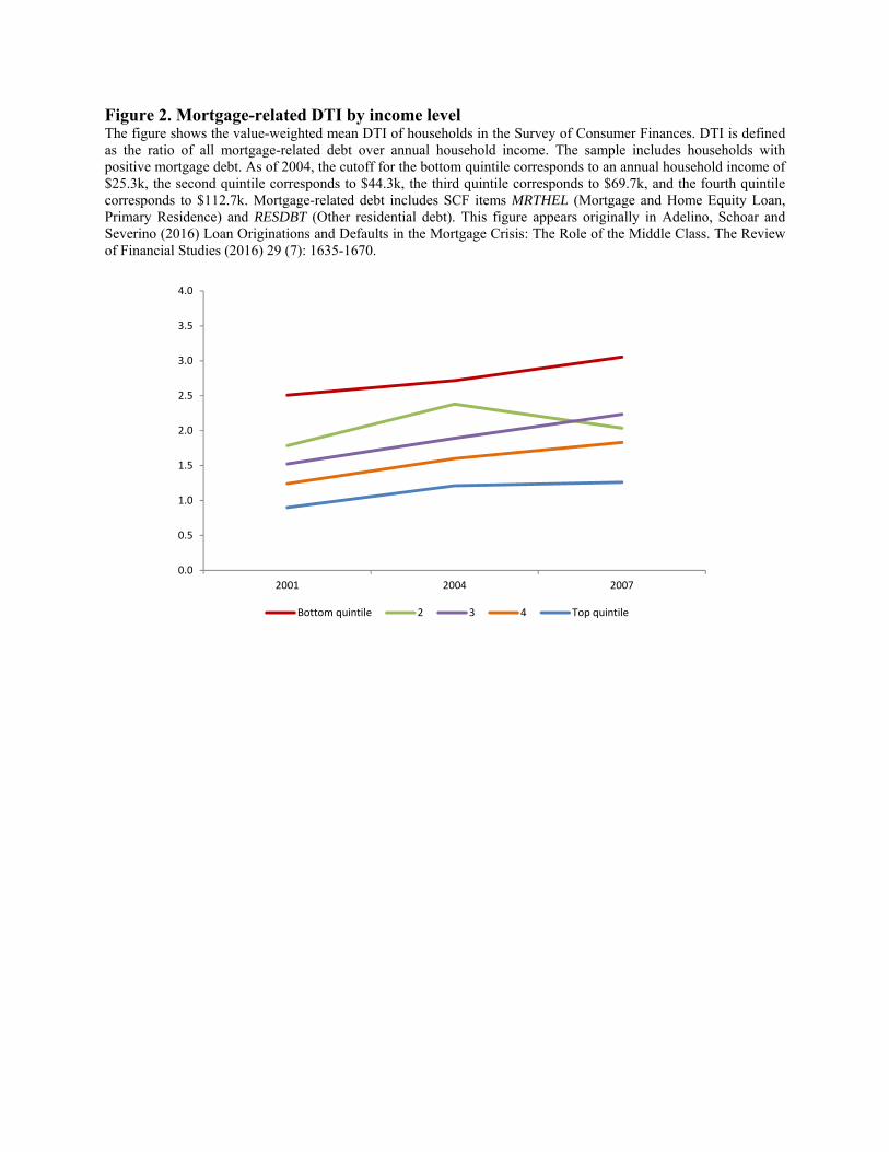
Figure 2. Mortgage-related DTI by income level The figure shows the value-weighted mean DTI of households in the Survey of Consumer Finances. DTI is defined as the ratio of all mortgage-related debt over annual household income. The sample includes households with positive mortgage debt. As of 2004, the cutoff for the bottom quintile corresponds to an annual household income of $25.3k, the second quintile corresponds to $44.3k, the third quintile corresponds to $69.7k, and the fourth quintile corresponds to $112.7k. Mortgage-related debt includes SCF items MRTHEL (Mortgage and Home Equity Loan, Primary Residence) and RESDBT (Other residential debt). This figure appears originally in Adelino, Schoar and Severino (2016) Loan Originations and Defaults in the Mortgage Crisis: The Role of the Middle Class. The Review of Financial Studies (2016) 29 (7): 1635-1670.
0.0
0.5
1.0
1.5
2.0
2.5
3.0
3.5
4.0
2001 2004 2007
Bottom quintile 2 3 4 Top quintile

Figure 3: Annual housing cost as a percentage of income (recent movers) Note: Figure shows the evolution of median housing costs by household income quintile. Data from the American Community Survey. Recent movers defined as those who bought a home within the last year. Housing costs in the ACS include mortgage payments and any other costs associated with owning a home (taxes, insurance, utilities, among others). Costs are shown as a percentage of household income. The same plots including the first quintile are in Figure A3. Panel A: Owners
Panel B: Renters
0
5
10
15
20
25
30
35
40
2001 2002 2003 2004 2005 2006 2007 2008 2009 2010 2011 2012 2013 2014 2015
Quintile 2 (second lowest) Q3 Q4 Quintile 5
0
5
10
15
20
25
30
35
40
2001 2002 2003 2004 2005 2006 2007 2008 2009 2010 2011 2012 2013 2014 2015
Quintile 2 (second lowest) Q3 Q4 Quintile 5

Panel C: Difference between the cost of owning and renting
‐8
‐6
‐4
‐2
0
2
4
6
8
2001 2002 2003 2004 2005 2006 2007 2008 2009 2010 2011 2012 2013 2014 2015
Quintile 2 (second lowest) Q3 Q4 Quintile 5

Figure 4: Change in housing cost as a percentage of income, recent movers, owners only Note: Figure shows the change in median housing costs by household income quintile. Data from the American Community Survey. Recent movers defined as those who bought a home within the last year. Housing costs in the ACS include mortgage payments and any other costs associated with owning a home (taxes, insurance, utilities, among others). Costs are shown as a percentage of household income. Panel A: “Boom” areas (above median state HPA)
Panel B: “Non-Boom” areas (below median state HPA)
‐6
‐4
‐2
0
2
4
6
8
10
2001 2002 2003 2004 2005 2006 2007 2008 2009 2010 2011 2012 2013 2014 2015
Quintile 2 (second lowest) Q3 Q4 Quintile 5
‐6
‐4
‐2
0
2
4
6
8
10
2001 2002 2003 2004 2005 2006 2007 2008 2009 2010 2011 2012 2013 2014 2015
Quintile 2 (second lowest) Q3 Q4 Quintile 5

Figure 5: House value-to-income (recent movers) Note: Figure shows the change in median value of homes as a share of household income by income quintile. Data from the American Community Survey. Recent movers defined as those who bought a home within the last year. Income quintiles 2-5 shown. Panel A: All states
Panel B: “Boom” areas (above median state HPA)
0
1
2
3
4
5
6
7
2001 2002 2003 2004 2005 2006 2007 2008 2009 2010 2011 2012 2013 2014 2015
Quintile 2 (second lowest) Q3 Q4 Quintile 5
0
1
2
3
4
5
6
7
2001 2002 2003 2004 2005 2006 2007 2008 2009 2010 2011 2012 2013 2014 2015
Quintile 2 (second lowest) Q3 Q4 Quintile 5

Figure 6: Cumulative change in homeownership rate Note: Figure shows the share of homeowners within each household income quintile in the American Community Survey 1-year public use microdata sample. Homeownership rate is calculated as the share of owner-occupied homes over the total number of occupied homes. House price appreciation is measured between 2001 and 2006. Panel A: All states
Panel B: “Boom” areas (above median state HPA)
‐0.08
‐0.06
‐0.04
‐0.02
0
0.02
0.04
0.06
0.08
2001 2002 2003 2004 2005 2006 2007 2008 2009 2010 2011 2012 2013 2014 2015
Quintile 1 (lowest) Q2 Q3 Q4 Quintile 5
‐0.08
‐0.06
‐0.04
‐0.02
0
0.02
0.04
0.06
0.08
2001 2002 2003 2004 2005 2006 2007 2008 2009 2010 2011 2012 2013 2014 2015
Quintile 1 (lowest) Q2 Q3 Q4 Quintile 5

Panel C: Sand states (AZ, CA, FL, NV)
‐0.08
‐0.06
‐0.04
‐0.02
0
0.02
0.04
0.06
0.08
2001 2002 2003 2004 2005 2006 2007 2008 2009 2010 2011 2012 2013 2014 2015
Quintile 1 (lowest) Q2 Q3 Q4 Quintile 5

Figure 7: Change in homeownership rate 1980-2015 Note: Homeownership rate is calculated as the share of owner-occupied homes over the total number of occupied homes. Data comes from the Decennial Census for 1980, 1990 and 2000, and from the American Community Survey 5-year public use microdata sample for 2005-2015. Panel A: All households
Panel B: Change in homeownership rate by income level
‐0.05
‐0.04
‐0.03
‐0.02
‐0.01
0.00
0.01
0.02
0.03
0.04
0.05
1980‐1990 1990‐2000 2000‐2005 2005‐2010 2010‐2015
‐0.05
‐0.04
‐0.03
‐0.02
‐0.01
0
0.01
0.02
0.03
0.04
0.05
1980‐1990 1990‐2000 2000‐2005 2005‐2010 2010‐2015
Quintile 1 (lowest) Q2 Q3 Q4 Quintile 5

Figure 8: Share of households moving in the last year (owners only) Note: Shares within each household income quintile. Data from the American Community Survey. Panel A: All states
Panel B: “Boom” areas (above median state HPA)
0
0.02
0.04
0.06
0.08
0.1
2001 2002 2003 2004 2005 2006 2007 2008 2009 2010 2011 2012 2013 2014 2015
Quintile 1 (lowest) Q2 Q3 Q4 Quintile 5
0
0.02
0.04
0.06
0.08
0.1
2001 2002 2003 2004 2005 2006 2007 2008 2009 2010 2011 2012 2013 2014 2015
Quintile 1 (lowest) Q2 Q3 Q4 Quintile 5

Figure 9: Combined loan-to-value (CLTV) for home purchase by year Data comes from Corelogic (formerly Dataquick). Sample includes all transactions with positive combined loan-to-value. Combined loan-to-value is computed as the sum of first, second and third liens taken up to 6 months after a home purchase transaction. Panel A: All transactions
Panel B: Median combined loan-to-value (CLTV) by level of house prices

Figure 10: Combined loan-to-value (CLTV), boom and non-boom states Data comes from Corelogic (formerly Dataquick). Sample includes all transactions with positive combined loan-to-value. Combined loan-to-value is computed as the sum of first, second and third liens taken up to 6 months after a home purchase transaction. Boom states are those with above-median house price appreciation. Panel A: “Boom” areas (above median state HPA)
Panel B “Non-Boom” areas (above median state HPA)

Figure 11: Mortgage delinquency Note: Panel A shows the fraction of total dollar volume of delinquent purchase mortgages by cohort, split by ZIP code income quintile. A mortgage is defined as being delinquent if payments become more than ninety days past due (i.e., 90 days, 120 days, or more in foreclosure or REO) at any point during the three years after origination. Data are from the 5% sample of the LPS (formerly McDash) data set. We use household income from the IRS as of 2002 (i.e., in all panels ZIP codes are fixed as of 2002, and cutoffs are the same as those given in Figure 1). Panel B shows fraction of total dollar volume of delinquent purchase mortgages by cohort, split by credit scores. A FICO score of 660 corresponds to a widely used cutoff for subprime borrowers, and 720 is close to the median FICO score of borrowers in the data. This figure appears originally in Adelino, Schoar and Severino (2016) Loan Originations and Defaults in the Mortgage Crisis: The Role of the Middle Class. The Review of Financial Studies (2016) 29 (7): 1635-1670. Panel A. IRS 2002 income quintile
Panel B. FICO Score
22 22 19 21
23 2121 19
2218
21 20
21
23 23 24
1216 16 17
0
10
20
30
40
50
60
70
80
90
100
Bottom quintile 2 3 4 Top quintile
7163
4739
20
25
34
38
9 1218
23
0
10
20
30
40
50
60
70
80
90
100
2003 2004 2005 2006
FICO < 660 660 ≤ FICO < 720 FICO ≥ 720
Panel C. Delinquency by House Price Growth
2003 mortgage cohort
2006 mortgage cohort
26
15 1317
8
77
7
0
10
20
30
40
50
60
Low HP Growth02‐06
Q2 Q3 High HP Growth02‐06
FICO < 660 FICO ≥ 660
6 6 7
204 7
14
37
0
10
20
30
40
50
60
Low HP Growth02‐06
Q2 Q3 High HP Growth02‐06
FICO < 660 FICO ≥ 660

Figure 12: Stability of employment status (recent movers) Note: Figure shows the median share of households who moved in the last twelve months in each income quintile who have stable employment. Stable employment is defined as having at least one full-time employed household member. Data from the American Community Survey. Panel A: Share of recent movers with “stable” employment
Panel B: Change in share of recent movers with “stable” employment
0
0.1
0.2
0.3
0.4
0.5
0.6
0.7
2001 2002 2003 2004 2005 2006 2007 2008 2009 2010 2011 2012 2013 2014
Quintile 1 (lowest) Q2 Q3 Q4 Quintile 5
‐0.05
‐0.04
‐0.03
‐0.02
‐0.01
0
0.01
0.02
0.03
0.04
0.05
2001 2002 2003 2004 2005 2006 2007 2008 2009 2010 2011 2012 2013 2014
Quintile 1 (lowest) Q2 Q3 Q4 Quintile 5

Table 1: Summary statistics Note: Data is from the 2000 Census, the American Community Survey. Panel A, shows the income median per year in 2000 dollars in the first row (real income) and then nominal income upper bound for each income quintile. Panel B, shows the percentage of homeowners per year and income quintile. Panel C, show the percentage of homeowners than moved within the last twelve months per year and income quintile. Panel D, shows the housing cost as a percentage of income shown for homeowners who moved within the last year.
2000 2005 2010 2015Income (median, 2000 dollars) 41,900 40,122 39,385 40,161
Upper bound of each quintile:Quintile 1 (lowest income) 18,000 19,000 20,200 22,900Quintile 2 33,300 36,000 39,000 43,400Quintile 3 51,400 56,800 61,900 70,000Quintile 4 80,000 90,000 99,800 112,250
Homeowner (%) 66.2 67.5 65.3 63.1Quintile 1 (lowest income) 43.1 42.5 39.2 38.8Quintile 2 56.5 57.3 55.4 53.1Quintile 3 67.0 68.6 66.6 64.0Quintile 4 77.7 80.0 77.8 75.0Quintile 5 (highest income) 86.9 89.6 87.6 85.1
Percent Movers (over last 12 months, %)) 7.9 8.2 4.9 5.8Quintile 1 (lowest income) 6.4 6.6 4.4 4.8Quintile 2 7.8 7.6 4.6 5.2Quintile 3 8.4 9.0 5.3 6.0Quintile 4 8.9 8.7 5.2 6.2Quintile 5 (highest income) 7.7 8.3 4.7 6.2
Housing cost / Income (movers, %) 26.2 31.0 28.1 24.9Quintile 1 (lowest income) 52.3 63.9 60.8 59.4Quintile 2 32.4 39.5 35.1 32.2Quintile 3 25.7 31.1 27.4 23.9Quintile 4 21.0 25.3 22.3 20.0Quintile 5 (highest income) 17.1 19.7 17.5 15.0
Number of Observations 5,663,214 1,245,246 1,397,789 1,496,678

Table 2. Summary statistics by house price growth and subprime origination This table shows descriptive statistics by ZIP code split by quartiles of the proportion of purchase mortgages originated by subprime lenders (subprime lenders are defined by the HUD subprime lender list), as well as quartiles of house price growth between 2002 and 2006. Panel A, shows the number of zipcodes associated to each suprime/house price growth cell. Panel B, shows the fraction of subprime lenders with respect to all mortgages originated in 2006 in that particular cell. Panel C , shows the mortgage growth between 2002 and 2006 within each cell. Data is from HMDA and the sample includes ZIP codes with non-missing house price data from Zillow.
Panel A. Distribution of ZIP codes
Panel B. Fraction of total purchase mortgages originated by subprime lenders (as of 2006)
Panel C. Annualized growth in total purchase mortgage origination
Low HP growth 2 3 High HP growthLow subprime 535 651 646 338
2 639 610 522 3983 583 604 484 483
High subprime 435 351 539 801
Low HP growth 2 3 High HP growthLow subprime 3.8% 3.8% 3.8% 4.3%
2 8.0% 8.0% 8.1% 8.0%3 12.6% 12.4% 12.5% 12.7%
High subprime 22.8% 22.1% 23.3% 26.1%
Low HP growth 2 3 High HP growthLow subprime 7.1% 11.3% 10.2% 14.8%
2 7.5% 11.0% 12.1% 15.3%3 7.2% 12.1% 13.2% 17.9%
High subprime 8.1% 13.6% 15.9% 18.2%

Table 3: Housing cost as a percentage of income (movers only) Note: Data from the American Community Survey. Boom areas defined as states with above median growth in house prices. Weighted OLS regressions using ACS weights.
All Boom Non-boomYear 2.5186*** 3.1746*** 2.0464**
0.4910 0.4513 0.5614
Year2 -0.1635*** -0.2041*** -0.1343**0.0338 0.0322 0.0365
Quintile 2 x Year -0.1164 0.2980 -0.32800.1359 0.1624 0.3460
Quintile 2 x Year2 -0.0116 -0.0476** 0.00910.0090 0.0113 0.0211
Quintile 3 x Year -0.6143* -0.1687 -0.9643*0.2442 0.3375 0.3728
Quintile 3 x Year2 0.0200 -0.0120 0.04500.0167 0.0258 0.0234
Quintile 4 x Year -0.9986** -0.8833*** -1.1932*0.2460 0.1997 0.4325
Quintile 4 x Year2 0.0473** 0.0364* 0.0625*0.0154 0.0130 0.0258
Quintile 5 x Year -1.4978*** -1.6875*** -1.5685**0.3026 0.2285 0.4044
Quintile 5 x Year2 0.0805** 0.0894*** 0.0870**0.0192 0.0126 0.0255
Age + Children controls Y Y YQuintile dummies Y Y YState F.E. Y Y YNumber of Obs. 526,480 245,588 280,892
R2 0.4 0.38 0.42

Table 4: House value a percentage of income (movers only) Note: Data from the American Community Survey. Boom areas defined as states with above median growth in house prices. Weighted OLS regressions using ACS weights.
All Boom Non-boomYear 0.5740** 1.0866*** 0.3009*
0.1627 0.2019 0.1094
Year2 -0.0376** -0.0705*** -0.0198*0.0120 0.0153 0.0080
Quintile 2 x Year -0.0700 -0.2094* -0.04040.0493 0.0707 0.0485
Quintile 2 x Year2 0.0048 0.0130* 0.00330.0033 0.0052 0.0034
Quintile 3 x Year -0.2263** -0.4606*** -0.1642*0.0682 0.0879 0.0609
Quintile 3 x Year2 0.0139** 0.0283*** 0.01020.0042 0.0054 0.0048
Quintile 4 x Year -0.2821** -0.6103*** -0.1710*0.0858 0.1137 0.0653
Quintile 4 x Year2 0.0177** 0.0381*** 0.0108*0.0054 0.0073 0.0049
Quintile 5 x Year -0.3356* -0.7402*** -0.1898*0.1154 0.1532 0.0638
Quintile 5 x Year2 0.0211* 0.0468*** 0.0116*0.0070 0.0102 0.0048
Age + Children controls Y Y YQuintile dummies Y Y YState F.E. Y Y YNumber of Obs. 515,866 240,279 275,587
R2 0.25 0.25 0.23

Table 5: Homeownership rate by quintiles over time Note: Data from the American Community Survey. Boom areas defined as states with above median growth in house prices. Weighted OLS regressions using ACS weights. Figure A6 shows fitted values from the regression. Panel A: Pooled income quintiles
All Boom Non-boomYear -0.0019 0.0006 -0.0035
0.0020 0.0030 0.0020
Year2 -0.0001 -0.0002 0.00000.0001 0.0002 0.0001
Quintile 2 x Year 0.0062** 0.0029 0.0087***0.0016 0.0025 0.0018
Quintile 2 x Year2 -0.0004*** -0.0002 -0.0005***0.0001 0.0002 0.0001
Quintile 3 x Year 0.0113*** 0.0056 0.0157***0.0023 0.0033 0.0023
Quintile 3 x Year2 -0.0007*** -0.0004* -0.0010***0.0001 0.0002 0.0001
Quintile 4 x Year 0.0121*** 0.0065 0.0169***0.0025 0.0039 0.0026
Quintile 4 x Year2 -0.0008*** -0.0005* -0.0011***0.0001 0.0002 0.0001
Quintile 5 x Year 0.0109*** 0.0082* 0.0129***0.0022 0.0036 0.0019
Quintile 5 x Year2 -0.0007*** -0.0006* -0.0008***0.0001 0.0002 0.0001
Age + Children controls Y Y YQuintile dummies Y Y YState F.E. Y Y YNumber of Obs. 13,803,090 6,558,031 7,245,059
R2 0.19 0.19 0.19

Panel B: Income quintiles formed within each state
All Boom Non-boomYear -0.0014 0.0017 -0.0043
0.0022 0.0034 0.0021
Year2 -0.0001 -0.0003 0.00000.0001 0.0002 0.0001
Quintile 2 x Year 0.0059** 0.0051 0.0067**0.0017 0.0026 0.0020
Quintile 2 x Year2 -0.0004** -0.0003 -0.0004**0.0001 0.0002 0.0001
Quintile 3 x Year 0.0097** 0.0054 0.0136***0.0025 0.0040 0.0031
Quintile 3 x Year2 -0.0007*** -0.0004 -0.0009***0.0001 0.0002 0.0002
Quintile 4 x Year 0.0119*** 0.0075 0.0159***0.0027 0.0045 0.0030
Quintile 4 x Year2 -0.0008*** -0.0006* -0.0010***0.0001 0.0003 0.0002
Quintile 5 x Year 0.0107*** 0.0074 0.0137***0.0022 0.0042 0.0015
Quintile 5 x Year2 -0.0007*** -0.0006* -0.0008***0.0001 0.0003 0.0001
Age + Children controls Y Y YQuintile dummies Y Y YState F.E. Y Y YNumber of Obs. 13,803,090 6,558,031 7,245,059
R2 0.19 0.19 0.19

Appendix Figure A1. Mortgage approval rate by income This figure shows the fraction of purchase mortgages in the HMDA that are approved each year over the total number of purchase mortgages applications in HMDA split by income quintile. We use household income from the IRS as of 2002 (i.e., the ZIP codes in each bin are fixed over time). The cutoff for the bottom quintile corresponds to an average household income in the ZIP code as of 2002 of $34k, the second quintile corresponds to $40k, the third quintile corresponds to $48k, and the fourth quintile corresponds to $61k. Sample includes 8,619 ZIP codes described in the “Data and summary statistics” section.
0.00
0.10
0.20
0.30
0.40
0.50
0.60
0.70
0.80
0.90
1.00
2001 2002 2003 2004 2005 2006 2007 2008 2009 2010 2011 2012 2013 2014 2015
Q1 Q2 Q3 Q4 Q5

Figure A2. Mortgage origination by credit score This figure shows the fraction of total dollar volume of purchase mortgages in the LPS data split by FICO score. A FICO score of 660 corresponds to a widely used cutoff for subprime borrowers, and 720 is near the median FICO score of borrowers in the LPS data (the median is 721 in 2003, 716 in 2004, 718 in 2005, and 715 in 2006). The sample includes ZIP codes with nonmissing house price data from Zillow. This figure appears originally in Adelino, Schoar and Severino (2016) Loan Originations and Defaults in the Mortgage Crisis: The Role of the Middle Class. The Review of Financial Studies (2016) 29 (7): 1635-1670.
17 18 17 18
28 30 30 29
55 53 53 53
0
10
20
30
40
50
60
70
80
90
100
2003 2004 2005 2006
FICO < 660 660 ≤ FICO < 720 FICO ≥ 720

Figure A3: Distribution of annual housing cost as a percentage of income, recent movers
Note: Medians within each income quintile. Data from the American Community Survey. Recent movers defined as those who bought a home within the last two years. Income quintiles 1-5 shown. Panel A: Owners
Panel B: Renters
0
10
20
30
40
50
60
70
80
2001 2002 2003 2004 2005 2006 2007 2008 2009 2010 2011 2012 2013 2014 2015
Q1 Q2 Q3 Q4 Q5
0
10
20
30
40
50
60
70
80
2001 2002 2003 2004 2005 2006 2007 2008 2009 2010 2011 2012 2013 2014 2015
Q1 Q2 Q3 Q4 Q5

Panel C: Difference between the cost of owning and renting
‐25
‐20
‐15
‐10
‐5
0
5
10
2001 2002 2003 2004 2005 2006 2007 2008 2009 2010 2011 2012 2013 2014 2015
Q1 Q2 Q3 Q4 Q5

Figure A4: House Value-to-income Note: Owners only, recent movers. Medians for each variable. Data from the American Community Survey. Income quintiles 1-5 shown. Panel A: “Boom” areas (above median state HPA)
Panel B: Non-“boom” areas (below median state HPA)
0
2
4
6
8
10
12
2001 2002 2003 2004 2005 2006 2007 2008 2009 2010 2011 2012 2013 2014 2015
Q1 Q2 Q3 Q4 Q5
0
2
4
6
8
10
12
2001 2002 2003 2004 2005 2006 2007 2008 2009 2010 2011 2012 2013 2014 2015
Q1 Q2 Q3 Q4 Q5

Figure A5: Change in homeownership rate by income, alternative data sources Note: Share of homeowners within each income quintile for the AHS and CPS / HVS (Panels B through D). Data for CPS / HVS, Panels B and C is obtained from https://www.census.gov/housing/hvs/data/histtab17.xlsx and for Panel D from https://cps.ipums.org/cps/. Panel A: American Housing Survey (AHS)
Panel B: Community Population Survey / Housing Vacancy Survey (CPS / HVS)
‐0.08
‐0.06
‐0.04
‐0.02
0
0.02
0.04
0.06
0.08
2001 2003 2005 2007 2009 2011 2013
Q1 Q2 Q3 Q4 Q5
‐0.08
‐0.06
‐0.04
‐0.02
0
0.02
0.04
0.06
0.08
2001 2002 2003 2004 2005 2006 2007 2008 2009 2010 2011 2012 2013 2014 2015
U.S. Above Median Below Median

Panel C: Community Population Survey / Housing Vacancy Survey (CPS / HVS) – Adjusted for 2010 change in methodology Until 2010, householders not responding to the “income” question in the CPS / HVS (Panel B) were excluded from the homeownership calculations by family income level (this does not affect the overall U.S. data). According to Census, “this change results in an increase in the homeownership rate of 1.5 percentage points for those at or below the median family income and an increase of 0.3 percentage points for those above the median family income level for the third quarter 2016.” This jump is visible in 2010 in Panel B and it may help explain the smaller overall post-crisis drop for below-median households in Panel B relative to the ACS and the AHS figures (as the cumulative change shown for 2010-2015 is affected by this change). Here we adjust the post-2010 data using the change of 0.3 and 1.5 percentage points reported by the Census to construct an “adjusted” 2000-2015 series.
Panel D: Community Population Survey / Housing Vacancy Survey (CPS / HVS) – by quintile
‐0.08
‐0.06
‐0.04
‐0.02
0
0.02
0.04
0.06
0.08
2001 2002 2003 2004 2005 2006 2007 2008 2009 2010 2011 2012 2013 2014 2015
U.S. Above Median Below Median Above Median ‐ Adj. Below Median ‐ Adj.
‐0.08
‐0.06
‐0.04
‐0.02
0
0.02
0.04
0.06
0.08
2001 2002 2003 2004 2005 2006 2007 2008 2009 2010 2011 2012 2013 2014 2015
Q1 Q2 Q3 Q4 Q5

Figure A6: Fitted values from Table 5 – homeownership by quintile and year Note: Data from the American Community Survey. Coefficient from weighted OLS regressions using ACS weights, in Table 5.
‐0.06
‐0.05
‐0.04
‐0.03
‐0.02
‐0.01
0
0.01
0.02
0.03
0.04
2001 2002 2003 2004 2005 2006 2007 2008 2009 2010 2011 2012 2013 2014
Q1 Q2 Q3 Q4 Q5

Figure A7: Evolution of aggregate combined loan-to-value from Flow of Funds data Data comes from Financial Accounts of the United States - Z.1.20 The blue line represent one minus the reported owner’s equity as a percentage of household real estate assets. The orange line shows the fraction of household mortgage liabilities over household real estate assets. The time period is from 1996 to 2012 with a quarterly frequency.
20 Data from https://www.federalreserve.gov/releases/Z1/current/default.htm
0
0.1
0.2
0.3
0.4
0.5
0.6
0.7
Flow of Fund Household LTV ‐ 1996‐2012
Households; (1‐ owner's equity as a percentage of household real estate)
Households; mortgage liability as a percentage of household real estate

Table A1: Comparison of ACS 1-year and ACS 5-year estimates of homeownership rate, 2005-2014 Note: The table below shows homeownership rates across income quintiles computed using the ACS 1-year public use microdata sample (Panel A) and the ACS 5-year sample (Panel B). Panel C shows the difference between the two. Panel A uses the same data as Figures 3-7. 5-year estimates are not available pre-2005. For a detailed discussion of the differences between the samples, and the advantages and disadvantages of using each dataset, please refer to http://www.census.gov/programs-surveys/acs/guidance/estimates.html. Panel A: ACS 1-year
Panel B: ACS 5-year
Panel C: ACS 5 year - ACS 1-year
2005 2006 2007 2008 2009 2010 2011 2012 2013 2014
Q1 41.7 42.0 41.6 41.2 39.9 39.3 38.7 38.4 38.4 38.3
Q2 56.6 57.2 57.0 56.2 55.7 55.6 55.1 54.2 53.6 53.3
Q3 67.6 68.5 68.3 68.3 68.0 66.8 65.8 65.7 64.6 64.2
Q4 79.4 79.6 79.8 78.8 78.4 77.9 77.0 76.0 75.6 74.9
Q5 89.2 89.3 89.3 88.8 88.3 87.7 87.2 86.3 85.7 85.3
2005 2006 2007 2008 2009 2010 2011 2012 2013 2014
Q1 42.5 42.1 41.6 41.2 40.1 39.2 38.6 38.5 38.5 38.4
Q2 57.3 57.2 57.1 56.1 55.7 55.4 54.9 54.1 53.7 53.3
Q3 68.6 68.6 68.3 68.2 68.1 66.6 65.7 65.6 64.6 64.2
Q4 80.0 79.7 80.1 78.8 78.6 77.8 76.9 76.0 75.6 74.9
Q5 89.6 89.2 89.3 88.7 88.3 87.6 87.2 86.3 85.7 85.3
2005 2006 2007 2008 2009 2010 2011 2012 2013 2014
Q1 0.8 0.1 0.0 0.0 0.2 -0.1 -0.1 0.1 0.1 0.1
Q2 0.7 0.1 0.1 -0.1 0.1 -0.2 -0.2 0.0 0.1 0.0
Q3 1.0 0.1 0.0 -0.1 0.0 -0.2 -0.1 0.0 0.0 0.0
Q4 0.5 0.0 0.2 -0.1 0.2 -0.1 -0.1 0.0 0.0 0.0
Q5 0.4 0.0 0.0 -0.1 0.0 0.0 -0.1 0.0 0.0 0.0