Dutch Old Master Floral - Kingslan
17
Dutch Old Master Floral Kingslan & Gibilisco www.kingslan.com
Transcript of Dutch Old Master Floral - Kingslan

Dutch Old Master Floral
Kingslan & Gibiliscowww.kingslan.com

Kingslan & Gibilisco Publications © 2002-2011Dutch Old Master Floral - page 2
Permission is granted to teach this project within a 100 mile radius of teacher’s home studio.Written permission is required beyond this point. Permission is granted to reproduce writtenmaterial verbatim for teaching purposes only (one copy per student) and may not be resold, normay it be rewritten into a different format.
Develop objects in the following order:
Form is the first consideration based on righthand light source.Decorations, characteristics, markings
Harmony adjustments - glazes, accents, tints
Dimensional adjustments - Values, hues, andintensities
Texture.
Shines and Shadows are last.
Dutch Old Master Floral
PreparationThe masonite panel is prepared withDecoArt Acrylic Slate or DoveGray. Apply 2-3 coats (using a rollerbrush) then sand lightly with apaper bag.
Brushes and PaintKingslan & Gibilisco902 S 107 Ave #102Omaha NE 68114402.397.0298http://[email protected]
Transfer InformationTrace the line drawing in using a4H or mechanical pencil. (A 4Hpencil is a hard leaded penciltherefore it will not smear or needsharpening as often as a standardone.) Prove the container forsymmetry. Use the line the foldline created as a guide. Tape thetracing on two or three sides, thenslip the graphite transfer paperbetween. All elements in thepainting will be transferred.
A Few Gentle Reminders:
Review Focus on Realistic Roses Book
Don’t rush. Build the foundation of the painting welland the final development will be easier and moreeffective.
A color is neither right nor wrong in itself. It is howit is used that determines if it is correct. Always testyour value within the context of your painting.Palette right does not mean picture perfect. Onlyjudge in relationship to the painting. Color is apartnership with its surroundings.
Conversion Chart
Packet Code Archival Winsor & Newton Genesis
W Soft Titanium White Titanium White WhiteY Cadmium Yellow Mid Cadmium Yellow Pale Genesis YellowR Cadmium Scarlet Bright Red Genesis RedRV or QC Permanent Alizarine Alizarin Crimson Quinacridone CrimsonUB Ultramarine Blue Ultramarine Blue Ultramarine BlueBU Burnt Umber + R Burnt Umber Burnt UmberRS Raw Sienna Raw Sienna Raw SiennaBlk Mars Black Ivory Black Carbon or Mars BlackPB Cerulean Blue Cerulean Blue Pthalo Blue 5NY Naples Yellow Naples Yellow YO + TW + YOG Olive Green Olive Green YO + UB + BUBC or PM Purple Madder Alizarin Purple Madder RV + BlkPG Pthalo Yellow Green Cadmium Green Pale UB + Y + W

Kingslan & Gibilisco Publications © 2002-2011Dutch Old Master Floral - page 3
Permission is granted to teach this project within a 100 mile radius of teacher’s home studio.Written permission is required beyond this point. Permission is granted to reproduce writtenmaterial verbatim for teaching purposes only (one copy per student) and may not be resold, normay it be rewritten into a different format.
Palette Set up and mixingThe original piece was painted with Genesis Heat Set Oils. There is a conversionchart included if you care to use traditional oils. See the enclosed Colour MixingGuide for the mixes for each object.
TW: Titanium WhiteY: Genesis YellowDY: Diarylide Yellow (optional)R: Genesis RedO: Genesis Orange 04 (or mix R + Y)RV: Quinacridone CrimsonUB: Ultramarine BlueRS: Raw SiennaBU: Burnt UmberBlk: Mars or Carbon BlackPB: Pthalo Blue 05
Violet: UltramarineBlue + Quinacradone Crimson
Set of Grays: Values of Gray 02-08
How to use the codes on the value placement guidesEach object is placed using 1, 2 or 3 steps. The first step is the form, the secondis colour and third plus are embellishments. Refer to codes on page 5.
The code for actual colour is listed on the Conversion Chart on page 2.
Value Placement GuideThese guides are illustrated throughout this lessons and will show how to createthe form of each object. The light source is from the upper right, slightly in front.The light areas will be on the right and above the center line. The dark areas willbe on the left and become gradually darker as the object recedes from the light.
Mixing FormulasFormulae for mixing is given throughout this lesson. You will find that the mixesfor the hue are given first. This is followed by a colour that will raise or lower thevalue. Once the value and colour are mixed, the next addition usually is meant toeither brighten or dull the colour. Finally, a colour may need to be mixed into thepile that will adjust the temperature.
Vase and PlumsMix the vase and plum value scale (see value notes page). Develop accordingto the value placement guide.

Kingslan & Gibilisco Publications © 2002-2011Dutch Old Master Floral - page 4
Permission is granted to teach this project within a 100 mile radius of teacher’s home studio.Written permission is required beyond this point. Permission is granted to reproduce writtenmaterial verbatim for teaching purposes only (one copy per student) and may not be resold, normay it be rewritten into a different format.
CamelliaMix the camellia value scale (see value notes page). Develop according to thevalue placement guide.
Hibiscus and budMix the hibiscus value scale (see value notes page). Develop according to thevalue placement guide.
Iris and budMix the iris value scale (see value notes page). Develop according to the valueplacement guide.
TulipsMix the tulilp valuescale (see valuenotes page). Developaccording to thevalue placementguide.

Kingslan & Gibilisco Publications © 2002-2011Dutch Old Master Floral - page 5
Permission is granted to teach this project within a 100 mile radius of teacher’s home studio.Written permission is required beyond this point. Permission is granted to reproduce writtenmaterial verbatim for teaching purposes only (one copy per student) and may not be resold, normay it be rewritten into a different format.
CarnationMix the carnation value scale (see value notes page). Develop according to thevalue placement guide.
LeavesLeaves are the support system for the fruit in life as well as in a still life. Artisticlicense may be taken when coloring leaves as well as designing leaves. Emphasisis given to flowers through contrast in the leaves. Place cool tones close to warmtones; place light values close to dark values. Recede leaves and minimize emphasisby parallel placement; i.e., cool next to cool, warm next to warm, dark next to dark.etc.
Use these mixtures in combination. No leaf should be entirely cool; add somewarm tones. No leaf should be entirely warm; add some cool tones. Advancing andimportant leaves will be more vibrant and will show a wider contrast range of values.Receding leaves will be duller and show a closer contrast range of values.
Temperature can create contrast. Use warm against warm, and cool against coolin order to recede into the background or connect with the neighboring flower. Usewarm against cool in order to pull forward, emphasize or contrast with theneighboring flower, area, or background. The veins, spots, holes, and interestingdetails may be added after the leaf is dry.
Basic Leaf ScaleMix a value scale of grey using black and white. The scale should range fromvery light to very dark. There should be at least 7 different values. Now add asmall amount of Y to each pile to shift the scale to the green side. The lowervalues should be quieter (duller in intensity) than the lighter piles.
Split the value scale into four equal piles. There should now be 28 piles ofpaint.
Warm Leaf ScaleTo one of the value scales of green, create a warm leaf value scale by addingYO to the lighter values and BU to the darker values. If any of the valuesbecome too grey, add Y to the pile.
Cool Leaf ScaleTo the third value scale of green, create a cool leaf value scale by adding UB toeach pile. If any of the values become too intense with the blue, neutralize withBU.
Red or Dull Leaf ScaleTo the final value scale, create rich browns by adding YO + Y to the lightervalues and RV + BU to the darker values. Add Y if any of the mixes become toodull.
Allium and White BlossomsThese small and airy flowers will add relief to all of the heavy, solid flowers.Each allium flower is developed individually according to its overall form. Forexample, if it is a bud then develop it as a sphere. The overall form of the alliumis a sphere so the flowers in the upper right must be overall lighter in valuethan the flowers in the crescent area of the sphere.
Branches and stemsUse the brown/warm value scale from the leaf value scale

Kingslan & Gibilisco Publications © 2002-2011Dutch Old Master Floral - page 6
Permission is granted to teach this project within a 100 mile radius of teacher’s home studio.Written permission is required beyond this point. Permission is granted to reproduce writtenmaterial verbatim for teaching purposes only (one copy per student) and may not be resold, normay it be rewritten into a different format.
Add side and center veins with dark green. Add highlight inthe center of the veins where they cross over the light area ofthe leaf.
Add tints and accents
Initial value placement of a standard leaf (see page 2 forcode explanation)
Increase lights and darks
Example of how to paint leaves

Kingslan & Gibilisco Publications © 2002-2011Dutch Old Master Floral - page 7
Permission is granted to teach this project within a 100 mile radius of teacher’s home studio.Written permission is required beyond this point. Permission is granted to reproduce writtenmaterial verbatim for teaching purposes only (one copy per student) and may not be resold, normay it be rewritten into a different format.
Stage FourWhen the first stage objects are dry, begin the this stage.
Streaking of TulipsMoisten the area to be streaked with a film of RS. Initially the streaks willappear diffused. The streaks become progressively more defined. The streaksbegin on the outside edge and are triangular in shape. There are a few that“stagger” and create a series of dots and dashes. The streak should be darkeston the outside edge. Follow the form or growth direction of the petal. This willenhance the form and flow of the petal. Strive for variety in terms of value,length, width, shape and placement. Avoid boredom!
Streak mixes: Use the hibiscus value scale or QC
Flower CentersCamellia and Blossom CenterAdd a series of dull yellow pollen dots in the center of the flower. The lightestdots are added using warm white (TW + Y) and cool white (TW + UB). Thesedots are concentrated in the upper right of the center.
Tulip CenterThe open tulip has five stamens. Each is based in with warm black (Black +BU). Add a highlight with Cool White.
Hibiscus CenterThe hibiscus has one of the all time great flower centers. The filament is basedin with dark green The stigma is created using the light value of the hibiscusvalue scale. Add pollen dots using a variety of values of yellow.
Iris CenterThe stamen of the iris is created using Gray Value 5 plus a small amount of Y.The beard is added with dull yellows in a stippling motion.
Reflections into UrnReflect surrounding colour into the urn. This will give the illusion that the urnis shiny and reflective. This will also help the colour “travel” throughout thecomposition. First add the colour that matches the value of the area. Then adda lighter value within the first application of paint. The like value is added firstso that form of the container is retained. The lighter value is added for interestand realism. The lighter value is in the center of the darker value.
cross section of flower 1b: 1 filament, 2 anther, 3 stigma, 4style, 5 petal, 6 ovary, 7 sepal, 8 pedicel, 9 stamen, 10 pistil,11 perianth

Kingslan & Gibilisco Publications © 2002-2011Dutch Old Master Floral - page 8
Permission is granted to teach this project within a 100 mile radius of teacher’s home studio.Written permission is required beyond this point. Permission is granted to reproduce writtenmaterial verbatim for teaching purposes only (one copy per student) and may not be resold, normay it be rewritten into a different format.
FINAL STAGESAdjust With GlazesAll painting must be thoroughly dried before proceeding.
Accents, colours and values may be reinforced during this stage.Apply a trans-parent colour mix and into this add the opaque paint. The goal should be to allowsome of the transparent tone to show at the edges of the opaque paint for a softereffect.
Shines and ShadowsGlazing steps for Primary Shines1. Dry the painting thoroughly.2. Begin the shining process by applying the last value used. In most instances,this value is the high light tone from each object’s value scale.3. The shines should be transparent at the edges and gradually build to opaqueand heavy (impasto) in the middle. Therefore, begin the application with a dirtybrush only, then In order to disperse the paint, pull at the edges of the applicationwith a mop brush. Use a rotary motion for more even distribution.
Each dispersal should be shorter in area in order that the previous applicationglows at the edges. Additionally, the value of the shine should gradually lighten.TW + RS and/or Y) is generally the highest value. However, Cool white (TW + asmall amount of PB) may be also be used.7. If the shine appears to be a straight line, the gradation has been forced tooquickly. To be most effective, the shine should have a dull glow behind the impasto.
Glazing shadows and to reinforce darks1. Begin application where the value needs adjustment.2. Gradually blend the dark paint toward the edges of the value. If the value needsto be increased further, repeat this step. It may be necessary to add opaque paintif the glazel is not strong enough to adjust the tone(s).
Scumbling Shines & Colours1. Scumbling does not usually require an extender. A brush that is only “dirty” withpaint is pulled with only a skimming motion over the area. This technique may beused to repeat colour as well as secondary shines.2. Since scumbling and colour repetition is most frequently applied over a dark area,the value of the colour should be darker than that which is used in light areas.Should the colour appear chalky or milky when applied, the value is may be too light.3. Gradually build the scumbles from transparent at the edges of the applicationto a more opaque look in the middle of the scumble.
4. A fabric brush should be used to disperse the scumble after application with ablending brush. This will avoid burning the bristles of the blender. Reinforce theoriginal light sections on each object. Glaze the area with a small amount of yourglazing choice. Inside the original light section, place the last value used anddiffuse. This should not leave the original light section as “chalkiness” may occur.Strengthen highlights with WW (or Y yellow objects) as many times as necessaryto achieve desired effect. Each application of paint should stay contained withinthe previous application of paint. The shines/highlights proceed from transparentto opaque while becoming progressively smaller and brighter.
Note: The dark areas may also be strengthened. If the highlights do not appearstrong enough, attempt to lower the dark areas. This will make the lights appearlighter due to simultaneous contrast.
ShadowsAdd the shadows using thinned Black when all objects are dry. Shadows cast asmall amount of the complement of the area upon which they fall. If effective, adda small amount of the complement into the Black. Reference the overall photos forplacement.
Remember that shadows have the following characteristicsShadows:· are created only when there is light and the light is interrupted· are created only when there is a receiver for the shadow such as the table· are transparent· cast color when object is coloured glass or coloured liquid· follow the contour of the receiver· are in the shape of the object that creates the shadow· have at least three optical value changes· are darker closer to the object that creates the shadow· are relatively horizontal in nature so as to correspond with the shape of the tablebut curve when following the contour of a leaf, folded petals, etc. .
VarnishIf painted with traditional oils: Varnish with Krylon Satin #7002 or your favoritenon-water based varnish following manufacturer’s instructions included with theproduct. If Genesis is used: Varnish with Final Coat Varnish following themanufacturer’s instructions.

Kingslan & Gibilisco Publications © 2002-2011Dutch Old Master Floral - page 9
Permission is granted to teach this project within a 100 mile radius of teacher’s home studio.Written permission is required beyond this point. Permission is granted to reproduce writtenmaterial verbatim for teaching purposes only (one copy per student) and may not be resold, normay it be rewritten into a different format.
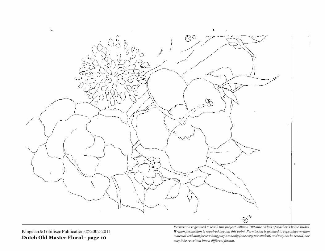
Kingslan & Gibilisco Publications © 2002-2011Dutch Old Master Floral - page 10
Permission is granted to teach this project within a 100 mile radius of teacher’s home studio.Written permission is required beyond this point. Permission is granted to reproduce writtenmaterial verbatim for teaching purposes only (one copy per student) and may not be resold, normay it be rewritten into a different format.

Kingslan & Gibilisco Publications © 2002-2011Dutch Old Master Floral - page 11
Permission is granted to teach this project within a 100 mile radius of teacher’s home studio.Written permission is required beyond this point. Permission is granted to reproduce writtenmaterial verbatim for teaching purposes only (one copy per student) and may not be resold, normay it be rewritten into a different format.
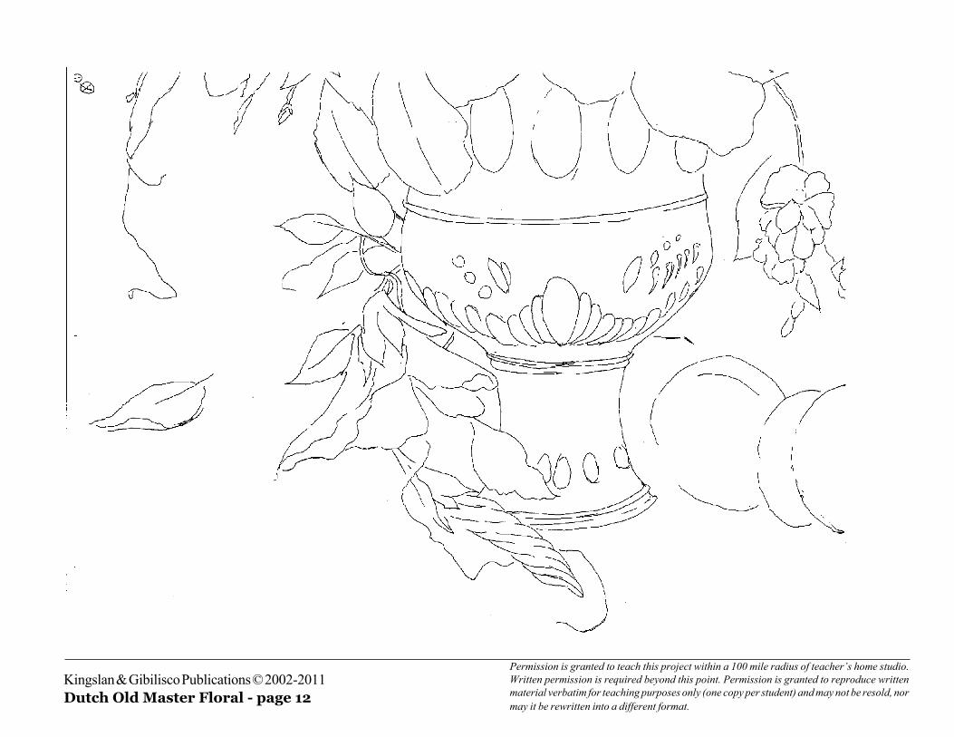
Kingslan & Gibilisco Publications © 2002-2011Dutch Old Master Floral - page 12
Permission is granted to teach this project within a 100 mile radius of teacher’s home studio.Written permission is required beyond this point. Permission is granted to reproduce writtenmaterial verbatim for teaching purposes only (one copy per student) and may not be resold, normay it be rewritten into a different format.

Kingslan & Gibilisco Publications © 2002-2011Dutch Old Master Floral - page 13
Permission is granted to teach this project within a 100 mile radius of teacher’s home studio.Written permission is required beyond this point. Permission is granted to reproduce writtenmaterial verbatim for teaching purposes only (one copy per student) and may not be resold, normay it be rewritten into a different format.

Kingslan & Gibilisco Publications © 2002-2011Dutch Old Master Floral - page 14
Permission is granted to teach this project within a 100 mile radius of teacher’s home studio.Written permission is required beyond this point. Permission is granted to reproduce writtenmaterial verbatim for teaching purposes only (one copy per student) and may not be resold, normay it be rewritten into a different format.

Kingslan & Gibilisco Publications © 2002-2011Dutch Old Master Floral - page 15
Permission is granted to teach this project within a 100 mile radius of teacher’s home studio.Written permission is required beyond this point. Permission is granted to reproduce writtenmaterial verbatim for teaching purposes only (one copy per student) and may not be resold, normay it be rewritten into a different format.
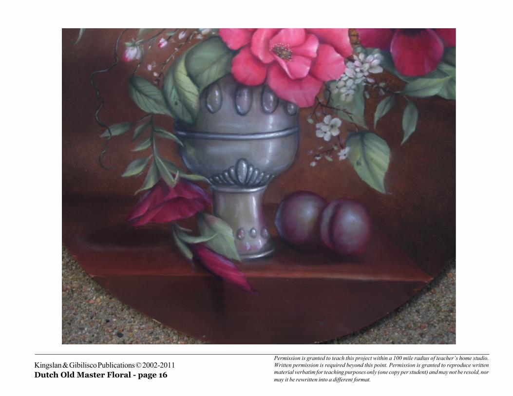
Kingslan & Gibilisco Publications © 2002-2011Dutch Old Master Floral - page 16
Permission is granted to teach this project within a 100 mile radius of teacher’s home studio.Written permission is required beyond this point. Permission is granted to reproduce writtenmaterial verbatim for teaching purposes only (one copy per student) and may not be resold, normay it be rewritten into a different format.

Kingslan & Gibilisco Publications © 2002-2011Dutch Old Master Floral - page 17
Permission is granted to teach this project within a 100 mile radius of teacher’s home studio.Written permission is required beyond this point. Permission is granted to reproduce writtenmaterial verbatim for teaching purposes only (one copy per student) and may not be resold, normay it be rewritten into a different format.