Drawing Graphs - THE SCIENCE EXCHANGE -...
43
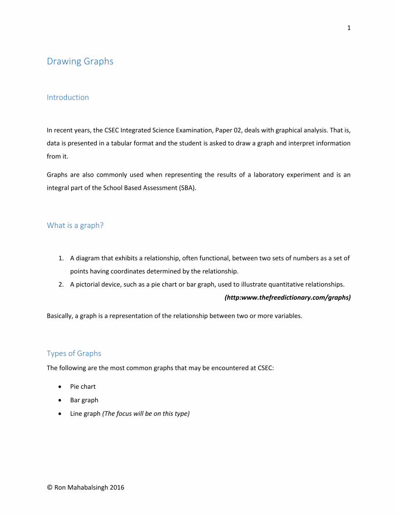
1 © Ron Mahabalsingh 2016 Drawing Graphs Introduction In recent years, the CSEC Integrated Science Examination, Paper 02, deals with graphical analysis. That is, data is presented in a tabular format and the student is asked to draw a graph and interpret information from it. Graphs are also commonly used when representing the results of a laboratory experiment and is an integral part of the School Based Assessment (SBA). What is a graph? 1. A diagram that exhibits a relationship, often functional, between two sets of numbers as a set of points having coordinates determined by the relationship. 2. A pictorial device, such as a pie chart or bar graph, used to illustrate quantitative relationships. (http:www.thefreedictionary.com/graphs) Basically, a graph is a representation of the relationship between two or more variables. Types of Graphs The following are the most common graphs that may be encountered at CSEC: Pie chart Bar graph Line graph (The focus will be on this type)
Transcript of Drawing Graphs - THE SCIENCE EXCHANGE -...
1
© Ron Mahabalsingh 2016
Drawing Graphs
Introduction
In recent years, the CSEC Integrated Science Examination, Paper 02, deals with graphical analysis. That is,
data is presented in a tabular format and the student is asked to draw a graph and interpret information
from it.
Graphs are also commonly used when representing the results of a laboratory experiment and is an
integral part of the School Based Assessment (SBA).
What is a graph?
1. A diagram that exhibits a relationship, often functional, between two sets of numbers as a set of
points having coordinates determined by the relationship.
2. A pictorial device, such as a pie chart or bar graph, used to illustrate quantitative relationships.
(http:www.thefreedictionary.com/graphs)
Basically, a graph is a representation of the relationship between two or more variables.
Types of Graphs
The following are the most common graphs that may be encountered at CSEC:
Pie chart
Bar graph
Line graph (The focus will be on this type)

2
© Ron Mahabalsingh 2016

3
© Ron Mahabalsingh 2016
Pie chart video: http://study.com/academy/lesson/what-is-a-pie-chart-definition-examples-quiz.html
Bar graph video: http://study.com/academy/lesson/bar-graph-definition-types-examples.html
Line chart video: http://study.com/academy/lesson/what-is-a-line-graph-definition-examples.html
Interpreting graphs: http://study.com/academy/lesson/reading-and-interpreting-line-graphs.html
Or visit http://intscience.weebly.com/cool-videos.html to download and watch these videos.
Parts of a graph

4
© Ron Mahabalsingh 2016
Getting started
1. Look at the data to be plotted.
Example:
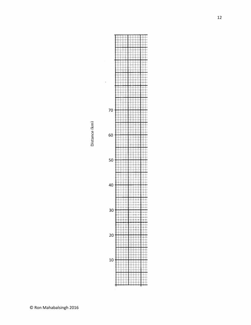
Table 1 showing the distance covered by the Stones family in a seven hour road trip.
Time (h) 1 2 3 7
Distance (km) 10 20 30 70
In the example above, Time and Distance are the two variables being compared.
2. Insert relevant information on the graph page, especially if it is being done in the SBA notebook.
Information such as Date, Lab # and Page. The Date and Lab # should be the SAME as the Date
and Lab # of the lab report.
3. The height (vertical distance) of the graph page is greater than the width (horizontal distance).
That is, the number of grids vertically is greater than the number of grids horizontally.
4. A 1cm grid consists of 5 subdivisions vertically and horizontally while a 2cm grid consists of
double that amount, that is, 10 subdivisions vertically and horizontally.

5
© Ron Mahabalsingh 2016
Date: Lab: Page:
Vertical
distance
Horizontal
distance
2 cm
grid
1 cm
grid

6
© Ron Mahabalsingh 2016
Axes
A graph consists of two axes. The horizontal line drawn at the bottom of the graph is called the x-axis.
The vertical line drawn at the leftmost part of the graph is called the y-axis. It should be noted that the x
and y axes must touch one another. In the case of CSEC Integrated Science, this is the only orientation
that the axes will take since negative values are never used. (Refer to “Parts of a graph”)
Which variable goes on the x-axis and which on the y-axis?
Variables
Variables can be classified as either Independent or Dependent.
The independent variable is put on the x-axis. It is the variable that does not change or depend on
another.
The dependent variable is placed on the y-axis. It is the variable that is being measured or is dependent
on the other.
In the case of our example, Time is the independent variable and Distance is the dependent variable
since Distance travelled cannot determine the Time, and likewise, Time keeps ticking regardless of how
far the family travelled.
Time (h) 1 2 3 7
Distance (km) 10 20 30 70
In most cases, the table of data lists the independent variable (x-axis) first!
Before drawing in the axes lines, determine which variable contains the smaller range.
Remember that a graph page contains different number of grids vertically and
horizontally.
x-axis
y-axis

7
© Ron Mahabalsingh 2016
Looking once again at the example, both orientations may be used since both have the same ranges,
that is, Time ranges from 1 to 7 whereas Distance ranges from 10 to 70, which is essentially 7 units each.
Only if the range on the x axis is bigger than the y axis, Orientation 2 should be used.
Orientation 1
x-axis contains the smaller range
Orientation 2
x-axis contains the larger range

8
© Ron Mahabalsingh 2016
Labels
After the axes have been drawn in (pencil and ruler), they should both be labelled. This is done by simply
stating the variable and its corresponding unit in brackets.
The axis label should be placed leaving room to insert the values for each variable.
Title
At this point where the axes have both been labelled, a title of the graph can be inserted at the top of
the graph page. The title is stated as follows:
Graph 1 showing Dependent variable against (or versus) the Independent variable.
Example: Graph 1 showing Distance (km) against Time (h)
Dis
tan
ce (
km)
Time (h)

9
© Ron Mahabalsingh 2016
Remember the title of the table in the example?
Table 1 showing the distance covered by the Stones family in a seven hour road trip.
Simply replace “Table 1” with “Graph 1” to get the title of your graph!
Example 2: Graph 1 showing distance covered by the Stones family during a seven hour road trip.
Graph 1 showing Distance covered by the Stones family during a seven hour road trip.

10
© Ron Mahabalsingh 2016
Scale
Values corresponding to each variable must now be inserted on each axis. This must be done at equal
intervals away from the starting point (usually zero) trying to occupy as much of the graph page as
possible.
Looking at the example:
Time (h) 1 2 3 7
Distance (km) 10 20 30 70
The x-axis ranges from 1 to 7 but some graph pages have up to 18 1cm intervals. Therefore, it would be
better to space markers at 2cm intervals to maximize space.
Next, insert values at each marker using a simple common multiple.
Note: A common mistake of students is to insert the exact values found in the table.
Time (h)
Markers at
2cm intervals

11
© Ron Mahabalsingh 2016
Similarly, insert the markers and values on the y-axis. The y-axis goes from 10 to 70 therefore a multiple
of 10 is used. Since the y-axis can have up to 23 1cm intervals, it would be better to space out values
every 2cm as well.
Time (h)
Time (h)
1 2 3 7
1 2 3 4 5 6 7
1h 3h? 1h 1h
12
© Ron Mahabalsingh 2016
Dis
tan
ce (
km)
10
20
30
40
50
60
70

13
© Ron Mahabalsingh 2016
It is not necessary to stop at the last value. Additional values may be inserted to make the graph look
complete or in case any extrapolation of data is required.
The Scales used on each axis must be inserted on the graph where it does not interfere with the graph
itself.
This should, therefore, be inserted AFTER the graph has been completed. (See “Plotting Coordinates”)
In General:
Scale: On the x axis ____cm represents ____ unit(s)
On the y axis ____cm represents ____unit(s)
Example:
Scale: On the x axis 2cm represents 1 unit
On the y axis 2cm represents 10 units
OR
Scale: On the x axis 2cm represents 1 hour
On the y axis 2cm represents 10 km
14
© Ron Mahabalsingh 2016
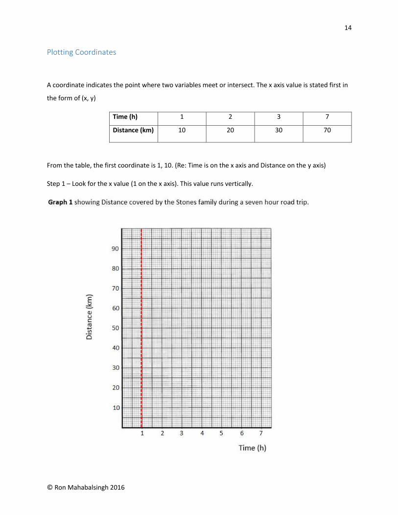
Plotting Coordinates
A coordinate indicates the point where two variables meet or intersect. The x axis value is stated first in
the form of (x, y)
Time (h) 1 2 3 7
Distance (km) 10 20 30 70
From the table, the first coordinate is 1, 10. (Re: Time is on the x axis and Distance on the y axis)
Step 1 – Look for the x value (1 on the x axis). This value runs vertically.

15
© Ron Mahabalsingh 2016
Step 2 – Look for the y value (10 on the y axis). This value runs horizontally.
The point where both lines intersect is the (x, y) coordinate. In this case, (1, 10).
The point is marked by either an “x” or an “ “. Note: the Red and Green dotted lines serve as a guide
and should not be drawn in the graph.
Point of
Intersection
(1, 10)

16
© Ron Mahabalsingh 2016

17
© Ron Mahabalsingh 2016
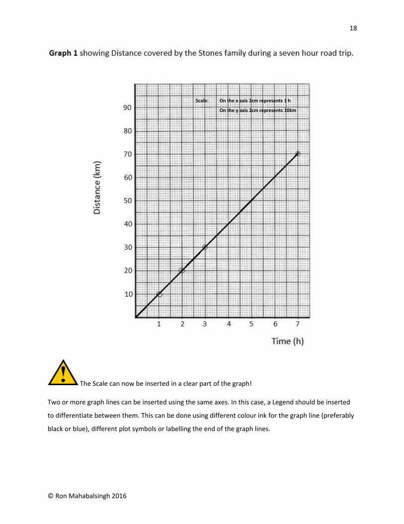
Step 3 – Continue plotting the points from the table.
2nd coordinate (2, 20)
3rd coordinate (3, 30) and so on.
Step 4 – Draw in the graph line.
This can be done by joining the coordinates using a ruler and pencil. In most cases, the graph line
expected is stated. For this example, the “best straight line” is drawn. (See “Graph Lines”)
18
© Ron Mahabalsingh 2016
The Scale can now be inserted in a clear part of the graph!
Two or more graph lines can be inserted using the same axes. In this case, a Legend should be inserted
to differentiate between them. This can be done using different colour ink for the graph line (preferably
black or blue), different plot symbols or labelling the end of the graph lines.
Scale: On the x axis 2cm represents 1 h
On the y axis 2cm represents 10km

19
© Ron Mahabalsingh 2016
Example:
Legend
BOYS
GIRLS
Interpretation of Scale – Subunits
Plotting of the coordinates in the example given is straight-forward, but, supposed there were values
that did not run along the labelled lines?
Time (h) 1 2 3 4.5 7
Distance (km) 10 20 30 45 70
Let’s look for the x value of 4.5.
There are 10 subdivisions between 4 and 5. Since 4.5 (or 4 ½) is half-way between 4 and 5, this value will
fall on the 1cm marker.
4.5
1cm

20
© Ron Mahabalsingh 2016
Another way of finding the value is to determine the value of each sub-division.
So, 4.5 is found on the 5th subdivision between 4 and 5.
Let’s look for the y axis value of 45.
Once again, 45 is mid-way between 40 and 50. That is, it lies on the 1cm mark between the upper value
(50) and the lower value (40).
1/10 = 0.1
Value of each subdivision
No. of
subdivisions
Difference between the
upper value (5) and the
lower value (4)
4 4.1 4.2 4.3 4.4 4.5 4.6 4.7 4.8 4.9 5
45
Time (h)

21
© Ron Mahabalsingh 2016
The value of each subdivision could also be determined as before.
10/10 = 1
Difference between the
upper value (50) and the
lower value (40) No. of
subdivisions
Value of each subdivision
50
49
48
47
46
45
44
43
42
41
40
Dis
tan
ce (
km)

22
© Ron Mahabalsingh 2016
The new coordinate on the graph appears as follows:
Let’s assume that the scale was altered so that 1cm represented 1 unit instead of 2cm representing 1
unit. This would mean that the number of subdivisions between 4 and 5 on the x axis would now be 5
instead of 10. Likewise, the number of subdivisions between 40 and 50 on the y axis would also be 5
instead of 10. This will change the value of each subdivision.

23
© Ron Mahabalsingh 2016
On the x axis:
On the y axis:
Note: There is NO 4.5 line on the x axis and NO 45 line on the y axis. So where do these
values go?
1/5 = 0.2
Difference between the
upper value (5) and the
lower value (4) No. of
subdivisions
Value of each subdivision
Value of each subdivision
No. of
subdivisions
Difference between the
upper value (50) and the
lower value (40)
10/5 = 2
4 4.2 4.4 4.6 4.8 5
Time (h)
Dis
tan
ce (
km)
50
48
46
44
42
40

24
© Ron Mahabalsingh 2016
Think about it!!!
What if 1cm represented 5 units. What would be the value of each subdivision?
What if 4cm represented 10 units. What would be the value of each subdivision?
What if 2cm represented 25 units. What would be the value of each subdivision?
Difference bet. upper & lower No. of subdivisions Value of each subdivision
5 5 1
10 20 0.5
25 10 2.5
Dis
tan
ce (
km)
Time (h)
(4.5, 45)

25
© Ron Mahabalsingh 2016
Reading the graph
Extrapolation of data
The graph line represents the relationship between two variables. It can be used to find unknown values
if the corresponding value is known. Meaning, if the x value is known, the y value can be found using the
graph line and vice versa. Note: The graph line does not have to be straight to do this.
Example:
What distance would the Stones family travelled in 3.7 hours? (3.7, y)
26
© Ron Mahabalsingh 2016
Find the value 3.7 on the x axis.
Draw a line along it until it touches the graph line. (red arrow)
At this point, draw a line horizontally until it touches the y axis. (green arrow)
From the example, the corresponding y value is 37km. In other words, the Stones family travelled 37km
in 3.7 hours. (3.7, 37)
Example 2:
How long would it take the Stones family to travel 62km? (x, 62)

27
© Ron Mahabalsingh 2016
Find the value 62 on the y axis.
Draw a line along it until it touches the graph line. (red arrow)
At this point, draw a line vertically until it touches the x axis. (green arrow)
From the example, the corresponding x value is 6.2 hours. In other words, it took the Stones family 6.2
hours to travel a distance of 62km. (6.2, 62)
There are times where values may NOT fall on the graph line. In these cases, the graph line could be
extended to fall within the range of the unknown value.
Unlike before when plotting coordinates, the lines drawn on the graph to find unknown values should
be left there. This shows the examiner where the values came from in your answer.
Reading the lines
Straight lines
The shape of the graph gives an overview of the relationship between two variables. Use the variables
on both axes to describe the shape of the line, read from left to right. Let’s look at a few relationships
commonly found. Keep in mind that there are different ways to say the same thing.
Proportional relationship – As the x value
increases, the y value increases by an equal
number of units.
Example: If x increases from 1 to 2 (doubles) by 1
unit, the y value increases from 10 to 20 (doubles)
by 1 unit.

28
© Ron Mahabalsingh 2016
Inversely Proportional relationship – As the x
value increases, the y value decreases by an equal
number of units.
Example: If x increases from 1 to 2 by 1 unit the y
value decreases from 30 to 20 by 1 unit.
Weak positive relationship – As the x value
increases, the y value increases by a smaller
amount.
Example: If x increases from 1 to 2 by 1 unit the y
value increases from 22 to 25 by less than 1 unit.
Strong positive relationship – As the x value
increases, the y value increases by a greater
amount.
Example: If x increases from 1 to 2 by 1 unit the y
value increases from 10 to 30 by greater than 1
unit.

29
© Ron Mahabalsingh 2016
Weak negative relationship – As the x value
decreases, the y value increases by a smaller
amount.
Example: If x decreases from 1 to 2 by 1 unit the y
value decreases from 11 to 9 by less than 1 unit.
Strong negative relationship – As the x value
decreases, the y value decreases by a greater
amount.
Example: If x decreases from 1 to 2 by 1 unit the y
value decreases from 40 to 15 by greater than 1
unit.
Constant / No change
As x increases, y remains the same

30
© Ron Mahabalsingh 2016
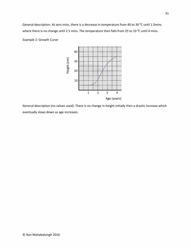
Curves
Different relationships on the same curve / lines
Use a combination of straight and curve line graphs to describe the graphs below. Remember to use the
variables to describe what happens to the graph line as one moves from left to right.
Example 1: Melting Curve
Constant / No change
As y increases, x remains the same
Gradual then
drastic increase
Drastic then
gradual increase
Gradual then
drastic decrease
Drastic then
gradual decrease
Time (mins)
Tem
p (
0 C)
31
© Ron Mahabalsingh 2016
General description: At zero mins, there is a decrease in temperature from 40 to 30 0C until 1.5mins
where there is no change until 2.5 mins. The temperature then falls from 25 to 10 0C until 4 mins.
Example 2: Growth Curve
General description (no values used): There is no change in height initially then a drastic increase which
eventually slows down as age increases.
Age (years)
Hei
ght
(cm
)

32
© Ron Mahabalsingh 2016
Other common graphs
What about graphs that only have ONE set of numerical values?
Example: Bar graph
Table 1 showing carbon dioxide emissions per capita
Country Australia US Canada Russia
CO2 emissions (metric tonnes)
18.6 18.0 16.3 12.0
Note: The alphabetical values are placed on the x axis at equal intervals apart. Sometimes names are
replaced by years. The same procedure applies by just spacing the data given at equal intervals apart
regardless of value.

33
© Ron Mahabalsingh 2016
Example 2: Pie Chart
Table 1 showing CO2 emissions in the United States of America
Agriculture Commercial and Residential
Electricity Industry Transportation
8% 11% 33% 20% 28%
https://geog397.wiki.otago.ac.nz/images/9/9f/Sources-overview.png
In CSEC Integrated Science Paper 02, there is the tendency to list TWO y axis values. However, the graph
usually involves plotting just one set of coordinates.
Example 3: CSEC June 2011
The x axis values are the years (again this is usually placed first on a table). The two y axis values are
China and USA.

34
© Ron Mahabalsingh 2016
If asked to plot a graph to represent the data for China, the information taken from the table would be
as follows:
Similarly, if asked to plot a graph to represent the data for USA, the x axis values remain the same but
the y axis shifts to the column with USA values:

35
© Ron Mahabalsingh 2016
Examples from CSEC Integrated Science
Try the following questions from CSEC on new graph pages. Ensure that all the elements are present.
Labelled Axes
Title
Scale
Legend
You can download these past papers in its entirety at The Science Exchange
http://intscience.weebly.com/downloads.html
June 2011
*Plot a graph to represent the data for China using the same axes and scale. USA has already been
plotted. (Remember to use different plotting symbols or ink. Similarly, graph lines can be labelled.)

36
© Ron Mahabalsingh 2016

37
© Ron Mahabalsingh 2016
June 2012

38
© Ron Mahabalsingh 2016

39
© Ron Mahabalsingh 2016
June 2013
*Plot a graph to represent the data for the tobacco smokers

40
© Ron Mahabalsingh 2016
June 2014

41
© Ron Mahabalsingh 2016
June 2015

42
© Ron Mahabalsingh 2016
June 2016
43
© Ron Mahabalsingh 2016
Conclusion
It is the hope of the author that the preceding information will not only assist students, but also teachers
when encountering graphs at all levels of Integrated Science. Recently, the Ministry of Education of
Trinidad and Tobago has reformulated the Science Curriculum to stress on the various aspects of
Integrated Science, that is, Biology, Chemistry and Physics. However, the fact that CSEC Integrated Science
still exists, the guidelines remain 100% relevant to the syllabus. Having dealt with students who have not
understood the concept of graphs for some time, I am confident that these guidelines will cut down on
the time spent drawing graphs in the classroom, increasing students’ self-efficacy and teacher motivation.
Feel free to visit my website at http://intscience.weebly.com/ and Facebook page “The Science
Experiment” for your comments / questions / suggestions.
Ron Mahabalsingh
July 19th 2016