
Double page spread research
6
Double Page Spread Research
-
Upload
connormorpurgo -
Category
Art & Photos
-
view
32 -
download
0
Transcript of Double page spread research

Double Page Spread Research

Vibe
The spread is almost half taken up by a landscape, panoramic style group of images of the same artist, the way in which the editor has made this suggests an aura of individuality and attracts the readers attention straight away
Particularly using the bright red on her dress contrasting with the grey background images is the first thing the reader will be attracted to, its bold and is a way of luring the reader in
The producer of the magazine has gone with a blue colour onto the artist’s name on this bold font, which is bigger than the main article to grab the readers eye, particularly making her name ‘Solange Knowles’ a contrasting blue to immediately tell the reader who this article is on effectively, and the audience expects this bit of information, complying with the codes and conventions

Q
Lady Gaga is featured wearing an outfit and posing in a way which would entice readers who find the female form attractive.
Note that the medium close up of Lady Gaga featured on the left hand side of the double paged spread takes up half the article, which shows that this photo has significance.
The vibrant enlarged red L which is featured behind the text links not only to Lady Gaga’s alas but also the colour anchors Q’s house style
The page contains no title only a full A4 photograph of the main focus of the article, and her name, displayed in the upper right hand corner. This intrigues the viewer as they must read on further if they’re to find out what exclusive information Q has on one of the most famous women of the moment

XXL
The magazine lets the artists arm intrude the next page and overlap the title, creating a unique and eye catching effect. This will attract readers because of its creativity and makes them believe the article should follow suit in being original and innovative.
The article from an overall perspective takes up a old-skool house-style, particularly displaying the one page filling image on the left in black and white along with the rest of the article, apart from the title “Trilla” which comes up in red. This makes the article look very vintage and therefore aesthetically pleasing, but the contrasting red sticks out on the page and catches the readers eye.
This capsule of text is a selling point on the page, because it is briefly describing what is to follow in the article, and does this using some exaggeration and makes it look at attractive as possible of course. It describes the artists firstly, bigging him up as such, then goes on to say he is “growing old gracefully”. To fans of the artist they will like this article as the editor compliments “Styles P”.
Kerrang
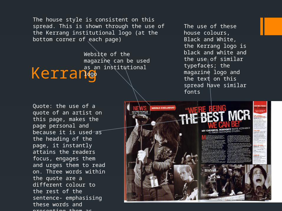
The house style is consistent on this spread. This is shown through the use of the Kerrang institutional logo (at the bottom corner of each page)
The use of these house colours, Black and White, the Kerrang logo is black and white and the use of similar typefaces; the magazine logo and the text on this spread have similar fonts
Quote: the use of a quote of an artist on this page, makes the page personal and because it is used as the heading of the page, it instantly attains the readers focus, engages them and urges them to read on. Three words within the quote are a different colour to the rest of the sentence- emphasising these words and presenting them as important.
Website of the magazine can be used as an institutional logo

MixMag
The magazine contains a page-filling image on the left of an artist. This is important to the spread because accompanying the page full of words essentially, there needs to be an image, otherwise it has a feel that it’s a dry, book or newspaper style text.
The artists name is bold in a pink font, contrasting the black to justify the information that it is his name. This therefore provides the reader with information they expect when starting on an article, fulfilling the expectations of the needs and gratifications theory
The editor feels the need to include a quote from the centrepiece of the article, the artist being interviewed as a sell point of the spread, its placed on the main image and before the reader will read the article, they will look at the quote to get a gist of what’s to come
The quote is also unique and powerful, bold and individual- it has to be to say to the reader that this interview is going to be intriguing in some sense.


