
Double page spread analysis
5
DOUBLE PAGE SPREAD ANALYSIS
-
Upload
mariadikova -
Category
Education
-
view
104 -
download
0
Transcript of Double page spread analysis

DOUBLE PAGE SPREAD ANALYSIS

This double spread is from the ‘Mayhem!’ magazine which is a free lifestyle mag focused on keeping us up-to-date with the latest trends, culture, fashion and celebs.

HEADING
The heading of this article is simply called ‘RITA ORA’ as it is an interview with and about the celebrity which reveals answers that come fresh from the person.
It is in red colour which gives us a hint about her wild and passionate personality. What is more, it is positioned in front of a white brick wall which serves as a source of contrast and reminds us of graffiti, which once again connotes her unique personality.

MAIN IMAGE
The main image in this article is of Rita Ora and is positioned across both the pages. However the second page is mainly the background - the wall and floor. The first page, slightly on the right side of it, is where the celebrity is positioned. This immediately grabs the reader’s attention and gives the idea that the article is about her.
The image also has a vintage look which represents her style and speaks for an unique artist.
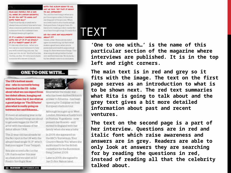
TEXT‘One to one with…’ is the name of this particular section of the magazine where interviews are published. It is in the top left and right corners.
The main text is in red and grey so it fits with the image. The text on the first page serves as an introduction to what is to be shown next. The red text summaries what Rita is going to talk about and the grey text gives a bit more detailed information about past and recent ventures.
The text on the second page is a part of her interview. Questions are in red and italic font which raise awareness and answers are in grey. Readers are able to only look at answers they are searching for by reading the questions in red, instead of reading all that the celebrity talked about.


