Double page articles
5
Analysis of similar products
-
Upload
a2media14f -
Category
Education
-
view
60 -
download
0
Transcript of Double page articles

Analysis of similar products
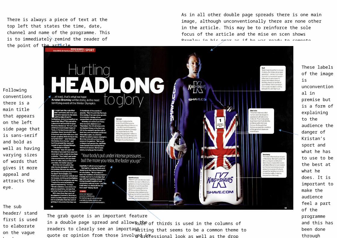
There is always a piece of text at the top left that states the time, date, channel and name of the programme. This is to immediately remind the reader of the point of the article.
Rule of thirds is used in the columns of writing that seems to be a common theme to a professional look as well as the drop cap used which illustrates to all those reading where to start.
The grab quote is an important feature in a double page spread and allows the readers to clearly see an important quote or opinion from those involved in the program.
These labels of the image is unconventional in premise but is a form of explaining to the audience the danger of Kristan’s sport and what he has to use to be the best at what he does. It is important to make the audience feel a part of the programme and this has been done through educating them of the dangers of skeleton.
As in all other double page spreads there is one main image, although unconventionally there are none other in the article. This may be to reinforce the sole focus of the article and the mise en scen shows Bromley in his gear as if he was ready to compete making the audience feel a part of it. As there are lots for our documentary to focus on we are unlikely to use this approach.
Following conventions there is a main title that appears on the left side page that is sans-serif and bold as well as having varying sizes of words that gives it more appeal and attracts the eye.
The sub header/ stand first is used to elaborate on the vague header, following conventions.

Main header, large and again on the left. It also follows conventions by being on the left as it is read that way by readers. The sub header again elaborate the initial title to the audience and usually helps to grab attention as readers flick through the magazine.
Main image, focused on the right which shows how most professional spreads follow this routine. The picture is a direct mode of address used to make it feel as though they are directly getting talked to by the actors and feel involved.
Images captions that help explain the meaning and expressions behind the images chosen.
The rule of thirds is again present keeping up the professional feel to the article and the text is in the similar sized fonts used for the main text blocks.
A large grab quote is used to show an important opinion of one of the actors involved and stands out for the reader to read and understand it importance. This also follows conventions.
What I have learned from this:
The main image should be majorly on the left side of the page and the main header on the right.
The header should be bold, short and vague to grab attention from the start. It should also be followed by a sub-header underneath explaining the article in further detail.
The time, date and channel should appear on the article usually near the top on the left page.
The rule of thirds, small text and drop caps all should be used to give off a professional feel to the magazine.
It is important to make the audience feel involved and a part of the programme so they want to watch it. This can be achieved by using a direct mode of address or educating them in topics they may have previously been unaware of.
Grab quotes should be used and should be in a much larger font than the normal text. It should include a quote or opinion from someone the audience may respect or want to hear from on the surrounding topic.
We as a group can carry this knowledge forward in the creation of our own product to keep it looking professional and make the reader want to watch it.