Digital graphics pro forma
38
Digital Graphics Olivia Bolt
-
Upload
oliviabolt -
Category
Technology
-
view
74 -
download
1
Transcript of Digital graphics pro forma

Digital GraphicsOlivia Bolt

File Formats
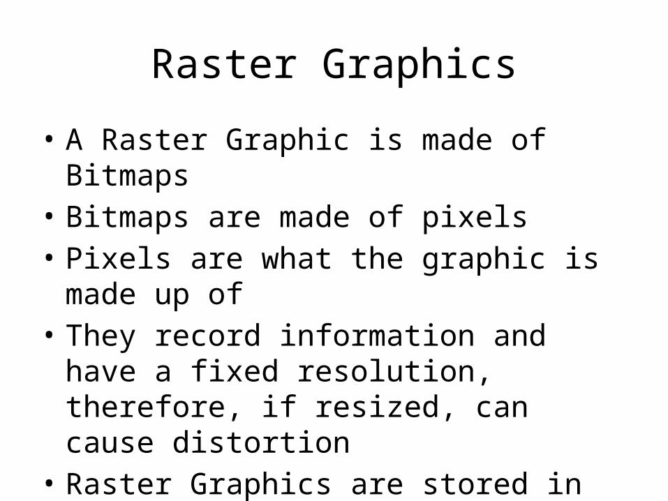
Raster Graphics
• A Raster Graphic is made of Bitmaps • Bitmaps are made of pixels • Pixels are what the graphic is made up of• They record information and have a fixed
resolution, therefore, if resized, can cause distortion
• Raster Graphics are stored in files, via different formats
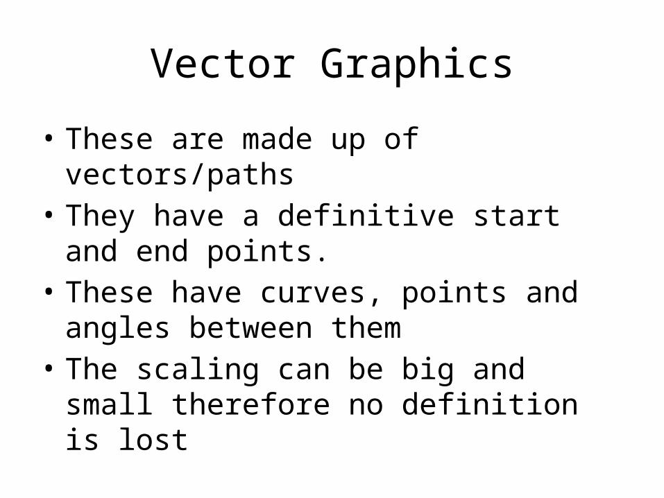
Vector Graphics
• These are made up of vectors/paths • They have a definitive start and end points.• These have curves, points and angles between
them• The scaling can be big and small therefore no
definition is lost
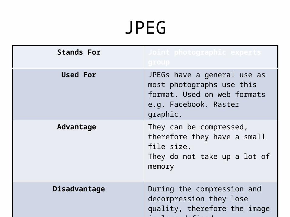
JPEGStands For Joint photographic experts group
Used For JPEGs have a general use as most photographs use this format. Used on web formats e.g. Facebook. Raster graphic.
Advantage They can be compressed, therefore they have a small file size. They do not take up a lot of memory
Disadvantage During the compression and decompression they lose quality, therefore the image is less defined
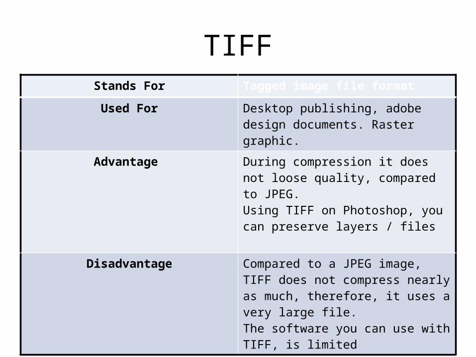
TIFFStands For Tagged image file format
Used For Desktop publishing, adobe design documents. Raster graphic.
Advantage During compression it does not loose quality, compared to JPEG.Using TIFF on Photoshop, you can preserve layers / files
Disadvantage Compared to a JPEG image, TIFF does not compress nearly as much, therefore, it uses a very large file. The software you can use with TIFF, is limited
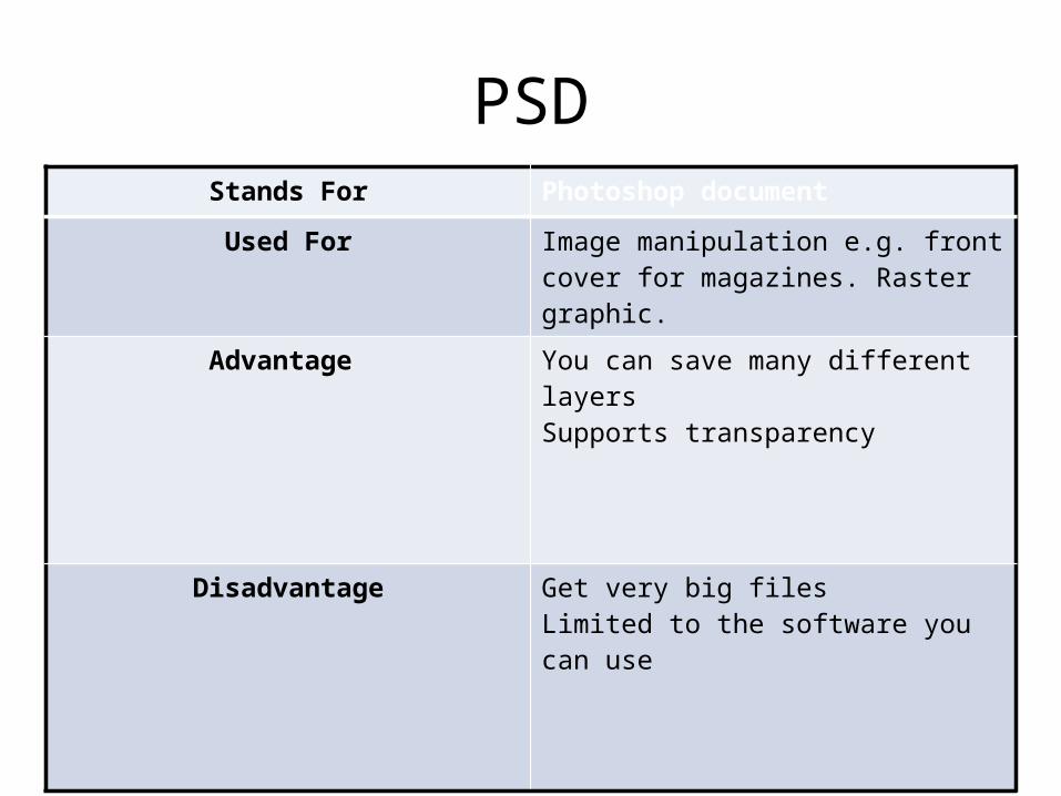
PSDStands For Photoshop document
Used For Image manipulation e.g. front cover for magazines. Raster graphic.
Advantage You can save many different layers Supports transparency
Disadvantage Get very big files Limited to the software you can use

AIStands For Adobe illustrator art
Used For Logo creation. Vector graphic.
Advantage Can be scaled big and small , therefore no quality is lost
Disadvantage Like PSD, you are limited to the software you can use with AI

AI example
• This is the software used whilst making a AI image.

3DSStands For 3D studio
Used For 3D modelling animation and rendering, moving images. Used in the creation of animated characters and environments. Vector graphic.
Advantage 3DS is the industry standard therefore you are flexible to the different software you can use
Disadvantage Huge file types, these are harder to storeComplicated to use, you have to be a professional Expensive software

Digital Graphics Images

Shape Task

Evaluation
What did you like about your image?In this image I like moulding the shape to the body part I chose. For example I used a rectangle with rounded edges for the neck then moulded into more of a giraffe shaped neck. This made my image look a lot more giraffe like. I also liked that the image I chose was easy to do and was quite straightforward. Which made my giraffe have simplicity.
What would you improve if you did it again?If I was to do this Giraffe again I would take more time into looking more carefully at the giraffes spots so they look a lot more accurate. I made the pattern on the image to big and they needed to be smaller and more detailed. I would also change the colour of the giraffe and not make it as yellow
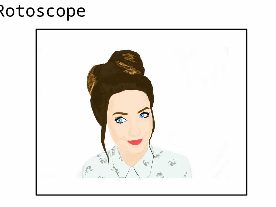
Rotoscope
Evaluation
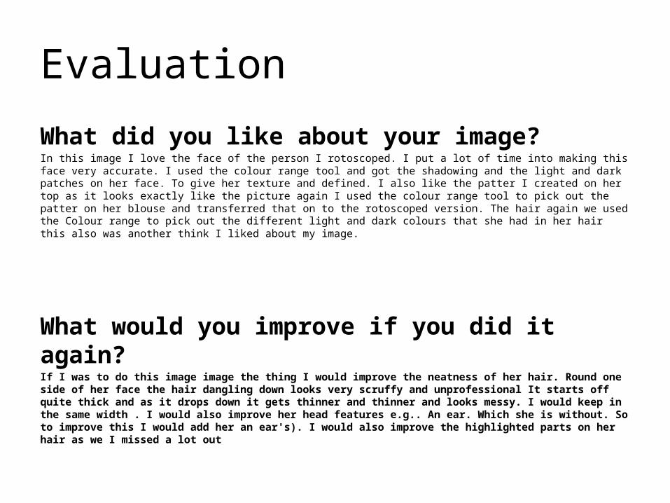
What did you like about your image?In this image I love the face of the person I rotoscoped. I put a lot of time into making this face very accurate. I used the colour range tool and got the shadowing and the light and dark patches on her face. To give her texture and defined. I also like the patter I created on her top as it looks exactly like the picture again I used the colour range tool to pick out the patter on her blouse and transferred that on to the rotoscoped version. The hair again we used the Colour range to pick out the different light and dark colours that she had in her hair this also was another think I liked about my image.
What would you improve if you did it again?If I was to do this image image the thing I would improve the neatness of her hair. Round one side of her face the hair dangling down looks very scruffy and unprofessional It starts off quite thick and as it drops down it gets thinner and thinner and looks messy. I would keep in the same width . I would also improve her head features e.g.. An ear. Which she is without. So to improve this I would add her an ear's). I would also improve the highlighted parts on her hair as we I missed a lot out
Text Based

Evaluation
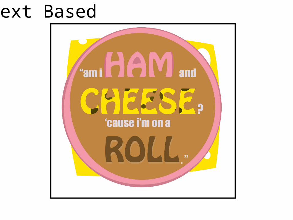
What did you like about your image?In this Image I specifically like how I connected the image with the words of the quote for instance “Ham and Cheese & Role” links with the ham and cheese bread role behind. The Image behind the text emphasises the words and makes them stand out which I liked about this text image. I also like that the word ham is in pink then the word Cheese is in yellow and the word role is brown this emphasises the words in this quote and is pun like what the quote is. The Font I chose also is fun and play like which shows that the quote is ment to be funny and is a play on words.
What would you improve if you did it again?In this text and image I would improve the image of the bread role behind the text. The bread part of it doesn’t look like bread. I would improve this by adding more texture and making the shape of the bread less of a perfect circle. The bread part is the worst part of the whole picture and text as its not as detailed as the rest of the graphics are.

Logo Creation
Evaluation
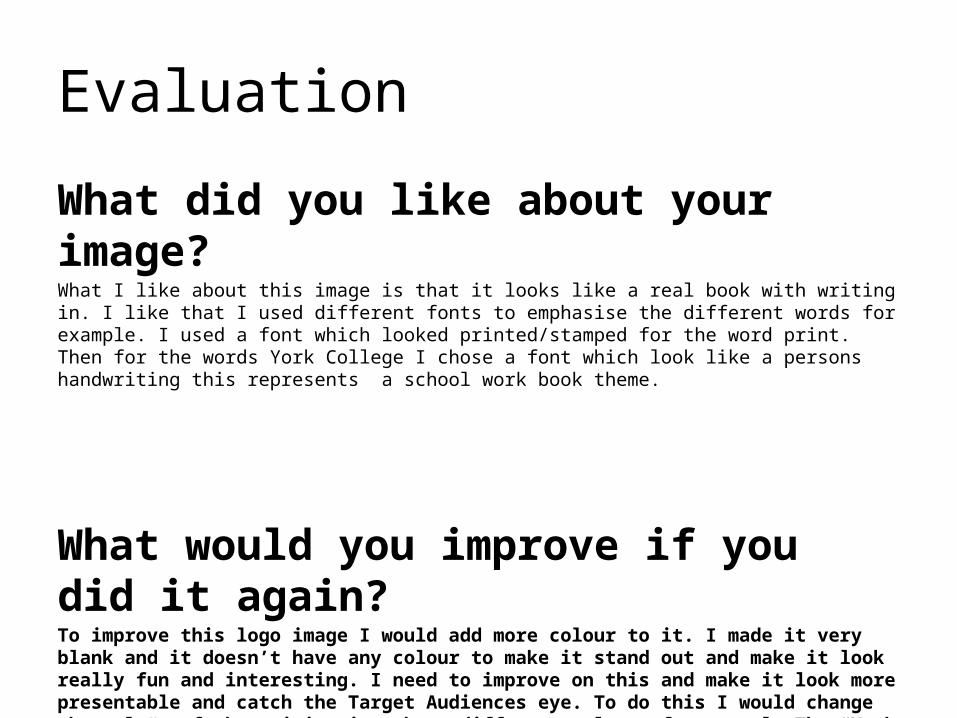
What did you like about your image?What I like about this image is that it looks like a real book with writing in. I like that I used different fonts to emphasise the different words for example. I used a font which looked printed/stamped for the word print. Then for the words York College I chose a font which look like a persons handwriting this represents a school work book theme.
What would you improve if you did it again?To improve this logo image I would add more colour to it. I made it very blank and it doesn’t have any colour to make it stand out and make it look really fun and interesting. I need to improve on this and make it look more presentable and catch the Target Audiences eye. To do this I would change the colour of the writing into have different colours for example The “York College” I would change the colour from black and white to a brighter colour like red and green etc…
T-Shirt Designs


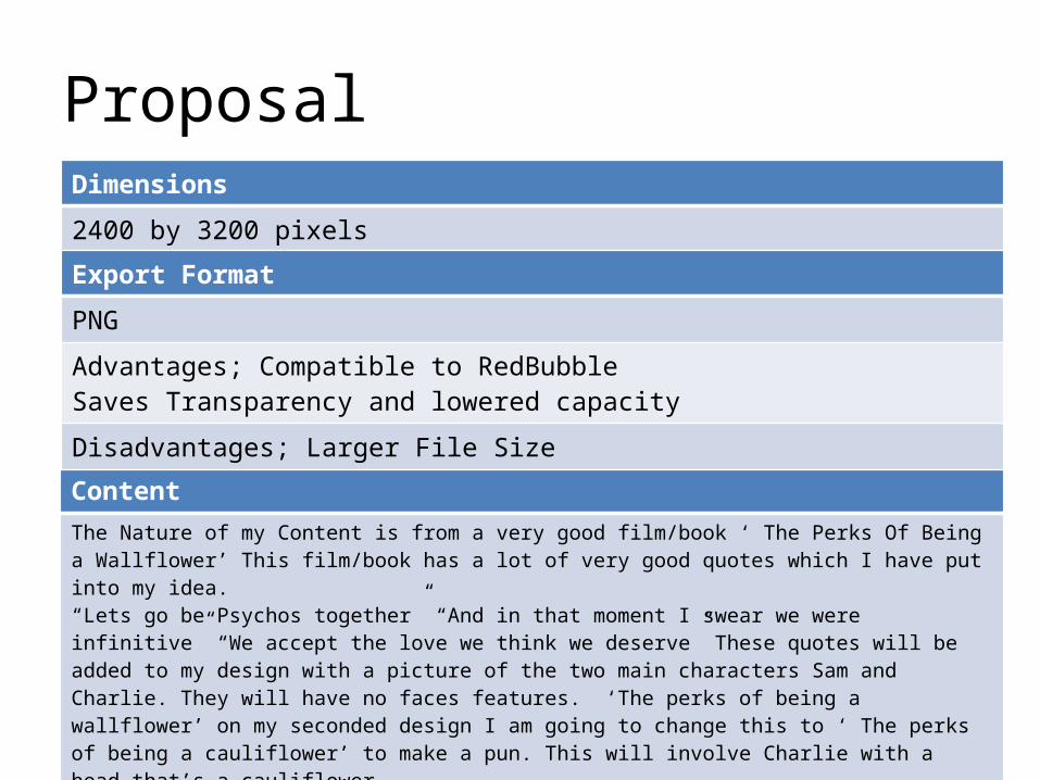
ProposalDimensions
2400 by 3200 pixels
ContentThe Nature of my Content is from a very good film/book ‘ The Perks Of Being a Wallflower’ This film/book has a lot of very good quotes which I have put into my idea.“Lets go be Psychos together” “And in that moment I swear we were infinitive” “We accept the love we think we deserve” These quotes will be added to my design with a picture of the two main characters Sam and Charlie. They will have no faces features. ‘The perks of being a wallflower’ on my seconded design I am going to change this to ‘ The perks of being a cauliflower’ to make a pun. This will involve Charlie with a head that’s a cauliflower. This will make a serious image and a funny image.
Export Format
PNG
Advantages; Compatible to RedBubble Saves Transparency and lowered capacity Disadvantages; Larger File Size
Proposal
Deadline
1st October 2013
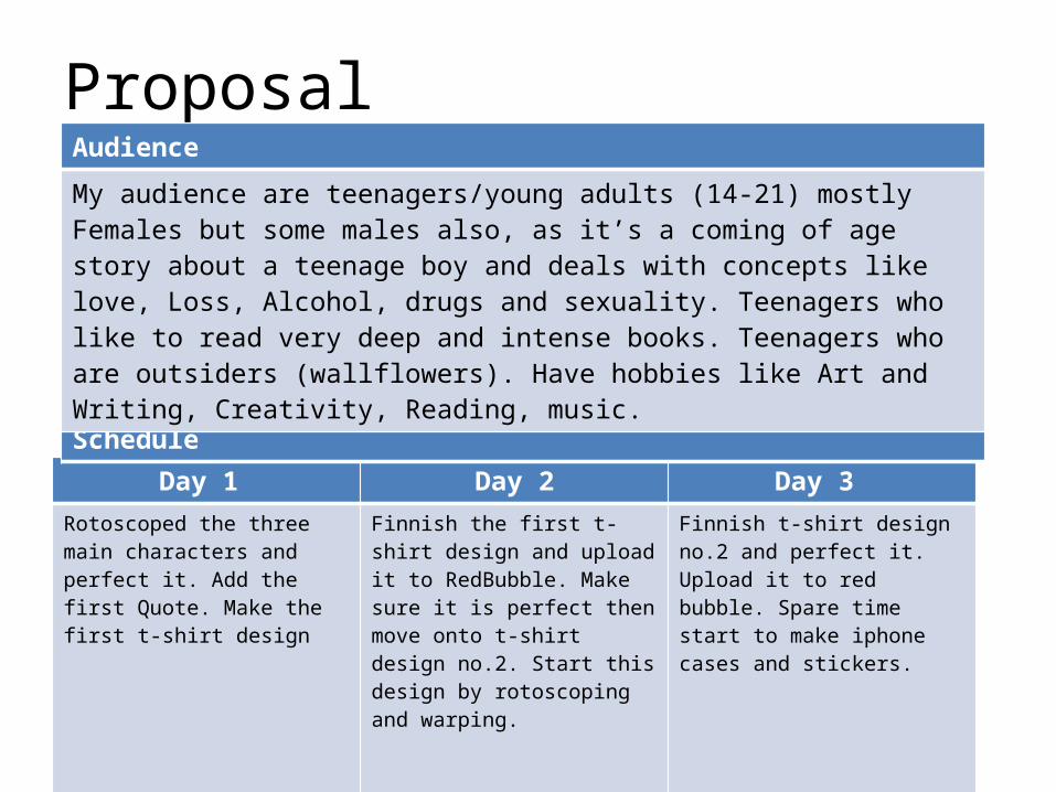
Day 1 Day 2 Day 3 Rotoscoped the three main characters and perfect it. Add the first Quote. Make the first t-shirt design
Finnish the first t-shirt design and upload it to RedBubble. Make sure it is perfect then move onto t-shirt design no.2. Start this design by rotoscoping and warping.
Finnish t-shirt design no.2 and perfect it. Upload it to red bubble. Spare time start to make iphone cases and stickers.
Schedule
Audience
My audience are teenagers/young adults (14-21) mostly Females but some males also, as it’s a coming of age story about a teenage boy and deals with concepts like love, Loss, Alcohol, drugs and sexuality. Teenagers who like to read very deep and intense books. Teenagers who are outsiders (wallflowers). Have hobbies like Art and Writing, Creativity, Reading, music.

“Lets go be
Psychos Together”
The ‘Psychos’ is in a different font, this I to emphasize the word and make it stand out
The Picture will not have the blue background and the characters will not have face features. They will just have blank faces. Then Block colours will be used to show simplity of the wallflowers.
This is the quote from the Book/Film and the writing is very plain and print like to show the contrast between the words in this quote.
I have chosen a background colour to mount the picture on as a lime green/Yellow colour. This colour is well know to the Film and the book. This appeals to my Target Audience as by looking at the colour they will think/know of “The perk..” straight away.
The Original colours
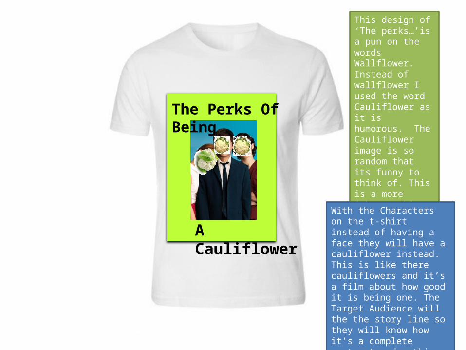
The Perks Of Being
A Cauliflower
This design of ‘The perks…’is a pun on the words Wallflower. Instead of wallflower I used the word Cauliflower as it is humorous. The Cauliflower image is so random that its funny to think of. This is a more jokey t-shirt which takes the Mick out of the title of the film/book
With the Characters on the t-shirt instead of having a face they will have a cauliflower instead. This is like there cauliflowers and it’s a film about how good it is being one. The Target Audience will the the story line so they will know how it’s a complete contrast and nothing about cauliflowers at all
T-Shirt Evaluation
Peer EvaluationWhat are the strengths of the final image?• The strengths of the final image Is that it is very creative and the person has put a lot of thought into
making it funny. There is a pun which works really well with the title and its very unique to anything which is on RedBubble. This person didn’t copy anything and its very original.
What could be developed if the image was repeated?
If the image was to be repeated the things that could be developed with this is the people on the t-shirt could have more detail on them and they could not be as blank. Also the Spoof is really good but I think if repeated more detail could be added the the cauliflowers to make them a lot more cauliflower like, overall I think that this person has done a really good job with the work that they have done.

Does your final product reflect your original intentions?
“Lets go be
Psychos Together”
The Perks Of Being
A Cauliflower
These Flat plans are quite different from their original images, I have changed the font of the quotes and title on the t-shirt and I have changed how I have laid the elements out as they looked better alternative ways. I used the ideas but tweeked thee elements to make them look more professional
On this t-shirt the quote looked a lot better above the image on the from and I changed the font on the front as it was more linked to the movie,
This changed a lot as I made it into a spoof movie poster. This made the t-shirt a lot more funnier which aims to attract the target audience as it’s a private joke with the niche audience.

Is your product suitable for your audience?
• My product is very suitable for the audience that I aimed this product at. The niche audience that I have concentrated on is fans of the film and book ‘The perks of being a wallflower.’ My audience proposal was to make a unique original t-shirt design that my target audience would find interesting and quirky so will be tempted to buy it. My audience are teenagers and young adult as my topic for the t-shirt was a coming of age film I have made this subtitle for them as I have used humour to engage them and made one of my t-shirt into a fans of the movie ‘private joke’. I used one of the top quotes from the book which fans of the film will find interesting and meaningful in which to want to wear the quote. I wanted the t-shirts to be meaning full as the book deals with a lot of deep issues, by having a very meaningful quote on one of my t-shirts makes the target audience feel connected with the t-shirt as my target audience are creative and indie type girls and some boys. They can relate to this one quote as society may see this types of teenagers as ‘psychos’. On a happier scale I did a spoof to gain interest of the niche audience and put a positive twist on this deep book, it brakes the intense factors of the book down and shows humour and positive attitude towards this.
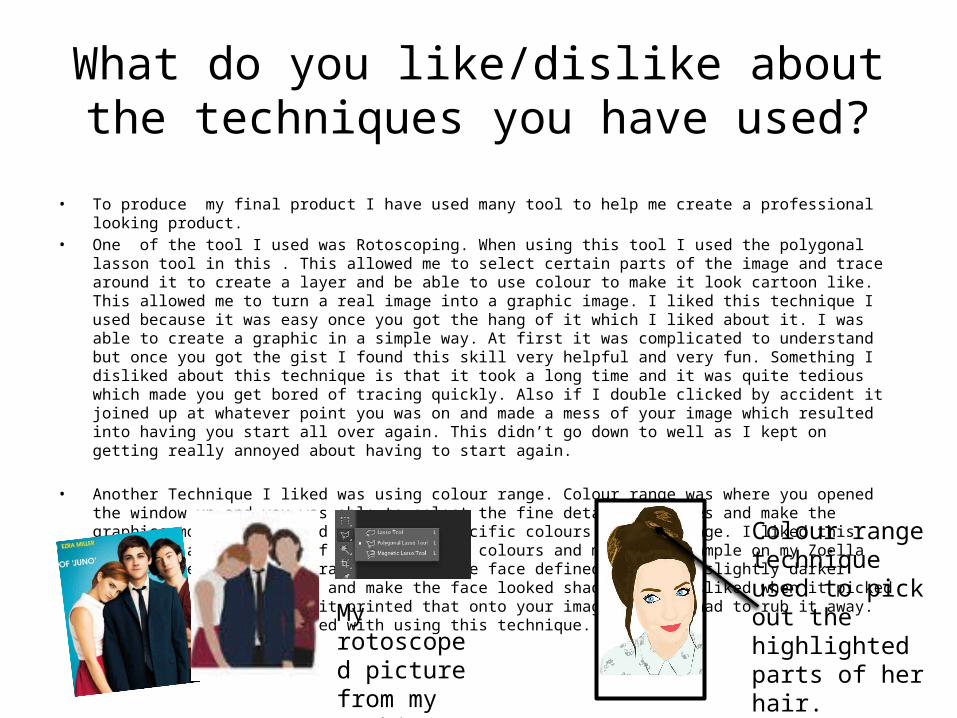
What do you like/dislike about the techniques you have used?
• To produce my final product I have used many tool to help me create a professional looking product.• One of the tool I used was Rotoscoping. When using this tool I used the polygonal lasson tool in this . This allowed me to
select certain parts of the image and trace around it to create a layer and be able to use colour to make it look cartoon like. This allowed me to turn a real image into a graphic image. I liked this technique I used because it was easy once you got the hang of it which I liked about it. I was able to create a graphic in a simple way. At first it was complicated to understand but once you got the gist I found this skill very helpful and very fun. Something I disliked about this technique is that it took a long time and it was quite tedious which made you get bored of tracing quickly. Also if I double clicked by accident it joined up at whatever point you was on and made a mess of your image which resulted into having you start all over again. This didn’t go down to well as I kept on getting really annoyed about having to start again.
• Another Technique I liked was using colour range. Colour range was where you opened the window up and you was able to select the fine detail in images and make the graphics more defined and picked out specific colours in that image. I liked this technique as you could of chosen pacific colours and made for example on my Zoella image I used the colour range to make the face defined and using slightly darker colours to show the nose and make the face looked shadowed. I disliked when it picked out the wrong parts and it printed that onto your image and you had to rub it away. Overall I was very pleased with using this technique.
Colour range technique used to pick out the highlighted parts of her hair.
My rotoscoped picture from my T-Shirt

What do you like/dislike about how your final product looks?
• My final product overall looked really good. I was very pleased with hw it turned out and it was exactly how I thought it would look in my head. I had to tweeked parts from my flat plan to make them look better on my t-shirt but they still looked as good as I originally planned out or even better than I originally looked. On way image I changed my layout of it I specifically liked my change in idea as I made it into a spoof movie poster this worked really well as I was able to add my humour to the t-shirt to make it extra funny. I also liked my idea of having the people as cauliflowers. It hadn't been done before on RedBubble so that made it original and unique. This element to my T-Shirt makes it more interesting to the target audience. I disliked how the cauliflowers looked on the people. They were really hard to make into a graphic without them looking silly so I had to try my best to make them look as real as possible. The thing I liked about my other t-shirt is that the characters looked very blank and not personal. I didn’t add faces so it was more unique and original. I also like the fonts I chose I chose to write ‘Psycho’ in a different font to put empathises on that pacific word. On the design I disliked nothing about the actual image as it was exactly how I wanted it to be.
The emphasized word and no faces on my design to make it quirky.
The cauliflowers were very hard to make into a graphic as you can see

Why did you include the content you used?
• The content I had used I chose specifically because they all had a meaningful connection or a link with the film/book. The content was very pacific to this film and it would attracted my target audience as straight away they would know by looking at the colours and images my design was about ‘the perks of being a wallflower’ The image I chose for one of my designs was the famous image from the film. The way they were stood you didn’t have to add character to guess that it was about the perks… The font I used was a print like font I used this because in the film Charlie (main character) does a lot of writing on a type writer so I used a type writer type font to represent the letters that Charlie writes. This was a personal reference that my niche audience would understand. Also this font was used on the movie poster so straight away seeing the font you don’t have to read what it says to know what it is. The font is very specific to this film only. The colour I used on the Iphone background was the main colour of the film. This Lime green colour is on every film poster and it represents the famous lime green wall they stand against on the cover of the book. This only is linked with the story which shows my audience that my design is about the perks.
The lime green background on my Iphone case representing the films famous colour.
This is the font I used. It looks like its printed and it specific to the film
The famous pose they do where Sam has her head on Charlie to represent their relationship which I like about this picture.

What style have you employed in your products?
• The thing that influenced me about doing this design onto my product is that I liked the originality and the potential that you could do with this book/film. I really love the film/book myself and it wanted to show this through my design. I had a lot of influence through RedBubble by looking through the different designs for this topic that already existed. There was lots of quotes that people had already used on their work but the one I chose was a popular quote but hardly anyone had used yet. That’s what influenced me to use that quote from the book. Existing products hadn't done any spoofs or humorous designs with “The perks” so I decided to be the first to do this with my spoof movie poster. The visual style my work has is a original quirky and indie style. I have chose and indie book which I wanted to reflect on to my work. I chose this indie style as its what my target audience have as a personality and style there self.
Here is existing designs on RedBubble with the same theme as my design. As you can see some of my influence came from these as they is so many different designs generated from one theme
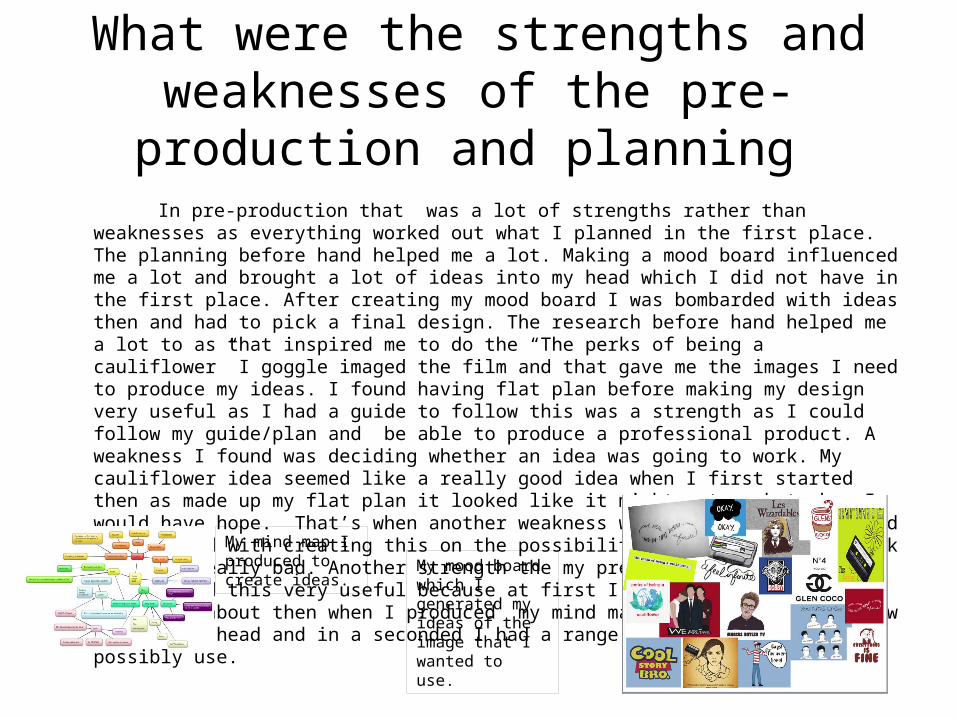
What were the strengths and weaknesses of the pre-production and planning
In pre-production that was a lot of strengths rather than weaknesses as everything worked out what I planned in the first place. The planning before hand helped me a lot. Making a mood board influenced me a lot and brought a lot of ideas into my head which I did not have in the first place. After creating my mood board I was bombarded with ideas then and had to pick a final design. The research before hand helped me a lot to as that inspired me to do the “The perks of being a cauliflower” I goggle imaged the film and that gave me the images I need to produce my ideas. I found having flat plan before making my design very useful as I had a guide to follow this was a strength as I could follow my guide/plan and be able to produce a professional product. A weakness I found was deciding whether an idea was going to work. My cauliflower idea seemed like a really good idea when I first started then as made up my flat plan it looked like it might not work to how I would have hope. That’s when another weakness was decision making I had to go ahead with creating this on the possibility that it might not work and look really bad. Another strength the my preproduction was my mind map I found this very useful because at first I didn’t know what to do my design about then when I produced my mind map. Ideas started to flow through my head and in a seconded I had a range of ideas that I could possibly use.
My mind map I produced to create ideas.
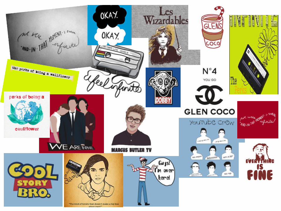
My mood board which I generated my ideas of the image that I wanted to use.
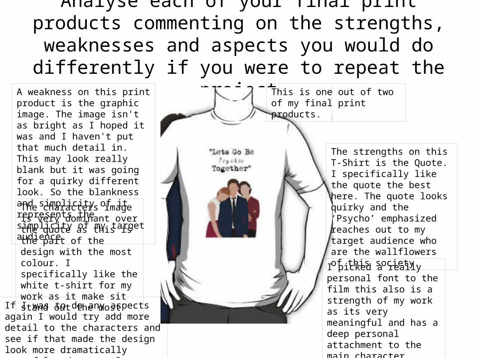
Analyse each of your final print products commenting on the strengths, weaknesses and aspects you would
do differently if you were to repeat the projectThis is one out of two of my final print products.
The strengths on this T-Shirt is the Quote. I specifically like the quote the best here. The quote looks quirky and the ‘Psycho’ emphasized reaches out to my target audience who are the wallflowers of this society.
I picked a really personal font to the film this also is a strength of my work as its very meaningful and has a deep personal attachment to the main character.
A weakness on this print product is the graphic image. The image isn't as bright as I hoped it was and I haven't put that much detail in. This may look really blank but it was going for a quirky different look. So the blankness and simplicity of it represents the simplicity of my target audience.
The characters image is very dominant over the quote as this is the part of the design with the most colour. I specifically like the white t-shirt for my work as it make sit stand out the most
If I was to do any aspects again I would try add more detail to the characters and see if that made the design look more dramatically powerful and personal to my target audience.

Peer Feedback
I agree with what the person has said about the image being developed I would change that if I had to repeat this designing. To make it a lot more personal to my target audience. As faces make connections.
I also agree that these are the strengths of the final images. I have two which work really well. There was nothing like that on RedBubble so I have created my own original piece of work.