Digital Graphics Evaluation
20
Graphic Narrative Evaluation Jess Stanton
-
Upload
jessstanton17 -
Category
Art & Photos
-
view
23 -
download
0
Transcript of Digital Graphics Evaluation

Graphic Narrative Evaluation
Jess Stanton
Does your final product reflect your original intentions?
• A difference was that I had originally planned to illustrate the characters however after planning out the pages and deciding I would rotoscope the backgrounds and items in the book I realised the addition of illustrated characters may not look very appealing and may not fit in with a rotoscoped backgrounds and so instead I decided to rotoscope the characters too.
• Another difference between my planning, flat plans and storyboards compared to my final product is originally I had planned to put text on one page and the image on the next however whilst in production I decided to make my image smaller than the page which allowed a white background and border around the image. I then decided to add the text to the same page as the image to create something different as when I was doing my research not a lot of children’s books were laid out the same and I felt it was a different take but was still effective and looks interesting. This meant that I had to align each image correctly on the page along with the text to make sure the layout was consistent all the way through and each page looked the same.

• When I created my mood boards at the start of my planning I chose to place some samples of different text fonts and explained they would be used for my title cover however by the end of production when I had made the book I felt making a front cover in Photoshop and using all the skills I had learnt in there such as word warping and how to put a texture in a word was much better than an website creating a ready made title for me.
• As part of the research to this task I looked into what happens in the original story and so found an original script. The problem with the original script was that my aim for the children’s book was from 8-12 pages and with the original script I felt it would be too long to fit into 12 pages and so I adapted it to not only a shorter story but also to a more children friendly storyline. Instead of Rumpelstiltskin demanding the Queen’s first unborn baby, I changed it to he demands her crown and shortened the story by making the Queen not have to guess Rumpelstiltskin’s name for a long time. This aided my production massively as it meant I would have enough production time to produce the book and not have to worry about running over.
• When it came to creating my storyboard I also decided to make the backgrounds different and not have all of the backgrounds in the same place and I thought it would tell the story better as well as look better. To do this I decided to make four backgrounds in two different scenes and have one of each in the day and one of each in the night so when the target audience looked through and read it, little differences like these would help tell the story and give the audience a sense of the story progressing. To do this and keep track of which scenes would be in the daytime and which would be in the nighttime I wrote when the scene would take place on the storyboard so I could work out which day was which and it also made it easier when it came to producing the scenes as I knew how many of each I needed.

How well have you constructed your images?
• Overall I feel my images are similar and as you go through the book there is a sense of consistency to them all. My main aim for the images was to make sure as they all looked similar and not for one to stand out whilst I was rotoscoping each character using available images online as templates. When I was rotoscoping Rumpelstiltskin I tried different colours and techniques to find one that wouldn’t make him look out of place amongst the other characters. The first time I rotoscoped him I made it very detailed, outlined him in black and made patches darker to look like the light however when I added him into a scene, along with the other characters it didn’t look like my own work as the style of him was very different and so I adapted him to fit the scene by making his clothes darker and I got rid of some of the outlines as none of the other characters were that detailed and when I added Rumpelstiltskin I noticed a massive difference when all the characters were in the scene together.
• To make my story feel and look like a story I altered the backgrounds so there were two versions, a daytime scene and a nighttime scene. As I found from my research on the original script, the story happens over three days and so I felt the best way to portray the sense of time moving was to create backgrounds in different times of the day, this gave the book a feel of progressing and made it look as though the story was over more than just a day.
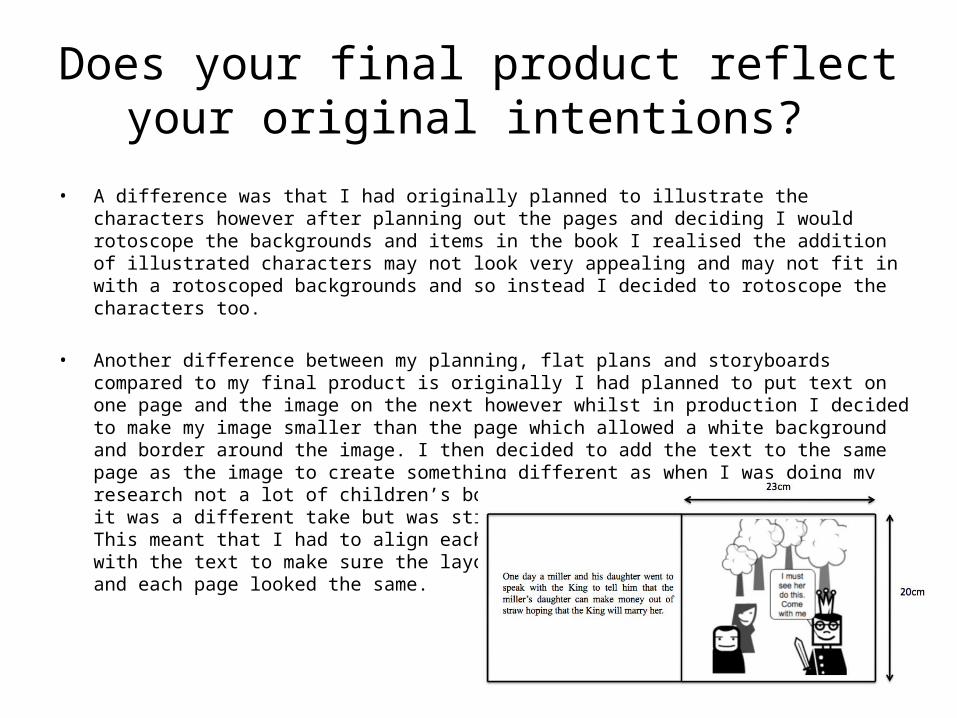
• When making the backgrounds for my book in Photoshop I came to making the background of the room and started to make the wall. However as I started to make the brick effect that I was aiming for it proved difficult to make the wall look realistic and so instead I decided to use a different technique and make a few brick like shapes to add to the wall in the background although place them around the wall creating a background which looked like it was made of bricks. I also used this technique on my image of the castle which appears in the woods backgrounds and proved effective in this case too.
• Using the technique of allowing a certain object to be filled in a gradient style on Photoshop I was able to create a brick looking pattern around the window of the room in the castle scenes which, along with rotoscoping made the bricks around the window look very realistic. On the window again, I was also able to easily construct it and make it look like it had some depth to it by rotoscoping the walls around it individually and colour them appropriately and accurately using the colour selector, making the middle part of stone a darker colour to look as if it had depth to it.

How well have you used text to anchor your images
• When planning the text for my book I took into account that children as young as 5 may read it but also older children and so I understood that the text had to be appropriate for all ages in the range that was my target audience. I thought about my vocabulary and so when reading over my script I changed some words to suite what the audience’s vocabulary would be and also reduced the amount of text on each page by spreading it over all the pages as children may pay more attention to the pictures if they see lots of text on a page. As this book could be to help practise their reading skills I wanted to use a font that was easy to read and each letter was not attached from the next and discovered serif fonts would be ideal as they have lines attached to the end of each symbol which makes each letter individual which would help the readers navigate along the sentences easier than san serif fronts would.
• To make the images more interesting I added speech bubbles to the characters and so when the audience has read the text they can read the speech bubbles. This is a way of putting more of the original story into my book but not having so much text in a chunk on one page to put a reader off. It also makes the book more interesting to read and look at.

• Speech bubbles follow on from main text to allow more of the story to be told. This scenes text could have mentioned the King marrying the queen if she successfully spun all the straw however to add something different I used a speech bubble.
• In the story the father mentions that the girl can turn straw into money however more specifically he says she can spin it into money. To help capture this image I decided to create a spinning wheel by rotoscoping over an image I found and then placed it into the scenes instead of saying she could turn it to money and not keeping too the original story as much.

Is your product suitable for your audience? • I believe my product is suitable for my audience as I thought about all aspects of the book and how it
would best suit the age range I chose and explained why I had chosen it in my proposal. I believe that the vocabulary font and size of the text in my book will be appropriate for 5-8 year olds.
• Characteristics of 5-8 year olds are varied. If children are beginning to read and some words are not in their vocabulary, they may have an adult read it to them and therefore only take an interest in the pictures, however the older children may be the other way around and feel as because they are reading the text the image may just repeat what the text says and not pay full attention to all parts of the image, only the speech bubbles. By making both factors of the page as equally balanced in terms of detail and effort put in, whatever age the child is they are all getting the same amount of knowledge of the storyline out of the book as each other.
• Another character trait of children aged 5-8 is that they are interested in a lot of things and so this book will appeal to a wide array of them. Boys in this audience range will find the character of Rumpelstiltskin odd but interesting nonetheless. Girls may not appeal to Rumpelstiltskin as much however may still find pleasure in reading the book because it is different to most fairy and folktales but it still involves a princess and a happy ending.
• In terms of the size of the book I was going to use was 20x23cm which when doing my research was the size of a book I found that I thought would be an appropriate size however it was rather large and bigger size books are normally meant for children who are younger than the age range of my target audience. The size of the book could be smaller and so I believe this is my only feature that would make the book slightly less suitable for my audience.

What do you like/dislike about the techniques you have used?
• The main technique I used in the production of my book was rotoscoping. This tool in Photoshop allows you to individually select a part of the image which came in useful in the process of making my backgrounds, items and characters. By selecting each part of an image individually it enabled me to easily make a copy of that image however by rotoscoping. This tool was very useful whilst using it for all the parts of my book as I could navigate around any part of an image and then select the appropriate colour, making very realistic and detailed pieces to go into my narrative. Although this technique was very useful throughout the production it is a tool where I had to be precise as when I was rotoscoping for example on a lamp I made and I had rotoscoped a part of it and then moved onto another part, if I didn’t properly outline the shape there would be a gap with no colour in which could effect my time management which is why when I had rotoscoped one part of an image, I would find the layer with the original image on and turn it off so I could see my progress and find any places where I had missed.
• Once I had rotoscoped one part of an image and created a layer from it the effects that were available to apply for that layer became very useful as I was able to outline a shape very quickly using ‘stroke’ and choose an accurate colour for the shape using ‘colour overlay’ and the colour selector. I particularly liked this tool as it helped me when I was creating parts of my book to make sure if there was a certain shade of a colour in one place, the exact same colour was then used again for example when creating the King.

• A technique that I used and liked that was also available on the effects for the layers was the Drop Shadow tool which allowed me to add a shadow to each character. This made each character stand out from the pages and gave each scene depth which added to the overall image of the book.
• Shape and word warping was a technique which I used on my front cover. This was an effective technique because it made the title stand out more than what the title I had previously planned to use from a website would have done. I found this a better technique because if the front page looks interesting and stands out then there is more chance people would pick up the book. A difference between my own titles and the ones available on the website is that using word warping on my own title I could alter the shape and angles of it and give my font page a different look and personalise the title even more than the ready made ones so that the title fitted even more with the theme that the book presented and for that reason I found this tool to be useful and so it was one that I liked.
• Shape warping could be applied to shapes that have been created to make the background but also for the characters. The warping means you can alter their size, position, rotation and perspective without having to recreate them again. This came in useful at the end of production when I went back to each page and changed the characters perspective so it looked like they were on an angle talking to each other to go with the changes I had made in the eyes so that they were now positioned to be looking at the other character like they were talking and not just flat on the page looking forward.
What do you like/dislike about how your final product looks?
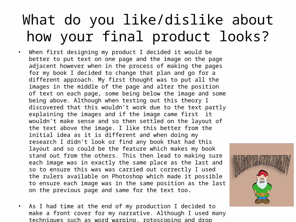
• When first designing my product I decided it would be better to put text on one page and the image on the page adjacent however when in the process of making the pages for my book I decided to change that plan and go for a different approach. My first thought was to put all the images in the middle of the page and alter the position of text on each page, some being below the image and some being above. Although when testing out this theory I discovered that this wouldn’t work due to the text partly explaining the images and if the image came first it wouldn’t make sense and so then settled on the layout of the text above the image. I like this better from the initial idea as it is different and when doing my research I didn’t look or find any book that had this layout and so could be the feature which makes my book stand out from the others. This then lead to making sure each image was in exactly the same place as the last and so to ensure this was was carried out correctly I used the rulers available on Photoshop which made it possible to ensure each image was in the same position as the last on the previous page and same for the text too.
• As I had time at the end of my production I decided to make a front cover for my narrative. Although I used many techniques such as word warping, rotoscoping and drop shadows I think I could have done a better job with the colours as the word ‘ Rumpelstiltskin’ doesn’t stand out as much as it could have against the brown background despite a black border and shadow. If I were to improve this I would change the background to white. This would allow the title and the image to stand out more on the front cover and it would also keep up the consistency in my book as the white background on the front cover would match the pages in the rest of the book.

• Even though the characters, objects and backgrounds in my book have been rotoscoped I think it looks very realistic. With little touches such as changing the characters’ perspectives or editing their eyes so they were looking at each other made them a little more real and better than I first expected and so this is something I like about my final product.
• To make the character of the girl very realistic, when it was the scene where the king and the girl were getting married I changed the girl’s character and rotoscoped another version so that she was wearing a wedding dress was holding flowers and from that scene on she is then wearing a crown. It was also other small differences such as changing the position of her mouth into a smile that made the realism of the character.
• Looking back on the production of my narrative and looking through it if I were to go back I would put more effort into the making of the necklace and ring that the girl gives to Rumpelstiltskin as rewards. Even though they are only small and are not a major item in the scenes I still believe it would improve the overall appearance if more detail was added to them.

Why did you include the content you used?
• To allow my pages to be attractive and entice children to read the book, the colours are simple to hold interest. The image will not be too complex enabling all children in my target audience to enjoy and understand the images.
• I chose Times New Roman as my font of choice due to it being a Serif font and would be easier for children to follow text in this font unlike a san serif font such as Arial. It is also easier to read when in a smaller size such as when the text is in speech bubbles. I also think that Times New Roman has a more professional look than a font such as Comic Sans, even though Comic Sans is popularly used as it is an easy font to read.
• I chose to keep the font black to contrast with the white background and also to make sure it stood out on each page. It would also stand out more due to it being black as this was not a main colour in any of my scenes and there are no big blocks of it which means that it stands out as it is completely different from the colours in the images.
• Although the narrative is for children I did want the images to look interesting however not just because of the colours. By applying effects such as drop shadow it allowed the characters to look as if they were coming out of the page to give the images more depth.
• I could have chosen not to include some of the items I did such as the spinning wheel and the lamp however to achieve the best possible outcome in terms of looks for this book, I felt like they were necessary and added to the book.

What signs, symbols or codes have you used in your work?
• On multiple of the slides you see the money appear. This was, in the original story gold, however I adapted it to this day and so there is now money. I sign involving this is that on the money there is a pound sign, signifying that this has been made by someone who is British.
• In scene 8 we see that the girl is now the Queen, not only from the King’s speech bubble which tells us but also from the crown on her head highlighting the fact. The girl has also changed her dress and is now in a white wedding dress signifying her marriage to the King once again.
• The door in the castle room has a large handle on signifying that the girl has been locked in there or at least will struggle to get out because the door looks heavy. Next to the door we see steps leading down into the main part of the room similar to the layout of a dungeon.
• The colour of the walls and the detailing of the bricks shows us that the walls and floor are stone and may be cold and dark as the only object giving us a sign of a light source is also one lamp shown by the door.

What representations can be found in your work?
• The girl in my story is the only female in the book and in the storyline. Her mother is never mentioned, only her dad. Her father is the one who claims she can spin straw into money showing that at the start of the story she has little power and does what the king and her father say, however towards the end, when she marries the King and becomes Queen, she orders a messenger to help her to complete a task, highlighting the new power she now has.
• Men, in this story are shown to have the most power. This is shown through the King being able to tell the girl what to do and Rumpelstiltskin’s ability to demand rewards from the girl. The father is also given power as he tells a lie to the King about the girl and the girl doesn’t say anything to object.
• There are now children present in my version of the story that is intended for children however in the original the only child mentioned is the queen’s unborn one, who Rumpelstiltskin wants as his final reward.

What style have you employed in your products?
• To help with a style to feature throughout my book I found images of cartoon characters similar to the style of character I was going for. I kept each character simple with the exception of the King as characters in children’s books are not overly detailed and I wanted the King to be different but not stand out massively amongst the others as he has more wealth and so is clearly identified with features such as a crown and cloak. By keeping the characters simple I had to alter the appearance of Rumpelstiltskin and make him more simple and so I rotoscoped all of his top one colour of green instead of different shades of it; this was the same with his boots legs and on his hat also.
• When rotoscoping the backgrounds, to keep the same style throughout my book and to make it look as if it were the same place only a different time of day I copied the original rotoscoped background that was set in the daytime and edited the sky to a night sky. I then edited these further by adding parts into the sky for the different times of day; the daytime scene had birds added in and for the nighttime scene I had stars which are the same style of star shapes I used in the night time scene for the room in the castle background.

• Another style that features in my book which I used in multiple places was the style of the brick wall effect which I used on the walls of the room in the castle and also on the castle to make it appear like the walls are made out of bricks without having to create all of the individual bricks.
• I found an image which had 3 images of men on that were in a similar style to my other characters. I used the two on either end as the messenger and the girl’s father however got rid of some of the features such as the man’s walking stick and glasses and the younger man’s bag and also changed how they were stood to change the position and make the characters my own.
• My work has a visual style which is similar to a cartoon which is the style I was aiming for. This style was possible to achieve and was aided by when I was searching for suitable images to rotoscope as some images that came up for each character were in the style of cartoons. I still wanted an element of realism to my work which is why some parts are very detailed.
What were the strengths and weaknesses of the pre-production and planning
• To start the pre production of my book I needed to do research into the story to see if it would be suitable to recreate with my own ideas and to also to see if the storyline would be suitable for my target audience of children aged 5-8. To allow me to create a story I had to research and see if the story of Rumpelstiltskin was older than 50 years as that is the time when a storyline becomes copyright free. Research and planning also in the form of mood boards and mind maps helped me out greatly as it gave me an idea of how long the production of the book would take, what each page would look like and how I could achieve the best work possible. It gave me an insight into how others have interpreted the characters in Rumpelstiltskin and so enabled me to see how I could create my own versions. Planning also lead me to think about how I would design a front cover. I decided to make my own and also create my own title instead of a ready made title from a website creator and so I was able to
• By creating a time plan for each available session I had on producing my book I was able to manage my time well and have extra time at the end to go back to check and improve my work if necessary and I was also able to make a font cover, completing the overall image of the narrative. This for me was a great strength as it gave me guidance during production as the time schedule I had created consisted of tasks I needed to do in the sessions and how to do them which meant once I had done one I was able to move onto the next. It gave me a great sense of direction to where I was heading whilst creating my narrative and meant that if there were any errors I could look over what I had done and alter the time plan to what was appropriate.
• A weakness, I feel in my planning was that I had originally planned to illustrate the characters which meant in my time schedule I planned all of the sessions including time to illustrate the characters and scan them into the computer so they could be added to the scenes in Photoshop, however along the way of production as my book was coming together and I had rotoscoped the backgrounds and created storyboards and test pages, I realised not only would rotoscoping may be easier however take up more time but it would work better in the final image of the book as all of the boom would be rotoscoped. This set me back as it meant I then had to find images for the characters to rotoscope and change my time plan to fit around rotoscoping 5 characters instead of illustrating them. Fortunately I managed to re arrange my time plan and worked it out so that I had extra time at the end to go through and thoroughly check my work.
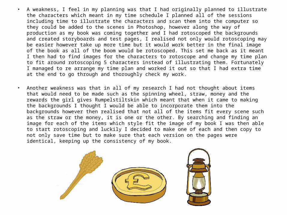
• Another weakness was that in all of my research I had not thought about items that would need to be made such as the spinning wheel, straw, money and the rewards the girl gives Rumpelstiltskin which meant that when it came to making the backgrounds I thought I would be able to incorporate them into the backgrounds however then realised that not all of the items fit every scene such as the straw or the money, it is one or the other. By searching and finding an image for each of the items which style fit the image of my book I was then able to start rotoscoping and luckily I decided to make one of each and then copy to not only save time but to make sure that each version on the pages were identical, keeping up the consistency of my book.

Historical and cultural context• Rumpelstiltskin started off as a novel first collected by the Grimm brothers Jacob
and Wilhelm in 1812. This story was then later adapted into many other forms of media including literature but also comics, music, television, film and games.
• One of the most popular appearances of Rumpelstiltskin is in the 4th Shrek movie Shrek Forever After where he manipulates Shrek by giving him the deal of a lifetime that would erase him from the land and so played the antagonist.
• The tale has also been adapted into a comic series Grimm Fairy tales however the story was given a more tragic ending. There is also a ballet piece created by British composer David Sawer that is based on the fairy-tale.
• In America, Rumpelstiltskin featured in a TV series on ABC called Once Upon A Time and is shown as a trickster who prefers all of his rewards as firstborn children. The miller’s daughter has been adapted into the Evil Queen who eventually becomes the Queen of Hearts.
• The character of Rumpelstiltskin has also made appearances in games such as the first game in the series “King’s Quest” by Roberta Williams. In this game his name is spelled backwards with a backwards alphabet e.g. a=z, b=y, c=x, d=w etc.. and so his name is Nikstlitslepmur.


