Digipak Analysis - Arctic Monkeys
5
Digipak analysis Arctic Monkeys - AM
-
Upload
joshmellard123 -
Category
Art & Photos
-
view
187 -
download
0
Transcript of Digipak Analysis - Arctic Monkeys
Digipak analysis Arctic Monkeys - AM
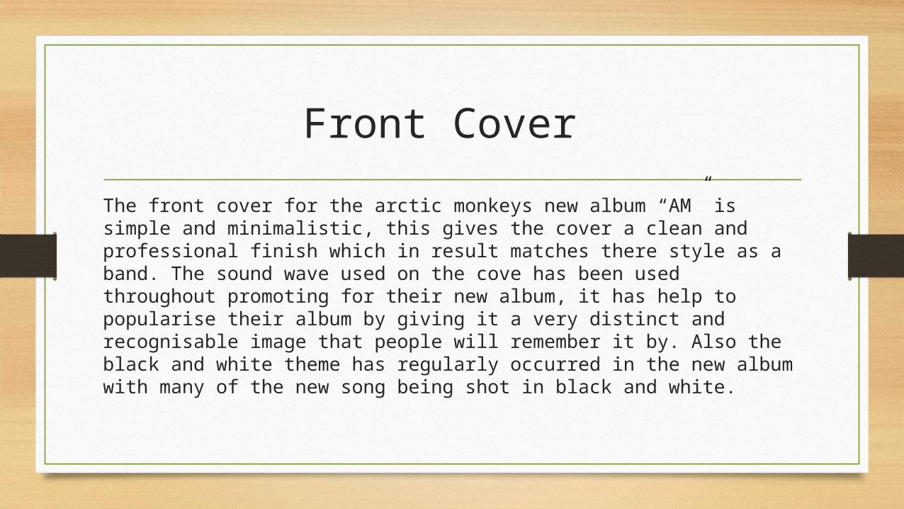
Front Cover The front cover for the arctic monkeys new album “AM” is simple and minimalistic, this gives the cover a clean and professional finish which in result matches there style as a band. The sound wave used on the cove has been used throughout promoting for their new album, it has help to popularise their album by giving it a very distinct and recognisable image that people will remember it by. Also the black and white theme has regularly occurred in the new album with many of the new song being shot in black and white.
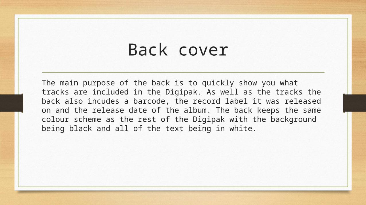
Back cover The main purpose of the back is to quickly show you what tracks are included in the Digipak. As well as the tracks the back also incudes a barcode, the record label it was released on and the release date of the album. The back keeps the same colour scheme as the rest of the Digipak with the background being black and all of the text being in white.
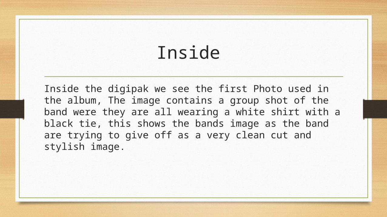
Inside
Inside the digipak we see the first Photo used in the album, The image contains a group shot of the band were they are all wearing a white shirt with a black tie, this shows the bands image as the band are trying to give off as a very clean cut and stylish image.
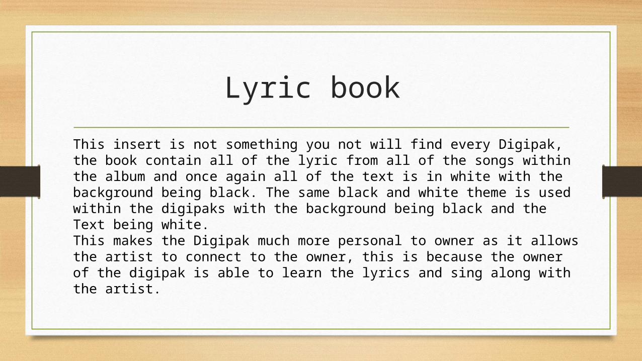
Lyric book This insert is not something you not will find every Digipak, the book contain all of the lyric from all of the songs within the album and once again all of the text is in white with the background being black. The same black and white theme is used within the digipaks with the background being black and the Text being white. This makes the Digipak much more personal to owner as it allows the artist to connect to the owner, this is because the owner of the digipak is able to learn the lyrics and sing along with the artist.