Digipak analysis
7
DIGIPAK RESEARCH & ANALYSIS By Anisha Vasudevan
Transcript of Digipak analysis
DIGIPAK RESEARCH & ANALYSIS
By Anisha Vasudevan

Digipak – Definition...What exactly is a Digipak?Well it’s a type of CD packaging made out of card
stock or other heavy paper/cardboard material. Digipaks can flip open like a book, or it can have three parts, so that one portion of the packaging opens to the right and one to the left, with the CD in the centre portion.
In order for us to create our Digipak we had to under take a lot of research to come up with an original idea for ours.
We had to consider: Logo Font styles Layout Images to be used What information was to be presented

Conventions...When looking through Digipaks I owned at home, I noticed
some conventions of the product, that are useful information to know when creating your own one.
Here are the conventions I noticed.. It had either 4 or 6 panels A main image was placed on the front either being a logo,
symbol, image to represent the artist or band. A song list was at the back to show what songs were on
the CD. The logo of the production company. Barcode of the product. Name of the album and artist in the form of text or
pictures. Same theme running throughout.
Before creating my own, I decided to analyse and research into other Digipaks.

Digipak Layout...
This is a flat plan template of a Digipak . To create my own Digipak, I would need to create a similar template to this one, with correct measurements and with 6 panels.
Hopefully our end product would look similar to the image on the left. As you can see the Digipak has all the conventions I picked out on the previous slide.

Digipak Analysis...This particular Digipak focuses on one theme pattern with the bury lights.
The use of a simple prop of the rose interlinks with the main front image of the tree.
Simple layout which is effective as it’s not over crowed for the audience to understand.
This Digipak focuses very much on one person which I'm guessing is the artist.
The prop of the mask portrays the character to be mysterious . It could mean that he’s trying to hide his identity.
The text style used gives a sense of a rock theme to the album.

Digipak Analysis...This Digipak is based on an abstract look which I really took a liking to.It works really well in creating a different look compared to the other Digipaks.
The simplicity of the colours works well with the title of the album. As the blue links in with the water and the red with the danger aspect of it.
The title is set in bold to set attention towards it which is effective. The star adds to the abstract look that there going for.
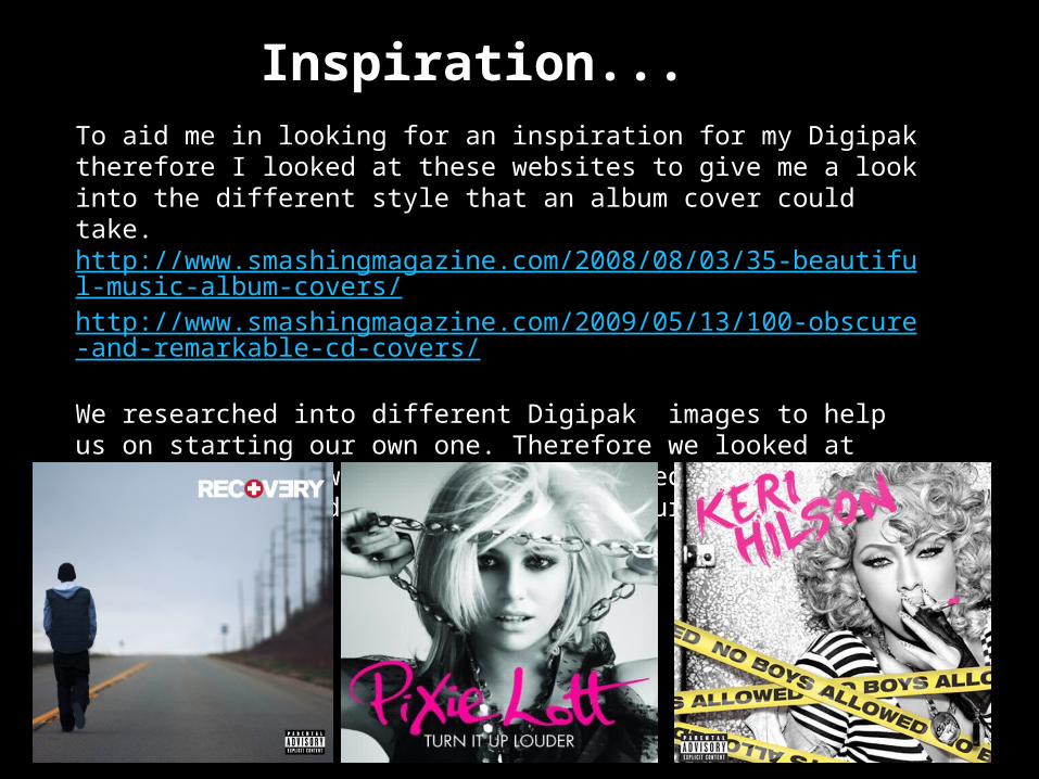
Inspiration...To aid me in looking for an inspiration for my Digipak therefore I looked at these websites to give me a look into the different style that an album cover could take.http://www.smashingmagazine.com/2008/08/03/35-beautiful-music-album-covers/http://www.smashingmagazine.com/2009/05/13/100-obscure-and-remarkable-cd-covers/
We researched into different Digipak images to help us on starting our own one. Therefore we looked at current artists which we felt expressed some of the theme’s we wanted to come across in our main image.