Digipak analysis
7
Ways In Which My Digipak Uses Conentions of Real Media Products
-
Upload
sanan-barissal -
Category
Documents
-
view
138 -
download
0
Transcript of Digipak analysis
Ways In Which My Digipak Uses Conentions of Real Media Products
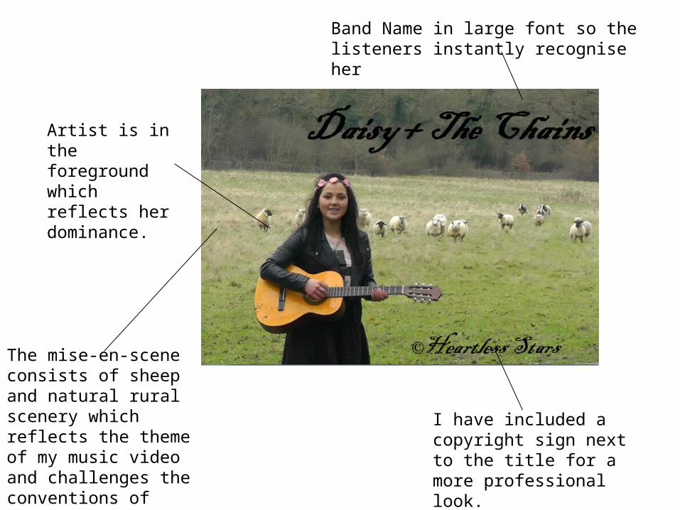
Band Name in large font so the listeners instantly recognise her
Artist is in the foreground which reflects her dominance.
The mise-en-scene consists of sheep and natural rural scenery which reflects the theme of my music video and challenges the conventions of close up shots for the first panel.
I have included a copyright sign next to the title for a more professional look.
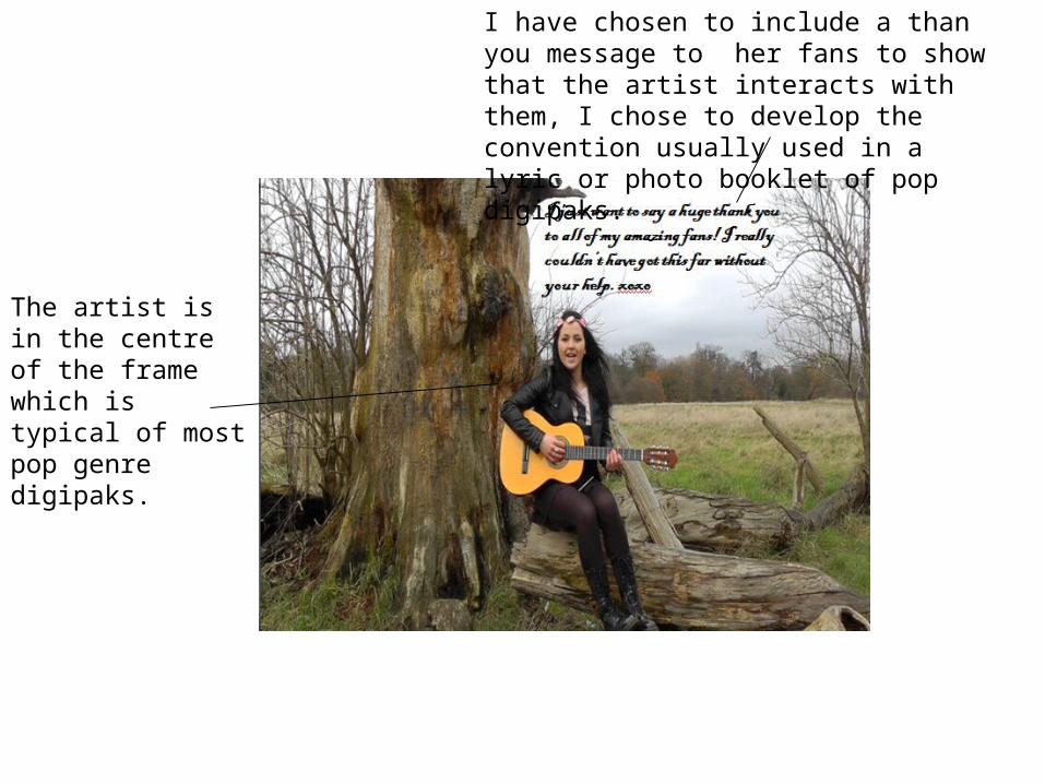
I have chosen to include a than you message to her fans to show that the artist interacts with them, I chose to develop the convention usually used in a lyric or photo booklet of pop digipaks.
The artist is in the centre of the frame which is typical of most pop genre digipaks.
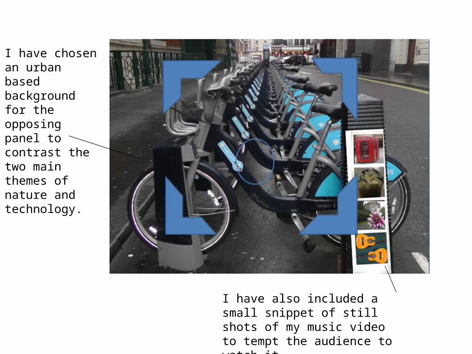
I have chosen an urban based background for the opposing panel to contrast the two main themes of nature and technology.
I have also included a small snippet of still shots of my music video to tempt the audience to watch it.
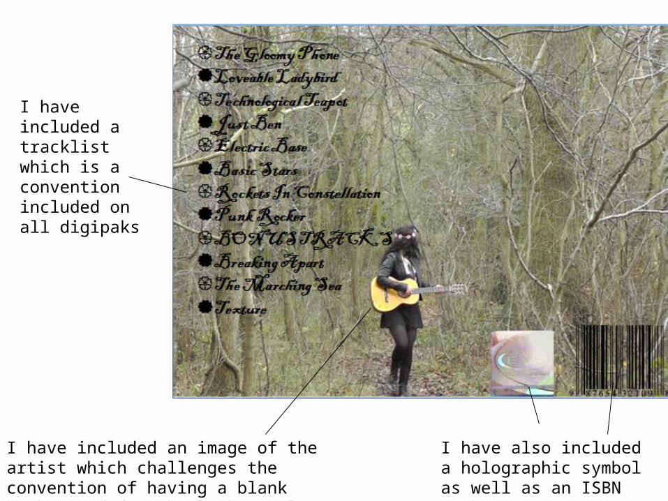
I have included a tracklist which is a convention included on all digipaks
I have included an image of the artist which challenges the convention of having a blank background for the back panel
I have also included a holographic symbol as well as an ISBN number
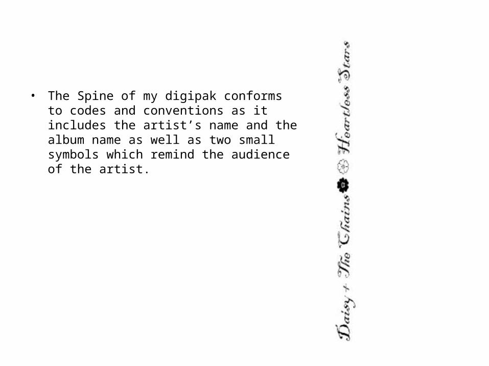
• The Spine of my digipak conforms to codes and conventions as it includes the artist’s name and the album name as well as two small symbols which remind the audience of the artist.
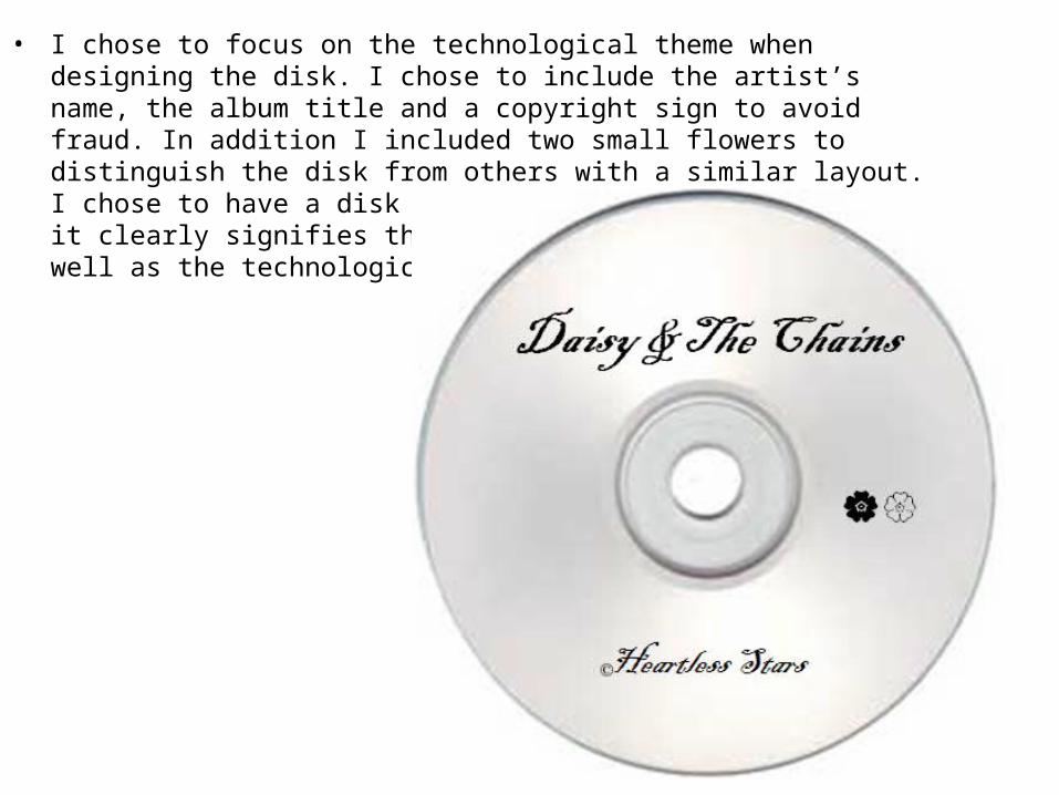
• I chose to focus on the technological theme when designing the disk. I chose to include the artist’s name, the album title and a copyright sign to avoid fraud. In addition I included two small flowers to distinguish the disk from others with a similar layout. I chose to have a disk that looks very technological as it clearly signifies the unique entity of the artist as well as the technological theme of the music video.