
Digipak Analysis
6
Digipak Analysis Lynley Sykes
-
Upload
lynley-sykes -
Category
Education
-
view
111 -
download
0
Transcript of Digipak Analysis

Digipak AnalysisLynley Sykes

CD/Inner Panel
Here I have a selection of digipak CDs the objective of this slide is to determine what kind of image to use on the CD itself as well as the panel right next to the CD. There are a variety of ways that this could be done. In image one a panoramic shot is used for the CD and the panel to the left of the CD I find this effective and a good way to make this part of the digipak look appealing to the public. Also this type of shot might be effective because of the nature of out video. As we intend to use various nature shots because of the location of our video. This might be the way to for this section of our digipak. Image two uses a panoramic shot for the left side of the album cover as well as behind the CD I think that this might be the best layout so far as our artist has a logo which might look the better on the CD itself. Image 3 has a very simple background with writing on the left side of the cover. The CD and the front
1 2
43
Spine of Digipak
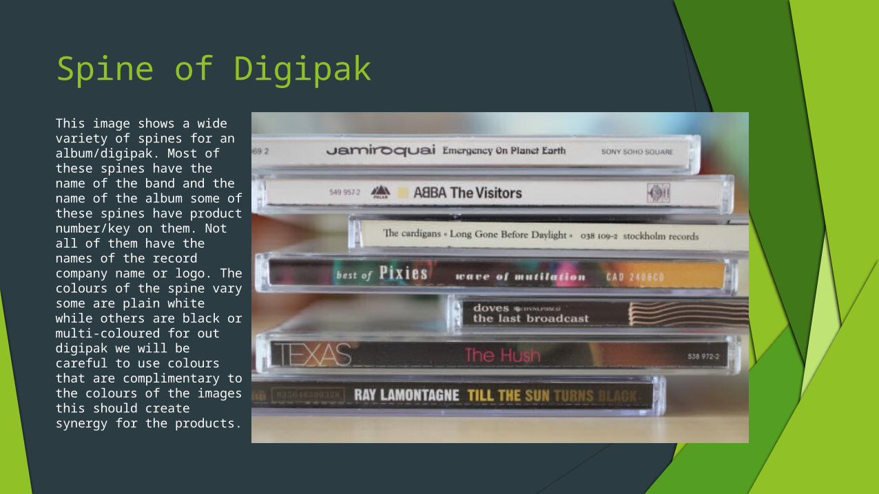
This image shows a wide variety of spines for an album/digipak. Most of these spines have the name of the band and the name of the album some of these spines have product number/key on them. Not all of them have the names of the record company name or logo. The colours of the spine vary some are plain white while others are black or multi-coloured for out digipak we will be careful to use colours that are complimentary to the colours of the images this should create synergy for the products.
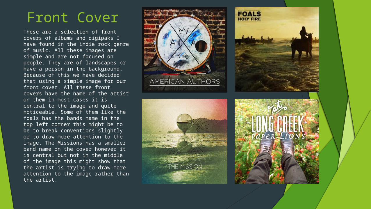
Front Cover These are a selection of front covers of albums and digipaks I have found in the indie rock genre of music. All these images are simple and are not focused on people. They are of landscapes or have a person in the background. Because of this we have decided that using a simple image for our front cover. All these front covers have the name of the artist on them in most cases it is central to the image and quite noticeable. Some of them like the foals has the bands name in the top left corner this might be to be to break conventions slightly or to draw more attention to the image. The Missions has a smaller band name on the cover however it is central but not in the middle of the image this might show that the artist is trying to draw more attention to the image rather than the artist.

BackThe back of the albums/digipaks are simple having a few lines on them and information of the record label company as well as copy right information and a barcode. We would like to use a layout similar to the Adele back as we would like to use an image on the right side of the back and have writing on the other side. All these backs use simple images with minimal writing. We think that this will be an effective way to go about designing our digipak and we would like to use a similar type effect.

Full DigipakThis digipak works well the image have a good synergy and suit the setting and feel of the album. All the pictures link well and fit in with the dark gloomy appearance that seems to be the theme. There is only one image with the whole hand on it while the rest either are land scape shots or show obscure images of a person like the front image. This is a good example of a six panel digipak and gives us something we can gain inspiration from and got a basic idea of what a six panel digipak should have on each panel.
