Digipak Analysis
11
Digipak Analysis Natalie Suchecki
-
Upload
nattsuchecki -
Category
Entertainment & Humor
-
view
136 -
download
0
Transcript of Digipak Analysis

Digipak AnalysisNatalie Suchecki

What is a digipak?A digipak is the name for the type of packaging used for CD’s and DVD’s. These are typically made from cardboard often with a internal plastic section to hold one or more disks. The digipak was first created by Meadwestvaco and is now a registered trademark of AGI-Shorewood, an Atlas Holdings LLC company. However over time these gatefold designs have become more and more popular and are now used by more and more manufacturers. This style of packaging is often used for CD singles or special editions of an artists album, for example the live tour album or the greatest hits. Below are some examples of Digipaks.

How do digipaks benefit the artist?
The artists predominate genre will often be represented on the front of the case, which allows us to identify with their style of music. They often embody a theme and a message about the artist also, emphasising the artists brand image. Fans may also be able to relate to this which in turn will encourage popularity for this artist. The digipak is often used to exemplify the creative approach to the genre and pose a link often between the lyrics and visuals to reinforce the intentions of the artist.Digipaks often convey Andrew Goodwin's theory. Although Andrew Goodwin's theory focuses solely on music videos, I feel his ideas work well on other promotional packages too. Often on the front of digipaks there is a close up of the artist which allows us to recognise their music instantly. The notion of looking is also incorporated which can encourage a personal feeling between the artist themselves and the fan. An artist can only be in one place at once, a digipak allows them to engage with their fans as much as possible and provide them with ‘a kit’ to feel closer to them.Digipaks obviously benefit the promotional aspects of the music industry through helping the record label bring awareness to the artist. This encourages consumers e.g. fans to buy and listen to the artist, a digipak is just a single entry point into their world. The record label will often produce posters and other merchandise to increase the entry points fans have to their artist. Furthermore it could be said that a digipak suggests loyalty between a fan and the artist.

Paramore Riot AnalysisThe album Riot was released in 2007 and was their first real breakthrough with their single ‘Misery Business’. Paramores aim was to express their genre uniquely and they band did not want to be seen as a typical rock band. They wanted to find a way for their fans to relate to their music and express themselves through the music that they created. On the front cover the central image of the band is the main focus point. Here each member of the band, in particular the main singer Hayley Williams are looking directly at the audience to encourage us to engage with them. This is the notion of looking and makes the band stand out and catch our eye when on the shelves. It can often mean that fans relate more with the band as it creates a personal feel as you feel they are just looking at you. In addition to this the image is taken through a high angle shot which makes the band look up as if they are addressing us to a higher power, making us feel special and this gives a friendly impression. The use of bold black on a white back ground makes us able to see the band clearer, yet the shading of the colours hides some of their attributes connoting mystery and makes us want to look further at perhaps posters and other leaflets that are within the digipak. These colours are conventional of the genre and the use of orange for the title is a bold contrast and suggests to us that this is an important feature. The whole image of the band and the title ‘Riot’ suggest chaos, in particular the typography used reinforces this as it is a rough sketch which gives the band an edgy feel opposed to a script style font that would connote formality. Once more reinforcing the genre just as Andrew Goodwin suggests.The title suggests that we should be laid back and let go of ourselves, to an extent. Which recreates the bands mission to allow fans to relate to their music and express themselves as many paramore fans are often between the age of 16-25.

Furthermore, the entire front cover is full of words written in a sketched typography connoting a rough and urban environment just as many of their music videos do. This shows their genre and allows the audience to identify with this quickly. At the bottom right is some orange coloured text, standing out from the rest of the piece we automatically recognise that this is important information similar to a strap line on a magazine. This information is about the band and their promotion company and is used to catch your eye and make you recognise them. The repitition of the title ‘Riot’ surrounds the band numerous times and this is a promotional technique to allow us to easily remember the bands name. This is a simple and effective background not only for promotional purposes but it reinforces genre giving that urban feel and also the black allows the orange to stand out more. The typography is signifying anger and frustration which is something conventional of a rock band, this gives the notion of rebelling something closely associated with the title ‘Riot’. The back cover is very similar in terms of house styles and conventions. The title names are in bright orange to contrast with the black background, making them appear as important information and stand out from the rest, a technique also used on the front cover. The large image on the back makes us easily able to recognise the band and once more the close up is used as a promotional technique so that we can relate to them. We also see the notion of looking here also, so that no matter which way we look at the album we feel a link to them. The shot is also at eye level which means that are addressing the audience directly which gives a friendly approach. This image however contrasts with the one on the front which connotes chaos and anger. I have noticed how the production credits are in a simple plain text to signify their importance.

The inside cover has information of the main songs lyrics such as ‘Misery business’ and ‘Thats what you get’ which are the bands most successful tracks from this album.This also shows a close up of each band member which furthermore allows us to identify with them easier. The entire piece is used as a promotional technique to allow us to engage with the band and feel a connection with them. There are also credits to the producers from whom the band would like to thank. This is done in similar typography to that of the front and back cover to carry on the signification of the urban and rough feel which represent the band and reinforces the genre.The CD front cover is very bold and is used solely to reinforce the title of the album. The use of orange on a white background is very bold. Orange itself connotes heat, passion and perhaps anger as the colour is close to a red. These are all conventions of a rock band like paramore.The same typography is used however we see it better here. The scratched effect symbolises anger and frustration and really does reinforce the title ‘Riot’ along with their genre and intentions.I feel the overall digipak is an excellent representation of their band, genre and mission. It reflects all of the main aspects associated with this type of music whilst promoting the band in a subtle way.

Avril LavigneFor my second digipak analysis I have chosen to analyse Avril Lavigne's album ‘Avril Lavigne’. I've chosen this artist and digipak as I feel it links closely and shares conventions similar to our chosen band Paramore. This is her fifth album which was released in November 2013. On her album is a mixture of pop rock and punk rock songs which is integrating her past production with her new production as she develops herself as an artist.The front cover consists of a bold black background which connotes mystery and follows conventions of a rock genre. The title written in white contrasts well and stands out which allows us to recognise and identify with it instantly, a convention I have noticed across many albums. The typography is stencil like which gives it a rougher more laid back theme. The white particles surrounding it can be seen as representing chalk, as though she has written the title on herself which reinforces the idea of her being a young artist. The close up of her is a good promotional technique as it allows the audience to recognise whos album it is when it is on the shelves. Notice she is not looking directly at us which disputes with the theory of Andrew Goodwin and the notion of looking. This shows rebellion which is a strong convention of rock music. The use of makeup is important here also. She is photographed looking very pale with bold black eyes and little colour to her lips. This is often associated with this genre for example Marilyn Manson was often portrayed in this way. This once more reinforces genre. The use of bold black eye makeup allows us to engage with her more personally, and helps us to gain eye contact even though she is not looking directly at us. The hair style pulls her hair away from her face which also makes her more recognisable.The simplistic front cover design reinforces the idea of simplicity, a laid back lifestyle and a care free life, all strong connotations of rock artists and bands.

The colour scheme is followed onto the back of the digipak which represent continuity. Here we see a medium close up of the artist who appears very feminine. In this image she looks directly at us, reinforcing the notion of looking. This also links to the male gaze, she is enticing both men and women to look at her and perhaps want to be her. Her beauty is amplified by her makeup and her hairstyle off of the face allows us to recognise this clearer. The black background only makes her stand out more as the bright lighting on her pale face makes her appear 3D making her stand out to the audience and appear closer to them. She is also aligned centre left of the piece making her the focal point where our eyes will go automatically which in turn is a very clever promotional technique.The tracks are listed and numbered on the back in a narrow and neat typography, which contrasts to the font used on the paramore album. The font connotes formality, femininity, beauty and precision. Everything associated with female artists. However I do feel that this typography does not represent her genre very well and can be perhaps misleading to somebody looking at this who does not know her as an artist.The barcode is surrounded by a white mist which makes it stand out more this fits with the album and colour scheme. Everything looks formal and in place which shows that the digipak has been well thought out. However once more this does not reflect a rock genre. The production company along with other important information is displayed in the bottom left hand corner of the CD in plain and simplistic writing to show us that this is important information, this is a convention of any digipak.The spine of the album shows the record label logo, to make it easily identifiable. The name of the album and artist is one and is displayed once more in a bold white constrasting with the background, this will stand out on shelves in the stores and also stand out on a fans own shelf.
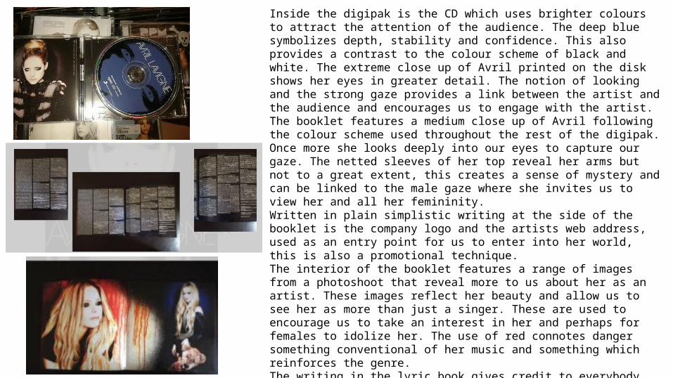
Inside the digipak is the CD which uses brighter colours to attract the attention of the audience. The deep blue symbolizes depth, stability and confidence. This also provides a contrast to the colour scheme of black and white. The extreme close up of Avril printed on the disk shows her eyes in greater detail. The notion of looking and the strong gaze provides a link between the artist and the audience and encourages us to engage with the artist. The booklet features a medium close up of Avril following the colour scheme used throughout the rest of the digipak. Once more she looks deeply into our eyes to capture our gaze. The netted sleeves of her top reveal her arms but not to a great extent, this creates a sense of mystery and can be linked to the male gaze where she invites us to view her and all her femininity. Written in plain simplistic writing at the side of the booklet is the company logo and the artists web address, used as an entry point for us to enter into her world, this is also a promotional technique.The interior of the booklet features a range of images from a photoshoot that reveal more to us about her as an artist. These images reflect her beauty and allow us to see her as more than just a singer. These are used to encourage us to take an interest in her and perhaps for females to idolize her. The use of red connotes danger something conventional of her music and something which reinforces the genre.The writing in the lyric book gives credit to everybody who has helped her to produce her music and each individual song and is written in clear simple typography so that we can understand this well.

Green DayAmerican idiot is the seventh studio album produced by the american punk rock band Green Day. The album was produced by longtime collaborator Rob Cavallo. As mentioned before it is obvious that the conventions of a rock genre are very different to that of pop or indie music. This is represented particularly well on this album which does not feature an image of the band as the main focal point on the digipak cover. The colour scheme of red, black and white is very conventional of the rock genre. The black background reflects the punk rock element of the music and gives a deeper, darker overall feel to the band. The use of white font on top of the black creates a bold, impressionistic feeling which will instantly catch the eyes of the audience when on the shelves amongst other albums. Furthermore, black generally holds negative connotations also of death, tragedy, loss and despair which are often themes that feature in the songs of rock bands. Therefore we can say that there is a clear link between the lyrics and the visuals.Red is a prominent colour connoting often passion, danger or hatred. On this cover the heart is coloured red, symbolizing passion. Yet is also portrayed as a grenade. This is a mixture of two antithetic symbols of love and of hate. This suggests that the two are very close and that one may lead to the other, connoting that love is destructive. This strongly conveys the tone of their music. The blood dripping from the heart and the grenade may appeal to males as grenades are often used in video games that are played by males. On the other hand the heart and the strong meaning conveyed may appeal to females and therefore this cover is targeted at a wide audience. Also the use of the distressed font reflects the rebellious attitude of the band which appeals to their male primary target audience.

The colour scheme is followed through onto the back of the album, where the important information such as the tracklist is shown in a contrasting colour to make it stand out more to the audience. This could also show connotations of rebellion as typically text is black on a white background, this shows they are going against the norm which is very conventional of a rock band. This may also show that they are exciting, young and free and dont play by the rules. The use of a magnifying glass could symbolize that they are looking for something or that they are lost, this could be reflected in the lyrics in their songs once more reinforcing the link between the lyrics and the visuals. A magnifying glass could also connote crime as they can be used to look for clues. This reinforces rebellion and the overall rock genre.The colour scheme used on the disk shows continuity through the use of colours. It is also consistent with the front cover depicting the image of the hand with blood dripping from it. The use of white on black for the track list highlights the important features as done on the back of the digipak. The layout of the disk and overall covers really does reinforce their genre and the conventional intentions that rock bands hold. This is opposed to pop artists who mainly feature images of themselves on their digipaks to show that their image is vital to the success of their career. The booklet inside the digipak shows the lyrics to each song on the album. The typography is hand written which reflects chaos, rebellion and an urban environment. It also holds connotations of young children. The doodles and emphasis on particular words gives a fun overall vibe which is their intention as a band.