Digipak analysis
8
Fall Out Boy – Infinity On High Digipak Analysis By Dani Wilkinson
-
Upload
daniwilkinson -
Category
Social Media
-
view
89 -
download
0
Transcript of Digipak analysis

Fall Out Boy – Infinity On High Digipak Analysis
By Dani Wilkinson
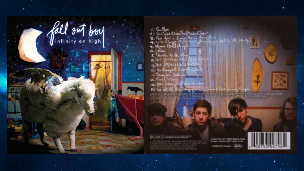
DescriptionInstead of the image of the artist this one has a sheep with wings in a bedroom which is the first thing you notice when you look at the album as it’s bigger and uncommon. You eyes are then drawn to the moon and then the text. The background of the picture includes a bed, a cuckoo clock, an empty wardrobe and and a crow sitting on a bath filled with pumpkin. The walls in the bedroom have been made to look like the night sky with the light blue dots for stars and then the 3D moon that looks to be made of paper.The band name is in a written font as though it has been signed or written quickly by the band to personalise the album as their own, the same effect applies to the back of the album. The album name however it in a straight forward block text to counteract the cover and the band name. The cover itself is closed and very busy. There is a lot going on so no matter where you look there is something different their, it’s like this to constantly keep your attention and to make you think deeper about the album.The back of the album has the song names and an image of the band members who are staring straight at you. This direct address makes the album seem more personal as they are engaging your attention and trying to send you a message.
Reception TheoryThe reception theory is used because there are a lot of visuals to be discussed about. The album cover is full of different and weird objects so there is always something to look at and entice the audience in. The cover is a representation of the band and how far away they are from normal. The title is ‘Infinity on High’ which could be connoting the use of drugs and being high which would explain the randomness of the album cover. It could also be a reference to the stuffed sheep with wings which would be the first thing the audience the see and could be received in a positive or negative way, depending on who it is. They could either find it funny and weird or inaccurate and annoying. The back of the album doesn’t have as many visuals to discuss apart from the expression on the artists faces and how they are directly looking at you. This could be taken one of two ways, the audience could like this as the artists are looking at you and making the album seem more personal but they cold also dislike it as they look quite miserable and it could affect your view on this album.

Todorov’s Theory Todorov’s theory can be applied to this album cover because it could be considered as a disruption of order from the equilibrium due to an event. We don’t know what the event is but the album cover has so much happening that we have to assume reality has been disrupted. The whole cover image is blurry as though it is being shaken which only adds to the disruption effect.The back of the album could be the a return or restoration of a NEW equilibrium because they are back but hey are different, you can see that through their facial expressions; they are looking straight at you.
Language and TypographyThe title ‘Infinity on High’ could have a lot of connotations. It could be expressing that they are better than other artists as they are higher than them and will be for ‘infinity’. It could also be a reference to drugs and them being high in a literal sense. They font style on the front and back of this album is messy and looks similar to handwriting which could be making it seem more personal, as though they wrote it themselves for you. The legibility is also an issue because they have made it harder for you to read which could be a clever way to make you buy the album so you find out what the songs are and figure out the names.The names of the songs themselves also leave a lot to our imagination because they are quite vague, which could again be a clever way of making you interested in this album so you’d want to buy it to figure out how the titles are related to the songs.
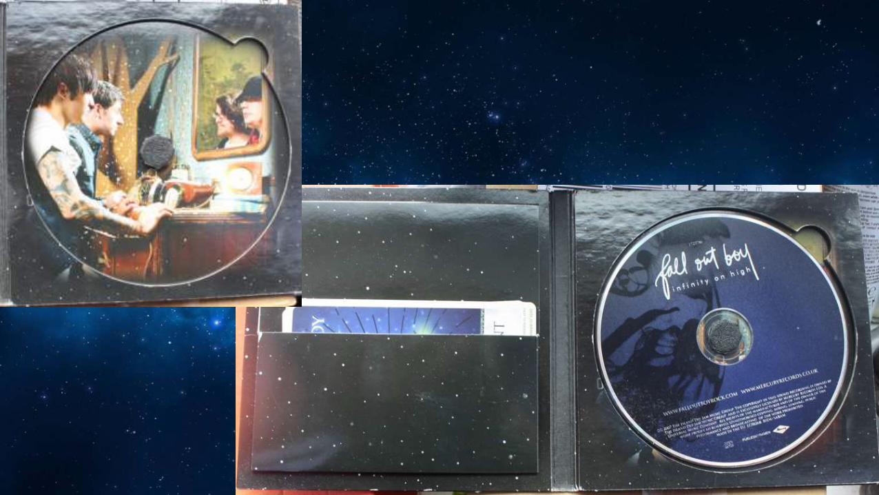

InsideThe inside of this digipak the background is of the night sky which relates tot he album title ‘Infinity on High’ because the sky is infinite. There’s a little pocket that holds tarot cards which is the unique selling point of this album and can be an attraction to their target audience. The CD is blue like the sky on the front and has a darker blue pattern going through it to make it more interesting. The font is the same as on the front cover which keeps up the continuity. Behind the CD is an image of two of the band members looking into a mirror and the other two members looking back which could connote that they are a lot like each other which is why they work well together.