Diffuse groundwater recharge modelling across Tasmania · Figure 1. Location of study region...
71
Russell S. Crosbie, James L. McCallum & Glenn A. Harrington February 2010 Diffuse groundwater recharge modelling across Tasmania
Transcript of Diffuse groundwater recharge modelling across Tasmania · Figure 1. Location of study region...

Russell S. Crosbie, James L. McCallum & Glenn A. Harrington
February 2010
Diffuse groundwater recharge modelling across
Tasmania

Water for a Healthy Country Flagship Report series ISSN: 1835-095X
Australia is founding its future on science and innovation. Its national science agency, CSIRO, is a
powerhouse of ideas, technologies and skills.
CSIRO initiated the National Research Flagships to address Australia’s major research challenges and
opportunities. They apply large scale, long term, multidisciplinary science and aim for widespread adoption
of solutions. The Flagship Collaboration Fund supports the best and brightest researchers to address these
complex challenges through partnerships between CSIRO, universities, research agencies and industry.
The Water for a Healthy Country Flagship aims to achieve a tenfold increase in the economic, social and
environmental benefits from water by 2025.
For more information about Water for a Healthy Country Flagship or the National Research Flagship Initiative
visit www.csiro.au/org/HealthyCountry.html
Citation: Crosbie RS, McCallum JL, and Harrington GA 2009. Diffuse groundwater recharge modelling
across Tasmania. CSIRO: Water for a Healthy Country National Research Flagship
Copyright and Disclaimer
© 2008 CSIRO To the extent permitted by law, all rights are reserved and no part of this publication covered
by copyright may be reproduced or copied in any form or by any means except with the written permission of
CSIRO.
Important Disclaimer:
CSIRO advises that the information contained in this publication comprises general statements based on
scientific research. The reader is advised and needs to be aware that such information may be incomplete or
unable to be used in any specific situation. No reliance or actions must therefore be made on that
information without seeking prior expert professional, scientific and technical advice. To the extent permitted
by law, CSIRO (including its employees and consultants) excludes all liability to any person for any
consequences, including but not limited to all losses, damages, costs, expenses and any other
compensation, arising directly or indirectly from using this publication (in part or in whole) and any
information or material contained in it.

Page 1
Contents
Contents 1
List of Figures ............................................................................................................................................. 2
List of Tables .............................................................................................................................................. 4
Acknowledgments ................................................................................................................................... 5
Executive Summary ................................................................................................................................. 6
1 Introduction ............................................................................................................................... 8 1.1 Project Scope ............................................................................................................................................................... 8 1.2 Description of project area ............................................................................................................................................ 8 1.3 Aims of project ............................................................................................................................................................. 8 1.4 Guidance on interpreting results ................................................................................................................................... 9
2 Methods ................................................................................................................................... 10 2.1 Point scale modelling.................................................................................................................................................. 10
2.1.1 Selection of model code ............................................................................................................................... 10 2.1.2 Control points ............................................................................................................................................... 10 2.1.3 Climate ......................................................................................................................................................... 12 2.1.4 Soil ............................................................................................................................................................... 14 2.1.5 Vegetation .................................................................................................................................................... 17
2.2 Upscaling ................................................................................................................................................................... 20 2.3 Aggregation ................................................................................................................................................................ 21
3 Results ...................................................................................................................................... 22 3.1 Point scale modelling.................................................................................................................................................. 22 3.2 Upscaling ................................................................................................................................................................... 26
3.2.1 Scenario A ................................................................................................................................................... 26 3.2.2 Scenario B ................................................................................................................................................... 28 3.2.3 Scenario C ................................................................................................................................................... 29 3.2.4 Scenario D ................................................................................................................................................... 33
3.3 Aggregation ................................................................................................................................................................ 38
4 Discussion ................................................................................................................................ 43 4.1 A sensitivity analysis of recharge to WAVES climate inputs ........................................................................................ 43
4.1.1 Rainfall ......................................................................................................................................................... 44 4.1.2 Carbon Dioxide ............................................................................................................................................ 45 4.1.3 Temperature ................................................................................................................................................ 46 4.1.4 Vapour Pressure Deficit................................................................................................................................ 47 4.1.5 Solar Radiation ............................................................................................................................................. 48 4.1.6 Daily Rainfall Intensity .................................................................................................................................. 49
4.2 Why does the Scenario A recharge decrease with time? ............................................................................................ 50 4.3 How can recharge increase when rainfall decreases? ................................................................................................ 60 4.4 An assessment of the Scenario C results in light of the performance of the GCMs ..................................................... 63 4.5 An assessment of the methodology ............................................................................................................................ 65
4.5.1 Limitations of the methodology ..................................................................................................................... 65 4.5.2 Further work required ................................................................................................................................... 65
5 Conclusions ............................................................................................................................. 66
References .............................................................................................................................................. 67

Page 2
List of Figures
Figure 1. Location of study region showing the reporting regions and the groundwater assessment areas. ..................................... 8 Figure 2. Annual average rainfall for the historical period (1924-2007) and the control points used for WAVES modelling. These were selected to cover the rainfall gradient with a bias toward the priority catchments. .................................................................. 11 Figure 3. Historical (1924-2007) monthly average rainfall (bars) and PET (line) at each of the control points. ................................ 12 Figure 4. Soils types across Tasmania, simplified from Johnston et al. (2003). On the left is the original soil order map and the on the right is the map that was used after the dominant soil type had been extracted for each 0.05°x0.05 ° SILO grid cell................. 15 Figure 5. Vegetation types across Tasmania for Scenarios A, B & C, simplified from BRS (2008). ................................................ 18 Figure 6. Vegetation for Scenario D. The new plantations were randomly assigned from all suitable land. .................................... 19 Figure 7. Example annual time series of recharge for a high rainfall point (A) with annual vegetation on a Dermosol soil also showing the 10th, 50th and 90th percentiles of the 23 year averages of recharge. ............................................................................ 22 Figure 8. Relationships between annual average rainfall and recharge for each combination of soil and vegetation types used for upscaling to create Scenario A recharge raster. ............................................................................................................................. 23 Figure 9. Frequency of finish year selected for 23 year periods of Awet, Amid and Adry. ............................................................... 24 Figure 10. Example of regression equations developed for the 23 year (RSF23) Awet, Amid and Adry with the 84 year historical modelled recharge (R84). .............................................................................................................................................................. 25 Figure 11. Scatterplot of change in annual average rainfall versus change in annual average recharge between Scenario A and Scenario C for all GCMs, soil and vegetation types lumped together separated by the global warming scenarios (High, Medium & Low). ............................................................................................................................................................................................. 26 Figure 12. Scenario A recharge averaged over the 84 years of interest. ........................................................................................ 27 Figure 13. Scenario A 23 year variants (Awet, Amid and Adry) expressed as an RSF compared to the 84 year historical Scenario A. ................................................................................................................................................................................................... 27 Figure 14. Scenario B RSF raster and Scenario B rainfall expressed as the 11 year rainfall (P11) as a proportion of the 84 year rainfall (P77). ................................................................................................................................................................................. 29 Figure 15. Rasters of RSFs from each GCM for the Scenario C low global warming scenario. ...................................................... 30 Figure 16. Rasters of RSFs from each GCM for the Scenario C medium global warming scenario. ............................................... 31 Figure 17. Rasters of RSFs from each GCM for the Scenario C high global warming scenario. ..................................................... 32 Figure 18. Number of GCM derived climate scenarios that predict a decrease in recharge for the Scenario C low, medium and high global warming scenarios and compared to the number of GCMs which predict an decrease in rainfall. ........................................ 33 Figure 19. Rasters of RSFs from each GCM for the Scenario D low global warming scenario. ...................................................... 34 Figure 20. Rasters of RSFs from each GCM for the Scenario D medium global warming scenario. ............................................... 35 Figure 21. Rasters of RSFs from each GCM for the Scenario D high global warming scenario. ..................................................... 36 Figure 22. Number of GCM derived climate scenarios that predict a decrease in recharge for the Scenario D low, medium and high global warming scenarios and compared to the number of GCMs which predict a decrease in rainfall. .......................................... 37 Figure 23. Composite rasters of Cwet, Cmid and Cdry. .................................................................................................................. 40 Figure 24. Composite rasters of Dwet, Dmid and Ddry. .................................................................................................................. 41 Figure 25. Sensitivity of recharge estimates to changes in daily rainfall. ........................................................................................ 44 Figure 26. Sensitivity of recharge estimates to changes in concentration of carbon dioxide in the atmosphere. ............................. 45 Figure 27. Sensitivity of recharge estimates to changes in temperature. ........................................................................................ 46 Figure 28. Sensitivity of recharge estimates to changes in vapour pressure deficit. ....................................................................... 47 Figure 29. Sensitivity of recharge estimates to changes in solar radiation. ..................................................................................... 48 Figure 30. Sensitivity of recharge estimates to changes in daily rainfall intensity............................................................................ 49 Figure 31. Annual series of recharge at 20 points for the Scenario A climate and the soil and vegetation that dominate that pixel. The blue line on each plot is the average annual recharge for the period 1924 to 1974 and the red line is the annual average recharge for the period 1997-2007. ................................................................................................................................................ 51 Figure 32. Double mass curves of cumulative rainfall versus cumulative recharge for each of the 20 control points and the soil and vegetation that dominates that pixel. .............................................................................................................................................. 53 Figure 33. Annual series of rainfall at 20 points for the Scenario A climate. The blue line on each plot is the average annual rainfall for the period 1924 to 1974 and the red line is the annual average rainfall for the period 1997-2007. ............................................ 54 Figure 34. Annual series of average daily maximum temperature (tmax) at 20 points for the Scenario A climate. The blue line on each plot is the average tmax for the period 1924 to 1974 and the red line is the average tmax for the period 1997-2007. ................. 56 Figure 35. Annual series of average daily minimum temperature (tmin) at 20 points for the Scenario A climate. The blue line on each plot is the average tmin for the period 1924 to 1974 and the red line is the average tmin for the period 1997-2007. ........................... 57 Figure 36. Annual series of average daily vapour pressure deficit (VPD) at 20 points for the Scenario A climate. The blue line on each plot is the average VPD for the period 1924 to 1974 and the red line is the average VPD for the period 1997-2007. ............. 58 Figure 37. Annual series of average solar radiation at 20 points for the Scenario A climate. The blue line on each plot is the average daily solar radiation for the period 1924 to 1974 and the red line is the average daily solar radiation for the period 1997-2007. ............................................................................................................................................................................................. 59 Figure 38. A histogram of the years selected for a statistically significant step change in recharge, rainfall and vapour pressure deficit at the 20 points as identified by the Distribution Free CUSUM Test, the Cumulative Deviation Test and the Worsley Likelihood Ratio Test. .................................................................................................................................................................... 60 Figure 39. Probability of exceedance curves for daily rainfall and recharge for three climate points with annual vegetation on Dermasol soils. .............................................................................................................................................................................. 61

Page 3
Figure 40. Probability of exceedance curves for daily rainfall and recharge for three climate points with tree vegetation on Dermasol soils. .............................................................................................................................................................................. 62 Figure 41. A comparison of the weighted and unweighted RSF rasters after being fitted to a Pearson Type III distribution. The plot shows the 10th and 90th percentile exceedance rasters for the high global warming scenario and the 50th percentile exceedance for the medium global warming scenario. The difference plots are the weighted minus the unweighted. ............................................. 64

Page 4
List of Tables
Table 1. Summary of recharge scaling factors for each reporting region and scenario. .................................................................... 7 Table 2. Soil parameters used in WAVES modelling: saturated hydraulic conductivity. .................................................................. 15 Table 3. Soil parameters used in WAVES modelling: saturated moisture content (residual moisture content assumed to be 0.2). . 16 Table 4. Soil parameters used in WAVES modelling: inverse capillary length scale. ...................................................................... 16 Table 5. Soil parameters used in WAVES modelling: empirical constant. ....................................................................................... 17 Table 6. Vegetation parameters for WAVES model taken from the user manual (Dawes et al., 2004). ........................................... 20 Table 7. RSFs for Scenario A and B aggregated to the reporting region. ....................................................................................... 28 Table 8. RSFs for Scenario A and B aggregated to the GAA. ........................................................................................................ 28 Table 9. Scenario C changes in rainfall and recharge for the Arthur-Inglis-Cam region for each GCM and global warming scenario. ...................................................................................................................................................................................................... 38 Table 10. Scenario C changes in rainfall and recharge for the Pipers-Ringarooma region for each GCM and global warming scenario. ........................................................................................................................................................................................ 38 Table 11. Scenario C changes in rainfall and recharge for the South-Esk region for each GCM and global warming scenario. ...... 39 Table 12. Scenario C changes in rainfall and recharge for the Mersey-Forth region for each GCM and global warming scenario. . 39 Table 13. Scenario C changes in rainfall and recharge for the Derwent-South East region for each GCM and global warming scenario. ........................................................................................................................................................................................ 40 Table 14. Summary of Scenario C and D RSFs aggregated to the reporting region level. .............................................................. 41 Table 15. Summary of Scenario C and D RSFs aggregated to the GAA level. ............................................................................... 42 Table 16. Weights for each GCM for use in weighted Pearson Type III distribution. The weights are 1 minus the failure rate identified by Post et al. (2009). ....................................................................................................................................................... 63 Table 17. Comparison of the average RSFs calculated for each reporting region from the RSFs as output from the Pearson Type III distribution for the weighted and unweighted cases. .................................................................................................................. 65

Page 5
Acknowledgments
This Water for a Healthy Country Science Report contains research that was carried out as part of the
CSIRO Tasmania Sustainable Yields Project, however it is not one of the official deliverables from that
project.

Page 6
Executive Summary
The Tasmania Sustainable Yields (TasSY) Project aims to investigate the water resources across Tasmania now and
into the future. Diffuse dryland groundwater recharge is only a small component of the water balance but has an
influence on the amount of groundwater available for consumptive use and sustaining groundwater dependant
ecosystems. Prudent management of water resources requires that all threats to water availability are investigated and
assessed for uncertainty. Climate change is one cause of uncertainty in the availability of future water resources and its
impact upon groundwater recharge has been investigated here. This project follows from the Murray-Darling Basin
Sustainable Yields (MDBSY) Project and the methods used here are based upon those used in the MDBSY project.
Groundwater recharge was modelled at selected points using the WAVES model for a variety of soil type and vegetation
types and is reported as a scaling factor that is the ratio of a given scenario to historical recharge rates. Recharge scaling
factors were calculated for each climate scenario at those selected points. The point scale estimates of the recharge
scaling factors were then upscaled to the entire TasSY area using soil type, vegetation type and rainfall as covariates to
create rasters of recharge scaling factors for each scenario.
The scenarios investigated here are the historical climate (Scenario A), the recent climate (Scenario B), future climate as
predicted by 15 different global climate models (Scenario C) and a future climate with future forestry development
(Scenario D) (described elsewhere). The outputs of this report are a series of rasters for the change in recharge
throughout the TasSY region at a resolution of 0.05° × 0.05° for each of these climate scenarios. There are three variants
of Scenario A; these represent the 10th, 50th and 90th percentile of 23 year periods within the 84 year historical sequence.
The results of Scenario C and D are presented as a composite of the different global climate models to create a wet, mid
and dry scenario. These rasters were aggregated to provide recharge scaling factors for each region. The recharge
scaling factors are used to assess the change in the groundwater resources of Tasmania as a result of climate change,
as reported elsewhere.
For the historical climate (Scenario A) the results were very consistent between reporting regions with the median
projection for the next 23 years being between a 9 and 15 percent increase in recharge. The wet extreme projection for
the next 23 years is between a 52 and 67 percent increase in recharge for the different reporting regions and the dry
extreme projection between a 46 and 55 percent decrease in recharge for the different reporting regions. The large
spread of results from Scenario A are because the climate of Tasmania has not been stationary over the past 84 years,
there has been a statistically significant increase in temperature and vapour pressure deficit over the past few decades
leading to a downward trend in the modelled historical recharge. This has resulted in the Awet periods being selected
from early in the time series and Adry being selected from more recent times.
The recent climate (Scenario B) has been characterised by drought and therefore all of the reporting regions showed a
decrease in groundwater recharge with a maximum decrease of 74 percent below the modelled historical average for the
Pipers-Ringarooma region.
For a future climate (Scenario C) the median projection is for an increase in recharge in most regions of between 2 and
11 percent with only the South Esk region projected to have a decrease of 1 percent. For the wet extreme, the
projections for all reporting regions show an increase in recharge of between 8 and 19 percent. For the dry extreme,
most reporting regions are projected to have a decrease in recharge of up to 8 percent except for the Derwent-South
East which shows no change.
For a future climate and future forestry development (Scenario D) the median projection is for a range between a
reduction of 3 percent and an increase of 11 percent. For the wet extreme all regions project an increase in recharge of
between 2 and 18 percent. For the dry extreme most regions are projected to have a decrease in recharge of up to 13
percent except for the Derwent-South East which shows no change.

Page 7
Table 1. Summary of recharge scaling factors for each reporting region and scenario.
Reporting region Adry Amid Awet B Cdry Cmid Cwet Ddry Dmid Dwet
Arthur-Inglis-Cam 0.46 1.14 1.61 0.32 0.97 1.05 1.10 0.95 1.04 1.08
Pipers-Ringarooma 0.43 1.15 1.64 0.26 0.92 1.02 1.08 0.87 0.97 1.02
South Esk 0.54 1.15 1.52 0.53 0.94 0.99 1.11 0.92 0.97 1.09
Mersey-Forth 0.50 1.12 1.54 0.48 0.98 1.06 1.11 0.93 1.01 1.05
Derwent-South East 0.45 1.09 1.67 0.41 1.00 1.11 1.19 1.00 1.11 1.18

Page 8
1 Introduction
1.1 Project Scope
In March 2008, the Council of Australian Governments (COAG) asked CSIRO to extend the work that was done in the
Murray-Darling Basin Sustainable Yields (MDBSY) Project to other areas of Australia. The Tasmania Sustainable Yields
(TasSY) Project was one of three new sustainable yields projects undertaken by CSIRO. This project is tasked with
investigating the water availability across Tasmania for a range of current and future climate and development scenarios.
1.2 Description of project area
The TasSY project area covers most of Tasmania except for the catchments draining to the west coast. The project area
is sub-divided into five reporting regions based upon surface water catchments (Figure 1). For the groundwater section of
the project there are 20 groundwater assessment areas that have a higher level of analysis (Harrington et al., 2009).
Figure 1. Location of study region showing the reporting regions (left) and the groundwater assessment areas (right).
1.3 Aims of project
This technical report describes a small segment of the larger Tasmania Sustainable Yield Project, which aims to estimate
the amount of water available throughout the region for every catchment and aquifer under a series of historical and
future climate scenarios. This report provides the technical background to the recharge results reported in the TasSY
groundwater technical report (Harrington et al., 2009).
This report describes the groundwater recharge component of this work. This project aims to:
• use a similar methodology to the MDBSY project for estimating the change in diffuse groundwater recharge with
a change in climate

Page 9
• provide estimates of the change in recharge caused by a change in climate for all reporting regions in the
TasSY project area. The change in recharge will be expressed as a series of scaling factors.
1.4 Guidance on interpreting results
There is a great deal of uncertainty when predicting the impact of climate change upon groundwater recharge in the
TasSY region. The first source of uncertainty is in climate change itself; this has been addressed through modelling three
global warming scenarios – high, medium and low. The second source of uncertainty is in the impact of increased global
temperatures upon climate; this has been addressed through the use of 15 different GCMs. The third source of
uncertainty is in our ability to determine groundwater recharge; this has been addressed by reporting the projected
change in recharge for a future climate relative to the historical climate (i.e., as a scaling factor). The fourth source of
uncertainty is in climate variability and its ability to mask a climate change effect.
The approach taken by this project for reporting the uncertainty is to present on a range of estimates of the impact of
climate change and climate variability upon recharge. The range of estimates incorporates the extremes and the median
of the historical climate, the recent climate and the likely extremes in a wet future climate and a dry future climate.

Page 10
2 Methods
The method used for the recharge modelling in the TasSY project is an evolution of that used in the MDBSY project
(Crosbie et al., 2008a). It is based around modelling recharge at a series of points using WAVES (Zhang and Dawes,
1998) and then upscaling the outputs to the entire region using soil type, vegetation type and annual average rainfall as
covariates. The results are reported as recharge scaling factors (RSFs) giving the scenario recharge as a proportion of
the historical recharge.
2.1 Point scale modelling
2.1.1 Selection of model code
The model chosen for the unsaturated zone modelling in this project was WAVES (Zhang and Dawes, 1998). It is a
SVAT model that can be used to estimate the components of an unsaturated zone water balance at a daily timestep.
WAVES achieves a balance in its modelling complexity between soil physics, plant physiology, energy and solute
balances. WAVES has been shown to be able to reproduce the water balance of field experiments in many studies in the
MDB (Crosbie et al., 2008b; Slavich et al., 1999; Zhang et al., 1999), the rest of Australia (Dawes et al., 2002; Salama et
al., 1999; Xu et al., 2008) and throughout the world (Wang et al., 2001; Yang et al., 2003; Zhang et al., 1996). Some
changes were made to the model code to tailor its use for the SY projects, these changes are detailed in (Crosbie et al.,
2008a). The changes relate to making CO2 concentration a variable rather than a hard coded constant.
The WAVES model requires three different data sets: climate, soil and vegetation. The input files for the model were
generated automatically using a simple FORTRAN program developed for this project. Similarly the output files from
WAVES were summarised using another simple program.
A 4 m soil profile was modelled with a free draining lower boundary condition. It was assumed that the deep drainage
from the bottom of the model was groundwater recharge and did not become lateral flow. The assumption was made that
diffuse recharge in dryland areas was not affected by groundwater; this assumption will result in errors where the
watertable is close to the surface. This report only considers dryland diffuse recharge and so the impacts of irrigation are
not considered.
The output of the point scale modelling was 38,088 model runs of WAVES. This was comprised of 20 control point
locations, 3 vegetation types, 12 soils and 46 climate scenarios. These are described below.
2.1.2 Control points
With each run of the WAVES model taking up to two minutes to complete, it was impractical to model the entire TasSY
region at the same scale as the climate data (~5 km grid). A series of control points were selected across the TasSY
region to reflect the rainfall gradient. These control points are used to develop regression equations between average
annual rainfall and average annual recharge that are used to upscale the average annual recharge to the SILO grid. The
20 control points selected are labelled A to T in Figure 2.
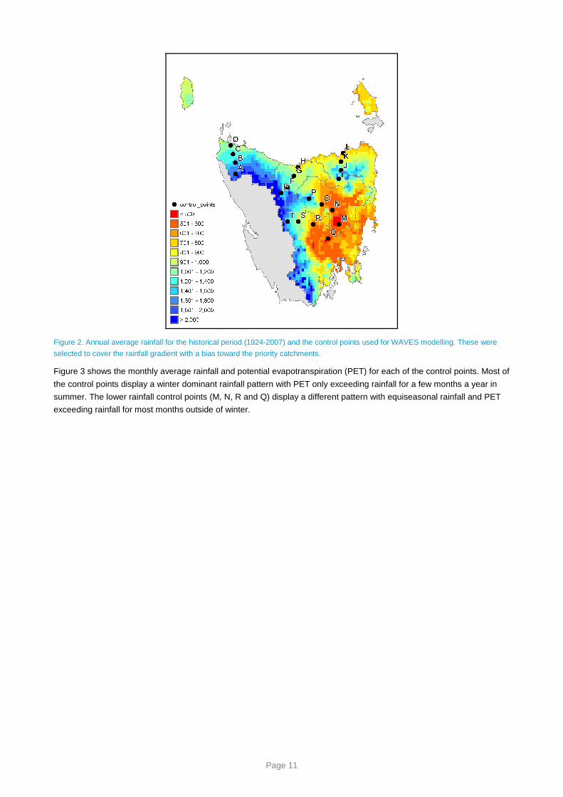
Page 11
Figure 2. Annual average rainfall for the historical period (1924-2007) and the control points used for WAVES modelling. These were
selected to cover the rainfall gradient with a bias toward the priority catchments.
Figure 3 shows the monthly average rainfall and potential evapotranspiration (PET) for each of the control points. Most of
the control points display a winter dominant rainfall pattern with PET only exceeding rainfall for a few months a year in
summer. The lower rainfall control points (M, N, R and Q) display a different pattern with equiseasonal rainfall and PET
exceeding rainfall for most months outside of winter.

Page 12
A
1 2 3 4 5 6 7 8 9101112
Rai
nfal
l / P
ET
(m
m)
0
50
100
150
200
250B
1 2 3 4 5 6 7 8 9101112
Rai
nfal
l / P
ET
(m
m)
0
50
100
150
200
250C
1 2 3 4 5 6 7 8 9101112
Rai
nfal
l / P
ET
(m
m)
0
50
100
150
200
250D
1 2 3 4 5 6 7 8 9101112
Rai
nfal
l / P
ET
(m
m)
0
50
100
150
200
250
Q
1 2 3 4 5 6 7 8 9101112
Rai
nfal
l / P
ET
(m
m)
0
50
100
150
200
250R
1 2 3 4 5 6 7 8 9101112
Rai
nfal
l / P
ET
(m
m)
0
50
100
150
200
250S
1 2 3 4 5 6 7 8 9101112
Rai
nfal
l / P
ET
(m
m)
0
50
100
150
200
250T
1 2 3 4 5 6 7 8 9101112
Rai
nfal
l / P
ET
(m
m)
0
50
100
150
200
250
M
1 2 3 4 5 6 7 8 9101112
Rai
nfal
l / P
ET
(m
m)
0
50
100
150
200
250N
1 2 3 4 5 6 7 8 9101112
Rai
nfal
l / P
ET
(m
m)
0
50
100
150
200
250O
1 2 3 4 5 6 7 8 9101112
Rai
nfal
l / P
ET
(m
m)
0
50
100
150
200
250P
1 2 3 4 5 6 7 8 9101112
Rai
nfal
l / P
ET
(m
m)
0
50
100
150
200
250
I
1 2 3 4 5 6 7 8 9101112
Rai
nfal
l / P
ET
(m
m)
0
50
100
150
200
250J
1 2 3 4 5 6 7 8 9101112
Rai
nfal
l / P
ET
(m
m)
0
50
100
150
200
250K
1 2 3 4 5 6 7 8 9101112
Rai
nfal
l / P
ET
(m
m)
0
50
100
150
200
250L
1 2 3 4 5 6 7 8 9101112
Rai
nfal
l / P
ET
(m
m)
0
50
100
150
200
250
E
1 2 3 4 5 6 7 8 9101112
Rai
nfal
l / P
ET
(m
m)
0
50
100
150
200
250F
1 2 3 4 5 6 7 8 9101112
Rai
nfal
l / P
ET
(m
m)
0
50
100
150
200
250G
1 2 3 4 5 6 7 8 9101112
Rai
nfal
l / P
ET
(m
m)
0
50
100
150
200
250H
1 2 3 4 5 6 7 8 9101112
Rai
nfal
l / P
ET
(m
m)
0
50
100
150
200
250
Figure 3. Historical (1924-2007) monthly average rainfall (bars) and PET (line) at each of the control points.
2.1.3 Climate
The climate across Tasmania is mostly winter dominated but still with rainfall over summer (Figure 3). The rainfall varies
greatly from less than 500 mm/year to over 3000 mm/year with a strong rainfall gradient toward the west (Figure 2).
There were four climate and development scenarios modelled as part of this project, as detailed in Post et al. (2009):

Page 13
• Scenario A – historical climate, current development
• Scenario B – recent climate, current development
• Scenario C – future climate (~2030), current development
• Scenario D – future climate (~2030), future development
The time frame modelled for scenarios A and C is 113 years, beginning 1 January 1895 and ending 31 December 2007,
all the reporting is done on the period 1 January 1924 to 31 December 2007. The modelled period between 1895 and
1924 was used to ensure that the initial conditions assumed in the model did not affect the results. Scenario B is a
subset of the Scenario A modelling and Scenario D is calculated from the Scenario C modelling.
For Scenario A the interpolated historical climate sequence was extracted from the Queensland Department of Natural
Resources and Water SILO website (Jeffrey et al., 2001) (http://www.nrw.qld.gov.au/silo/ppd/index.html) for each of the
20 points selected for modelling. The CO2 concentration used was 378 ppm as the scenario was for current conditions,
this concentration was used as a constant even though the CO2 concentrations have been increasing throughout the
historical period used for Scenario A (IPCC, 2007). As a point of difference to the MDBSY project, for TasSY there were
three variants of Scenario A used for forward modelling of groundwater conditions to 2030. These are a subset of the
historical modelled recharge and are defined as:
• Awet – the 90th percentile 23 year period from within the 84 year modelled record
• Amid – the 50th percentile 23 year period from within the 84 year modelled record
• Adry – the 10th percentile 23 year period from within the 84 year modelled record
The Scenario B is taken as a subset of the Scenario A modelled recharge record, and represents the last 11 years
(1/1/1997 to 31/12/2007). This 11 year recharge record was implemented in three numerical models by repeating the
sequence 2.1 times to produce a 23 year recharge period.
For Scenario C there were three different climate scenarios produced from 15 global climate models (GCMs). The high
(CH) global warming scenario was a 1.3 °C increase in temperature, the low (CL) global warming was a 0.7 °C increase
in temperature, and the medium (CM) global warming scenario was a 1.0 °C increase in temperature. The CO2
concentrations used in the WAVES modelling were 437, 446 and 455 ppm for the CL, CM and CH scenarios
respectively. The outputs from the three scenarios from 15 GCMs produced a total of 45 climate scenarios for modelling.
Each of the 45 scenarios produced climate modifiers that were applied to the historical (84 year) climate sequence
(Scenario A). Full details of the climate generation procedure can be found in Post et al. (2009).
The 45 different Scenario C recharge scenarios were aggregated to three scenarios at a reporting region level for further
modelling. These were:
• Cwet – the 90th percentile (rank 2 of 15 of the GCM outputs) of the CH scenario
• Cmid – the 50th percentile (rank 8 of 15 of the GCM outputs) of the CM scenario
• Cdry – the 10th percentile (rank 14 of 15 of the GCM outputs) of the CH scenario
Scenario D (future climate, future development) had the same climate as Scenario C but with changes in development.
The changes in development that impacts upon dryland diffuse recharge are the increases in areas of plantation forestry.
Scenario D produced similar outputs as Scenario C. The 45 different Scenario D recharge scenarios were aggregated to
three scenarios at a reporting region level for further modelling. These were:
• Dwet – the 90th percentile (rank 2 of 15 of the GCM outputs) of the CH climate scenario with the projected
forestry increases
• Dmid – the 50th percentile (rank 8 of 15 of the GCM outputs) of the CM climate scenario with the projected
forestry increases
• Ddry – the 10th percentile (rank 14 of 15 of the GCM outputs) of the CH climate scenario with the projected
forestry increases

Page 14
2.1.4 Soil
The Broadbridge-White equation (Broadbridge and White, 1998) for soil moisture retention is used in WAVES. To
calculate hydraulic conductivity (K) and matric potential (Ψ) as a function of moisture content (θ) five parameters are
required: saturated hydraulic conductivity (Ks, m/d), saturated moisture content (θs , cm3/cm3), residual moisture content
(θr , cm3/cm3), inverse capillary length scale (α, m) and an empirical constant based on soil properties (C, unitless).
These parameters are related in the following three equations.
r
s r
θ θθ θ
−Θ =−
(1)
where Θ is the relative moisture content (scaled between 0 and 1).
( ) ( ) 21s
CK K
C
− ΘΘ =
− Θ (2)
( ) ( )1 1 1
ln1
C
C Cα − Θ − ΘΨ Θ = + Θ Θ −
(3)
The ASRIS v1.5 database (Johnston et al., 2003) is the best data set that covers northern Tasmania; it was assumed
that the soil properties of northern Tasmania were similar to southern Tasmania. ASRIS has data layers for soil type
(Isbell, 2002), Ks and plant available water capacity (PAWC) for up to five soil layers. The PAWC is defined as the
difference in volumetric moisture content between matric potentials of 0.1 and 15 bar. The Ks and PAWC of the topsoils
and subsoils were averaged across the TasSY region by soil type, and θs and θr were determined using equations (1)
and (3) assuming representative porosity values and empirical constants (C) for each soil type. The C and α parameters
were estimated based on soil texture and Ks. A map of soil types is shown in Figure 4 and listing of the soil parameters
used is shown in Table 2.
.

Page 15
Figure 4. Soils types across Tasmania, simplified from Johnston et al. (2003). On the left is the original soil order map and the on the
right is the map that was used after the dominant soil type had been extracted for each 0.05°x0.05° SILO grid cell.
Table 2. Soil parameters used in WAVES modelling: saturated hydraulic conductivity.
Soil Order layer 1 layer 2 layer 3 layer 4 layer 5
Calcarosols 3.192 3.192 0.244 0.017 0.063
Chromosols 2.891 0.104 0.012 0.002 0.007
Dermosols 1.856 0.192 0.026 0.003 0.006
Ferrosols 6.543 1.200 0.185 0.001 0.023
Hydrosols 0.426 0.219 0.021 0.002 0.002
Kandasols 0.797 0.281 0.013 0.003 0.009
Kurosols 2.397 0.555 0.023 0.004 0.005
Organosols 1.253 0.110 0.021 0.007 0.014
Podosols 0.997 1.051 0.227 0.004 0.092
Rudosols 2.306 1.536 1.599 0.967 0.757
Sodosols 1.006 0.741 0.254 0.015 0.016
Tenosols 0.911 0.396 0.106 0.015 0.028
Vertosols 2.400 2.400 0.011 0.0002 0.0003

Page 16
Table 3. Soil parameters used in WAVES modelling: saturated moisture content (residual moisture content assumed to be 0.2).
Soil Order layer 1 layer 2 layer 3 layer 4 layer 5
Calcarosols 0.291 0.291 0.292 0.306 0.295
Chromosols 0.295 0.296 0.312 0.339 0.339
Dermosols 0.299 0.299 0.315 0.344 0.344
Ferrosols 0.319 0.319 0.319 0.373 0.339
Hydrosols 0.324 0.324 0.344 0.379 0.379
Kandasols 0.303 0.304 0.321 0.350 0.350
Kurosols 0.298 0.299 0.315 0.343 0.343
Organosols 0.327 0.328 0.348 0.385 0.348
Podosols 0.292 0.292 0.293 0.334 0.296
Rudosols 0.254 0.254 0.254 0.254 0.254
Sodosols 0.334 0.335 0.335 0.357 0.357
Tenosols 0.289 0.290 0.290 0.304 0.304
Vertosols 0.312 0.312 0.332 0.446 0.446
Table 4. Soil parameters used in WAVES modelling: inverse capillary length scale.
Soil Order layer 1 layer 2 layer 3 layer 4 layer 5
Calcarosols 0.05 0.05 0.1 0.5 0.2
Chromosols 0.05 0.1 0.5 1 1
Dermosols 0.05 0.1 0.5 1 1
Ferrosols 0.05 0.05 0.1 1 0.5
Hydrosols 0.1 0.1 0.5 1 1
Kandasols 0.07 0.1 0.5 1 1
Kurosols 0.05 0.07 0.5 1 1
Organosols 0.05 0.1 0.5 1 0.5
Podosols 0.07 0.05 0.1 1 0.2
Rudosols 0.05 0.05 0.05 0.07 0.07
Sodosols 0.05 0.07 0.1 0.5 0.5
Tenosols 0.07 0.1 0.1 0.5 0.5
Vertosols 0.05 0.05 0.5 2 2

Page 17
Table 5. Soil parameters used in WAVES modelling: empirical constant.
Soil Order layer 1 layer 2 layer 3 layer 4 layer 5
Calcarosols 1.02 1.02 1.1 1.5 1.3
Chromosols 1.02 1.1 1.5 1.7 1.7
Dermosols 1.02 1.1 1.5 1.7 1.7
Ferrosols 1.02 1.02 1.1 1.7 1.5
Hydrosols 1.1 1.1 1.5 1.7 1.7
Kandasols 1.05 1.1 1.5 1.7 1.7
Kurosols 1.02 1.05 1.5 1.7 1.7
Organosols 1.02 1.1 1.5 1.7 1.5
Podosols 1.05 1.02 1.1 1.7 1.3
Rudosols 1.02 1.02 1.02 1.05 1.05
Sodosols 1.02 1.05 1.1 1.5 1.5
Tenosols 1.05 1.1 1.1 1.5 1.5
Vertosols 1.02 1.02 1.5 2 2
2.1.5 Vegetation
Because it was computationally infeasible to model every point within the TasSY region within the timeframe set by the
project, therefore it was necessary to simplify the number vegetation classes. BRS’s Integrated Vegetation Coverage
(2008) was reclassified to three vegetation classes:
• annuals
• perennials
• trees
The vegetation parameters required by WAVES were taken from the User Manual (Dawes et al., 2004). The annuals
(including crops) were modelled as a C3 annual pasture, the perennials were modelled as a C3 perennial pasture and
the trees (including forestry) was modelled as an overstorey of Eucalypts with an understorey of C3 perennial grasses.
The simplified vegetation groupings are shown in Figure 5 for Scenarios A, B and C and for Scenario D in Figure 6
showing the impact of new plantations (see Viney et al. (2009) for details of the new forestry scenario). The parameters
used in the WAVES modelling are shown in Table 6.

Page 18
Figure 5. Vegetation types across Tasmania for Scenarios A, B & C, simplified from BRS (2008).

Page 19
Figure 6. Vegetation for Scenario D. The new plantations were randomly assigned from all suitable land.

Page 20
Table 6. Vegetation parameters for WAVES model taken from the user manual (Dawes et al., 2004).
Parameter Units Annuals Perennials Trees (overstorey)
Trees (understorey)
1 minus albedo of the canopy - 0.85 0.85 0.80 0.85
1 minus albedo of the soil - 0.85 0.85 0.85 0.85
Rainfall interception coefficient m d-1 LAI-1 0.0005 0.0002 0.0005 0.0003
Light extinction coefficient - -0.65 -0.65 -0.45 -0.65
Maximum carbon assimilation rate Kg C m-2 d-1 0.025 0.02 0.02 0.01
Slope parameter for the conductance model - 0.9 0.9 0.9 0.9
Maximum plant available water potential m -150 -150 -150 -150
IRM weighting of water m 2 2 2.1 2
IRM weighting of nutrients m 0.5 0.5 0.3 0.5
IRM weighting of CO2 m 1.42 1.42 1.42 1.42
Ratio of stomatal to mesophyll conductance m 0.2 0.2 0.2 0.2
Temperature when growth is half optimum °C 7 7 7 7
Temperature when growth is optimum °C 12 12 15 12
Year day of germination d 120 -1 -1 -1
Degree-daylight hours of growth °C h 16000 -1 -1 -1
Saturation light intensity µmoles m-2 d-1 1000 1000 1000 1000
Maximum rooting depth m 1 1 4 1
Specific leaf area LAI kg C-1 24 15 10 20
Leaf respiration coefficient kg C kg C-1 0.001 0.001 0.001 0.001
Stem respiration coefficient kg C kg C-1 -1 -1 0.0006 -1
Root respiration coefficient kg C kg C-1 0.0002 0.001 0.0001 0.001
Leaf mortality rate Fraction of C d-1 0.001 0.001 0.0001 0.001
Above ground portioning factor - 0.4 0.4 0.25 0.4
Aerodynamic resistance s d-1 30 30 10 30
2.2 Upscaling
The output of the WAVES modelling was used to create regression equations between average annual rainfall and
average annual recharge for each combination of soil, vegetation and climate. The form of the relationship was a power
function:
bs sR a P= (4)
where Rs is the recharge for a given scenario, Ps is the rainfall for a given scenario and a and b are fitting parameters.
The fitting parameters were determined using a least squares routine between the 20 model runs (i.e. one for each of 20
control points) for every combination of soil, vegetation and climate. The regression equations were applied with a rainfall
limit of 1651 mm (the highest average annual rainfall of the control points) to prevent recharge being predicted to be
greater than rainfall when the regression equation was applied to areas that had rainfall greater than the control points.
Using the set of regression equations (4) and the set of annual average rainfall rasters (Post et al., 2009), a series of
annual average recharge rasters on a 0.05° grid were developed for the 84 year Scenario A, the 11 year Scenario B and
the 45 different outputs for the 84 year Scenario C’s and D’s. These are reported as a recharge scaling factor (RSF):
S
A
RRSF
R= (5)
where Rs is the recharge for a given scenario and RA is the annual average recharge for the 84 year Scenario A.
For the three 23 year variants of Scenario A, a different upscaling approach had to be taken. As a time series of recharge
is only calculated at the 20 control points, these are the only points where the 23 year annual average recharge series
can be ranked and the 10th, 50th and 90th percentiles evaluated. There is a poor relationship between annual rainfall and
annual recharge so the 10th, 50th and 90th percentiles of 23 year series of rainfall were not an appropriate covariate for

Page 21
upscaling. A relationship was found between the RSF of the 23 year Scenario A variants (RSFA23) and the 84 year
Scenario A recharge (RA84) to enable the 23 year Scenario A variants to be upscaled across the entire TasSY project
area:
23 84A ARSF a R b= + (6)
On some occasions the regression line fitted would have predicted a negative RSF at high RA84, for these occasions the
regression line was fitted without a slope making a constant RSFA23 for all RA84.
2.3 Aggregation
The 45 different Scenario C and D outputs were used to investigate the differences between GCMs and their predictions
of how the future climate will impact upon groundwater recharge. For reporting and further detailed groundwater
modelling only three variants of Scenario C and D were modelled:
• 10th percentile of CH scenario (Cwet and Dwet)
• 90th percentile of CH scenario (Cdry and Ddry)
• 50th percentile of CM scenario (Cmid and Dmid).
Scenario Cmid represents the middle estimate of climate change in this project. It is the median response of the GCMs
under the medium global warming scenario. The greatest variability in estimates of recharge change comes from the
high global warming scenario. Therefore Scenario Cwet comes from the 10th percentile of the high global warming
scenario and Scenario Cdry scenario comes from the 90th percentile of the high global warming scenario. The GCMs
chosen for the three variants of Scenario D are the same GCMs as chosen for the three variants of Scenario C.
As each of the GCMs were ranked differently in each reporting region, composite rasters were created for scenarios
Cwet, Cmid, Cdry, Dwet, Dmid and Ddry by stitching together the scenarios selected in each reporting region.
The average RSFs were also reported at the scale of the reporting regions and groundwater assessment areas (GAA,
Figure 1). The calculated recharge varied greatly depending upon soil type and land use but could give very similar
RSFs. Therefore the average RSF over a reporting region was calculated as the area-weighted average of the recharge
for the scenario divided by the area-weighted average recharge for the 84 year Scenario A:
s
A
RRSF
R= (7)

Page 22
3 Results
3.1 Point scale modelling
The WAVES model runs produces a daily time series of recharge rate as output. When the point modelling is aggregated
to an annual series it is clear that recharge is more variable than rainfall (Figure 7). There is also an apparent downward
trend in recharge through time that is not apparent in the rainfall time series; this is explored further in Section 4.2.
Rai
nfal
l (m
m/y
r)
0
500
1000
1500
2000
2500
1940 1960 1980 2000
Rec
harg
e (m
m/y
r)
0
200
400
600
Figure 7. Example annual time series of recharge for a high rainfall point (A) with annual vegetation on a Dermosol soil also showing the
10th, 50th and 90th percentiles of the 23 year averages of recharge.
The point scale modelling was used to create regression equations between annual average rainfall and average annual
recharge for each combination of soil, vegetation and climate scenario. The results of these regression equations are
shown in Figure 8 for Scenario A. The plots for Scenario B and the 45 Scenario C’s are very similar to that shown for
Scenario A (data for other scenarios not shown).

Page 23
Calcarosols
Annual Rainfall (mm)
400 600 800 1000 1200 1400 1600 1800
Ann
ual R
echa
rge
(mm
)
0
200
400
600
800
AnnualsPerennialsTrees
Chromosols
Annual Rainfall (mm)
400 600 800 1000 1200 1400 1600 1800
Ann
ual R
echa
rge
(mm
)
0
200
400
600
800
Dermosols
Annual Rainfall (mm)
400 600 800 1000 1200 1400 1600 1800
Ann
ual R
echa
rge
(mm
)
0
200
400
600
800
Ferrosols
Annual Rainfall (mm)
400 600 800 1000 1200 1400 1600 1800
Ann
ual R
echa
rge
(mm
)
0
200
400
600
800
Hydrosols
Annual Rainfall (mm)
400 600 800 1000 1200 1400 1600 1800
Ann
ual R
echa
rge
(mm
)
0
200
400
600
800
Kandasols
Annual Rainfall (mm)
400 600 800 1000 1200 1400 1600 1800
Ann
ual R
echa
rge
(mm
)
0
200
400
600
800
Kurasols
Annual Rainfall (mm)
400 600 800 1000 1200 1400 1600 1800
Ann
ual R
echa
rge
(mm
)
0
200
400
600
800
Organosols
Annual Rainfall (mm)
400 600 800 1000 1200 1400 1600 1800
Ann
ual R
echa
rge
(mm
)
0
200
400
600
800
Podosols
Annual Rainfall (mm)
400 600 800 1000 1200 1400 1600 1800
Ann
ual R
echa
rge
(mm
)
0
200
400
600
800
Rudosols
Annual Rainfall (mm)
400 600 800 1000 1200 1400 1600 1800
Ann
ual R
echa
rge
(mm
)
0
200
400
600
800
Sodosols
Annual Rainfall (mm)
400 600 800 1000 1200 1400 1600 1800
Ann
ual R
echa
rge
(mm
)
0
200
400
600
800
Tenosols
Annual Rainfall (mm)
400 600 800 1000 1200 1400 1600 1800
Ann
ual R
echa
rge
(mm
)
0
200
400
600
800
Figure 8. Relationships between annual average rainfall and recharge for each combination of soil and vegetation types used for
upscaling to create Scenario A recharge raster.
For the three variants of Scenario A, the 10th, 50th and 90th percentiles of 23 year average annual recharge were
extracted from the 84 year time series (Figure 7). For each of the reporting regions there were four control points that
each had 12 soil types and three vegetation types modelled giving a total of 144 model runs. All reporting regions were
very consistent in the timing of the 10th, 50th and 90th percentiles of 23 year average annual recharge (Figure 9). It is very

Page 24
clear that the same pattern seen in the annual series of recharge shown for point A (Figure 7) is representative of all
model runs. There is a drying trend, the 10th percentiles of 23 year average annual recharge were all recent and the 90th
percentiles were all in the early part of the 84 year modelling time frame. This observation is explored further in Section
4.2.
1960 1980 2000
Fre
quen
cy
0
20
40
60
80
100
120
1960 1980 2000
Fre
quen
cy
0
20
40
60
80
100
120
1960 1980 2000
Fre
quen
cy
0
20
40
60
80
100
120
1960 1980 2000
Fre
quen
cy
0
20
40
60
80
100
120
1960 1980 2000
Fre
quen
cy
0
20
40
60
80
100
120
1960 1980 2000
Fre
quen
cy
0
20
40
60
80
100
120
1960 1980 2000
Fre
quen
cy
0
20
40
60
80
100
120
1960 1980 2000
Fre
quen
cy
0
20
40
60
80
100
120
1960 1980 2000
Fre
quen
cy
0
20
40
60
80
100
120
1960 1980 2000
Fre
quen
cy
0
20
40
60
80
100
120
1960 1980 2000
Fre
quen
cy
0
20
40
60
80
100
120
1960 1980 2000
Fre
quen
cy
0
20
40
60
80
100
120
1960 1980 2000
Fre
quen
cy
0
20
40
60
80
100
120
1960 1980 2000
Fre
quen
cy
0
20
40
60
80
100
120
1960 1980 2000
Fre
quen
cy
0
20
40
60
80
100
120
10th percentile 50th percentile 90th percentile
AIC
DS
ES
EP
RM
F
Figure 9. Frequency of finish year selected for 23 year periods of Awet, Amid and Adry.
The regression equations developed for the Scenario A variants show that the Adry is drier than the 84 year average and
the Awet is wetter than the 84 year average and the Amid is most often close to average. An example of the relationships
obtained is shown in Figure 10 for the three vegetation types on a Dermosol soil type. The other 11 soil types show very
similar relationships (data not shown).

Page 25
Perennials on Dermosols
RA84 (mm/yr)
0 20 40 60 80 100 120 140
RS
FA
23
0.0
0.5
1.0
1.5
2.0
2.5
3.0Annuals on Dermosols
RA84 (mm/yr)
0 100 200 300 400
RS
FA
23
0.0
0.5
1.0
1.5
2.0
2.5
3.0AdryAmidAwet
Trees on Dermosols
RA84 (mm/yr)
0 20 40 60 80
RS
FA
23
0.0
0.5
1.0
1.5
2.0
2.5
3.0
Figure 10. Example of regression equations developed for the 23 year (RSF23) Awet, Amid and Adry with the 84 year historical
modelled recharge (R84).
The point modelling of Scenario C showed similar results to MDBSY and NASY projects. When all 45 scenarios are
plotted together (without accounting for different soil or vegetation types) as a change in rainfall versus change in
recharge, there is a relationship showing that recharge changes disproportionately to rainfall [Figure 11, Equation (8)].
The three global warming scenarios have similar slopes to the regression lines fitted with the intercept increasing with
increasing global warming; this is suggesting that recharge will increase without a change in rainfall. This observation is
explored further in Section 4.1.
2
2
2
: 3.32 13 0.33
: 3.52 12 0.40
: 3.56 9 0.37
High R P r
Medium R P r
Low R P r
∆ = × ∆ + =∆ = × ∆ + =∆ = × ∆ + =
(8)

Page 26
Change in rainfall (%)
-15 -10 -5 0 5 10 15
Cha
nge
in r
echa
rge
(%)
-100
0
100
200
300
HighMediumLow
Figure 11. Scatterplot of change in annual average rainfall versus change in annual average recharge between Scenario A and
Scenario C for all GCMs, soil and vegetation types lumped together separated by the global warming scenarios (High, Medium & Low).
3.2 Upscaling
3.2.1 Scenario A
The regression equations developed between annual average rainfall and annual average recharge (Figure 8) along with
rasters of average annual rainfall (Figure 2), soil type (Figure 4) and percentage of vegetation type (Figure 5) allow a
raster of average annual recharge to be developed (Figure 12).

Page 27
Figure 12. Scenario A recharge averaged over the 84 years of interest.
The 23 year variants of Scenario A were created in a similar way to the 84 year Scenario A recharge raster (Figure 13).
For all reporting regions the projected recharge for Awet was more than 50% greater than the historical 84 year average
and the Adry was more than 50% less than the historical 84 year average (Table 7). The Amid variant had between a 9
percent and 15 percent increase in recharge when compared to the 84 year Scenario A. The trends in the variants of
Scenario A were similar when aggregated to the GAA scale (Table 8): the wet is very wet and the dry is very dry.
Figure 13. Scenario A 23 year variants (Awet, Amid and Adry) expressed as an RSF compared to the 84 year historical Scenario A.

Page 28
Table 7. RSFs for Scenario A and B aggregated to the reporting region.
Region Awet Amid Adry B
Arthur-Inglis-Cam 1.61 1.14 0.46 0.32
Pipers-Ringarooma 1.64 1.15 0.43 0.26
South Esk 1.52 1.15 0.54 0.53
Mersey-Forth 1.54 1.12 0.50 0.48
Derwent-South East 1.67 1.09 0.45 0.41
Table 8. RSFs for Scenario A and B aggregated to the GAA.
GAA Awet Amid Adry B
Coal River Basin 1.56 1.20 0.44 0.29
Longford Basin 1.61 1.22 0.35 0.22
Ringarooma 1.65 1.13 0.41 0.22
King Island 1.46 1.18 0.57 0.39
Flinders Island 1.43 1.16 0.63 0.46
Smithton Syncline GMU (regional) 1.63 1.16 0.44 0.31
Spreyton 1.62 1.20 0.36 0.24
Wesley Vale 1.60 1.22 0.37 0.23
Scottsdale 1.52 1.16 0.53 0.33
Sorell Tertiary Basalt 1.64 1.21 0.33 0.20
Mt Wellington - Huonville 1.72 1.16 0.32 0.23
Cygnet-Cradoc 1.64 1.21 0.33 0.23
Mole Creek 1.54 1.14 0.53 0.48
Inglis_Cam 1.51 1.14 0.52 0.32
Leven-Forth-Wilmot 1.57 1.16 0.43 0.24
Cam-Emu-Blyth 1.52 1.14 0.51 0.31
Sheffield-Barrington 1.57 1.18 0.44 0.24
Kimberley-Deloraine 1.60 1.20 0.41 0.25
Togari 1.56 1.15 0.50 0.42
Mella 1.54 1.19 0.47 0.27
Swansea – Nine Mile Beach 1.34 1.15 0.74 0.50
3.2.2 Scenario B
The Scenario B raster of RSF was created similarly to the Scenario A raster. The changes in recharge are greater than
the changes in rainfall with most areas showing a small decrease in rainfall and a large decrease in recharge (Figure 14,
Table 7 and Table 8). The Scenario B was drier than the Scenario Adry in all reporting regions and GAAs reflecting the
drought in the recent climate sequence.

Page 29
Figure 14. Scenario B RSF raster and Scenario B rainfall expressed as the 11 year rainfall (P11) as a proportion of the 84 year rainfall
(P77).
3.2.3 Scenario C
The 45 Scenario C rasters were created similarly to the Scenario A and B rasters and are shown in Figure 15 for the low
global warming scenario, Figure 16 for the medium global warming scenario and Figure 17 for the high global warming
scenario. The patterns between the different global warming scenarios are very similar but getting more extreme in either
increasing or decreasing recharge with the high global warming scenario when compared to the low global warming
scenario.

Page 30
Figure 15. Rasters of RSFs from each GCM for the Scenario C low global warming scenario.

Page 31
Figure 16. Rasters of RSFs from each GCM for the Scenario C medium global warming scenario.

Page 32
Figure 17. Rasters of RSFs from each GCM for the Scenario C high global warming scenario.
The number of GCMs predicting an increase or decrease in recharge can be informative for looking at trends. At a pixel
level these trends were investigated for rainfall and each of the global warming scenarios for recharge (Figure 18). For
the majority of the TasSY project area the trends in GCM outputs for rainfall show that more than half the GCMs predict a

Page 33
decrease in rainfall. In the north-west all GCMs predict a decrease in rainfall. The pattern for recharge is different to
rainfall where in large parts of Tasmania more climate sequences derived from GCMs predict recharge to increase.
Figure 18. Number of GCM derived climate scenarios that predict a decrease in recharge for the Scenario C low, medium and high
global warming scenarios and compared to the number of GCMs which predict an decrease in rainfall.
3.2.4 Scenario D
The results for Scenario D are very similar to Scenario C and are only different where there is a change in plantation
forest area (Figure 6). The spatial patterns in the RSF for each GCM are quite consistent between the low global
warming scenario (Figure 19), the medium global warming scenario (Figure 20) and the high global warming scenario

Page 34
(Figure 21). This can also be seen when the number of GCMs that project a decrease in recharge are collated (Figure
22).
Figure 19. Rasters of RSFs from each GCM for the Scenario D low global warming scenario.

Page 35
Figure 20. Rasters of RSFs from each GCM for the Scenario D medium global warming scenario.

Page 36
Figure 21. Rasters of RSFs from each GCM for the Scenario D high global warming scenario.

Page 37
Figure 22. Number of GCM derived climate scenarios that predict a decrease in recharge for the Scenario D low, medium and high
global warming scenarios and compared to the number of GCMs which predict a decrease in rainfall.

Page 38
3.3 Aggregation
For Scenario C the changes in rainfall and recharge were aggregated to the reporting region level for each GCM and
global warming scenario and are listed in Table 9 through to Table 13. This shows a great variation between different
GCMs and the inconsistency between the change in rainfall and change in recharge. It is not uncommon for a GCM to
predict a decrease in rainfall for a particular region but the recharge modelling predicts an increase in recharge. This
apparent contradiction is explored further in Section 4.3.
Table 9. Scenario C changes in rainfall and recharge for the Arthur-Inglis-Cam region for each GCM and global warming scenario.
High global warming Medium global warming Low global warming
GCM Rainfall Recharge GCM Rainfall Recharge GCM Rainfall Recharge
cccma_t47 -3% 5% cccma_t47 -2% 5% cccma_t47 -1% 4%
cccma_t63 -2% 7% cccma_t63 -1% 7% cccma_t63 0% 4%
cnrm -2% 2% cnrm -2% 3% cnrm -1% 4%
csiro -8% 3% csiro -6% 5% csiro -4% 7%
gfdl -6% 8% gfdl -4% 7% gfdl -2% 11%
giss_aom -3% 6% giss_aom -2% 7% giss_aom -1% 11%
iap -1% 7% iap 0% 7% iap 0% 7%
inmcm -4% 0% inmcm -3% 2% inmcm -2% 3%
ipsl -3% 13% ipsl -2% 11% ipsl -1% 6%
miroc -1% 3% miroc 0% 4% miroc 0% 2%
miub -4% 10% miub -2% 9% miub -1% 10%
mpi -2% 5% mpi -1% 6% mpi -1% 4%
mri -3% -3% mri -2% 0% mri -1% 0%
ncar_ccsm -4% -6% ncar_ccsm -3% -3% ncar_ccsm -2% -6%
ncar_pcm -2% -3% ncar_pcm -2% -1% ncar_pcm -1% 0%
Table 10. Scenario C changes in rainfall and recharge for the Pipers-Ringarooma region for each GCM and global warming scenario.
High global warming Medium global warming Low global warming
GCM Rainfall Recharge GCM Rainfall Recharge GCM Rainfall Recharge
cccma_t47 -5% 0% cccma_t47 -4% 1% cccma_t47 -3% -1%
cccma_t63 -4% 3% cccma_t63 -3% 3% cccma_t63 -2% 0%
cnrm -1% 6% cnrm -1% 5% cnrm -1% 4%
csiro -11% -13% csiro -9% -9% csiro -6% -5%
gfdl -8% -3% gfdl -6% -2% gfdl -4% 3%
giss_aom -3% 3% giss_aom -2% 3% giss_aom -2% 7%
iap -3% 2% iap -2% 2% iap -2% 3%
inmcm -3% 3% inmcm -3% 3% inmcm -2% 2%
ipsl -6% 2% ipsl -4% 2% ipsl -3% -2%
miroc -1% 7% miroc -1% 6% miroc -1% 2%
miub -3% 8% miub -2% 7% miub -2% 6%
mpi 3% 26% mpi 2% 20% mpi 1% 12%
mri -5% -8% mri -4% -6% mri -3% -5%
ncar_ccsm -5% -7% ncar_ccsm -4% -5% ncar_ccsm -3% -9%
ncar_pcm -5% -5% ncar_pcm -4% -4% ncar_pcm -3% -3%

Page 39
Table 11. Scenario C changes in rainfall and recharge for the South-Esk region for each GCM and global warming scenario.
High global warming Medium global warming Low global warming
GCM Rainfall Recharge GCM Rainfall Recharge GCM Rainfall Recharge
cccma_t47 -5% -1% cccma_t47 -4% -1% cccma_t47 -2% -2%
cccma_t63 -3% 2% cccma_t63 -2% 2% cccma_t63 -2% -1%
cnrm 2% 11% cnrm 2% 9% cnrm 1% 6%
csiro -11% -11% csiro -8% -8% csiro -6% -5%
gfdl -7% -4% gfdl -6% -3% gfdl -4% 1%
giss_aom -4% -2% giss_aom -3% -1% giss_aom -2% 3%
iap -2% 2% iap -1% 2% iap -1% 2%
inmcm -3% -1% inmcm -2% 0% inmcm -2% 0%
ipsl -5% 1% ipsl -4% 1% ipsl -3% -3%
miroc 0% 6% miroc 0% 5% miroc 0% 2%
miub -6% -3% miub -5% -2% miub -3% 0%
mpi 2% 18% mpi 2% 14% mpi 1% 8%
mri -4% -6% mri -3% -5% mri -2% -5%
ncar_ccsm -4% -6% ncar_ccsm -3% -5% ncar_ccsm -2% -7%
ncar_pcm -3% -3% ncar_pcm -2% -3% ncar_pcm -2% -3%
Table 12. Scenario C changes in rainfall and recharge for the Mersey-Forth region for each GCM and global warming scenario.
High global warming Medium global warming Low global warming
GCM Rainfall Recharge GCM Rainfall Recharge GCM Rainfall Recharge
cccma_t47 -5% 7% cccma_t47 -4% 6% cccma_t47 -2% 4%
cccma_t63 -4% 7% cccma_t63 -3% 6% cccma_t63 0% 3%
cnrm -4% 3% cnrm -3% 4% cnrm 7% 4%
csiro -8% 10% csiro -6% 9% csiro -2% 9%
gfdl -7% 10% gfdl -6% 9% gfdl -2% 11%
giss_aom -4% 7% giss_aom -3% 7% giss_aom 0% 10%
iap -2% 7% iap -2% 7% iap 1% 6%
inmcm -6% 1% inmcm -5% 2% inmcm 1% 2%
ipsl -5% 13% ipsl -4% 12% ipsl -1% 6%
miroc -2% 3% miroc -2% 4% miroc 3% 1%
miub -6% 11% miub -4% 9% miub -3% 9%
mpi -5% 4% mpi -4% 4% mpi 0% 2%
mri -5% -1% mri -4% 1% mri 0% 0%
ncar_ccsm -5% -2% ncar_ccsm -4% 0% ncar_ccsm -1% -4%
ncar_pcm -4% -3% ncar_pcm -3% -1% ncar_pcm 0% -1%

Page 40
Table 13. Scenario C changes in rainfall and recharge for the Derwent-South East region for each GCM and global warming scenario.
High global warming Medium global warming Low global warming
GCM Rainfall Recharge GCM Rainfall Recharge GCM Rainfall Recharge
cccma_t47 -4% 6% cccma_t47 -3% 6% cccma_t47 -2% 4%
cccma_t63 -1% 11% cccma_t63 -1% 10% cccma_t63 0% 5%
cnrm 13% 35% cnrm 10% 29% cnrm 7% 22%
csiro -4% 19% csiro -3% 16% csiro -2% 14%
gfdl -5% 16% gfdl -4% 13% gfdl -2% 15%
giss_aom 0% 16% giss_aom 0% 14% giss_aom 0% 17%
iap 1% 13% iap 1% 11% iap 1% 10%
inmcm 1% 13% inmcm 1% 12% inmcm 1% 9%
ipsl -3% 19% ipsl -2% 16% ipsl -1% 9%
miroc 4% 13% miroc 3% 12% miroc 3% 6%
miub -5% 11% miub -4% 11% miub -3% 10%
mpi 0% 12% mpi 0% 10% mpi 0% 6%
mri -1% 4% mri -1% 5% mri 0% 2%
ncar_ccsm -2% 0% ncar_ccsm -1% 2% ncar_ccsm -1% -4%
ncar_pcm 0% -1% ncar_pcm 0% 1% ncar_pcm 0% 0%
Three variants of Scenario C and Scenario D were selected from the 45 rasters. The GCMs were selected on a reporting
region basis; these are highlighted in bold type in Table 9 through to Table 13. The Cwet is the 2nd ranked from the high
global warming scenario, the Cmid is the 8th ranked from the medium global warming scenario and the Cdry is the 14th
ranked from the high global warming scenario (Figure 23). The Dwet, Dmid and Ddry use the same GCMs as Scenario C
for each reporting region (Figure 24).
Figure 23. Composite rasters of Cwet, Cmid and Cdry.

Page 41
Figure 24. Composite rasters of Dwet, Dmid and Ddry.
The results of this aggregation process for the Cwet and Dwet scenarios are for recharge to increase relative to the 84
year historical period in all reporting regions, with the increase less in the Dwet than the Cwet due to the impact of
additional forestry (Table 14). For Cmid all regions except for South Esk are projected to have an increase in recharge,
while for Dmid South Esk and Pipers-Ringarooma are projected to have a decrease in recharge with the other regions
projected to have an increase in recharge (Table 14). For Cdry and Ddry all regions are projected to have a decrease in
recharge except Derwent-South East which sees no change from the 84 year historical period (Table 14).
Table 14. Summary of Scenario C and D RSFs aggregated to the reporting region level.
Region Cwet Cmid Cdry Dwet Dmid Ddry
Arthur-Inglis-Cam 1.10 1.05 0.97 1.08 1.04 0.95
Pipers-Ringarooma 1.08 1.02 0.92 1.02 0.97 0.87
South Esk 1.11 0.99 0.94 1.09 0.97 0.92
Mersey-Forth 1.11 1.06 0.98 1.05 1.01 0.93
Derwent-South East 1.19 1.11 1.00 1.18 1.11 1.00
When the aggregated results are reported for Scenarios C and D at the GAA level there are some anomalies (Table 15).
For example, in the Coal River Basin the Cmid is higher than the Cwet. The reason for this is that the GCMs were
chosen at a reporting region scale not at the GAA scale; this means that the order of wet, mid and dry is not guaranteed
to be wet is the wettest and dry is the driest.

Page 42
Table 15. Summary of Scenario C and D RSFs aggregated to the GAA level.
GAA Cwet Cmid Cdry Dwet Dmid Ddry
Coal River Basin 1.05 1.11 1.10 1.01 1.07 1.06
Longford Basin 1.21 1.11 1.03 1.21 1.11 1.03
Ringarooma 0.99 0.94 0.84 0.93 0.87 0.78
King Island 1.02 1.07 1.07 1.02 1.07 1.07
Flinders Island 1.17 1.13 1.13 1.17 1.13 1.13
Smithton Syncline GMU (regional) 1.03 1.01 0.93 1.03 1.01 0.93
Spreyton 1.02 1.09 1.00 0.92 0.98 0.89
Wesley Vale 1.01 1.10 1.04 0.84 0.90 0.85
Scottsdale 1.03 0.99 0.90 1.02 0.98 0.89
Sorell Tertiary Basalt 1.03 1.06 1.01 1.01 1.04 0.99
Mt Wellington - Huonville 1.05 1.10 1.05 0.94 0.99 0.94
Cygnet-Cradoc 0.99 0.95 0.88 0.90 0.85 0.78
Mole Creek 0.96 0.97 0.94 0.89 0.89 0.86
Inglis_Cam 0.95 0.99 0.90 0.82 0.85 0.78
Leven-Forth-Wilmot 0.96 0.98 0.96 0.84 0.86 0.83
Cam-Emu-Blyth 0.96 0.99 0.91 0.80 0.83 0.76
Sheffield-Barrington 1.04 1.03 0.95 0.95 0.93 0.86
Kimberley-Deloraine 1.01 1.01 0.94 1.01 1.01 0.94
Togari 0.96 0.98 0.95 0.96 0.98 0.95
Mella 1.05 1.11 1.10 1.01 1.07 1.06
Swansea – Nine Mile Beach 1.20 1.19 1.13 1.20 1.19 1.13

Page 43
4 Discussion
4.1 A sensitivity analysis of recharge to WAVES climate inputs
To help understand the trends seen in Scenario A and the counter-intuitive results seen in Scenario C a sensitivity
analysis of the climate inputs to WAVES was undertaken in a similar manner to that used to investigate the MDBSY
project results (McCallum et al., 2009).
The method used was to select three control points that reflect the rainfall gradient and then systematically alter the
climate variables to investigate their impact upon recharge. This was done for the most common soil type across
Tasmania (Dermasols) and the two most common vegetation types (trees and annuals). The control points selected
were: M for the low rainfall example; A for the high rainfall example; and, D for the medium rainfall example.
The variables under investigation were:
• Rainfall – a 10 percent increase or decrease in daily rainfall
• CO2 concentration – a baseline of 380 ppm and 437, 446 and 455 ppm which are the concentrations used for
the low, medium and high global warming scenarios respectively
• Temperature – a baseline and increases of 0.7°C, 1.0°C and 1.3°C which are the temperatures used for the
low, medium and high global warming scenarios respectively
• Vapour pressure deficit – a 10 percent increase or decrease in daily vapour pressure deficit
• Solar radiation – a 10 percent increase or decrease in daily solar radiation
• Daily rainfall intensity either increasing or decreasing
Changes to the daily rainfall intensity were made by ranking the daily rainfall from highest to lowest and then multiplying
the daily rainfall total with a multiplier that varied linearly between 1.5 for the highest daily rainfall and 0.5 for the lowest.
The total rainfall was then scaled back to that of the original time series. In this way the high intensity rainfall events were
increased and the low rainfall events were decreased but the total amount of rainfall over the 84 years was identical. The
multipliers were reversed to get the low intensity scenario.
The results of the sensitivity analysis are reported as percentage changes in recharge (∆R), transpiration (∆T),
evaporation (∆E) and leaf area index (∆LAI).

Page 44
4.1.1 Rainfall
The results of the investigation into the sensitivity of recharge estimates to changes in total rainfall amounts are as
expected (Figure 25). When rainfall increases so too does recharge, and vice versa. The change in recharge is greater
than the change in rainfall, being between 1.7 and 5.8 times greater depending upon scenario. The change in
transpiration and evaporation is in the same direction as the change in rainfall.
change in rainfall (%)
-15 -10 -5 0 5 10 15
∆∆ ∆∆R
(%
)
-60
-40
-20
0
20
40
60
80
change in rainfall (%)
-15 -10 -5 0 5 10 15
∆∆ ∆∆T
(%
)
-15
-10
-5
0
5
10
15
change in rainfall (%)
-15 -10 -5 0 5 10 15
∆∆ ∆∆E
(%
)
-8
-6
-4
-2
0
2
4
6
8
change in rainfall (%)
-15 -10 -5 0 5 10 15
∆∆ ∆∆L
AI (
%)
-30
-20
-10
0
10
20
30
High P, annual vegMedium P, annual vegLow P, annual veg
High P, trees veg, (o/s in LAI plot)Medium P, trees veg (o/s in LAI plot)Low P, trees veg (o/s in LAI plot)
High P, u/s treesMedium P, u/s treesLow P, u/s trees
Figure 25. Sensitivity of recharge estimates to changes in daily rainfall.

Page 45
4.1.2 Carbon Dioxide
Under a high CO2 atmosphere vegetation is able to assimilate carbon more efficiently and therefore less water is
required. However the increased carbon assimilation leads to increased leaf area and consequently more interception of
rainfall on the plant canopy, which is evaporated. The change in recharge will be dependant upon the relative balance of
the changes in transpiration and evaporation. In the cases modelled here, the change in recharge due to increases in
CO2 concentration is quite small with some cases predicting an increase in recharge while others predict a decrease
(Figure 26).
Of interest here is that in two out of three cases (D,M) the leaf area index (LAI) of the understorey (u/s) in the trees (T)
vegetation is decreasing under increasing CO2 concentration while that of the overstorey (o/s) is increasing. In the other
case (A) the overstorey increases more than the understorey. The modelling is suggesting that increasing CO2
concentrations favour the overstorey at the expense of the understorey. The modelling is predicting more trees. There
has been an increase in woody vegetation across Australia over the last few decades that has been attributed to
increased CO2 concentration (Donohue et al., 2009), this sensitivity analysis is consistent with these observations.
CO2 concentration (ppm)
360 380 400 420 440 460
∆∆ ∆∆R
(%
)
-1
0
1
2
3
4
5
6
CO2 concentration (ppm)
360 380 400 420 440 460
∆∆ ∆∆T
(%
)
-1.6
-1.4
-1.2
-1.0
-0.8
-0.6
-0.4
-0.2
0.0
CO2 concentration (ppm)
360 380 400 420 440 460
∆∆ ∆∆E
(%
)
0.0
0.5
1.0
1.5
2.0
2.5
CO2 concentration (ppm)
360 380 400 420 440 460
∆∆ ∆∆L
AI (
%)
-6
-4
-2
0
2
4
6
8
10
12
High P, annual vegMedium P, annual vegLow P, annual veg
High P, trees veg, (o/s in LAI plot)Medium P, trees veg (o/s in LAI plot)Low P, trees veg (o/s in LAI plot)
High P, u/s treesMedium P, u/s treesLow P, u/s trees
Figure 26. Sensitivity of recharge estimates to changes in concentration of carbon dioxide in the atmosphere.

Page 46
4.1.3 Temperature
The results of this sensitivity analysis show that increased temperature leads to increased recharge. This is counter-
intuitive as increased temperature increases potential ET and would be expected to decrease recharge. There are
different mechanisms that explain this result for annual (A) and tree (T) vegetation types. The annual vegetation has a
greater increase in recharge than the trees because of the way they are modelled. The lifecycle of the annual vegetation
is defined by the degree-days of growth parameter in WAVES (Table 6); as the temperature increases, the lifecycles
becomes shorter and so the land is modelled to be fallow for a greater part of the year. The modelled lifecycle was up to
18 days shorter under the 1.3ºC increased temperature case. This explains why the evaporation increases in the annuals
and the transpiration decreases, the change in transpiration is greater than the change in evaporation leading to more
recharge. For the tree vegetation type the increased temperatures lead to more time that the vegetation is outside of its
optimum growth range leading to decreased efficiency of carbon assimilation. This means more transpiration for less
growth. This also applies to the annuals but the effect of the optimum temperature is smaller than the lifecycle changes.
This is seen in the LAI plot for the overstorey (o/s) as a decrease, the understorey (u/s) actually increases because more
light is coming through the canopy but overall there is a decrease in LAI. Less LAI means that less rainfall is intercepted
by the canopy leading to increased soil moisture and recharge.
Cartwright and Simmonds (2008) speculated that increased temperature could lead to less vegetation and ultimately
more recharge, the modelling undertaken here adds some credence to this argument.
change in temperature (OC)
0.0 0.2 0.4 0.6 0.8 1.0 1.2 1.4
∆∆ ∆∆R
(%
)
-5
0
5
10
15
20
25
30
35
change in temperature (OC)
0.0 0.2 0.4 0.6 0.8 1.0 1.2 1.4
∆∆ ∆∆T
(%
)
-4
-3
-2
-1
0
1
2
3
change in temperature (OC)
0.0 0.2 0.4 0.6 0.8 1.0 1.2 1.4
∆∆ ∆∆E
(%
)
-3
-2
-1
0
1
2
change in temperature (OC)
0.0 0.2 0.4 0.6 0.8 1.0 1.2 1.4
∆∆ ∆∆L
AI (
%)
-25
-20
-15
-10
-5
0
5
10
High P, annual vegMedium P, annual vegLow P, annual veg
High P, trees veg, (o/s in LAI plot)Medium P, trees veg (o/s in LAI plot)Low P, trees veg (o/s in LAI plot)
High P, u/s treesMedium P, u/s treesLow P, u/s trees
Figure 27. Sensitivity of recharge estimates to changes in temperature.

Page 47
4.1.4 Vapour Pressure Deficit
Changes in vapour pressure deficit can have a large effect upon recharge with increased vapour pressure deficit
resulting in less recharge (Figure 28). The changes are due to more transpiration being required to assimilate the same
amount of CO2. This results in small changes in LAI and evaporation. The changes in vapour pressure deficit (calculated
via changes in relative humidity and temperature) predicted by the GCMs are small and so the impact of these changes
will be negligible upon Scenario C. However, there are large effects due to changes in vapour pressure deficit upon the
three variants of Scenario A.
change in VPD (%)
-60 -40 -20 0 20 40 60
∆∆ ∆∆R
(%
)
-40
-20
0
20
40
60
80
change in VPD (%)
-60 -40 -20 0 20 40 60
∆∆ ∆∆T
(%
)
-6
-4
-2
0
2
4
change in VPD (%)
-60 -40 -20 0 20 40 60
∆∆ ∆∆E
(%
)
-1.5
-1.0
-0.5
0.0
0.5
1.0
1.5
2.0
change in VPD (%)
-60 -40 -20 0 20 40 60
∆∆ ∆∆L
AI (
%)
-20
-10
0
10
20
30
40
High P, annual vegMedium P, annual vegLow P, annual veg
High P, trees veg, (o/s in LAI plot)Medium P, trees veg (o/s in LAI plot)Low P, trees veg (o/s in LAI plot)
High P, u/s treesMedium P, u/s treesLow P, u/s trees
Figure 28. Sensitivity of recharge estimates to changes in vapour pressure deficit.
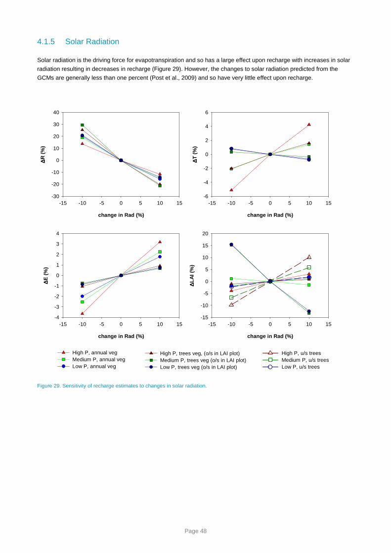
Page 48
4.1.5 Solar Radiation
Solar radiation is the driving force for evapotranspiration and so has a large effect upon recharge with increases in solar
radiation resulting in decreases in recharge (Figure 29). However, the changes to solar radiation predicted from the
GCMs are generally less than one percent (Post et al., 2009) and so have very little effect upon recharge.
change in Rad (%)
-15 -10 -5 0 5 10 15
∆∆ ∆∆R
(%
)
-30
-20
-10
0
10
20
30
40
High P, annual vegMedium P, annual vegLow P, annual veg
change in Rad (%)
-15 -10 -5 0 5 10 15
∆∆ ∆∆T
(%
)-6
-4
-2
0
2
4
6
change in Rad (%)
-15 -10 -5 0 5 10 15
∆∆ ∆∆E
(%
)
-4
-3
-2
-1
0
1
2
3
4
High P, trees veg, (o/s in LAI plot)Medium P, trees veg (o/s in LAI plot)Low P, trees veg (o/s in LAI plot)
change in Rad (%)
-15 -10 -5 0 5 10 15
∆∆ ∆∆L
AI (
%)
-15
-10
-5
0
5
10
15
20
High P, u/s treesMedium P, u/s treesLow P, u/s trees
Figure 29. Sensitivity of recharge estimates to changes in solar radiation.

Page 49
4.1.6 Daily Rainfall Intensity
Recharge is very sensitive to changes in rainfall intensity, increases in rainfall intensity result in increased recharge
(Figure 30). This is due to the reduction in small rainfall events that are intercepted by the vegetation canopy and
evaporated before reaching the soil moisture store. This means that even if total rainfall doesn’t change, an increase in
rainfall intensity will cause more rainfall to enter the soil moisture store and be available for transpiration or recharge.
Change in rainfall intensity has been shown to be an important driver of changes in recharge, however GCMs are not
particularly good at estimating rainfall intensity so there is considerable uncertainty about this parameter in the modelling
(Sun et al., 2006).
change in rainfall intensity
(% change in 1st percentile of P)
-30 -20 -10 0 10 20
∆∆ ∆∆R
(%
)
-60
-40
-20
0
20
40
change in rainfall intensity
(% change in 1st percentile of P)
-30 -20 -10 0 10 20
∆∆ ∆∆T
(%
)
-20
-15
-10
-5
0
5
10
change in rainfall intensity
(% change in 1st percentile of P)
-30 -20 -10 0 10 20
∆∆ ∆∆E
(%
)
-15
-10
-5
0
5
10
15
20
change in rainfall intensity
(% change in 1st percentile of P)
-30 -20 -10 0 10 20
∆∆ ∆∆L
AI (
%)
-40
-30
-20
-10
0
10
20
High P, annual vegMedium P, annual vegLow P, annual veg
High P, trees veg, (o/s in LAI plot)Medium P, trees veg (o/s in LAI plot)Low P, trees veg (o/s in LAI plot)
High P, u/s treesMedium P, u/s treesLow P, u/s trees
Figure 30. Sensitivity of recharge estimates to changes in daily rainfall intensity

Page 50
4.2 Why does the Scenario A recharge decrease with time?
In Figure 9 it was shown that the 23 year periods selected for the variants of Scenario A were clustered in the early part
of the 84 year period for Awet and the more recent years for Adry implying a drying trend through time. This trend is even
more evident in an annual time series of recharge from each of the 20 control points for the soil and vegetation that
dominates that pixel (Figure 31). A linear regression through time shows a statistically significant downward trend in 17
out of the 20 control points with only points N, O and R not being statistically significant at p<0.05. Visually, some control
points appear to have a step change in recharge. Three tests for a step change at an unknown time were performed at
each point, these were the Distribution Free CUSUM Test, the Cumulative Deviation Test and the Worsley Likelihood
Ratio Test (Grayson et al., 1996). For most points all three tests identified a statistically significant step change in annual
recharge. At point N no tests were significant, points R and O had only one test produce a significant result and points J
and G had two tests identify significant step changes. The tests identified a step change in recharge in years between
1931 (C, G, J, O) and 1986 (M) with the most frequent year identified as 1975. A t-test was performed on the periods
1924-1974 and 1997-2007 to demonstrate the differences in the annual average recharge. The majority of control points
showed a highly significant (p<0.001) change in recharge, but points G and N were only significant at p<0.1 and point O
did not have a significant change in recharge. A visual representation of the change in mean is displayed in Figure 31 as
the blue and red lines. In some cases the reduction in recharge between these two periods is greater than 90% (B, C, F,
G, I, J, T). This analysis has demonstrated that the annual series of modelled recharge is not stationary and explains why
the difference between Awet and Adry (Figure 13) is so great when compared to the same scenarios calculated for the
NASY project (Crosbie et al., 2009a). This modelled trend cannot be tested in the field without long time series of
observed groundwater levels, and unfortunately these do not exist. What does exist is streamflow gauging. There is
some evidence of a decreasing trend in the filtered baseflow time series (Figure 32) suggesting that the trends observed
here in modelling recharge may be realistic.
A double mass curve (DMC) of cumulative rainfall and cumulative recharge can be used to visually assess whether the
relationship between rainfall and recharge has been maintained even though there is a decreasing trend in the annual
series of recharge (Figure 33). This will test whether a decrease in rainfall is responsible for the decrease in recharge. If
the relationship is constant the DMC will plot as a straight line, a step change in the relationship will show as a break in
slope and a gradual change will display as a curve. There are several different patterns shown in the DMCs. There are
points where a break in slope is quite clear indicating a step change in the relationship between rainfall and recharge (A,
E, F, P, Q, T). There are some points that show a curved relationship between rainfall and recharge indicating a gradual
change in the relationship over time (D, H, K, L, M). There are two points that do not seem to have a change in the
relationship between rainfall and recharge (N, O); these are two of the three points that did not have a significant
downward trend in the annual series of the recharge identified by linear regression. The remaining points (B, C, G, J, R,
S, T) plot as a series of steps which is indicative of episodic recharge (Crosbie et al., 2009b) and not suited to this kind of
visual analysis.
The DMCs suggest that there has been a change in the relationship between rainfall and recharge and therefore a
change in rainfall is not responsible for the decreasing trend in recharge. When the annual series of rainfall is plotted for
the same 20 points it is clear that the decreasing trend seen in the recharge is not as pronounced in the rainfall (Figure
34). Fitting a linear regression line through the data shows that only 6 points have a significant decreasing trend (I, J, K,
L, M, Q) and one point has a significant increasing trend (P). The same tests investigating a step change were performed
on the rainfall data as the recharge data, the results showed that only two points had all three tests predicting a
significant step change reduction in rainfall (I, L) and one point had all three tests predicting a step change increase in
rainfall (P). (Only at point I were the same years as recharge identified for the step change.) A t-test performed on the
annual rainfall comparing the periods 1924-1974 and 1997-2007 showed that seven points had a statistically significantly
lower rainfall (C, I, J, K, L, M, Q) for a maximum decrease of 20% (M) and one point had a statistically significant
increase in rainfall of 16% (P). The validity of the results at point P may be questionable (Post et al., 2009).

Page 51
A
1940 1960 1980 2000
Ann
ual R
echa
rge
(mm
)
0
20
40
60
80
100
120
B
1940 1960 1980 20000
100
200
300
400
500
600
C
1940 1960 1980 20000
20
40
60
80
D
1940 1960 1980 20000
50
100
150
200
250
300
350
E
1940 1960 1980 2000
Ann
ual R
echa
rge
(mm
)
0
200
400
600
800
1000
F
1940 1960 1980 20000
100
200
300
400
500
G
1940 1960 1980 20000
20
40
60
80
100
H
1940 1960 1980 20000
20406080
100120140160180200
I
1940 1960 1980 2000
Ann
ual R
echa
rge
(mm
)
0
100
200
300
400
J
1940 1960 1980 20000
20
40
60
80
100
120
140
160
180
K
1940 1960 1980 20000
50
100
150
200
250
300
L
1940 1960 1980 20000
20
40
60
80
100
120
140
M
1940 1960 1980 2000
Ann
ual R
echa
rge
(mm
)
0
50
100
150
200
250N
1940 1960 1980 20000.0
0.1
0.2
0.3
0.4
0.5
0.6
0.7
0.8
O
1940 1960 1980 20000
2
4
6
8
10
P
1940 1960 1980 20000
100
200
300
400
500
600
Q
1940 1960 1980 2000
Ann
ual R
echa
rge
(mm
)
0
5
10
15
20
25
30
35
R
1940 1960 1980 20000
10
20
30
40
50
60
70S
1940 1960 1980 20000
20
40
60
80
T
1940 1960 1980 20000
50
100
150
200
250
Figure 31. Annual series of recharge at 20 points for the Scenario A climate and the soil and vegetation that dominate that pixel. The
blue line on each plot is the average annual recharge for the period 1924 to 1974 and the red line is the annual average recharge for the
period 1997-2007.

Page 52
00040 Florentine above Derwent
1960 1980 2000
Bas
eflo
w (
ML)
40000
60000
80000
100000
120000
140000
16000000061 Hellyer River at Guildford Junction
1960 1980 2000
Bas
eflo
w (
ML)
0
10000
20000
30000
40000
50000
6000000078 King River at Crotty
1960 1980 2000
Bas
eflo
w (
ML)
0
20000
40000
60000
80000
100000
120000
140000
160000
180000
200000
00450 Forth River above Lemonthyme Power Station
1960 1980 2000
Bas
eflo
w (
ML)
0
20000
40000
60000
80000
100000
12000000497 Nive River at Gowan Brae
1960 1980 2000
Bas
eflo
w (
ML)
10000
20000
30000
40000
50000
6000000499 Tyenna at Newbury
1960 1980 2000
Bas
eflo
w (
ML)
10000
20000
30000
40000
50000
60000
Col 1 vs 00040 Col 1 vs 00040 Col 1 vs 00040
02208 Meredith River at Swansea
1960 1980 2000
Bas
eflo
w (
ML)
0
500
1000
1500
200002216 Allans Rivulet u/s Taranna
1960 1980 2000
Bas
eflo
w (
ML)
0
200
400
600
800
1000
1200
1400
14210 Inglis River above Flowerdale
1960 1980 2000
Bas
eflo
w (
ML)
10000
20000
30000
40000
50000
6000018210 Macquarie River d/s Longmarsh
1960 1980 2000
Bas
eflo
w (
ML)
0
500
1000
1500
2000
2500
3000
3500
02219 Swan River u/s Hardings Falls
1960 1980 2000
Bas
eflo
w (
ML)
0
500
1000
1500
2000
2500
Figure 32. Annual series of baseflow separated using a digital filter (Lynne and Hollick, 1979) from stream gauging records. The
gauging records were selected from those used by Viney et al. (2009) for calibration catchments where there was not significant
diversions or upstream hydro infrastructure. The 8 plots with a regression line fitted are those that have a statistically significant trend.

Page 53
A
Cumulative rainfall (m)
0 20 40 60 80 100120140160
Cum
ulat
ive
Rec
harg
e (m
)
0
2
4
6
8
10
12
14
B
Cumulative rainfall (m)
0 20 40 60 80 100 120 140
Cum
ulat
ive
Rec
harg
e (m
)
0.0
0.2
0.4
0.6
0.8
C
Cumulative rainfall (m)
0 20 40 60 80 100 120
Cum
ulat
ive
Rec
harg
e (m
)
0.00
0.05
0.10
0.15
0.20
0.25
D
Cumulative rainfall (m)
0 20 40 60 80 100
Cum
ulat
ive
Rec
harg
e (m
)
0
2
4
6
8
10
12
E
Cumulative rainfall (m)
0 20 40 60 80 100120140160
Cum
ulat
ive
Re
char
ge
(m)
0
5
10
15
20
25
30
F
Cumulative rainfall (m)
0 20 40 60 80 100 120 140
Cum
ulat
ive
Re
char
ge
(m)
0
1
2
3
4
5
6
7
G
Cumulative rainfall (m)
0 20 40 60 80 100C
umul
ativ
e R
ech
arg
e (m
)0.00
0.02
0.04
0.06
0.08
0.10
0.12
0.14
0.16
0.18
H
Cumulative rainfall (m)
0 20 40 60 80
Cum
ulat
ive
Re
char
ge
(m)
0
1
2
3
4
I
Cumulative rainfall (m)
0 20 40 60 80 100120140160
Cum
ula
tive
Rec
harg
e (
m)
0
1
2
3
4
5
6
J
Cumulative rainfall (m)
0 20 40 60 80 100 120
Cum
ula
tive
Rec
harg
e (
m)
0.00
0.05
0.10
0.15
0.20
0.25
0.30
0.35
K
Cumulative rainfall (m)
0 20 40 60 80
Cum
ula
tive
Rec
harg
e (
m)
0.0
0.5
1.0
1.5
2.0
2.5
3.0
3.5
L
Cumulative rainfall (m)
0 10 20 30 40 50 60 70C
umul
ativ
e R
echa
rge
(m
)0.0
0.2
0.4
0.6
0.8
1.0
1.2
1.4
1.6
1.8
M
Cumulative rainfall (m)
0 10 20 30 40 50
Cum
ula
tive
Rec
harg
e (
m)
0
1
2
3
4
5
6
N
Cumulative rainfall (m)
0 10 20 30 40 50 60
Cum
ula
tive
Rec
harg
e (
m)
0.000
0.001
0.002
0.003
0.004
0.005
0.006
0.007
O
Cumulative rainfall (m)
0 10 20 30 40 50 60
Cum
ula
tive
Rec
harg
e (
m)
0.000
0.002
0.004
0.006
0.008
0.010
0.012
0.014
0.016
0.018
P
Cumulative rainfall (m)
0 20 40 60 80 100120140160
Cum
ula
tive
Rec
harg
e (
m)
0
2
4
6
8
Q
Cumulative rainfall (m)
0 10 20 30 40 50
Cum
ulat
ive
Rec
harg
e (m
)
0.0
0.1
0.2
0.3
0.4
0.5
0.6
R
Cumulative rainfall (m)
0 10 20 30 40 50 60
Cum
ulat
ive
Rec
harg
e (m
)
0.00
0.05
0.10
0.15
0.20
0.25
S
Cumulative rainfall (m)
0 20 40 60 80 100
Cum
ulat
ive
Rec
harg
e (m
)
0.0
0.2
0.4
0.6
0.8
1.0
T
Cumulative rainfall (m)
0 20 40 60 80 100 120 140
Cum
ulat
ive
Rec
harg
e (m
)
0.0
0.2
0.4
0.6
0.8
1.0
1.2
1.4
1.6
Figure 33. Double mass curves of cumulative rainfall versus cumulative recharge for each of the 20 control points and the soil and
vegetation that dominates that pixel.

Page 54
A1940 1960 1980 2000
Ann
ual R
ainf
all (
mm
)
1000
1200
1400
1600
1800
2000
2200
B1940 1960 1980 2000
1200
1400
1600
1800
2000
2200
2400
C1940 1960 1980 2000
800
1000
1200
1400
1600
1800
2000
D1940 1960 1980 2000
600
800
1000
1200
1400
1600
E1940 1960 1980 2000
Ann
ual R
ainf
all (
mm
)
1200
1400
1600
1800
2000
2200
2400
2600
2800
F1940 1960 1980 2000
600
800
1000
1200
1400
1600
1800
2000
2200
G1940 1960 1980 2000
400
600
800
1000
1200
1400
1600
H1940 1960 1980 2000
200
400
600
800
1000
1200
1400
I1940 1960 1980 2000
Ann
ual R
ainf
all (
mm
)
80010001200140016001800200022002400260028003000
J1940 1960 1980 2000
400
600
800
1000
1200
1400
1600
1800
2000
K1940 1960 1980 2000
200
400
600
800
1000
1200
1400
L1940 1960 1980 2000
200
400
600
800
1000
1200
M1940 1960 1980 2000
Ann
ual R
ainf
all (
mm
)
200
300
400
500
600
700
800
N1940 1960 1980 2000
300
400
500
600
700
800
900
1000
O1940 1960 1980 2000
300
400
500
600
700
800
900
1000
1100
P1940 1960 1980 2000
80010001200140016001800200022002400260028003000
Q1940 1960 1980 2000
Ann
ual R
ainf
all (
mm
)
200
300
400
500
600
700
800
R1940 1960 1980 2000
300
400
500
600
700
800
900
1000
1100
S1940 1960 1980 2000
800
1000
1200
1400
1600
1800
2000
T1940 1960 1980 2000
8001000120014001600180020002200240026002800
Figure 34. Annual series of rainfall at 20 points for the Scenario A climate. The blue line on each plot is the average annual rainfall for
the period 1924 to 1974 and the red line is the annual average rainfall for the period 1997-2007.
As it could not be proven that the decreasing trend in recharge was caused by a decreasing trend in rainfall (particularly
point P where the trends are in opposite directions), the other climate variables used by WAVES were investigated.
These being maximum and minimum temperatures; vapour pressure deficit; and, solar radiation.
For the annual series of daily average maximum temperature there is a clear increasing trend over recent decades at all
points with some points showing a decreasing trend for the first 20 years of the modelling period (Figure 35). Using linear
regression, all except two points (M, Q) showed a statistically significant increasing trend in maximum temperature. A t-
test on the periods 1924-1974 and 1997-2007 showed a highly significant increase in maximum temperature at all 20

Page 55
points with four points (A, B, C, P) having an increase in average maximum temperature that was greater than the high
global warming scenario used in Scenario C (1.3 °C).
The annual series of daily average minimum temperature (Figure 36) do not show as dramatic a trend as the daily
average maximum temperature. A linear regression only shows a statistically significant increasing trend at eight points
(A, B, C, D, E, F, G, H). A t-test performed on the periods 1924-1974 and 1997-2007 showed that only nine points had a
significant change in minimum temperature (A, B, E, F, G, H, I, K, L) and the changes were not as great as the maximum
temperature with a maximum increase of 0.7 °C.
The annual series of average daily vapour pressure deficit show an increasing trend with time (Figure 37) that is
statistically significant (p<0.01) at all points when assessed using linear regression. A step change was investigated
using the same methods as recharge, and the results showed that for all 20 points and three tests there was a significant
step change in vapour pressure deficit, the years that were identified for the step change varied between 1956 and 1978.
The results of a t-test between the periods 1924-1974 and 1997-2007 showed a highly statistically significant change in
vapour pressure deficit at all 20 points; the average change was a 20% increase with a maximum of 43% increase. This
far exceeds the change in vapour pressure deficit used for Scenario C as relative humidity changes are not predicted to
be greater than 1% (Post et al., 2009).
The annual series of average daily solar radiation shows similar patterns at all sites with radiation decreasing in the
1940s and increasing thereafter (Figure 38). Using linear regression a statistically significant change (p<0.1) in solar
radiation is only seen at three points (H, J, K). A t-test comparing the periods 1924-1974 to 1997-2007 shows that at
most points (except B, C, D, F, G, G, Q) there is a statistically significant (p<0.05) change in the mean solar radiation.
However, the change is only small with an average of 1.8%; this is within the range used for Scenario C (Post et al.,
2009).
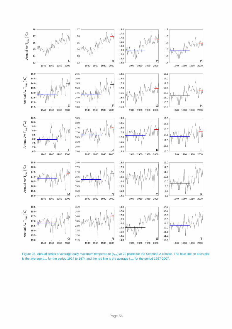
Page 56
A1940 1960 1980 2000
Ann
ual A
v T
max
(OC
)
13
14
15
16
17
18
B1940 1960 1980 2000
12
13
14
15
16
17
C1940 1960 1980 2000
14.0
14.5
15.0
15.5
16.0
16.5
17.0
17.5
18.0
D1940 1960 1980 2000
14
15
16
17
18
19
E1940 1960 1980 2000
Ann
ual A
v T
max
(OC
)
11.5
12.0
12.5
13.0
13.5
14.0
14.5
15.0
F1940 1960 1980 2000
13.0
13.5
14.0
14.5
15.0
15.5
16.0
16.5
G1940 1960 1980 2000
15.0
15.5
16.0
16.5
17.0
17.5
18.0
18.5
H1940 1960 1980 2000
15.0
15.5
16.0
16.5
17.0
17.5
18.0
18.5
I1940 1960 1980 2000
Ann
ual A
v T
max
(OC
)
6.5
7.0
7.5
8.0
8.5
9.0
9.5
10.0
10.5
J1940 1960 1980 2000
15.0
15.5
16.0
16.5
17.0
17.5
18.0
18.5
K1940 1960 1980 2000
15.5
16.0
16.5
17.0
17.5
18.0
18.5
19.0
L1940 1960 1980 2000
16.0
16.5
17.0
17.5
18.0
18.5
19.0
M1940 1960 1980 2000
Ann
ual A
v T
max
(OC
)
15.0
15.5
16.0
16.5
17.0
17.5
18.0
18.5
N1940 1960 1980 2000
14.5
15.0
15.5
16.0
16.5
17.0
17.5
18.0
O1940 1960 1980 2000
14.5
15.0
15.5
16.0
16.5
17.0
17.5
18.0
P1940 1960 1980 2000
8.5
9.0
9.5
10.0
10.5
11.0
11.5
12.0
Q1940 1960 1980 2000
Ann
ual A
v T
max
(OC
)
15.0
15.5
16.0
16.5
17.0
17.5
18.0
18.5
R1940 1960 1980 2000
11.5
12.0
12.5
13.0
13.5
14.0
14.5
15.0
S1940 1960 1980 2000
14.0
14.5
15.0
15.5
16.0
16.5
17.0
17.5
18.0
T1940 1960 1980 2000
10.5
11.0
11.5
12.0
12.5
13.0
13.5
14.0
14.5
Figure 35. Annual series of average daily maximum temperature (tmax) at 20 points for the Scenario A climate. The blue line on each plot
is the average tmax for the period 1924 to 1974 and the red line is the average tmax for the period 1997-2007.
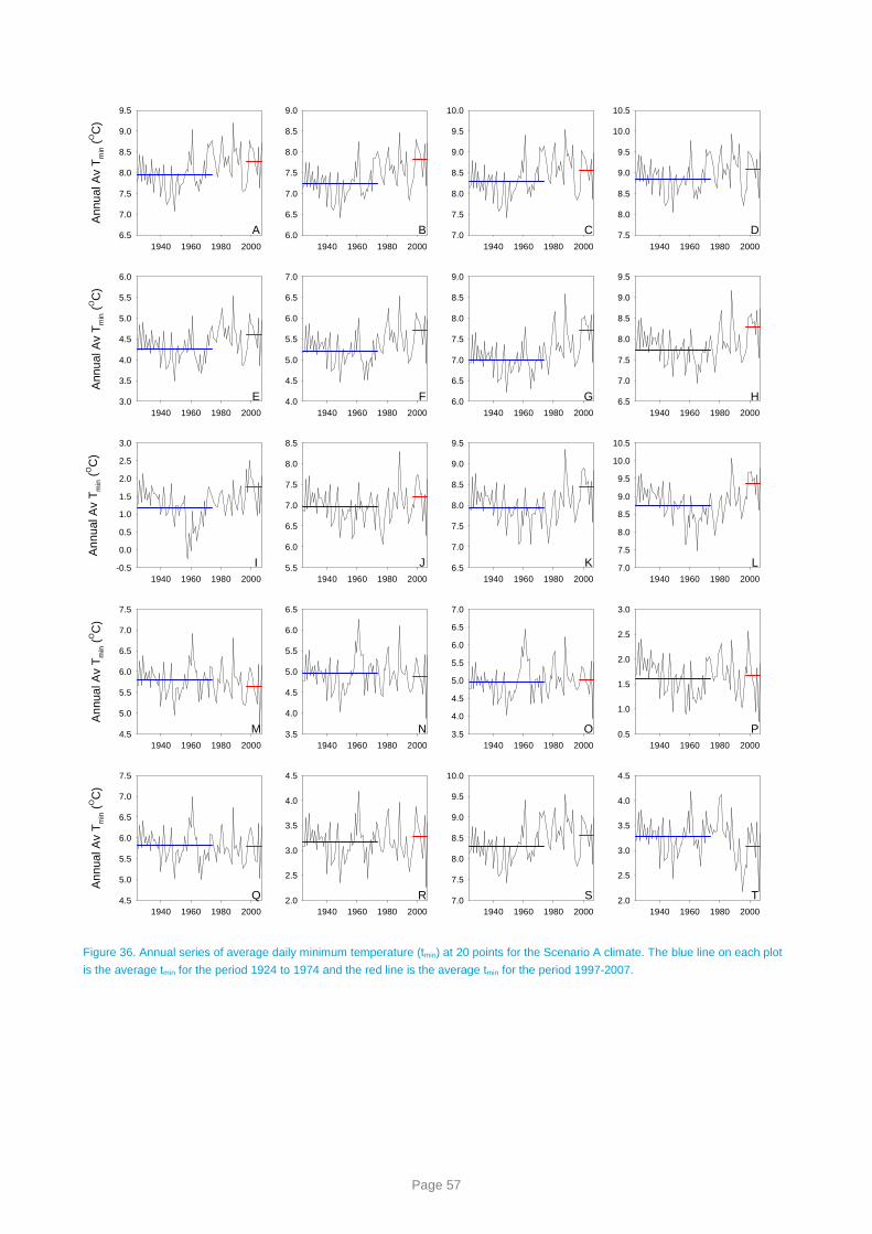
Page 57
A1940 1960 1980 2000
Ann
ual A
v T
min (
OC
)
6.5
7.0
7.5
8.0
8.5
9.0
9.5
B1940 1960 1980 2000
6.0
6.5
7.0
7.5
8.0
8.5
9.0
C1940 1960 1980 2000
7.0
7.5
8.0
8.5
9.0
9.5
10.0
D1940 1960 1980 2000
7.5
8.0
8.5
9.0
9.5
10.0
10.5
E1940 1960 1980 2000
Ann
ual A
v T
min (
OC
)
3.0
3.5
4.0
4.5
5.0
5.5
6.0
F1940 1960 1980 2000
4.0
4.5
5.0
5.5
6.0
6.5
7.0
G1940 1960 1980 2000
6.0
6.5
7.0
7.5
8.0
8.5
9.0
H1940 1960 1980 2000
6.5
7.0
7.5
8.0
8.5
9.0
9.5
I1940 1960 1980 2000
Ann
ual A
v T
min (
OC
)
-0.5
0.0
0.5
1.0
1.5
2.0
2.5
3.0
J1940 1960 1980 2000
5.5
6.0
6.5
7.0
7.5
8.0
8.5
K1940 1960 1980 2000
6.5
7.0
7.5
8.0
8.5
9.0
9.5
L1940 1960 1980 2000
7.0
7.5
8.0
8.5
9.0
9.5
10.0
10.5
M1940 1960 1980 2000
Ann
ual A
v T
min (
OC
)
4.5
5.0
5.5
6.0
6.5
7.0
7.5
N1940 1960 1980 2000
3.5
4.0
4.5
5.0
5.5
6.0
6.5
O1940 1960 1980 2000
3.5
4.0
4.5
5.0
5.5
6.0
6.5
7.0
P1940 1960 1980 2000
0.5
1.0
1.5
2.0
2.5
3.0
Q1940 1960 1980 2000
Ann
ual A
v T
min (
OC
)
4.5
5.0
5.5
6.0
6.5
7.0
7.5
R1940 1960 1980 2000
2.0
2.5
3.0
3.5
4.0
4.5
S1940 1960 1980 2000
7.0
7.5
8.0
8.5
9.0
9.5
10.0
T1940 1960 1980 2000
2.0
2.5
3.0
3.5
4.0
4.5
Figure 36. Annual series of average daily minimum temperature (tmin) at 20 points for the Scenario A climate. The blue line on each plot
is the average tmin for the period 1924 to 1974 and the red line is the average tmin for the period 1997-2007.

Page 58
A1940 1960 1980 2000
VP
D (
hPa)
1.5
2.0
2.5
3.0
3.5
4.0
B1940 1960 1980 2000
1.0
1.5
2.0
2.5
3.0
3.5
4.0
C1940 1960 1980 2000
1.82.02.22.42.62.83.03.23.43.63.8
D1940 1960 1980 2000
2.2
2.4
2.6
2.8
3.0
3.2
3.4
3.6
3.8
E1940 1960 1980 2000
VP
D (
hPa)
1.6
1.8
2.0
2.2
2.4
2.6
2.8
3.0
3.2
3.4
F1940 1960 1980 2000
2.0
2.2
2.4
2.6
2.8
3.0
3.2
3.4
3.6
3.8
G1940 1960 1980 2000
2.62.83.03.23.43.63.84.04.24.44.6
H1940 1960 1980 2000
2.8
3.0
3.2
3.4
3.6
3.8
4.0
4.2
4.4
I1940 1960 1980 2000
VP
D (
hPa)
1.6
1.8
2.0
2.2
2.4
2.6
2.8
3.0
3.2
J1940 1960 1980 2000
2.8
3.0
3.2
3.4
3.6
3.8
4.0
4.2
4.4
4.6
K1940 1960 1980 2000
2.8
3.0
3.2
3.4
3.6
3.8
4.0
4.2
4.4
4.6
L1940 1960 1980 2000
3.0
3.2
3.4
3.6
3.8
4.0
4.2
4.4
4.6
M1940 1960 1980 2000
VP
D (
hPa)
3.2
3.4
3.6
3.8
4.0
4.2
4.4
4.6
4.8
5.0
N1940 1960 1980 2000
2.8
3.0
3.2
3.4
3.6
3.8
4.0
4.2
4.4
4.6
O1940 1960 1980 2000
2.83.03.23.43.63.84.04.24.44.64.8
P1940 1960 1980 2000
1.6
1.8
2.0
2.2
2.4
2.6
2.8
3.0
3.2
Q1940 1960 1980 2000
VP
D (
hPa)
3.23.43.63.84.04.24.44.64.85.05.25.4
R1940 1960 1980 2000
2.02.22.42.62.83.03.23.43.63.84.0
S1940 1960 1980 2000
1.82.02.22.42.62.83.03.23.43.63.8
T1940 1960 1980 2000
1.5
2.0
2.5
3.0
3.5
4.0
Figure 37. Annual series of average daily vapour pressure deficit (VPD) at 20 points for the Scenario A climate. The blue line on each
plot is the average VPD for the period 1924 to 1974 and the red line is the average VPD for the period 1997-2007.

Page 59
A1940 1960 1980 2000
Ave
rage
Rad
iatio
n (k
J/m
2 )
12000
12500
13000
13500
14000
14500
15000
15500
B1940 1960 1980 2000
12000
12500
13000
13500
14000
14500
15000
C1940 1960 1980 2000
12500
13000
13500
14000
14500
15000
15500
D1940 1960 1980 2000
12500
13000
13500
14000
14500
15000
15500
E1940 1960 1980 2000
Ave
rage
Rad
iatio
n (k
J/m
2 )
12500
13000
13500
14000
14500
15000
15500
F1940 1960 1980 2000
13000
13500
14000
14500
15000
15500
16000
G1940 1960 1980 2000
13500
14000
14500
15000
15500
16000
H1940 1960 1980 2000
13500
14000
14500
15000
15500
16000
I1940 1960 1980 2000
Ave
rage
Rad
iatio
n (k
J/m
2 )
12000
12500
13000
13500
14000
14500
15000
15500
16000
J1940 1960 1980 2000
138001400014200144001460014800150001520015400156001580016000
K1940 1960 1980 2000
140001420014400146001480015000152001540015600158001600016200
L1940 1960 1980 2000
14000
14500
15000
15500
16000
16500
M1940 1960 1980 2000
Ave
rage
Rad
iatio
n (k
J/m
2 )
13000
13500
14000
14500
15000
15500
16000
N1940 1960 1980 2000
13000
13500
14000
14500
15000
15500
16000
O1940 1960 1980 2000
13500
14000
14500
15000
15500
16000
P1940 1960 1980 2000
12000
12500
13000
13500
14000
14500
15000
15500
16000
Q1940 1960 1980 2000
Ave
rage
Rad
iatio
n (k
J/m
2 )
12500
13000
13500
14000
14500
15000
15500
16000
R1940 1960 1980 2000
12500
13000
13500
14000
14500
15000
15500
16000
S1940 1960 1980 2000
12500
13000
13500
14000
14500
15000
15500
T1940 1960 1980 2000
12000
12500
13000
13500
14000
14500
15000
15500
Figure 38. Annual series of average solar radiation at 20 points for the Scenario A climate. The blue line on each plot is the average
daily solar radiation for the period 1924 to 1974 and the red line is the average daily solar radiation for the period 1997-2007.
This analysis of the Scenario A climate data has shown that the climate of Tasmania has already had a statistically
significant change. Maximum daily temperatures and vapour pressure deficits have increased over the period of analysis
while changes in rainfall, minimum temperatures and solar radiation are less certain. These changes in climate have led
to statistically significant decreases in recharge. From the sensitivity analysis, it can be seen that increased temperature
leads to increased recharge (Figure 27). As the trends in recharge and temperature are in opposite directions, changes
in temperature are not responsible for the decreasing recharge but are acting to mitigate against it. The increase in
vapour pressure deficit leads to decreased recharge (Figure 28) which means that the changes in vapour pressure deficit
are expected to cause the decrease in recharge. Decreased rainfall also leads to decreased recharge (Figure 25). The

Page 60
timing of these changes as identified by the Distribution Free CUSUM Test, the Cumulative Deviation Test and the
Worsley Likelihood Ratio Test will help identify the importance of changes in rainfall and vapour pressure deficit on
recharge. The identified step changes in recharge are mostly in two clusters from the mid ‘50s to early ‘60s and the late
‘70s to late ’80s (Figure 39). The first of these clusters coincides with the identified changes in vapour pressure deficit
and the second coincides with some of the changes in rainfall as well as some changes in vapour pressure deficit.
Considering the magnitude of the changes in vapour pressure deficit and rainfall, it is likely that the changes in vapour
pressure deficit are responsible for the majority of the downward trends seen in the recharge time series.
Rainfalln = 22
1930 1940 1950 1960 1970 1980 1990
Pro
babi
lity
0.0
0.1
0.2
0.3
0.4
0.5Vapour pressure deficitn = 60
1930 1940 1950 1960 1970 1980 1990
Pro
babi
lity
0.0
0.1
0.2
0.3
0.4
0.5
Rechargen = 51
1930 1940 1950 1960 1970 1980 1990
Pro
babi
lity
0.0
0.1
0.2
0.3
0.4
0.5
Figure 39. A histogram of the years selected for a statistically significant step change in recharge, rainfall and vapour pressure deficit at
the 20 points as identified by the Distribution Free CUSUM Test, the Cumulative Deviation Test and the Worsley Likelihood Ratio Test.
4.3 How can recharge increase when rainfall decreases?
The sensitivity analysis has shown that after change in total rainfall the next most important climate variables to change
in recharge are changes in rainfall intensity and temperature. For all cases investigated in the sensitivity analysis (Figure
27), recharge increased with increasing temperature. The three global warming scenarios are defined by their increase in
global temperature and so are quite similar between GCMs.
The change in rainfall intensity is a product of both the change in total rainfall and the distribution of that rainfall. To
investigate these changes a probability of exceedance curve of daily rainfall and recharge was constructed for control
points with high rainfall (A), medium rainfall (D) and low rainfall (M) on the most common soil type within the TasSY
project area (Dermasols) for the climate sequences used for the high global warming scenario from all 15 GCMs; these
are shown for annual and tree vegetation types in Figure 40 and Figure 41 respectively. These figures show the changes
in high intensity rainfall events and their effect upon recharge. Of particular interest are the results where there is a
decrease in total rainfall and an increase in recharge (shown in blue). At points A and D all GCMs have less total rainfall
than the Scenario A rainfall but the high intensity events are generally greater, this leads to increased recharge in some
cases.
Through the MDBSY project the episodicity of rainfall was shown to be useful predictor of changes in recharge. A useful
metric for investigating the change in episodicity of rainfall is the proportion of total rainfall in the top 1% of daily records
(Crosbie et al., 2009b):
0 0.01
ip
Pi
P
EP
< <=∑
∑ (9)
where EP is the episodicity of rainfall. This is not as useful as a predictor for the TasSY project because the rainfall
intensities for all GCMs were scaled from the CCAM results with GFDL (Post et al., 2009). This means that all the GCMs
as used for this project have an increase in Ep for the three points investigated here.

Page 61
Figure 40. Probability of exceedance curves for daily rainfall and recharge for three climate points with annual vegetation on Dermasol
soils.

Page 62
Figure 41. Probability of exceedance curves for daily rainfall and recharge for three climate points with tree vegetation on Dermasol
soils.

Page 63
4.4 An assessment of the Scenario C results in light of the
performance of the GCMs
The analysis in this project assumes that each GCM is equally good. In reality some GCMs are better than others at
replicating the historical climate and this is used to judge their ability to predict a future climate. It is prudent to check the
results obtained from assuming that each GCM is equally good to assuming that some are better than others. Post et al.
(2009) presented the results of different studies examining the performances of the different GCMs as is relevant to the
different sustainable yields projects around the country (Table 16). The best GCM was assessed to be GFDL which
scored above the median in nine out 10 tests and the worst was NCAR_PCM which scored below the median in all tests.
Table 16. Weights for each GCM for use in weighted Pearson Type III distribution. The weights are 1 minus the failure rate identified by
Post et al. (2009).
Model Weight
cccma_t47 0.4
cccma_t63 0.5
cnrm 0.37
csiro 0.5
gfdl 0.9
giss_aom 0.37
iap 0.33
inmcm 0.5
ipsl 0.11
miroc 0.8
miub 0.75
mpi 0.7
mri 0.7
ncar_ccsm 0.62
ncar_pcm 0
A methodology for fitting the 15 RSF rasters for a global warming scenario to a weighted Pearson Type III distribution
was presented by Crosbie et al. (2009c). This method allows a comparison to be made of the 10th, 50th and 90th
percentiles of the RSFs at a pixel scale when the probability distribution is weighted for GCM performance or unweighted
if all GCMs are assumed equal.
The difference between the weighted and unweighted cases is not great (Figure 42). For the 10% exceedance case of
the high global warming scenario (akin to Cwet) the greatest differences are along the western edge of the Derwent
South-East region but overall the difference is only 0.02 in RSF (Table 17). There is some structure to the pattern of the
difference plot along the boundaries of the reporting regions; this is an artefact of the scaling used in defining the climate
scenarios. The 50% exceedance case of the medium global warming scenario (akin to Cmid) shows almost no difference
between the weighted and the unweighted cases. The 90% exceedance case of the high global warming scenario (akin
to Cdry) shows a similar but opposite pattern to the 10% exceedance case. Along the western edge of the Derwent
South-East the weighted case gives a lower RSF than the unweighed case, for the region this averages -0.01 in RSF.
Overall, the differences between the weighted and unweighted cases are small and justify the decision to treat all GCMs
as being equal.

Page 64
Figure 42. A comparison of the weighted and unweighted RSF rasters after being fitted to a Pearson Type III distribution. The plot
shows the 10th and 90th percentile exceedance rasters for the high global warming scenario and the 50th percentile exceedance for the
medium global warming scenario. The difference plots are the weighted minus the unweighted.

Page 65
Table 17. Comparison of the average RSFs calculated for each reporting region from the RSFs as output from the Pearson Type III
distribution for the weighted and unweighted cases.
Reporting Region Unweighted Weighted
H-10 M-50 H-90 H-10 M-50 H-90
Arthur-Inglis-Cam 1.13 1.04 0.95 1.13 1.04 0.95
Pipers-Ringarooma 1.14 1 0.91 1.16 1.01 0.9
South Esk 1.14 1.02 0.92 1.15 1.02 0.92
Mersey-Forth 1.13 1.05 0.97 1.13 1.05 0.98
Derwent-South East 1.29 1.09 1 1.27 1.09 1.01
4.5 An assessment of the methodology
4.5.1 Limitations of the methodology
The method used in this study is very similar to that used in the MDBSY project and therefore suffers from the same
limitations. The WAVES model has been used extensively around the world and shown to be able to reproduce the
results from field trials; however, the way it has been used here has some limitations.
WAVES is a Richard’s equation-based model that routes water through the soil matrix. There is no mechanism within the
model to simulate recharge that bypasses the soil matrix (i.e., preferential flow pathways). This can be overcome within
the model by assuming that preferential pathways are equivalent to artificially increasing the hydraulic conductivity.
The modelling assumes a free draining lower boundary condition for a 4 m soil column. The free draining boundary
condition may overestimate recharge in high water table areas because the water table will not limit the amount of rainfall
that can be infiltrated. Furthermore, soil hydraulic parameters may not accurately describe areas where there was no soil
(i.e. rock outcrops) or areas that had shallow depths to bedrock.
The vegetation parameters used in WAVES were taken from literature values; there is insufficient detailed information on
the vegetation of Tasmania to have confidence that the vegetation parameters used are correct. The effect this has upon
the results are minimised by reporting the recharge for the different scenarios as RSFs, the absolute value of the
recharge calculation is not given priority in the reporting.
4.5.2 Further work required
The modelling undertaken here demonstrates the impact vegetation has upon recharge and potential outcomes from
different scenarios of climate change. The Scenario C for this project assumed current development with a future climate;
it was assumed that the vegetation was the same as historical. The modelling here suggests that under a future climate
there is the possibility for ecological succession with changes in climate favouring some vegetation types over others.
Investigating these changes was beyond the scope of this project, but could have changed the results had they been
incorporated.

Page 66
5 Conclusions
This report used a similar methodology to that used in the MDBSY project to estimate the changes in diffuse
groundwater recharge across Tasmania under different climate scenarios.
For the historical climate (Scenario A) the results were very consistent between reporting regions with the median
projection for the next 23 years being between a 9 and 15 percent increase in recharge with the wet extreme projecting
between a 52 and 67 percent increase in recharge and the dry extreme projecting between a 46 and 55 percent
decrease in recharge. The large spread of results from Scenario A are because the climate of Tasmania has not been
stationary over the past 84 years. There has been a statistically significant increase in temperature and vapour pressure
deficit over the past few decades leading to a downward trend in the modelled historical recharge. This has resulted in
the Awet periods being selected from early in the time series and Adry being selected from more recent times.
The recent climate (Scenario B) has been characterised by drought and therefore all of the reporting regions showed a
decrease in groundwater recharge with a maximum decrease of 74 percent below the modelled historical average for the
Pipers-Ringarooma region.
For a future climate (Scenario C) the median projection is for an increase in recharge in most regions of between 2 and
11 percent with only the South Esk region projected to have a decrease of 1 percent. For the wet extreme, the
projections for all reporting regions show an increase in recharge of between 8 and 19 percent. For the dry extreme,
most reporting regions are projected to have a decrease in recharge of up to 8 percent except for the Derwent-South
East which shows no change.
For a future climate and future forestry development (Scenario D) the median projection is for a range between a
reduction of 3 percent and an increase of 11 percent. For the wet extreme all regions project an increase in recharge of
between 2 and18 percent. For the dry extreme most regions are projected to have a decrease in recharge of up to 13
percent except for the Derwent-South East which shows no change.

Page 67
References
Broadbridge, P. and White, I., 1998. Constant rate rainfall infiltration: A versatile non-linear model: I. Analytical solution. Water Resources Research, 24: 145-154.
BRS, 2008. Integrated Vegetation Cover 2008, Bureau of Rural Sciences, Canberra.
Cartwright, I. and Simmonds, I., 2008. Impact of changing climate and land use on the hydrogeology of southeast Australia. Australian Journal of Earth Sciences, 55(8): 1009-1021.
Crosbie, R.S., McCallum, J., Walker, G.R. and Chiew, F.H.S., 2008a. Diffuse groundwater recharge modelling across the Murray-Darling Basin. A report to the Australian government from the CSIRO Murray-Darling Basin Sustainable Yields project, Water for a Healthy Country Flagship. CSIRO, Canberra, http://www.csiro.au/files/files/pn7z.pdf.
Crosbie, R.S., McCallum, J.L. and Harrington, G.A., 2009a. Diffuse groundwater recharge modelling across northern Australia: A report to the Australian Government from the CSIRO Northern Australia Sustainable Yields Project, Water for a Healthy Country Flagship, CSIRO, Canberra.
Crosbie, R.S., McCallum, J.L., Walker, G.R. and Chiew, F.H.S., 2009b. The impact of climate change on the episodicity of groundwater recharge. Submitted to Hydrogeology Journal.
Crosbie, R.S., McCallum, J.L., Walker, G.R. and Chiew, F.H.S., 2009c. Modelling the climate change impact on groundwater recharge in the Murray-Darling Basin. Submitted to Hydrogeology Journal.
Crosbie, R.S., Wilson, B., Hughes, J.D., McCulloch, C. and King, W.M., 2008b. A comparison of the water use of tree belts and pasture in recharge and discharge zones in a saline catchment in the Central West of NSW, Australia. Agricultural Water Management, 95(3): 211-223.
Dawes, W., Zhang, L. and Dyce, P., 2004. WAVES v3.5 User Manual, CSIRO Land and Water, Canberra.
Dawes, W.R., Gilfedder, M., Stauffacher, M., Coram, J., Hajkowicz, S., Walker, G.R. and Young, M., 2002. Assessing the viability of recharge reduction for dryland salinity control: Wanilla, Eyre Peninsula. Australian Journal of Soil Research, 40(8): 1407-1424.
Donohue, R.J., McVicar, T.R. and Roderick, M.L., 2009. Climate-related trends in Australian vegetation cover as inferred from satellite observations, 1981-2006. Global Change Biology, 15(4): 1025-1039.
Grayson, R., Argent, R., Nathan, R., McMahon, T. and Mein, R., 1996. Hydrological recipes: Estimation techniques in Australian hydrology. CRC Catchment Hydrology, Melbourne, 125 pp.
Harrington, G.A., Crosbie, R.S., Marvanek, S., McCallum, J.L., Currie, D., Richardson, S., Waclawik, V., Georgiou, J., Middlemis, H. and Bond, K., 2009. Current and future (2030) groundwater for Tasmania. A report to the Australian Government from the CSIRO Tasmania Sustainable Yields project . Water for a Healthy Country Flagship, CSIRO, Canberra.
IPCC, 2007. Climate Change 2007: The Physical Science Basis. Contribution of Working Group 1 to the Fourth Assessment Report of the Intergovernmental Panel on Climate Change. Cambridge University Press, Cambridge UK, 996 pp.
Isbell, R.F., 2002. Australian Soils Classification. CSIRO, Collingwood, Victoria, 144 pp.
Jeffrey, S.J., Carter, J.O., Moodie, K.B. and Beswick, A.R., 2001. Using spatial interpolation to construct a comprehensive archive of Australian climate data. Environmental Modelling & Software, 16(4): 309-330.
Johnston, R.M., Barry, S.J., Bleys, E., Bui, E.N., Moran, C.J., Simon, D.A.P., Carlile, P., McKenzie, N.J., Henderson, B.L., Chapman, G., Imhoff, M., Maschmedt, D., Howe, D., Grose, C., Schoknecht, N., Powell, B. and Grundy, M., 2003. ASRIS: the database. Australian Journal of Soil Research, 41(6): 1021-1036.
Lynne, V. and Hollick, M., 1979. Stochastic time variable rainfall runoff modelling, Hydrology and Water Resources Symposium, Perth, Australia, pp. 89-92.
McCallum, J.L., Crosbie, R.S., Walker, G.R. and Dawes, W.R., 2009. Impacts of climate change on groundwater: A sensitivity analysis of recharge. Submitted to Hydrogeology Journal.
Post, D.A., Chiew, F.H.S., Teng, J., Vaze, J., Yang, A., Mpelasoka, F., Smith, I.N., Katzfey, J., Marston, F., Marvanek, S.P., Kirono, D., Nguyen, K., Kent, D., Donohue, R.J. and McVicar, T.R., 2009. Climate scenarios for Tasmania. Tasmania Sustainable Yields Project. A report to the Australian Government from the CSIRO Tasmania Sustainable Yields Project, CSIRO, Canberra.
Salama, R., Hatton, T. and Dawes, W., 1999. Predicting land use impacts on regional scale groundwater recharge and discharge. Journal of Environmental Quality, 28(2): 446-460.
Slavich, P.G., Walker, G.R., Jolly, I.D., Hatton, T.J. and Dawes, W.R., 1999. Dynamics of Eucalyptus largiflorens growth and water use in response to modified watertable and flooding regimes on a saline floodplain. Agricultural Water Management, 39(2-3): 245-264.
Sun, Y., Solomon, S., Dai, A.G. and Portmann, R.W., 2006. How often does it rain? Journal of Climate, 19(6): 916-934.
Viney, N.R., Post, D.A., Yang, A., Willis, M., Robinson, K., Bennett, J., Ling, F. and Marvanek, S., 2009. Rainfall-runoff modelling for Tasmania. A report to the Australian Government from the CSIRO Tasmania Sustainable Yields Project, CSIRO, Australia.
Wang, H.X., Zhang, L., Dawes, W.R. and Liu, C.M., 2001. Improving water use efficiency of irrigated crops in the North China Plain - measurements and modelling. Agricultural Water Management, 48(2): 151-167.
Xu, C., Martin, M., Silberstein, R. and Smetten, K., 2008. Identifying sources of uncertainty in groundwater recharge estimates using the biophysical model WAVES, Water Down Under, Adelaide, Australia.

Page 68
Yang, Y.H., Watanabe, M., Wang, Z.P., Sakura, Y. and Tang, C.Y., 2003. Prediction of changes in soil moisture associated with climatic changes and their implications for vegetation changes: Waves model simulation on Taihang Mountain, China. Climatic Change, 57(1-2): 163-183.
Zhang, L. and Dawes, W., 1998. WAVES - An integrated energy and water balance model. Technical Report No. 31/98, CSIRO Land and Water.
Zhang, L., Dawes, W.R. and Hatton, T.J., 1996. Modelling hydrologic processes using a biophysically based model--application of WAVES to FIFE and HAPEX-MOBILHY. Journal of Hydrology, 185(1-4): 147-169.
Zhang, L., Dawes, W.R., Hatton, T.J., Hume, I.H., O'Connell, M.G., Mitchell, D.C., Milthorp, P.L. and Yee, M., 1999. Estimating episodic recharge under different crop/pasture rotations in the Mallee region. Part 2. Recharge control by agronomic practices. Agricultural Water Management, 42(2): 237-249.