Development process
44
Reece Bahia
-
Upload
reecebahiagad -
Category
Business
-
view
83 -
download
2
Transcript of Development process

Reece Bahia

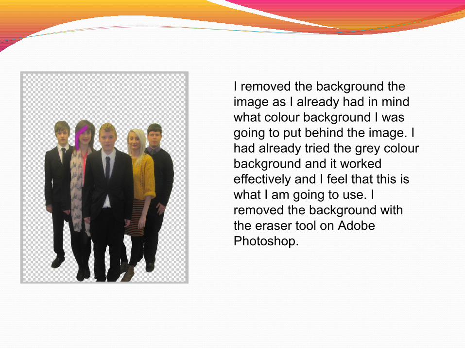
I removed the background the image as I already had in mind what colour background I was going to put behind the image. I had already tried the grey colour background and it worked effectively and I feel that this is what I am going to use. I removed the background with the eraser tool on Adobe Photoshop.

I added the grey background to my magazine so that it looks effective as it works with the characters in the image

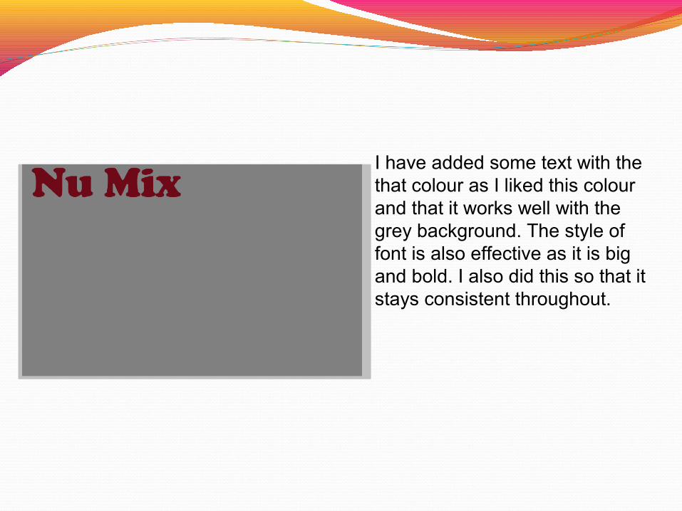
I have added some text with the that colour as I liked this colour and that it works well with the grey background. The style of font is also effective as it is big and bold.

I have added a drop glow of white so that it stands out and it looks more effective the white outline around it. I played around with the different colours in which I preferred white than any other colour.

I have added the rectangular shape at the top of the page so that I can added some text on to that bar.
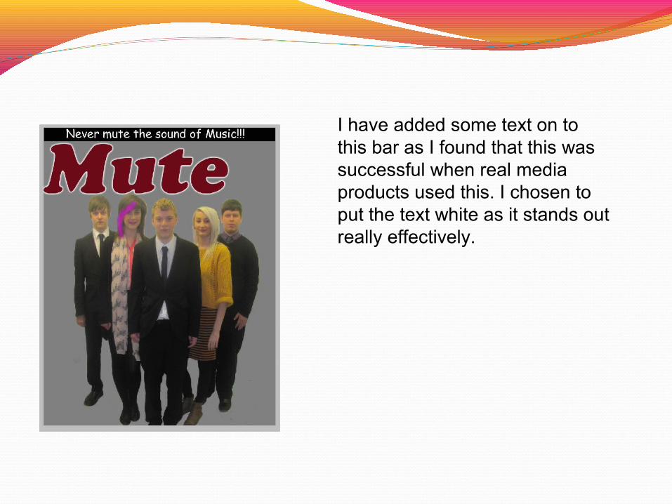
I have added some text on to this bar as I found that this was successful when real media products used this. I chosen to put the text white as it stands out really effectively.
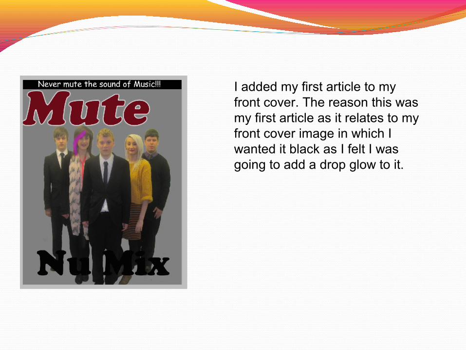
I added my first article to my front cover. The reason this was my first article as it relates to my front cover image in which I wanted it black as I felt I was going to add a drop glow to it.
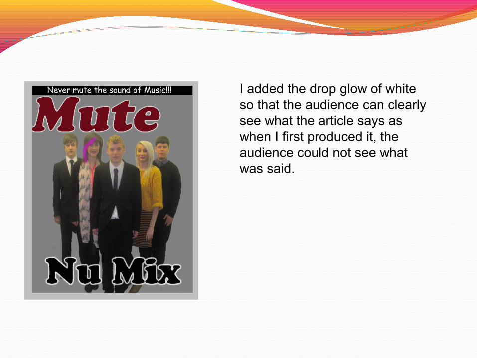
I added the drop glow of white so that the audience can clearly see what the article says as when I first produced it, the audience could not see what was said.
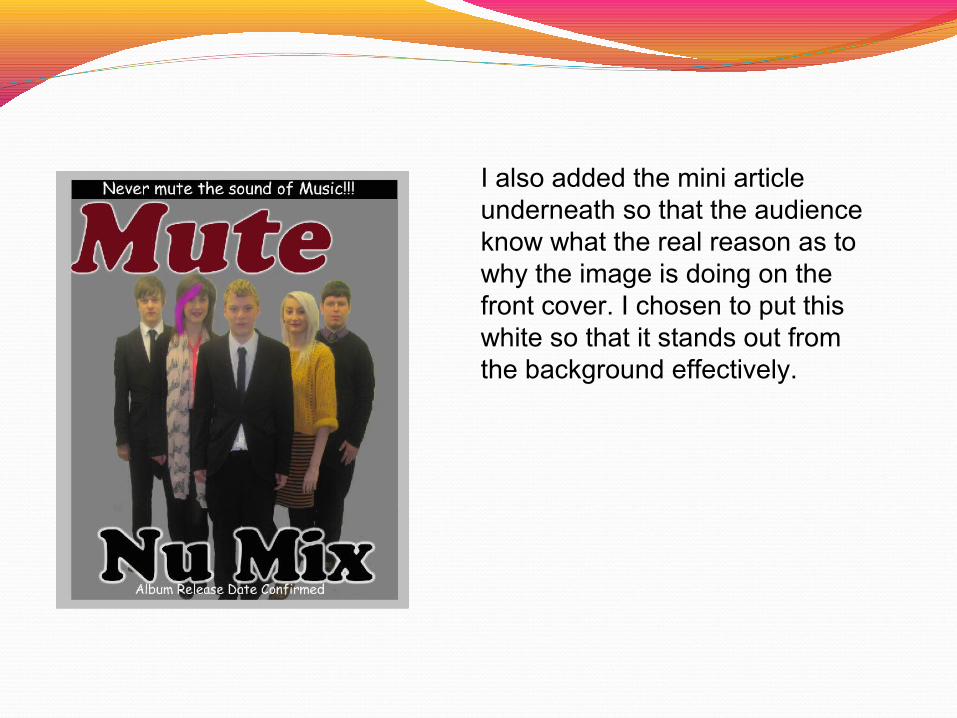
I also added the mini article underneath so that the audience know what the real reason as to why the image is doing on the front cover. I chosen to put this white so that it stands out from the background effectively.

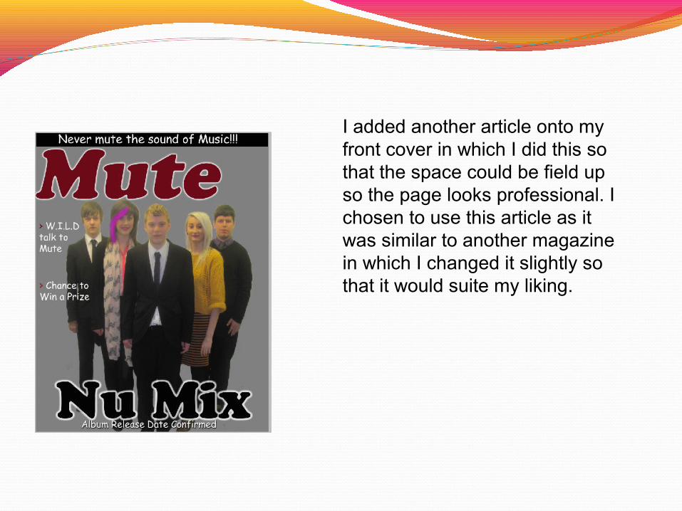
I added another article onto my front cover in which I did this so that the space could be field up so the page looks professional. I chosen to use this article as it was similar to another magazine in which I changed it slightly so that it would suite my liking.
I added another article onto my front cover in which I did this so that the space could be field up so the page looks professional. I chosen to use this article as it was similar to another magazine in which I changed it slightly so that it would suite my liking.

I added another article onto my front cover in which I did this so that the space could be field up so the page looks professional. I chosen to use this article as it was similar to another magazine in which I changed it slightly so that it would suite my liking.

I added another article onto my front cover in which I did this so that the space could be field up so the page looks professional. I chosen to use this article as it was similar to another magazine in which I changed it slightly so that it would suite my liking.

I added the date of my magazine so that the audience know when the magazine was published. I chosen to do this in that colour so that the magazine is consistent throughout.

I also added the issue number so that the audience know how many of the magazine have been published each week. I chosen to do this in that colour so that the magazine is consistent throughout.


I have chosen to have my magazine background as grey so that it is consistent throughout each pages of my magazine

I have added some text with the that colour as I liked this colour and that it works well with the grey background. The style of font is also effective as it is big and bold. I also did this so that it stays consistent throughout.

I have added a drop glow of white so that it stands out and it looks more effective the white outline around it. I played around with the different colours in which I preferred white than any other colour. This is similar to my front cover in which I wanted to keep it consistent.
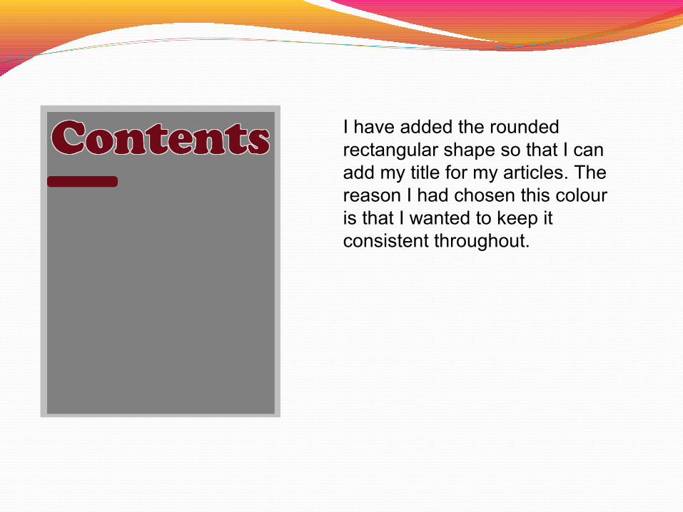
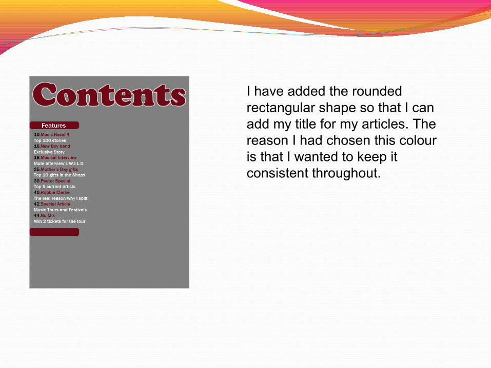
I have added the rounded rectangular shape so that I can add my title for my articles. The reason I had chosen this colour is that I wanted to keep it consistent throughout.

I have added some text to the shape and I chosen to use white as I wanted to keep it consistent throughout. I had chosen to centralise this so that it looks more effective.

I added my articles that will feature in this issue of the magazine. I have aligned they to the left in which it will look more effective. The colours that I have chosen are consistent throughout the magazine.
I have added the rounded rectangular shape so that I can add my title for my articles. The reason I had chosen this colour is that I wanted to keep it consistent throughout.

I have added some text to the shape and I chosen to use white as I wanted to keep it consistent throughout. I had chosen to centralise this so that it looks more effective.

I added my articles that will feature every month of the magazine. I have aligned they to the left in which it will look more effective. The colours that I have chosen are consistent throughout the magazine.
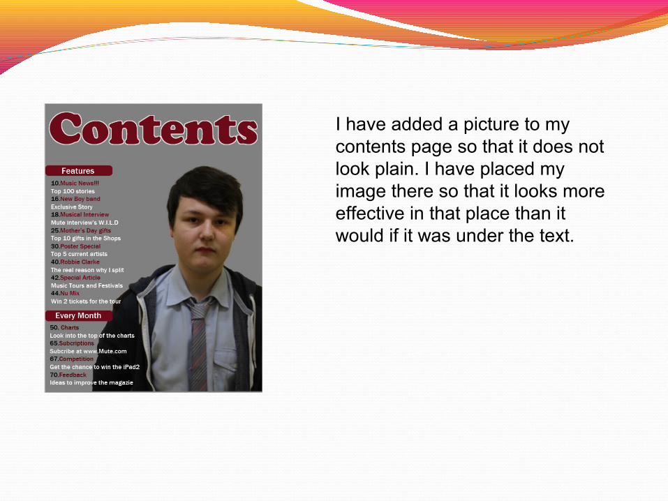
I have added a picture to my contents page so that it does not look plain. I have placed my image there so that it looks more effective in that place than it would if it was under the text.

I have added the article onto the image so that it shows to the audience the reason why that the image is placed on the magazine contents page.

I have added a square shape so that my number that the article will be on can be shown to the audience effectively.

I have added the number so that the audience know where the story is going to be in the magazine.


I have chosen to have my magazine background as grey so that it is consistent throughout each pages of my magazine
I have added some text with the that colour as I liked this colour and that it works well with the grey background. The style of font is also effective as it is big and bold. I also did this so that it stays consistent throughout.

I have added a drop glow of white so that it stands out and it looks more effective the white outline around it. I played around with the different colours in which I preferred white than any other colour. This is similar to my front cover in which I wanted to keep it consistent.

I added the centre line on the page so that I knew where I would be placing my writing. I chosen the colour black as it keeps it consistent throughout.

I have added the first half of my interview in which I wanted it to be placed the way it is so that the layout of the page looks effective. The colours that have been used are the same as my front cover and my contents page which shows the consistency throughout.

I have added the second half of my interview in which I wanted it to be placed the way it is so that the layout of the page looks effective. The colours that have been used are the same as my front cover and my contents page which shows the consistency throughout.

I added that bar so that the page could be split up as there would be two different things will be shown to the audience.

I have added the text so that the audience know when the band are next on tour. I have chosen to use white so that it stands out much better.

I have added the drop glow of dark red in which the colour scheme of this text is still shows the consistency.
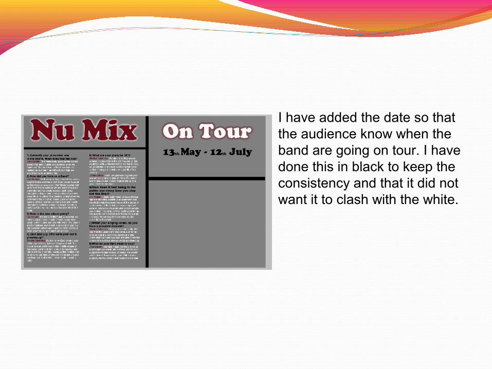
I have added the date so that the audience know when the band are going on tour. I have done this in black to keep the consistency and that it did not want it to clash with the white.

I have added a inspirational quote for the audience in which it may inspire the audience in which it shows to the audience that the band cares for them.

I have added an image of the band so that the audience could keep this image of the band as it is a very exclusive image and it would look dull without an image.


![[PPT]DEVELOPMENT PLANNING PROCESS - National ...nepa.gov.jm/ecentre/Development-Planning-Process-in... · Web viewDEVELOPMENT PLANNING PROCESS IN JAMAICA Development Order Outline](https://static.fdocuments.in/doc/165x107/5ae0bd6f7f8b9a1c248d8e7e/pptdevelopment-planning-process-national-nepagovjmecentredevelopment-planning-process-inweb.jpg)