Developing a framework of design principles for single page websites and their application
39
Developing a framework of design principles for single page websites and their application Signe Elimar Hansen & Charlotte Bust Sigvardt
-
Upload
world-ia-day-copenhagen -
Category
Internet
-
view
120 -
download
0
Transcript of Developing a framework of design principles for single page websites and their application

Developing a framework of design principles for single page websites and
their application
Signe Elimar Hansen & Charlotte Bust Sigvardt

1. Introduction• Who are we?• The single page
phenomenon• Problem statement
2.Method/approach• Phenomenological
Agenda3.Investigation
• Evolution of web design
• Definition and characteristics
4.Usability and results• Usability study• Usability data and
results• Design principles
2

Introduction
3

Masters of Science in Information Technology from the master’s programme in Information Architecture at Aalborg University.
Graduated July 2015.
Introduction - who are we?
4
Charlotte Bust Sigvardt
MSc IT from AAU
Signe Elimar HansenMSc IT from AAU

Introduction - the single page phenomenon
5
Factory Forty - Coworking, Meeting Rooms and Event Venue in Brussels.
Phoenix the Creative Studio - Agency Survival Kit products.

Through an examination of the notion of single page websites we aim to develop a framework of design principles- What is a single page website?- How is information architecture in single page
websites designed, and how is it utilised by designers and users?
- How can the usability and user experience, in the context of single page websites, be characterised?
Introduction - problem statement
6

Method/approach
7

Phenomenological reduction is aimed at investigating phenomena in an unbiased way, which should lead to looking at the phenomenon without the bias of prior understanding. The scientific method should lead to the essence of a phenomenon.
(Norlyk & Martinesen, 2008, pp. 70-73)
Method/approach - the phenomenological approach
8

Evolution of web designDefining single pages by looking at examplesDescribing characteristics (features, tehnologies)Categorisation of 100 single pages by contextIdentification of 2 sub-genresObservational usability studyMeaning categorisation of dataDesign principles
Method/approach - the phenomenological approach
9

Investigation
10

Started from broad perspective: Investigated evolution of web design (and technology)
Investigation - evolution of web design
11
1990 2000 2010
1990: First website
1996: Flash
introduced
2000: Separation of structure/style
Early 00s: Web 2.0 and user-created
content
Late 2000s: HTML5
2008: Mobile access
Early-mid 90s: Table-based
structure

Web design is a product of technological enhancements, and single page websites have strong ties to responsive design thinking and the mobile-first approach.
Investigation - evolution of web design
12

Defining the characteristics of the genre: Which features and technologies are associated with the genre today?
• Ajax (Asynchronous JavaScript and XML)• Responsive web design• Parallax scrolling• Custom and automatic scroll• Fullscreen images• Infinite scroll
Investigation - definition and characteristics
13

Investigation - current context
14
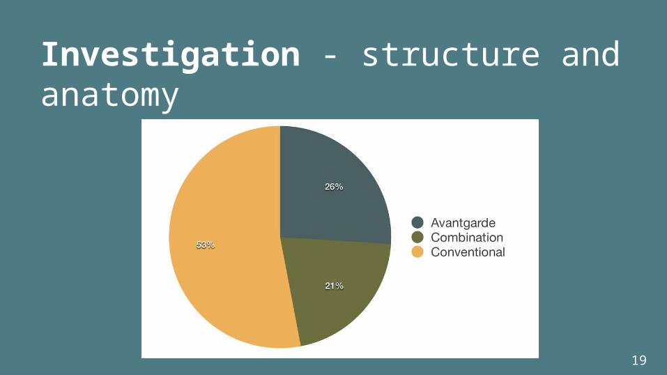
Note: 21 % of all single pages were represented by web design agencies

The anatomy and structure of single page websites have clear differences. The structural differences propelled us towards creating a sub-genre division of single page websites: Conventional and Avantgarde.
Investigation - structure and anatomy
15

Conventional: Clear/conventional navigation forms a distinct overview.
Presents information to the user right away. Easy to predict, seems familiar.
Focus on usability = functionalist approach.
16
Investigation - structure and anatomy

Avantgarde: Artistic and unconventional appearance.
Hard to predict - breaking user-expectation. Not clear what is going to happen next.
Focus on user experience = experience-based approach
17
Investigation - structure and anatomy

Combination: Hard to place. Navigation not always clear.
Site can seem confusing before initiating scroll.
After you have started navigating, it is very clear what is going to happen next.
18
Investigation - structure and anatomy
19
Investigation - structure and anatomy

Usability and results
20

How do users navigate single page websites, and what are their thoughts about them?● Observational study with 17 participants divided into
two groups (each sub-genre represented)○ Attempted to find equal representation between
genders, ages, and backgrounds○ Participants were asked to complete a series of tasks
by locating information on the website○ Questions asked before, during, and after usability
session
Usability study
21

Usability study - the two sub-genres
22
ConventionalCompanies
AvantgardeShowcase/showroom
Representative of the two sub-genres and two largest categories.

Quantitative data• Evaluations on the semantic differential scale (1-
7)• GSR measurements
Qualitative data• Q&A before, during, and after usability session• Feedback based on specific times in screen
recording found using the GSR measurements
Usability results and data
23

GSR – Galvanic Skin Response
24

Usability and resultsDesign principles
25

12 design principles:• Principles 1-9 produced during the writing
process• Principles 10-12 produced after handing in the
thesis (presented at final exam)
Usability results and data - the 12 design principles
26

Consider which information behaviour the website should facilitate, and how it can be accomplished.
Inconsistencies between the user’s perceived affordances and designer’s intended affordances can occur.Some users did not discover manual scrolling, but only navigated via automatic scroll features.
Design principles - principle #1
27

The amount of text must correspond to the context of the website.
A website with the purpose of informing the user, such as a campaign, should provide more in-depth information than a website aimed at displaying images, such as an artist’s portfolio.
Participants felt that one of the websites was too text-heavy, while the other did not provide enough explicit information.
Design principles - principle #2
28

Horizontal navigation confuses some users.
In order to help the users understand the structure of the site, horizontal navigation should be clearly marked by signifiers and help-text, a ording the action of navigating horizontally.Some participants were inexperienced with horizontal navigation.
Design principles - principle #3
29

Some users only navigate via automatic scroll.
Consider how a website would be navigated if the users only moved via automatic scroll, and how the designer can communicate that manual scroll is possible.Some participants did not discover the possibility of navigating manually, and therefore only navigated via automatic scroll (and missed some content).
Design principles - principle #4
30

Some users will use browser functionalities.
Designers of single page websites should take into account that some users will use browser-functionalities.Some participants tried to use the back-button, find-on-page functionality, and looked to the browser (like the URL) to find information about the sender.
Design principles - principle #5
31

Transparency is heightened by placing information about the sender in the header or footer.
Much like a letter, the user looks to the head and foot for information. Some participants became confused and frustrated when the site did not provide practical information in the footer/header as expected.
Design principles - principle #6
32

Be consistent with use of signifiers in the interface.
Identical arrows (or other signifiers) should be consistently used within the interface, and that the designers set up and follow platform conventions.Some participants were confused by arrows affording different actions, and found them hard to predict.
Design principles - principle #7
33

Visualise the journey during automatic scroll
Automatic scroll should provide the users with the feeling that they are being taken from one place to another, thus making the animated journey transparent to the user. Designers should be aware that users might try to brake the animation.Some users saw the automatic scrolling as a film playing, instead of the site scrolling down. Some users tried to “brake” the automatic scrolling, as they found what they were looking for during scroll.
Design principles - principle #8
34

Familiarity can help minimise the user’s memory load.
It takes less time to learn the design and be able to accomplish basic tasks, if users have encountered them before and are able to derive the meanings and actions from experience and memory.
Participants attempted to rationalise interface/actions based on prior experience - for example, press an arrow pointing downwards with the expectation of automatic downwards scroll.
Design principles - principle #9
35

Familiar transaction-patterns can increase credibility.
The single page structure can in some cases decrease credibility if the transaction process is downgraded to keep the single page structure intact.Participants expected to be presented with a traditional e-payment system, but instead an e-mail client opened.
Design principles - principle #10
36

Navigational architecture communicates content and structure.
By removing the traditional menu structure, efficiency decreases and users experience that content is not explicitly presented to them.Participants were sometimes able to derive sender, receive, message and goal of the website based on a sticky top-menu.
Design principles - principle #11
37

Layering-effect can lead to coincidental overlaps of interface objects.
The layering-effect can result in overlapping elements in the interface and cause them to be perceived as connected (in accordance with Gestalt principles).Some participants were confused when they interpreted a button and an arrow as interconnected because the automatic scroll destination caused the elements to overlap in the interface.
Design principles- principle #12
38

THANK YOU
39