Designing and Evaluating Glanceable Peripheral … and Evaluating Glanceable Peripheral Displays by...
201
Designing and Evaluating Glanceable Peripheral Displays Tara Lynn Matthews Electrical Engineering and Computer Sciences University of California at Berkeley Technical Report No. UCB/EECS-2007-56 http://www.eecs.berkeley.edu/Pubs/TechRpts/2007/EECS-2007-56.html May 16, 2007
Transcript of Designing and Evaluating Glanceable Peripheral … and Evaluating Glanceable Peripheral Displays by...
Designing and Evaluating Glanceable PeripheralDisplays
Tara Lynn Matthews
Electrical Engineering and Computer SciencesUniversity of California at Berkeley
Technical Report No. UCB/EECS-2007-56
http://www.eecs.berkeley.edu/Pubs/TechRpts/2007/EECS-2007-56.html
May 16, 2007
Copyright © 2007, by the author(s).All rights reserved.
Permission to make digital or hard copies of all or part of this work forpersonal or classroom use is granted without fee provided that copies arenot made or distributed for profit or commercial advantage and that copiesbear this notice and the full citation on the first page. To copy otherwise, torepublish, to post on servers or to redistribute to lists, requires prior specificpermission.
Acknowledgement
Thank you to my advisor, Jennifer Mankoff, for her support, knowledge,enthusiasm, and motivation. Thank you to my committee members ¿ Jennifer Mankoff, John Canny,Maneesh Agrawala, Mary Czerwinski, William Prinzmetal, and KenGoldberg ¿ for their expertise and mentorship. Thank you to the National Science Foundation and the University ofCalifornia, for fellowship support of my graduate studies. Thank you to my husband, Kevin Watt, for constant support and inspiration;

to my Mom and sister, Ashley, for their love and encouragement; and to myDad ¿ his legacy lives on in everything I do. Thank you to my co-authors and collaborators ¿ their ideas and friendshiphas been invaluable. Thank you to my U.C. Berkeley and Carnegie Mellonlab mates and friends.
����������������� �������������������������������������
���
�������������������
������������ ��������������
������� ����������������� ������������������
�
���������� ���������� � ��������!�� ����"���
��#������ ������"����$�������
���������������������
���
���� ������������
�������
��� �������������
�������
�����������������������!�"��#�����
�
�������������������$�
%���������&� ������ ������!�'!"����
%���������&�" �� ���!�'!"����%���������� ���"��$�(��
%���������)� �*������$�%���������+������%�� ,����
-��������,��(� ����
�
�������%&&'
The dissertation of Tara Lynn Matthews is approved: Co-chair _____________________________________________ Date _____________ Co-chair _____________________________________________ Date _____________ _____________________________________________ Date _____________ _____________________________________________ Date _____________ _____________________________________________ Date _____________ _____________________________________________ Date _____________
University of California, Berkeley Spring 2007

Designing and Evaluating Glanceable Peripheral Displays Copyright 2007 by Tara Lynn Matthews
1
(��������
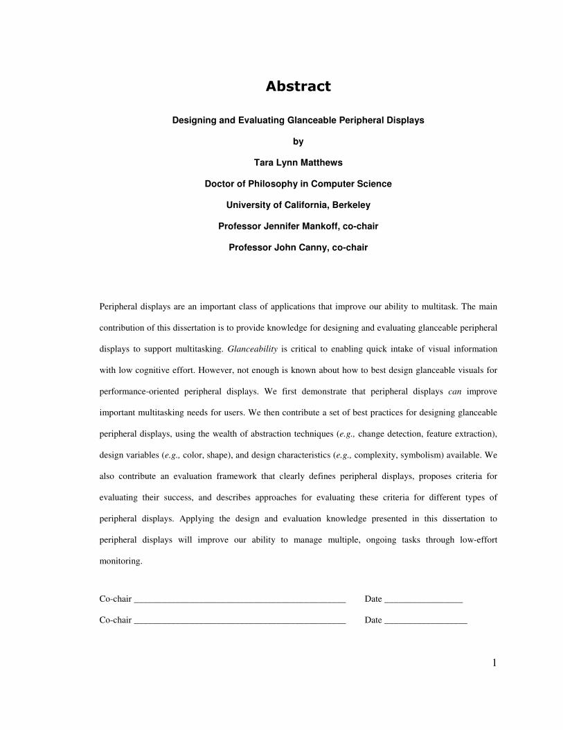
Designing and Evaluating Glanceable Peripheral Displays
by
Tara Lynn Matthews
Doctor of Philosophy in Computer Science
University of California, Berkeley
Professor Jennifer Mankoff, co-chair
Professor John Canny, co-chair
Peripheral displays are an important class of applications that improve our ability to multitask. The main
contribution of this dissertation is to provide knowledge for designing and evaluating glanceable peripheral
displays to support multitasking. Glanceability is critical to enabling quick intake of visual information
with low cognitive effort. However, not enough is known about how to best design glanceable visuals for
performance-oriented peripheral displays. We first demonstrate that peripheral displays can improve
important multitasking needs for users. We then contribute a set of best practices for designing glanceable
peripheral displays, using the wealth of abstraction techniques (e.g., change detection, feature extraction),
design variables (e.g., color, shape), and design characteristics (e.g., complexity, symbolism) available. We
also contribute an evaluation framework that clearly defines peripheral displays, proposes criteria for
evaluating their success, and describes approaches for evaluating these criteria for different types of
peripheral displays. Applying the design and evaluation knowledge presented in this dissertation to
peripheral displays will improve our ability to manage multiple, ongoing tasks through low-effort
monitoring.
Co-chair ______________________________________________ Date _________________
Co-chair ______________________________________________ Date __________________
i
����������������
("��)(���***************************************************�+�
�,�-���./�/��� ********************************************�-�
(�0/.1����/��� ****************************************�-2�
+� -/�).� ��-./� *******************************************�+�
1.1� UNDERSTANDING ACTIVITY, TASK, MULTITASKING, AND PERIPHERAL DISPLAYS ______________ 2�1.2� EXPERIMENTS: INFORMING THE DESIGN OF PERIPHERAL DISPLAYS FOR MULTITASKING ________ 10�1.3� OVERVIEW ___________________________________________________________________ 12�
%� )�(���1.)0�./���-�/-/����(/�("���)-�,)(���-���(3��+4�
2.1� CONCEPTS AND THEORY RELATING TO GLANCEABILITY ________________________________ 13�2.1.1� Defining Abstraction ______________________________________________________ 14�2.1.2� Practice Makes Glanceable (Chunking, Unitization, & Automization) ________________ 16�2.1.3� Naturally Glanceable (Bottom-up Processing: Attention Theory and Gestalt Theory) ____ 17�2.1.4� Discriminability Improves Glanceability _______________________________________ 20�2.1.5� Summary of Concepts and Theory ____________________________________________ 21�
2.2� EMPIRICAL STUDIES OF VISUAL DISPLAY CHARACTERISTICS _____________________________ 22�2.2.1� Visual Variables __________________________________________________________ 23�2.2.2� Icons ___________________________________________________________________ 28�2.2.3� Text v. Signs _____________________________________________________________ 34�
2.3� STUDIES OF PERIPHERAL DISPLAYS ________________________________________________ 36�2.3.1� Summary of Studies of Peripheral Displays _____________________________________ 39�
2.4� ATTENTION CAPTURE ___________________________________________________________ 40�2.5� OPEN QUESTIONS ______________________________________________________________ 43�
4� �5-/-/��(/��2(� (�-/���)-�,)(���-���(3�$�(/�(��-2-�3�
�,.)3�(/(�3�-��****************************************�67�
3.1� INTERVIEWING PERIPHERAL DISPLAY CREATORS ______________________________________ 47�3.1.1� Method _________________________________________________________________ 47�3.1.2� Results and Discussion _____________________________________________________ 48�
3.2� ACTIVITY THEORY AND PERIPHERAL DISPLAYS _______________________________________ 50�3.2.1� Activities, Objects, and Motives ______________________________________________ 52�3.2.2� Actions and Operations ____________________________________________________ 52�3.2.3� Tool Artifacts ____________________________________________________________ 54�3.2.4� Classification of a Person’s Multiple Ongoing Activities ___________________________ 55�3.2.5� An Activity Theory Definition of Peripheral Displays _____________________________ 56�3.2.6� Comparison with Existing Terminology ________________________________________ 59�
3.3� PERIPHERAL DISPLAY IN CONTEXT: DESIGN DIMENSIONS _______________________________ 60�3.3.1� Scope of Use _____________________________________________________________ 60�3.3.2� Class(es) of Supported Activities _____________________________________________ 61�3.3.3� Criticality _______________________________________________________________ 62�3.3.4� Example Peripheral Displays ________________________________________________ 62�
3.4� EVALUATION CRITERIA _________________________________________________________ 65�3.4.1� Related Work on Peripheral Display Evaluation _________________________________ 66�3.4.2� Appeal (Usefulness, Aesthetics) ______________________________________________ 67�3.4.3� Learnability _____________________________________________________________ 68�3.4.4� Awareness _______________________________________________________________ 69�3.4.5� Effects of Breakdowns _____________________________________________________ 70�3.4.6� Distraction ______________________________________________________________ 72�
ii
3.5� GUIDELINES FOR DESIGNING AND EVALUATING DISPLAYS ______________________________ 73�3.5.1� Scope __________________________________________________________________ 73�3.5.2� High-Criticality Displays ___________________________________________________ 74�3.5.3� Low-Criticality Displays____________________________________________________ 74�3.5.4� Displays Supporting Primary Activities ________________________________________ 74�3.5.5� Displays Supporting Secondary Activities ______________________________________ 75�3.5.6� Displays Supporting Pending Activities ________________________________________ 76�
3.6� CASE STUDY: IC2HEAR _________________________________________________________ 76�3.6.1� Design Process ___________________________________________________________ 77�3.6.2� Prototypes _______________________________________________________________ 79�3.6.3� Evaluation ______________________________________________________________ 80�
3.7� DISCUSSION OF THE ACTIVITY THEORY FRAMEWORK __________________________________ 83�3.7.1� A Definition of Glanceability ________________________________________________ 84�3.7.2� Glanceability vs. Attention Capture ___________________________________________ 85�
6� � ��-�(�0-/��8�)-�/�$�55����.5�("��)(��-./��3���./�� ��-�(�0-/��*******************************************�9:�
4.1� RELATED WORK: SYSTEMS THAT SUPPORT MULTITASKING ______________________________ 88�4.2� FOUR INTERFACE DESIGNS _______________________________________________________ 91�
4.2.1� Scalable Fabric __________________________________________________________ 91�4.2.2� Clipping Lists ____________________________________________________________ 92�4.2.3� Change Borders __________________________________________________________ 94�
4.3� IMPLEMENTATIONS _____________________________________________________________ 95�4.4� USER EXPERIMENT _____________________________________________________________ 96�
4.4.1� Participants _____________________________________________________________ 96�4.4.2� Equipment _______________________________________________________________ 96�4.4.3� Tasks ___________________________________________________________________ 96�4.4.4� Interface Setup ___________________________________________________________ 99�4.4.5� Measures ______________________________________________________________ 100�4.4.6� Design _________________________________________________________________ 100�4.4.7� Procedure ______________________________________________________________ 100�
4.5� RESULTS ____________________________________________________________________ 101�4.5.1� Task Times _____________________________________________________________ 101�4.5.2� Time to Resume__________________________________________________________ 102�4.5.3� Task Switches ___________________________________________________________ 102�4.5.4� Window Switches ________________________________________________________ 103�4.5.5� Satisfaction _____________________________________________________________ 104�4.5.6� User Comments _________________________________________________________ 105�
4.6� DISCUSSION _________________________________________________________________ 106�4.6.1� Maintaining Task Flow ____________________________________________________ 107�4.6.2� Knowing When to Resume a Task ____________________________________________ 107�4.6.3� Task Reacquisition and Recognition _________________________________________ 107�4.6.4� Design Implications ______________________________________________________ 108�
4.7� SUMMARY___________________________________________________________________ 109�
7� ��(/�("-�-�3�8�)-�/��$�2(� (�-/����(/�("��2-� (���
5.)��)-�,)(���-���(3��********************************�++&�
5.1� INTERVIEWING DESIGNERS ABOUT GLANCEABILITY __________________________________ 114�5.1.1� Materials: Email Peripheral Displays ________________________________________ 114�5.1.2� Participants and Method __________________________________________________ 115�5.1.3� Results ________________________________________________________________ 116�5.1.4� Discussion _____________________________________________________________ 118�5.1.5� A Note about Information Types _____________________________________________ 120�5.1.6� Summary _______________________________________________________________ 121�
iii
5.2� SELECTING RENDITIONS ________________________________________________________ 121�5.2.1� Rendition Exploration Procedure ____________________________________________ 123�5.2.2� Pre-Testing Renditions ____________________________________________________ 126�
5.3� DUAL-TASK LABORATORY EXPERIMENTS __________________________________________ 128�5.3.1� General Experimental Setup and Tasks _______________________________________ 128�5.3.2� Visual Choice Reaction Time Experiments _____________________________________ 131�5.3.3� Participants ____________________________________________________________ 133�5.3.4� Measures ______________________________________________________________ 133�
5.4� UNLEARNED EXPERIMENT ______________________________________________________ 134�5.4.1� Method ________________________________________________________________ 135�
5.5� UNLEARNED EXPERIMENT RESULTS AND DISCUSSION _________________________________ 135�5.5.1� Evaluating Unlearned Glanceable Visuals_____________________________________ 137�5.5.2� Incorrect Identification and Confusion _______________________________________ 137�
5.6� LEARNED EXPERIMENT _________________________________________________________ 138�5.6.1� Design _________________________________________________________________ 139�5.6.2� Method ________________________________________________________________ 140�
5.7� LEARNED EXPERIMENT RESULTS _________________________________________________ 141�5.8� LEARNED EXPERIMENT DISCUSSION _______________________________________________ 144�
5.8.1� Discovery 1: Symbolism did not affect reaction times, but it strongly affected user opinions 144�5.8.2� Discovery 2: Complex renditions led to good user opinions for the larger set size ______ 145�5.8.3� Discovery 3: Heavy use of peripheral vision & the efficacy of color _________________ 145�5.8.4� Discovery 4: Impact of glanceability on monitoring _____________________________ 146�
5.9� BEST PRACTICES FOR EVALUATING AND DESIGNING GLANCEABLE DISPLAYS ______________ 147�5.9.1� Evaluation _____________________________________________________________ 147�5.9.2� Design _________________________________________________________________ 148�
5.10� CONCLUSION ______________________________________________________________ 149�
:� 5 � )�1.)0�(/���./�� �-./�***************************�+7&�
6.1� FIELDWORK: PERIPHERAL DISPLAYS IN REAL WORK SETTINGS __________________________ 150�6.2� AGGREGATING INFORMATION ON PERIPHERAL DISPLAYS ______________________________ 152�6.3� ACTIVITY MANAGEMENT _______________________________________________________ 154�6.4� PERIPHERAL AWARENESS FOR PERSONAL IMPROVEMENT ______________________________ 156�6.5� CONCLUSION ________________________________________________________________ 157�
'� )5)/���********************************************�+7;�
(��/�-8�(� ***********************************************�+'&�
(��/�-8�"� ***********************************************�+''�
QUALITATIVE SURVEY – MULTITASKING STUDY __________________________________________ 178�RENDITION SET QUALITATIVE RATING SURVEY – UNLEARNED STUDY _________________________ 180�RENDITION SET QUALITATIVE RATING SURVEY – LEARNED STUDY ___________________________ 186�DEMOGRAPHIC SURVEY – UNLEARNED & LEARNED STUDIES ________________________________ 189�
iv
(�#�������������
." �������������������&� ������ ����������"����� ����� �(���$���� "�������
�������� ��
." �����������!���������������/�&� ������ ������&�" �� ���� ���"�
�$�(��������,��(� �����+������%�� ,����� ��)� �*������$�/�����"����
�0 ������ ���� ���"� ��
." ��������"��1�� ���!�� !��2�� ��� � ��"��� ����������������� �������
�����(�"� ��� ���������$�������������
." �����������"��� ���)��� �+������!� � ��� ��� ��� � ���� 3������
���� �����������"���������"��������� ��� !���$��� 3� �������-��/�"���
��$!��������� �� ������"� $�4�����
." �����������!�'�"���� ��!����������/�"��������� ������ ��"� �"����� �
� ������5��!���������� ���� �������� � ��-����&����2����,,���6�����)�,����
.���6� ������*���$��6������ ���!���6�"��!"�� ��-�� ���. ��
." ������������������������� ���� �$�������� �������� ������ ����
1
+� -���� ������
Peripheral displays are an important class of applications that improve our ability to multitask. Managing
multiple tasks and interruptions is a challenge for information workers, who typically balance 10 tasks at
once, spend 3 minutes on a task before switching, and are interrupted about once per task [Czerwinski et
al., 2004; González & Mark, 2004; Mark et al., 2005]. Because glanceable displays require less attention,
they better enable users to monitor secondary tasks while multitasking. This can be highly valuable to
multitasking performance since it allows users to maintain focus on their primary task, determine the most
appropriate time to switch tasks, and more easily reacquire paused tasks since reminders about them are
available.
However, existing literature on peripheral displays suffers from a lack of consistent terminology that has
slowed progress gathering knowledge about their design and evaluation. This dissertation presents a
common terminology and meaning for peripheral displays derived from an Activity Theory analysis, which
is introduced in the next subsection. This common ground enables us to derive a set of design dimensions
and goals and evaluation guidelines for peripheral displays. Core to the design goals are that the display be
glanceable and non-interruptive. With this foundation, we conduct a series of experiments that focus on
informing the design and evaluation of glanceable peripheral displays. Designing peripheral visualizations
to be glanceable is critical to enabling quick intake of information with low cognitive effort. Low effort
mental interactions are crucial for supporting the flow of multiple activities.
The major challenges in creating peripheral displays lie in their design and evaluation, a fact emphasized in
interviews with ten peripheral display creators. Interview participants were a mixture of four industry and
six academic researchers from eight different institutions; three were designers, three were implementers,
and four were both. Interviewees elicited the interdependent problem of design and evaluation, in which
they needed increased design knowledge and better early-stage evaluation in order to select from too many
design options. One interviewee said:
2
“I think it’s frustrating because there are so many options for designing the information.
Literally in some instances, there are millions of options and you’re never going to be
able to systematically test all of those… If you could find ways of assessing large
amounts of options quickly, that would be fantastic.”
Results of the experiments presented in this dissertation will inform design and evaluation best practices for
glanceable peripheral displays, enhancing future displays and enabling them to play an important part in
information worker productivity. The following subsections further describe the scope and contributions of
this work.
���� ���������� ���������������������� ������������������������
One contribution of this dissertation is to present a way for researchers to understand and describe how
peripheral displays are embedded in everyday contexts. Human-Computer Interaction (HCI) researchers
frequently speak of activities, tasks, and multitasking. How do these concepts relate to each other and to the
research presented in this dissertation?
To answer these questions, we propose and discuss a descriptive theory of peripheral displays based on
Activity Theory [Leontiev, 1978], in Chapter 3 of this dissertation. Our decision to use Activity Theory is
rooted in the observation that any peripheral display may operate in different contexts (both socially and
physically defined). Activity Theory provides a framework for describing user context [Nardi, 1996], and
consequently provides a framework for describing how people and peripheral displays interact in various
situations. Here we present a brief overview of the Activity Theory discussion and describe its relation to
tasks and multitasking, terms commonly used in HCI literature. This will help clarify the goals and impact
of the experiments presented in this dissertation.

3
What do the terms activity and task mean? How are activities and tasks different?
Though a detailed analysis of the use of and differences between these terms in HCI literature is beyond the
scope of this dissertation, it is important to introduce these terms and draw connections between their uses
within this document.
According to Activity Theory, an activity is a long-term (weeks, months, years) project of a person or
group of people. People engage in activities to satisfy their needs – e.g., the need to eat, be social, or to
accomplish [Leontiev, 1978]. An example of an activity is earning a Ph.D. Activities are composed of goal-
directed actions (seconds, minutes, hours) that are themselves composed of environmentally contingent
operations. Actions are equivalent to the classic HCI notion of low-level tasks (e.g., copy-editing a
document), and operations are equivalent to the operations from GOMS (John & Kieras, 1996) (e.g.,
reading a word). People have multiple, ongoing activities at any given time. However, they are generally
working on only a subset of those activities through their current actions and operations. Because activities
are very high-level and actions are very low-level, Activity Theory researchers are openly discussing a new
intermediary level of work between actions and activities.
HCI literature uses the terms activity and task differently than Activity Theory – in fact, the terms are often
used interchangeably and inconsistently. The problem is that the activities from Activity Theory are very
high-level and driven by major life-goals, and actions are quite low-level. The terms task and activity are
most often used in HCI literature to refer to an intermediary-level sequence of actions motivated by a single
goal. For example, in an early investigation of people’s use of systems with command-line interfaces,
Bannon et al. [Bannon et al., 1983] define activities as being “partitioned into sets of goal-related tasks.”
Task management applications often support a range of short-term to long-term tasks. For example,
Scalable Fabric enables users to cluster application windows into “tasks.” These user-defined tasks be
lower-level (e.g., review a coworker’s paper) or higher-level (e.g., write your dissertation). Throughout this
4
dissertation, we use the term task to refer to an intermediary level between activities and actions1. When
authors use the term activity synonymously with task, we use the author’s terminology.
González and Mark introduce the concept of “working spheres” as the basic unit in which people organize
their work [González & Mark, 2004], which are very similar to high-level tasks. Working spheres are
“thematically connected,” “higher levels of units of work or activities that people divide their work into on
a daily basis.” More specifically, a working sphere is defined as “a set of interrelated events, which share a
common motive (or goal), involves the communication or interaction with a particular constellation of
people, uses unique resources and has its own individual time framework.” They argue that information
technology should support organizing work around these larger working spheres, rather than low-level
tasks (as is most common).
What do we mean by multitasking?
We define multitasking as the interleaved execution of two or more tasks. We say interleaved rather than
simultaneous because psychology research has shown that the central processing can only occur for one
task at a time [Lien et al., 2005]. Only in a few very limited situations can true, simultaneous multitasking
occur.
Multitasking could be defined as interleaving execution of activities, high-level tasks, actions, or operations
– which level of granularity is appropriate? We have chosen the task level. We recognize that sometimes
multitasking occurs at the action level (i.e., low-level tasks). However, we believe that high-level tasks are
most appropriate for focusing designs. High-level tasks provide conceptually natural boundaries for
separating sets of actions. This implies that switching between tasks will have a greater impact than
switching between actions servicing the same activity. This also implies that reacquisition and flow issues
are better supported at the task level because it better matches a user’s conceptual model. González and
Mark support this view, arguing that high-level tasks are the most effective organizational unit for
technology: “Constant switching at the level of events is not challenging per se; it is the switching at higher
1 Low-level tasks are equivalent to actions, so the term task can be inclusive of actions.
5
levels of activity that we envision can be problematic” [González & Mark, 2004]. They refer to actions
included in multitasking behavior but not associated with a higher-level task as metawork. The existence of
metawork supports our decision to include actions in our definition of multitasking, since metawork refers
to low-level tasks that are not servicing any higher-level task but may still be included in a person’s set of
tasks to do.
Scalable Fabric [Robertson et al., 2004] is a research prototype modified and studied in this dissertation. It
groups application windows into “tasks” and provides mechanisms for easier “task-switching.” Tasks are
user defined; they could include anything from writing a dissertation to jotting down a grocery list. Clearly,
Scalable Fabric includes support for organizing work by both high- and low-level tasks. Despite this
flexibility, the most common “tasks” are higher-level, conceptual sets of actions. In general, we believe that
it is most effective to design for the high-level tasks in systems that support multitasking, and it is
important to maintain the flexibility for action level multitasking.
What are peripheral displays?
A peripheral display is any information display that is (1) a tool2 in at least one activity of its user and (2) is
used primarily at the operation level rather than the action level (i.e., use requires relatively low cognitive
cost3 due to practiced, low effort use, a process that can be helped by specific design toward easy
interpretation), while doing other tasks. This definition is user-centered: a display is peripheral when a
particular person uses it in an operational or automatic way.
How can peripheral displays support multitasking?
People can only really pay attention to one thing at a time, so most of their tasks will be secondary at any
given time. Peripheral displays are an important class of applications that allow a person to be aware of
information from multiple aspects of one or more task without being overburdened [Weiser & Brown,
2 Tools are socially constructed artifacts that both encode the operations in which they are used and guide the user in formulating goals and actions for using them. 3 By “low cognitive cost” we mean that monitoring the peripheral display causes minimal distraction from the user’s focus of attention which, by definition, is not the peripheral display.
6
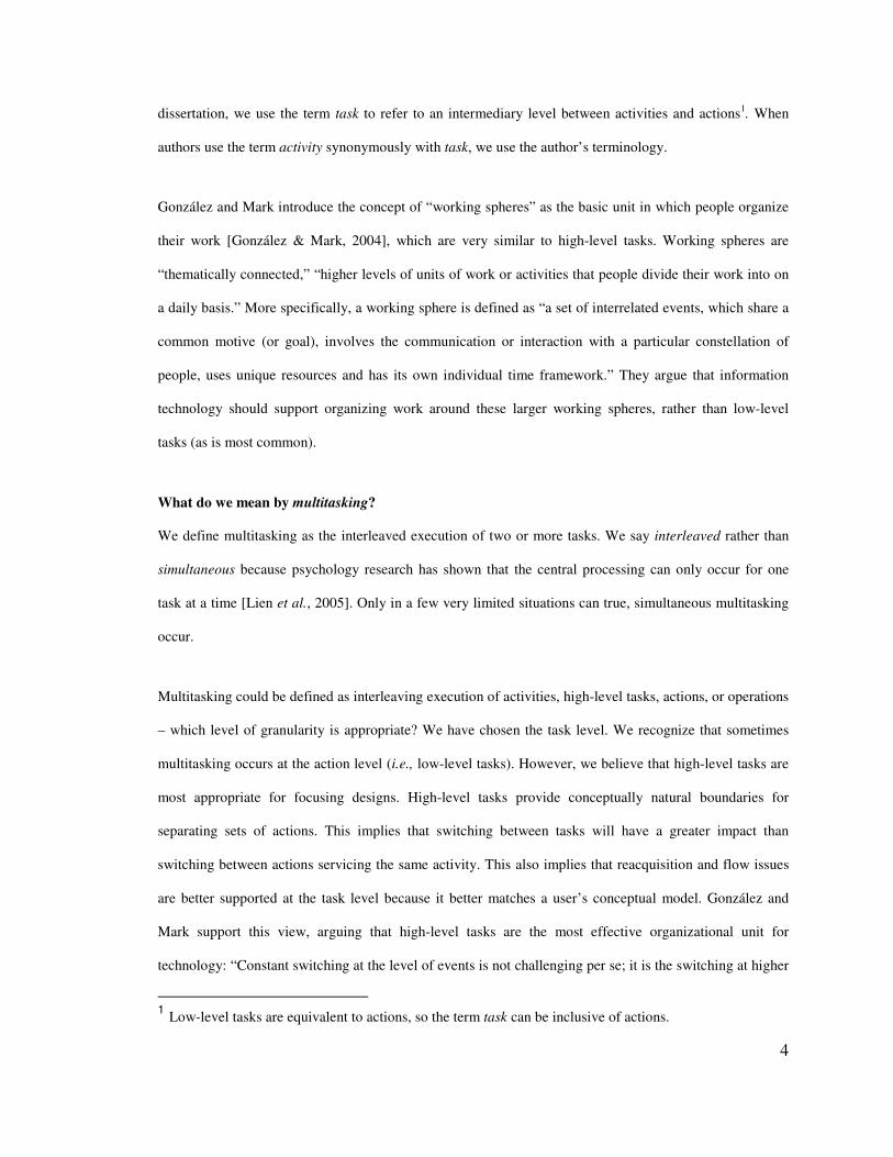
Figure 1: The Scalable Fabric task management system is an example of how peripheral displays can support multitasking. The peripheral display portion of this system includes lists of clippings cut from task windows and placed on the edges of a user’s work area, as shown in this figure. These allow users to (1) maintain task flow by quickly getting information about secondary tasks without distraction; (2) more easily task switch by making new information easier to see and by supporting window management; and (3) quickly reacquire tasks by making relevant task information glanceable.
1996]. For example, the peripheral task clusters in the Scalable Fabric task management system (see Figure
1) show information about tasks a user has set aside with the intent to switch back to them. Many studies
have investigated how people balance multiple tasks. Several core conceptions from multitasking literature
can be supported by peripheral displays: maintaining primary task flow, monitoring secondary tasks to
determine when to resume / switch tasks, and reacquiring tasks upon switching to them.
Maintaining Task Flow
Existing systems often interrupt users when new information arrives, which is disruptive to task
performance. McFarland [McFarland, 1999] found that task performance is better when the user can
control interruption delivery. Gillie and Broadbent report [Gillie & Broadbent, 1989] that cognitively
taxing interruptions are harmful to task performance, which implies that glanceable peripheral displays can
be valuable. Czerwinski et al. [Czerwinski et al., 2000] describe the cost of interruptions from instant
messaging on task performance, showing that they are harmful to primary task performance, especially for
fast, stimulus driven tasks. Peripheral displays reduce the need for interruptive updates by making new
information glanceable, like new email messages as shown in Figure 1. We demonstrate in this dissertation
that this can enable users to maintain task flow.
7
Task Switching
One of the reasons software support is inadequate for multitasking is that it is isolated to a single
application (e.g., the “to do” list in a software calendar). However, high-level tasks span multiple
applications. In a diary study of information workers, Czerwinski et al. [Czerwinski et al., 2004] found that
users wanted an overarching application to keep track of tasks across applications. Based on an
observational study of information workers, González and Mark [González & Mark, 2004] argued that
information technology should consider that users constantly switch high-level tasks and that multiple
information objects are required by some tasks. Peripheral displays can help by highlighting new
information that may cause users to switch tasks, like with a colorful border around changed content as
shown in Figure 1.
Reacquiring Tasks
Central to the notion of multitasking is a concept known in psychology as prospective memory [Ellis &
Kvavilashvili, 2000], or remembering to remember. Successful prospective memory requires effective task
resumption timing, or recalling tasks at appropriate times, and can help dramatically in reacquiring tasks. A
number of studies have shown prospective memory failures to be a major issue for information workers
who multitask [Czerwinski & Horvitz, 2002; Lamming & Newman, 1992; Sellen et al., 1996; Terry, 1988].
Other studies have examined how users remind themselves about tasks [González & Mark, 2004; Gwizdka,
2000; Jones et al., 2001], such as creating Web pages with “to do” lists and emailing reminders. Clearly,
people spend a great deal of time devising solutions to multitasking problems. Based on a study of
command-line interface use, Bannon et al. [Bannon et al., 1983] argued that users need support for
reducing their mental load when switching tasks and for suspending and resuming tasks. These studies
indicate that users need better software support for prospective memory when doing multiple tasks, which
glanceable, non-interruptive peripheral displays can support. For example, the task windows represented by
clippings in Figure 1 can help users quickly remember what they were doing in that task. We explore
glanceable design in this dissertation, contributing to design knowledge about displays that can improve
multitasking abilities.

8
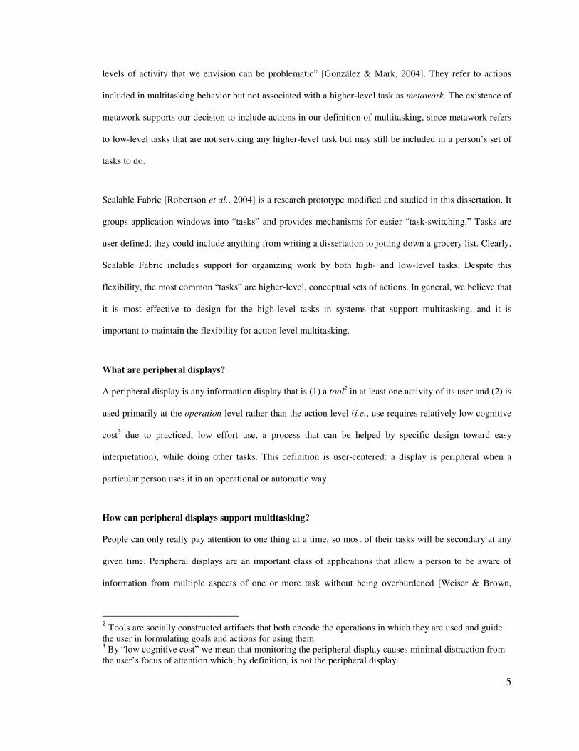
Figure 2: The “desktop alert” in Microsoft Outlook is a common peripheral display that appears when new email arrives. The display includes a picture of an envelope, the name of the sender, the subject, and the first two lines of the email message.
The Activity Theory design and evaluation framework presented in Chapter 3 is applicable to peripheral
displays of any modality, on any device, used by any number of people, to monitor any type and number of
activities or tasks. However, the remaining studies included in this dissertation explore the design of a
subset of peripheral displays. The peripheral displays we explore in this dissertation support actions and
activities, are used as personal displays by a single individual (i.e., they are not shared or public displays),
and are graphical visualizations used on a desktop computer with one or more monitors. This subset of
peripheral displays is particularly well suited to support information workers while multitasking, which
makes it an important area to study.
Additional Notes on Terminology and Scope
The term display implies a non-interactive presentation of information. For example, the Bus Mobile
[Mankoff et al., 2003] is a physical display of bus schedule information that users can only look at or listen
to – they cannot interact with it. The term interface implies that both presentation of information and
interaction are possible. For example, Scalable Fabric [Robertson et al., 2004] is a peripheral interface that
enables users to monitor displayed information as well as interact with windows in both the foreground and
the periphery. The glanceable design knowledge presented in this dissertation applies to the display of
information, which is applicable to both peripheral displays and interfaces. We will use the term peripheral
display throughout the dissertation, but note that the concepts are applicable to any peripheral visualization.
In existing literature, peripheral display has often referred to off-the-desktop, Ubiquitous Computing
applications. The formative work presented in this dissertation (the Activity Theory analysis and interviews
of peripheral display creators) apply to all peripheral displays and the three experiments apply to any

9
graphical, visual display of peripheral information. For example, a very common peripheral display is the
“desktop alert” that appears when new email arrives in Microsoft Outlook (shown in Figure 2). The alert
includes a picture of an envelope, the name of the sender, the subject, and the first two lines of the email
message. Clearly, this is not an off-the-desktop, Ubiquitous Computing application but it would benefit
from glanceable design.
Finally, in the three experiments conducted as part of this dissertation, we exclude other peripheral
modalities (auditory, tangible, olfactory) and focus on visuals. Glanceability inherently applies to
visualizations, an important part of HCI research. Exploring quick and easy intake of information for other
modalities is an area for future work.
Summary of Terms
Here we summarize the terms used throughout this thesis.
• Operation: basic perceptual, motor, or cognitive acts (as defined in Activity Theory and GOMS).
• Action: a low-level, short-term, goal-directed sequence of operations (as defined in Activity
Theory).
• Task: intermediary-level sequence of actions motivated by a single goal. The granularity of a task
can range from an action (a low-level task) to an activity (a high-level task), as these two terms are
defined in Activity Theory.
• Activity: According to Activity Theory, an activity is a long-term (weeks, months, years) project
of a person or group of people that satisfies major life-goals. According to HCI literature, an
activity is equivalent to task, as defined above. We use this term in both ways in this thesis,
depending on the context.
• Multitasking: the interleaved execution of two or more tasks.
10
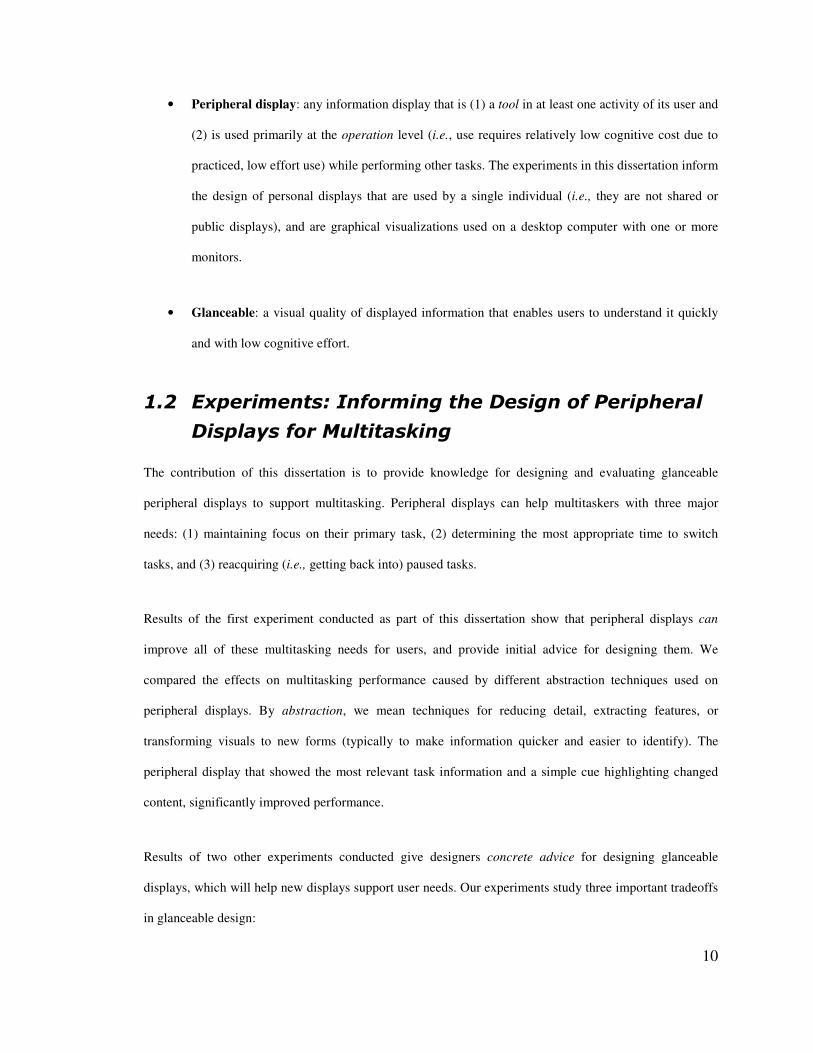
• Peripheral display: any information display that is (1) a tool in at least one activity of its user and
(2) is used primarily at the operation level (i.e., use requires relatively low cognitive cost due to
practiced, low effort use) while performing other tasks. The experiments in this dissertation inform
the design of personal displays that are used by a single individual (i.e., they are not shared or
public displays), and are graphical visualizations used on a desktop computer with one or more
monitors.
• Glanceable: a visual quality of displayed information that enables users to understand it quickly
and with low cognitive effort.
���� ��������� �!�"#���� ������� ��#"������������
�������"#���������� �
The contribution of this dissertation is to provide knowledge for designing and evaluating glanceable
peripheral displays to support multitasking. Peripheral displays can help multitaskers with three major
needs: (1) maintaining focus on their primary task, (2) determining the most appropriate time to switch
tasks, and (3) reacquiring (i.e., getting back into) paused tasks.
Results of the first experiment conducted as part of this dissertation show that peripheral displays can
improve all of these multitasking needs for users, and provide initial advice for designing them. We
compared the effects on multitasking performance caused by different abstraction techniques used on
peripheral displays. By abstraction, we mean techniques for reducing detail, extracting features, or
transforming visuals to new forms (typically to make information quicker and easier to identify). The
peripheral display that showed the most relevant task information and a simple cue highlighting changed
content, significantly improved performance.
Results of two other experiments conducted give designers concrete advice for designing glanceable
displays, which will help new displays support user needs. Our experiments study three important tradeoffs
in glanceable design:

11
1. Complexity – designs can range from simple to complex.
2. Symbolism – designs can be very good at conveying the intended meaningful (i.e., high-
symbolism; e.g., a photograph of the object) or have very little ability to convey the intended
meaning (i.e., low-symbolism; e.g., abstract art).
3. Set size – the number of abstract mappings a user must remember, which is related to the amount
of information the peripheral display can convey.
In one experiment, users had never seen the peripheral display renditions. In the second experiment, users
learned to fluidly identify renditions. Our experiments gathered information about several qualities of these
characteristics: perceptibility (i.e., the ease in which a visual is recognized), interpretability (i.e., the ease in
which the visual’s meaning is identified), memorability (i.e., how well the visual enables recall of its
meaning), and aesthetics (i.e., the attractiveness of the visual). Results enabled us to advise the design of
glanceable peripheral displays in the future.
Note that the definition of peripheral display given above highlights a tension between complexity and
symbolism. Operation level use can be accomplished through either extensive practice or specific design for
easy interpretation (i.e., symbolic or meaningful designs). However, past research has shown that concrete
icons (i.e., icons that directly depict the signified, or the concept to be denoted) used in various icon design
experiments were more detailed than non-concrete icons [Garcia et al., 1994]. This means that simple,
potentially easier to perceive signs, may be less capable of directly depicting the signified. Thus,
complexity may be required to enable easy interpretation and avoid the need for extensive user training to
interpret a display. Our experiments provide results that help designers to make informed decisions
regarding the complexity and symbolism of peripheral display designs.
Overall, the three experiments presented in this dissertation show that peripheral displays can improve
multitasking and provide advice for designers on how to accomplish this goal.

12
��$� %������&�
The next section presents related work informing the design of glanceable peripheral displays. Then, we
present an Activity Theory analysis of peripheral displays leading to a definition, design dimensions and
goals, and evaluation guidelines. In order to determine what abstraction methods will improve multitasking
performance for information workers (if any), we then present an experiment of three abstraction methods
(semantic content extraction, change detection, and scaling). Finally, we present two experiments to
empirically measure the glanceability of various abstract renditions derived from a literature review and
interview results. One experiment compares the speed and ease of user interpretation of renditions they
have never seen. The second experiment compares the speed and ease of user perception and interpretation
of renditions they have been trained to identify. We vary the set size to test how visual characteristics affect
performance when users memorize either a small or large number of renditions. Finally, we close with
future work and conclusions.
13
%� )������1��#�������������������������
��������������������
A main goal of a peripheral display is to convey information without unduly distracting users from their
primary task. Thus glanceability, or enabling quick and easy information intake, is a major design
requirement. In this chapter, we review literature that informs the visual design of glanceable peripheral
displays. We first introduce theoretical issues related to abstracting information to be glanceable, then we
present studies of peripheral displays that led to generalizable design knowledge, review empirical studies
of visual characteristics, briefly survey attention capture literature, and finish by discussing open questions
related to peripheral display design.
���� '#������������#���(����� �#�)������*�����
Peripheral displays in the literature typically employ abstraction to attain glanceable design. The goal of
abstraction techniques is to lower the cognitive effort needed to understand the information. In this section,
we present concepts and theory that inform how to abstract information to be glanceable. We begin with
definitions of abstraction presented in peripheral display and design literature. While simple practice can
help to improve glanceability by allowing people to increase their ability to perceive or react to well known
visuals through mechanisms such as chunking, unitization, and automaticity, there are some specific goals
that abstraction can achieve to improve glanceability. In particular, abstraction can be used to emphasize
certain visual features of a rendition. Making a rendition unique in some way can cause it to pop out,
drawing attention quickly and involuntarily. When it is important that two visuals are discriminable, or
easily differentiated, it is important to ensure that they have differing features. Global features (i.e., a
stimulus’s shape, color, size or closure) support focal classification best, but there is some evidence that
local features (i.e., structures within the stimulus) are better when a quick glance at a rendition occurs.
Finally, while unitization requires learning, a design leveraging gestalt principles (like proximity,
similarity, and so on) can achieve similar effects naturally. Below we discuss the empirical knowledge
available on pop-out, discriminability, and naturally glanceable designs.
14
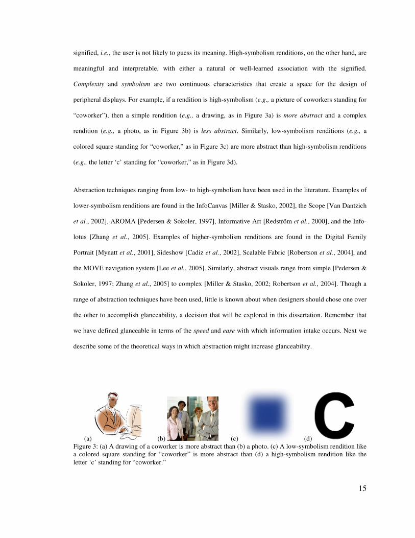
2.1.1 Defining Abstraction
Intuitively, abstraction reduces the information in a rendition in some way, sometimes to support goals such
as discriminability or pop-out, and at other times to support aesthetic goals. Abstraction was first discussed
in peripheral display literature by Pederson and Sokoler [Pedersen & Sokoler, 1997], who distinguished
three types of abstraction in peripheral displays: degradation (e.g., pixelation, thresholding), feature
extraction (i.e., singling-out certain parts of an information source for display), and radical abstraction (i.e.,
extracting features from an information source and displaying it in a new, symbolic form).4 Abstraction was
certainly not a new concept outside of the peripheral display world, having been discussed in the
information design literature. For example, Mullet and Sano [Mullet & Sano, 1995] propose a method for
abstracting visual information that involves reducing detail and extracting essential content.5 Our definition
of abstraction is derived from these: abstraction means reducing the amount of visual detail, extracting and
showing only essential information, and/or transforming information to new forms. Mullet and Sano argue
that glanceability (which they call immediacy) is important for effective information representations. To
accomplish glanceability, Mullet and Sano recommend designs that are “reduced to the essence of the
underlying sign through a process of simplification and abstraction.”
Abstraction techniques typically involve varying two characteristics: complexity and symbolism.
Complexity is the amount of visual detail in a rendition: from simple (more abstract) to complex (less
abstract). Referring to our definition of abstraction, complexity is varied through degradation and feature
extraction. Symbolism is a rendition’s ability to convey common meaning [Bertin, 1983]: from low-
symbolism (more abstract) to high-symbolism (less abstract). Symbolism is commonly varied by
transforming information to new forms. Low-symbolism renditions have an arbitrary association with the
4 AROMA specifically explored the use of “radical abstraction” to support remote awareness. AROMA combines audio and video streams into a single “bustle factor” bit aimed at providing users with a general sense of how much activity was happening in another location. Since no formal evaluation was reported, we cannot conclude how useful radical abstraction was for AROMA’s design goals. 5 Mullet and Sano describe a “refinement” method to accomplish abstraction: (1) Determine an appropriate level of abstraction for your image set, subject matter, audience, and display resolution; (2) Begin with an image seen from the viewpoint including the most characteristic contours; (3) Use a trace overlay technique to rapidly develop a series of drawings derived from the initial image. Omit details until only the most essential or characteristic elements remain; (4) Simplify complex shapes into regular geometrical forms where possible; (5) Eliminate contour information that is not required for recognition of the object.
15
(a) (b) (c) (d) Figure 3: (a) A drawing of a coworker is more abstract than (b) a photo. (c) A low-symbolism rendition like a colored square standing for “coworker” is more abstract than (d) a high-symbolism rendition like the letter ‘c’ standing for “coworker.”
signified, i.e., the user is not likely to guess its meaning. High-symbolism renditions, on the other hand, are
meaningful and interpretable, with either a natural or well-learned association with the signified.
Complexity and symbolism are two continuous characteristics that create a space for the design of
peripheral displays. For example, if a rendition is high-symbolism (e.g., a picture of coworkers standing for
“coworker”), then a simple rendition (e.g., a drawing, as in Figure 3a) is more abstract and a complex
rendition (e.g., a photo, as in Figure 3b) is less abstract. Similarly, low-symbolism renditions (e.g., a
colored square standing for “coworker,” as in Figure 3c) are more abstract than high-symbolism renditions
(e.g., the letter ‘c’ standing for “coworker,” as in Figure 3d).
Abstraction techniques ranging from low- to high-symbolism have been used in the literature. Examples of
lower-symbolism renditions are found in the InfoCanvas [Miller & Stasko, 2002], the Scope [Van Dantzich
et al., 2002], AROMA [Pedersen & Sokoler, 1997], Informative Art [Redström et al., 2000], and the Info-
lotus [Zhang et al., 2005]. Examples of higher-symbolism renditions are found in the Digital Family
Portrait [Mynatt et al., 2001], Sideshow [Cadiz et al., 2002], Scalable Fabric [Robertson et al., 2004], and
the MOVE navigation system [Lee et al., 2005]. Similarly, abstract visuals range from simple [Pedersen &
Sokoler, 1997; Zhang et al., 2005] to complex [Miller & Stasko, 2002; Robertson et al., 2004]. Though a
range of abstraction techniques have been used, little is known about when designers should chose one over
the other to accomplish glanceability, a decision that will be explored in this dissertation. Remember that
we have defined glanceable in terms of the speed and ease with which information intake occurs. Next we
describe some of the theoretical ways in which abstraction might increase glanceability.
16
2.1.2 Practice Makes Glanceable (Chunking, Unitization, & Automization)
Practice can help to improve glanceability by allowing people to increase their ability to perceive or react to
well known visuals through mechanisms such as chunking and automaticity. Of course, any visual can
become highly learned with enough practice (e.g., written words), but visuals that are already highly
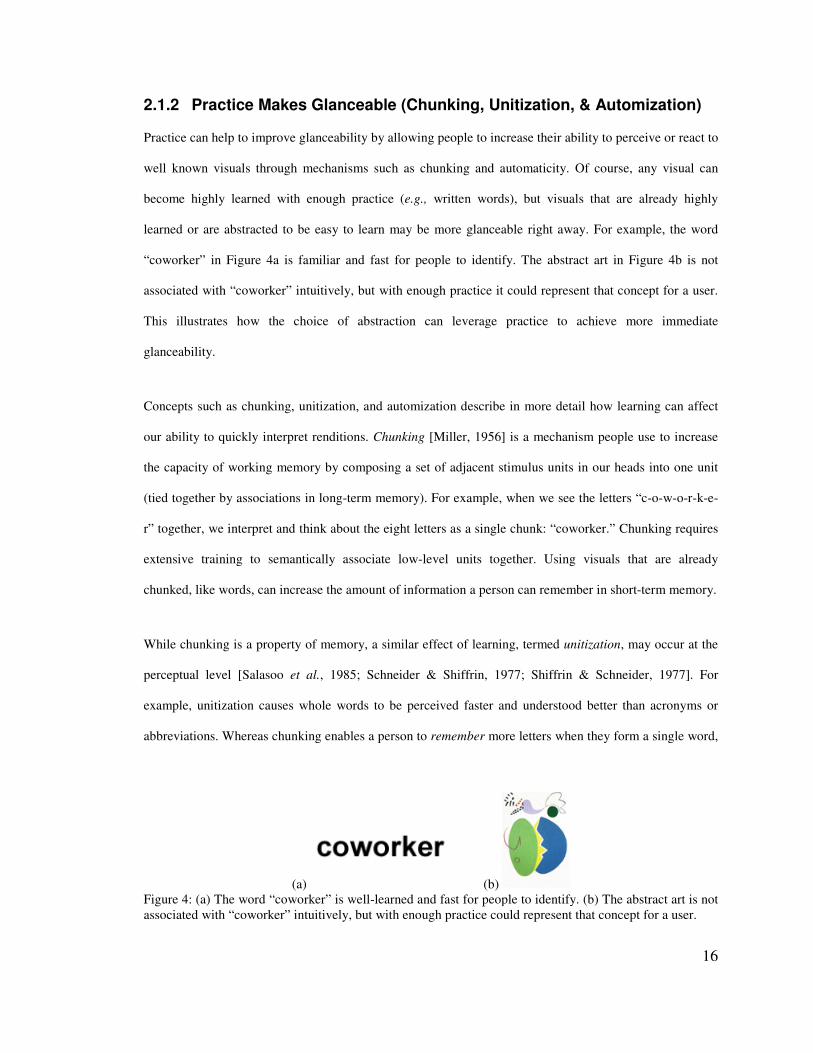
learned or are abstracted to be easy to learn may be more glanceable right away. For example, the word
“coworker” in Figure 4a is familiar and fast for people to identify. The abstract art in Figure 4b is not
associated with “coworker” intuitively, but with enough practice it could represent that concept for a user.
This illustrates how the choice of abstraction can leverage practice to achieve more immediate
glanceability.
Concepts such as chunking, unitization, and automization describe in more detail how learning can affect
our ability to quickly interpret renditions. Chunking [Miller, 1956] is a mechanism people use to increase
the capacity of working memory by composing a set of adjacent stimulus units in our heads into one unit
(tied together by associations in long-term memory). For example, when we see the letters “c-o-w-o-r-k-e-
r” together, we interpret and think about the eight letters as a single chunk: “coworker.” Chunking requires
extensive training to semantically associate low-level units together. Using visuals that are already
chunked, like words, can increase the amount of information a person can remember in short-term memory.
While chunking is a property of memory, a similar effect of learning, termed unitization, may occur at the
perceptual level [Salasoo et al., 1985; Schneider & Shiffrin, 1977; Shiffrin & Schneider, 1977]. For
example, unitization causes whole words to be perceived faster and understood better than acronyms or
abbreviations. Whereas chunking enables a person to remember more letters when they form a single word,
(a) (b) Figure 4: (a) The word “coworker” is well-learned and fast for people to identify. (b) The abstract art is not associated with “coworker” intuitively, but with enough practice could represent that concept for a user.
17
unitization enables a person to more quickly perceive a word than a list of letters. Automaticity is any
skilled behavior that can be performed easily with little attention, effort, or conscious awareness [Salasoo et
al., 1985; Schneider & Shiffrin, 1977; Shiffrin & Schneider, 1977]. More precisely, an automatic process is
a sequence of steps in memory activated automatically in response to a particular input generated internally
or externally, that do not require active control or attention by the person. Automaticity is determined by
the amount of practice that a person has had in applying the rules of action selection. For example,
interpreting complex and low-symbolism visualizations may require more practice than simple ones to
achieve automaticity. Peripheral displays can benefit from automatic processing, which allows users to
garner information from a display without being distracted from their primary task.
Practice has been shown to be important to multitasking efficiency, which is of particular relevance to
peripheral displays. Hess and Detweiler showed that users who practiced dealing with interruptions while
performing a primary task were far less disrupted by them [Hess & Detweiler, 1994].
2.1.3 Naturally Glanceable (Bottom-up Processing: Attention Theory and Gestalt Theory)
While glanceability can be improved by taking advantage of learning, theories of attention indicate that
certain visuals will be perceived automatically, without cognitive effort or learning. Leveraging these
visuals when abstracting information on peripheral displays could improve glanceability, enabling quicker
and easier intake of new information.
The world around us contains too much visual information to perceive at once, so people pay attention to
single items at a time. As a result, one impediment to glanceability may be that it simply takes some time
until the user pays attention to the important visual feature of a rendition (e.g., the part of it that has
changed). In a process termed visual search, we decide which item to look at next using two distinct
attentional mechanisms: bottom-up processing (i.e., exogenous or preattentive) and top-down processing
(i.e., endogenous or selective attention) [Julesz, 1984b; Treisman & Gelade, 1980]. Bottom-up mechanisms
use raw sensory input, quickly and involuntarily shifting attention to visual features of potential importance
18
(e.g., a red circle on a field of green could be a piece of fruit). Top-down mechanisms invoke cognitive
strategies, which bias us toward information that is relevant to our current interests (e.g., we are biased
toward finding red circles when hungry). Many researchers have pointed out that neither mechanism works
in isolation in a particular situation; instead, the mechanisms work together interactively. Typically,
bottom-up mechanisms act early in the visual perception process, and then top-down mechanisms take
over, generally within a time on the order of 100 milliseconds [Connor et al., 2004]. However, studies have
shown that people can control their attention, suppressing bottom-up attention capture in order to focus on a
task [Lamy & Tsal, 1999].
These phenomena were discovered in parallel by Treisman and Gelade [Treisman & Gelade, 1980] and
Julesz [Julesz, 1984b]. They theorized that visually searching for items involves two stages: (1) a
preattentive stage in which primitive features are registered automatically and in parallel across the visual
field; and (2) a slower focused attention stage in which primitive features are bound together serially within
a spatial window. This theory was later updated by Wolfe [Wolfe, 1994] to account for new experimental
findings. Wolfe’s guided search theory also includes two stages: (1) features are identified; and (2) a
salience map guides selective attention to likely target stimuli. This indicates that certain groupings or
features can lead to faster second-stage searching.
Quick and easy perception is a core component of our definition of glanceability, and may be improved by
designing displays to leverage bottom-up processing6. Results of past icon design studies that have found
6 Other visual tasks that can be enhanced with bottom-up mechanisms include target detection (finding an item in a field), boundary detection (detecting a texture boundary between two groups of items), region
(a) (b) Figure 5: (a) The colorful square would pop-out to our visual system if it were unique among other items in the visual field. (b) Each of the people in the photograph is identified as a gestalt, rather than a set of shapes, colors, lines, and textures.
19
complex icons to require more time to process even after training (e.g., [McDougall et al., 2000]) can be
explained by these theories of attention. Simple icons will require less binding in the slower second stage,
decreasing search times over complex icons. Also, glanceable displays may benefit from leveraging pop-
out effects. Pop-out means that attention was preattentively drawn to an object because it was distinctive
along some visual dimension (for example, possessing a distinctive color or brightness when compared
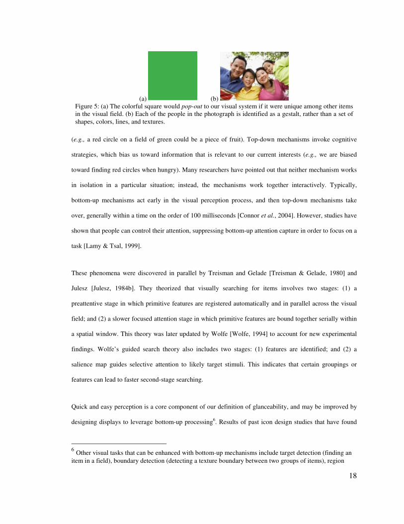
with other objects in the visual field, like the green square in a white field shown in Figure 5a). Prior
studies have identified a range of visual features which can induce pop-out effects, including color,
brightness, movement, direction of illumination, distinct curvature, length, width, size, line/blob
orientation, number, terminators, intersection, closure, intensity, flicker, direction of motion, binocular
luster, stereoscopic depth, 3D depth cues, 3D orientation, lighting direction, texture properties, and artistic
properties (see [Healey, 2005] for a survey). Designs can also leverage top-down processes by semantically
matching the visual characteristics of the information a person expects to find (though, knowing user
information expectations may not always be possible and depends on the application).
For some renditions, visual search is not needed but preattentive processing can still be leveraged. Gestalt
Theory, founded by Max Wertheimer [Wertheimer, 1938], also describes preattentive processes, focusing
on how certain visual designs are seen as a gestalt or single stimulus unit, not as a set of the discrete
dimensions that compose them. A gestalt refers to a number of items that are preattentively grouped
together, because of our bottom-up processes of grouping units that appear to be together. For example, the
photograph in Figure 5b is viewed as people rather than a set of shapes, lines, and colors. Palmer [Palmer,
1992] applied Gestalt principles to identify the basic principles that cause items to be preattentively
grouped together on a display (proximity, similarity, common fate, good continuation, and closure). These
concepts give insight into what makes a rendition glanceable. The act of viewing an item as a gestalt is
automatic and requires no cognition, so using gestalt principles may benefit glanceability. Gestalt differs
from learning in its perceptual nature: when a rendition is learned, its visual elements are chunked, but
identifying a chunk requires retrieving it in memory. Gestalt processing is more closely related to
tracking (visually following one or more items as they move in time and space), and counting and estimation (to determine the number of items with a unique visual feature) [Healey, 2005].
20
unitization, which may improve perception of learned renditions. Gestalt principles may group visual
stimuli that have never been seen into a single rendition.
2.1.4 Discriminability Improves Glanceability
While the previous two subsections have focused on how an individual rendition may be made more
glanceable, in some cases a user must distinguish among multiple related renditions displayed either
simultaneously or sequentially (e.g., renditions that represent different categories of related information).
Studies have shown that visual discriminability of renditions affects reaction times. In particular, Vickers
found that reaction time on a discrimination task (i.e., selecting the longer of two 1 mm-wide bars shown 4
mm apart, where the difference in length between the two bars varied) is lengthened as the set of stimuli
become less discriminable from each other [Vickers, 1970]. Discriminability is determined by the ratio of
shared features to total features in a stimulus, rather than the total number of shared or different features.
For example, the numbers 3 and 1 are distinct, but the numbers 36291 and 36292 are not, even though in
both sets the two numbers differ by one digit. To further understand discriminability, Tversky [Tversky,
1977] proposed a feature-based contrast model of similarity: common features tend to increase the
perceived similarity of two concepts; different features tend to decrease perceived similarity; and common
features increase perceived similarity more than feature differences decrease it. So, if two concepts have a
very prominent feature in common, people will likely see them as similar even if other features are
different. For example, tomato and cherry are considered similar because their most prominent features
(i.e., fruit, round, red, and succulent) are similar, while less prominent features are different (i.e., size and
seed).
Global superiority refers to a well-verified phenomenon that a stimulus can be discriminated, classified,
and matched faster using a global feature (i.e., the stimulus’s shape, color, size, or closure) than a local
feature (i.e., structures within the stimulus) [Wandmacher & Arend, 1985]. The implication for designing
peripheral displays is that a design with a unique global feature will lead to faster identification speed than
designs without. One study, however, showed that for short glances, local features could be better
discriminated than global features [Wandmacher & Arend, 1985]. The authors argue that a brief glance is
21
an unusual viewing condition and that global superiority still holds for normal situations. However,
glancing is a common way to view peripheral displays, so distinguishable local features may contribute to
glanceability.
Using theories of discriminability, Lewis et al. [Lewis et al., 2004] developed an algorithm for
automatically generating low-symbolism, complex, distinctive icons to help users find files on a desktop
interface. Results of studies comparing a user’s ability to find files and memory for file icons showed that
the generated icons performed better than regular document icons. The abstraction technique chosen by
Lewis et al. was able to emphasize visual features supporting discriminability by reducing or removing
many other visual features. These results demonstrate in a more applied setting low-symbolism renditions
that are visually distinct may be effective for helping users identify information.
2.1.5 Summary of Concepts and Theory
It is important for peripheral displays to convey information to users without requiring excessive cognitive
effort or unduly distracting them. To accomplish this, peripheral display typically abstract information (i.e.,
they reduce the amount of visual detail, extract and show only essential information, and/or transform
information to new forms) to be glanceable (i.e., quick and easy to understand). This review has touched on
different perceptual and cognitive mechanisms that might be supported by specific design choices when
abstracting information. For example, reducing the amount of color in a rendition can increase its
abstractness, but the specific choice of color (e.g., a color not prominent elsewhere in a display) can make a
rendition naturally glanceable by supporting pop-out, reducing visual search time. Table 1 summarizes
theory relevant to abstraction and glanceability, and lists visual features associated with different theories
that a designer might leverage. While these findings describe general theories of human attention and
processing mechanisms, many visual display characteristics have been studied and compared empirically.
The next section discusses those studies and their results, highlighting the relationship between visual
variables and issues such as information intake and display density.

22
Table 1: Summary of design knowledge presented in the Concepts and Theory section.
Summary of design knowledge Reference
Prac
tice
• Extensive practice can lead to greater working memory capacity (chunking), faster perception of sensory signals (unitization), and faster performance of skilled behaviors (automaticity).
[Miller, 1956; Salasoo et al., 1985; Schneider & Shiffrin, 1977; Shiffrin & Schneider, 1977]
Nat
ural
ly G
lanc
eabl
e: P
op-o
ut • Pop-out is an attentional phenomena whereby attention is quickly and
involuntarily drawn to an object because it is distinctive along some visual dimension.
[Julesz, 1984a; Treisman & Gelade, 1980]
• Visual features that can induce pop-out effects: color, brightness, movement, direction of illumination, distinct curvature, length, width, size, line/blob orientation, number, terminators, intersection, closure, intensity, flicker, direction of motion, binocular luster, stereoscopic depth, 3D depth cues, 3D orientation, lighting direction, texture properties, and artistic properties.
[Healey, 2005]
Nat
ural
ly G
lanc
eabl
e: G
esta
lt • Certain visual designs are seen as a gestalt or a single stimulus unit, not as a set of the discrete dimensions that compose them. The act of viewing an item as a gestalt is automatic and requires no cognition, and thus can be leveraged to increase the number of dimensions in a rendition without increasing the cognition required to identify it.
[Wertheimer, 1938]
• The basic principles that cause items to be preattentively grouped together on a display include proximity, similarity, common fate, good continuation, and closure.
[Palmer, 1992]
Dis
crim
inab
ility
• Visuals that are more discriminable can be more quickly differentiated. Common features tend to increase the perceived similarity of two concepts; different features tend to decrease perceived similarity; and common features increase perceived similarity more than feature differences decrease it.
[Tversky, 1977; Vickers, 1970]
• Global superiority phenomenon: stimuli can be discriminated, classified, and matched faster using a global feature than a local feature.
• For brief exposure durations, local features can be better discriminated than global features.
[Wandmacher & Arend, 1985]
���� ����������+�����#"�,������������'�����������
In this section we review empirical studies of the perceptual and cognitive performance effects of various
visual characteristics that can be used to abstract information shown on peripheral displays: visual variables

23
(e.g., color, digits or letters, geometric shapes), icons (i.e., pictograms intended to convey some meaning)
and comparisons of text and non-text signs.
2.2.1 Visual Variables
In a survey of visual choice reaction time (RT) studies, Teichner and Krebs [Teichner & Krebs, 1974]
highlight common results for various independent variables that are common design characteristics of
peripheral displays. The studies surveyed were single-task set-ups with simple stimuli (single light flashes,
single digits or letters, colors, and common geometric shapes), requiring users to choose some response
based on the stimuli (e.g., push the ‘D’ key when the color blue appears).
Somervell et al. [Somervell et al., 2002] conducted a dual-task, visual search experiment to understand how
quickly and effectively people can find items on a peripheral display and remember their characteristics
(e.g., color, shape) while performing a high-attention focal task. Peripheral displays varied in their visual
density (i.e., the number of objects on the visualization, either 20 or 320), presence time (i.e., the peripheral
display was visible for 1 or 8 seconds), and secondary task type (i.e., participants looked for either a single
item or a cluster of items in the periphery). Results of the experiment showed that (1) peripheral
visualizations can be introduced without necessarily hindering primary task performance; (2) in a dual-task
scenario, the visual search task could not be completed effectively for high-density visualizations within
one second, but it could within eight seconds; (3) lower density visualizations can result in performance
that is as good or better than high density displays in a dual-task scenario; and (4) finding clusters of
visually similar items is easier than locating a single item. These results are consistent with cognitive
science literature on visual search, which shows that larger items are easier to find and lower density
visualizations lead to easier target finding [Treisman, 1998]. However, the visual characteristics in
Somervell et al.’s experiment were not mapped to any meaning, and thus do not tell us about information
intake, which requires that renditions be mapped to some information.
Color has been well-studied in terms of enabling quick interpretation of information mappings (or codes).
Christ [Christ, 1975] surveyed studies on the effects of color in visual search and identification
24
performance. Christ notes a gap in the literature up to 1975 on exploring the effectiveness of color codes
and on studying displays that are not always the focus of attention. The identification tasks reported
involved people accurately naming a color (or other visual features) after having seen it for some period of
time. Color was identified faster and more accurately than several other features: size, brightness, familiar
geometric shapes, and other shapes. Color was identified less accurately than alphanumeric symbols.
Redundant color could improve identification accuracy of other features (brightness, size, etc.) in simple
targets. Using color in a pictorial display to provide a “natural” representation of the world was shown to
decrease search time over black and white versions.
Jubis [Jubis, 1990] studied the effects on search and identification times of mapping information to color
(blue square, green square, orange square, red square), shape (white triangle, white square, white cross,
white diamond), color + shape (blue triangle, green square, orange cross, red diamond), and partially
redundant color + shape (green triangle, green square, red cross, red diamond). Information represented
was either one parameter with four states or two parameters with two states each. Participants learned the
mappings and then counted the number of targets on the screen that matched a certain state. Before
counting, participants had to mentally translate the information parameters to their visual renditions. She
found that there were no differences between any of the conditions for the identification task. For the
search task, she found that the color + shape condition and the color condition resulted in faster reaction
times, regardless of display density (i.e., the number of items on the screen at once). Reaction time was
faster with partially redundant color + shape than with shape alone. These results indicated that color was
the more important design variable for search, which may be because color is processed in parallel (i.e.,
multiple colors can be processed at once), whereas shape is processed serially (i.e., multiple shapes are
processed one after another) [Treisman, 1998]. These results also show that when an information set is too
large for color mappings alone to discriminate them, partially redundant color codes may be an effective
alternative (although slower).
Nowell [Nowell, 1997] empirically studied certain dimensions (icon color, icon shape, and icon size) for
communicating categorical (document type) and ordered (document relevance) data. The individual

25
Figure 6: Rendition attributes tested in [Nowell, 1997]. (top) Size, color, and shape to represent ordered information (document relevance). (bottom) Size, color, and shape to represent categorical information (document type).
dimensions tested are pictured in Figure 6. Renditions tested included unidimensional (color, size, or
shape), two-dimensional (color + size, color + shape, shape + size), and three-dimensional (color + size +
shape). For two-dimensional renditions, Nowell also tested redundant (e.g., both color and size are mapped
to categorical information) and non-redundant (e.g., color is mapped to categorical information and size is
mapped to ordered). For each graphical device, three instances were used (e.g., the three size instances
were small, medium, and large). Study participants completed a focal counting task, in which they were
given search criteria (e.g., find journal articles) and then counted how many graphical renditions matched
it. In a second experiment, participants were also asked to count the number of graphical renditions that
matched a description without decoding to rank the discriminability of renditions (e.g., find pink, medium
circles). Measurements were time for task completion, frequency of errors, qualitative feedback on ease and
likelihood of use, and the discriminability of the sets of graphical devices used in codes. Results showed
that color was consistently ranked higher for all measures when communicating both types of information.
For categorical information, icon shape ranked higher than icon size for all measures except time for task
completion, in which size was better. For ordered information, icon shape was ranked higher than icon size
for all measures. For both categorical and ordered data, redundant codes led to greater accuracy in
responses.
Past research also indicates how many colors can be used when coding a display. To avoid errors in
identifying color mappings, no more than 5 or 6 colors should be used in a display [Carter & Cahill, 1979].
The maximum information transfer occurs using about 10 colors [Flavell & Heath, 1992].
26
Summary of Visual Variables
This section has presented empirical findings related to specific visual variables (e.g., color, shape, letters,
and the number of simple stimuli), their relationships with other visual variables, and practical issues such
as information intake. From the last section, we know that pop-out reduces visual search time, and the
studies in the section showed which visual variables pop-out more than others (e.g., color tends to pop-out
most). Unitization and automaticity help people quickly identify information mappings, and studies in this
section showed which visual variables enable this more quickly (redundant mappings and color enable
faster identification than simple shapes or size differences). Table 2 summarizes design knowledge
gathered in this section (column 1), describes the basic study setup (column 2; experiments can be survey-
based, in-lab, or in the field, controlled or uncontrolled, and single-, dual-, or multiple-task), lists the
characteristics of the studied display (column 3; characteristics include a range from simple to complex and
low- to high-symbolism renditions), and cites to relevant publication (column 4).
Table 2: Summary of design knowledge gathered in studies of visual variables presented in this section.
Summary of design knowledge Study Display Reference
• As the number of stimuli increases, RT increases.
• High stimulus-response compatibility leads to faster RT (e.g., seeing the letter “D” and pressing the “D” key is more compatible than seeing “D” and pressing the “W” key).
• Practice reduces RT (practice may eliminate the detrimental effects of increasing the number of stimuli).
• Physical parameters of the stimulus, such as duration, size, intensity, or other visual characteristics affect RT in varying ways.
• Differential stimulus-response mapping (i.e., participants are not required to respond for most stimuli) does not improve the detrimental effects of increasing the number of stimuli.
• Stimuli that are seen more often (i.e., they have a high stimulus probability) lead to faster RTs.
• As foreperiod length increases (foreperiod is the interval between a warning signal and stimulus onset), RT increases (except for very short foreperiods, i.e., with a
In-lab
Controlled
Single-task
Simple renditions
Low-symbolism renditions or no info mappings
[Teichner & Krebs, 1974]

27
length close to zero).
• Peripheral visualizations can be introduced without necessarily hindering primary task performance.
• High-density displays lead to slower visual search than lower-density displays.
• Finding a cluster of visually similar items is faster than locating a single item.
In-lab
Controlled
Dual-task
Simple renditions
No info mappings (symbolism level not applicable)
Visual density varied (20 - 320 items)
[Somervell et al., 2002]
• Color leads to faster and more accurate search and feature identification compared to size, brightness, geometric shapes, and other shapes.
• Redundant color could improve identification accuracy of other features in simple renditions.
• Color in pictorial renditions can decrease search time.
In-lab
Controlled
Single-task
Simple renditions (pictorial displays were complex)
No info mappings (symbolism level not applicable)
[Christ, 1975]
• Color leads to faster search compared to geometric shapes and partially redundant color + shape.
• Partially redundant color codes lead to faster search than shape alone (useful when information set size is too large for color mappings along to discriminate them).
• Identification speed does not differ for color, shape, color + shape, and partially redundant color + shape mappings.
In-lab
Controlled
Single-task
Simple renditions
Low-symbolism renditions
[Jubis, 1990]
• Redundant coding (e.g., on one rendition, color and size stand for the same information) leads to greater accuracy.
• Color leads to better search + identification accuracy and speed and qualitative ratings than shape and size when communicating categorical and ordered information.
• Shape led to better search + identification accuracy and speed and qualitative ratings than size when communicating categorical and ordered information (except size led faster task times for categorical information only).
In-lab
Controlled
Single-task
Simple renditions
Low-symbolism renditions
[Nowell, 1997]

28
• For accurate identification, no more than 5 or 6 color mappings should be used.
In-lab
Controlled
Single-task
Simple renditions
Low-symbolism renditions
[Carter & Cahill, 1979
• Maximum information transfer occurs using about 10 colors.
In-lab
Controlled
Single-task
Simple renditions
Low-symbolism renditions
[Flavell & Heath, 1992]
2.2.2 Icons
While the previous section focused on specific visual variables, many renditions will be more complex,
made up of many variables. Icons are a common and thoroughly studied example of this, in which
complexity and symbolism (important components of abstraction) have been directly explored. These
studies help inform the design of peripheral displays, which also can use pictorial renditions intended to
quickly convey information. Here we present results regarding the effects of complexity and symbolism in
icon interpretation accuracy and speed (i.e., their glanceability) in survey and single-task studies. We begin
by presenting existing methods and metrics for measuring icon symbolism and complexity.
Measuring Icon Symbolism and Complexity
Researchers tend to measure icon symbolism using matching tests, since symbolism is defined subjectively
(i.e., symbolism is the degree to which something conveys meaning to people). For example, Rogers
[Rogers, 1986] asked participants to match written functions to icons. McDougall et al. [McDougall et al.,
2000] presented users with a text description of an icon and asked to search for the icon in a grid of icons.
Complexity is objectively defined (i.e., complexity refers to the amount of visual detail); thus, objective
measures of complexity have been developed. Garcia et al. [Garcia et al., 1994] devised a quantitative
metric for inspecting an icon and determining its complexity. The metric counts the number of components
(closed figures, letters, lines, open figures, special characters, arrowheads, and arcs). The higher the
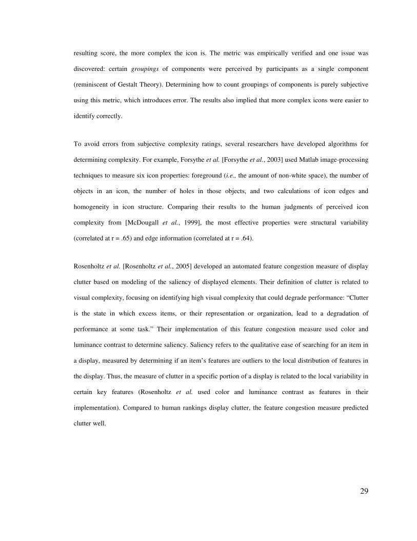
29
resulting score, the more complex the icon is. The metric was empirically verified and one issue was
discovered: certain groupings of components were perceived by participants as a single component
(reminiscent of Gestalt Theory). Determining how to count groupings of components is purely subjective
using this metric, which introduces error. The results also implied that more complex icons were easier to
identify correctly.
To avoid errors from subjective complexity ratings, several researchers have developed algorithms for
determining complexity. For example, Forsythe et al. [Forsythe et al., 2003] used Matlab image-processing
techniques to measure six icon properties: foreground (i.e., the amount of non-white space), the number of
objects in an icon, the number of holes in those objects, and two calculations of icon edges and
homogeneity in icon structure. Comparing their results to the human judgments of perceived icon
complexity from [McDougall et al., 1999], the most effective properties were structural variability
(correlated at r = .65) and edge information (correlated at r = .64).
Rosenholtz et al. [Rosenholtz et al., 2005] developed an automated feature congestion measure of display
clutter based on modeling of the saliency of displayed elements. Their definition of clutter is related to
visual complexity, focusing on identifying high visual complexity that could degrade performance: “Clutter
is the state in which excess items, or their representation or organization, lead to a degradation of
performance at some task.” Their implementation of this feature congestion measure used color and
luminance contrast to determine saliency. Saliency refers to the qualitative ease of searching for an item in
a display, measured by determining if an item’s features are outliers to the local distribution of features in
the display. Thus, the measure of clutter in a specific portion of a display is related to the local variability in
certain key features (Rosenholtz et al. used color and luminance contrast as features in their
implementation). Compared to human rankings display clutter, the feature congestion measure predicted
clutter well.
30
Studies Comparing Multiple Icon Characteristics
McDougall et al. [McDougall et al., 1999; McDougall et al., 2000] conducted studies to determine the
relationship between complexity, symbolism, and other important icon characteristics. In a qualitative
survey study, McDougall et al. [McDougall et al., 1999] provided qualitative rating norms of a variety of
unlearned icons for certain characteristics that may affect performance (see Figure 7 for some of the icons
tested):
• concreteness (concrete if it depicts a real object and abstract if it does not),
• complexity (the number of components in the icon),
• familiarity (frequency users have encountered the icon),
• meaningfulness (equivalent to symbolism),
• concept agreement (percent of users who can describe the correct function),
• name agreement (percent of users who can give the icon’s correct name), and
• semantic distance (concreteness of the icon conveying its function).
The major finding was that complexity and concreteness (an icon is more concrete if it depicts a real
object) are not correlated, indicating that prior studies that recommended the use of simple icons for visual
search may have confounded these two measures by not controlling for icon concreteness, invalidating the
claim that simplicity caused performance differences. They also found a strong correlation (r = .82)
between meaningfulness and concreteness, indicating that concrete symbols tend to be more meaningful
than abstract symbols. Meaningfulness was very strongly correlated with familiarity (r = .93).
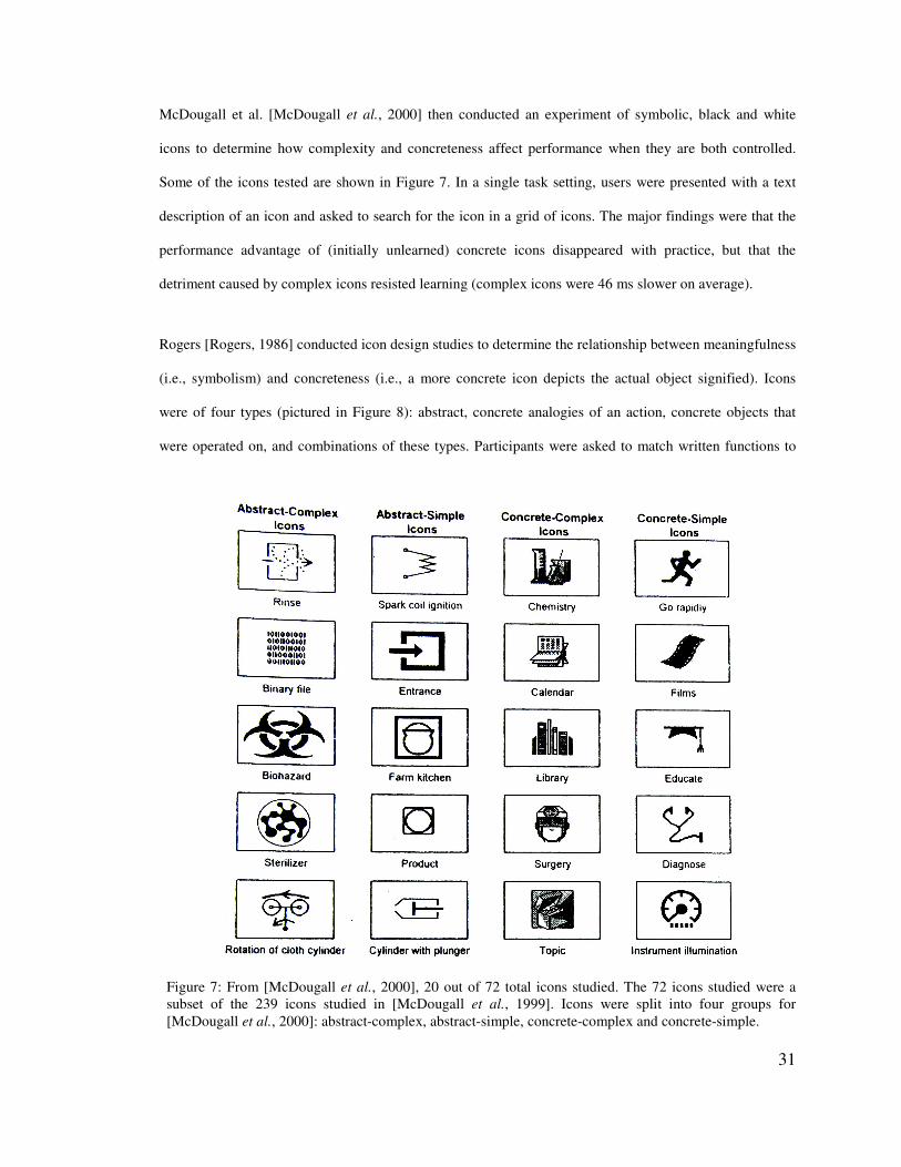
31
Figure 7: From [McDougall et al., 2000], 20 out of 72 total icons studied. The 72 icons studied were a subset of the 239 icons studied in [McDougall et al., 1999]. Icons were split into four groups for [McDougall et al., 2000]: abstract-complex, abstract-simple, concrete-complex and concrete-simple.
McDougall et al. [McDougall et al., 2000] then conducted an experiment of symbolic, black and white
icons to determine how complexity and concreteness affect performance when they are both controlled.
Some of the icons tested are shown in Figure 7. In a single task setting, users were presented with a text
description of an icon and asked to search for the icon in a grid of icons. The major findings were that the
performance advantage of (initially unlearned) concrete icons disappeared with practice, but that the
detriment caused by complex icons resisted learning (complex icons were 46 ms slower on average).
Rogers [Rogers, 1986] conducted icon design studies to determine the relationship between meaningfulness
(i.e., symbolism) and concreteness (i.e., a more concrete icon depicts the actual object signified). Icons
were of four types (pictured in Figure 8): abstract, concrete analogies of an action, concrete objects that
were operated on, and combinations of these types. Participants were asked to match written functions to
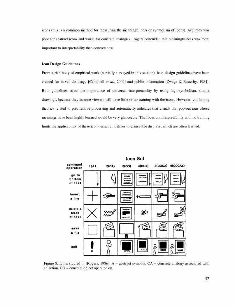
32
Figure 8: Icons studied in [Rogers, 1986]. A = abstract symbols. CA = concrete analogy associated with an action. CO = concrete object operated on.
icons (this is a common method for measuring the meaningfulness or symbolism of icons). Accuracy was
poor for abstract icons and worse for concrete analogies. Rogers concluded that meaningfulness was more
important to interpretability than concreteness.
Icon Design Guidelines
From a rich body of empirical work (partially surveyed in this section), icon design guidelines have been
created for in-vehicle usage [Campbell et al., 2004] and public information [Zwaga & Easterby, 1984].
Both guidelines stress the importance of universal interpretability by using high-symbolism, simple
drawings, because they assume viewers will have little or no training with the icons. However, combining
theories related to preattentive processing and automaticity indicates that visuals that pop-out and whose
meanings have been highly learned would be very glanceable. The focus on interpretability with no training
limits the applicability of these icon design guidelines to glanceable displays, which are often learned.
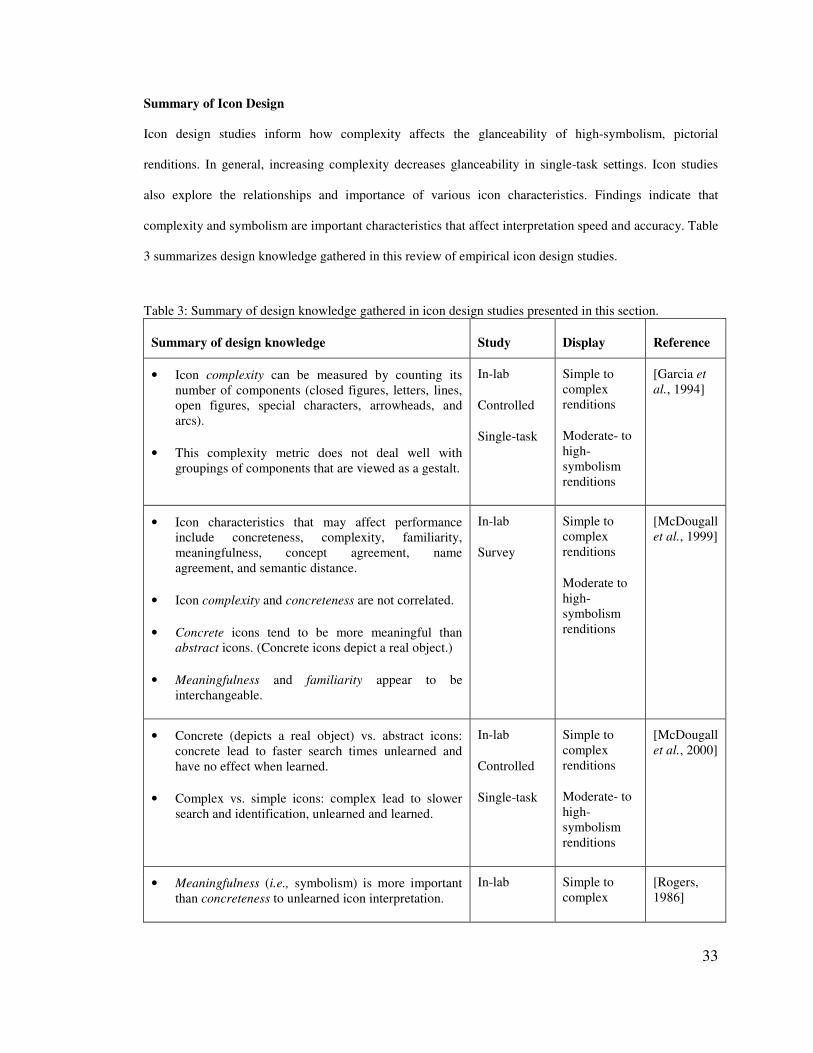
33
Summary of Icon Design
Icon design studies inform how complexity affects the glanceability of high-symbolism, pictorial
renditions. In general, increasing complexity decreases glanceability in single-task settings. Icon studies
also explore the relationships and importance of various icon characteristics. Findings indicate that
complexity and symbolism are important characteristics that affect interpretation speed and accuracy. Table
3 summarizes design knowledge gathered in this review of empirical icon design studies.
Table 3: Summary of design knowledge gathered in icon design studies presented in this section.
Summary of design knowledge Study Display Reference
• Icon complexity can be measured by counting its number of components (closed figures, letters, lines, open figures, special characters, arrowheads, and arcs).
• This complexity metric does not deal well with groupings of components that are viewed as a gestalt.
In-lab
Controlled
Single-task
Simple to complex renditions
Moderate- to high-symbolism renditions
[Garcia et al., 1994]
• Icon characteristics that may affect performance include concreteness, complexity, familiarity, meaningfulness, concept agreement, name agreement, and semantic distance.
• Icon complexity and concreteness are not correlated.
• Concrete icons tend to be more meaningful than abstract icons. (Concrete icons depict a real object.)
• Meaningfulness and familiarity appear to be interchangeable.
In-lab
Survey
Simple to complex renditions
Moderate to high-symbolism renditions
[McDougall et al., 1999]
• Concrete (depicts a real object) vs. abstract icons: concrete lead to faster search times unlearned and have no effect when learned.
• Complex vs. simple icons: complex lead to slower search and identification, unlearned and learned.
In-lab
Controlled
Single-task
Simple to complex renditions
Moderate- to high-symbolism renditions
[McDougall et al., 2000]
• Meaningfulness (i.e., symbolism) is more important than concreteness to unlearned icon interpretation.
In-lab Simple to complex
[Rogers, 1986]
34
• Meaningfulness and concreteness are icon characteristics with different implications for icon interpretability.
Controlled
Single-task
renditions
Moderate- to high-symbolism renditions
2.2.3 Text v. Signs
Most studies of icons do not directly include text as a representation. However, a number of studies
compare interpretation times of text and signs (i.e., pictorial or other graphical renditions like colors,
shapes, etc.).
Carney et al. [Carney et al., 1998] present a survey of literature related to in-vehicle display icons,
including results of studies comparing text to in-vehicle icons. Their overall finding is that learned, low-
and high-symbolism icons are most often recognized more quickly and accurately than text, and the same is
true for unlearned, high-symbolism icons. “Unfamiliar or unintuitive” icons (i.e., low-symbolism) led to
worse performance than text when unlearned. They cite literature that gives several theories to explain
these results: icons are more visually distinct that text; an icon has a name and a visual representation,
leveraging verbal and visual memories; images are stored in several forms and tightly linked to one another
and to other forms; icons can convey messages across cultures but text is language-specific; and icons can
be presented in more spatially condensed forms than text.
Potter and Faulconer [Potter & Faulconer, 1975] found that (when unlearned) simple pictures of objects can
be understood at least as rapidly as words. They presented line drawings and written words to people and
measured how quickly they could do two things (in different trials): (1) name the represented object and (2)
name the category of the object (e.g., for a chair, say “furniture”). Results showed that naming the object
from the drawing was much slower than from text, because it requires an extra step from the abstract
concept to its associated name (unlike the word, which only requires reading before the concept is evoked).
However, naming the object’s category was faster from the drawing then from the text. Potter and Falconer
35
argue this is because objects lead to common representations in memory, neither word-like nor image-like,
and that representation is connected with knowledge of an item’s category. Images lead to the common
representation faster.
In a dual-task experiment, learned, high-symbolism, pictorial signs were shown to allow more rapid
processing than text [Camacho et al., 1990]. Their experimental method was very similar to our
glanceability experiments. It was dual task, with indicators (i.e., icons or text) in the periphery and an
almost identical primary task: users tracked a moving target by maintaining the mouse cursor on the target.
At the same time, users had to respond to verbal questions by finding and selecting the correct indicator (an
icon or text, depending on the condition). Verbal queries (e.g., “What is your current RPM”) happened
every 5 seconds, and required the users to find the indicator that answered the question (e.g, the “engine
system” indicator). The indicators were located around the focal task, on all sides. The number of indicators
shown at one time varied: 4, 12, or 20. For all conditions, icons enabled faster RTs. The authors argue that
the icons enabled better performance partly because they were more visually distinct.
However, Wickens and Holland caution against the use of icons as labels for two reasons: legibility (or
discriminability) and interpretation [Wickens & Hollands, 2000]. Discriminability is generally
accomplished via the global shape of the symbol and unique features (discussed more in a later section).
Interpretation can be improved with redundant text labels. Several studies have concluded that pictures with
redundant text lead to the best comprehension of procedural instructions [Booher, 1975; Schmidt & Kysor,
1987; Stone & Gluck, 1981]. The tasks involved in these studies are quite different from monitoring a
peripheral display, but they provide some context for how well pictorial renditions are interpreted in other
situations.
Summary of Text v. Signs
In general, though text is a very efficient way to convey information, high-symbolism, non-text signs can
be highly glanceable abstractions as they are often interpreted quicker than text. Table 4 summarizes design
knowledge gathered in this review of empirical studies comparing text and non-text signs.
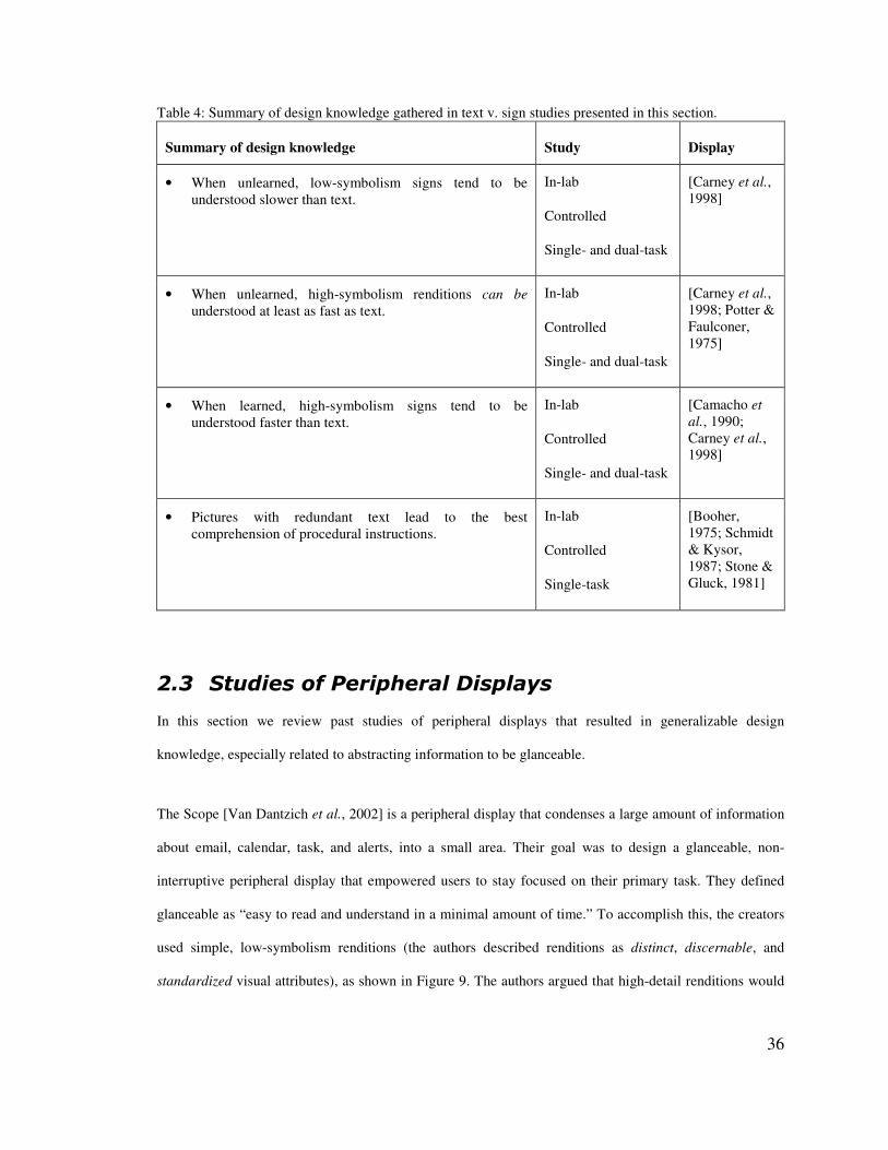
36
Table 4: Summary of design knowledge gathered in text v. sign studies presented in this section.
Summary of design knowledge Study Display
• When unlearned, low-symbolism signs tend to be understood slower than text.
In-lab
Controlled
Single- and dual-task
[Carney et al., 1998]
• When unlearned, high-symbolism renditions can be understood at least as fast as text.
In-lab
Controlled
Single- and dual-task
[Carney et al., 1998; Potter & Faulconer, 1975]
• When learned, high-symbolism signs tend to be understood faster than text.
In-lab
Controlled
Single- and dual-task
[Camacho et al., 1990; Carney et al., 1998]
• Pictures with redundant text lead to the best comprehension of procedural instructions.
In-lab
Controlled
Single-task
[Booher, 1975; Schmidt & Kysor, 1987; Stone & Gluck, 1981]
��$� +�����#"�������������������
In this section we review past studies of peripheral displays that resulted in generalizable design
knowledge, especially related to abstracting information to be glanceable.
The Scope [Van Dantzich et al., 2002] is a peripheral display that condenses a large amount of information
about email, calendar, task, and alerts, into a small area. Their goal was to design a glanceable, non-
interruptive peripheral display that empowered users to stay focused on their primary task. They defined
glanceable as “easy to read and understand in a minimal amount of time.” To accomplish this, the creators
used simple, low-symbolism renditions (the authors described renditions as distinct, discernable, and
standardized visual attributes), as shown in Figure 9. The authors argued that high-detail renditions would
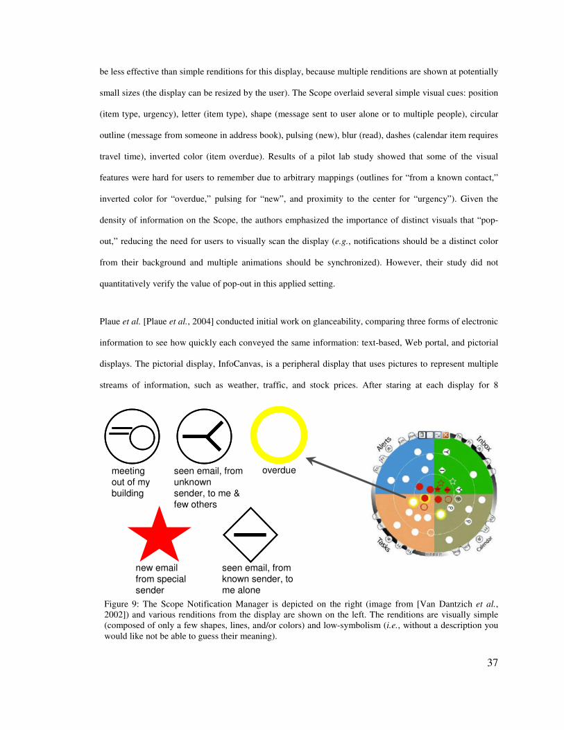
37
be less effective than simple renditions for this display, because multiple renditions are shown at potentially
small sizes (the display can be resized by the user). The Scope overlaid several simple visual cues: position
(item type, urgency), letter (item type), shape (message sent to user alone or to multiple people), circular
outline (message from someone in address book), pulsing (new), blur (read), dashes (calendar item requires
travel time), inverted color (item overdue). Results of a pilot lab study showed that some of the visual
features were hard for users to remember due to arbitrary mappings (outlines for “from a known contact,”
inverted color for “overdue,” pulsing for “new”, and proximity to the center for “urgency”). Given the
density of information on the Scope, the authors emphasized the importance of distinct visuals that “pop-
out,” reducing the need for users to visually scan the display (e.g., notifications should be a distinct color
from their background and multiple animations should be synchronized). However, their study did not
quantitatively verify the value of pop-out in this applied setting.
Plaue et al. [Plaue et al., 2004] conducted initial work on glanceability, comparing three forms of electronic
information to see how quickly each conveyed the same information: text-based, Web portal, and pictorial
displays. The pictorial display, InfoCanvas, is a peripheral display that uses pictures to represent multiple
streams of information, such as weather, traffic, and stock prices. After staring at each display for 8
meeting out of my building
seen email, from unknown sender, to me & few others
overdue
new email from special sender
seen email, from known sender, to me alone
Figure 9: The Scope Notification Manager is depicted on the right (image from [Van Dantzich et al., 2002]) and various renditions from the display are shown on the left. The renditions are visually simple (composed of only a few shapes, lines, and/or colors) and low-symbolism (i.e., without a description you would like not be able to guess their meaning).
38
seconds, users were tested for their immediate recall of the focally displayed information. Results showed
that the pictorial display enabled users to recall significantly more information. However, this experiment
did not evaluate displays peripherally and so it is difficult to draw conclusions that relate to peripheral
displays. Results of a 1-month field study with eight office workers tangentially supported results from the
lab experiment, indicating that users found the InfoCanvas fun, useful, and informative, but some thought
the aesthetics could be improved [Stasko et al., 2005]. Stasko et al. argued that the abstraction techniques
used on InfoCanvas (i.e., low-symbolism, artistic renditions) have advantages:
“The use of abstraction or symbolism to hide details and only communicate trends or
relative values can be an advantage rather than a limitation… Furthermore, actually
hiding details through abstraction can better match awareness goals where speed and ease
of information acquisition are more important than exact transmission of precise values.”
The Info-Lotus [Zhang et al., 2005] is an aesthetically pleasing visualization of incoming emails of interest
with design goals of being both glanceable and non-interruptive. Red flowers represent email topics, yellow
flowers sprouting from the red flower represent unread subtopics, and blue flowers represent read
subtopics. The position of the flower indicates how old it is (lower means newer) and the size of a cluster of
flowers indicates how many messages belong to the topic. In a dual-task lab experiment comparing Info-
Lotus to Microsoft Outlook’s taskbar email notification, Info-Lotus did not perform as well for a
notification-driven task (e.g., click a button when a message from your manager arrives) because it was
very non-interruptive. Also, the information users needed for identifying email from their manager (sender)
was not persistently present on the display. Thus, results imply that Info-Lotus was successfully non-
interruptive, but did not include enough information about each email to enable identification of specific
messages. The authors redesigned the display to draw more attention to messages from an important sender
(with a bee flying above flowers with messages from that sender).
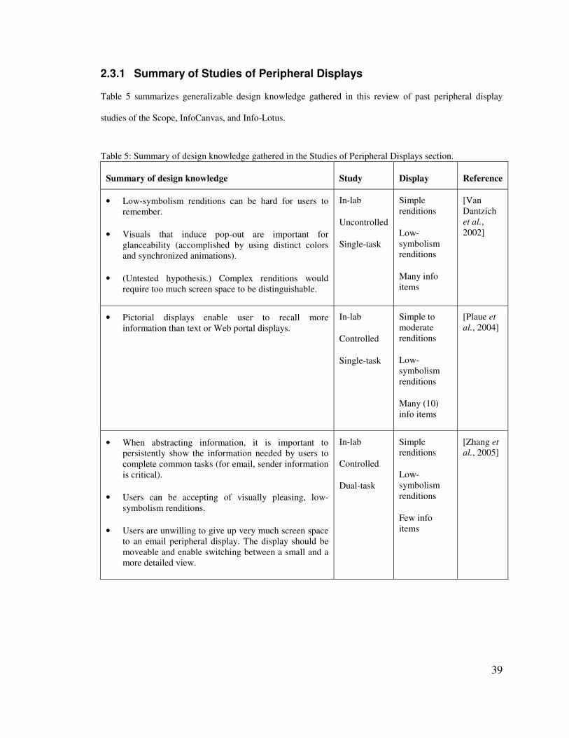
39
2.3.1 Summary of Studies of Peripheral Displays
Table 5 summarizes generalizable design knowledge gathered in this review of past peripheral display
studies of the Scope, InfoCanvas, and Info-Lotus.
Table 5: Summary of design knowledge gathered in the Studies of Peripheral Displays section.
Summary of design knowledge Study Display Reference
• Low-symbolism renditions can be hard for users to remember.
• Visuals that induce pop-out are important for glanceability (accomplished by using distinct colors and synchronized animations).
• (Untested hypothesis.) Complex renditions would require too much screen space to be distinguishable.
In-lab
Uncontrolled
Single-task
Simple renditions
Low-symbolism renditions
Many info items
[Van Dantzich et al., 2002]
• Pictorial displays enable user to recall more information than text or Web portal displays.
In-lab
Controlled
Single-task
Simple to moderate renditions
Low-symbolism renditions
Many (10) info items
[Plaue et al., 2004]
• When abstracting information, it is important to persistently show the information needed by users to complete common tasks (for email, sender information is critical).
• Users can be accepting of visually pleasing, low-symbolism renditions.
• Users are unwilling to give up very much screen space to an email peripheral display. The display should be moveable and enable switching between a small and a more detailed view.
In-lab
Controlled
Dual-task
Simple renditions
Low-symbolism renditions
Few info items
[Zhang et al., 2005]
40
��-� ����#��'������
Though the focus of this thesis is to study the ability of visuals to represent or convey information quickly
and easily, we present an overview of results regarding attention capture since it is another important
design issue for peripheral displays (see [Ruz & Lupianez, 2002] for an extensive survey). When peripheral
display designers refer to attention capture, they tend to mean a display’s tendency to grab a user’s
attention when new information appears. Attention capture is defined within cognitive science literature as
a phenomenon that occurs “when an irrelevant item that is unique in some dimension (i.e., a singleton)
affects the time to detect a target” [Ruz & Lupianez, 2002]. Though these definitions are not identical, they
both refer to a visual item that distracts the user from what s/he was doing.
In cognitive science research, there are two main, recognized ways to measure attention capture: the cueing
paradigm and the visual-search paradigm. In the cueing paradigm [Posner, 1980], attention capture is
inferred from performance on a task where a target stimulus follows a cue. If the response to a target
stimulus is faster when a singleton cue has previously appeared at the same spatial location (compared to
when the singleton cue appears at some other location), then the cue has captured attention. On the other
hand, if the response to a target stimulus is the same regardless of cue location, then it is inferred that the
singleton cue did not capture attention. In the visual-search paradigm (see [Wolfe, 1998] for a survey),
participants search for a target stimulus among a variable number of distracters. Reaction time or accuracy
is plotted – attention was not captured by distracters if their presence did not affect the target search speed.
As discussed previously, people have two types of attention control: top-down or endogenous orienting
(i.e., you consciously chose where your attention goes) and bottom-up or exogenous orienting (i.e., your
attention is grabbed automatically by some external stimulus).
A number of studies have shown that salient (i.e., outstanding, prominent), unique distracters can capture
attention (e.g., via abrupt onset or color) [Ruz & Lupianez, 2002]. This attention capture occurs
automatically “by default” (i.e., in the absence of a particular mental focus, salient distracters have
priority), but it can be regulated endogenously (e.g., by a person’s focus on a particular task). To what
41
extent is attention capture automatic (i.e., not tied to conscious processing)? Two points are important: (1)
people can suppress attention capture when their attention is previously focused on a specific spatial
location [Yantis & Jonides, 1990] or their primary task requires focused attention [Lamy & Tsal, 1999] (as
a person’s attention becomes less focused, it is more likely that a distracter will capture attention); and (2)
attention capture can occur without conscious perception of the distracter [McCormick, 1997].
What distracters are most effective at capturing attention? Abrupt onset (i.e., the appearance of an object
where none was previously) captures attention partially automatically (considering the exceptions listed
above) [Yantis & Jonides, 1990]. Humans give high priority to abrupt onsets, likely due to its evolutionary
benefits to safety. Motion also captures attention, though recent results show that the onset of motion is
more effective at capturing attention than motion itself [Abrams & Christ, 2006].
Motion captures attention and is easier to identify in the periphery than color and shape [Bartram et al.,
2003]. In their experiment, Bartram et al. asked participants to edit a document while monitoring a
peripheral display with several icons. Participants would either press a button when one of the icons
changed (experiment 1) or point to the icon that changed with the mouse (experiment 2). In a third
experiment, Bartram et al. measured attention capture caused by several motion cues, while users
performed three different primary tasks that demanded different levels and types of attention (playing
Solitaire, playing Tetris, and browsing online text). Change was indicated by motion, color, or shape. Four
motion types (blink, bounce, travel, pop) in two categories (anchored or small trajectories, and traveling or
large trajectories) were tested. Results showed that motion was more effective at capturing attention in the
periphery than shape and color. Traveling cues were much more distracting than the anchored cues. Of the
anchored cues, popping, bouncing and then blinking were successively less distracting. The speed of the
motion had little effect on distraction. Motion cues were more distracting in the text browsing task than in
the two game tasks, supporting prior findings in cognitive science literature that task engagement can affect
attention capture.
42
McCrickard et al. [McCrickard et al., 2001] studied attention capture caused by different animations on a
peripheral display. Three animations were used on a peripheral display that participants monitored while
browsing online text: fading (words slowly faded in), tickering (words scrolled across the window), and
blasting (abrupt onset of words). Results showed that none of these animations distracted from the primary
task enough to effect performance, and that blasting was the most effecting at capturing attention (which is
consistent with the cognitive science literature reviewed).
Peripheral displays may sometimes show important information that warrants attention capture, but often
the goal is to minimize distraction. What display update mechanisms can minimize or eliminate attention
capture? The phenomena of change blindness offers a solution. Change blindness is “the difficulty people
have detecting changes to visual stimuli that occur across views, sometimes even when the changing object
is being attended” [Varakin et al., 2004]. Change blindness can occur when a visual change is obscured
(either occluded or made less salient by a distracter). Obscuring can be caused by an eye movement: for the
30 to 50 ms it takes to complete an eye movement, very little visual information is obtained. Moving an
entire image can obscure a smaller change within the image that happens at the same time. Black screens
displayed between presentations of two different versions of an image mask the change. Small black
patches displayed on the image at the same time as the change also mask the change. Change blindness
likely occurs because people do not store a complete memory of a visual scene: for a change to be detected,
motion signals from a change must be visible or the changed region must be directly attended to.
Intille proposed ways in which a context-aware interface can leverage change blindness to minimize
detectable changes: flash a blank image between two images; change views concurrently with changes;
display small black patches concurrently with changes; change the image very slowly; make changes
during eye blinks or movements; or occlude the changes [Intille, 2002]. Though some of these mechanisms
for inducing change blindness are likely just as distracting as detecting the change (flashing a blank image,
changing views, and black patches), others are promising for enabling non-distracting updates (slow
changes, detecting eye blinks or movements, and occluding changes). For example, Intille presents a
display mechanism within a context-aware environment that changes a wall display when it is occluded by

43
people moving in the space [Intille, 2002]. As another example, in our toolkit to build peripheral displays
[Matthews et al., 2004], we included a change blind update mechanism that caused changes to occur very
slowly.
As we will argue in the Activity Theory chapter of this thesis, the distraction (or attention capture) caused
by a peripheral display should match the importance of the information it conveys: very important
information should employ highly salient attention capture mechanisms (e.g., abrupt onsets), and
information of low importance should employ subtle mechanisms that do not tend to capture attention (e.g.,
leveraging change blindness). Mechanisms to capture different levels of attention called notification levels
are discussed in [Matthews et al., 2004]. The importance of matching information importance to the
attention capture mechanism was validated in studies of peripheral displays of sound for the deaf
[Matthews et al., 2006b]. Participants asked that more critical information (e.g., phone ringing) be
displayed in a way that captured their attention, whereas less critical information (e.g., activities of others)
be “visual[ly] quiet.” This was particularly important for sound awareness because of a tension caused by
vast differences in sound importance (from emergency alarms to the sound of a heater) and the huge
quantity of possible sounds to display.
��.� %����/���#��
Prior sections gave an overview of many areas of research, laying a foundation for understanding
peripheral display design. Visual search studies (upon which many of the empirical results presented in this
section are based) are not representative of actual usage of peripheral displays. How is glanceability
affected when renditions are interpreted as part of a secondary task? The visuals tested in these studies
tend to be single visual variables (e.g., colors, shapes, size, orientation, brightness, etc.), which is not
representative of the full spectrum of visuals used on existing peripheral displays. How does the
glanceability of renditions differ across the entire peripheral display design space (low- to high-symbolism,
simple to complex)? Visuals used in past human factors and icon design studies are not characteristic of the
visuals on existing peripheral displays, largely because they have focused on icon-function relationships
rather than conveying information for secondary task monitoring. This leaves open the exploration of
44
lower-symbolism renditions that may quickly convey information. How glanceable are different renditions
that closely match those used in peripheral displays for information monitoring? Empirical studies of
peripheral displays in HCI literature have only begun to address important open questions related to their
design. For example, a single-task experiment of the InfoCanvas display showed that pictorial renditions
enable recall of more information than text or Web portal displays [Plaue et al., 2004]. A dual-task
experiment showed that finding items on a peripheral displays may not significantly hinder a primary task
[Somervell et al., 2002]. More open questions remain: How is glanceability affected by increasing the
number of renditions used on a display? For all renditions tested, how do their affects differ when well-
learned or unlearned?
Past controlled lab studies provide principles about human perception and behavior that are important for
designers to consider. However, they do not eliminate the need for a creative, iterative design process that
involves evaluating displays with users in realistic settings. In the next section, we discuss peripheral
display evaluation using Activity Theory as a descriptive tool. Our contributions are a definition of
peripheral displays, a set of evaluation criteria, and an analysis of evaluation options based on the
contextual usage issues embodied in a set of design dimensions (scope, type of activity supported, and
information criticality).

45
4� ��������������� �������������������������$�
(��(���������������(��������
While the requisite of demanding little to no conscious attention provides a general description of
peripheral displays, researchers have nonetheless employed a variety of refinements and generalization in
their own definitions. The lacking consensus on a single definition contributes to the difficulty of
evaluating peripheral displays, an acknowledged problem in the field [Carter et al., In press; Mankoff et al.,
2003]. Peripheral display innovation and development has suffered because much of the past work has been
technology-driven: there exists little theoretical understanding of how they operate in relation to people’s
everyday lives. Common terminology and meaning based on a contextual understanding of peripheral
display use would enable better design and evaluation.
In response to this, we present a framework for understanding, designing, and evaluating peripheral
displays based on Activity Theory [Matthews et al., 2007]. We argue that peripheral displays are
information displays that become unobtrusive to users. As this quality depends on the context of use, we
present a framework for describing peripheral displays based on the number and types of activities they
support. Furthermore, we argue that different types of displays require different approaches to evaluation.
From our own work, interviews of peripheral display creators, and a review of related literature we derive a
set of general evaluation criteria for peripheral displays (appeal, learnability, awareness, effects of
breakdowns, and distraction). We then describe approaches for evaluating these criteria for different types
of peripheral displays and present a case study to illustrate the value of our Activity Theory evaluation
framework in practice.
Activity Theory provides a framework for describing user context [Nardi, 1996], and consequently
provides a framework for describing how people and peripheral displays interact in various situations. The
contribution of our Activity Theory approach to peripheral display design and evaluation is its explicit
focus on operationalization of basic acts and the set of activities that contextualize the use of the display.
This focus suggests important criteria to measure for evaluations, and indicates how those criteria change in
46
importance in different contexts. Some of these criteria – appeal, awareness, effects of breakdowns, and
distraction – are present in prior work [Mankoff & Dey, 2003; McCrickard et al., 2003a; Shami et al.,
2005]. A standard approach to designing peripheral displays to meet these criteria involves (1) interviewing
and/or surveying people to find the location of the display and type of information to display, (2) designing
a display for that location and information, and (3) conducting a summative evaluation of the display
[Mankoff & Dey, 2003]. However, this approach does not recognize that peripheral display use is
operationalized and that its use depends upon the type of activities it supports. Therefore, our work extends
prior criteria to include learnability, or how readily the display is operationalized. We also highlight
evaluation difficulties related to operationalization. For example, some evaluation methods, such as
experience sampling, inherently call attention to the tool being evaluated, which is particularly problematic
for peripheral display evaluation because it would violate the very nature of the tool. Furthermore, we
present design dimensions that characterize how different contexts affect evaluation criteria. Our design
dimensions are derived from Activity Theory and include scope (will the display support one or many of
the target user’s activities?), class(es) of supported activities (are the supported activities primary,
secondary, or pending for the user?), and criticality (what is at stake if the user is not aware of the
information in the display?). For example, our work clarifies the importance of demonstrating that a high-
criticality information display is empirically easy to learn, provides appropriate levels of notification, is
explicit about breakdowns, and is only as distracting as the importance of the information being shown. On
the other hand, a display of low-criticality information need not be easily learnable or display breakdowns,
but it should be aesthetically pleasing, minimally distracting, and convey information in accordance with
the user’s interests.
In the next section, we describe interviews of peripheral display creators that highlighted problems caused
by inconsistent definitions and missing design and evaluation knowledge. After presenting the interviews,
we introduce Activity Theory and define peripheral displays based on their use. Then we present three
design dimensions that describe the use of peripheral displays in context. Next, we discuss important
evaluation criteria for peripheral displays based on interviews with peripheral display creators, our own
design and evaluation experience, and existing literature. Then we use our design dimensions and criteria to
47
discuss guidelines for focusing evaluations on issues important to peripheral displays. We conclude with a
case study of the design and evaluation of a peripheral sound display for the deaf, which highlights the
strengths and weaknesses of our Activity Theory framework.
$��� !������&�� �������������������'���#��
Understanding the challenges of designing, implementing, and evaluating peripheral displays would help
guide future research, but these challenges are not explicitly explored by existing literature. We gathered
this information in interviews with 10 peripheral display designers. Results indicate that the major
challenges in creating peripheral displays lie in their design and evaluation. Creators need more design
knowledge to aid early design decisions and evaluation metrics, methods, and guidelines tailored for
peripheral displays. The Activity Theory analysis and empirical studies presented in this chapter begin to
solve these problems by investigating glanceable design and evaluation guidelines.
3.1.1 Method
We recruited ten participants: six were academics (two faculty, four graduate students); four were industrial
researchers. Eight unique institutions were represented; two institutions each had two participants. Three of
the participants were primarily designers, three were primarily developers, and four were both. Participants
had a self-reported mean of 5.3 years experience designing and/or implementing peripheral displays. They
had been involved in the creation of between 1 and 20 displays, with a median of 3 per person. Three
participants had built one or more toolkits relevant to peripheral displays. Participants self-reported their
design and implementation expertise on a scale of 1 to 5, where 1 was “no experience” and 5 was “very
experienced (3+ years, multiple displays built).” Their average ratings were 4.0 for design and 3.3 for
implementation.
Interviews were conducted in-person when possible and over the phone otherwise. The interviews were 50
to 80 minutes long. Each interview began with an explanation of our high-level goal: to determine ways to
support the process of designing, implementing, and/or evaluating peripheral displays. We then asked pre-
determined questions that helped us explore the difficulties creators faced at each stage.
48
3.1.2 Results and Discussion
Interviewees reported that the biggest challenges in creating peripheral displays are designing and
evaluating them. In the design process, early-stage design was particularly challenging. When beginning
the design process, the first problem encountered was deciding among the many design options:
“I think it’s frustrating because there are so many options for designing the information.
Literally in some instances, there are millions of options and you’re never going to be
able to systematically test all of those.”
One reason for this challenge is a lack of design knowledge. What design elements or combinations of
elements are best for providing quick and easy access to information (e.g., highly distinguishable colors or
shapes, simple sketches, icons, photos)? What design techniques are best for abstractly conveying
information (e.g., creating highly meaningful, memorable, aesthetic, or simple renditions)?
A second major challenge in creating peripheral displays is in their evaluation. Participants expressed a
need for metrics, methods, and guidelines tailored to peripheral displays. The literature indicates that the
most common evaluations of peripheral displays have been lab studies, usually of the dual-task variety.
However, despite the relative popularity of this approach, many participants told us that designing a
realistic lab experiment was difficult for them. One interviewee said that “evaluation is the hardest part.
How do you evaluate a peripheral display–you can’t do a typical lab/usability study…” Even so, in-lab
experiments are viewed as important because, as the same interviewee pointed out, “we had to implement a
working prototype and deploy it in people’s work place. If we had found that it was all wrong, we would
have had to throw away all that work.” Participants reported difficulties not only with how to structure a lab
experiment, but with what to look for when running it. One participant said, “I would have liked [to use
some metrics], if I had known what metric to look for. That I guess is where I felt there was a lag in the
project… At least we did not know of enough, or of any psychological theory that could come and assist us
here. Something that you could measure and then predict about longitudinal effects.” Six participants
pointed out that knowing what to measure and how to measure it are separate challenges: “We could really

49
use methodology to evaluate peripheral displays in terms of usefulness, desirability, and distraction… We
never had it and it was hard.”
Participants tended to feel that the best way to find out if a peripheral display was successful was a situated,
long-term deployment:
“[Evaluation] is so hard when you are talking about peripheral awareness because how
are you going to prove that it is successful, except if people after two years are still using
it?... But you cannot test it after a month because it is like a language: you have to learn
and you are not learning it in an intellectual way, you are learning it in a sympathetic
way. You are getting it internalized gradually.”
Five interviewees had conducted field studies lasting between 2 and 8 weeks. They reported that
unobtrusive observation and system maintenance were the two most crucial problems when deploying and
studying peripheral displays. Interviewees gathered self-report survey data, but found them “not satisfying”
and they did not “fully trust” the self-reported answers. However, gathering quantitative data in the field is
challenging. In particular, it is difficult to remain unobtrusive, which is particularly critical with peripheral
displays, for which non-disruptiveness is a design goal.
Participants named some criteria that were important to measure during evaluations. This list is not
necessarily complete, but it provides a starting point for understanding important factors when evaluating
peripheral displays.
• (4 participants) appeal, desirability, aesthetics
• (3) usefulness, awareness (e.g., is the display saving users time during the day, is it making them
aware of the information it displays, etc.).
• (3) distraction from primary task
50
• (1) a combination of the interruption, reaction, and comprehension (IRC)
Appeal, desirability, usefulness, and aesthetics are similar in their inherently subjective nature. Awareness
and distraction have been measured empirically in lab studies. IRC has been studied in past research using
surveys [McCrickard et al., 2003a].
In the next section, we present an Activity Theory framework that provides a common definition for
peripheral displays and guidance for designing and evaluating them. After defining peripheral displays
based on a user’s context and set of activities, we derive a set of evaluation metrics based on the Activity
Theory framework and existing literature. Then, we discuss guidelines for evaluating peripheral displays
based on design dimensions that emerge from the analysis (i.e., the number and type of activities supported
and the criticality of information conveyed).
$��� ����������#�������������������������
Peripheral displays are often thought of in perceptual terms. In these definitions, peripheral displays are
those that literally sit in the periphery of a person’s field of vision or that issue subtle auditory cues. While
these perceptual interpretations of peripheral displays are initially useful, they quickly break down. What
happens if a person changes the angle of their gaze or starts attending to the auditory cue? Does the device
cease to be a peripheral display? To fully analyze peripheral displays, one should also consider the “messy”
scenarios when a peripheral display becomes the user’s focus of attention. The theory we chose for this
purpose is Activity Theory. Activity Theory is an expansive framework for describing human behavior, but
for our purposes there are four particularly important points:
• Activities, objects, and motives. Activities correspond to long term (weeks, months, years)
projects of a person or group of people. These projects are directed toward some object in the
world like a new product design or a social relationship. An object may be physical or conceptual,
but is always coupled with a motive – a driving force that seeks to satisfy some need(s) of the
people in the activity [Kuutti, 1995; Leontiev, 1978].
51
• Actions and operations. For execution, activities are composed of goal-directed actions which
are themselves composed of environmentally contingent operations. Actions are equivalent to the
classic HCI notion of tasks, operations to the operations from GOMS.
• Tool artifacts. In terms of elements in the world, activities are composed of an object, the person
or people involved, and the tools that the people use to carry out and support the operations and
actions in the activity. Tools are socially constructed artifacts that both encode the operations they
are used in and guide the user in formulating goals and actions for using them.
• Multiple, ongoing activities. People have multiple, ongoing activities at any given time.
However, they are generally working on only a subset of these activities through their current
actions and operations.
These points are made by Leontiev [Leontiev, 1978] in his initial formulation of Activity Theory. There
have been a number of extensions to this original formulation, most notably by Yrjö Engeström and his
colleagues [Engeström et al., 1999]. This extension has two primary additions to Leontiev’s original
formulation. First, the notions of community, rules, and division of labor are included with the notions of
tools, objects, and motives. While these additional notions clearly influence how an activity is carried out,
they are most useful in analyzing how an activity changes and evolves to handle various breakdowns and
contradictions that arise [Engeström, 1987]. Second, groups of activities are often modeled as systems of
co-dependent activities (whose objects and motives constrain one another) where the relationships between
the activities are delineated and analyzed. Both of these extensions have provided insights into the nature of
activities, particularly in how they change and evolve (e.g., [Nardi & Redmiles, 2002]). However, as we
demonstrate in this dissertation, the framework proposed by Leontiev, captured in the above four points,
provides enough paradigmatic scaffolding for designers to implement a more context sensitive approach to
the design and evaluation of peripheral displays. We discuss these four points in more detail in the
following sub-sections.
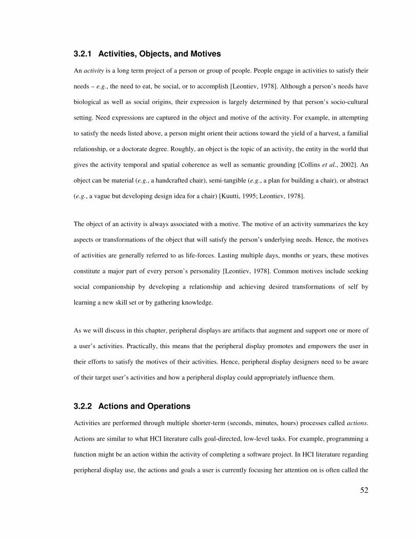
52
3.2.1 Activities, Objects, and Motives
An activity is a long term project of a person or group of people. People engage in activities to satisfy their
needs – e.g., the need to eat, be social, or to accomplish [Leontiev, 1978]. Although a person’s needs have
biological as well as social origins, their expression is largely determined by that person’s socio-cultural
setting. Need expressions are captured in the object and motive of the activity. For example, in attempting
to satisfy the needs listed above, a person might orient their actions toward the yield of a harvest, a familial
relationship, or a doctorate degree. Roughly, an object is the topic of an activity, the entity in the world that
gives the activity temporal and spatial coherence as well as semantic grounding [Collins et al., 2002]. An
object can be material (e.g., a handcrafted chair), semi-tangible (e.g., a plan for building a chair), or abstract
(e.g., a vague but developing design idea for a chair) [Kuutti, 1995; Leontiev, 1978].
The object of an activity is always associated with a motive. The motive of an activity summarizes the key
aspects or transformations of the object that will satisfy the person’s underlying needs. Hence, the motives
of activities are generally referred to as life-forces. Lasting multiple days, months or years, these motives
constitute a major part of every person’s personality [Leontiev, 1978]. Common motives include seeking
social companionship by developing a relationship and achieving desired transformations of self by
learning a new skill set or by gathering knowledge.
As we will discuss in this chapter, peripheral displays are artifacts that augment and support one or more of
a user’s activities. Practically, this means that the peripheral display promotes and empowers the user in
their efforts to satisfy the motives of their activities. Hence, peripheral display designers need to be aware
of their target user’s activities and how a peripheral display could appropriately influence them.
3.2.2 Actions and Operations
Activities are performed through multiple shorter-term (seconds, minutes, hours) processes called actions.
Actions are similar to what HCI literature calls goal-directed, low-level tasks. For example, programming a
function might be an action within the activity of completing a software project. In HCI literature regarding
peripheral display use, the actions and goals a user is currently focusing her attention on is often called the
53
primary task of the user. We will call this the primary action in this chapter. Actions often service multiple
activities. This statement has two distinct implications: (1) a generic action can service different activities
at different times (e.g., writing a passage of text could be a useful action in many different activities); and
(2) a specific action can simultaneously services multiple activities (e.g., writing a passage of a research
paper might service (a) a research project activity, (b) a developing understanding of the language in which
the paper is written, and (c) providing a paycheck with which to support a family).
The activities that are serviced by the user’s primary actions provide a context for understanding it [Nardi,
1996]. For example, if a person is writing a passage of text, the context surrounding this action is dependent
on whether (a) she is writing an email to a relative under the activity of maintaining a familial relationship,
(b) she is a researcher writing a section of a research publication, (c) she is writing part of a fictional short
story for fun, and so on.
Actions involve multiple operations, which are well-defined, habitual routines used while a person is
performing an action. The concept of operations is similar to automatized behavior defined in cognitive
science literature. Automaticity describes skilled behavior that can be performed easily with little effort and
attention, generally as a result of practice or learning. Operations are directly influenced by the conditions
of the environment in which they take place. An important distinction between the operation level and the
action level for peripheral displays is that operations require low cognitive load to execute whereas actions
require high cognitive load. This distinction is a consequence of the creative nature of setting and
accomplishing action goals versus executing a habitual routine at the operation level. This distinction
practically means that people are generally working on at most one action at a time (their primary action)
due to limitations of cognitive resources like working memory. Conversely, a person can carry out many
operations at once in appropriate environments (e.g., drinking and eating while having an intense
discussion about a research project).
Thus, if a display is to be classified as peripheral it should be used primarily at the level of operations (and
not at the action level). This does not mean, however, that a peripheral display will never reach the action
54
level. Even well-designed peripheral displays will occasionally become the focus of their user’s attention,
but reaching operational use is a central objective in peripheral display design. Also, a new peripheral
display must be learned and appropriated by its user, which is generally done at the action level or even as a
separate activity [Leontiev, 1978]. (Learning how to use a new peripheral display is one of the evaluation
criteria that we discuss later in this chapter.) For example, many peripheral displays abstract the
information they present in some way. The user generally has to learn this abstraction to be able to easily
(i.e., at the operation level) interpret the information presented.
Operations are sequenced to complete an action, but this sequencing is not always optimally efficient or
constructive (e.g., trial-and-error methods of problem solving). An important type of operation sequencing
in peripheral displays design involves chaining together operations that do not build on one another. For
example, most people will subconsciously glance at a clock or out a window while they are working on
various actions. These glancing operations may not contribute to the completion of the user’s primary
action, but they occur nonetheless. Later in this chapter we define a class of peripheral displays that rely on
operations that do not service the user’s primary action.
3.2.3 Tool Artifacts
A fundamental pillar of Activity Theory is that people’s interaction with the world is mediated by physical
and psychological tools [Leontiev, 1978]. Tools are artifacts that enable people to act on the objects of their
activities. In other words, these tools allow users to accomplish, understand, motivate, or see the future
transformations of their activities.
Tools are socially constructed. Hence they are subject to the trends and fashions of cultures which are
constantly evolving and transforming. Individually, tools are appropriated and adapted for various actions
and operations. Activity Theory is vague when defining tools because it tries not to bias or limit the full
variety of forms and functions that mediating artifacts take.

55
Peripheral displays are tools. Moreover, the importance of a peripheral display is determined by its
importance in the activity or activities that it supports. This could range from low (e.g., a single clock in a
room with multiple clocks) to high (e.g., the altimeter in a cockpit).
3.2.4 Classification of a Person’s Multiple Ongoing Activities
As noted above, a person’s actions can service multiple activities simultaneously. Also, the sequence of
operations performed by a person may include some operations that do not service the goal of their primary
action. Relying on these two points, we posit a set of four classes of activities. Note that this classification
is not standard in Activity Theory: we derive them here to categorize the types of activities peripheral
displays are likely to support. Also, note that these classes of activities are not universal or static. They not
only differ from person to person, they change as the person’s primary action changes (e.g., a pending
activity may become a primary activity).
• Dormant activities. This class consists of activities that are not serviced by any operation
performed in the user’s current sequence of operations. Generally, there will be activities that a
user is likely not to work on in a particular setting (e.g., developing a relationship with a distant
relative while in their office setting). However, many of these restrictions are based on choice, and
the user may choose to incorporate these activities in the future. In designing peripheral displays,
we recommend that designers only treat activities that cannot be worked on in their current setting
as dormant. For example, the activity of learning to ski is hard to work on in an office cubicle and
can reasonably be ignored in the design of an office peripheral display. We do not discuss dormant
activities further because their impact on the design of displays is limited.
• Primary activities. This is the class of activities that are serviced by operations needed to complete
the user’s primary action. We will refer to peripheral displays that support this class of activities as
primary activity displays or primary tools.
56
• Secondary activities. This class includes the activities that are serviced by operations that are in
the user’s primary action but do not promote the attainment of the primary action’s goal. In other
words, these activities are not the focus of the user’s current action. Also, in contrast to the next
class of activities, secondary activities are not likely to become primary in the near future.
• Pending activities. This final class of activities is similar to secondary activities with one
important distinction. Pending activities are monitored with the intent that they will become the
primary activity in the near future. Generally, a pending activity was once a primary activity that
has been temporarily “set aside.” The user is monitoring some aspect of the activity to decide
when to start working on it again.
3.2.5 An Activity Theory Definition of Peripheral Displays
Based on the four characteristics of Activity Theory that we introduced above, we arrive at the following
definition: a peripheral display is any information display that
1. is a tool in at least one activity of its user and
2. is used primarily at the operation level rather than the action level.
This definition is framed by an understanding that the peripheral display user has multiple, ongoing
activities. Depending on how the peripheral display is used, it may be a primary tool in the user’s primary
activities or a non-primary tool supporting the user’s secondary and/or pending activities.
Notice in our definition of peripheral displays that they are primarily used at the operation level. This
means that use requires relatively low cognitive cost due to operationalization (i.e., automaticity). The
amount of learning required by a user to operationalize their use of a peripheral display will depend in part
on how well the display adheres to ease of use design principles like glanceability (i.e., enabling quick and
easy visual information intake).
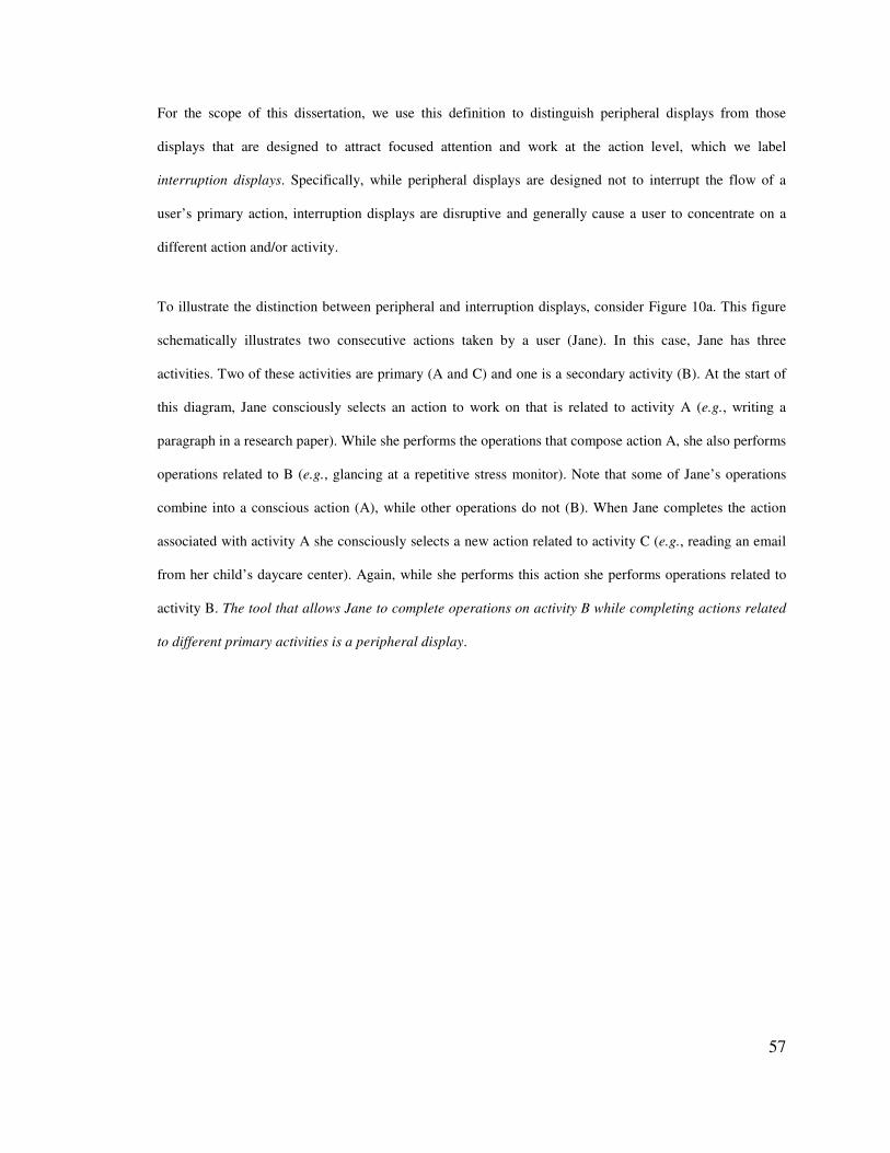
57
For the scope of this dissertation, we use this definition to distinguish peripheral displays from those
displays that are designed to attract focused attention and work at the action level, which we label
interruption displays. Specifically, while peripheral displays are designed not to interrupt the flow of a
user’s primary action, interruption displays are disruptive and generally cause a user to concentrate on a
different action and/or activity.
To illustrate the distinction between peripheral and interruption displays, consider Figure 10a. This figure
schematically illustrates two consecutive actions taken by a user (Jane). In this case, Jane has three
activities. Two of these activities are primary (A and C) and one is a secondary activity (B). At the start of
this diagram, Jane consciously selects an action to work on that is related to activity A (e.g., writing a
paragraph in a research paper). While she performs the operations that compose action A, she also performs
operations related to B (e.g., glancing at a repetitive stress monitor). Note that some of Jane’s operations
combine into a conscious action (A), while other operations do not (B). When Jane completes the action
associated with activity A she consciously selects a new action related to activity C (e.g., reading an email
from her child’s daycare center). Again, while she performs this action she performs operations related to
activity B. The tool that allows Jane to complete operations on activity B while completing actions related
to different primary activities is a peripheral display.
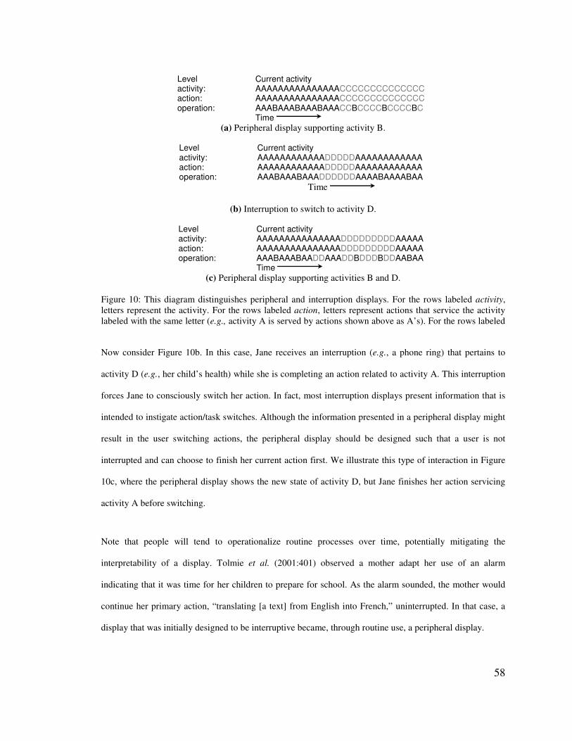
58
Level Current activity activity: AAAAAAAAAAAAAAACCCCCCCCCCCCCC action: AAAAAAAAAAAAAAACCCCCCCCCCCCCC operation: AAABAAABAAABAAACCBCCCCBCCCCBC Time
(a) Peripheral display supporting activity B.
Level Current activity activity: AAAAAAAAAAAADDDDDAAAAAAAAAAAA action: AAAAAAAAAAAADDDDDAAAAAAAAAAAA operation: AAABAAABAAADDDDDDAAAABAAAABAA
Time
(b) Interruption to switch to activity D.
Level Current activity activity: AAAAAAAAAAAAAAADDDDDDDDDAAAAA action: AAAAAAAAAAAAAAADDDDDDDDDAAAAA operation: AAABAAABAADDAAADDBDDDBDDAABAA Time
(c) Peripheral display supporting activities B and D. Figure 10: This diagram distinguishes peripheral and interruption displays. For the rows labeled activity, letters represent the activity. For the rows labeled action, letters represent actions that service the activity labeled with the same letter (e.g., activity A is served by actions shown above as A’s). For the rows labeled operation, letters represent operations that service the activity labeled with the same letter.
Now consider Figure 10b. In this case, Jane receives an interruption (e.g., a phone ring) that pertains to
activity D (e.g., her child’s health) while she is completing an action related to activity A. This interruption
forces Jane to consciously switch her action. In fact, most interruption displays present information that is
intended to instigate action/task switches. Although the information presented in a peripheral display might
result in the user switching actions, the peripheral display should be designed such that a user is not
interrupted and can choose to finish her current action first. We illustrate this type of interaction in Figure
10c, where the peripheral display shows the new state of activity D, but Jane finishes her action servicing
activity A before switching.
Note that people will tend to operationalize routine processes over time, potentially mitigating the
interpretability of a display. Tolmie et al. (2001:401) observed a mother adapt her use of an alarm
indicating that it was time for her children to prepare for school. As the alarm sounded, the mother would
continue her primary action, “translating [a text] from English into French,” uninterrupted. In that case, a
display that was initially designed to be interruptive became, through routine use, a peripheral display.
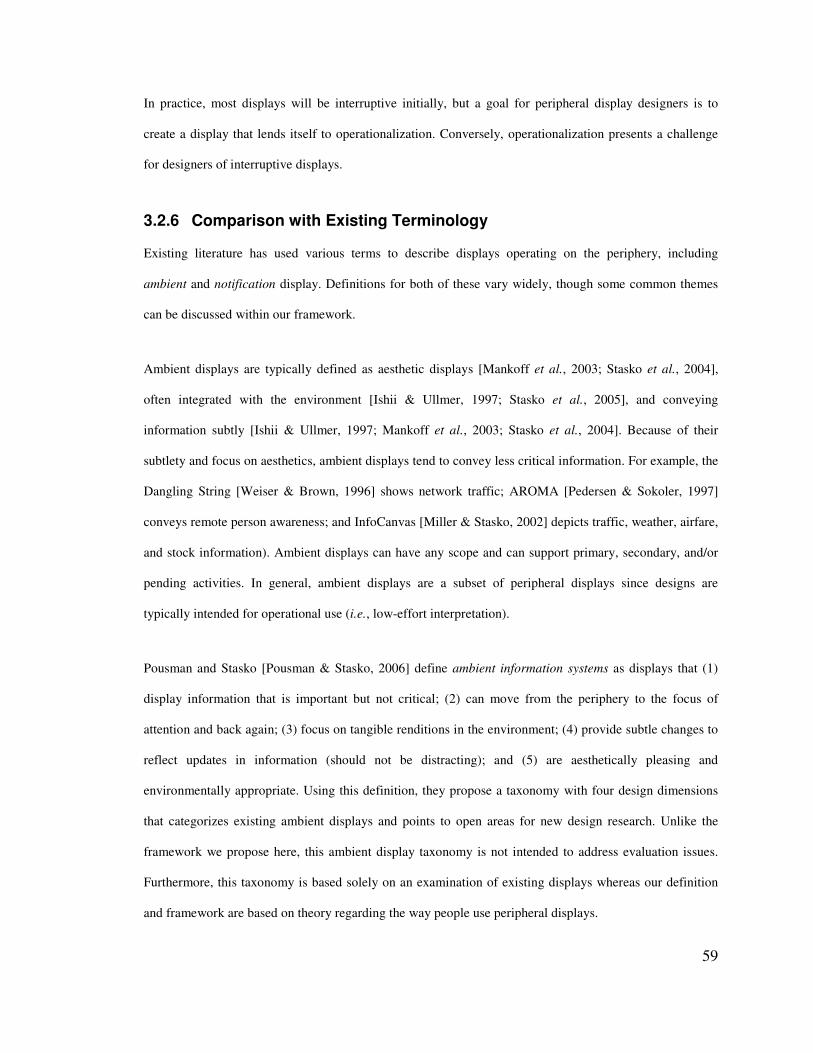
59
In practice, most displays will be interruptive initially, but a goal for peripheral display designers is to
create a display that lends itself to operationalization. Conversely, operationalization presents a challenge
for designers of interruptive displays.
3.2.6 Comparison with Existing Terminology
Existing literature has used various terms to describe displays operating on the periphery, including
ambient and notification display. Definitions for both of these vary widely, though some common themes
can be discussed within our framework.
Ambient displays are typically defined as aesthetic displays [Mankoff et al., 2003; Stasko et al., 2004],
often integrated with the environment [Ishii & Ullmer, 1997; Stasko et al., 2005], and conveying
information subtly [Ishii & Ullmer, 1997; Mankoff et al., 2003; Stasko et al., 2004]. Because of their
subtlety and focus on aesthetics, ambient displays tend to convey less critical information. For example, the
Dangling String [Weiser & Brown, 1996] shows network traffic; AROMA [Pedersen & Sokoler, 1997]
conveys remote person awareness; and InfoCanvas [Miller & Stasko, 2002] depicts traffic, weather, airfare,
and stock information). Ambient displays can have any scope and can support primary, secondary, and/or
pending activities. In general, ambient displays are a subset of peripheral displays since designs are
typically intended for operational use (i.e., low-effort interpretation).
Pousman and Stasko [Pousman & Stasko, 2006] define ambient information systems as displays that (1)
display information that is important but not critical; (2) can move from the periphery to the focus of
attention and back again; (3) focus on tangible renditions in the environment; (4) provide subtle changes to
reflect updates in information (should not be distracting); and (5) are aesthetically pleasing and
environmentally appropriate. Using this definition, they propose a taxonomy with four design dimensions
that categorizes existing ambient displays and points to open areas for new design research. Unlike the
framework we propose here, this ambient display taxonomy is not intended to address evaluation issues.
Furthermore, this taxonomy is based solely on an examination of existing displays whereas our definition
and framework are based on theory regarding the way people use peripheral displays.
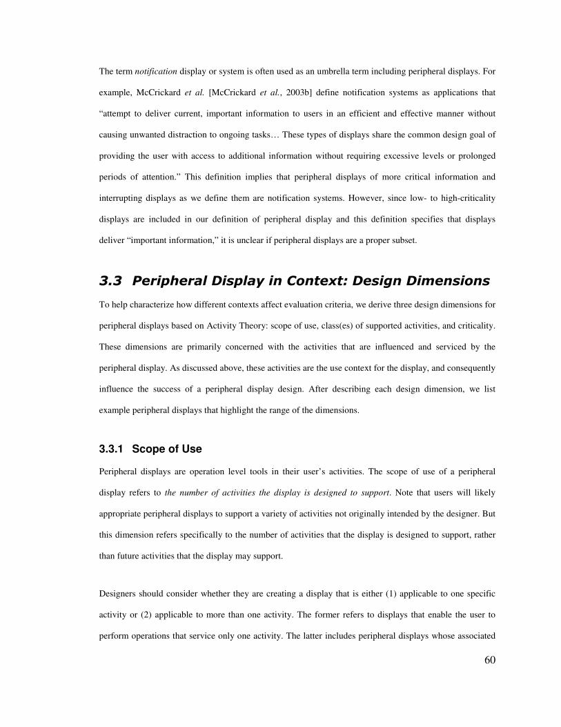
60
The term notification display or system is often used as an umbrella term including peripheral displays. For
example, McCrickard et al. [McCrickard et al., 2003b] define notification systems as applications that
“attempt to deliver current, important information to users in an efficient and effective manner without
causing unwanted distraction to ongoing tasks… These types of displays share the common design goal of
providing the user with access to additional information without requiring excessive levels or prolonged
periods of attention.” This definition implies that peripheral displays of more critical information and
interrupting displays as we define them are notification systems. However, since low- to high-criticality
displays are included in our definition of peripheral display and this definition specifies that displays
deliver “important information,” it is unclear if peripheral displays are a proper subset.
$�$� ���������������������'#��� ���� ��������#��
To help characterize how different contexts affect evaluation criteria, we derive three design dimensions for
peripheral displays based on Activity Theory: scope of use, class(es) of supported activities, and criticality.
These dimensions are primarily concerned with the activities that are influenced and serviced by the
peripheral display. As discussed above, these activities are the use context for the display, and consequently
influence the success of a peripheral display design. After describing each design dimension, we list
example peripheral displays that highlight the range of the dimensions.
3.3.1 Scope of Use
Peripheral displays are operation level tools in their user’s activities. The scope of use of a peripheral
display refers to the number of activities the display is designed to support. Note that users will likely
appropriate peripheral displays to support a variety of activities not originally intended by the designer. But
this dimension refers specifically to the number of activities that the display is designed to support, rather
than future activities that the display may support.
Designers should consider whether they are creating a display that is either (1) applicable to one specific
activity or (2) applicable to more than one activity. The former refers to displays that enable the user to
perform operations that service only one activity. The latter includes peripheral displays whose associated
61
operations service more than one activity. For example, a peripheral display that allows its user to monitor
email – e.g., the email orb [Hsieh & Mankoff, 2003] – can support both work and personal activities. Note
that we are not concerned with the ease of appropriating the display for a different activity, but only with
the number of activities the display is intended to support.
We exclude displays that do not service any activity (i.e., those displays that do not promote or empower
the user in their efforts to satisfy the motives of any of their activities). For example, very low fidelity
monitoring devices, such as simple fire alarms that detect fires but do not provide the user with any
additional information on how to deal with the fire, would categorically fall into this excluded group of
displays. Ultimately, however, whether or not a display can service an activity depends on the user and the
context. For example, the altimeter in a cockpit is not a peripheral display for someone who does not pilot
planes.
3.3.2 Class(es) of Supported Activities
People are generally involved in multiple ongoing activities but are focused on a small set of these through
their primary action. The class(es) of supported activities design dimension captures whether the peripheral
display supports primary activities, secondary activities, and/or pending activities (see the description of
these classes of activities above). Although it is natural to consider only two cases – peripheral displays that
support primary activities and peripheral displays that do not – we further distinguish between displays that
support secondary activities and displays that support pending activities.
Practically, this distinction allows the peripheral display designer to assess whether they need to design for
transitions that enable a pending activity to become a primary activity; or whether they only need to design
for the monitoring of some aspect of a secondary activity. Scalable Fabric [Robertson et al., 2004] is an
example of a peripheral display designed to support pending activities. Scalable Fabric users interact with
windows in a central focus area of the screen in a normal manner, but when a user moves a window into the
periphery, it shrinks. Placing a set of windows near each other in the periphery dynamically creates a task
composed of them. Window management is supported on a task level: clicking on a task name in the
62
periphery restores all the task windows to the focus area. Scalable Fabric enables users to monitor the status
of pending actions/tasks that have been temporarily set aside but could be resumed at any time via the
shrunken windows. The display also supports transitioning between different activities (by clicking on
peripheral tasks), appropriately modifying its view when pending activities become primary activities (by
restoring task windows to the focus area).
Even when a peripheral display does not support the user’s primary activities, a designer should have some
understanding of what the user’s primary activities are and how the user’s primary action supports them.
For example, a peripheral display designer needs this understanding to choose an appropriate interaction
modality. In some situations, interaction modalities carry different restrictions (e.g., many researchers have
shown that when driving a vehicle, conveying various types of information audibly leads to better driving
and in-vehicle task performance than conveying it visually; see [Wickens & Seppelt, 2002] for a survey).
Without assessing the user’s primary action – a major component of the current situation and context – a
designer may be unable to make appropriate design decisions regarding the display.
3.3.3 Criticality
The final design dimension is criticality; which refers to how critical or important the activities the display
is designed to support are for the user. Criticality represents a continuous range from low-criticality to high-
criticality. For simplicity, we compare and contrast these two end-points but note that activity importance
could fall anywhere in the range. Although some criticality distinctions are largely universal (e.g., most
people would consider activities involving life or death situations as high-criticality), Activity Theory does
provide a handle on a more subjective sense of criticality. Since each activity for a user has an associated
motive, one can gauge criticality by assessing the importance of the appropriate motives for the user –
generally speaking, the more important the motive the more critical the activity.
3.3.4 Example Peripheral Displays
Our design dimensions have meaning only in relation to specific people and their sets of activities. Below
we describe two simple personas. Then we present example displays for each of our three design
63
dimensions and how they might be used. These examples serve to illustrate the connection between a
peripheral display, its use, and the activities of the user.
Personas
Bob is a social services coordinator who exercises regularly, owns a home, and flies single-engine planes in
his spare time. Jane is a computer science professor who is partially deaf, a single mother of a toddler, and
a frequent user of public transportation.
Peripheral Display Examples
Scope of 1, Primary Activity, Low-Criticality: It is nearly time to head home and Jane is wrapping up loose
ends and getting organized to leave work. Her office has an information ticker that indicates bus arrival and
departure times. Since Jane is planning to ride the bus, she peripherally monitors the ticker to make sure
she finishes her wrap-up in time to catch the next bus. Here, the ticker supports one specific activity for
Jane: managing her work-life balance. This is Jane’s primary activity and the information displayed in the
ticker is low-criticality (Jane could walk home if she misses the bus).
Scope of 1, Secondary Activity, Low-Criticality: Jane is concentrating on writing a research paper and a
repetitive-stress monitoring program presents the length of time she has gone without taking a break. Here,
there is one activity that the display supports (maintaining her health), the supported activity is secondary to
her primary activity (writing a research paper), and the supported activity is relatively low-criticality.
Scope of 1, Primary Activity, High-Criticality: Bob is monitoring an altimeter while flying a plane. Here,
there is one activity that the display supports (flying a plane), it is Bob’s primary activity, and it is highly
critical (negligence of the activity would risk Bob’s life). Note that the altimeter is only peripheral for
trained pilots who have operationalized its interpretation. The altimeter is an example of a more complex
visual display that may require more learning to reach operational or peripheral use.
64
Scope of 1, Secondary/Pending Activity, High-Criticality: While Jane is cooking, she monitors a high-
fidelity visual display showing her baby playing in another room. In this case, the display supports one
activity (maintaining the health of her baby) which is highly critical. This activity could be secondary if
Jane’s baby is relatively independent and Jane is not expecting to directly attend to her baby in the near
future. Or, if Jane expects her baby to need her direct assistance in the near future, this could be a pending
activity.
Scope of 2, Primary and Secondary Activities, Low-Criticality: Jane is using a version of IC2Hear
[Matthews et al., 2006b], an application that visually displays sound information, to monitor audience noise
and to gain feedback of her own voice level while she teaches a class. While IC2Hear can support low- and
high-criticality activities, here the display supports two low-criticality activities: managing a class and
practicing public speaking. The former activity is primary while the latter is secondary.
Scope of 2, Pending Activities, Low-Criticality: Jane is using Scalable Fabric [Robertson et al., 2004] to
manage research projects that all have approaching deadlines. Her primary action is writing part of a
research paper in activity A, but she is also waiting for an email to finish a grant proposal for activity B and
for some data-processing algorithms to finish in activity C. Jane is using Scalable Fabric to monitor the
arrival of the email she needs and to determine when the data-processing has finished. Here, there are two
supported activities, both of which are low-criticality, pending activities for Jane. The display also supports
transitioning between different activities. For example, when the email arrives for activity B (Jane’s grant
proposal) Scalable Fabric shows that there is an email in Jane’s inbox. But when Jane clicks on the inbox to
read the email, activity B becomes the primary activity and Scalable Fabric appropriately modifies its view
of activity B.
Scope of 2, Primary and Secondary Activities, High and Low-Criticality: Bob uses his heart monitor while
at work to monitor his stress and fitness level. He also uses his heart monitor while flying to gauge his
susceptibility to G-force blackouts. Here, the display supports two activities: health monitoring and flying.
The former is non-primary and low-criticality, the latter is primary and high-criticality.
65
Scope of Many, Secondary Activities, High and Low-Criticality: When Bob is busy talking with people over
the phone or during meetings, he monitors a display that indicates the number of high priority emails
remaining in his inbox. Here, the display supports more than one specific activity (Bob’s high-priority
emails relate to different work activities as well as some of his personal activities), which are secondary
and of varying levels of criticality.
$�-� �������#��'�������
Traditional user interfaces that support primary activities are typically evaluated on criteria related to
efficiency and effectiveness, such as time to complete supporting actions, success rate of completing
actions, number of errors, and quality of the resulting object. However, since peripheral displays are not
designed for direct interaction, it is often harder to assess the influence of these displays on a person’s
efficiency or overall work effectiveness. Hence, different evaluation criteria are required for peripheral
displays.
This section presents five evaluation criteria for peripheral displays that we derived from interviews with
peripheral display creators, from our own design and evaluation experience, and by reviewing existing
literature. The criteria are appeal, learnability, awareness, effects of breakdowns, and distraction. Our
review of past literature focused on peripheral display evaluation research, namely the ambient heuristics
[Mankoff et al., 2003], the Context of Use Evaluation for Peripheral Displays (CUEPD) method [Shami et
al., 2005], and the Interruption, Reaction, and Comprehension (IRC) classification model for notification
systems [McCrickard et al., 2003a]. Criteria suggested by these works fall into a subset of our criteria:
appeal, awareness, effects of breakdowns, and distraction. We add learnability because it is essential to
operationalization.
In the following subsections, we discuss related peripheral display evaluation literature and then we present
our evaluation criteria. For each criterion, we define it, relate it with past peripheral display evaluation
literature and our interviews, and discuss how examining a user’s activities can help designers as they
gather data about it.

66
3.4.1 Related Work on Peripheral Display Evaluation
Past peripheral display research has provided several specialized evaluation methods [Mankoff et al., 2003;
Shami et al., 2005] and a framework for evaluating notification systems [McCrickard et al., 2003a]. The
specialized methods provide either heuristics [Mankoff et al., 2003] or metrics [Shami et al., 2005] to
measure the success of a display or to detect problems. Our goal is to generalize and extend these
approaches by formalizing a more general set of evaluation criteria for peripheral displays.
Examining the heuristics and metrics embedded in existing methods reveals underlying criteria. For
example, the CUEPD method [Shami et al., 2005] includes survey questions for display evaluators. These
survey questions ask about various concrete issues related to the general criteria of noticeability,
comprehension, relevance, division of attention, and engagement. The ambient heuristics [Mankoff et al.,
2003] similarly focus on concrete usability issues that relate to more general criteria influencing the
adoption and use of peripheral displays. By specifying evaluation criteria instead of specific metrics (that
target various concrete issues related to these criteria), we can highlight common evaluation issues across
varying contexts and situations. The evaluation criteria we present in the rest of this section are based
partially on an analysis of existing methods; with revisions and extensions that are grounded in our Activity
Theory framework.
Our Activity Theory approach defines a set of design dimensions and evaluation criteria that is explicitly
dependent upon the user’s multiple, ongoing activities. This distinguishes our work from prior work, which
has not provided clear guidelines for peripheral display evaluation that considers the user’s activities. One
model, IRC (Interruption, Reaction, and Comprehension), classifies notification systems and is inclusive of
peripheral displays [McCrickard et al., 2003a]. McCrickard, Chewar, Somervell, and Ndiwalana apply the
IRC model to evaluation by using levels of interruption, reaction, and comprehension as general criteria for
evaluation metrics (e.g., they modify a user study questionnaire to ask about these criteria). Like our
framework, the IRC model describes displays varying in criticality. However, the IRC model does not
explicitly contain any notion of the user’s context (i.e., their activities). Although they recognize the
importance of context, they assume that the designer can aptly map his or her understanding of the user’s
67
activities to a position in the IRC space unassisted. Instead of supporting this mapping process, the IRC
framework focuses on and supports the evaluation of low-level interaction with a display – with the
primary objective of determining how effective the display is from a human information processor
perspective.
Our approach to peripheral display evaluation relies on five criteria: appeal, learnability, awareness, effects
of breakdowns, and distraction. The importance of these evaluation criteria depends on dimensions that
capture relevant activity-based context: scope, activity class(es), and criticality of the display. We present
our evaluation criteria in the following sections; relate each criterion with the model and methods described
above, our interviews, and past case study evaluations of peripheral displays in the literature; and discuss
how examining a user’s activities can help designers as they gather data about each criterion.
3.4.2 Appeal (Usefulness, Aesthetics)
Appeal refers to a user’s qualitative enjoyment of a display. In other words, this criterion represents their
overall feelings about the display. This criterion can be broken down into usefulness and aesthetics, which
represent different aspects of a user’s qualitative feelings that are commonly evaluated for peripheral
displays.
Designers we interviewed mentioned usefulness and aesthetics as important when evaluating peripheral
displays. They noted that adoption of a peripheral display depends on its appeal to users. In addition, this
criterion is informed by the ambient display heuristics presented in [Mankoff et al., 2003], several of which
affect the appeal of a display: “aesthetic and pleasing design,” “useful and relevant information,” and
“match between design of ambient display and environment.” Appeal is also related to the “engagement”
survey category that is part of the CUEPD method [Shami et al., 2005], which suggests that user feedback
be gathered on the display’s attractiveness and usage enjoyment. In a field study of the Sideshow display,
Cadiz et al. [Cadiz et al., 2002] asked users about “usefulness” in surveys. Consolvo et al. [Consolvo et al.,
2004] found in a field study of the CareNet display (which provides adult children with awareness of their
elderly parent’s activities and environment) that it was useful to participants, having a positive impact on
68
the elders’ care. In general, appeal is typically measured through qualitative reports, such as surveys and
interviews, following realistic usage.
Activities supported by peripheral displays are typically already ripe with other tools, social contexts, and
semantic themes. By understanding these aspects of the user’s activities the designer can conceptualize
what displays might be useful and aesthetically pleasing. This type of user profiling is common practice in
many design methods, but we believe designers will be better equipped in assessing the appeal of their
displays by explicitly considering a user’s activities.
3.4.3 Learnability
Learnability is the amount of time and effort required for users to operationalize their use of a peripheral
display. Although the notion of reaching operational use of a system is not novel to interaction design [John
& Kieras, 1996], the systems designed using these methods are often focused on conscious, action-level
interaction. Hence they are concerned with the user’s ability to form and execute goals [John & Kieras,
1996]. Alternatively, focusing on learnability as an important criterion for peripheral display design
emphasizes operation-level interaction over action-level – if the user is making conscious goals related to
the interaction with or content of a display, it is not being used peripherally. Though any display will
sometimes become the focus of a user’s attention, the design goal, as emphasized by our Activity Theory
framework and captured by the learnability evaluation criterion, is for peripheral display users to be able to
use the display predominately at the operation level. In general, displays that are quick and easy to interpret
are more likely to be used peripherally since they will require less practice to become operational. The
learnability of a display may influence its adoption since users may be less likely to use a display they find
difficult to learn, unless interpreting it is meant to present a challenge and users expect this [Hallnäs &
Redström, 2001].
Past peripheral display evaluation literature has tended to focus on the design qualities that enable quick or
easy operationalization, rather than on the user’s operationalization process. For example, the CUEPD
survey asks if the user was able to understand information just by glancing at it, an indicator that
69
information was easy to learn. Likewise, the ambient heuristics [Mankoff et al., 2003] call for a “consistent
and intuitive mapping,” so that users spend less effort learning the mappings. Other evaluations have
measured whether or not users learned to interpret a display [Skog et al., 2003], but not how long it took
them or how challenging it was to learn. Despite relatively few studies that have examined learnability
(compared to awareness, distraction, and appeal), it is important to evaluate that the learning process match
user expectations to bolster adoption. For example, an evaluation of sound displays for the deaf revealed
that users disliked visualizations they thought were difficult to learn [Matthews et al., 2005]. While easy
operationalization is appropriate for many peripheral displays, we acknowledge that some peripheral
displays may require effort to learn to use.
Activity Theory suggests that it would be most beneficial to evaluate learnability based on the activities in
which the display is used and on feedback from users. Every person will require a different amount of
practice to use a new display peripherally (i.e., at the operation level). In Activity Theory, new tools are
often traced from the activity level (when the tool is first introduced and the user is trying to learn about it
and how it relates to other tools) to the action level (when the user still has to direct their attention to the
tool to use it appropriately) to the operation level (when the user can use the tool without high cognitive
load) [Leontiev, 1978]. The rate of this learning depends on the user as well as the situation.
3.4.4 Awareness
Definitions of awareness widely vary in past literature [Schmidt, 2002]. For this dissertation we focus on
peripheral awareness, which we define as the amount of information shown by the display that people are
able to register and use without focal attention. For our purposes, awareness includes both consciously and
unconsciously registered information. Since the purpose of a peripheral display is to convey some
information, it follows that the user’s awareness of that information can be used to judge the effectiveness
of the display.
Interview participants said user awareness of information is an important criterion for evaluating peripheral
displays. Our studies of sound displays for the deaf [Matthews et al., 2006b] and Scalable Fabric (presented
70
later in this thesis) have explored measuring awareness. Many studies in peripheral display literature have
also evaluated awareness as an important criterion [Arroyo & Selker, 2003; Carter et al., 2004; Dabbish &
Kraut, 2004; Hsieh & Mankoff, 2003; Mankoff et al., 2003; McCrickard & Zhao, 2000; Mynatt et al.,
1998; Mynatt et al., 2001; Pedersen & Sokoler, 1997; Plaue et al., 2004].
Evaluation literature also considers awareness as an important criterion. In the IRC model from
McCrickard, et al. [McCrickard et al., 2003a], both reaction and comprehension are similar to awareness.
Reaction is the speed and accuracy of the user’s response to the information provided by the display.
Comprehension refers to the user’s ability to make sense of the information displayed and remember it at a
later time. Because these criteria focus on immediate response and conscious registration, they are more
appropriate for notification and interruption displays than for peripheral displays. In particular, peripheral
displays often do not result in an observable reaction, and reaction and comprehension (as defined by
McCrickard et al.) are not applicable to unconsciously registered information.
The ambient heuristics [Mankoff et al., 2003] also indicate that awareness is important, and prescribe that
“useful and relevant information” is visible. Similarly, the CUEPD survey [Shami et al., 2005] asks if users
were “able to understand the information in the display.”
Like appeal and learnability, awareness will depend on the user’s activities. It is important to focus on how
the information in the peripheral display relates to the other information in the user’s activities.
Understanding this relationship will help the designer assess how aware the user needs to be about
information in the display, how often it should be updated, and how often the user should be monitoring the
display.
3.4.5 Effects of Breakdowns
The effects of breakdowns refers to how apparent breakdowns are to users and how easily users can recover
from them. It is apparent when most tools suffer breakdowns. For example, when a mouse suddenly stops
responding it suddenly becomes for the user a tool that requires repairing, whereas before it had been an
71
unremarkable means of production – to use Heidegger’s [Heidegger, 1927] phrases, the mouse becomes
present-at-hand when it had been ready-to-hand. However, by their nature peripheral displays are unlikely
to become present-at-hand even when they suffer breakdowns. Thus, people may use the display even when
the information it presents is misleading, which eventually can lead to disruptions and ultimately rejection
of the display. When breakdowns are made obvious and recovery is straightforward, users are more likely
to adopt displays.
Breakdowns are often measured inadvertently, when a display unexpectedly breaks down during an
evaluation or deployment. Though not always considered before evaluations, breakdowns can cause major
problems for peripheral display users and evaluators. For example, in an evaluation of the Bus Mobile,
which shows bus schedule information, the visibility of breakdowns was shown to be a problem [Mankoff
et al., 2003]. The state signified by the bus tokens still underneath the white skirt had two possible
meanings: no buses are scheduled, or a motor is broken. Users could not tell the difference. One interview
participant described a situation in which a different peripheral display designed to show levels of activity
on a main server broke down and caused mild panic in a lab group. At one point, an error in the display
caused it to freeze. Users interpreted this to mean that the main server had frozen and they frantically
searched for problems with it. Also, in a past field study of the Email Orb [Hsieh & Mankoff, 2003], the
Orb was not displaying anything for half a day before users noticed. To avoid problems like this, the
Ambient Heuristics state that “error prevention” is an important design consideration, since “users should
be able to distinguish between an inactive display and a broken display” [Mankoff et al., 2003].
As with the earlier criteria, understanding the effects of breakdowns depends on the user’s activities. If the
designer understands what aspects of the user’s activity are influenced by the peripheral display, and how
these aspects relate to the activity as a whole, the designer can make more appropriate decisions on how to
expose breakdowns and how to support recovery. Understanding the criticality of the activity and the scope
of the display are also important. Breakdowns in the gauges in a cockpit could represent a serious concern
which needs to be communicated to the pilot. Likewise, if the display supports multiple activities (scope
greater than one) it is important to consider interactions between activities that could influence how to
72
make users aware of the breakdown and to support efficient recovery. For example, in the scenario where
Bob uses a heart monitor to check on his health as well as factors that could influence his ability to fly, a
breakdown in the heart monitor needs to be conveyed in a manner that alerts Bob to the failure of the
device but does not distract him from flying.
3.4.6 Distraction
Distraction is the amount of attention the display attracts away from a user’s primary action. Distraction is
important since it affects the user’s ability to carry out their primary action and will likely influence their
qualitative reactions to using the display.
Interview participants named distraction as an important criterion, saying that a crucial measure of success
for peripheral displays is that they be peripheral and not unnecessarily distract the user. Past studies of the
Bus Mobile [Mankoff et al., 2003], Hebb [Carter et al., 2004], sound displays for the deaf [Matthews et al.,
2006b], Info-Lotus [Zhang et al., 2005], Sideshow [Cadiz et al., 2002], and email displays [Hsieh &
Mankoff, 2003] have all evaluated distraction, often (but not always) with a goal of minimizing it.
Past research also implies that distraction is an important criterion. In the IRC model [McCrickard et al.,
2003a], interruption describes the event that causes the user to switch their focal attention to the
notification. Interruptions cause distraction from a primary task. The ambient heuristics [Mankoff et al.,
2003] prescribe that a display “should be unobtrusive and remain so unless it requires the user’s attention.”
This implies that measuring distraction is useful. Finally, the CUEPD survey [Shami et al., 2005] asks
several questions about distraction (e.g., did the user notice the display, and was the user able to adequately
focus on their primary task).
Distraction is a natural criterion given our Activity Theory analysis. Since the display is monitored at the
same time as the user is performing an action, it will require some user attention. This does not necessarily
result in the user being less efficient. For example, the display could provide information that is useful
and/or important to the user’s action, enabling them to perform better with the display than without.
73
In the next section we describe how Activity Theory and our design dimensions constrain the application
and evaluation of these criteria.
$�.� )���������"#����� ��� ������������� ��������
In this section we discuss the evaluation of peripheral displays relative to our design dimensions: scope,
classes of activities supported, and criticality. In particular, we discuss how criteria will vary in importance
depending on a display’s position along each design dimension (e.g., for displays with high-criticality,
awareness is more important while certain aspects of appeal, like aesthetics, are less important).
For scope, we distinguish between displays that are associated with one activity and displays that are
associated with more than one activity. For classes of supported activities, we discuss peripheral displays
that support the user’s primary activity (e.g., the altimeter in a cockpit), displays that support secondary
activities (e.g., a bus schedule display), and displays supporting pending activities (e.g., Scalable Fabric
[Robertson et al., 2004]). For criticality, we discuss peripheral displays that are associated with highly
critical activities (e.g., the altimeter) and displays associated with low-criticality activities (e.g., a bus
schedule display).
In our experience, scope, classes of supported activities, and criticality can be treated as independent
dimensions. Accordingly, we present how each dimension influences peripheral display design separately.
We proposed that evaluators combine the evaluation recommendations presented below depending on
where their display falls within these dimensions.
3.5.1 Scope
In general, changes in scope do not change the relative importance of our evaluation criteria – e.g.,
knowing that a peripheral display supports one activity instead of two does not make appeal any more or
less important. However, as scope increases, evaluating each criterion can become significantly more
complicated because it becomes increasingly important to consider the impact of the peripheral display in
more situations and contexts. For example, the appeal of the display will have more constraints, the user
74
will have to learn to use the display in more activities, and measuring awareness and distraction for
multiple activities can be more complicated.
Lab experiments can be particularly useful in examining support for a single activity in depth. But, as scope
increases, controlling lab experiments to handle all the possible interactions of the supporting activities
becomes difficult.
3.5.2 High-Criticality Displays
Peripheral displays associated with a high-criticality activity are not tools for opportunistic information,
curiosity, or aesthetic appeal. Our evaluation criteria should be adjusted for displays supporting high-
criticality activities. First, in terms of appeal, usefulness is more important than aesthetics. Quick and easy
learnability and awareness, and transparency of breakdowns are important goals. Finally, it is particularly
important that distractions caused by a high-criticality display correspond to the importance of new
information being shown (i.e., more important information warrants more distracting updates).
3.5.3 Low-Criticality Displays
A low-criticality display is a tool for maintaining awareness related to activities of low importance. For
example, the Bus Mobile [Mankoff et al., 2003] provides bus schedule information for an activity of
managing a work-life balance. Low-criticality activity displays are often characterized as being artifacts for
opportunistic information, curiosity, or aesthetic appeal, rather than for productivity. This means that is it
typically important to maximize appeal and minimize distraction. It also implies different user needs and
expectations for learnability, awareness, and knowledge of breakdowns. For example, Slow Technology
[Hallnäs & Redström, 2001] is designed to be slow to learn and understand in order to give people time to
reflect.
3.5.4 Displays Supporting Primary Activities
A primary-activity display supports the user’s current activity and may influence the user’s primary action
(e.g., an altimeter supports the activity of safely flying the plane, which is also the pilot’s primary activity).
75
This means that the display is related to a specific context and a relatively stable set of actions that support
the user’s primary activity, making lab experiments more tenable. For example, a user’s awareness of
information can be tested with knowledge questions regarding the displayed information. Gathering
awareness data at various stages of the study gives an indication of how quickly and effectively the user
learned to get information from the display. Distraction can be evaluated by measuring overall activity
speed and success. Finally, the effects of breakdowns can be evaluated by simulating breakdowns and
observing a user’s response.
3.5.5 Displays Supporting Secondary Activities
Since secondary activities do not typically become primary activities, progress is made by monitoring their
status. For example, the Bus Mobile [Mankoff et al., 2003] supports the activity of managing a work-life
balance by providing users with help in deciding when to leave work and head home. While waiting for a
bus to be close enough, a user could be working on another activity, such as writing a research paper.
Since the user’s primary action and activities generally define their context [Nardi, 1996], a peripheral
display that only supports secondary activities could be used in a variety of contexts which may vary and
change. It follows that the context in which the peripheral display is used can be difficult to simulate
realistically and evaluation may require an extended deployment (i.e., weeks). A field study uses primarily
qualitative measures to evaluate criteria. For this reason, a display should be deployed for an extended
period of time (i.e., weeks) so users can develop accurate qualitative feedback. In such a field study, each
criterion can be evaluated via qualitative feedback from users during and after deployment.
Secondary activity displays do not impose any priority on evaluation criteria. Rather, it is important to
determine the display’s other design dimensions (criticality and scope) before deciding how to evaluate
each criterion. For example, ensuring that a display is easy to learn is more important for high-criticality
displays than for low-criticality displays – the fact that the display supports secondary activities does not
affect this criterion.
76
3.5.6 Displays Supporting Pending Activities
Pending activity displays are designed to allow users to monitor non-primary activities that may become
primary in the near future. This type of monitoring does not involve making progress on the activity; rather,
the user switches to the activity to make progress on it. For example, Scalable Fabric [Robertson et al.,
2004] enables users to monitor the status of actions that have been temporarily set aside but could be
resumed at any time. For example, users might set aside activities while waiting for a file to download, or
for a coworker to provide some information, or for a paper to finish printing.
Switches between a primary activity and the pending activity can be simulated during laboratory tests in a
semi-realistic way. For example, an experiment could involve users monitoring a peripheral display of
email updates so that they can switch to an email activity when certain messages arrive, while editing a
document as a primary activity. When evaluating displays that support transitioning between multiple
primary and pending activities, it is important to evaluate support for the transitions themselves (i.e., a
rendition change from pending to primary activity). For example, evaluating Scalable Fabric [Robertson et
al., 2004] might involve measuring difficulty or distraction caused by moving focal windows into the
periphery and bringing peripheral windows into the focal area.
Like secondary activity displays, pending activity displays do not impose any importance level on
evaluation criteria. Instead, it is essential to examine the other design dimensions (criticality and scope) in
order to determine the priority of each criterion. However, it is important to evaluate the learnability of the
display’s support for switching between activities. Ideally, it should be easy to learn how to switch between
the primary and pending activities.
$�0� '���+��� �!'�1����
Here we discuss an example peripheral display design and evaluation process in the context of our Activity
Theory-based design dimensions and evaluation criteria. IC2Hear is a visual, peripheral display to help
people who are deaf maintain awareness of sounds in their environment [Matthews et al., 2006b]. In our
77
deployment of IC2Hear, it was a high scope, low- to high-criticality, primary, secondary, and pending
activity display (i.e., it supports many activities and shows sounds ranging in criticality).
We analyze the methods we used in [Matthews et al., 2006b] to gather knowledge of user needs and
activities, design the IC2Hear application, and evaluate the prototypes. Results reported in [Matthews et al.,
2006b] focus on presenting knowledge about users’ needs for non-speech sound awareness and design
knowledge for peripheral displays of sound for the deaf. In this chapter, we analyze the IC2Hear design
process with our Activity Theory framework and present evaluation suggestions using our proposed criteria
and guidelines. The process actually followed in [Matthews et al., 2006b] did not use this Activity Theory
approach. Thus we highlight mistakes made during the design process that could have been avoided if we
had used the approach presented in this chapter.
3.6.1 Design Process
The goal of our design process was to understand sound awareness needs and challenges by gathering
information about users and their activities. The end result of our design process was a set of three visual
peripheral displays that visualized nearby sounds. At the beginning of the IC2Hear project, we interviewed
eight participants who are deaf to gather information about their activities and sound awareness needs. In
the same session as the interview, we presented participants with sketches of potential sound awareness
displays and asked their opinions. We built three of the most popular sound awareness displays and
evaluated them in a formative lab study. In this section, we discuss the design process that occurred before
any prototypes were built.
As with many user-centered approaches to design, Activity Theory emphasizes the need for a deep
understanding of user motives and activities, the tools used, and other people involved. Our framework
focuses this process for peripheral display designers on gathering information that will determine the three
design dimensions of the display: scope, classes of activities supported, and criticality of information
shown. Focusing the formative design work helps streamline the process and draws attention to important
issues for peripheral displays. For example, highly critical information is so important to people that they

78
may emphasize it in interviews. Using our framework, we know that low and highly critical information
can be displayed in different ways, so it is important to gather detailed information about both to inform the
different display mechanisms.
From interviews, we determined that IC2Hear was high scope, supported all classes of activities, and
conveyed all criticalities of information. For example, people wanted sound awareness to support their
work productivity – a higher criticality, primary activity (e.g., phone calls from clients). They also wanted
sound awareness to support their ability to maintain social ties with coworkers – a lower criticality,
secondary activity (e.g., coworkers chatting in the hall).
Unfortunately, we did not separate low- and high-criticality display mechanisms in our sketches, something
our Activity Theory framework would have encouraged us to do. This limited the feedback we received
from users, and hence resulted in less successful prototypes. In particular, almost all of our design sketches
used the same display mechanism for all types of information (both low- and high-criticality). For example,
all information was displayed abstractly with colors and shapes regardless of importance. A few design
sketches only showed important sounds, which were depicted with icons (phones, doorbells, voices,
alarms). Participants gravitated toward displays that clearly depicted important sounds, although they
actually wanted a combination of display mechanisms that could depict all sounds of interest (as we learned
in later evaluations). One display combined both: a spectrograph placed next to an icon, where the
spectrograph continuously conveyed literal sound information and the icon showed certain important
sounds. This was a favorite among participants. In building the prototype, however, we made another
mistake regarding learnability (discussed below).
The implications for our designs was that, since IC2Hear was a many-scope display, using multiple
approaches to convey information of different criticality was important to supporting all the target
activities. In particular, our designs should have focused on using subtle visuals for continuous sound
awareness of low to moderately critical sounds and should have included some more interruptive visuals
for highly critical sounds. The most critical sounds that participants listed were interruptions (e.g., the

79
phone, alarms, doorbells, people trying to capture attention, cars honking, and so on). Whereas our
visualization of highly critical sounds was designed for a de-contextualized aesthetic (based only on the
sound itself), we should have focused more on designs that acknowledged and harmonized with the
environment in which these sounds occurred. This change in focus could have improved the user’s
awareness and the appropriateness of interruptions. Our sketches and prototypes might have been improved
with careful consideration of the display’s goal to make users aware of information ranging from low- to
high-criticality.
Our Activity Theory framework’s emphasis on separating information of differing criticality could also
have improved feedback gathered in interviews. Participants emphasized highly critical sounds in
interviews and in their comments about design sketches. We should have clearly separated more and less
critical sounds in our discussion, gathering more data about how to support less critical sound awareness.
In summary, our display would have better supported user needs if we had gathered more information
about participant’s use of less critical sounds in their activities, and had created a larger set of sketches that
combined multiple mechanisms for conveying information of differing criticality. In the next sections, we
present the IC2Hear prototypes and discuss their evaluation.
3.6.2 Prototypes
Based on feedback from interviews, we implemented three graphical displays: Spectrograph with Icon
(Figure 11a), Single Icon (Figure 11b), and the History Display (Figure 11c). Spectrograph with Icon was a
design favored by interviewees that combines continuous, detailed sound information and an icon for more
critical sounds (phone rings, nearby voices, opening/closing doors). The icon portion displays a set of rings
that indicated gross pitch and volume (pitch: low = blue, red = high; volume: low = few rings, high = many
rings). The other portion is a standard spectrograph, a visualization of amplitude (darkness), frequency (y-
axis patterns), over time (x-axis). In Figure 11a the icon shows a person knocking on a door. Single Icon is
simply the icon portion of Spectrograph with Icon. Figure 11c shows the History Display, a bar graph of
past sounds where color identifies the sound, height of the bar indicates the sound’s volume (e.g., loud
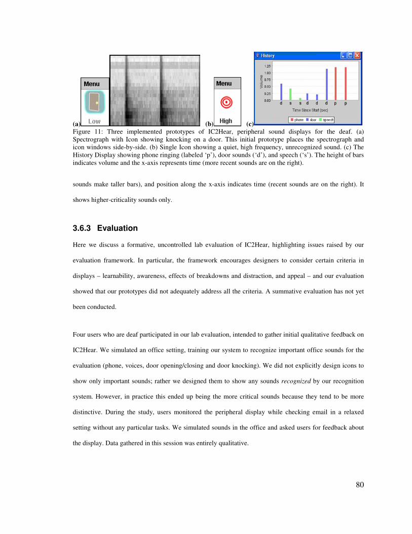
80
(a) (b) (c) Figure 11: Three implemented prototypes of IC2Hear, peripheral sound displays for the deaf. (a) Spectrograph with Icon showing knocking on a door. This initial prototype places the spectrograph and icon windows side-by-side. (b) Single Icon showing a quiet, high frequency, unrecognized sound. (c) The History Display showing phone ringing (labeled ‘p’), door sounds (‘d’), and speech (‘s’). The height of bars indicates volume and the x-axis represents time (more recent sounds are on the right).
sounds make taller bars), and position along the x-axis indicates time (recent sounds are on the right). It
shows higher-criticality sounds only.
3.6.3 Evaluation
Here we discuss a formative, uncontrolled lab evaluation of IC2Hear, highlighting issues raised by our
evaluation framework. In particular, the framework encourages designers to consider certain criteria in
displays – learnability, awareness, effects of breakdowns and distraction, and appeal – and our evaluation
showed that our prototypes did not adequately address all the criteria. A summative evaluation has not yet
been conducted.
Four users who are deaf participated in our lab evaluation, intended to gather initial qualitative feedback on
IC2Hear. We simulated an office setting, training our system to recognize important office sounds for the
evaluation (phone, voices, door opening/closing and door knocking). We did not explicitly design icons to
show only important sounds; rather we designed them to show any sounds recognized by our recognition
system. However, in practice this ended up being the more critical sounds because they tend to be more
distinctive. During the study, users monitored the peripheral display while checking email in a relaxed
setting without any particular tasks. We simulated sounds in the office and asked users for feedback about
the display. Data gathered in this session was entirely qualitative.
81
Our formative evaluation made it evident that none of our prototypes adequately address all criteria
important to peripheral displays, a problem our Activity Theory framework may have directed us to
consider. In particular, we may not have prototyped a design as difficult to learn as a spectrograph, we may
have included different display mechanisms for information of differing criticality, and we may have better
enabled users to detect breakdowns in the History Display.
Learning is necessary for a display’s use to become operationalized or peripheral. From interviews, we
knew that users expected the display to be easy to learn. In the formative evaluation, users were skeptical
about using the spectrograph because they thought it was too difficult to learn. One participant said, “It’s
just a blurry picture. I have no idea what the sound is.” Users thought Single Icon and the History Display
were easy to learn, preferring these two displays over Spectrograph with Icon.
Realizing the importance of easy learnability early on could have greatly improved our success with
IC2Hear. From the beginning, we should have inspected design sketches and eliminated or modified ones
that would be hard to learn. It is well-known in speech therapy literature that “reading” spectrographs
requires extensive practice for months (Zue & Cole, 1979). Several of our design sketches were similar to a
spectrograph, using movement of colors and abstract shapes to represent sounds. Before building any
display, we could have tested user learning and interpretation speeds for various sounds, to ensure our
designs would enable easy learning and information awareness.
Even though our interview participants favored the Spectrograph with Icon display on paper, this was likely
due to a lack of alternatives that conveyed low- and high-criticality sounds in different ways. Our formative
evaluation indicated that users preferred Single Icon and the History Display for learnability. However, the
History Display only showed more critical events and Single Icon showed only limited information about
unrecognized events. To address this, we could have tested more designs for conveying a range of less
critical sounds in an easy to learn way.
82
Users in the formative evaluation also felt the displays did a poor job of varying their display mechanisms
based on information criticality. Users made it clear that they wanted overt interruptions for highly critical
sounds and non-distracting updates for less critical sounds. They suggested that the icon flash when the
sound was “really important,” and be more “visual[ly] quiet” for less important sounds. The Single Icon
and Spectrograph with Icon, in particular, did not adequately distinguish between sounds of varying
criticality. For this reason, users favored the History Display, which inadvertently emphasized loud sounds
(which users told us were more important) by using larger bars. However, it is likely that varying the sizes
of bars would not be distracting enough for very important events like the phone or alarms. The design of
interruptions for high-criticality sounds needs more exploration, since we did not adequately address this in
our designs.
Finally, the evaluation showed that the History Display did not enable users to easily discover breakdowns,
an important feature of displays showing high-criticality information. Single Icon and Spectrograph with
Icon showed all sounds, so users could see the constantly updating display was working. The History
Display, however, only showed recognized sounds (phone, voices, door opening/closing, door knocking)
which happen less often. This could impede users from noticing a system breakdown. One possible solution
would be to display unrecognized sounds on the History Display as well, an idea that we may have
included in the display if we had considered the criteria emphasized by our framework.
To summarize, the three displays were preferred differently for different criteria: the History Display
performed better on learnability, distraction, and awareness, Single Icon and Spectrograph with Icon
showed more information and better enabled recovery from breakdowns, and Single Icon also enabled
better learnability. None of these designs were strong on all criteria. Overall, this analysis using our
framework, with its emphasis on design dimensions and criteria that are important to peripheral displays,
helped reveal central issues that could guide future redesigns and evaluations.
83
$�2� �����#��#"��������������#���3����&#���
In this chapter, we introduced a descriptive theory of peripheral displays based on Activity Theory.
Specifically, a peripheral display is any information display that is (1) a tool in at least one activity of its
user and (2) is used primarily at the operation level. Our Activity Theory framework extends past work on
peripheral displays by highlighting the need for designers to focus on operationalization and on the
activities that contextualize the use of the display.
One of the primary advantages of our framework is that it provides practical guidelines for designing and
evaluating peripheral displays. Specifically, we used the framework to derive a set of important design
dimensions for peripheral displays (scope, class(es) of supported activities, and criticality); to extend
peripheral display evaluation criteria (appeal, learnability, awareness, effects of breakdowns, and
distraction); and to understand how to evaluate different criteria in different contexts (i.e., in relation to
different users and their activities).
The major limitation of our Activity Theory framework is that it does not alleviate the difficulties of
applying design and evaluation methods. It guides the design and evaluation processes, but design and
evaluation methods remain challenging and time-consuming to employ. Understanding all of the subtleties
of user behavior would require an intensive triangulation of methods that concentrates on finding issues
less likely to be captured by other methods, such as the display’s affects on activities it was not expected to
support. For example, it is likely that users will not be consciously aware enough of some behavior changes
to provide useful self-report data, log analysis tools inevitably will fall short of describing all aspects of
user activities, and participant observation is very time-consuming and subject to observer bias.
Despite this limitation, our Activity Theory framework is an important tool for designers that enables them
to tailor their design process and evaluation methods to focus on issues that are important for peripheral
displays. By focusing the design and evaluation processes on design dimensions (scope, classes of activities
supported, and information criticality) and criteria (learnability, awareness, breakdowns, distraction, and
84
appeal) that are important to peripheral displays, our framework helps designers address issues that are key
to the success of their displays.
The Activity Theory framework helps begin to solve the design and evaluation challenges raised by
peripheral display creators in interviews. Though analyzing designs within the framework can improve
designs as shown in our IC2Hear case study, more design knowledge is needed to help designers create the
most effective abstract renditions. The remainder of this dissertation addresses this need by exploring
glanceability in peripheral visualizations. We begin by refining our definition of glanceability based on our
Activity Theory framework.
3.7.1 A Definition of Glanceability
We define glanceability as a visual quality that enables users to understand information quickly and with
low cognitive effort. The Activity Theory definition of peripheral display is that it is a tool in at least one
activity of the user and it is used primarily at the operation level (i.e., its use requires low cognitive cost).
This definition indicates that glanceability is an important way to quicken the operationalization process.
For displays to be used peripherally, the user must operationalize the interpretation of displayed
information. One way to accomplish operational use is through extensive practice. However, if a display
enables information intake quickly and with low cognitive cost (i.e., it is glanceable) then the
operationalization process will be drastically reduced.
We identify two major concepts that determine glanceability: quickness and ease of interpretation and
perception. If a display is very easy to interpret, then operational use should require less practice.
Interpretation ease is greatly affected by the amount and type of information being displayed. Interpreting a
display of one piece of information will be much easier than interpreting a display of many bits of
information. Likewise, certain visuals are quicker and easier to perceive. Even if a non-glanceable display
is operationalized through practice, visuals designed to take advantage of human perceptual capabilities
will likely enable faster information intake. For example, humans can perceive colors faster than geometric
shapes [Christ, 1975; Jubis, 1990; Nowell, 1997; Smith & Thomas, 1964]. So displays that effectively
85
employ color may be quicker to understand than displays that do not, regardless of how much a user
practices using either. We explore interpretation and perception as two integral pieces to glanceable design.
Glanceability is not an evaluation criteria, but it is a design mechanism through which designers can
improve a display’s learnability, improve user awareness, minimize distraction caused by time take to
interpret a display, and increase appeal. The experiments we present as part of this thesis show that
glanceability leads to better awareness, less distraction, and greater appeal.
3.7.2 Glanceability vs. Attention Capture
Our exploration of glanceability does not include issues of notification or attention capture. Glanceability
refers to the perception and interpretation of information after the user is paying attention to the interface.
Attention capture refers to the process of attracting the user’s attention away from their focal action (e.g.,
through techniques like abrupt onset, flashing, bouncing, and other motion). Thus glanceability and
attention capture are separate issues that can be studied largely independently.

86
(a) (b) Figure 12: (a) Clipping Lists interface showing our study’s Quiz task with a progress bar indicating the next quiz module is loading, and Web page text to help users recognize them. (b) Clipping Lists with Change Borders shows an email inbox and indicates with a green border that new email arrived.
6� � ������#����<��������$�����������
(��������������������� ������#����
In this chapter, we describe an experiment that empirically compares the multitasking performance impact
of three abstraction techniques used on peripheral displays that showed subjects information about their
multiple tasks [Matthews et al., 2006a].
Multitasking means interleaving two or more tasks. These interleaved tasks tend to be pending tasks, since
they have been set aside with the intent that they will be returned to. Metrics of multitasking performance
are indicated by existing research, which points to several problems multitaskers continue to battle due to
inadequate software support. First, interruptions plague longer-term tasks undermining user concentration
and task progress, because users are often unable to determine which interruptions need to be handled
immediately [Czerwinski et al., 2004; Schneiderman & Bederson, 2005]. This makes it difficult for users to
maintain current task flow. Second, successful task completion requires knowing when to step out of the
current task and return to a pending task, which we call resumption timing. For example, Czerwinski et al.
[Czerwinski et al., 2004] found that people often set aside tasks while waiting for some external event (e.g.,
an email to arrive from a coworker), but wanted to resume as soon as the event occurred. Third, people
have trouble getting back on task after shifting their attention away (i.e., it is difficult to reacquire tasks)
87
[Czerwinski et al., 2004]. Though these multitasking needs are particularly relevant to pending tasks,
maintaining task flow is an issue with any type of task supported by peripheral displays (primary,
secondary, and pending).
We believe that providing relevant task information in a glanceable, low-attention manner is critical to
solving these multitasking problems. Our goal with this experiment is to determine the effects of three
abstraction types on multitasking performance: semantic content extraction, change detection, and scaling.
Semantic content extraction refers to selecting and displaying only pieces of information from an original
window that are relevant to task flow, resumption timing, and task reacquisition. In our interfaces, lists of
rectangular window “clippings,” which we call Clipping Lists (see Figure 12a), are shown in the periphery.
Change detection provides one extra bit of information to the user, signaling when a change has occurred
within a window. Our interfaces use Change Borders, colored highlights that appear around peripheral
windows, to indicate changed content (see Figure 12b). Finally, scaling involves shrinking windows to
thumbnail-size when they are in the periphery. We conducted a lab experiment comparing four interfaces
that introduced these abstraction types to the Scalable Fabric task management system [Robertson et al.,
2004]. In comparing these interfaces, we were not interested in which form of abstraction shows more
information, but rather which shows the most relevant task information in a glanceable way.
In the next section, we discuss related user interfaces that support multitasking. We then introduce the
design and implementation of our four peripheral interfaces, which use semantic content extraction, change
detection, and/or scaling to abstract information. We then present a lab experiment that compares the
effects of these four interfaces on multitasking performance. The main result is that semantic content
extraction is more effective than both change detection and our baseline case of scaling peripheral windows
in improving multitasking efficiency. We show that since our implementation of semantic content
extraction significantly reduces task time, task switches, and window switches, it benefits task flow,
resumption timing, and reacquisition. We use these findings to discuss how to design peripheral displays
that aid multitasking and task flow, so that users focus their cognitive resources on the task at hand, instead
of on task management.
88
-��� (������4#�� �+�������+���#���������� �
A number of systems have been built to support multitasking needs. Several of these existing systems have
focused on organizing work at the task or activity level (rather than the application level), which defines
how they support task switching and reacquisition. Only two systems discussed in this section (Scalable
Fabric [Robertson et al., 2004] and Kimura [MacIntyre et al., 2001]) explicitly support peripheral
awareness of task information. Scalable Fabric provides the baseline comparison within the experiment we
present in this chapter, comparing the effects of three abstraction methods on multitasking.
Scalable Fabric [Robertson et al., 2004] is a system for organizing task windows across applications that
addresses the issues of task flow, switching, and reacquisition using peripheral awareness. Scalable Fabric
provides task management support by spatially organizing shrunken versions of windows into tasks in the
periphery and enabling window management on a task level. Users interact with windows in a central focus
area of the screen in a normal manner, but when a user moves a window into the periphery, it shrinks. The
window “minimize” action is redefined to return the window to the user-chosen location in the periphery,
rather than hiding the window. Placing a set of windows near each other in the periphery dynamically
creates a task composed of them. Clicking on a minimized task’s name restores all its windows into the
central focus area. This is the equivalent of switching rooms in the Rooms system [Henderson & Card,
1986], which enables users to organize activities as different virtual desktops. Clicking again on the focal
task’s name minimizes all its windows to the periphery. Windows from all tasks are visible at all times
(either in the focus area or as shrunken, peripheral windows), enabling easier task switching. A user study
was conducted to compare Scalable Fabric and the Windows XP Taskbar. In a qualitative rating survey,
users showed they significantly favored Scalable Fabric. There was no significant difference between task
times for the two. These results indicate that Scalable Fabric is at least as effective as the Taskbar and more
preferable. A second longitudinal field study was conducted with 200 users and resulted in favorable
feedback.
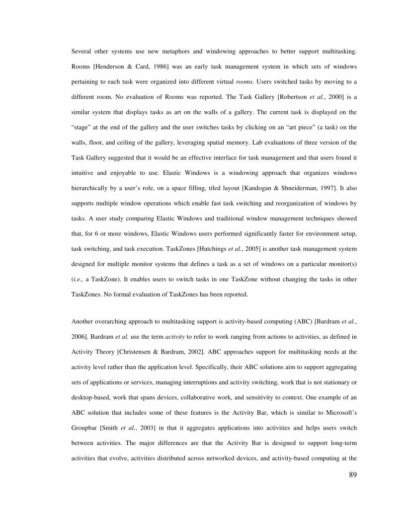
89
Several other systems use new metaphors and windowing approaches to better support multitasking.
Rooms [Henderson & Card, 1986] was an early task management system in which sets of windows
pertaining to each task were organized into different virtual rooms. Users switched tasks by moving to a
different room. No evaluation of Rooms was reported. The Task Gallery [Robertson et al., 2000] is a
similar system that displays tasks as art on the walls of a gallery. The current task is displayed on the
“stage” at the end of the gallery and the user switches tasks by clicking on an “art piece” (a task) on the
walls, floor, and ceiling of the gallery, leveraging spatial memory. Lab evaluations of three version of the
Task Gallery suggested that it would be an effective interface for task management and that users found it
intuitive and enjoyable to use. Elastic Windows is a windowing approach that organizes windows
hierarchically by a user’s role, on a space filling, tiled layout [Kandogan & Shneiderman, 1997]. It also
supports multiple window operations which enable fast task switching and reorganization of windows by
tasks. A user study comparing Elastic Windows and traditional window management techniques showed
that, for 6 or more windows, Elastic Windows users performed significantly faster for environment setup,
task switching, and task execution. TaskZones [Hutchings et al., 2005] is another task management system
designed for multiple monitor systems that defines a task as a set of windows on a particular monitor(s)
(i.e., a TaskZone). It enables users to switch tasks in one TaskZone without changing the tasks in other
TaskZones. No formal evaluation of TaskZones has been reported.
Another overarching approach to multitasking support is activity-based computing (ABC) [Bardram et al.,
2006]. Bardram et al. use the term activity to refer to work ranging from actions to activities, as defined in
Activity Theory [Christensen & Bardram, 2002]. ABC approaches support for multitasking needs at the
activity level rather than the application level. Specifically, their ABC solutions aim to support aggregating
sets of applications or services, managing interruptions and activity switching, work that is not stationary or
desktop-based, work that spans devices, collaborative work, and sensitivity to context. One example of an
ABC solution that includes some of these features is the Activity Bar, which is similar to Microsoft’s
Groupbar [Smith et al., 2003] in that it aggregates applications into activities and helps users switch
between activities. The major differences are that the Activity Bar is designed to support long-term
activities that evolve, activities distributed across networked devices, and activity-based computing at the

90
operating system level (not the application level). A user evaluation of the Activity Bar was conducted:
users completed a range of tasks while thinking aloud (tasks included parallel work, interruptions, and
moving and adapting work to different devices); observers completed an analysis by scenario; and users
completed a survey and interview. Results showed that users found the activity-based approach useful and
easy to use. Several issues were raised for future iterations: users wanted to place windows in more than
one activity, and some users expressed confusion about the life cycle of an activity (e.g., when do I create
one, what constitutes an activity).
Bellotti et al. [Bellotti et al., 2004] propose a task list manager that provides task management functionality
on task list items. In particular, it organizes to-do tasks by age and priority, allowing users to launch
resources associated with a task. It visualizes a timeline of all tasks (time constraints, meetings, deadlines,
etc.) to help with time management. Finally, tasks can have various properties associated with them (e.g.,
participants, dependencies). This system is notable for its aggregation of many pieces of information that
could lead to enhanced task management support.
Kimura [MacIntyre et al., 2001] uses a peripheral display to help users keep track of multiple tasks. In their
system, a task is represented as a montage of images (e.g., application windows and notification icons)
gathered from past actions. Montages are displayed on a large, digital white board on which users can
interact. Kimura provides constant, visual reminders about various tasks. Inspired in part by this work, we
explore peripheral visuals for conveying task related information that addresses one of the disadvantages of
the Kimura system: that the peripheral collages are not live and updating, which does not enable users to
monitor new task information. In the experiment we describe in this chapter, we include live information in
the periphery and empirically compare live window displays that abstract information differently.
Several other projects have proposed systems that allow users to manage tasks by interacting with
information across applications. Though they were not designed as peripheral displays, they make some use
of abstraction by reducing the amount of information shown. Hutchings and Stasko [Hutchings & Stasko,
2004] and Tan et al. [Tan et al., 2004] presented techniques for selecting a rectangular portion of a window
91
so that only the window’s relevant information is visible (a form of semantic content extraction). Hutchings
and Stasko’s shrinking windows operation replaced an existing window with the user-selected portion. Tan
et al.’s WinCuts created a new window with the user-selected portion, leaving the original window for the
user to use or minimize. These two projects allowed users to extract semantic content, much like the
Clipping Lists interface presented in this chapter. We extend this work by studying the effects of peripheral
interfaces using semantic content extraction and other abstraction methods on multitasking efficiency.
Overall, support for high-level tasks and interleaving multiple tasks is important for information technology
that most closely matches users’ conceptual models of work. Peripheral displays have the opportunity to
provide information about activities to help people deal with issues of flow, switching, and reacquisition.
-��� 3#���!���"������� ��
Here we present four interfaces that instantiate our ideas around semantic content extraction and change
detection. First we describe Scalable Fabric, a task management system which uses the scaling technique.
We used Scalable Fabric as our baseline and augmented it to include different types of abstraction. Next,
we describe Clipping Lists, which replaces the scaling techniques used in Scalable Fabric with semantic
content extraction. Finally, we present Change Borders, a change detection technique, which we apply to
both Scalable Fabric and Clipping Lists. We discuss the pros and cons of each interface. Note that for each
interface, we explicitly designed updates (i.e., the appearance of new information) to be subtle, as we are
interested in comparing the abstraction techniques rather than how well each interface attracts user
attention (e.g., through distracting notifications).
4.2.1 Scalable Fabric
Scalable Fabric [Robertson et al., 2004] provides task management support by spatially organizing
shrunken versions of windows into tasks in the periphery and enabling window management on a task
level. Users interact with windows in a central focus area of the screen in a normal manner, but when a user
moves a window into the periphery, it shrinks. The window “minimize” action is redefined to return the
window to the user-chosen location in the periphery, rather than hiding the window. Placing a set of
92
windows near each other in the periphery dynamically creates a task composed of them. Clicking on a
minimized task’s name restores all its windows into the central focus area. Clicking again on the focal
task’s name minimizes all its windows to the periphery. Windows from all tasks are visible at all times
(either in the focus area or as shrunken, peripheral windows), enabling easier task switching.
Scalable Fabric provided the baseline comparison within our experiment. In a previous study, Scalable
Fabric was found to perform as well as Windows [Robertson et al., 2004] and was qualitatively preferred.
Comparing our three new interfaces to Windows would not have been a fair comparison, as they introduce
task management support in addition to abstraction. By comparing them to Scalable Fabric, which uses a
simple abstraction technique (i.e., scaling or shrunken windows), we gained additional insights about
abstraction.
We compare scaling as a baseline to semantic content extraction and change detection. A shrunken
peripheral window enables users to see the general layout of the window, major color schemes, and
graphics, but virtually none of the content is legible. The benefits of shrunken windows are that they
convey the window’s spatial layout, they may enable easy recognition of windows for reacquiring tasks,
and large updates are visible. In our experiment, we explore the relative importance of the window layout
overview (provided by the scaling technique) compared with a more detailed view of only one portion of
the window (provided by semantic content extraction).
4.2.2 Clipping Lists
Our Clipping Lists interface uses semantic content extraction, replacing the shrunken peripheral windows
of Scalable Fabric with vertical lists of window “Clippings.” Here, semantic content extraction refers to
selecting and displaying Clippings, rectangular sub-regions of relevant information from the original
window. For example, Figure 12a shows Clippings of a progress bar and Web page text for a Quiz task.
This enables users to monitor the progress bar so they know when they can return, and to easily identify
Web pages by their title text. We also place an application icon next to Clippings to further aid
identification (e.g., Figure 12a shows Internet Explorer icons next to Web page Clippings).
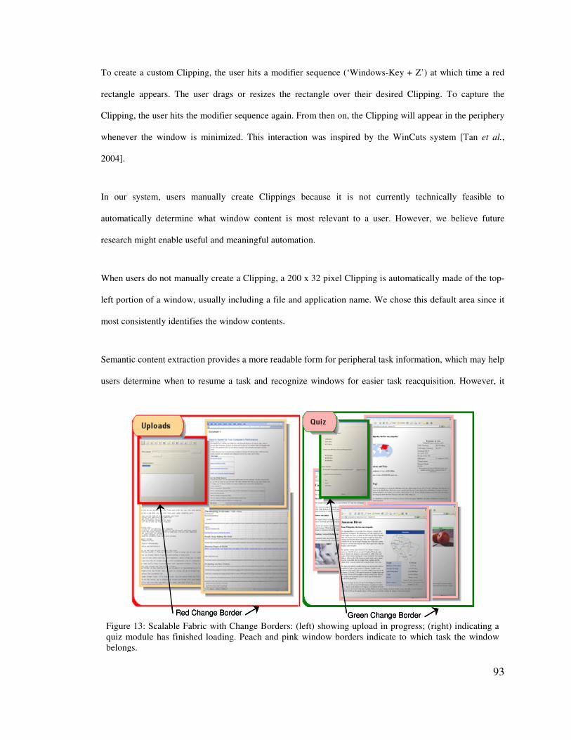
93
Red Change Border Green Change BorderRed Change Border Green Change Border Figure 13: Scalable Fabric with Change Borders: (left) showing upload in progress; (right) indicating a quiz module has finished loading. Peach and pink window borders indicate to which task the window belongs.
To create a custom Clipping, the user hits a modifier sequence (‘Windows-Key + Z’) at which time a red
rectangle appears. The user drags or resizes the rectangle over their desired Clipping. To capture the
Clipping, the user hits the modifier sequence again. From then on, the Clipping will appear in the periphery
whenever the window is minimized. This interaction was inspired by the WinCuts system [Tan et al.,
2004].
In our system, users manually create Clippings because it is not currently technically feasible to
automatically determine what window content is most relevant to a user. However, we believe future
research might enable useful and meaningful automation.
When users do not manually create a Clipping, a 200 x 32 pixel Clipping is automatically made of the top-
left portion of a window, usually including a file and application name. We chose this default area since it
most consistently identifies the window contents.
Semantic content extraction provides a more readable form for peripheral task information, which may help
users determine when to resume a task and recognize windows for easier task reacquisition. However, it
94
may also increase the cognitive overhead of monitoring the periphery by providing too much information.
In our experiment, examine the tradeoff between the higher cognitive cost of interpreting detailed task
information in Clippings and having the most relevant task information visible. In addition, semantic
content extraction removes spatial layout information about a given window, the relative importance of
which we examine in our experiment.
4.2.3 Change Borders
We chose to visually represent changes with Change Borders, colored borders that appear around
peripheral windows or Clippings when the system detects that the window content has changed. The
borders are red while changes are happening (i.e., window pixels have changed recently) and green when
changes are complete (i.e., no window pixels have changed for a certain period of time). We added Change
Borders to both Scalable Fabric and Clipping Lists, as described below.
Scalable Fabric + Change Borders
Our third interface adds change detection to Scalable Fabric using Change Borders. To illustrate, Figure
13a shows a red Change Border around an upload tool, indicating a document upload is in progress. Figure
13b shows a green Change Border around a quiz tool, indicating that a quiz module has finished loading.
Here, Change Borders may help users know when the upload or quiz loading is done and they can resume
either task.
Clipping Lists + Change Borders
Our fourth interface combines change detection and semantic content extraction, using both Change
Borders and Clipping Lists. Figure 12b shows an email has arrived: the Change Border allows the user to
easily glance and see that an email has arrived and the Clipping allows the user to determine if it is
important to read.
In general, knowing when a change has occurred within a particular window can be useful in helping users
know when to resume a pending task. There are many situations in which knowledge of changes would be
95
useful: when waiting for email, documents to upload, files to be checked in to a version control system, a
compiler build to complete, a large file or Web page to finish loading, etc. However, Web pages and other
windows might change because of ads, which may render change detection less useful. Given that only one
bit of information is conveyed (i.e., that a change has occurred), we assert that the cognitive overhead
caused by change detection interfaces is low. In our experiment, we examine whether change detection
provides enough information to also improve multitasking performance, or whether it is considered
annoying or not informative.
-�$� !���������#��
All interfaces were implemented on top of Scalable Fabric [Robertson et al., 2004]. For Change Borders,
we detected changes with a pixel-based image difference of two window images, taken 1 second apart. The
images were sampled (e.g., every 10th pixel), and if any of the sampled pixels changed, the window was
flagged as having a change in progress. This caused a red border to appear around the window. Five
seconds after these changes stopped, the window was flagged as having completed changes, causing the
border to turn green.
Though the image differencing method could potentially be fairly accurate, we wanted to test this with
100% accuracy in our lab experiment. Therefore, we implemented message passing between task windows
and Scalable Fabric. Whenever a change occurred in the experimental tasks, the task window (which we
controlled) sent a message to Scalable Fabric indicating a change was in progress or completed. We used
messages rather than image differencing during the experiment.
For Clipping Lists, we made two changes to the Scalable Fabric baseline: (1) we enabled user selections of
a window region and then rendered only that portion of the window in the periphery; and (2) rather than
allowing user arrangement of peripheral windows, we automatically arranged Clippings to be left justified
and stacked vertically (users could still change the vertical position of a Clipping). This modification was
important because we could not allow windows to overlap, as every part of a selected Clipping is
considered relevant to users.
96
-�-� ��������������
We conducted a user experiment comparing our four interfaces, Scalable Fabric, Clipping Lists, Scalable
Fabric with Change Borders, and Clipping Lists with Change Borders, in a simulated multitasking
situation. The experimental tasks simulated real office knowledge work (e.g., monitoring email, uploading
files, filling out web forms, and arranging images to make a nice graphic layout). We hypothesized that
Clipping Lists would be more useful than Scalable Fabric in multitasking work because the interface
extracted the semantic information that would allow users to stay in their current task flow longer, while
also knowing the optimal time to switch to a high priority task. We also hypothesized that change detection,
as we designed it, would be a light-weight, glanceable method that would further increase multitasking
effectiveness while preserving current task flow.
4.4.1 Participants
We recruited 26 users (10 female) from the greater Seattle area who had moderate to high experience using
computers and were intermediate to expert users of Microsoft Office-style applications, as indicated
through a well validated screening survey used to at Microsoft to select participants. Users ranged in age
from 23 to 53, with an average of 38. They had used a computer for an average of 18 years. Users received
software gratuities for their time.
4.4.2 Equipment
We ran the experiment on a 2.8 GHz Pentium 4 Compaq PC with 2G of RAM and two NEC MultiSync
LCDs 1880SX set at 1024 x 768 display resolution. Users provided input with a Compaq keyboard and
Microsoft Intellisense mouse.
4.4.3 Tasks
To simulate multitasking, users performed three tasks and also read email. Two tasks were higher priority
(Quiz and Upload) and involved waiting for updates. We instructed users to work on the third, lower
priority task (a Puzzle) while waiting for high priority updates, to monitor the Quiz and Upload tasks in the
97
periphery, and to return to them as soon as updates were complete. Email provided necessary documents
and information for priority tasks, and distracter email, in order to mimic the real world and test how well
our interfaces enabled users to ignore irrelevant information.
We told users to complete all three tasks as quickly as possible and that they were being timed. Study
timing software was run on the top of the left monitor. Users stopped timers for each task by clicking on
labeled “task done” buttons.
To attain high external validity, it was important for the tasks to mimic real world tasks, including
multitasking, tasks of varying importance, and interruptions. Also, the tasks needed to be engaging enough
that users would not mind repeating slight variations of them for each interface. After the experiment, users
told us in follow-up interviews that we had successfully captured the sorts of task and email juggling they
do in a typical work day. Though a lab experiment necessarily reduces realism by simplifying work
contexts, our study succeeded in drawing out important issues that peripheral display designers can use.
Next, we describe the details of each task.
Quiz
The Quiz task was labeled a high priority task, and it involved waiting for updates. The task was composed
of 5 windows: a Quiz Tool and 4 Web pages containing graphics (all of which were open and pre-
arranged).
Users used our Quiz Tool to answer Web-based, Wikipedia-derived questions, as might be indicative of a
typical research project. Answers were not known by any of our participants (e.g., what is the length of the
Amazon River). A quiz included 4 modules, each with a different topic (e.g., Cats, Asia, Apples, and the
Amazon River). Each module had 2 questions about its topic. We provided the answers in the Web page
titled with the topic name. Within the Web page, answers were bolded and easy to find so that locating
them was neither cognitively nor mechanically challenging.
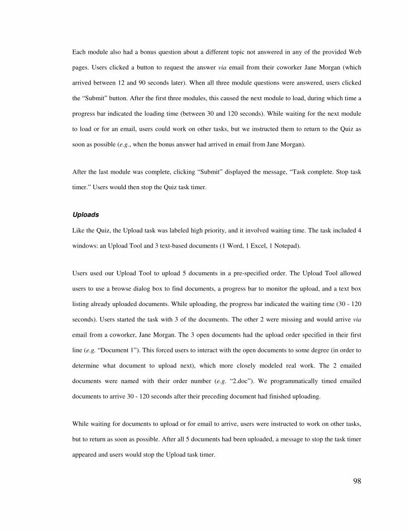
98
Each module also had a bonus question about a different topic not answered in any of the provided Web
pages. Users clicked a button to request the answer via email from their coworker Jane Morgan (which
arrived between 12 and 90 seconds later). When all three module questions were answered, users clicked
the “Submit” button. After the first three modules, this caused the next module to load, during which time a
progress bar indicated the loading time (between 30 and 120 seconds). While waiting for the next module
to load or for an email, users could work on other tasks, but we instructed them to return to the Quiz as
soon as possible (e.g., when the bonus answer had arrived in email from Jane Morgan).
After the last module was complete, clicking “Submit” displayed the message, “Task complete. Stop task
timer.” Users would then stop the Quiz task timer.
Uploads
Like the Quiz, the Upload task was labeled high priority, and it involved waiting time. The task included 4
windows: an Upload Tool and 3 text-based documents (1 Word, 1 Excel, 1 Notepad).
Users used our Upload Tool to upload 5 documents in a pre-specified order. The Upload Tool allowed
users to use a browse dialog box to find documents, a progress bar to monitor the upload, and a text box
listing already uploaded documents. While uploading, the progress bar indicated the waiting time (30 - 120
seconds). Users started the task with 3 of the documents. The other 2 were missing and would arrive via
email from a coworker, Jane Morgan. The 3 open documents had the upload order specified in their first
line (e.g. “Document 1”). This forced users to interact with the open documents to some degree (in order to
determine what document to upload next), which more closely modeled real work. The 2 emailed
documents were named with their order number (e.g. “2.doc”). We programmatically timed emailed
documents to arrive 30 - 120 seconds after their preceding document had finished uploading.
While waiting for documents to upload or for email to arrive, users were instructed to work on other tasks,
but to return as soon as possible. After all 5 documents had been uploaded, a message to stop the task timer
appeared and users would stop the Upload task timer.
99
Puzzle
Users were instructed to only work on the Puzzle task when they were waiting for both Quiz and Upload.
Though we recorded the Puzzle task time, we stopped 8 users before they completed the puzzles in order to
conclude the session in a reasonable amount of time and always made it clear to users that the Quiz and
Upload tasks were higher priority.
This task included 4 windows: 2 with images and 2 with square pieces from the 2 images mixed together.
Users first dragged pieces for each picture into one document. Then they rearranged the pieces to resemble
the 2 model images.
The Puzzle task turned out to be extremely engaging, (as witnessed by users’ focus on this task and by their
comments after finishing it) probably because the pictures were designed to be challenging to reassemble.
This was important since an engaging task would be more realistic and enable us to see bigger differences
between users’ ability to monitor the periphery with different peripheral interfaces.
In addition to receiving task-relevant email (quiz answers and documents to upload, both from Jane
Morgan), users received distracter email from different people on a variety of topics (again, in an effort to
mimic the real world). Distracters were sent programmatically, at random rates between 20 and 90 seconds
apart. Users received an average of 12 distracter emails per interface. They differentiated task-relevant
email by the sender: Jane Morgan was the only person who sent email of importance. The presence of
distracters enabled us to see if any interfaces performed poorly with the presence of uninteresting updates.
4.4.4 Interface Setup
The user interfaces being studied were presented on both the left side of the left monitor and the right side
of the right monitor. Tasks were preset to include the correct windows and arranged in the periphery to
allow maximal visibility of all windows. Window height and width were scaled to 25% of their original
size (the default for Scalable Fabric). To maintain consistency across users, we disabled several Scalable
100
Fabric functions during the experiment: clicking on a task name to restore or minimize all task windows,
dragging windows into the periphery, moving windows in the periphery, and moving tasks in the periphery.
For Clipping Lists interfaces, we pre-selected Clippings. Since we designed the tasks and knew exactly
how the tasks would be optimally completed, we were able to select the most useful Clippings. We believe
that context awareness and document processing techniques could be combined to aid the user in at least
semi-automating this task.
4.4.5 Measures
Dependent variables collected during the course of the experiment included task time, task resumption
time, the number of task switches, the number of window switches within each task, user satisfaction
ratings, and overall interface preference. Other than satisfaction ratings and preferences, all other measures
were automatically collected via logging tools installed on the user’s machine.
4.4.6 Design
The experimental design was a 2 (Semantic Content Extraction: Scalable Fabric v. Clipping Lists) x 2
(Change Detection: No Change Borders v. Change Borders) x 2 tasks, within subjects design. We
counterbalanced the presentation order of all conditions and task sets across users (four isomorphic task
sets were rotated through the conditions so that users were not performing the same task in each user
interface).
4.4.7 Procedure
Users were run in pairs with an experimenter present in the room. After greeting the users, the experimenter
presented the overall study procedure and then walked the users through a set of practice tasks using their
first interface (counter-balanced across users). Once users completed the practice tasks (approximately 30
minutes), they began the study proper. Users completed the Quiz, Upload, and Puzzle tasks using a single
interface and then completed a satisfaction questionnaire about it before moving on to the next interface. In
between each interface, we explained how to use the next interface.
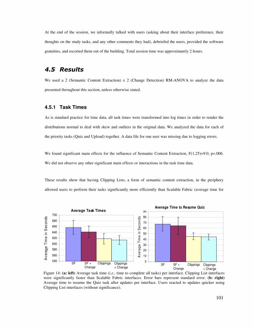
101
Average Task TimesAverage Task Times
540
560
580
600
620
640
660
680
700
Ave
rage
Tim
e in
Sec
onds
SF Clippings + Change
ClippingsSF + Change
540
560
580
600
620
640
660
680
700
Ave
rage
Tim
e in
Sec
onds
SF Clippings + Change
ClippingsSF + Change
Average Task TimesAverage Task Times
540
560
580
600
620
640
660
680
700
Ave
rage
Tim
e in
Sec
onds
SF Clippings + Change
ClippingsSF + Change
540
560
580
600
620
640
660
680
700
Ave
rage
Tim
e in
Sec
onds
SF Clippings + Change
ClippingsSF + Change
Average Time to Resume Quiz
90
Average Time to Resume Quiz
90
0
10
20
30
40
50
60
70
80
90
Ave
rage
Tim
e in
Sec
onds
SF Clippings + Change
ClippingsSF + Change
0
10
20
30
40
50
60
70
80
90
Ave
rage
Tim
e in
Sec
onds
SF Clippings + Change
ClippingsSF + Change
Average Time to Resume Quiz
90
Average Time to Resume Quiz
90
0
10
20
30
40
50
60
70
80
90
Ave
rage
Tim
e in
Sec
onds
SF Clippings + Change
ClippingsSF + Change
0
10
20
30
40
50
60
70
80
90
Ave
rage
Tim
e in
Sec
onds
SF Clippings + Change
ClippingsSF + Change
Figure 14: (a: left) Average task time (i.e., time to complete all tasks) per interface. Clipping List interfaces were significantly faster than Scalable Fabric interfaces. Error bars represent standard error. (b: right)Average time to resume the Quiz task after updates per interface. Users reacted to updates quicker using Clipping List interfaces (without significance).
At the end of the session, we informally talked with users (asking about their interface preference, their
thoughts on the study tasks, and any other comments they had), debriefed the users, provided the software
gratuities, and escorted them out of the building. Total session time was approximately 2 hours.
-�.� (����
We used a 2 (Semantic Content Extraction) x 2 (Change Detection) RM-ANOVA to analyze the data
presented throughout this section, unless otherwise stated.
4.5.1 Task Times
As is standard practice for time data, all task times were transformed into log times in order to render the
distributions normal to deal with skew and outliers in the original data. We analyzed the data for each of
the priority tasks (Quiz and Upload) together. A data file for one user was missing due to logging errors.
We found significant main effects for the influence of Semantic Content Extraction, F(1,25)=9.0, p=.006.
We did not observe any other significant main effects or interactions in the task time data.
These results show that having Clipping Lists, a form of semantic content extraction, in the periphery
allowed users to perform their tasks significantly more efficiently than Scalable Fabric (average time for

102
Scalable Fabric = 649.7 seconds v. Clipping Lists = 615.6 seconds). Also, it shows that our implementation
of change detection did not significantly improve users’ efficiency. These results are shown in Figure 14a.
4.5.2 Time to Resume
Again, we transformed the time to resume data to log times for analysis. We collected this data by
measuring the time from which the user completed an update on the quiz or upload tools and when the user
responded to the update by clicking on the tool.
We observed no significant main effects or interactions at the p=.05 level in this data. However, Figure 14b
shows a trend toward a significant effect for the Quiz task only, F(1,24)=2.7, p=.115: interfaces with
Clipping Lists improved resumption times, on average (Scalable Fabric = 66.0 seconds v. Clipping Lists =
45.0 seconds).
4.5.3 Task Switches
We counted a task switch as a user starting on a window in one task (e.g., Upload) and then clicking on a
window in a second task (e.g., Quiz). Data from three subjects were missing due to logging errors.
We observed a significant main effect of Semantic Content Extraction, F(1,23)=13.0, p=.002, indicating
that Clipping Lists reduced the number of task switches, enabling users to better maintain their task flow.
These results are shown in Figure 15. We did not observe any other significant main effects or interactions
in the task switch data.
103
Average Task SwitchesAverage Task Switches
40
42
44
46
48
50
52
54
56
Ave
rage
# o
f Sw
itche
s
SF Clippings + Change
ClippingsSF + Change
40
42
44
46
48
50
52
54
56
Ave
rage
# o
f Sw
itche
s
SF Clippings + Change
ClippingsSF + Change
Average Task SwitchesAverage Task Switches
40
42
44
46
48
50
52
54
56
Ave
rage
# o
f Sw
itche
s
SF Clippings + Change
ClippingsSF + Change
40
42
44
46
48
50
52
54
56
Ave
rage
# o
f Sw
itche
s
SF Clippings + Change
ClippingsSF + Change
Figure 15: Average number of task switches per interface. Clipping List interfaces significantly reduced task switches; Change Borders increased them for Scalable Fabric.
We also examined task switches caused by distracter email, which indicate inopportune switches to the
email task. To do this, we analyzed the proportion of switches to email that occurred after distracters
arrived, over the total number of distracters received. Logging of switches due to distracters was affected
by an error, so we lost small amounts of data from 11 users. Therefore, we chose not to include these users
in this analysis. We report these findings anyway because the results are intriguing, but caution should be
taken until they are replicated.
We found a significant main effect of Semantic Content Extraction, F(1,15)=42.9, p<.001, as well as
Change Detection, F(1,15)=6.3, p=.024. This means that when Clipping Lists were present, users were
significantly less likely to switch away from their current task due to spam email. When Change Borders
were present, users were significantly more likely to switch away from their current task due to spam email.
This negative effect of Change Borders was particularly strong with Scalable Fabric.
4.5.4 Window Switches
We analyzed the number of window switches for each priority task (Quiz and Upload) separately. Window
switches were counted as the number of switches to a different window within a single task (Quiz or
Upload). Data from three subjects were missing due to logging errors.
104
We found significant main effects for the influence of Semantic Content Extraction for both tasks, Quiz
F(1,23)=4.6, p=.042, and Upload F(1,23)=51.9, p<.001. These results show that Clipping Lists significantly
reduced the number of window switches within both priority tasks, which may improve task flow. These
results are shown in Figure 16.
4.5.5 Satisfaction
We ran a 2 (Semantic Content Extraction) x 2 (Change Detection) x 13 (Questionnaire Item) RM-ANOVA
on the satisfaction questionnaire ratings. We chose to not include surveys from two users who did not
complete all questions.
We found significant main effects for Semantic Content Extraction, F(1,24)=11.3, p=.003, Change
Detection, F(1,24)=9.5, p=.005, and Questionnaire Item, F(14,336)=34.6, p<.001. User interfaces with
Clipping Lists were rated significantly better than interfaces without. In addition, interfaces with Change
Borders were rated significantly better that interfaces without. All of the average satisfaction ratings for the
user interfaces in the experiment are shown in Figure 17.
When asked to choose their preferred interface, 17 out of 25 users who responded chose Clipping Lists
with Change Borders (significant by chi square test), 4 chose Scalable Fabric with Change Borders, 2 chose
Clipping Lists, and 2 chose the baseline Scalable Fabric.
Average Quiz Window SwitchesAverage Quiz Window Switches
16.517
17.518
18.5
19
19.520
20.521
Ave
rage
# o
f S
witc
hes
SF Clippings + Change
ClippingsSF + Change
16.517
17.518
18.5
19
19.520
20.521
Ave
rage
# o
f S
witc
hes
SF Clippings + Change
ClippingsSF + Change
Average Quiz Window SwitchesAverage Quiz Window Switches
16.517
17.518
18.5
19
19.520
20.521
Ave
rage
# o
f S
witc
hes
SF Clippings + Change
ClippingsSF + Change
16.517
17.518
18.5
19
19.520
20.521
Ave
rage
# o
f S
witc
hes
SF Clippings + Change
ClippingsSF + Change
Average Upload Window SwitchesAverage Upload Window Switches
02468
101214161820
Ave
rage
# o
f Sw
itche
s
SF Clippings + Change
ClippingsSF + Change
02468
101214161820
Ave
rage
# o
f Sw
itche
s
SF Clippings + Change
ClippingsSF + Change
Average Upload Window SwitchesAverage Upload Window Switches
02468
101214161820
Ave
rage
# o
f Sw
itche
s
SF Clippings + Change
ClippingsSF + Change
02468
101214161820
Ave
rage
# o
f Sw
itche
s
SF Clippings + Change
ClippingsSF + Change
Figure 16: Average number of window switches per interface for the (left) Quiz and (right) Upload tasks. Clipping List interfaces significantly reduced window switches.
105
4.5.6 User Comments
User comments supported and explained our quantitative results. They explained why the scaling used in
Scalable Fabric needed improvement. In particular, they needed more obvious visual cues that tasks had
updated (such as Change Borders) and clearer identifying information visible for windows in order to
recognize them. One user said, “It was impossible to know when something was ready to use and I had to
open all the windows for a particular project, to tell which window contained the item I needed. It just
didn’t feel efficient.” Users also needed more context about a task in order to switch to the correct task:
“[For] text based documents… it is better to be able to just read a little bit of the text, because that gives
enough context information to be able to switch to the proper task.”
Users explained why Change Borders were useful, “…the border made monitoring the two main tasks
pretty easy and didn't require a lot of mental action.” They also explained why Change Borders caused
problems for email, “…the majority of emails are irrelevant to the tasks being performed here, and
therefore will have a negative effect if [I] check email every time the color changes.” Users thought
frequent emails were realistic: “In my real-life job… [I] can expect to receive an email every few minutes.”
User feedback favored the Clipping List interfaces. They thought Clippings made it easier to distinguish
documents, determine to which task or window to switch, and improved monitoring ability by exposing
updating content (which they especially liked for email). One user said, “This display allowed me to see all
of the data that I needed at a glance.”
106
SF SF + Change Clippings Clippings + ChangeSF SF + Change Clippings Clippings + Change
0 1 2 3 4 5
Ease of use
Learnability
Performance
Satisfaction
Intention to use
Peripheral awareness
Task reacquisition
Question Subject(Higher is better)
Visible content
Preference over Windows
Understanding in a glance
0 1 2 3 4 5
Ease of use
Learnability
Performance
Satisfaction
Intention to use
Peripheral awareness
Task reacquisition
Question Subject(Higher is better)
Visible content
Preference over Windows
Understanding in a glance
0 1 2 3 4 5(Lower is better)
Task switching mental demand
Physical demand
Monitoring mental demand
Frustration level
Interruption
0 1 2 3 4 5(Lower is better)
Task switching mental demand
Physical demand
Monitoring mental demand
Frustration level
Interruption
0 1 2 3 4 5 6 70 1 2 3 4 5 6 7
0 1 2 3 4 5 6 7
Task switching
Monitoring mental
0 1 2 3 4 5 6 7
Task switching
Monitoring mental
0 1 2 3 4 5 6 70 1 2 3 4 5 6 7
0 1 2 3 4 5 6 7
Task switching
Monitoring mental
0 1 2 3 4 5 6 7
Task switching
Monitoring mental
SF SF + Change Clippings Clippings + ChangeSF SF + Change Clippings Clippings + Change
0 1 2 3 4 5
Ease of use
Learnability
Performance
Satisfaction
Intention to use
Peripheral awareness
Task reacquisition
Question Subject(Higher is better)
Visible content
Preference over Windows
Understanding in a glance
0 1 2 3 4 5
Ease of use
Learnability
Performance
Satisfaction
Intention to use
Peripheral awareness
Task reacquisition
Question Subject(Higher is better)
Visible content
Preference over Windows
Understanding in a glance
0 1 2 3 4 5(Lower is better)
Task switching mental demand
Physical demand
Monitoring mental demand
Frustration level
Interruption
0 1 2 3 4 5(Lower is better)
Task switching mental demand
Physical demand
Monitoring mental demand
Frustration level
Interruption
0 1 2 3 4 5
Ease of use
Learnability
Performance
Satisfaction
Intention to use
Peripheral awareness
Task reacquisition
Question Subject(Higher is better)
Visible content
Preference over Windows
Understanding in a glance
0 1 2 3 4 5
Ease of use
Learnability
Performance
Satisfaction
Intention to use
Peripheral awareness
Task reacquisition
Question Subject(Higher is better)
Visible content
Preference over Windows
Understanding in a glance
0 1 2 3 4 5(Lower is better)
Task switching mental demand
Physical demand
Monitoring mental demand
Frustration level
Interruption
0 1 2 3 4 5(Lower is better)
Task switching mental demand
Physical demand
Monitoring mental demand
Frustration level
Interruption
0 1 2 3 4 5 6 70 1 2 3 4 5 6 7
0 1 2 3 4 5 6 7
Task switching
Monitoring mental
0 1 2 3 4 5 6 7
Task switching
Monitoring mental
0 1 2 3 4 5 6 70 1 2 3 4 5 6 7
0 1 2 3 4 5 6 7
Task switching
Monitoring mental
0 1 2 3 4 5 6 7
Task switching
Monitoring mental
Figure 17: Survey result averages (Likert scale 1-7). UIs with Clipping Lists performed significantly better than those without, as did interfaces with Change Borders.
Additionally, users pointed out a few improvements that could be made. One suggested that the area under
the mouse on shrunken windows enlarge as if the mouse were “a magnifying glass.” One user wanted
“something more obvious than the green border, to show a task complete.” Another user wanted the
Clippings to be interactive: “the email [Clipping] is… difficult to follow. I would rather be able to scroll the
peripheral display to a particular message and click on that to open the desired email.” A few users thought
the aesthetics of the Clipping Lists could be improved with “more uniformity in the... text type,” and by
making all the Clippings the same width.
-�0� �����#��
Our results enable us to examine the effects of our implementations of scaling, change detection, and
107
semantic content extraction on task flow, task resumption timing, and reacquisition.
4.6.1 Maintaining Task Flow
Users switched tasks significantly less often with Clipping Lists interfaces, which used semantic content
extraction, indicating that it improved task flow. We informally observed that users glanced more quickly
at Clipping Lists and returned to their focal task, implying less detriment to task flow. We feel adding
Clipping List-style interfaces to peripheral displays could significantly enhance information workers’
ability to remain in task flow, while efficiently responding to important task updates
4.6.2 Knowing When to Resume a Task
Our results showed that the Clipping Lists interfaces, using semantic content extraction, were most
effective at making users aware of when to resume a pending task. First, task times were significantly faster
for Clipping Lists, indicating more efficient multitasking. Though not significant, resumption times for
Clipping Lists were faster, suggesting that users might have known when to return to tasks—a trend that
deserves further attention. Finally, task switches were significantly fewer, implying that users did not have
to manually check if peripheral tasks were ready.
Change Borders (a version of change detection), when used without Clipping Lists, had a negative effect on
users’ ability to resume email at appropriate times. From user feedback, it is clear that the one bit of
information was not enough; users needed more information to determine if an email was important.
Having relevant task information drawn out in Clipping Lists enabled these effects. This suggests that
semantic content extraction is important for giving users enough information to know when to resume a
task.
4.6.3 Task Reacquisition and Recognition
Clipping Lists (semantic content extraction) were also most effective at enabling users to easily get back
into tasks and recognize task-relevant windows. Qualitatively, users told us that Clippings made it easier to
108
distinguish between windows. Quantitatively, window switching results showed that Clipping List
interfaces significantly reduced the number of window switches within both priority tasks. This indicates
that Clipping Lists better enabled users to recognize windows and get back to resumed tasks. We
informally observed that users seemed to spend less time staring at peripheral tasks when switching.
4.6.4 Design Implications
Our results show that Clipping Lists were effective and users told us this was because they provided the
most relevant task information (i.e., they used semantic content extraction). Clipping Lists improved task
times by 29 seconds on average; Clipping Lists with Change Borders improved task times by 44 seconds on
average. These task switching improvements are cumulative, adding up to a sizeable impact on daily
multitasking productivity.
Presumably, the higher detail shown in Clippings required more attention to process, but Clipping Lists
were still more efficient than scaling and Change Borders. Peripheral display designers have focused much
effort on non-text based UIs and abstraction techniques that are low detail or symbolism. The fact that a
detailed portion of a window, as long as it shows relevant information, offers improved task performance is
quite interesting. Though liked by users and very simple to perceive, Change Borders did not provide as
much of a performance benefit. We assert this was because change detection did not provide enough
information to help users recognize windows, reacquire tasks, or to determine if an update was worthy of
interruption. Specifically, more relevant task information is needed.
Though relevant task information is more critical to efficiency than simple to perceive visuals, combining
the two leads to even better performance and satisfaction. Our results support this since Clipping Lists with
Change Borders (i.e., relevant information plus easy to perceive visuals) was far preferred and improved
performance for most metrics.
Unfortunately, at this time, semantic content extraction requires extra effort from users (e.g., to select
relevant task information) or from designers (e.g., to design peripheral elements with pre-selected data).

109
Given that semantic content extraction is more effort for either users or designers, is it worth it? We argue
that the results of this experiment suggest it is. Results showed significant performance benefits as well as
user preference for interfaces using semantic content extraction. Neither scaled windows nor change
detection seemed to provide the right information to improve multitasking performance. Extracting relevant
task information seems a crucial part of designing peripheral displays for multitasking, and clipping small
pieces of window content proved an effective way to semantically extract content.
-�2� +�������
We set out to improve multitasking efficiency, focusing on helping users maintain task flow, know when to
resume tasks, and more easily reacquire tasks. In an empirical study, we compared four peripheral
interfaces using different types of abstraction that provided varying types of task information: scaling
(showing a window’s layout overview), change detection (whether or not a change had occurred), and
semantic content extraction (displaying a small piece of the most relevant window content).
The main contribution of this experiment is a set of results showing that peripheral displays can improve
multitasking efficiency (by significantly benefiting task flow, resumption timing, and reacquisition) and
that semantic content extraction is more effective than both change detection and scaling at doing so. We
assert that this is because showing relevant task information is more important in peripheral displays
supporting efficiency than providing very simple to perceive visuals. However, we also show that
combining relevant task information and glanceable visuals leads to better performance and satisfaction.
These findings provide a better understanding of how to design peripheral displays that aid people who
multitask, so that they focus their cognitive resources on the task at hand, instead of on monitoring and
managing pending tasks.
As we learned in this experiment, the combination of relevant task information and glanceable visuals
leads to better performance and satisfaction. Glanceability refers to how quickly and easy people can
perceive and interpret abstract renditions. In the next experiments, we gather information about what
makes visuals quicker and easier to interpret.
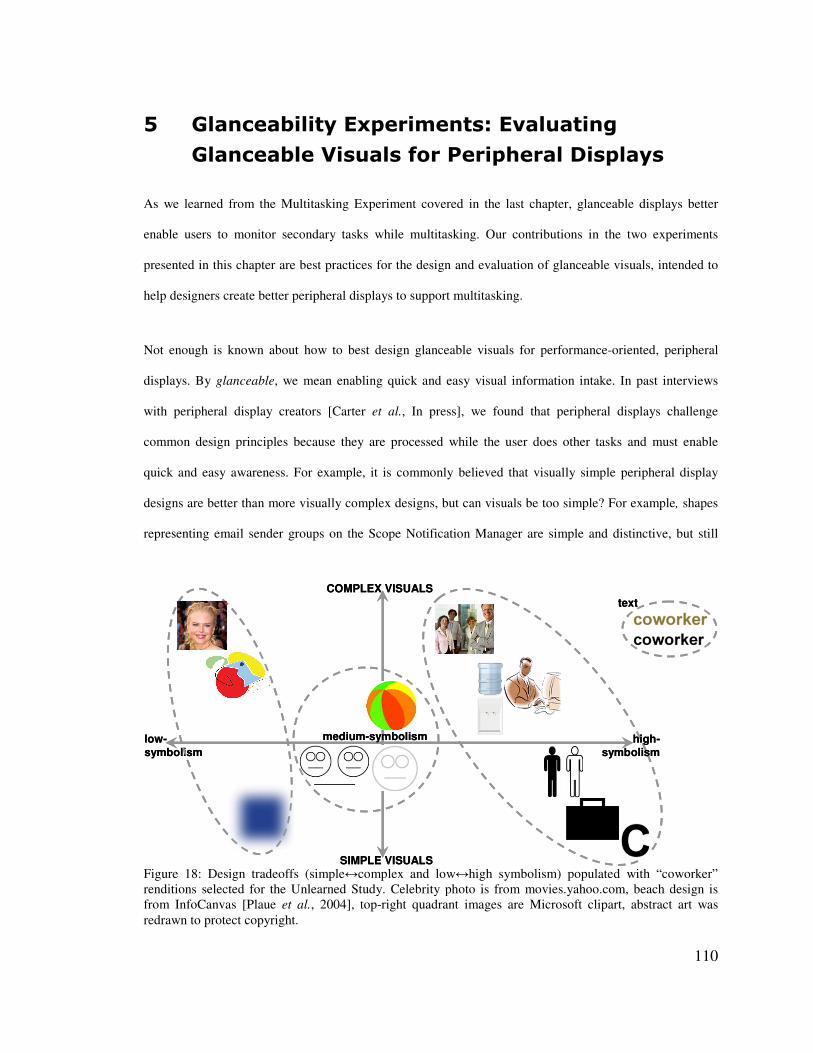
110
COMPLEX VISUALS
SIMPLE VISUALS
medium-symbolismlow-symbolism
high-symbolism
textCOMPLEX VISUALS
SIMPLE VISUALS
medium-symbolismlow-symbolism
high-symbolism
text
Figure 18: Design tradeoffs (simple�complex and low�high symbolism) populated with “coworker” renditions selected for the Unlearned Study. Celebrity photo is from movies.yahoo.com, beach design is from InfoCanvas [Plaue et al., 2004], top-right quadrant images are Microsoft clipart, abstract art was redrawn to protect copyright.
7� ��������������<���������$���� ������
�����������2�� ����������������������������
As we learned from the Multitasking Experiment covered in the last chapter, glanceable displays better
enable users to monitor secondary tasks while multitasking. Our contributions in the two experiments
presented in this chapter are best practices for the design and evaluation of glanceable visuals, intended to
help designers create better peripheral displays to support multitasking.
Not enough is known about how to best design glanceable visuals for performance-oriented, peripheral
displays. By glanceable, we mean enabling quick and easy visual information intake. In past interviews
with peripheral display creators [Carter et al., In press], we found that peripheral displays challenge
common design principles because they are processed while the user does other tasks and must enable
quick and easy awareness. For example, it is commonly believed that visually simple peripheral display
designs are better than more visually complex designs, but can visuals be too simple? For example, shapes
representing email sender groups on the Scope Notification Manager are simple and distinctive, but still
111
require user effort to decode [Van Dantzich et al., 2002]. It is also commonly believed that peripheral
displays should be intuitive and interpretable without training, but when is this not the best design decision?
For example, items in an InfoCanvas beach scene representing various streams of information may be
glanceable despite requiring users to remember many abstract mappings [Plaue et al., 2004].
Our contribution in this chapter is a set of experiments that inform the design of glanceable visuals,
meaning those that enable quick and easy visual information intake. Figure 18 shows some example
renditions of the concept “coworker” that we explored. Our experiments tease apart the impact of two
important factors that affect glanceability: abstraction and the size and design of interrelated sets of
glanceable visuals, or renditions. We define renditions as individual graphic objects or text used to convey
categorical information to a user.
• Abstraction: Complexity and symbolism are two continuous characteristics that affect the level of
abstraction of visual renditions. These characteristics create a design space for abstraction
techniques for peripheral displays (Figure 18). For example, if a rendition is high-symbolism (e.g.,
a picture of people in professional dress standing for “coworker” as in the top-right of Figure 18),
then a simple rendition (e.g., a drawing) is more abstract and a complex rendition (e.g., a photo) is
less abstract. In other words, complexity is the amount of visual detail in a rendition. Similarly,
low-symbolism renditions (e.g., the colored square, left side of Figure 18) are more abstract than
high-symbolism renditions (e.g., the ‘c’, right side of Figure 18). In other words, symbolism is a
rendition’s ability to convey a particular common meaning to an individual [Bertin, 1983]. A low-
symbolism rendition has an arbitrary association with the thing signified, such that the user is not
likely to guess its meaning. High-symbolism renditions, on the other hand, are meaningful and
interpretable, with either a natural or well-learned association with the thing signified.
• Set size and design: Another important issue in the design of glanceable displays is how
renditions function as a set and still remain individually recognizable, and how this changes with
set size. For example, variations on a simple, low-symbolism visual like a colored square might
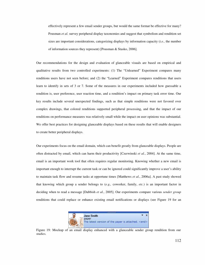
112
Figure 19: Mockup of an email display enhanced with a glanceable sender group rendition from our studies.
effectively represent a few email sender groups, but would the same format be effective for many?
Pousman et al. survey peripheral display taxonomies and suggest that symbolism and rendition set
sizes are important considerations, categorizing displays by information capacity (i.e., the number
of information sources they represent) [Pousman & Stasko, 2006].
Our recommendations for the design and evaluation of glanceable visuals are based on empirical and
qualitative results from two controlled experiments: (1) The “Unlearned” Experiment compares many
renditions users have not seen before; and (2) the “Learned” Experiment compares renditions that users
learn to identify in sets of 3 or 7. Some of the measures in our experiments included how guessable a
rendition is, user preference, user reaction time, and a rendition’s impact on primary task error time. Our
key results include several unexpected findings, such as that simple renditions were not favored over
complex drawings, that colored renditions supported peripheral processing, and that the impact of our
renditions on performance measures was relatively small while the impact on user opinions was substantial.
We offer best practices for designing glanceable displays based on these results that will enable designers
to create better peripheral displays.
Our experiments focus on the email domain, which can benefit greatly from glanceable displays. People are
often distracted by email, which can harm their productivity [Czerwinski et al., 2004]. At the same time,
email is an important work tool that often requires regular monitoring. Knowing whether a new email is
important enough to interrupt the current task or can be ignored could significantly improve a user’s ability
to maintain task flow and resume tasks at opportune times [Matthews et al., 2006a]. A past study showed
that knowing which group a sender belongs to (e.g., coworker, family, etc.) is an important factor in
deciding when to read a message [Dabbish et al., 2005]. Our experiments compare various sender group
renditions that could replace or enhance existing email notifications or displays (see Figure 19 for an
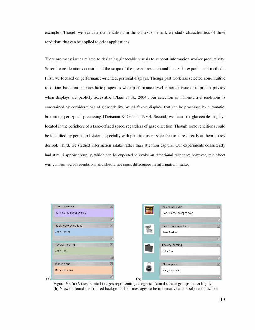
113
(a) (b) Figure 20: (a) Viewers rated images representing categories (email sender groups, here) highly. (b) Viewers found the colored backgrounds of messages to be informative and easily recognizable.
example). Though we evaluate our renditions in the context of email, we study characteristics of these
renditions that can be applied to other applications.
There are many issues related to designing glanceable visuals to support information worker productivity.
Several considerations constrained the scope of the present research and hence the experimental methods.
First, we focused on performance-oriented, personal displays. Though past work has selected non-intuitive
renditions based on their aesthetic properties when performance level is not an issue or to protect privacy
when displays are publicly accessible [Plaue et al., 2004], our selection of non-intuitive renditions is
constrained by considerations of glanceability, which favors displays that can be processed by automatic,
bottom-up perceptual processing [Treisman & Gelade, 1980]. Second, we focus on glanceable displays
located in the periphery of a task-defined space, regardless of gaze direction. Though some renditions could
be identified by peripheral vision, especially with practice, users were free to gaze directly at them if they
desired. Third, we studied information intake rather than attention capture. Our experiments consistently
had stimuli appear abruptly, which can be expected to evoke an attentional response; however, this effect
was constant across conditions and should not mask differences in information intake.
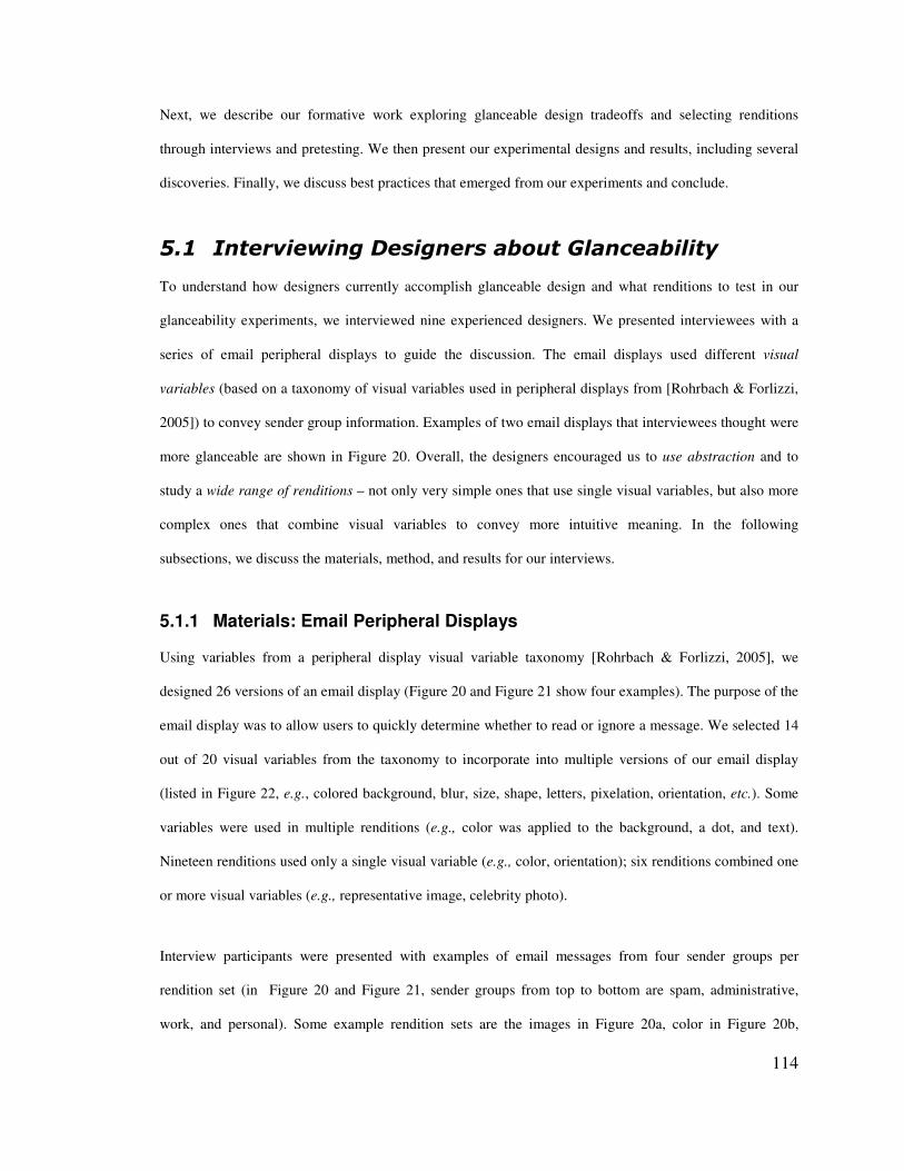
114
Next, we describe our formative work exploring glanceable design tradeoffs and selecting renditions
through interviews and pretesting. We then present our experimental designs and results, including several
discoveries. Finally, we discuss best practices that emerged from our experiments and conclude.
.��� !������&�� ���� �����*#��)������*�����
To understand how designers currently accomplish glanceable design and what renditions to test in our
glanceability experiments, we interviewed nine experienced designers. We presented interviewees with a
series of email peripheral displays to guide the discussion. The email displays used different visual
variables (based on a taxonomy of visual variables used in peripheral displays from [Rohrbach & Forlizzi,
2005]) to convey sender group information. Examples of two email displays that interviewees thought were
more glanceable are shown in Figure 20. Overall, the designers encouraged us to use abstraction and to
study a wide range of renditions – not only very simple ones that use single visual variables, but also more
complex ones that combine visual variables to convey more intuitive meaning. In the following
subsections, we discuss the materials, method, and results for our interviews.
5.1.1 Materials: Email Peripheral Displays
Using variables from a peripheral display visual variable taxonomy [Rohrbach & Forlizzi, 2005], we
designed 26 versions of an email display (Figure 20 and Figure 21 show four examples). The purpose of the
email display was to allow users to quickly determine whether to read or ignore a message. We selected 14
out of 20 visual variables from the taxonomy to incorporate into multiple versions of our email display
(listed in Figure 22, e.g., colored background, blur, size, shape, letters, pixelation, orientation, etc.). Some
variables were used in multiple renditions (e.g., color was applied to the background, a dot, and text).
Nineteen renditions used only a single visual variable (e.g., color, orientation); six renditions combined one
or more visual variables (e.g., representative image, celebrity photo).
Interview participants were presented with examples of email messages from four sender groups per
rendition set (in Figure 20 and Figure 21, sender groups from top to bottom are spam, administrative,
work, and personal). Some example rendition sets are the images in Figure 20a, color in Figure 20b,
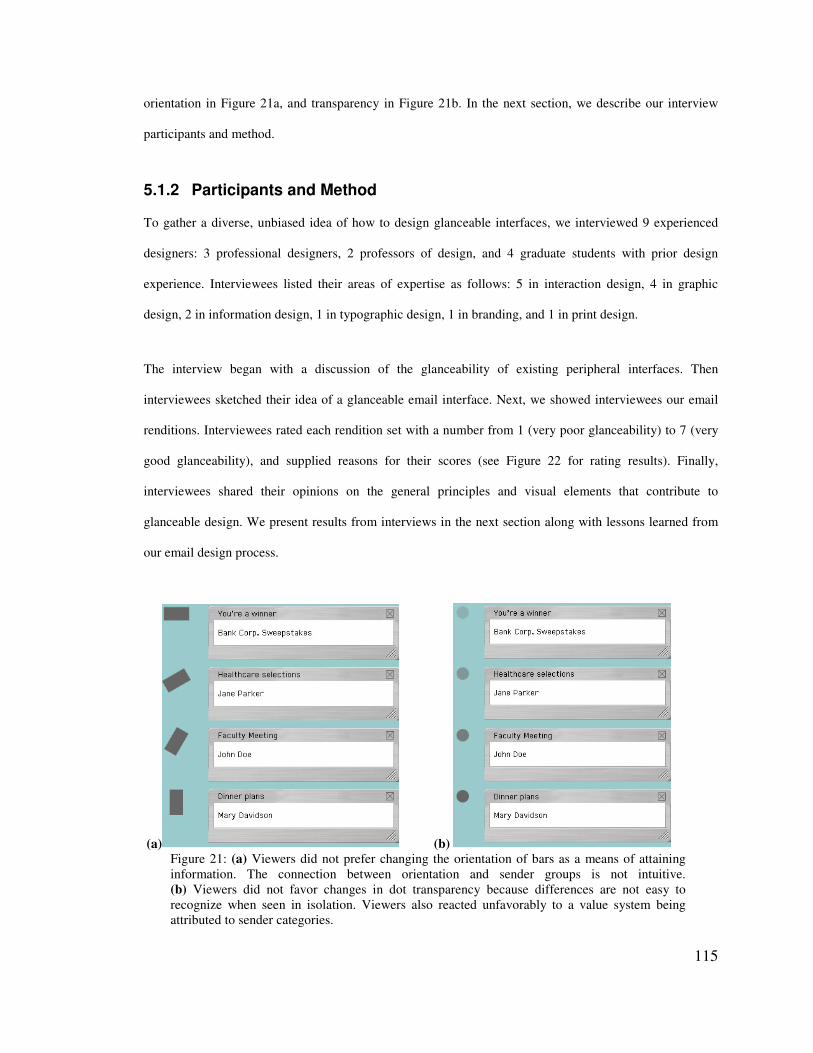
115
(a) (b) Figure 21: (a) Viewers did not prefer changing the orientation of bars as a means of attaining information. The connection between orientation and sender groups is not intuitive. (b) Viewers did not favor changes in dot transparency because differences are not easy to recognize when seen in isolation. Viewers also reacted unfavorably to a value system being attributed to sender categories.
orientation in Figure 21a, and transparency in Figure 21b. In the next section, we describe our interview
participants and method.
5.1.2 Participants and Method
To gather a diverse, unbiased idea of how to design glanceable interfaces, we interviewed 9 experienced
designers: 3 professional designers, 2 professors of design, and 4 graduate students with prior design
experience. Interviewees listed their areas of expertise as follows: 5 in interaction design, 4 in graphic
design, 2 in information design, 1 in typographic design, 1 in branding, and 1 in print design.
The interview began with a discussion of the glanceability of existing peripheral interfaces. Then
interviewees sketched their idea of a glanceable email interface. Next, we showed interviewees our email
renditions. Interviewees rated each rendition set with a number from 1 (very poor glanceability) to 7 (very
good glanceability), and supplied reasons for their scores (see Figure 22 for rating results). Finally,
interviewees shared their opinions on the general principles and visual elements that contribute to
glanceable design. We present results from interviews in the next section along with lessons learned from
our email design process.
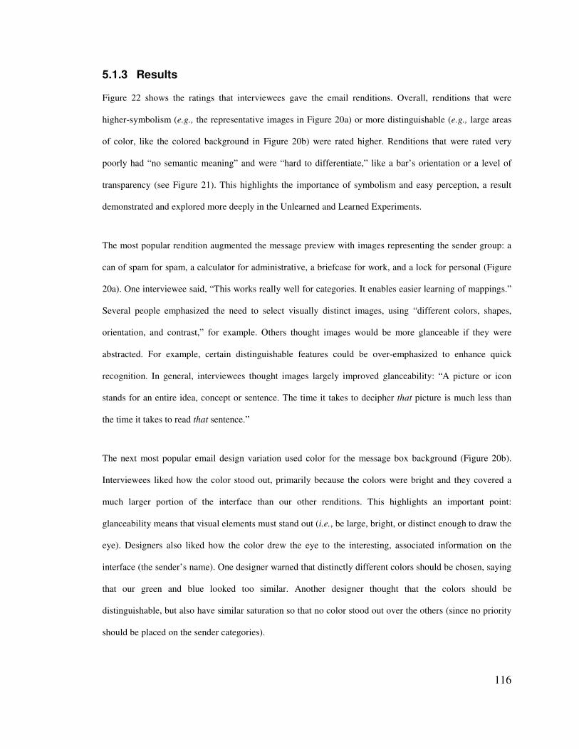
116
5.1.3 Results
Figure 22 shows the ratings that interviewees gave the email renditions. Overall, renditions that were
higher-symbolism (e.g., the representative images in Figure 20a) or more distinguishable (e.g., large areas
of color, like the colored background in Figure 20b) were rated higher. Renditions that were rated very
poorly had “no semantic meaning” and were “hard to differentiate,” like a bar’s orientation or a level of
transparency (see Figure 21). This highlights the importance of symbolism and easy perception, a result
demonstrated and explored more deeply in the Unlearned and Learned Experiments.
The most popular rendition augmented the message preview with images representing the sender group: a
can of spam for spam, a calculator for administrative, a briefcase for work, and a lock for personal (Figure
20a). One interviewee said, “This works really well for categories. It enables easier learning of mappings.”
Several people emphasized the need to select visually distinct images, using “different colors, shapes,
orientation, and contrast,” for example. Others thought images would be more glanceable if they were
abstracted. For example, certain distinguishable features could be over-emphasized to enhance quick
recognition. In general, interviewees thought images largely improved glanceability: “A picture or icon
stands for an entire idea, concept or sentence. The time it takes to decipher that picture is much less than
the time it takes to read that sentence.”
The next most popular email design variation used color for the message box background (Figure 20b).
Interviewees liked how the color stood out, primarily because the colors were bright and they covered a
much larger portion of the interface than our other renditions. This highlights an important point:
glanceability means that visual elements must stand out (i.e., be large, bright, or distinct enough to draw the
eye). Designers also liked how the color drew the eye to the interesting, associated information on the
interface (the sender’s name). One designer warned that distinctly different colors should be chosen, saying
that our green and blue looked too similar. Another designer thought that the colors should be
distinguishable, but also have similar saturation so that no color stood out over the others (since no priority
should be placed on the sender categories).
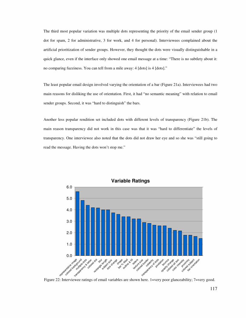
117
Variable Ratings
0.0
1.0
2.0
3.0
4.0
5.0
6.0
repre
senta
tive im
age
color
ed bac
kgro
und
multiple
dots
trans
pare
ncy &
lette
r
color
ed dot
blur
recta
ngle le
ngth
subje
ct siz
e
size c
hange
shap
e
bar %
filled
outlin
e & fil
l
letters
textur
e size
color
ed bord
er
celeb
rity
trans
pare
ncy o
f dots
pixela
tion
boun
ce
opac
ity ch
ange
color
ed all t
ext
color
inten
sity
prox
imity
color
ed su
bject
bar o
rienta
tion
Figure 22: Interviewee ratings of email variables are shown here. 1=very poor glanceability; 7=very good.
The third most popular variation was multiple dots representing the priority of the email sender group (1
dot for spam, 2 for administrative, 3 for work, and 4 for personal). Interviewees complained about the
artificial prioritization of sender groups. However, they thought the dots were visually distinguishable in a
quick glance, even if the interface only showed one email message at a time: “There is no subtlety about it:
no comparing fuzziness. You can tell from a mile away: 4 [dots] is 4 [dots].”
The least popular email design involved varying the orientation of a bar (Figure 21a). Interviewees had two
main reasons for disliking the use of orientation. First, it had “no semantic meaning” with relation to email
sender groups. Second, it was “hard to distinguish” the bars.
Another less popular rendition set included dots with different levels of transparency (Figure 21b). The
main reason transparency did not work in this case was that it was “hard to differentiate” the levels of
transparency. One interviewee also noted that the dots did not draw her eye and so she was “still going to
read the message. Having the dots won’t stop me.”

118
5.1.4 Discussion
In general, participants were skeptical that email renditions based on a single variable (e.g., the orientation
of a single black line or the color of a dot) would be the most effective design choice. Though some single
variables could be valuable in designs (e.g., color added to the background of a message), participants felt
that more complex visuals could also be valuable for conveying information. This motivated us to study a
wide range of renditions in subsequent experiments (a few variables, simple and complex illustrations,
photographs, and text) rather than drawing from a single design variable with a large range of values.
Several themes came out very strongly in interviews. First, interviewees gravitated toward designs that
were meaningful, like images. Using meaningful visuals enables people to quickly learn and interpret an
interface. In other words, the visual matches a person’s expectations of what information it conveys. This is
consistent with icon design literature, which emphasizes the importance of meaningfulness [McDougall et
al., 1999; Rogers, 1986].
Second, interviewees emphasized the importance of representing information abstractly, so that it is simple
and lower in detail. As one designer noted, “There is a threshold of what level of detail is appropriate for a
peripheral display.” Several interviewees emphasized the need for “simple,” “minimalistic,” designs.
Abstraction is a tool for accomplishing simpler designs, since it involves extracting or removing
information from the original source. For example, one interviewee talked about John Lennon’s sketched
self-portrait (Figure 23) that uses only a few lines to show his most recognizable features: long hair, round
glasses, and a long nose. It is abstract, but unmistakably Lennon. This designer emphasized that
abstractions should “over-emphasize recognizable features.” An effective way to use abstraction is to select
only the essential bits of information to convey. All interviewees thought that at least some of our abstract
renditions, such as the representative image (Figure 20a), were effective and glanceable in our email case
study. Past literature supports these opinions, emphasizing the importance of abstraction [Mullet & Sano,
1995] and demonstrating the performance benefits of simpler icons [McDougall et al., 2000].
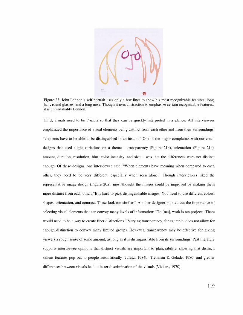
119
Figure 23: John Lennon’s self portrait uses only a few lines to show his most recognizable features: long hair, round glasses, and a long nose. Though it uses abstraction to emphasize certain recognizable features, it is unmistakably Lennon.
Third, visuals need to be distinct so that they can be quickly interpreted in a glance. All interviewees
emphasized the importance of visual elements being distinct from each other and from their surroundings:
“elements have to be able to be distinguished in an instant.” One of the major complaints with our email
designs that used slight variations on a theme – transparency (Figure 21b), orientation (Figure 21a),
amount, duration, resolution, blur, color intensity, and size – was that the differences were not distinct
enough. Of these designs, one interviewee said, “When elements have meaning when compared to each
other, they need to be very different, especially when seen alone.” Though interviewees liked the
representative image design (Figure 20a), most thought the images could be improved by making them
more distinct from each other: “It is hard to pick distinguishable images. You need to use different colors,
shapes, orientation, and contrast. These look too similar.” Another designer pointed out the importance of
selecting visual elements that can convey many levels of information: “To [me], work is ten projects. There
would need to be a way to create finer distinctions.” Varying transparency, for example, does not allow for
enough distinction to convey many limited groups. However, transparency may be effective for giving
viewers a rough sense of some amount, as long as it is distinguishable from its surroundings. Past literature
supports interviewee opinions that distinct visuals are important to glanceability, showing that distinct,
salient features pop out to people automatically [Julesz, 1984b; Treisman & Gelade, 1980] and greater
differences between visuals lead to faster discrimination of the visuals [Vickers, 1970].
120
Fourth, visual elements should be consistent. One designer gave an example: “In a lot of interfaces you’ll
see a magnifying glass that lets you zoom in, and in other interfaces the magnifying glass lets you search. It
can’t mean both in the same context – that’s confusing.” Likewise glanceable displays have to use
consistent visuals in order to avoid confusion. Consistency can enhance mechanisms for conveying
information glanceably. For example, one participant described a set of icons he designed: “Behind each
icon there is a family of icons that represent variations on a particular state. [Each] one will have 4 or 5
sister icons and a [single] variation in that symbology means different things… [Here] I am changing the
color of the bell. That bell means three things: warning, caution, or [alarm].” The consistent visual (the bell
icon) conveyed one meaning across multiple icons, and the single variation (color) conveyed additional
information.
5.1.5 A Note about Information Types
A number of visual variables examined in the interviews were inherently ordered (e.g., small to large sized
elements, elements positioned low to high, numbers, and so on). Many of these variables were rated poorly,
but this may have been affected by the type of information being conveyed. Email sender groups are a
limited set of unordered information. Hence, limited sets of unordered visual variables (like images and
color) were preferred over ordered visual variables (like size and proximity).
More specifically, with ordered visual variables, we explored prioritizing the sender groups from most to
least important as follows: personal, work, administrative, spam. Then we assigned visual elements to the
sender groups, creating a visual hierarchy (e.g., a small rectangle represented spam whereas a large
rectangle signified personal). However, most interviewees thought this hierarchy was artificial because
sender groups aren’t inherently ordered. One participant said, “I could be waiting for a very important
administrative email; this would be confusing.” Another said, “If you use a continuum it should be because
the data really is a continuum.” In practice, one should use design elements that imply order only when
representing ordered information, thus matching viewer expectations.
121
Interviewees found unordered visual variables to be more appropriate for conveying email sender group
information. Unordered information can be separated into two types: limited set (e.g., email sender groups,
book genres, types of recipes, and so on) and large set (e.g., email message contents, news articles, blog
postings, and so on). Abstract or literal design elements that do not imply a particular order can be used for
limited sets: colors of similar hue, icons, photos, shapes, and so on. In the Unlearned and Learned
Experiments, we explore how many mappings can be used with different limited sets of unordered
renditions.
Large, unordered sets contain too many pieces of information to be categorized by a set of memorable or
easily interpretable renditions. Some techniques that could improve the ability to convey large set
information in a glanceable manner, include categorizing a large set into limited sets (e.g., sets of email
senders) and summarizing (e.g., selecting keywords from an email message).
5.1.6 Summary
In this section, we presented interviews of nine experience designers that helped us understand how they
currently accomplish glanceable design and what renditions to test in our glanceability experiments.
Overall, the designers encouraged us to use abstraction and to study a wide range of renditions – not only
very simple ones that use single visual variables, but also more complex ones that combine visual variables
to convey more intuitive meaning. In the next section we describe our rendition selection process for the
Unlearned and Learned Experiments.
.��� +������ �(�����#��
The goal of our rendition selection process was to create rendition sets to be tested in our experiments that
demonstrate major tradeoffs in the design of glanceable displays: complexity, symbolism, and set size (see
Figure 18). We explored two other characteristics of renditions: visual content (people, objects,
situations/ideas, shapes, text) and rendering technique (photographs, complex illustrations, simple
illustrations, text). These characteristics are laid out in Table 6.
122
Visual content is based on a classic semiotics classification of signs [Meggs, 1992]: icon, index, symbol,
and metasymbol. In the list below, the related visual content is listed in parentheses after the sign type.
• Icon (people): resembles the thing it represents (an illustration of a bird is an icon for a bird).
• Index (object): has a factual or causal connection that points toward its object (smoke is an index
for fire).
• Symbol (shapes, text): has an arbitrary relationship between the signifier and the thing signified
(the word “bird” is a symbol for a bird). (Note, this is separate from our definition for symbolism.)
• Metasymbol (situations / ideas, text): is a symbol whose meaning transcends the tangible realm of
simple one-to-one relationships. History, culture, and tradition all play a role in creating
metasymbols (a dove with an olive branch is a metasymbol for peace).
Our categories organize the use of these sign types. Complex + high-symbolism renditions can be an icon,
index or symbol. Low-symbolism renditions can be symbols only, because the other sign types convey
meaning. Simple + high-symbolism renditions can be an index or symbol, but icons are typically too
detailed. Table 7 describes how sign types are used in our categories.
In the experiments, our goal was to understand the effects of our rendition sets’ characteristics (complexity,
symbolism, set size, visual content, and rendering technique) on glanceability. Thus, we explored certain
qualities that would provide insight regarding glanceability: perceptibility, interpretability, memorability,
and aesthetics. We explored each quality by either explicitly measuring it (interpretability in the Unlearned
Experiment; perceptibility and memorability in the Learned Experiment), or by asking users for their
feedback (all qualities in all experiments). All of these qualities will affect the success of glanceable
renditions, but it is not known what role each plays. For example, are celebrity photographs (likely to be
highly memorable) glanceable renditions of sender groups? Are symbolic icons (likely to be highly
123
interpretable) glanceable? Are colored shapes (likely to be easy to perceive) glanceable? Is abstract art
(highly aesthetic) preferred by users and glanceable enough?
5.2.1 Rendition Exploration Procedure
We began our rendition exploration by creating many sets of renditions for the categories in Table 6.
Renditions were next pruned to one set for each combination of simple vs. complex, low vs. high-
symbolism, visual content, and rendering technique that made sense (e.g., text was not varied by visual
content). The result was 32 sets with 5 renditions per set, for a total of 160. We organized these renditions
into charts, such that each chart had a similar theme (e.g. entity = people, rendering technique =
illustrations). See Table 7 for one of our rendition charts (the remaining charts are in Appendix A). Our
initial sets include five sender group renditions: supervisor, coworker, family, friend, and stranger (for sets
tested in the Learned Experiment, we later added two more sender groups: administrator and subordinate).
For each rendition chart, the complex + high-symbolism renditions (left column) serves as the visual
starting point for the chart. Then we worked toward the right, filling in the chart with renditions that
maintain the visual relationship.
I worked with two professors from the Carnegie Mellon School of Design to gather individual renditions to
fill in the rendition charts. Any style or visual content choices made outside the constraints of the rendition
chart were largely subjective. Our choices were motivated by our goal to learn about the qualities of
glanceable renditions (interpretability, perceptibility, memorability, and aesthetics) and informed by the
literature discussed in Chapter 2; for example, people have a harder time distinguishing certain types of
information (e.g., the relative size of a set of squares) than other information (e.g., colors). Table 8 gives
rationale for some of the subjective choices made during the rendition selection process.
At the end of our design exploration we had 32 rendition sets (5 renditions per set, 160 total). See Appendix
A for all of our rendition sets. In the next section, we describe a pre-test of these renditions with users.
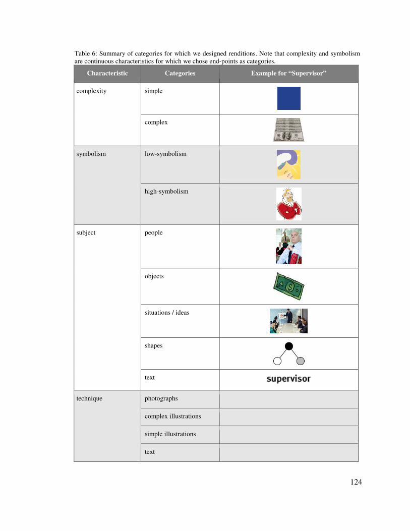
124
Table 6: Summary of categories for which we designed renditions. Note that complexity and symbolism are continuous characteristics for which we chose end-points as categories.
Characteristic Categories Example for “Supervisor”
complexity simple
complex
symbolism low-symbolism
high-symbolism
subject people
objects
situations / ideas
shapes
text
technique photographs
complex illustrations
simple illustrations
text
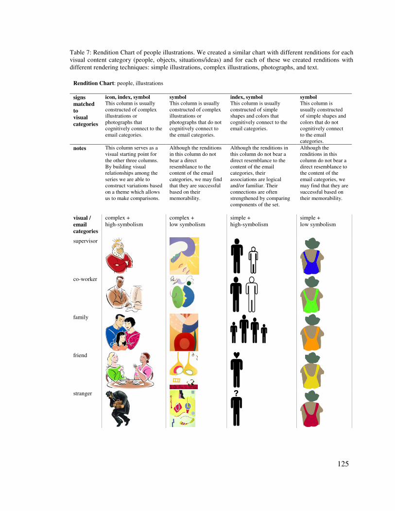
125
Table 7: Rendition Chart of people illustrations. We created a similar chart with different renditions for each visual content category (people, objects, situations/ideas) and for each of these we created renditions with different rendering techniques: simple illustrations, complex illustrations, photographs, and text.
Rendition Chart: people, illustrations
signs matched to visual categories
icon, index, symbol This column is usually constructed of complex illustrations or photographs that cognitively connect to the email categories.
symbol This column is usually constructed of complex illustrations or photographs that do not cognitively connect to the email categories.
index, symbol This column is usually constructed of simple shapes and colors that cognitively connect to the email categories.
symbol This column is usually constructed of simple shapes and colors that do not cognitively connect to the email categories.
notes This column serves as a visual starting point for the other three columns. By building visual relationships among the series we are able to construct variations based on a theme which allows us to make comparisons.
Although the renditions in this column do not bear a direct resemblance to the content of the email categories, we may find that they are successful based on their memorability.
Although the renditions in this column do not bear a direct resemblance to the content of the email categories, their associations are logical and/or familiar. Their connections are often strengthened by comparing components of the set.
Although the renditions in this column do not bear a direct resemblance to the content of the email categories, we may find that they are successful based on their memorability.
visual / email categories
complex + high-symbolism
complex + low symbolism
simple + high-symbolism
simple + low symbolism
supervisor
co-worker
family
friend
stranger
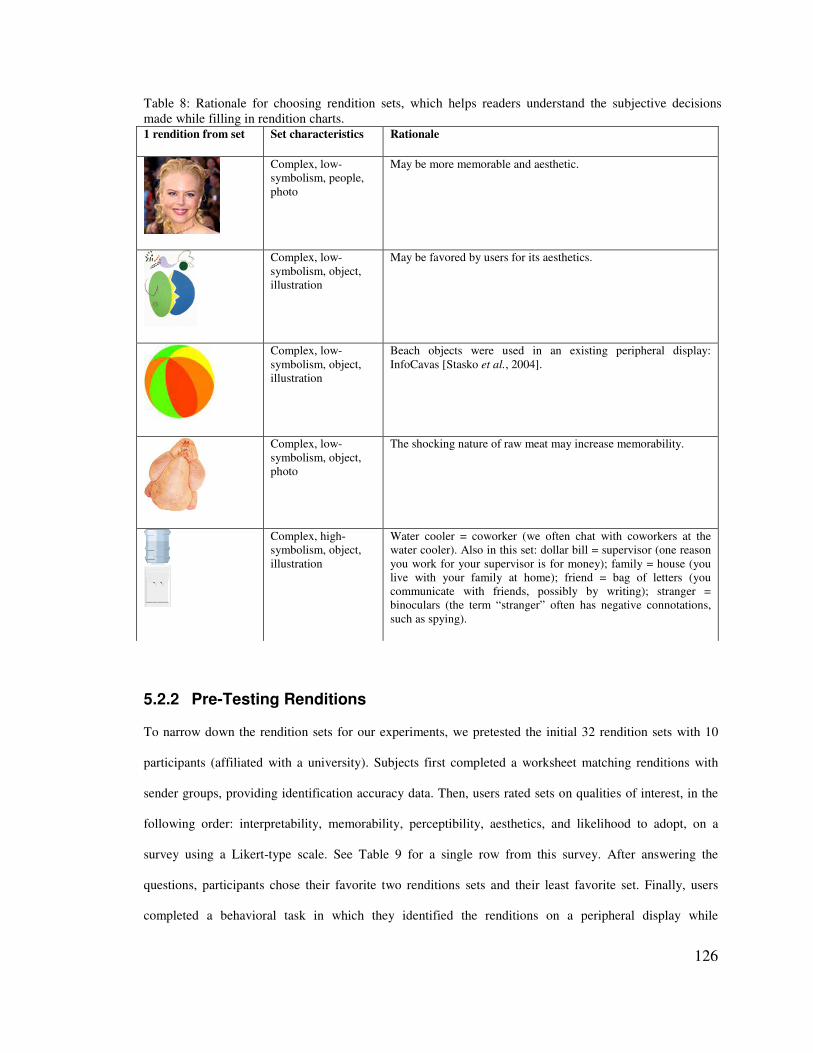
126
5.2.2 Pre-Testing Renditions
To narrow down the rendition sets for our experiments, we pretested the initial 32 rendition sets with 10
participants (affiliated with a university). Subjects first completed a worksheet matching renditions with
sender groups, providing identification accuracy data. Then, users rated sets on qualities of interest, in the
following order: interpretability, memorability, perceptibility, aesthetics, and likelihood to adopt, on a
survey using a Likert-type scale. See Table 9 for a single row from this survey. After answering the
questions, participants chose their favorite two renditions sets and their least favorite set. Finally, users
completed a behavioral task in which they identified the renditions on a peripheral display while
Table 8: Rationale for choosing rendition sets, which helps readers understand the subjective decisions made while filling in rendition charts. 1 rendition from set Set characteristics Rationale
Complex, low-symbolism, people, photo
May be more memorable and aesthetic.
Complex, low-symbolism, object, illustration
May be favored by users for its aesthetics.
Complex, low-symbolism, object, illustration
Beach objects were used in an existing peripheral display: InfoCavas [Stasko et al., 2004].
Complex, low-symbolism, object, photo
The shocking nature of raw meat may increase memorability.
Complex, high-symbolism, object, illustration
Water cooler = coworker (we often chat with coworkers at the water cooler). Also in this set: dollar bill = supervisor (one reason you work for your supervisor is for money); family = house (you live with your family at home); friend = bag of letters (you communicate with friends, possibly by writing); stranger = binoculars (the term “stranger” often has negative connotations, such as spying).
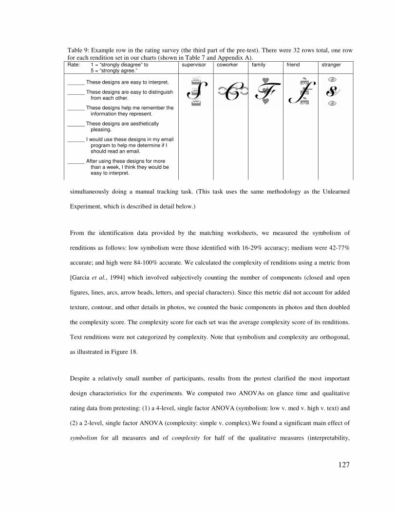
127
Table 9: Example row in the rating survey (the third part of the pre-test). There were 32 rows total, one row for each rendition set in our charts (shown in Table 7 and Appendix A). Rate: 1 = “strongly disagree” to 5 = “strongly agree.”
supervisor coworker family friend stranger
______ These designs are easy to interpret.
______ These designs are easy to distinguish from each other.
______ These designs help me remember the information they represent.
______ These designs are aesthetically pleasing.
______ I would use these designs in my email program to help me determine if I should read an email.
______ After using these designs for more than a week, I think they would be easy to interpret.
simultaneously doing a manual tracking task. (This task uses the same methodology as the Unlearned
Experiment, which is described in detail below.)
From the identification data provided by the matching worksheets, we measured the symbolism of
renditions as follows: low symbolism were those identified with 16-29% accuracy; medium were 42-77%
accurate; and high were 84-100% accurate. We calculated the complexity of renditions using a metric from
[Garcia et al., 1994] which involved subjectively counting the number of components (closed and open
figures, lines, arcs, arrow heads, letters, and special characters). Since this metric did not account for added
texture, contour, and other details in photos, we counted the basic components in photos and then doubled
the complexity score. The complexity score for each set was the average complexity score of its renditions.
Text renditions were not categorized by complexity. Note that symbolism and complexity are orthogonal,
as illustrated in Figure 18.
Despite a relatively small number of participants, results from the pretest clarified the most important
design characteristics for the experiments. We computed two ANOVAs on glance time and qualitative
rating data from pretesting: (1) a 4-level, single factor ANOVA (symbolism: low v. med v. high v. text) and
(2) a 2-level, single factor ANOVA (complexity: simple v. complex).We found a significant main effect of
symbolism for all measures and of complexity for half of the qualitative measures (interpretability,
128
memorability, and aesthetics). Differences among renditions with respect to visual content and rendering
technique were largely driven by variations in shape and text that were better categorized by our symbolism
factor, so we removed them from consideration in experiments. Finally, a factor analysis of qualitative
ratings from the survey described above resulted in three factors driven by interpretability, aesthetics, and
likelihood to adopt. These were the final ratings used in the remaining experiments.
Based on our results, we chose two text renditions. We then chose 12 additional top scoring renditions from
categories defined by crossing symbolism (three levels for pictorial renditions, and text as a fourth level)
and complexity (two levels). Figure 18 shows the renditions of the sender group coworker from these 14
sets (the other 6 sender groups for each set are left out for space reasons). By choosing the best performing
sets in each category, we made the tradeoff of focusing on good design over large performance differences.
This reflects our focus on studying renditions that are relevant to the real world.
.�$� ����5����6�*#��#�������������
We ran two experiments exploring three tradeoffs in the design of glanceable visuals: complexity,
symbolism, and the number of renditions to learn. In the Unlearned Experiment, we empirically determined
the symbolism levels of our renditions (which users had never seen), and gathered qualitative feedback. In
the Learned Experiment, we tested different numbers of learned renditions, exploring how symbolism,
complexity, and the number of renditions affect user performance and opinions.
5.3.1 General Experimental Setup and Tasks
Both experiments were run on a dual-monitor system with screens set to 1280 x 1024 resolution (see Figure
24 for a diagram of the experimental set up). Users provided input with a keyboard and infrared mouse.
The primary task was displayed on the focal monitor (placed directly in front of the user). The email
peripheral display was on the second monitor (placed to the right of the focal monitor). Non-text renditions
were 1¼ inches on their longest side; text stimuli were rendered using Arial 18 pt. bold font.
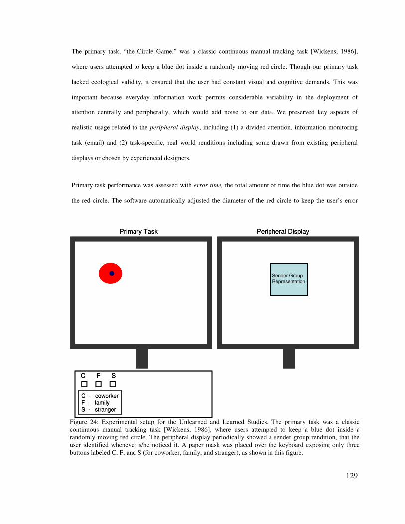
129
Sender Group Representation
Primary Task Peripheral Display
C F S� � �
C - coworkerF - familyS - stranger
Sender Group Representation
Primary Task Peripheral Display
C F S� � �
C - coworkerF - familyS - stranger
Figure 24: Experimental setup for the Unlearned and Learned Studies. The primary task was a classic continuous manual tracking task [Wickens, 1986], where users attempted to keep a blue dot inside a randomly moving red circle. The peripheral display periodically showed a sender group rendition, that the user identified whenever s/he noticed it. A paper mask was placed over the keyboard exposing only three buttons labeled C, F, and S (for coworker, family, and stranger), as shown in this figure.
The primary task, “the Circle Game,” was a classic continuous manual tracking task [Wickens, 1986],
where users attempted to keep a blue dot inside a randomly moving red circle. Though our primary task
lacked ecological validity, it ensured that the user had constant visual and cognitive demands. This was
important because everyday information work permits considerable variability in the deployment of
attention centrally and peripherally, which would add noise to our data. We preserved key aspects of
realistic usage related to the peripheral display, including (1) a divided attention, information monitoring
task (email) and (2) task-specific, real world renditions including some drawn from existing peripheral
displays or chosen by experienced designers.
Primary task performance was assessed with error time, the total amount of time the blue dot was outside
the red circle. The software automatically adjusted the diameter of the red circle to keep the user’s error
130
time per minute below 1.9 seconds. Automatic adjustment compensated for differential user abilities and
fatigue during testing.
A new rendition abruptly appeared on the peripheral display every 10-15 seconds. The presentation order
of renditions was counterbalanced across users. Users identified a rendition on its appearance by pressing a
keyboard key. The keyboard was covered with a paper mask to expose only keys needed for the
experiment. For set size 3, 3 keys were visible. For set size 7, the same 3 keys, each mapped to one sender
group for a single-press and a second sender group for a double-press, plus the space bar were used. Pilot
testing showed that double-mapping the keys enabled faster responses than using 7 separate keys since
users could avoid moving their fingers. To control for double-press errors, we removed data points when
the user incorrectly identified the rendition. Training enabled users to make these key-to-sender group
mappings fluently.
Users were shown a point total at the end of the experiment, encouraging them to get the highest point total
possible. Points were accrued for error-free Circle Game performance and for faster identification of
renditions on the peripheral display. To discourage errors, when the user identified a rendition incorrectly,
both monitors blacked-out for 2 seconds (pausing the tasks so errors did not accrue).
The software logged information about when renditions were shown, how long it took until they were
identified, and whether the user was correct. A user’s visible saccades to the peripheral display (glances)
were measured by pointing a video camera at the user’s face with a mirror placed behind him or her that
captured the peripheral display. We recorded the user’s face at 30 frames per second, so we could tell with
high precision when the user glanced at the peripheral display. Glances were hand coded by stepping
through the video frame by frame. As time data distributions tend to be skewed, they were transformed into
log times to render the distributions normal.
131
5.3.2 Visual Choice Reaction Time Experiments
Measuring glanceability in a controlled experiment typically means using a visual choice reaction time
method (we use a dual-task visual choice reaction time method in the Unlearned and Learned
Experiments). Reaction time (RT) is a common metric in psychology experiments, measuring how quickly
a person translates a stimulus into an action. In some situations, action is an immediate response to a
perceived event (e.g., we reach out to catch a ball someone unexpectedly tosses us). In some situations, a
complex decision process follows information intake. Our experiments on glanceability involve a minimal
decision process: participants must translate the displayed rendition into the information it represents and
press the button labeled with that information.
Teichner and Krebs [Teichner & Krebs, 1974] survey visual reaction time (RT) experiments in order to
determine the most important independent variables and develop empirical functions for them. Their
analysis informs the design of RT experiments. They surveyed only single-task experiments with simple
stimuli: single light flashes, single digits or letters, colors, and common geometric shapes. One of the two
types of RT experiments they surveyed is similar to ours: a person is presented with a series of visual
stimuli and must perform some action for each one when s/he sees it (in our case, the person identifies the
stimuli). Our study differs in that users identify more complex stimuli (e.g., icons, photos) in the periphery.
However, Teichner and Krebs’ analysis helps inform the issues we need to consider in our experimental
design. According to Teichner and Krebs, the following independent variables affect RT:
• Number of alternative stimuli that the person has to identify. All experiments show that RT increases
as the number of stimuli increases. Results from our Learned Experiment are consistent with this point:
RT increased for sets of 7 renditions when compared to sets of 3.
• Stimulus response compatibility, which refers to the amount of translation that the person has to
perform to respond. For example, seeing the letter “D” and pressing the “D” key is more compatible
than seeing “D” and pressing the “W” key. The higher the compatibility, the shorter the RT.
Compatibility is somewhat related to our notion of symbolism, or the degree to which visuals convey
132
the meaning of what they represent. Results of our Unlearned Experiment support that higher-
symbolism renditions are quicker to identify than low-symbolism renditions when unlearned.
• Effects of practice. Again, automaticity is the effect of extensive practice, which greatly reduces RT.
Teichner and Krebs present arguments that enough practice can eliminate the effects of increasing the
number of stimuli and of any stimulus response incompatibilities. We found that the practice included
in our Learned Experiment reduced the effects of increasing the set size, and that low- and high-
symbolism renditions led to similar performance when learned (i.e., practice overcame any
incompatibilities between the sign and the thing signified).
• Physical parameters of the stimulus, such as duration, size, intensity, or other visual characteristics
affect RT in varying ways. This is primarily what we studied in this chapter: what characteristics of the
stimuli increase or decrease RT to a peripheral display? Teichner and Krebs note that physical
parameters had been little studied at the time of their survey.
• Differential stimulus-response mapping. In RT experiments when no response is necessary for most
stimuli (unlike our experiment), increasing the number of stimuli still increases the RT.
• Stimulus probability. Though not varied in our experiments, this refers to the frequency with which a
person sees a given stimuli. Stimuli that are seen more often have faster RTs. We test stimuli that are
all seen with equal probability (i.e., an equal number of times).
• Temporal uncertainty. When there is a warning cue that a stimulus will appear, this variable refers to
variability in the amount of time between the cue onset and stimulus onset. Increased uncertainty of the
length of this time interval increases RT. We do not use warning cues in our experiments.
Results of their survey indicated that the most important variables are the level of practice, the number of
alternative stimuli, and the stimulus-response combination used (e.g., pressing a key versus saying a word
to identify the stimulus). These variables affect each other; for example, increasing the number of stimuli
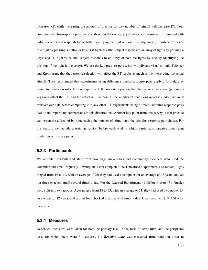
133
increases RT, while increasing the amount of practice for any number of stimuli will decrease RT. Four
common stimulus-response pairs were analyzed in the survey: (1) digit-voice (the subject is presented with
a digit or letter and responds by verbally identifying the digit out loud); (2) digit-key (the subject responds
to a digit by pressing a button or key); (3) light-key (the subject responds to an array of lights by pressing a
key); and (4) light-voice (the subject responds to an array of possible lights by vocally identifying the
position of the light in the array). We use the key-press response, but with diverse visual stimuli. Teichner
and Krebs argue that the response selection will affect the RT results as much as the interpreting the actual
stimuli. They recommend that experiments using different stimulus-response pairs apply a formula they
derive to translate results. For our experiment, the important point is that the response we chose (pressing a
key) will affect the RT, and the affect will increase as the number of renditions increases. Also, we must
translate our data before comparing it to any other RT experiments using different stimulus-response pairs
(we do not report any comparisons in this dissertation). Another key point from this survey is that practice
can lessen the affects of both increasing the number of stimuli and the stimulus-response pair chosen. For
this reason, we include a training session before each trial in which participants practice identifying
renditions with a key press.
5.3.3 Participants
We recruited students and staff from two large universities and community members who used the
computer and email regularly. Twenty-six users completed the Unlearned Experiment, (14 female); ages
ranged from 19 to 41, with an average of 25; they had used a computer for an average of 13 years; and all
but three checked email several times a day. For the Learned Experiment, 49 different users (31 female)
were split into two groups. Ages ranged from 18 to 53, with an average of 24; they had used a computer for
an average of 12 years; and all but four checked email several times a day. Users received $10 (USD) for
their time.
5.3.4 Measures
Dependent measures were taken for both the primary task, in the form of error time, and the peripheral
task, for which there were 5 measures. (1) Reaction time was measured from rendition onset to

134
identification by key-press. It can be split into two component measures, peripheral processing time and
glance time. (2) Peripheral processing time is the time from rendition onset until the user’s first look at the
peripheral display, on trials where the user glanced. We hypothesize that users began identifying a rendition
before looking at it, and if they failed to identify the rendition peripherally, they resorted to glancing. (This
hypothesis is supported by results from the second experiment in which some renditions were processed
entirely without glancing.) Because a rendition appears via abrupt onset, which captures attention
automatically, peripheral processing time also includes attention capture [Yantis & Jonides, 1990]. We
estimate that attention capture takes on the order of 100 ms [Card et al., 1983] and is constant across
rendition types. (3) Glance time is the time from the first look to rendition identification. Glance time here
also includes the time necessary to press the key identifying a rendition, but this is constant across
renditions. (4) The number of glances at a rendition per trial was also measured (e.g., when the number of
glances was 0, peripheral vision was used). (5) Correct rendition identification rate was the fifth measure.
In addition to these measures of glanceability, we also surveyed users for their qualitative ratings of each
rendition set’s interpretability, aesthetics, and likelihood to adopt and their overall rendition preferences.
.�-� ��������������������
The Unlearned Experiment serves two goals: (1) No metric exists for calculating symbolism without data
about how users interpret a rendition. This experiment provided the data necessary to calculate the
symbolism of our renditions, in the form of interpretation accuracy. (2) Little is known about how users
will react to different design choices for unlearned, low symbolism renditions. The Unlearned Experiment
explored this systematically for 6 different low symbolism renditions.
The experiment comprised a 4-level, single factor (symbolism: low v. medium v. high v. text) within-
subjects design. The assignment of renditions to the 4 symbolism levels was based on ad-hoc design
knowledge and subsequently confirmed according to correct identification rates of renditions, as described
below.
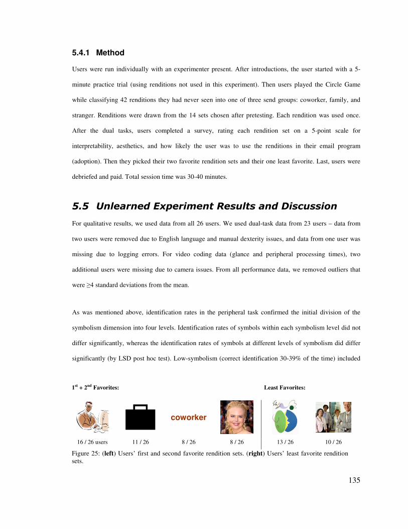
135
1st + 2nd Favorites: Least Favorites:
coworker
16 / 26 users 11 / 26 8 / 26 8 / 26 13 / 26 10 / 26
Figure 25: (left) Users’ first and second favorite rendition sets. (right) Users’ least favorite rendition sets.
5.4.1 Method
Users were run individually with an experimenter present. After introductions, the user started with a 5-
minute practice trial (using renditions not used in this experiment). Then users played the Circle Game
while classifying 42 renditions they had never seen into one of three send groups: coworker, family, and
stranger. Renditions were drawn from the 14 sets chosen after pretesting. Each rendition was used once.
After the dual tasks, users completed a survey, rating each rendition set on a 5-point scale for
interpretability, aesthetics, and how likely the user was to use the renditions in their email program
(adoption). Then they picked their two favorite rendition sets and their one least favorite. Last, users were
debriefed and paid. Total session time was 30-40 minutes.
.�.� ��������������������(�������������#��
For qualitative results, we used data from all 26 users. We used dual-task data from 23 users – data from
two users were removed due to English language and manual dexterity issues, and data from one user was
missing due to logging errors. For video coding data (glance and peripheral processing times), two
additional users were missing due to camera issues. From all performance data, we removed outliers that
were �4 standard deviations from the mean.
As was mentioned above, identification rates in the peripheral task confirmed the initial division of the
symbolism dimension into four levels. Identification rates of symbols within each symbolism level did not
differ significantly, whereas the identification rates of symbols at different levels of symbolism did differ
significantly (by LSD post hoc test). Low-symbolism (correct identification 30-39% of the time) included

136
(a) (b) (c) Figure 26: Unlearned Study results by symbolism (low, medium, high, text). All metrics improve as symbolism increases. A factor analysis proves these metrics are all correlated to the same phenomena, which we call glanceability. (Error bars depict standard error.)
celebrity photo, abstract art, and colored square (see Figure 18). Medium (52-54%) included one face, two
faces, and beach picture. High (74-92%) included the remaining renditions and the text initial. Text (97%)
included colored and black words.
A single-factor (symbolism) ANOVA with four levels was performed on each measure of interest. Where a
significant main effect was found, LSD post hoc tests (alpha set to .05) were used to determine which
means differed significantly. We briefly explored the effects of complexity on our measures, but found no
significant effects. Thus our analysis focuses solely on symbolism.
As expected, as symbolism increases, glance, peripheral processing, and error times decrease and
qualitative ratings increase (all with significance – glance time: F(3,60)=4.8, p=.004; peripheral processing
time: F(3,60)=41.6, p<.001; error time: F(3,66)=3.5, p=.019; interpretation rating: F(3,78)=162.6, p<.001;
adoption rating: F(3,78)=34.2, p<.001)). See Figure 26 for graphs.
When asked to choose the two rendition sets they liked most and the one they liked least, user preferences
were generally similar to interpretability and adoption ratings (i.e., higher symbolism renditions were
favored), with an exception for text. Whereas colored text had the highest interpretation and adoption
ratings, it was listed less often in the top-two choices (by only 8 users) than cartoons (top-two for all users)
and black and white pictures (top-two for 11 users).
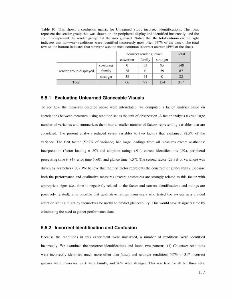
137
Table 10: This shows a confusion matrix for Unlearned Study incorrect identifications. The rows represent the sender group that was shown on the peripheral display and identified incorrectly, and the columns represent the sender group that the user guessed. Notice that the total column on the right indicates that coworker renditions were identified incorrectly most often (47% of the time). The total row on the bottom indicates that stranger was the most common incorrect answer (49% of the time).
incorrect sender guessed Total
coworker family stranger
sender group displayed coworker 0 53 95 148
family 28 0 59 87 stranger 38 44 0 82
Total 66 97 154 317
5.5.1 Evaluating Unlearned Glanceable Visuals
To see how the measures describe above were interrelated, we computed a factor analysis based on
correlations between measures, using rendition set as the unit of observation. A factor analysis takes a large
number of variables and summarizes them into a smaller number of factors representing variables that are
correlated. The present analysis reduced seven variables to two factors that explained 82.5% of the
variance. The first factor (59.2% of variance) had large loadings from all measures except aesthetics:
interpretation (factor loading = .97) and adoption ratings (.91), correct identifications (.92), peripheral
processing time (-.84), error time (-.60), and glance time (-.57). The second factor (23.3% of variance) was
driven by aesthetics (.80). We believe that the first factor represents the construct of glanceability. Because
both the performance and qualitative measures (except aesthetics) are strongly related to this factor with
appropriate signs (i.e., time is negatively related to the factor and correct identifications and ratings are
positively related), it is possible that qualitative ratings from users who tested the system in a divided
attention setting might by themselves be useful to predict glanceability. This would save designers time by
eliminating the need to gather performance data.
5.5.2 Incorrect Identification and Confusion
Because the renditions in this experiment were unlearned, a number of renditions were identified
incorrectly. We examined the incorrect identifications and found two patterns: (1) Coworker renditions
were incorrectly identified much more often than family and stranger renditions (47% of 317 incorrect
guesses were coworker, 27% were family, and 26% were stranger. This was true for all but three sets:
138
faces, cartoon people, and photos of people (for these three sets, stranger was incorrectly identified most
often). (2) Stranger was the most common incorrect answer (49% of incorrect answers were stranger, 30%
were family, and 21% were coworker). See Table 10 for a confusion matrix of the incorrect identifications.
A number of reasons could explain these patterns of user confusion with coworker renditions and their
tendency to guess stranger when incorrect. Coworkers are harder to visualize in a way that is both universal
and distinctive. For example, people have varied emotions about their coworkers, ranging from positive to
neutral to negative. Also, a coworker is a single person whose age, gender, attire, and demeanor can vary
widely. Selecting a visual – whether it be an object, a symbol, or an actual depiction of coworker – can be
difficult since coworkers and our relationships with them vary so widely. Stranger may have been a
common incorrect answer because all the visuals depicted were strange and unknown to participants.
Future work is needed to determine the causes of user confusion.
.�0� 6�����������������
The purpose of the Learned Experiment was to investigate what characteristics of visual renditions make
them faster and easier to perceive and interpret when renditions are learned. Specifically, the experiment
compared the effects of symbolism and complexity on the glanceability of learned renditions. Because
these effects may depend on ease of learning, the experiment also manipulated the number of renditions to
be memorized. The experiment compared the three sets shown in Table 11, which produced the best
performance in the Unlearned Experiment, using the design described in the next subsection. We also
tested a fourth set of text renditions with all users and, though not included in our main analysis, we briefly
report results of text compared to the complex + high-symbolism cartoons.
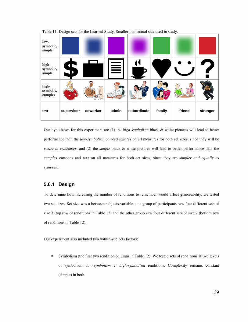
139
Table 11: Design sets for the Learned Study. Smaller than actual size used in study.
low-symbolic, simple
high-symbolic, simple
high-symbolic, complex
text supervisor coworker admin subordinate family friend stranger
Our hypotheses for this experiment are (1) the high-symbolism black & white pictures will lead to better
performance than the low-symbolism colored squares on all measures for both set sizes, since they will be
easier to remember; and (2) the simple black & white pictures will lead to better performance than the
complex cartoons and text on all measures for both set sizes, since they are simpler and equally as
symbolic.
5.6.1 Design
To determine how increasing the number of renditions to remember would affect glanceability, we tested
two set sizes. Set size was a between subjects variable: one group of participants saw four different sets of
size 3 (top row of renditions in Table 12) and the other group saw four different sets of size 7 (bottom row
of renditions in Table 12).
Our experiment also included two within-subjects factors:
• Symbolism (the first two rendition columns in Table 12): We tested sets of renditions at two levels
of symbolism: low-symbolism v. high-symbolism renditions. Complexity remains constant
(simple) in both.
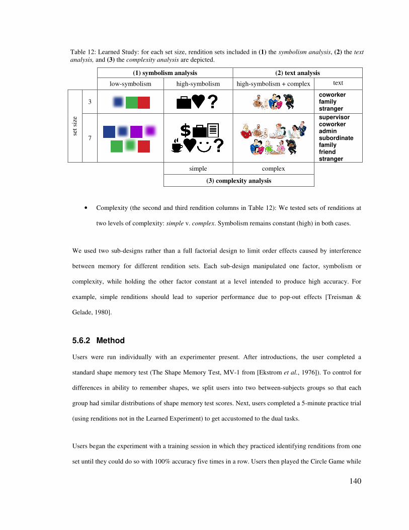
140
Table 12: Learned Study: for each set size, rendition sets included in (1) the symbolism analysis, (2) the text analysis, and (3) the complexity analysis are depicted.
(1) symbolism analysis (2) text analysis low-symbolism high-symbolism high-symbolism + complex text
set s
ize
3
coworker family stranger
7
supervisor coworker admin subordinate family friend stranger
simple complex
(3) complexity analysis
• Complexity (the second and third rendition columns in Table 12): We tested sets of renditions at
two levels of complexity: simple v. complex. Symbolism remains constant (high) in both cases.
We used two sub-designs rather than a full factorial design to limit order effects caused by interference
between memory for different rendition sets. Each sub-design manipulated one factor, symbolism or
complexity, while holding the other factor constant at a level intended to produce high accuracy. For
example, simple renditions should lead to superior performance due to pop-out effects [Treisman &
Gelade, 1980].
5.6.2 Method
Users were run individually with an experimenter present. After introductions, the user completed a
standard shape memory test (The Shape Memory Test, MV-1 from [Ekstrom et al., 1976]). To control for
differences in ability to remember shapes, we split users into two between-subjects groups so that each
group had similar distributions of shape memory test scores. Next, users completed a 5-minute practice trial
(using renditions not in the Learned Experiment) to get accustomed to the dual tasks.
Users began the experiment with a training session in which they practiced identifying renditions from one
set until they could do so with 100% accuracy five times in a row. Users then played the Circle Game while

141
identifying each rendition in the set three times each. Users repeated the training and dual-task trial four
times: once for each set of renditions. Then they completed a survey, rating each rendition set on a 5-point
scale for identifiability (similar to rating interpretability in the Unlearned Experiment), aesthetics, and how
likely they were to adopt the renditions in their email program. At the end of the session, we debriefed and
paid users. Total session time was about 30 minutes for people in the 3 set size group and 60 minutes for
people in the 7 set size group.
.�2� 6�����������������(����
Our findings reject both of our hypotheses, which we will describe in this section and discuss in the next.
The analysis focused on three measures: reaction time, identifiability ratings, and adopting ratings, shown
in Figure 27. Due to low incidence of overt glancing, the breakdown of reaction time into glance time and
peripheral processing time was not feasible. We did not analyze identification accuracy, which was near
ceiling (averages for various rendition sets ranged from 93% to 98%, with no significant differences).
Primary-task error time revealed no effects and will not be discussed further.
For qualitative results, we used data from all 49 users. Reaction time data from one user were removed due
to a software malfunction during the test. Outliers �4 standard deviations from the mean were removed
from time data. We also removed time data points when the user incorrectly identified the rendition (2.7%
of reaction time data were removed for set size 3, 5.3% for set size 7)
In keeping with our design, we performed two ANOVAs. The first was a 2 (symbolism: low v. high, both
simple) X 2 (set size: 3 v. 7) ANOVA. The second was a 2 (complexity: simple v. complex, both high-
symbolism) X 2 (set size: 3 v. 7) ANOVA. Set size varied between subjects, and complexity and
symbolism varied within subjects. Although subjects were also exposed to text, we considered it separately
as its complexity is obviously not on a common continuum with graphic symbols.
Symbolism (left column of Figure 27). The symbolism ANOVA showed a main effect of symbolism for
identification and adaptation ratings, such that the high-symbolism black & white pictures led to higher
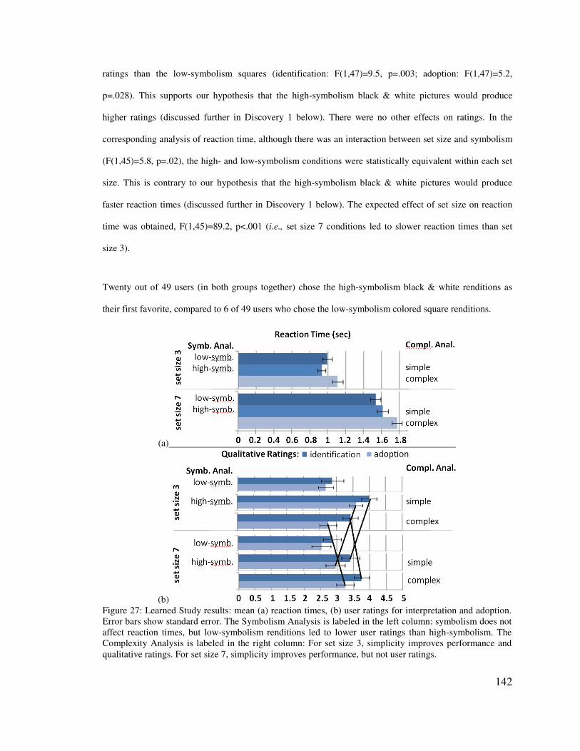
142
(a)
(b) Figure 27: Learned Study results: mean (a) reaction times, (b) user ratings for interpretation and adoption. Error bars show standard error. The Symbolism Analysis is labeled in the left column: symbolism does not affect reaction times, but low-symbolism renditions led to lower user ratings than high-symbolism. The Complexity Analysis is labeled in the right column: For set size 3, simplicity improves performance and qualitative ratings. For set size 7, simplicity improves performance, but not user ratings.
ratings than the low-symbolism squares (identification: F(1,47)=9.5, p=.003; adoption: F(1,47)=5.2,
p=.028). This supports our hypothesis that the high-symbolism black & white pictures would produce
higher ratings (discussed further in Discovery 1 below). There were no other effects on ratings. In the
corresponding analysis of reaction time, although there was an interaction between set size and symbolism
(F(1,45)=5.8, p=.02), the high- and low-symbolism conditions were statistically equivalent within each set
size. This is contrary to our hypothesis that the high-symbolism black & white pictures would produce
faster reaction times (discussed further in Discovery 1 below). The expected effect of set size on reaction
time was obtained, F(1,45)=89.2, p<.001 (i.e., set size 7 conditions led to slower reaction times than set
size 3).
Twenty out of 49 users (in both groups together) chose the high-symbolism black & white renditions as
their first favorite, compared to 6 of 49 users who chose the low-symbolism colored square renditions.

143
square
b&w
cartoon
text
0
2
4
6
8
10
12
0 1 2 3 4 50 1 2 3 4 51st 2nd 3rd 4th
# us
ers
User Preferences
1st 2nd 3rd 4th
set size 3 set size 7
square
b&w
cartoon
text
0
2
4
6
8
10
12
0 1 2 3 4 50 1 2 3 4 51st 2nd 3rd 4th
# us
ers
User Preferences
1st 2nd 3rd 4th
set size 3 set size 7
0
2
4
6
8
10
12
0 1 2 3 4 50 1 2 3 4 51st 2nd 3rd 4th
# us
ers
User Preferences
1st 2nd 3rd 4th
set size 3 set size 7
Figure 28: Learned Study, user preferences. Note that the black & white picture’s votes for first favorite dropped for set size 7 and the cartoon’s votes rose.
Complexity (right column of Figure 27). The complexity ANOVA for both user rating measures showed an
interaction, such that the effects of complexity depended on set size (identification: F(1,47)=4.8, p=.033;
adoption: F(1,47)=6.0, p=.018), and no main or set size effects. For set size 3, there was a significant main
effect for qualitative ratings (identification ratings: F(1,24)=4.7, p=.041; adoption ratings: F(1,24)=8.2,
p=.008). There was no significant main effect for ratings in the set size 7 condition. Essentially, from set
size 3 to 7, users’ ratings of the complex cartoons rose and of the simple black & white pictures fell enough
to make the differences between then insignificant. These results reject our second hypothesis, since the
complex cartoons led to good user opinions for set size 7. This surprising result will be discussed below
(Discovery 2).
The corresponding ANOVA on reaction time showed expected effects of set size (F(1,46)=114.5, p<.001),
and a main effect of complexity F(1,46)=30.6, p<.001), with higher reaction times for the more complex
cartoon renditions. There was no significant interaction effect.
For the set size 3 group, 12 of 25 users chose the simple black & white renditions as their first favorite,
compared to 5 users who chose the complex cartoon renditions. For set size 7, the same number of users
chose simple renditions as their first favorite as chose complex renditions (8 users each). Like qualitative
ratings, from set size 3 to 7, user preferences for the complex cartoons rose and for the simple black &
white pictures fell. See Figure 28 for a graph of user preferences.
144
Text. Because text is commonly considered, it was compared to the complex + high-symbolism cartoons in
an additional analysis. We computed a 2 (high-symbolism + complex v. text) X 2 (set size: 3 v. 7) ANOVA.
Text led to the longest reaction times (F(1,45)=40.6, p<.001) but did not lead to significantly different
qualitative ratings. However, text was less favored by users: Only 5 users chose text as a first favorite,
while 13 chose the cartoons as a first favorite. Text was chosen as least favorite by 20 users, while cartoons
were chosen as least favorite by only 6 users.
Use of peripheral vision. Simple renditions enabled users to avoid overt glancing by using peripheral
vision. Out of 2772 total viewings, users used peripheral vision alone in 1074 cases (38.7%). Set size of 3
afforded this better than set size of 7. For set size 3, 90% of colored square views were peripheral alone,
82% for black & white pictures, 38% for cartoon people, and 5% for text. For set size 7, 76% of colored
square views were peripheral only, 51% for black & white pictures, 4% for cartoon people, and 0% for text.
These results are shown in Figure 29, which graphs the percentage of views that used peripheral vision
alone for each rendition set, and for both set sizes.
.�7� 6����������������������#��
Based on the results presented above, we discuss some the interesting or unexpected results which lead to
several insights for designing glanceable displays.
5.8.1 Discovery 1: Symbolism did not affect reaction times, but it strongly affected user opinions
We hypothesized that the high-symbolism renditions would lead to the best performance on all measures.
However, we discovered a discrepancy between qualitative and reaction time data: low- and high-
symbolism renditions led to similar performance, while the high-symbolism black & white pictures were
strongly favored (see Figure 27b). Users explained why low-symbolism renditions were less liked: “It is
hard to remember what color represents what.” The low-symbolism colored square renditions may have
enabled faster reaction times than expected due to the efficacy of our training session in helping users
fluently identify renditions. This result may also be due to the saliency of color, which has been shown in

145
many studies to lead to faster code identification and visual search times than shape [Christ, 1984] (shape
being the primary design variable for the black & white pictures). In essence, users favored mnemonic
value as a deciding factor over ease of perception and despite practice. These results indicate that low-
symbolism renditions may have a harder time gaining approval, despite enabling equivalent reaction times
after practice.
5.8.2 Discovery 2: Complex renditions led to good user opinions for the larger set size
We hypothesized that the simple, high-symbolism black & white pictures would be favored for larger set
sizes. We were very surprised that the complex cartoon people were also popular, especially since they
were not highly discriminable compared to the simpler renditions. As shown in Figure 27, complex
renditions did not lead to faster performance than simple, but qualitative ratings and preferences rose for
complex and fell for simple from set size 3 to 7. Users explained that complex renditions were easier to
remember and identify, and “they are the most pleasing to look at and not as ‘boring’ as the others.” Our
results indicate that extra detail may make renditions more attractive and identification easier within large
sets.
5.8.3 Discovery 3: Heavy use of peripheral vision & the efficacy of color
We assumed that users would always focally look at the peripheral display to identify renditions. We were
surprised that peripheral vision alone was so prevalently used (39% of the time), and that color supported
this (80% of colored square views were with peripheral vision alone, and color was the primary visual
difference between renditions in the set). Peripheral vision use was beneficial because the simple renditions
that afforded peripheral identification also led to less primary task distraction. It is surprising that colored
squares were most effective in the periphery, since color discrimination is poor in peripheral vision, and
prior research recommends that color not be used in the periphery [Christ, 1984]. The reason our second-
monitor position of the peripheral display was effective is that the display was close enough that colors
were discriminable (around 30º from the primary screen [Johnson, 1986]). This indicates that color may be
effective for peripheral displays on dual-monitor systems since they are not very far in the periphery,

146
0%
10%
20%
30%
40%
50%
60%
70%
80%
90%
100%
% v
iew
s us
ing
only
per
iphe
ral v
isio
n
coworker0%
10%
20%
30%
40%
50%
60%
70%
80%
90%
100%
% v
iew
s us
ing
only
per
iphe
ral v
isio
n
0%
10%
20%
30%
40%
50%
60%
70%
80%
90%
100%
% v
iew
s us
ing
only
per
iphe
ral v
isio
n
coworker
Figure 29: Learned Study: graph showing the percentage of views that used only peripheral vision (i.e., no glance). It is surprising that 39% of 2772 views used peripheral vision alone. It is also surprising that color supported this. As the graph shows, peripheral-vision-only views of the colored square were 90% for set size 3, and 76% for set size 7.
particularly sizeable areas of distinct colors like our renditions. In general, our results show that if use of
peripheral vision is important, simple renditions (high or low-symbolism) are best.
5.8.4 Discovery 4: Impact of glanceability on monitoring
A surprising result from both experiments is that the impact of glanceable visuals on peripheral display
monitoring performance was minimal, but the impact on user satisfaction was significant. Improvements
caused by the most glanceable renditions were small: over a day with 49 new emails (a reported average for
information workers [Whittaker & Sidner, 1996]) savings from the best unlearned rendition (text) over the
worst (low-symbolism) add up to only 12.2 seconds less primary task distraction and 42.7 seconds less time
reacting to new emails. Savings from the best learned rendition (square) over the worst (text) are 1.5
seconds less primary task distraction and 17.3 seconds less time reacting to new emails. These time
improvements (though similar in magnitude to past studies [McDougall et al., 2000]) are not large enough
to make a real impact on work efficiency. However, it is important to note that we selected renditions that
147
were most successful in pretesting, so our experiment was not set up to find large differences in qualitative
or performance measures.
Despite this, glanceability was still important to users. For example, when learned, the black & white
pictures were rated higher and preferred more often than the cartoons for set size 3, but the two are not
significantly different for set size 7 (Figure 27b). Users explained that with more renditions to remember,
despite better performance with the black & white pictures, it was “not as easy to remember what icon
corresponds with which group of people,” while the cartoons were “easy to identify and relate with as they
pictorially represent the categories.” These results imply that small differences in performance or perceived
difficulty should be taken seriously, since they can affect the effort expended and users’ opinions of a
display.
.�8� 9����������"#���������� �������� ��� �)������*����������
Based on results from both experiments, we have distilled some best practices for evaluating and designing
glanceable peripheral displays. In applying these best practices, a few caveats are necessary. First, our
measured results are a proxy for true multitasking performance. A study of real-world use is required to
confirm them. Second, it is important to emphasize that these best practices help narrow down what to
study. Because we had to limit the number of renditions studied, we cannot recommend exact levels of
complexity and symbolism for different set sizes. These qualitative guidelines will help designers get much
closer to selecting effective renditions to study. Finally, our results are best applicable to displays for
divided-attention, performance-oriented, information monitoring situations. The closer a new system’s
goals and usage are those studied in our experiments, the better the results will apply.
5.9.1 Evaluation
Listen to user preference. Though we found significant results that show certain characteristics lead to
faster reaction times, our main recommendation is to listen to what users want. The impact of glanceable
148
visuals on peripheral display monitoring reaction times was minimal, but the impact on user satisfaction
was significant (Discovery 4).
Glanceability of unlearned visuals may be evaluated qualitatively following realistic use. Our factor
analysis from the Unlearned Experiment data showed that glanceability is a phenomenon measurable by all
of our measures except aesthetics. Because interpretation and adoption ratings from users were strongly
related to glanceability, it is possible that they might by themselves be useful to predict glanceability. This
would save designers time by eliminating the need to gather performance data.
5.9.2 Design
Use low-symbolism renditions with caution. Despite similar performance to the high-symbolism black &
white pictures, the low-symbolism colored squares were rated poorly (Discovery 1). Low-symbolism
renditions may have a harder time gaining approval.
Extra visual detail may make renditions more appealing and identification easier within large sets. As
Discovery 2 showed, users preferred the complex cartoons over the simple black & white pictures for the
larger set size because their extra detail made them more attractive and distinguishable. Note that all added
details may not serve to increase aesthetic appeal or distinguishability.
Simple renditions are highly effective for peripheral vision. The simple colored squares (80% of views
were peripheral) and black & white pictures (60%) enabled significantly more peripheral views than
complex cartoon (13%) and text (1%) renditions (Discovery 3).
Color can be effective for peripheral viewing on single and dual-monitor systems (depending on color
size and proximity to focal area). Our peripheral display was close enough and the colored squares were
large enough to afford the most peripheral viewings among all of our renditions (Discovery 3).
149
.��:��'#�����#��
Our goal was to inform the design of glanceable visuals, which better enable people to monitor secondary
tasks while multitasking. We conducted two experiments to understand what rendition characteristics are
most glanceable, learned and unlearned, when dividing attention. Our experiments explored three major
tradeoffs in designing glanceable visuals: complexity, symbolism, and rendition set size. Among our key
findings were a set of surprises related to characteristics that led to anomalies, divergences in performance
and qualitative results, and renditions that afforded the use of peripheral vision. Our main contributions are
best practices for the design and evaluation of glanceable displays based on empirical and qualitative
results. These contributions provide design and evaluation knowledge that will enable designers to create
more glanceable peripheral displays to support multitasking.
150
:� 5 � ���1��#��������� �����
The design and evaluation knowledge presented in this dissertation provides a basis for future research
directions. In the following sub-sections, promising areas for future work are presented.
0��� 3����&#�� ����������������������(����4#���+��� �
The design knowledge we contribute helps designers narrow initial design prototypes based on basic,
behavioral results. Since our experimental settings were controlled, the results are more precise and
generally applicable, but less representative of real-world multitasking performance. Field studies are
required to understand the impact of effects observed in-lab on people in real work settings. Here, we
propose a field study of an existing system, redesigned using the results gathered in this dissertation.
Studying email in the field will be most closely comparable to our lab experiment, since we can use the
same sender groups and renditions. We propose augmenting an email program to add a “peripheral view”
of the program when it is minimized. Research questions for the field study along with hypotheses include
the following:
1. Do the negative qualitative reactions to low-symbolism renditions reduce with longer-term user?
a. Hypothesis: Yes, the negative user reactions to low-symbolism renditions will reduce
over time (would contradict/extend result of the lab experiment).
2. Which type of rendition do users prefer in large set sizes after realistic, longer-term use (low- v.
high-symbolism, simple v. complex)?
a. Hypothesis: Users will prefer complex + high-symbolism renditions after extended,
realistic use (same result as the lab experiment).
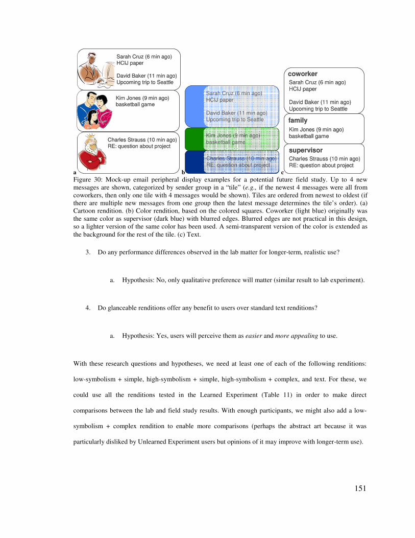
151
a
Charles Strauss (10 min ago)RE: question about project
Sarah Cruz (6 min ago)HCIJ paper
David Baker (11 min ago)Upcoming trip to Seattle
Kim Jones (9 min ago)basketball game
Charles Strauss (10 min ago)RE: question about project
Sarah Cruz (6 min ago)HCIJ paper
David Baker (11 min ago)Upcoming trip to Seattle
Kim Jones (9 min ago)basketball game
b
Charles Strauss (10 min ago)RE: question about project
Kim Jones (9 min ago)basketball game
Sarah Cruz (6 min ago)HCIJ paper
David Baker (11 min ago)Upcoming trip to Seattle
Charles Strauss (10 min ago)RE: question about project
Kim Jones (9 min ago)basketball game
Sarah Cruz (6 min ago)HCIJ paper
David Baker (11 min ago)Upcoming trip to Seattle
c
Charles Strauss (10 min ago)RE: question about project
Sarah Cruz (6 min ago)HCIJ paper
David Baker (11 min ago)Upcoming trip to Seattle
Kim Jones (9 min ago)basketball game
coworker
family
supervisorCharles Strauss (10 min ago)RE: question about project
Sarah Cruz (6 min ago)HCIJ paper
David Baker (11 min ago)Upcoming trip to Seattle
Kim Jones (9 min ago)basketball game
coworker
family
supervisor
Figure 30: Mock-up email peripheral display examples for a potential future field study. Up to 4 new messages are shown, categorized by sender group in a “tile” (e.g., if the newest 4 messages were all from coworkers, then only one tile with 4 messages would be shown). Tiles are ordered from newest to oldest (if there are multiple new messages from one group then the latest message determines the tile’s order). (a) Cartoon rendition. (b) Color rendition, based on the colored squares. Coworker (light blue) originally was the same color as supervisor (dark blue) with blurred edges. Blurred edges are not practical in this design, so a lighter version of the same color has been used. A semi-transparent version of the color is extended as the background for the rest of the tile. (c) Text.
3. Do any performance differences observed in the lab matter for longer-term, realistic use?
a. Hypothesis: No, only qualitative preference will matter (similar result to lab experiment).
4. Do glanceable renditions offer any benefit to users over standard text renditions?
a. Hypothesis: Yes, users will perceive them as easier and more appealing to use.
With these research questions and hypotheses, we need at least one of each of the following renditions:
low-symbolism + simple, high-symbolism + simple, high-symbolism + complex, and text. For these, we
could use all the renditions tested in the Learned Experiment (Table 11) in order to make direct
comparisons between the lab and field study results. With enough participants, we might also add a low-
symbolism + complex rendition to enable more comparisons (perhaps the abstract art because it was
particularly disliked by Unlearned Experiment users but opinions of it may improve with longer-term use).
152
The peripheral display designs would likely be iterated with colleagues and pilot testing, but initial designs
are shown and described in Figure 30. Several issues would need to be considered for the display design
(e.g., confounds caused by differing sizes; changes to renditions that make them more applicable to users –
like the supervisor king cartoon (Figure 30a) might be replaced with a queen for users who have female
supervisors; and so on).
We would begin the field study by gathering baseline metrics with no peripheral display, then we would
gather field data for each of the peripheral display variations. Data gathered would be primarily qualitative
(e.g., from surveys and interviews), but we could gather some empirical data: frequency that email was
clicked on, time email was in focus, number and sender of new messages that prompted a click on email,
and latency between email arrival and a click on email. These data would help us determine if the display
renditions improved performance (less clicking on email with high reported awareness of email; less
latency before messages from high-priority senders were read).
Our analysis would involve determining the answers to our research questions above and confirming or
rejecting our hypotheses. We would also explore the data and do a detailed comparison with results from
the lab experiment for new information or surprises. Finally, we would determine if any additional best
practices could be derived from the study results and what design knowledge was still missing. Overall, this
field study would enable us to vet our lab experiment best practices and results in a real-world setting and
gather additional design knowledge.
0��� � �� ��� �!�"#����#��#���������������������
When gathering basic, behavioral information (as with the Unlearned and Learned Experiments),
controlling confounding variables is important. However, this limits what can be learned from an
experiment. Real peripheral displays combine visual renditions of information in infinite ways, all of which
could not be studied in a reasonable set of experiments. How can we inform the design of glanceable
peripheral displays that combine many renditions? One way to answer this question would be to redesign a
highly aggregated display based on results from this dissertation and compare it with the original display.
153
Results would indicate how well the best practices from this dissertation apply to aggregate displays and
advise additional studies to gather pertinent, missing design knowledge.
The Scope Notification Manager [Van Dantzich et al., 2002] is a good example of compact display that
combines many, complex streams of information. Glanceability is a goal of the display, which uses the
spatial layout of various simple, low-symbolism renditions to represent calendar, email, task, and alert
information. Visual cues used on the Scope include the following: position (item type, urgency), letter
(item type), shape (message sent to user alone or to multiple people), circular outline (message from
someone in address book), pulsing (new), blur (read), dashes (calendar item requires travel time), inverted
color (item overdue).
Our results show that low-symbolism renditions lead to good performance but are harder for users to
identify and adopt. Our results also show that user preferences are important. A possible redesign of the
Scope would be to use high-symbolism, complex renditions for certain email, calendar, task, and alert
information. Users could be asked to associate complex renditions (from a collection provided by
designers) with people in their address book and to ongoing activities (such that the associations were high-
symbolism to the user). Address book renditions could appear for relevant email and calendar information;
activity renditions could appear for task, alert, calendar, and email information (depending on how activity
categorization was implemented). The rendition would replace the shape and color of the item, but other
aspects of the Scope would remain the same (position, highlight, pulsing, blur, dashes). Not all items would
be represented by a special rendition.
An important difference between the original Scope and the proposed redesign is that high-symbolism
renditions may need to be bigger than low-symbolism renditions in order to be distinguished. The original
Scope display could be shrunk to a very small size that fit in the corner of the screen. High-symbolism
renditions may make it impossible to shrink the display to very small sizes. A possible solution would be to
only use high-symbolism renditions when the display is larger and to use low-symbolism renditions when
the display small.
154
The proposed changes introduce another potential confounds: the type of information shown is different. In
particular, sender and activity information replace cues for overdue items and email receiver lists.
However, the strengths of each visual is being used – something any good designer would do when
comparing two designs. In particular, complex renditions may be capable of conveying more information
(exact people or concepts, larger set sizes of people or concepts); thus they are better suited to convey
sender and activity information than very simple renditions. Simple renditions can easily show abstract
concepts with few alternatives (small set size) like “read/not read” and “overdue/not overdue.”
The two designs could be compared in a field or lab study that focuses on gathering qualitative feedback.
Alternatively, a version of the display that uses high-symbolism renditions when larger and switches to
low-symbolism renditions when smaller could be evaluated with one set of participants. Important
questions include which version of the design is preferred, users’ opinions on seeing select complex
renditions v. seeing only simple renditions, and what aspects of either design are good / could use
improvement. If users prefer the redesign including complex, high-symbolism renditions, then the results of
this dissertation show promise for being applicable to aggregate displays.
0�$� ����������� �����
Several research projects have begun to rethink the way information technology organizes work, to better
match the way information workers think about and do work. For example, Scalable Fabric provides
higher-level organization of application windows into tasks and supports aggregate window management,
spatial layout of tasks, and peripheral awareness of task information [Robertson et al., 2004]. Rattenbury
and Canny present a system that automatically classifies users’ resources into activities and visualizes the
information for users [Rattenbury & Canny, 2007]. Bardram et al. [Bardram et al., 2006] proposed activity-
based computing (ABC) to support work at the activity rather than application level by supporting
aggregating sets of applications or services, managing interruptions and activity switching, work that is not
stationary or desktop-based, work that spans devices, collaborative work, and sensitivity to context (though
all of these features have not been addressed in existing systems). Voida et al. [Voida et al., 2007]
proposed a similar approach that focused on supporting human activities and presented several
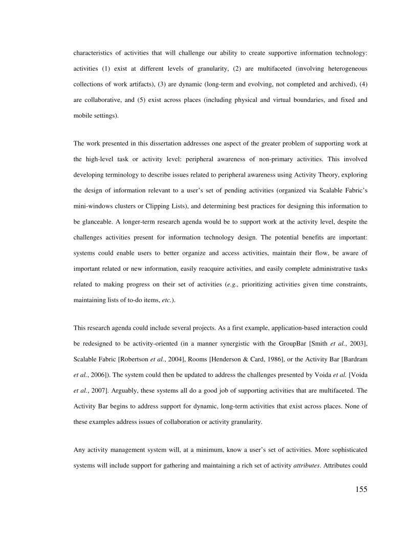
155
characteristics of activities that will challenge our ability to create supportive information technology:
activities (1) exist at different levels of granularity, (2) are multifaceted (involving heterogeneous
collections of work artifacts), (3) are dynamic (long-term and evolving, not completed and archived), (4)
are collaborative, and (5) exist across places (including physical and virtual boundaries, and fixed and
mobile settings).
The work presented in this dissertation addresses one aspect of the greater problem of supporting work at
the high-level task or activity level: peripheral awareness of non-primary activities. This involved
developing terminology to describe issues related to peripheral awareness using Activity Theory, exploring
the design of information relevant to a user’s set of pending activities (organized via Scalable Fabric’s
mini-windows clusters or Clipping Lists), and determining best practices for designing this information to
be glanceable. A longer-term research agenda would be to support work at the activity level, despite the
challenges activities present for information technology design. The potential benefits are important:
systems could enable users to better organize and access activities, maintain their flow, be aware of
important related or new information, easily reacquire activities, and easily complete administrative tasks
related to making progress on their set of activities (e.g., prioritizing activities given time constraints,
maintaining lists of to-do items, etc.).
This research agenda could include several projects. As a first example, application-based interaction could
be redesigned to be activity-oriented (in a manner synergistic with the GroupBar [Smith et al., 2003],
Scalable Fabric [Robertson et al., 2004], Rooms [Henderson & Card, 1986], or the Activity Bar [Bardram
et al., 2006]). The system could then be updated to address the challenges presented by Voida et al. [Voida
et al., 2007]. Arguably, these systems all do a good job of supporting activities that are multifaceted. The
Activity Bar begins to address support for dynamic, long-term activities that exist across places. None of
these examples address issues of collaboration or activity granularity.
Any activity management system will, at a minimum, know a user’s set of activities. More sophisticated
systems will include support for gathering and maintaining a rich set of activity attributes. Attributes could
156
include files, online resources, shared resources, emails, colleagues, relevant calendar information, time
spent on the activity, completed sub-tasks, etc. Attributes would enable sophisticated support for task
management and collaboration. If multiple colleagues use the system and have common activities, the
system could provide collaboration awareness cues when visualizing an activity (e.g., a colleague’s photo
placed near an activity on your screen when she is working on it). Attributes like completed sub-tasks and
time spend on the activity could enable automatic generation of progress reports or time-tracking
visualizations to help people improve their time management. Calendar information attributes could help
user’s plan when to work on certain tasks. To enhance multitasking within groups, activities could be
shared – resources, calendar information, time spent, and any other attributes could be accessed by anyone
in the group. Also, members could see when others were currently working on the activity and the progress
they have made. Imagine these ideas added to Scalable Fabric: the state of activity attributes would be
peripherally visible with each activity cluster (e.g., relevant upcoming meetings or deadlines, new emails,
sub-tasks left to do), group members working on a shared activity would be visualized, changes to items in
an activity (made by the user or group members) would be highlighted, users could chose to view a time-
tracking visualization for each activity, and so on.
A second project related to activity management would be to design the features described above for
mobile devices. A study of a new desktop activity management system would highlight the most essential
features to desktop users and interviews of busy mobile device users could help determine which of those
features would be most relevant in mobile situations and if important features were missing. The activity
management system could then be redesigned to make important features highly visible and accessible on a
mobile device.
0�-� ������������&������"#�����#����!���#������
Peripheral visualization of certain information has the opportunity to help people be more aware of their
positive and negative habits and activities and to help them see when they are making improvements.
Imagine a continually updating visualization of your daily health data (heart rate, speed of movement,
number of steps taken that day, and calories burned), that enables you to peripherally get a sense for how
157
different activities affect your health. The visualization could indicate your normal levels and normal levels
for your age group. With this you could see, for example, that your heart rate was higher than usual given
the amount of exercise you had done, prompting you to see a doctor. Many compelling applications of
peripheral displays could be created to help people personally improve. An interesting area for future
research is in the design of visual cues that people will find motivating for various applications.
Another potentially motivating display could visualize the time you spend on different activities and how
the time within an activity breaks down, so that you can improve your management of time. Simple sensors
could help to categorize most of a user’s time. Desktop activities could be logged (writing, coding, email,
Internet research/surfing, etc.). Users could carry mobile devices that detected speech in order to
automatically categorize meeting time, informal exchanges, and phone calls. The mobile device could be
instrumented with an accelerometer that detects travel time. The display would take all these data and
determine what time was productive (e.g., time communicating with others) and what time was potentially
wasteful (e.g., excessive Internet time). The user would have the opportunity to correct the system, which
could learn to better categorize productive and wasteful time (e.g., Internet time preceded and followed by
writing a document tends to be research-related). The display could visualize all of these data to give the
user a clear picture of her day. A peripheral version of the visualization could indicate the amount of
productive time on different activities, the amount of time spent talking with people, and the amount of
wasteful time. If a person’s goal is to spend more time learning about the research of her colleagues, than
the visualization would help her see this metric. Determining what pieces of information are key to
motivating positive time management changes and how to best visualize that information to prompt
changes are open research questions.
0�.� '#�����#��
The purpose of this dissertation has been to learn about how to design and evaluate glanceable peripheral
displays. Peripheral displays and interfaces are an important class of applications that improve our ability to
multitask. Designing these visualizations to be glanceable is critical to enabling quick intake of information
with low cognitive effort. Increased knowledge on how to design and evaluate glanceable peripheral
158
displays can lead to better support for multitasking. We have contributed a set of guidelines for designing
glanceable peripheral displays, using the wealth of abstraction techniques (e.g., change detection, feature
extraction), design variables (e.g., color, shape), and design characteristics (e.g., complexity, symbolism)
available. We have also contributed an evaluation framework that clearly defines peripheral displays,
proposes criteria for evaluating their success, and describes approaches for evaluating these criteria for
different types of peripheral displays. Applying the design and evaluation knowledge presented in this
dissertation to peripheral displays will improve our ability to manage multiple, ongoing tasks through low-
effort monitoring.
159
'� )���������
1. Abrams, R. & Christ, S.E. (2006). Motion onset captures attention: A rejoinder to Franconeri and Simons (2005). Perception and Psychophysics, 68 (1). 114-117.
2. Arroyo, E. & Selker, T. (2003). Arbitrating multimodal outputs: Using ambient displays as interruptions. Proceedings of 10th International Conference on Human-Computer Interaction (HCI International), 591-595.
3. Bannon, L., Cypher, A., Greenspan, S. & Monty, M.L. (1983). Evaluation and analysis of users' activity organization. Proceedings of the SIGCHI conference on Human factors in computing systems (CHI), 54-57. ACM Press.
4. Bardram, J.E., Bunde-Pedersen, J. & Soegaard, M. (2006). Support for Activity-Based Computing in a Personal Computing Operating System. Proceedings of the SIGCHI conference on Human factors in computing systems (CHI), 211-220. ACM Press.
5. Bartram, L., Ware, C. & Calvert, T. (2003). Moticons: Detection, distraction and task. International Journal Human-Computer Studies, 58 (5). 515-545.
6. Bellotti, V., Dalal, B., Good, N., Flynn, P., Bobrow, D.G. & Ducheneaut, N. (2004). What a to-do: Studies of task management towards the design of a personal task list manager. Proceedings of the SIGCHI Conference on Human Factors in Computing Systems (CHI), 735-742. ACM Press.
7. Bertin, J. (1983). Semiology of graphics, diagrams, networks, maps. Madison, WI: University of Wisconsin Press.
8. Booher, H.R. (1975). Relative comprehensibility of pictorial information and printed words in proceduralized instructions. Human Factors, 17. 266-277.
9. Cadiz, J.J., Venolia, G., Jancke, G. & Gupta, A. (2002). Designing and deploying an information awareness interface. Proceedings of the ACM conference on Computer supported cooperative work (CSCW), 314-323. New York, NY: ACM Press.
10. Camacho, M.J., Steiner, B.A. & Berson, B.L. (1990). Icons versus alphanumerics in pilot-vehicle interfaces. Proceedings of the 34th annual meeting on the Human Factors Society, 11-15.
11. Campbell, J.L., Richman, J.B., Carney, C. & Lee, J.D. (2004). In-vehicle display icons and other information elements: Volume I: Guidelines.). Federal Highway Administration.
12. Card, S., Moran, T. & Newell, A. (1983). The psychology of human-computer interaction. Mahwah, NJ: Lawrence Erlbaum Associates.
13. Carney, C., Campbell, J.L. & Mitchell, E.A. (1998). In-vehicle display icons and other information elements: Literature review. (Technical Report FHWA-RD-98-164). Federal Highway Administration.
160
14. Carter, R.C. & Cahill, M.C. (1979). Regression models of search time for color-coded information displays. Human Factors, 21. 293-302.
15. Carter, S., Mankoff, J. & Goddi, P. (2004). Building connections among loosely coupled groups: Hebb’s rule at work. Journal of Computer-Supported Cooperative Work, 13 (3). 305-327.
16. Carter, S., Mankoff, J., Klemmer, S. & Matthews, T. (In press). Exiting the cleanroom: On ecological validity and ubiquitous computing. Human-Computer Interaction.
17. Christ, R.E. (1984). Research for evaluating visual display codes: An emphasis on colour coding. In Easterby, R. and Zwaga, H. (Eds.). Information design: The design and evaluation of signs and printed materials (209-228). New York: John Wiley & Sons.
18. Christ, R.E. (1975). Review and analysis of color coding research for visual displays. Human Factors, 17 (6). 542-570.
19. Christensen, H.B. & Bardram, J.E. (2002). Supporting Human Activities -- Exploring Activity-Centered Computing. Proceedings of the 6th international conference on Ubiquitous Computing (UbiComp), 107-116. Springer.
20. Collins, P., Shukla, S. & Redmiles, D. (2002). Activity Theory and System Design: A View from the Trenches. Computer Supported Cooperative Work (CSCW), 11 (1-2). 55-80.
21. Connor, C.E., Egeth, H.E. & Yantis, S. (2004). Visual attention: Bottom-up versus top-down. Current Biology, 14. R850–R852.
22. Consolvo, S., Roessler, P. & Shelton, B.E. (2004). The CareNet Display: Lessons learned from an in home evaluation of an ambient display. Proceedings of the 6th international conference on Ubiquitous Computing (UbiComp), 1-17. Berlin: Springer.
23. Czerwinski, M., Cutrell, E. & Horvitz, E. (2000). Instant messaging and interruption: Influence of task type on performance. Proceedings of OZCHI, 71-76.
24. Czerwinski, M. & Horvitz, E. (2002). An investigation of memory for daily computing events. Proceedings of HCI 2002: Sixteenth British HCI Group Annual Conference, 230-245.
25. Czerwinski, M., Horvitz, E. & Wilhite, S. (2004). A diary study of task switching and interruptions. Proceedings of the SIGCHI conference on Human factors in computing systems (CHI), 175-182. New York, NY: ACM Press.
26. Dabbish, L. & Kraut, R.E. (2004). Controlling interruptions: Awareness displays and social motivation for coordination. Proceedings of the 2004 ACM conference on Computer supported cooperative work (CSCW). New York, NY: ACM Press.
27. Dabbish, L., Kraut, R.E., Fussell, S. & Kiesler, S. (2005). Understanding email use: Predicting action on a message. Proceedings of the SIGCHI conference on Human factors in computing systems (CHI), 691-700. New York, NY: ACM Press.

161
28. Ekstrom, R., French, J., Harman, H. & Dermen, D. (1976). Manual for kit of factor referenced cognitive tests.).
29. Ellis, J. & Kvavilashvili, L. (2000). Prospective memory in 2000: Past, present and future directions. Applied Cognitive Psychology, 14. 1-9.
30. Engeström, Y. (1987). Learning by expanding: An Activity-Theoretical approach to developmental research. Helsinki: OrientaKonsultit.
31. Engeström, Y., Miettinen, R. & Punamäki, R.-L. (Eds.). (1999). Perspectives on Activity Theory. New York, NY: Cambridge University Press.
32. Flavell, R. & Heath, A. (1992). Further investigations into the use of colour coding scales. Interacting With Computers, 4. 179-199.
33. Forsythe, A., Sheehy, N. & Sawey, M. (2003). Measuring icon complexity: An automated analysis. Behavior Research Methods, Instruments, & Computers, 35 (2). 334-352.
34. Garcia, M., Badre, A.N. & Stasko, J.T. (1994). Development and validation of icons varying in their abstractness. Interacting With Computers, 6 (2). 191-211.
35. Gillie, T. & Broadbent, D. (1989). What makes interruptions disruptive? A study of length, similarity and complexity. Psychological Research, 50. 243-250.
36. González, V.M. & Mark, G. (2004). ‘Constant, constant, multi-tasking craziness’: Managing multiple working spheres. Proceedings of the SIGCHI conference on Human factors in computing systems, 113-120. New York, NY: ACM Press.
37. Gwizdka, J. (2000). Timely reminders: A case study of temporal guidance in PIM and email tools usage. Extended abstracts of the SIGCHI conference on Human factors and computing systems (CHI), 163-164. New York, NY: ACM Press.
38. Hallnäs, L. & Redström, J. (2001). Slow technology – designing for reflection. Journal of Personal Ubiquitous Computing, 5 (3). 201-212.
39. Healey, C.G. (2005). Perception in Visualization. Available online at: http://www.csc.ncsu.edu/faculty/healey/PP/ (Accessed March 2006).
40. Heidegger, M. (1927). Being and Time. New York: Harper and Row.
41. Henderson, D.A.J. & Card, S. (1986). Rooms: The use of multiple virtual workspaces to reduce space contention in a window-based graphical user interface. ACM Transactions on Graphics, 5 (3). 211-243.
42. Hess, S.M. & Detweiler, M.C. (1994). Training to reduce the disruptive effects on interruptions. Proceedings on the Human Factors and Ergonomics Society 38th Annual Meeting, 1173-1177.
162
43. Hsieh, G. & Mankoff, J. (2003). A comparison of two peripheral displays for monitoring email: Measuring usability, awareness, and distraction. (Technical Report CSD-03-1286). EECS Department, University of California, Berkeley.
44. Hutchings, D.R., Czerwinski, M., Robbins, D., Robertson, G., Smith, G. & Meyers, B. (2005). TaskZones: A task manager for multiple-monitor systems (poster). Presented at the 18th annual ACM symposium on User interface software and technology (UIST). ACM Press.
45. Hutchings, D.R. & Stasko, J. (2004). Shrinking window operations for expanding display space. Proceedings of the working conference on Advanced visual interfaces (AVI), 350-353. New York, NY: ACM Press.
46. Intille, S.S. (2002). Change blind information display for ubiquitous computing environments. Proceedings of the 4th international conference on Ubiquitous Computing, 91-106. Berlin: Springer.
47. Ishii, H. & Ullmer, B. (1997). Tangible Bits: Towards seamless interfaces between people, bits and atoms. Proceedings of the SIGCHI conference on Human factors in computing systems (CHI), 234-241. New York, NY: ACM Press.
48. John, B.E. & Kieras, D.E. (1996). The GOMS family of user interface analysis techniques: Comparison and Contrast. ACM Transactions on Computer-Human Interaction, 3 (4). 320-351.
49. Johnson, M.A. (1986). Color vision in the peripheral retina. American Journal of Optometry and Physiological Optics, 63 (2). 97-103.
50. Jones, W., Bruce, H. & Dumais, S. (2001). Keeping found things found on the web. Proceedings of the Tenth international Conference on information and Knowledge Management (CIKM), 119-126. New York, NY: ACM Press.
51. Jubis, R.M. (1990). Coding effect on performance in a process control task with uniparameter and multiparameter displays. Human Factors, 32 (3). 287-297.
52. Julesz, B. (1984a). A brief outline of the text on theory of human vision. Trends in Neuroscience, 7 (2). 41-45.
53. Julesz, B. (1984b). A brief outline of the text on theory of human vision. Trends in Neurosciences, 7 (2). 41-45.
54. Kandogan, E. & Shneiderman, B. (1997). Elastic Windows: evaluation of multi-window operations. Proceedings of the SIGCHI conference on Human factors in computing systems (CHI), 250-257. ACM Press.
55. Kuutti, K. (1995). Activity theory as a potential framework for human-computer interaction research. In Nardi, B. (Ed.), Context and Consciousness: Activity Theory and Human-Computer Interaction (17-44). Cambridge, MA: MIT Press.
163
56. Lamming, M.G. & Newman, W.M. (1992). Activity-based information retrieval: technology in support of personal memory. Proceedings of the IFIP 12th World Computer Congress on Personal Computers and intelligent Systems (Information Processing) Volume 3, 68-81. North-Holland.
57. Lamy, D. & Tsal, Y. (1999). A salient distractor does not disrupt conjunction search. Psychonomic Bulletin & Review, 6. 93-98.
58. Lee, J., Forlizzi, J. & Hudson, S.E. (2005). Studying the effectiveness of MOVE: A contextually optimized in-vehicle navigation system. Proceedings of the SIGCHI conference on Human factors in computing systems (CHI), 571-580. New York, NY: ACM Press.
59. Leontiev, A.N. (1978). Activity, consciousness, and personality. Englewood Cliffs, NJ: Prentice-Hall.
60. Lewis, J.P., Rosenholtz, R., Fong, N. & Neumann. (2004). VisualIDs: Automatic distinctive icons for desktop interfaces. ACM Transactions on Graphics (TOG), 23 (3). 416-423.
61. Lien, M.-C., Ruthruff, E. & Johnston, J. (2005). Attention limitations in doing two tasks at once: The search for exceptions. Current Directions in Cognitive Psychology, 15. 89-93.
62. Macintyre, B., Mynatt, E.D., Voida, S., Hansen, K.M., Tullio, J. & Corso, G.M. (2001). Support for multitasking and background awareness using interactive peripheral displays. Proceedings of the 14th annual ACM symposium on User interface software and technology (UIST), 41-50. New York, NY: ACM Press.
63. Mankoff, J. & Dey, A.K. (2003). From conception to design: A practical guide to designing and evaluating ambient displays. In O'Hara, K. and Churchill, E. (Eds.). Public and situated displays: Social and interactional aspects of shared display technologies (210-230). Dordrecht, The Netherlands: Kluwer Academic.
64. Mankoff, J., Dey, A.K., Hsieh, G., Kientz, J., Lederer, S. & Ames, M. (2003). Heuristic evaluation of ambient displays. Proceedings of the SIGCHI conference on Human factors in computing systems (CHI), 169-176. New York, NY: ACM Press.
65. Mark, G., González, V.M. & Harris, J. (2005). No task left behind? Examining the nature of fragmented work. Proceedings of the SIGCHI conference on Human factors in computing (CHI), 321-330. New York, NY: ACM Press.
66. Matthews, T., Czerwinski, M., Robertson, G. & Tan, D. (2006a). Clipping Lists and Change Borders: Improving multitasking efficiency with peripheral information design. Proceedings of the SIGCHI conference on Human factors in computing systems (CHI), 989-998. New York, NY: ACM Press.
67. Matthews, T., Dey, A.K., Mankoff, J., Carter, S. & Rattenbury, T. (2004). A toolkit for managing user attention in peripheral displays. Proceedings of the 17th annual ACM symposium on User interface software and technology (UIST), 247-256. New York, NY: ACM Press.
164
68. Matthews, T., Fong, J., Ho-Ching, F.W. & Mankoff, J. (2006b). Evaluating non-speech sound visualizations for the deaf. Behaviour & Information Technology, 25 (4). 333-351.
69. Matthews, T., Fong, J. & Mankoff, J. (2005). Visualizing non-speech sounds for the deaf. Proceedings of ACM SIGACCESS Conference on Computers and Accessibility (ASSETS), 52-59.
70. Matthews, T., Rattenbury, T. & Carter, S. (2007). Defining, designing, and evaluating peripheral displays: An analysis using Activity Theory. Human-Computer Interaction, 22 (1).
71. Mccormick, P.A. (1997). Orienting attention without awareness. Journal of Experimental Psychology: Human Perception and Performance, 23. 168-180.
72. Mccrickard, D., Catrambone, R. & Stasko, J. (2001). Evaluating animation in the periphery as a mechanism for maintaining awareness. Proceedings of the IFIP TC.13 Conference on Human Computer Interaction (INTERACT), 148-156. Berlin: Springer.
73. Mccrickard, D.S., Chewar, C.M., Somervell, J.P. & Ndiwalana, A. (2003a). A model for notification systems evaluation – Assessing user goals for multitasking activity. ACM Transactions on Computer-Human Interaction, 10 (4). 312-338.
74. Mccrickard, D.S., Czerwinski, M. & Bartram, L. (2003b). Introduction: Design and evaluation of notification user interfaces. International Journal of Human-Computer Studies, 58. 509-514.
75. Mccrickard, D.S. & Zhao, Q.A. (2000). Supporting information awareness using animated widgets. Proceedings of the USENIX Conference on Tcl/Tk (Tcl2K), 117-127. Berkeley, CA: USENIX.
76. Mcdougall, S., Curry, M. & De Bruijn, O. (1999). Measuring symbol and icon characteristics: Norms for concreteness, complexity, meaningfulness, familiarity and semantic distance for 239 symbols. Behavior Research Methods, Instruments, & Computers, 31 (3). 487-519.
77. Mcdougall, S., De Bruijn, O. & Curry, M. (2000). Exploring the effects of icon characteristics: concreteness, complexity and distinctiveness. The Journal of Experimental Psychology: Applied, 6 (4). 291-306.
78. Mcfarland, D. (1999). Coordinating the interruptions of people in human-computer interaction. Human-Computer Interaction (Interact), 295-303. IOS Press, Inc., IFIP TC 13.
79. Meggs, P. (1992). Type & image, the language of graphic design. New York, NY: Van Nostrand Reinhold.
80. Miller, G.A. (1956). The magical number seven, plus or minus two: Some limits on our capacity for processing information. Psychological Review, 63. 81-97.
81. Miller, T. & Stasko, J. (2002). Artistically conveying information with the InfoCanvas. Proceedings of the working conference on Advanced visual interfaces (AVI), 43-50. New York, NY: ACM Press.
165
82. Mullet, K. & Sano, D. (1995). Designing visual interfaces: Communication oriented techniques. Englewood Cliffs, NJ: Sunsoft Press.
83. Mynatt, E.D., Back, M., Want, R., Baer, M. & Ellis, J.B. (1998). Designing Audio Aura. Proceedings of the SIGCHI conference on Human factors in computing systems (CHI), 566-573. New York, NY: ACM Press.
84. Mynatt, E.D., Rowan, J., Craighill, S. & Jacobs, A. (2001). Digital family portraits: Supporting peace of mind for extended family members. Proceedings of the SIGCHI conference on Human factors in computing systems (CHI), 333-340. New York, NY: ACM Press.
85. Nardi, B. (Ed.), (1996). Context and consciousness: Activity Theory and human-computer interaction. Cambridge, MA: MIT Press.
86. Nardi, B. & Redmiles, D. (2002). Journal of Computer Supported Cooperative Work, Special Issue on Activity Theory and the Practice of Design, 11 (1-2).
87. Nowell, L.T. (1997). Graphical encoding for information visualization: Using icon color, shape, and size to convey nominal and quantitative data. Computer Science, Virginia Polytechnic Institute and State University, Ph.D., 1997.
88. Palmer, S.E. (1992). Common region: A new principle of perceptual grouping. Cognitive Psychology, 24. 436-447.
89. Pedersen, E.R. & Sokoler, T. (1997). AROMA: Abstract representation of presence supporting mutual awareness. Proceedings of the SIGCHI conference on Human factors in computing systems (CHI), 51-58. New York, NY: ACM Press.
90. Plaue, C., Miller, T. & Stasko, J. (2004). Is a picture worth a thousand words? An evaluation of information awareness displays. Proceedings of the conference on Graphics interfaces (GI), 117-126. Wellesley, MA: AK Peters Ltd.
91. Posner, M.I. (1980). Orienting of attention. Quarterly Journal of Experimental Psychology, 32. 3-25.
92. Potter, M.C. & Faulconer, B.A. (1975). Time to understand pictures and words. Nature, 253. 437 – 438.
93. Pousman, Z. & Stasko, J.T. (2006). A taxonomy of ambient information systems: Four patterns of design. Proceedings of the working conference on Advanced visual interfaces (AVI), 67-74. New York, NY: ACM Press.
94. Rattenbury, T. & Canny, J. (2007). CAAD: An Automatic Task Support System. Proceedings of the SIGCHI Conference on Human Factors in Computing Systems (CHI), To Appear. ACM Press.
95. Redström, J., Skog, T. & Hallnäs, L. (2000). Informative art: Using amplified artworks as information displays. Proceedings of the conference on Designing augmented reality environments (DARE), 103-114. New York, NY: ACM Press.

166
96. Robertson, G., Horvitz, E., Czerwinski, M., Baudisch, P., Hutchings, D.R., Meyers, B., Robbins, D. & Smith, G. (2004). Scalable Fabric: Flexible task management. Proceedings of the working conference on Advanced visual interfaces (AVI), 85-89. New York, NY: ACM Press.
97. Robertson, G., Van Dantzich, M., Robbins, D., Czerwinski, M., Hinckley, K., Risden, K., Thiel, D. & Gorokhovsky, V. (2000). The Task Gallery: a 3D window manager. Proceedings of the SIGCHI conference on Human factors in computing system (CHI), 494-501. ACM Press.
98. Rogers, Y. (1986). Evaluating the meaningfulness of icon sets to represent command operations. Proceedings of the HCI'86 conference on people and computers: Designing for usability II, 586-603. Cambridge University Press.
99. Rohrbach, S. & Forlizzi, J. (2005). A taxonomy of information representations and their effectiveness in ambient displays. Carnegie Mellon University, Unpublished.
100. Rosenholtz, R., Li, Y., Mansfield, J. & Jin, Z. (2005). Feature Congestion: A Measure of Display Clutter. Proceedings of the SIGCHI conference on Human factors in computing systems (CHI), 761-770. ACM Press.
101. Ruz, M. & Lupianez, J. (2002). A review of attentional capture: On its automaticity and sensitivity to endogenous control. Psicologica, 23. 283-309.
102. Salasoo, A., Shiffrin, R.M. & Feustel, T.C. (1985). Building permanent memory codes: Codification and repetition effects in word identification. Journal of Experimental Psychology: General, 114. 50-77.
103. Schmidt, J.K. & Kysor, K.P. (1987). Designing airline passenger safety cards. Proceedings of the 31st annual meeting of the Human Factors Society, 51-55. Human Factors Society.
104. Schmidt, K. (2002). The problem with 'awareness': Introductory remarks on 'Awareness in CSCW'. Computer Supported Cooperative Work (CSCW), 11 (3). 285-298.
105. Schneider, W. & Shiffrin, R.M. (1977). Controlled and automatic human information processing: I. Detection, search, and attention. Psychological Review, 84. 1-66.
106. Schneiderman, B. & Bederson, B.B. (2005). Maintaining concentration to achieve task completion. Proceedings of the conference on Designing for user experiences (DUX). New York, NY: ACM Press.
107. Sellen, A.J., Louie, G., Harris, J.E. & Wilkins, A.J. (1996). What brings intentions to mind? An in situ study of prospective memory. Memory, 5 (4). 483-507.
108. Shami, N.S., Leshed, G. & Klein, D. (2005). Context of use evaluation of peripheral displays. Proceedings of the tenth IFIP TC13 international conference on Human computer interaction (INTERACT), 579-587. Berlin: Springer.

167
109. Shiffrin, R.M. & Schneider, W. (1977). Controlled and automatic human information processing: II. Perceptual learning, automatic attending and a general theory. Psychological Review, 84. 127-190.
110. Skog, T., Ljungblad, S. & Holmquist, L.E. (2003). Between aesthetics and utility: Designing ambient information visualizations. IEEE Symposium on Information Visualization (INFOVIS), 233-240.
111. Smith, G., Baudisch, P., Robertson, G.G., Czerwinski, M., Meyers, B., Robbins, D. & Andrews, D. (2003). Groupbar: The taskbar evolved. Proceedings of OZCHI 2006, ACM International Conference Proceedings Series, 34-43.
112. Smith, L. & Thomas, D. (1964). Color versus shape coding in information displays. Journal Applied Psychology, 48 (3). 137-146.
113. Somervell, J., Mccrickard, D.S., North, C. & Shukla, M. (2002). An evaluation of information visualization in attention-limited environments. Proceedings of the symposium on Data visualisation (VISSYM). Aire-la-Ville, Switzerland: Eurographics Association.
114. Stasko, J., Mccolgin, D., Miller, T., Plaue, C. & Pousman, Z. (2005). Evaluating the InfoCanvas peripheral awareness system: A longitudinal, in situ study. (Technical Report GIT-GVU-05-08). College of Computing, Georgia Institute of Technology.
115. Stasko, J., Miller, T., Pousman, Z., Plaue, C. & Ullah, O. (2004). Personalized peripheral information awareness through information art. Proceedings of the 6th international conference on Ubiquitous Computing (UbiComp), 18-35. Berlin: Springer.
116. Stone, D.E. & Gluck, M.D. (1981). How do young adults read directions with and without pictures? Journal of Educational Psychology, 73 (3). 419-426.
117. Tan, D.S., Meyers, B. & Czerwinski, M. (2004). WinCuts: Manipulating arbitrary window regions for more effective use of screen space. Extended abstracts of the SIGCHI conference on Human factors in computing systems (CHI), 1525-1528. New York, NY: ACM Press.
118. Teichner, W.H. & Krebs, M.J. (1974). Laws of Visual Choice Reaction Time. Psychological Review, 81. 75-98.
119. Terry, W.S. (1988). Everyday forgetting: Data from a diary study. Psychological Reports, 62. 299-303.
120. Treisman, A. (1998). The perception of features and objects. In Wright, R.D. (Ed.), Visual attention (26-54: Oxford University Press.
121. Treisman, A. & Gelade, G. (1980). A feature integration theory of attention. Cognitive Psychology, 12. 97-136.
122. Tversky, A. (1977). Features of similarity. Psychology Review, 84. 327-352.
168
123. Van Dantzich, M., Robbins, D., Horvitz, E. & Czerwinski, M. (2002). Scope: Providing awareness of multiple notifications at a glance. Proceedings of the working conference on Advanced visual interfaces (AVI). New York, NY: ACM Press.
124. Varakin, D.A., Levin, D.T. & Fidler, R. (2004). Unseen and unaware: Implications of recent research on failures of visual awareness for human-computer interface design. Human-Computer Interaction, 19. 389-422.
125. Vickers, D. (1970). Evidence for an accumulator model of psychophysical discrimination. Ergonomics, 13. 37-58.
126. Voida, S., Mynatt, E.D. & Macintyre, B. (2007). Supporting Activity in Desktop and Ubiquitous Computing. In Kaptelinin, V.C., M. (Ed.), Designing integrated digital work environments: Beyond the desktop metaphor (In press). Cambridge, Massachusetts: MIT Press.
127. Wandmacher, J. & Arend, U. (1985). Superiority of global features in classification and matching. Psychological Research, 47. 143-151.
128. Weiser, M. & Brown, J.S. (1996). Designing calm technology. PowerGrid Journal, 1 (1).
129. Wertheimer, M. (1938). Gestalt Theory. In Ellis, W.D. (Ed.), Source Book of Gestalt Psychology (362-369). New York: Harcourt, Brace and Co.
130. Whittaker, S. & Sidner, C. (1996). Email overload: Exploring personal information management of email. Proceedings of the SIGCHI conference on Human factors in computing systems (CHI), 276-283. New York, NY: ACM Press.
131. Wickens, C.D. (1986). The effects of control dynamics on performance. In Kaufman, K.B.A. (Ed.), Handbook of Perception and Performance (39-60). New York, NY: John Wiley & Sons Ltd.
132. Wickens, C.D. & Hollands, J.G. (2000). Engineering psychology and human performance. Upper Saddle River, NJ: Prentice Hall.
133. Wickens, C.D. & Seppelt, B. (2002). Interference with driving or in-vehicle task information: The effects of auditory versus visual delivery. (Technical Report AFHD-02-18/GM-02-3). University of Illinois Human Factors Division.
134. Wolfe, J.M. (1994). Guided Search 2.0: A revised model of visual search. Psychonomic Bulletin & Review, 1 (2). 202-238.
135. Wolfe, J.M. (1998). Visual Search. In Pashler, H. (Ed.), Attention (13-73). London: Psychology Press.
136. Yantis, S. & Jonides, J. (1990). Abrupt Visual Onsets and Selective Attention: Voluntary Versus Automatic Allocation. Journal of Experimental Psychology: Human Perception and Performance, 16 (1). 121-134.
169
137. Zhang, L., Tu, N. & Vronay, D. (2005). Info-Lotus: A peripheral visualization for email notification. Extended abstracts of the SIGCHI conference on Human factors in computing systems (CHI), 1901-1904. New York, NY: ACM Press.
138. Zwaga, H. & Easterby, R.S. (1984). Developing effective symbols for public information. In Easterby, R. and Zwaga, H. (Eds.). Information design: The design and evaluation of signs and printed material (277-297). New York, NY: J. Wiley & Sons.
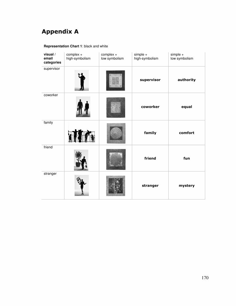
170
(�����<�(�
Representation Chart 1: black and white
visual / email categories
complex + high-symbolism
complex + low symbolism
simple + high-symbolism
simple + low symbolism
supervisor � �
� ��������� � ��������
coworker � �
�����#��� �= ���
family � �
������� ��������
friend � �
������ � ��
stranger � �
��������� ��������
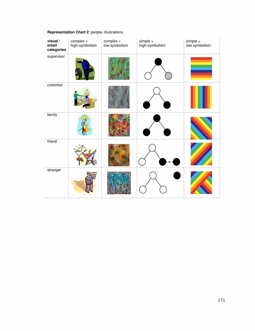
171
Representation Chart 2: people, illustrations
visual / email categories
complex + high-symbolism
complex + low symbolism
simple + high-symbolism
simple + low symbolism
supervisor � � � �
coworker � � � �
family � � � �
friend � � � �
stranger � � � �
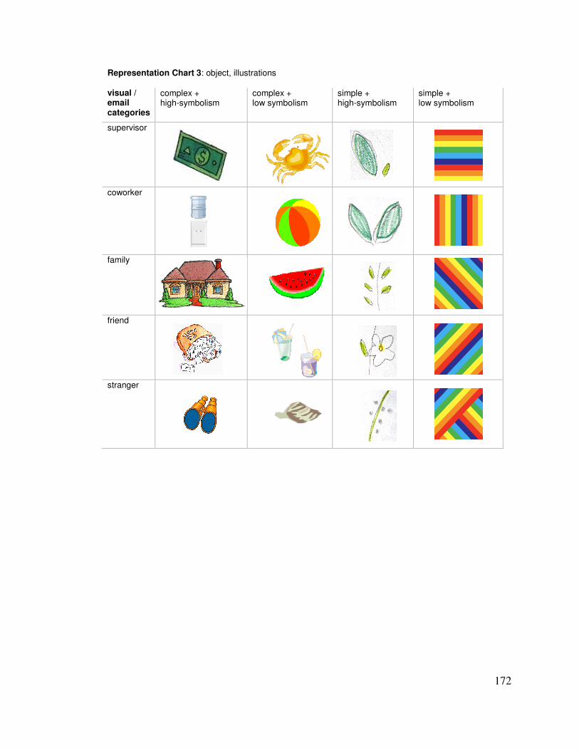
172
Representation Chart 3: object, illustrations
visual / email categories
complex + high-symbolism
complex + low symbolism
simple + high-symbolism
simple + low symbolism
supervisor � � � �
coworker � � � �
family � � � �
friend � � � �
stranger � � � �
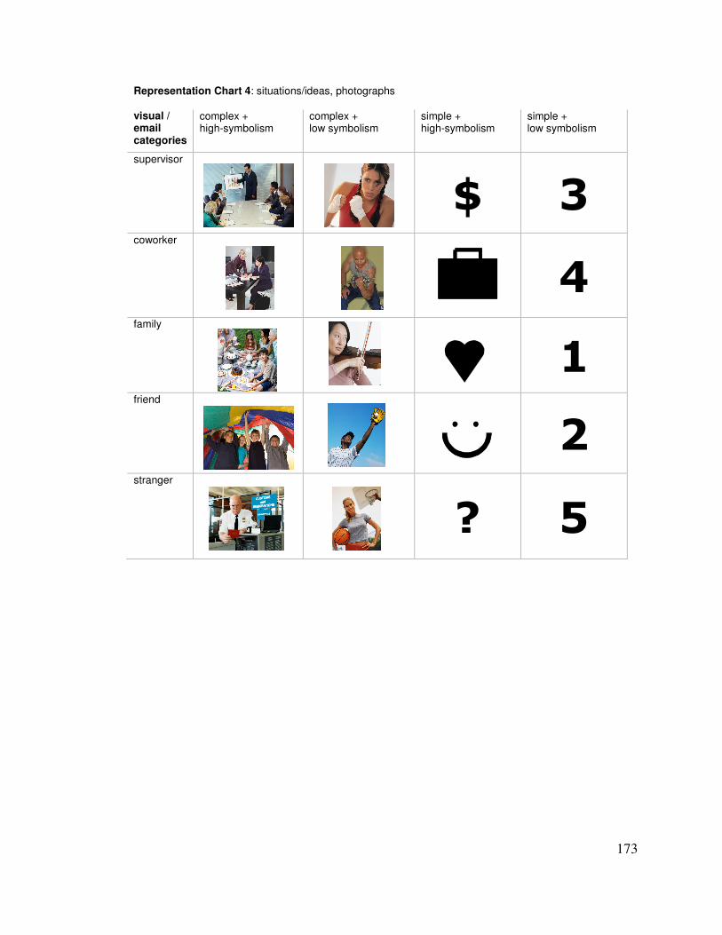
173
Representation Chart 4: situations/ideas, photographs
visual / email categories
complex + high-symbolism
complex + low symbolism
simple + high-symbolism
simple + low symbolism
supervisor � �
>� 4�coworker � � �
6�family � � �
+�friend � � �
%�stranger � �
?� 7�
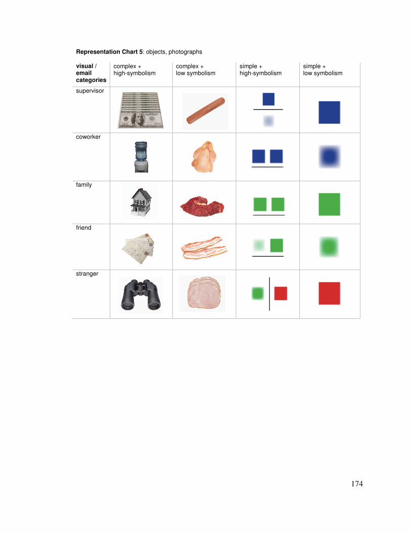
174
Representation Chart 5: objects, photographs
visual / email categories
complex + high-symbolism
complex + low symbolism
simple + high-symbolism
simple + low symbolism
supervisor � � � �
coworker � � � �
family � � � �
friend � � � �
stranger � � � �
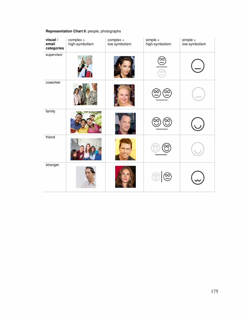
175
Representation Chart 6: people, photographs
visual / email categories
complex + high-symbolism
complex + low symbolism
simple + high-symbolism
simple + low symbolism
supervisor � � � �
coworker � � � �
family � � � �
friend � � � �
stranger � � � �
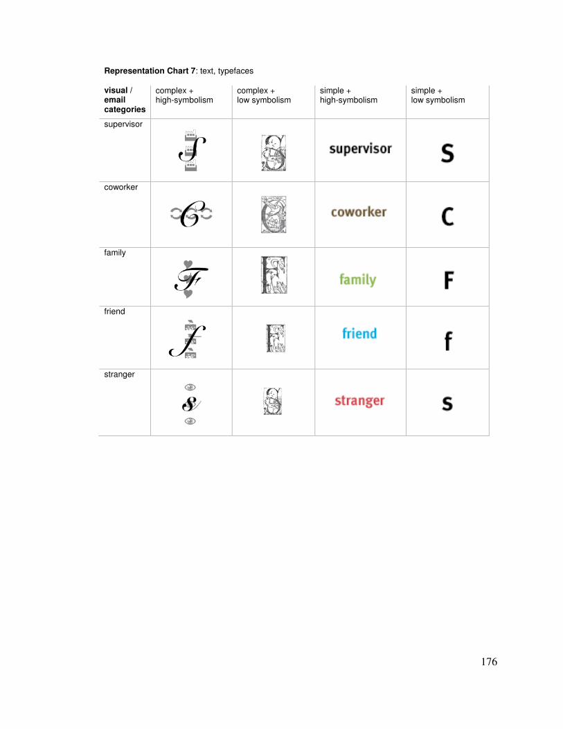
176
Representation Chart 7: text, typefaces
visual / email categories
complex + high-symbolism
complex + low symbolism
simple + high-symbolism
simple + low symbolism
supervisor � � � �
coworker � � � �
family � � � �
friend � � � �
stranger � � � �
177
(�����<�"�
The following pages include survey materials from the Multitasking, Unlearned and Learned Studies. Each survey is preceded by a cover page to identify it and describe its administration. Paper surveys are presented exactly as the users saw them except that the margins are smaller (thus, table and text sizes were reduced slightly to fit on the page) and page numbers were added.
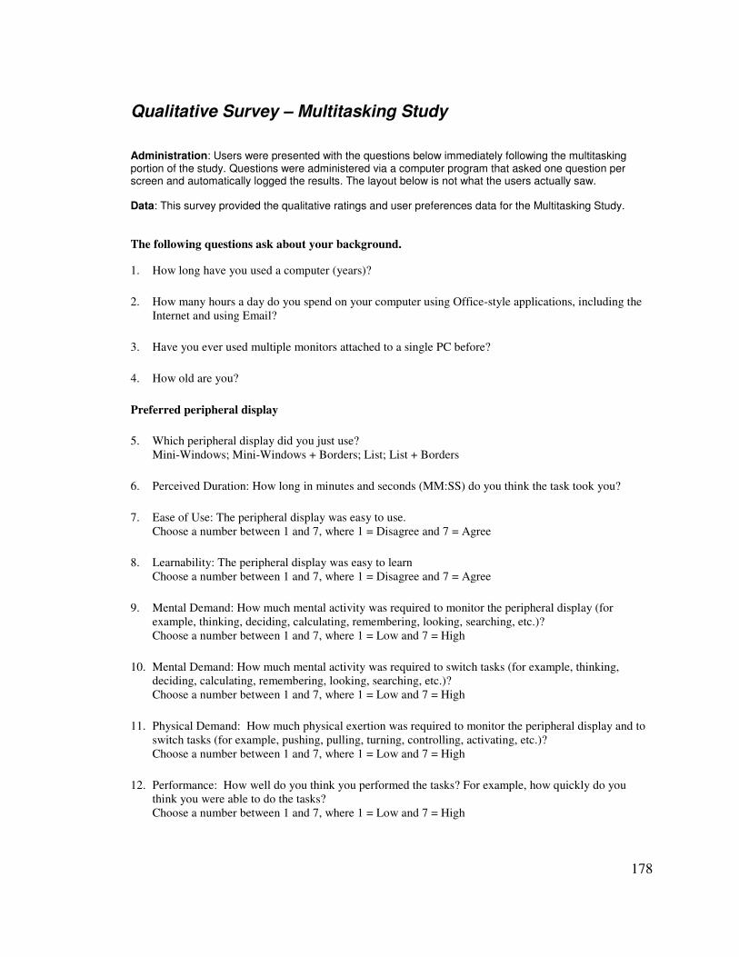
178
Qualitative Survey – Multitasking Study Administration: Users were presented with the questions below immediately following the multitasking portion of the study. Questions were administered via a computer program that asked one question per screen and automatically logged the results. The layout below is not what the users actually saw. Data: This survey provided the qualitative ratings and user preferences data for the Multitasking Study. The following questions ask about your background. 1. How long have you used a computer (years)?
2. How many hours a day do you spend on your computer using Office-style applications, including the Internet and using Email?
3. Have you ever used multiple monitors attached to a single PC before?
4. How old are you?
Preferred peripheral display
5. Which peripheral display did you just use? Mini-Windows; Mini-Windows + Borders; List; List + Borders
6. Perceived Duration: How long in minutes and seconds (MM:SS) do you think the task took you?
7. Ease of Use: The peripheral display was easy to use. Choose a number between 1 and 7, where 1 = Disagree and 7 = Agree
8. Learnability: The peripheral display was easy to learn Choose a number between 1 and 7, where 1 = Disagree and 7 = Agree
9. Mental Demand: How much mental activity was required to monitor the peripheral display (for example, thinking, deciding, calculating, remembering, looking, searching, etc.)? Choose a number between 1 and 7, where 1 = Low and 7 = High
10. Mental Demand: How much mental activity was required to switch tasks (for example, thinking, deciding, calculating, remembering, looking, searching, etc.)? Choose a number between 1 and 7, where 1 = Low and 7 = High
11. Physical Demand: How much physical exertion was required to monitor the peripheral display and to switch tasks (for example, pushing, pulling, turning, controlling, activating, etc.)? Choose a number between 1 and 7, where 1 = Low and 7 = High
12. Performance: How well do you think you performed the tasks? For example, how quickly do you think you were able to do the tasks? Choose a number between 1 and 7, where 1 = Low and 7 = High
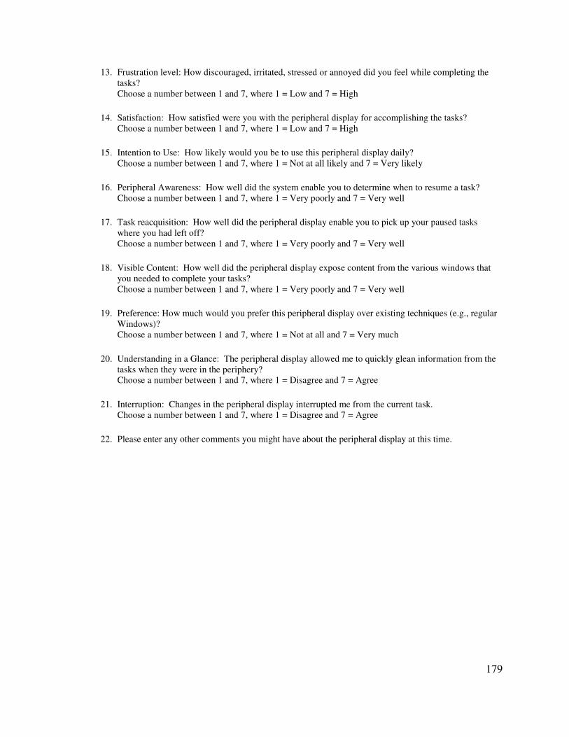
179
13. Frustration level: How discouraged, irritated, stressed or annoyed did you feel while completing the tasks? Choose a number between 1 and 7, where 1 = Low and 7 = High
14. Satisfaction: How satisfied were you with the peripheral display for accomplishing the tasks? Choose a number between 1 and 7, where 1 = Low and 7 = High
15. Intention to Use: How likely would you be to use this peripheral display daily? Choose a number between 1 and 7, where 1 = Not at all likely and 7 = Very likely
16. Peripheral Awareness: How well did the system enable you to determine when to resume a task? Choose a number between 1 and 7, where 1 = Very poorly and 7 = Very well
17. Task reacquisition: How well did the peripheral display enable you to pick up your paused tasks where you had left off? Choose a number between 1 and 7, where 1 = Very poorly and 7 = Very well
18. Visible Content: How well did the peripheral display expose content from the various windows that you needed to complete your tasks? Choose a number between 1 and 7, where 1 = Very poorly and 7 = Very well
19. Preference: How much would you prefer this peripheral display over existing techniques (e.g., regular Windows)? Choose a number between 1 and 7, where 1 = Not at all and 7 = Very much
20. Understanding in a Glance: The peripheral display allowed me to quickly glean information from the tasks when they were in the periphery? Choose a number between 1 and 7, where 1 = Disagree and 7 = Agree
21. Interruption: Changes in the peripheral display interrupted me from the current task. Choose a number between 1 and 7, where 1 = Disagree and 7 = Agree
22. Please enter any other comments you might have about the peripheral display at this time.

180
Rendition Set Qualitative Rating Survey – Unlearned Study Administration: Users were presented with this survey immediately following the dual-task portion of the study. Data: This survey provided the qualitative ratings and user preferences data for the Unlearned Study.

181
Instructions:
1. For each row, please rate the set of 5 designs on a scale from 1 = “strongly disagree” to 5 = “strongly agree” for each quality listed.
2. Pick your 2 favorite rows and your 1 least favorite row and fill in the information about them below.
My 1st favorite. Number: _____________ Description: __________________________________________________________
What about this set of designs makes it your favorite? _______________________________________________
__________________________________________________________________________________________
__________________________________________________________________________________________
__________________________________________________________________________________________
What would you change about this set of designs to make it better, if anything? ___________________________
__________________________________________________________________________________________
__________________________________________________________________________________________
My 2nd favorite. Number: _____________ Description: __________________________________________________________
What about this set of designs makes it your 2nd favorite? ___________________________________________
__________________________________________________________________________________________
__________________________________________________________________________________________
__________________________________________________________________________________________
What would you change about this set of designs to make it better, if anything? ___________________________
__________________________________________________________________________________________
__________________________________________________________________________________________
My least favorite. Number: _____________ Description: __________________________________________________________
What about this set of designs makes it your least favorite? ___________________________________________
__________________________________________________________________________________________
182
__________________________________________________________________________________________
__________________________________________________________________________________________
What would you change about this set of designs to make it better? ____________________________________
__________________________________________________________________________________________
__________________________________________________________________________________________
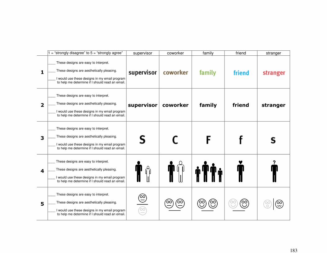
183
1 = “strongly disagree” to 5 = “strongly agree” � supervisor coworker family friend stranger
+�
____ These designs are easy to interpret.
____ These designs are aesthetically pleasing.
____ I would use these designs in my email program to help me determine if I should read an email.
� � � � �
%�
____ These designs are easy to interpret.
____ These designs are aesthetically pleasing.
____ I would use these designs in my email program to help me determine if I should read an email.
� ��������� �����#��� ������� ������ ���������
4�
____ These designs are easy to interpret.
____ These designs are aesthetically pleasing.
____ I would use these designs in my email program to help me determine if I should read an email.
� � � � �
6�
____ These designs are easy to interpret.
____ These designs are aesthetically pleasing.
____ I would use these designs in my email program to help me determine if I should read an email.
7�
____ These designs are easy to interpret.
____ These designs are aesthetically pleasing.
____ I would use these designs in my email program to help me determine if I should read an email.
� � � � �

184
1 = “strongly disagree” to 5 = “strongly agree” � supervisor coworker family friend stranger
:�
____ These designs are easy to interpret.
____ These designs are aesthetically pleasing.
____ I would use these designs in my email program to help me determine if I should read an email.
� � � � �
'�
____ These designs are easy to interpret.
____ These designs are aesthetically pleasing.
____ I would use these designs in my email program to help me determine if I should read an email.
� � � � �
9�
____ These designs are easy to interpret.
____ These designs are aesthetically pleasing.
____ I would use these designs in my email program to help me determine if I should read an email.
>�
� � �
?�
;�
____ These designs are easy to interpret.
____ These designs are aesthetically pleasing.
____ I would use these designs in my email program to help me determine if I should read an email.
� � � � �
+&�
____ These designs are easy to interpret.
____ These designs are aesthetically pleasing.
____ I would use these designs in my email program to help me determine if I should read an email.
� � � � �
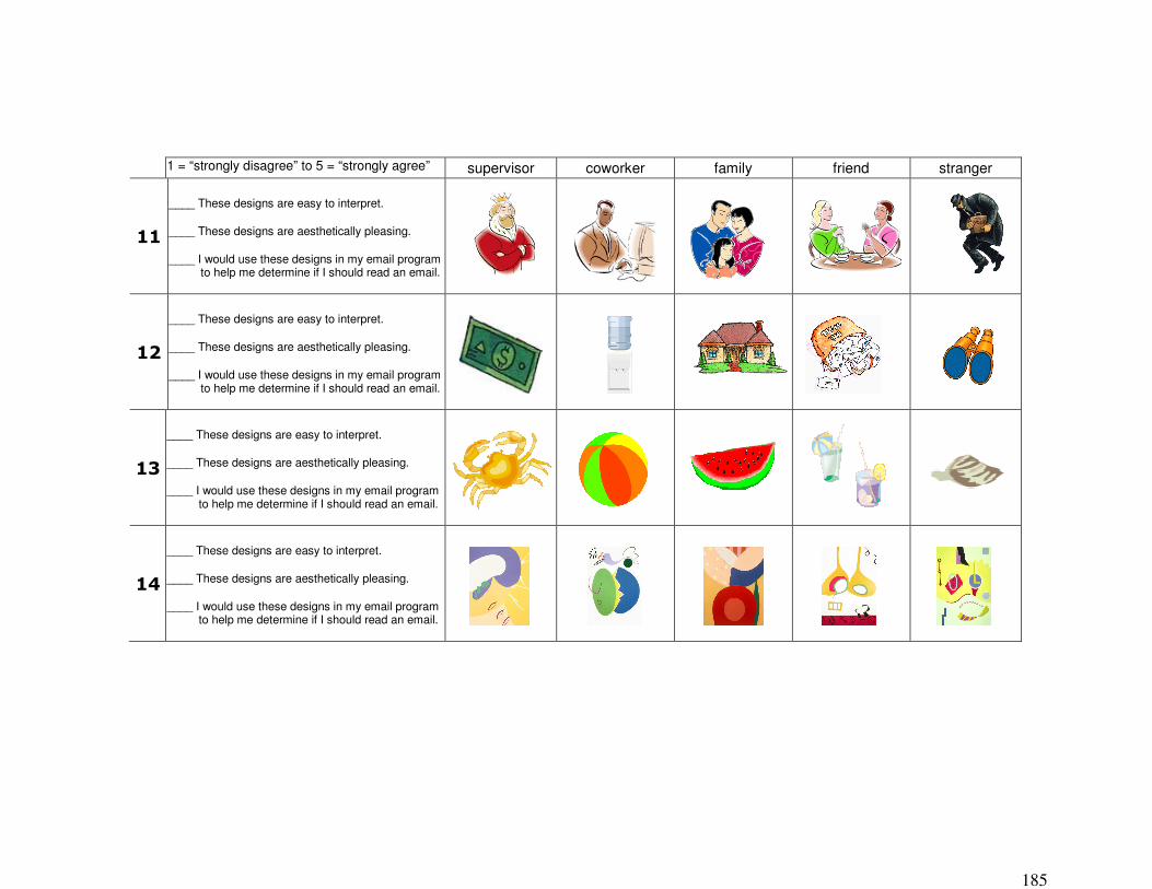
185
1 = “strongly disagree” to 5 = “strongly agree” � supervisor coworker family friend stranger
++�
____ These designs are easy to interpret.
____ These designs are aesthetically pleasing.
____ I would use these designs in my email program to help me determine if I should read an email.
+%�
____ These designs are easy to interpret.
____ These designs are aesthetically pleasing.
____ I would use these designs in my email program to help me determine if I should read an email.
� � � � �
+4�
____ These designs are easy to interpret.
____ These designs are aesthetically pleasing.
____ I would use these designs in my email program to help me determine if I should read an email.
� � � � �
+6�
____ These designs are easy to interpret.
____ These designs are aesthetically pleasing.
____ I would use these designs in my email program to help me determine if I should read an email.
�
186
Rendition Set Qualitative Rating Survey – Learned Study Administration: Users were presented with this survey immediately following the dual-task portion of the study. Data: This survey provided the qualitative ratings and user preferences data for the Learned Study.
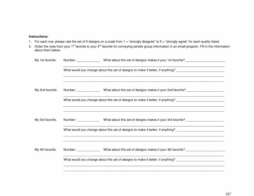
187
Instructions: 1. For each row, please rate the set of 5 designs on a scale from 1 = “strongly disagree” to 5 = “strongly agree” for each quality listed. 2. Order the rows from your 1st favorite to your 4th favorite for conveying sender group information in an email program. Fill in the information
about them below.
My 1st favorite. Number: _____________ What about this set of designs makes it your 1st favorite? ______________________
__________________________________________________________________________________________
What would you change about this set of designs to make it better, if anything? ___________________________
__________________________________________________________________________________________
__________________________________________________________________________________________
My 2nd favorite. Number: _____________ What about this set of designs makes it your 2nd favorite? _____________________
__________________________________________________________________________________________
What would you change about this set of designs to make it better, if anything? ___________________________
__________________________________________________________________________________________
__________________________________________________________________________________________
My 3rd favorite. Number: _____________ What about this set of designs makes it your 3rd favorite? _____________________
__________________________________________________________________________________________
What would you change about this set of designs to make it better, if anything? ___________________________
__________________________________________________________________________________________
__________________________________________________________________________________________
My 4th favorite. Number: _____________ What about this set of designs makes it your 4th favorite? ______________________
__________________________________________________________________________________________
What would you change about this set of designs to make it better, if anything? ___________________________
__________________________________________________________________________________________
__________________________________________________________________________________________
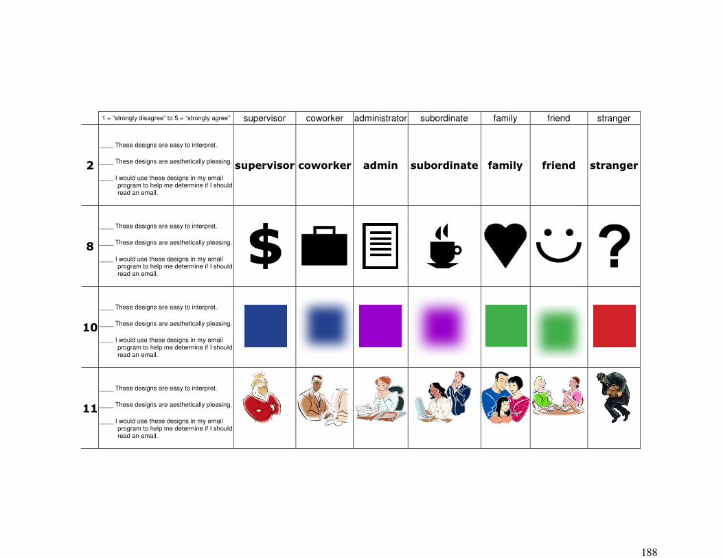
188
1 = “strongly disagree” to 5 = “strongly agree”� supervisor coworker administrator subordinate family friend stranger
%�
____ These designs are easy to interpret.
____ These designs are aesthetically pleasing.
____ I would use these designs in my email program to help me determine if I should read an email.
� ��������������#��� ����� � ��������� ������� ������ ���������
9�
____ These designs are easy to interpret.
____ These designs are aesthetically pleasing.
____ I would use these designs in my email program to help me determine if I should read an email.
� � � � �� �
+&�
____ These designs are easy to interpret.
____ These designs are aesthetically pleasing.
____ I would use these designs in my email program to help me determine if I should read an email.
����
���� �
� ��
�� �
�
� �
���
� �
��
�
��
�� �
++�
____ These designs are easy to interpret.
____ These designs are aesthetically pleasing.
____ I would use these designs in my email program to help me determine if I should read an email.

189
Demographic Survey – Unlearned & Learned Studies Administration: Users were presented with this survey they completed the Rendition Set Qualitative Survey, at the end of the study. Data: This survey provided participant demographic data.

190
Demographic Survey 1. Gender: Male Female 2. Age: 3. Ethnicity: (This is collected for IRB reporting purposes only.)
___Caucasian ___African American ___Hispanic ___Asian/Pacific Islander ___Native American ___Other(describe)____________________
4. What is your occupation? Institution?
5. How long have you used a computer?
6. How many hours a day do you use a computer?
7. How often do you check email? (circle one) hourly 2-4 times a day 1 time a day a few times a week other:
8. Please share any comments you have about this study (the circle game, the email
peripheral display), the designs you saw, or anything else you would like to tell us about your experience today.
Thank you for participating!