Design.as.Art
127
-
Upload
henry-moreno -
Category
Documents
-
view
32 -
download
0
Transcript of Design.as.Art


PENGUIN MODERN CLASSICS
BRUNO MUNARIDESIGN AS ART
Bruno Munari was a well-known. Milanese designer and graphic artist who wastwice awarded the Compasso d’Oro for excellence in his field. Known for hisresearches in visual communication and cinematography, various exhibitions ofhis work have been held in Europe, the United States and Japan. He died in 1998.

BRUNO MUNARI
DESIGNASARTTranslated by Patrick Creagh
PENGUIN BOOKS

PENGUIN CLASSICS
Published by the Penguin GroupPenguin Books Ltd, 80 Strand, London WC2R 0RL, EnglandPenguin Group (USA) Inc., 375 Hudson Street, New York, New York 10014, USAPenguin Group (Canada), 90 Eglinton Avenue East, Suite 700, Toronto, Ontario,Canada M4P 2Y3 (a division of Pearson Penguin Canada Inc.)Penguin Ireland, 25 St Stephen’s Green, Dublin 2, Irelanda division of Penguin Books Ltd)Penguin Group (Australia), 250 Camberwell Road, Camberwell,Victoria 3124, Australia (a division of Pearson Australia Group Pty Ltd)Penguin Books India Pvt Ltd, 11 Community Centre,Panchsheel Park, New Delhi – 110 017, IndiaPenguin Group (NZ), 67 Apollo Drive, Rosedale, North Shore 0632,New Zealand (a division of Pearson New Zealand Ltd)Penguin Books (South Africa) (Pty) Ltd, 24 Sturdee Avenue,Rosebank, Johannesburg 2196, South Africa
Penguin Books Ltd, Registered Offices: 80 Strand, London WC2R 0RL, England
First published by Editori Laterza 1966Published in Pelican Books 1971Reissued in Penguin Modern Classics 20081
Copyright © Bruno Munari, 1966Translation copyright © Patrick Creagh, 1971All rights reserved
The moral right of the author has been asserted
Except in the United States of America, this book is sold subject to the condition that it shall not, by way of trade orotherwise, be lent, re-sold, hired out, or otherwise circulated without the publisher’s prior consent in any form of bindingor cover other than that in which it is published and without a similar condition including this condition being imposedon the subsequent purchaser
978-0-14-192080-1

CONTENTS
Preface to the English Edition
Preface: The Useless Machines
Design as Art
Designers and Stylists
What is a Designer?Pure and AppliedA Living LanguageA Rose is a Rose is aThe StylistsMystery Art
Visual Design
Character BuildingThe Shape of WordsPoems and TelegramsTwo in OneA Language of Signs and Symbols?12,000 Different Colours
Graphic Design
Poster with a Central ImagePoster without EndChildren’s Books
Industrial Design
Micro-ArtHow One Lives in a Traditional Japanese HouseWhat is Bamboo?A Spontaneous FormA Prismatic LampWear and Tear

Orange, Peas and RoseA Piece of Travelling SculptureLuxuriously Appointed Gentlemen’s ApartmentsKnives, Forks and SpoonsAnd That’s Not All…Fancy Goods
Research Design
IrisGrowth and ExplosionConcave-Convex FormsContinuous StructuresThe TetraconeYang-YinMoiréDirect ProjectionsProjections with Polarized LightThe SquareThe CircleAn Arrow Can Lose Its Feathers but Not Its PointTheoretical Reconstructions of Imaginary ObjectsExercises in Topology, or Rubber-Sheet GeometryTwo Fountains, Nine SpheresAppendix: The Machines of my Childhood (1924)

An artist is a man who digests his own subjective impressions and knows how tofind a general objective meaning in them, and how to express them in aconvincing form.
MAXIM GORKY

PREFACE TO THE ENGLISH EDITION
In art exhibitions we see less and less of oil paintings on canvas and pieces of sculpturein marble or bronze. Instead we see a growing number of objects made in all sorts ofways of all sorts of materials, things that have no connection with the old-fashionedcategories of the visual arts. In the old days of painting these materials and techniqueswere very much looked down on as inhuman and unworthy of being the vehicles of aWork of Art.
But even in the recent past both painting and sculpture began to lose a few of theirbits and pieces. The literary element in a visual work of art was the first to be discardedin favour of pure visuality (Seurat), and it was understood that with the means properto the visual arts one could say many things that could not be put into words. It wastherefore left to literature to tell stories. The disappearance of narrative led to thedisappearance of the forms that imitated visible nature, and (with Kandinsky) the firstabstract forms entered the scene. These still had shades of colouring, but this naturalisticand representative element was discarded (by Mondrian) in favour of a colour and formthat was simply itself and nothing else. From this point it is practically inevitable thatwe should end up with paintings that are all of one colour (Klein). This version of thestory is rather compressed, but these at any rate are the essential stages in thedisappearance of the old categories in art. Eventually the picture is punctured, slashedor burnt alive (Fontana, Burri), and this is the last farewell to techniques that no longerhad anything to say to modern man.
The artists of today are busily looking for something that will once again interest thepeople of today, distracted as they are by a multitude of visual stimuli all clamouring fortheir attention. If you go to an art exhibition today you may see very simple objects thatare so huge that they fill the whole room, some based on statics and others on kinetics.You will find stainless steel used in conjunction with seagull droppings, laminatedplastics of every conceivable kind, rigid or inflatable transparent plastic, bits of scrapmetal soldered together, and live animals. The artist wants to make the viewerparticipate at all costs. He is looking for a point of contact, and he wants to sell hisworks of art in the chain stores just like any other commercial article, stripped of itsmystery and at a reasonable price.
But what is at the bottom of this anxiety that drives artists to abandon safe traditionaltechniques and certain markets, and to sell mass-produced articles in shops and not ingalleries?
It is probably the desire to get back into society, to re-establish contact with theirneighbours, to create an art for everyone and not just for the chosen few with bags ofmoney. Artists want to recover the public that has long ago deserted the art galleries,and to break the closed circle of Artist – Dealer – Critic – Gallery – Collector.
They want to destroy the myth of the Great Artist, of the enormously costly

Masterpiece, of the one and only unique divine Thing.They have realized that at the present time subjective values are losing their
importance in favour of objective values that can be understood by a greater number ofpeople.
And if the aim is to mass-produce objects for sale to a wide public at low price, then itbecomes a problem of method and design. The artist has to regain the modesty he hadwhen art was just a trade, and instead of despising the very public he is trying tointerest he must discover its needs and make contact with it again. This is the reasonwhy the traditional artist is being transformed into the designer, and as I myself haveundergone this transformation in the course of my working career I can say that thisbook of mine is also a kind of diary in which I try to see the why and wherefore of thismetamorphosis.
1970
BRUNO MUNARI
PREFACE
The Useless Machines
Lots of people know of me as ‘You know, the man who made the useless machines’, andeven today I still occasionally get asked for one of these objects, which I designed andmade in about 1933. That was the time when the movement called the ‘novecentoitaliano’ ruled the roost, with its High Court of super-serious masters, and all the artmagazines spoke of nothing else but their granitic artistic productions; and everyonelaughed at me and my useless machines. They laughed all the harder because mymachines were made of cardboard painted in plain colours, and sometimes a glassbubble, while the whole thing was held together with the frailest of wooden rods andbits of thread. They had to be light so as to turn with the slightest movement of the air,and the thread was just the thing to prevent them getting twisted up.
But all my friends rocked with laughter, even those I most admired for the energy theyput into their own work. Nearly all of them had one of my useless machines at home,but they kept them in the children’s rooms because they were absurd and practicallyworthless, while their sitting-rooms were adorned with the sculpture of Marino Mariniand paintings by Carrà and Sironi. Certainly, in comparison with a painting by Sironi,scored deeply by the lion’s claw of feeling, I with my thread and cardboard could hardlyexpect to be taken seriously.
Then these friends of mine discovered Alexander Calder, who was making mobiles;but his things were made of iron and painted black or some stunning colour. Caldertriumphed in our circle, and I came to be thought of as his imitator.
What is the difference between my useless machines and Calder’s mobiles? I think it isbest to make this clear, for apart from the different materials the methods ofconstruction are also quite distinct. They have only two things in common: both aresuspended and both gyrate. But there are thousands of suspended objects and alwayshave been, and I might point out that my friend Calder himself had a precursor in ManRay, who in 1920 made an object on exactly the same principles later used by Calder.
There is a harmonic relationship between all the parts which go to make up a uselessmachine. Let us suppose that we start with a glass ball, marked A in the illustration.From this we obtain the disc A+1/3R by simply adding one third to the radius of theball and marking the dimensions of the ball inside the cardboard disc. The diameter ofthis disc determines the other two geometric forms B and 2B (the one being just doublethe other). The backs of these forms are painted as the negatives of the fronts. Thewooden rods to which the shapes are attached are also measured in relation to thediameter of the ball: 3A, 5A and 6A. The whole thing is then balanced up and hung on apiece of thread.

Mobiles are by nature different. The inspiration for them seems to be drawn from thevegetable kingdom. One might say that Calder was the first sculptor of trees. There areplenty of sculptors of figures and animals, but trees in the sense of living things thatoscillate, with branches of progressive dimensions and with leaves on the branches,these had never been done. Take a branch with its leaves still on and you are looking ata mobile by Calder. They have the same principle, the same movement, the samedynamic behaviour.
But the pieces of a useless machine all turn upon themselves and in respect to eachother without touching. Their basis is geometrical, while the two differently colouredfaces give a variety of colour-effects as the forms turn. People have often wondered howthe idea originated, and here is the answer. In 1933 they were painting the first abstractpictures in Italy, and these were nothing more than coloured geometric shapes or spaces

with no reference at all to visible nature. Very often these abstract paintings were stilllives of geometric forms done in realistic style. They used to say that Morandi madeabstract pictures by using bottles and vases as formal pretexts. The subject of a Morandicanvas is in fact not the bottles, but painting enclosed within those spaces. Bottles ortriangles were therefore the same thing, and the painting emerged from therelationships of its forms and colours.
Now I myself thought that instead of painting triangles and other geometrical formswithin the atmosphere of an oblong picture (for this — look at Kandinsky — was stillessentially realistic) it would perhaps be interesting to free these forms from the staticnature of a picture and to hang them up in the air, attached to each other in such a wayas to live with us in our own surroundings, sensitive to the atmosphere of real life, tothe air we breathe. And so I did. I cut out the shapes, gave them harmonic relationshipsto one another, calculated the distances between them, and painted their backs (the partone never sees in a picture) in a different way so that as they turned they would form avariety of combinations. I made them very light and used thread so as to keep themmoving as much as possible.
Whether or not Calder started from the same idea, the fact is that we were together inaffirming that figurative art had passed from two or at the most three dimensions toacquire a fourth: that of time.

Other types of ‘useless machine’ designed in the period 1935-54 and made of balsawood,cardboard and thread. Some were made of flexible wire and wooden rods. Thecomponents were always tied together with thread. The wire gave a special springinessto the wooden rods.
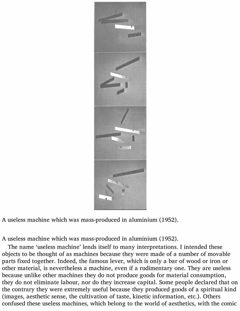
A useless machine which was mass-produced in aluminium (1952).
A useless machine which was mass-produced in aluminium (1952).The name ‘useless machine’ lends itself to many interpretations. I intended these
objects to be thought of as machines because they were made of a number of movableparts fixed together. Indeed, the famous lever, which is only a bar of wood or iron orother material, is nevertheless a machine, even if a rudimentary one. They are uselessbecause unlike other machines they do not produce goods for material consumption,they do not eliminate labour, nor do they increase capital. Some people declared that onthe contrary they were extremely useful because they produced goods of a spiritual kind(images, aesthetic sense, the cultivation of taste, kinetic information, etc.). Othersconfused these useless machines, which belong to the world of aesthetics, with the comic

machines I invented during my student days with the sole purpose of making my friendslaugh. These comic machines were later published by Einaudi in a book (long since outof print) called Le Macchine di Munari. They were projects for strange constructions forwagging the tails of lazy dogs, for predicting the dawn, for making sobs sound musical,and many other facetious things of that kind. They were inspired by the famousAmerican designer Rube Goldberg, but British readers will more easily recall HeathRobinson, who was working in a similar field.
‘Machines would not exist without us, but our existence would no longer be possiblewithout them.’ (Pierre Ducassé)

DESIGN AS ART
Today it has become necessary to demolish the myth of the ‘star’ artist who onlyproduces masterpieces for a small group of ultra-intelligent people. It must beunderstood that as long as art stands aside from the problems of life it will only interesta very few people. Culture today is becoming a mass affair, and the artist must stepdown from his pedestal and be prepared to make a sign for a butcher’s shop (if heknows how to do it). The artist must cast off the last rags of romanticism and becomeactive as a man among men, well up in present-day techniques, materials and workingmethods. Without losing his innate aesthetic sense he must be able to respond withhumility and competence to the demands his neighbours may make of him.
The designer of today re-establishes the long-lost contact between art and the public,between living people and art as a living thing. Instead of pictures for the drawing-room, electric gadgets for the kitchen. There should be no such thing as art divorcedfrom life, with beautiful things to look at and hideous things to use. If what we useevery day is made with art, and not thrown together by chance or caprice, then we shallhave nothing to hide.
Anyone working in the field of design has a hard task ahead of him: to clear hisneighbour’s mind of all preconceived notions of art and artists, notions picked up atschools where they condition you to think one way for the whole of your life, withoutstopping to think that life changes – and today more rapidly than ever. It is therefore upto us designers to make known our working methods in clear and simple terms, themethods we think are the truest, the most up-to-date, the most likely to resolve ourcommon aesthetic problems. Anyone who uses a properly designed object feels thepresence of an artist who has worked for him, bettering his living conditions andencouraging him to develop his taste and sense of beauty.
When we give a place of honour in the drawing-room to an ancient Etruscan vasewhich we consider beautiful, well proportioned and made with precision and economy,we must also remember that the vase once had an extremely common use. Mostprobably it was used for cooking-oil. It was made by a designer of those times, when artand life went hand in hand and there was no such thing as a work of art to look at andjust any old thing to use.
I have therefore very gladly accepted the proposal that I should bring together in avolume the articles I originally published in the Milanese paper Il Giorno. To these I haveadded other texts, as well as a lot of illustrations which it was not possible to publish inthe limited space of a daily paper. I have also made a few essential changes for theEnglish edition.
I hope that other designers will make similar efforts to spread knowledge of our work,for our methods are daily asserting themselves as the fittest way of gaining theconfidence of men at large, and of giving a meaning to our present way of life.

Design came into being in 1919, when Walter Gropius founded the Bauhaus atWeimar. Part of the prospectus of this school reads:
‘We know that only the technical means of artistic achievement can be taught, not artitself. The function of art has in the past been given a formal importance which hassevered it from our daily life; but art is always present when a people lives sincerelyand healthily.
‘Our job is therefore to invent a new system of education that may lead – by way of anew kind of specialized teaching of science and technology – to a complete knowledgeof human needs and a universal awareness of them.
‘Thus our task is to make a new kind of artist, a creator capable of understandingevery kind of need: not because he is a prodigy, but because he knows how to approachhuman needs according to a precise method. We wish to make him conscious of hiscreative power, not scared of new facts, and independent of formulas in his own work.’
From that time on we have watched an ever more rapid succession of new styles inthe world of art: abstract art, Dada, Cubism, Surrealism, Neo-Abstract art, Neo-Dada,pop and op. Each one gobbles up its predecessor and we start right back at thebeginning again.
What Gropius wrote is still valid. This first school of design did tend to make a newkind of artist, an artist useful to society because he helps society to recover its balance,and not to lurch between a false world to live one’s material life in and an ideal worldto take moral refuge in.
When the objects we use every day and the surroundings we live in have become inthemselves a work of art, then we shall be able to say that we have achieved a balancedlife.

DESIGNERS AND STYLISTS
What is a Designer?
He is a planner with an aesthetic sense. Certain industrial products depend in largemeasure on him for their success. Nearly always the shape of a thing, be it a typewriter,a pair of binoculars, an armchair, a ventilator, a saucepan or a refrigerator, will havean important effect on sales: the better designed it is, the more it will sell.
The term ‘designer’ was first used in this sense in America. It does not refer to anindustrial designer, who designs machines or mechanical parts, workshops or otherspecialized buildings. He is in fact a design engineer, and if he has a motor-scooter onthe drawing-board he does not give a great deal of importance to the aesthetic side ofthings, or at the most he applies a personal idea of what a motor-scooter ought to looklike. I once asked an engineer who had designed a motor-scooter why he had chosen aparticular colour, and he said: because it was the cheapest. The industrial designertherefore thinks of the aesthetic side of the job as simply a matter of providing a finish,and although this may be most scrupulously done he avoids aesthetic problems that arebound up with contemporary culture because such things are not considered useful. Anengineer must never be caught writing poetry. The designer works differently. He givesthe right weight to each part of the project in hand, and he knows that the ultimateform of the object is psychologically vital when the potential buyer is making up hismind. He therefore tries to give it a form as appropriate as possible to its function, aform that one might say arises spontaneously from the function, from the mechanicalpart (when there is one), from the most appropriate material, from the most up-to-dateproduction techniques, from a calculation of costs, and from other psychological andaesthetic factors.
In the early days of rationalism it used to be said that an object was beautiful in so faras it was functional, and only the most practical functions were taken into account.Various kinds of tool were used as evidence for this argument, such as surgicalinstruments. Today we do not think in terms of beauty but of formal coherence, andeven the ‘decorative’ function of the object is thought of as a psychological element. Forbeauty in the abstract may be defined as what is called style, with the consequent needto force everything into a given style because it is new. Thus in the recent past we havehad the aerodynamic style, which has been applied not only to aeroplanes and cars butto electric irons, perambulators and armchairs. On one occasion I even saw anaerodynamic hearse, which is about as far as the aerodynamic style can go (speedingthe departing guest?).
We have therefore discarded beauty in the abstract sense, as something stuck on to thetechnical part of a thing, like a stylish car body or a decoration tastefully chosen fromthe work of some great artist. Instead we have formal coherence, rather as we see it innature. A leaf has the form it has because it belongs to a certain tree and fulfils a certain

function; its structure is determined by the veins which carry the sap, and the skeletonthat supports it might have been worked out by mathematics. Even so, there are manykinds of leaf, and the leaves of any single tree differ slightly among themselves. But ifwe saw a fig-leaf on a weeping-willow we would have the feeling that all was not well.It would lack coherence. A leaf is beautiful not because it is stylish but because it isnatural, created in its exact form by its exact function. A designer tries to make anobject as naturally as a tree puts forth a leaf. He does not smother his object with hisown personal taste but tries to be objective. He helps the object, if I may so put it, tomake itself by its own proper means, so that a ventilator comes to have just the shape ofa ventilator, a fiasco for wine has the shape that blown glass gives it, as a cat isinevitably covered with cat-fur. Each object takes on its own form. But of course this willnot be fixed and final because techniques change, new materials are discovered, andwith every innovation the problem arises again and the form of the object may change.
At one time people thought in terms of fine art and commercial art, pure art andapplied art. So we used to have sewing-machines built by engineers and then decoratedby an artist in gold and mother-of-pearl. Now we no longer have this distinctionbetween fine and not-fine, pure and applied. The definition of art that has caused somuch confusion in recent times, and allowed so many fast ones to be pulled, is nowlosing its prestige. Art is once more becoming a trade, as it was in ancient times whenthe artist was summoned by society to make certain works of visual communication(called frescoes) to inform the public of a certain religious event. Today the designer (inthis case the graphic designer) is called upon to make a communication (called a poster)to inform the public of some new development in a certain field. And why is it thedesigner who is called upon? Why is the artist not torn from his easel? Because thedesigner knows about printing, about the techniques used, and he uses forms andcolours according to their psychological functions. He does not just make an artisticsketch and leave it up to the printer to reproduce it as best he may. He thinks from thestart in terms of printing techniques, and it is with these that he makes his poster.
The designer is therefore the artist of today, not because he is a genius but because heworks in such a way as to re-establish contact between art and the public, because hehas the humility and ability to respond to whatever demand is made of him by thesociety in which he lives, because he knows his job, and the ways and means of solvingeach problem of design. And finally because he responds to the human needs of his time,and helps people to solve certain problems without stylistic preconceptions or falsenotions of artistic dignity derived from the schism of the arts.
‘The form follows the function.’ (Jean-Baptiste Lamarck)
The designer works in a vast sector of human activity: there is visual design, industrialdesign, graphic design and research design.

Visual design is concerned with images whose function is to communicate and informvisually: signs, symbols, the meaning of forms and colours and the relations betweenthese.
Industrial design is concerned with functional objects, designed according to economicfacts and the study of techniques and materials.
Graphic design works in the world of the Press, of books, of printed advertisements,and everywhere the printed word appears, whether on a sheet of paper or a bottle.
Research design is concerned with experiments of both plastic and visual structures intwo or more dimensions. It tries out the possibilities of combining two or moredimensions, attempts to clarify images and methods in the technological field, andcarries out research into images on film.

Pure and Applied
Once upon a time there was pure art and applied art (I prefer to use these terms, ratherthan ‘fine’ and ‘commercial’, because ‘commercial art’ does not really cover enoughground). At all events, forms were born in secret in ivory towers and fathered by divineinspiration, and Artists showed them only to initiates and only in the shape of paintingsand pieces of sculpture: for these were the only channels of communication open to theold forms of art.
Around the person of the Artistic Genius there circulated other and lesser geniuses whoabsorbed the Pure Forms and the Style of the Master and attempted to give these somecurrency by applying them to objects of everyday use. This led to the making of objectsin this style or that style, and even today the question of Style has not been altogetherdisposed of.
The distinction between pure art, applied art and industrial design is still made inFrance, a country that at one time was the cradle of living art. What we call design, theFrench call ‘esthétique industrielle’, and by this phrase they mean the application toindustry of styles invented in the realm of the pure arts.
It therefore comes about that in France they make lamps inspired by abstract formswithout bearing in mind that a lamp must give light. They design a Surrealist televisionset, a Dada table, a piece of ‘informal’ furniture, forgetting that all objects have theirexact uses and well-defined functions, and that they are no longer made by craftsmenmodelling a stylish shape in copper according to their whim of the moment but byautomatic machines turning out thousands of the things at a time.
What then is this thing called Design if it is neither style nor applied art? It isplanning: the planning as objectively as possible of everything that goes to make up thesurroundings and atmosphere in which men live today. This atmosphere is created by allthe objects produced by industry, from glasses to houses and even cities. It is planningdone without preconceived notions of style, attempting only to give each thing itslogical structure and proper material, and in consequence its logical form.
So all this talk about sober harmony, beauty and proportions, about the balancebetween masses and spaces (typical sculpture-talk), about aesthetic perfection(classicism?), about the charm of the materials used and the equilibrium of the forms, allthis talk our French friends go in for, is just a lot of old-fashioned claptrap. An objectshould now be judged by whether it has a form consistent with its use, whether thematerial fits the construction and the production costs, whether the individual parts arelogically fitted together. It is therefore a question of coherence.
Beauty as conceived of in the fine arts, a sense of balance comparable with that of themasterpieces of the past, harmony and all the rest of it, simply make no more sense indesign. If the form of an object turns out to be ‘beautiful’ it will be thanks to the logic ofits construction and to the precision of the solutions found for its various components. Itis ‘beautiful’ because it is just right. An exact project produces a beautiful object,

beautiful not because it is like a piece of sculpture, even modern sculpture, but becauseit is only like itself.
If you want to know something else about beauty, what precisely it is, look at ahistory of art. You will see that every age has had its ideal Venus (or Apollo), and thatall these Venuses or Apollos put together and compared out of the context of theirperiods are nothing less than a family of monsters.
A thing is not beautiful because it is beautiful, as the he-frog said to the she-frog, it isbeautiful because one likes it.
‘The basic teaching error of the academy was that of directing its attention towardsgenius rather than the average.’ (Bauhaus)

A Living Language
‘Good language alone will not save mankin9. But seeing the things behind the nameswill help us to understand the structure of the world we live in. Good language will helpus to communicate with one another about the realities of our environment, where wenow speak darkly, in alien tongues.’
(Stuart Chase, The Tyranny of Words)
‘… And after whan ye han examined youre conseil, as Ihan said beforne, and knowenwel that ye moun performe youre emprise, conferme it than sadly til it be at an ende.’Can one now address the public in the language of the fourteenth century? It is mostunlikely that the public would understand.
Just as there are dead languages, it is natural that there should be modes ofexpression and communication that have gone out of use. It is a well-known fact that toget a message across we can use not only words, but in many cases also images, formsand colours, symbols, signs and signals. Just as there are words which belong to otherages, so there are colours, forms, signs and so on which in our time have come to meannothing, or would convey a wrong meaning.
What does a blacksmith’s sign mean to the children of today? To children in 1900 itmeant a lot: it meant excitement. When they saw it they ran to watch the blacksmithhammering the glowing iron on his anvil, heating it every now and then in a furnacethat threw off sparks like a firework display, nailing the finished shoe to the horse’shoof. Imagine the pungent stench of the hot iron, and the huge impassive horse tetheredto an iron ring set in the blackened wall of that smoky cavern….
Maybe a city child of today doesn’t even know what a horseshoe is, and for thisreason an object that was a symbol and a sign that evoked many images and meaningsis now reduced to the status of a lucky charm.
We can point out similar changes in the colours used for visual communication.Looking into the past we find certain periods dominated by certain colours and forms:periods in which all the colours are earthy and the forms hard, some in which the wholerange of colours is put to use, others in which everything is done with three or fourcolours. And so on down to our own times, when thanks to chemistry, plastic materialsand other inventions, the kingdom of colour is governed by total chaos.
Certainly if we now used the colours of the ‘art nouveau’ period for roadsigns, thesewould fade magnificently into their surroundings. At that time they used some reallyrefined combinations of colour. A faint idea of them can still be had from Roberts’stalcum powder boxes and the labels on Strega bottles. They used to put pink and yellowside by side, or brown and blue, coffee and chocolate, pea-green and violet. Then theywould make unexpected leaps from one shade to another, putting red with pale blue(instead of dark) and so on. Can we imagine a ‘No Overtaking’ sign with a coffee and

chocolate car on a violet background? Well, yes. We can imagine it for fun, but wecannot use it for a roadsign in real life.
At some times in the past a certain series of colours, let us say all of dark tone, wereindiscriminately adapted to all branches of human activity. The colours used forfurnishings did not differ much from those for clothes or carriages. But today differentcolours have different uses. For roadsigns we use only red, blue and yellow (apart fromthe green light at traffic lights), and each colour has its well-defined meaning. Inadvertising we use bright brash colours or very refined ones according to our purpose.In printing we use the dull four-colour system which reduces all colours to a norm, whilewomen’s fashions make use of all the colours in rotation.
A double-bend sign in the style of Louis XIV. There have always been dangerous doublebends, even in the time of Louis XIV, but then there were no roadsigns. They hadheraldic arms instead. As the speed and volume of traffic increases, decoration isproportionally reduced, until it reaches the bare essentials of our present-day signals.Visual language changes according to the needs of the day.
In the past, images were nearly all painted, drawn or carved, and they reproducedvisible and recognizable reality. Now we can even see the invisible. We have a host ofmachines exploring for us what we cannot see with the naked eye. We have X-rayphotos, the world of the microscope, and the abstract inventions of artists. We havemachines that enable us to see music and sounds in the form of luminous waves,machines that show us photo-elasticity in colour by means of polarized light, machinesthat slow up pictures of motion until we get as it were a blow-up of each instant. Thenthere are the lights which already form an accepted part of the night-scape, fluorescentlights, neon, sodium vapour lights, black light. And we have forms that are beautiful andexact because they are true forms: the forms of aeroplanes and missiles are dictated bythe demands of speed, and were inconceivable in the past. These are forms we see everyday, the colours and lights of our own time. To accept, to know and to use them is to

express oneself in the language of today which was made for the man of today.

A Rose is a Rose is a
And then you go up to it and see, for the sake of argument, that it is an artificial rose.Then you become aware of the material it is made of, cloth or plastic or paper. But atfirst glance you were certain of one thing only, that it was a rose. This apparentlyinsignificant fact is the subject of careful study today, for it is vital to the problems ofvisual communication.
All over the world psychologists, designers and research workers in other fields aretrying to understand and establish objective rules that will enable us to use these meansof visual communication with increasing precision.
The growing use of symbols such as roadsigns and trademarks on a worldwide scaledemands absolute clarity of expression. It is no longer possible to confine oneself tolocal tastes. If a visual message is going to get across to people of different languagesand backgrounds it is essential that the message does not lend itself to wronginterpretations. Another point is the speed at which signs can be read, though now weare pretty well trained to take them in in the blinking of an eye. Reading them is amatter of conditioning, and we do it without thinking, as when we put our foot on thebrake when we see a red light. We are surrounded by countless visual stimuli, postersthat flash past the car windows, lighted signs, blinking lights, images that crowd inupon us on every side, and all intent on telling us something. We have already made acatalogue of stimuli in our own minds, and the process goes on without pause. Almostwithout realizing it we arrange these images in order, rejecting those that do notinterest us. We already know that roadsigns occur at a certain height above the groundand have exactly those shapes and colours and no others.
Putting things in pigeon-holes like this helps us to make snap readings of signs, andtoday it is important to have quick reflexes, so as not to waste time, or worse.
All over the world this kind of lettering conveys an immediate message: ‘strip cartoon’.Even before we read what it says. It goes without saying that an essay on Giotto as anarchitect ought not to have a title in such lettering. I know this is an exaggeration, andthat no one would in fact think of using lettering like this for such a subject, butexaggeration often throws light upon the negative aspects of a problem (in this case aproblem of graphic design). Between these letters and the right kind for the job there isa vast range of letters to choose from, both printed and drawn, and countless ways ofarranging the title. Often a firm unwilling to call in a graphic designer will use lettering

suited to cheese to present a book of famous artists, and we may see an advertisementfor the Bible which looks at first sight as if it were trying to sell us beer.
So we all have inside us (naturally with some variation from person to person) groupsof images, forms and colours which have exact meanings. There are masculine formsand colours and feminine forms and colours, warm colours and cold colours, images ofviolence and images of gentleness, images connected with culture and the arts andothers that are just plain vulgar. It goes without saying that if I have to publicize acultural campaign on behalf of works of art I must not use vulgar colours, letteringassociated with ads for canned foods, or a brash method of composition. On thecontrary, I must immediately convey the idea that here we are dealing with somethinglofty and not to be compared in any way with commonplace things. A lot of peoplethink that the public does not understand such matters, but it is not a question ofunderstanding. There is a whole mechanism already at work on its own, quiteindependent of logic or reason. It is true that a badly designed poster will have someeffect if the walls are smothered with it, but a good poster would achieve the sameresults less wastefully by giving more pleasure.
Unhappily there is a lot of confusion and waste in these messages that surround us.They often weary us with their petulance, their insistence on cramming things we don’twant down our throats, and (what is worse) doing it clumsily.
There is one American catalogue that gives a choice of one thousand two hundredcolours, and that’s not all of them. In the face of this one simply cannot go on using thesame red as a background for quite different products, for car tyres, perfumes andfoodstuffs, as if one had no other resources. The eye of the beholder is hopelesslymuddled, and his first impression, which will determine whether he is interested or not,is a vague and indefinite one.
The same can be said of form. There are things on sale that demand a tremendouseffort to guess at their proper use. With the confusion of form that persists today a brushcan look like a cat, a lamp like a weighing machine, a home like an office and an officelike a drawing-room, a bank like an electrician’s workshop and a church like a stand atthe Earls Court Exhibition.

The Stylists
One of the commonest aspects of design, and one of the most facile, is styling. It iswithin the scope of all those who have artistic stirrings, who sign their work with agenerous flutter of calligraphy as if setting their mark on a romantic masterpiece, andwhose lips are constantly laden with the words Poetry and Art.
Styling is a kind of industrial designing, and of all branches of design the mostephemeral and superficial. It does no more than give a veneer of fashion, acontemporary ‘look’, to any object whatever. The stylist works for the quick turnover,and takes his ideas from the fads of the day. The ‘aerodynamic’ period was the GoldenAge for stylists.
What most interests a stylist is line, sculptural form, a bizarre idea. A little sciencefiction does no harm and a sense of elegance is basic.
The project (let’s say a car body) is first sketched out with coloured pencils. The styliststrikes while the iron is hot, perhaps making a thumbnail sketch on the back of acigarette packet. The great thing is to get it down before inspiration cools. Then it isworked out in more detail and on a bigger scale, using artists’ charcoals. This secondsketch is always done with a great flaunting of perspective and with dazzling highlights:the car is shown by night on a wet road so as to make the utmost of these highlights.One sees something similar in those drawings of seaside and suburban villas in whichthe clouds behind and the tree before the house make ever such a nice picture.
They then make a plaster model, as sculptors do, and the joints and relative volumesare studied. While the stylist is at work he feels all the great artists of the past breathingover his shoulder, and he wants his design to be worthy of standing beside the Venus deMilo or a Palladian villa without looking foolish: indeed, these styled cars often arephotographed standing confidently in front of some masterpiece of the past.
Is this a flatiron or a speedboat? Someone turned up this sketch by the famous Americanstylist Bernard Tettamanzi (it was he who created that fabulous car for Peter Zunzer),but there is no scale marked on the drawing. There is no way of knowing the life-size ofthe object sketched out in such a masterly fashion with the point of a Flomaster. It couldbe an iron, it could be a speedboat. Opinions vary. Maybe it’s simply a handle with a

handle on it. In any case, it’s got style.In the United States stylists are responsible for giving a new look to a car or other
object that has flooded the market and is no longer selling. Leaving the vital parts insidethe car alone, they dress it up in a new suit, launch a new fashion and spread the wordthat the old style is Out. So everyone who sets great store by his dignity rushes out tobuy the new model for fear of being thought old hat.
What does fashion actually do? It sells you a suit made of a material that could lastfive years, and as soon as you have bought it tells you that you can’t wear it any longerbecause a newer one has already been created. The same principle can be used to sellanything. The motto of styling is ‘It’s Out’. As soon as one thing is sold they must inventanother to supersede it.
The stylist therefore works by contrasts. If curves were In yesterday, square cornersare In today. Out with delicate colours, in with bright ones. It is well known thatwomen’s fashions work the same way. A fashionable colour reaches saturation point andeveryone longs only to see its opposite, so that an excess of violet produces a desire foryellow. After a season of violet, then, one can fairly reliably predict a season of yellow.
Obviously this way of carrying on is quite different from the true designer’s workingmethod, for the designer takes no notice of the styles and forms of ‘pure’ art for thesimple reason that a statue and a car body are two distinct problems, and the colours ofa painting have nothing in common with the colours of mass-produced plastic objects.
A designer with a personal style, arrived at a priori, is a contradiction in terms. Thereis no such thing as a personal style in a designer’s work. While a job is in hand, be it alamp, a radio set, an electrical gadget or an experimental object, his sole concern is toarrive at the solution suggested by the thing itself and its destined use. Thereforedifferent things will have different forms, and these will be determined by their differentuses and the different materials and techniques employed.

Mystery Art
The children come out of school happy and laughing, strolling contentedly along orrunning at full tilt, shouting goodbyes to one another and snapping their books shut ineach other’s faces, pushing and shoving and thumping backs. They go home on foot orby bike or in the vast black limousine chauffeured by a peaked cap and a pair of whitegloves.
But meanwhile an idea has been implanted in their minds that will be difficult tochange for the rest of their lives. Among other things, they have learnt that art isconfined to painting, sculpture, poetry and architecture…. That painting is done withoil on canvas, that sculpture is three-dimensional and made of bronze or marble, thatpoetry is language made to rhyme, that architecture…. That the most beautiful art isthat of the distant past, that modern art stopped being good after the Impressionists,that visual art imitates nature, and that in painting and sculpture there must be ameaning (that is, a literary content) or it is not art.
And in fact you only have to go to a proper museum to see what visual art really is,and how paintings and pieces of sculpture have to be made, with due allowance fordifferent styles and periods of course, and of course with the exception of our ownperiod.
Then perhaps these children happen to see an exhibition of modern sculpture, andcome face to face with a perfectly flat statue, a statue with no profile and no thirddimension, or a painting with coloured things stuck on to its surface, in which the basrelief effect is of the greatest importance. A painting in three dimensions. And yet thethree-dimensional picture is behind glass in a gilt frame and the two-dimensional statueis on a pedestal. How are they to come to terms with these contradictions?
But this is nothing compared with what they might meet with later on. For example, ahuge painting expressing social protest, with poor peasants being kicked to death bycapitalists (a very expensive painting, such as you will only find in the drawing-roomsof capitalist country houses on the shores of Lake Como). But this picture is done inImpressionist-Cubist style, using strong colours and a very simple pictorial design,because although it is a unique piece and very expensive it has to be readily understoodby everyone. Or take another kind of protest picture, made of rubbish, rags and old iron(there are pieces of sculpture like this too) all thrown together into a frame, thoughnaturally by the hand of an artist. This is a work of art, a unique work of art, and verynice it will look — such an artistic contrast — among the cut glass and shiningsilverware of a prosperous middle-class home. It will bear witness to how indulgent wesolid men are towards the wicked artist.
How is it that our times are producing such works of art? A realistic monochromepicture of a lavatory seat. A transparent plastic box full of second-hand dentures. Atinned blackbird signed by the artist. Ten one pound tins of the same. A tailor’s dummypainted white, a canvas bundle tied with 100,000 different pieces of string, a machine

that does your doodles for you. A picture made by pouring on paint at random. Apostcard of Portsmouth twelve feet by six. A toothpaste tube twelve yards long. Ablown-up detail of a strip-cartoon.
Is this not perhaps the mirror of our society, where the incompetent landlubbers are atthe helm, where deceit is the rule, where hypocrisy is mistaken for respecting theopinions of others, where human relationships are falsified, where corruption is thenorm, where scandals are hushed up, where a thousand laws are made and noneobeyed?
But what about the art critics whose job it is to explain these things and make themclear? What have they got to say about it? They say that here we have a lyric poem inpure frontal visuality that avoids three-dimensional language in order to reinstate manin the field of semantic-entropic discourse so as to achieve a new dimension that is quitethe reverse of Kitsch and exists on the plane of objectivized and reversible Time asPlay….
That is why young people are all in love with the Beatles and live in houses with goodsolid nineteenth-century pictures, like the pictures they are taught about at school.
Why have we become like gods as technologists and like devils as moral beings,supermen in science and idiots in aesthetics—idiots above all in the Greek sense ofabsolutely isolated individuals, incapable of communicating among themselves orunderstanding one another? (Lewis Mumford)

VISUAL DESIGN
Character Building
In the world of publicity there are Rules for visual communication. These Rules arearrived at by Research and Questionnaires which are then boiled down into Statistics,and these tell us that a woman’s face must be of such and such a type and no other, thatit must be photographed in a particular way, that it must be wearing a certain kind ofexpression and looking at the public, like the Mona Lisa.
It has to be this way because the Public wishes it so. And as this Rule is a GeneralRule, all women are made to look the same in the advertising world, with the same facephotographed in the same way. Likewise, all the babies whose innocence is exploited topush dried milk and biscuits and talcum powder are perfectly identical.
How is one to distinguish at a glance between a motor-tyre poster (with femalefigure) and one for a fizzy drink (with ditto)? There once was a company that alwaysput lots of women in its advertisements, and whenever one saw a poster of theirs oneknew it was that company advertising their…. I can’t quite remember what they used tosell. Now we have countless cameras clicking away and taking exactly the same sort ofphoto for every product.
It therefore seems plain to me that we must add a footnote to the General Rules formaking a good poster. We must introduce the notion of character, so that without losingany of its impact a poster for motor-tyres can easily be distinguished from posters forbeer or Bibles. And vice versa.
It is not true to say that all posters today are the same. There are differences, butexcept in rare cases these differences are based purely on chance. They depend on thetaste of the artist, who just happened to see things that way. He has a style of his own,as they used to say in the old days. But the style should rather be that of the thing beingadvertised, so as to make it instantly recognizable.
An artist’s style is a leftover of romanticism, and is generally damaging to the goodshe is advertising, unless (as has sometimes happened) a firm simply takes over an artist,style and all, and makes him its personal property.
The problem is therefore how to give individual character to images, whether we aredealing with an isolated poster or an entire campaign. How can we do this? We have, ofcourse, famous examples in the realm of the fine arts, but it is just not good enough topick a style and apply it at random. There must be coherence between the product andthe forms and colours used.
There are products which already have strongly distinct characters of their own, andin themselves contain the images of the world in which they will be used. And each‘world’, each limited group of consumers, has its images, ranging from those of comicsfor children to those of the classics for the average adult. There are thousands of ways of

photographing or drawing the human face. Look at a book of contemporaryphotographs and you will see for yourself. A poster recommending concentrated soups isdesigned to reach a different public from one announcing the call-up of conscripts intothe armed forces. But posters and advertising in general are nearly always totallydivorced from culture. And by culture I do not mean what is taught in schools and canreadily be found in books. I mean living culture, knowledge of what is happening in thearts today, the efforts living artists are making to find expressive forms. They are notclassical artists or romantic artists, but seekers after images who use all the scientificand technical means available. Only a knowledge of their experiments can provide thedistinctive quality posters need if they are to be something more than generalinformation aimed at everyone and no one. Visual characterization makes for directnessand immediacy. People haven’t got time to stop in the street, size a poster up, see whatit refers to and then decide whether or not it interests them. Communication must beinstant and it must be exact.
Variations on the Theme of the Human Face
In how many ways and with what techniques can one produce variations on the humanface seen from the front? The graphic designer works without set limits and withoutrejecting any possible technique. His experiments in the visual lead him to try out allpossible combinations and methods in order to arrive at the precise image he needs forthe job in hand, and no other.
Looking at the techniques of the past we notice that a human face made in mosaic hasa different structure from one painted on a wall, drawn in chiaroscuro, carved in stone,and so on.
The features — eyes, nose and mouth—are ‘structured’ differently. In the same way ifone is thinking of making a face out of glass, wire, folded paper, woven straw,inflatable rubber, strips of wood, plastic, fibreglass or wire netting, etc., the relationshipbetween the features will have to be adapted to each material.
Or if we imagine seeing this face through a pane of glass with lettering on it, througha blockmaker’s screen, through the slats of a Venetian blind or a bottle full of water, it isclear that we will have a lot of transformations, deformations and alterations of theface. We may also look for all possible linear connections between the features, and wemay try to do this with straight lines, curves, dotted lines, parallels, with one unbrokenline or with a fragmented one.
For the sake of this exercise we must keep to full-face, for obviously a host of otherpossibilities arises the moment we go into profiles and all the intermediate stages, or ifwe use three-dimensional effects or perspective.
Such an exercise as this helps a graphic designer to find the image best adapted to agiven theme, and each image and technique has precise qualities of its own and

transmits a certain message. A graphic symbol for a cosmetic cannot be the same as onefor coal. The graphic designer usually makes hundreds of small drawings and then picksone of them.

The Shape of Words
Not only does each letter of a word have a shape of its own, but all its letters takentogether give shape to the word. We are of course referring to printed, or at leastwritten, words; for the words we hear in speech or on the radio do not have a visualform. They have what might be called sonic form, but we are not dealing with this at themoment. When you read the word MAMMA you see at once that it has quite a differentshape from the word OBOLO. The lines (straight or curved, upright or at an angle) andthe blank spaces between one letter and the next all contribute to giving the word itsoverall shape.
This is especially the case with words we are used to reading — or forced to read —every day: the names of newspapers, of big firms, foreign countries, film stars, thenames dinned into us by assiduous advertisers, words that greet us wherever we look,such as ‘sport’, and the ‘in’ words of the moment, such as ‘pop’. These we seize at aglance, without having to spell out each letter or syllable. That is, we recognize theiroverall shape, a thing we cannot do with unfamiliar words such as tetradecapodous ortryanlyonnonodont, especially when these are written in the tiniest print on a minutescrap of paper rolled round a medicine bottle, for example.
Some words, such as the names of well-known firms or products, are so familiar to usthat if we block out most of the letters we can still read the name correctly at firstglance and only notice afterwards that something is slightly unusual. But this can onlyhappen if we preserve the general shape of the word.

An experiment anyone can make is to cut out the letters of a newspaper title, forexample, and push these closer together until the upright stroke of one letter also doesduty for the next. This gives a clearer idea of the shape of the word. One can go evenfurther, and superimpose one letter on another, as in one of my illustrations I havemade an M do duty also as an A in the word DAMO (the trademark of an ancient Romanbrick factory).
Knowledge of the shape of words and the possibilities these offer for communicationcan be very useful to the graphic designer when he comes to make warning signs thathave to be taken in quickly, like the ones on motorways, that one cannot stop todecipher.

Poems and Telegrams
It is certainly quite wrong to read a poem in a hurry, as if it were a telegram. Thoughsome contemporary poems do in fact have as few words as the average telegram, theircontent is in many cases different. I say ‘in many cases’ because one does sometimes gettelegrams that might almost be poems, and these one reads through quickly at first andthen more slowly, realizing that some of the words can have more than one meaning, asin a poem. They are poems struck off at random. And I will go further and say that eachtext, however short, has its own ‘reading time’. A poem only communicates if readslowly: only then does it have time to create a state of mind in which the images canform and be transformed.
The graphic designer can also operate in this field; where lettering and spacing mustbe calculated according to the effect required. Though it is commonly done, it is notright to use the same type faces for poems as for the reports of Board meetings. Forrapid reading the type must be simple and clear, the spaces between letters and wordsexactly calculated, the space around each word sufficient to isolate it completely fromits surroundings; while the letters and background must not be done in complementarycolours.
Quick legibility is the quality required most of all for roadsigns, yet on most of thesigns we see the words have completely lost their shape. For example, the word HULL isshorter than the word LIVERPOOL, but we often see it drawn out to H U L L, so as to make itall of a length with LIVERPOOL. In this way our reading has been slowed down and themessage retarded in the interests of a quite bogus aesthetic standard.
When we are sitting in an armchair reading a good book we need to slow down ourreading speed, and a number of writers and artists have realized this need. One of theeffects of the total lack of punctuation in the last chapter of Joyce’s Ulysses is that itchanges our reading speed. Klee once wrote a poem and filled the spaces between theletters with various colours. The result was that the words revealed themselves to theconsciousness in slow motion. The Futurists composed their tavole parolibere according tothis principle, while poems have also been written with one word on each page. The

reading time of posters is often varied by the use of lettering of different sizes, and asingle word in large letters following ten or twenty lines of small type will be readbefore the text that precedes it. Some posters and advertisements are read at two orthree different speeds.
Onecanalsoeliminatethespacesbetweenthewords: it certainly slows up the reading. Butat the same time it is very tiring to the eye.
In some publications that have artistic pretensions the printed text is lined up on theleft while the right-hand margin is left ragged. This is done so as not to split the wordsand create time-gaps in the middle of them. Finally, a good designer could set a textwith the reading time varying according to meaning and emphasis, just as a personchanges speed in speech. To a certain extent, of course, this is already done withpunctuation.

Two in One
Two images in one, or rather an image made up of a lot of other images: such is thisillustration advertising rubber spare parts for motor vehicles. The detailed outlines ofthe individual parts are so arranged as to make up a picture of a car, and taken alltogether they provide that direct visual information that is the purpose of theadvertisement. Not a word of explanation is needed.
Leonardo da Vinci saw trees, towns, battles and a lot of other things in the stains hefound on old walls. Shakespeare saw whales and camels in the clouds. Simple Simonlooks at the clouds and just sees clouds. The stains on old walls simply look like stains tohim. On old walls.
Not everyone sees pictures in the fire, or in the clouds, and of those who do, not allsee the same thing. It depends on what they are looking at, and on who is doing thelooking.
The shape of a cloud, be it cumulus or cirrus, is already a picture, but sometimes italso takes a form very like an animal or a face or an island. The same thing happenswith the grain of wood or marble, floors made of marble chips, the bark of trees, and infact all those things that do not have any definite set shape but can take many forms.
It depends on the person looking, because each of us sees only what he knows. If youdo not know what a Bunstable is you will never see one anywhere. If, as often happens,a person is exclusively interested in food, then in the clouds at sunset he will seeenormous dishes of spaghetti and tomato sauce (if he can raise his eyes from the table tolook at the sunset), the clouds will be heaps of mashed potato and in the grains ofcertain woods he is bound to find pork chops concealed. But joking apart, this businessof two or more images in one must be taken into account by the graphic designer whenhe is trying to achieve really concentrated visual communication. And one canformulate fairly exact rules for it.
We have a historical example in the paintings of Arcimboldi.Simultaneous superimposed images may for example be useful in a poster showing a
hand composed of cigarettes holding a cigarette, when a trademark may be identifiedwith the product, when a watch may be made to look like the sun or moon, and so on.
These double images may either be obvious or concealed. One can present an image

with the merest suggestion of another image in it, barely hinted at, so that it is notrevealed at once but leaves a trace of doubt in the mind, or allows the second image soambiguously presented to grow as from a seed in the mind. In such a case the secondimage works on the subconscious and may well have a more lasting effect, for it seemsto the viewer to be a private acquisition, a personal discovery that he has made insideor beyond what was obvious to everyone else.

A Language of Signs and Symbols?
Many of our activities today are conditioned by signs and symbols, though so far theseare only used for visual communication and information. Each sign and each symbol hasan exact meaning that is recognized the world over: everyone everywhere knows whatto do when faced by a certain roadsign. We are already conditioned to doing what thesesigns tell us to do, and know that we cannot ignore them without being punished. Ourmovements on the roads are rigorously controlled: we are told how fast we may go, inwhich direction, whether we take precedence or must wait for others, what lane to drivein and when we may or must stop.
In this case no one may do as he wants to. Each of us is part of the larger organism ofhuman society, and just as in our bodies each small organ must live in harmony with theothers, so when we move from place to place we must do it in harmony with others. Toneglect the rules is dangerous, because it fouls up the whole organism.
Roadsigns are the best known, but our society has many other signs and symbols for avariety of human activities: the plan of an electric circuit is drawn with a series ofconventional signs, meteorologists communicate among themselves with special signs,there are proof-readers’ signs and Boy Scout signs, there are railway signals and thespecial signs used in railway timetables, on board ship and in factories and workshops.Even tramps use a sign language to tell each other if they can go to a certain place,whether the police are nice or nasty, whether or not they can beg, etc.
In the old days there were the symbols of heraldry, the personal marks of builders andstonemasons, hallmarks on silver and alchemical symbols. Today there are trademarks,internationally accepted signs, the badges of airlines, and so on.
Everyone naturally knows roadsigns because you have to learn them if you want todrive a car. But when the signs used in other fields, such as mathematics and music, aremore generally known, then perhaps we may try to express ourselves by means of signsand symbols, and to combine various signs as they do in the ideographic scripts of Chinaand Japan. In these ancient scripts the signs have one value as image or idea when theyare alone, and another when they are used in combination. This principle, based onlogic, is also used by us in visual communication. For example, in the language ofmeteorology a six-pointed asterisk means snow, a triangle with its point downwardsmeans a stormy sky. The two together mean ‘blizzard’.
In the language of tramps a sign made of two interlocking circles means ‘caution’, atriangle point upwards with two crude arms raised means ‘armed man’. A big trianglewith three small ones alongside means that one should spin a really tear-jerking yarn (Iimagine that the big triangle is the wife and the little ones her starving children).
In a certain sense the plan of an electric circuit composed of symbols and connectionsis nothing less than a synthetic discourse of component parts, exact in all particularsand conveying precise information. It might be put into words in this way: link up withthe external power line six feet to the left of the main door, put a fuse in it, connect to

the three ceiling lights, put a switch here, a two-pin socket there.…
Key to the signs: top left, armed man with fierce dog in damp town; top right, caution,female danger, proceed this way; bottom left, no entry, I am in a narrow place betweenrain and snow, please help; bottom right, friend, this way, good place for begging, goslow, the town is asleep and the police inactive. Tell a tear-jerking tale.
These groups of signs are made up of tramps’ signs with a sprinkling of roadsigns.If we suppose all these signs and symbols to be already known to the reader, as they
will be in the future, will we be able to write a story that makes sense? A certainelasticity of interpretation is clearly necessary. If I put the sign for ‘fuse’ between a manand a woman it obviously does not mean that they actually and physically have a fusebetween them, but that there is between them a change of tension and a danger of thecircuit blowing. We shall try to use the symbols as the words are used in a poem: theywill have more than one meaning, and the meanings will change according to wherethey are put. We can express the weather with meteorological signs, movement anddirection with roadsigns, objects with their appropriate symbols, some sensations in thesign-language of tramps… or that of electronics.

The sign for ‘switch’ may be used to switch off or stop an action, the sign for ‘mirage’may have many other meanings, while those for ‘precedence’, ‘stop’, ‘wait’ and ‘roadnarrows’ would take on special meanings when used in conjunction with other signs.The narrative should be clear enough, in some places all too clear, but should also becapable of being as esoteric as a poem.
Will something like this be the international language of the near future? In limitedways perhaps it might. In meteorology and electronics it is already used. But it has notyet been used to tell a story. Or rather, mine is the first attempt.
Attempt at a poem:Rainon the firing switch

end of precedence

12,000 Different Colours
Colour is nothing but a sensation and has no existence at all independent of the nervoussystems of living beings. (O.N. Rood)
Red, green, yellow, blue, white, brown, violet, orange, turquoise, grey… a list of colourssuch as this ends almost as soon as it has begun, but there are in fact twelve thousandcolours in existence, like cockleshells all in a row. Twelve thousand colours. Think of it.Maybe it is not possible to tell them all apart, but they are there all the same. They existin the catalogue of an American company which produces plastics, and their purpose isto guarantee a constant production that will always satisfy the needs of the market.
It is true that the list we gave at the beginning was very basic. We could for examplelist all the various reds, blues and browns. Brown is in fact the colour with the mostvariations because it can be nearly red, nearly black, nearly green, nearly yellow,nearly blue or nearly grey; for it is nothing but a mixture of all the basic colours (giveyour child a set of Plasticine strips of every colour in the rainbow, and in half an hourhe will have crammed them all together into one brown ball). But even if we named allthe colours we can think of we would still not reach 12,000.
There is another American catalogue with a modest 1,200 colours, for use bycommercial artists. Each colour is reproduced and numbered. This catalogue might bevery useful for someone planning a large uniform edition of books, for example, oranything else for which one has to use a group of colours which correspond in tone.
How does one arrive at such a vast number of colours? There are various methods. Butin the first place we must distinguish black and white from the colours proper, for blackand white are no more than darkness and light. If we take, say, a sheet of green paperand look through it at the light we will see a brilliant green. Then let us take it towardsa dark corner of the room, and we will watch the green grow progressively darker untilin pitch blackness we do not see it at all. If you buy a set of artist’s colours it willcontain tubes of black and white, but these are used only to make the true coloursdarker or lighter. So we may in theory set about obtaining a great number of colours inthe following way: let us imagine a pure colour, say a red which contains not even themost infinitesimal quantity of yellow, blue or other colour. Take this red, which will bevery like the red used by printers in four-colour printing, and paint a disc as big as apenny on a very long strip of paper. Add one drop of black to the red and paint anotherdisc. Then another drop, another disc… and so on until the red has turned black. On thesame strip, working towards the other end, paint other red discs, but this timeprogressively lightened by the addition of white, one drop at a time. By the time wehave finished we will be extremely tired and our strip of paper will be several mileslong. We can then repeat the operation starting with another red, for example with onedrop of yellow added to the original pure colour. Then we start with a red with two

drops of yellow added….I am sure that you are prepared to take my word for it and not insist on making the
experiment for yourselves to test me out. You will now realize that twelve thousandcolours exist, even if you cannot distinguish one from its neighbour. But the story ofcolours does not end there. Every colour changes according to the material in which it isfixed, just as in music the same note sounds one way played on a trumpet and quiteanother when played on the mandolin. Red silk is different from chalk of the samecolour, a surface painted in tempera differs from the same painted in oils, one blackvelvet is blacker than another black velvet. In this case it is the roughness or smoothnessof the surface which determines the variation. A smooth surface reflects the light and thecolour is more intense, while on a rough surface the colour is matt and more subdued.Mrs Jones is therefore attempting the impossible in trying to match the velvet of hersofa with her sitting-room walls, because the wall is smooth and the velvet is velvety.
Unfortunately people talk of colours too loosely, and create confusions that eventhose who want to be precise have to adapt themselves to. What colour is white wine?Yellow. But try asking the waiter for yellow wine and all you will get is a pitying look.Do you know what colour a sheet of white paper is? Well, take quite a number of sheets,or open several books and lay them in a row. You will find that some are yellow, somebrownish, others grey.
Would it be a good thing if people were taught to know their colours? I certainlythink so. Any knowledge of the world we live in is useful, and enables us to understandthings that previously we did not know existed.

GRAPHIC DESIGN
Poster with a Central Image
The old idea in advertising was that a poster should hit you in the eye, and even todaymany people would agree. It is a way of getting information across to the averagepasser-by, who might well be thinking about the transformation of a caterpillar into abutterfly: a violent transformation, and everyone knows that violence has to be opposedwith equal violence.
But joking apart, what did these old-fashioned advertising men mean by hitting you inthe eye? They probably meant that a poster must stand out a mile from the other postersdisplayed around it in the street. It must jump out at you, surprise you, capture yourattention by an act of banditry. The same thing goes for all the other posters nearby.
A poster for soap, for example, or for some detergent, must be quite different fromany other poster for soap. We already know that a certain detergent washes white, thatanother washes whiter, that a third washes whiter still, that a fourth washes whiter thanthe first and second put together, that a fifth washes easily twice as white, and that asixth (which is in fact the same powder as the one which started the whole idea) washesso white that it makes things look black.
It usually happens that when someone cannot keep his end up in an argument hebegins to shout. In this way he does not add anything new to his argument, but at leasthe makes himself heard. Many posters want to make themselves heard at all costs, andso they shout with their colours, yell at you with strident shapes. And the worst thing ofall is that there are thousands of them all bellowing at you in satanic discord. Nothaving studied the exact techniques of visual communication, advertisers fall back oncommonplace images which they multiply ad nauseam and without thinking whether theforms and colours they are using could not equally well be applied to tyres, soap orapéritifs. But the designer’s experiments have taught us that it would be enough toemploy an unusual colour, a different form, and to give the passer-by exact andimmediate information instead of assaulting him time and time again until he isbattered senseless.

Basic pattern of a poster in the form of the Japanese flag. The eye is attracted by thedark disc and has no way of escaping. It has to tear itself away. The space around thedisc isolates the image from any other near-by forms.
On the other hand one sometimes sees posters so jaded they seem to have beendeliberately camouflaged, and it is incredible that they could have been accepted andprinted. It probably happens like this. The painter (not a graphic designer) makes arough sketch of the poster and takes it along to the advertising manager’s office. Thissketch is full size, say three feet by five, and done on canvas or stiff paper. It is proppedup opposite the advertising manager’s desk for his approval. Now his office is furnishedwith exquisite taste, as befits the head of a department: for one must not only be thehead of a department, but must be seen to be such. The colours are muted, the furnitureof a classical restraint. There is nothing in the least gaudy about it. In thesesurroundings the poster, even if it is ugly, has an explosive force. The picture hangingon the wall beside it looks like a washed out photograph. The poster is accepted andprinted, and only then is it realized that surrounded by a mass of other posters it isbarely noticeable. But what’s done is done, and all we can hope is to do better nexttime.
There is one basic kind of poster that graphic designers often use, because it is sovisually compelling. This is the Japanese flag, a red disc on a white background. Why issuch a simple design so effective? Because the white background isolates the disc fromeverything around it, from the other posters, and because the disc itself is a form thatthe eye finds it hard to escape from. The eye is in fact accustomed to making its escapeat the points or corners of things, at the head of an arrow for example. A triangle offersthree escape routes, a square offers four. A circle has no corners, and the eye is forced togo round and round in it until it tears itself away with an effort.
How is this basic pattern used in a poster? The disc may represent or become atomato, a plate of soup, a clock, a football, a shell, a steering-wheel, a cooking pot, around cheese, a button, a champagne cork, a gramophone record, a flower, a roadsign,a wheel, a tyre, a target, a ball-bearing, a Gothic rose-window, an open umbrella, acogwheel… and last but not least the globe. A photo of a globe, the globe painted withbold strokes of the brush, a globe made of strips of paper or torn paper scraps, in blackand white, in colour….
Even today you will find this basic design used for countless posters.On the other hand it is a mistake to divide the surface of a poster into different blocks
of colour or print. Such a poster fades too easily into its surroundings, and each part ofthe composition flows off into the poster next door, confusing the public and absolutelynullifying the effect of the message.

Basic pattern of a poster cut up into separate sections. The eye wanders over the surfaceand is continually forced to follow the dividing lines between the light and darksections. These lead it out and away from the poster. Besides this, the sectionsthemselves may easily seem to belong to the posters next door.

Poster without End
Is it possible to make a poster of unlimited dimensions, a poster as long or high as youcare to make it? A poster three foot by five, twelve foot by two and a half, six foot byten…?
Posters are usually designed as single entities, enclosed within their particulardimensions, and then pasted up on walls and hoardings three or four together andsometimes more. Now it often happens that a poster is simply not designed to bedisplayed side by side with its twin, and some very odd things may happen to the formif it is so displayed. If (as in a recent example) two faces in profile are looking into theposter from right and left, sniffing at the soup or exclaiming over the apéritif thatoccupies the centre of the design, when several of these posters are put up together theresult is a series of strange Janus-faced creatures looking both ways at once, an imagethat was far from the mind of the designer. Every figurative element of the poster that iscut by the right-or left-hand edge will inevitably combine in some unforeseen way withthe poster next door. This never happens to posters with a central image, as described inthe last chapter.
But there is a way of getting round this problem, and this is the method already usedfor designing wallpaper and materials for clothing and furnishing. Here the left handside must know what the right hand is doing, the top must know the bottom. If someform is cut in half by the right-hand margin, then the left-hand margin must have acorresponding form for it to link up with, for the right of one poster joins on to the leftof its neighbour.
It is therefore in certain cases possible to design posters on the same lines aswallpaper, posters with no set limits, that can be pasted up on a wall by the dozen toform one great poster of any size you like.
An Italian example of this – but of a product sufficiently well known to Englishreaders – is the Campari advertisement displayed in underground stations. It is hard tosay for sure whether it is one poster or many. The red background holds the whole thingtogether, while the name of the product is cut to pieces and put together again in such away as to make an endless game for the eye. Meanwhile the impression of depth isconveyed by printing the word CAMPARI in bigger or smaller letters. The eye isattracted by this interplay of various combinations, and runs easily back and forth(often in the malignant hope of finding a mistake somewhere). This poster gets acrossits message even if you just catch a glimpse of it, if people are standing in front of it, orif you pass it in a train at speed. In this particular case the series can only runhorizontally, but clearly it is also possible to make posters combine vertically as well.The motif which links one poster with its neighbour can also be quite distinct from thething advertised. For example, one might put a red apple on a background of black andwhite check or horizontal lines, or have a coloured band running right through the seriesof posters and bearing the overprinted name of the product.

The edges of a poster are therefore worthy of special consideration. They may serveas neutral areas to isolate one poster from the others around it, or as calculated links ina series. In any case one can never ignore them when one designs a poster, andcertainly not if one wants to avoid the unpleasant surprise of seeing one’s work come tonothing the moment it goes up on a wall.
Trademark of the ‘Nobel Prize’ editions, devised with reference to old Byzantine,Christian and Greek writing. Various working stages are visible in this sketch, as well astests of legibility. The graphic form is contained within two squares. Such a mark mustbe legible even if reduced to the smallest proportions.


Children’s Books
Knowing children is like knowing cats. Anyone who doesn’t like cats will not likechildren or understand them. Every day you see some old woman approach a child withterrible grimaces and babble idiocies in a language full of booes and cooes andpeekiweekies. Children generally regard such persons with the utmost severity, becausethey seem to have grown old in vain. Children do not understand what on earth theywant, so they go back to their games, simple and serious games that absorb themcompletely.
To enter the world of a child (or a cat) the least you must do is sit down on the groundwithout interrupting the child in whatever he is doing, and wait for him to notice you. Itwill then be the child who makes contact with you, and you (being older, and I hope notolder in vain) with your higher intelligence will be able to understand his needs and hisinterests, which are by no means confined to the bottle and the potty. He is trying tounderstand the world he is living in, he is groping his way ahead from one experience tothe next, always curious and wanting to know everything.
A two-year-old is already interested in the pictures in a story book, and a little laterhe will be interested in the story as well. Then he will go on to read and understandthings of ever increasing complexity.
It is obvious that there are certain events that a child knows nothing of because he hasnever experienced them. For example, he will not really understand what it means whenthe Prince (very much a fictional character these days) falls in love with the equallyfictional Princess. He will pretend to understand, or he will enjoy the colours of theclothes or the smell of the printed page, but he will certainly not be deeply interested.Other things that a child will not understand are: de luxe editions, elegant printing,expensive books, messy drawings, incomplete objects (such as the details of a head,etc.).
But what does the publisher think about all this? He thinks that it is not children whobuy books. They are bought by grown-ups who give them as presents not so much toamuse the child as to cut a (sometimes coldly calculated) dash with the parents. A bookmust therefore be expensive, the illustrations must use every colour in the rainbow, butapart from that it doesn’t matter even if they are ugly. A child won’t know thedifference because he’s just a little nincompoop. The great thing is to make a goodimpression.
A good children’s book with a decent story and appropriate illustrations, modestlyprinted and produced, would not be such a success with parents, but children would likeit a lot.
Then there are those tales of terror in which enormous pairs of scissors snip off thefingers of a child who refuses to cut his nails, a boy who won’t eat his soup gets thinnerand thinner until he dies, a child who plays with matches is burnt to a cinder, and so on.Very amusing and instructive stories, of German origin.

A good book for children aged three to nine should have a very simple story andcoloured illustrations showing whole figures drawn with clarity and precision. Childrenare extraordinarily observant, and often notice things that grown-ups do not. In a bookof mine in which I tried out the possibilities of using different kinds of paper, there is (inchapter one, on black paper) a cat going off the right hand edge of one page andlooking-round the corner, as it were – into the next page. Lots of grown-ups nevernoticed this curious fact.
The stories must be as simple as the child’s world is: an apple, a kitten (young animalsare preferred to fully grown ones), the sun, the moon, a leaf, an ant, a butterfly, water,fire, time (the beating of the heart). ‘That’s too difficult,’ you say. ‘Time is an abstractthing.’ Well, would you like to try? Read your child the following paragraph and see ifhe doesn’t understand:
Your heart goes tick tock. Listen to it. Put your hand on it and feel it. Count the beats:one, two, three, four…. When you have counted sixty beats a minute will have passed.After sixty minutes an hour will have passed. In one hour a plant grows a hundredth ofan inch. In twelve hours the sun rises and sets. Twenty-four hours make one whole dayand one whole night. After this the clock is no good to us any more. We must look at thecalendar: Monday, Tuesday, Wednesday, Thursday, Friday, Saturday and Sunday makeone week. Four weeks make one month: January. After January come February, March,April, May, June, July, August, September, October, November, December. Now twelvemonths have passed, and your heart is still going tick tock. A whole year of seconds andminutes has passed. In a year we have spring, summer, autumn and winter. Time neverstops: the clocks show us the hours, calendars show us the days, and time goes on andon and eats up everything. It makes even iron fall to dust and it draws the lines on oldpeople’s faces. After a hundred years, in a second, one man dies and another is born.

Variations on the trademark of the Club degli Editori (Publishers’ Association), theemblem being a fish. These sketches were made to see how far it can be changed andstill remain recognizable. In some kinds of advertisement or in setting up stands atexhibitions, for example, the trademark is sometimes a wooden construction severalyards high. Will it still be recognized as such? In what ways can it be varied withoutessential change? At the bottom left is a photo of four books stood on edge and openedin such a way as to form the trademark. This idea was actually used in anadvertisement.

Exercises in altering and deforming a well-known brand name until it reaches the limitsof legibility.

INDUSTRIAL DESIGN
Micro-Art
All the objects that surround us in the home or at our place of work are tending tobecome smaller and smaller without getting any less effective or functional. Apart fromthings which have contact with our bodies (chairs, beds, etc.), everything is on the wayto becoming miniature. A radio set ten years ago was an affair as big as a sofa, but nowthanks to transistors and printed circuits we can easily carry our radios about in ourpockets. The archives in which documents are stored used to occupy vast halls withdusty shelves stretching from floor to ceiling. Today the whole lot are down on amicrofilm that will fit into an ordinary desk drawer.
One of the smallest electronic computer cells is one made in Germany. It is square inshape and each side is two millimetres long. It contains 15 silicon transistors and 13resistors with their relative connections. In a thousandth of a second it can storecomplex information running into several figures.
Automatic microfilm can be made as fast as a thousand frames a minute. Eachphotograph can then be enlarged again on to paper in a few seconds and at very littleexpense. The use of this system cuts down the space needed in archives by ninety percent. The film is specially made so as to last for many years without deterioration.
Everything changes for reasons of economy: the less room things take up, the smallerthe expense. And for the same reason attempts are being made to build houses that aresmaller than in the past, but just as comfortable. Those great houses with their sky-highceilings and broad dark corridors, those huge villas in their private parks, are slowlydisappearing. They are having a last flicker of life at the moment thanks to film starsand others who have made a lot of money very quickly and don’t know how to spend itall.
The private house of the future (some are already lived in) will be as compact andcomfortable as possible, easy to run and, easy to keep clean without the trouble andexpense of servants. A lot of single pieces of furniture will be replaced by built-incupboards, and maybe we shall even achieve the simplicity, the truly humandimensions, of the traditional Japanese house, a tradition that is still alive.
The living-room of our new house will perhaps have one wall made completely ofglass, another devoted to built-in cupboards, one blank movable wall and a fourth wallwith the door in it. The floor will be carpeted, the ceiling low but luminous, and therewill be chairs and surfaces for putting things on. In the old-fashioned house there werecountless walls hung with pictures, and the corridors were wide enough in places tostand statues in. But in the new house there is no longer any room for this kind of art. Apicture is already but a portable version of a frescoed wall. Does anyone nowa-dayshave the walls of his house frescoed ? Just about no one, I should think. This is not so

much on account of any technical difficulty, but because we move house so often: atleast we can take our pictures along with us. But how in the future is a collector going tofind room for all his works of art? Will he keep them in a special storeroom? And whenwe come right down to it, are painting and sculpture as we know them today the onlyways of creating visual art? Can we not find other creative means?
What happened in music when people realized that the times had changed and thatno one any longer summoned orchestras to their houses to play them concerts? Why,records and high-fidelity equipment. An orchestra in the drawing-room belongs to theage of frescoes. Today we have techniques whereby artists can make works to beprojected, tiny compositions with colours that change by means of polarized light orfixed-colour slides made of plastic.
Once upon a time an artist’s colours came in tubes. Now, for those who know how touse them, there are the new possibilities created by hundreds of different materials andcolours that come in sheets. In the house of the future, reduced as it will be to minimumsize but equipped with the most practical gadgets, we will be able to keep a thousand‘pictures’ in a box as big as a dictionary and project them on our white wall with anordinary projector just as often as we please. And I do not mean colour photographs,but original works of art.
With these techniques visual art will survive even if the old techniques disappear. Artis not technique, as everyone knows, and an artist can create with anything that comesto hand.
One day a man with nothing but a hammer in his hand presented himself to one ofthe great personages of the day and said: ‘With this hammer I intend to make works ofart, great works that the whole world will come flocking to see.’ They ushered him,kindly but firmly, out of the palace. It was Michelangelo.

How One Livesin a Traditional Japanese House
We have never grown tired of each other, the mountains and I. (Li-Po)
Ever since I was a boy I have dreamt of living in a Japanese house made of wood andpaper. During a recent trip to Tokyo and Kyoto I stayed for three days in a traditionalhouse and was able to poke around and notice every detail, the thicknesses, thematerials, the colours. I was able to sniff around it inside and out, and try to make outhow it was built the way it was, and why.
In modern Japan there are thousands of buildings and great office blocks made ofcement, but the house that people actually choose to live in is nearly always thetraditional house of wood, straw and paper.
The entrance of this very ancient type of house is most discreet. One does not stepstraight from the street into the living-room, as we so often do. There is a space, nearlyalways a small space, between the street and the door. It may be six foot square, thisspace, but it is enough to create a sense of detachment that is, I should say, morepsychological than physical. The surface of these four square yards differs from that ofthe street. If the street is asphalt, this tiny forecourt will be paved with stones, and notjust slabs of paving but stones of different kinds. Then there is one wall made ofbamboo, one of natural wood, and one stuccoed. The street side of the forecourtsometimes has a low wooden gate. In some cases there is also a small trickle of waterrunning in a groove or a square stone with a round hollow full of water in it. Ourequivalent would be the gutter that you see sticking out of the side of certain peasanthouses, that periodically gushes out soapy water from the wash tub.
A small tree rather higher than the bamboo wall throws a decorative pattern of leaveson the plastered wall. The actual door is hidden behind a screen of dry branches. Oneopens the door and there one is. The entrance hall is paved with rough grey stone, andthere one takes off one’s shoes. On a wooden step one finds a pair of slippers. The roomone enters next is raised above the level of the hall. If you go to Japan don’t bother totake a pair of slippers: anywhere you go you will find some ready for you.
Our custom, on the other hand, is to keep our shoes on and trample the dirt from thestreet right through to the bedroom.
The character of the inside of the house is determined by the tatami on the horizontalplane, and by other vertical modular components. The module, prefabrication,massproduction and all the other things we are now recommending as necessaryinnovations have been used for hundreds of years in the traditional Japanese house.
The tatami is a mat of fine and tightly woven straw, and its colour is that of almostdry grass. It is edged with dark (often black) material and its size is about three foot by

six, the size of a man lying down. The floors are covered with these tatami from wall towall. They are pleasantly soft underfoot. The proportions of the room are expressed intatami, so that a two-tatami room is about six foot by six, an eight-tatami room is twelveby twelve, and so on.
Another Japanese discovery that we are now in the process of discovering is themoving wall and the continuous window. All the inside walls of the Japanese house aremovable except those devoted to built-in cupboards. Similarly, with the exception of thehousehold services, all the rooms have outside walls that slide. One puts the walls andwindows where one wants them. According to the position of the sun or the direction ofthe wind, one can arrange one’s house in various ways.
I should tell you at once, in case you do not know, that there are no pieces offurniture stuck about the room. Everything one needs is kept in the wall-cupboards, thatalso act as soundproofing when necessary. Even the bed (that is, mattress and blankets)is kept in one of these cupboards. When you want to go to bed you close one wall, takeyour mattress out of another, lay it on the tatami (which is by no means ‘on the ground’,as some people think), tuck the blankets round it and go to sleep. And how do yousleep? Very well indeed. The floor is not hard or cold, thanks to the tatami, and themattress gives one the firm comfort of a good solid bed without a sagging hole in themiddle.
The rooms are about eight feet high, so that when one lies in bed there is not a greatyawning void above one. It is like being in a large four-poster.
The sliding doors of the house itself and of the cupboards are made of paper mountedon a light wooden frame, and they run in grooves scarcely wider than a scratch betweenone tatami and another. They are so light they can be moved with a fingertip, and theyhave no locks or handles.
But we of course have heavy doors with locks and handles, bolts and chains, andwhen we shut our doors the bang can be heard all over the house. But when you shut apaper door.… One pads softly over the tatami in one’s socks, the light is discreet butsufficient, the proportions are harmonious. Air is circulated in a natural way. Instead ofblasting in ‘conditioned’ air that is nearly always either too hot or too cold, theJapanese have regulable openings in the coolest part of the house and others at highpoints in the sunniest part. In comes the cool air and out goes the hot air. In winter theysimply make their rooms small, so that a brazier or small stove gives ample heat.
The ‘windows’ are sliding frames fitted with paper or glass, and they can be openedall round the house. They are protected by a roof that projects so far as to form acovered way along the outside. This serves as a kind of veranda, or an external passagebetween one part of the house and another. Windows and doors, you will already haverealized, are one and the same thing. Each panel could equally well be thought of aseither.
The building materials are used in their natural state and according to logical andnatural rules. For example, what should one use to roof a wooden house, as we would

use tiles? A layer of cypress bark of course, for bark is the part of the tree accustomed toalternations of sun and frost, damp and drought, so it will not rot or perish. In usingwood for the rest of the house it is always borne in mind that every tree-trunk has aback and a front: the front is the part facing the sun, the back is the shady side. They donot put wood that has always been in the shade in a sunny part of the house, or viceversa.
All woods and other materials are thus used in their natural state, and only for certainexceptional uses are they painted. A natural material ages well. Painted material losesits paint, cannot breathe, rots. It has become bogus.
All these houses, whether rich or poor, have the same modules, the same tatami, thesame woods and the same proportions, but they differ in the degree of inventivenesswith which the materials are used. Their colour is neutral, ranging from grey-green towalnut, from the colours of the woods to those of dry grasses, and finally that of aspecial stucco coloured with the clay soil of Kyoto.
In such natural surroundings a person stands out and dominates. Sitting on the tatamior on cushions at a small low table — the only piece of furniture and the only lacqueredobject of any kind — one drinks tea and plies one’s wooden chopsticks. The food issimple and abundant, a kind of oriental equivalent of Tuscan cooking. The wine is sakè.At the end of the meal the chopsticks are thrown away, the few plates are washed andput away, and the dining-room becomes the sitting-room again. Later on it will be abedroom. There is no moving of furniture, no complication, no clattering of knives,forks and spoons. Everything is of the simplest.
In the part of the house which is most used there is a kind of square niche with araised floor. This is the Tokonoma, a corner of the house made out of materials from thepreceding house, a link with the past. It is sufficient that in our new house we have anold wooden post, well seasoned but still sound. In the Tokonoma is the only picturehanging in the house (there are others rolled up in the cupboards), and a vase of flowersarranged with real art. Unlike us, the Japanese do not buy a couple of pounds ofcarnations and stuff them into the first jam-jar that comes to hand.
Even the ‘services’ are arranged with simplicity and imagination. From the lavatorywindow one can see a branch of a tree, a patch of sky, a low wall and a hedge ofbamboo. The bathtub is made of wood, the most pleasant material to the touch.
Of course, living in a house made of paper and wood one has to behave well. Onemust learn not to lean against the walls, or throw cigarette butts on to the floor. Onecannot bang doors and spill things. But if by chance one does dirty a door, with a fewpence one buys a new piece of paper and all is spick-and-span again.
How lucky we are, in comparison. Especially in Italy where our floors are made ofmarble, which doesn’t burn, so we can drop our cigarettes on to them without evenhaving to stamp them out, where we can slam the doors to our hearts’ content(otherwise they don’t shut properly), where our hands can swarm here there andeverywhere and we can make crazy patterns on the wainscot with the soles of our shoes.

And as if that weren’t enough we try to use materials that won’t show the dirt. We donot get rid of dirt, or try to behave in a more civilized way. Just as long as we don’t seeit, why worry?
Anyone wishing to study this subject more closely is recommended to read the finevolume on Japanese architecture by Teiji Itoh, published in Italian by Silvana.

What is Bamboo?
It is very interesting to the designer to know what bamboo means to the Japanese, howthey grow it, use it, work it, eat it. Especially interesting is the way that Japanesecraftsmen, those few who are still willing to earn little in order to do a job that reallysatisfies them, set to work on this material. Bamboo is a wood that is almost like bone, akind of prehistoric grass (I must remember to ask a botanist if it dates from the era ofthe giant ferns), a plant that in the right conditions can grow as much as eight inches aday.
The straightness of bamboo fibres is probably the result of this phenomenal rate ofgrowth. Bamboo is almost like a vegetable extruded section, a smooth green tubeblocked on the inside every so often. Corresponding with the inner blockages there areknuckled rings on the outside that seem to mark the pulses of the plant’s rhythm ofgrowth. Nature provides bamboo in all sizes, and (for no extra charge) already painted.
The Japanese have since time immemorial used bamboo to make tubes, simply bybreaking through the blockages with thin iron rods. They use it for the framework ofhouses, they make fences out of bamboo rods tied together in a thousand different ways,they make vases for flowers, using the block-age as the bottom of the vase and cuttingthe bamboo into the most unimaginable shapes. These vases are excellent examples ofthe skill and inventiveness of Japanese craftsmen. They always pay attention to thenature and structure of the ‘tube with knots in it’, and discover in it a great variety ofproportions. There is always a perfect balance between the inside and outside of thevase, and also between the masses and the empty spaces. The knot is always placed inits logical position, just where one would expect a good designer to place it if he wereworking with this material.

A few of the many kinds of vases made of bamboo. The one on the left, marked with anasterisk, is one of the most ancient types of vase for Ikebana (the art of arrangingflowers) and is the work of Sen-no-Rikyu (mid sixteenth century). It is just over thirteeninches high, and was used in the tea ceremony.
I have seen a moneybox made of a single piece of bamboo closed by a knot at eitherend and a slot for coins; a pair of stilts with poles and foot-rests made entirely ofbamboo; a syringe made of a piece with a knot at one end, a fine tube of bambooinserted in the closed end, and a piston made of a third tube whose outer diameterexactly fitted the inner diameter of the cylinder. I need hardly mention fishing-rods,javelins and other sports equipment, musical instruments, toys and gadgets of everykind. I have even bought paintbrushes made entirely of bamboo: there is a knot at oneend of the handle, while the other end has been frayed out into thread-like fibres. It canbe used like a normal bristle brush.
If one splits a six-foot-long green bamboo cane lengthwise, using a blunt knife, oneobtains two equal halves. The knife is guided by the fibres, and the stuff splits at once.One can go on repeating this until one has dozens of bamboo threads six feet long andperhaps only a millimetre thick. They use these threads to make rolling shutters, mats,baskets, and all the things that we tend to make out of rushes or wicker.
Larger strips are used for other kinds of mats, baskets, etc. Then, if you split abamboo cane in two and lay the halves on the ground with the open sides downwards,

you have only to tread on them and they fan out into four or six segments to form a flatsurface. In this way the Japanese make walls, ceilings, and many other parts of theirhouses.
Japanese craftsmen cut and work bamboo completely naturally and almost withoutthe use of special tools. The things they make are immediately comprehensible becausethe material has been used according to its inherent nature; it is natural and logical thatthe diameter of the cane should be greater at the knots, and it appears equally logicalthat any cuts should be made in a precise way, according to the use of the object.
I will not say that all Japanese craftsmen are good, but most of them are. They havetradition behind them. Of course there are also those who ape Western styles, usingbamboo for ‘abstract’ decorations that might just as well have been made out of plastictubing. Such workmen simply show their lack of intelligence.
When one studies something characteristic of a people it is wise to look at its bestside, at least if one wants to learn anything. Ugly things are ugly in much the same waythe world over. Only the best can teach us, and the best of anything is individual. Eachcountry excels in some things, and in the rest is just the same as other countries:mediocre.

A Spontaneous Form
Or perhaps I might say a natural form. Nature in fact creates her forms according to aparticular material, function, environment and set of needs. Simple forms such as a dropof water or more complicated ones such as the praying mantis are all made according tolaws of structural economy. In a bamboo cane the thickness of the material, thedecreasing diameter, the arrangement of the knots and the elasticity of the cane answerto exact laws of economy. It would be all wrong if it were bigger at the top than at thebottom. If a cane were more rigid it would break, if it were more pliable it would bendunder the weight of the snow. Errors of construction do not arise from the aestheticaspects of a thing, but from neglect of the natural and logical techniques ofconstruction.
It therefore seems that a thing made with precision is also beautiful, and the study ofnatural and spontaneous forms is of the highest importance to the designer, whose habitit is to use materials according to their nature and their technical characteristics. Hedoes not use iron where wood would suit better, or glass when the logical thing wouldbe plastic.
The designer of course does not operate in nature, but within the orbit of industrialproduction, and therefore his projects will aim at a different kind of spontaneity, anindustrial spontaneity based on simplicity and economy in construction. There are limitsof how far simplicity of structure can be taken, and it is exciting to push things to theselimits. One sees how many different imitations are made of a spontaneous object, allinferior to the original, as if they were preliminary studies made in the course ofarriving at the simple form.
An example of a spontaneous form is the lamp illustrated here. Basically it is a simple

tube of artificial fabric as used for stockings. For a long time I had been thinking aboutelasticity as a formal component of things, and one day I went to a hosiery factory tosee if they could make me a lamp. ‘We do not make lamps, sir. Only stockings,’ theysaid. I told them to wait and see.
Manufacturers sometimes have fixations. They impose limitations on themselves. Theythink that their product can only be used for one particular type of goods. But withexperiment and good will one can think of new things to make, and so enlarge thecommercial possibilities of a given product.
So it was in this case. The factory gave me all the necessary information about themaximum and minimum elasticity of stocking materials, the sizes in which it waspossible to make the tubes, the best kinds of thread to put to this new use, and lastly asample piece of white tubing, of a size decided on the spur of the moment, for me toexperiment with.
The formal components of the lamp are as follows: the elasticity of the material used,the tension provided by metal rings of various sizes (the largest corresponding to themaximum elasticity of the tube), and the weight.
The spontaneous form is born from these three factors, which are all closely relatedone to another. The object literally makes itself by creating a balance between theseforces.
Thus it turns out that the flexible section between one ring and the next has thenatural quality of a piece of bamboo, for example, but without trying to ‘represent’ thebamboo or remind us of the small geometric structures of soap bubbles. It is simplyitself.
One problem that arose was how to attach the metal rings, and this was solved bymaking loops in the material itself. These loops made it easy to find the right place forthe rings when it came to putting the thing together, and also ensured that the ringswere parallel to one another.
When hung up the lamp is about five foot high, but you only have to put it down on aflat surface and it collapses to a height of scarcely more than an inch. Storage andpostage are therefore no problem, and costs are thereby cut. To obtain the form, onesimply has to hang the thing up. There are no struts or other fittings to hold the rings inplace, as there are in all table lamps designed according to preconceived stylistic orformal ideas. The form really does emerge spontaneously, in this case from ourexperiments with materials and tensions.
The rings are so placed that the light from the bulb at the top reaches to the verybottom, giving the effect of silk moiré as one looks through the layers of fabric.

A Prismatic Lamp
From the moment he sets about a job a good designer must bear in mind that an objectthat takes up quite a lot of room when in working order must not be bulky for storageor delivery. By saving on storage and delivery costs he is cutting the eventual sales priceof the product.
Many designers make things that can be assembled and dismantled, but a lot of slotsand screws make life difficult for purchasers who are not accustomed to them. The idealwould be for objects to assemble themselves automatically the moment they areunpacked, like the huge things a conjuror draws out of his little box: out of a flat boxcomes a three-dimensional object.
In many cases this is possible. It is enough to count the force of gravity as one of thecomponents of an object. An old-fashioned chandelier without its frame at once becomesa pile of rubbish. Its form is obtained with the help of gravity.
The luminous prism illustrated here is designed on these principles. It is made of threesheets of polyester and fibreglass attached to a simple articulated frame. In its box inthe storeroom it is less than an inch thick, but take it by the ring at the top which fitsround the light-socket, and it will pull itself into shape by its own weight.
The three transparent sheets are held together by rings that are also attached to threethin aluminium rods. These rods are attached at the light-socket end by other rings. Thewhole thing is articulated and folds easily, and the corners of the otherwise squaresheets are cut off to make this even easier.
The material has a luminous beauty of its own when lit up from inside. When it isfolded, it can be safely and cheaply sent through the post.

Subtract rather than add: this rule must be understood in the sense of reachingsimplicity, getting at the essence of the object by eliminating anything superfluous untilno further simplification is possible.
Wherever possible one must make a choice of materials for the object and also achoice of techniques. For example, makers of motor-car bodies still produce thousands ofparts and useless refinements simply to please the questionable taste of the public. Themoney they spend to gratify this taste (which apart from everything else changes eachseason) could be spent on making this worship of an ephemeral kind of beauty into astable appreciation of authenticity. This would reduce production costs and lead to asimpler and more genuine product. An object stamped out in one piece, with theminimum of working hours needed for finishing, is the ideal that a designer ought towork towards. Clearly it will not be long before car bodies made of single pieces ofplastic will replace the complicated ones now made up of many pieces, all pressedseparately and then welded together.
By designing without any stylistic or formal preconceived notions, and tendingtowards the natural formation of things, one gets the essence of a product. This meansusing the most appropriate materials of the correct thickness, reducing working hours toa minimum, combining a number of functions in one element, making all attachmentssimple, using as few different materials as possible for each single object, trying toabolish the need for finishing off in detail, doing any necessary lettering during theoriginal pressing, and bearing in mind that the object should take up as little storagespace as possible and should assemble itself automatically when ready for use. As forthis last effect, one should, when possible, use the force of gravity, remembering that ahanging object costs less than one standing up. These arc only some of the tricks of thetrade which an experienced designer finds useful for coping with problems as he goesalong.

Some studies made of the structure and possible variants of a cubic lamp. The problem isto hold a cube of plastic open with wire supports running horizontally along thediagonals and vertically on the four upright sides.

Wear and Tear
Go into the kitchen and open the first drawer you come to and the odds are you’ll findthe wooden spoon that is used to stir soups and sauces. If this spoon is of a certain ageyou will see that it no longer has its original shape. It has changed, as if a piece hadbeen cut obliquely off the end. Part of it is missing.
We have (though not all at once, of course) eaten the missing part mixed up in oursoup. It is continual use that has given the spoon its new shape. This is the shape thesaucepan has made by constantly rubbing away at the spoon until it eventually showsus what shape a spoon for stirring soup should be.
This is a case (and there are many) in which a designer can learn what shape to makethe object he is designing, especially if it is a thing destined to come into frequentcontact with other things, and which therefore takes its particular shape according tothe use to which it is put.
What could be more utterly wrongheaded than the heel of a shoe? Upon this we putthe whole weight of our bodies while standing or walking. As soon as we actually usethese heels we destroy them, yet we obstinately persist in putting identical heels back onagain. These are heels made to be admired in shop windows, while the shoes are asuseless and as stationary as pieces of sculpture. Certain children’s shoes are now madewith rounded heels, and start out in the shape that wear will reduce them to anyway.But this is impossible for grown-ups. Such shoes wouldn’t sell. They’re not dignified.
In some cases wear demands the opposite solution: instead of going along with it wemust oppose it. A motor tyre is thickest where it will take most wear. We must thereforeconsider the question of wear carefully. One cannot generalize and make one rule thatholds good in all cases.
If you have visited the famous Leaning Tower of Pisa, have you noticed how the stepsare worn? The angle of the tower, makes you climb on the inside of the spiral staircasewhen the wall is leaning inwards, and move over to the outside edge when the wallslopes outwards.
The result is a strange helicoidal groove that has no particular lesson to teach thedesigner but is interesting simply as a fact, as a groove worn by thousands of pairs offeet, all following a pathway forced on them by the angle of the tower. In an uprighttower the groove would be somewhere between the middle of each step and the inneredge. In any case it would run parallel to the outside edge of the staircase. But in theLeaning Tower it is by no means parallel. Suppose we laid all the steps in the tower sideby side on that wonderful green lawn of the Cathedral Close, in the order they are in

now but flat on the ground, we would see the groove winding its way from side to sideof the line of stone.
But enough of that. Let’s put them all back in the tower again.

Orange, Peas and Rose
Can one draw a parallel between the objects created by a designer and those producedby nature? Some natural objects do have elements in common with the products of thedesigner’s craft. What is the rind or shell of a fruit if not the ‘packing’ it comes in?Different fruits, from coconuts to bananas, are packed in different ways. Perhaps if weapply the jargon of design to a few natural objects we may make some interestingdiscoveries.…
Orange
This object is made up of a series of modular containers shaped very much like thesegments of an orange and arranged in a circle around a vertical axis. Each container orsection has its straight side flush with the axis and its curved side turned outwards. Inthis way the sum of their curved sides forms a globe, a rough sphere.
All these sections are packed together in a container that is quite distinctive both as toits material and its colour. Its outside surface is fairly hard, but it has a soft internallining that serves as padding between the outer surface and the sections packed inside.The material is in origin all of the same type, but it is suitably differentiated accordingto its function.
Each section or container consists of an envelope of plastic-like material large enoughto contain the juice but easy to handle during the dismemberment of the global form.The sections are attached to one another by a very weak, though adequate, adhesive.The outer or packing container, following the growing tendency of today, is notreturnable and may be thrown away.
The form of each section exactly follows the disposition of the teeth in the humanmouth, so that once a section has been successfully extracted from the outer container itmay be placed between the teeth, and a light pressure is enough to burst the envelopeand extract the juice. Apart from juice the sections generally contain a small seed fromthe same plant that produced the fruit. This is a small free gift offered by the firm to theclient in case the latter wishes to start a production of these objects on his own account.We draw your attention to the fact that while no economic loss is incurred in this gift, itgives rise to an important psychological bond between producer and consumer: few ifany of the consumers will actually start growing orange trees, and yet this entirelyaltruistic concession (the idea of being able to do it if he wishes) frees the consumerfrom his castration complex and establishes a relationship of reciprocal trust.
The orange is therefore an almost perfect object in which one may observe anabsolute coherence of form, function and consumption. Even the colour is exactly right.It would be quite wrong if such an object were blue.
The only concession to decorativeness, if we may say so, is the highly sophisticated

material of the outer container, treated as it is in such a way as to produce the ‘orangeskin’ effect. Perhaps this is done to remind the consumer of the juicy pulp to be foundinside the plastic containers. Anyway, a minimum of decoration must be allowed for,especially when as justified as it is in this case.
Peas
These are food products of varying diameters packed in bivalve cases of great eleganceof form, colour and material. These cases are semitransparent and notably easy to open.
The products themselves, the case they come in and the adhesive used in packing allderive from the same source of production. This is not therefore a question of differentoperations with different materials and a process of assembly in the final stage ofproduction, but of a precisely planned work programme, a genuine triumph ofteamwork.
The object is monochrome but with noticeable variations of shade. These give it afaintly sophisticated appearance which does however have an appeal also for thoseconsumers who are at the furthest remove from modern culture. The colour is, in pointof fact, green, and moreover a green of the well-known type popularly known as ‘peagreen’. The choice of this colour was a sound one: introduced when production was firststarted, it has held its own against all rivals until the present day. It had considerableinfluence on taste, especially in the fashion and furnishing worlds, during the decade1920–30.
The form of the pills contained in the bivalve case is fairly regular, though trouble hasbeen taken to vary their diameters. The real originality of the product, the essentialsimplicity of concept, resides in the case. It is made up of two equal and symmetricalcomponents (as is usual nowa-days, for economy of production). These components aresufficiently concave to contain the pills, the shape, number and disposition of which isstamped into the case and clearly visible. The two components are joined with perfectaccuracy (a point of great importance, since they are often exposed to rain), and heldtogether by an adhesive which performs a double function: on the longer or outer side ofthe case it is simply an adhesive, while on the shorter side it acts as a spring-hinge.Holding the case like a knife between crooked forefinger and thumb, it is enough toapply the slightest pressure and the case will spring open, revealing all the pillsarranged in a line according to size.
One characteristic of this product is the variation in the number of pills (or ‘peas’) ineach series. This raises a problem that has often been the subject of discussion atdesigners’ conferences all over the world. In general, greater variety helps sales as longas the characteristics of the product remain unaltered. In the case of pea production wecome across a downright excess of variation. Available on the market are containerswith dozens of pills, or with ten, eight, seven… right down to two, and in some casesone only. This excess implies, in effect, a certain waste. Who buys one single pea, or

actually demands from his dealer a container with only one pea in it? Nevertheless, forthousands of years this object has been offered to consumers in this format, andconsumers have raised virtually no objections. However, the likelihood is that thisexcessive variation stems from an initial error of market research. Such an error wascertainly made before it was decided to proceed with production on such a large scale,and has since been perpetuated due to bureaucratic negligence.
Rose
Any rational concept of the function of Industrial Design must begin by rejecting the alltoo common production of objects that are absolutely useless to man.
These are objects that have come into being for no good reason, useful only on themost banal level: that of decoration. They are entirely gratuitous and unjustified, eventhough in some cases they have a certain formal coherence. It is, however, a generallyaccepted fact that formal coherence is not in itself enough to justify objects producedwithout any previous analysis of marketing possibilities.
Constructional drawing of the thorn of a rose.
One such object is the rose.

This object is very widely produced, and this production often becomes really chaoticin circumstances when the economics of production have been given no serious study atall. The object is formally coherent and pleasantly coloured. It comes in a wide varietyof colours, all of them warm. The distribution channels for the sap are well worked outand arranged with great precision; indeed, with excessive precision in the case of thoseparts which are hidden from view. The petals are elegantly curved, reminding one of aPininfarina sports car design. The calyx is more reminiscent of the 1935 Venini line. Theserrated leaves with visible nervation are tastefully though not symmetrically arranged.
How can a consumer who does not yet know his own mind be expected to appreciatesuch an object? And why the thorns? Is it to provide a certain frisson? Or to create acontrast between the sweetness of the scent and the aggressiveness of the vegetableclaws? If so, it is a very crude contrast, and will certainly have little appeal for thatmass of consumers who shop in low-price stores and bargain basements.
We therefore have an object that is absolutely useless to man, an object good fornothing better than being looked at, or at the most sniffed (though it seems that someproducers have now invaded the market with roses that do not even have the virtue ofscent). This is an object without justification, and one moreover that may lead theworker to think futile thoughts. It is, in the last analysis, even immoral.
base of the thorn adhesive surface sticking to the branch

A Piece of Travelling Sculpture
What is a car, for many people, if not a piece of travelling sculpture? It is something toride in down the smartest streets in town, to exhibit whenever possible (when you canpark, that is) in front of the most fashionable restaurant or at a vantage point in themain square. It is a piece of sculpture you can get into, rather uncomfortably in somecases, equipped with a sonorous and potent motor. Your aim is to transport it assmoothly as possible from one public exhibition to another. It is something to show yourfriends, that gives you the exact sort of prestige that people most value today.
There are a number of genres in this branch of sculpture. There is the classical typethat has never been fashionable and will never go out of fashion. This is black and silverand more than somewhat funereal, but it is heavy with prestige because it is the mostexpensive. Pieces of sculpture of this kind are shown only for a few seconds at a time, infront of the principal theatres of the West End. They are propelled not by the ownerhimself but by a man of rather inferior class, dressed in a special uniform so that there isno danger of his being confused with the owner. The latter emerges slowly from hispiece of sculpture and takes three dignified steps before disappearing into a blaze oflights. Then there are pieces of ‘aggressive’ sculpture, with shapes that mimic themuscles of Mr Universe: low, flat shapes like coiled springs, all sharp edges and nervouscurves. Red, as a rule. Their well-endowed bodywork is perhaps thrust rather furtherforward than nature intended, but actually this is just an optical illusion created bysome infernal genius of a ‘stylistic expert’ specialized in making figurines of car bodies.
These are the two extremes: the V.I.P. car and the sports car. Evidently theycorrespond to social needs, or they would not be made and bought, and as long as oursociety is prepared to carry the millstone of certain prejudices round its neck we willalways see them on the road.
Between these two extremes there is the more or less anonymous sea of cars thatfollow the current fashions while trying to look just that little bit different. And here wedo occasionally find a designer who tries to make a decent, logical and functional carbody. For example, he is so foolish as to think it would be a good idea if the bumpers onall cars were at a standard height from the ground. To try to get the air circulatingproperly he takes the trouble to consult an expert in such matters. He designs seats thatwill be well aerated and really comfortable. He considers the possibility of putting asmall spy-hole low down at the back of the car so that the driver does not have to parkcompletely blind. He attempts to solve the problem of dazzling lights, and finally heuses only those colours which show up well in fog or half-light. But he labours in vain.There remains the question of taste, of aesthetics and other subjective criteria whichconspire to push a design, however well it starts out, right off the rails.
Either we ought to apply aesthetic criteria to everything, or forget them completely.Why do we criticize the ‘line’ of a mudguard but never think of questioning the tread ofa tyre? Did you ever hear of anyone refusing to buy a tyre because its design didn’t go
with his waistcoat? No, because a car is part machine and part drawing-room. Have youheard how these styling experts talk? Just listen to them: ‘giving the interior a moreintimate character… an inspired model… a delicious harmony of colours… a new, moreslender line… an utterly personal interpretation… a real jewel’, etc. Isn’t this the kindof talk you expect to hear in a couturier’s salon? And of course the word salon is actuallyused for exhibitions of new cars. And what do you think these gentlemen ought to betalking about? They should be discussing the real problems, aside from matters ofaesthetics and personal taste and the art of sculpturing forms. Their designs should bebased on statistics and lab tests, on the ceaseless study of form, function and cost.
Do you want proof that present-day designs are not what they should be? Well, youtoo will have seen shops crammed with thousands of different accessories for cars.Amongst a mass of useless gadgets you will also see a seat-back made of straw or canefor fixing to the seat of your car. It is to make your seat more comfortable and betterventilated. The implication is that your present seat is not comfortable. There are alsogadgets of greater or lesser complexity for conditioning the air inside the car, anadmission that the makers have not solved this problem. There are extra attachments toput on your bumpers because your present bumpers are either too high or too low. Ortoo feeble. And so one could go on.
However, the line of your car is smooth and elegant, and the colour is most distingué.

Luxuriously AppointedGentlemen’s Apartments
‘A laugh is an external sign of inner balance, while a gloomy face is the sign of gloom inthe spirit.’ (Zen)
You scarcely pass a new block of flats that does not display a sign reading: FOR SALE(or TO LET), LUXURIOUSLY APPOINTED GENTLEMEN’S APARTMENTS, or some suchphrase. It is not the comfort of a home, or its snugness, or how convenient it is to livein, that interests the public. It is the luxury of it. This is particularly true of Italians, whohave a mania for luxury.
What does luxury consist of, for the vast majority of the people who buy or renthomes? As a general rule, value is confused with price, and the things that cost most arethe most luxurious. Someone accustomed to using an enamelled chamber-pot thinks thatluxury means having a gold one. He will not change his habits, but he must have themost expensive thing of its kind: a gold chamber-pot. An example of this way ofthinking is the famous golden telephone which was given to the Pope. This is shapedlike a perfectly normal everyday telephone, but it is made of gold, engraved gold, goldembossed with the Papal arms, gold embellished with the symbols of the Evangelists,with the keys of St Peter and the monogram of Christ. Gold.
And what is our Luxuriously Appointed home like? Well, at any rate in Italy, the firstessential is marble marble everywhere, even where it is no use, or where it needs anenormous effort to keep it polished (for marble must be polished, and very highlypolished too, so that it reflects the crystal chandelier with crystal clarity). It must bemarble even in the entrance hall, where all the dirt is brought directly from the street. Insuch a case, however, the marble is covered with a strip of red carpet which of course(being by the front door) gets dirty at once and is in turn covered with a strip of whitematerial which shows the dirt terribly and has to be covered with plastic. So we enterthe house and tread at once on the plastic, but warm in the knowledge that under itthere is white material and under that the red carpet and under that the marble. And weknow, of course, that the marble is very highly polished.
Then there are cut glass chandeliers, even in the porter’s little cubby-hole. It is aluxurious cubby-hole, lined with marble, and the smell of cabbage and fried foods; for itis not clean air and the ventilation system that matter, but luxury. The walls of theapartments themselves are painted in impossible colours or covered with very expensivepapers, while in the drawing-rooms with their astronomically expensive carpets and redvelvet armchairs the conversation is often interrupted by a Niagara of noise from thelavatory (for sound-proofing has been neglected in favour of more luxurious wallpaper).The windows, needless to say, are very large indeed, very large and panoramic. The

panorama one enjoys from them consists of a series of other panoramic windows in theLuxuriously Appointed Apartments opposite. Through these windows, designed to bringthe traffic right into the heart of your home, the sun also enters violently, ricochets offthe brilliant marble and strikes the retina with great force. However, it must be said thatby using washable cream-coloured net curtains and thick nonwashable velvet curtainsthe effects of all this light can be very much reduced.
But it is not marbles, chandeliers, panoramic windows and outrageously expensivethings which make a gentleman’s residence. If the person living in it is a gentleman thehouse will match him: it will be modest, quiet, hospitable, and will have all thenecessary comforts without falling over backwards to achieve them. We have all seenold farmhouses which have been done up, furnished in simple good taste, restored withdue respect for the original architectural style and with the comforts one really needs.But what we see far more often are Luxuriously Appointed Freaks lived in any old how,decorated in the Arabic-Bergamasque style, filled with fake baroque furniture (as if therehad been no other styles in history), with badly proportioned rooms and colours thatclash with each other and stun the visitor. These are uncultured houses, built byuncultured builders for uncultured tenants.
When a lot of money comes along before culture arrives, we get the phenomenon ofthe gold telephone. And when I say culture I don’t mean academic knowledge, I meaninformation: information about what is happening in the world, about the things thatmake life interesting.

Knives, Forks and Spoons
I think it would be useful for young married people who are setting up house together toknow what they have to get in the way of knives, forks and spoons. I mean, of course, acomplete service, so as not to cut a sorry figure when the duchess comes to dinner.
An inquiry which I have carried out in the knife, fork and spoon industry reveals thattoday there is an implement for every specific purpose, that each operation and eachsingle item of diet requires its own implement (such as the traditional special equipmentfor fish), and that it is absolutely wrong to serve one dish with the implements designedfor another. For example there are several different kinds of knife for steak, withnormal edges or razor edges, with toothed or saw edges of various types. Then there isone with a wavy edge that is sharp on the inside of the curves but not on the crests ofthe waves where it touches the plate. Thus the plate remains unharmed, and the knifestays sharp.
There are special implements for eating fondue and others for lobster. There is a smallknife for peeling oranges, with a saw edge and one large protruding tooth: the largetooth is used for cutting through the rind without piercing the segments, the saw-edgedpart for removing the neat quarters of peel.
There is a tiny knife for spreading bread and butter and there is another for use at thebar, with a tooth for lifting bottle-tops, a saw edge for peeling fruit, and three teeth atthe end for pronging the slice of lemon and putting it in the glass.
There’s quite another knife for cutting the slices of lemon to put in tea, for aseveryone knows it is not the actual juice of the lemon that flavours tea, but the liquidcontained in the countless little pores of the rind. Well, this knife is specially made so asto break open these pores and extract the maximum flavour.
There’s a knife for chips, with a zigzag blade, another for shredding orange or lemonpeel (or carrots or potatoes), there’s a kind of scalpel for fruit, there’s a curved knife forgrapefruit and a matching spoon in the shape of a grapefruit section. There’s thattubular object with an opening on one side, for coring apples. There’s a spoon-shapedknife for making miniature ‘new’ potatoes out of big old hoary ones. And is thereanyone who doesn’t know about the knife for making slits in chestnuts? Could anyreally smart household be without one? What would happen if the duchess, on a suddenimpulse, ordered a roast chestnut for dinner?
Then there’s the broad, rounded saw-edged knife for tomatoes, made in such a waythat the slices remain on the broad blade, and thus you can arrange them on the dishwithout touching them with your fingers — the very fingers with which you have justbeen holding the whole tomato.
And no kitchen must lack a battery of small knives for assorted uses, uses for which noreally specialized instrument has yet been perfected. Certainly no Italian kitchen mustbe without a knife for cutting fresh pasta into tagliatelle or maltagliati, or be deprived ofthat little wheel with a zigzag edge and a handle, that you roll across a sheet of pasta to

give it a zigzag edge like the border of a sample of cloth. In the same way, every Englishkitchen must be equipped with various knives for trimming pastry and making prettypatterns on it, as well as moulds and things for pressing out shapes, and an object (notan eggcup, if you please) for holding up the middle of piecrusts. You will also need asaw-edged bread-knife, a curved knife for making rolls of butter, a slice for creamy cake(made of silver) and a wicked short dagger or skean-dhu for opening mussels. Thenthere is the stubby round-bladed knife for cutting hard cheeses such as Parmesan. Justthe thought of it makes your mouth water.
I must also tell you about the knife for cleaning and peeling mushrooms, the potatopeeler with an adjustable blade, a knife for asparagus and a pair of tongs for eatingthem with. For snails you must also have a pair of tongs and a fork with miniatureprongs. And what about all the other kinds of cheese?
Well, there’s the general, purpose cheese knife with a blade broad enough to servehelpings on. There’s a shorter and broader knife with the handle set nearly an inchhigher than the blade, specially for soft cheeses, and one with an adjustable doubleblade for slicing gruyère. Some softer cheeses need a palette knife, of course, whilemozzarella demands a broad semicircular blade and gorgonzola one of only moderatewidth. Nor must you forget that short, broad rounded knife for spreading butter onextra-thin slices of bread. For cutting such slices in the first place you need a small saw-edged affair that will not make the soft bread crumble. For semi-hard cheeses Irecommend a medium-sized knife with the end bent up at right angles and three teethon the tip. It can be used for offering cheese to guests, as well as for cutting it up. Forrather less semi-hard cheeses there’s a similar knife but with barbed ends to the teeth sothat the cheese doesn’t slip off in transit.
Housewives in Northern Italy will often serve polenta, which is maize-flour cooked intoa sort of slab porridge. They of course will need a wooden spoon, if possible with ahandle in the shape of a corn-cob. The effect of this is genuinely rustic, and when theybring such spoons to the table their city guests will almost explode with astonishment, asif to say, ‘What a daring hostess!’ But do not worry, gentle housewives, for the woodand the shape of the corn-cob are quite appropriate to polenta, and sooner or later yourguests will realize this and smile with delight at your rustic spoon (coupled with the factthat the polenta itself was first-rate).
This list of indispensable tableware is naturally incomplete. I have left out the wholerange of spoons, from serving spoons to ice-cream spoons, from those with benthandles, made for children, to those especially for strawberries. I have left out the ladlesand the strainers, the tin-openers and the corkscrews, the fork that is also a spoon andthe fork with the cutting edge. I have quite forgotten to mention the spring-operatedtongs for serving spaghetti, sugar-tongs, ice-tongs, nutcrackers for walnuts, hazelnuts,almonds… I have neglected the special fork for capers and the other for olives, thetubular spoon for marrow-bone, the palette knife for omelettes, the shears for cutting upchickens. Nor have I included the pincers for frogs’ legs, or the perforated spoon forfried marrow-flowers.

If this partial and incomplete list leaves you wondering how you are going to pay foreverything, or how you can possibly build a piece of furniture large enough to containall this stuff; if you are in two minds about the style to choose, or the material (for itgoes without saying that all these things can be obtained with handles made of silver,steel, ceramic, horn, hoof, perspex, etc., and in modern style, more modern style, ultra-contemporary style, antique style, more antique style, antediluvian style, comic orserious, garish or restrained, elaborate or rustic, to suit all tastes), then you can alwaysfall back on something else. What I am suggesting is most original, and I am bound toagree is a last resort. The table implements used by the Japanese do not give you anyfeeling of inferiority, and they do not have to be washed because at the end of the mealyou simply throw them away. So you need not worry about where to keep them, orabout moth and rust corrupting, or that thieves will break through and steal your silver.They cost very little and millions of people have been using them for thousands of years.They are made of natural wood, like two giant toothpicks ten inches long, and in Japanyou can buy them in packets of a hundred in any big store. They are easy to use, andthe food is cut up beforehand into mouthful-sized pieces.
Millions of people have been using them for thousands of years. But not us! No! Fartoo simple.

And That’s Not All…
For years and years architects and designers all over the world have been designingthousands of chairs, upright chairs and armchairs, all different and all the fruit ofinfinite inventiveness. I have even designed two or three myself. But it seems that theproblem has not yet been altogether solved, because architects and designers all overthe world are still going on designing chairs, just as if all their efforts up till now hadbeen wrong.
A very thorough market research campaign on people’s taste in chairs has establishedthat they must answer the following requirements: they must be comfortable, luxurious,rustic, fanciful, strictly technical and functional, broad, narrow, high, low, hard, soft,flexible, elegant, rigid, compact, large and impressive, cheap, good value, obviouslyexpensive and socially impressive, made of one single material, made of a variety ofmaterials; while the favoured materials are rare and rough, as well as refined and crude.
So there we are. Chairs must be made for indoors and out, for the drawing-room, theoffice, the waiting-room at the doctor’s or at the railway station, for playing cards in,for taking tea in the garden, for lunch, for the seaside, for holidays in the mountains (avast range), very low with a very high back, very high with no back at all (for the bar),for boutiques, for buses, for churches, for camping.
‘Today we are moving towards forms that, once achieved, will remain unchanged andunchangeable for all time.’ (Pier Luigi Nervi)

There is Grandma’s chair and there is Aunt Mary’s, there is Father Bear, Mother Bearand Baby Bear’s chair; there are temporary perches at airports and permanent thronesin the clubs in St James’s.
They can be made of carved wood, curved wood, pressed wood, plasticized wood; theycan be dovetailed, screwed, glued or pegged; they can be sandpapered, stained, painted,varnished, matt, semi-glossy or perfectly dazzling. And all this goes for all kinds of woodfrom poplar to ebony.
Or they can be made of iron or steel, welded, bent, burnished, enamelled, chromium-plated, nickel-plated, pressed, rubberized, magnetized, plated with brass or copper.They can be extruded, tubular, in square section or in oblong, in U-section, T-section, E-section, XYZ-section.
Or they can be made of aluminium, anodized, coloured, natural, sandblasted, pressed,in polished sheets or perforated sheets, coated, plasticized, tinted, cast. Then we havebrass, cast iron, bentwood, malacca, wickerwork, stag’s horn, elephant’s tusks…
With all these materials a good designer can make a chair that may be dismantled, afolding chair, a swivel chair, a fixed chair, a chair on castors, a chair that becomes abed, a chair that one can raise or lower, a chair with a reclining back, a rocking chair, achair for anyone anywhere at any time. In Relax, Delux, Rex, Tex, Mux; in velvet,velveteen, cotton, canvas, travertine; in nylon, orlon, maulon, moron.
My phone rings. It is the editor of a Contemporary Furnishing Review. He wants adesign for a new chair, for publication in the next issue…

Fancy Goods
‘You’re always so full of ideas. Give me an idea for a Christmas present, not one of theordinary things you find in the usual shops.’
How was I to set about it? Well, first of all I had to get an idea of what my lady friendmeant by ordinary things. I did a tour of the gift shops that sell fancy goods, just to seewhat they had in stock.
In one shop I see a brass boot, size 25 (approx.). ‘I’ll have a pair of those,’ I say. ‘Wehave only one, sir.’ ‘What can I do with one boot?’ ‘It is not a boot to wear on the foot,sir. It is a boot to keep umbrellas in,’ the assistant explains, smiling patiently as onewould at a madman. I am greatly embarrassed by this gaffe, and leave the shop at once,nearly tripping over a marble cat decorated with floral reliefs and serving as adoorstop. I am beginning to learn.
As I stand indecisively outside the shop my glance happens to light on a copperfrying-pan hanging on the wall. It is not meant to be used as a frying-pan, of course,because it has clock-hands attached and numbers from one to twelve. Ah… then it is aclock. It is in the shape of a frying-pan because it is for the kitchen. And a clock for thelavatory?
It is a cool evening and the bright shop-windows spill gold into the street. Here wehave a pair of brushes shaped like cats and held together at the sides by magnets. Anashtray in the shape of a woman’s hand, and one of those old-fashioned irons that youput embers in: but this one is made of china, is embellished with forget-me-nots, and isfull of chocolates. And here is a board for cutting salami and ham on, shaped like a pig.A corkscrew like a pig’s tail with a brass pig for a handle. A potty for a child, in theshape of a duckling (it seems that children love to take it out on ducklings). A lamp likea bunch of flowers, a lamp like a bunch of grapes. A pipe like a shoe, like a bull’s head,like a revolver, like a corn-cob, like a.… A moneybox in the shape of an apple, a pear, ashoe. A bottle like a cottage, a cottage like a bottle. An ashtray in the form of a littlehouse with a chimney: when you poke your cigarette in at the front door, smoke comesout of the chimney.
A photo-frame like a pocket watch, scissors like a flamingo, a salt-cellar like awheelbarrow with a spoon like a shovel. A dish for fish shaped like a fish, a dish forpig’s foot shaped like a pig’s foot, a tureen for tomato soup shaped like soup. A hammerlike a fish, a fish like a hammer, a cheese-dish in the form of a sitting hen, a thermosflask for ice, shaped like a football.
A dish for fruit in the shape of a leaf, an old wooden cradle for use as a magazinerack…
These are certainly not objects produced by designers, for designers do not have suchraging imaginations. They confine themselves to making candlesticks that look likecandlesticks. But look, what have we here? An antique gun hung on the wall as ahatstand, with a row of hooks soldered along the barrel. Or an enormous key with

smaller hooks, for hanging real keys on. A cigarette lighter in the shape of a revolver, arevolver in the shape of a cigarette lighter. An umbrella like a pagoda, a table-lampmade of a clarinet (likewise, a trumpet), with a lampshade of sheet-music: take yourchoice, The Barber of Seville or The Magic Flute. A pair of pretty slippers like rabbits, abeer mug like a boot. A miniature Tyrolese hat, in bronze as a paperweight. A priest’shat as a cigarette box, a bishop’s hat as a cigar box, a paper-knife in the shape of asword, a barometer in the shape of a rudder, a clock also disguised as a rudder, ablotting pad like a steam-roller, a wrought iron cigarette box in the shape of a vintagecar, a bar for dispensing drinks from in the sitting-room, in the shape of a safe. An ironsuit of armour that is really a fridge, an ashtray in the shape of a rapier, its pointplanted in the ground. A book-bottle, a statue-bottle, a corn-cob bottle, a bottle-candlestick, a ship in a bottle, even some wine in a bottle (some wine in a book, somewine in a statue, some wine in a corn-cob), a bottle of liqueur with a sprig of rue insideit. A huge clothes-peg made of mahogany and brass, for use as a paperclip. A stonemade of foam rubber for use as a paper-weight for airmail paper. An enormous walnut-shell as a bowl for walnuts. An enormous shell as a bowl for shellfish, an enormousspoon for bringing coffee-spoons to the table in, a miniature funeral urn, in marble, foruse as an ashtray.
By this time my head is spinning and I don’t know for sure whether what I am seeingis really there. I don’t know whether to put my cigarette ash into someone’s hand or toscrew the light-bulb into the soup-tureen. What on earth can I say to my lady friend? Ifwe have gone this far at Christmas, where will we be at carnival time?
However, I do say something. I say, let’s buy a pipe that is really a pipe, let’s fill itwith real tobacco, light a match that looks like a match and works like a match, andapply it to the pipe-pipe. Let us have a cup of coffee in a cuplike cup on a table-tablenear our chairlike chair, and read a good book-book. And my friend gets all upset. Sheclimbs into her Mini tarted up to look like a Cadillac and roars off into the mist,sounding like a Ferrari.

RESEARCH DESIGN
Iris
In springtime when the Irises (Iris Germanica to the experts, flagflower to the profane)begin to show themselves, still wrapped up in a kind of tissue paper, before they opentheir violet petals with a kind of yellow scroll in the middle, that is the time to pick aflower and take it home.
Take a razor-blade and cut it clean across the middle (see illustration), and you willsee how all its parts are arranged before the flower opens. Nothing is untidy, each partis in its proper place, and each is already coloured.
This is a way of getting to understand nature, observing natural forms in the processof transformation, following their cycles of evolution. From its birth until the momentwhen it bears its fruit a plant gives us a series of explanations as to why its forms are asthey are and arranged in just that way.
It is very interesting to study the nerve-systems of leaves, the arrangement of themain and the subsidiary channels, and to distinguish the two networks. Also to followthe development of pine-cones from the time they appear until they finally open. It isfascinating to watch the growth of any plant, and to observe its changing forms.
‘Copying nature’ is one thing and understanding nature is another. Copying naturecan be simply a form of manual dexterity that does not help us to understand, for itshows us things just as we are accustomed to seeing them. But studying the structures of

nature, observing the evolution of forms, can give everyone a better understanding ofthe world we live in.

Growth and Explosion
The secrets of any trade that is pursued with serious intentions are more than a series ofrules and working methods based on logic and experience and applied so as to obtainthe greatest possible effect with the least amount of effort. They also include acontinuous process of observations, thoughts and ideas that are pushed ahead even if atthe beginning they seem to have no logical basis.
Driving one day down one of the big motorways I happened to see a big bush in themiddle of a meadow, and this set a whole train of ideas going in my mind. Whether ornot they might have some practical application must be left to the future to decide. Inany case, here they are. That big bush in the meadow looked to me like an explosioncaught and fixed at its point of maximum expansion. If I were to take a photo of thatbush, slightly out of focus, and show it to you side by side with a photo of a hand-grenade exploding, the two things would have the same form. One might say that afirework is nothing other than a tree or a big artificial flower that grows, blooms anddies in the course of a few seconds. After that it withers and falls to the ground inunrecognizable shreds. Well then, let us take this firework and make it last a month,stretching the time element but leaving Diagram of the growth of a conventionalizedtree (drawn from memory after a study by Leonardo). Each arc represents a year, andeach year the branches fork (in theory an infinite number of times). In fact, they do soaccording to natural relationships and surrounding conditions.
Diagram of an atomic chain-reaction. Considered in the abstract, as a diagram, it issimilar to the growth of the conventionalized tree. The only difference is the timeelement: instants instead of years. If we could slow down the explosion so that athousandth of a second equalled one year, perhaps we might be able to catch sight ofstrange atomic flowers with fluorescent colours…
‘Concern yourself with things before they come into existence.’(Tao Te-ching)everything else as it is. What we will get will be a flower, with all the visual

characteristics of other flowers. Or let us imagine that the seed of a tree might explodelike a bomb. In such a case we would have a tree in a matter of minutes, rather as wecan watch the growth of a flower on film by running the film through quicker. Our treewould have straight branches, as in an explosion the bits fly off in straight lines beforedescribing a parabola. In the normal way the explosion of a tree happens very slowlyand the branches, instead of being straight, grow crooked for a number of reasons:atmospheric conditions, the course of the sap, the prevailing wind and many others. Butof course there are small fireworks that describe trajectories not unlike the tortuousgrowth of a vine or olive.
A drawing of Leonardo’s (which I here reproduce from memory) shows the growth ofa conventionalized tree. It starts from the trunk and then produces a series of forks. Atthe same time the thickness of the branches lessens, until the whole thing takes on arounded form quite similar to that of a nuclear explosion, the so-called ‘mushroom’.
The process of growth shows the same progression as a nuclear chain-reaction: 2–4–8–16–32–64, etc.
At this point my ideas come to a halt, because they arose in the first place purely fromvisual observation. But it may happen that a simple observation stimulates deeperresearch. Or on the other hand it may simply demonstrate a coincidence between onevisual image and another.
But today we are in the habit of breaking down all known things into theircomponent parts. We know the effects of the absence of gravity, a thing that wasinconceivable not so long ago; a man floating in space, alone, without wings ormechanism of any kind! This we have all seen. Time is a component which it is hard toimagine any different from how it has always seemed to us. But in the last few yearsthings have been happening even in this field of human experience.

Concave-Convex Forms
These plastic forms are made out of a square of metal netting with a mesh of about fouror five millimetres. The square itself can be of any size, and depends on the width of thenetting you buy. When you have cut the square, you need to turn the wires on the cutside back on themselves, so as to prevent the last wire (parallel with the cut) fromshredding loose. This needs patience and a pair of pincers: one wire upwards, the nextdown, and so on.
Then you decide on a number of points on the square surface. These may bedetermined either by measurement and proportion or freely, by trial and error andfollowing the dictates of the form as it emerges. In the first case the object will bemathematical, in the second it will be a free form. When you have marked these pointswith a knot of string, begin bending one of the corners of the net towards one of thepoints. The net is flexible and not difficult to work with. Fold the net slowly back onitself, keeping it smooth and round with the hand, until the corner touches the point youare aiming for. Tie it there with a piece of fine wire. Then go to work on the othercorners, and a plastic form will emerge from a piece of netting that was perfectly flatbefore. This form will be semi-transparent and will have the same plastic characteristicsas a shell, or as certain topological or mathematical forms.
I began making these forms in 1948, and exhibited them as objects to be hung fromthe ceilings of restaurants and so on. The slightest movement of the air makes themturn, and if you project light on to them they throw a constantly changing shadow on tothe walls and ceiling, or even into a corner. The shadow projected looks like a drawing,with an effect not unlike that of an old print, but when it is in motion it gives beautiful

moiré effects that appear and dissolve like a cloud.These objects were a by-product of my ‘useless machines’, and they too are fragile and
therefore not easily saleable compared with things cast in bronze and destined to sit inmuseums, perfectly still, for centuries.

Continuous Structures
In 1961 I had the first show of my ‘continuous structures’ at the Galleria Danese inMilan. There were about a dozen objects in the show, ranging in size from one foot highto something over six feet. They were made of bent sheets of natural anodizedaluminium, and were composed of modulated elements joined together. The basicelements, joined to others like them, gave these structures their particular forms; andthese elements were of different kinds. Each kind produced a different final form, andeach object emerged as one of an infinitely modulated series.
Thus it is in the natural structures of matter: the nervation of a leaf, the geometricalelements of a mineral, a quartz crystal or cubic pyrites. In the same way these simpleelements confer form upon objects that can be thought of as belonging to a kind of man-made nature, structured in the same way as the natural things we know. They could beproduced in an infinite series, just as theoretically a mineral could take on an infinitenumber of forms while at the same time remaining recognizably itself, classifiableaccording to its particular kind.
The elements of the continuous structures are based on the elementary formulae of thesquare and the right angle. The simplest of these elements consists of two squaressoldered together along one side, and each having a straight cut made from the centre tothe middle of another side, parallel to the joint. Two of these elements can be fittedtogether to form the cell of a certain kind of structure. This is the basic form. Otherelements slotted into one another to form a chain, until the last slots into the first, makeup a continuous structure that may be composed of any number of equal parts. Inaddition, the object may be put together in a number of ways, according to whether the

pieces are mounted all facing in one direction, or turned in the opposite direction, oralternated, or otherwise varied. The final result has something of the look of a piece ofabstract sculpture, or of something between sculpture and the mineral world. And just asin nature the forms of minerals or plants or anything that grows according to aparticular internal structure are limited by surrounding conditions, so the limits of acontinuous structure depend on what the owner wants and the surroundings he intendsto put it in.
Natural forms are continually modified during growth by their surroundings.Theoretically all the leaves of a single tree should be identical, but this could onlyhappen if they were able to grow in surroundings completely devoid of outsideinfluences and variations. All oranges should have an identical round shape. But inreality one grows in the shade, another in the sun, another in a narrow space betweentwo branches, and they all turn out to be different. This diversity is a sign of life as it isactually lived. The internal structures adapt themselves and give birth to many diverseforms, all of the same family but different.
There are no works of art that show us this aspect of nature. In the usual way a pieceof sculpture shows us one aspect of reality and one only. These continuous structures,with their capacity for variation according to the likings and moods of the spectator,bring to mind a whole realm of nature as yet unexplored by the plastic arts.
Naturally, this puts an end to the already tarnished image of the work of art as a rareand even unique thing, independent of what it expresses. Each continuous structure isreproduced in a certain number of ‘dissimilar’ copies, dissimilar in the number ofelements used and in their arrangement. Two continuous structures made of the samenumber of elements can be different, according to the temperaments of whoeverassembled them.
In the Japanese magazine Graphic Design (No. 3, p. 40) there is a picture of one ofthese structures. Assembled by Shuzo Takigouchi, it is completely different from the oneowned by Michel Seuphor of Paris, though it is made of the same number of identicalbasic elements.

Another thing about these structures is that unlike conventional pieces of sculpturethey do not have a base, a top and a bottom, a back and a front. They can be placedany way up, or hung on a wire or a wall. Any similarity to abstract sculpture is purelyaccidental, in that certain abstract sculptures could perhaps catch one aspect of onephase of a continuous structure. The structures do not have a ‘composition’, an interplayof masses and spaces fixed once and for all. The only fixed and invariable thing is thebasic element, but even this becomes variable according to how many are used and howthey are arranged in the object as a whole.
This too is a requirement of art today. We need to give the spectator more room topenetrate into the work itself, and works which allow this are called ‘open’. It is a formof art that adapts itself to the artistic sense of the beholder. In times past people wantedthe artist to explain in very clear terms exactly how he saw the world in every detail.The beholder was content to react to the personality of the artist, who in everyone’seyes became a genius, the greatest, the one whom nobody could imitate. Today theperson who looks at a work of art is more sensitive, more accustomed to simultaneousand intense stimuli, to brand new technical and scientific concepts, so he is no longer sointerested in a ‘closed’ work of art. Art that is too defined, conclusive, and limited to oneaspect of a thing, leaves a man of today standing isolated and apart: either he acceptsthe fait accompli or he gets nothing from it. There is very little actual participationinvolved. Everything that does not coincide with the particular vision of the artist has tobe excluded. But in an open work of art a person participates much more, to the extentof being able to change the work of art according to his state of mind.

The Tetracone
The tetracone is an object produced on a small scale for the purposes of programmedart. It consists of a cube with sides eight inches long, within which four cones revolveslowly at different speeds. The cube is open on two (opposite) sides, so that the conesinside it may be seen from front and back. They are arranged so as to fill the entireareas of the spaces thus presented to the view. From the front one sees one combinationof colours, from the back the same combination but with the opposite colours.
Each cone contains a small motor and is fixed to the inside of one of the walls of thecube. The cones are cast in aluminium with an internal cavity that contains the motor.All the wires pass through grooves cut into the inside of the box, which is then coveredwith black plastic. On the base there is nothing but a plug for electric current and aswitch.
The dimensions of the box are the basis of all the other forms. Each element is relatedto every other one and to the whole, not according to the old rules of the GoldenSection, which do not apply in this case, but by simple geometrical relationships. Thediagonals of the sides of the box determine the size of the cones. The diameter of thebase of each cone is equal to the internal length of the sides of the box, while its heightfrom base to apex is equal to half that amount. The surface of each cone, if projected onto a flat surface, is equal to three quarters of the circle which has a radius of half thediagonal of the side of the box. Each cone is painted in two complementary colours, halfone colour and half the other. In this case the colours are red and green.Complementary colours produce an optical vibration at the dividing line between them,and this gets rid of the material. I had better explain this: if you look at complementarycolours in the right lighting conditions you will lose all awareness of the material theyare painted on. You will therefore be looking purely at the colour and not at thematerial.
The programming part of the operation consists in deciding the speeds at which thefour cones will turn, and the combination of the number of seconds that each cone takesto make a complete turn. In this way one can establish not only the three spatialdimensions but also an effective (as opposed to poetical or metaphysical) dimension oftime, which in the tetracone I am describing here is 1, 080 seconds. This means thattheoretically the combinations of colour repeat themselves every eighteen minutes.
The tetracone therefore offers the viewer a changing combination of twocomplementary colours. Looking at the object, with its shifting chromatic effect, issupposed to lead the viewer to meditate on the mutability of nature (which intraditional art is presented as static). Because of the slowness with which the changeoccurs, the colour combinations are at first perceived one by one, like the single framesin a film, but if one watches for longer the effect becomes that of a continuoustransformation, from all green to all red, in the course of eighteen minutes.
The art of the past (painting and sculpture) has accustomed

‘As long as we try to slow up and limit spontaneous change by means of a staticsymbol we will never be able to understand or to act in a really effective way.’(Alexander Dormer)
‘The greatest freedom comes from the greatest strictness.’(Paul Valéry) us to seeingnature as static: a sunset, a face, an apple, all static. People go to nature looking forimages such as these static things, whereas an apple is in fact a moment in the processfrom apple-seed to tree, blossom, fruit. In nature nothing is still. The idea of naturefixed at 1 June 1969 or a face fixed at thirty-two years and eight days old is completelyunreal; quite apart from the fact that if we stop nature we shall never be able tounderstand her.
When we fly over the Pole we see a sunset that lasts for hours, and then slowlychanges into dawn. Sunset and dawn are the same thing; day and night are bothcontinuous in the world. They never stop. What kind of art can tell us about these factsof nature? What have we learnt from the art of the past about the cyclic movements ofnature? Or about the transformations of forms and colours? Think of a tree when it is aseed, and then imagine it tall and green and flowering, laden with fruit. Think of it inautumn, and in winter. All this is nature and nature is all of this, not just one moment ofit.
The programmed art of today aims to show forms while they are in the process ofbecoming, and for this reason it cannot use forms such as painting and sculpture use. Onthe contrary, its means must be dynamic, and it must be prepared to make full use ofmotors and other industrial materials.
What really counts is the information which a work of art can convey, and to getdown to this we have to abandon all our preconceived notions and make a new objectthat will get its message across by using the tools of our own time.

‘The principle of a form is not it is but one does.’ (Bauhaus)

Yang-Yin
This Yang-Yin symbol is of Chinese origin, and is more than three thousand years old. Itrepresents the unity created by a balance between two opposing forces that are equaland contrary.
This unity is visibly represented by a disc made up of two equal parts, one black andone white. These parts seem to be in constant movement in a clockwise direction.
The two opposing forces are interpreted as natural forces, and from their balancecomes life itself. Yang is the positive, active, masculine force, and subsists in dryness,heat, hardness, the sky, light, the sun, fire. It is firmness and brightness. Yin is thenegative feminine principle present in everything passive, such as cold, damp, softness,mystery. It is in all mysterious, secret, evanescent, cloudy things, and in everythinginactive. The shadow on the north side of a hill, the estuary of a river, earth and water:these are Yin.
Millions of people, amazed by the glories of nature and stunned by the terrible havocof natural calamities, recognize this definite and mobile symbol as the symbol of lifeitself.
We ourselves get tired, and rest in order to recover our equilibrium. If our eyes arestruck by a sudden bright red light, we see a complementary green colour until ourretina has returned to normal.
This rule about complementary colours, or the balance of opposites in general, mustalways be borne in mind in some kinds of work.
In his book The Hidden Persuaders, Vance Packard describes an experiment made bypsychologists to determine the best colour for a detergent packet. Three trial packetswere made up, one yellow, one blue, the third yellow and blue. Housewives chose theyellow and blue packet (complementary colours in equilibrium), saying that in theiropinion the yellow packet contained a corrosive detergent, and the blue packet adetergent that was too mild. The yellow and blue packet contained a detergent that wasjust right. It goes without saying that the detergent in all three packets was one and thesame product.
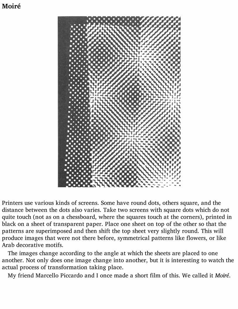
Moiré
Printers use various kinds of screens. Some have round dots, others square, and thedistance between the dots also varies. Take two screens with square dots which do notquite touch (not as on a chessboard, where the squares touch at the corners), printed inblack on a sheet of transparent paper. Place one sheet on top of the other so that thepatterns are superimposed and then shift the top sheet very slightly round. This willproduce images that were not there before, symmetrical patterns like flowers, or likeArab decorative motifs.
The images change according to the angle at which the sheets are placed to oneanother. Not only does one image change into another, but it is interesting to watch theactual process of transformation taking place.
My friend Marcello Piccardo and I once made a short film of this. We called it Moiré.
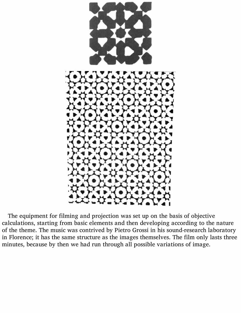
The equipment for filming and projection was set up on the basis of objectivecalculations, starting from basic elements and then developing according to the natureof the theme. The music was contrived by Pietro Grossi in his sound-research laboratoryin Florence; it has the same structure as the images themselves. The film only lasts threeminutes, because by then we had run through all possible variations of image.

Techne – artasobi – art, but also game (in ancient Japanese)

Direct Projections
Direct projections of what? Well, of a dragonfly’s wing for example. Take the ordinaryframe that you use for colour slides, get two squares of thin glass of the right size andsandwich the dragonfly’s wing between them. Needless to say, you should take a wingfrom a dead dragonfly and not kill one specially to make an amusing experiment. Youthen project the wing with the ordinary projector that you use for photographs of yoursummer holidays, enlarged to six feet high for the greater delight of your guests. Andvoilà, you see everything. You see its design and how it is made. Then when you getbored with that (and I know just how quickly you do get bored) get a feather, just one ofthe tiny feathers from your grandmother’s softest cushion. And there is the feather sixfeet long, absolutely beautiful, with its hundreds of filaments that you now notice forthe first time are themselves long feathers.
If you can’t find your grandmother’s feather cushion, take a foam rubber one and cuta slice off it as thin as a Communion wafer (sorry Vicar). You will see the structure ofthe foam rubber, and it really is like a drawing of foam.
But seriously, how can we make full use of a slide-projector in this day and age?We can use it as a means of expression, just like any other artistic technique. Just as
one can buy tubes of paint for painting pictures, so one can obtain sheets of colouredCellophane and other substances that can be used for projecting. They are very thinsheets and come in a wide range of colours, so that you have no lack of choice, from thelightest colours to the darkest. You can put two or three thicknesses of one colour todarken it, or you can superimpose different colours to get any mixture you like.
You can also find sheets of transparent coloured plastic, as thick as a visiting card.These can be scratched, engraved, burnt or dipped in solvents to obtain many differenteffects.
Apart from these there are materials which have a particular structure and therefore(when projected) a particular design, such as the nervation of leaves, some nylons andother artificial fabrics, mica, threads as fine as hairs, crystalline powders, and so on.
All these things should be used with the utmost freedom. It is no good trying to makea portrait of Aunt Mary or a view of Loch Lomond. At least, one could do it, but it wouldbe a lot of trouble to get a rather poor result. The best thing is to use small pieces ofthese materials and put them together as the mood takes you, without any pretence atcreating a masterpiece, working by trial and error. Simply by trying things out you willbecome involved in an absorbing game (the ancient Japanese word for art was asobi,which also means game). You will find that this game gives the chance of selfexpression, that certain colours and forms which come into being by chance provokecertain sensations, and that certain strange colours remind you of something. You willfind out that these images evoke feelings and memories from the distant past: thecolours of a terrace where one played as a child, the waters of a river full of rapids andwhirlpools, a square in the shadow of a great looming castle (I mention things at

random). Then you can ask the other viewers to talk about their reactions. It will be aninteresting experiment.
‘To understand means to be capable of doing.’(Goethè)

When the experiment is over you will still have a collection of little slides to keep in acigar box (one of those wonderful cigar boxes that smell of wood and good tobacco).
When man ceases to create he ceases to live.’ (Lewis Mumford)
Hyposulphite crystals in a lantern slide. The slide is used just like a normal negative, putin the enlarger and printed on normal paper.

Projections with Polarized Light
‘The colour receptors of the retina have been evolved and conditioned in the course ofages by the combined colour stimuli of the natural scene. Static coloration can neverassure enduring psychological satisfaction; it is unnatural…
… Colours should set each other off refreshingly, not only in space, side by side, butalso in time, one stimulation following another. Any unchanging combination becomesunbearable for an extended period, even if the initial selection of colours seemedperfect. Colour perception, like form perception, takes place in the space—timecontinuum. To treat it in relation to space alone is in itself a defective approach.’(Richard Neutra, Survival through Design)
This kind of projection was the result of experiments I made in 1954, in the hope ofobtaining effects with changing colours. My first ninety compositions for directprojection are now in the Museum of Modern Art, New York, where I gave a personalshowing of them.
These are made on the same principle but using a polarizing filter, while the slides arefilled with plastic materials of various kinds, but all absolutely transparent andcolourless.
The idea of using projection for works of art is not new. Many people will rememberthe magic lantern projections of realist images, made on sheets that were slid throughthe projector. But what I was doing is different in that for the first time it uses polarizedlight as a means of generating and animating colour.
Polaroid has the same effect as a glass prism, which as everyone knows breaks downa ray of white light into all the colours of the spectrum (that is, all the visible colours).Polaroid is generally used in experiments to show the stresses in material whensubjected to tension, or in crystallography for the examination of certain crystals andmaterials to discover their structure. It had never been used in art before.
If we take two sheets of polaroid and sandwich a piece of Cellophane between them,folded over two or three times, we shall produce a colour. By revolving one of the twopolaroids we can observe the whole arc of the spectrum except the complementarycolours.
We learn from the folded piece of Cellophane that it is the thickness of the colourlessmaterial that determines what colour we see: one thickness gives no colour, twothicknesses produce red (and its complementary green), three produce blue (and itscomplementary orange), etc. The chromatic effect naturally depends on the nature andstructure of the material used. Over a period of years I made a lot of experiments to findout what materials were best for obtaining various effects. I discovered, for example,that polythene can be stretched and ironed out, like a piece of elastic that does notreturn to its original shape. But thanks to the difference in thickness caused by ironing,it produces particularly soft colours. I found other substances, such as mica, that givebeautiful colours, and also certain types of Cellophane and some crystalline substances

and ultra-fine slices of certain minerals (that however are difficult to use).These experiments gave me a whole mass of possibilities so that now I can compose a
whole changing and living world of colours and images, and all within the tiny scope ofa lantern-slide.
Each material may be treated in different ways to give different effects. With one ofthese colourless compositions I can produce about fifty variations, simply by rotatingthe polaroid during the projection. It is as if a collector were able to show off fiftydifferent works by the same artist.
In the Home of the Future people will be able to keep a small box containinghundreds of ‘pictures’ for projection.

The Square
As broad and as high a man standing with outstretched arms, since the times of theearliest writings and in the earliest stone engravings the square has stood for the idea ofthe enclosure, the house, the village.
Enigmatic in its simplicity, in the monotony of its four equal sides and four equalangles, it generates a whole series of interesting figures: a group of harmoniousrectangles, the Golden Section and the logarithmic spiral which is found in nature in theorganic growth of many forms of life.
The logarithmic spiral is based on a series of ‘golden’ rectangles arranged in progressionaround the smallest of them.
A square cut as shown in the above diagram can be turned into an equilateral trianglesimply by turning the pieces round as on hinges at the points marked.
Its many structural possibilities have enabled artists and architects of every age togive a well-produced framework to their buildings and works of art. It is present inevery style produced by every people on earth at any time, both as structural elementand as the base and background of particular decorative motifs.
It is static when resting on one of its sides, dynamic when balanced on one of itsangles. It is magic if it contains numbers, and can even be diabolic if these numbers are

related between themselves and to the square or the cube. It is found in nature in manyminerals. It is a curve, according to Paeanus. By cutting it up and putting the piecestogether in a different arrangement you can make it into triangles or rectangles. Inancient times it had the power to keep the plague at bay. It has provided theproportions of famous ancient cities and of modern buildings: Babylon and Tel el-Amarnah were square, while of the buildings we may mention the Parthenon, theCathedral at Pisa, the Palazzo Farnese in Rome, and Le Corbusier’s ‘square spiral’museum. In the designs of many churches the square spaces beneath the semicirculardomes are the most logical spaces possible, just as the square shape of a photographcorresponds to the round lens with a minimum of waste or distortion.
A square cut as shown by the white lines on the black figure at the top can be puttogether again in many different ways.
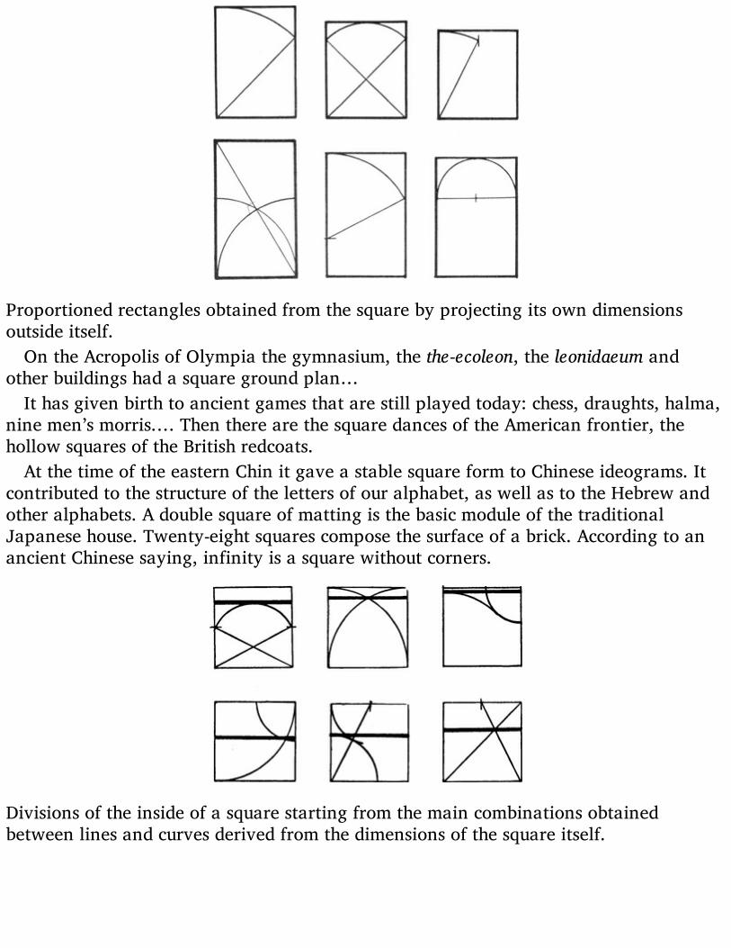
Proportioned rectangles obtained from the square by projecting its own dimensionsoutside itself.
On the Acropolis of Olympia the gymnasium, the the-ecoleon, the leonidaeum andother buildings had a square ground plan…
It has given birth to ancient games that are still played today: chess, draughts, halma,nine men’s morris.… Then there are the square dances of the American frontier, thehollow squares of the British redcoats.
At the time of the eastern Chin it gave a stable square form to Chinese ideograms. Itcontributed to the structure of the letters of our alphabet, as well as to the Hebrew andother alphabets. A double square of matting is the basic module of the traditionalJapanese house. Twenty-eight squares compose the surface of a brick. According to anancient Chinese saying, infinity is a square without corners.
Divisions of the inside of a square starting from the main combinations obtainedbetween lines and curves derived from the dimensions of the square itself.
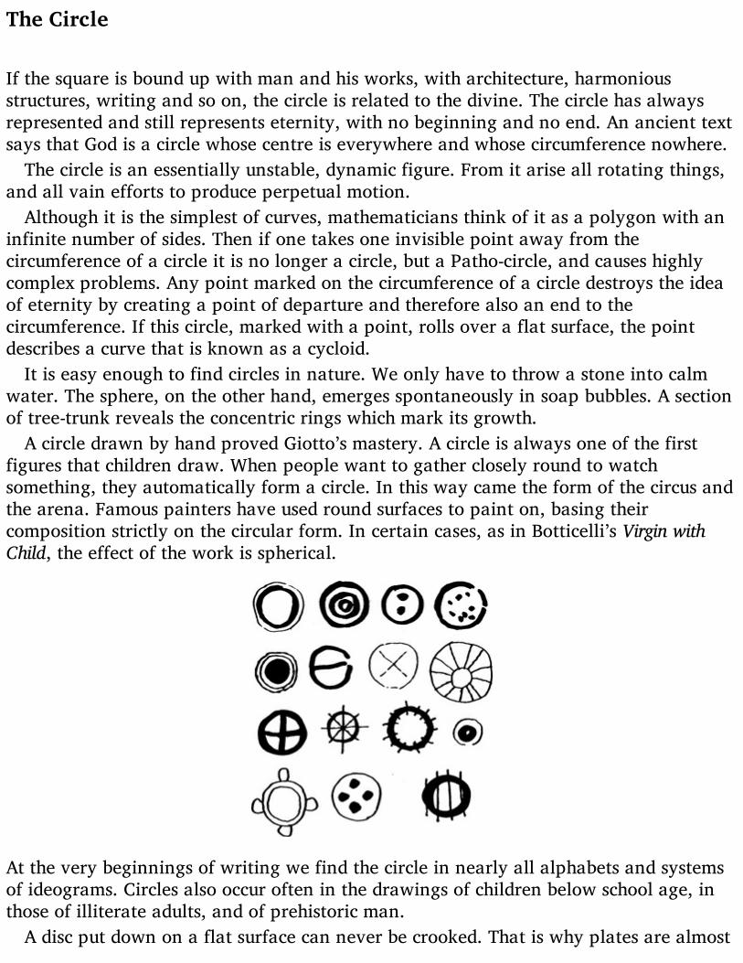
The Circle
If the square is bound up with man and his works, with architecture, harmoniousstructures, writing and so on, the circle is related to the divine. The circle has alwaysrepresented and still represents eternity, with no beginning and no end. An ancient textsays that God is a circle whose centre is everywhere and whose circumference nowhere.
The circle is an essentially unstable, dynamic figure. From it arise all rotating things,and all vain efforts to produce perpetual motion.
Although it is the simplest of curves, mathematicians think of it as a polygon with aninfinite number of sides. Then if one takes one invisible point away from thecircumference of a circle it is no longer a circle, but a Patho-circle, and causes highlycomplex problems. Any point marked on the circumference of a circle destroys the ideaof eternity by creating a point of departure and therefore also an end to thecircumference. If this circle, marked with a point, rolls over a flat surface, the pointdescribes a curve that is known as a cycloid.
It is easy enough to find circles in nature. We only have to throw a stone into calmwater. The sphere, on the other hand, emerges spontaneously in soap bubbles. A sectionof tree-trunk reveals the concentric rings which mark its growth.
A circle drawn by hand proved Giotto’s mastery. A circle is always one of the firstfigures that children draw. When people want to gather closely round to watchsomething, they automatically form a circle. In this way came the form of the circus andthe arena. Famous painters have used round surfaces to paint on, basing theircomposition strictly on the circular form. In certain cases, as in Botticelli’s Virgin withChild, the effect of the work is spherical.
At the very beginnings of writing we find the circle in nearly all alphabets and systemsof ideograms. Circles also occur often in the drawings of children below school age, inthose of illiterate adults, and of prehistoric man.
A disc put down on a flat surface can never be crooked. That is why plates are almost

always round: easier to lay a table with. If they were hexagonal, square, octagonal orrectangular, they would be hard to line up neatly for dinner. And more important, wecan say of a sphere that it is absolutely impossible to knock over.
Nearly all the many failed experiments in perpetual motion used the wheel or circle.Both in genuine attempts to construct a machine that would turn for ever by itself, andin demonstrations that this is impossible, unknown inventors and learned men such asLeonardo da Vinci and Villard de Honnecourt have made static models. One of theoddest cases is that of the Marquis of Worcester, who amongst his other inventions madethis wheel shown above. It was supposed to rotate on its own, thanks to the weight ofthe balls that rolled outwards along the tilted spokes and thus acquired more leveragethan the balls near the axle.
The ingenious Marquis later became famous for his piquant sauce.

An Arrow Can Lose Its Feathersbut Not Its Point
This is not a proverb, as you might think at first sight. It is simply an observation abouta common directional signal that in recent years has lost almost everything, but kept itsmost essential part.
If there is an object known to everyone, even to savages, and one that can be used toindicate direction, that object is the arrow. The arrow leaves a taut bow and always fliesin the direction of its point.
Whoever chose the arrow as a signal to indicate direction must evidently have thoughtof this. And of course, for this purpose, it doesn’t matter if the arrow is made of ebony,teak or a willow wand, if the arrowhead is made of forged iron or tiger’s bone, orwhether the flight that keeps it on a straight course is made of feathers endowed withmagic powers to guide it to its mark. What matters is the shape.
At the beginning of the nineteenth century, arrows used as signs had scarcely begunto be stylized. The part representing the feathered flight was simply filled in with black,with straight lines at top and bottom and curved lines at front and back to suggest thesoftness of the feathers. ‘Otherwise,’ some critic of the times is sure to have said, ‘no onewill understand what it is.’ Later the arrow became more rigid, and the point sharper, aswe find on the roadsigns of circa 1910.

‘I TAO PI PU TAO’: If the idea is there, the brush can spare itself the work. (Ancient rule ofChinese painting.)
We will not go into all the byways of this development, but stick to the main road.The arrow loses its slender shaft, the breadth of the flight being continued down thewhole length until it meets the head. Certainly it is more noticeable like this. One couldeven do away with the indented notch at the heel of the arrow. And indeed, it was doneaway with. By now it was realized that all one’s attention should be concentrated on thepoint of the arrow, for that is the part that actually conveys the message. The rest couldbe eliminated. The shape arrived at is still seen on the traffic signals that tell you whichway to turn: a white arrow on a blue background.
Early in the twentieth century, with Futurism and the first experiments in geometricdesign, the arrow grew thicker still. This time it was the width of the arrowhead thatdetermined the thickness of the shaft. The arrow became a rectangle with a triangle cutout of the heel and stuck on the front instead. The cut-out at the back suggests that thedesigner was uncertain of getting his message across clearly with this sign, for thetriangular cut-out represents the shape of the feathered flight, long since done awaywith. We still find this model of the arrow on our roads, where it is used to markdangerous bends.
But soon the heel of the arrow was cut straight across, and the last suggestion of theflight vanished. And so it remains, an oblong with a point at one end.

Now we have become so highly trained, and our reflexes are so fast, that the arrowhas even lost all trace of its shaft. After all, what matters is the point, and the pointremains in the shape of the black triangle we often see at the bottom righthand cornerof magazine pages, indicating that the article we are reading is continued on thefollowing pages.
But the arrow has not yet finished its process of transformation. The most recent signsaccompanying the names of towns along the Italian motorways have just the leadingedge of the arrowhead, as in the last of my illustrations. Every now and then someartistically nostalgic draughtsman puts in an old-fashioned arrow, but is at onceoverwhelmed by an army of points, just the extreme essential tips of arrowheads thatwe take in in the blinking of an eye, almost without noticing them.

Theoretical Reconstructionsof Imaginary Objects
Every now and then archaeologists digging in the Sahara, or in some cave that was onceon the sea shore, find a fragment of animal remains. By close examination they discoverthat it is a bit of the tooth of a creature that lived in the Upper Palaeolithic Age, somehitherto unknown species of Man.
This fragment passes into the hands of other experts, who try to reconstruct the wholeanimal, man or object (as the case may be) on the basis of structural measurements andanalysis of the material and so on.
We see a lot of these reconstructions in Natural History museums, especially of coursein the departments dealing with life on our planet in remote eras of which we knowlittle or nothing. In other departments we see vases reconstructed from tiny scraps ofpottery found in some tomb, and if there is a design on these an effort is made toreconstruct this as well as the pot itself.
As everyone well knows, the genuine part is left just as it was found while thereconstructed parts are made of quite different materials, partly to make thereconstruction work stand out.
Let us carry this idea over into the field of art. Let us set our imaginations to the taskof reconstructing something which we assume to be unknown and build up a fantasticand unexpected thing according to the structural and material data provided by the fewfragments we have to go on.
Let us in fact make a theoretical reconstruction of an imaginary object, basing ourwork on fragments of unknown function and uncertain origin.
Whatever emerges from this, we will not know exactly what it is, or what world itbelongs to. Maybe it will belong solely to the world of aesthetics and imagination. Thisis how we do it.
We take a few scraps of black paper, or coloured paper, or paper from a packet,wrapping paper, a sheet of music, a rag, or anything else that comes to hand. We tearthe first of these into two or three pieces and drop the pieces on to a sheet of drawingpaper. Then we go on to the next kind of paper. The objects (they are nothing less thanthe fragments we have discovered) will fall on to the paper any old how. We then lookat them for quite some time, and maybe we will want to move something, but we must

not do this according to any rule of logic, but simply (as Hans Arp said) according to‘the rule of the moment’. We must ‘feel’ something that makes our hand move. Havingmade any required changes of this kind we go on to join up the various fragments. Todo this we must study the outlines of the fragments and their internal structures. If afragment is torn it has a different outline from one that is cut, so that torn fragmentswill be joined by ragged lines and cut fragments by straight ones.
Sheet music is marked with the lines of the stave and the notes, and we assume thatthese will behave rather like the threads of a torn piece of cloth, only they will be rigid.If a fragment is stained or marked in any way, the stains will be reproduced also in thereconstructed part.
And thus, slowly and without thinking of Raphael, we shall have reconstructedsomething that never existed, something no one has ever seen, something that even wehad no inkling of, something we will at once bung into the waste-paper basket becauseit is a mess.
If at first you don’t succeed.…

Exercises in Topology,or Rubber-Sheet Geometry
‘The atomic age in which we live is beginning to change our ideas about reality. Thedarkness of the unknown world is being illuminated. Visions at one time incompatiblewith the concept of reality are now no longer imaginary. From here there will arise newforms of visual art.
Science creates new means of knowledge. But the new inquiry is simply a return tothe curiosity of children inquiring into the unknown. In this sense art and science aretwins. Art serves asmediator between the imagination of the child and the adult’s senseof reality. The fate of visual art in the atomic age will depend on the way in which thesetendencies of mind unite.’ (Felix Deutsch)
Geometrical figures and solids are bodiless, abstract and perfect. In geometry a cubeof lead and a cube of sponge are both of them just cubes, and if their sides are of equallength the two cubes are equal, whatever they are made of.
But topology gives these forms material being, and wants to know what wouldhappen to a tetrahedron if all its sides were sheets of rubber joined together. Topologyopens the form up, shoves its hands inside, pulls it about as a furrier does the skin of ananimal. Topology breaks form down on to a plane surface and finds that a tetrahedronreduced to two dimensions is a triangle. In geometry a circle is the place of residence ofall the points that are equidistant from a given point. A circle with some points nearerthe centre than others is no longer a circle.
In topology a circle might be made up of the links in a chain, rather than just a seriesof points. One can push it about as much as one wants to, as long as it retains theessential feature of dividing space into two parts, one inside the figure and one outside.It can have any shape you like, even a square. In topology this has the same value asthe circle.
The prince of geometrical instruments is the pair of compasses. The tops in topologyis the pair of scissors. Topology cuts things up, puts them together again in a differentway and says they are still the same, or that their qualities are equal, or that they arecompletely absurd like the famous Möbius Strip. Is it possible that a plastic body hasonly one surface? That it has no inside or out? That it is confined by a single line?
Let’s see. Take a paper strip two inches wide and eight or ten inches long (the exactmeasurements don’t matter). Place the two ends together so that the edges touch. Youwill have a ring, or (looked at another way) a cylinder two inches high. Open the ringagain and twist one end round 180 degrees. Now place the two ends together as before,and what do you see? That what was the inside of the cylinder is now, for half thecircumference, the outside, and that the two lines which previously formed the top andbottom of the cylinder are now one single and continuous line. Now does that seemright to you? But it’s not all.…

Things were complicated still further by a certain Mr Klein, who produced a kind ofbottle with a neck that turned back into the bottle through one of the sides and thencame out at the bottom, joining up with the outside of the bottle. But in point of fact thisbottle has no inside or outside. It is all one continuous surface.
These exercises and many others arose from a brain-twister posed to a bunch of good-for-nothings idling their time away in a café in Königsberg during the first half of theeighteenth century.
The Möbius Strip.
Now it happened that the River Pregel flowed through that ancient university city,and that in the middle of the river there were two islands. Joining the islands to eachother and to the river banks were seven bridges. It was raining. One of the idlers said:‘One afternoon in March a tramp wanted to take a walk across all seven bridgeswithout crossing any of them twice. How could he do it?’
There was an embarrassed silence. They ordered another round of beer, and severalhours later they all went off about their business without having spoken a single word.But the problem had been squarely put, and slowly it made its way around the world. Itwas Leonard Euler of Petersburg who came forward with a solution, discovering that thething was possible only if the vertices were even. Casting the islands and their bridgesinto the form of a graph, Euler was able to demonstrate his theory.
In 1847 the German mathematician Listing published the first treatise on topology,and today any geometry book worth looking at has some topological problems at theend.
Topology obviously has a great future, for a few happy insights, as apparently absurdand idle as the ones about the tramp and the bridges or the rubber tetrahedron, can giverise to a great number of important problems that in turn help us to a deeperunderstanding of the things around us and their transformations. Why don’t we pose afew more problems? We are only prevented by the idea that it is not a serious matter. It

is not serious, for example, to consider the thermic aspect of geometry. Why not? If wecan meditate on the transformations of a rubber cube or a paper strip, why can we notalso wonder about the changes caused by heat or anything else? What happens to acube at 20 °Centigrade °? At 50 °? At 100 °? What does it become?
EXPERIMENTS
1. A geometrical form exposed to intense heat loses a dimension
Take a cube of lead each side of which measures one twenty-fifth of an inch and place itin the centre of a vast horizontal iron sheet. Heat the iron gradually to x degrees andthen let it cool. Watch how the cube is altered by the heat. The corners graduallybecome round, first the lower and then the upper ones. The base expands, its cornersgetting increasingly rounder. They will never become square again. The cube then lookslike a squat rounded pyramid, and finally a large flat disc.
Is there a relationship between the radius of the circle thus formed and the originalside of the cube? Between the area of the circle and that of one side of the cube?
The experiment is irreversible. If we heat up the leaden disc again we do not producea cube.
2. Transformation of a triangle into a sphere
Take some Plasticine and roll it out flat as housewives roll out pastry. Cut out anequilateral triangle with each side about eight inches long. Fold the three angles intowards the centre of the triangle until they touch. You have a hexagon. Make threemore folds, following the diagonals, and you have a triangle again. Repeat thisoperation for as long as the material permits. When folding is no longer possible holdthe object in the palm of one hand and, exercising a light pressure, move the other handin a rotary manner upon it until the object has become a sphere.
This experiment clearly shows that the sphere weighs the same as the triangle. Whatwe have to do is establish the relation between the sides of the triangle and themaximum circumference of the sphere, between the apothem of the triangle and theradius of the sphere, and between the area of the triangle and that of the sphere.
It seems most likely that x = 3a + (6E + r2) ÷ r2 + aT + bT + cT − 1, or X = 3t− 1.
3. The fourth dimension of a cylinder

Take a cylindrical receptacle and fill it with H2O. What you will have is a cylinder ofwater. Raise the temperature of this cylinder to 100° Centigrade, and you will observethe progressive reduction of one of the dimensions and one only: the height lessens,while the other dimensions remain the same. At the moment when the height of thecylinder of water has been reduced to zero you will have the complete transformation ofa three-dimensional solid into a dynamic fluid mass with four dimensions. Thisexperiment holds good for any solid form obtainable from a liquid. The form resultingfrom such an operation is incapable of recuperation and cannot be measured, like allforms that have a fourth dimension.
4. Transformation by abrasion
Take a series of geometrical solids made of the same material and ranging from thetetrahedron to the icosahedron. Put them in one of those rotating cylinders that are infact specially made for rounding off objects with unwanted protuberances. It will beinteresting to see how long it takes to rub off all the corners and reduce all the objects tospheres; to see the time-relation of the sphere derived from the tetrahedron to thatderived from the icosahedron; to discover the relationship between the material and theform; to find out who on earth would make such calculations and how much he wouldask for the job.

Two Fountains, Nine Spheres
Designs for fountains based on the principle of the water-meter: a double-triangularcontainer, as shown in the photo, is held in balance on a supporting structure. A trickleof water falls from a hole in the tube above, filling one half of the container. When theweight of the water overcomes the weight of the empty half, the container tips over andpours the water out. Meanwhile the other half slowly fills up until.…

Photo and plan of the first fountain designed in 1954 and erected in front of the BookPavilion at the Venice Biennale Exhibition.
A series of slightly tilted water-shoots started from a height of rather over six feetabove the ground and eventually discharged into a black hole. During its long journeyfrom top to bottom the water was carried across a lawn, over some shrubbery, andevery time it changed direction it splashed almost silently on to and spread over thesurface of glass sheets rather like lecterns. The tilted runnels were made of zinc sheetingpainted yellow and supported by tubes that were simply stuck into the ground. One ofthese tubes conveyed the water up to the highest point. Otherwise the whole thingworked by itself.
The waterslide fountain (Venice Biennale, 1954) viewed from above.
Nine spheres in a column

Drawing and diagram of the programmed art object called ‘Nine spheres in a column’(shown at the Mostra Olivetti, 1962). Nine transparent plastic spheres are held in avertical column by three vertical sheets of glass. Inside each sphere is a whitediaphragm. The bottom sphere rests on the turn-table of a motor that gyrates veryslowly. All the spheres thus turn slowly, by friction, and the white diaphragms areconstantly changing position.
The diameter of the spheres determines all the dimensions of the object.

APPENDIX
The Machines of my Childhood (1924)
The Place of the Machine was far away.We would set off in the early hours of the afternoon, leaving town by way of the
Abbey of Vangadizza and keeping along the bank of the Adigetto river, shaded by anavenue of scented limes. After miles of dusty, sun-parched road we would come in sightof the huge dyke. It was bigger than our whole town and dominated everything,blocking out the horizon as far as you could see to right and to left.
Some stone steps led up to the top of the dyke, but we clambered breathlessly up thegreat bank of earth through the sparse lucerne that was cool on our bare knees.
The view from the top of the dyke left us breathless, not least because we had rushedup the slope so fast. And there was our Machine, floating on the water near the bank. Itwas an old wooden watermill that might have been built by Robinson Crusoe himself.
The sky was immense and the wind ruffled our hair; the great mass of the grey watersof the Adige flowed slowly by, here and there forming a dangerous whirlpool. For meand my friends that water came from the unknown and disappeared into the unknownonce more, carrying with it bits of trees and dry branches, tufts of grass and uprootedbushes, and sometimes weird objects and dead cats.
One at a time we would cross the wooden gangway between the mill and the riverbank, and there we were on the raft. It was made of dozens of spars all joined togetherand resting on two large floats. In the middle of the raft was the cabin, with a thatchedroof. Beside the cabin, on the side towards the river, the Great Wheel turned slowly. Thewhole Machine was made of old wood, now quite grey, the hard grain standing out andthe softer parts carved out by the weather. Only the metal axles of the Wheel and themillstones were polished to brightness by continual wear; they were inside the cabin inhalf-darkness, among the flour-sprinkled spiders’ webs and full sacks with almost humanforms. The Machine squeaked and creaked, groaned and grumbled, and one could followits rhythms in time with the turning of the Wheel. And the Great Wheel itself providedan ever-varied spectacle: with slow deliberation it drew from the river marvellous greenweeds and water-plants like soft glass, held them up flashing in the sunlight, raisedthem as high as it could and then slowly lowered them, immersing them again in ashower of spray that fell with the sound of gentle rain. This sound formed a continuousbackground for all the other noises of the mill. Every now and then one would catch thesmell of flour or weeds, water or earth, rotten wood and moss. And sometimes the GreatWheel would fish up a chicken-feather along with the plants, or a piece of paper or aleaf to vary its brilliant compositions.

And while my friends poked about in all the corners they could reach, tried to pick thelock of the cabin door or threw stones at the waterbirds, I stayed near the Great Wheel,with the river flowing ceaselessly under the spars where I sat as if suspended in air,watching the endless display of colours and lights and the movements of the GreatWheel.
This very day I went by car to see if the mill was still there. The road is a short one,the dyke a small one, the mill has gone.