Design - open.byu.edu
25
Writing in the Social Sciences 1 6 Design Brian Collier Learning Outcomes Students will learn the principles of good visual design including font choice, space, and scale/hierarchy. how to create and utilize tables and figures including different types of graphs 6.1 Visual Design So you’re a writer. You’ve got some nice words to say about something important. You’ve successfully accomplished step one, that is, having something to say and saying it well. Step two is how you present your writing. Is it readable? Is it easy to scan and understand? Basically, does your writing convert a viewer into a reader? Visual
Transcript of Design - open.byu.edu

Writing in the Social Sciences 1
6
Design
Brian Collier
Learning Outcomes
Students will learn
the principles of good visual design including font choice,space, and scale/hierarchy.how to create and utilize tables and figures including differenttypes of graphs
6.1 Visual DesignSo you’re a writer. You’ve got some nice words to say aboutsomething important. You’ve successfully accomplished step one, thatis, having something to say and saying it well. Step two is how youpresent your writing. Is it readable? Is it easy to scan and understand?Basically, does your writing convert a viewer into a reader? Visual

Writing in the Social Sciences 2
design is the key to turning someone into a reader. Just as there areprinciples in writing that establish structure and appeal such ascharacter (ethos), emotion (pathos), and evidence and reasoning(logos), visual design is no different. There are three main principlesto consider when visually designing your text: font choice, space, andscale or hierarchy.
Quote
“Only when the design fails does it call attention to itself;when it succeeds, it’s invisible." --typographer John D.Berry.
We’ll discuss how these three design principles will make your visualdesign invisible, and in so doing, succeed at conveying the weight ofyour words.
6.2 PRINCIPLE 1: FONTSThe word font is often synonymous with the word typeface today. Atypeface, however, is a design of type like Times New Roman or Arial,whereas font refers to the various styles of a typeface, like bold, 16pt,italicized, etc. For the purpose of this section though, we will use theword font to refer to different styling of written words. Fonts are to written language as accents are to audible speech.Oftentimes, the accent carries more communicative power than thecontent being verbalized. The same goes for fonts. Fonts are conduitsto convey tone before a word is ever read. And in today’s world,people don’t like to read too much, so font choice is pretty important.As Roger Black, founder of the Font Bureau, boldly stated, “Make iteasy to read.”

Writing in the Social Sciences 3
There are two common families of fonts that many people have heardof at some point—serif and sans serif.
Sans serif shown in Neue Helvetica 48 pt. Serif shown in Bodoni 48 pt.
Serif
Serif fonts have been used in print for centuries. The serif, or tail thatextends from the main stroke, leads the eye to the next letter, helpingto group letters to become words more easily. It has traditionally beenused for body copy or the copy that makes up a paragraph, however,this trend has evolved with the advent of the internet. You’ll noticethis book doesn’t use serif fonts for paragraphs (We’ll discuss thismore in the sans serif section). When using serif fonts, viewersimmediately get a sense of historicity, professionalism, and formality.Use serif fonts to elevate your words if you want them to appear moresophisticated.

Writing in the Social Sciences 4
Serif font with serifs highlighted.
Sans Serif
These are fonts without tails, or serifs (the word “sans” literally means“without”). If fonts wore clothes, sans serifs would be buck naked. Thefirst sans serif font made its appearance in the early 19th century andthen caught on with popularity in headlines and posteradvertisements. For this reason, sans serif fonts tend to carry a senseof modernity with them. They connote “progress and emphasize thefuture, which is why aerospace, technology, medicine, and biotechcompanies adopted sans serifs early on.” (Monotype)
If you want to communicate a sense of modernity, sleekness, boldnessor even approachability in your words, a sans serif would make agreat choice.

Writing in the Social Sciences 5
Web Fonts
Fonts eventually were translated from print to web, which weretechnically sans serif due to low pixel count. As screen resolutionincreased with denser pixel count, more detail could be added to webfonts. This took years though, which is why sans serif fonts are soubiquitous on the web. However, today both serif and sans serif areused extensively on the web. It’s a great time to be a Typophile! As co-founder of Fonts in Use, Stephen Cole noted, “You can’t be a goodtypographer if you aren’t a good reader.” I would also argue that youbecome a more effective writer as you become more knowledgeableabout typography. There are other font types including display andscript. Display fonts are often custom and carry unique personalities.
The font used for the word Jump is considered a display font. This type of font would not be good to use in aparagraph at small scales. It is meant to be displayed at larger sizes. Logo and card design: Brian Collier

Writing in the Social Sciences 6
Script fonts originate from handwriting, both print and cursive andcan be quite useful and beautiful.
A proper use of Script Font in a logo (wordmark). Custom Script designed by Brian Collier
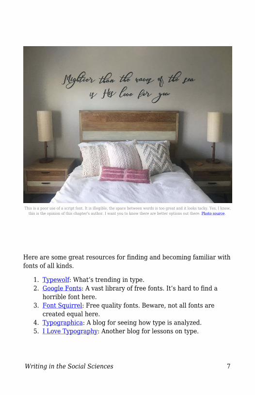
However, if you use poorly crafted script fonts to express a verygeneric phrase or idea and apply it in vinyl on the wall of your home, Iwill fail you. This is simply tacky and you’re better than that.
Writing in the Social Sciences 7
This is a poor use of a script font. It is illegible, the space between words is too great and it looks tacky. Yes, I know,this is the opinion of this chapter's author. I want you to know there are better options out there. Photo source.
Here are some great resources for finding and becoming familiar withfonts of all kinds.
Typewolf: What’s trending in type.1.Google Fonts: A vast library of free fonts. It’s hard to find a2.horrible font here.Font Squirrel: Free quality fonts. Beware, not all fonts are3.created equal here.Typographica: A blog for seeing how type is analyzed.4.I Love Typography: Another blog for lessons on type.5.

Writing in the Social Sciences 8
General Rules for Using Fonts
Now that we’ve introduced where to find some good fonts, let’s talkabout the do’s and don’ts of using them. 1. Don't use too many fonts. Our brains like simple. Our cerebralorgan loves to find shortcuts to free up space to compute new ideas.Fonts help train our brains. Too many fonts force us to try to findassociations with the font's use that may not be there.
2. Keep it consistent. This goes hand in hand with not using toomany fonts. Of the fonts you do use, keep their usage consistent. Thiscreates a pattern. Again, the brain functions on patterns. Good userexperience involves establishing patterns. 3. Mix your styles. This follows the principle of contrast. Contrast isjust one principle to help provide context. Mix a serif with a sans seriffor best contrast. Mix fonts too similar to one another and it will onlycause confusion. People need to be told what is important. 4. Don’t be blind to the color blind. This is called accessibility. Canthose who have color blindness still read what you’ve written? Whenusing color, use this checker to verify there is sufficient contrast inthe colors you’ve chosen.

Writing in the Social Sciences 9
5. Watch your weight. That’s not a negative comment on bodyimage. Fonts have weights too. Some are thin and some are thick. Andyes, they are called weights. When you bold a font, that would beconsidered a heavier font. As a rule of thumb, don’t deviate from'normal' on body text, to ensure you keep text readable. Reserveheavier weights for headlines and emphasizing certain words in aparagraph (like the bolded words in this paragraph). 6. Be aware of the accent. Remember, fonts are like accents. Theycarry distinctive communication before a word is ever read. Take alook at some of these words in fonts that don’t necessarily matchpersonalities.

Writing in the Social Sciences 10
For example, "formal dinner" wouldn't usually be written in a casual,handwriting font--the font choice creates a disconnect. Or moreinterestingly, the tone of "Wrestling Match's" font is what most peoplewould consider a stereotypical, girl-oriented, frilly font and mightcreate a disconnect with some people who consider wrestling a beefy,macho, male-oriented sport. As you can see, fonts can even revealsocietal biases! When Bill Dawson was asked why we need so many typefaces, Hereplied, “Do we need so many books? Do we need another painting?Do we need so many songs? Do we need another movie?” The answeris yes. Type is what meaning looks like. It will add an extra layer ofcommunication and intention to your writing. To use type well is totruly understand what you are trying to convey.
6.3 PRINCIPLE 2: SPACESpace defines relationships. Basically, the amount of space betweentwo elements defines the relationship between them. The closer twoobjects are to each other, the more likely they are related to eachother. When designing your text, you must be aware of the spacebetween letters, between words, between paragraphs, betweenheadlines, and even the margins and gutters. Knowing how to utilizethese spaces intentionally will communicate to your reader how toassociate and process the information provided. This is Dave Matthews of the Dave Matthews Band. He comments onspacing between words. Listen to his song "Space Between":

Writing in the Social Sciences 11
Watch on YouTube https://edtechbooks.org/-bvEThttps://youtu.be/Wi9HjkJ3L5Y
Thanks, Dave, for teaching us the design principle of proximity. :)How about now I just show you what I’m talking about. Ready? Herewe go! The small space between lines makes the whole lines look like a singlegroup (leading) Too much space means no relation
Writing in the Social Sciences 12
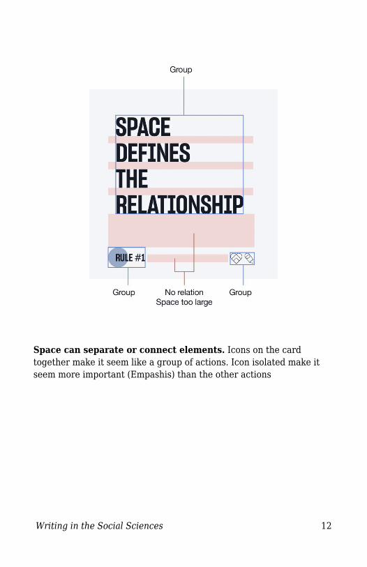
Space can separate or connect elements. Icons on the cardtogether make it seem like a group of actions. Icon isolated make itseem more important (Empashis) than the other actions

Writing in the Social Sciences 13
Space can add clarity instead of confusion.Add space and it defines the relationship
Writing in the Social Sciences 14
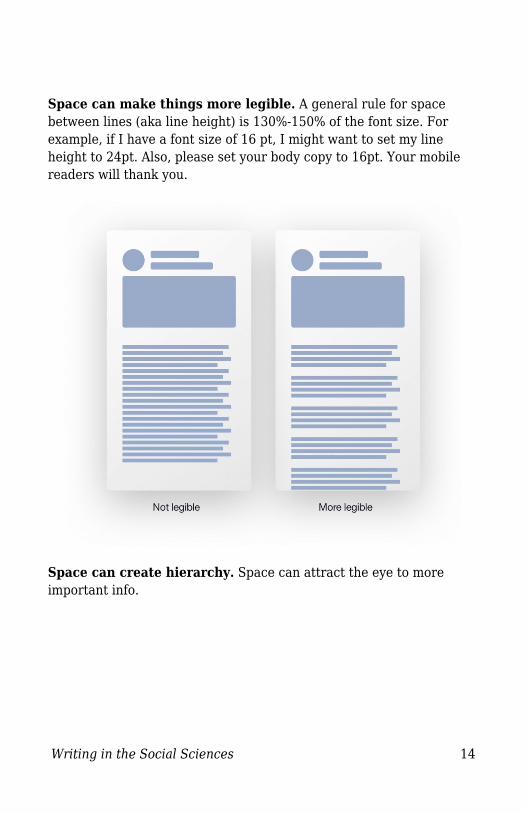
Space can make things more legible. A general rule for spacebetween lines (aka line height) is 130%-150% of the font size. Forexample, if I have a font size of 16 pt, I might want to set my lineheight to 24pt. Also, please set your body copy to 16pt. Your mobilereaders will thank you.
Space can create hierarchy. Space can attract the eye to moreimportant info.

Writing in the Social Sciences 15
Learn to see space first if you want to control it. Don’t focus on theelements, focus on all the area around it and the relationships itcreates. Want to see the importance of space? Tryremovingit,amirite?
6.4 PRINCIPLE 3: SCALESize. Creating hierarchy is the process of using scale or size ofmultiple elements in a composition. In writing, you develop ahierarchy of ideas such as stories, chapters, paragraphs, andsentences. How will you visually treat these ideas to clearlycommunicate the separation or association of common ideas, or the

Writing in the Social Sciences 16
ideas within a larger idea? Scale, of course. You thought I wasn’tgoing to give you the answer? Come on, who do you think I am?
Headings as Navigational Tools
We’ve been trained to have shorter attention spans for reading.Therefore, depending on the what and to whom you’re writing, you’llwant to consider creating an easily skimmable document. You cantypically do this by using headlines.Typically in website design, there is a hierarchy of headings used: H1,H2, H3, H4, H5. H stands for header.
Here’s an example of the scale of each header.
Example of website typographic hierarchy of different sized headlines.
Writing in the Social Sciences 17
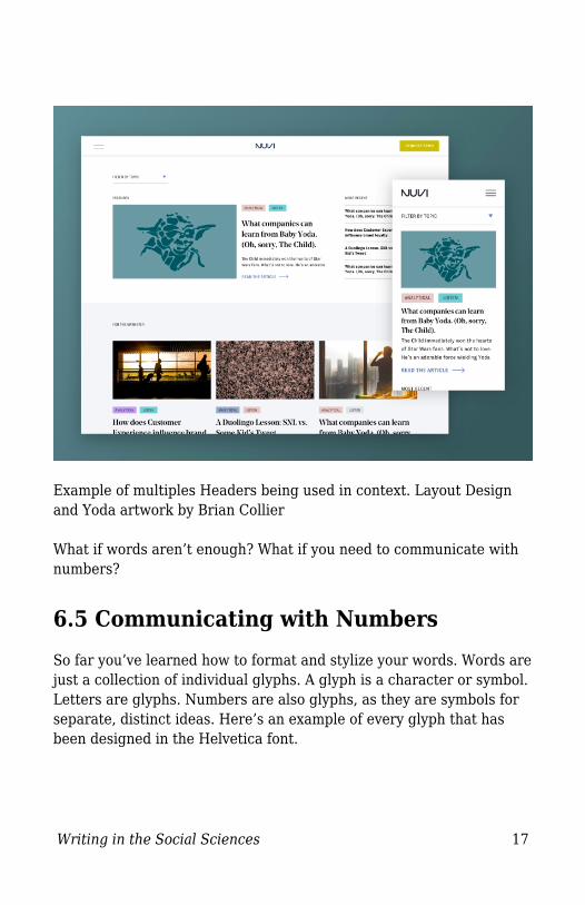
Example of multiples Headers being used in context. Layout Designand Yoda artwork by Brian Collier What if words aren’t enough? What if you need to communicate withnumbers?
6.5 Communicating with NumbersSo far you’ve learned how to format and stylize your words. Words arejust a collection of individual glyphs. A glyph is a character or symbol.Letters are glyphs. Numbers are also glyphs, as they are symbols forseparate, distinct ideas. Here’s an example of every glyph that hasbeen designed in the Helvetica font.

Writing in the Social Sciences 18
Full Glyph Set for Helvetica Font designed by Monotype
Remember, English isn’t the only language a font has to be designedfor. Characters exist in other languages that don’t belong to theEnglish speakers' character set, but numbers are a bit more universalbetween languages. Let’s dive into how to use numeric glyphseffectively.Table and Figures
Tables and figures are common ways to showcase a numeric data set.According to APA Guidelines, tables are “numerical values or textdisplayed in rows and columns.” A figure is “any type of illustration(chart, graph, photograph, drawing maps...) other than a table.” How to Choose

Writing in the Social Sciences 19
Remember, clarity above all. If it’s hard to write, it’s hard to read. Ifit’s hard to display, it’s hard to compare and digest. Do not use tablesand figures to simply decorate your presentation. Decoration is notdesign because it lacks purpose or intent. The visualization of datashould always punctuate the point you are trying to make withcredible information. Tables are ideal for showing raw data, or data that has not beenanalyzed in a way to imply a comparison or conclusion of relationshipsbetween data variables. Though it requires more analyticalbrainpower, readers can more liberally draw their own conclusionsfrom tables.
Figures are ideal when visualizing data results that have beenanalyzed for relationships between variables. They come in the formof graphs, charts, drawings, photos, or maps. Figures tell moreexplicitly what the reader should deduct from the data presented.

Writing in the Social Sciences 20
Because figures are so varying, here are a few guidelines to followwhen using them. 1. Pick the right graph Here are a few examples of popular graph types and the pros andcons of using them. Pie Charts
great for categorical data. A circle is divided into segments, with each segmentrepresenting a category of data adding up to 100%. Not great if there are too many categories or the categorypercentages are too similar. Best used when you have 5 or fewer categories to showcasewith greater variation in segment percentages.

Writing in the Social Sciences 21
Pictographs/Infographics
Graphs for comparing data using pictures. Great for general audiences as they simply convey trends. Not great for scientific data as it’s hard to convey minutedifferences in numbers. These graphs tend to generalize numbers to show largertrends.
Line Graphs
These are some of the most popular graphs because they areeasy to make and easy to understand.Line graphs are great when portraying change in magnitudeover time. The X-axis usually represents time with data points plotted andconnected with a line. The Y-axis can represent a number of data, but always whenshowing change in magnitude.
Bar Graphs
These are similar to line graphs in that they show time-seriesdata, but using bars instead of lines.Bar graphs are great for comparing data and can be displayedwith vertical or horizontal bars.Vertical bar graphs are best used for time comparison andfrequency data.Remember they typically don’t leave room for text labelsthough. Horizontal bar graphs accommodate longer text labels.
2. Don’t use legends unnecessarily
Writing in the Social Sciences 22
Quote
"Remember kid . . . Heroes get remembered; legends never die.” --TheGreat Bambino to Benny “The Jet” Rodriguez in the movie The Sandlot
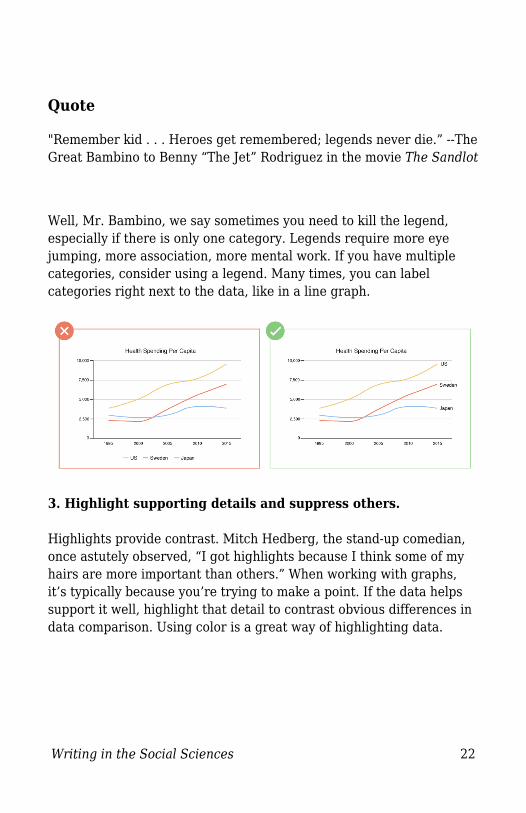
Well, Mr. Bambino, we say sometimes you need to kill the legend,especially if there is only one category. Legends require more eyejumping, more association, more mental work. If you have multiplecategories, consider using a legend. Many times, you can labelcategories right next to the data, like in a line graph.
3. Highlight supporting details and suppress others. Highlights provide contrast. Mitch Hedberg, the stand-up comedian,once astutely observed, “I got highlights because I think some of myhairs are more important than others.” When working with graphs,it’s typically because you’re trying to make a point. If the data helpssupport it well, highlight that detail to contrast obvious differences indata comparison. Using color is a great way of highlighting data.

Writing in the Social Sciences 23
4. Don’t introduce unnecessary complexity. Keep it simple. Don’t use more lines than necessary and don’thighlight frames, just the data.
Conclusion
It’s not enough to be a great writer. You must be a great presenter ifyou are to increase the chances of people reading your words orunderstanding your ideas. Visual design is essential in accomplishingthis goal. Remember, if it’s hard to write, it’s hard to read. If it’s hardto look at, it’s hard to read. Your job is to uncover the unseen and

Writing in the Social Sciences 24
articulate it. Part of that is to learn how to choose good fonts, utilizespace intentionally, and establish hierarchy of information by usingscale.

Writing in the Social Sciences 25
Larsen, J. (2020). Design. In C. C. Charles, Writing in theSocial Sciences. EdTech Books. Retrieved fromhttps://edtechbooks.org/writing/design