
Design Logic for BlueAnt Digital Talks
31
Design thinking in everyday life Presented for BlueAnt Digital, New Delhi -India: 23/5/2014 Form follows Function. (Luis Sullivan, 1896) Form follows Meaning. (Reinhart Butter, 1989) Lacie ‘petite key’ by 5.5 designers Shujoy Chakraborty Ph.D (Design), M.Des, B.Arch design thinking | design research | product innovation Presented to
-
Upload
anika-verma -
Category
Design
-
view
283 -
download
0
Transcript of Design Logic for BlueAnt Digital Talks

Design thinking in everyday life
Presented for BlueAnt Digital, New Delhi -India: 23/5/2014
Form follows Function. (Luis Sullivan, 1896)
Form follows Meaning. (Reinhart Butter, 1989)
Lacie ‘petite key’ by 5.5 designers
Shujoy ChakrabortyPh.D (Design), M.Des, B.Archdesign thinking | design research | product innovation
Presented to

Living in a designed society
Wake up to design everday
Experience design everywhere
Walk through designed streets
Study in designed universitiesAbove: EPFL Zurich, Switzerland
Presented for BlueAnt Digital, New Delhi -India: 23/5/2014

Living in a designed society
Use designed spaces Use designed servicesAbove: BikeMi, bike sharing Milano
Experience designed systemsAbove: Milan (Italy) Metro: yellow line
Experience designed systems
Presented for BlueAnt Digital, New Delhi -India: 23/5/2014
Living in an un-designed society
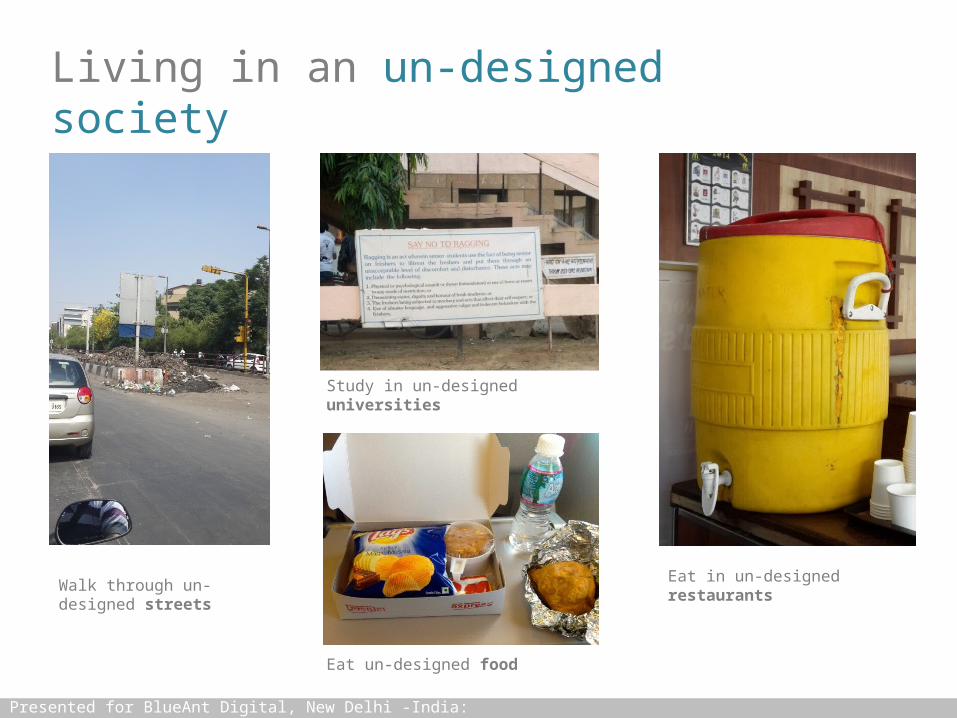
Walk through un-designed streets
Study in un-designed universities
Eat un-designed food
Eat in un-designed restaurants
Presented for BlueAnt Digital, New Delhi -India: 23/5/2014

Living in an un-designed society
Experience un-designed services
Experience un-designed shopping
Accept un-designed productsAbove: Wheelchair in an airport
Presented for BlueAnt Digital, New Delhi -India: 23/5/2014

Standardisation in a designed society
For each service a standardised icon
Consistent usage of colors and fonts
Consistent usage across locations
Presented for BlueAnt Digital, New Delhi -India: 23/5/2014

User experience becomes intuitiveConsistent indication for every street
All important city layers are indicated
Presented for BlueAnt Digital, New Delhi -India: 23/5/2014

Non-standardisation in an un-designed society
Critical services are non-uniformly indicated
Improvisation ‘jugaad’ is accepted No clarity of communication
Concept of iconography is weak
Presented for BlueAnt Digital, New Delhi -India: 23/5/2014

Non-standardisation in an un-designed society
Improvisation ‘jugaad’ is acceptedAbove: Ahmedabad airport
Emergency indications are poorly designedAbove: 2° AC compartment- Indian Railways
Life threatening warnings illegible
Presented for BlueAnt Digital, New Delhi -India: 23/5/2014

Too much detailing
Over detailing leads to confusion
Cartoonish proportions
Presented for BlueAnt Digital, New Delhi -India: 23/5/2014
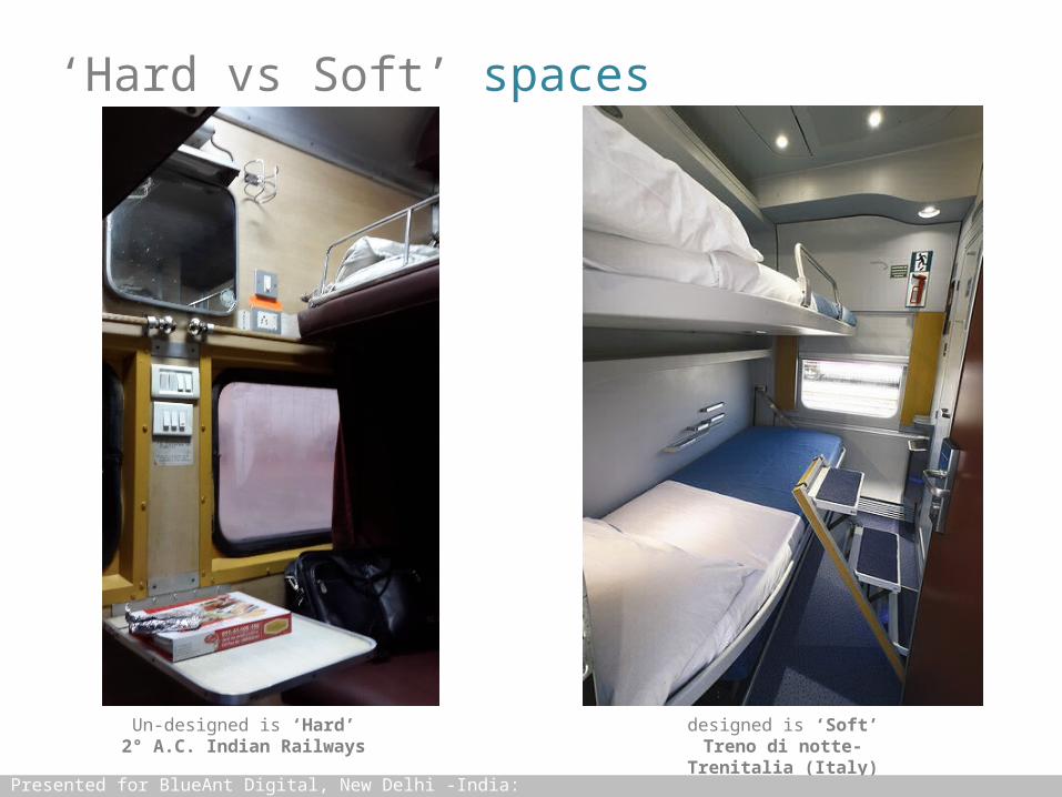
‘Hard vs Soft’ spaces
Un-designed is ‘Hard’2° A.C. Indian Railways
designed is ‘Soft’Treno di notte- Trenitalia
(Italy)Presented for BlueAnt Digital, New Delhi -India: 23/5/2014

Sensitivity to details
Thought out details lead to consistency reducing stress on
the user
Inconsistent details lead to stress on the user
Presented for BlueAnt Digital, New Delhi -India: 23/5/2014

Sensitivity to consistency
Systemic level design leads to consistency
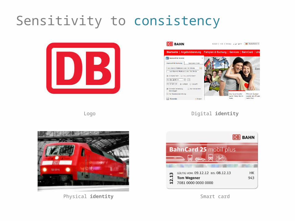
Sensitivity to consistency
Logo Digital identity
Smart cardPhysical identity

Sensitivity to simplicity
Presented for BlueAnt Digital, New Delhi -India: 23/5/2014
Do not use conflicting fonts and colors
Use large fonts and coordinated colors

Sensitivity to information
Presented for BlueAnt Digital, New Delhi -India: 23/5/2014
Metro map of ATM service Milan: all facilties are indicated
Metro map of DMRC service Delhi: no facilties are indicated

Sensitivity to usability
Presented for BlueAnt Digital, New Delhi -India: 23/5/2014
lack of usability Thought given to usability

Sensitivity to Design
Presented for BlueAnt Digital, New Delhi -India: 23/5/2014
Rubbish bin Plastic chair Ice-cream brick

Sensitivity to packaging
Presented for BlueAnt Digital, New Delhi -India: 23/5/2014
Quality packaging communicates trust
(olive oil €4)
Usability increases pleasure
(spices€2 each)
All critical information present
(chicken €3)

Sensitivity to packaging
Presented for BlueAnt Digital, New Delhi -India: 23/5/2014
Material selection is important
(bottle €2)
Graphics are important(spaghetti €1)
Protection is important(6 eggs €2)

Sensitivity to clearity
Presented for BlueAnt Digital, New Delhi -India: 23/5/2014
Too much informationNo heirarchy
Structure and layer the information
Clear heirarchy

Make functions visible
Presented for BlueAnt Digital, New Delhi -India: 23/5/2014
Do not hide the obvious and basicsAbove: 3 step operation to remove a
contact

Consider symmetry and simplicity
Presented for BlueAnt Digital, New Delhi -India: 23/5/2014
Proper use of geometry is important

Don’t introduce unknown symbols
Presented for BlueAnt Digital, New Delhi -India: 23/5/2014
Do not hide critical functionality behind arbitary icons
Critical functionality should be clearly mapped and visible

Reduce is not always simple
Presented for BlueAnt Digital, New Delhi -India: 23/5/2014
Less is not always better Google page 2014
Google page 2004

Reduce is not always clear
Presented for BlueAnt Digital, New Delhi -India: 23/5/2014
Iconography should be recognisable
Too much reduction can take away clarity

Reduce can be archetypical
Presented for BlueAnt Digital, New Delhi -India: 23/5/2014
Icons should communicate clarity of thought and purpose

Affordance
Presented for BlueAnt Digital, New Delhi -India: 23/5/2014
Flat design shouldn’t take away from affordance

Consistency
Presented for BlueAnt Digital, New Delhi -India: 23/5/2014
Consistency is critical for everyday useAbove: Android 3.3
Consistency is critical for everyday useAbove: Android 4.2

Further Reading
Presented for BlueAnt Digital, New Delhi -India: 23/5/2014
Laws of Simplicity- John Maeda Emotional Design- Donald Norman

design thinking | design research | product innovation
Delhi | Milan
Sound logic behind great design.
Disclaimer: All content in this document is copyrighted intellectual property of DesignLogic India.


![[PPT]Lazy Logic - PHARM--Computer Architecture Researchpharm.ece.wisc.edu/talks/lazy_logic_toronto_july07.ppt · Web viewApplications of Lazy Logic Circuit-switched coherence Stall-cycle](https://static.fdocuments.in/doc/165x107/5b2199337f8b9ad0448b494f/pptlazy-logic-pharm-computer-architecture-web-viewapplications-of-lazy.jpg)


![Logical and Probabilistic Knowledge …people.scs.carleton.ca/~bertossi/talks/semCogSci.pdfMarkov Logic Networks: (MLNs) [30, 10] • MLNs combine FO logic and Markov Networks (MNs)](https://static.fdocuments.in/doc/165x107/5ec4f876bc867929bb3fe32f/logical-and-probabilistic-knowledge-bertossitalkssemcogscipdf-markov-logic-networks.jpg)