Communication Cube (CCUBE) software and handling documentation
Upload
clint-galeaCategory
view
225download
0description

Clint GaleaBA(Hons) Graphic Design & Interactive Media
Module 6: Design & Communication2011/2012 Documentation

Contents
Intro
Handmade spreads
Exploration, critique and analysis research of prospectuses
De constructed prospectus
Photographic style proposed
Interpretation & Improved final version of individual prospectus
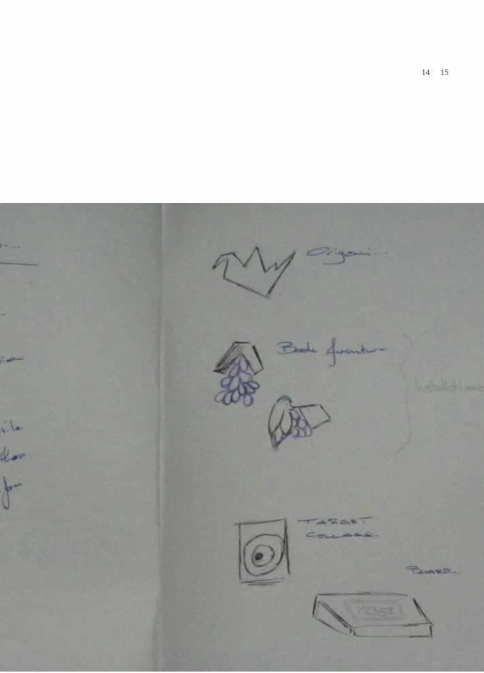
Creation of images + Sketches
4 double page spreads + Sketches
Typographic poster + Sketches
Navigation & Sequence free creative exercise
Grid system designed
Concluding Note

4.
6
8
14
20
22
40
48
60
66
72
84

Intro
This module was certainly the one that interested me the most, coming from the Interactive media HND I was exposed more towards digital interactivity rather than working more on graphic related modules. Nonetheless modules such as this are the ones that trigger my best attention. Considering myself a very good time manager I cannot fail to mention that some other modules took over, due to group work involvement, yet I still feel I’ve drastically improved my knowledge in the subject as well as improved the final outcomes of my final submitted work considering the 4 month module duration.
The main purpose of the module was to explore typography in visual communication tasks for printed media, and tasks varied from research into editorial design, proposal for the redesigning of the MCAST prospectus to documenting all the modules research into a self-designed grid on a double page spread editorial and an A1 Typographic poster amongst other creative tasks. Trough out this documentation I will be using a combination of three fonts, with the main ones being Wisdom Script for the titles & Quaver serif for all the information and Garamond as the page numbering system.

4 5

Handmade Spreads
This module was launched with experimentation for grid structuring and layouts. I started this exercise with little knowledge for editorial design and appropriate layout knowledge. Using the original size of an A3 I placed a repetitive triangular layout and dedicating opposing corners for image and text forming the shape of and X whilst using the extra bleed allowance for a flip over. This was basically the initiation of my in-depth relation with grids, their structures, how they are used and how can they be broken. Unfortunately the spread was taken down from the installation placement in the studio and got lost for appropriate photography.

6 7

Exploration, critique and analysis research of prospectuses
Front cover Spine Back cover Photography content Grid system Typography Institutes Courses Intro spreads Colour coding Stock paperFormat Page size Dimensions Contents page Message from the principal Progression grid Dual language usageNavigationSequence Overall style
Requesting for several prospectuses form overseas, mainly British
universities and colleges, I started studying in detail and comparing
several points such as;

8 9Exploration, critique and analysis research of prospectuses
From the gathered awareness I then compiled all retrieved information into a review booklet in the form of an editorial booklet. This was done after creating the first digital grid to be possibly used later for this documentation. Inspired from all the prospectuses studied I’ve worked on an A4 spread sized informative editorial and the grid designed here involved a page that is divided into 6 columns and rows using the Rule of Thirds (Golden Ratio) with a 12pt baseline grid. I’ve also used a combination of serif and sans typography to distinguish titles and informative text.
In this scenario the grid was used to appropriately allocate both the image and text on the available space. Looking back at the these spreads, I feel I made a drastic improvement in the knowledge I then had involving background/foreground layers, whilst now appreciating and sensible using the flatness of the paper to communicate effectively and wisely.


10 11


12 13

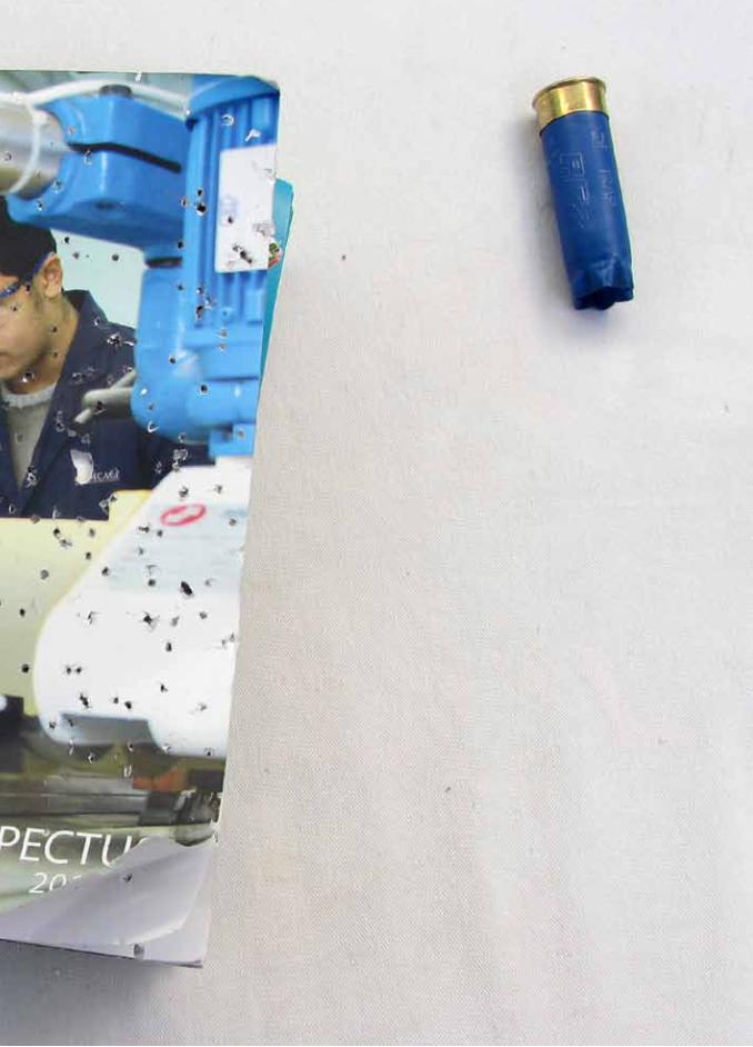
Deconstructed Prospectus
This was by far the most enjoyable and task in this semester. I’ve looked at creative means of
breaking down and deconstruction/ reconstruction ideas from multiple
sources, which mainly included the tearing and breaking of the book system to reconstruct a renewed
creative version of it.
Following brain storming I’ve looked at taking some risks and
created an installation. The process for this involved the prospects
taking 3 shotgun shots as the first two were slightly far and on the third hit the right deconstruction
effect I was looking for … I’ve then built an exhibition stand for it and screwed it along the cartridge on the board as a whole installation, still enough paper to flip through
the initial pages.
14 15Deconstructed Prospectus


16 17

18 19

Photographic style proposed

20 21Photographic style proposed
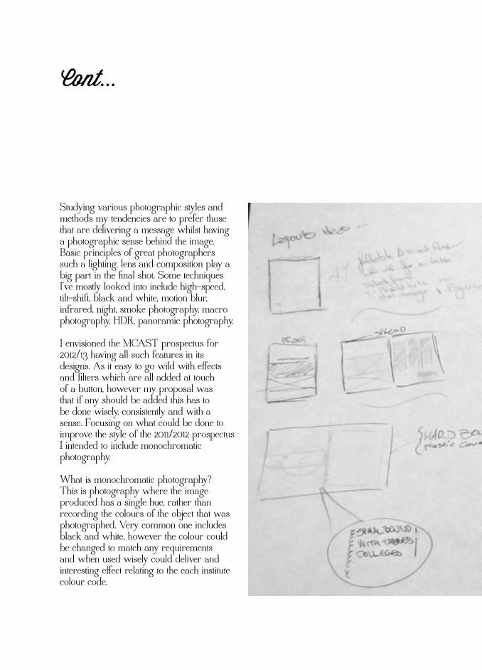
Studying various photographic styles and methods my tendencies are to prefer those that are delivering a message whilst having a photographic sense behind the image. Basic principles of great photographers such a lighting, lens and composition play a big part in the final shot. Some techniques I’ve mostly looked into include high-speed, tilt-shift, black and white, motion blur, infrared, night, smoke photography, macro photography, HDR, panoramic photography.
I envisioned the MCAST prospectus for 2012/13 having all such features in its designs. As it easy to go wild with effects and filters which are all added at touch of a button, however my proposal was that if any should be added this has to be done wisely, consistently and with a sense. Focusing on what could be done to improve the style of the 2011/2012 prospectus I intended to include monochromatic photography.
What is monochromatic photography?This is photography where the image produced has a single hue, rather than recording the colours of the object that was photographed. Very common one includes black and white, however the colour could be changed to match any requirements and when used wisely could deliver and interesting effect relating to the each institute colour code.

Interpretation & improved final version of individual prospectus
Finalizing my proposal for the final prospectus I focused on utilizing paper stock, colour schemes, and typography effectively to be as creative as possible yet keep in mind effectiveness and printing costs. The way I did this was to start off with a spread size of 230 x 150 allowing for a horizontal style booklet.
One of the main issues I ran across in this task was to find suitable typography which was available for both Maltese & English language in order to keep all the information already available for the current prospectus. A set of icons for each institute was also created in order to aid the existing institute’s colour scheme which was kept along with the creation of a progression grid per courses available which would vary according to courses available.
The final proposal for the MCAST 2012/2013 prospectus consisted of a one perfect binding booklet.Paper texture /weight were matt throughout with a 250gsm cover and 100gsm for other pages. Spot lamination was also proposed for individual areas such as titles on front covers and students comments.
Colour scheme proposed involved the use of two colours in order to keep production cost down, this comprised of the institutes respective colour scheme with black and the use of the papers colour being white.

22 23Interpretation & improved final version of individual prospectus
Studying various photographic styles and methods my tendencies are to prefer those that are delivering a message whilst having a photographic sense behind the image. Basic principles of great photographers such a lighting, lens and composition play a big part in the final shot. Some techniques I’ve mostly looked into include high-speed, tilt-shift, black and white, motion blur, infrared, night, smoke photography, macro photography, HDR, panoramic photography.
I envisioned the MCAST prospectus for 2012/13 having all such features in its designs. As it easy to go wild with effects and filters which are all added at touch of a button, however my proposal was that if any should be added this has to be done wisely, consistently and with a sense. Focusing on what could be done to improve the style of the 2011/2012 prospectus I intended to include monochromatic photography.
What is monochromatic photography?This is photography where the image produced has a single hue, rather than recording the colours of the object that was photographed. Very common one includes black and white, however the colour could be changed to match any requirements and when used wisely could deliver and interesting effect relating to the each institute colour code.
Cont...

24 25Cont...

26 27


28 29


30 31

32 33


34 35


36 37

Icons Set
Community Services Electrical & Electronics ICT
Agribusiness Applied Science Art & Des

38 39Icons Set
Mechanical EngineeringMaritime Institute Gozo Centre
Building & Construction Business & Commercet & Design

Creation of images + Sketches
By any means this and the following tasks are the ones that I dedicated all my energies to, I’ve brainstormed, design, evolved, and redesigned over and over until I got the appropriate visuals and layouts.
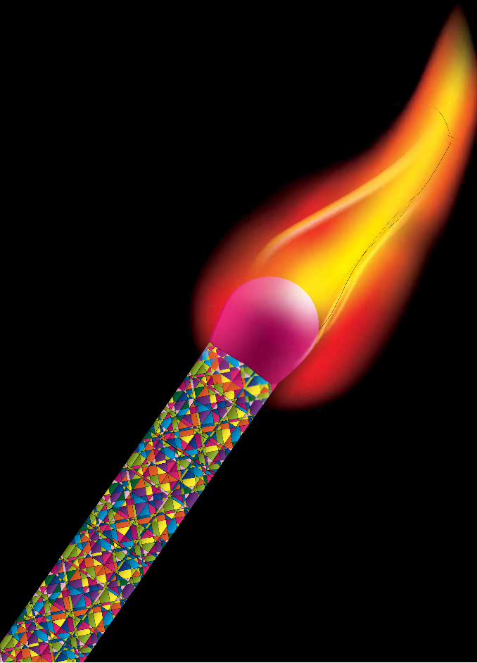
Initially I looked at using locating the appropriate I needed my idea, however this was later discarded after I was pushed to create my own visuals and thankfully for this I ended creating an illustrated visual that I’m quite fond of. This image represents the quote selected from the poem “An American Prayer” by Jim Morrison and represents a matchstick with psychedelic patterns later uses also a similar colour scheme for the A1 Typographic poster, with a flame portraying the revolution the American citizens were upbringing in the late 60’s early 70’s.
Early spreads also included repetitive symbols in the spreads, these were representing what the American politics were pretending to convey to their people yet there was thin line between the truth and lies, especially about the Vietnam War.
Navigation & Sequence free creative
exercise

40 41Creation of images + Sketches
Navigation & Sequence free creative
exercise

Development to Final Image

42 43Development to Final Image
Starting with brainstorming, I then sketched my ideas and later moved to the initial photomontages, inspired to represent the quote mentioned before.


44 45
Idea developed into a symbolic psychedelic representation for “Hear no harm, speak no harm“ as the game the American politics were trying to play.

46 47

4 double page spreads + Sketches
These spreads developed along with images that were being produced, keeping the spread size of 360 x 250 always in mind, I’ve taken multiple attempts at a visual balance between the image, text and overall balance. The following are sketches of work in progress towards the final submission with which grid is also being used for this documentation.
Grids have also evolved along the different layouts developed from an initial breaking of traditional rules, to then working myself into a more structured system which probably reflects my personality as needing everything to be neat. A detailed explanation of the grid, how it was developed and how it works is listed in the following sections.
AmericanPrayer
Jim
48 49
Music
Temp
erar
ment

“Inflames temperament”

50 51
Music Inflames Temperament

Jim Morrison

52 53
Jim Morrison

Do you know we are ruled by T.V.The moon is a dry blood beastGuerilla bands are rolling numbers in the next block of green vineAmassing for warfare on innocent herdsmen who are just dying
O great creator of being grant us one more hour to perform our art & perfect our lives
The moths & atheists are doubly divine & dyingWe live, we die & death not ends itJourney we more into the Nightmare
Cling to cunts & cocks of despair

54 55
Do you know we are ruled by T.V.The moon is a dry blood beastGuerilla bands are rolling numbers in the next block of green vineAmassing for warfare on innocent herdsmen who are just dying
O great creator of being grant us one more hour to perform our art & perfect our lives
The moths & atheists are doubly divine & dyingWe live, we die & death not ends itJourney we more into the Nightmare
Cling to cunts & cocks of despair
I'm getting out of hereWhere're you going?To the other side of the morningPlease don't chase the cloudsPagodas, templesHer cunt gripped himLike a warm friendly hand."It's all right.All your friends are here."When can I meet them?"After you've eaten"I'm not hungry"O, we meant beaten"
Silver stream, silvery scream,Impossible concentration
Here come the comediansLook at them smileWatch them dance
An indian mile
Look at them gestureHow aplomb
So to gesture everyoneWords dissembleWords be quickWords resemble walking sticks
O, we meant beaten

56 57
I'm getting out of hereWhere're you going?To the other side of the morningPlease don't chase the cloudsPagodas, templesHer cunt gripped himLike a warm friendly hand."It's all right.All your friends are here."When can I meet them?"After you've eaten"I'm not hungry"O, we meant beaten"
Silver stream, silvery scream,Impossible concentration
Here come the comediansLook at them smileWatch them dance
An indian mile
Look at them gestureHow aplomb
So to gesture everyoneWords dissembleWords be quickWords resemble walking sticks
O, we meant beaten


58 59
Typographic poster + Sketches
Working with Jim Morrison’s An American Prayer quote “music inflames temperament” I was inspired by psychedelic posters, studying their motives and building blocks and brainstorming how I could use these design principles in my scenario.
I major fact I kept in mind all along was to be careful from pixilation as this was going for a large print. I started with the idea to give a flaming effect to the message with different experimentation of typography. I then moved to the idea of creating everything from scratch myself and so I did. By defining a new brush I created in illustrator, I then applied the brush to the paths. These were initially word per line however I later transformed the whole quote into a circle shape centred to the layout.
The circle represents the uniformity and cleanliness the American politicians were trying to portray, and through the smoke effect created through the brush, I then wanted to export the artwork into Photoshop which proved highly troublesome due to extreme large number of paths created in applying the brush.
I then managed to export in PNG format into Photoshop, converted the colours as in illustrator the smoke effect could only be achieved on a solid black background,
managing all this within a reasonable time ahead of the deadline I printed the designs and immediately noticed I had an issue with the work created as it was pixeled and the matt finish paper didn’t reproduce the colour effect I wanted.
I managed to solve this issue spending an overnight rendering each letter on both layers individually, went for print again and was satisfied with colour effect brought out from the different paper. I then hung and exhibited all the work in class and following what I’ve always seen around college I mounted the poster on a foam board and later it was brought to my attention that this alters the finishing effect. Looking at the scenario and the reasoning behind it is totally understandable and is received definite learning point which I’ll implement in my future design exhibitions.

60 61


62 63

64 65

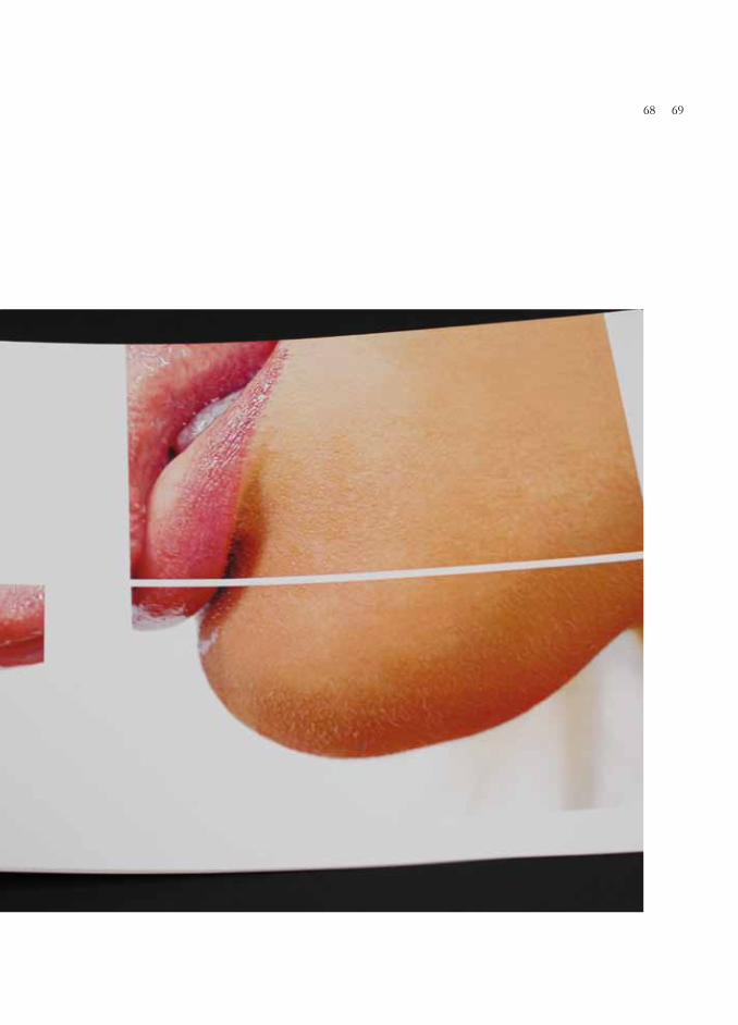
Navigation & Sequence free creative exercise
With the ambitions of a shocking/inquisitive image in a rhythmic pattern over the course of twelve spreads reproduced from the size of24 A4 originally into a 200 x 200. The same image was placed in different sections wisely considering the context of the white space allowed, under the grid created with some images having full bleed, and closing page with the full bleed image demonstrated.
This was printed on a 250gsm glossy paper giving a nice texture to the overall feel of the booklet, I’ve then attached everything together by using double sided tape at the ends after carefully cutting the edges carefully.

66 67

68 69


70 71

Grid system designed
The design of the grid also evolved along with the design of the four double page spreads. Other grids involved using 3 columns, but tended to get quite busy so I moved onto the final grid, which was based on a 2 column system of 65 mm each with a gutter of 5 mm and a border of 13 at the edges and 12 at the centre.
Titles are all placed at a height of 76mm from the top of the page this pattern is repeated on other spreads containing other images, allowing for enough white space repetition throughout the spreads. Full bleed images are also used as well as using the border margins for single and double paged spreads. Page numbers are placed on the right hand spread only displaying previous and current page at the title height.
Sizes were calculated on the golden ration theory, per spread size to visually balance necessary artwork. Looking back at the initial stages of this module I feel there has been great improvement yet I still feel there’s room for more improvements which I see taking place on a continuous basis.

72 73

26
13
12
250
6565
5

26
13
219.5
235
8


76 77


78 79


80 81


82 83

Conclusion
As I’ve stated in some other section’s throughout this documentation I feel I’ve learnt a great deal, I’ve noticed the improvement and recognize there are still areas I need to focus more dedication and attention towards. I feel I’ve excelled in the poster design and free image sequence, and gained thorough knowledge in other sections if I need to improve upon. Nonetheless I am know appreciating graphic design better, I look at typography and recognize the importance of the font itself conveying the message, grid systems and how they can be wisely broken, page structuring, layouts and rhythmic movement in reading the designs. Thanks for the continued pushing to improve designs and finishing.

84 85