DESIGN & BRAND Guidelines · 2018-03-19 · Background colours Vertical & horizontal use Language...
31
DESIGN & BRAND Guidelines
Transcript of DESIGN & BRAND Guidelines · 2018-03-19 · Background colours Vertical & horizontal use Language...

DESIGN & BRAND Guidelines

2 BRAND GUIDE Belgian Development Cooperation
This document provides guidelines to ensure the correct use of the BelgianDevelopment Cooperation visual identity. A correct and consistent implementation conveys what we stand for and supports our reputation of excellence.
The use of the logo is not optional. Its use follows from accepting funding anddisplays where Belgium’s development budget is spent.
By applying these guidelines to your communications, campaigns and materials, you will strengthen Belgium’s ambition to be a true partner in development.
TABLE OF CONTENTS
What is the Belgian Development
Cooperation and its partners
Our mission & vision
Brand values
INTRODUCTION
4
5
6

3Belgian Development Cooperation BRAND GUIDE
Introduction
Logo & use
Exclusion zone
Best practices
Background colours
Vertical & horizontal use
Language options
Co-branding
Specific logos & use
Exclusion zone
Best practices
Background colours
Primary & secondary colours
Fonts & use
Pictures
Icons
Design process
Values
Message
Tone of voice
Audience
Symbols
VISUAL LANGUAGE
8
16
20
10
11
12
14
3Belgian Development Cooperation BRAND GUIDE
726
24
27
28
30
32
34
35
36
37
37
38
38
38

4 BRAND GUIDE Belgian Development Cooperation
INTRODUCTION
What is the Belgian Development Cooperation?
The priority objective of Belgium’s Development Cooperation is sustainable human development and the realization of the Sustainable Development Goals (SDGs): the eradication of poverty and building a better world for all in a spirit of true partnership.
The Directorate General for Development Cooperation is part of the Federal Public Service (SFP) Foreign Affairs, Foreign Trade and Development Cooperation. The SFP has been tasked with organizing and developing development cooperation in accordance with the legal and regulatory framework.

5Belgian Development Cooperation BRAND GUIDE
OUR mission & vision
Vision
Work with partners to build a just, equitable and sustainable world where everyone lives in peace, security, freedom and freedom from poverty.
Be a leading, effective and innovative player who focuses on results and impact.
Adequately and proactively manage human potential to contribute to staff development and engagement.
Mission
The DGD contributes to the improvement of the living conditions of the populations of the developing countries, to their socio-eco-nomic and cultural development, to the sustainable and equitable economic growth in the respect of the human dignity, the rule of law, the fundamental freedoms, equality between women and men and human rights.
DGD develops development policies at the federal level; allocates
Belgian Official Development Assistance (ODA) to national and in-ternational actors who implement this aid; carries out the monitor-ing and evaluation of its policies.
The DGD actively participates in the debates of ideas around in-novative concepts of development and dares to apply them in its policy.
The DGD supports the development and poverty reduction efforts of actors in developing countries, in synergy with other Belgian and international partners and donors.
The DGD also contributes to helping people in crisis situations ac-cording to the principles of humanitarian assistance.
The DGD ensures the support and solidarity of public opinion and political authorities in the fulfillment of its mission / actions.
Values
• Engagement and personal development• Respect• Transparency• Professionalism• Flexibility• Team spirit
6 BRAND GUIDE Belgian Development Cooperation
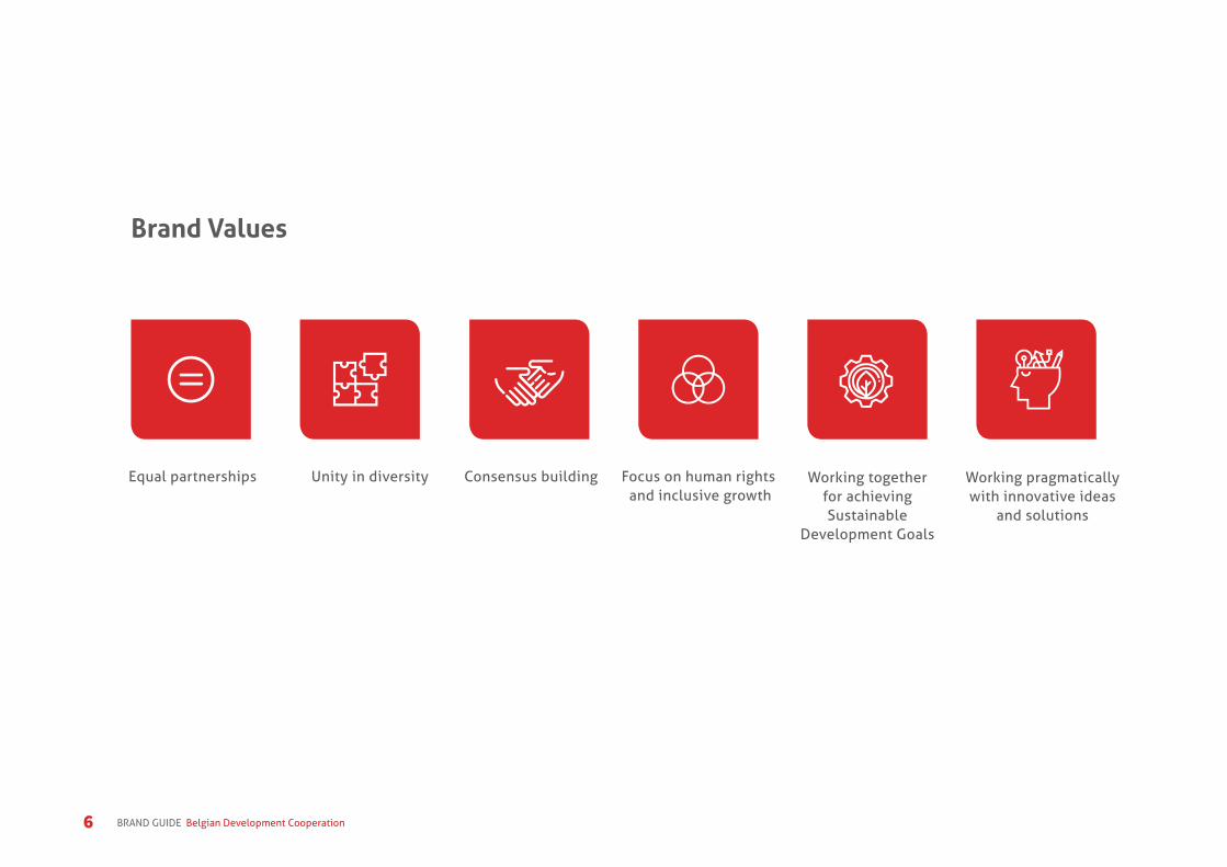
Brand Values
Equal partnerships Unity in diversity Consensus building Focus on human rights and inclusive growth
Working together for achieving Sustainable
Development Goals
Working pragmatically with innovative ideas
and solutions

7Belgian Development Cooperation BRAND GUIDE
VISUAL LANGUAGE
Introduction
This Brand identity contains all the information you need to use our logo proprely.
Our brand style serves to differentiate the Belgian development cooperation materials from those of other organizations.
By applying these guidelines to all of your communication and project materials, you support the recognition of Belgium’s international development efforts.

8 BRAND GUIDE Belgian Development Cooperation
Logo & use
The Belgian development cooperation logo is the one element that unifies and represents our organization. It has been specially designed to symbolize not only our name, but also what we stand for. The lower case letters used in the logo are friendly and approachable. The B letter is formed by three diffrent shapes, combined in a single itentity. This symbolises the vision of solidarity, promoted by Belgium and its people. This logo should be used as an indivisible unit and its integrity should be respected at all times.
The Belgian development cooperation logo should be displayed only in its approved colours. The examples shown here illustrate the correct use of the logo in positive and reverse formats. The preferred way to display the logo is in its horizontal version, with three colours on white background. For more information on colour please refer to page 28 Primary & secondary colours.
All logo files (including approved language versions) are available on our website for download.
https://diplomatie.belgium.be/nl/Beleid/Ontwikkelingssamenwerking/Multimediabibliotheek/Zichtbaarheid
https://diplomatie.belgium.be/fr/politique/cooperation_au_developpement/librairie_multimedia/kit_de_visibilite

9Belgian Development Cooperation BRAND GUIDE

10 BRAND GUIDE Belgian Development Cooperation
Exclusion zone
To ensure the logo is free to breathe, a clear area must be maintained around it at all times. No typography, imagery or other visual information should appear within this zone.
• Never allow typography or other elements to “invade” the logo.
• Never redraw or alter the logo, including the placement and size relationship of its letter or spark symbol.
• Use only authorized artwork from our website
The exclusion zone around the vertical logo is the height of the logotype (BB) and has to be applied on all sides.
The exclusion zone around the horizontal logo is half the height of the logotype (B+1/2) and has to be applied on all sides.

11Belgian Development Cooperation BRAND GUIDE
Best practices
We’ve created a complete set of design guidelines to ensure consistency over just about every instance. The core design elements are the essential visual elements of our brand – our logo, colour palette, typography, imagery, and graphics.
The logo minimum size is 3cm wide. Never use it smaller to ensure the readability of the text.
Please never deform or change the logo colour. Also don’t seprate the logo to use the parts separatly. Never change the font.
The logo should always be used with a full subline ‘partner in development’. Never use the logo only with the word Belgium.
3cm width min. size80 px width min. size

12 BRAND GUIDE Belgian Development Cooperation
Background colours
Use the colours from the Primary colours page 28for a coloured background, and reverse out the logo.
Coloured backgrounds from the Primary colours sectionare acceptable if necessary, though NOT preferred. Use them in restricted instances, such as in materials for services.
The use of a picture background is also not preferred.If needed, take care of the visibility of the logo, use it only in white or in black depending to the clarity of the picture. Note the examples on the following pages as references.
If pictures are used, please use pictures that symbolize the optimist, people-centred and positive approach of Belgium’s international development. Use pictures that tell a story. Preference should be given to images of people and their faces over showing technical equipment.

13Belgian Development Cooperation BRAND GUIDE
14 BRAND GUIDE Belgian Development Cooperation
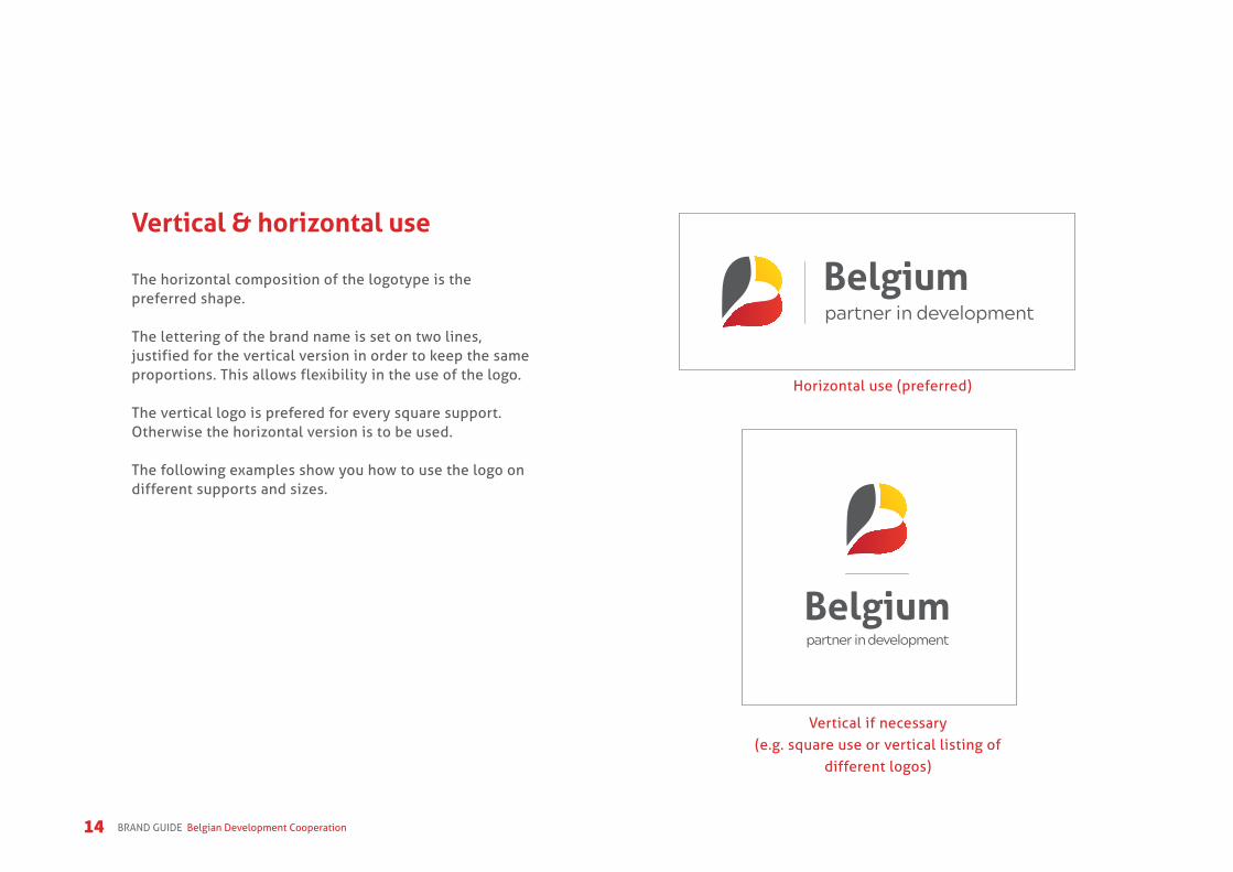
Vertical & horizontal use
The horizontal composition of the logotype is thepreferred shape.
The lettering of the brand name is set on two lines, justified for the vertical version in order to keep the same proportions. This allows flexibility in the use of the logo.
The vertical logo is prefered for every square support. Otherwise the horizontal version is to be used.
The following examples show you how to use the logo on different supports and sizes.
Horizontal use (preferred)
Vertical if necessary (e.g. square use or vertical listing of
different logos)

15Belgian Development Cooperation BRAND GUIDE

16 BRAND GUIDE Belgian Development Cooperation
Language options
Feel free to use the language you speak in theproposals displayed here. The baseline sizes have beenadapted to keep the balance of the logo.
You can download all the different language versions of the logos on our website.
As an international organization, our logo is available in the following languages:
Spanish, Arabic, Portuguese and German.
The same font and aligment are used for all, except for the Arabic version. For this one please use the font “Arial” in Arabic version and the specific right alignment of the text.
Never translate the logo into another language. If another language version is needed, contact us first.

17Belgian Development Cooperation BRAND GUIDE

18 BRAND GUIDE Belgian Development Cooperation
BelgienPartner für Entwicklung
Bélgicasocio para el desarrollo

19Belgian Development Cooperation BRAND GUIDE
Bélgicaparceiro para o Desenvolvimento

20 BRAND GUIDE Belgian Development Cooperation
Co-branding
The logo can be displayed in combination with other logos, i.e. the logos of implementing organizations and/or the logos of partners that are equally contributing.
Implementing organizationsThe logo of the implementing organization is positioned at 80%, below or next to the Cooperation logo, accompanied by ‘Implemented by’ (Dutch: ‘Geïmplementeerd door’, French: ‘mis en oeuvre par’,German: ‘durchgeführt von’).
The font used is Aller font. In case you do not have Aller font installed, use Myriad Pro for internal presentations.
Implemented by

21Belgian Development Cooperation BRAND GUIDE
Implemented by

22 BRAND GUIDE Belgian Development Cooperation
Equal partnersThe logos are equal in size, preferably displayed in a horizontal row, with the Cooperation logo on the left.
If the partner logos are displayed in a horizontal row they are equal in height. If the logos are displayed in a vertical row, they are equal in width.
The relative size of the logo of the Belgian Development Cooperation reflects the contribution made by the Belgian Development Cooperation.

23Belgian Development Cooperation BRAND GUIDE
24 BRAND GUIDE Belgian Development Cooperation
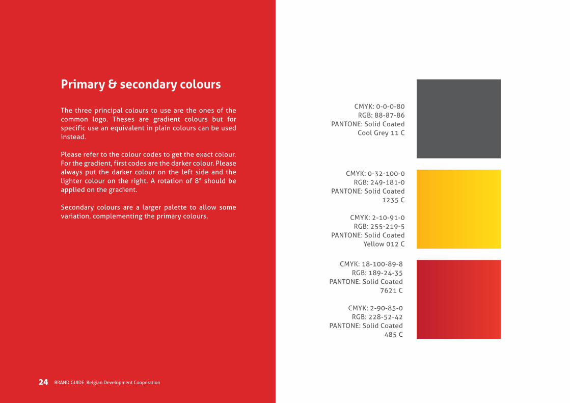
Primary & secondary colours
The three principal colours to use are the ones of the common logo. Theses are gradient colours but for specific use an equivalent in plain colours can be used instead.
Please refer to the colour codes to get the exact colour.For the gradient, first codes are the darker colour. Please always put the darker colour on the left side and the lighter colour on the right. A rotation of 8° should be applied on the gradient.
Secondary colours are a larger palette to allow some variation, complementing the primary colours.
CMYK: 0-0-0-80RGB: 88-87-86
PANTONE: Solid CoatedCool Grey 11 C
CMYK: 0-32-100-0RGB: 249-181-0
PANTONE: Solid Coated1235 C
CMYK: 2-10-91-0RGB: 255-219-5
PANTONE: Solid Coated Yellow 012 C
CMYK: 18-100-89-8RGB: 189-24-35
PANTONE: Solid Coated 7621 C
CMYK: 2-90-85-0RGB: 228-52-42
PANTONE: Solid Coated 485 C
24 BRAND GUIDE Belgian Development Cooperation

25Belgian Development Cooperation BRAND GUIDE
• Use our core colours for a consistent platform that allows other design elements.• Colour ratio depends on the individual application.• Use mainly the Primary colours, and only if needed add secondary to highlight elements in the design. • Grey tones can be used as much as you want.
CMYK: 4-18-92-0RGB: 248-205-22PANTONE: Solid Coated 116 C
CMYK: 7-98-96-1RGB: 216-26-26PANTONE: Solid Coated 485 C
Black 80% Black 70% Black 40% Black 5%
CMYK: 84-43-2-0
RGB: 15-126-191
PANTONE: 7690 C
CMYK: 99-83-31-21
RGB: 27-59-105
PANTONE: 541 C
CMYK: 51-1-89-0
RGB: 137-196-83
PANTONE: 368 C
CMYK: 0-54-89-0
RGB: 247-141-53
PANTONE: 144 C

26 BRAND GUIDE Belgian Development Cooperation
Fonts & use
We’ve selected two type families that givesus a reliable, strong and real voice:Aller and Acherus Grotesque.
• Aller is our primary typeface used in all communication materials
• Acherus is our secondary typeface and should be use as a complement to Aller.
• Use type size and weight to establish a clear hierarchy of information
• Don’t substitute any other typeface• For printed items being distributed, use Aller• In case your computer does not have Aller font
installed, use Myriad Pro for internal presentations
Use typeface, type size, and typeweight wisely to establish a clearhierarchy of information.
26 BRAND GUIDE Belgian Development Cooperation

27Belgian Development Cooperation BRAND GUIDE
ABCDEFabcdef1234ABCDEFGHIJKLMNOPQRSTUVWXYZabcdefghijklmnopqrstuvwxyz1234567890!@£$%^&*()
ABCDEFabcdef1234ABCDEFGHIJKLMNOPQRSTUVWXYZabcdefghijklmnopqrstuvwxyz1234567890!@£$%^&*()
ALLER FONT
ACHERUS GROTESQUE FONT

28 BRAND GUIDE Belgian Development Cooperation
Pictures
These are recommended picture examples.Select picture examples that are:
• Show people and tell their story• Natural; not posed or stylized• High quality• Showing Belgian identity at work• Supporting the key personality traits of the brand:
reliable, authentic, innovative.

29Belgian Development Cooperation BRAND GUIDE
Icons
Our icons are used across a range of marketing materials to provide symbolism, conceptual clar-ity, and visual interest in a simple and extensible format. They are an universal language.
They can be used in web or in print, to show a concept, to highlight a fact or to give structure to chapters.
The icon’s style should be linear, light and used only in primary colours or in white.
Partnership and collaboration
Open-mindedness
Unity in diversity
Sustainable development
Innovation
Consensus building
Flexible approach International spirit
Equal partnerships
Inclusive growth
Multiculturality
Empowerment

30 BRAND GUIDE Belgian Development Cooperation
Des
ign
by A
dGra
fics
I inf
o@ad
grafi
cs.e
uIm
ages
by
Shut
ters
tock

Contact
Iris Van RobaysKelly Rigaux
Deputy Director GeneralDirectorate General Development
Cooperation and Humanitarian AidMinistry of Foreign Affairs
[email protected]@diplobel.fed.be