Descriptive CHAPTER 3 Statistics: Numerical...
52
CHAPTER 3 3.1 Describing Central Tendency 3.2 Measures of Variation 3.3 Percentiles, Quartiles, and Box-and- Whiskers Displays 3.4 Covariance, Correlation, and the Least Squares Line (Optional) 3.5 Weighted Means and Grouped Data (Optional) 3.6 The Geometric Mean (Optional) Descriptive Statistics: Numerical Methods Chapter Outline Learning Objectives LO3-5 Compute and interpret covariance, correlation, and the least squares line (Optional). LO3-6 Compute and interpret weighted means and the mean and standard deviation of grouped data (Optional). LO3-7 Compute and interpret the geometric mean (Optional). LO3-1 Compute and interpret the mean, median, and mode. LO3-2 Compute and interpret the range, variance, and standard deviation. LO3-3 Use the Empirical Rule and Chebyshev’s Theorem to describe variation. LO3-4 Compute and interpret percentiles, quartiles, and box-and-whiskers displays. When you have mastered the material in this chapter, you will be able to:
Transcript of Descriptive CHAPTER 3 Statistics: Numerical...
CH
AP
TE
R 3
3.1 Describing Central Tendency
3.2 Measures of Variation
3.3 Percentiles, Quartiles, and Box-and-Whiskers Displays
3.4 Covariance, Correlation, and the LeastSquares Line (Optional)
3.5 Weighted Means and Grouped Data(Optional)
3.6 The Geometric Mean (Optional)
DescriptiveStatistics: NumericalMethods
Chapter Outline
Learning Objectives
LO3-5 Compute and interpret covariance,correlation, and the least squares line(Optional).
LO3-6 Compute and interpret weighted meansand the mean and standard deviation ofgrouped data (Optional).
LO3-7 Compute and interpret the geometricmean (Optional).
LO3-1 Compute and interpret the mean, median,and mode.
LO3-2 Compute and interpret the range,variance, and standard deviation.
LO3-3 Use the Empirical Rule and Chebyshev’sTheorem to describe variation.
LO3-4 Compute and interpret percentiles,quartiles, and box-and-whiskers displays.
When you have mastered the material in this chapter, you will be able to:
bow20530_ch03_098-149.qxd 10/31/13 3:40 PM Page 98 CONFIRMING PAGES
we might estimate (1) a typical bottle design ratingand (2) how the bottle design ratings vary fromconsumer to consumer.
Taken together, the graphical displays of Chapter 2and the numerical methods of this chapter give us abasic understanding of the important aspects of aset of measurements. We will illustrate this bycontinuing to analyze the car mileages, paymenttimes, bottle design ratings, and cell phone usagesintroduced in Chapters 1 and 2.
3.1 Describing Central Tendency The mean, median, and mode In addition to describing the shape of the distribution of
a sample or population of measurements, we also describe the data set’s central tendency. A
measure of central tendency represents the center or middle of the data. Sometimes we think
of a measure of central tendency as a typical value. However, as we will see, not all measures
of central tendency are necessarily typical values.
One important measure of central tendency for a population of measurements is the popula-tion mean. We define it as follows:
The population mean, which is denoted and pronounced mew, is the average of the population
measurements.
More precisely, the population mean is calculated by adding all the population measurements and
then dividing the resulting sum by the number of population measurements. For instance, sup-
pose that Chris is a college junior majoring in business. This semester Chris is taking five classes
and the numbers of students enrolled in the classes (that is, the class sizes) are as follows:
Class Class Size ClassSizesBusiness Law 60
Finance 41
International Studies 15
Management 30
Marketing 34
The mean of this population of class sizes is
Because this population of five class sizes is small, it is possible to compute the population mean.
Often, however, a population is very large and we cannot obtain a measurement for each popula-
tion element. Therefore, we cannot compute the population mean. In such a case, we must
estimate the population mean by using a sample of measurements.
In order to understand how to estimate a population mean, we must realize that the population
mean is a population parameter.
A population parameter is a number calculated using the population measurements that
describes some aspect of the population. That is, a population parameter is a descriptive measure
of the population.
There are many population parameters, and we discuss several of them in this chapter. The simplest
way to estimate a population parameter is to make a point estimate, which is a one-number
estimate of the value of the population parameter. Although a point estimate is a guess of a popu-
lation parameter’s value, it should not be a blind guess. Rather, it should be an educated guess
based on sample data. One sensible way to find a point estimate of a population parameter is to
use a sample statistic.
m �60 � 41 � 15 � 30 � 34
5�
180
5� 36
m
DS
m
n this chapter we study numerical methodsfor describing the important aspects of a setof measurements. If the measurements are
values of a quantitative variable, we often describe(1) what a typical measurement might be and(2) how the measurements vary, or differ, from eachother. For example, in the car mileage case we mightestimate (1) a typical EPA gas mileage for the newmidsize model and (2) how the EPA mileages varyfrom car to car. Or, in the marketing research case,
I
Computeand
interpret the mean,median, and mode.
LO3-1
bow20530_ch03_098-149.qxd 10/31/13 3:40 PM Page 99 CONFIRMING PAGES

100 Chapter 3 Descriptive Statistics: Numerical Methods
A sample statistic is a number calculated using the sample measurements that describes some
aspect of the sample. That is, a sample statistic is a descriptive measure of the sample.
The sample statistic that we use to estimate the population mean is the sample mean, which is
denoted as (pronounced x bar) and is the average of the sample measurements.
In order to write a formula for the sample mean, we employ the letter n to represent the num-
ber of sample measurements, and we refer to n as the sample size. Furthermore, we denote the
sample measurements as , , . . . , . Here is the first sample measurement, is the second
sample measurement, and so forth. We denote the last sample measurement as . Moreover,
when we write formulas we often use summation notation for convenience. For instance, we
write the sum of the sample measurements
as . Here the symbol � simply tells us to add the terms that follow the symbol. The term
is a generic (or representative) observation in our data set, and the and the n indicate where
to start and stop summing. Thus
We define the sample mean as follows:
an
i�1
xi � x1 � x2 � � � � � xn
i � 1
xian
i�1
xi
x1 � x2 � � � � � xn
xn
x2x1xnx2x1
x
The sample mean is defined to be
and is the point estimate of the population mean . m
x �an
i�1xi
n�
x1 � x2 � � � � � xn
n
x
EXAMPLE 3.1 The Car Mileage Case: Estimating Mileage
In order to offer its tax credit, the federal government has decided to define the “typical” EPA
combined city and highway mileage for a car model as the mean of the population of EPA com-
bined mileages that would be obtained by all cars of this type. Here, using the mean to represent
a typical value is probably reasonable. We know that some individual cars will get mileages that
are lower than the mean and some will get mileages that are above it. However, because there will
be many thousands of these cars on the road, the mean mileage obtained by these cars is proba-
bly a reasonable way to represent the model’s overall fuel economy. Therefore, the government
will offer its tax credit to any automaker selling a midsize model equipped with an automatic
transmission that achieves a mean EPA combined mileage of at least 31 mpg.
To demonstrate that its new midsize model qualifies for the tax credit, the automaker in this
case study wishes to use the sample of 50 mileages in Table 3.1 to estimate m, the model’s mean
mileage. Before calculating the mean of the entire sample of 50 mileages, we will illustrate the
formulas involved by calculating the mean of the first five of these mileages. Table 3.1 tells us that
x1 � 30.8, x2 � 31.7, x3 � 30.1, x4 � 31.6, and x5 � 32.1, so the sum of the first five mileages is
Therefore, the mean of the first five mileages is
x �a
5
i�1
xi
5�
156.3
5� 31.26
� 30.8 � 31.7 � 30.1 � 31.6 � 32.1 � 156.3
a5
i�1
xi � x1 � x2 � x3 � x4 � x5
m
C
bow20530_ch03_098-149.qxd 10/31/13 3:40 PM Page 100 CONFIRMING PAGES
3.1 Describing Central Tendency 101
Of course, intuitively, we are likely to obtain a more accurate point estimate of the population
mean by using all of the available sample information. The sum of all 50 mileages can be veri-
fied to be
Therefore, the mean of the sample of 50 mileages is
This point estimate says we estimate that the mean mileage that would be obtained by all of the
new midsize cars that will or could potentially be produced this year is 31.56 mpg. Unless we are
extremely lucky, however, there will be sampling error. That is, the point estimate � 31.56 mpg,
which is the average of the sample of fifty randomly selected mileages, will probably not exactly
equal the population mean m, which is the average mileage that would be obtained by all cars.
Therefore, although � 31.56 provides some evidence that m is at least 31 and thus that the
automaker should get the tax credit, it does not provide definitive evidence. In later chapters, we
discuss how to assess the reliability of the sample mean and how to use a measure of reliability
to decide whether sample information provides definitive evidence.
Another descriptive measure of the central tendency of a population or a sample of measure-
ments is the median. Intuitively, the median divides a population or sample into two roughly
equal parts. We calculate the median, which is denoted Md, as follows:
x
x
x �a50
i�1
xi
50�
1578
50� 31.56
a50
i�1
xi � x1 � x2 � � � � � x50 � 30.8 � 31.7 � � � � � 31.4 � 1578
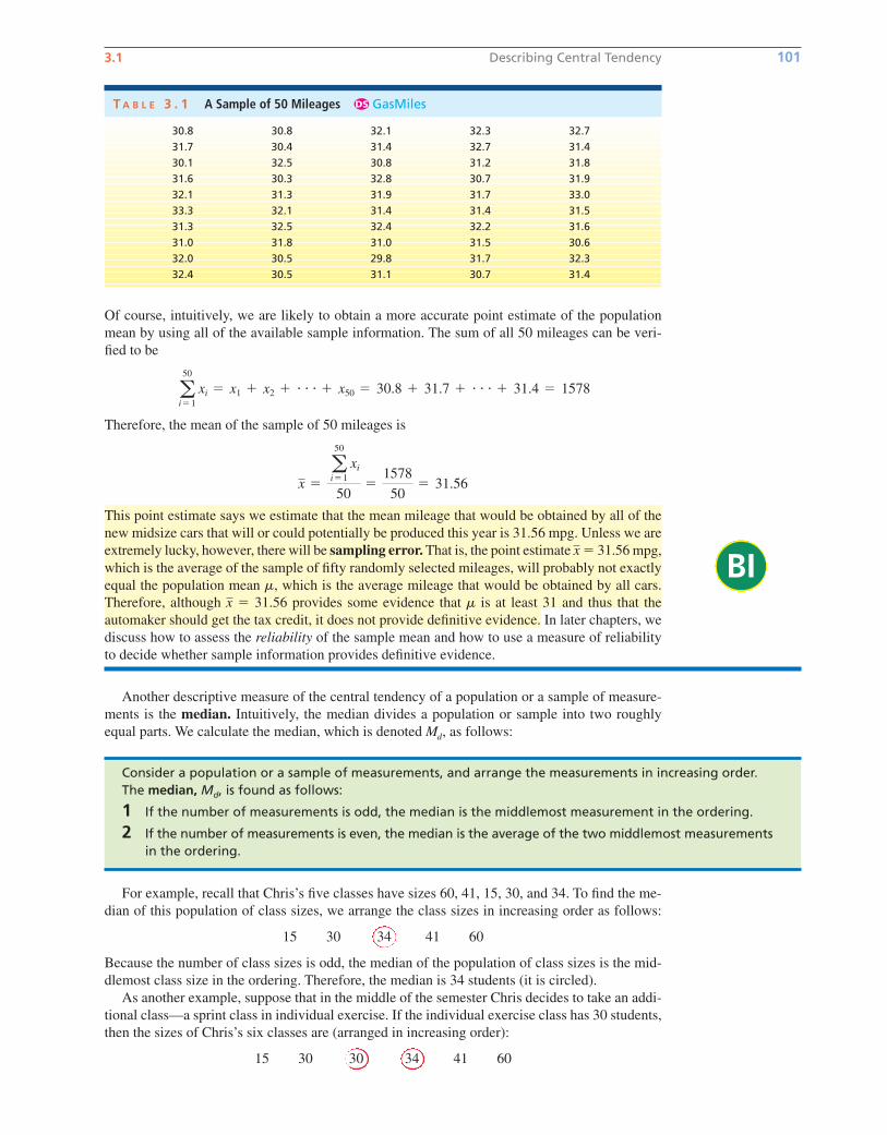
T A B L E 3 . 1 A Sample of 50 Mileages GasMilesDS
30.8 30.8 32.1 32.3 32.7
31.7 30.4 31.4 32.7 31.4
30.1 32.5 30.8 31.2 31.8
31.6 30.3 32.8 30.7 31.9
32.1 31.3 31.9 31.7 33.0
33.3 32.1 31.4 31.4 31.5
31.3 32.5 32.4 32.2 31.6
31.0 31.8 31.0 31.5 30.6
32.0 30.5 29.8 31.7 32.3
32.4 30.5 31.1 30.7 31.4
BI
Consider a population or a sample of measurements, and arrange the measurements in increasing order.The median, Md, is found as follows:
1 If the number of measurements is odd, the median is the middlemost measurement in the ordering.
2 If the number of measurements is even, the median is the average of the two middlemost measurementsin the ordering.
For example, recall that Chris’s five classes have sizes 60, 41, 15, 30, and 34. To find the me-
dian of this population of class sizes, we arrange the class sizes in increasing order as follows:
15 30 34 41 60
Because the number of class sizes is odd, the median of the population of class sizes is the mid-
dlemost class size in the ordering. Therefore, the median is 34 students (it is circled).
As another example, suppose that in the middle of the semester Chris decides to take an addi-
tional class—a sprint class in individual exercise. If the individual exercise class has 30 students,
then the sizes of Chris’s six classes are (arranged in increasing order):
15 30 30 34 41 60
bow20530_ch03_098-149.qxd 10/31/13 3:40 PM Page 101 CONFIRMING PAGES
Because the number of classes is even, the median of the population of class sizes is the average of
the two middlemost class sizes, which are circled. Therefore, the median is stu-
dents. Note that, although two of Chris’s classes have the same size, 30 students, each observation
is listed separately (that is, 30 is listed twice) when we arrange the observations in increasing order.
As a third example, if we arrange the sample of 50 mileages in Table 3.1 in increasing order,
we find that the two middlemost mileages—the 25th and 26th mileages—are 31.5 and 31.6. It
follows that the median of the sample is 31.55. Therefore, we estimate that the median mileage
that would be obtained by all of the new midsize cars that will or could potentially be produced
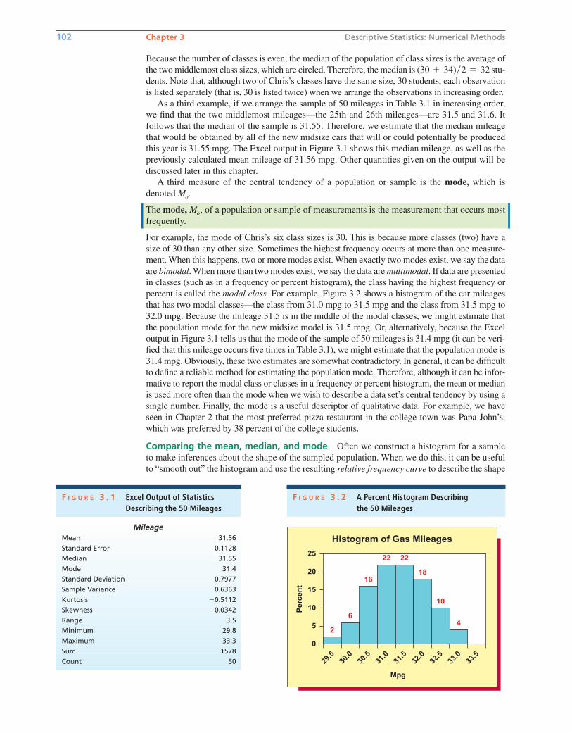
this year is 31.55 mpg. The Excel output in Figure 3.1 shows this median mileage, as well as the
previously calculated mean mileage of 31.56 mpg. Other quantities given on the output will be
discussed later in this chapter.
A third measure of the central tendency of a population or sample is the mode, which is
denoted Mo.
The mode, Mo, of a population or sample of measurements is the measurement that occurs most
frequently.
For example, the mode of Chris’s six class sizes is 30. This is because more classes (two) have a
size of 30 than any other size. Sometimes the highest frequency occurs at more than one measure-
ment. When this happens, two or more modes exist. When exactly two modes exist, we say the data
are bimodal. When more than two modes exist, we say the data are multimodal. If data are presented
in classes (such as in a frequency or percent histogram), the class having the highest frequency or
percent is called the modal class. For example, Figure 3.2 shows a histogram of the car mileages
that has two modal classes—the class from 31.0 mpg to 31.5 mpg and the class from 31.5 mpg to
32.0 mpg. Because the mileage 31.5 is in the middle of the modal classes, we might estimate that
the population mode for the new midsize model is 31.5 mpg. Or, alternatively, because the Excel
output in Figure 3.1 tells us that the mode of the sample of 50 mileages is 31.4 mpg (it can be veri-
fied that this mileage occurs five times in Table 3.1), we might estimate that the population mode is
31.4 mpg. Obviously, these two estimates are somewhat contradictory. In general, it can be difficult
to define a reliable method for estimating the population mode. Therefore, although it can be infor-
mative to report the modal class or classes in a frequency or percent histogram, the mean or median
is used more often than the mode when we wish to describe a data set’s central tendency by using a
single number. Finally, the mode is a useful descriptor of qualitative data. For example, we have
seen in Chapter 2 that the most preferred pizza restaurant in the college town was Papa John’s,
which was preferred by 38 percent of the college students.
Comparing the mean, median, and mode Often we construct a histogram for a sample
to make inferences about the shape of the sampled population. When we do this, it can be useful
to “smooth out” the histogram and use the resulting relative frequency curve to describe the shape
(30 � 34)�2 � 32
102 Chapter 3 Descriptive Statistics: Numerical Methods
Histogram of Gas Mileages
0
20
15
10
5
25
Mpg
Per
cen
t
29.5
30.0
30.5
31.0
31.5
32.0
32.5
33.0
33.5
6
16
22 22
18
10
42
F I G U R E 3 . 2 A Percent Histogram Describingthe 50 Mileages
F I G U R E 3 . 1 Excel Output of Statistics Describing the 50 Mileages
MileageMean 31.56
Standard Error 0.1128
Median 31.55
Mode 31.4
Standard Deviation 0.7977
Sample Variance 0.6363
Kurtosis �0.5112
Skewness �0.0342
Range 3.5
Minimum 29.8
Maximum 33.3
Sum 1578
Count 50
bow20530_ch03_098-149.qxd 10/31/13 3:40 PM Page 102 CONFIRMING PAGES
3.1 Describing Central Tendency 103
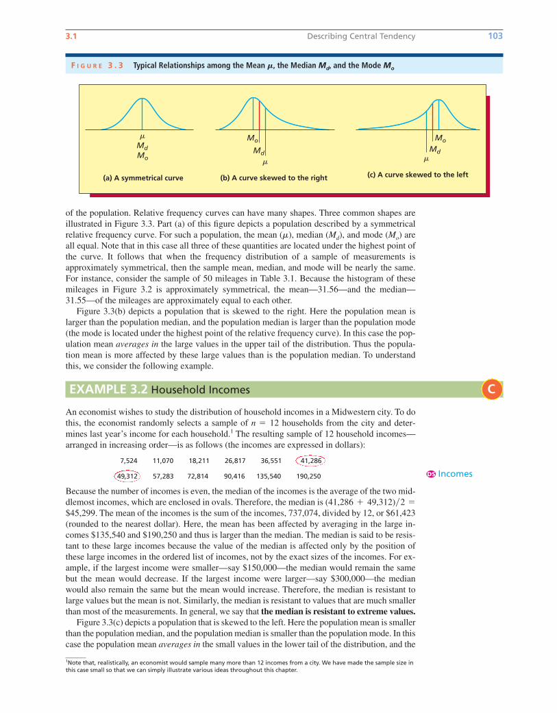
of the population. Relative frequency curves can have many shapes. Three common shapes are
illustrated in Figure 3.3. Part (a) of this figure depicts a population described by a symmetrical
relative frequency curve. For such a population, the mean ( ), median (Md), and mode (Mo) are
all equal. Note that in this case all three of these quantities are located under the highest point of
the curve. It follows that when the frequency distribution of a sample of measurements is
approximately symmetrical, then the sample mean, median, and mode will be nearly the same.
For instance, consider the sample of 50 mileages in Table 3.1. Because the histogram of these
mileages in Figure 3.2 is approximately symmetrical, the mean—31.56—and the median—
31.55—of the mileages are approximately equal to each other.
Figure 3.3(b) depicts a population that is skewed to the right. Here the population mean is
larger than the population median, and the population median is larger than the population mode
(the mode is located under the highest point of the relative frequency curve). In this case the pop-
ulation mean averages in the large values in the upper tail of the distribution. Thus the popula-
tion mean is more affected by these large values than is the population median. To understand
this, we consider the following example.
m
(a) A symmetrical curve (b) A curve skewed to the right
Mo
Md�
Mo
Md
�
(c) A curve skewed to the left
Mo
Md�
F I G U R E 3 . 3 Typical Relationships among the Mean M, the Median Md, and the Mode Mo
EXAMPLE 3.2 Household Incomes
An economist wishes to study the distribution of household incomes in a Midwestern city. To do
this, the economist randomly selects a sample of households from the city and deter-
mines last year’s income for each household.1 The resulting sample of 12 household incomes—
arranged in increasing order—is as follows (the incomes are expressed in dollars):
7,524 11,070 18,211 26,817 36,551 41,286
49,312 57,283 72,814 90,416 135,540 190,250
Because the number of incomes is even, the median of the incomes is the average of the two mid-
dlemost incomes, which are enclosed in ovals. Therefore, the median is
The mean of the incomes is the sum of the incomes, 737,074, divided by 12, or $61,423
(rounded to the nearest dollar). Here, the mean has been affected by averaging in the large in-
comes $135,540 and $190,250 and thus is larger than the median. The median is said to be resis-
tant to these large incomes because the value of the median is affected only by the position of
these large incomes in the ordered list of incomes, not by the exact sizes of the incomes. For ex-
ample, if the largest income were smaller—say $150,000—the median would remain the same
but the mean would decrease. If the largest income were larger—say $300,000—the median
would also remain the same but the mean would increase. Therefore, the median is resistant to
large values but the mean is not. Similarly, the median is resistant to values that are much smaller
than most of the measurements. In general, we say that the median is resistant to extreme values.Figure 3.3(c) depicts a population that is skewed to the left. Here the population mean is smaller
than the population median, and the population median is smaller than the population mode. In this
case the population mean averages in the small values in the lower tail of the distribution, and the
$45,299.
(41,286 � 49,312)�2 �
n � 12
C
IncomesDS
1Note that, realistically, an economist would sample many more than 12 incomes from a city. We have made the sample size inthis case small so that we can simply illustrate various ideas throughout this chapter.
bow20530_ch03_098-149.qxd 10/31/13 3:40 PM Page 103 CONFIRMING PAGES
mean is more affected by these small values than is the median. For instance, in a survey several
years ago of 20 Decision Sciences graduates at Miami University, 18 of the graduates had obtained
employment in business consulting that paid a mean salary of about $43,000. One of the graduates
had become a Christian missionary and listed his salary as $8,500, and another graduate was work-
ing for his hometown bank and listed his salary as $10,500. The two lower salaries decreased the
overall mean salary to about $39,650, which was below the median salary of about $43,000.
When a population is skewed to the right or left with a very long tail, the population mean can be
substantially affected by the extreme population values in the tail of the distribution. In such a case,
the population median might be better than the population mean as a measure of central tendency.
For example, the yearly incomes of all people in the United States are skewed to the right with a very
long tail. Furthermore, the very large incomes in this tail cause the mean yearly income to be inflated
above the typical income earned by most Americans. Because of this, the median income is more
representative of a typical U.S. income.
104 Chapter 3 Descriptive Statistics: Numerical Methods
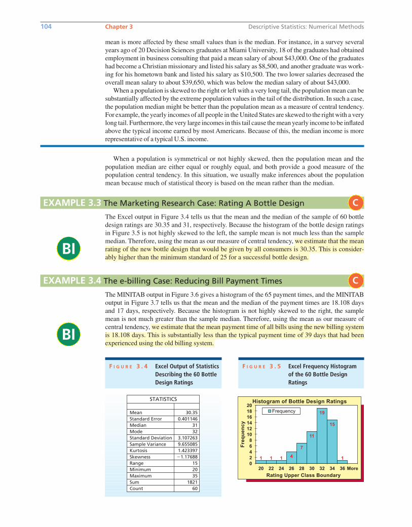
EXAMPLE 3.3 The Marketing Research Case: Rating A Bottle Design
BI
BI
The Excel output in Figure 3.4 tells us that the mean and the median of the sample of 60 bottle
design ratings are 30.35 and 31, respectively. Because the histogram of the bottle design ratings
in Figure 3.5 is not highly skewed to the left, the sample mean is not much less than the sample
median. Therefore, using the mean as our measure of central tendency, we estimate that the mean
rating of the new bottle design that would be given by all consumers is 30.35. This is consider-
ably higher than the minimum standard of 25 for a successful bottle design.
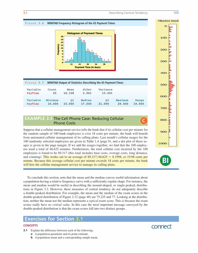
The MINITAB output in Figure 3.6 gives a histogram of the 65 payment times, and the MINITAB
output in Figure 3.7 tells us that the mean and the median of the payment times are 18.108 days
and 17 days, respectively. Because the histogram is not highly skewed to the right, the sample
mean is not much greater than the sample median. Therefore, using the mean as our measure of
central tendency, we estimate that the mean payment time of all bills using the new billing system
is 18.108 days. This is substantially less than the typical payment time of 39 days that had been
experienced using the old billing system.
EXAMPLE 3.4 The e-billing Case: Reducing Bill Payment Times
C
C
Mean 30.350.401146
3.1072639.6550851.423397
�1.17688
3132
152035
601821
Standard ErrorMedianModeStandard DeviationSample VarianceKurtosisSkewnessRangeMinimumMaximumSumCount
STATISTICS
F I G U R E 3 . 4 Excel Output of StatisticsDescribing the 60 BottleDesign Ratings
02
20 22 24 26 28 30 32 34 36 More
468
10
Fre
qu
en
cy
Frequency
1214161820
1 1 1 4
7
11
19
15
1
Rating Upper Class Boundary
Histogram of Bottle Design Ratings
F I G U R E 3 . 5 Excel Frequency Histogram of the 60 Bottle Design Ratings
When a population is symmetrical or not highly skewed, then the population mean and the
population median are either equal or roughly equal, and both provide a good measure of the
population central tendency. In this situation, we usually make inferences about the population
mean because much of statistical theory is based on the mean rather than the median.
bow20530_ch03_098-149.qxd 10/31/13 3:40 PM Page 104 CONFIRMING PAGES
Variable Count Mean StDev Variance PayTime 65 18.108 3.961 15.691
Variable Minimum Q1 Median Q3 Maximum RangePayTime 10.000 15.000 17.000 21.000 29.000 19.000
F I G U R E 3 . 7 MINITAB Output of Statistics Describing the 65 Payment Times
BI
3.1 Describing Central Tendency 105
To conclude this section, note that the mean and the median convey useful information about
a population having a relative frequency curve with a sufficiently regular shape. For instance, the
mean and median would be useful in describing the mound-shaped, or single-peaked, distribu-
tions in Figure 3.3. However, these measures of central tendency do not adequately describe
a double-peaked distribution. For example, the mean and the median of the exam scores in the
double-peaked distribution of Figure 2.12 (page 48) are 75.225 and 77. Looking at the distribu-
tion, neither the mean nor the median represents a typical exam score. This is because the exam
scores really have no central value. In this case the most important message conveyed by the
double-peaked distribution is that the exam scores fall into two distinct groups.
F I G U R E 3 . 6 MINITAB Frequency Histogram of the 65 Payment Times
EXAMPLE 3.5 The Cell Phone Case: Reducing Cellular Phone Costs
Suppose that a cellular management service tells the bank that if its cellular cost per minute for
the random sample of 100 bank employees is over 18 cents per minute, the bank will benefit
from automated cellular management of its calling plans. Last month’s cellular usages for the
100 randomly selected employees are given in Table 1.4 (page 9), and a dot plot of these us-
ages is given in the page margin. If we add the usages together, we find that the 100 employ-
ees used a total of 46,625 minutes. Furthermore, the total cellular cost incurred by the 100
employees is found to be $9,317 (this total includes base costs, overage costs, long distance,
and roaming). This works out to an average of $9,317�46,625 � $.1998, or 19.98 cents per
minute. Because this average cellular cost per minute exceeds 18 cents per minute, the bank
will hire the cellular management service to manage its calling plans.
C
Exercises for Section 3.1CONCEPTS
3.1 Explain the difference between each of the following:
a A population parameter and its point estimate.
b A population mean and a corresponding sample mean.
bow20530_ch03_098-149.qxd 10/31/13 3:40 PM Page 105 CONFIRMING PAGES
106 Chapter 3 Descriptive Statistics: Numerical Methods
Variable Count Mean StDev Variance Ratings 65 42.954 2.642 6.982
Variable Minimum Q1 Median Q3 Maximum RangeRatings 36.000 41.000 43.000 45.000 48.000 12.000
F I G U R E 3 . 8 MINITAB Output of Statistics Describing the 65 Satisfaction Ratings (for Exercise 3.5)
Variable Count Mean StDev Variance WaitTime 100 5.460 2.475 6.128
Variable Minimum Q1 Median Q3 Maximum RangeWaitTime 0.400 3.800 5.250 7.200 11.600 11.200
F I G U R E 3 . 9 MINITAB Output of Statistics Describing the 100 Waiting Times (for Exercise 3.6)
3.2 Explain how the population mean, median, and mode compare when the population’s relative
frequency curve is
a Symmetrical.
b Skewed with a tail to the left.
c Skewed with a tail to the right.
METHODS AND APPLICATIONS
3.3 Calculate the mean, median, and mode of each of the following populations of numbers:
a 9, 8, 10, 10, 12, 6, 11, 10, 12, 8
b 110, 120, 70, 90, 90, 100, 80, 130, 140
3.4 Calculate the mean, median, and mode for each of the following populations of numbers:
a 17, 23, 19, 20, 25, 18, 22, 15, 21, 20
b 505, 497, 501, 500, 507, 510, 501
3.5 THE VIDEO GAME SATISFACTION RATING CASE VideoGame
Recall that Table 1.7 (page 13) presents the satisfaction ratings for the XYZ-Box game system that
have been given by 65 randomly selected purchasers. Figures 3.8 and 3.11(a) give the MINITAB
and Excel outputs of statistics describing the 65 satisfaction ratings.
a Find the sample mean on the outputs. Does the sample mean provide some evidence that the mean
of the population of all possible customer satisfaction ratings for the XYZ-Box is at least 42?
(Recall that a “very satisfied” customer gives a rating that is at least 42.) Explain your answer.
b Find the sample median on the outputs. How do the mean and median compare? What does the
histogram in Figure 2.15 (page 52) tell you about why they compare this way?
3.6 THE BANK CUSTOMER WAITING TIME CASE WaitTime
Recall that Table 1.8 (page 13) presents the waiting times for teller service during peak business hours
of 100 randomly selected bank customers. Figures 3.9 and 3.11(b) give the MINITAB and Excel out-
puts of statistics describing the 100 waiting times.
a Find the sample mean on the outputs. Does the sample mean provide some evidence that the
mean of the population of all possible customer waiting times during peak business hours is less
than six minutes (as is desired by the bank manager)? Explain your answer.
b Find the sample median on the outputs. How do the mean and median compare? What does the
histogram in Figure 2.16 (page 52) tell you about why they compare this way?
3.7 THE TRASH BAG CASE TrashBag
Consider the trash bag problem. Suppose that an independent laboratory has tested 30-gallon trash
bags and has found that none of the 30-gallon bags currently on the market has a mean breaking
strength of 50 pounds or more. On the basis of these results, the producer of the new, improved
trash bag feels sure that its 30-gallon bag will be the strongest such bag on the market if the new
trash bag’s mean breaking strength can be shown to be at least 50 pounds. Recall that Table 1.9
(page 14) presents the breaking strengths of 40 trash bags of the new type that were selected during
DS
DS
DS
bow20530_ch03_098-149.qxd 10/31/13 3:40 PM Page 106 CONFIRMING PAGES
3.1 Describing Central Tendency 107
a 40-hour pilot production run. Figures 3.10 and 3.12 give the MINITAB and Excel outputs of
statistics describing the 40 breaking strengths.
a Find the sample mean on the outputs. Does the sample mean provide some evidence that the
mean of the population of all possible trash bag breaking strengths is at least 50 pounds?
Explain your answer.
b Find the sample median on the outputs. How do the mean and median compare? What does the
histogram in Figure 2.17 (page 52) tell you about why they compare this way?
3.8 Lauren is a college sophomore majoring in business. This semester Lauren is taking courses in
accounting, economics, management information systems, public speaking, and statistics. The
sizes of these classes are, respectively, 350, 45, 35, 25, and 40. Find the mean and the median
of the class sizes. What is a better measure of Lauren’s “typical class size”—the mean or the
median?
In the National Basketball Association (NBA) lockout of 2011, the owners of NBA teams wished to
change the existing collective bargaining agreement with the NBA Players Association. The owners
wanted a “hard salary cap” restricting the size of team payrolls. This would allow “smaller market
teams” having less revenue to be (1) financially profitable and (2) competitive (in terms of wins and
losses) with the “larger market teams.” The NBA owners also wanted the players to agree to take less
than the 57 percent share of team revenues that they had been receiving. The players opposed these
changes. Table 3.2 on the next page gives, for each NBA team, the team’s 2009–2010 revenue, player
expenses (including benefits and bonuses), and operating income as given on the Forbes.com website
on October 26, 2011. Here, the operating income of a team is basically the team’s profit (that is, the
team’s revenue minus the team’s expenses—including player expenses, arena expenses, etc.—but not
including some interest, depreciation, and tax expenses). Use the data in Table 3.2 to do Exercises 3.9
through 3.15.
3.9 Construct a histogram and a stem-and-leaf display of the teams’ revenues. NBAIncome
3.10 Compute the mean team revenue and the median team revenue, and explain the difference between
the values of these statistics. NBAIncome
3.11 Construct a histogram and a stem-and-leaf display of the teams’ player expenses. NBAIncomeDS
DS
DS
Variable Count Mean StDev Variance Strength 40 50.575 1.644 2.702
Variable Minimum Q1 Median Q3 Maximum RangeStrength 46.800 49.425 50.650 51.650 54.000 7.200
F I G U R E 3 . 1 0 MINITAB Output of Statistics Describing the 40 Breaking Strengths (for Exercise 3.7)
F I G U R E 3 . 1 1 Excel Outputs of Statistics Describing Two Data Sets F I G U R E 3 . 1 2 Excel Output ofBreaking Strength Statistics (for Exercise 3.7)(a) Satisfaction rating statistics
(for Exercise 3.5)
RatingsMean 42.954
Standard Error 0.3277
Median 43
Mode 44
Standard Deviation 2.6424
Sample Variance 6.9822
Kurtosis �0.3922
Skewness �0.4466
Range 12
Minimum 36
Maximum 48
Sum 2792
Count 65
(b) Waiting time statistics (for Exercise 3.6)
WaitTimeMean 5.46
Standard Error 0.2475
Median 5.25
Mode 5.8
Standard Deviation 2.4755
Sample Variance 6.1279
Kurtosis �0.4050
Skewness 0.2504
Range 11.2
Minimum 0.4
Maximum 11.6
Sum 546
Count 100
StrengthMean 50.575
Standard Error 0.2599
Median 50.65
Mode 50.9
Standard Deviation 1.6438
Sample Variance 2.7019
Kurtosis �0.2151
Skewness �0.0549
Range 7.2
Minimum 46.8
Maximum 54
Sum 2023
Count 40
bow20530_ch03_098-149.qxd 10/31/13 3:40 PM Page 107 CONFIRMING PAGES
3.12 Compute the mean team player expense and the median team player expense and explain the differ-
ence between the values of these statistics. NBAIncome
3.13 Construct a histogram and a stem-and-leaf display of the teams’ operating incomes. NBAIncome
3.14 Compute the mean team operating income and the median team operating income, and explain the
difference between the values of these statistics. NBAIncome
3.15 The mean team operating income is the operating income each NBA team would receive if the
NBA owners divided the total of their operating incomes equally among the 30 NBA teams. (Of
course, some of the owners might object to dividing their operating incomes equally among the
teams). NBAIncomea How would the players use the mean team operating income to justify their position opposing a
hard salary cap?
b Use Table 3.2 to find the number of NBA teams that made money (that is, had a positive oper-
ating income) and the number of teams that lost money (had a negative operating income).
c How would the owners use the results of part (b) and the median team operating income to
justify their desire for a hard salary cap?
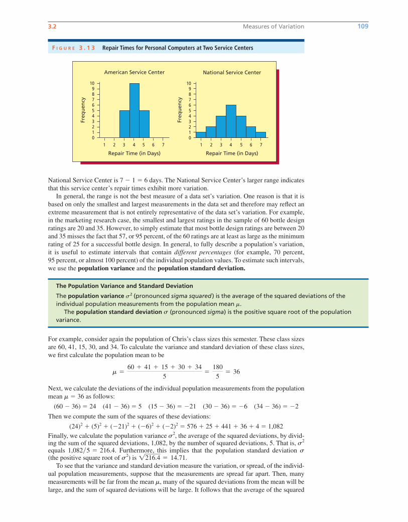
3.2 Measures of Variation Range, variance, and standard deviation In addition to estimating a population’s central
tendency, it is important to estimate the variation of the population’s individual values. For ex-
ample, Figure 3.13 shows two histograms. Each portrays the distribution of 20 repair times (in
days) for personal computers at a major service center. Because the mean (and median and mode)
of each distribution equals four days, the measures of central tendency do not indicate any differ-
ence between the American and National Service Centers. However, the repair times for the
American Service Center are clustered quite closely together, whereas the repair times for the
National Service Center are spread farther apart (the repair time might be as little as one day, but
could also be as long as seven days). Therefore, we need measures of variation to express how
the two distributions differ.
One way to measure the variation of a set of measurements is to calculate the range.
Consider a population or a sample of measurements. The range of the measurements is the
largest measurement minus the smallest measurement.
In Figure 3.13, the smallest and largest repair times for the American Service Center are three
days and five days; therefore, the range is 5 � 3 � 2 days. On the other hand, the range for the
DS
DS
DS
DS
108 Chapter 3 Descriptive Statistics: Numerical Methods
T A B L E 3 . 2 National Basketball Association Team Revenues, Player Expenses, and Operating Incomes as Given on theForbes.com Website on October 26, 2011 NBAIncomeDS
Player Operating Player OperatingRevenue Expenses Income Revenue Expenses Income
Rank Team ($mil) ($mil) ($mil) Rank Team ($mil) ($mil) ($mil)1 New York Knicks 226 86 64.0 16 Utah Jazz 121 76 �3.9
2 Los Angeles Lakers 214 91 33.4 17 Philadelphia 76ers 110 69 �1.2
3 Chicago Bulls 169 74 51.3 18 Oklahoma City Thunder 118 62 22.6
4 Boston Celtics 151 88 4.2 19 Washington Wizards 107 73 �5.2
5 Houston Rockets 153 67 35.9 20 Denver Nuggets 113 79 �11.7
6 Dallas Mavericks 146 81 �7.8 21 New Jersey Nets 89 64 �10.2
7 Miami Heat 124 78 �5.9 22 Los Angeles Clippers 102 62 11.0
8 Phoenix Suns 147 69 20.4 23 Atlanta Hawks 105 70 �7.3
9 San Antonio Spurs 135 84 �4.7 24 Sacramento Kings 103 72 �9.8
10 Toronto Raptors 138 72 25.3 25 Charlotte Bobcats 98 73 �20.0
11 Orlando Magic 108 86 �23.1 26 New Orleans Hornets 100 74 �5.9
12 Golden State Warriors 119 70 14.3 27 Indiana Pacers 95 71 �16.9
13 Detroit Pistons 147 64 31.8 28 Memphis Grizzlies 92 59 �2.6
14 Portland Trail Blazers 127 64 10.7 29 Minnesota Timberwolves 95 67 �6.7
15 Cleveland Cavaliers 161 90 2.6 30 Milwaukee Bucks 92 69 �2.0
Source: http://www.forbes.com/lists/2011/32/basketball-valuations-11.
Computeand inter-
pret the range,variance, andstandard deviation.
LO3-2
bow20530_ch03_098-149.qxd 10/31/13 3:40 PM Page 108 CONFIRMING PAGES
3.2 Measures of Variation 109
National Service Center is 7 � 1 � 6 days. The National Service Center’s larger range indicates
that this service center’s repair times exhibit more variation.
In general, the range is not the best measure of a data set’s variation. One reason is that it is
based on only the smallest and largest measurements in the data set and therefore may reflect an
extreme measurement that is not entirely representative of the data set’s variation. For example,
in the marketing research case, the smallest and largest ratings in the sample of 60 bottle design
ratings are 20 and 35. However, to simply estimate that most bottle design ratings are between 20
and 35 misses the fact that 57, or 95 percent, of the 60 ratings are at least as large as the minimum
rating of 25 for a successful bottle design. In general, to fully describe a population’s variation,
it is useful to estimate intervals that contain different percentages (for example, 70 percent,
95 percent, or almost 100 percent) of the individual population values. To estimate such intervals,
we use the population variance and the population standard deviation.
The Population Variance and Standard Deviation
The population variance s2 (pronounced sigma squared ) is the average of the squared deviations of theindividual population measurements from the population mean m.
The population standard deviation (pronounced sigma) is the positive square root of the populationvariance.
s
For example, consider again the population of Chris’s class sizes this semester. These class sizes
are 60, 41, 15, 30, and 34. To calculate the variance and standard deviation of these class sizes,
we first calculate the population mean to be
Next, we calculate the deviations of the individual population measurements from the population
mean � 36 as follows:
(60 � 36) � 24 (41 � 36) � 5 (15 � 36) � �21 (30 � 36) � �6 (34 � 36) � �2
Then we compute the sum of the squares of these deviations:
(24)2 � (5)2 � (�21)2 � (�6)2 � (�2)2 � 576 � 25 � 441 � 36 � 4 � 1,082
Finally, we calculate the population variance , the average of the squared deviations, by divid-ing the sum of the squared deviations, 1,082, by the number of squared deviations, 5. That is, equals Furthermore, this implies that the population standard deviation (the positive square root of ) is
To see that the variance and standard deviation measure the variation, or spread, of the individ-
ual population measurements, suppose that the measurements are spread far apart. Then, many
measurements will be far from the mean , many of the squared deviations from the mean will be
large, and the sum of squared deviations will be large. It follows that the average of the squared
m
1216.4 � 14.71.s2s1,082�5 � 216.4.s2
s2
m
m �60 � 41 � 15 � 30 � 34
5�
180
5� 36
Freq
uen
cy
American Service Center
Repair Time (in Days)
109876543210
1 2 3 4 5 6 7
National Service Center
Freq
uen
cy
Repair Time (in Days)
109876543210
1 2 3 4 5 6 7
F I G U R E 3 . 1 3 Repair Times for Personal Computers at Two Service Centers
bow20530_ch03_098-149.qxd 10/31/13 3:40 PM Page 109 CONFIRMING PAGES
deviations—the population variance—will be relatively large. On the other hand, if the population
measurements are clustered closely together, many measurements will be close to m, many of the
squared deviations from the mean will be small, and the average of the squared deviations—the
population variance—will be small. Therefore, the more spread out the population measurements,
the larger is the population variance, and the larger is the population standard deviation.
To further understand the population variance and standard deviation, note that one reason we
square the deviations of the individual population measurements from the population mean is
that the sum of the raw deviations themselves is zero. This is because the negative deviations
cancel the positive deviations. For example, in the class size situation, the raw deviations are 24,
5, �21, �6, and �2, which sum to zero. Of course, we could make the deviations positive by
finding their absolute values. We square the deviations instead because the resulting population
variance and standard deviation have many important interpretations that we study throughout
this book. Because the population variance is an average of squared deviations of the original
population values, the variance is expressed in squared units of the original population values. On
the other hand, the population standard deviation—the square root of the population variance—
is expressed in the same units as the original population values. For example, the previously dis-
cussed class sizes are expressed in numbers of students. Therefore, the variance of these class
sizes is � 216.4 (students)2, whereas the standard deviation is � 14.71 students. Because
the population standard deviation is expressed in the same units as the population values, it is
more often used to make practical interpretations about the variation of these values.
When a population is too large to measure all the population units, we estimate the population
variance and the population standard deviation by the sample variance and the sample standarddeviation. We calculate the sample variance by dividing the sum of the squared deviations of the
sample measurements from the sample mean by n � 1, the sample size minus one. Although we
might intuitively think that we should divide by n rather than n � 1, it can be shown that divid-
ing by n tends to produce an estimate of the population variance that is too small. On the other
hand, dividing by n � 1 tends to produce a larger estimate that we will show in Chapter 7 is more
appropriate. Therefore, we obtain:
ss2
110 Chapter 3 Descriptive Statistics: Numerical Methods
The Sample Variance and the Sample Standard Deviation
The sample variance s2 (pronounced s squared) is defined to be
and is the point estimate of the population variance .The sample standard deviation is the positive square root of the sample variance and is the
point estimate of the population standard deviation .ss � 2s2
s2
s2 �an
i�1(xi � x )2
n � 1�
(x1 � x )2 � (x2 � x )2 � � � � � (xn � x )2
n � 1
To illustrate the calculation of the sample variance and standard deviation, we begin by consider-
ing the first five mileages in Table 3.1 (page 101): x1 � 30.8, x2 � 31.7, x3 � 30.1, x4 � 31.6, and
x5 � 32.1. Because the mean of these five mileages is it follows that
Therefore, the variance and the standard deviation of the sample of the first five mileages are
s2 �2.572
5 � 1� .643 and s � 1 .643 � .8019
� 2.572
� (�.46)2 � (.44)2 � (�1.16)2 � (.34)2 � (.84)2
� (31.6 � 31.26)2 � (32.1 � 31.26)2
� (30.8 � 31.26)2 � (31.7 � 31.26)2 � (30.1 � 31.26)2
a
5
i�1
(xi � x)2 � (x1 � x)2 � (x2 � x)2 � (x3 � x)2
� (x4 � x)2 � (x5 � x)2
x � 31.26,
EXAMPLE 3.6 The Car Mileage Case: Estimating Mileage C
bow20530_ch03_098-149.qxd 10/31/13 3:40 PM Page 110 CONFIRMING PAGES
3.2 Measures of Variation 111
Of course, intuitively, we are likely to obtain more accurate point estimates of the population vari-
ance and standard deviation by using all the available sample information. Recall that the mean
of all 50 mileages is Using this sample mean, it can be verified that
Therefore, the variance and the standard deviation of the sample of 50 mileages are
Notice that the Excel output in Figure 3.1 (page 102) gives these quantities. Here s2 � .6363 and
s � .7977 are the point estimates of the variance, s2, and the standard deviation, s, of the popu-
lation of the mileages of all the cars that will be or could potentially be produced. Furthermore,
the sample standard deviation is expressed in the same units (that is, miles per gallon) as the sam-
ple values. Therefore s � .7977 mpg.
Before explaining how we can use s2 and s in a practical way, we present a formula that makes
it easier to compute s2. This formula is useful when we are using a handheld calculator that is not
equipped with a statistics mode to compute s2.
s2 �31.18
50 � 1� .6363 and s � 1.6363 � .7977.
� 31.18
� (�.76)2 � (.14)2 � � � � � (�.16)2
� (30.8 � 31.56)2 � (31.7 � 31.56)2 � � � � � (31.4 � 31.56)2
a50
i�1
(xi � x)2 � (x1 � x )2 � (x2 � x)2 � � � � � (x50 � x)2
x � 31.56.
The sample variance can be calculated using the computational formula
s2 �1
n � 1� ani�1x2
i ��a
n
i�1xi�
2
n �
Consider the sample of 65 payment times in Table 2.4 (page 42). Using these data, it can be
verified that
Therefore,
and days. Note that the MINITAB output in Figure 3.7 on
page 105 gives these results in slightly rounded form.
s � 2s2 � 215.69135 � 3.9612
�1,004.2464
64� 15.69135 s2 �
1
(65 � 1)B22,317 �
(1,177)2
65R
a
65
i�1
x2i � x2
1 � x22
� � � � � x265 � (22)2 � (19)2 � � � � � (21)2 � 22,317
a
65
i�1
xi � x1 � x2 � � � � � x65 � 22 � 19 � � � � � 21 � 1,177 and
EXAMPLE 3.7 The e-billing Case: Reducing Bill Payment Times C
A practical interpretation of the standard deviation: The Empirical Rule One type
of relative frequency curve describing a population is the normal curve, which is discussed
in Chapter 6. The normal curve is a symmetrical, bell-shaped curve and is illustrated in
Figure 3.14(a) on the next page. If a population is described by a normal curve, we say that the
population is normally distributed, and the following result can be shown to hold.
Use the Em-pirical Rule
and Chebyshev’sTheorem todescribe variation.
LO3-3
bow20530_ch03_098-149.qxd 10/31/13 3:40 PM Page 111 CONFIRMING PAGES

112 Chapter 3 Descriptive Statistics: Numerical Methods
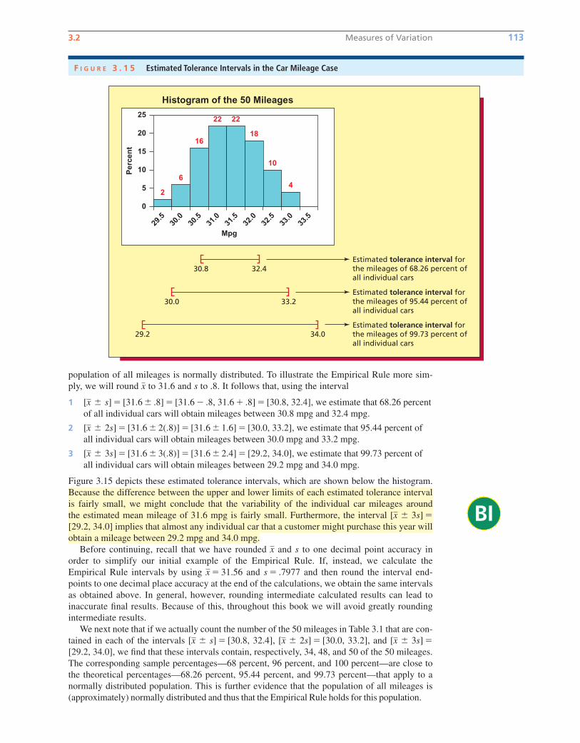
Again consider the sample of 50 mileages. We have seen that � 31.56 and s � .7977 for this
sample are the point estimates of the mean m and the standard deviation s of the population of
all mileages. Furthermore, the histogram of the 50 mileages in Figure 3.15 suggests that the
x
The Empirical Rule for a Normally Distributed Population
If a population has mean M and standard deviation S and is described by a normal curve, then, as illustrated in Figure 3.14(a),
ations of the mean and thus lie in the interval
3 99.73 percent of the population measurementsare within (plus or minus) three standard devi-ations of the mean and thus lie in the interval[m � 3s, m � 3s] � [m � 3s]
[m � 2s, m � 2s] � [m � 2s]1 68.26 percent of the population measurements
are within (plus or minus) one standard devi-ation of the mean and thus lie in the interval
2 95.44 percent of the population measurementsare within (plus or minus) two standard devi-
[m � s, m � s] � [m � s]
F I G U R E 3 . 1 4 The Empirical Rule and Tolerance Intervals for a Normally Distributed Population
68.26% of the populationmeasurements are within(plus or minus) one standarddeviation of the mean
95.44% of the populationmeasurements are within(plus or minus) two standarddeviations of the mean
99.73% of the populationmeasurements are within(plus or minus) three standarddeviations of the mean
� 2 3�
� 2 2�
� 2 � � 1 ��
� 1 2�
� 1 3��
�
(a) The Empirical Rule (b) Tolerance intervals for the 2012 Buick LaCrosse
11
All mid-size cars
Your actual
mileage will vary
depending on how you
drive and maintain
your vehicle.
W2A
Expected range
for most drivers
22 to 32 MPG
Expected range
for most drivers
22 to 32 MPG
Expected range
for most drivers
14 to 20 MPG
Expected range
for most drivers
14 to 20 MPG
based on 15,000 miles
at $3.48 per gallon
See the Recent Fuel Economy Guide at dealers or www.fueleconomy.gov
Estimated
Annual Fuel Cost
$2,485
These estimates reflect new EPA methods beginning with 2008 models.
Combined Fuel Economy
This Vehicle
2148
CITY MPG HIGHWAY MPG
2717
EPA Fuel Economy Estimates
EXAMPLE 3.8 The Car Mileage Case: Estimating Mileage C
In general, an interval that contains a specified percentage of the individual measurements in a
population is called a tolerance interval. It follows that the one, two, and three standard
deviation intervals around given in (1), (2), and (3) are tolerance intervals containing, respec-
tively, 68.26 percent, 95.44 percent, and 99.73 percent of the measurements in a normally distrib-
uted population. Often we interpret the three-sigma interval to be a tolerance interval
that contains almost all of the measurements in a normally distributed population. Of course, we
usually do not know the true values of and . Therefore, we must estimate the tolerance inter-
vals by replacing and in these intervals by the mean and standard deviation s of a sample
that has been randomly selected from the normally distributed population.
xsm
sm
[m � 3s]
m
bow20530_ch03_098-149.qxd 10/31/13 3:40 PM Page 112 CONFIRMING PAGES
BI
3.2 Measures of Variation 113
F I G U R E 3 . 1 5 Estimated Tolerance Intervals in the Car Mileage Case
Estimated tolerance interval forthe mileages of 99.73 percent ofall individual cars
29.2 34.0
Estimated tolerance interval forthe mileages of 95.44 percent ofall individual cars
30.0 33.2
Estimated tolerance interval forthe mileages of 68.26 percent ofall individual cars
30.8 32.4
Histogram of the 50 Mileages
0
20
15
10
5
25
Mpg
Per
cen
t
29.5
30.0
30.5
31.0
31.5
32.0
32.5
33.0
33.5
6
16
22 22
18
10
42
population of all mileages is normally distributed. To illustrate the Empirical Rule more sim-
ply, we will round to 31.6 and s to .8. It follows that, using the interval
1 � [31.6 � .8] � [31.6 � .8, 31.6 � .8] � [30.8, 32.4], we estimate that 68.26 percent
of all individual cars will obtain mileages between 30.8 mpg and 32.4 mpg.
2 � [31.6 � 2(.8)] � [31.6 � 1.6] � [30.0, 33.2], we estimate that 95.44 percent of
all individual cars will obtain mileages between 30.0 mpg and 33.2 mpg.
3 � [31.6 � 3(.8)] � [31.6 � 2.4] � [29.2, 34.0], we estimate that 99.73 percent of
all individual cars will obtain mileages between 29.2 mpg and 34.0 mpg.
Figure 3.15 depicts these estimated tolerance intervals, which are shown below the histogram.
Because the difference between the upper and lower limits of each estimated tolerance interval
is fairly small, we might conclude that the variability of the individual car mileages around
the estimated mean mileage of 31.6 mpg is fairly small. Furthermore, the interval �[29.2, 34.0] implies that almost any individual car that a customer might purchase this year will
obtain a mileage between 29.2 mpg and 34.0 mpg.
Before continuing, recall that we have rounded and s to one decimal point accuracy in
order to simplify our initial example of the Empirical Rule. If, instead, we calculate the
Empirical Rule intervals by using � 31.56 and s � .7977 and then round the interval end-
points to one decimal place accuracy at the end of the calculations, we obtain the same intervals
as obtained above. In general, however, rounding intermediate calculated results can lead to
inaccurate final results. Because of this, throughout this book we will avoid greatly rounding
intermediate results.
We next note that if we actually count the number of the 50 mileages in Table 3.1 that are con-
tained in each of the intervals � [30.8, 32.4], � [30.0, 33.2], and �[29.2, 34.0], we find that these intervals contain, respectively, 34, 48, and 50 of the 50 mileages.
The corresponding sample percentages—68 percent, 96 percent, and 100 percent—are close to
the theoretical percentages—68.26 percent, 95.44 percent, and 99.73 percent—that apply to a
normally distributed population. This is further evidence that the population of all mileages is
(approximately) normally distributed and thus that the Empirical Rule holds for this population.
[x � 3s][x � 2s][x � s]
x
x
[x � 3s]
[x � 3s]
[x � 2s]
[x � s]
x
bow20530_ch03_098-149.qxd 10/31/13 3:40 PM Page 113 CONFIRMING PAGES
To conclude this example, we note that the automaker has studied the combined city and
highway mileages of the new model because the federal tax credit is based on these combined
mileages. When reporting fuel economy estimates for a particular car model to the public,
however, the EPA realizes that the proportions of city and highway driving vary from pur-
chaser to purchaser. Therefore, the EPA reports both a combined mileage estimate and separate
city and highway mileage estimates to the public. Figure 3.14(b) on page 112 presents a window
sticker that summarizes these estimates for the 2012 Buick LaCrosse equipped with a six-
cylinder engine and an automatic transmission. The city mpg of 17 and the highway mpg of 27
given at the top of the sticker are point estimates of, respectively, the mean city mileage and
the mean highway mileage that would be obtained by all such 2012 LaCrosses. The expected
city range of 14 to 20 mpg says that most LaCrosses will get between 14 mpg and 20 mpg in
city driving. The expected highway range of 22 to 32 mpg says that most LaCrosses will get
between 22 mpg and 32 mpg in highway driving. The combined city and highway mileage es-
timate for the LaCrosse is 21 mpg.
Skewness and the Empirical Rule The Empirical Rule holds for normally distributed pop-
ulations. In addition:
The Empirical Rule also approximately holds for populations having mound-shaped (single-peaked) distributions that are not very skewed to the right or left.
In some situations, the skewness of a mound-shaped distribution can make it tricky to know
whether to use the Empirical Rule. This will be investigated in the end-of-section exercises.
When a distribution seems to be too skewed for the Empirical Rule to hold, it is probably best to
describe the distribution’s variation by using percentiles, which are discussed in the next section.
Chebyshev’s Theorem If we fear that the Empirical Rule does not hold for a particular
population, we can consider using Chebyshev’s Theorem to find an interval that contains a
specified percentage of the individual measurements in the population. Although Chebyshev’s
Theorem technically applies to any population, we will see that it is not as practically useful as
we might hope.
114 Chapter 3 Descriptive Statistics: Numerical Methods
Chebyshev’s Theorem
Consider any population that has mean and standard deviation . Then, for any value of k greaterthan 1, at least of the population measurements lie in the interval .[m � ks]100(1 � 1�k2)%
sm
For example, if we choose k equal to 2, then at least 100(1 � 1�22)% � 100(3�4)% � 75% of
the population measurements lie in the interval [m� 2s]. As another example, if we choose kequal to 3, then at least 100(1 � 1�32)% � 100(8�9)% � 88.89% of the population measure-
ments lie in the interval [m� 3s]. As yet a third example, suppose that we wish to find an inter-
val containing at least 99.73 percent of all population measurements. Here we would set
100(1 � 1�k2)% equal to 99.73%, which implies that (1 � 1�k 2) � .9973. If we solve for k, we
find that k � 19.25. This says that at least 99.73 percent of all population measurements lie in
the interval [m� 19.25s]. Unless s is extremely small, this interval will be so long that it will
tell us very little about where the population measurements lie. We conclude that Chebyshev’s
Theorem can help us find an interval that contains a reasonably high percentage (such as 75 per-
cent or 88.89 percent) of all population measurements. However, unless � is extremely small,
Chebyshev’s Theorem will not provide a useful interval that contains almost all (say, 99.73 percent)
of the population measurements.
Although Chebyshev’s Theorem technically applies to any population, it is only of practical
use when analyzing a non-mound-shaped (for example, a double-peaked) population that isnot very skewed to the right or left. Why is this? First, we would not use Chebyshev’s Theo-rem to describe a mound-shaped population that is not very skewed because we can use theEmpirical Rule to do this. In fact, the Empirical Rule is better for such a population because it
gives us a shorter interval that will contain a given percentage of measurements. For example,
if the Empirical Rule can be used to describe a population, the interval [m� 3s] will contain
bow20530_ch03_098-149.qxd 10/31/13 3:41 PM Page 114 CONFIRMING PAGES

3.2 Measures of Variation 115
99.73 percent of all measurements. On the other hand, if we use Chebyshev’s Theorem, the inter-
val [m� 19.25s] is needed. As another example, the Empirical Rule tells us that 95.44 percent
of all measurements lie in the interval [m� 2s], whereas Chebyshev’s Theorem tells us only that
at least 75 percent of all measurements lie in this interval.
It is also not appropriate to use Chebyshev’s Theorem—or any other result making useof the population standard deviation S—to describe a population that is very skewed. This
is because, if a population is very skewed, the measurements in the long tail to the left or right
will inflate . This implies that tolerance intervals calculated using s will be too long to be use-
ful. In this case, it is best to measure variation by using percentiles, which are discussed in the
next section.
z-scores We can determine the relative location of any value in a population or sample by
using the mean and standard deviation to compute the value’s z-score. For any value x in a popu-
lation or sample, the z-score corresponding to x is defined as follows:
s
z-score:
z �x � mean
standard deviation
The z-score, which is also called the standardized value, is the number of standard deviations that
x is from the mean. A positive z-score says that x is above (greater than) the mean, while a
negative z-score says that x is below (less than) the mean. For instance, a z-score equal to 2.3 says
that x is 2.3 standard deviations above the mean. Similarly, a z-score equal to �1.68 says that xis 1.68 standard deviations below the mean. A z-score equal to zero says that x equals the mean.
A z-score indicates the relative location of a value within a population or sample. For exam-
ple, below we calculate the z-scores for each of the profit margins for five competing companies
in a particular industry. For these five companies, the mean profit margin is 10% and the standard
deviation is 3.406%.
Company Profit margin, x x � mean z-score1 8% 8 � 10 � �2 �2�3.406 � �.59
2 10 10 � 10 � 0 0�3.406 � 0
3 15 15 � 10 � 5 5�3.406 � 1.47
4 12 12 � 10 � 2 2�3.406 � .59
5 5 5 � 10 � �5 �5�3.406 � �1.47
These z-scores tell us that the profit margin for Company 3 is the farthest above the mean. More
specifically, this profit margin is 1.47 standard deviations above the mean. The profit margin for
Company 5 is the farthest below the mean—it is 1.47 standard deviations below the mean.
Because the z-score for Company 2 equals zero, its profit margin equals the mean.
Values in two different populations or samples having the same z-score are the same number
of standard deviations from their respective means and, therefore, have the same relative loca-
tions. For example, suppose that the mean score on the midterm exam for students in Section A
of a statistics course is 65 and the standard deviation of the scores is 10. Meanwhile, the mean
score on the same exam for students in Section B is 80 and the standard deviation is 5. A student
in Section A who scores an 85 and a student in Section B who scores a 90 have the same
relative locations within their respective sections because their z-scores, (85 � 65)�10 � 2 and
(90 � 80)�5 � 2, are equal.
The coefficient of variation Sometimes we need to measure the size of the standard
deviation of a population or sample relative to the size of the population or sample mean. The
coefficient of variation, which makes this comparison, is defined for a population or sample as
follows:
coefficient of variation �standard deviation
mean� 100
bow20530_ch03_098-149.qxd 10/31/13 3:41 PM Page 115 CONFIRMING PAGES
Exercises for Section 3.2
116 Chapter 3 Descriptive Statistics: Numerical Methods
The coefficient of variation compares populations or samples having different means and different
standard deviations. For example, suppose that the mean yearly return for a particular stock fund,
which we call Stock Fund 1, is 10.39 percent with a standard deviation of 16.18 percent, while the
mean yearly return for another stock fund, which we call Stock Fund 2, is 7.7 percent with a stan-
dard deviation of 13.82 percent. It follows that the coefficient of variation for Stock Fund 1 is
(16.18�10.39) � 100 � 155.73, and that the coefficient of variation for Stock Fund 2 is
(13.82�7.7) � 100 � 179.48. This tells us that, for Stock Fund 1, the standard deviation is 155.73 per-
cent of the value of its mean yearly return. For Stock Fund 2, the standard deviation is 179.48 per-
cent of the value of its mean yearly return.
In the context of situations like the stock fund comparison, the coefficient of variation is
often used as a measure of risk because it measures the variation of the returns (the standard
deviation) relative to the size of the mean return. For instance, although Stock Fund 2 has a
smaller standard deviation than does Stock Fund 1 (13.82 percent compared to 16.18 percent),
Stock Fund 2 has a higher coefficient of variation than does Stock Fund 1 (179.48 versus
155.73). This says that, relative to the mean return, the variation in returns for Stock Fund 2 is
higher. That is, we would conclude that investing in Stock Fund 2 is riskier than investing in
Stock Fund 1.
CONCEPTS
3.16 Define the range, variance, and standard deviation for a population.
3.17 Discuss how the variance and the standard deviation measure variation.
3.18 The Empirical Rule for a normally distributed population and Chebyshev’s Theorem have the same
basic purpose. In your own words, explain what this purpose is.
METHODS AND APPLICATIONS
3.19 Consider the following population of five numbers: 5, 8, 10, 12, 15. Calculate the range, variance,
and standard deviation of this population.
3.20 Table 3.3 gives data concerning the 10 most valuable Nascar team valuations and their revenues as
given on the Forbes.com website on June 14, 2011. Calculate the population range, variance, and
standard deviation of the 10 valuations and of the 10 revenues. Nascar
3.21 Consider Exercise 3.20. Nascar
a Compute and interpret the z-score for each Nascar team valuation.
b Compute and interpret the z-score for each Nascar team revenue.
3.22 In order to control costs, a company wishes to study the amount of money its sales force spends
entertaining clients. The following is a random sample of six entertainment expenses (dinner costs
for four people) from expense reports submitted by members of the sales force. DinnerCost
$157 $132 $109 $145 $125 $139
a Calculate and s for the expense data. In addition, show that the two different formulas
for calculating s2 give the same result.
b Assuming that the distribution of entertainment expenses is approximately normally distributed,
calculate estimates of tolerance intervals containing 68.26 percent, 95.44 percent, and
99.73 percent of all entertainment expenses by the sales force.
c If a member of the sales force submits an entertainment expense (dinner cost for four) of $190,
should this expense be considered unusually high (and possibly worthy of investigation by the
company)? Explain your answer.
d Compute and interpret the z-score for each of the six entertainment expenses.
3.23 THE TRASH BAG CASE TrashBag
The mean and the standard deviation of the sample of 40 trash bag breaking strengths are
and s � 1.6438.
a What does the histogram in Figure 2.17 (page 52) say about whether the Empirical Rule should
be used to describe the trash bag breaking strengths?
x � 50.575
DS
x, s2,
DS
DS
DS
bow20530_ch03_098-149.qxd 10/31/13 3:41 PM Page 116 CONFIRMING PAGES

3.2 Measures of Variation 117
b Use the Empirical Rule to calculate estimates of tolerance intervals containing 68.26 percent,
95.44 percent, and 99.73 percent of all possible trash bag breaking strengths.
c Does the estimate of a tolerance interval containing 99.73 percent of all breaking strengths
provide evidence that almost any bag a customer might purchase will have a breaking strength
that exceeds 45 pounds? Explain your answer.
d How do the percentages of the 40 breaking strengths in Table 1.9 (page 14) that actually fall
into the intervals and compare to those given by the Empirical
Rule? Do these comparisons indicate that the statistical inferences you made in parts b and care reasonably valid?
3.24 THE BANK CUSTOMER WAITING TIME CASE WaitTime
The mean and the standard deviation of the sample of 100 bank customer waiting times are
and s � 2.475.
a What does the histogram in Figure 2.16 (page 52) say about whether the Empirical Rule should
be used to describe the bank customer waiting times?
b Use the Empirical Rule to calculate estimates of tolerance intervals containing 68.26 percent,
95.44 percent, and 99.73 percent of all possible bank customer waiting times.
c Does the estimate of a tolerance interval containing 68.26 percent of all waiting times provide
evidence that at least two-thirds of all customers will have to wait less than eight minutes for
service? Explain your answer.
d How do the percentages of the 100 waiting times in Table 1.8 (page 13) that actually fall into
the intervals , and compare to those given by the Empirical Rule?
Do these comparisons indicate that the statistical inferences you made in parts b and c are
reasonably valid?
3.25 THE VIDEO GAME SATISFACTION RATING CASE VideoGame
The mean and the standard deviation of the sample of 65 customer satisfaction ratings are
and s � 2.6424.
a What does the histogram in Figure 2.15 (page 52) say about whether the Empirical Rule should
be used to describe the satisfaction ratings?
b Use the Empirical Rule to calculate estimates of tolerance intervals containing 68.26 percent,
95.44 percent, and 99.73 percent of all possible satisfaction ratings.
c Does the estimate of a tolerance interval containing 99.73 percent of all satisfaction ratings
provide evidence that 99.73 percent of all customers will give a satisfaction rating for the
XYZ-Box game system that is at least 35 (the minimal rating of a “satisfied” customer)? Explain
your answer.
d How do the percentages of the 65 customer satisfaction ratings in Table 1.7 (page 13) that
actually fall into the intervals , , and compare to those given by the
Empirical Rule? Do these comparisons indicate that the statistical inferences you made in parts band c are reasonably valid?
[x � 3s][x � 2s][x � s]
x � 42.95
DS
[x � 3s][x � s], [x � 2s]
x � 5.46
DS
[x � 3s][x � s], [x � 2s],
T A B L E 3 . 3 Top 10 Highest Nascar Team Valuations and Revenues as Given on the Forbes.comWebsite on June 14, 2011 (for Exercise 3.20) NascarDS
Value RevenueRank Team ($mil) ($mil)1 Hendrick Motorsports 350 177
2 Roush Fenway 224 140
3 Richard Childress 158 90
4 Joe Gibbs Racing 152 93
5 Penske Racing 100 78
6 Stewart-Haas Racing 95 68
7 Michael Waltrip Racing 90 58
8 Earnhardt Ganassi Racing 76 59
9 Richard Petty Motorsports 60 80
10 Red Bull Racing 58 48
Source: http://www.forbes.com/2011/02/23/nascar-highest-paid-drivers-business-sports-nascar-11_land.htm1(accessed 6/14/2011).
bow20530_ch03_098-149.qxd 10/31/13 3:41 PM Page 117 CONFIRMING PAGES
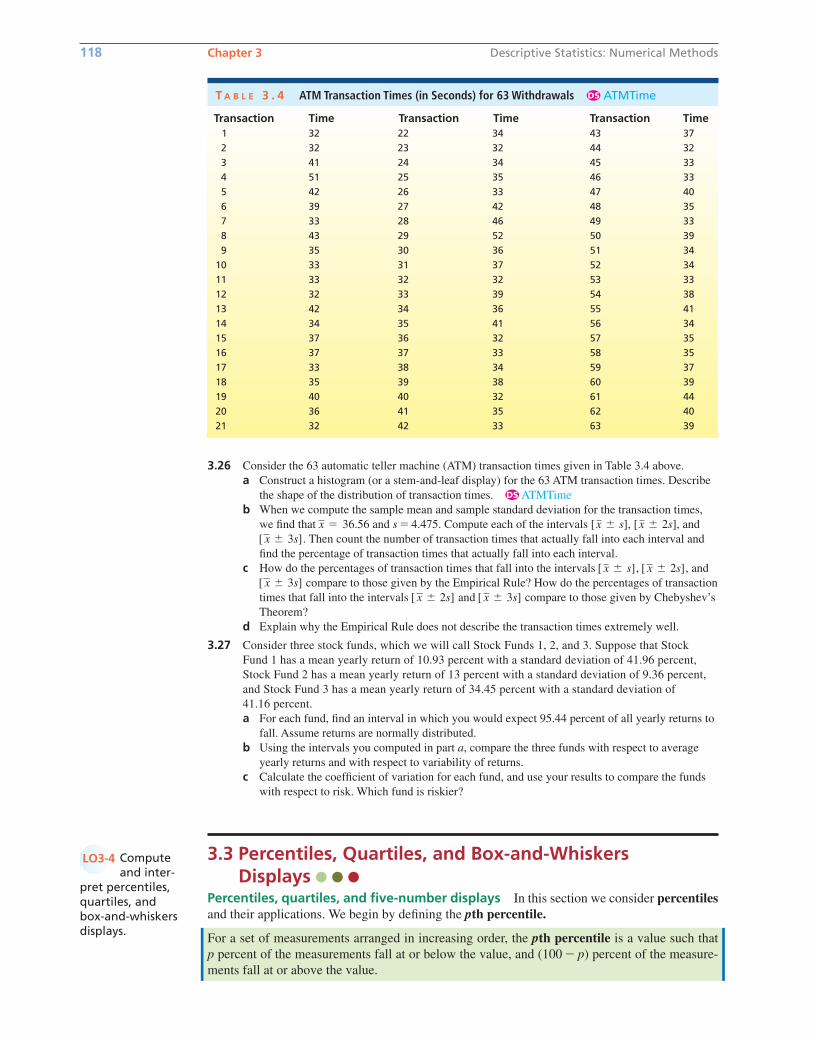
3.26 Consider the 63 automatic teller machine (ATM) transaction times given in Table 3.4 above.
a Construct a histogram (or a stem-and-leaf display) for the 63 ATM transaction times. Describe
the shape of the distribution of transaction times. ATMTime
b When we compute the sample mean and sample standard deviation for the transaction times,
we find that and s � 4.475. Compute each of the intervals , , and
. Then count the number of transaction times that actually fall into each interval and
find the percentage of transaction times that actually fall into each interval.
c How do the percentages of transaction times that fall into the intervals , , and
compare to those given by the Empirical Rule? How do the percentages of transaction
times that fall into the intervals and compare to those given by Chebyshev’s
Theorem?
d Explain why the Empirical Rule does not describe the transaction times extremely well.
3.27 Consider three stock funds, which we will call Stock Funds 1, 2, and 3. Suppose that Stock
Fund 1 has a mean yearly return of 10.93 percent with a standard deviation of 41.96 percent,
Stock Fund 2 has a mean yearly return of 13 percent with a standard deviation of 9.36 percent,
and Stock Fund 3 has a mean yearly return of 34.45 percent with a standard deviation of
41.16 percent.
a For each fund, find an interval in which you would expect 95.44 percent of all yearly returns to
fall. Assume returns are normally distributed.
b Using the intervals you computed in part a, compare the three funds with respect to average
yearly returns and with respect to variability of returns.
c Calculate the coefficient of variation for each fund, and use your results to compare the funds
with respect to risk. Which fund is riskier?
3.3 Percentiles, Quartiles, and Box-and-Whiskers Displays
Percentiles, quartiles, and five-number displays In this section we consider percentilesand their applications. We begin by defining the pth percentile.
For a set of measurements arranged in increasing order, the pth percentile is a value such that
p percent of the measurements fall at or below the value, and (100 � p) percent of the measure-
ments fall at or above the value.
[ x � 3s][ x � 2s]
[ x � 3s]
[ x � 2s][ x � s]
[ x � 3s]
[x � 2s][x � s]x � 36.56
DS
118 Chapter 3 Descriptive Statistics: Numerical Methods
T A B L E 3 . 4 ATM Transaction Times (in Seconds) for 63 Withdrawals ATMTimeDS
Transaction Time Transaction Time Transaction Time1 32 22 34 43 37
2 32 23 32 44 32
3 41 24 34 45 33
4 51 25 35 46 33
5 42 26 33 47 40
6 39 27 42 48 35
7 33 28 46 49 33
8 43 29 52 50 39
9 35 30 36 51 34
10 33 31 37 52 34
11 33 32 32 53 33
12 32 33 39 54 38
13 42 34 36 55 41
14 34 35 41 56 34
15 37 36 32 57 35
16 37 37 33 58 35
17 33 38 34 59 37
18 35 39 38 60 39
19 40 40 32 61 44
20 36 41 35 62 40
21 32 42 33 63 39
Computeand inter-
pret percentiles,quartiles, and box-and-whiskersdisplays.
LO3-4
bow20530_ch03_098-149.qxd 10/31/13 3:41 PM Page 118 CONFIRMING PAGES
3.3 Percentiles, Quartiles, and Box-and-Whiskers Displays 119
There are various procedures for calculating percentiles. One procedure for calculating thepth percentile for a set of n measurements uses the following three steps:
Step 1: Arrange the measurements in increasing order.
Step 2: Calculate the index
Step 3: (a) If i is not an integer, round up to obtain the next integer greater than i. This integer
denotes the position of the pth percentile in the ordered arrangement.
(b) If i is an integer, the pth percentile is the average of the measurements in positions
i and in the ordered arrangement.
To illustrate the calculation and interpretation of percentiles, recall in the household income
situation that an economist has randomly selected a sample of households from a Mid-
western city and has determined last year’s income for each household. In order to assess the
variation of the population of household incomes in the city, we will calculate various percentiles
for the sample of incomes. Specifically, we will calculate the 10th, 25th, 50th, 75th, and 90th per-
centiles of these incomes. The first step is to arrange the incomes in increasing order as follows:
7,524 11,070 18,211 26,817 36,551 41,286
49,312 57,283 72,814 90,416 135,540 190,250
To find the 10th percentile, we calculate (in step 2) the index
Because is not an integer, step 3(a) says to round up to 2. It follows that the 10th
percentile is the income in position 2 in the ordered arrangement—that is, 11,070. To find the
25th percentile, we calculate the index
Because is an integer, step 3(b) says that the 25th percentile is the average of the incomes
in positions 3 and 4 in the ordered arrangement—that is, To
find the 50th percentile, we calculate the index
Because is an integer, step 3(b) says that the 50th percentile is the average of the incomes
in positions 6 and 7 in the ordered arrangement—that is, To
find the 75th percentile, we calculate the index
Because is an integer, step 3(b) says that the 75th percentile is the average of the incomes in
positions 9 and 10 in the ordered arrangement—that is, To find
the 90th percentile, we calculate the index
Because is not an integer, step 3(a) says to round up to 11. It follows that the
90th percentile is the income in position 11 in the ordered arrangement—that is, 135,540.
One appealing way to describe the variation of a set of measurements is to divide the data into
four parts, each containing approximately 25 percent of the measurements. This can be done by
defining the first, second, and third quartiles as follows:
The first quartile, denoted Q1, is the 25th percentile.The second quartile (or median), denoted Md, is the 50th percentile.The third quartile, denoted Q3, is the 75th percentile.
i � 10.8i � 10.8
i � � p
100�n � � 90
100�12 � 10.8
(72,814 � 90,416)�2 � 81,615.
i � 9
i � � p
100�n � � 75
100�12 � 9
(41,286 � 49,312)�2 � 45,299.
i � 6
i � � p
100�n � � 50
100�12 � 6
(18,211 � 26,817)�2 � 22,514.
i � 3
i � � p
100�n � � 25
100�12 � 3
i � 1.2i � 1.2
i � � p
100�n � � 10
100�12 � 1.2
n � 12
i � 1
i � � p
100�n
bow20530_ch03_098-149.qxd 10/31/13 3:41 PM Page 119 CONFIRMING PAGES
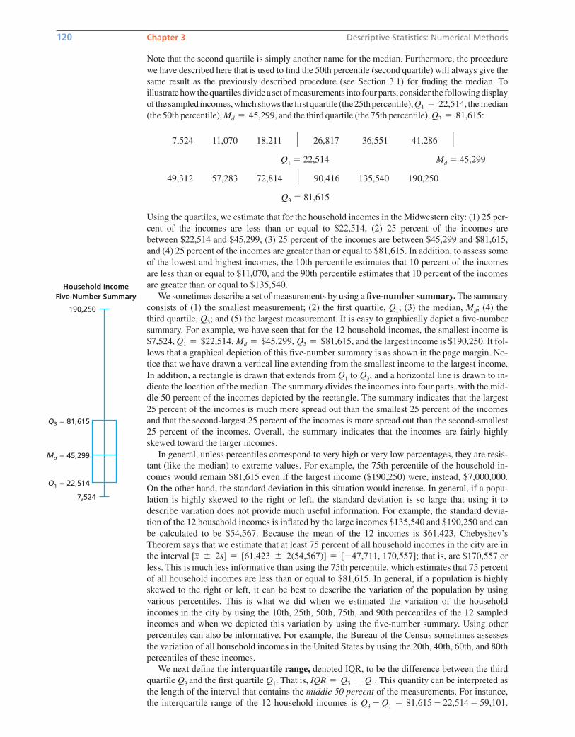
Note that the second quartile is simply another name for the median. Furthermore, the procedure
we have described here that is used to find the 50th percentile (second quartile) will always give the
same result as the previously described procedure (see Section 3.1) for finding the median. To
illustratehowthequartilesdivideasetofmeasurements into fourparts, consider the followingdisplay
of thesampled incomes,whichshowsthefirstquartile (the25thpercentile), the median
(the 50th percentile), and the third quartile (the 75th percentile), :
7,524 11,070 18,211 � 26,817 36,551 41,286 �Q1 � 22,514 Md � 45,299
49,312 57,283 72,814 � 90,416 135,540 190,250
Q3 � 81,615
Using the quartiles, we estimate that for the household incomes in the Midwestern city: (1) 25 per-
cent of the incomes are less than or equal to $22,514, (2) 25 percent of the incomes are
between $22,514 and $45,299, (3) 25 percent of the incomes are between $45,299 and $81,615,
and (4) 25 percent of the incomes are greater than or equal to $81,615. In addition, to assess some
of the lowest and highest incomes, the 10th percentile estimates that 10 percent of the incomes
are less than or equal to $11,070, and the 90th percentile estimates that 10 percent of the incomes
are greater than or equal to $135,540.
We sometimes describe a set of measurements by using a five-number summary. The summary
consists of (1) the smallest measurement; (2) the first quartile, Q1; (3) the median, Md; (4) the
third quartile, Q3; and (5) the largest measurement. It is easy to graphically depict a five-number
summary. For example, we have seen that for the 12 household incomes, the smallest income is
$7,524, and the largest income is $190,250. It fol-
lows that a graphical depiction of this five-number summary is as shown in the page margin. No-
tice that we have drawn a vertical line extending from the smallest income to the largest income.
In addition, a rectangle is drawn that extends from Q1 to Q3, and a horizontal line is drawn to in-
dicate the location of the median. The summary divides the incomes into four parts, with the mid-
dle 50 percent of the incomes depicted by the rectangle. The summary indicates that the largest
25 percent of the incomes is much more spread out than the smallest 25 percent of the incomes
and that the second-largest 25 percent of the incomes is more spread out than the second-smallest
25 percent of the incomes. Overall, the summary indicates that the incomes are fairly highly
skewed toward the larger incomes.
In general, unless percentiles correspond to very high or very low percentages, they are resis-
tant (like the median) to extreme values. For example, the 75th percentile of the household in-
comes would remain $81,615 even if the largest income ($190,250) were, instead, $7,000,000.
On the other hand, the standard deviation in this situation would increase. In general, if a popu-
lation is highly skewed to the right or left, the standard deviation is so large that using it to
describe variation does not provide much useful information. For example, the standard devia-
tion of the 12 household incomes is inflated by the large incomes $135,540 and $190,250 and can
be calculated to be $54,567. Because the mean of the 12 incomes is $61,423, Chebyshev’s
Theorem says that we estimate that at least 75 percent of all household incomes in the city are in
the interval ; that is, are $170,557 or
less. This is much less informative than using the 75th percentile, which estimates that 75 percent
of all household incomes are less than or equal to $81,615. In general, if a population is highly
skewed to the right or left, it can be best to describe the variation of the population by using
various percentiles. This is what we did when we estimated the variation of the household
incomes in the city by using the 10th, 25th, 50th, 75th, and 90th percentiles of the 12 sampled
incomes and when we depicted this variation by using the five-number summary. Using other
percentiles can also be informative. For example, the Bureau of the Census sometimes assesses
the variation of all household incomes in the United States by using the 20th, 40th, 60th, and 80th
percentiles of these incomes.
We next define the interquartile range, denoted IQR, to be the difference between the third
quartile Q3 and the first quartile Q1. That is, This quantity can be interpreted as
the length of the interval that contains the middle 50 percent of the measurements. For instance,
the interquartile range of the 12 household incomes is Q3 � Q1 � 81,615 � 22,514 � 59,101.
IQR � Q3 � Q1.
[x � 2s] � [61,423 � 2(54,567)] � [�47,711, 170,557]
Q1 � $22,514, Md � $45,299, Q3 � $81,615,
Q3 � 81,615Md � 45,299,
Q1 � 22,514,
120 Chapter 3 Descriptive Statistics: Numerical Methods
190,250
Household IncomeFive-Number Summary
7,524
Md 5 45,299
Q3 5 81,615
Q1 5 22,514
bow20530_ch03_098-149.qxd 10/31/13 3:41 PM Page 120 CONFIRMING PAGES
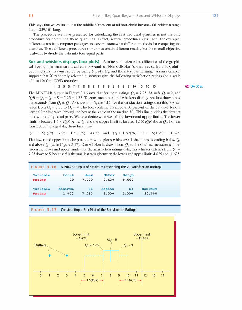
3.3 Percentiles, Quartiles, and Box-and-Whiskers Displays 121
This says that we estimate that the middle 50 percent of all household incomes fall within a range
that is $59,101 long.
The procedure we have presented for calculating the first and third quartiles is not the only
procedure for computing these quantities. In fact, several procedures exist, and, for example,
different statistical computer packages use several somewhat different methods for computing the
quartiles. These different procedures sometimes obtain different results, but the overall objective
is always to divide the data into four equal parts.
Box-and-whiskers displays (box plots) A more sophisticated modification of the graphi-
cal five-number summary is called a box-and-whiskers display (sometimes called a box plot).Such a display is constructed by using Q1, Md, Q3, and the interquartile range. As an example,
suppose that 20 randomly selected customers give the following satisfaction ratings (on a scale
of 1 to 10) for a DVD recorder:
1 3 5 5 7 8 8 8 8 8 8 9 9 9 9 9 10 10 10 10
The MINITAB output in Figure 3.16 says that for these ratings Q1 � 7.25, Md � 8, Q3 � 9, and
IQR � Q3 � Q1 � 9 � 7.25 � 1.75. To construct a box-and-whiskers display, we first draw a box
that extends from Q1 to Q3. As shown in Figure 3.17, for the satisfaction ratings data this box ex-
tends from Q1 � 7.25 to Q3 � 9. The box contains the middle 50 percent of the data set. Next a
vertical line is drawn through the box at the value of the median Md. This line divides the data set
into two roughly equal parts. We next define what we call the lower and upper limits. The lowerlimit is located 1.5 � IQR below Q1 and the upper limit is located 1.5 � IQR above Q3. For the
satisfaction ratings data, these limits are
Q1 � 1.5(IQR) � 7.25 � 1.5(1.75) � 4.625 and Q3 � 1.5(IQR) � 9 � 1.5(1.75) � 11.625
The lower and upper limits help us to draw the plot’s whiskers: dashed lines extending below Q1
and above Q3 (as in Figure 3.17). One whisker is drawn from Q1 to the smallest measurement be-
tween the lower and upper limits. For the satisfaction ratings data, this whisker extends from Q1 �7.25 down to 5, because 5 is the smallest rating between the lower and upper limits 4.625 and 11.625.
F I G U R E 3 . 1 6 MINITAB Output of Statistics Describing the 20 Satisfaction Ratings
Variable Count Mean StDev Range
Rating 20 7.700 2.430 9.000
Variable Minimum Q1 Median Q3 Maximum
Rating 1.000 7.250 8.000 9.000 10.000
DVDSatDS
F I G U R E 3 . 1 7 Constructing a Box Plot of the Satisfaction Ratings
Outliers Q1 5 7.25 Q3 5 9
Md 5 8
0 1 2 3 4 5 6 7 8 9 10 11 12 13 14
Upper limit5 11.625
Lower limit5 4.625
1.5(IQR) 1.5(IQR)
bow20530_ch03_098-149.qxd 10/31/13 3:41 PM Page 121 CONFIRMING PAGES

The other whisker is drawn from Q3 to the largest measurement between the lower and upper lim-
its. For the satisfaction ratings data, this whisker extends from Q3 � 9 up to 10, because 10 is the
largest rating between the lower and upper limits 4.625 and 11.625. The lower and upper limits
are also used to identify outliers. An outlier is a measurement that is separated from (that is, dif-
ferent from) most of the other measurements in the data set. A measurement that is less than the
lower limit or greater than the upper limit is considered to be an outlier. We indicate the location
of an outlier by plotting this measurement with the symbol *. For the satisfaction rating data, the
ratings 1 and 3 are outliers because they are less than the lower limit 4.625. Figure 3.18 gives the
MINITAB output of a box-and-whiskers plot of the satisfacting ratings.
We now summarize how to construct a box-and-whiskers plot.
122 Chapter 3 Descriptive Statistics: Numerical Methods
Constructing a Box-and-Whiskers Display (Box Plot)
3 Draw whiskers as dashed lines that extendbelow Q1 and above Q3. Draw one whisker fromQ1 to the smallest measurement that is betweenthe lower and upper limits. Draw the otherwhisker from Q3 to the largest measurementthat is between the lower and upper limits.
4 A measurement that is less than the lower limit orgreater than the upper limit is an outlier. Plot eachoutlier using the symbol *.
1 Draw a box that extends from the first quartileQ1 to the third quartile Q3. Also draw a verticalline through the box located at the median Md.
2 Determine the values of the lower and upperlimits. The lower limit is located 1.5 � IQR belowQ1 and the upper limit is located 1.5 � IQR aboveQ3. That is, the lower and upper limits are
Q1 � 1.5(IQR) and Q3 � 1.5(IQR)
When interpreting a box-and-whiskers display, keep several points in mind. First, the box
(between Q1 and Q3) contains the middle 50 percent of the data. Second, the median (which is
inside the box) divides the data into two roughly equal parts. Third, if one of the whiskers is
longer than the other, the data set is probably skewed in the direction of the longer whisker.
Last, observations designated as outliers should be investigated. Understanding the root causes
behind the outlying observations will often provide useful information. For instance, under-
standing why two of the satisfaction ratings in the box plot of Figure 3.18 are substantially
lower than the great majority of the ratings may suggest actions that can improve the DVD
recorder manufacturer’s product and/or service. Outliers can also be caused by inaccurate mea-
suring, reporting, or plotting of the data. Such possibilities should be investigated, and incor-
rect data should be adjusted or eliminated.
Graphical five-number summaries and box-and-whiskers displays are perhaps best used to
compare different sets of measurements. We demonstrate this use of such displays in the follow-
ing example.
EXAMPLE 3.9 The Standard and Poor’s 500 Case
Figure 3.19 shows box plots of the percentage returns of stocks on the Standard and Poor’s 500
(S&P 500) for different time horizons of investment. Figure 3.19(a) compares a 1-year time hori-
zon with a 3-year time horizon. We see that there is a 25 percent chance of a negative return (loss)
F I G U R E 3 . 1 8 MINITAB Output of a Box Plot of the Satisfaction Ratings
C
bow20530_ch03_098-149.qxd 10/31/13 3:41 PM Page 122 CONFIRMING PAGES
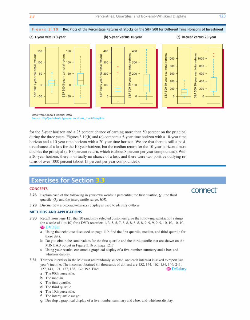
3.3 Percentiles, Quartiles, and Box-and-Whiskers Displays 123
for the 3-year horizon and a 25 percent chance of earning more than 50 percent on the principal
during the three years. Figures 3.19(b) and (c) compare a 5-year time horizon with a 10-year time
horizon and a 10-year time horizon with a 20-year time horizon. We see that there is still a posi-
tive chance of a loss for the 10-year horizon, but the median return for the 10-year horizon almost
doubles the principal (a 100 percent return, which is about 8 percent per year compounded). With
a 20-year horizon, there is virtually no chance of a loss, and there were two positive outlying re-
turns of over 1000 percent (about 13 percent per year compounded).
F I G U R E 3 . 1 9 Box Plots of the Percentage Returns of Stocks on the S&P 500 for Different Time Horizons of Investment
CONCEPTS
3.28 Explain each of the following in your own words: a percentile; the first quartile, Q1; the third
quartile, Q3; and the interquartile range, IQR.
3.29 Discuss how a box-and-whiskers display is used to identify outliers.
METHODS AND APPLICATIONS
3.30 Recall from page 121 that 20 randomly selected customers give the following satisfaction ratings
(on a scale of 1 to 10) for a DVD recorder: 1, 3, 5, 5, 7, 8, 8, 8, 8, 8, 8, 9, 9, 9, 9, 9, 10, 10, 10, 10.
DVDSata Using the technique discussed on page 119, find the first quartile, median, and third quartile for
these data.
b Do you obtain the same values for the first quartile and the third quartile that are shown on the
MINITAB output in Figure 3.16 on page 121?
c Using your results, construct a graphical display of a five-number summary and a box-and-
whiskers display.
3.31 Thirteen internists in the Midwest are randomly selected, and each internist is asked to report last
year’s income. The incomes obtained (in thousands of dollars) are 152, 144, 162, 154, 146, 241,
127, 141, 171, 177, 138, 132, 192. Find: DrSalarya The 90th percentile.
b The median.
c The first quartile.
d The third quartile.
e The 10th percentile.
f The interquartile range.
g Develop a graphical display of a five-number summary and a box-and-whiskers display.
DS
DS
Exercises for Section 3.3
S&P
500
1-ye
ar r
eal t
ota
l ret
urn
s
150
100
50
0
�50 S&P
500
3-ye
ar r
eal t
ota
l ret
urn
s
150
100
50
0
�50 S&P
500
5-ye
ar r
eal t
ota
l ret
urn
s
400
300
200
100
0 S&P
500
10-y
ear
real
to
tal r
etu
rns
400
300
200
100
0 S&P
500
10-y
ear
real
to
tal r
etu
rns
600
800
1000
400
200
0
600
800
1000
400
200
0S&P
500
20-y
ear
real
to
tal r
etu
rns
(a) 1-year versus 3-year (b) 5-year versus 10-year (c) 10-year versus 20-year
Data from Global Financial DataSource: http//junkcharts.typepad.com/junk_charts/boxplot/.
bow20530_ch03_098-149.qxd 10/31/13 3:41 PM Page 123 CONFIRMING PAGES
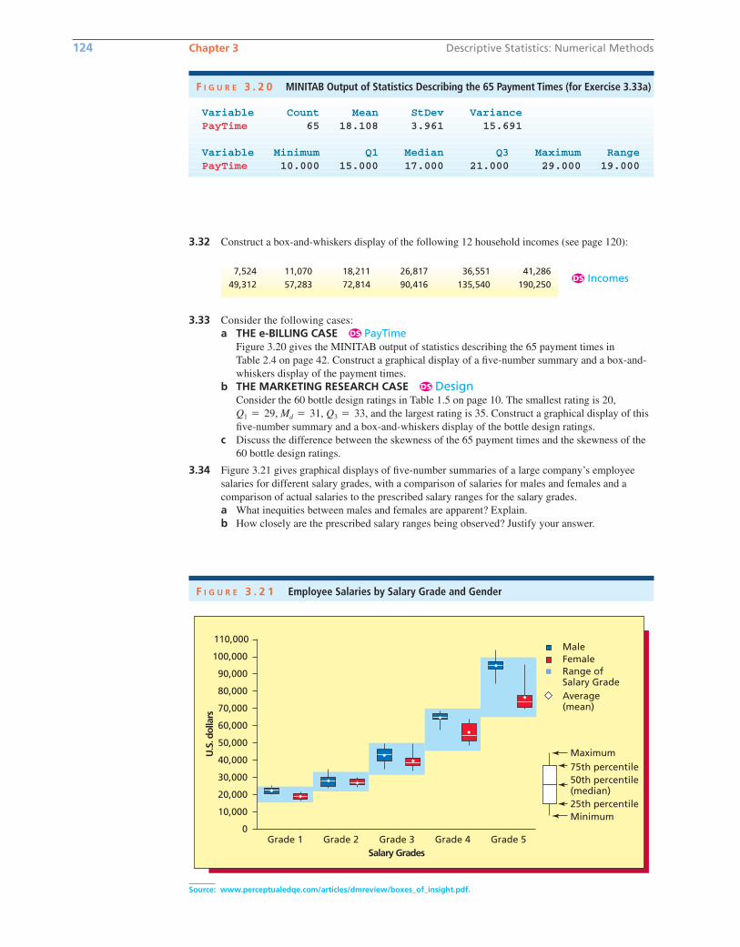
124 Chapter 3 Descriptive Statistics: Numerical Methods
3.32 Construct a box-and-whiskers display of the following 12 household incomes (see page 120):
F I G U R E 3 . 2 1 Employee Salaries by Salary Grade and Gender
Grade 4Grade 1
110,000MaleFemaleRange ofSalary GradeAverage(mean)
Maximum75th percentile50th percentile(median)25th percentileMinimum
40,000
60,000
90,000
20,000
0Grade 2 Grade 3 Grade 5
30,000
50,000
70,000
10,000
100,000
80,000
Salary Grades
U.S
. dol
lars
Source: www.perceptualedqe.com/articles/dmreview/boxes_of_insight.pdf.
Variable Count Mean StDev Variance PayTime 65 18.108 3.961 15.691
Variable Minimum Q1 Median Q3 Maximum RangePayTime 10.000 15.000 17.000 21.000 29.000 19.000
F I G U R E 3 . 2 0 MINITAB Output of Statistics Describing the 65 Payment Times (for Exercise 3.33a)
7,524 11,070 18,211 26,817 36,551 41,286
49,312 57,283 72,814 90,416 135,540 190,250IncomesDS
3.33 Consider the following cases:
a THE e-BILLING CASE PayTimeFigure 3.20 gives the MINITAB output of statistics describing the 65 payment times in
Table 2.4 on page 42. Construct a graphical display of a five-number summary and a box-and-
whiskers display of the payment times.
b THE MARKETING RESEARCH CASE DesignConsider the 60 bottle design ratings in Table 1.5 on page 10. The smallest rating is 20,
and the largest rating is 35. Construct a graphical display of this
five-number summary and a box-and-whiskers display of the bottle design ratings.
c Discuss the difference between the skewness of the 65 payment times and the skewness of the
60 bottle design ratings.
3.34 Figure 3.21 gives graphical displays of five-number summaries of a large company’s employee
salaries for different salary grades, with a comparison of salaries for males and females and a
comparison of actual salaries to the prescribed salary ranges for the salary grades.
a What inequities between males and females are apparent? Explain.
b How closely are the prescribed salary ranges being observed? Justify your answer.
Q1 � 29, Md � 31, Q3 � 33,
DS
DS
bow20530_ch03_098-149.qxd 10/31/13 3:41 PM Page 124 CONFIRMING PAGES
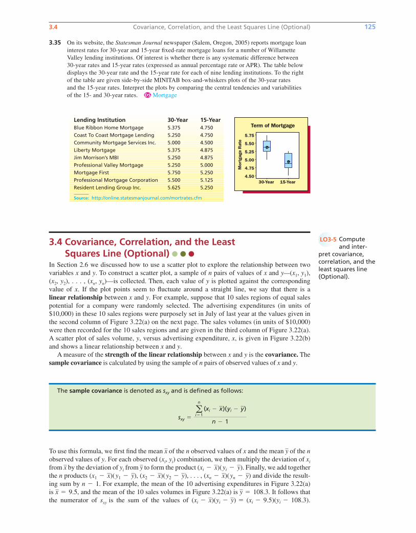
3.4 Covariance, Correlation, and the Least Squares Line (Optional) 125
3.35 On its website, the Statesman Journal newspaper (Salem, Oregon, 2005) reports mortgage loan
interest rates for 30-year and 15-year fixed-rate mortgage loans for a number of Willamette
Valley lending institutions. Of interest is whether there is any systematic difference between
30-year rates and 15-year rates (expressed as annual percentage rate or APR). The table below
displays the 30-year rate and the 15-year rate for each of nine lending institutions. To the right
of the table are given side-by-side MINITAB box-and-whiskers plots of the 30-year rates
and the 15-year rates. Interpret the plots by comparing the central tendencies and variabilities
of the 15- and 30-year rates. Mortgage
3.4 Covariance, Correlation, and the Least Squares Line (Optional)
In Section 2.6 we discussed how to use a scatter plot to explore the relationship between two
variables x and y. To construct a scatter plot, a sample of n pairs of values of x and y—(x1, y1),
(x2, y2), . . . , (xn, yn)—is collected. Then, each value of y is plotted against the corresponding
value of x. If the plot points seem to fluctuate around a straight line, we say that there is a
linear relationship between x and y. For example, suppose that 10 sales regions of equal sales
potential for a company were randomly selected. The advertising expenditures (in units of
$10,000) in these 10 sales regions were purposely set in July of last year at the values given in
the second column of Figure 3.22(a) on the next page. The sales volumes (in units of $10,000)
were then recorded for the 10 sales regions and are given in the third column of Figure 3.22(a).
A scatter plot of sales volume, y, versus advertising expenditure, x, is given in Figure 3.22(b)
and shows a linear relationship between x and y.
A measure of the strength of the linear relationship between x and y is the covariance. The
sample covariance is calculated by using the sample of n pairs of observed values of x and y.
Lending Institution 30-Year 15-YearBlue Ribbon Home Mortgage 5.375 4.750
Coast To Coast Mortgage Lending 5.250 4.750
Community Mortgage Services Inc. 5.000 4.500
Liberty Mortgage 5.375 4.875
Jim Morrison’s MBI 5.250 4.875
Professional Valley Mortgage 5.250 5.000
Mortgage First 5.750 5.250
Professional Mortgage Corporation 5.500 5.125
Resident Lending Group Inc. 5.625 5.250
Source: http://online.statesmanjournal.com/mortrates.cfm
DS
The sample covariance is denoted as and is defined as follows:
sxy �an
i�1(xi � x)(yi � y)
n � 1
sxy
To use this formula, we first find the mean of the n observed values of x and the mean of the nobserved values of y. For each observed (xi, yi) combination, we then multiply the deviation of xi
from by the deviation of yi from to form the product . Finally, we add together
the n products , , . . . , and divide the result-
ing sum by . For example, the mean of the 10 advertising expenditures in Figure 3.22(a)
is , and the mean of the 10 sales volumes in Figure 3.22(a) is . It follows that
the numerator of sxy is the sum of the values of (yi � 108.3).(yi � y) � (xi � 9.5)(xi � x)
y � 108.3x � 9.5
n � 1
(xn � x)(yn � y)(x2 � x)(y2 � y)(x1 � x)(y1 � y)
(xi � x)(yi � y)yx
yx
Computeand inter-
pret covariance,correlation, and theleast squares line(Optional).
LO3-5
bow20530_ch03_098-149.qxd 10/31/13 3:41 PM Page 125 CONFIRMING PAGES
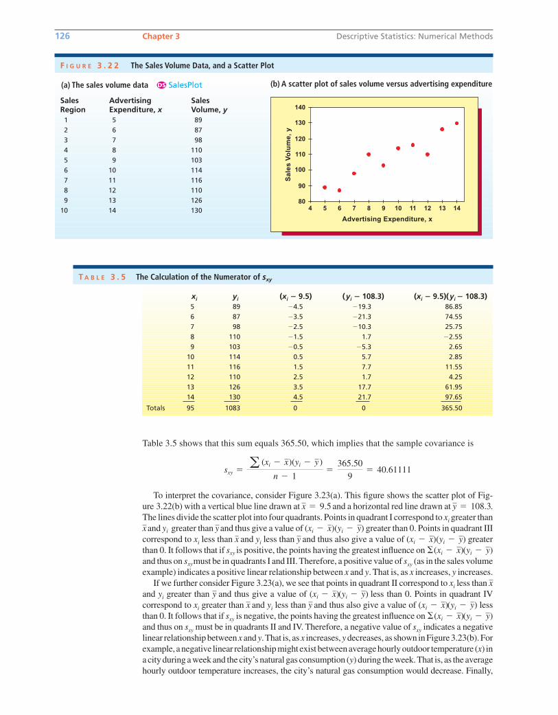
Table 3.5 shows that this sum equals 365.50, which implies that the sample covariance is
To interpret the covariance, consider Figure 3.23(a). This figure shows the scatter plot of Fig-
ure 3.22(b) with a vertical blue line drawn at and a horizontal red line drawn at .
The lines divide the scatter plot into four quadrants. Points in quadrant I correspond to xi greater than
and greater than and thus give a value of ( )( ) greater than 0. Points in quadrant III
correspond to xi less than and yi less than and thus also give a value of ( )( ) greater
than 0. It follows that if is positive, the points having the greatest influence on
and thus on must be in quadrants I and III. Therefore, a positive value of sxy (as in the sales volume
example) indicates a positive linear relationship between x and y. That is, as x increases, y increases.
If we further consider Figure 3.23(a), we see that points in quadrant II correspond to xi less than
and yi greater than and thus give a value of less than 0. Points in quadrant IV
correspond to xi greater than and yi less than and thus also give a value of less
than 0. It follows that if sxy is negative, the points having the greatest influence on
and thus on sxy must be in quadrants II and IV. Therefore, a negative value of sxy indicates a negative
linear relationship between x and y.That is, as x increases, y decreases, as shown in Figure 3.23(b). For
example, a negative linear relationship might exist between average hourly outdoor temperature (x) in
a city during a week and the city’s natural gas consumption (y) during the week.That is, as the average
hourly outdoor temperature increases, the city’s natural gas consumption would decrease. Finally,
(yi � y)�(xi � x)
(yi � y)(xi � x)yx(yi � y)(xi � x)y
x
sxy
(yi � y)�(xi � x)sxy
yi � yxi � xyxyi � yxi � xyyix
y � 108.3x � 9.5
sxy �a (xi � x)(yi � y)
n � 1�
365.50
9� 40.61111
126 Chapter 3 Descriptive Statistics: Numerical Methods
xi yi (xi � 9.5) (yi � 108.3) (xi � 9.5)(yi � 108.3)5 89 �4.5 �19.3 86.85
6 87 �3.5 �21.3 74.55
7 98 �2.5 �10.3 25.75
8 110 �1.5 1.7 �2.55
9 103 �0.5 �5.3 2.65
10 114 0.5 5.7 2.85
11 116 1.5 7.7 11.55
12 110 2.5 1.7 4.25
13 126 3.5 17.7 61.95
14 130 4.5 21.7 97.65
Totals 95 1083 0 0 365.50
T A B L E 3 . 5 The Calculation of the Numerator of sxy
Sales Advertising SalesRegion Expenditure, x Volume, y1 5 89
2 6 87
3 7 98
4 8 110
5 9 103
6 10 114
7 11 116
8 12 110
9 13 126
10 14 130
F I G U R E 3 . 2 2 The Sales Volume Data, and a Scatter Plot
4 5 6 7 8 9 10 11 12 13 14
140
130
120
110
100
80
90
Advertising Expenditure, x
Sa
les
Vo
lum
e,
y
(a) The sales volume data SalesPlotDS (b) A scatter plot of sales volume versus advertising expenditure
bow20530_ch03_098-149.qxd 10/31/13 3:41 PM Page 126 CONFIRMING PAGES
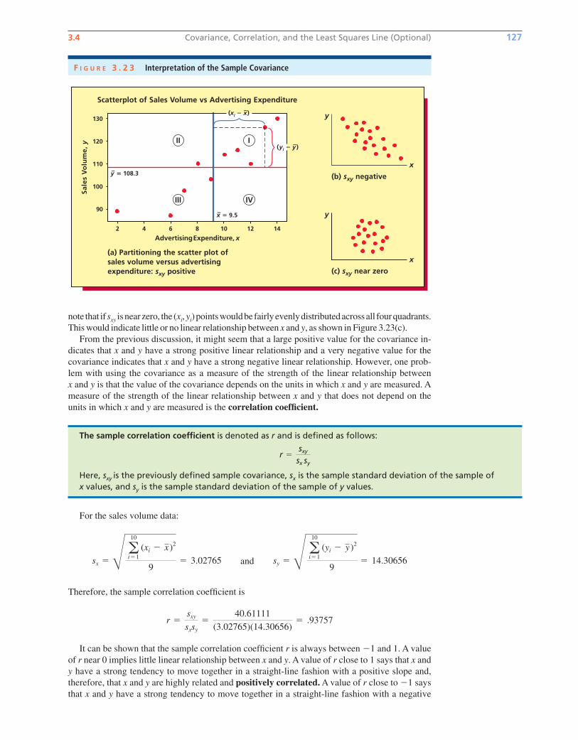
3.4 Covariance, Correlation, and the Least Squares Line (Optional) 127
note that if sxy isnearzero, the (xi,yi)pointswouldbe fairlyevenlydistributedacrossall fourquadrants.
This would indicate little or no linear relationship between x and y, as shown in Figure 3.23(c).
From the previous discussion, it might seem that a large positive value for the covariance in-
dicates that x and y have a strong positive linear relationship and a very negative value for the
covariance indicates that x and y have a strong negative linear relationship. However, one prob-
lem with using the covariance as a measure of the strength of the linear relationship between
x and y is that the value of the covariance depends on the units in which x and y are measured. A
measure of the strength of the linear relationship between x and y that does not depend on the
units in which x and y are measured is the correlation coefficient.
F I G U R E 3 . 2 3 Interpretation of the Sample Covariance
Scatterplot of Sales Volume vs Advertising Expenditure
Sale
s V
olu
me,
y
Advertising Expenditure, x2 4
y– � 108.3
x– � 9.5
(yi � y–)
6 8 10 12 14
130
120
110
100
90
(a) Partitioning the scatter plot ofsales volume versus advertisingexpenditure: sxy positive
III
III IV
(xi � x–)
(b) sxy negative
y
x
(c) sxy near zero
y
x
The sample correlation coefficient is denoted as r and is defined as follows:
Here, sxy is the previously defined sample covariance, sx is the sample standard deviation of the sample of x values, and sy is the sample standard deviation of the sample of y values.
r �sxy
sx sy
For the sales volume data:
and
Therefore, the sample correlation coefficient is
It can be shown that the sample correlation coefficient r is always between �1 and 1. A value
of r near 0 implies little linear relationship between x and y. A value of r close to 1 says that x and
y have a strong tendency to move together in a straight-line fashion with a positive slope and,
therefore, that x and y are highly related and positively correlated. A value of r close to �1 says
that x and y have a strong tendency to move together in a straight-line fashion with a negative
r �sxy
sxsy
�40.61111
(3.02765)(14.30656)� .93757
sy � Q a10
i�1
(yi � y )2
9� 14.30656sx � Q a
10
i�1
(xi � x)2
9� 3.02765
bow20530_ch03_098-149.qxd 10/31/13 3:41 PM Page 127 CONFIRMING PAGES
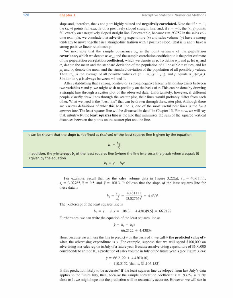
128 Chapter 3 Descriptive Statistics: Numerical Methods
It can be shown that the slope b1 (defined as rise/run) of the least squares line is given by the equation
In addition, the y-intercept b0 of the least squares line (where the line intersects the y-axis when x equals 0)is given by the equation
b0 � y � b1x
b1 �sxy
sx2
For example, recall that for the sales volume data in Figure 3.22(a),
It follows that the slope of the least squares line for
these data is
The of the least squares line is
Furthermore, we can write the equation of the least squares line as
Here, because we will use the line to predict y on the basis of x, we call the predicted value of ywhen the advertising expenditure is x. For example, suppose that we will spend $100,000 on
advertising in a sales region in July of a future year. Because an advertising expenditure of $100,000
corresponds to an x of 10, a prediction of sales volume in July of the future year is (see Figure 3.24):
Is this prediction likely to be accurate? If the least squares line developed from last July’s data
applies to the future July, then, because the sample correlation coefficient is fairly
close to 1, we might hope that the prediction will be reasonably accurate. However, we will see in
r � .93757
� 110.5152 (that is, $1,105,152)
y � 66.2122 � 4.4303(10)
y
� 66.2122 � 4.4303x
y � b0 � b1x
b0 � y � b1x � 108.3 � 4.4303(9.5) � 66.2122
y-intercept
b1 �sxy
s2x
�40.61111
(3.02765)2 � 4.4303
sx � 3.02765, x � 9.5, and y � 108.3.
sxy � 40.61111,
slope and, therefore, that x and y are highly related and negatively correlated. Note that if ,
the (x, y) points fall exactly on a positively sloped straight line, and, if r � �1, the (x, y) points
fall exactly on a negatively sloped straight line. For example, because r � .93757 in the sales vol-
ume example, we conclude that advertising expenditure (x) and sales volume (y) have a strong
tendency to move together in a straight-line fashion with a positive slope. That is, x and y have a
strong positive linear relationship.
We next note that the sample covariance is the point estimate of the populationcovariance, which we denote as , and the sample correlation coefficient r is the point estimate
of the population correlation coefficient, which we denote as r. To define and r, let mx and
sx denote the mean and the standard deviation of the population of all possible x values, and let
my and sy denote the mean and the standard deviation of the population of all possible y values.
Then, is the average of all possible values of (x � mx)(y � my), and r equals (sxsy).
Similar to r, r is always between and 1.
After establishing that a strong positive or a strong negative linear relationship exists between
two variables x and y, we might wish to predict y on the basis of x. This can be done by drawing
a straight line through a scatter plot of the observed data. Unfortunately, however, if different
people visually drew lines through the scatter plot, their lines would probably differ from each
other. What we need is the “best line” that can be drawn through the scatter plot. Although there
are various definitions of what this best line is, one of the most useful best lines is the leastsquares line. The least squares line will be discussed in detail in Chapter 13. For now, we will say
that, intuitively, the least squares line is the line that minimizes the sum of the squared vertical
distances between the points on the scatter plot and the line.
�1
sxysxy
sxy
sxy
sxy
r � 1
bow20530_ch03_098-149.qxd 10/31/13 3:41 PM Page 128 CONFIRMING PAGES
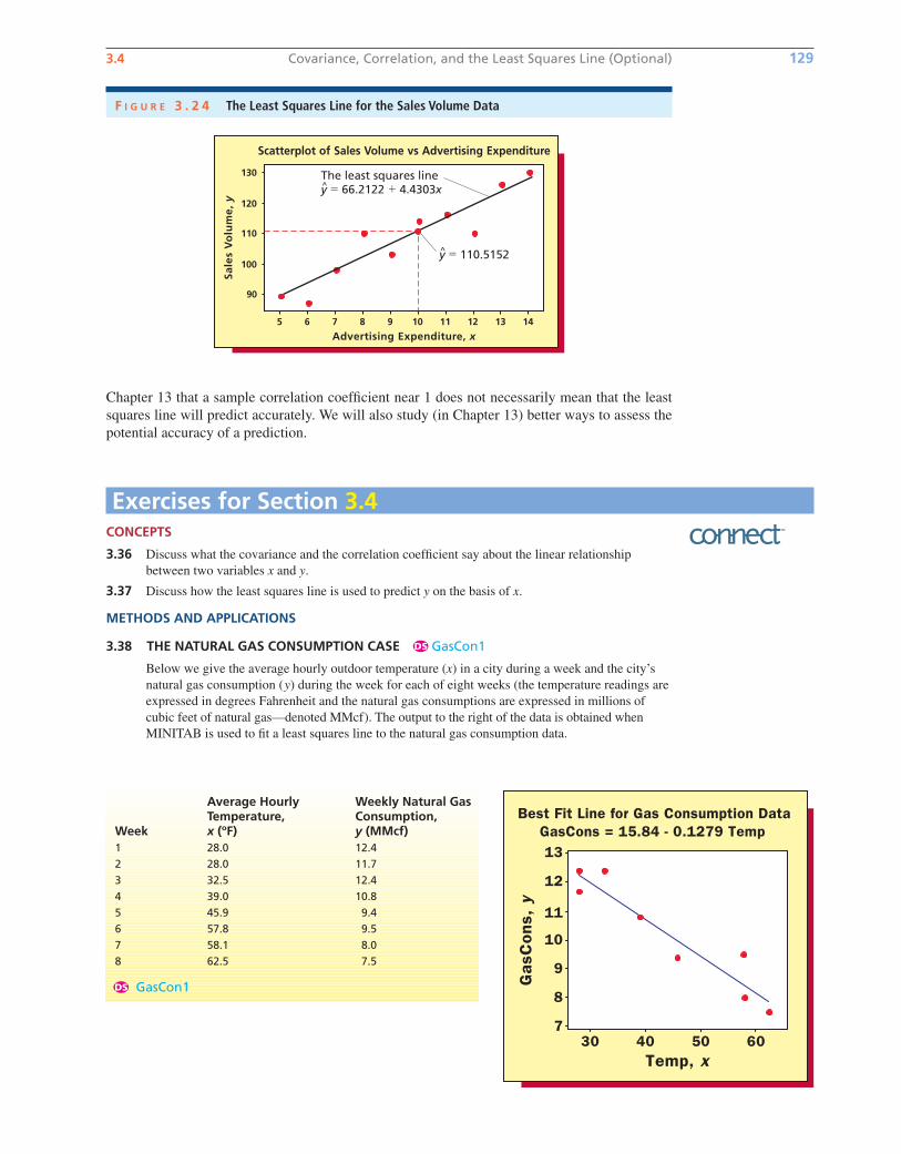
3.4 Covariance, Correlation, and the Least Squares Line (Optional) 129
Chapter 13 that a sample correlation coefficient near 1 does not necessarily mean that the least
squares line will predict accurately. We will also study (in Chapter 13) better ways to assess the
potential accuracy of a prediction.
F I G U R E 3 . 2 4 The Least Squares Line for the Sales Volume Data
Advertising Expenditure, x
Sale
s V
olu
me,
y
5 6 7 8 9 10 11 12 13 14
130
120
110
100
90
Scatterplot of Sales Volume vs Advertising Expenditure
The least squares liney � 66.2122 � 4.4303x
y � 110.5152
Exercises for Section 3.4CONCEPTS
3.36 Discuss what the covariance and the correlation coefficient say about the linear relationship
between two variables x and y.
3.37 Discuss how the least squares line is used to predict y on the basis of x.
METHODS AND APPLICATIONS
3.38 THE NATURAL GAS CONSUMPTION CASE GasCon1
Below we give the average hourly outdoor temperature (x) in a city during a week and the city’s
natural gas consumption (y) during the week for each of eight weeks (the temperature readings are
expressed in degrees Fahrenheit and the natural gas consumptions are expressed in millions of
cubic feet of natural gas—denoted MMcf). The output to the right of the data is obtained when
MINITAB is used to fit a least squares line to the natural gas consumption data.
DS
Average Hourly Weekly Natural GasTemperature, Consumption,
Week x (ºF) y (MMcf)1 28.0 12.4
2 28.0 11.7
3 32.5 12.4
4 39.0 10.8
5 45.9 9.4
6 57.8 9.5
7 58.1 8.0
8 62.5 7.5
GasCon1DS
Temp, x
GasC
ons,
y
60504030
13
12
11
10
9
8
7
Best Fit Line for Gas Consumption DataGasCons = 15.84 - 0.1279 Temp
bow20530_ch03_098-149.qxd 10/31/13 3:41 PM Page 129 CONFIRMING PAGES
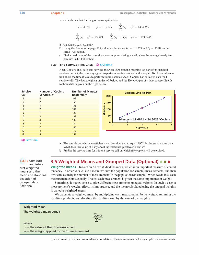
3.5 Weighted Means and Grouped Data (Optional) Weighted means In Section 3.1 we studied the mean, which is an important measure of central
tendency. In order to calculate a mean, we sum the population (or sample) measurements, and then
divide this sum by the number of measurements in the population (or sample). When we do this, each
measurement counts equally. That is, each measurement is given the same importance or weight.
Sometimes it makes sense to give different measurements unequal weights. In such a case, a
measurement’s weight reflects its importance, and the mean calculated using the unequal weights
is called a weighted mean.We calculate a weighted mean by multiplying each measurement by its weight, summing the
resulting products, and dividing the resulting sum by the sum of the weights:
130 Chapter 3 Descriptive Statistics: Numerical Methods
Service Number of Copiers Number of MinutesCall Serviced, x Required, y1 4 109
2 2 58
3 5 138
4 7 189
5 1 37
6 3 82
7 4 103
8 5 134
9 2 68
10 4 112
11 6 154
SrvcTimeDS
Copiers Line Fit Plot
Minutes = 11.4641 + 24.6022*Copiers 0
50
100
150
200
0 2 4 6 8
Copiers, x
Min
utes
, y
a The sample correlation coefficient r can be calculated to equal .9952 for the service time data.
What does this value of r say about the relationship between x and y?
b Predict the service time for a future service call on which five copiers will be serviced.
Weighted Mean
The weighted mean equals
wherexi � the value of the ith measurement
wi � the weight applied to the ith measurement
awixi
awi
It can be shown that for the gas consumption data:
a Calculate and r.
b Using the formulas on page 128, calculate the values and on the
MINITAB output.
c Find a prediction of the natural gas consumption during a week when the average hourly tem-
perature is 40 Fahrenheit.
3.39 THE SERVICE TIME CASE SrvcTime
Accu-Copiers, Inc., sells and services the Accu-500 copying machine. As part of its standard
service contract, the company agrees to perform routine service on this copier. To obtain informa-
tion about the time it takes to perform routine service, Accu-Copiers has collected data for 11
service calls. The data are given on the left below, and the Excel output of a least squares line fit
to these data is given on the right below.
DS
b0 � 15.84b1 � �.1279
sxy, sx, sy,
a8
i�1
(xi � x)(yi � y) � �179.6475a8
i�1
(yi � y)2 � 25.549
a8
i�1
(xi � x)2 � 1404.355y � 10.2125x � 43.98
Computeand inter-
pret weightedmeans and themean and standarddeviation ofgrouped data (Optional).
LO3-6
Such a quantity can be computed for a population of measurements or for a sample of measurements.
bow20530_ch03_098-149.qxd 10/31/13 3:41 PM Page 130 CONFIRMING PAGES
3.5 Weighted Means and Grouped Data (Optional) 131
StockRtnDS
In order to illustrate the need for a weighted mean and the required calculations, suppose that
an investor obtained the following percentage returns on different amounts invested in four stock
funds:
If we wish to compute a mean percentage return for the total of $100,000 invested, we should use
a weighted mean. This is because each of the four percentage returns applies to a different amount
invested. For example, the return 9.2 percent applies to $50,000 invested and thus should count
more heavily than the return 6.1 percent, which applies to $30,000 invested.
The percentage return measurements are x1 � 9.2 percent, x2 � 12.8 percent, x3 � �3.3 per-
cent, and x4 � 6.1 percent, and the weights applied to these measurements are w1 � $50,000,
w2 � $10,000, w3 � $10,000, and w4 � $30,000. That is, we are weighting the percentage returns
by the amounts invested. The weighted mean is computed as follows:
In this case the unweighted mean of the four percentage returns is 6.2 percent. Therefore, the
unweighted mean understates the percentage return for the total of $100,000 invested.
The weights chosen for calculating a weighted mean will vary depending on the situation. For
example, in order to compute the grade point average of a student, we would weight the grades
A(4), B(3), C(2), D(1), and F(0) by the number of hours of A, the number of hours of B, the num-
ber of hours of C, and so forth. Or, in order to compute a mean profit margin for a company con-
sisting of several divisions, the profit margins for the different divisions might be weighted by the
sales volumes of the divisions. Again, the idea is to choose weights that represent the relative
importance of the measurements in the population or sample.
Descriptive statistics for grouped data We usually calculate measures of central ten-
dency and variability using the individual measurements in a population or sample. However,
sometimes the only data available are in the form of a frequency distribution or a histogram. For
example, newspapers and magazines often summarize data using frequency distributions and his-
tograms without giving the individual measurements in a data set. Data summarized in frequency
distribution or histogram form are often called grouped data. In this section we show how to
compute descriptive statistics for such data.
Suppose we are given a frequency distribution summarizing a sample of 65 customer satisfac-
tion ratings for a consumer product.
Because we do not know each of the 65 individual satisfaction ratings, we cannot compute an
exact value for the mean satisfaction rating. However, we can calculate an approximation of
this mean. In order to do this, we let the midpoint of each class represent the measurements
in the class. When we do this, we are really assuming that the average of the measurements in
Satisfaction Rating Frequency36–38 4
39–41 15
42–44 25
45–47 19
48–50 2
�738,000
100,000� 7.38%
m �50,000(9.2) � 10,000(12.8) � 10,000(�3.3) � 30,000(6.1)
50,000 � 10,000 � 10,000 � 30,000
Stock Fund Amount Invested Percentage Return1 $50,000 9.2%
2 $10,000 12.8%
3 $10,000 �3.3%
4 $30,000 6.1%
SatRatingsDS
bow20530_ch03_098-149.qxd 10/31/13 3:41 PM Page 131 CONFIRMING PAGES
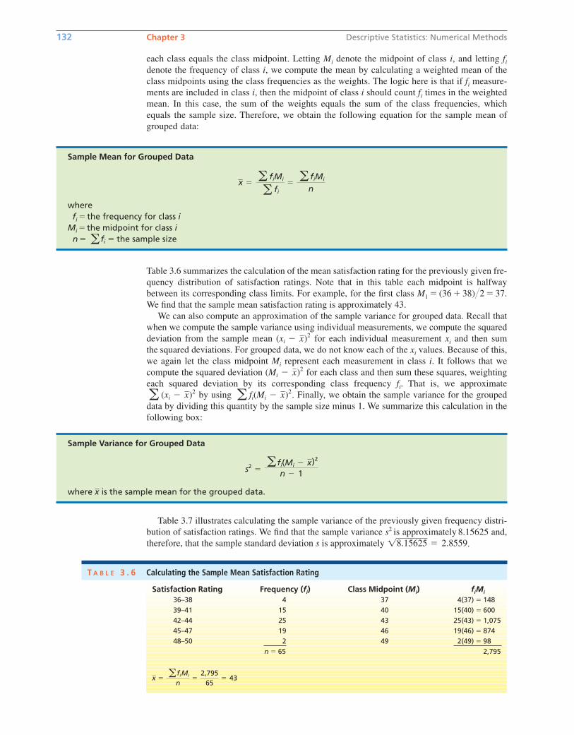
each class equals the class midpoint. Letting Mi denote the midpoint of class i, and letting fi
denote the frequency of class i, we compute the mean by calculating a weighted mean of the
class midpoints using the class frequencies as the weights. The logic here is that if fi measure-
ments are included in class i, then the midpoint of class i should count fi times in the weighted
mean. In this case, the sum of the weights equals the sum of the class frequencies, which
equals the sample size. Therefore, we obtain the following equation for the sample mean of
grouped data:
132 Chapter 3 Descriptive Statistics: Numerical Methods
Sample Mean for Grouped Data
wherefi � the frequency for class i
Mi � the midpoint for class in � � the sample size a fi
x �a fiMi
a fi
�a fiMi
n
Table 3.6 summarizes the calculation of the mean satisfaction rating for the previously given fre-
quency distribution of satisfaction ratings. Note that in this table each midpoint is halfway
between its corresponding class limits. For example, for the first class M1 � (36 � 38)2 � 37.
We find that the sample mean satisfaction rating is approximately 43.
We can also compute an approximation of the sample variance for grouped data. Recall that
when we compute the sample variance using individual measurements, we compute the squared
deviation from the sample mean for each individual measurement xi and then sum
the squared deviations. For grouped data, we do not know each of the xi values. Because of this,
we again let the class midpoint Mi represent each measurement in class i. It follows that we
compute the squared deviation for each class and then sum these squares, weighting
each squared deviation by its corresponding class frequency fi. That is, we approximate
by using . Finally, we obtain the sample variance for the grouped
data by dividing this quantity by the sample size minus 1. We summarize this calculation in the
following box:
a fi(Mi � x)2a (xi � x)2
(Mi � x)2
(xi � x)2
Satisfaction Rating Frequency (fi) Class Midpoint (Mi) fiMi
36–38 4 37 4(37) � 148
39–41 15 40 15(40) � 600
42–44 25 43 25(43) � 1,075
45–47 19 46 19(46) � 874
48–50 2 49 2(49) � 98
n � 65 2,795
x � afiMi
n�
2,79565
� 43
T A B L E 3 . 6 Calculating the Sample Mean Satisfaction Rating
Sample Variance for Grouped Data
where is the sample mean for the grouped data.x
s2 �a fi(Mi � x)2
n � 1
Table 3.7 illustrates calculating the sample variance of the previously given frequency distri-
bution of satisfaction ratings. We find that the sample variance s2 is approximately 8.15625 and,
therefore, that the sample standard deviation s is approximately .18.15625 � 2.8559
bow20530_ch03_098-149.qxd 10/31/13 3:41 PM Page 132 CONFIRMING PAGES
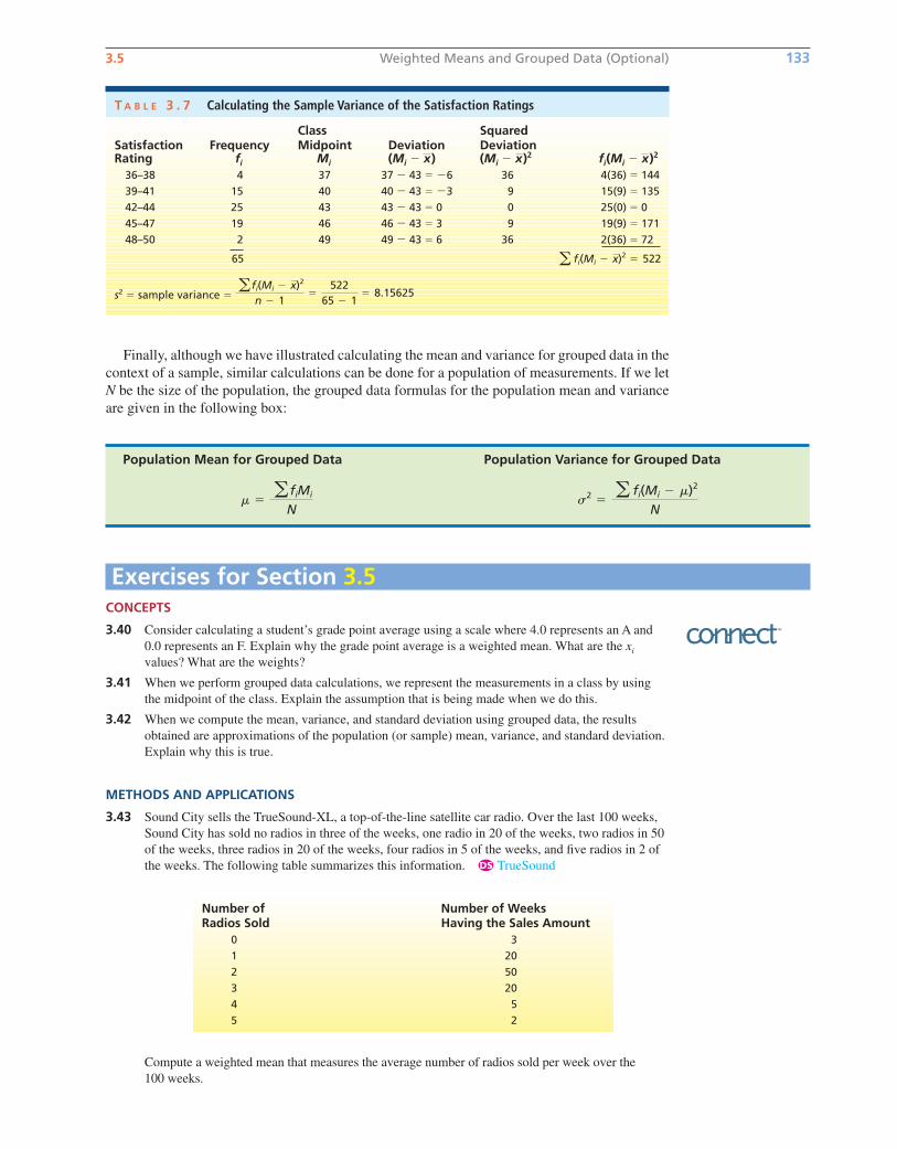
3.5 Weighted Means and Grouped Data (Optional) 133
Finally, although we have illustrated calculating the mean and variance for grouped data in the
context of a sample, similar calculations can be done for a population of measurements. If we let
N be the size of the population, the grouped data formulas for the population mean and variance
are given in the following box:
Population Mean for Grouped Data Population Variance for Grouped Data
s2 �a fi(Mi � m)2
Nm �
a fiMi
N
T A B L E 3 . 7 Calculating the Sample Variance of the Satisfaction Ratings
Class Squared Satisfaction Frequency Midpoint Deviation DeviationRating fi Mi (Mi � ) (Mi � )2 fi(Mi � )2
36–38 4 37 37 � 43 � �6 36 4(36) � 144
39–41 15 40 40 � 43 � �3 9 15(9) � 135
42–44 25 43 43 � 43 � 0 0 25(0) � 0
45–47 19 46 46 � 43 � 3 9 19(9) � 171
48–50 2 49 49 � 43 � 6 36 2(36) � 72
65
s2 � sample variance �afi(Mi � x)2
n � 1�
52265 � 1
� 8.15625
a fi(Mi � x)2 � 522
xxx
Exercises for Section 3.5CONCEPTS
3.40 Consider calculating a student’s grade point average using a scale where 4.0 represents an A and
0.0 represents an F. Explain why the grade point average is a weighted mean. What are the xi
values? What are the weights?
3.41 When we perform grouped data calculations, we represent the measurements in a class by using
the midpoint of the class. Explain the assumption that is being made when we do this.
3.42 When we compute the mean, variance, and standard deviation using grouped data, the results
obtained are approximations of the population (or sample) mean, variance, and standard deviation.
Explain why this is true.
METHODS AND APPLICATIONS
3.43 Sound City sells the TrueSound-XL, a top-of-the-line satellite car radio. Over the last 100 weeks,
Sound City has sold no radios in three of the weeks, one radio in 20 of the weeks, two radios in 50
of the weeks, three radios in 20 of the weeks, four radios in 5 of the weeks, and five radios in 2 of
the weeks. The following table summarizes this information. TrueSound
Compute a weighted mean that measures the average number of radios sold per week over the
100 weeks.
Number of Number of WeeksRadios Sold Having the Sales Amount
0 3
1 20
2 50
3 20
4 5
5 2
DS
bow20530_ch03_098-149.qxd 10/31/13 3:41 PM Page 133 CONFIRMING PAGES
134 Chapter 3 Descriptive Statistics: Numerical Methods
3.44 The following table gives a summary of the grades received by a student for the first 64 semester
hours of university coursework. The table gives the number of semester hours of A, B, C, D, and F
earned by the student among the 64 hours. Grades
a By assigning the numerical values, 4.00, 3.00, 2.00, 1.00, and 0.00 to the grades A, B, C, D,
and F (as shown), compute the student’s grade point average for the first 64 semester hours
of coursework.
b Why is this a weighted average?
3.45 The following frequency distribution summarizes the weights of 195 fish caught by anglers
participating in a professional bass fishing tournament. BassWeights
a Calculate the (approximate) sample mean for these data.
b Calculate the (approximate) sample variance for these data.
3.46 The following is a frequency distribution summarizing earnings per share (EPS) growth data for
the 30 fastest-growing firms as given on Fortune magazine’s website on March 16, 2005.
EPSGrowth
Calculate the (approximate) population mean, variance, and standard deviation for these data.
3.47 The Data and Story Library website (a website devoted to applications of statistics) gives a
histogram of the ages of a sample of 60 CEOs. We present the data in the form of a frequency
distribution below. CEOAges
Calculate the (approximate) sample mean, variance, and standard deviation of these data.
Age (Years) Frequency28–32 1
33–37 3
38–42 3
43–47 13
48–52 14
53–57 12
58–62 9
63–67 1
68–72 3
73–77 1
Source: http://lib.stat.cmu.edu/DASL/Stories/ceo.html (accessedApril 15, 2005).
DS
EPS Growth(Percent) Frequency
0–49 1
50–99 17
100–149 5
150–199 4
200–249 1
250–299 2
Source: http://www.fortune.com (accessed March 16, 2005).
DS
Weight (Pounds) Frequency1–3 53
4–6 118
7–9 21
10–12 3
DS
Grade Number of HoursA (that is, 4.00) 18
B (that is, 3.00) 36
C (that is, 2.00) 7
D (that is, 1.00) 3
F (that is, 0.00) 0
DS
bow20530_ch03_098-149.qxd 10/31/13 3:41 PM Page 134 CONFIRMING PAGES
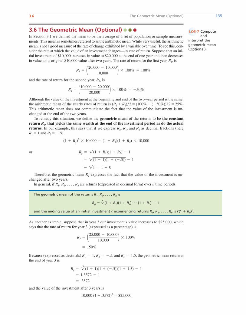
3.6 The Geometric Mean (Optional) 135
3.6 The Geometric Mean (Optional) In Section 3.1 we defined the mean to be the average of a set of population or sample measure-
ments. This mean is sometimes referred to as the arithmetic mean. While very useful, the arithmetic
mean is not a good measure of the rate of change exhibited by a variable over time. To see this, con-
sider the rate at which the value of an investment changes—its rate of return. Suppose that an ini-
tial investment of $10,000 increases in value to $20,000 at the end of one year and then decreases
in value to its original $10,000 value after two years. The rate of return for the first year, R1, is
and the rate of return for the second year, R2, is
Although the value of the investment at the beginning and end of the two-year period is the same,
the arithmetic mean of the yearly rates of return is (R1 � R2)�2 � (100% � (�50%))�2 � 25%.
This arithmetic mean does not communicate the fact that the value of the investment is un-
changed at the end of the two years.
To remedy this situation, we define the geometric mean of the returns to be the constantreturn Rg, that yields the same wealth at the end of the investment period as do the actualreturns. In our example, this says that if we express Rg, R1, and R2 as decimal fractions (here
R1 � 1 and R2 � �.5),
or
Therefore, the geometric mean Rg expresses the fact that the value of the investment is un-
changed after two years.
In general, if R1, R2, . . . , Rn are returns (expressed in decimal form) over n time periods:
� 11 � 1 � 0
� 1(1 � 1)(1 � (�.5)) � 1
Rg � 1(1 � R1)(1 � R2) � 1
(1 � Rg)2 � 10,000 � (1 � R1)(1 � R2) � 10,000
R2 � �10,000 � 20,000
20,000 � � 100% � �50%
R1 � �20,000 � 10,000
10,000 � � 100% � 100%
The geometric mean of the returns R1, R2, . . . , Rn is
and the ending value of an initial investment � experiencing returns R1, R2, . . . , Rn is �(1 � Rg)n.
Rg �n1(1 � R1)(1 � R2) � � � (1 � Rn) � 1
As another example, suppose that in year 3 our investment’s value increases to $25,000, which
says that the rate of return for year 3 (expressed as a percentage) is
Because (expressed as decimals) and the geometric mean return at
the end of year 3 is
and the value of the investment after 3 years is
10,000 (1 � .3572)3 � $25,000
� .3572
� 1.3572 � 1
Rg � 13 (1 � 1)(1 � (�.5))(1 � 1.5) � 1
R3 � 1.5,R1 � 1, R2 � �.5,
� 150%
R3 � �25,000 � 10,000
10,000 � � 100%
Computeand
interpret thegeometric mean(Optional).
LO3-7
bow20530_ch03_098-149.qxd 10/31/13 3:41 PM Page 135 CONFIRMING PAGES

Chapter Summary
We began this chapter by presenting and comparing several mea-
sures of central tendency. We defined the population mean and
we saw how to estimate the population mean by using a samplemean. We also defined the median and mode, and we compared
the mean, median, and mode for symmetrical distributions and
for distributions that are skewed to the right or left. We then stud-
ied measures of variation (or spread ). We defined the range,variance, and standard deviation, and we saw how to estimate
a population variance and standard deviation by using a sample.
We learned that a good way to interpret the standard deviation
when a population is (approximately) normally distributed is to
use the Empirical Rule, and we studied Chebyshev’s Theorem,which gives us intervals containing reasonably large fractions of
the population units no matter what the population’s shape might
be. We also saw that, when a data set is highly skewed, it is best
to use percentiles and quartiles to measure variation, and we
learned how to construct a box-and-whiskers plot by using the
quartiles.
After learning how to measure and depict central tendency
and variability, we presented several optional topics. First, we dis-
cussed several numerical measures of the relationship between two
variables. These included the covariance, the correlation coeffi-cient, and the least squares line. We then introduced the concept
of a weighted mean and also explained how to compute descrip-
tive statistics for grouped data. Finally, we showed how to calcu-
late the geometric mean and demonstrated its interpretation.
136 Chapter 3 Descriptive Statistics: Numerical Methods
Exercises for Section 3.6CONCEPTS
3.48 In words, explain the interpretation of the geometric mean return for an investment.
3.49 If we know the initial value of an investment and its geometric mean return over a period of years,
can we compute the ending value of the investment? If so, how?
METHODS AND APPLICATIONS
3.50 Suppose that a company’s sales were $5,000,000 three years ago. Since that time sales have grown
at annual rates of 10 percent, �10 percent, and 25 percent.
a Find the geometric mean growth rate of sales over this three-year period.
b Find the ending value of sales after this three-year period.
3.51 Suppose that a company’s sales were $1,000,000 four years ago and are $4,000,000 at the end of
the four years. Find the geometric mean growth rate of sales.
3.52 The following table gives the value of the Dow Jones Industrial Average (DJIA), NASDAQ, and
the S&P 500 on the first day of trading for the years 2008 through 2010. StockIndex
a For each stock index, compute the rate of return from 2008 to 2009 and from 2009
to 2010.
b Calculate the geometric mean rate of return for each stock index for the period from 2008
to 2010.
c Suppose that an investment of $100,000 is made in 2008 and that the portfolio performs
with returns equal to those of the DJIA. What is the investment worth in 2010?
d Repeat part c for the NASDAQ and the S&P 500.
3.53 Refer to Exercise 3.52. The values of the DJIA on the first day of trading in 2005, 2006,
and 2007 were 10,729.43, 10,847.41, and 12,474.52.
a Calculate the geometric mean rate of return for the DJIA from 2005 to 2010.
b If an investment of $100,000 is made in 2005 and the portfolio performs with returns equal to
those of the DJIA, what is the investment worth in 2010?
Year DJIA NASDAQ S&P 5002008 13,043.96 2,609.63 1,447.16
2009 9,034.69 1,632.21 931.80
2010 10,583.96 2,308.42 1,132.99
Source: http://www.davemanuel.com/where-did-the-djia-nasdaq-sp500-trade-on.php..
DS
bow20530_ch03_098-149.qxd 10/31/13 4:02 PM Page 136 CONFIRMING PAGES

Important Formulas 137
Glossary of Terms
box-and-whiskers display (box plot): A graphical portrayal of
a data set that depicts both the central tendency and variability of
the data. It is constructed using Q1, Md, and Q3. (pages 121, 122)
central tendency: A term referring to the middle of a population
or sample of measurements. (page 99)
Chebyshev’s Theorem: A theorem that (for any population)
allows us to find an interval that contains a specified percentage
of the individual measurements in the population. (page 114)
coefficient of variation: A quantity that measures the variation
of a population or sample relative to its mean. (page 115)
correlation coefficient: A numerical measure of the linear
relationship between two variables that is between �1 and 1.
(page 127)
covariance: A numerical measure of the linear relationship
between two variables that depends upon the units in which the
variables are measured. (page 125)
Empirical Rule: For a normally distributed population, this
rule tells us that 68.26 percent, 95.44 percent, and 99.73 percent,
respectively, of the population measurements are within one, two,
and three standard deviations of the population mean. (page 112)
first quartile (denoted Q1): A value below which approxi-
mately 25 percent of the measurements lie; the 25th percentile.
(page 119)
geometric mean: The constant return (or rate of change) that
yields the same wealth at the end of several time periods as do
actual returns. (page 135)
grouped data: Data presented in the form of a frequency distri-
bution or a histogram. (page 131)
interquartile range (denoted IQR): The difference between the
third quartile and the first quartile (that is, Q3 � Q1). (page 120)
least squares line: The line that minimizes the sum of the squared
vertical differences between points on a scatter plot and the line.
(page 128)
lower and upper limits (in a box-and-whiskers display):Points located 1.5 � IQR below Q1 and 1.5 � IQR above Q3.
(pages 121, 122)
measure of variation: A descriptive measure of the spread of
the values in a population or sample. (page 108)
median (denoted Md): Ameasure of central tendency that divides
a population or sample into two roughly equal parts. (page 101)
mode (denoted Mo): The measurement in a sample or a popula-
tion that occurs most frequently. (page 102)
mound-shaped: Description of a relative frequency curve that is
“piled up in the middle.” (page 114)
normal curve: A bell-shaped, symmetrical relative frequency
curve. We will present the exact equation that gives this curve in
Chapter 6. (page 111)
outlier (in a box-and-whiskers display): A measurement less
than the lower limit or greater than the upper limit. (page 122)
percentile: The value such that a specified percentage of the mea-
surements in a population or sample fall at or below it. (page 118)
point estimate: A one-number estimate for the value of a popu-
lation parameter. (page 99)
population mean (denoted M): The average of a population of
measurements. (page 99)
population parameter: A descriptive measure of a population.
It is calculated using the population measurements. (page 99)
population standard deviation (denoted S): The positive square
root of the population variance. It is a measure of the variation of
the population measurements. (page 109)
population variance (denoted S2): The average of the squared
deviations of the individual population measurements from the
population mean. It is a measure of the variation of the population
measurements. (page 109)
range: The difference between the largest and smallest measure-
ments in a population or sample. It is a simple measure of variation.
(page 108)
sample mean (denoted x–): The average of the measurements in a
sample. It is the point estimate of the population mean. (page 100)
sample size (denoted n): The number of measurements in a
sample. (page 100)
sample standard deviation (denoted s): The positive square
root of the sample variance. It is the point estimate of the popula-
tion standard deviation. (page 110)
sample statistic: A descriptive measure of a sample. It is calcu-
lated from the measurements in the sample. (page 100)
sample variance (denoted s2): A measure of the variation of the
sample measurements. It is the point estimate of the population
variance. (page 110)
third quartile (denoted Q3): A value below which approxi-
mately 75 percent of the measurements lie; the 75th percentile.
(page 119)
tolerance interval: An interval of numbers that contains a spec-
ified percentage of the individual measurements in a population.
(page 112)
weighted mean: A mean where different measurements are
given different weights based on their importance. (page 130)
z-score (of a measurement): The number of standard deviations
that a measurement is from the mean. This quantity indicates
the relative location of a measurement within its distribution.
(page 115)
Important Formulas
The population mean, m: page 99
The sample mean, : page 100
The median: page 101
The mode: page 102
The population range: page 108
The population variance, s2: page 109
The population standard deviation, s: page 109
x
The sample variance, s2: pages 110 and 111
The sample standard deviation, s: page 110
Computational formula for s2: page 111
The Empirical Rule: page 112
Chebyshev’s Theorem: page 114
z-score: page 115
The coefficient of variation: page 115
bow20530_ch03_098-149.qxd 10/31/13 3:41 PM Page 137 CONFIRMING PAGES
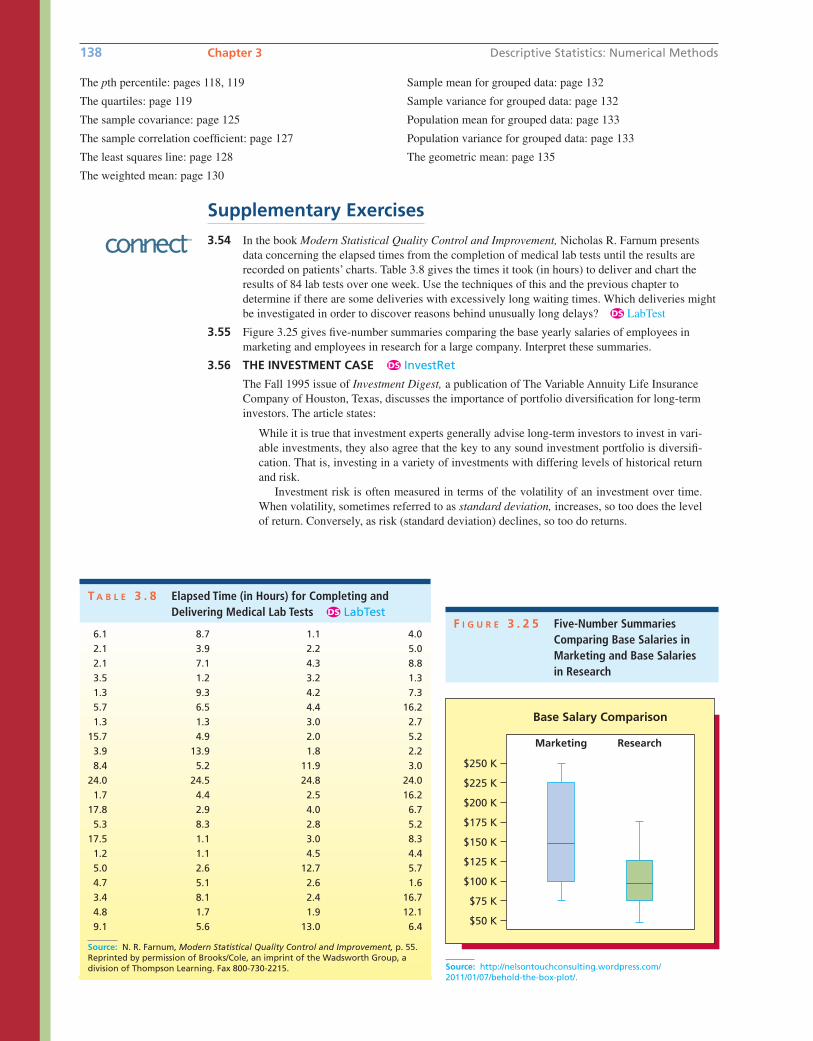
138 Chapter 3 Descriptive Statistics: Numerical Methods
The pth percentile: pages 118, 119
The quartiles: page 119
The sample covariance: page 125
The sample correlation coefficient: page 127
The least squares line: page 128
The weighted mean: page 130
Sample mean for grouped data: page 132
Sample variance for grouped data: page 132
Population mean for grouped data: page 133
Population variance for grouped data: page 133
The geometric mean: page 135
Source: http://nelsontouchconsulting.wordpress.com/2011/01/07/behold-the-box-plot/.
$125 K
$100 K
$75 K
$50 K
$150 K
$175 K
$200 K
$225 K
$250 K
Marketing
Base Salary Comparison
Research
F I G U R E 3 . 2 5 Five-Number SummariesComparing Base Salaries inMarketing and Base Salaries in Research
T A B L E 3 . 8 Elapsed Time (in Hours) for Completing and Delivering Medical Lab Tests LabTestDS
6.1 8.7 1.1 4.0
2.1 3.9 2.2 5.0
2.1 7.1 4.3 8.8
3.5 1.2 3.2 1.3
1.3 9.3 4.2 7.3
5.7 6.5 4.4 16.2
1.3 1.3 3.0 2.7
15.7 4.9 2.0 5.2
3.9 13.9 1.8 2.2
8.4 5.2 11.9 3.0
24.0 24.5 24.8 24.0
1.7 4.4 2.5 16.2
17.8 2.9 4.0 6.7
5.3 8.3 2.8 5.2
17.5 1.1 3.0 8.3
1.2 1.1 4.5 4.4
5.0 2.6 12.7 5.7
4.7 5.1 2.6 1.6
3.4 8.1 2.4 16.7
4.8 1.7 1.9 12.1
9.1 5.6 13.0 6.4
Source: N. R. Farnum, Modern Statistical Quality Control and Improvement, p. 55.Reprinted by permission of Brooks/Cole, an imprint of the Wadsworth Group, adivision of Thompson Learning. Fax 800-730-2215.
3.54 In the book Modern Statistical Quality Control and Improvement, Nicholas R. Farnum presents
data concerning the elapsed times from the completion of medical lab tests until the results are
recorded on patients’ charts. Table 3.8 gives the times it took (in hours) to deliver and chart the
results of 84 lab tests over one week. Use the techniques of this and the previous chapter to
determine if there are some deliveries with excessively long waiting times. Which deliveries might
be investigated in order to discover reasons behind unusually long delays? LabTest
3.55 Figure 3.25 gives five-number summaries comparing the base yearly salaries of employees in
marketing and employees in research for a large company. Interpret these summaries.
3.56 THE INVESTMENT CASE InvestRet
The Fall 1995 issue of Investment Digest, a publication of The Variable Annuity Life Insurance
Company of Houston, Texas, discusses the importance of portfolio diversification for long-term
investors. The article states:
While it is true that investment experts generally advise long-term investors to invest in vari-
able investments, they also agree that the key to any sound investment portfolio is diversifi-
cation. That is, investing in a variety of investments with differing levels of historical return
and risk.
Investment risk is often measured in terms of the volatility of an investment over time.
When volatility, sometimes referred to as standard deviation, increases, so too does the level
of return. Conversely, as risk (standard deviation) declines, so too do returns.
DS
DS
Supplementary Exercises
bow20530_ch03_098-149.qxd 10/31/13 3:41 PM Page 138 CONFIRMING PAGES
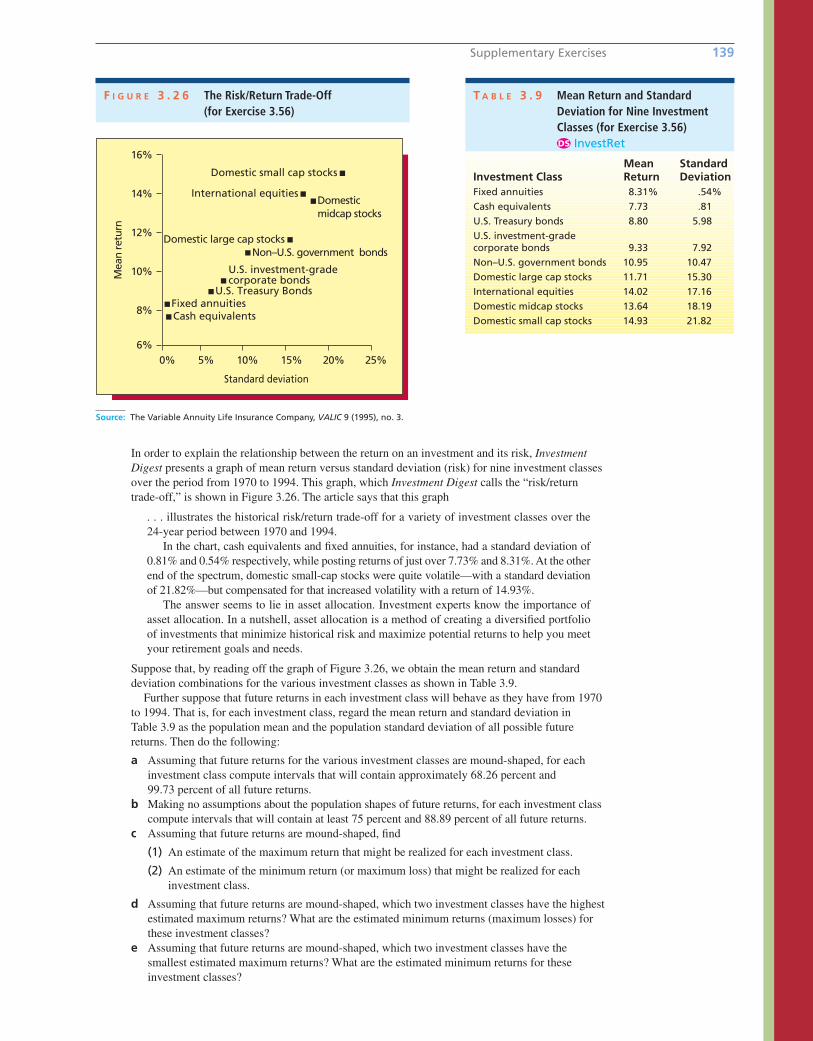
Supplementary Exercises 139
In order to explain the relationship between the return on an investment and its risk, InvestmentDigest presents a graph of mean return versus standard deviation (risk) for nine investment classes
over the period from 1970 to 1994. This graph, which Investment Digest calls the “risk/return
trade-off,” is shown in Figure 3.26. The article says that this graph
. . . illustrates the historical risk/return trade-off for a variety of investment classes over the
24-year period between 1970 and 1994.
In the chart, cash equivalents and fixed annuities, for instance, had a standard deviation of
0.81% and 0.54% respectively, while posting returns of just over 7.73% and 8.31%. At the other
end of the spectrum, domestic small-cap stocks were quite volatile—with a standard deviation
of 21.82%—but compensated for that increased volatility with a return of 14.93%.
The answer seems to lie in asset allocation. Investment experts know the importance of
asset allocation. In a nutshell, asset allocation is a method of creating a diversified portfolio
of investments that minimize historical risk and maximize potential returns to help you meet
your retirement goals and needs.
Suppose that, by reading off the graph of Figure 3.26, we obtain the mean return and standard
deviation combinations for the various investment classes as shown in Table 3.9.
Further suppose that future returns in each investment class will behave as they have from 1970
to 1994. That is, for each investment class, regard the mean return and standard deviation in
Table 3.9 as the population mean and the population standard deviation of all possible future
returns. Then do the following:
a Assuming that future returns for the various investment classes are mound-shaped, for each
investment class compute intervals that will contain approximately 68.26 percent and
99.73 percent of all future returns.
b Making no assumptions about the population shapes of future returns, for each investment class
compute intervals that will contain at least 75 percent and 88.89 percent of all future returns.
c Assuming that future returns are mound-shaped, find
(1) An estimate of the maximum return that might be realized for each investment class.
(2) An estimate of the minimum return (or maximum loss) that might be realized for each
investment class.
d Assuming that future returns are mound-shaped, which two investment classes have the highest
estimated maximum returns? What are the estimated minimum returns (maximum losses) for
these investment classes?
e Assuming that future returns are mound-shaped, which two investment classes have the
smallest estimated maximum returns? What are the estimated minimum returns for these
investment classes?
Source: The Variable Annuity Life Insurance Company, VALIC 9 (1995), no. 3.
8%
6%
10%
12%
14%
16%
Mea
n re
turn
Cash equivalentsFixed annuities
U.S. Treasury Bonds
U.S. investment-grade corporate bonds
Non–U.S. government bondsDomestic large cap stocks
International equities
Domestic small cap stocks
Domestic midcap stocks
0% 5% 10% 15% 20% 25%
Standard deviation
F I G U R E 3 . 2 6 The Risk/Return Trade-Off (for Exercise 3.56)
T A B L E 3 . 9 Mean Return and StandardDeviation for Nine InvestmentClasses (for Exercise 3.56)
InvestRetDS
Mean StandardInvestment Class Return DeviationFixed annuities 8.31% .54%
Cash equivalents 7.73 .81
U.S. Treasury bonds 8.80 5.98
U.S. investment-gradecorporate bonds 9.33 7.92
Non–U.S. government bonds 10.95 10.47
Domestic large cap stocks 11.71 15.30
International equities 14.02 17.16
Domestic midcap stocks 13.64 18.19
Domestic small cap stocks 14.93 21.82
bow20530_ch03_098-149.qxd 10/31/13 3:41 PM Page 139 CONFIRMING PAGES

3.57 Table 3.10 gives data concerning America’s 30 largest private companies of 2010 as rated by
Forbes magazine.
a Construct a box-and-whiskers display of the large company revenues.
b Construct a box-and-whiskers display of the large company numbers of employees.
c Interpret the displays of parts (a) and (b). LargeComp
3.58 THE FLORIDA POOL HOME CASE PoolHome
In Florida, real estate agents refer to homes having a swimming pool as pool homes. In this
case, Sunshine Pools Inc. markets and installs pools throughout the state of Florida. The com-
pany wishes to estimate the percentage of a pool’s cost that can be recouped by a buyer when
he or she sells the home. For instance, if a homeowner buys a pool for which the current pur-
chase price is $30,000 and then sells the home in the current real estate market for $20,000
more than the homeowner would get if the home did not have a pool, the homeowner has
recouped (20,000�30,000) � 100% � 66.67% of the pool’s cost. To make this estimate, the
company randomly selects 80 homes from all of the homes sold in a Florida city (over the last
six months) having a size between 2,000 and 3,500 square feet. For each sampled home, the
following data are collected: selling price (in thousands of dollars); square footage; the number
of bathrooms; a niceness rating (expressed as an integer from 1 to 7 and assigned by a real
estate agent); and whether or not the home has a pool (1 � yes, 0 � no). The data are given in
Table 3.11. Figure 3.27 gives descriptive statistics for the 43 homes having a pool and for the
37 homes that do not have a pool.
a Using Figure 3.27, compare the mean selling prices of the homes having a pool and the homes
that do not have a pool.
b Using these data, and assuming that the average current purchase price of the pools in the
sample is $32,500, estimate the percentage of a pool’s cost that can be recouped when the
home is sold.
c The comparison you made in part a could be misleading. Noting that different homes
have different square footages, numbers of bathrooms, and niceness ratings, explain
why.
DS
DS
140 Chapter 3 Descriptive Statistics: Numerical Methods
T A B L E 3 . 1 0 America’s 30 Largest Private Companies of 2010 as Rated by Forbes Magazine LargeCompDS
Revenue RevenueRank Company ($bil) Employees Rank Company ($bil) Employees
1 Cargill 109.84e 130,500 16 Toys “R” Us 13.57 68,000
2 Koch Industries 100.00e 70,000 17 Enterprise Holdings 12.60 68,000
3 Bechtel 30.80 49,000 18 Love’s Travel Stops 12.602 6,700
4 HCA 30.05 190,000 19 Aramark 12.54e 255,000
5 Mars 28.00 65,000 20 Reyes Holdings 12.50 10,300
6 Chrysler 27.90e 41,200 21 Fidelity Investments 11.49 37,000
7 PricewaterhouseCoopers 26.57 161,718 22 TransMontaigne 10.23e 815
8 Publix Super Markets 24.32 142,000 23 Performance Food 10.10 9,800
9 Ernst & Young 21.26 141,000 24 Kiewit Corporation 9.99 25,900
10 C&S Wholesale Grocers 20.40e 16,600 25 Energy Future Holdings 9.55 9,030
11 US Foodservice 18.96 25,000 26 First Data 9.31 24,900
12 Pilot Flying J 17.00 23,000 27 SC Johnson & Son 8.96e 12,000
13 HE Butt Grocery 15.10e 75,000 28 Harrah’s Entertainment 8.91 69,000
14 Cox Enterprises 14.70 66,000 29 Giant Eagle 8.61 36,000
15 Meijer 14.25e 72,200 30 Southern Wine & Spirits 8.60 11,100
e � Forbes estimate2 � Company-provided estimate
Source: http://www.forbes.com/lists/2010/21/private-companies-10_land.html (accessed June 14, 2011).
bow20530_ch03_098-149.qxd 10/31/13 3:41 PM Page 140 CONFIRMING PAGES
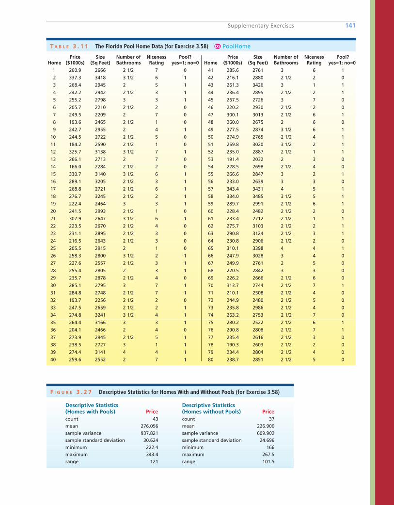
Supplementary Exercises 141
T A B L E 3 . 1 1 The Florida Pool Home Data (for Exercise 3.58) PoolHomeDS
Price Size Number of Niceness Pool? Price Size Number of Niceness Pool?Home ($1000s) (Sq Feet) Bathrooms Rating yes=1; no=0 Home ($1000s) (Sq Feet) Bathrooms Rating yes=1; no=0
1 260.9 2666 2 1/2 7 0 41 285.6 2761 3 6 1
2 337.3 3418 3 1/2 6 1 42 216.1 2880 2 1/2 2 0
3 268.4 2945 2 5 1 43 261.3 3426 3 1 1
4 242.2 2942 2 1/2 3 1 44 236.4 2895 2 1/2 2 1
5 255.2 2798 3 3 1 45 267.5 2726 3 7 0
6 205.7 2210 2 1/2 2 0 46 220.2 2930 2 1/2 2 0
7 249.5 2209 2 7 0 47 300.1 3013 2 1/2 6 1
8 193.6 2465 2 1/2 1 0 48 260.0 2675 2 6 0
9 242.7 2955 2 4 1 49 277.5 2874 3 1/2 6 1
10 244.5 2722 2 1/2 5 0 50 274.9 2765 2 1/2 4 1
11 184.2 2590 2 1/2 1 0 51 259.8 3020 3 1/2 2 1
12 325.7 3138 3 1/2 7 1 52 235.0 2887 2 1/2 1 1
13 266.1 2713 2 7 0 53 191.4 2032 2 3 0
14 166.0 2284 2 1/2 2 0 54 228.5 2698 2 1/2 4 0
15 330.7 3140 3 1/2 6 1 55 266.6 2847 3 2 1
16 289.1 3205 2 1/2 3 1 56 233.0 2639 3 3 0
17 268.8 2721 2 1/2 6 1 57 343.4 3431 4 5 1
18 276.7 3245 2 1/2 2 1 58 334.0 3485 3 1/2 5 1
19 222.4 2464 3 3 1 59 289.7 2991 2 1/2 6 1
20 241.5 2993 2 1/2 1 0 60 228.4 2482 2 1/2 2 0
21 307.9 2647 3 1/2 6 1 61 233.4 2712 2 1/2 1 1
22 223.5 2670 2 1/2 4 0 62 275.7 3103 2 1/2 2 1
23 231.1 2895 2 1/2 3 0 63 290.8 3124 2 1/2 3 1
24 216.5 2643 2 1/2 3 0 64 230.8 2906 2 1/2 2 0
25 205.5 2915 2 1 0 65 310.1 3398 4 4 1
26 258.3 2800 3 1/2 2 1 66 247.9 3028 3 4 0
27 227.6 2557 2 1/2 3 1 67 249.9 2761 2 5 0
28 255.4 2805 2 3 1 68 220.5 2842 3 3 0
29 235.7 2878 2 1/2 4 0 69 226.2 2666 2 1/2 6 0
30 285.1 2795 3 7 1 70 313.7 2744 2 1/2 7 1
31 284.8 2748 2 1/2 7 1 71 210.1 2508 2 1/2 4 0
32 193.7 2256 2 1/2 2 0 72 244.9 2480 2 1/2 5 0
33 247.5 2659 2 1/2 2 1 73 235.8 2986 2 1/2 4 0
34 274.8 3241 3 1/2 4 1 74 263.2 2753 2 1/2 7 0
35 264.4 3166 3 3 1 75 280.2 2522 2 1/2 6 1
36 204.1 2466 2 4 0 76 290.8 2808 2 1/2 7 1
37 273.9 2945 2 1/2 5 1 77 235.4 2616 2 1/2 3 0
38 238.5 2727 3 1 1 78 190.3 2603 2 1/2 2 0
39 274.4 3141 4 4 1 79 234.4 2804 2 1/2 4 0
40 259.6 2552 2 7 1 80 238.7 2851 2 1/2 5 0
F I G U R E 3 . 2 7 Descriptive Statistics for Homes With and Without Pools (for Exercise 3.58)
Descriptive Statistics Descriptive Statistics(Homes with Pools) Price (Homes without Pools) Pricecount 43 count 37
mean 276.056 mean 226.900
sample variance 937.821 sample variance 609.902
sample standard deviation 30.624 sample standard deviation 24.696
minimum 222.4 minimum 166
maximum 343.4 maximum 267.5
range 121 range 101.5
bow20530_ch03_098-149.qxd 10/31/13 3:41 PM Page 141 CONFIRMING PAGES
142 Chapter 3 Descriptive Statistics: Numerical Methods
3.59 Internet ExerciseThe Data and Story Library (DASL) houses a rich collectionof data sets useful for teaching and learning statistics,from a variety of sources, contributed primarily by univer-sity faculty members. DASL can be reached through theBSC by clicking on the Data Bases button in the BSC homescreen and by then clicking on the Data and Story Librarylink. The DASL can also be reached directly using the urlhttp://lib.stat.cmu.edu/DASL/. The objective of this exer-cise is to retrieve a data set of chief executive officersalaries and to construct selected graphical and numericalstatistical summaries of the data.
a From the McGraw-Hill/Irwin Business Statistics CenterData Bases page, go to the DASL website and select“List all topics.” From the Stories by Topic page, se-lect Economics, then CEO Salaries to reach the CEOSalaries story. From the CEO Salaries story page,select the Datafile Name: CEO Salaries to reach the
data set page. The data set includes the ages andsalaries (save for a single missing observation) for asample of 60 CEOs. Capture these observations andcopy them into an Excel or MINITAB worksheet. Thisdata capture can be accomplished in a number ofways. One simple approach is to use simple copy andpaste procedures from the DASL data set to Excel orMINITAB (data sets CEOSal.xlsx, CEOSal.MTW).
b Use your choice of statistical software to create graph-ical and numerical summaries of the CEO Salaries dataand use these summaries to describe the data. InExcel, create a histogram of salaries and generate de-scriptive statistics. In MINITAB, create a histogram,stem-and-leaf display, box plot, and descriptive statis-tics. Offer your observations about typical salary level,the variation in salaries, and the shape of the distribu-tion of CEO salaries.
Appendix 3.1 ■ Numerical Descriptive Statistics Using ExcelThe instructions in this section begin by describing the entry of data into an Excel worksheet. Alternatively, the datamay be downloaded from this book’s website. The appropriate data file name is given at the top of each instruc-tion block. Please refer to Appendix 1.1 for further information about entering data, saving data, and printing re-sults when using Excel.
Numerical descriptive statistics for the bottle designratings in Figure 3.4 on page 104 (data file: Design.xlsx):
• Enter the bottle design ratings data into column Awith the label Rating in cell A1 and with the 60 design ratings from Table 1.5 on page 10 in cellsA2 to A61.
• Select Data : Data Analysis : Descriptive Statistics.
• Click OK in the Data Analysis dialog box.
• In the Descriptive Statistics dialog box, enter therange for the data, A1:A61, into the “Input Range”box.
• Check the “Labels in First Row” checkbox.
• Click in the “Output Range” window and enter thedesired cell location for the upper left corner of the output, say cell C1.
• Check the “Summary Statistics” checkbox.
• Click OK in the Descriptive Statistics dialog box.
• The descriptive statistics summary will appear incells C1:D15. Drag the column C border to revealcomplete labels for all statistics.
bow20530_ch03_098-149.qxd 10/31/13 3:41 PM Page 142 CONFIRMING PAGES
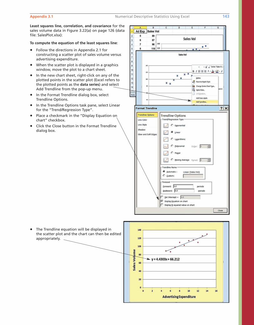
Appendix 3.1 Numerical Descriptive Statistics Using Excel 143
Least squares line, correlation, and covariance for thesales volume data in Figure 3.22(a) on page 126 (datafile: SalesPlot.xlsx):
To compute the equation of the least squares line:
• Follow the directions in Appendix 2.1 forconstructing a scatter plot of sales volume versusadvertising expenditure.
• When the scatter plot is displayed in a graphicswindow, move the plot to a chart sheet.
• In the new chart sheet, right-click on any of theplotted points in the scatter plot (Excel refers to the plotted points as the data series) and select Add Trendline from the pop-up menu.
• In the Format Trendline dialog box, select Trendline Options.
• In the Trendline Options task pane, select Linearfor the “Trend/Regression Type”.
• Place a checkmark in the “Display Equation onchart” checkbox.
• Click the Close button in the Format Trendlinedialog box.
• The Trendline equation will be displayed inthe scatter plot and the chart can then be edited appropriately.
bow20530_ch03_098-149.qxd 10/31/13 3:41 PM Page 143 CONFIRMING PAGES
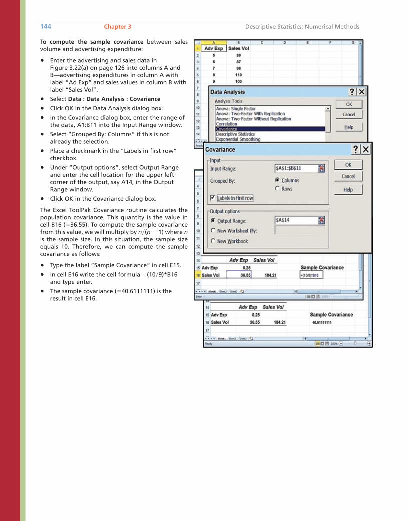
144 Chapter 3 Descriptive Statistics: Numerical Methods
To compute the sample covariance between salesvolume and advertising expenditure:
• Enter the advertising and sales data inFigure 3.22(a) on page 126 into columns A andB—advertising expenditures in column A withlabel “Ad Exp” and sales values in column B withlabel “Sales Vol”.
• Select Data : Data Analysis : Covariance
• Click OK in the Data Analysis dialog box.
• In the Covariance dialog box, enter the range ofthe data, A1:B11 into the Input Range window.
• Select “Grouped By: Columns” if this is notalready the selection.
• Place a checkmark in the “Labels in first row”checkbox.
• Under “Output options”, select Output Rangeand enter the cell location for the upper leftcorner of the output, say A14, in the OutputRange window.
• Click OK in the Covariance dialog box.
The Excel ToolPak Covariance routine calculates thepopulation covariance. This quantity is the value incell B16 (�36.55). To compute the sample covariancefrom this value, we will multiply by n�(n � 1) where nis the sample size. In this situation, the sample sizeequals 10. Therefore, we can compute the samplecovariance as follows:
• Type the label “Sample Covariance” in cell E15.
• In cell E16 write the cell formula �(10�9)*B16and type enter.
• The sample covariance (�40.6111111) is theresult in cell E16.
bow20530_ch03_098-149.qxd 10/31/13 3:41 PM Page 144 CONFIRMING PAGES
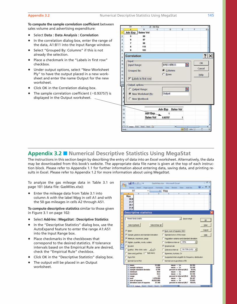
Appendix 3.2 Numerical Descriptive Statistics Using MegaStat 145
To compute the sample correlation coefficient betweensales volume and advertising expenditure:
• Select Data : Data Analysis : Correlation
• In the correlation dialog box, enter the range ofthe data, A1:B11 into the Input Range window.
• Select “Grouped By: Columns” if this is notalready the selection.
• Place a checkmark in the “Labels in first row”checkbox.
• Under output options, select “New WorksheetPly” to have the output placed in a new work-sheet and enter the name Output for the newworksheet.
• Click OK in the Correlation dialog box.
• The sample correlation coefficient (�0.93757) isdisplayed in the Output worksheet.
Appendix 3.2 ■ Numerical Descriptive Statistics Using MegaStatThe instructions in this section begin by describing the entry of data into an Excel worksheet. Alternatively, the datamay be downloaded from this book’s website. The appropriate data file name is given at the top of each instruc-tion block. Please refer to Appendix 1.1 for further information about entering data, saving data, and printing re-sults in Excel. Please refer to Appendix 1.2 for more information about using MegaStat.
To analyze the gas mileage data in Table 3.1 on page 101 (data file: GasMiles.xlsx):
• Enter the mileage data from Table 3.1 intocolumn A with the label Mpg in cell A1 and withthe 50 gas mileages in cells A2 through A51.
To compute descriptive statistics similar to those givenin Figure 3.1 on page 102:
• Select Add-Ins : MegaStat : Descriptive Statistics
• In the “Descriptive Statistics” dialog box, use theAutoExpand feature to enter the range A1:A51into the Input Range box.
• Place checkmarks in the checkboxes that correspond to the desired statistics. If toleranceintervals based on the Empirical Rule are desired,check the “Empirical Rule” checkbox.
• Click OK in the “Descriptive Statistics” dialog box.
• The output will be placed in an Outputworksheet.
bow20530_ch03_098-149.qxd 10/31/13 3:41 PM Page 145 CONFIRMING PAGES
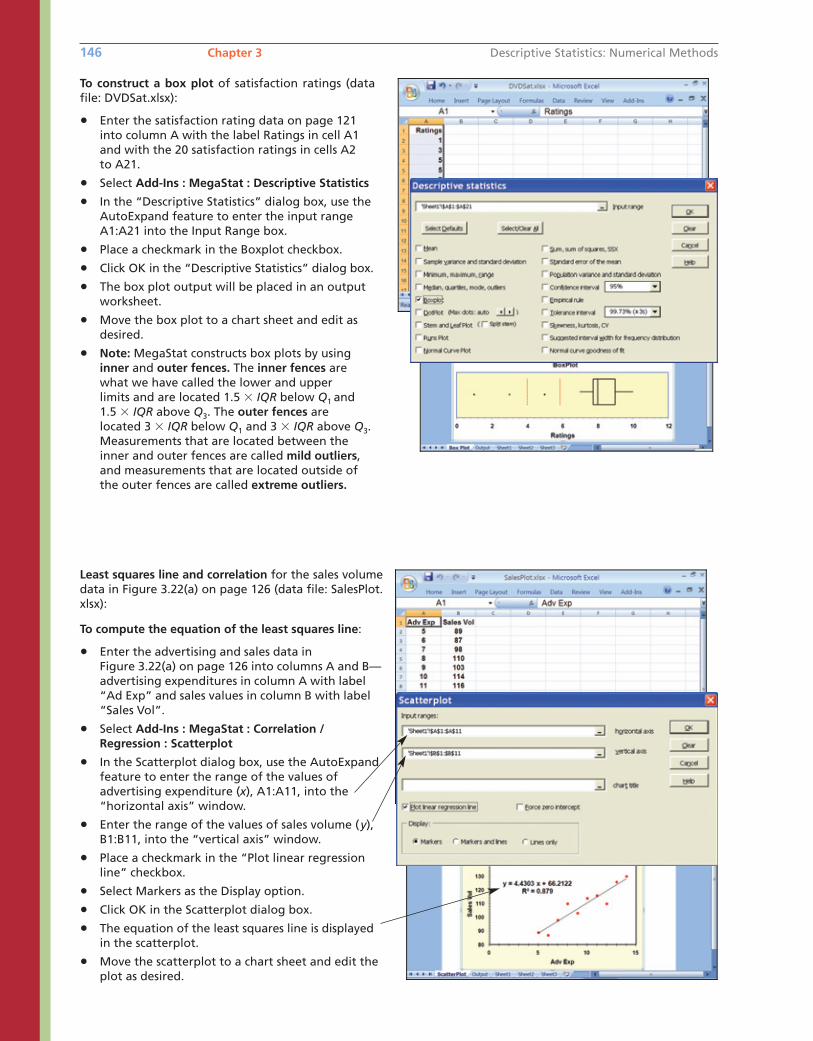
Least squares line and correlation for the sales volumedata in Figure 3.22(a) on page 126 (data file: SalesPlot.xlsx):
To compute the equation of the least squares line:
• Enter the advertising and sales data inFigure 3.22(a) on page 126 into columns A and B—advertising expenditures in column A with label“Ad Exp” and sales values in column B with label“Sales Vol”.
• Select Add-Ins : MegaStat : Correlation /Regression : Scatterplot
• In the Scatterplot dialog box, use the AutoExpandfeature to enter the range of the values of advertising expenditure (x), A1:A11, into the “horizontal axis” window.
• Enter the range of the values of sales volume (y),B1:B11, into the “vertical axis” window.
• Place a checkmark in the “Plot linear regressionline” checkbox.
• Select Markers as the Display option.
• Click OK in the Scatterplot dialog box.
• The equation of the least squares line is displayedin the scatterplot.
• Move the scatterplot to a chart sheet and edit theplot as desired.
146 Chapter 3 Descriptive Statistics: Numerical Methods
To construct a box plot of satisfaction ratings (datafile: DVDSat.xlsx):
• Enter the satisfaction rating data on page 121into column A with the label Ratings in cell A1and with the 20 satisfaction ratings in cells A2 to A21.
• Select Add-Ins : MegaStat : Descriptive Statistics
• In the “Descriptive Statistics” dialog box, use theAutoExpand feature to enter the input rangeA1:A21 into the Input Range box.
• Place a checkmark in the Boxplot checkbox.
• Click OK in the “Descriptive Statistics” dialog box.
• The box plot output will be placed in an outputworksheet.
• Move the box plot to a chart sheet and edit as desired.
• Note: MegaStat constructs box plots by usinginner and outer fences. The inner fences arewhat we have called the lower and upper limits and are located 1.5 � IQR below Q1 and 1.5 � IQR above Q3. The outer fences are located 3 � IQR below Q1 and 3 � IQR above Q3.Measurements that are located between theinner and outer fences are called mild outliers,and measurements that are located outside ofthe outer fences are called extreme outliers.
bow20530_ch03_098-149.qxd 10/31/13 3:41 PM Page 146 CONFIRMING PAGES
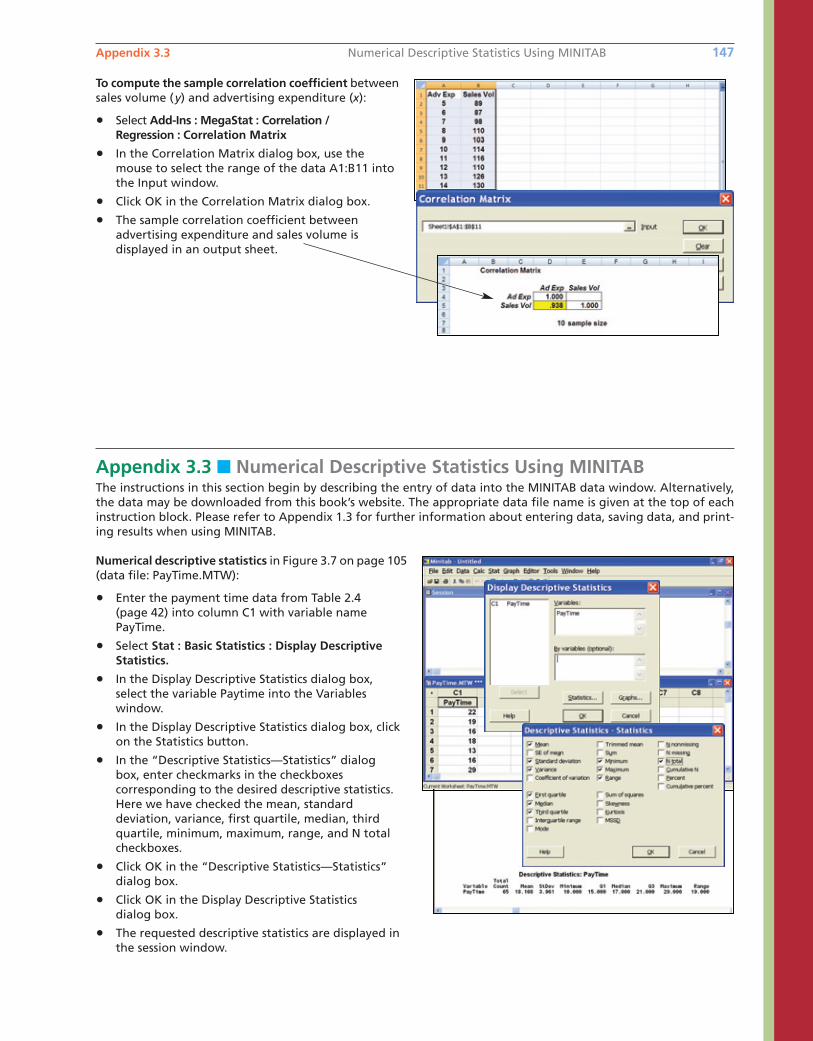
Appendix 3.3 Numerical Descriptive Statistics Using MINITAB 147
Appendix 3.3 ■ Numerical Descriptive Statistics Using MINITABThe instructions in this section begin by describing the entry of data into the MINITAB data window. Alternatively,the data may be downloaded from this book’s website. The appropriate data file name is given at the top of eachinstruction block. Please refer to Appendix 1.3 for further information about entering data, saving data, and print-ing results when using MINITAB.
Numerical descriptive statistics in Figure 3.7 on page 105(data file: PayTime.MTW):
• Enter the payment time data from Table 2.4(page 42) into column C1 with variable namePayTime.
• Select Stat : Basic Statistics : Display DescriptiveStatistics.
• In the Display Descriptive Statistics dialog box, select the variable Paytime into the Variables window.
• In the Display Descriptive Statistics dialog box, clickon the Statistics button.
• In the “Descriptive Statistics—Statistics” dialogbox, enter checkmarks in the checkboxes corresponding to the desired descriptive statistics.Here we have checked the mean, standard deviation, variance, first quartile, median, thirdquartile, minimum, maximum, range, and N totalcheckboxes.
• Click OK in the “Descriptive Statistics—Statistics”dialog box.
• Click OK in the Display Descriptive Statisticsdialog box.
• The requested descriptive statistics are displayed inthe session window.
To compute the sample correlation coefficient betweensales volume (y) and advertising expenditure (x):
• Select Add-Ins : MegaStat : Correlation / Regression : Correlation Matrix
• In the Correlation Matrix dialog box, use themouse to select the range of the data A1:B11 intothe Input window.
• Click OK in the Correlation Matrix dialog box.
• The sample correlation coefficient between advertising expenditure and sales volume is displayed in an output sheet.
bow20530_ch03_098-149.qxd 10/31/13 3:41 PM Page 147 CONFIRMING PAGES
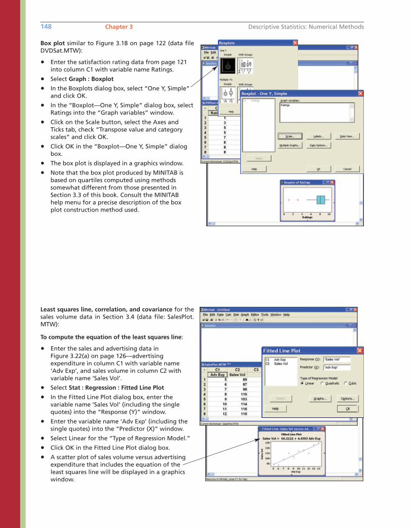
148 Chapter 3 Descriptive Statistics: Numerical Methods
Least squares line, correlation, and covariance for thesales volume data in Section 3.4 (data file: SalesPlot.MTW):
To compute the equation of the least squares line:
• Enter the sales and advertising data in Figure 3.22(a) on page 126—advertising expenditure in column C1 with variable name‘Adv Exp’, and sales volume in column C2 withvariable name ‘Sales Vol’.
• Select Stat : Regression : Fitted Line Plot
• In the Fitted Line Plot dialog box, enter the variable name ‘Sales Vol’ (including the singlequotes) into the “Response (Y)” window.
• Enter the variable name ‘Adv Exp’ (including thesingle quotes) into the “Predictor (X)” window.
• Select Linear for the “Type of Regression Model.”
• Click OK in the Fitted Line Plot dialog box.
• A scatter plot of sales volume versus advertising expenditure that includes the equation of the least squares line will be displayed in a graphicswindow.
Box plot similar to Figure 3.18 on page 122 (data fileDVDSat.MTW):
• Enter the satisfaction rating data from page 121into column C1 with variable name Ratings.
• Select Graph : Boxplot
• In the Boxplots dialog box, select “One Y, Simple”and click OK.
• In the “Boxplot—One Y, Simple” dialog box, selectRatings into the “Graph variables” window.
• Click on the Scale button, select the Axes andTicks tab, check “Transpose value and categoryscales” and click OK.
• Click OK in the “Boxplot—One Y, Simple” dialogbox.
• The box plot is displayed in a graphics window.
• Note that the box plot produced by MINITAB isbased on quartiles computed using methodssomewhat different from those presented inSection 3.3 of this book. Consult the MINITAB help menu for a precise description of the boxplot construction method used.
bow20530_ch03_098-149.qxd 10/31/13 3:41 PM Page 148 CONFIRMING PAGES
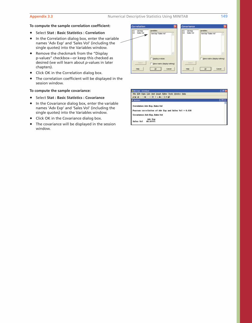
Appendix 3.3 Numerical Descriptive Statistics Using MINITAB 149
To compute the sample covariance:
• Select Stat : Basic Statistics : Covariance
• In the Covariance dialog box, enter the variablenames ‘Adv Exp’ and ‘Sales Vol’ (including the single quotes) into the Variables window.
• Click OK in the Covariance dialog box.
• The covariance will be displayed in the session window.
To compute the sample correlation coefficient:
• Select Stat : Basic Statistics : Correlation
• In the Correlation dialog box, enter the variablenames ‘Adv Exp’ and ‘Sales Vol’ (including the single quotes) into the Variables window.
• Remove the checkmark from the “Display p-values” checkbox—or keep this checked as desired (we will learn about p-values in later chapters).
• Click OK in the Correlation dialog box.
• The correlation coefficient will be displayed in thesession window.
bow20530_ch03_098-149.qxd 10/31/13 3:41 PM Page 149 CONFIRMING PAGES