Describing Data Visually Describing Data Visually Chapter33 Visual Description Dot Plots Frequency...
16
Describing Data Describing Data Visually Visually C h a p t e r 3 3 Visual Description Dot Plots Frequency Distributions and Histograms Line Charts Bar Charts Scatter Plots Tables Pie Charts Descriptive Graphs Copyright © 2010 by The McGraw-Hill Companies, Inc. All rights reserved. McGraw-Hill/Irwin
-
Upload
shonda-leonard -
Category
Documents
-
view
259 -
download
0
Transcript of Describing Data Visually Describing Data Visually Chapter33 Visual Description Dot Plots Frequency...
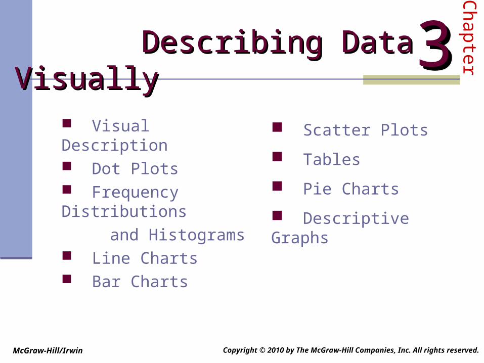
Describing Data Visually Describing Data Visually
Chapter3333
Visual Description Dot Plots Frequency Distributions
and Histograms Line Charts Bar Charts
Scatter Plots
Tables
Pie Charts
Descriptive Graphs
Copyright © 2010 by The McGraw-Hill Companies, Inc. All rights reserved.
McGraw-Hill/Irwin
Visual DescriptionVisual Description
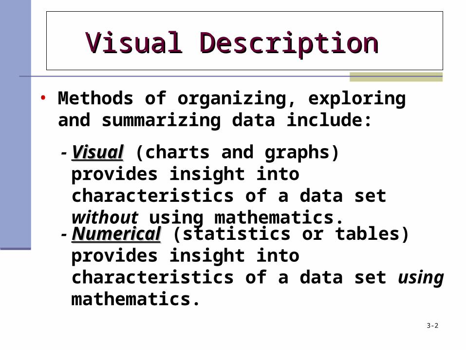
• Methods of organizing, exploring and summarizing data include:
- VisualVisual (charts and graphs) provides insight into characteristics of a data set without using mathematics.
- NumericalNumerical (statistics or tables) provides insight into characteristics of a data set using mathematics.
3-2
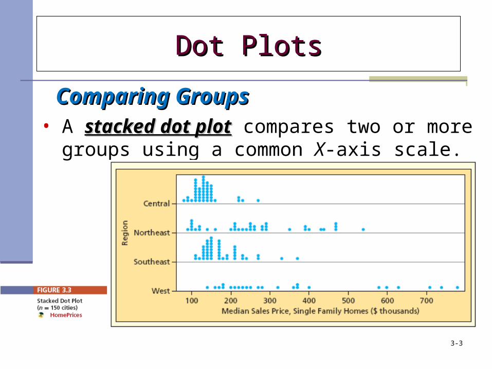
Comparing GroupsComparing Groups• A stacked dot plotstacked dot plot compares two or more
groups using a common X-axis scale.
Dot PlotsDot Plots
3-3
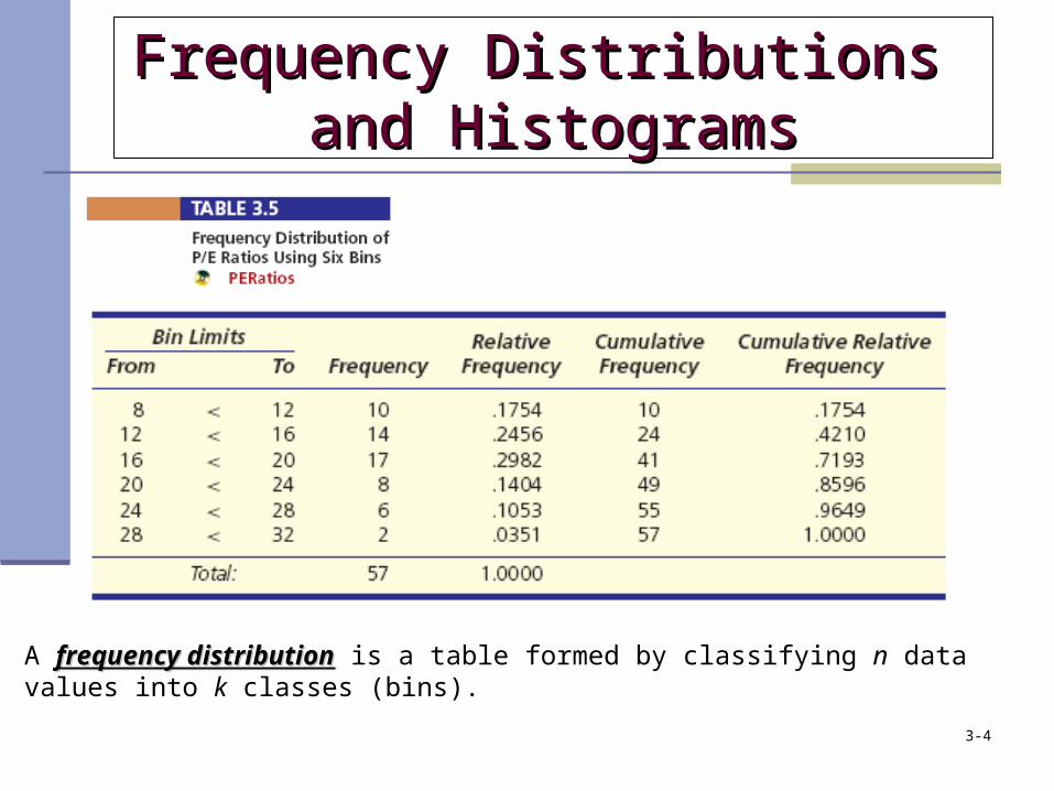
Frequency Distributions Frequency Distributions and Histogramsand Histograms
A frequency distributionfrequency distribution is a table formed by classifying n data values into k classes (bins).
3-4
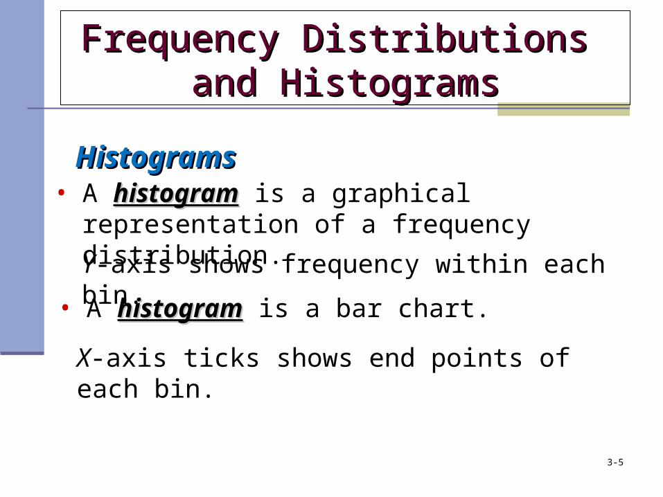
HistogramsHistograms• A histogramhistogram is a graphical representation of a
frequency distribution.
• A histogramhistogram is a bar chart.
Y-axis shows frequency within each bin.
X-axis ticks shows end points of each bin.
Frequency Distributions Frequency Distributions and Histogramsand Histograms
3-5
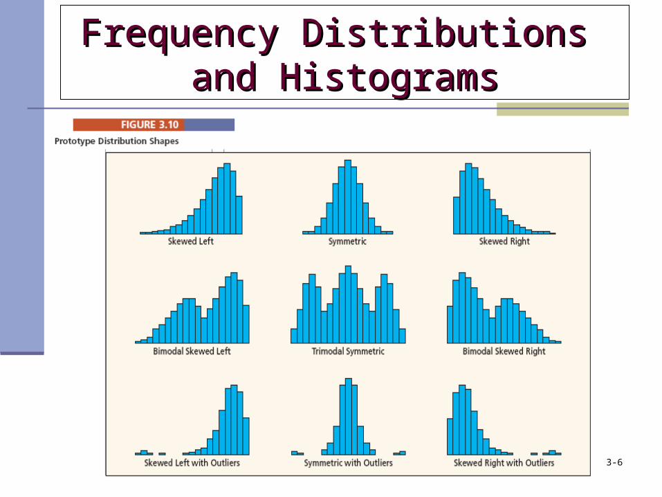
Frequency Distributions Frequency Distributions and Histogramsand Histograms
3-6
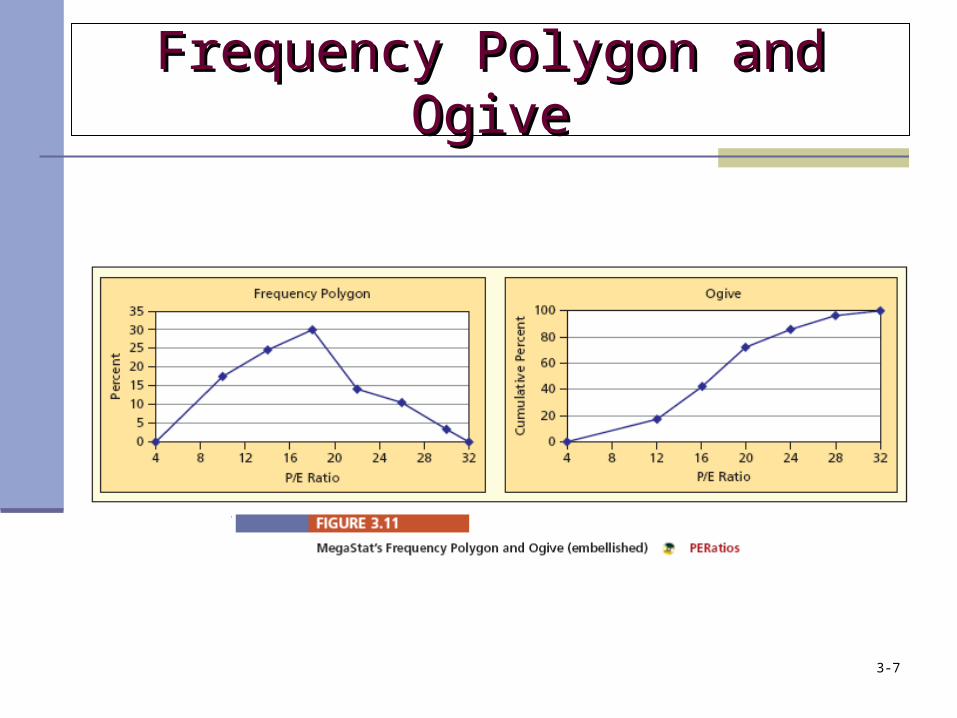
Frequency Polygon and OgiveFrequency Polygon and Ogive
3-7
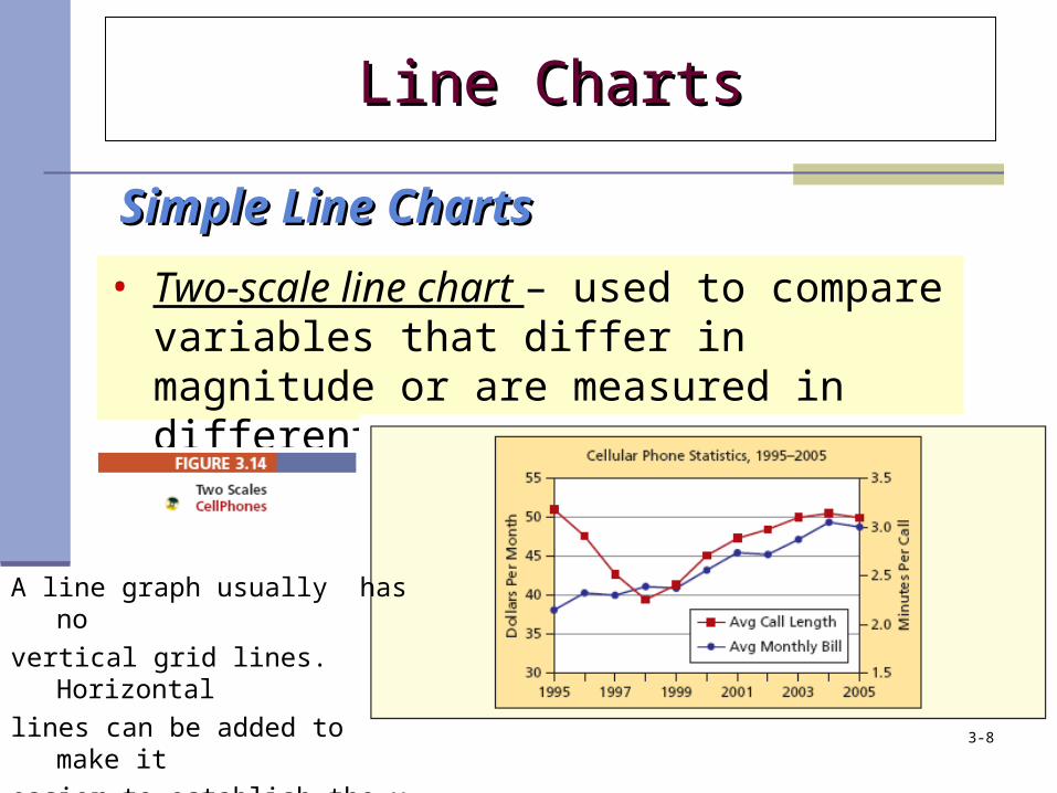
• Two-scale line chart – used to compare variables that differ in magnitude or are measured in different units.
Line ChartsLine Charts
Simple Line ChartsSimple Line Charts
A line graph usually has no
vertical grid lines. Horizontal
lines can be added to make it
easier to establish the y value. 3-8
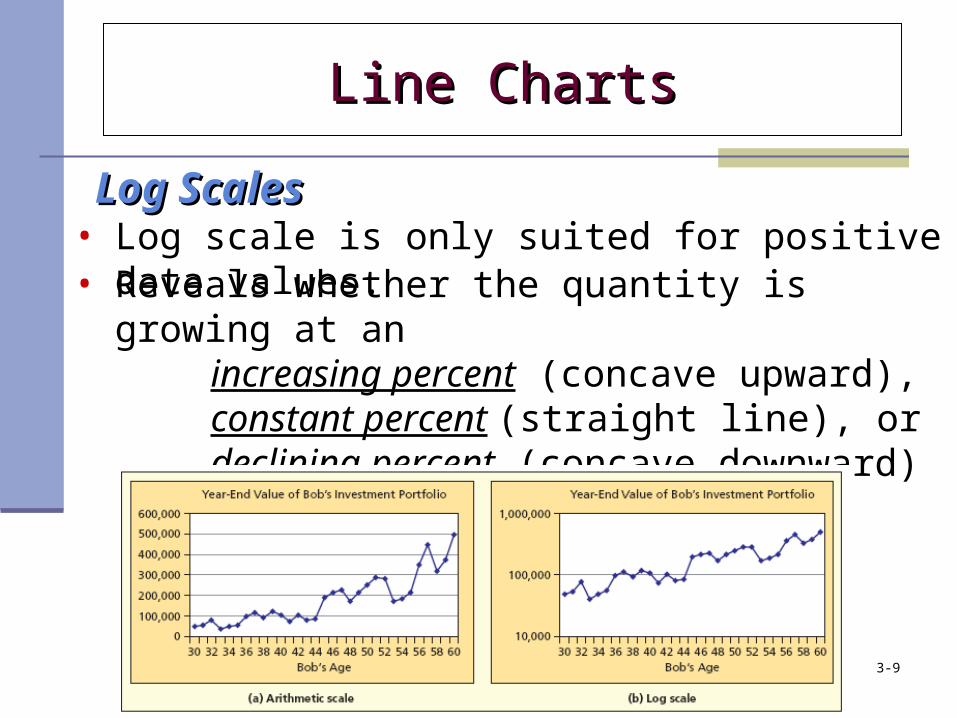
Log ScalesLog Scales• Log scale is only suited for positive data values.• Reveals whether the quantity is growing at an
increasing percent (concave upward), constant percent (straight line), or declining percent (concave downward)
Line ChartsLine Charts
3-9
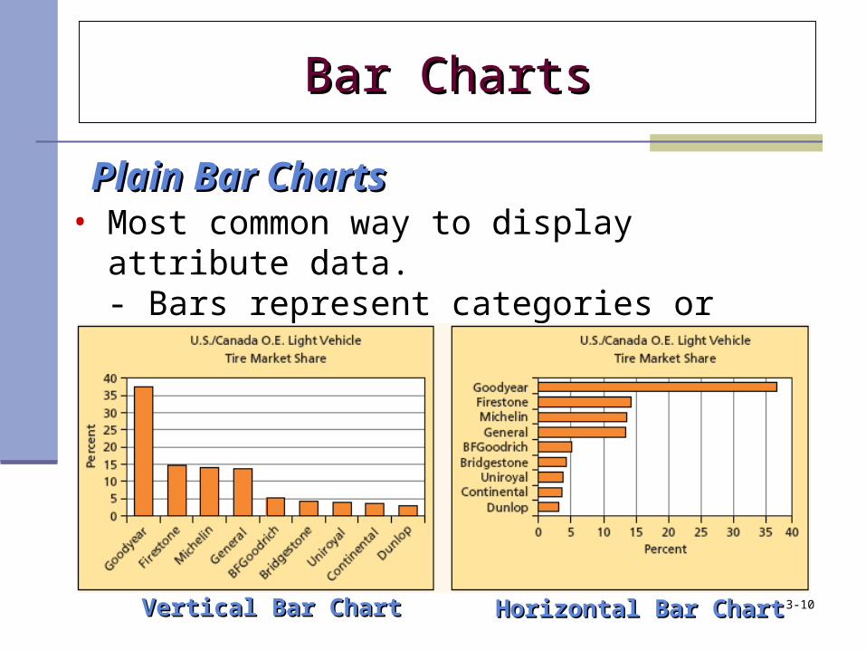
• Most common way to display attribute data. - Bars represent categories or attributes. - Lengths of bars represent frequencies.
Vertical Bar ChartVertical Bar Chart Horizontal Bar ChartHorizontal Bar Chart
Bar ChartsBar Charts
Plain Bar ChartsPlain Bar Charts
3-10
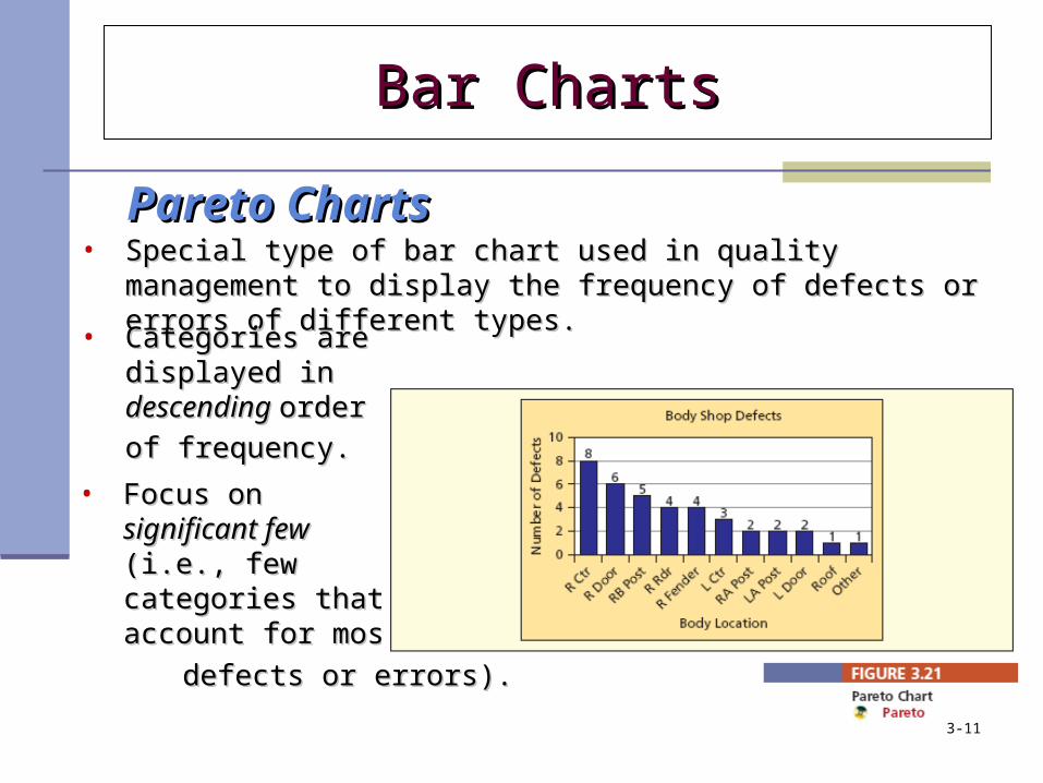
• Special type of bar chart used in quality management to display the Special type of bar chart used in quality management to display the frequency of defects or errors of different types. frequency of defects or errors of different types.
• Categories are Categories are displayed in displayed in descending descending order order
of frequency.of frequency. • Focus on Focus on
significant fewsignificant few (i.e., few (i.e., few categories that categories that account for most account for most
defects or errors).defects or errors).
Bar ChartsBar Charts
Pareto ChartsPareto Charts
3-11
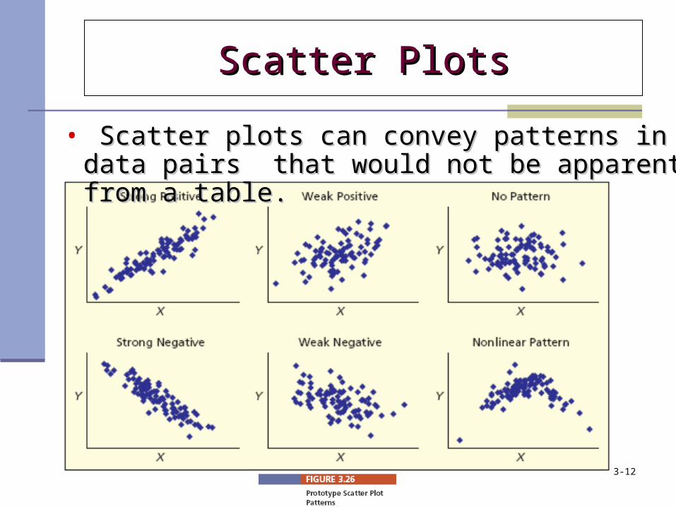
Scatter PlotsScatter Plots
• Scatter plots can convey patterns in data pairs Scatter plots can convey patterns in data pairs that would not be apparent from a table.that would not be apparent from a table.
3-12
• TablesTables are the simplest form of data display.
• A compound tablecompound table is a table that contains time series data down the columns and variables across the rows.
TablesTables
3-13

• ExplodedExploded and 3-D pie charts3-D pie charts add strong visual impact but slices are hard to assess.
Pie Chart OptionsPie Chart Options
Pie ChartsPie Charts
Exploded Pie ChartExploded Pie Chart Exploded 3-D Pie ChartExploded 3-D Pie Chart
3-14
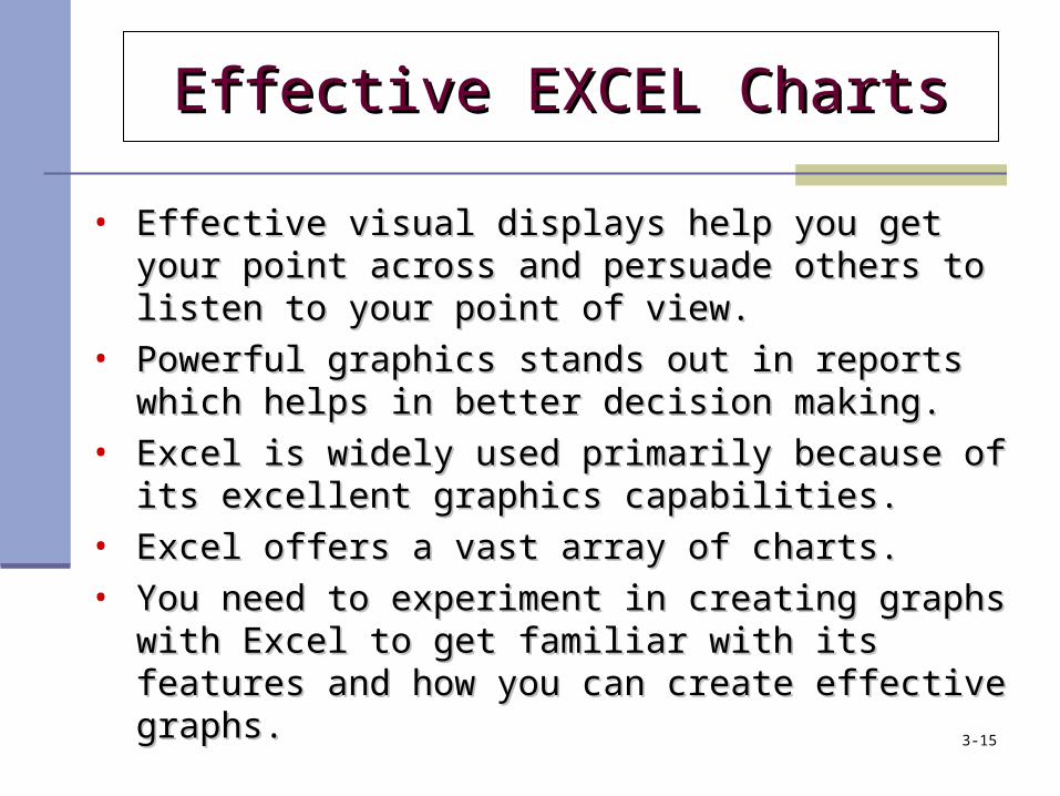
• Effective visual displays help you get your point across Effective visual displays help you get your point across and persuade others to listen to your point of view.and persuade others to listen to your point of view.
• Powerful graphics stands out in reports which helps in Powerful graphics stands out in reports which helps in better decision making.better decision making.
• Excel is widely used primarily because of its excellent Excel is widely used primarily because of its excellent graphics capabilities.graphics capabilities.
• Excel offers a vast array of charts.Excel offers a vast array of charts.• You need to experiment in creating graphs with Excel to You need to experiment in creating graphs with Excel to
get familiar with its features and how you can create get familiar with its features and how you can create effective graphs. effective graphs.
Effective EXCEL ChartsEffective EXCEL Charts
3-15
Deceptive GraphsDeceptive Graphs
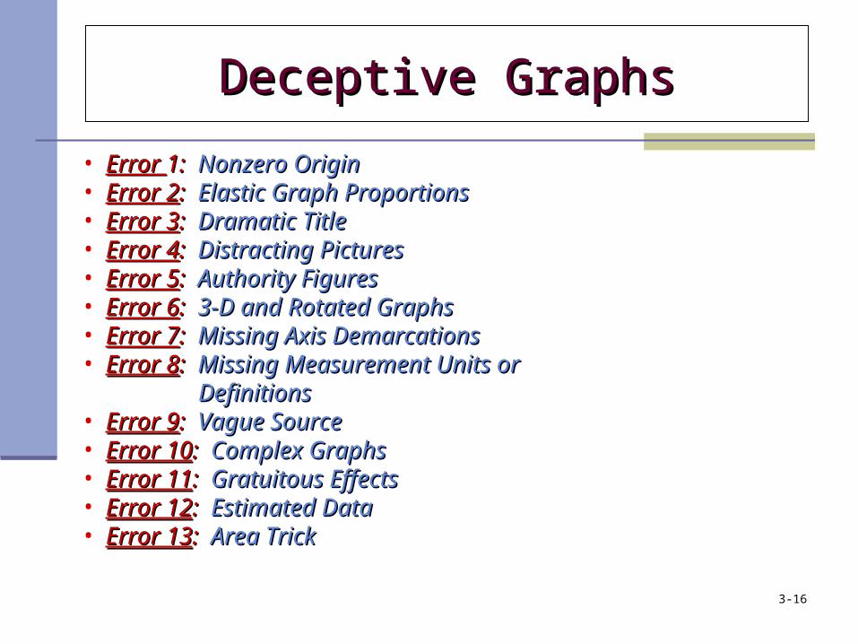
• Error Error 1:1: Nonzero OriginNonzero Origin• Error 2Error 2:: Elastic Graph ProportionsElastic Graph Proportions• Error 3Error 3:: Dramatic TitleDramatic Title• Error 4Error 4:: Distracting PicturesDistracting Pictures • Error 5Error 5:: Authority FiguresAuthority Figures • Error 6Error 6:: 3-D and Rotated Graphs3-D and Rotated Graphs• Error 7Error 7:: Missing Axis DemarcationsMissing Axis Demarcations• Error 8Error 8:: Missing Measurement Units or Missing Measurement Units or
Definitions Definitions• Error 9Error 9:: Vague SourceVague Source• Error 10Error 10:: Complex GraphsComplex Graphs • Error 11Error 11:: Gratuitous EffectsGratuitous Effects• Error 12Error 12:: Estimated DataEstimated Data• Error 13Error 13:: Area TrickArea Trick
3-16