Defining an audience
29
How do media producers create products for specific audiences Shania Carter
-
Upload
shaniajane -
Category
Data & Analytics
-
view
38 -
download
0
Transcript of Defining an audience

How do media producers create products for specific audiences
Shania Carter

Creating an Audience
The media producers, first have to have a tight grasp on their target audience before beginning to produce any specific work.
The producers also have to realise that their audience changes over the years so therefore the products have to change with the audience. E.g. in gaming, there is new stars (footballers) that people like every year so the covers etc. have to change.

Selecting Contents
There are four different steps when selecting content. Such as:
Images- Pictures and Graphics. Words- Written Content. Colours- a colour scheme. Fonts- Style type.In an example, such as a children’s magazine, the colours are bright and loud such as yellow, because that represents that the children are happy. Whereas using dull colours in older people’s magazines because they are not ‘loud’ people.

Images and word placing's
Images: The images are a big part of finding your audience, you have to know whether they like a number of smaller images or one big image that takes up the whole front cover. An example that has ‘one big image’ on, is the Doctor Who magazines because they focus on one topic, whereas in celebrity magazines there are different candid photos of celebrities. The main focus in a gossip magazine is to show the raw photos of the celebrities that everyone wants to see so its important that there is a lot of images to keep the mainstream audience occupied. However you have to choose the right images otherwise the customers won’t buy your magazine. In mainstream magazines they run out of ideas and therefore can’t produce any good pictures and turn to making fun out of celebrities body shapes, that brings the readers back into interest.
Word placing: The way words are written can help define an audience as well as an image. Some audiences like the bigger print or are variable to the upper class language- such as in a broadsheet newspaper e.g. The Times. Whilst others like small paragraphs and like to look at pictures, this occurs in the smaller chat magazines as there are little parts of gossip rather than lengthy paragraphs. Also in the gossip magazine the text seems to centre around the main picture, this is also the same for an interview. In newspapers the word placing is not very different but usually it has bigger font depending on the target audience.

Colours and fonts Colours: Colours are an important part of attracting an audience, but they can also be educational.
Using the primary colours displayed on the example below, the colours are recognisable and easy to see as they are bright and bold. On the other end of the spectrum, when looking at colours for a different audience they are much softer and delicate, portraying a different look as these colours are aesthetically pleasing, especially for a clothing line as the colours are not harsh or in your face, these softer colours also show a mature side to the audience as and what the audience is reading, the colours need to be appropriate as you don’t want to draw attention to the wrong idea of using bright colours to show off a winter clothing line.
Fonts: Fonts are one of the most important conventions when writing and producing something. Taking the two examples into consideration, these fonts are both easy to read but both different. The example of Noddy has big chunky letters that are fairly close, whereas the letters on Damart are much closer together and have less of a chunkiness. Fonts also need to be appropriate for a specific product and audience as it will clash and look silly having a children’s book with a handwritten font such as Signerica (displayed below) which nobody can really read. It is easy to apply fonts to a specific audience such as the two examples as it is also easy to define what fonts are suitable to understand for the generic audiences but also have a good enough impact to attract the audience such as soft fonts that have been discussed or harsh fonts that represent the individual target audience.
Layouts
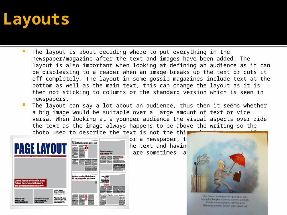
The layout is about deciding where to put everything in the newspaper/magazine after the text and images have been added. The layout is also important when looking at defining an audience as it can be displeasing to a reader when an image breaks up the text or cuts it off completely. The layout in some gossip magazines include text at the bottom as well as the main text, this can change the layout as it is then not sticking to columns or the standard version which is seen in newspapers.
The layout can say a lot about an audience, thus then it seems whether a big image would be suitable over a large amount of text or vice versa. When looking at a younger audience the visual aspects over ride the text as the image always happens to be above the writing so the photo used to describe the text is not the thing that is necessarily seen first. Taking a layout for a newspaper, this is the opposite due to the columns provided for the text and having the picture normally centred to the right as there are sometimes a couple of pictures used to describe the story.

Layouts continued In VOGUE magazine, normally the celebrities head is covering the ‘G’ and the celebrity is either in a
relaxed or posed position, which helps the readers understand what type of issue the magazine is going to be about. Both Beyoncé and Gisele are in model poses showing that this particular article is going to be about high fashion. Both women have their bodies placed so they are missing the ‘G’ however both layouts are very different because Beyoncé's cover looks more relaxed with the pink whereas Gisele’s cover photo is more bold suggesting that she has a louder personality than Beyoncé.
Inside VOUGE the layout is quite messy as the numbers don’t go down in order, suggesting that this is just a relaxed index page for browsing and for you to expect on what to come. Having images at different places on the page breaks up the text so it doesn’t get boring and you are not having to read a big chunk. Also the producers want to make sure that you are looking at the fashion on some pages so so the magazine incorporates minimal writing and makes sure it’s eye catching. The two cover stars are very different presumably in fashion as well as personality and are considered different role models when looking at creating a magazine cover, they are needed to portray their personality through the cover.
Strong and bold pose
Soft colouring and wording placed to make sure there is a more feminine touch

Captions Captions are the title of a picture or a short description of an object, person or product. A
caption can change a picture and the viewers' perception on a topic, depending on the context of the story. As an example I am going to use the Sun newspaper. This a ‘newspaper’ that captioned photographs wrongly over the Hillsborough tragedy naming the fans ‘ticketless thugs” the use of the word thug was very much highlighted within the caption.
Here is a picture after the truth was revealed about Hillsborough, with the captions under Margaret Thatcher and some of the political party, rightly branding them liars. With these captions, The Sun newspaper is trying to win back the trust of the public and is their way of apologising, even though this newspaper has now been boycotted in Merseyside.
The captions underneath the political party are ‘Liar’

Anchorage
Anchorage is used to give a specific image meaning. It tells the audience how to view an image and used widespread across newspapers and magazines for advertising purposes. Anchorage is also used so that the publisher can get across their interpretation rather than letting the audience have their own. An example of this could be a headline for a police arrest. Roland Barthes, had a theory that all pictures were open to any interpretation, from this any publisher can then change an interpretation quite easily.
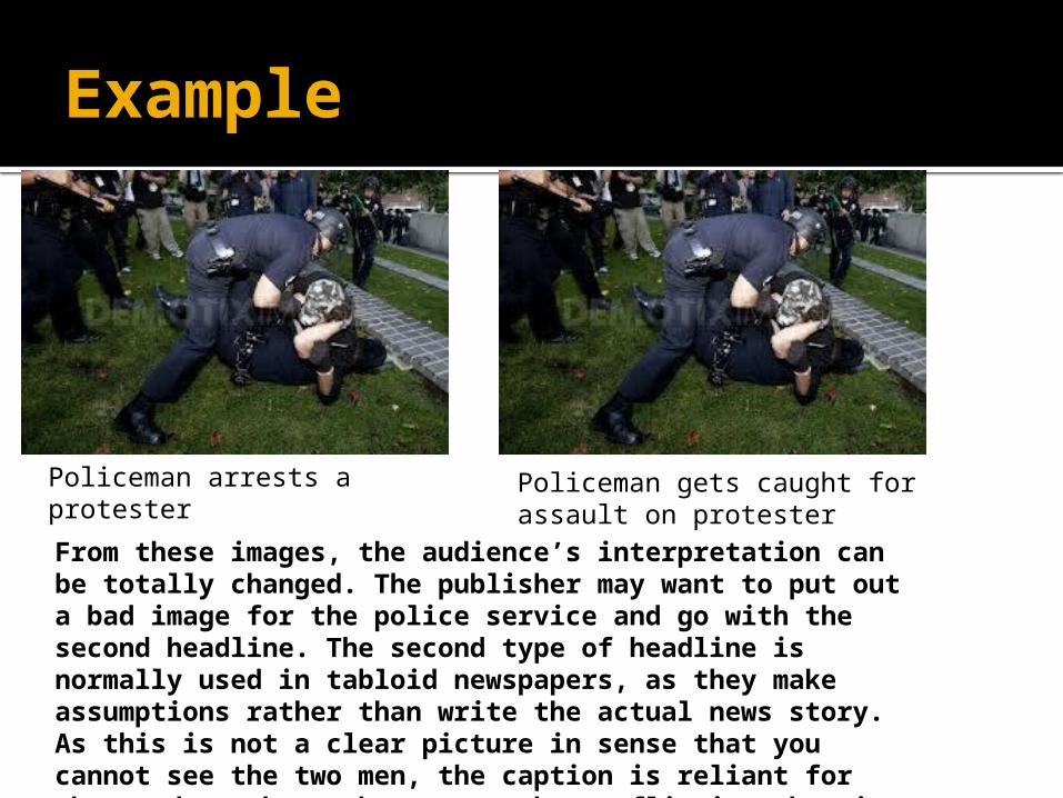
Example
Policeman arrests a protester
Policeman gets caught for assault on protester
From these images, the audience’s interpretation can be totally changed. The publisher may want to put out a bad image for the police service and go with the second headline. The second type of headline is normally used in tabloid newspapers, as they make assumptions rather than write the actual news story. As this is not a clear picture in sense that you cannot see the two men, the caption is reliant for the reader, the anchorage can be conflicting when it is later revealed to be not true and the readers view on the police man or the protester has been swung by a few words.

Codes and conventions
Codes and conventions are ‘rules’ that a publisher has to follow when thinking about creating their magazine/newspaper. These codes are:
Colour Scheme Photography Writing style and Language Text and picture ratio Fonts Mode of address

Colour schemes and photography
Colour Scheme- A colour scheme is a big part of everyday life, a colour scheme for a children’s book needs to be bright and colourful preferably with primary colours such as; red, yellow, green and blue for some children’s books there are also soft pastel colours to show clothes or the environment. When having a colour scheme alongside a lot of text, the printed version in a newspaper can be black and white or fully coloured, the colours are minimalistic as it is the text that needs to be focused on. Bright colours such as red are most likely used for the title to attract attention to the readers.
Photography- Photography in magazines can be either posed or candid, it can automatically sell to your audience, a mainstream magazine often has candid photos because the public want to see the celebrities in their day to day routine, however in other publication such as FourFourTwo the photos taken of the football players are mostly posed and staged as they are seen differently to when they are in their football kit and running around the pitch. Photography used in a magazine such as Vogue can change a viewer’s perception on how they look or how the celebrity looks, the photography side to this is getting the right image (of fashion) that the reader can relate to, rather than a photograph that makes the reader feel unwelcome or displeased with how a body image is portrayed.

Writing style and language Each media product uses a language to target its audience, the
text is most often written in a way that the audience might speak or write. In tabloid newspapers, there is no set language style as there are a widespread of audiences reading the newspaper although the language needs to be appropriate in occurrence with the story.
The writing style variants on how the magazine is portrayed, either mainstream or niche, a writing style can also reveal the writer’s personality and voice, but can also show how the audience is perceived – the writing style can be presented as it is truly engaged with the audience or can show off the reader’s personality by being quirky and fun – rather in a magazine than a newspaper as this way the voice of the writer can be put out more as there isn’t a ‘serious situation’ to report on. It can be important in that the writing style is posed for the specific audience because then they are on a personal level with the writer and therefore usually opinions are the same.
Text/picture ratio, Font & Mode of Address
This is all about the amount of text compared to how many pictures are on the page too. In mainstream magazines, the target audience, taken at an age range of young adolescents they have an inclination for looking at images of their favourite celebrity and tend to skim read over interviews or other parts of information to just see the photographs. From an older point of view, when looking at broadsheet newspapers for example, the information may be presented in a graph or chart which can be visually understanding with only a small piece of explanation underneath/
The font used, is to appeal to different target audiences. Magazines such as Kerrang use an eroded and smashed like font face. The actual font used is very bold and the letters are connected together/ this font could be an actual representation of the audience and the magazine producers in the sense of having bold personalities but having a close connection to make the magazine what it is. Mode of address is how different types of media ‘shout out’ at their audience. There are four different types of modal address including the first and third person, most magazines and newspapers will inherit the third person to act as a narrative for news stories. Colloquial language is a term that is often seen in gossip magazines such as Chat or Take a Break – whereas the explicit language mode is rarely seen in any type of media.

Audience feedback
There is no clear response how a target audience will react to a news story, a publication or a product release that has been sought out for a long time. The demographics of an audience can change between weeks and month, thus in the media it is important not to be repetitive about a celebrity or one person as this can bore the reader. There are however four strong ways of gaining feedback, including;
• Focus Groups - a group of people that talk about design layouts, images and fonts used in a magazine/newspaper.
• Audience Panels - another group of people that ‘stay in touch’ all year round, the panellists are often the same number of people.
• Trailing - after a product has gone on its ‘trial’ changes can be made before the product is released to the public. In effect the newspaper/magazine is being judged before the public can purchase.
• Complaints – where the audience can give their feedback critically, it is a chance for a publisher to see the audience reaction and to see if and why their product has a negative response. Complaints can be seen over social networking sites and on forums.

OK Magazine

OK MAGAZINE MEDIA PACK

OK MAGAZINE ANALYSIS
86.1% are women that buy OK magazine whilst only 13.9% are male readers. There is more women because celebrities such as Peter Andre are featured on the magazine quite often. The age range for this magazine is 18-24 year olds, and the social grade would be a grade D, most of the people in this age range would not have a full time job yet so this is why they are placed in this particular social band.

OK magazine - images
Cheryl Cole, is a single woman and is the centre of attention on this cover. Also in the pictures, Peter Andre has a new love interest, Danni Minogue has had a baby and Rachel Stevens is expecting one. The magazine presumes that people of this age range (18-24) are looking for a boyfriend, having a baby or have had a baby.
This particular magazine has chosen Cheryl Cole as she is described as the ‘nations favourite’ she has also been chosen because she is a figure most women look up to and the young women will therefore want to read about her.
Rachel Stevens, Danni Minogue and Peter Andre have all done their fair share of acting and singing and are still role (back in 2010) and today this is why the key images of them are on the front cover. Rachel Stevens was in the biggest band in the 90’s so the people of this age range (18-24) have grown up around her, the publisher knows that this will attract people as they have grown up around her.

OK MAGAZINE – WRITTEN CONTENT
This feature is on the Royals – William and Kate. There is a lot written here because it is very rare some magazines actually get to talk about the Prince and about his private life. Here, this article is talking about the pregnancy of Kate which everyone in that moment wanted to know about because it was the first royal-common baby.The magazine has to keep the readers interested with the words they write, people want to know about Kate so the publisher would have to select carefully and produce an article where it is interesting to read about the royals.
You can define your audience by finding out what and how much they like to read in a magazine. In this instance, the publisher would have to keep it short and to the point because that is the main reason of a mainstream magazine.

COLOUR SCHEME AND FONTS
Every magazine has a colour scheme, the colours that ‘OK!’ magazine have stuck with over the years are a range of colours, red, white, blue, pink. The red white and blue colours are all part of the England national flag, representing that this magazine is British. The white colours stand out on the magazine as they are bold and therefore ‘show off the story’. The white is also used to show world interviews, such as the one with Barack Obama. There are lots of different colours on this magazine to be eye catching to any one buying this magazine. The age range also comes in to the colour selection because when young people go out they tend to wear bright colours and the colours on the magazine could reflect this target audience’s personality and that’s why these colours were selected.
The font on the front cover of this magazine is a caps lock, the caps lock emphasises the point that the publisher is trying to make. The font is also very straight and tall, suggesting that this magazine is ‘above all the others’. The font changes inside the magazine but on the outside the bigger the font- tells you which stories you should be reading.

OK Magazine - layoutsThis extract is from an interview in OK magazine, this layout here focusses on the text. Layouts can help break up the texts making it easier for readers, this particular layout has the question in bold and the answer not in bold. The reader can then distinguish questions and answers so that the reading will flow.This extract is the front cover of OK magazine. The layout of the images are quite confusing for this magazine, there is a picture of Cheryl Cole, next to a picture of Kian Egan, claiming ‘she hates a woman’. The cover is jam packed with pictures, this could draw your attention away from the main topic (the wedding). As I mentioned earlier, in the target audience, Cheryl Cole is a main figure, however the target audience will then be driven to the picture and story of Cheryl Cole, and skipping through the main story of this issue.Well known celebrities, eye catching as Cheryl Cole is the media’s favourite whilst Westlife are also well known in the media, two big stories and two big celebrities that attract to the target audience – attractive male and female.

captions
There are four different captions on this front cover. The main caption being about Prince Harry and Kate – it shows them both smiling and looking like brother and sister. The title given is ‘she’s like a sister to me’ it also a quote that draws the people in because it shows the bond between them both. There is more titles than actual captions on this cover as the pictures are quite self explanatory. Simon Cowell’s picture at the bottom of the picture has a caption, telling us that the pictures of him are going to be in his new home. He is sat on a sofa so the picture kind of explains itself.

Anchorage
Red dress makes Holly Willoughby ‘larger than normal’.
This sort of text makes the reader believe what they have read, this picture is also making a jibe but also gets the reader to actually look, anchorage can actually change a person to believe something, such as these two comparison pictures.
Red dress enhances Holly’s curves.
If this sort of anchorage is included in someone’s favourite magazine they will believe anything the publisher writes, even it is about their favourite celebrity. Even though there is nothing wrong with Holly’s weight the publisher knows that a critical anchorage will get them noticed more.

OK MAGAZINE – CODES AND CONVENTIONS
The codes and conventions are the; Colour SchemePhotographyWriting style and LanguageText and picture ratioFontsMode of address
As already talked about in the previous slides, the codes are very important for the target audience. The target audience would like to see more posed photos, as this can shine a light better on the stories about weight loss, like the one shown on the example cover above.
OK magazine is the perfect example of combining all 5 of these codes, there is examples of photography, text and picture ratio, fonts, mode of address and writing style.

OK Magazine- audience feedback
Within a product there is no guarantee, that the whole audience will appreciate or like the product. Even if there is a large audience, the feedback could be more negative than positive, leading into people not buying OK magazine. OK magazine could use focus groups, audience panels, trialing and complaints to help them get the best out of their feedback.
• Focus Groups - a group of people that talk about design layouts, images and fonts used in a magazine/newspaper.
• Audience Panels - another group of people that ‘stay in touch’ all year round, the panellists are often the same number of people.
• Trailing- after a product has gone on its ‘trial’ changes can be made before the product is released to the public. In effect the newspaper/magazine is being judged before the public can purchase.
• Complaints – where the audience can give their feedback critically, it is a chance for a publisher to see the audience reaction and to see if and why their product has a negative response. Complaints can be seen over social networking sites and on forums.

FOCUS GROUPSOK magazine do not specifically have a focus group set up themselves, however they could set up one which would benefit the company because there is a large number of people who are able to give their feedback and therefore the publishers can take fresh advice and ideas.
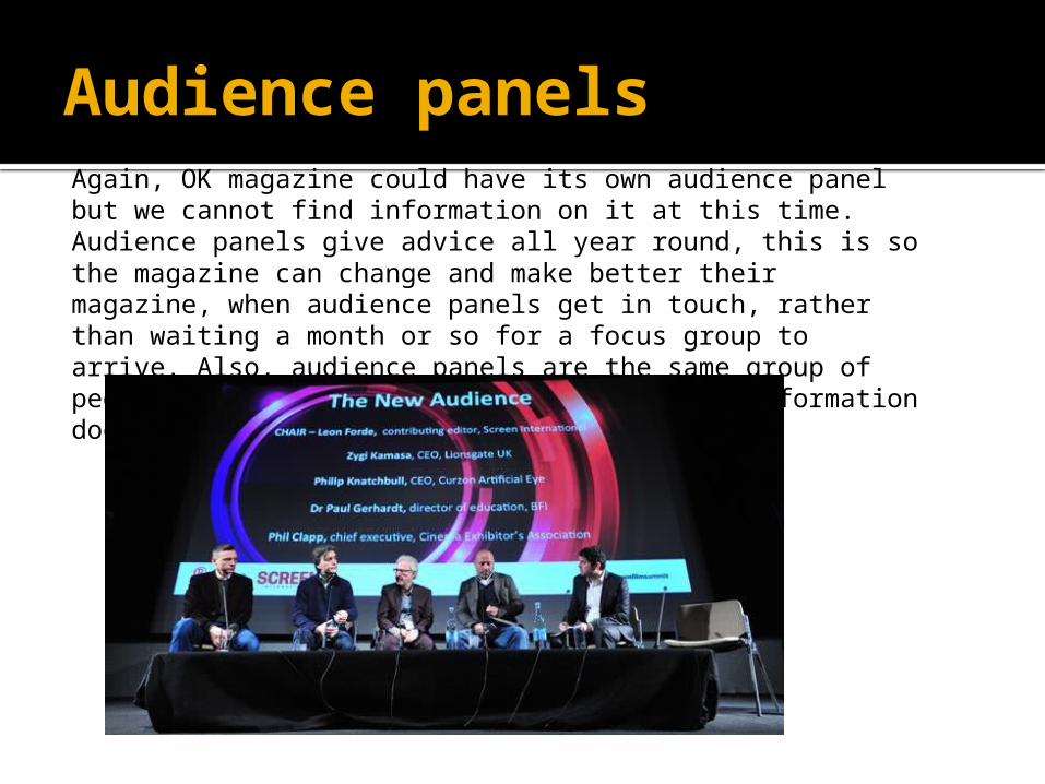
Audience panelsAgain, OK magazine could have its own audience panel but we cannot find information on it at this time. Audience panels give advice all year round, this is so the magazine can change and make better their magazine, when audience panels get in touch, rather than waiting a month or so for a focus group to arrive. Also, audience panels are the same group of people each year, so that the opinions and information doesn’t alter too much.

Trialing and complaintsIn this instance, the magazine is being pre judged to see whether it is suitable to be available to the public. Like everything, it has to be trialed and tested first, which looks at the pros and cons, once this is over any changes can be made to the magazine and then put on sale.Complaints:An audience can give their feedback very critically, especially if they don’t like your product. It is also a chance for the publisher to look at the negative side of their product because even the big magazines get critical feedback. Complaints can be sent any way possible, it is mostly using social media sites such as twitter or facebook, but the majority of people still send complaints via post.OK magazine could use these two ways by collecting and taking on the criticism from complaint letters and the trialing sessions to make their magazine better and to possibly gain a larger audience.