Decision Support for Barge Planning at Combi Terminal Twente
80
MASTER THESIS Decision Support for Barge Planning at Combi Terminal Twente Bachelor Thesis Industrial Engineering Management 30-08-2020 Author: B. Smeekes S1695169 b[email protected]
Transcript of Decision Support for Barge Planning at Combi Terminal Twente

MASTER THESIS
Decision Support for
Barge Planning at
Combi Terminal Twente
Bachelor Thesis
Industrial Engineering Management
30-08-2020
Author:
B. Smeekes
S1695169


II
Management Summary
Combi Terminal Twente B.V. (CTT) is a terminal operator with terminals at 4 locations, in Hengelo, Almelo,
Rotterdam, and Bad Bentheim. This research focus on the locations in Hengelo, next to the Twente Canal, and Almelo.
The main service CTT provides is the transportation of containers between Rotterdam and Twente, with the round
trip as the most executed trip. In 2019 CTT handled 5.5% more containers compared to 2018, and CTT is expecting
a continuing growth over the next years. With the increasing complexity of the planning and constant intraday planning
changes, there are many real-time decisions made without having a total overview of the situation. This leads to CTT
encountering difficulties in scheduling the transport of containers by barge due to a lack of a holistic overview
supporting the decision making. This results in the following research problem:
How can we build a decision support tool for the barge planners at CTT?
To find an answer to this question, first the current situation at CTT was analysed. According to the barge planners,
the most time-consuming activities are the (re)assigning of containers to barges and barges to terminals. Besides,
checking barges and the availability of containers and documents are a large contribution to the daily work. The
activities that are desired to become less time-consuming mostly include checking if the planning can still be carried
out. The activities considered as possibly automatable processes include the option of finding an earlier timeslot for
containers that were re-planned for a later time, as it is sometimes possible to arrange an earlier pick-up. Another
aspect mentioned is automatically planning a new incoming order to the first barge available. The activities where
decision support is preferred include the assignment of containers to a barge. Finally, it is favoured to get an overview
of the containers that will possibly be picked up too late.
Next, KPIs suitable for CTT were chosen. This was done by using the AHP method, as it is seen as the most widely
used technique for decision making and it has been shown that it is useful in prioritizing alternative variables, such as
KPIs (Lee, 2010; Suryadi, 2007). Several KPIs relevant for the improvement of road transport (García-Arca, Prado-
Prado, and Fernández-González, 2018) have been translated into KPIs relevant for CTT, which resulted in 8 possible
KPIs for the barge planning process at CTT. These KPIs were ranked on their relevance according to a 5-step AHP
method for the selection of KPIs developed by Shahin & Mahbod (2007). This resulted in five KPIs; on-time delivery,
order cycle time, transport costs, barge utilization and average delay. As the improvement of the transport costs will
be an automatic result of the improvement of the other KPIs, this KPI is not further included.
Decision support for the improvement of the barge utilization can be given by looking for containers that are not
planned in on a barge yet, but are present at a terminal the barge is already going to. This way, additional containers
can be picked up and the barges will be used more efficiently, which will lead to an increase of the utilization rate. The
next KPI, on-time delivery, can be improved by looking for containers that will possibly be delivered too late, and give
suggestions for the shipment of these containers. Containers that are already scheduled on a barge, but have enough
margin to be picked up later, can be scheduled for a later pick up, which facilitates the pick-up of containers with a
nearer delivery deadline instead. The order cycle time indicates the time between the moment a container is available
in Rotterdam and the moment the container is delivered to the customer in Twente. To reduce the order cycle time,
containers can be planned on the first available barge that is not fully loaded. Besides the KPIs just mentioned, another
aspect is included in the tool. As the planners have indicated, checking if the container is ready takes up a lot of time.
Therefore, the tool should provide an overview of the containers that are scheduled in the near future but are not
ready to be picked up.
The result of this thesis is a dashboard which can help the barge planners with their daily planning, by giving them a
holistic overview of the planning process and the parts of the planning that can be improved. Due to time restrictions,
only two of the KPIs have been designed in the dashboard.
The barge planners of CTT, the barge planner manager and the Business Developer Managers were asked to fill out a
questionnaire about the dashboards, to evaluate the designed dashboards. This questionnaire was designed based on
the design principles of user-friendly dashboards, which are the structure, information design and the functionality of
the dashboard. In total 18 questions were asked, which resulted in a score of 8 or higher in the majority of the cases.
The average score of all the questions is an 8.00 out of 10 with a standard deviation of 0.65. The statement “The tool
will be useful for me when using it in the future” was rated with an eight of ten on average, which shows the dashboard
will be of added value for the barge planners.

III
Table of Contents
1.1 COMBI TERMINAL TWENTE __________________________________________________________ 1 1.2 PROBLEM STATEMENT ______________________________________________________________ 2 1.3 SCOPE OF RESEARCH _______________________________________________________________ 4 1.4 RESEARCH METHODOLOGY __________________________________________________________ 4 1.5 THEORETICAL FRAMEWORK __________________________________________________________ 5 1.6 RESEARCH QUESTIONS ______________________________________________________________ 6 1.7 VALIDITY AND RELIABILITY __________________________________________________________ 7 1.8 DELIVERABLES ____________________________________________________________________ 8
2.1 TYPES OF SERVICES ________________________________________________________________ 9 2.2 CURRENT AND EXPECTED SITUATION AT CTT ___________________________________________ 11 2.3 PLANNING PROCESSES _____________________________________________________________ 12 2.4 PLANNERS OPINION ON PLANNING PROCESS ____________________________________________ 14 2.5 CONCLUSION ____________________________________________________________________ 15
3.1 MCDA METHODS FOR SELECTING KPIS _______________________________________________ 16 3.2 KPIS FOR THE MEASUREMENT OF PLANNING PROCESSES __________________________________ 20 3.3 CONCLUSION ____________________________________________________________________ 23
4.1 DEVELOPMENT USER-FRIENDLY TOOL ________________________________________________ 25 4.2 DESIRED OUTPUT AND REQUIREMENTS ________________________________________________ 27 4.3 INFORMATION REQUIRED FROM CTT _________________________________________________ 29 4.4 DESIGN AND DEVELOPMENT OF THE TOOL _____________________________________________ 32 4.5 DASHBOARD DESIGN ______________________________________________________________ 39 4.6 CONCLUSION ____________________________________________________________________ 46

IV
List of Figures Figure 1: Transport of a container by barge (a) or by truck (b) to the customer _____________________________________ 1
Figure 2: Problem cluster of CTT identifying the possible core problems __________________________________________ 3
Figure 3: Process flow diagram of the Design Science Research Methodology (DSRM) _______________________________ 4
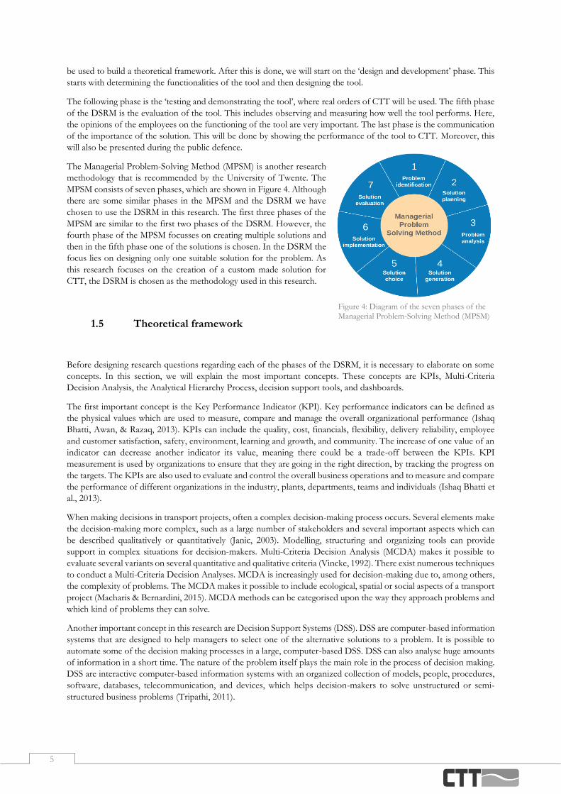
Figure 4: Diagram of the seven phases of the Managerial Problem-Solving Method (MPSM) ___________________________ 5
Figure 5: A schematic overview of an import and export round trip, in which the blue box frames the transport executed by CTT9
Figure 6: A schematic overview of a single trip, in which the blue box frames the transport executed by CTT ______________ 10
Figure 7: A schematic overview of a depot trip, in which the blue box frames the transport executed by CTT ______________ 10
Figure 8: A schematic overview of a trucking trip, in which the blue box frames the transport executed by CTT ____________ 10
Figure 9: Number of containers yearly imported and exported at the port of Rotterdam ______________________________ 11
Figure 10: Number of TEU handled by CTT in 2019 _________________________________________________________ 11
Figure 11: Flowchart icons used in the business process models _________________________________________________ 12
Figure 12: Simplified business process model of the container transport process at CTT ______________________________ 12
Figure 13: Simplified business process model of the planning process at CTT ______________________________________ 12
Figure 14: Business process model of the barge planning process at CTT __________________________________________ 12
Figure 15:Business process model of the composition of the barge planning at CTT _________________________________ 13
Figure 16: Results of the survey conducted amongst the barge planners of CTT, where the coloured dots represent the answers
given related to the process ____________________________________________________________________________ 14
Figure 17: Diagram of the Analytical Hierarchy Process by Ishizaka & Nemery (2013) ________________________________ 18
Figure 18: Diagram of the Analytic Network Process by Ishizaka & Nemery (2013) __________________________________ 18
Figure 19: Diagram of the Multi-Attribute Utility Theory by Ishizaka & Nemery (2013) _______________________________ 18
Figure 20: Integration of AHP and SMART criteria __________________________________________________________ 19
Figure 21: AHP Hierarchy of the KPI alternatives and the five performance objectives suitable for CTT __________________ 21
Figure 22: Data Flow Diagram Notation __________________________________________________________________ 29
Figure 23: DFD Level 0 of the future dashboard, showing the general dataflows between the different aspects of the dashboard
and datasets of CTT _________________________________________________________________________________ 29
Figure 24: DFD Level 1 of the future barge utilization dashboard _______________________________________________ 30
Figure 25: DFD Level 1 of the future on-time delivery dashboard _______________________________________________ 30
Figure 26: DFD Level 1 of the future order cycle time dashboard _______________________________________________ 31
Figure 27: DFD Level 1 of the future checks dashboard ______________________________________________________ 31
Figure 28: Power BI data model with relations between the different data sets ______________________________________ 32
Figure 29: Overview of the barge utilization dashboard in Power BI _____________________________________________ 39
Figure 30: Table consisting of future voyages displayed on the utilization dashboard _________________________________ 39
Figure 31: Table consisting of the transportelements which are unscheduled yet ____________________________________ 40
Figure 32: Cards on the utilization dashboard showing the number of TEUs that will be loaded and discharged when no selection
is made (a) and when the filters are used for a selection (b) ____________________________________________________ 40
Figure 33: Filters of the barge utilization dashboard without a selection made (a) and with a barge, day and address selected (b) _ 41
Figure 36: Card displaying the KPI of the barge utilization _____________________________________________________ 41
Figure 35: Card showing the number of TEU currently on the selected barge ______________________________________ 41
Figure 34: Card showing the maximum number of TEU on the selected barge ______________________________________ 41
Figure 37: Part of the graph showing the number of TEU on a selected barge after each voyage and the capacity of that barge _ 41
Figure 38: Part of the table showing unscheduled containers on the utilization dashboard _____________________________ 42
Figure 39: Overview of barges with a future voyage at the APM2 ________________________________________________ 42
Figure 40: An overview of the changing KPI when selecting the Borelli (a) and the Martinique (b) in the table with future voyages
_________________________________________________________________________________________________ 42
Figure 41: Graph showing the utilization of the Martinique over time ____________________________________________ 43
Figure 42: An overview of the import checks dashboard ______________________________________________________ 43
Figure 43: An overview of the export checks dashboard ______________________________________________________ 43
Figure 44: Cards on the import checks dashboard ___________________________________________________________ 44
Figure 45: Filters on the import checks dashboard ___________________________________________________________ 44
Figure 46: Graph giving an overview of the number of containers not ready to be picked up ___________________________ 44
Figure 47: KPI on the import checks dashboard showing the percentage of containers that are ready for pick-up ___________ 44
Figure 48: Overview of containers not ready for pick-up on the import dashboard __________________________________ 45
Figure 50: The graph giving an overview of the numbers of containers not ready for pick-up with one of the voyages selected _ 45
Figure 50: Table with information of containers that are scheduled on a selected voyage ______________________________ 45

V
List of Tables Table 1: Popular MCDA approaches, categorized by Ishizaka & Nemery (2013) ____________________________________ 17 Table 2: An overview of KPIs usable for transported goods and their required adaption for the use at CTT________________ 21 Table 3: Ranked list of the global weights of the KPIs according to the planners of CTT ______________________________ 23 Table 4: Selected KPIs and their rank according to the planners at CTT___________________________________________ 24 Table 5: Overview of the relationships in the Power BI data model ______________________________________________ 32 Table 6: Results of the survey conducted amongst the barge planners of CTT regarding the structure of the dashboard _______ 47 Table 7: Results of the survey conducted amongst the barge planners of CTT regarding the information design of the dashboard
_________________________________________________________________________________________________ 48 Table 8: Results of the survey conducted amongst the barge planners of CTT regarding the functionality of the dashboard ____ 48 Table 9: Mean and deviation of the questionnaire conducted on the different domains of the dashboard __________________ 52 Table 10: Pairwise comparisons alternatives ________________________________________________________________ 61 Table 11: Normalized pairwise comparisons _______________________________________________________________ 62 Table 12: Consistency ratios matrices _____________________________________________________________________ 63 Table 13: Local Weights of KPIs ________________________________________________________________________ 64 Table 14: Global Weights of KPIs _______________________________________________________________________ 64


1
Project Plan
In this chapter, we will first introduce the company Combi Terminal Twente in Section 1.1, next in Section 1.2 we will
discuss the problem by means of a problem identification. Then in Section 1.3, we will elaborate on the scope of this
research. In Section 1.4 the methodology which is used, will be explained. Next, in Section 1.5 we will elaborate on
some essential concepts. In Section 1.6 we will state the research questions. Section 1.7 will elaborate on the validity
and reliability of the research. The chapter will be concluded with the deliverables in Section 1.8.
1.1 Combi Terminal Twente
Combi Terminal Twente (CTT) is a container shipping company with terminals at 4 locations, in Hengelo, Almelo,
Rotterdam, and Bad Bentheim. This research focusses on the locations in Hengelo, next to the Twente Canal, and in
Almelo. CTT Hengelo arranges the transport of containers from Rotterdam to Hengelo and from there further to the
customer and vice-versa. The transportation between Rotterdam and Hengelo can be done by truck, or by barge. When
sailing between Hengelo and Rotterdam, the barges also frequently load and unload containers in Almelo. Barges take
an average of three days to complete the trip Hengelo-Almelo-Rotterdam-Hengelo. By truck the time of a trip Hengelo-
Rotterdam-Hengelo is only about 6 to 7 hours. Once the containers arrive at Rotterdam and are released, they will be
picked up. Figure 1 shows a visual representation of the two possibilities of shipping the container to the customer via
the terminal in Hengelo. In Figure 1a the transport by barge is shown, in Figure 1b the transport by truck is shown.
The container is shipped from a factory oversea to the port of Rotterdam by truck and a sea vessel. Once the container
is in Rotterdam CTT picks it up and transports it to Hengelo. From Hengelo, it is transported to the customer.
At CTT, customers can place an order for the shipment from the port of Rotterdam to their factory. They inform
CTT by telephone or email that their container is on its way to Rotterdam, thereafter CTT schedules a trip on one of
their barges, or in some cases on a truck. As this planning is very subject to change, CTT only knows about 2 days in
advance which barge will ship the container to Hengelo. Once a barge departs from Hengelo, it is definite which
containers will be picked up in Rotterdam and the owners of those containers are informed. As the barge takes 3 days
for a return, it will take at least 3 days before the containers are at the customers. Once a container arrives in Hengelo,
it is transported by truck to the customer. This does also mean that the customer only knows 3 to 4 days in advance
when their container will be delivered. Whenever there are no trucks available on the day the containers arrive in
Hengelo, they will be transported one day later.
A
Figure 1: Transport of a container by barge (a) or by truck (b) to the customer
BB

2
1.2 Problem Statement
In this section, we will investigate the problems at CTT. In Section 1.2.1 we will describe the problems at CTT. In
Section 1.2.2 a problem cluster of the described problems will be displayed. In Section 1.2.3 we will discuss the core
problem of this research.
1.2.1. Problem Context
The first problem is the increasing complexity of the planning due to increasing amounts of modalities and orders. In
2015, CTT opened its fourth terminal location, in Almelo. These various locations of terminals allow more possibilities
for transportation. As the number of bookings also increases annually, the planning process of the containers
complexifies. At this moment, the entire planning is made manually.
The second problem is the constant intraday planning changes. There are two possible reasons for these changes. The
first reason is the delay of sea vessels, barges, or trucks; by for example traffic jams or waiting times at a sluice. These
unexpected and unpredictable delays will force CTT to change their planning, as not all the containers can be picked
up on time anymore.
The other reason for the intraday changes is the uncertainty at the customers. Several attributes need to be known
before a container can be picked up. Examples of these are the container number, the release code of the container,
the terminal it arrives and on which sea vessel it arrives. Most of the attributes require to be provided by the customer.
Most of the information becomes gradually available, however, this needs to be checked closely by the planners. If
these attributes are not known on time, the container cannot be picked up. This requires the planning to change.
Customers may also ask to deliver containers later or earlier on that day, which requires a change in the planning.
Another problem follows from this. As there is a changing availability of data and there are changes in the planning
due to external factors, like delays, it is desirable to make the planning as late as possible since the data is most up-to-
date. This leads to many real-time decisions without gaining a total overview of the situation. There is no overview of,
for example, the remaining resources. When deciding, there are too many aspects to account for. All the data is available
in the database; however, it is a lot of work and it is too complicated to investigate all of it. Therefore, the complete
situation is not clear. This combined with manual planning results in empty spots on barges.
The third problem is the hard to calculate network performance. There is a database available with information about
all containers and bookings. Examples of this data are the arrival and departure times at different terminals. These
things are registered in Modality, a software program designed for intermodal container logistics (Modality, 2020).
However, in the current format, this data cannot be analysed. Once the delivery of a container is completed, the data
is still available in Modality. However, when information about a container or booking is updated, the original data is
overwritten. For example, if a sea vessel has a delay, the original pick-up frame will be updated. When calculating the
delay in picking up the container, the updated timeframe will be used, instead of the original time frame. It may appear
that the container was not delayed and picked up in time, but this is not necessarily the case. This makes it hard to
calculate CTT its network performance. CTT is currently focussing on designing a new system, ‘Modality 2.0’, to solve
that the data in Modality is overwritten. The goal of designing ‘Modality 2.0’ is to have a program that also saves the
original inputs. As CTT is already trying to solve this problem, this problem will not be further considered.

3
1.2.2. Problem Cluster
It is useful to make a problem cluster to get an overview of the problems of a process. The relations between the
problems stated in Section 1.2.1 are shown as a problem cluster in Figure 2. This figure shows which problems there
are, how the problems are related and to which core problems they can be derived.
1.2.3. Core Problem
There are five possible core problems, shown in blue in Figure 2. A core problem can never be a problem that you
cannot influence (Heerkens & van Winden, 2012). As the uncertainty of the customers, the delay of transport and the
increasing number of orders cannot be influenced, these cannot be core problems. This leaves two possible core
problems, shown in darker blue in Figure 2. These are the fact that the planning is made manually and that there is no
holistic overview of the planning.
If there is more than one possible core problem that remains in the cluster, the most important problem should be
chosen to be solved. The most important problem is whichever one whose solution would have the greatest impact
effect at the lowest cost (Heerkens & van Winden, 2012).
Solving the problem of manual planning making is beyond time and discipline limits. However, when creating a tool
that provides a holistic overview for the planners, manual planning making is less of a problem. As planners can rely
on decision-support from a clear overview, the planning can be made better and faster. The problem that there is no
holistic overview is a cause of the action problem but has no direct cause of itself. This leads to the following core
problem:
CTT encounters difficulties in scheduling the transport of containers by barge due to a lack of a holistic
overview which supports decision making.
If we express this problem in terms of norm and reality, we could state that in the current situation there is no holistic
overview and the desired situation is that there is a tool that provides a holistic overview.
Figure 2: Problem cluster of CTT identifying the possible core problems

4
1.3 Scope of Research
In this section, we will discuss the scope of this research. CTT transports containers by truck and by barge between
Hengelo and Rotterdam. In this research, only the barge planning will be taken into consideration.
First, the focus will be on barge planning as this planning is less flexible than truck planning. The barge planning is at
the core of the overall planning, every container that cannot be picked up by barge in time will be transported by truck.
By improving the barge planning, fewer trucks will eventually be necessary. Transport is preferred by barge, as it is less
expensive, more reliable and it emits less CO2 (Guidelines for Measuring and Managing CO2 Emission from Freight Transport
Operations, 2011).
The focus will be on the operational level. Therefore, we will not discuss strategic choices such as the locations of the
terminals and the tactical objectives. We will focus on the day-to-day planning processes.
In this research, we will only focus on the transport between Rotterdam and Hengelo, where the stops in Almelo are
taken into consideration. The transport from and to Bad Bentheim will be excluded. The terminal in Bad Bentheim is
only used as a storage facility to store containers for large customers that produce stock during the year that is only
needed to be shipped later that year.
In this research, we will focus on the possibilities to give decision support to the barge planners. This will not solve
the problem of the manual making of the planning. However, it supports the barge planners so they will need less time
to make the planning and can make the planning more efficient. It is beyond time and discipline limits to create an
automated planning system.
1.4 Research Methodology
In this section, we will explain the research methodology that will be used and how it will apply to this research. Also,
we justify why this research methodology is chosen. The methodology that will be used is the Design Science Research
Methodology (DSRM).
Design science is the design and investigation of artefacts in context (Wieringa, 2014). In order to fully understand a
design problem, the context in which the improvement has to be made should be understood. A visual representation
of the design science and its six main phases can be found below in Figure 3.
The first phase is the ‘identification of the problem and the motivation’. This is done in Section 1.2. The problem will
be led back to one core problem that will be focussed on and the motivation why this problem is chosen will be
explained. Once the problem is clear, the objectives for a solution will be set up. These objectives will follow from the
first phase, the identification and motivation. Between the second and third phase, there is a theory element. This will
Figure 3: Process flow diagram of the Design Science Research Methodology (DSRM)
5
be used to build a theoretical framework. After this is done, we will start on the ‘design and development’ phase. This
starts with determining the functionalities of the tool and then designing the tool.
The following phase is the ‘testing and demonstrating the tool’, where real orders of CTT will be used. The fifth phase
of the DSRM is the evaluation of the tool. This includes observing and measuring how well the tool performs. Here,
the opinions of the employees on the functioning of the tool are very important. The last phase is the communication
of the importance of the solution. This will be done by showing the performance of the tool to CTT. Moreover, this
will also be presented during the public defence.
The Managerial Problem-Solving Method (MPSM) is another research
methodology that is recommended by the University of Twente. The
MPSM consists of seven phases, which are shown in Figure 4. Although
there are some similar phases in the MPSM and the DSRM we have
chosen to use the DSRM in this research. The first three phases of the
MPSM are similar to the first two phases of the DSRM. However, the
fourth phase of the MPSM focusses on creating multiple solutions and
then in the fifth phase one of the solutions is chosen. In the DSRM the
focus lies on designing only one suitable solution for the problem. As
this research focuses on the creation of a custom made solution for
CTT, the DSRM is chosen as the methodology used in this research.
1.5 Theoretical framework
Before designing research questions regarding each of the phases of the DSRM, it is necessary to elaborate on some
concepts. In this section, we will explain the most important concepts. These concepts are KPIs, Multi-Criteria
Decision Analysis, the Analytical Hierarchy Process, decision support tools, and dashboards.
The first important concept is the Key Performance Indicator (KPI). Key performance indicators can be defined as
the physical values which are used to measure, compare and manage the overall organizational performance (Ishaq
Bhatti, Awan, & Razaq, 2013). KPIs can include the quality, cost, financials, flexibility, delivery reliability, employee
and customer satisfaction, safety, environment, learning and growth, and community. The increase of one value of an
indicator can decrease another indicator its value, meaning there could be a trade-off between the KPIs. KPI
measurement is used by organizations to ensure that they are going in the right direction, by tracking the progress on
the targets. The KPIs are also used to evaluate and control the overall business operations and to measure and compare
the performance of different organizations in the industry, plants, departments, teams and individuals (Ishaq Bhatti et
al., 2013).
When making decisions in transport projects, often a complex decision-making process occurs. Several elements make
the decision-making more complex, such as a large number of stakeholders and several important aspects which can
be described qualitatively or quantitatively (Janic, 2003). Modelling, structuring and organizing tools can provide
support in complex situations for decision-makers. Multi-Criteria Decision Analysis (MCDA) makes it possible to
evaluate several variants on several quantitative and qualitative criteria (Vincke, 1992). There exist numerous techniques
to conduct a Multi-Criteria Decision Analyses. MCDA is increasingly used for decision-making due to, among others,
the complexity of problems. The MCDA makes it possible to include ecological, spatial or social aspects of a transport
project (Macharis & Bernardini, 2015). MCDA methods can be categorised upon the way they approach problems and
which kind of problems they can solve.
Another important concept in this research are Decision Support Systems (DSS). DSS are computer-based information
systems that are designed to help managers to select one of the alternative solutions to a problem. It is possible to
automate some of the decision making processes in a large, computer-based DSS. DSS can also analyse huge amounts
of information in a short time. The nature of the problem itself plays the main role in the process of decision making.
DSS are interactive computer-based information systems with an organized collection of models, people, procedures,
software, databases, telecommunication, and devices, which helps decision-makers to solve unstructured or semi-
structured business problems (Tripathi, 2011).
Figure 4: Diagram of the seven phases of the Managerial Problem-Solving Method (MPSM)
6
To visualise the outcomes of DSS, dashboards can be used. Dashboards represent current and past key performances
of a company, expressed in forms such as gauges, tables, and charts (Abd el Fattah, Alghamdi, & Amer, 2014).
Dashboards are typically showed on a single screen and use colours to indicate the progress towards the goal. The data
displayed is not static information, but is updated regularly, for example hourly, depending on the needs of the user
and the capabilities of a system.
Dashboards enable the possibility to measure, monitor and manage organization performance more effectively (Abd
el Fattah et al., 2014). The importance of the monitoring purpose is to track performance in various strategic,
operational, and financial areas. Dashboards can provide a display of information to improve decisions, efficiency and
streamline workflow. As critical business processes can be monitored, alerts can be triggered when potential problems
arise, notifying the user on time.
In the next section, we will design research questions to cover each of the DSRM phases described in Section 1.4. The
concepts described in this section will be the topics of some of the research questions.
1.6 Research Questions
The core problem stated in Section 1.2.3 is translated into the following research question:
How can we build a decision support tool for the barge planners at CTT?
The sub-questions stated below are formulated to support and answer the research question.
1. How is the planning of the container shipment done at this moment?
1. What services does CTT provide?
2. What is the current and expected situation at CTT regarding barge planning?
3. What is the current planning process of containers?
4. What do the planners currently think of the planning process and what can be improved?
This first question covers the ‘identify problem and motivate’ phase of the DSRM, where the current situation is
discovered. We will gain a better insight into the planning process and its variables. To answer this question, it is
divided into four sub-questions. To answer the first three sub-questions, knowledge will be gathered by documentation,
observations, and interviews at CTT. The fourth sub-question will be answered by conducting a survey among the
barge planners at CTT.
2. Which KPIs can be used to measure the barge planning process at CTT?
1. Which MCDA methods for the selection of KPIs are available in academic literature?
2. Which KPIs can be used in the measurements of planning processes?
This second question covers the ‘define objectives of a solution’ phase of the DSRM. When selecting the KPIs, it will
become clear how the solution can be measured in terms of KPIs. The first sub-question will be answered by
conducting a systematic literature review. This review will build a theoretical framework. Relevant literature regarding
the methods for selecting KPIs will be discussed. Once this question is answered, we can set up a solution method.
3. How can the decision support tool be designed and developed?
1. How can we develop a user-friendly tool?
2. What is the desired output and which requirements need to be met?
3. Which information is needed from CTT to develop the tool?
This third question relates to the third phase of the DSRM, the ‘design and development’ phase. Based on the
knowledge from literature and the current situation at CTT, we will design a solution for the transport problem. In
this section, we will first focus on the desired output. The first two questions will be answered using interviews at CTT.
The third sub-question will be answered by choosing one of the earlier found possibilities in the academic literature
and combining this with the answers on the first two sub-questions.
7
4. How can we test the performance of the solution?
This fourth question relates to the demonstration phase of the DSRM. Once it is clear how a solution can be designed
and developed, we will develop a way to test the solution in the context of CTT, which gives an answer to the fourth
question.
5. What recommendations can be given to CTT regarding the solution and its implementation?
1. What is the opinion of the planners on the tool?
The fifth phase of the DSRM will be covered by this fifth question, where we will investigate how effective and efficient
the solution is. The sub-question will be answered by conducting a survey among the barge planners at CTT. To give
proper recommendations, we need to know what the planners, that will be using the tool, think of the functionalities
and the operation of the tool.
6. What limitations are there in this research and what recommendations can be given for future
research?
Despite the DSRM existing out of multiple iterations, we will only complete the first iteration in this research. This
sixth question is designed to analyse the limitations of this research and the recommendations regarding future research
and iterations. The report will be concluded with an answer to this question.
1.7 Validity and Reliability
Validity and reliability are closely related, as reliability is a part of validity. Reliability means, if the measurements are
repeated, the results will be the same. Validity means if you are measuring what you want to measure. Validity can be
categorized into three types of validity. These types are internal, construct and external validity (Heerkens, 2015). Two
of these types of validity and their threats will be discussed in this section.
Internal validity is the soundness of the research design, meaning if the research design is set up to measure what is
intended to measure. Threats of internal validity are unrepresentative sample, demotivation, rivalry, growth or quitting,
incorrect statistical methods, unwanted artificiality, ignoring time delays and unreliable measuring instruments
(Heerkens, 2015). In this research, the biggest threat to internal validity is the selection of the KPIs. For the selection
of KPIs, the Analytical Hierarchy Process (AHP) method will be used, which is seen as the most widely used technique
for decision making and it has been shown that it is useful in prioritizing alternative variables (Shahin & Mahbod,
2007). We will elaborate more on this method in Section 3.1. There are five steps in selecting the KPIs, we will explain
these steps in Section 3.1.3. When these steps are followed correctly, the internal validity will be assured.
External validity, also called generalizability, is the usability of the research outside the research population. Threats of
external validity are a unique population, a unique environment, a unique period in time and a unique combination of
factors in the research context (Heerkens, 2015). As this research aims to develop a solution specific for CTT, there
are some threats to external validity, as the research environment and the factors within it are unique for CTT.
However, this research can be used as a basis for similar problems at other companies. Therefore, every step that is
taken in this research will carefully be documented. This way, this research can be used in other contexts by adapting
the steps where the companies differ.
The reliability of the research is the extent to which the research is repeatable. One threat to reliability is the
objectiveness of the sources. In this research, a communicative approach will be used to gather data at CTT, as the
employees will be filling out a survey. The threat is that the information is obtained from the employees their point of
view and that this might not always be objective.

8
1.8 Deliverables
This report will deliver the following:
- An analysis of the current situation
- A report discussing the design and the development of the decision support tool
- A manual for the planners on how to use the tool
- A decision support tool for the planners of CTT

9
Current Situation
This chapter describes the current situation at Combi Terminal Twente and therefore focuses on the first research
question ‘How is the planning of the container shipment done at this moment?’. We start this chapter with an overview
of the services that CTT provides in Section 2.1. Next, we discuss the current and expected situation at CTT in Section
2.2. In Section 2.3 the processes of loading and unloading of the containers are explained. Section 2.4 gives an analysis
of the opinions on the current systems. This chapter ends with a conclusion on the current situation in Section 2.5.
2.1 Types of Services
As mentioned before, the main service CTT provides is the transportation of containers between Twente and
Rotterdam. In this section, we elaborate on the different services CTT provides. Note that when we say Rotterdam,
we mean one of the terminals in Rotterdam and when we use Hengelo, we mean the CTT terminal in Hengelo.
2.1.1. Round Trip
The most common trip executed is the round trip. A container is picked up in Rotterdam and goes via the customer
back to Rotterdam. It depends on the contents of the container if it is an import trip, export trip or a combination of
both. Figure 5 shows an example of a round trip, where the transport within the blue box is arranged by CTT. In the
example in Figure 5, a container is transported with a sea vessel to Rotterdam, where CTT picks it up with one of its
barges and transports it to Hengelo. Once in Hengelo, transport is scheduled for the transport by truck to the customer,
where it delivers the container. In this example, the container is loaded, making this first part an import trip. Once the
container is unloaded, the container can optionally be loaded by the customer. In this case, the second part of the
transport is an export trip. CTT will transport the container back to Hengelo by truck, and from there on to Rotterdam
by barge. From Rotterdam, it can be shipped oversea.
If the customer does not load the container after unloading, regarding the example given in Figure 5, it will be emptily
transported back to Hengelo, which makes it an import round trip. It is also possible that empty containers are
transported to the customer, where the customer will load the container and CTT returns the container to Rotterdam.
This case will be an export round trip.
Figure 5: A schematic overview of an import and export round trip, in which the blue box frames the transport executed by CTT

10
2.1.2. Single Trip
The difference of a single trip compared to a round trip is that the container is not transported back to Rotterdam.
Instead, the container is left in Hengelo. Once the container is transported to the customer and is unloaded, the
container is stored in Hengelo. Note that this is only possible if the owner of the container and the inland terminal
agreed on this. Figure 6 shows an example of a single trip, where the transport within the blue box is executed by CTT,
which in this case is an import trip.
Single trips can be, like round trips, import or export trips. When it is an export trip, the container is taken out of
storage in Hengelo and transported to the customer. Once the container is loaded, it is transported back to Hengelo
from where it continues to Rotterdam. The number of containers stored in the depot is balanced, as empty containers
are stored when an import single trip occurs but taken if there is an export single trip.
2.1.3. Depot
An other trip CTT can make is the depot trip. This depot trip can be made if the number of empty containers does
not balance out at the terminal, so if there are too many or too few empty containers. An example of this depot trip is
given in Figure 7. In the case of a depot trip, all the transport is done by CTT. A depot trip can, like the other trips, be
an import or export trip. The example of Figure 7 is an export depot trip. When empty containers are transported
from Rotterdam to Hengelo and put into the depot, it is an import trip.
2.1.4. Trucking
Another possibility for the transport from Rotterdam to the customer is by truck. Since the transport is only done by
one way of transport, the container is transported directly to the customer instead of going through Hengelo. With
trucking, it is also possible to have import trips, export trips or a combination. An example of trucking is given in
Figure 8. In this example, it is an import and export roundtrip, where all the transport done by CTT is by truck. Factors
that can influence the choice of customers for transport by truck are reliability, transportation time, environmental
impact and costs of the modality.
Figure 6: A schematic overview of a single trip, in which the blue box frames the transport executed by CTT
Figure 7: A schematic overview of a depot trip, in which the blue box frames the transport executed by CTT
Figure 8: A schematic overview of a trucking trip, in which the blue box frames the transport executed by CTT
11
2.1.5. Other Services
There are several other services that CTT provides, a brief explanation of the most important services is given below.
- CTT stores containers that are not used, or used for a single trip, at their company site at the terminal in
Hengelo.
- As containers can contain toxic gasses, CTT can analyse the air inside containers before opening them, to
prevent intoxication. An example is when the glue of recently produced shoes dries inside the container,
which releases toxic gasses.
- CTT can repair damaged containers and trucks in a workplace on the company site in Hengelo.
- CTT has bought several containers multiple times. These containers are stored at the company site in
Hengelo. These containers can be resold to others or leased to other companies.
- Importing and exporting containers require customs documentation before transportation, which CTT can
provide for customers.
2.2 Current and Expected Situation at CTT
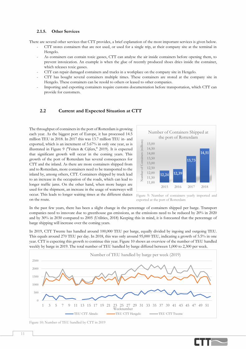
The throughput of containers in the port of Rotterdam is growing
each year. As the biggest port of Europe, it has processed 14.5
million TEU in 2018. In 2017 this was 13.7 million TEU in- and
exported, which is an increment of 5.67% in only one year, as is
illustrated in Figure 9 ("Feiten & Cijfers," 2019). It is expected
that significant growth will occur in the coming years. This
growth of the port of Rotterdam has several consequences for
CTT and the inland. As there are more containers shipped from
and to Rotterdam, more containers need to be transported to the
inland by, among others, CTT. Containers shipped by truck lead
to an increase in the occupation of the roads, which can lead to
longer traffic jams. On the other hand, when more barges are
used for the shipment, an increase in the usage of waterways will
occur. This leads to longer waiting times at the different sluices
on the route.
In the past few years, there has been a slight change in the percentage of containers shipped per barge. Transport
companies need to innovate due to greenhouse gas emissions, as the emissions need to be reduced by 20% in 2020
and by 30% in 2030 compared to 2005 (Utilities, 2018) Keeping this in mind, it is forecasted that the percentage of
barge shipping will increase over the coming years.
In 2019, CTT Twente has handled around 100,000 TEU per barge, equally divided by ingoing and outgoing TEU.
This equals around 270 TEU per day. In 2018, this was only around 95,000 TEU, indicating a growth of 5.5% in one
year. CTT is expecting this growth to continue this year. Figure 10 shows an overview of the number of TEU handled
weekly by barge in 2019. The total number of TEU handled by barge differed between 1,000 to 2,300 per week.
0
500
1000
1500
2000
2500
1 3 5 7 9 11 13 15 17 19 21 23 25 27 29 31 33 35 37 39 41 43 45 47 49 51Weeknumber
Number of TEU handled by barge per week (2019)
TEU CTT Almelo TEU CTT Hengelo TEU CTT Twente
Figure 10: Number of TEU handled by CTT in 2019
Figure 9: Number of containers yearly imported and
exported at the port of Rotterdam
12,24 12,39
13,73
14,51
11,00
11,50
12,00
12,50
13,00
13,50
14,00
14,50
15,00
2015 2016 2017 2018
Num
ber
of
Co
nta
iner
s (m
illio
ns)
Number of Containers Shipped at the port of Rotterdam

12
2.3 Planning Processes
In this section, we will investigate the current planning processes. To visualise the processes, several flowcharts are
made. Figure 11 gives an overview of the icons used and their meaning. For the visualisation of the process, the
Business Process Modelling Notation or BPMN has been used (Weske, 2012). In this section, we will provide the
flowcharts that are relevant to the barge planning process. Some processes are simplified to keep an orderly overview.
Figure 12 shows an overview of the process of transporting a container. The process starts when a customer sends a
request for the transport of a container. An order is made for this request and is put in Modality, the software used by
CTT. From this moment the planners can see this order. The planning department schedules transport for this order
and puts this order in the planning for a barge or truck. We will look closer into this process in the next paragraph.
After the container is planned, the container is handled, meaning the container is loaded onto a barge or truck. Once
this is done, the container is transported to the destination. This process is concluded by sending an invoice to the
customer.
Figure 13 shows an overview of the planning process of a container. This process starts after an order entry has been
made, as shown in Figure 12. The first step of this planning process is the barge planning. In this process, the barge
planners look for the possibility to schedule the transport of a container by barge. We will elaborate on this process in
the next paragraph. Once the container is planned on a barge, the truck planners can plan the transport in the port. As
it is not always possible or convenient to pick up a container by barge in the port, it is possible to pick it up by truck.
Once the transport of the container to Hengelo is scheduled, the truck planners can plan the last transport to the
customer.
Figure 14 shows an overview of the barge planning process, which is done manually. The first decision that should be
taken is, if there is a possibility to ship the container by barge. If this is not possible, for example, due to time
restrictions, it is shipped by truck. If it is possible to ship by barge, this will be included in the barge planning. This
process, indicated by A in Figure 14, will be explained in the next paragraph. Once the barge planning is composed,
the planning is updated. Next, the administration is done, meaning the travel manifests are collected and manifests for
each department are made. Finally, the planning is communicated to the specific departments.
Figure 11: Flowchart icons used in the business process models
Figure 12: Simplified business process model of the container transport process at CTT
Figure 13: Simplified business process model of the planning process at CTT
Figure 14: Business process model of the barge planning process at CTT
13
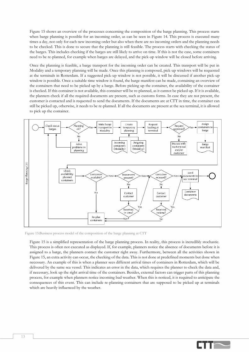
Figure 15 shows an overview of the processes concerning the composition of the barge planning. This process starts
when barge planning is possible for an incoming order, as can be seen in Figure 14. This process is executed many
times a day, not only for each new incoming order but also when there are no incoming orders and the planning needs
to be checked. This is done to secure that the planning is still feasible. The process starts with checking the status of
the barges. This includes checking if the barges are still likely to arrive on time. If this is not the case, some containers
need to be re-planned, for example when barges are delayed, and the pick-up window will be closed before arriving.
Once the planning is feasible, a barge transport for the incoming order can be created. This transport will be put in
Modality and a temporary planning will be made. Once this planning is composed, pick-up windows will be requested
at the terminals in Rotterdam. If a suggested pick-up window is not possible, it will be discussed if another pick-up
window is possible. Once a suitable time window is found, the barge manifest can be made, containing an overview of
the containers that need to be picked up by a barge. Before picking up the container, the availability of the container
is checked. If this container is not available, this container will be re-planned, as it cannot be picked up. If it is available,
the planners check if all the required documents are present, such as customs forms. In case they are not present, the
customer is contacted and is requested to send the documents. If the documents are at CTT in time, the container can
still be picked up, otherwise, it needs to be re-planned. If all the documents are present at the sea terminal, it is allowed
to pick up the container.
Figure 15 is a simplified representation of the barge planning process. In reality, this process is incredibly stochastic.
This process is often not executed as displayed. If, for example, planners notice the absence of documents before it is
assigned to a barge, the planners contact the customer right away. Furthermore, between all the activities shown in
Figure 15, an extra activity can occur, the checking of the data. This is not done at predefined moments but done when
necessary. An example of this is when a planner sees different arrival times of containers in Rotterdam, which will be
delivered by the same sea vessel. This indicates an error in the data, which requires the planner to check the data and,
if necessary, look up the right arrival time of the containers. Besides, external factors can trigger parts of this planning
process, for example when planners notice incoming bad weather. When this is noticed, it is required to anticipate the
consequences of this event. This can include re-planning containers that are supposed to be picked up at terminals
which are heavily influenced by the weather.
Figure 15:Business process model of the composition of the barge planning at CTT

14
2.4 Planners Opinion on Planning Process
In this section, we will discuss the opinion of the barge planners on the current planning processes. All the seven barge
planners of CTT Hengelo have conducted a survey about the current processes. The questions that were asked are:
1. Which activity is the most time consuming daily?
2. Which activities would you prefer to have simplified and/or less time-consuming?
3. Are there activities of which you think they can be automated? If yes, which activities?
4. Are there activities where you wish to get decision support? If yes, which activities?
The most relevant outcomes will be discussed in this section. Figure 16 gives an overview of the answers related to the
planning process discussed before.
The answers on the first question have a red dot. The most time-consuming activities are the (re)assigning of containers
to barges and barges to terminals. Besides, the checking of barges, availability and documents is a large contribution
to the daily work.
The activities that are desired to be less time-consuming, are indicated with a yellow dot. This mostly includes checking
if the planning can still be carried out. Besides, it is mentioned that the correctness of data, for example, pin numbers,
is favoured to be simplified. In addition to this, the synchronization of data should become more structured, by for
example synchronizing the data in real-time in Modality.
The activities with a blue dot are the activities that are considered as possibly automatable processes. Beside these
answers related to this process, there were a few other answers. This includes the option of finding an earlier timeslot
for containers that are re-planned for a later time, as it is sometimes possible to arrange an earlier pick-up for them.
Another aspect mentioned is automatically planning new incoming orders to the first barge available.
The activities with a green dot have been given as an answer to the fourth question. Both the assignment of containers
to a barge and the assignment of barges to terminals are mentioned multiple times. Next to these activities, two
additional activities have been noted. The first activity is when deciding to send a barge to different terminals. It is
favoured to see the consequences of this, by for example getting an overview of the containers that, with this new
planning, will be picked up too late. When this is clear, it will be easier to see which appointments at terminals need to
be re-planned. Other aspects that have been mentioned are the open releases and acceptances, to see which orders
still need handling. Additionally, when the planning requires adaptation due to external factors, it is favoured to receive
decision support for these events.
Figure 16: Results of the survey conducted amongst the barge planners of CTT, where the coloured dots represent the answers
given related to the process

15
2.5 Conclusion
In this section, we will conclude Chapter 2. The main service CTT provides is the transportation of containers between
Twente and Rotterdam. The most common trip executed is the round trip. A container is picked up in Rotterdam and
goes via the customer back to Rotterdam. It depends on the contents of the container if it is an import trip, export trip
or a combination of both. Another service is a single trip. Single trips can, like round trips, be import or export trips.
An import trip transports the container from Rotterdam to the customer and the empty container is then stored in
Hengelo. An export trip takes an empty container out of storage in Hengelo to the customer, where it is loaded and
transported via Hengelo to Rotterdam. These trips can be carried out by barge or by truck. When trucking the
container, it can be transported directly between the customer and Rotterdam, instead of going through Hengelo. As
the number of empty containers in Hengelo not always balances out, CTT can make a depot trip, transporting empty
containers between Rotterdam and Hengelo. Besides the transporting of containers, CTT provides several other
services. These services are the storage of containers, an analysis of the air inside the containers, repairing containers
or trucks, selling or leasing of containers and providing required customs documentation.
Over the last years, the throughput of containers in the port of Rotterdam is steadily growing. This is expected to
continue the coming years. This growth of the biggest port of Europe has several consequences for CTT and the
inland. As there are more containers shipped from and to Rotterdam, more containers need to be transported to the
inland by, among others, CTT. In 2019, CTT Twente has handled around 100,000 TEU, equally divided by ingoing
and outgoing TEU. This equals around 270 TEU handled per day, which is a growth of 5.5% compared to 2018. CTT
is expecting this growth to continue this year. In 2019, the total number of TEU handled by barge differed between
1,000 to 2,300 TEU per week.
The planning process starts when a customer sends in a request for the transport of a container. An order is made for
this request and put in Modality. The barge planners then look for a possibility to schedule the transport by barge. If
this is not possible, due to for example time restrictions, it will be transported by truck. The containers that can be
shipped by barge are planned on one of the barges. Once this planning is feasible, time windows will be requested at
the terminals in Rotterdam. If a suggested pick-up window is not possible, the possibility for another time window will
be discussed. Once a suitable time window is found, the barge manifest can be made, containing an overview of the
containers that need to be picked up by a barge. Before picking up the containers, the availability of the containers is
checked. If containers are not available, these containers will be re-planned. The available containers are checked for
the required documents, such as customs forms and pin codes. In case they are not present, the customer is contacted
and is requested to send the documents. If the documents are at CTT in time, the container can still be picked up,
otherwise, it will be re-planned. Once the barge planning is feasible, it is updated and the administration is done,
meaning the travel manifests are collected and manifests for each department are made. Finally, the planning is
communicated to the specific departments. Once the transport of the container between Hengelo and Rotterdam is
scheduled, the truck planners can plan the transport between Hengelo and the customer.
The barge planners of CTT have been asked to fill out a survey regarding the current planning processes. The most
time-consuming activities are the (re)assigning of containers to barges and barges to terminals. Besides, the checking
of barges, availability and documents is a large contribution to their daily work. The activities that are desired to become
less time-consuming mostly include checking if the planning can still be carried out. Besides, checking the correctness
and the synchronisation of data is favoured to be simplified. The activities considered as possibly automatable
processes include the option of finding an earlier timeslot for containers that were re-planned for a later time, as it is
sometimes possible to arrange an earlier pick-up for them. Another aspect mentioned is automatically planning a new
incoming order to the first barge available. The activities where decision support is preferred include the assignment
of containers to a barge and the assignment of barges to terminals. Besides these activities, it is favoured to see the
consequences of sending a barge to different terminals than originally planned, by getting an overview of the containers
that will be picked up too late when executing this new planning.
16
Selection of KPIs
This chapter focuses on the second research question ‘Which KPIs can be used to measure the barge planning process
at CTT?’. We start this chapter with a literature review in Section 3.1, where we will review the Multi-Criteria Decision
Analysis (MCDA) methods for the selection of KPIs. In Section 3.2 we will elaborate on the KPIs suitable for
measuring planning processes at CTT. We conclude this chapter in Section 3.3, where we will answer the research
question mentioned above.
3.1 MCDA Methods for Selecting KPIs
When making decisions in transport projects, often a complex decision-making process occurs. Several elements make
the decision making more complex, such as, a large number of stakeholders, and several important aspects which can
be described qualitatively or quantitatively. (Janic, 2003). Modelling, structuring and organizing tools can provide
support in complex situations for decision-makers. MCDA makes it possible to evaluate several variables on several
quantitative and qualitative criteria (Vincke, 1992). There exist numerous techniques to conduct a Multi-Criteria
Decision Analyses. MCDA is increasingly used for decision-making due to, among others, the complexity of problems.
The increased use of the MCDA seems to originate from the importance to include other aspects than only economic
aspects in analyses. The MCDA makes it possible to include ecological, spatial or social aspects of a transport project.
(Macharis & Bernardini, 2015). Besides, the MCDA allows the analyst to involve the objectives of different interest
groups or stakeholders. (Janic, 2003)
3.1.1. Types of MCDA
The different MCDA techniques can be divided into three different types of approaches (Ishizaka & Nemery, 2013).
These approaches are the full aggregation approach, the outranking approach, and the goal, aspiration or reverence
level approach. These approaches are shortly explained below.
- The full aggregation approach, also known as the American school, is a method where a score is evaluated
for each criterion and these are then synthesized into a global score. This approach assumes compensable
scores, so, for example, a bad score for one criterion is compensated for by a good score on another (Ishizaka
& Nemery, 2013).
- The outranking approach, also known as the French school, is a method where a bad score cannot be
compensated for by a better score. The order of the options may be partly because the notion of
incomparability is allowed. Two options may have the same score, but their behaviour may be different and
therefore incomparable (Ishizaka & Nemery, 2013).
- The goal, aspiration or reference level approach is an approach that defines a goal for each criterion and then
identifies the closest options to the ideal goal or reference level (Ishizaka & Nemery, 2013).
For the selection of KPIs, the most relevant approach is the full aggregation approach, as a bad scoring criterion can
be compensated for by a good scoring criterion.
17
Besides the division in types of approaches, the MCDA techniques can also be classified into four main types of
decisions. These types are the choice problem, the sorting problem, the ranking problem, and the description problem.
These four types of decisions are, according to Ishizaka & Nemery (2013), shortly explained below.
- The goal of the choice problem is to select the single best option or to reduce the group of options to a
subset of equivalent or incomparable ‘good’ options. For example, a manager selecting the right person for a
particular project.
- With the sorting problem, options are sorted into ordered and predefined groups, called categories. The aim
is to then regroup the options with similar behaviours or characteristics for descriptive, organizational or
predictive reasons.
- The goal of the ranking problem is ordering the options from best to worst by utilizing, for example, scores
or pairwise comparisons. The order can be partial if incomparable options are considered, or complete. A
typical example is the ranking of universities according to several criteria.
- The description problem has the goal to describe options and their consequences. This is usually done in the
first step, to understand the characteristics of the decision problem.
The selection of KPIs within a company can best be defined as a ranking problem. A set of KPIs should be made up
in the beginning, and the result is a list of KPIs ordered from most important to least important. Out of this list, a
selection can be made of the KPIs that will eventually be used to assess the company.
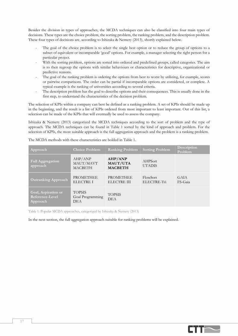
Ishizaka & Nemery (2013) categorized the MCDA techniques according to the sort of problem and the type of
approach. The MCDA techniques can be found in Table 1 sorted by the kind of approach and problem. For the
selection of KPIs, the most suitable approach is the full aggregation approach and the problem is a ranking problem.
The MCDA methods with these characteristics are bolded in Table 1.
Table 1: Popular MCDA approaches, categorized by Ishizaka & Nemery (2013)
In the next section, the full aggregation approach suitable for ranking problems will be explained.
Approach Choice Problem Ranking Problem Sorting Problem Description Problem
Full Aggregation approach
AHP/ANP MAUT/MAVT MACBETH
AHP/ANP MAUT/UTA MACBETH
AHPSort UTADIS
Outranking Approach PROMETHEE ELECTRE I
PROMETHEE ELECTRE III
FlowSort ELECTRE-Tri
GAIA FS-Gaia
Goal, Aspiration or Reference-Level Approach
TOPSIS Goal Programming DEA
TOPSIS DEA
18
3.1.2. Full Aggregation Approach Methods
Of the full aggregation approach methods, five methods can be used for ranking problems. These five methods will
be described in this section.
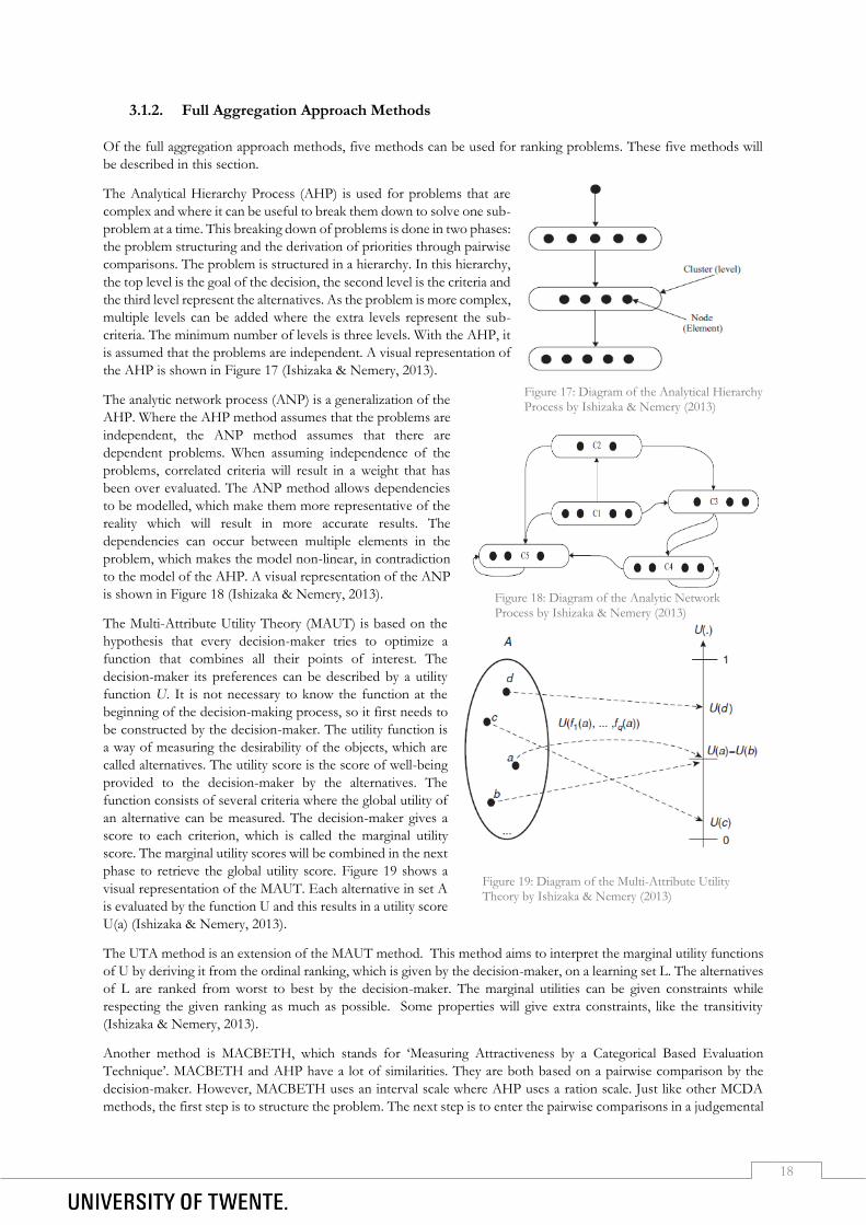
The Analytical Hierarchy Process (AHP) is used for problems that are
complex and where it can be useful to break them down to solve one sub-
problem at a time. This breaking down of problems is done in two phases:
the problem structuring and the derivation of priorities through pairwise
comparisons. The problem is structured in a hierarchy. In this hierarchy,
the top level is the goal of the decision, the second level is the criteria and
the third level represent the alternatives. As the problem is more complex,
multiple levels can be added where the extra levels represent the sub-
criteria. The minimum number of levels is three levels. With the AHP, it
is assumed that the problems are independent. A visual representation of
the AHP is shown in Figure 17 (Ishizaka & Nemery, 2013).
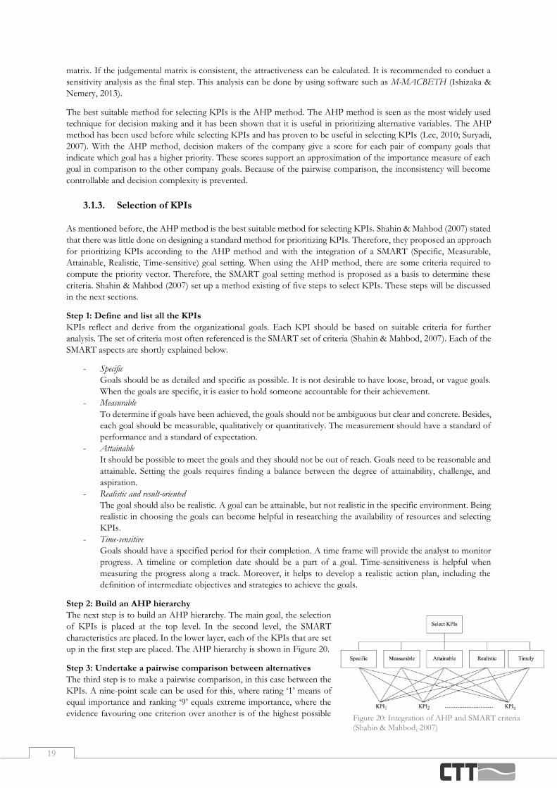
The analytic network process (ANP) is a generalization of the
AHP. Where the AHP method assumes that the problems are
independent, the ANP method assumes that there are
dependent problems. When assuming independence of the
problems, correlated criteria will result in a weight that has
been over evaluated. The ANP method allows dependencies
to be modelled, which make them more representative of the
reality which will result in more accurate results. The
dependencies can occur between multiple elements in the
problem, which makes the model non-linear, in contradiction
to the model of the AHP. A visual representation of the ANP
is shown in Figure 18 (Ishizaka & Nemery, 2013).
The Multi-Attribute Utility Theory (MAUT) is based on the
hypothesis that every decision-maker tries to optimize a
function that combines all their points of interest. The
decision-maker its preferences can be described by a utility
function U. It is not necessary to know the function at the
beginning of the decision-making process, so it first needs to
be constructed by the decision-maker. The utility function is
a way of measuring the desirability of the objects, which are
called alternatives. The utility score is the score of well-being
provided to the decision-maker by the alternatives. The
function consists of several criteria where the global utility of
an alternative can be measured. The decision-maker gives a
score to each criterion, which is called the marginal utility
score. The marginal utility scores will be combined in the next
phase to retrieve the global utility score. Figure 19 shows a
visual representation of the MAUT. Each alternative in set A
is evaluated by the function U and this results in a utility score
U(a) (Ishizaka & Nemery, 2013).
The UTA method is an extension of the MAUT method. This method aims to interpret the marginal utility functions
of U by deriving it from the ordinal ranking, which is given by the decision-maker, on a learning set L. The alternatives
of L are ranked from worst to best by the decision-maker. The marginal utilities can be given constraints while
respecting the given ranking as much as possible. Some properties will give extra constraints, like the transitivity
(Ishizaka & Nemery, 2013).
Another method is MACBETH, which stands for ‘Measuring Attractiveness by a Categorical Based Evaluation
Technique’. MACBETH and AHP have a lot of similarities. They are both based on a pairwise comparison by the
decision-maker. However, MACBETH uses an interval scale where AHP uses a ration scale. Just like other MCDA
methods, the first step is to structure the problem. The next step is to enter the pairwise comparisons in a judgemental
Figure 17: Diagram of the Analytical Hierarchy
Process by Ishizaka & Nemery (2013)
Figure 18: Diagram of the Analytic Network
Process by Ishizaka & Nemery (2013)
Figure 19: Diagram of the Multi-Attribute Utility Theory by Ishizaka & Nemery (2013)
19
matrix. If the judgemental matrix is consistent, the attractiveness can be calculated. It is recommended to conduct a
sensitivity analysis as the final step. This analysis can be done by using software such as M-MACBETH (Ishizaka &
Nemery, 2013).
The best suitable method for selecting KPIs is the AHP method. The AHP method is seen as the most widely used
technique for decision making and it has been shown that it is useful in prioritizing alternative variables. The AHP
method has been used before while selecting KPIs and has proven to be useful in selecting KPIs (Lee, 2010; Suryadi,
2007). With the AHP method, decision makers of the company give a score for each pair of company goals that
indicate which goal has a higher priority. These scores support an approximation of the importance measure of each
goal in comparison to the other company goals. Because of the pairwise comparison, the inconsistency will become
controllable and decision complexity is prevented.
3.1.3. Selection of KPIs
As mentioned before, the AHP method is the best suitable method for selecting KPIs. Shahin & Mahbod (2007) stated
that there was little done on designing a standard method for prioritizing KPIs. Therefore, they proposed an approach
for prioritizing KPIs according to the AHP method and with the integration of a SMART (Specific, Measurable,
Attainable, Realistic, Time-sensitive) goal setting. When using the AHP method, there are some criteria required to
compute the priority vector. Therefore, the SMART goal setting method is proposed as a basis to determine these
criteria. Shahin & Mahbod (2007) set up a method existing of five steps to select KPIs. These steps will be discussed
in the next sections.
Step 1: Define and list all the KPIs
KPIs reflect and derive from the organizational goals. Each KPI should be based on suitable criteria for further
analysis. The set of criteria most often referenced is the SMART set of criteria (Shahin & Mahbod, 2007). Each of the
SMART aspects are shortly explained below.
- Specific
Goals should be as detailed and specific as possible. It is not desirable to have loose, broad, or vague goals.
When the goals are specific, it is easier to hold someone accountable for their achievement.
- Measurable
To determine if goals have been achieved, the goals should not be ambiguous but clear and concrete. Besides,
each goal should be measurable, qualitatively or quantitatively. The measurement should have a standard of
performance and a standard of expectation.
- Attainable
It should be possible to meet the goals and they should not be out of reach. Goals need to be reasonable and
attainable. Setting the goals requires finding a balance between the degree of attainability, challenge, and
aspiration.
- Realistic and result-oriented
The goal should also be realistic. A goal can be attainable, but not realistic in the specific environment. Being
realistic in choosing the goals can become helpful in researching the availability of resources and selecting
KPIs.
- Time-sensitive
Goals should have a specified period for their completion. A time frame will provide the analyst to monitor
progress. A timeline or completion date should be a part of a goal. Time-sensitiveness is helpful when
measuring the progress along a track. Moreover, it helps to develop a realistic action plan, including the
definition of intermediate objectives and strategies to achieve the goals.
Step 2: Build an AHP hierarchy
The next step is to build an AHP hierarchy. The main goal, the selection
of KPIs is placed at the top level. In the second level, the SMART
characteristics are placed. In the lower layer, each of the KPIs that are set
up in the first step are placed. The AHP hierarchy is shown in Figure 20.
Step 3: Undertake a pairwise comparison between alternatives
The third step is to make a pairwise comparison, in this case between the
KPIs. A nine-point scale can be used for this, where rating ‘1’ means of
equal importance and ranking ‘9’ equals extreme importance, where the
evidence favouring one criterion over another is of the highest possible Figure 20: Integration of AHP and SMART criteria (Shahin & Mahbod, 2007)
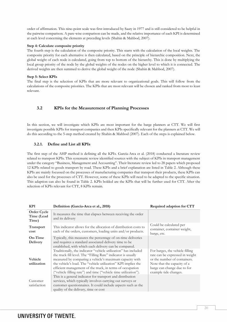
20
order of affirmation. This nine-point scale was first introduced by Saaty in 1977 and is still considered to be helpful in
the pairwise comparison. A pare-wise comparison can be made, and the relative importance of each KPI is determined
at each level concerning the elements at preceding levels (Shahin & Mahbod, 2007).
Step 4: Calculate composite priority
The fourth step is the calculation of the composite priority. This starts with the calculation of the local weights. The
composite priority for each alternative is then calculated, based on the principle of hierarchic composition. Next, the
global weight of each node is calculated, going from top to bottom of the hierarchy. This is done by multiplying the
local group priority of the node by the global weights of the nodes on the higher level to which it is connected. The
derived weights are then summed to derive the global weight of the node (Shahin & Mahbod, 2007).
Step 5: Select KPIs
The final step is the selection of KPIs that are more relevant to organizational goals. This will follow from the
calculations of the composite priorities. The KPIs that are most relevant will be chosen and ranked from most to least
relevant.
3.2 KPIs for the Measurement of Planning Processes
In this section, we will investigate which KPIs are most important for the barge planners at CTT. We will first
investigate possible KPIs for transport companies and then KPIs specifically relevant for the planners at CTT. We will
do this according to the 5-step method created by Shahin & Mahbod (2007). Each of the steps is explained below.
3.2.1. Define and List all KPIs
The first step of the AHP method is defining all the KPIs. García-Arca et al. (2018) conducted a literature review
related to transport KPIs. This systematic review identified sources with the subject of KPIs in transport management
under the category “Business, Management and Accounting”. Their literature review led to 28 papers which proposed
12 KPIs related to goods transport by road. These KPIs and a brief explanation are listed in Table 2. Although these
KPIs are mainly focussed on the processes of manufacturing companies that transport their products, these KPIs can
also be used for the processes of CTT. However, some of these KPIs will need to be adapted to the specific situation.
This adaption can also be found in Table 2. KPIs bolded are the KPIs that will be further used for CTT. After the
selection of KPIs relevant for CTT, 8 KPIs remain.
KPI Definition (García-Arca et al., 2018) Required adaption for CTT
Order Cycle Time (Lead Time)
It measures the time that elapses between receiving the order and its delivery
Transport cost
This indicator allows for the allocation of distribution costs to each of the orders, customers, loading units and/or products.
Could be calculated per container, container weight, barge, etc.
On-Time Delivery
Typically, this measures the percentage of on-time deliveries and requires a standard associated delivery time to be established, with which each delivery can be compared.
Vehicle utilization
Traditionally, the indicator “vehicle utilization” has included the truck fill level. The “Filling Rate” indicator is usually measured by comparing a vehicle’s maximum capacity with the vehicle’s load. The “vehicle utilization” KPI implies the efficient management of the truck, in terms of occupation (“vehicle filling rate”) and time (“vehicle time utilization”).
For barges, the vehicle filling rate can be expressed in weight or the number of containers. Note that the capacity of a barge can change due to for example tide changes.
Customer satisfaction
This is a general indicator for transport and distribution services, which typically involves carrying out surveys or customer questionnaires. It could include aspects such as the quality of the delivery, time or cost
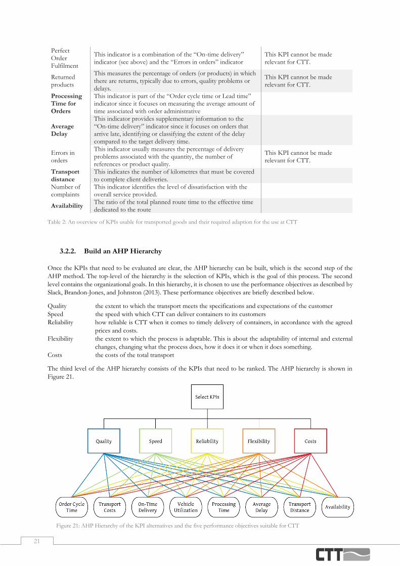
21
3.2.2. Build an AHP Hierarchy
Once the KPIs that need to be evaluated are clear, the AHP hierarchy can be built, which is the second step of the
AHP method. The top-level of the hierarchy is the selection of KPIs, which is the goal of this process. The second
level contains the organizational goals. In this hierarchy, it is chosen to use the performance objectives as described by
Slack, Brandon-Jones, and Johnston (2013). These performance objectives are briefly described below.
Quality the extent to which the transport meets the specifications and expectations of the customer
Speed the speed with which CTT can deliver containers to its customers
Reliability how reliable is CTT when it comes to timely delivery of containers, in accordance with the agreed
prices and costs.
Flexibility the extent to which the process is adaptable. This is about the adaptability of internal and external
changes, changing what the process does, how it does it or when it does something.
Costs the costs of the total transport
The third level of the AHP hierarchy consists of the KPIs that need to be ranked. The AHP hierarchy is shown in
Figure 21.
Perfect Order Fulfilment
This indicator is a combination of the “On-time delivery” indicator (see above) and the “Errors in orders” indicator
This KPI cannot be made relevant for CTT.
Returned products
This measures the percentage of orders (or products) in which there are returns, typically due to errors, quality problems or delays.
This KPI cannot be made relevant for CTT.
Processing Time for Orders
This indicator is part of the “Order cycle time or Lead time” indicator since it focuses on measuring the average amount of time associated with order administrative
Average Delay
This indicator provides supplementary information to the “On-time delivery” indicator since it focuses on orders that arrive late, identifying or classifying the extent of the delay compared to the target delivery time.
Errors in orders
This indicator usually measures the percentage of delivery problems associated with the quantity, the number of references or product quality.
This KPI cannot be made relevant for CTT.
Transport distance
This indicates the number of kilometres that must be covered to complete client deliveries.
Number of complaints
This indicator identifies the level of dissatisfaction with the overall service provided.
Availability The ratio of the total planned route time to the effective time dedicated to the route
Table 2: An overview of KPIs usable for transported goods and their required adaption for the use at CTT
Figure 21: AHP Hierarchy of the KPI alternatives and the five performance objectives suitable for CTT

22
3.2.3. Undertake a Pairwise Comparison Between Alternatives
The third step is a pairwise comparison between the KPIs. To do so, the barge planners of CTT are asked to fill out a
survey, in which they rank the performance objectives and the KPIs with respect to each performance objective. This
survey can be found in Appendix B. Only the barge planners of CTT are asked to fill out this survey, as they are the
ones for who the eventual tool will be developed. If this tool does not match their preferences for KPIs, for example
by letting the board of CTT fill in the survey, the change of the planners using and accepting the tool considerably
decreases. Typically, a choice should be made between each alternative with a weight for the importance. This should
be done for each organizational goal. The number of total comparisons that need to be made can be calculated by
Formula 1.
𝑖 ∗𝑛 ∗ (𝑛 − 1)
2+
𝑖 ∗ (𝑖 − 1)
2 (Formula 1)
In this formula, 𝑖 equals the number of alternatives in the second level, in this case, the organizational goals, and 𝑛
equals the number of alternatives in the third level, in this case, the KPIs. Filling in this formula with 𝑖 = 5 and 𝑛 = 8,
150 choices are needed to be made. As this is very time consuming and unrealistic to ask of each of the planners, the
survey does not ask for this. Instead, the planners are asked to rank the KPIs regarding each organizational goal. Before
it is possible to make the pairwise comparison, it is first needed to calculate the collective ranking of the planners. This
is done in Appendix C. With this collective ranking, it is possible to derive the pairwise comparison. This pairwise
comparison is done according to Saaty (1977). The matrices of the pairwise comparisons can be found in Appendix D
in Table 10.
After the pairwise comparison is done, it is needed to check the Consistency Ratio (CR) of the matrices (Saaty, 1977).
The CR is used to measure how consistent the judgments are relative to the large samples of random judgments. The
CR can be calculated by Formula 2, where the Consistency Index (CI) is divided by the consistency index of a random
matrix (RI).
𝐶𝑅 =𝐶𝐼
𝑅𝐼 (Formula 2)
The RI is dependent on the number of alternatives in a matrix. In this case, the matrices have respectively 5 and 8
alternatives. The RI of these matrices is respectively 0,90 and 1,41.
The first step to define the CI is to normalize the pairwise comparison matrices. Once this is done, the eigenvectors
of the alternatives can be calculated. To do so, all the values in one row of a matrix can be multiplied with each other
and the nth square root can be calculated, where n equals the number of elements in that row. This value equals the
eigenvector of that row. The normalized matrices and the eigenvectors can be found in Appendix D in Table 11.
When the eigenvectors are calculated, another vector can be computed. For each row of the matrix, this vector is
retrieved by multiplying each value by the corresponding eigenvalue of that alternative. This can be done for each row
of a matrix. When dividing each eigenvector by the new obtained vector, a value called 𝜆𝑚𝑎𝑥 can be calculated. 𝜆𝑚𝑎𝑥
is needed to calculate the CI, as can be seen in Formula 3.
𝐶𝐼 =𝜆𝑚𝑎𝑥 − 𝑛
𝑛 − 1 (Formula 3)
As 𝜆𝑚𝑎𝑥 is calculated for each of the alternatives, the average of 𝜆𝑚𝑎𝑥 will be used in defining the CI. The consistency
index needs to be calculated for each of the matrices. This is done in Appendix D in Table 12. As showed before, the
CR can be calculated by dividing the CI by the RI. The outcomes of this can also be found in Table 12.
Saaty (1977) suggests that if the CR exceeds 0.1, the judgments may be too inconsistent to be reliable. However,
sometimes CRs of more than 0.1 must be accepted. If the CR equals 0, the judgments are perfectly consistent. In this
case, the CRs all lie between 0.01 and 0.04, which makes the judgements all consistent. This implies that the data can
be used for the selection of KPIs.

23
3.2.4. Calculate Composite Priority
The fourth step is the calculation of the composite priority. This starts with the calculation of the local weights. This
is done in Appendix D in Table 13. The composite priority for each alternative is then calculated, based on the principle
of hierarchic composition. Next, the global weight of each node is calculated, going from top to bottom of the
hierarchy. This is done by multiplying the local group priority of the node by the global weights of the nodes on the
higher level to which it is connected. The derived weights are then summed to derive the global weight of the node.
These derived weights can be found in Appendix D in Table 14.
3.2.5. Select KPIs
The final step is to select the KPIs. Table 3 shows the KPIs with their global weight and their corresponding rank.
KPIs Global Weights Rank
On-time delivery 0,278 1
Order cycle time 0,197 2
Transport costs 0,155 3
Vehicle utilization 0,095 4
Average delay 0,091 5
Availability 0,078 6
Processing time for orders 0,075 7
Transport distance 0,031 8
Table 3: Ranked list of the global weights of the KPIs according to the planners of CTT
To not overwhelm the users with the tool, not all KPIs will be focussed on. Of these KPIs, the first five are selected
as the most important KPIs, as the planners see them as the most useful KPIs. Between the fifth and sixth KPI, there
is a relatively large difference. Therefore, the first five KPIs are included and the last three are excluded.
3.3 Conclusion
The Multi-Criteria Decision Analysis (MCDA) evaluates several variants on several quantitative and qualitative criteria (Vincke, 1992). MCDA is increasingly used for decision-making due to, among others, the complexity of problems. The MCDA makes it possible to include ecological, spatial or social aspects of a transport project (Macharis & Bernardini, 2015). There are three different kinds of approaches where the MCDA can be categorised upon; the full aggregation approach, the outranking approach and goal, aspiration or reverence level approach (Ishizaka & Nemery, 2013). For the selection of KPIs, the most relevant approach is the full aggregation approach, as this method allows it to compensate bad scoring criteria by good scoring criteria.
The MCDA methods can also be categorized by the sort of problem they are capable of solving (Ishizaka & Nemery, 2013). These types of problems are the choice problem, the sorting problem, the ranking problem, and the description problem. The selection of KPIs within a company can best be seen as a ranking problem, as the KPIs need to be ordered from most important to least important.
Ishizaka & Nemery (2013) categorized the MCDA techniques according to the sort of problem and the type of approach. The MCDA methods that are suitable for ranking problems and follow the full aggregation approach are the AHP/ANP, MAUT/UTA, and MACBETH. Of these methods, the best suitable method for selecting KPIs is the AHP method. The AHP method is seen as the most widely used technique for decision making and it has been shown that it is useful in prioritizing alternative variables. The AHP is used for problems that are complex and where it can be useful to break them down to solve one sub-problem at a time. This breaking down of problems is done in two phases; the problem structuring and the elicitation of priorities through pairwise comparisons (Ishizaka & Nemery, 2013).
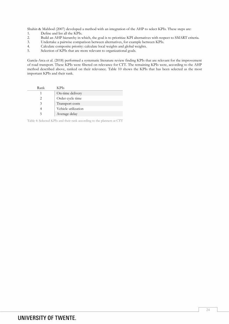
24
Shahin & Mahbod (2007) developed a method with an integration of the AHP to select KPIs. These steps are: 1. Define and list all the KPIs. 2. Build an AHP hierarchy in which, the goal is to prioritize KPI alternatives with respect to SMART criteria. 3. Undertake a pairwise comparison between alternatives, for example between KPIs. 4. Calculate composite priority: calculate local weights and global weights. 5. Selection of KPIs that are more relevant to organizational goals.
García-Arca et al. (2018) performed a systematic literature review finding KPIs that are relevant for the improvement of road transport. These KPIs were filtered on relevance for CTT. The remaining KPIs were, according to the AHP method described above, ranked on their relevance. Table 10 shows the KPIs that has been selected as the most important KPIs and their rank.
Rank KPIs
1 On-time delivery
2 Order cycle time
3 Transport costs
4 Vehicle utilization
5 Average delay
Table 4: Selected KPIs and their rank according to the planners at CTT

25
Design and Development
This chapter focuses on the question ‘How can the decision support tool be designed and developed?’. We start this
chapter with the literature on the development of a user-friendly tool in Section 4.1. Next, in Section 4.2, we focus on
the desired output and the requirements. Section 4.3 elaborates on the information and data required from CTT for
the development of the tool. We conclude this chapter in Section 4.6, where we will answer the research question
mentioned above.
4.1 Development User-Friendly Tool
In this section, we will look into the most frequently mentioned principles of user-friendly interfaces. The design
process of a dashboard can be divided into three different parts: the foundation, the structure and the information
design. These parts will provide a guideline for the development of the dashboard of the tool and are explained below.
4.1.1. The Foundation of Dashboards
Dashboards should provide the information that is useful to the specific organization. An important aspect is to
understand what the users of the dashboard would require in such a dashboard. To create a solid foundation, questions
that can be asked are, according to Juice (2009):
- How is the dashboard going to add value to my organization?
- Who is the audience of the dashboard and what are their needs?
- What is the central thought-line of my dashboard story?
- What are the key metrics that will focus users on actionable information?
Good dashboards focus on the most important information and communicate this information clearly and concisely.
The design of the dashboard should make common tasks simple to do, while clearly and simply communicating this
to the users. The dashboard should provide good shortcuts that are meaningfully related to longer procedures
(Constantine & Lockwood, 1999). The users cognitive abilities should not be overwhelmed by over-complicating the
interface and the visibility of the system should be maximized (Picking, Grout, McGinn, Crisp, & Grout, 2010).
Dialogues should not contain information which is rarely needed, as every extra unit of information competes with
the relevant units of information and diminishes their relative visibility (Nielsen, 2005).
4.1.2. The Structure of Dashboards
To construct the dashboard, four building blocks can be distinguished. These are the form, design principles, structure,
and functionality. Each of these building blocks are shortly explained.
Form
There are numerous forms of dashboards, a few examples are Excel sheets, online apps, Power BI and Tableau. Factors
that can influence the form of the dashboard are for example timeliness, interactivity, data detail and data density (Juice,
2009).

26
Design principles
Several fundamental objectives can guide the design of the dashboard. According to Juice (2009) these are:
- Dashboards should not become very large; therefore, they should stay compact.
- Information should be revealed as the user expresses interest, so the user should not be overloaded with
information at the beginning.
- Visual cues and functionality can be used to draw the user to the most important information. Tools for this
can be for example alerts and the use of colour.
- The user should be empowered to finish their task quickly and it should become clear which action should
be taken based on the results.
- Flexibility can be built in to make the dashboard relevant for different users. A common example is data
filters, to filter for example per customer.
Besides, the frequent users of the dashboard will desire a reduction in the number of interactions required. This can
be done by implementing abbreviations, function keys, hidden commands, and macro facilities (Shneiderman, 1998).
Structure
Rigid structures tell nothing about the relationships between different charts and do not tell which information is most
important. It is important to create a layout that helps frame the content of your dashboard (Juice, 2009). To structure
the dashboard flow, relationships, or grouping structures can be used (Juice, 2009). Flow-based structures show
sequences of events across time. Dashboards can also show the relationship between measures, which can be for
example geographical, organizational, or functional. It is also possible to group the graphs in a hierarchy or into
categories. The dashboard should be based on clear, consistent models that are apparent and recognizable to users,
putting related things together and separating unrelated things (Constantine & Lockwood, 1999).
Functionality
There are a few capabilities that can help the user understand the information and interact with it. The basics of these
are listed below (Juice, 2009):
- The ability to go from a summary view to a detailed view, that provides more context of the information.
- Allow users to define the scope of the data in the dashboard with filters, which can refine the scope for the
entire dashboard or refine the scope for a specific chart.
- Enable the ability to view multiple subsets of the data in a single chart, for example by putting multiple lines
in a graph.
- Alert users by highlighting information, based on pre-defined criteria.
- Give users the ability to pull information out of a dashboard and export it to other platforms.
4.1.3. The Information Design of Dashboards
An important aspect of the information design is the position of graphs. Important information should be placed
where people look first. Studies show that people tend to scan a page in a similar manner (Juice, 2009). Research
indicates that users first look for information at the top and on the left. Users also focus their attention down the left
side. The centre gets a bit of attention as well. However, the bottom and right may not be noticed by users at all. An
option to organize the different objects on a dashboard is by using a grid, a series of columns with certain widths where
the different objects are aligned in. This approach brings coherence and order to the page that puts users at ease (Juice,
2009). Also, the space between objects is important. White space in interface design is very important as it creates
places for the eye to rest on, so the non-white objects have more impact. When there is not enough white space, the
user is overwhelmed, hence it is more difficult to see what is important (Juice, 2009).
Colour can also be used to draw attention to the important things and to classify similar things. Sequential colours can
be used for ordering values from low to high. Divergent colours can be used to order values with a critical point in
between them. Categorial colours can be used to classify objects into distinct groups. Besides the use of colours, fonts
can also be used to effectively design the dashboard. According to Juice (2009) the rules of thumb for fonts are:
- Body text is clean and has readable content.
- The headers separate and name the major sections of the dashboard.
- Notes describe additional information that the reader should be aware of. Notes should fade into the
background unless the user calls attention to them.
- Emphasized text is where we want our reader to pay particular attention to within a sentence or text, which
can be done by for example bolding the text.

27
Choosing the type of chart is very important in dashboard designing, as charts should be used that maximize user
comprehension. Aspects easy to judge are for example the length of a line or a position in a 2D space, where the
position in a 3D space or the colour intensity is hard to judge (Juice, 2009). For accurate representation of data, lengths
and areas of objects should also be proportional (Juice, 2009).
According to Juice (2009), there are some fundamentals for the designing of charts and tables:
- The data-to-ink ratio should be as high as possible. Reduce chart junk by removing ornamental elements,
such as three-dimensional chart effects. Increase data-to-ink ratio by using every pixel to display relevant
information about the data.
- Contrast should be maximized between the data and background. White backgrounds and de-emphasized
gridlines are useful.
- Labels should be readable, and if possible, they should not be rotated as it distracts from the numbers.
Readable labels.
- The title of a chart may be sufficient to explain what the reader is looking at, so legends and titles are
redundant.
- Avoid smoothing of lines, as it gives the impression of data points that are not there.
- Use flat colours or a bare minimum gradient. Ensure that the endpoints of bars are visible, especially when
colours fade toward the endpoint.
- Add structure and clarity to the chart by sorting graphs by ascending or descending order if possible.
- When displaying multicolumn or stacked charts, use variants of a hue or grey to show different data series.
Besides, user interfaces should always be consistent. The system should speak the users their language, with words and
concepts familiar to the users, rather than system-oriented terms (Nielsen, 2005). Users should not have to wonder
whether different words, situations, or actions mean the same thing.
4.2 Desired Output and Requirements
In this section, we will discuss the objectives of the solution. First, we will discuss the features and functions that CTT wishes to see in the tool and then we will address some practical objectives. The desired output is given by the manager of the barge planning. These outputs are:
- The tool should implement the KPIs that are most important to the planners.
- The tool should attend the planners if there are containers that will not be picked up in time.
- The tool should use Microsoft Power BI, as this is already used by CTT.
The following requirements are formulated:
- The tool needs to run on the regular computers of CTT.
- It should be easy to work with the tool for the planners of CTT and they should understand the tool well. There are five KPIs that the planners of CTT like to monitor when scheduling containers, as described in Section 3.2.
These KPIs are on-time delivery, order cycle time, transport costs, vehicle utilization and average delay. The goal of
the tool is to provide insights into these KPIs, and how they can be improved. Below, we will describe how decision
support can be designed for the improvement of each of these KPIs.
The vehicle utilization, also barge utilization, is the occupancy rate of the barges, also the percentage of the barge that
is being used for the shipment. This utilization can be expressed in the amount of weight or the number of TEU. To
improve the barge utilization, decision support can be given by looking for containers that are not planned in on a
barge yet but are present at a terminal the barge is already going to. This way, the barges will be used more efficiently,
and the utilization rate will be increased.
This closely relates to the problems the planners remarked, that assigning containers to a barge is highly time-
consuming and it is favoured to have this simplified, and that decision support is preferred in this process. By
supporting the planners in the way described above, these problems will partly be tackled.
The average delay is the amount of time between the first pre-arranged time-frame a container would be delivered and the actual moment of delivery. However, as is said before, when it is already clear a container will not be delivered
28
within this time-frame, the customer is contacted to agree upon a new time-frame. This new time-frame is also put in the Modality database, where it overwrites the first time-frame. Therefore, it is impossible to calculate the actual delay at this time. CTT is working on an improved system where the data is not overwritten, but this is not yet available at the time of this research. Therefore, it is decided to exclude this KPI in the tool.
The on-time delivery indicates the percentage of containers that will be delivered within the pre-arranged time-frame.
Just as with the problem described for the average delay KPI, the on-time delivery will look at the current time-frame
and not the original time-frame. However, for this KPI, it is possible to look at the on-time delivery beforehand. A
few days in advance, it will already become clear whether a container will possibly be delivered to late. A way to give
decision support is to look for containers that will possibly be delivered to late and give suggestions for the shipment
of these containers. To do this, containers that are already scheduled on a barge, but have enough margin to be picked
up later, can be picked up later. This facilitates the pick-up of containers with a nearer delivery deadline instead. If
there are no possibilities to pick up the container sooner, it will be suggested to transport this container by truck.
With this decision support, it will become easier to create the planning, as the planners do not need to look for the
possibilities but instead the tool suggest, as of now, the best transport available. This will help the planners with the
problem that creating barge planning is time-consuming. This was frequently mentioned in the survey as a problem,
as described in Section 2.4.
The order cycle time indicates the time between the moment a container is available in Rotterdam and the moment
the container is delivered to the customer in Twente. To reduce the order cycle time, containers can be planned on the
first available barge. To do so, decision support can be given by looking for the first available barge that is not fully
loaded. By suggesting the pick-up of this container, its order cycle time will decrease. By decreasing the average order
cycle time, fewer containers will have an open status at any given moment. The planners indicated that they would like
to have some support in the assignment of containers to barges. This can be achieved by implementing the support
described above, such that containers of new incoming orders get suggestions on which barge they can best be
scheduled.
The transport costs are all the costs involved with the transport of a container. Although this KPI is very important,
this KPI is not easy improvable when looking at single containers. This KPI will be improved by improving the overall
process, so for example by increasing vehicle utilization. As this KPI will not influence single containers, there will be
no decision support provided for the costs per container.
Besides the KPIs mentioned above, another aspect will be included in the tool. As the planners have indicated in the
earlier conducted survey, checking if the container is ready takes up a lot of time. Before a container can be picked up,
five things need to be known or present, such as the import documents and the PIN of a container. Checking this,
and if necessary, contacting the customer is a time-consuming activity which does not add value. Therefore, the tool
should provide an overview of the containers that are scheduled soon but are not ready to be picked up.

29
4.3 Information Required from CTT
This section focusses on the question “Which information is needed from CTT to develop the tool?”. To find an
answer to this question, several Data Flow Diagrams (DFDs) will be made to describe how the information flows
through the eventual system. In this section, we will use the notation created by Gane and Sarson (1979). The symbols
are shown in Figure 22. These symbols, and the concepts they stand for, are at the logical level. DFDs shows how data
flows between different processes, which can be used as a guide when creating new systems and will help to identify
which information is required from CTT. DFDs can be displayed at different levels, where higher levels display the
data flows with more detail.
As described in Section 4.2, the tool will include 4 aspects. These are the improvement of the on-time delivery, order
cycle time, barge utilization, and the checking of documents. In Figure 23, the level 0 DFD is displayed. Each of the
aspects that the tool will include, is shown in a numbered container.
Figure 22: Data Flow Diagram Notation
Figure 23: DFD Level 0 of the future dashboard, showing the general dataflows between the different aspects of the dashboard and
datasets of CTT
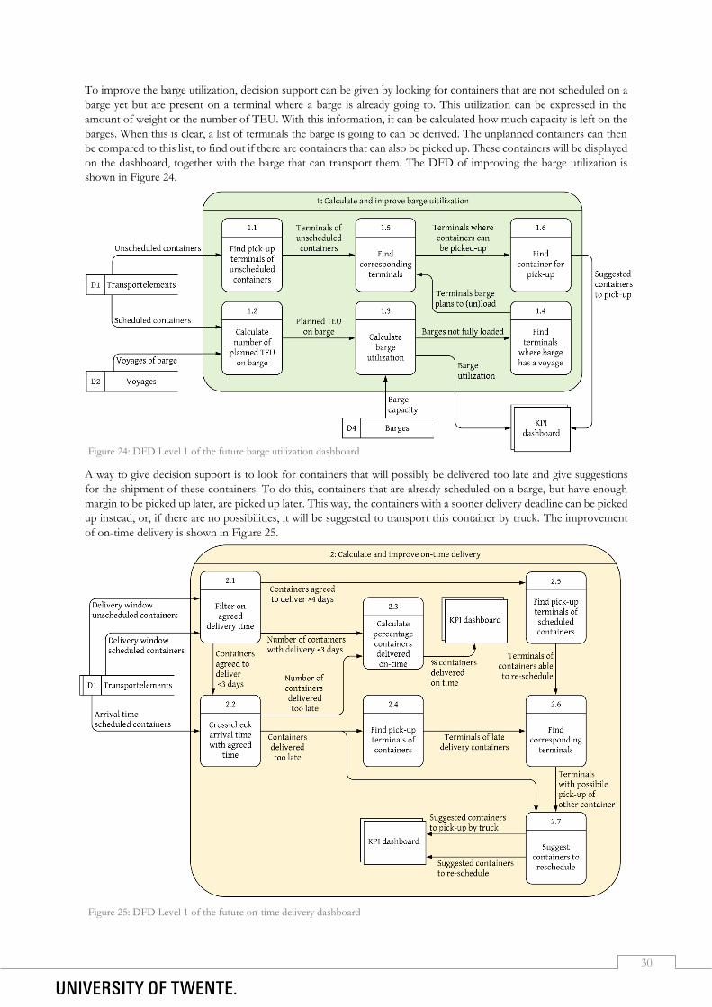
30
To improve the barge utilization, decision support can be given by looking for containers that are not scheduled on a
barge yet but are present on a terminal where a barge is already going to. This utilization can be expressed in the
amount of weight or the number of TEU. With this information, it can be calculated how much capacity is left on the
barges. When this is clear, a list of terminals the barge is going to can be derived. The unplanned containers can then
be compared to this list, to find out if there are containers that can also be picked up. These containers will be displayed
on the dashboard, together with the barge that can transport them. The DFD of improving the barge utilization is
shown in Figure 24.
A way to give decision support is to look for containers that will possibly be delivered too late and give suggestions
for the shipment of these containers. To do this, containers that are already scheduled on a barge, but have enough
margin to be picked up later, are picked up later. This way, the containers with a sooner delivery deadline can be picked
up instead, or, if there are no possibilities, it will be suggested to transport this container by truck. The improvement
of on-time delivery is shown in Figure 25.
Figure 24: DFD Level 1 of the future barge utilization dashboard
Figure 25: DFD Level 1 of the future on-time delivery dashboard
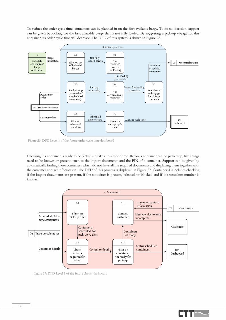
31
To reduce the order cycle time, containers can be planned in on the first available barge. To do so, decision support
can be given by looking for the first available barge that is not fully loaded. By suggesting a pick-up voyage for this
container, its order cycle time will decrease. The DFD of this system is shown in Figure 26.
Checking if a container is ready to be picked-up takes up a lot of time. Before a container can be picked up, five things
need to be known or present, such as the import documents and the PIN of a container. Support can be given by
automatically finding these containers which do not have all the required documents and displaying them together with
the customer contact information. The DFD of this process is displayed in Figure 27. Container 4.2 includes checking
if the import documents are present, if the container is present, released or blocked and if the container number is
known.
Figure 26: DFD Level 1 of the future order cycle time dashboard
Figure 27: DFD Level 1 of the future checks dashboard

32
4.4 Design and Development of the Tool
In this section, we will look into how the tool can be developed. Currently, CTT uses Microsoft Power BI (Microsoft,
2014) to visualize parts of their data. In this section, we refer to Microsoft Power BI when using Power BI. Power BI
makes it possible to access data from cloud-based sources and lets users develop insights in their data by creating
visuals of them. Power BI does not have a programming language, but instead, it uses Data Analysis Expressions
(SQLBI, 2020). Data Analysis Expressions (DAX) is the native formula and query language of, among others, Power
BI. In this section, the different containers with the processes mentioned in Section 4.3 will be written in DAX, and
the numbers refer to the numbers of the containers shown in Figures 23-27.
4.4.1. Power BI Data Model
CTT uses the program Modality to plan barges and the transport of containers. The data in Modality can be exported
to Power BI. Between the different tables, relationships can be made (Chen, 1975). The data model and the relations
between the entities are shown in Figure 28.
The relationships shown in Figure 28 are also described in Table 5 to indicate which entities are primary keys and
foreign keys in the relation.
Table 5: Overview of the relationships in the Power BI data model
Relationship Relationship type
Primary key Foreign key
ADDRESS - VOYTERM 1 → * ADDRESS(CODE) VOYTERM(ADDRESS)
VOYTERM - TRANSPORTELEMENT 1 → * VOYTERM(CODE) TRANSPORTELEMENT
(VOYTERM_FROM)
TRANSPORTELEMENT – UNITTYPE * → 1 UNITTYPE(CODE) TRANSPORTELEMENT
(UNITTYPE)
TRANSPORTELEMENT – ADDRESS_CLIENT * → 1 ADDRESS(CODE) TRANSPORTELEMENT
(ADDRESS_CLIENT) BARGE - VOYTERM 1 → * BARGE(BARGENAME) VOYTERM(BARGE)
Figure 28: Power BI data model with relations between the different data sets

33
4.4.2. Barge Utilization
In this section, we will look into how the barge utilization tool can be developed. The numbers from the numbered
list refer to the corresponding containers in Figure 24.
1.1 Find pick-up terminals of unscheduled containers
Containers which are not scheduled can be found by looking for containers without a VOYTERM_FROM. This
indicates that there is no voyage scheduled for the pick-up. This is the case for both import and export containers,
but the data, concerning the time these containers can and need to be picked up, are stored in different columns.
It is first necessary to classify the type of transport. This can be done by making a column in the transportelement
table, that indicates if the transport is import, export, or if it should be excluded. Excluded transportelements are
for example containers that need to be shipped from the port of Rotterdam to the port of Antwerp, which is
beyond the scope of this research. Transportelements which have a load or discharge address which is not in
Rotterdam, Almelo or Hengelo are excluded. This can be done by making a new table with terminals in these
cities. The Power Query for this is shown in Formula 4.
Once this table is made, the load and discharge cities can be added to the transportelement table. The formulas
for these columns are shown in Formula 6 and Formula 5. Sometimes the address is not known yet, and the
(Dutch) abbreviation NOGOPV is written down instead. If containers are reused, REUSE will be written at the
location. These codes will not occur in the terminal address table, but it is necessary to keep these codes, so these
location codes will be returned instead of an actual city.
Finally, with these columns, another column can be made which classifies the type of container into three
categories: Import, Export and Exclude. The formula for this column which can be added to the transportelement
table can be found in Formula 7.
= Table.SelectRows(ADDRESS1, each ([ADRTYPETERMBARGE] = "Y")
and ([COUNTRY1] = "NL")
and ([CITY] = "Almelo" or [CITY] = "Europoort Rotterdam"
or [CITY] = "Hengelo" or [CITY] = "Maasvlakte Rotterdam"
or [CITY] = "Rotterdam" or [CITY] = "ROTTERDAM"
or [CITY] = "rotterdam" or [CITY] = "Rotterdam - Botlek" ))
Formula 4
TRANSPORTELEMENT[_TransportType] = SWITCH( TRUE(), (TRANSPORTELEMENT[_Terminal city from] = "" || TRANSPORTELEMENT[_Terminal city to]=""), "Exclude", (TRANSPORTELEMENT[IE] = "I"), "Import", (TRANSPORTELEMENT[IE] = "E"), "Export", "ELSE")
Formula 7
TRANSPORTELEMENT[_Terminal city from] =
if(TRANSPORTELEMENT[ADDRESS_FROM] = "NOGOPV", "NOGOPV",
IF(TRANSPORTELEMENT[ADDRESS_FROM] = "REUSE", "REUSE",
lookupvalue(address_terminal[city], address_terminal[code], transportelement[address_from])))
Formula 6
TRANSPORTELEMENT[_Terminal city to] =
IF(TRANSPORTELEMENT[ADDRESS_TO] = "NOGOPV", "NOGOPV",
IF(TRANSPORTELEMENT[ADDRESS_TO] = "REUSE", "REUSE",
LOOKUPVALUE(ADDRESS_TERMINAL[CITY], ADDRESS_TERMINAL[CODE],
TRANSPORTELEMENT[ADDRESS_TO])))
Formula 5

34
With the transporttype known, the containers that still need to be scheduled can be found. As said before, these
can be found by filtering on the VOYTERM_FROM. When this is empty, it indicates that there is no voyage
scheduled for the pick-up. The PUDATETIME is the moment from which on an import container can be picked up
at the terminal. The DELDATETIME is the last moment an export container can be delivered at the terminal. If
these moments are not known yet, the container cannot be planned yet. With this information, two tables can be
made, for containers to be imported and containers to be exported. Formula 8 gives an overview of the filters that
should be applied to the import table and Formula 9 to the export table. These tables result in an overview of
containers which are not scheduled yet.
1.2 Calculate number of TEU planned on barge
To find the number of TEU scheduled on a barge, we can look into the TEUs that are scheduled for pick-up, and
the TEUs that are already picked up but are not delivered yet. We will first look into the calculations of scheduled
containers which are not picked up yet. The first step is to calculate how many TEU each transportelement is.
This can be done by adding Formula 10 as a column in the transportelement table.
Next, the number of TEU planned on a specific barge can be calculated. This can be done by adding Formula 11
to the VOYAGE table and Formula 12 as measures linked to the VOYAGE table.
TRANSPORTELEMENT[_TEUS TRANSPORT] =
LOOKUPVALUE(UNITTYPE[TEUS], UNITTYPE[CODE], TRANSPORTELEMENT[UNITTYPE])
Formula 10
VOYTERM[_TEU discharged] =
CALCULATE(
SUM(TRANSPORTELEMENT[_TEUS TRANSPORT]),
FILTER(TRANSPORTELEMENT, TRANSPORTELEMENT[VOYTERM_TO] = VOYTERM[CODE]))
VOYTERM[_TEU loaded] =
CALCULATE(
SUM(TRANSPORTELEMENT[_TEUS TRANSPORT]),
FILTER(TRANSPORTELEMENT, TRANSPORTELEMENT[VOYTERM_FROM] = VOYTERM[CODE]))
Formula 11
_Total TEU discharged = SUM(VOYTERM[_TEU discharged])
_Total TEU loaded = SUM(VOYTERM[_TEU loaded])
Formula 12
TRANSPORTELEMENT[SEQ] = ALL
TRANSPORTELEMENT[CNTR] = ALL
TRANSPORTELEMENT[ADDRESS_FROM] = ALL
TRANSPORTELEMENT[ADDRESS_TO] = ALL
TRANSPORTELEMENT[PUDATETIME] = NOTBLANK
TRANSPORTELEMENT[LATESTPUDATETIME] = ALL
TRANSPORTELEMENT[_TransportType] = Import TRANSPORTELEMENT[VOYTERM_FROM] = BLANK
Formula 8
TRANSPORTELEMENT[SEQ] = ALL
TRANSPORTELEMENT[CNTR] = ALL
TRANSPORTELEMENT[ADDRESS_FROM] = ALL
TRANSPORTELEMENT[ADDRESS_TO] = ALL
TRANSPORTELEMENT[DELDATETIME] = NOTBLANK
TRANSPORTELEMENT[LATESTPUDATETIME ]= ALL
TRANSPORTELEMENT[_TRANSPORTType] = EXPORT
TRANSPORTELEMENT[VOYTERM_FROM] = BLANK
Formula 9

35
When a transportelement, which has a pick-up location and a delivery address, is picked up, it disappears from
the list with active transportelements, even if it is not yet at the terminal it needs to be discharged. This causes the
problem that it is not straightforward to calculate the number of TEUs that are present on a barge. This problem
can partly be tackled by analysing the history of the transportelements and voyages. Therefore, tables of past
transportelements and voyages are added. These tables are named LW_TRANSPORTELEMENTS and LW_VOYAGES
and consists of the transportelements and voyages of the last week (LW). This table is retrieved by executing
several Power Queries on a database with historic transportelements and voyages. These Power Queries for
LW_TRANSPORTELEMENTS are described in Formula 14 and the Power Queries for LW_VOYAGES are described
in Formula 13.
In this new table, the transportelements which have been picked up, but have not arrived yet can be found. To
calculate the number of TEU, the TEUs of the containers need to be found in another table, the unit table. The
Power Query for this is shown in Formula 16. Once this table is imported, the number of TEU of a past
transportelement can be calculated. This is done by adding the TEUs to the transportelement table, by using
Formula 15.
Once the TEUs of a transportelement are known, the number of TEU that are currently on the barge can be
calculated. This can be done by creating a column in the barge table, with the formula in Formula 17.
BARGE[_TEU currently on barge]=
CALCULATE(
SUM(LW_Transportelements[_TEUS]),
FILTER(LW_Transportelements,LW_Transportelements[ACTUALDEPDATE]<>BLANK()),
FILTER(LW_Transportelements,LW_Transportelements[Barge] = BARGE[BARGENAME]))
Formula 17
= Oracle.Database("alias_ctt")
= Bron{[Schema = "CTT2_HISTORY", Item = "TRANSPORTELEMENT"]}[Data]
= Table.SelectRows(Navigation, each [MODALITYOPER] = "C")
= Table.SelectRows(#"Rijen gefilterd", each Date.IsInCurrentWeek([ACTUALDEPDATE]))
= Table.SelectRows(#"Rijen gefilterd 1", each [ACTUALARRDATE] = null)
Formula 14
= Oracle.Database("alias_ctt")
= Bron{[Schema = "CTT2_HISTORY", Item = "VOYTERM"]}[Data]
= Table.SelectRows(Navigation, each Date.IsInCurrentWeek([ACTUALARRDATE]))
= Table.Distinct(#"Rijen gefilterd", {"SEQ"})
= Table.Sort(#"Dubbele items verwijderd", {{"SEQ", Order.Ascending}})
Formula 13
= Oracle.Database("alias_ctt")
=Bron{[Schema = "CTT2", Item = "UNIT"]}[Data]
= Table.RemoveColumns(Navigation, Table.ColumnsOfType(Navigation, {type table, type record, type list,
type nullable binary, type binary, type function}))
Formula 16
LW_Transportelements[_TEUS ]=
LOOKUPVALUE(UNIT[_TEU unit],UNIT[CALCSEQ],LW_Transportelements[CALCSEQ.1])
Formula 15

36
1.3 Calculate barge utilization
As shown in Formula 17, the total number of TEU present on a barge can be calculated. With this data, the
current utilization of a barge can be calculated. This can be done by adding a column to the barge table as shown
in Formula 18.
It is possible to calculate the nett number of TEU discharged or loaded per voyage. This is done by adding
Formula 19 as columns to the voyage table.
As it is not sufficient to only calculate the utilization at this moment, but also after future voyages, it is
recommended to add this as well. However, at this moment it is not clear how this can be achieved. There should
be an extra column made which sums all the differences in TEU that occur on that specific barge before that
voyage will take place.
1.4 Find terminals where barge has a voyage
A table can be made with the filters in Formula 20 to create a table with the locations where a barge has a voyage.
1.5 Find corresponding terminals
With the table of terminals where the barge has a voyage and the table with unscheduled containers, the planners
can easily see which container can be picked up. If there is a corresponding terminal between the pick-up locations
and the terminals the barge is already loading or discharging, the container can also be picked up.
1.6 Find container for pick-up
If there are multiple containers with the possibility to be loaded and there is not enough capacity for all of them,
the planners can choose one of them. The tables mentioned in Formula 8 and Formula 9 can easily be sorted by
for example the LATESTPICKUPDATETIME, enabling the planners to choose a container based on the deadline it
should be picked up.
BARGE [KPI utlization] = BARGE[_TEU currently on barge]/BARGE[MAXTEU]
Formula 18
VOYTERM[BARGE]= ALL
VOYTERM[ADDRESS] = ALL
VOYTERM[REQUESTDATE] = ALL
Formula 20
VOYTERM[_Difference in TEU] =
- CALCULATE (SUM(TRANSPORTELEMENT[_TEUS TRANSPORT]),
FILTER(TRANSPORTELEMENT, TRANSPORTELEMENT[VOYTERM_TO] = VOYTERM[CODE]))
+ CALCULATE (SUM(TRANSPORTELEMENT[_TEUS TRANSPORT]),
FILTER(TRANSPORTELEMENT, TRANSPORTELEMENT[VOYTERM_FROM] = VOYTERM[CODE]))
Formula 19
_Teu after voyage =
CALCULATE(
SUM(VOYTERM[_Difference in TEU]),
FILTER(VOYTERM, VOYTERM[RequestMoment] <= EARLIER(VOYTERM[RequestMoment]) &&
VOYTERM[BARGE] = EARLIER(VOYTERM[BARGE])))
+ LOOKUPVALUE(BARGE[_Teu currently on barge],[BARGENAME],VOYTERM[BARGE])

37
4.4.3. On-time Delivery
Due to time restrictions, this dashboard has not been developed yet. However, the DFD shown in Figure 1Figure 25,
the idea explained in Section 4.2 and the guidelines in Section 4.3 provide guidance to develop this dashboard. The list
below shows the different processes that need to be implemented in the dashboard to realize the idea.
2.1 Filter on agreed delivery time
2.2 Cross-check arrival time with the agreed time
2.3 Calculate the percentage of containers delivered on-time
2.4 Find pick-up terminals of containers
2.5 Find pick-up terminals of scheduled containers
2.6 Find corresponding terminals
2.7 Suggest containers to reschedule
4.4.4. Order Cycle Time
Due to time restrictions, this dashboard has not been developed yet. However, the DFD shown in Figure 26 the idea
explained in Section 4.2 and the guidelines in Section 4.3 provide guidance to develop this dashboard. The list below
shows the different processes that need to be implemented in the dashboard to realize the idea.
3.1 Filter on not fully-loaded barges
3.2 Find terminals barge is (un)loading
3.3 Find pick-up terminals of unscheduled containers
3.4 Find corresponding terminals
3.5 Select barge and voyage for pick-up container
3.6 Filter on scheduled containers
3.7 Calculate average cycle time
4.4.5. Pick-up Checks
4.1 Filter on pick-up time.
As it is only necessary to look into containers that are scheduled in the near feature, only containers with a planned
pick-up in two days are relevant. A column is made in the VOYTERM table. This column contains zeroes and ones,
where the zeroes indicate that the pick-up moment is too far away, and ones indicate that the container is
scheduled in the next 2 days. The formula for this column is shown in Formula 21.
4.2 Check aspects required for pick-up.
This process uses zeroes and ones to indicate if a container is ready or not ready for pick-up on different aspects.
Note that the Value_Blocked has reversed zeroes and ones, as in this case if a container is blocked it is not ready,
in contradiction with for example the Value_Released, where a container is ready when it is released. The formula
for this is shown in Formula 22.
VOYTERM[_Time_Period_DocumentChecks] =
IF(TODAY()-VOYTERM[REQUESTDATE]>-2
&&TODAY()-VOYTERM[REQUESTDATE]<10, 1, 0)
Formula 21
TRANSPORTELEMENT[Value_Customs]= IF(TRANSPORTELEMENT[Customs cleared?] = "Y",1,0)
TRANSPORTELEMENT[Value_Released] = IF(TRANSPORTELEMENT[Released?] = "Y",1,0)
TRANSPORTELEMENT[Value_Blocked] = IF(TRANSPORTELEMENT[Blocked?] = "Y",0,1)
TRANSPORTELEMENT[Value_Present] = IF(TRANSPORTELEMENT[Present?] = "Y",1,0)
Formula 22

38
For the export of containers, four other aspects are required before the container can be delivered at the terminal.
The formulas of these columns are shown in Formula 23.
4.3 Filter on containers not ready for pick-up.
This process identifies transportelements where containers are not ready yet to be picked up. To find this, two
columns should be made that calculate the sum of the values described in Formula 22 and Formula 23. If the total
of these values equals 4, the container is ready for pick-up or delivery. The formula for the import is described in
Formula 24, and Formula 25 describes the formula for export. When containers need to be picked up at a depot,
the container number is not yet known. This, however, does not mean that the transport is not possible. For depot
trips, it is not important which container is loaded or discharged, so this number will only become clear when the
container is loaded on a barge. Therefore, if a container number is unknown, it is ready to be picked up.
4.4 Contact customer
Once it is clear which containers are not ready for pick-up, the customer who ordered the transport of the
container should be contacted. A column can be made with a standard text which can be easily copied and emailed
to the customer. The DAX code for this text is shown in Formula 26.
TRANSPORTELEMENT[Total_Value_Import] = IF(TRANSPORTELEMENT[CNTR] = "", "4",
TRANSPORTELEMENT[Value_Blocked] + TRANSPORTELEMENT[Value_Customs] +
TRANSPORTELEMENT[Value_Present] + TRANSPORTELEMENT[Value_Released]
Formula 24
TRANSPORTELEMENT[TEXT] =
"Container " & TRANSPORTELEMENT[CNTR] & " is not ready to be picked up yet. " &
IF(TRANSPORTELEMENT[Value_Customs] = 0 , "The container is still missing the custom documents.","")
& IF(TRANSPORTELEMENT[Value_Present] = 0 , TRANSPORTELEMENT[CNTR] & " is not present at the
terminal.","" ) &
IF(TRANSPORTELEMENT[Value_Blocked] = 0 , "The container is blocked.","") &
IF(TRANSPORTELEMENT[Value_Released]=0 , "This container is not yet released.",""))
Formula 26
TRANSPORTELEMENT[Value_Customs_Export] =
IF(TRANSPORTELEMENT [CUSTOMDOCAVAILABLEEXPORT] = "Y",1,0)
TRANSPORTELEMENT[Value_Cargoopening] = IF(TRANSPORTELEMENT[CARGOOPENINGEXPORT] =
"Y",0,1)
TRANSPORTELEMENT[Value_Blocked_Export] =
IF(TRANSPORTELEMENT[BLOCKEDEXPORT] = "Y",0,1)
TRANSPORTELEMENT[Value_Correctorder]= IF(TRANSPORTELEMENT[CORRECTORDEREXPORT] = "Y",1,0)
Formula 23
TRANSPORTELEMENT[Total_Value_Export] =
TRANSPORTELEMENT[Value_Blocked_Export] + TRANSPORTELEMENT[Value_Cargoopening] +
TRANSPORTELEMENT[Value_Customs_Export] + TRANSPORTELEMENT[Value_Correctorder]
Formula 25

39
4.5 Dashboard Design
In this section, we will explain the functionalities of the designed dashboards. These dashboards are the ones for the
barge utilization, and the import and export checks. We will first explain the different elements in the barge utilization
dashboard, and continue with an explanation on how to use the dashboard. After that, the same will be done for the
import and export dashboards.
4.5.1. Elements Utilization Dashboard
The barge utilization dashboard can be designed as shown in Figure 29. This dashboard shows an overview of the
containers that still need to be scheduled and the voyages that have room left for additional TEUs.
The first table on the dashboards gives an overview of the planned voyages. This table is displayed in Figure 30. This
table contains the moment, the terminal, and the barge that are scheduled for the voyage. Besides, the net result of the
number of TEU that will be discharged or loaded at that terminal and the number of TEU will be present on the barge
after that voyage.
Figure 29: Overview of the barge utilization dashboard in Power BI
Figure 30: Table consisting of future voyages displayed on the utilization dashboard

40
The second table on the dashboard contains the import transportelements that still need to be scheduled. This table is
also shown in Figure 31. This table contains the sequence number of the transportelement, which differentiates the
transportelement, the container number, the pick-up and deliver terminal, and the time window the container should
be picked up.
The two blue cards on the left, summarize the number of TEU that will be picked up on future voyages. When selecting
a barge or a specific day, these cards show the number of TEU of that specific barge or day. Figure 32a shows the
cards when there is no selection made, whereas Figure 32b shows the cards of a selected barge on a single day. A
selection can be made by applying filters or by clicking on one of the future voyages, which are shown in Figure 30.
Figure 31: Table consisting of the transportelements which are unscheduled yet
Figure 32: Cards on the utilization dashboard showing the number of TEUs that will be loaded and discharged when no selection is made (a) and when the filters are used for a selection (b)
a b

41
The red boxes contain the filters that enable the user to filter the page
by barge, by request date, or by location. These filters are shown in
Figure 33. Figure 33a shows the filters without a selection made. The
first filter enables the user to select a barge and a date. This filter pane
shows only the barges and the dates where one or more voyages are
scheduled. When selecting a barge and date, the second filter pane
also changes, displaying only the terminal locations where a voyage is
scheduled with the specific barge on a specific day, which can be seen
in Figure 33b. When no barge or date is selected, the second filter
pane shows all the terminals where future voyages are scheduled, as
can be seen in Figure 33a. The last filter pane enables the user to filter
the transportelement table, shown in Figure 31, on the pick-up or
deliver terminal. As this dashboard only focusses on import
containers, the deliver terminals are only CTT Hengelo and CTT
Almelo.
The KPI of the barge utilization is shown in Figure 34. This KPI
shows the percentage of the barge that is used, calculated by number
of TEUs. When no specific barge is selected, this KPI shows the
average of all the barges which have a scheduled voyage. When the
filters are used to select a barge, and possibly also a day, this KPI
calculates the utilization with respect to the selected filters. The next
grey card shows the number of TEU that are currently present on a
barge, as can be seen in Figure 35. Figure 36, the last grey card,
displays the total capacity of the barge in TEU.
Figure 37 shows the graph at the bottom of the page partly. This graph shows in orange the capacity in TEU of the
selected barge, where the blue line shows the TEUs present on the barge regarding each voyage. This graph enables
the user to also look further into the future. As it is possible the barge has a later voyage which will reach the maximum
capacity, not only the TEUs after the specific voyage need to be taken into account.
Figure 33: Filters of the barge utilization dashboard without a selection made (a) and with a barge, day and address selected (b)
a b
Figure 34: Card displaying the KPI of the
barge utilization Figure 35: Card showing the number of
TEU currently on the selected barge Figure 36: Card showing the maximum number of TEU on the selected barge
Figure 37: Part of the graph showing the number of TEU on a selected barge after each voyage and the capacity of that barge
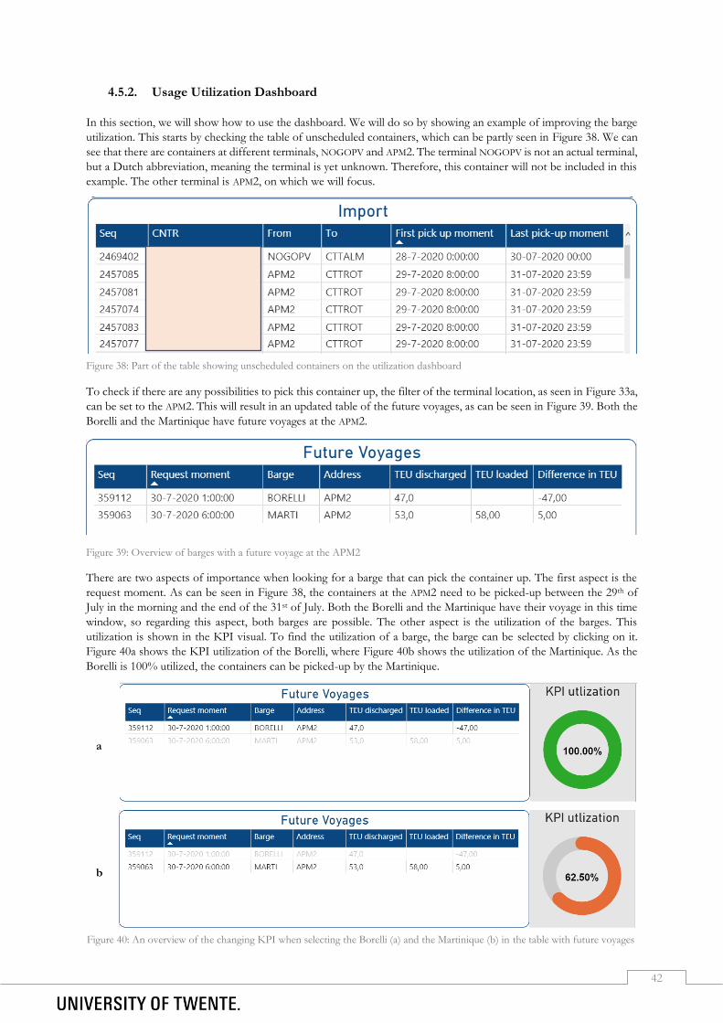
42
4.5.2. Usage Utilization Dashboard
In this section, we will show how to use the dashboard. We will do so by showing an example of improving the barge
utilization. This starts by checking the table of unscheduled containers, which can be partly seen in Figure 38. We can
see that there are containers at different terminals, NOGOPV and APM2. The terminal NOGOPV is not an actual terminal,
but a Dutch abbreviation, meaning the terminal is yet unknown. Therefore, this container will not be included in this
example. The other terminal is APM2, on which we will focus.
To check if there are any possibilities to pick this container up, the filter of the terminal location, as seen in Figure 33a,
can be set to the APM2. This will result in an updated table of the future voyages, as can be seen in Figure 39. Both the
Borelli and the Martinique have future voyages at the APM2.
Figure 39: Overview of barges with a future voyage at the APM2
There are two aspects of importance when looking for a barge that can pick the container up. The first aspect is the
request moment. As can be seen in Figure 38, the containers at the APM2 need to be picked-up between the 29th of
July in the morning and the end of the 31st of July. Both the Borelli and the Martinique have their voyage in this time
window, so regarding this aspect, both barges are possible. The other aspect is the utilization of the barges. This
utilization is shown in the KPI visual. To find the utilization of a barge, the barge can be selected by clicking on it.
Figure 40a shows the KPI utilization of the Borelli, where Figure 40b shows the utilization of the Martinique. As the
Borelli is 100% utilized, the containers can be picked-up by the Martinique.
Figure 38: Part of the table showing unscheduled containers on the utilization dashboard
a
b
Figure 40: An overview of the changing KPI when selecting the Borelli (a) and the Martinique (b) in the table with future voyages

43
When also looking at the utilization over time, shown in Figure 41, we see that the maximum capacity of the barge is
never reached, also not after the future voyages. This concludes that it is possible to pick up the containers from the
APM2 that are not scheduled yet.
Figure 41: Graph showing the utilization of the Martinique over time
4.5.3. Elements Import and Export Checks Dashboard
In this section, we will show and explain the elements present on the import and export dashboards. The import checks
dashboard, shown in Figure 42, and the export checks dashboard, shown in Figure 43, are built and designed in the
same way. Therefore, we will only highlight the different aspects of the import dashboard in this section.
Figure 43: An overview of the export checks dashboard
Figure 42: An overview of the import checks dashboard
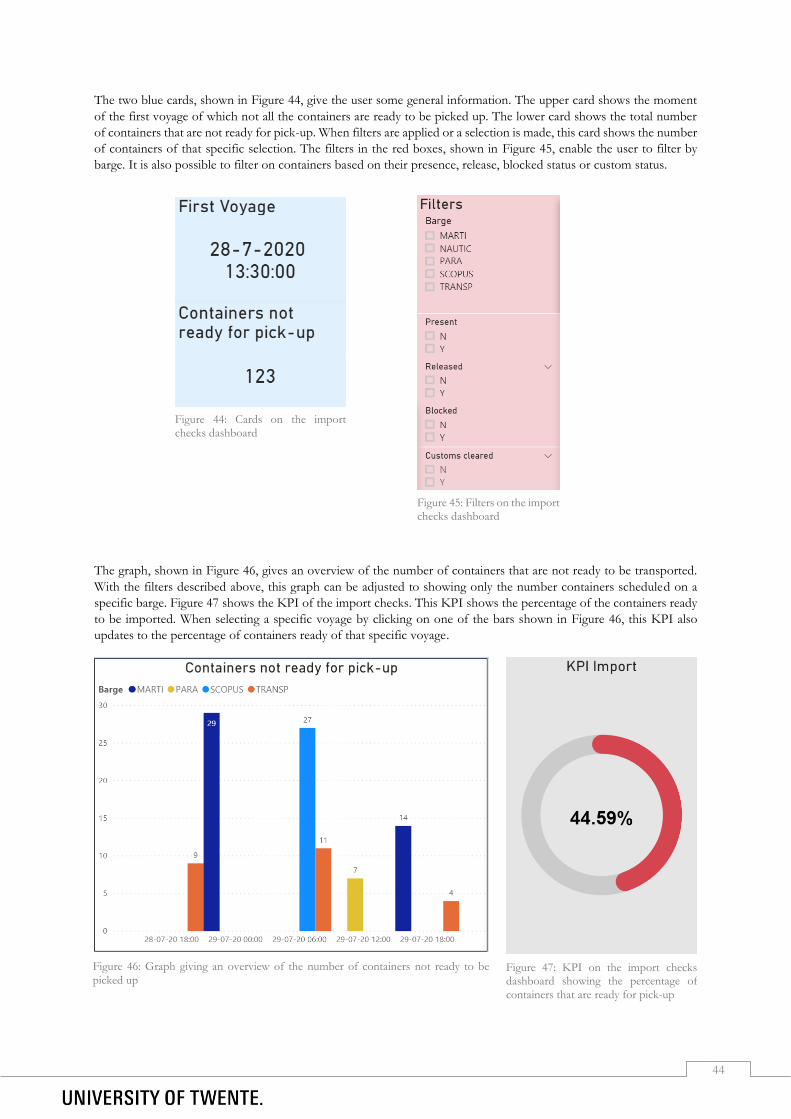
44
The two blue cards, shown in Figure 44, give the user some general information. The upper card shows the moment
of the first voyage of which not all the containers are ready to be picked up. The lower card shows the total number
of containers that are not ready for pick-up. When filters are applied or a selection is made, this card shows the number
of containers of that specific selection. The filters in the red boxes, shown in Figure 45, enable the user to filter by
barge. It is also possible to filter on containers based on their presence, release, blocked status or custom status.
The graph, shown in Figure 46, gives an overview of the number of containers that are not ready to be transported.
With the filters described above, this graph can be adjusted to showing only the number containers scheduled on a
specific barge. Figure 47 shows the KPI of the import checks. This KPI shows the percentage of the containers ready
to be imported. When selecting a specific voyage by clicking on one of the bars shown in Figure 46, this KPI also
updates to the percentage of containers ready of that specific voyage.
Figure 44: Cards on the import checks dashboard
Figure 45: Filters on the import checks dashboard
Figure 46: Graph giving an overview of the number of containers not ready to be
picked up Figure 47: KPI on the import checks dashboard showing the percentage of
containers that are ready for pick-up

45
The last element on the import dashboard is a table giving specific information of the containers, shown in Figure 48.
This table includes the unique number of the transportelement, the container number and the status of the different
checks. Moreover, it shows the information of the scheduled voyage, such as the barge, the locations and the moment.
It also contains information of the client who needs to be contacted to make the container ready. When applying filters
on the page or when selecting one of the bars shown Figure 46, this table will show the transportelements within that
selection.
Figure 48: Overview of containers not ready for pick-up on the import dashboard
4.5.4. Usage Checks Dashboard
In this section, we will explain how to use the dashboard by showing an example. This starts by checking the card of
Figure 44 and the graph in Figure 46. At this moment, the first voyage with containers that are not ready is the voyage
of the Transporter, this voyage can be selected by clicking on that bar, as shown in Figure 49.
With this bar selected, the table at the bottom of the dashboard will show the containers of that voyage that are not
ready. This table is shown below in Figure 50. In this case, all the containers are from the same client, so only one
client needs to be contacted. However, often these containers are from a number of different clients.
Figure 50: Table with information of containers that are scheduled on a selected voyage
Figure 49: The graph giving an overview of the numbers of containers not ready for pick-up with one of the voyages selected

46
4.6 Conclusion
In this section, we will conclude this fourth chapter. We will conclude the theory and then show how the different
sub-questions in this chapter can be combined into several dashboards.
When creating dashboards, several design principles should be kept in mind, such as the foundation of the dashboard,
the structure of the dashboard and the information design of the dashboard. The dashboard should implement the
KPIs most important to the planners, should attend the planners if containers will not be picked up in time and it
should be built in Microsoft Power BI, according to the manager of the barge planning. Besides, it needs to run on the
regular computers of CTT and it should be easy to work with.
The KPIs where the tool can be built for are the barge utilization, the on-time delivery, the order cycle time and the
checks of scheduled containers. For the barge utilization, decision support can be given by identifying not fully loaded
barges and giving suggestions for containers that can be picked up with those barges. For the improvement of the on-
time delivery, decision support can be given by identifying containers that have the risk of being delivered too late and
identifying containers that are scheduled but have enough time yet to be picked up by a later barge. The order cycle
time KPI can be improved by identifying the first possible available voyage for the transport of a container. The checks
can be done by providing an overview of the containers which are scheduled in the next few days but are not ready to
be picked up yet.

47
Evaluation
In this fifth chapter, we will look into the performance of the solution by conducting a survey, the recommendations
that can be given to CTT for further research and the limitations of the solution.
In this sub-section, we will focus on the question “How can we evaluate the performance of the solution?”. We can
find an answer to this question by letting the barge planners of CTT, the barge planner manager and the Business
Developer Managers fill out a questionnaire about the dashboards shown in Section 4.6. The questionnaire can be
found in Appendix E. This questionnaire is designed based on the design principles of user-friendly dashboards, which
are explained in Section 4.1. The design principles can be divided in three different categories; the foundation, structure
and information design of the dashboard. As the platform of the dashboard, Power BI, was one of the requirements
described in Section 4.2, there are no further questions asked about the foundation of the dashboard. We will discuss
the questions per subject and the average scores of the respondents below. In the questionnaire, a score of 1 equals a
strong disagreement with the statement, where a 5 equals a strong agreement with the statement. For a more detailed
result, the average scores of the respondents have been translated to a scale from 1 to 10.
In total, five employees of CTT filled out the questionnaire. A dashboard manual was given to the respondents, to
explain the functionalities and the use of the dashboard. This manual can be found in Appendix F.
The first design principle is the structure of the dashboard. Table 6 shows the questions regarding this subject and the
average score of the respondents of the questionnaire. The structure of the dashboard scores on or over 8 in all the
cases. One of the least scoring aspects is the indication in which degree the KPIs are met. This is caused as it is unclear
to the respondents what the KPIs represent. To improve this aspect, the planners can be better informed of the
meaning of the KPIs. After verbally having explained this, the planners could make more sense of the KPI number.
Before filling out the questionnaire, it was not the case that the KPIs where not clearly shown and in which degree
they were met, but it just was not clear what they represented. The colours used on the pages and the structure of the
pages were very similar on the different sheets, making it easy for the planners to identify similar aspects on the different
sheets.
1 2 3 4 5 6 7 8 9 10
1. The dashboard is compact and does not give irrelevant information.
Ο Ο Ο Ο Ο Ο Ο ● Ο Ο
2. Colours are clearly used to point out the difference between categories.
Ο Ο Ο Ο Ο Ο Ο Ο ● Ο
3. There are good filters on the dashboard. Ο Ο Ο Ο Ο Ο Ο ● Ο Ο
4. The dashboard clearly indicates in what degree the KPIs are met.
Ο Ο Ο Ο Ο Ο Ο ● Ο Ο
5. The different pages use the same structure. Ο Ο Ο Ο Ο Ο Ο ● Ο Ο
Table 6: Results of the survey conducted amongst the barge planners of CTT regarding the structure of the dashboard

48
Another design principle is the information design of the dashboard. As described before in Section 4.1, this concerns
for example the use of colour to draw attention to the important things and to classify similar things, the choice for a
specific type of chart to maximize the users comprehension and the readability of the charts. The questions shown in
Table 7 are based on the information design of the dashboard. This table also shows the average response of the
planners. The information design of the dashboard scores on or over 8 in all the cases. The clarity of the titles of the
visuals score an average of eight, which is one of the least scoring aspect of the information design. Some of the
respondents rated this little lower than the other questions, as not all the graphs have a title. Although it was clear what
the graph displayed, it would be contradictory to rate this higher, as not all graphs have a title. Also the stamen “The
titles of the visuals briefly make clear what is shown in the visual.” scored an eight on average, which was explained in
the same way as the earlier question about the titles of the graphs, as some of the graphs or visuals do not have titles.
Besides the design principles, also the functionality of the dashboard is extremely important. Questions regarding the
functionality of the dashboard are also asked to the planners. These questions and their average response can be found
in Table 8. The functionality of the dashboard scores on or over 7 in all the cases. One of the least scoring aspects was
the clarity of the manual provided. As this manual is rather long, this manual could be shortened to provide a more
brief overview of the use of the tool. The statements 16 and 17 in Table 8 also score a seven out of 10. When using
the dashboard, the containers that still can be picked up and the capacity of the barges is not displayed at the start.
When no filters are applied, the visuals and graphs do not give a clear overview of the capacity. However, when
applying filters, such as a specific barge, this graph gives a lot more relevant and clear information. One of the additional
comments was that the use of abbreviations, for example of the barges and terminals, was very pleasant. These
abbreviations made the information more familiar to the planners, as they would also use these abbreviations in
Modality.
1 2 3 4 5 6 7 8 9 10
7. The text on the dashboard is easily readable. Ο Ο Ο Ο Ο Ο Ο Ο ● Ο
8. The titles of the visuals briefly make clear what is shown in the visual.
Ο Ο Ο Ο Ο Ο Ο ● Ο Ο
9. The data-to-ink ratio is good. Ο Ο Ο Ο Ο Ο Ο ● Ο Ο
10. The contrast between the background and the data is high. Ο Ο Ο Ο Ο Ο Ο Ο Ο ●
11. The labels of the visuals are clearly readable. Ο Ο Ο Ο Ο Ο Ο Ο ● Ο
12. The titles of the graphs are clear. Ο Ο Ο Ο Ο Ο Ο ● Ο Ο
Table 7: Results of the survey conducted amongst the barge planners of CTT regarding the information design of the dashboard
1 2 3 4 5 6 7 8 9 10
14. I know what the information on the dashboard relates to. Ο Ο Ο Ο Ο Ο Ο ● Ο Ο
15. The dashboard provides a clear overview of the KPIs. Ο Ο Ο Ο Ο Ο Ο ● Ο Ο
16. The barge utilization dashboard gives a clear overview of the used capacity.
Ο Ο Ο Ο Ο Ο ● Ο Ο Ο
17. The barge utilization dashboard gives the possibility to identify containers that still can be picked up.
Ο Ο Ο Ο Ο Ο ● Ο Ο Ο
18. The checks dashboards give a clear overview of the containers that are not ready to be picked up yet but are scheduled.
Ο Ο Ο Ο Ο Ο Ο ● Ο Ο
19. The tool will be useful for me when using it in the future. Ο Ο Ο Ο Ο Ο Ο ● Ο Ο
20. The manual provided clearly explains how the dashboards can be used.
Ο Ο Ο Ο Ο Ο ● Ο Ο Ο
Table 8: Results of the survey conducted amongst the barge planners of CTT regarding the functionality of the dashboard

49
Overall, the dashboards scores on or over 8 in the majority of the cases. The average of all the questions is a 8.00 out
of 10, as calculated in Formula 27, with a standard deviation of 0.65 as calculated in Formula 28.
𝜇 = ∑ 𝑥𝑖
𝑁=
8 + 9 + 8 + 8 + 8 + 9 + 8 + 8 + 10 + 9 + 8 + 8 + 8 + 7 + 7 + 8 + 8 + 7
18=
144
18= 8.00 (Formula 27)
𝜎 = √1
𝑁 ∑(𝑥𝑖 − 𝜇)2
𝑁
𝑖=1
= √1
18 ∑(𝑥𝑖 − 8.00)2
18
𝑖=1
=
11
√ 0.25 + 0.25 + 0.25 + 1.00 + 2.25 + 0.25 + 0.25 + +1.00 + 1.00 + 1.00
18= √
7.50
18 = 0.65
(Formula 28)
50
Conclusion
In this chapter, we will conclude this research by giving brief answers in Sections 6.1, 6.2, 6.3 and 6.4 to the first four
research questions that were stated in Section 1.6. We also provide recommendations regarding the solution and its
implementation in Section 6.5 and we end this chapter by discussing the limitations of this research and suggestions
for further research in Section 6.6.
6.1 How is the planning of the container shipment done at this moment?
The main service CTT provides is the transportation of containers between Rotterdam and Twente, with the round
trip as the most executed trip. In 2019 CTT handled 5.5% more containers compared to 2018, and CTT is expecting
to continue to grow the next years.
The planning process starts when a customer sends in a request for the transport of a container. An order is made for
this request and is put in Modality, the implemented software CTT uses. The barge planners then look for a possibility
to schedule the transport by barge. If this is not possible it will be transported by truck. Once the barge planning is
feasible, time windows will be requested at the terminals in Rotterdam, the administration is done, and it is
communicated to the specific departments. Once the transport of the container between Hengelo and Rotterdam is
scheduled, the truck planners can plan the transport between Hengelo and the customer.
According to the barge planners, the most time-consuming activities are the (re)assigning of containers to barges and
barges to terminals. Besides, checking barges, their availability and documents are a large contribution to the daily
work. The activities that are desired to become less time-consuming mostly include checking if the planning can still
be carried out. The activities considered as possibly automatable processes include the option of finding an earlier
timeslot for containers that were re-planned for a later time, as it is sometimes possible to arrange an earlier pick-up.
Another aspect mentioned is automatically planning a new incoming order to the first barge available. The activities
where decision support is preferred include the assignment of containers to a barge. Finally, it is favoured to get an
overview of the containers that will possibly be picked up too late.
6.2 Which KPIs can be used to measure the barge planning process at CTT?
When making decisions in transport projects, often a complex decision-making process occurs. The selection of KPIs can be seen as such a complex process. Multi-Criteria Decision Analysis (MCDA) enables the possibility to evaluate different variables on several quantitative and qualitative criteria. There are several Multi-Criteria Decision Analysis such as the AHP, MAUT and MACBETH. Out of the MCDA methods, the AHP method is the most suitable method for the selection of KPIs. The AHP method is seen as the most widely used technique for decision making and it has been shown that it is useful in prioritizing alternative variables, such as KPIs (Lee, 2010; Suryadi, 2007).
García-Arca et al. (2018) performed a systematic literature review about finding KPIs that are relevant for the improvement of road transport. These KPIs were filtered on relevance for CTT, which resulted in 8 possible KPIs relevant for the barge planning process at CTT. These possible KPIs are: order cycle time, transport costs, on-time delivery, barge utilization, processing time, average delay, transport distance and availability.

51
These eight possible KPIs were ranked on their relevance by the barge planners of CTT. This was done according to a 5-step AHP method for the selection of KPIs developed by Shahin & Mahbod (2007).
The execution of this method resulted in the most important KPIs for CTT, which are: 1. On-time delivery 2. Order cycle time 3. Transport costs 4. Barge utilization 5. Average delay
The transport costs consists of all the costs involved with the transport of a container. Although this KPI is very
important for CTT, when looking at this KPI alone, is not easily improvable when looking at the planning of
independent containers. The improvement of this KPI will be an automatic result of the improvement of the other
KPIs. Therefore, this KPI will not be further included.
The first KPI, on-time delivery, measures the percentage of on-time deliveries and it requires a standard associated
delivery time to be established, with which each delivery can be compared. When customers place an order at CTT, a
delivery window is sometimes agreed. Delivering the container within this time window will mean as an on-time
delivery.
The order cycle time KPI typically measures the time that elapses between receiving the order and its delivery.
However, when concerning CTT this is not the way to measure this. Customers can place their order already when
their container is still overseas on a sea vessel on its way to Rotterdam. Therefore, the moment a customer places an
order is irrelevant. Instead, the moment the container is available for pick-up at the port of Rotterdam is chosen as the
start moment of the cycle time. The end time of the cycle time is when the container is delivered at the customer.
Traditionally, the indicator vehicle utilization has included the truck fill level, which is usually measured by comparing
a vehicle its maximum capacity with the vehicle its load. The vehicle utilization KPI implies the efficient management
of the truck. For CTT, this KPI is transformed into a barge utilization, where the number of TEU scheduled on a
barge with respect to the maximum possible TEU on a barge represents the utilization of a barge.
The average delay is the amount of time between the first pre-arranged time-frame a container would be delivered and the actual moment of delivery. However, when it is clear a container will not be delivered within its pre-arranged time-frame, the customer is contacted to agree upon a new time-frame. This new time-frame is put in the database, where it overwrites the first time-frame. Therefore, it is impossible to calculate the delay once a new time-frame is set. CTT is working on an improved system where the data is not overwritten, but this is not yet available at the time of this research. Therefore, it is decided to exclude this KPI in the tool.
6.3 How can the decision support tool be designed and developed?
When creating dashboards, several design principles should be kept in mind, such as the foundation of the dashboard,
the structure of the dashboard and the information design of the dashboard. The dashboard should implement the
KPIs most important to the planners, should attend the planners if containers will not be picked up in time and it
should be built in Microsoft Power BI, according to the manager of the barge planning. Besides, it needs to run on the
regular computers of CTT and it should be easy to work with.
As described before, the KPIs relevant for building a decision support tool are the barge utilization, the on-time
delivery, the order cycle time and the checks of scheduled containers. Each of these KPIs, the way decision support
can be given and how this relates to the survey conducted, described in Section 2.4, are explained below.
The barge utilization is the occupancy rate of the barges, which is the percentage of the barge that is being used for
the shipment of containers. This utilization can be expressed in the amount of weight or the number of TEU. To
improve the barge utilization, decision support can be given by looking for containers that are not planned in on a
barge yet but are present at a terminal the barge is already going to. This way, additional containers can be picked up
and the barges will be used more efficiently, which will lead to an increase of the utilization rate. This closely relates to
the problems the planners remarked, that assigning containers to a barge is highly time-consuming and it is favoured
to have this simplified.
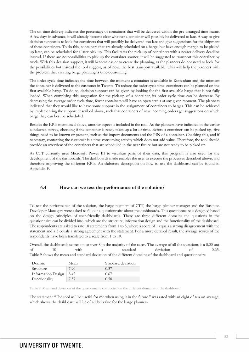
52
The on-time delivery indicates the percentage of containers that will be delivered within the pre-arranged time-frame.
A few days in advance, it will already become clear whether a container will possibly be delivered to late. A way to give
decision support is to look for containers that will possibly be delivered too late and give suggestions for the shipment
of these containers. To do this, containers that are already scheduled on a barge, but have enough margin to be picked
up later, can be scheduled for a later pick up. This facilitates the pick-up of containers with a nearer delivery deadline
instead. If there are no possibilities to pick up the container sooner, it will be suggested to transport this container by
truck. With this decision support, it will become easier to create the planning, as the planners do not need to look for
the possibilities but instead the tool suggest, as of now, the best transport available. This will help the planners with
the problem that creating barge planning is time-consuming.
The order cycle time indicates the time between the moment a container is available in Rotterdam and the moment
the container is delivered to the customer in Twente. To reduce the order cycle time, containers can be planned on the
first available barge. To do so, decision support can be given by looking for the first available barge that is not fully
loaded. When complying this suggestion for the pick-up of a container, its order cycle time can be decrease. By
decreasing the average order cycle time, fewer containers will have an open status at any given moment. The planners
indicated that they would like to have some support in the assignment of containers to barges. This can be achieved
by implementing the support described above, such that containers of new incoming orders get suggestions on which
barge they can best be scheduled.
Besides the KPIs mentioned above, another aspect is included in the tool. As the planners have indicated in the earlier
conducted survey, checking if the container is ready takes up a lot of time. Before a container can be picked up, five
things need to be known or present, such as the import documents and the PIN of a container. Checking this, and if
necessary, contacting the customer is a time-consuming activity which does not add value. Therefore, the tool should
provide an overview of the containers that are scheduled in the near future but are not ready to be picked up.
As CTT currently uses Microsoft Power BI to visualize parts of their data, this program is also used for the
development of the dashboards. The dashboards made enables the user to execute the processes described above, and
therefore improving the different KPIs. An elaborate description on how to use the dashboard can be found in
Appendix F.
6.4 How can we test the performance of the solution?
To test the performance of the solution, the barge planners of CTT, the barge planner manager and the Business
Developer Managers were asked to fill out a questionnaire about the dashboards. This questionnaire is designed based
on the design principles of user-friendly dashboards. There are three different domains the questions in the
questionnaire can be divided into, which are the structure, information design and the functionality of the dashboard.
The respondents are asked to rate 18 statements from 1 to 5, where a score of 1 equals a strong disagreement with the
statement and a 5 equals a strong agreement with the statement. For a more detailed result, the average scores of the
respondents have been translated to a scale from 1 to 10.
Overall, the dashboards scores on or over 8 in the majority of the cases. The average of all the questions is a 8.00 out
of 10 with a standard deviation of 0.65.
Table 9 shows the mean and standard deviation of the different domains of the dashboard and questionnaire.
Domain Mean Standard deviation
Structure 7.90 0.37
Information Design 8.42 0.67
Functionality 7.57 0.50
Table 9: Mean and deviation of the questionnaire conducted on the different domains of the dashboard
The statement “The tool will be useful for me when using it in the future.” was rated with an eight of ten on average,
which shows the dashboard will be of added value for the barge planners.

53
6.5 What recommendations can be given to CTT regarding the solution and its
implementation?
In this research, we have only developed two of the dashboards due to time restrictions. Therefore, it is recommended
to CTT to develop the other two dashboards as well. The guidelines and data flow diagrams for these dashboards can
be found in Section 4.2 and Section 4.3. As the ideas for the dashboards have been carefully designed to meet the
requirements of the planners, these dashboards can provide great value to the planners in the planning process.
Before using the designed dashboards, it is advised to carefully read the manual provided. When the questionnaire was
first filled out by the planners without having a manual, it became clear that the correct usage of the dashboard was
not initially clear. The manual however, explains the different aspects of the dashboards and how the visuals and tables
are interconnected. Therefore, the manual can provide great value in understanding the functionalities of the
dashboards.
When implementing this solution, it is advised to investigate the improvement of the KPIs. This can be done by
monitoring the KPIs for the timespan of a week without using the dashboard, and another week with the use of the
dashboard. When comparing the average KPIs of the different weeks, exact numbers regarding the added value of the
dashboard can be determined.
6.6 What limitations are there in this research and what recommendations can
be given for future research?
In this research, we have only focussed on the barge planning at CTT. However, the truck planning is also important.
As this research only focusses on the barge planning, the coherence between the two planning departments is not
included. Optimizing only the barge planning will lead to better results in this department, however, the overall results
are most important to CTT. Instead of optimizing each individual part of a company, the company as a whole can be
optimized. In some cases, this will lead to decisions in the barge planning that will not be optimal when only looking
at the barge planning. The optimization of the overall performance is not considered in this research but it can be
valuable for CTT to consider the overall performance when doing further research on the optimization of KPIs.
For this research, there are some selections made regarding the data imported in Power BI. CTT has huge databases,
but not all the data was regarded relevant. In this research, the six barges that are currently used frequently are included
in the dashboard. However, when other barges will be used in the future, these should also be included in the tool. To
prevent the imported datasets from becoming to large, several filters have been applied, such as date filters. An example
of this is that only containers transported in the last two weeks were included in the imported dataset, which equals
around only one percent of the entire dataset. Although it did not occur during the entire period of this research, it
could happen that relevant data is accidentally left out when importing or updating the datasets. As CTT is currently
working on better and faster performance of the servers, bigger datasets could be imported to the dashboard once the
server performance is better.
Another limitation is that the data used, is not always the most up-to-date data. When working in Power BI, the data
refreshes only once a day automatically, with the possibility to manually refresh more often. However, there is a
maximum of eight refreshes a day, which equals about one refresh per hour. Besides, when refreshing the data in
Power BI, the software program Modality will temporary slowdown, which is a disadvantage for the planners that are
using Modality at that moment.

54
References Abd el Fattah, A., Alghamdi, T., & Amer, E. (2014). Dashboard Technology Based Solution to Decision
Making. 4, 59-70. Chen, P. P.-S. (1975). The entity-relationship model toward a unified view of data. ACM SIGIR Forum,
10(3), 9. doi:10.1145/1095277.1095279 Constantine, L. L., & Lockwood, L. A. D. (1999). Software for use : a practical guide to the models and methods of
usage-centered design. Reading, Mass.: Addison Wesley. Feiten & Cijfers. (2019, 25 juli 2019). Gane, C., & Sarson, T. (1979). Structured systems analysis : tools and techniques. Englewood Cliffs, N.J.: Prentice-
Hall. García-Arca, J., Prado-Prado, J. C., & Fernández-González, A. J. (2018). Integrating KPIs for improving
efficiency in road transport. International Journal of Physical Distribution and Logistics Management, 48(9), 931-951. doi:10.1108/IJPDLM-05-2017-0199
Guidelines for Measuring and Managing CO2 Emission from Freight Transport Operations. (2011). Heerkens, H. (2015). validity. Vimeo.com: ITC-E Learning. Heerkens, H., & van Winden, A. (2012). Geen probleem, een aanpak voor alle bedrijfskundige vragen en mysteries.
Buren: Business School Nederland. Ishaq Bhatti, M., Awan, H. M., & Razaq, Z. (2013). The key performance indicators (KPIs) and their impact
on overall organizational performance. Quality & Quantity, 48(6), 3127-3143. Ishizaka, A., & Nemery, P. (2013). Multi-Criteria Decision Analysis: Methods and Software. Janic, M. (2003). Multicriteria evaluation of high-speed rail, Transrapid Maglev and air passenger transport
in Europe. Transportation Planning and Technology, 26(6), 491-512. Juice. (2009). A Guide to Creating Dashboards People Love to Use 49. Retrieved from
https://static1.squarespace.com/static/52f42657e4b0b3416ff6b831/t/5310292ce4b08d35a87c9426/1393568044420/Guide_to_Dashboard_Design.pdf
Lee, M.-C. (2010). The Analytic Hierarchy and the Network Process in Multicriteria Decision Making: Performance Evaluation and Selecting Key Performance Indicators Based on ANP Model. In.
Macharis, C., & Bernardini, A. (2015). Reviewing the use of Multi-Criteria Decision Analysis for the evaluation of transport projects: Time for a multi-actor approach. Transport Policy, 37, 177-186.
Microsoft. (2014). Microsoft Power BI. Retrieved from https://powerbi.microsoft.com/en-us/desktop/ Modality. (2020). Retrieved from https://www.modality.nl/en/home Nielsen, J. (2005). 10 Usability Heuristics for User Interface Design. Retrieved from
https://www.nngroup.com/articles/ten-usability-heuristics/ Picking, R., Grout, V., McGinn, J., Crisp, J., & Grout, H. (2010). Simplicity, Consistency, Universality,
Flexibility and Familiarity: The SCUFF Principles for Developing User Interfaces for Ambient Computer Systems. International Journal of Ambient Computing and Intelligence, 2(3), 40-49. doi:10.4018/jaci.2010070103
Saaty, T. L. (1977). A scaling method for priorities in hierarchical structures. Journal of Mathematical Psychology, 15(3), 234-281. doi:https://doi.org/10.1016/0022-2496(77)90033-5
Shahin, A., & Mahbod, A. (2007). Prioritization of key performance indicators: An integration of analytical hierarchy process and goal setting. International Journal of Productivity and Performance Management, 56, 226-240.
Shneiderman, B. (1998). Designing the user interface : strategies for effective human-computer-interaction (3rd ed. ed.). Reading, Mass: Addison Wesley Longman.
Slack, N., Brandon-Jones, A., & Johnston, B. (2013). Operations Management (7th ed.). Harlow, England: Pearson Education Limited.
SQLBI. (2020). Retrieved from https://dax.guide/ Suryadi, K. (2007). Key Performance Indicators Measurement Model Based on Analytic Hierarchy Process
and Trend-Comparative Dimension in Higher Education Institution. Tripathi, K. (2011). Decision Support System Is a Tool for Making Better Decisions in the Organization.
Indian Journal of Computer Science and Engineering, 2. Utilities. (2018). Ook transportsector moet CO2-emissie terugdringen. Retrieved from
https://utilities.nl/ook-transportsector-en-gebouwde-omgeving-moet-co2-emissie-terugdringen/

55
Weske, M. (2012). Business process management : concepts, languages, architectures [1 online resource (xv, 403 pages) : illustrations](2nd ed. ed.). doi:10.1007/978-3-642-28616-2
Wieringa. (2014). Design Science Methodology for Information Systems and Software Engineering: Springer-Verlag Berlin Heidelberg.

56
Appendix A List of Abbreviations
AHP Analytical Hierarchy Process
ANP Analytical Network Process
CI Consistency Index
CR Consistency Ratio
CTT Combi Terminal Twente
DAX Data Analysis Expressions
DFD Data Flow Diagram
DSRM Design Science Research Methodology
DSS Decision Support Systems
KPI Key Performance Indicator
MACBETH Measuring Attractiveness by a Categorical Based Evaluation Technique
MAUT Multi-Attribute Utility Theory
MCDA Multi-Criteria Decision Analysis
MPSM Managerial Problem-Solving Method
RI Consistency Index Random Matrix
SMART Specific, Measurable, Attainable, Realistic, Time-sensitive
TEU Twenty-foot Equivalent Unit

57
Appendix B Survey Barge Planning This survey has been conducted through Microsoft Forms in Dutch. Below the survey questions in English can be
found.
By clicking the button below, I acknowledge that participation to this research is voluntary, that I am above 18 years
old and I understand that I can end my participation to this research at any moment for any reason.
o Yes, start the survey
o No
In this part of the survey, several questions will be asked about the performance objectives. The purpose of this is to
determine which objectives are considered the most important. Five performance objectives will be distinguished in
this section. Below is explained what is meant by each performance objective.
Quality the extent to which the transport meets the specifications and expectations of the customer
Speed the speed with which CTT can deliver containers to its customers
Reliability how reliable is CTT when it comes to timely delivery of containers, in accordance with the agreed
prices and costs.
Flexibility the extent to which the process is adaptable. This is about the adaptability of internal and external
changes, changing what the process does, how it does it or when it does something.
Costs the costs of the total transport
1. Rank the performance objectives from 1 to 5, where 1 is the most important objective and 5 is the least important
objective.
_ Quality
_ Speed
_ Reliability
_ Flexibility
_ Costs
2. How important is each of the performance objectives for you? Grade each of them from 1 to 10. With 1 being not
important and 10 very important.
_ Quality
_ Speed
_ Reliability
_ Flexibility
_ Costs
The dashboard will contain various KPIs (Key Performance Indicators). These indicators provide insight into the
situation about various CTT performances. To find out which indicators are found most useful, a few questions will
be asked in the next part of the survey. The questions relate to the following KPIs:
Order cycle time the time between receiving an order and completing the transport
Transport costs the costs per TEU or weight
On-time delivery the percentage of containers delivered within the agreed time
Vehicle utilization the percentage of used capacity (weight or volume) of barges
Order processing time the time it takes to plan an order
Average delay the average time the transport is completed late
Transport distance the number of kilometres that a transport is, per means of transport
Availability the ratio between the total planned route time and the effective time assigned to the route
3. To evaluate the contribution of the KPIs to the performance objectives, we ask you to rank the KPIs from 1 to 8
based on their contribution to the quality objective, where 1 is the most important and 8 the least important.
_ Order cycle time
_ Transport costs
_ On-time delivery
_ Vehicle utilization
_ Order processing time

58
_ Average delay
_ Transport distance
_ Availability
4. To evaluate the contribution of the KPIs to the performance objectives, we ask you to rank the KPIs from 1 to 8
based on their contribution to the speed objective, where 1 is the most important and 8 the least important.
_ Order cycle time
_ Transport costs
_ On-time delivery
_ Vehicle utilization
_ Order processing time
_ Average delay
_ Transport distance
_ Availability
5. To evaluate the contribution of the KPIs to the performance objectives, we ask you to rank the KPIs from 1 to 8
based on their contribution to the reliability objective, where 1 is the most important and 8 the least important.
_ Order cycle time
_ Transport costs
_ On-time delivery
_ Vehicle utilization
_ Order processing time
_ Average delay
_ Transport distance
_ Availability
6. To evaluate the contribution of the KPIs to the performance objectives, we ask you to rank the KPIs from 1 to 8
based on their contribution to the flexibility objective, where 1 is the most important and 8 the least important.
_ Order cycle time
_ Transport costs
_ On-time delivery
_ Vehicle utilization
_ Order processing time
_ Average delay
_ Transport distance
_ Availability
7. To evaluate the contribution of the KPIs to the performance objectives, we ask you to rank the KPIs from 1 to 8
based on their contribution to the cost objective, where 1 is the most important and 8 the least important.
_ Order cycle time
_ Transport costs
_ On-time delivery
_ Vehicle utilization
_ Order processing time
_ Average delay
_ Transport distance
_ Availability
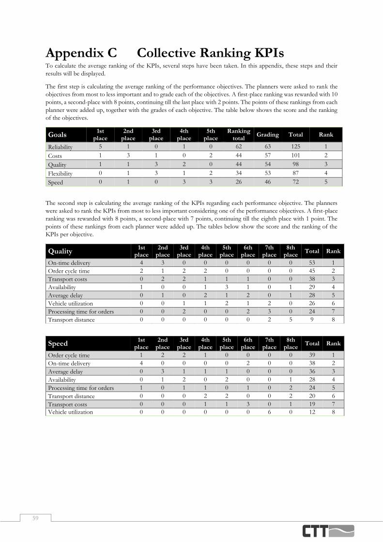
59
Appendix C Collective Ranking KPIs To calculate the average ranking of the KPIs, several steps have been taken. In this appendix, these steps and their
results will be displayed.
The first step is calculating the average ranking of the performance objectives. The planners were asked to rank the
objectives from most to less important and to grade each of the objectives. A first-place ranking was rewarded with 10
points, a second-place with 8 points, continuing till the last place with 2 points. The points of these rankings from each
planner were added up, together with the grades of each objective. The table below shows the score and the ranking
of the objectives.
Goals 1st
place 2nd
place 3rd
place 4th
place 5th
place Ranking
total Grading Total Rank
Reliability 5 1 0 1 0 62 63 125 1
Costs 1 3 1 0 2 44 57 101 2
Quality 1 1 3 2 0 44 54 98 3
Flexibility 0 1 3 1 2 34 53 87 4
Speed 0 1 0 3 3 26 46 72 5
The second step is calculating the average ranking of the KPIs regarding each performance objective. The planners
were asked to rank the KPIs from most to less important considering one of the performance objectives. A first-place
ranking was rewarded with 8 points, a second-place with 7 points, continuing till the eighth place with 1 point. The
points of these rankings from each planner were added up. The tables below show the score and the ranking of the
KPIs per objective.
Quality 1st place
2nd place
3rd place
4th place
5th place
6th place
7th place
8th place
Total Rank
On-time delivery 4 3 0 0 0 0 0 0 53 1
Order cycle time 2 1 2 2 0 0 0 0 45 2
Transport costs 0 2 2 1 1 1 0 0 38 3
Availability 1 0 0 1 3 1 0 1 29 4
Average delay 0 1 0 2 1 2 0 1 28 5
Vehicle utilization 0 0 1 1 2 1 2 0 26 6
Processing time for orders 0 0 2 0 0 2 3 0 24 7
Transport distance 0 0 0 0 0 0 2 5 9 8
Speed 1st place
2nd place
3rd place
4th place
5th place
6th place
7th place
8th place
Total Rank
Order cycle time 1 2 2 1 0 0 0 0 39 1
On-time delivery 4 0 0 0 0 2 0 0 38 2
Average delay 0 3 1 1 1 0 0 0 36 3
Availability 0 1 2 0 2 0 0 1 28 4
Processing time for orders 1 0 1 1 0 1 0 2 24 5
Transport distance 0 0 0 2 2 0 0 2 20 6
Transport costs 0 0 0 1 1 3 0 1 19 7
Vehicle utilization 0 0 0 0 0 0 6 0 12 8

60
Reliability 1st
place 2nd
place 3rd
place 4th
place 5th
place 6th
place 7th
place 8th
place Total Rank
On-time delivery 5 1 0 1 0 0 0 0 52 1
Order cycle time 1 3 1 1 1 0 0 0 44 2
Transport costs 1 0 3 0 1 1 1 0 35 3
Average delay 0 0 2 1 2 1 1 0 30 4
Processing time for orders 0 2 0 1 1 1 2 0 30 5
Availability 0 0 1 3 0 2 0 1 28 6
Vehicle utilization 0 1 0 0 2 1 2 1 23 7
Transport distance 0 0 0 0 0 1 1 5 10 8
Flexibility 1st
place 2nd
place 3rd
place 4th
place 5th
place 6th
place 7th
place 8th
place Total Rank
On-time delivery 2 4 0 0 0 1 0 0 47 1
Order cycle time 2 1 1 1 0 2 0 0 40 2
Availability 2 1 1 2 0 0 0 1 40 3
Transport costs 0 1 2 0 4 0 0 0 35 4
Vehicle utilization 0 0 3 0 1 1 2 0 29 5
Average delay 0 0 0 3 1 0 3 0 25 6
Transport distance 1 0 0 0 1 1 0 4 19 7
Processing time for orders 0 0 0 1 0 2 2 2 17 8
Costs 1st
place 2nd
place 3rd
place 4th
place 5th
place 6th
place 7th
place 8th
place Total Rank
Transport costs 4 1 2 0 0 0 0 0 51 1
Vehicle utilization 2 3 1 0 1 0 0 0 47 2
Order cycle time 1 1 0 3 1 1 0 0 37 3
On-time delivery 0 2 1 0 1 1 1 1 30 4
Average delay 0 0 2 1 2 1 1 0 30 5
Processing time for orders 0 0 1 0 1 3 1 1 22 6
Availability 0 0 0 2 1 0 2 2 20 7
Transport distance 0 0 0 1 0 1 2 3 15 8

61
Appendix D Pairwise Comparisons Organizational Goals Quality Speed Reliability Flexibility Costs
Quality 1,00 4,00 0,25 2,00 1,00
Speed 0,25 1,00 0,13 0,33 0,20
Reliability 4,00 8,00 1,00 6,00 4,00
Flexibility 0,50 3,00 0,17 1,00 0,33
Costs 1,00 5,00 0,25 3,00 1,00
Total 6,75 21,00 1,79 12,33 6,53
Quality On-time delivery
Order cycle time
Transport costs
Availability Average
delay Processing time
for orders Vehicle
utilization Transport distance
On-time delivery 1,00 2,00 3,00 5,00 5,00 5,00 5,00 8,00
Order cycle time 0,50 1,00 2,00 3,00 3,00 4,00 4,00 7,00
Transport costs 0,33 0,50 1,00 2,00 2,00 3,00 3,00 5,00
Availability 0,20 0,33 0,50 1,00 1,00 1,00 1,00 4,00
Average delay 0,20 0,33 0,50 1,00 1,00 1,00 1,00 4,00
Processing time for orders 0,20 0,25 0,33 1,00 1,00 1,00 1,00 3,00
Vehicle utilization 0,20 0,25 0,33 1,00 1,00 1,00 1,00 3,00
Transport distance 0,13 0,14 0,20 0,25 0,25 0,33 0,33 1,00
Total 2,76 4,81 7,87 14,25 14,25 16,33 16,33 35,00
Speed On-time delivery
Order cycle time
Transport costs
Availability Average
delay Processing time
for orders Vehicle
utilization Transport distance
On-time delivery 1,00 1,00 4,00 2,00 1,00 3,00 5,00 4,00
Order cycle time 1,00 1,00 4,00 2,00 1,00 3,00 5,00 4,00
Transport costs 0,25 0,25 1,00 0,50 0,33 1,00 2,00 1,00
Availability 0,50 0,50 2,00 1,00 0,50 1,00 3,00 2,00
Average delay 1,00 1,00 3,00 2,00 1,00 3,00 5,00 3,00
Processing time for orders 0,33 0,33 1,00 1,00 0,33 1,00 3,00 1,00
Vehicle utilization 0,20 0,20 0,50 0,33 0,20 0,33 1,00 0,50
Transport distance 0,25 0,25 1,00 0,50 0,33 1,00 2,00 1,00
Total 4,53 4,53 16,50 9,33 4,70 13,33 26,00 16,50
Reliability On-time delivery
Order cycle time
Transport costs
Availability Average
delay Processing time
for orders Vehicle
utilization Transport distance
On-time delivery 1,00 2,00 3,00 5,00 4,00 4,00 5,00 8,00
Order cycle time 0,50 1,00 2,00 3,00 3,00 3,00 4,00 6,00
Transport costs 0,33 0,50 1,00 2,00 1,00 1,00 3,00 5,00
Availability 0,20 0,33 0,50 1,00 1,00 1,00 1,00 4,00
Average delay 0,25 0,33 1,00 1,00 1,00 1,00 2,00 4,00
Processing time for orders 0,25 0,33 1,00 1,00 1,00 1,00 2,00 4,00
Vehicle utilization 0,20 0,25 0,33 1,00 0,50 0,50 1,00 3,00
Transport distance 0,13 0,17 0,20 0,25 0,25 0,25 0,33 1,00
Total 2,86 4,92 9,03 14,25 11,75 11,75 18,33 35,00
Flexibility On-time delivery
Order cycle time
Transport costs
Availability Average
delay Processing time
for orders Vehicle
utilization Transport distance
On-time delivery 1,00 2,00 3,00 2,00 4,00 6,00 4,00 5,00
Order cycle time 0,50 1,00 1,00 1,00 3,00 4,00 2,00 4,00
Transport costs 0,33 1,00 1,00 1,00 2,00 4,00 2,00 3,00
Availability 0,50 1,00 1,00 1,00 3,00 4,00 2,00 4,00
Average delay 0,25 0,33 0,50 0,33 1,00 2,00 1,00 2,00
Processing time for orders 0,17 0,25 0,25 0,25 0,50 1,00 1,00 1,00
Vehicle utilization 0,25 0,50 0,50 0,50 1,00 3,00 1,00 2,00
Transport distance 0,20 0,25 0,33 0,25 0,50 1,00 0,50 1,00
Total 3,20 6,33 7,58 6,33 15,00 25,00 13,50 22,00
Costs On-time delivery
Order cycle time
Transport costs
Availability Average
delay Processing time
for orders Vehicle
utilization Transport distance
On-time delivery 1,00 0,50 0,25 2,00 1,00 2,00 0,33 3,00
Order cycle time 2,00 1,00 0,33 3,00 2,00 3,00 0,50 4,00
Transport costs 4,00 3,00 1,00 6,00 4,00 5,00 1,00 7,00
Availability 0,50 0,33 0,17 1,00 0,50 1,00 0,20 1,00
Average delay 1,00 0,50 0,25 2,00 1,00 2,00 0,33 3,00
Processing time for orders 0,50 0,33 0,20 1,00 0,50 1,00 0,20 2,00
Vehicle utilization 3,00 2,00 1,00 5,00 3,00 5,00 1,00 6,00
Transport distance 0,33 0,25 0,14 1,00 0,33 0,50 0,17 1,00
Total 12,33 7,92 3,34 21,00 12,33 19,50 3,73 27,00
Table 10: Pairwise comparisons alternatives

62
Organizational Goals Quality Speed Reliability Flexibility Costs Eigenvector
Quality 0,15 0,19 0,14 0,16 0,15 0,16
Speed 0,04 0,05 0,07 0,03 0,03 0,04
Reliability 0,59 0,38 0,56 0,49 0,61 0,53
Flexibility 0,07 0,14 0,09 0,08 0,05 0,09
Costs 0,15 0,24 0,14 0,24 0,15 0,18
Total 1,00 1,00 1,00 1,00 1,00 1,00
Quality On-time delivery
Order cycle time
Transport costs
Availability Average
delay Processing
time for orders Vehicle
utilization Transport distance
Eigenvector
On-time delivery 0,36 0,42 0,38 0,35 0,35 0,31 0,31 0,23 0,338
Order cycle time 0,18 0,21 0,25 0,21 0,21 0,24 0,24 0,20 0,219
Transport costs 0,12 0,10 0,13 0,14 0,14 0,18 0,18 0,14 0,143
Availability 0,07 0,07 0,06 0,07 0,07 0,06 0,06 0,11 0,073
Average delay 0,07 0,07 0,06 0,07 0,07 0,06 0,06 0,11 0,073
Processing time for orders 0,07 0,05 0,04 0,07 0,07 0,06 0,06 0,09 0,064
Vehicle utilization 0,07 0,05 0,04 0,07 0,07 0,06 0,06 0,09 0,064
Transport distance 0,05 0,03 0,03 0,02 0,02 0,02 0,02 0,03 0,026
Total 1,00 1,00 1,00 1,00 1,00 1,00 1,00 1,00 1,00
Speed On-time delivery
Order cycle time
Transport costs
Availability Average
delay Processing
time for orders Vehicle
utilization Transport distance
Eigenvector
On-time delivery 0,22 0,22 0,24 0,21 0,21 0,23 0,19 0,24 0,22
Order cycle time 0,22 0,22 0,24 0,21 0,21 0,23 0,19 0,24 0,22
Transport costs 0,06 0,06 0,06 0,05 0,07 0,08 0,08 0,06 0,06
Availability 0,11 0,11 0,12 0,11 0,11 0,08 0,12 0,12 0,11
Average delay 0,22 0,22 0,18 0,21 0,21 0,23 0,19 0,18 0,21
Processing time for orders 0,07 0,07 0,06 0,11 0,07 0,08 0,12 0,06 0,08
Vehicle utilization 0,04 0,04 0,03 0,04 0,04 0,03 0,04 0,03 0,04
Transport distance 0,06 0,06 0,06 0,05 0,07 0,08 0,08 0,06 0,06
Total 1,00 1,00 1,00 1,00 1,00 1,00 1,00 1,00 1,00
Reliability On-time delivery
Order cycle time
Transport costs
Availability Average
delay Processing
time for orders Vehicle
utilization Transport distance
Eigenvector
On-time delivery 0,35 0,41 0,33 0,35 0,34 0,34 0,27 0,23 0,33
Order cycle time 0,17 0,20 0,22 0,21 0,26 0,26 0,22 0,17 0,21
Transport costs 0,12 0,10 0,11 0,14 0,09 0,09 0,16 0,14 0,12
Availability 0,07 0,07 0,06 0,07 0,09 0,09 0,05 0,11 0,08
Average delay 0,09 0,07 0,11 0,07 0,09 0,09 0,11 0,11 0,09
Processing time for orders 0,09 0,07 0,11 0,07 0,09 0,09 0,11 0,11 0,09
Vehicle utilization 0,07 0,05 0,04 0,07 0,04 0,04 0,05 0,09 0,06
Transport distance 0,04 0,03 0,02 0,02 0,02 0,02 0,02 0,03 0,03
Total 1,00 1,00 1,00 1,00 1,00 1,00 1,00 1,00 1,00
Flexibility On-time delivery
Order cycle time
Transport costs
Availability Average
delay Processing
time for orders Vehicle
utilization Transport distance
Eigenvector
On-time delivery 0,31 0,32 0,40 0,32 0,27 0,24 0,30 0,23 0,30
Order cycle time 0,16 0,16 0,13 0,16 0,20 0,16 0,15 0,18 0,16
Transport costs 0,10 0,16 0,13 0,16 0,13 0,16 0,15 0,14 0,14
Availability 0,16 0,16 0,13 0,16 0,20 0,16 0,15 0,18 0,16
Average delay 0,08 0,05 0,07 0,05 0,07 0,08 0,07 0,09 0,07
Processing time for orders 0,05 0,04 0,03 0,04 0,03 0,04 0,07 0,05 0,04
Vehicle utilization 0,08 0,08 0,07 0,08 0,07 0,12 0,07 0,09 0,08
Transport distance 0,06 0,04 0,04 0,04 0,03 0,04 0,04 0,05 0,04
Total 1,00 1,00 1,00 1,00 1,00 1,00 1,00 1,00 1,00
Costs On-time delivery
Order cycle time
Transport costs
Availability Average
delay Processing
time for orders Vehicle
utilization Transport distance
Eigenvector
On-time delivery 0,08 0,06 0,07 0,10 0,08 0,10 0,09 0,11 0,09
Order cycle time 0,16 0,13 0,10 0,14 0,16 0,15 0,13 0,15 0,14
Transport costs 0,32 0,38 0,30 0,29 0,32 0,26 0,27 0,26 0,30
Availability 0,04 0,04 0,05 0,05 0,04 0,05 0,05 0,04 0,05
Average delay 0,08 0,06 0,07 0,10 0,08 0,10 0,09 0,11 0,09
Processing time for orders 0,04 0,04 0,06 0,05 0,04 0,05 0,05 0,07 0,05
Vehicle utilization 0,24 0,25 0,30 0,24 0,24 0,26 0,27 0,22 0,25
Transport distance 0,03 0,03 0,04 0,05 0,03 0,03 0,04 0,04 0,04
Table 11: Normalized pairwise comparisons
Organizational Goals Eigenvector Vector 𝜆 max

63
Quality 0,16 0,82 5,175 CI =(𝜆 max - n) / (n-1) =
Speed 0,04 0,21 5,050 0,034
Reliability 0,53 2,77 5,262 Flexibility 0,09 0,44 5,024 CR = CI / RI = CI /0,90 =
Costs 0,18 0,95 5,162 0,04
Total 5,134 Quality Eigenvector Vector 𝜆 max On-time delivery 0,34 2,78 8,236 CI =(𝜆 max - n) / (n-1) =
Order cycle time 0,22 1,81 8,233 0,020
Transport costs 0,14 1,17 8,197 Availability 0,07 0,59 8,090 CR = CI / RI = CI / 1,41 =
Average delay 0,07 0,59 8,090 0,01
Processing time for orders 0,06 0,52 8,092 Vehicle utilization 0,06 0,52 8,092 Transport distance 0,03 0,21 8,085 Total 8,139 Speed Eigenvector Vector 𝜆 max On-time delivery 0,22 1,79 8,106 CI =(𝜆 max - n) / (n-1) =
Order cycle time 0,22 1,79 8,106 0,011
Transport costs 0,06 0,51 8,076 Availability 0,11 0,88 8,077 CR = CI / RI = CI / 1,41 =
Average delay 0,21 1,67 8,085 0,01
Processing time for orders 0,08 0,64 8,043 Vehicle utilization 0,04 0,29 8,045 Transport distance 0,06 0,51 8,076 Total 8,077 Reliability Eigenvector Vector 𝜆 max On-time delivery 0,33 2,71 8,258 CI =(𝜆 max - n) / (n-1) =
Order cycle time 0,21 1,77 8,273 0,025
Transport costs 0,12 0,97 8,173 Availability 0,08 0,61 8,150 CR = CI / RI = CI / 1,41 =
Average delay 0,09 0,75 8,176 0,02
Processing time for orders 0,09 0,75 8,176 Vehicle utilization 0,06 0,46 8,102 Transport distance 0,03 0,21 8,107 Total 8,177 Flexibility Eigenvector Vector 𝜆 max On-time delivery 0,30 2,46 8,287 CI =(𝜆 max - n) / (n-1) =
Order cycle time 0,16 1,34 8,258 0,039
Transport costs 0,14 1,17 8,310 Availability 0,16 1,34 8,258 CR = CI / RI = CI / 1,41 =
Average delay 0,07 0,58 8,255 0,03
Processing time for orders 0,04 0,37 8,285 Vehicle utilization 0,08 0,68 8,291 Transport distance 0,04 0,35 8,214 Total 8,270 Costs Eigenvector Vector 𝜆 max On-time delivery 0,09 0,70 8,060 CI =(𝜆 max - n) / (n-1) =
Order cycle time 0,14 1,15 8,132 0,013
Transport costs 0,30 2,45 8,180 Availability 0,05 0,37 8,093 CR = CI / RI = CI / 1,41 =
Average delay 0,09 0,70 8,060 0,01
Processing time for orders 0,05 0,41 8,051 Vehicle utilization 0,25 2,05 8,121 Transport distance 0,04 0,28 8,040 Total 8,092
Table 12: Consistency ratios matrices
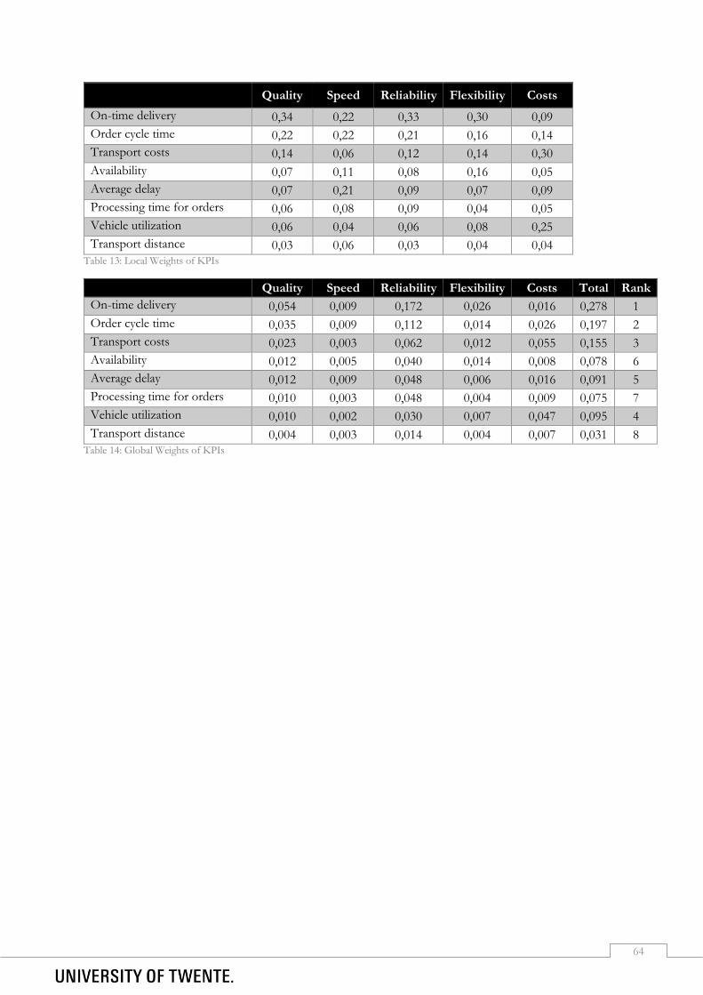
64
Quality Speed Reliability Flexibility Costs
On-time delivery 0,34 0,22 0,33 0,30 0,09
Order cycle time 0,22 0,22 0,21 0,16 0,14
Transport costs 0,14 0,06 0,12 0,14 0,30
Availability 0,07 0,11 0,08 0,16 0,05
Average delay 0,07 0,21 0,09 0,07 0,09
Processing time for orders 0,06 0,08 0,09 0,04 0,05
Vehicle utilization 0,06 0,04 0,06 0,08 0,25
Transport distance 0,03 0,06 0,03 0,04 0,04 Table 13: Local Weights of KPIs
Quality Speed Reliability Flexibility Costs Total Rank
On-time delivery 0,054 0,009 0,172 0,026 0,016 0,278 1
Order cycle time 0,035 0,009 0,112 0,014 0,026 0,197 2
Transport costs 0,023 0,003 0,062 0,012 0,055 0,155 3
Availability 0,012 0,005 0,040 0,014 0,008 0,078 6
Average delay 0,012 0,009 0,048 0,006 0,016 0,091 5
Processing time for orders 0,010 0,003 0,048 0,004 0,009 0,075 7
Vehicle utilization 0,010 0,002 0,030 0,007 0,047 0,095 4
Transport distance 0,004 0,003 0,014 0,004 0,007 0,031 8 Table 14: Global Weights of KPIs

65
Appendix E Survey Planners Dashboard This survey has been conducted through Microsoft Forms in Dutch. Below the survey questions in English can be
found.
This questionnaire consists of 16 questions and will take between 5 and 10 minutes. By clicking the button below, I
acknowledge that participation to this research is voluntary, that I am above 18 years old and I understand that I can
end my participation to this research at any moment for any reason.
o Yes, start the survey
o No
In this part of the survey, several questions will be asked about the structure of the dashboard. Please rate each of
these statements with 1 to 5, where ‘1’ equals ‘completely disagree’ and ‘5’ equals ‘completely agree’.
1 2 3 4 5
1. The dashboard is compact and does not give irrelevant information. Ο Ο Ο Ο Ο 2. Colours are used well to point out the difference between categories. Ο Ο Ο Ο Ο 3. There are good filters on the dashboard, which enables it to adjust the dashboard to more specific
information. Ο Ο Ο Ο Ο
4. The dashboard indicates well in what degree the KPIs are met. Ο Ο Ο Ο Ο 5. The different pages use the same structure, which makes it easy to recognize certain objects, like KPIs
or filters. Ο Ο Ο Ο Ο
6. Do you have any comments, additions or suggestions relating to the questions above? 7. The text on the dashboard is easily readable. Ο Ο Ο Ο Ο 8. The titles of the visuals make briefly clear what is shown in the visual. Ο Ο Ο Ο Ο 9. The data-to-ink ratio is good, meaning there is no space waisted to ornaments, but all the space is used
for relevant information. Ο Ο Ο Ο Ο
10. The contrast between the background and data is high, meaning the data is readable on the background.
Ο Ο Ο Ο Ο
11. The labels of the visuals are well readable. Ο Ο Ο Ο Ο 12. The titles of the graphs are clear, making it unnecessary to add x and y axis labels. Ο Ο Ο Ο Ο 13. Do you have any comments, additions or suggestions relating to the questions above? 14. I know where the information on the dashboard relates to. Ο Ο Ο Ο Ο 15. The dashboard provides a clear overview of the KPIs. Ο Ο Ο Ο Ο 16. The barge utilization dashboard gives a clear overview of the used capacity. Ο Ο Ο Ο Ο 17. The barge utilization dashboard gives the possibility to identify containers that still can be picked up. Ο Ο Ο Ο Ο 18. The checks dashboards give a clear overview of the containers that are not ready to be picked up yet
but are scheduled. Ο Ο Ο Ο Ο
19. The tool will be useful for me when using it in the future. Ο Ο Ο Ο Ο 20. The manual provided clearly explains how the dashboards can be used. Ο Ο Ο Ο Ο 21. Do you have any comments, additions or suggestions relating to the questions above?
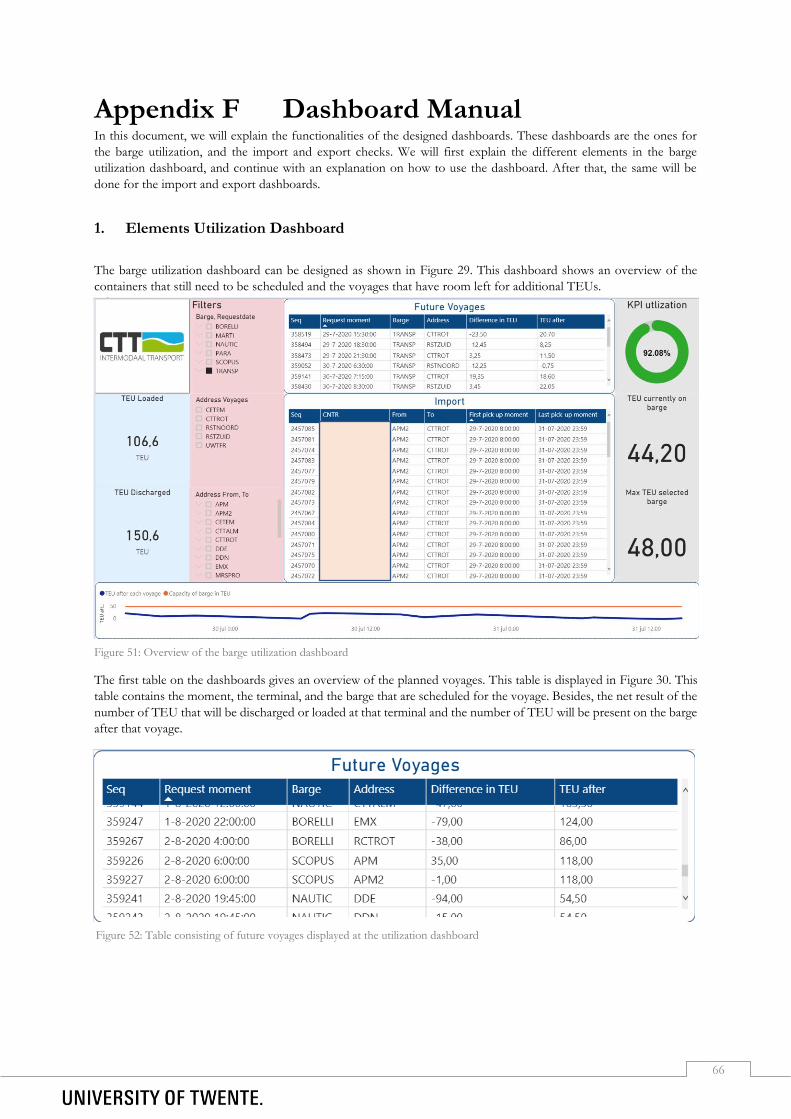
66
Appendix F Dashboard Manual In this document, we will explain the functionalities of the designed dashboards. These dashboards are the ones for
the barge utilization, and the import and export checks. We will first explain the different elements in the barge
utilization dashboard, and continue with an explanation on how to use the dashboard. After that, the same will be
done for the import and export dashboards.
1. Elements Utilization Dashboard
The barge utilization dashboard can be designed as shown in Figure 29. This dashboard shows an overview of the
containers that still need to be scheduled and the voyages that have room left for additional TEUs.
The first table on the dashboards gives an overview of the planned voyages. This table is displayed in Figure 30. This
table contains the moment, the terminal, and the barge that are scheduled for the voyage. Besides, the net result of the
number of TEU that will be discharged or loaded at that terminal and the number of TEU will be present on the barge
after that voyage.
Figure 51: Overview of the barge utilization dashboard
Figure 52: Table consisting of future voyages displayed at the utilization dashboard
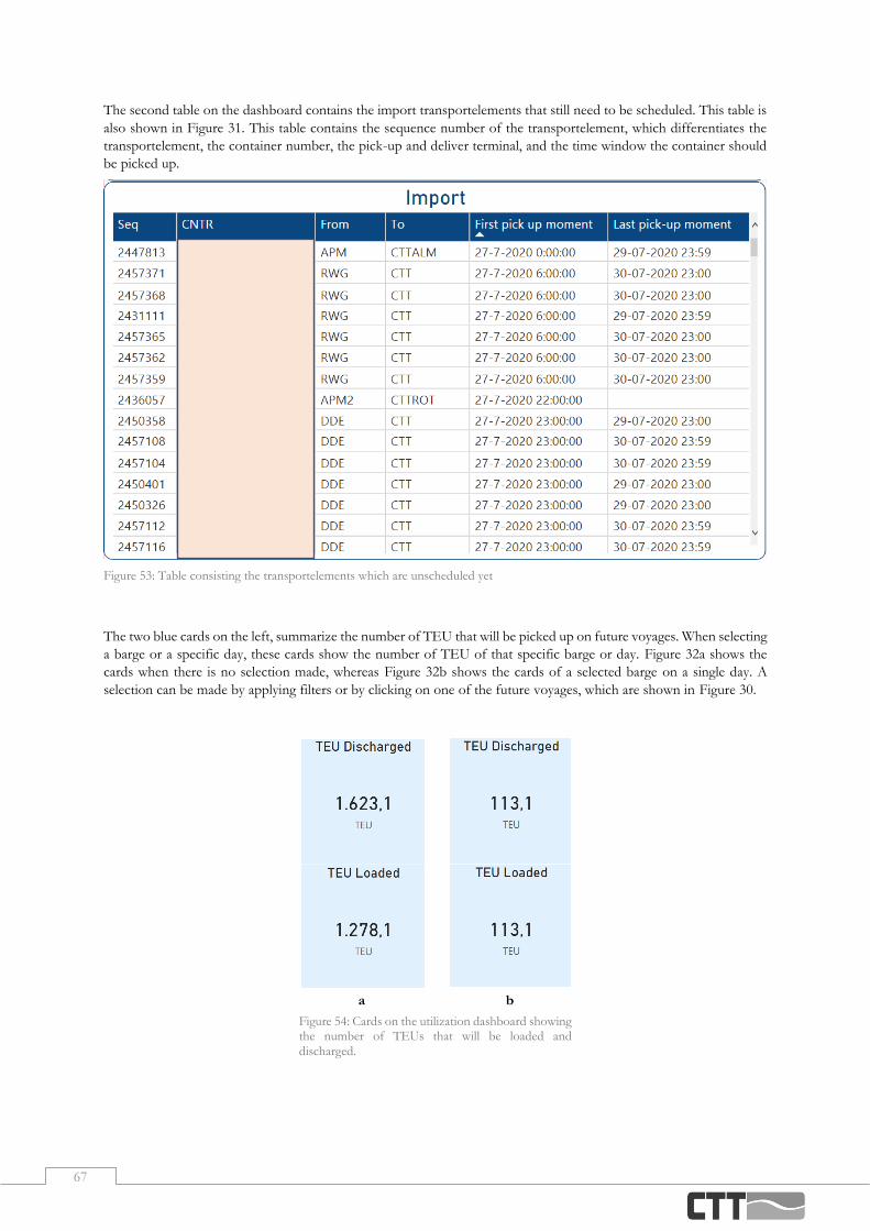
67
The second table on the dashboard contains the import transportelements that still need to be scheduled. This table is
also shown in Figure 31. This table contains the sequence number of the transportelement, which differentiates the
transportelement, the container number, the pick-up and deliver terminal, and the time window the container should
be picked up.
The two blue cards on the left, summarize the number of TEU that will be picked up on future voyages. When selecting
a barge or a specific day, these cards show the number of TEU of that specific barge or day. Figure 32a shows the
cards when there is no selection made, whereas Figure 32b shows the cards of a selected barge on a single day. A
selection can be made by applying filters or by clicking on one of the future voyages, which are shown in Figure 30.
Figure 53: Table consisting the transportelements which are unscheduled yet
Figure 54: Cards on the utilization dashboard showing the number of TEUs that will be loaded and
discharged.
a b

68
The red boxes contain the filters that enable the user to filter the page
by barge, by request date, or by location. These filters are shown in
Figure 33. Figure 33a shows the filters without a selection made. The
first filter enables the user to select a barge and a date. This filter pane
shows only the barges and the dates where one or more voyages are
scheduled. When selecting a barge and date, the second filter pane
also changes, displaying only the terminal locations where a voyage is
scheduled with the specific barge on a specific day, which can be seen
in Figure 33b. When no barge or date is selected, the second filter
pane shows all the terminals where future voyages are scheduled, as
can be seen in Figure 33a. The last filter pane enables the user to filter
the transportelement table, shown in Figure 31, on the pick-up or
deliver terminal. As this dashboard only focusses on import
containers, the deliver terminals are only CTT Hengelo and CTT
Almelo.
The KPI of the barge utilization is shown in Figure 34. This KPI
shows the percentage of the barge that is used, calculated by number
of TEUs. When no specific barge is selected, this KPI shows the
average of all the barges which have a scheduled voyage. When the
filters are used to select a barge, and possibly also a day, this KPI
calculates the utilization with respect to the selected filters. The next
grey card shows the number of TEU that are currently present on a
barge, as can be seen in Figure 35. Figure 36, the last grey card,
displays the total capacity of the barge in TEU.
Figure 37 shows the graph at the bottom of the page partly. This graph shows in orange the capacity in TEU of the
selected barge, where the blue line shows the TEUs present on the barge regarding each voyage. This graph enables
the user to also look further into the future. As it is possible the barge has a later voyage which will reach the maximum
capacity, not only the TEUs after the specific voyage need to be taken into account.
Figure 55: Filters of the barge utilization dashboard
a b
Figure 56: Card displaying the KPI of the barge utilization
Figure 57: Card showing the number of TEU currently on a barge
Figure 58: Card showing the maximum
number of TEU on a barge
Figure 59: Part of the graph showing the number of TEU on the barge after each voyage
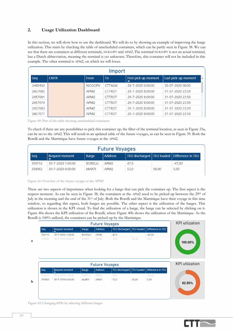
69
2. Usage Utilization Dashboard
In this section, we will show how to use the dashboard. We will do so by showing an example of improving the barge
utilization. This starts by checking the table of unscheduled containers, which can be partly seen in Figure 38. We can
see that there are containers at different terminals, NOGOPV and APM2. The terminal NOGOPV is not an actual terminal,
but a Dutch abbreviation, meaning the terminal is yet unknown. Therefore, this container will not be included in this
example. The other terminal is APM2, on which we will focus.
To check if there are any possibilities to pick this container up, the filter of the terminal location, as seen in Figure 33a,
can be set to the APM2. This will result in an updated table of the future voyages, as can be seen in Figure 39. Both the
Borelli and the Martinique have future voyages at the APM2.
Figure 61: Overview of the future voyages at the APM2
There are two aspects of importance when looking for a barge that can pick the container up. The first aspect is the
request moment. As can be seen in Figure 38, the containers at the APM2 need to be picked-up between the 29th of
July in the morning and the end of the 31st of July. Both the Borelli and the Martinique have their voyage in this time
window, so regarding this aspect, both barges are possible. The other aspect is the utilization of the barges. This
utilization is shown in the KPI visual. To find the utilization of a barge, the barge can be selected by clicking on it.
Figure 40a shows the KPI utilization of the Borelli, where Figure 40b shows the utilization of the Martinique. As the
Borelli is 100% utilized, the containers can be picked-up by the Martinique.
Figure 60: Part of the table showing unscheduled containers
a
b
Figure 62: Changing KPIs by selecting different barges

70
When also looking at the utilization over time, shown in Figure 41, we see that the maximum capacity of the barge is
never reached, also not after the future voyages. This concludes that it is possible to pick up the containers from the
APM2 that are not scheduled yet.
Figure 63: Graph showing the utilization over the Martinique
3. Elements Import and Export Checks Dashboard
In this section, we will show and explain the elements present on the import and export dashboards. The import checks
dashboard, shown in Figure 42, and the export checks dashboard, shown in Figure 43, are built and designed in the
same way. Therefore, we will only highlight the different aspects of the import dashboard in this section.
Figure 65: An overview of the export checks dashboard
Figure 64: An overview of the import checks dashboard

71
The two blue cards, shown in Figure 44, give the user some general information. The upper card shows the moment
of the first voyage of which not all the containers are ready to be picked up. The lower card shows the total number
of containers that are not ready for pick-up. When filters are applied or a selection is made, this card shows the number
of containers of that specific selection. The filters in the red boxes, shown in Figure 45, enable the user to filter by
barge. It is also possible to filter on containers based on their presence, release, blocked status or custom status.
The graph, shown in Figure 46, gives an overview of the number of containers that are not ready to be transported.
With the filters described above, this graph can be adjusted to showing only the number containers scheduled on a
specific barge. Figure 47 shows the KPI of the import checks. This KPI shows the percentage of the containers ready
to be imported. When selecting a specific voyage by clicking on one of the bars shown in Figure 46, this KPI also
updates to the percentage of containers ready of that specific voyage.
Figure 66: Cards on the import checks dashboard
Figure 67: Filters on the import checks dashboard
Figure 68: Graph giving an overview of the number of containers not ready for import Figure 69: KPI import checks dashboard

72
The last element on the import dashboard is a table giving specific information of the containers, shown in Figure 48.
This table includes the unique number of the transportelement, the container number and the status of the different
checks. Moreover, it shows the information of the scheduled voyage, such as the barge, the locations and the moment.
It also contains information of the client who needs to be contacted to make the container ready. When applying filters
on the page or when selecting one of the bars shown Figure 46, this table will show the transportelements within that
selection.
Figure 70: Overview of containers on the import dashboard
4. Usage Checks Dashboard
In this section, we will explain how to use the dashboard by showing an example. This starts by checking the card of
Figure 44 and the graph in Figure 46. At this moment, the first voyage with containers that are not ready is the voyage
of the Transporter, this voyage can be selected by clicking on that bar, as shown in Figure 49.
With this bar selected, the table at the bottom of the dashboard will show the containers of that voyage that are not
ready. This table is shown below in Figure 50. In this case, all the containers are from the same client, so only one
client needs to be contacted. However, often these containers are from a number of different clients.
Figure 72: Information of containers scheduled on a selected voyage
Figure 71: One selected voyage in the graph giving an overview of the numbers of containers not ready