Decades & Designers
82
Types of Times Alex Grant
-
Upload
alex-grant -
Category
Documents
-
view
227 -
download
2
description
A walkthrough of Typefaces and Type Designers from each decade and compositions at the end of each decade to summarize the decade
Transcript of Decades & Designers

Types of TimesAlex Grant

1910Fonts in the 1910’s were bold fonts that were often used for newspapers and
posters. These fonts were both serifed and sans serifed. When they were serifed they
were often found with very small serifs. Stylized fonts were also very popular
during this decade.

1910

In the 1910’s the world was becomIng more IndustrIal thIs can be seen In the
evolutIon of the fonts In thIs decade as well as how the fonts are used.
In the 1910’s the world was becomIng more and more IndustrIalIzed. some major events to occur In the 1910’s were
-standard oIl was broken up
-the tItanIc sank
- grand central statIon opens
-world war I began
- the assassInatIon of archduke franz ferdInane
-the us entered world war I
the effects of these events helped to shape the fonts of thIs tIme. thIs fonts were used by IndustrIes and newspapers to tell headlInes of the day lIke tItanIc sank and us enters world war I
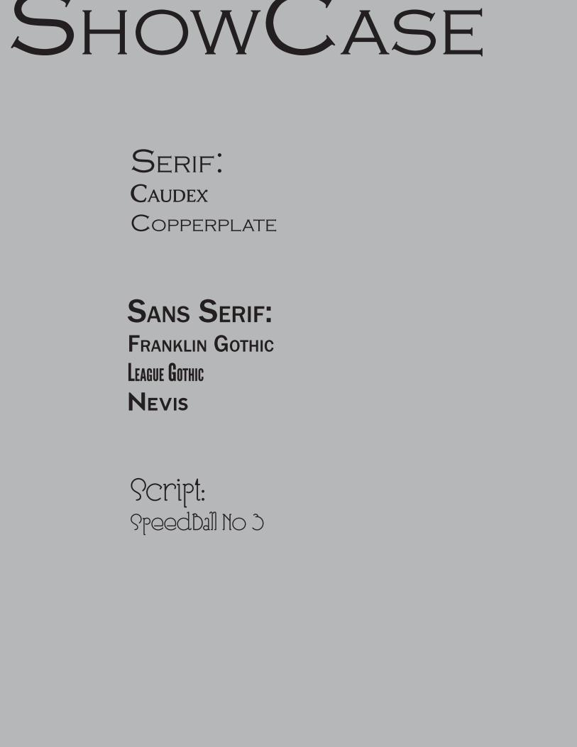
showcase
serIf:Caudex
copperplate
SanS Serif:franklin Gothic
League gothic
Nevis
Script:SpeedBall No 3
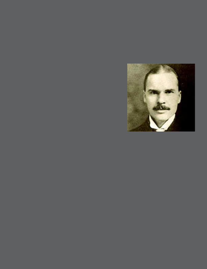
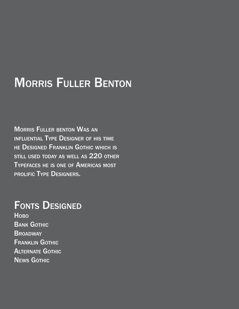
MorriS fuller Benton
MorriS fuller Benton WaS an influential type DeSiGner of hiS tiMe he DeSiGneD franklin Gothic Which iS Still uSeD toDay aS Well aS 220 other typefaceS he iS one of aMericaS MoSt prolific type DeSiGnerS.
fontS DeSiGneDhoBo Bank Gothic
BroaDWay
franklin Gothic
alternate Gothic
neWS Gothic

1910’s
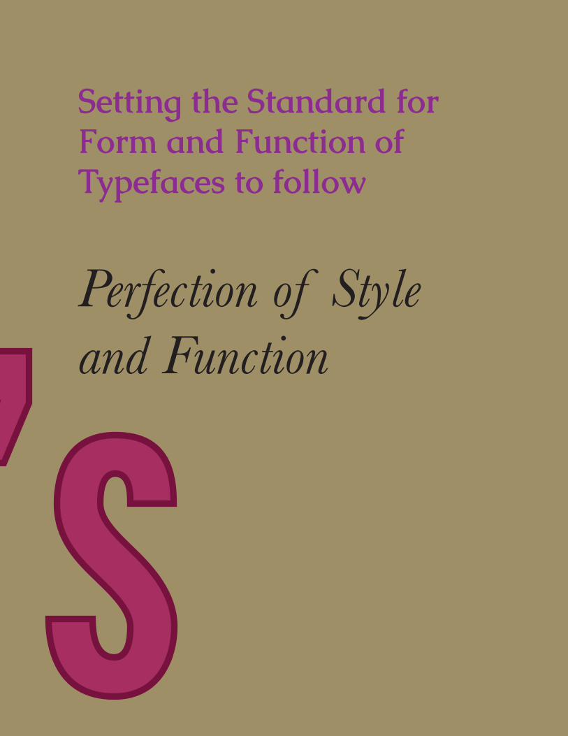
1910’sPerfection of Style and Function
Setting the Standard for Form and Function of Typefaces to follow

1920s

1920sThe 1920’s or The roaring TwenTies as They have
been called. was a Time for urbanizaTion in The uniTed sTaTes where more people began To live in
The ciTies raTher Then in The counTry. This was The age of breaking The social norms and TradiTions
of The pasT. many fonTs from This decade are sTill used Today because of Their fuTurisTic and simple
look. The influences of These fonTs came from ciTy life and forward Thinking.

In The 1920’s the United states was becoming more and more urbanized with a lot of people moving from the country to the city there were a lot of movements going on to broaden life for people weather that be people moving to an urban area or the movements to break social norms.
Some of the Events in the 1920’s that had an effect on the style of Type and broadened life for people-The Flapper Movement Begins-19th Amendment Gives Women The Right to Vote-Charles Lindbergh makes first Trans-Atlantic crossing.- Mickey Mouse is Created

ShowCaSeSerif:Cooper
SanS Serif:FuturaGill Sans

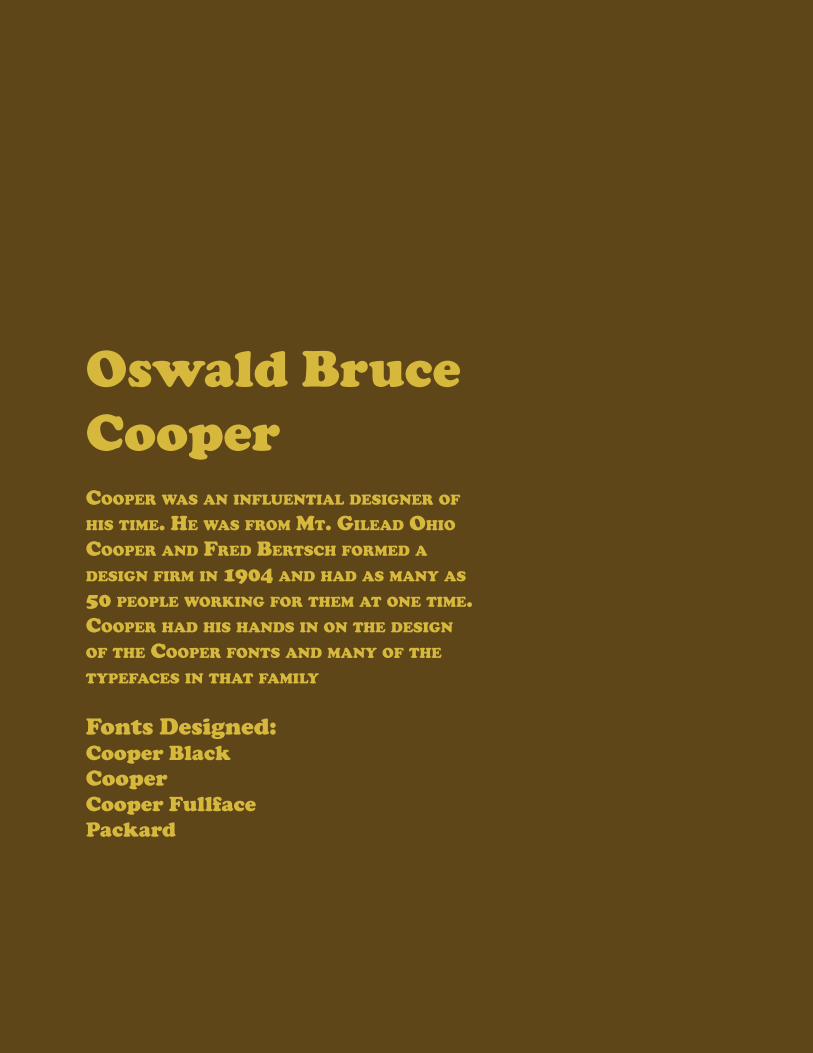
Oswald Bruce Coopercooper was an influenTial designer of his Time. he was from mT. gilead ohio cooper and fred berTsch formed a design firm in 1904 and had as many as 50 people working for Them aT one Time. cooper had his hands in on The design of The cooper fonTs and many of The Typefaces in ThaT family
Fonts Designed:Cooper BlackCooperCooper FullfacePackard
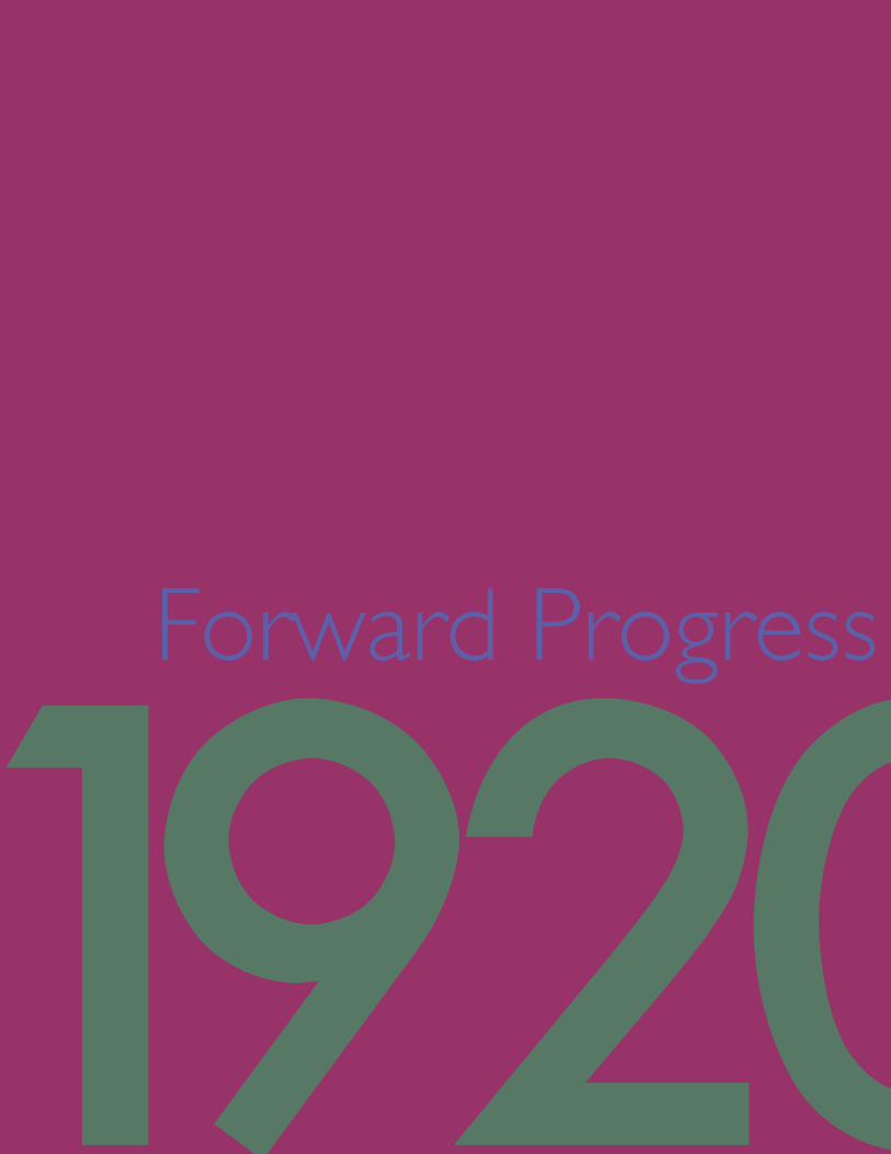
Forward Progress
1920s
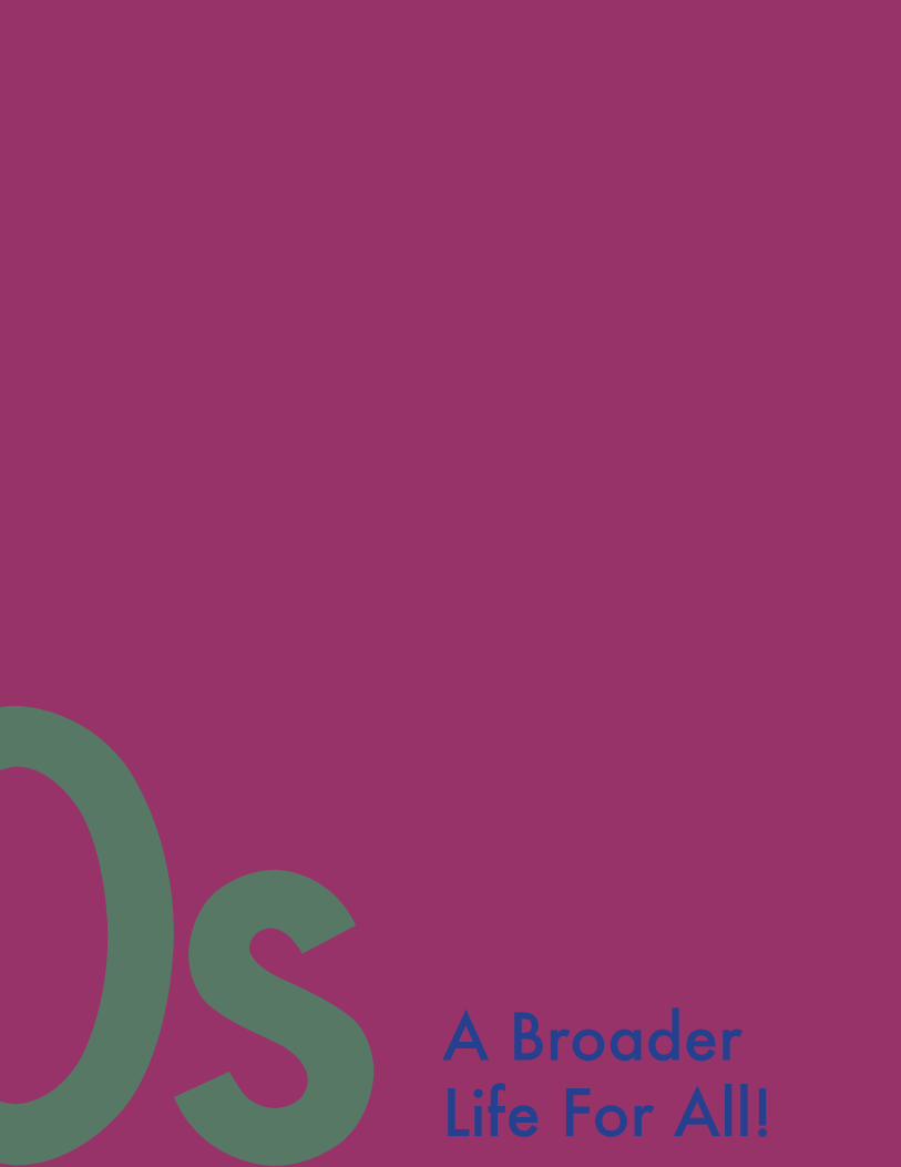
A Broader Life For All!1920s

1930sThe Thirties were a time for great development for the world some of these developments were positive and some were negative. Either way these had an effect on the Typefaces of the time. The Art Deco Movement was in motion and the world was going through changes such as the rise of communism and the US rising to be a World Super Power.
1930s
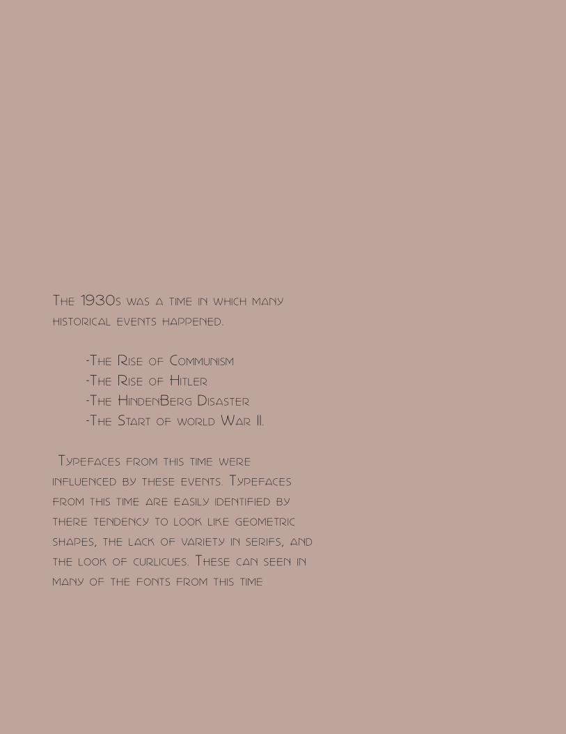
The 1930s was a Time in which many
hisTorical evenTs happened.
-The rise of communism
-The rise of hiTler
-The hindenBerg disasTer
-The sTarT of world war ii .
Typefaces from This Time were
influenced By These evenTs. Typefaces
from This Time are easily idenTified By
There Tendency To look like geomeTric
shapes, The lack of varieTy in serifs, and
The look of curlicues. These can seen in
many of The fonTs from This Time

ShowCase
Sans Serifs:Park Lane NFCorbert
ScriptGrand Hotel Recorda ScriptPeriSphere
BelleRose
Of CourseTimes New Roman
&


Paul RennerRenner was a Type designer with designs ranging from the 1920’s into the 30’ his most famous typeface is Futura which was designed in the 1920’s but he also had designs in the 1930’s including Ballade, Renner Antiqua and also Futura Light

1930sBeginning of Change

1930sRise of Super Powers

1940sThe 1940s were a time of great stress in the world with World War II Breaking out midway through the decade. With the great tension in the world at this time many of the creatives of the world were not producing at the rate they were before the great tension. Evidence of this is seen is the closing of the Bauhuas school by the Nazi Regime

1940s
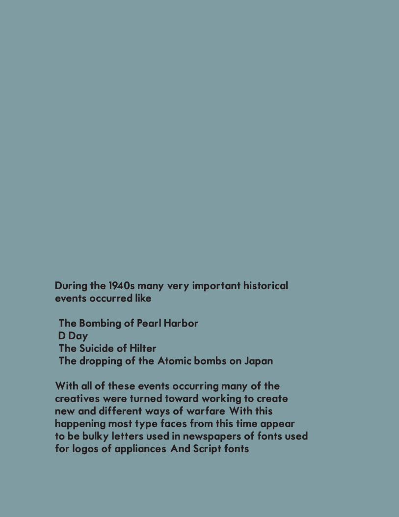
During the 1940s many very important historical events occurred like
- The Bombing of Pearl Harbor- D Day- The Suicide of Hilter- The dropping of the Atomic bombs on Japan
With all of these events occurring many of the creatives were turned toward working to create new and different ways of warfare. With this happening most type faces from this time appear to be bulky letters used in newspapers of fonts used for logos of appliances. And Script fonts

showCase
American Captain
Motor OilBrigthton Sans
Death Maach
Hamburger Heaven
Headliner
NewsPaper Style
Appliance Style
ScriptZapfino


Hermann ZapfHerman Zapf Was a type designer in the 1940’s who worked on typefaces like zapfino, palatino and Optima. Zapf was born in Germany during a very though time for Germany historically. Zapf had many difficulties breaking into the world of type design. He first wanted to be an electrical engineer but one of his teachers noticed his drawing skill and suggested he become a lithographer. Zapf had a very hard time finding an apprenticeship because they would ask him political questions. Every interviewer complimented his ability but he was still rejected. Finally he landed an apprenticeship and his career started.
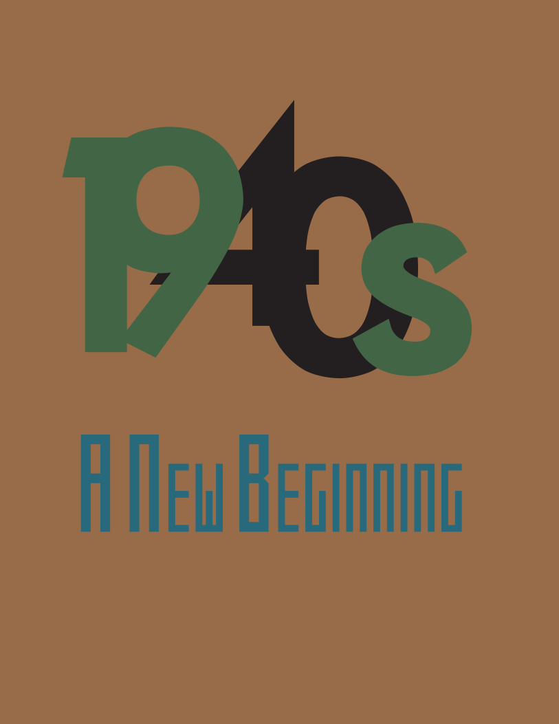
1490sA New BegiNNiNg

An End to a Regime

The 1950s were a time of progress for the world. During this decade the United states official ended world war II and the beginning of the civil rights movement. This was a decade to change the way we used to think and bring in a new era .

1950s

During the 1950s it was a change in eras, a change in the way of thinking. During this era there was the Mcarthyism and the Beginning of the civil rights movement. Some other events that happened during this decade were-Rosa Parks refused to give up her seat-Stalin Dies-Segregation ruled illegal in thee United States- NASA Was founded During this decade we turned away from beliefs that used to be social norms and began to look at the principal of the matters behind these issue
During this time Many of the fonts were Sans Serifs
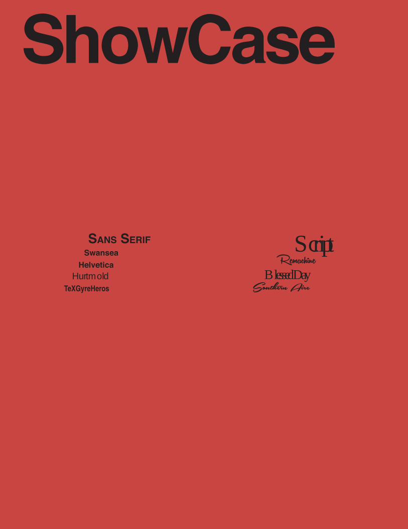
ShowCase
SanS Serif ScriptSwansea
HelveticaHurtmold
RemachineBlessed Day
Southern AireTeXGyreHeros


Max MiedingerMax miedinger was a font designer during the 1950s that designed one of the most famous fonts used today Helvetica. This font can be seen font the Toyota logo to the Subway signs in New York City. Max Miedinger designed a few other fonts all along the same style as Helvetica. This fonts include
-Pro Arte-Horizontal-Swiss 921-Swiss 721-Monospace 821-Miedinger

50the beginning of a type revolution

50Max Miedinger

TH E 1960S W E R E A T I M E O F C H A N G E A N D P RO G R E S S FO R T H E WO R L D, T H I S WAS T H E D E C A D E W E W E N T T O T H E M O O N B EG A N T O M OV E O N F RO M T H E T R AG E D I E S O F T H E PAST D E C A D E S TH E BR I T I S H I N VAS I O N O F M U S I C O CC U R R E D D U R I N G T H I S D E C A D E

1960 S

While this was a time of progress and change something seemed to stay consistent with the past few decades. There were tragedies in this decade as well, there were wars fought, and paranoia of communism. But during this time there was a lot of progress like-Reaching the moon-The first Superbowl-British invasion of musicThe fonts of this era began to turn into the style that we commonly associate with the 70s
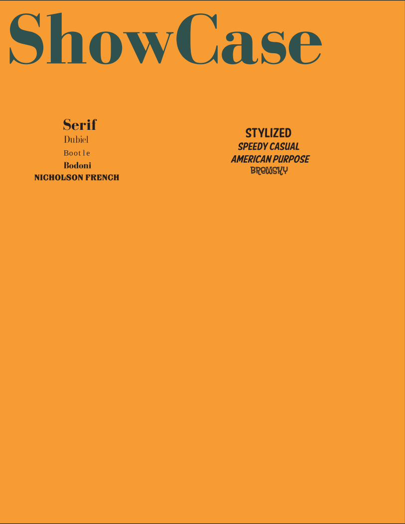
ShowCaseSerif
StylizedDubiel Speedy Casual
American PurposeBrewsky
B o o t l e
Nicholson FrenchBodoni

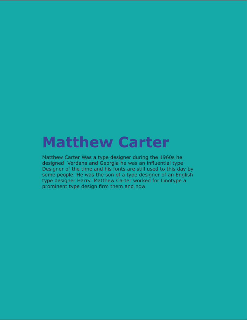
Matthew CarterMatthew Carter Was a type designer during the 1960s he designed Verdana and Georgia he was an influential type Designer of the time and his fonts are still used to this day by some people. He was the son of a type designer of an English type designer Harry. Matthew Carter worked for Linotype a prominent type design firm them and now
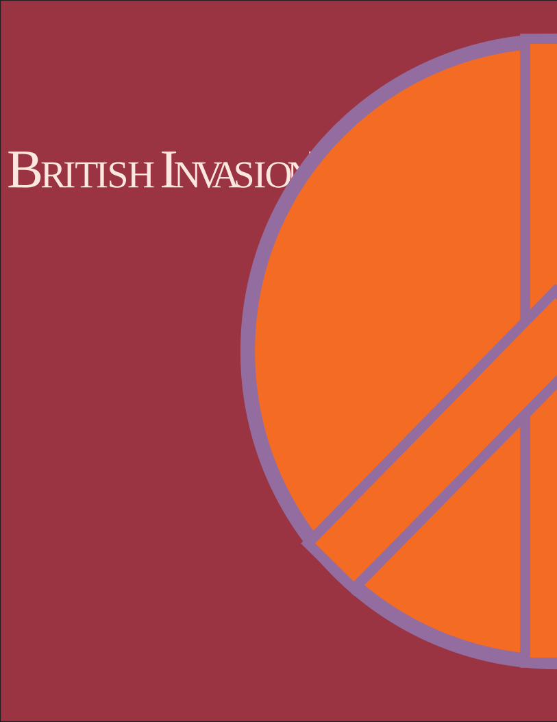
BR I T I S H IN VAS I O N!

10 YearsOf Peace& Music

The 1970s were a time in which the public protested the government. This was the decade of the hippies, sit in, and walkouts
1970s
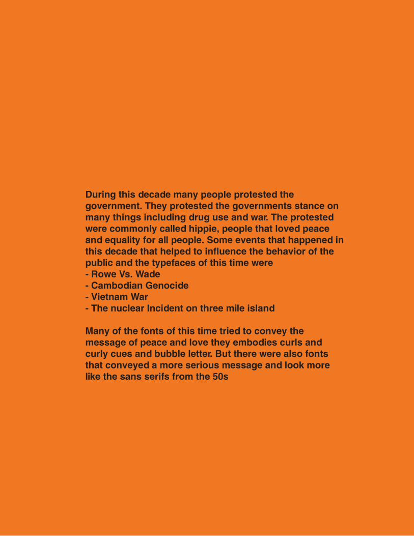
During this decade many people protested the government. They protested the governments stance on many things including drug use and war. The protested were commonly called hippie, people that loved peace and equality for all people. Some events that happened in this decade that helped to influence the behavior of the public and the typefaces of this time were- Rowe Vs. Wade- Cambodian Genocide- Vietnam War- The nuclear Incident on three mile island
Many of the fonts of this time tried to convey the message of peace and love they embodies curls and curly cues and bubble letter. But there were also fonts that conveyed a more serious message and look more like the sans serifs from the 50s
SanS Serif
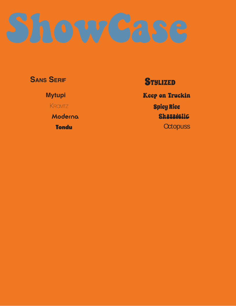
ShowCaseStylized
Keep on TruckinMytupi
Kravitz Spicy RiceModerna Shagadelic
Tondu Octopuss


Gerard UngerGerard Unger is a current type designer that got is breakthrough in the 1970s with the font Demos which was a serif font that was designed in the early phase of digital technology in the 1970s. Unger has developed several fonts since then includingSwift, Flora , and Argo

Make Love Not WarI TYPED
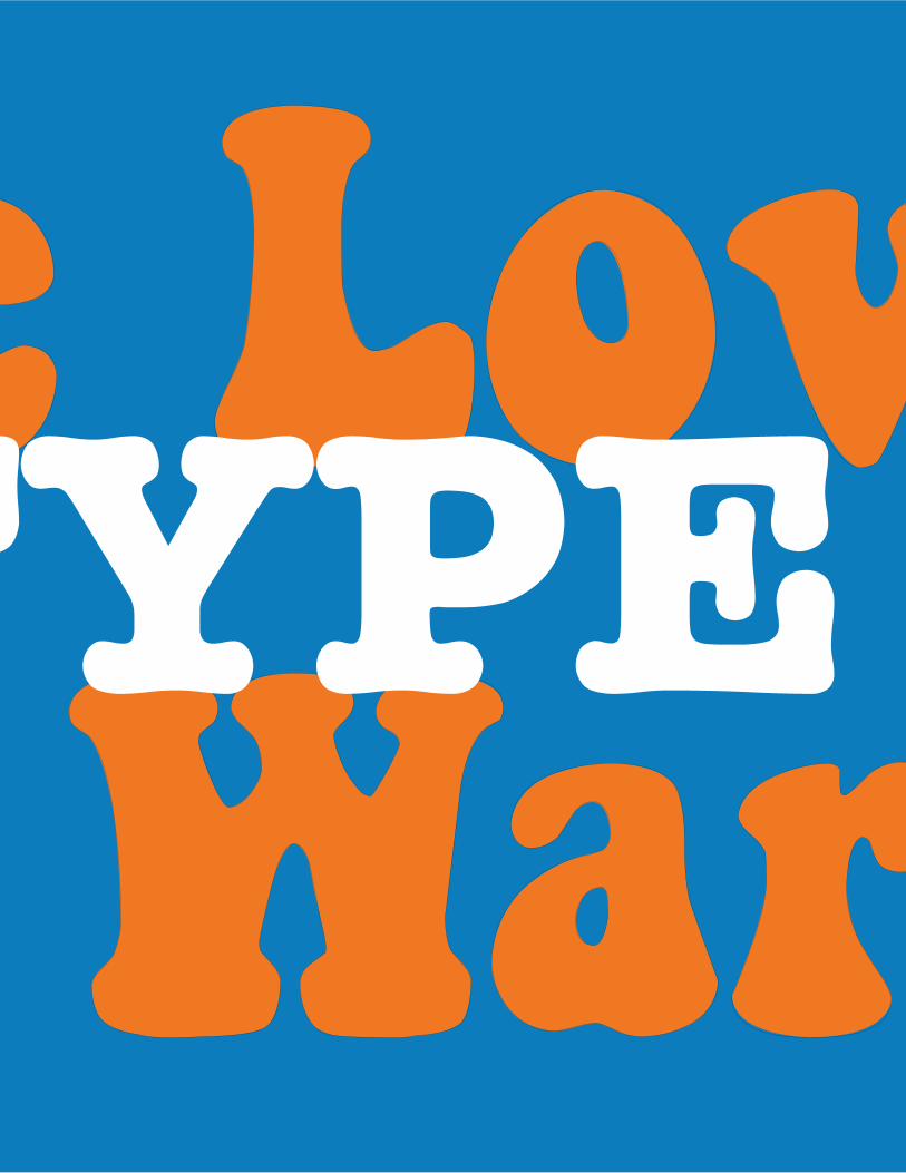
Make Love Not WarI TYPE

1980sThe 1980s were the beginning of the real technological revolution this was when the first personal computers were released when video games began to infect the world and video editing and special effects became big.

1980s

The 1980s were the Beginning of the real Technological age. This is when people began to use technology in there everyday life. Technology was used to create movies, send information and make life easier for people. In the 1980s many important things happened both in the field of technology and outside of it-CNN was established by Ted Turner-ET was released- IBM introducing the Personal Computer-Pac Man was released- The wreck of the Titanic was found- DNA was first used to convict criminals -The Berlin Wall falls
These events and advances in technology had an effect on type faces during this era. Many fonts from this time look like tech type fonts , With blocky edges although other fonts from tis time look very similar to the fonts started in the 1950s many fonts were redesigned during this time to make them compatible to the upcoming technological revolution.

SHOWCASESanS Serif
Koshgarian
Newtown
Good Morning
Nova Solid
Bitwise
Pacfont
Press Start
Digital
Serif
Queens Park
Edwardian
Portland
Arial


Colin Brignall
Brignall is a German type designer. He worked as a press photogra-pher he joined the Letrasettype Studio in 1964 as a photographer and then became a type designer for them in 1974 he has designed many fonts including-Octopuss-Italia-Tango-Victorian-Harlow-Edwardian
He is currently he type director for Esselte Letrasettype in London
This excerpt is written in Edwardian

pacman
1234567800000000000000000
TYPE
FACEFACE

pacman
1234567800000000000000000
TYPE
FACEFACE

1990s

1990sThe 1990s were a time for fonts to make a comeback fonts that had already been used and forgotten had a chance to make a comeback with the technological revolution being in full swing. With many fonts being digitalized to make them compatible with current technology forgotten fonts once again have their chance to rise to the top again.
The 1990s were a decade in which the technological era was in full swing this was both good and bad for the type community this meant that you had so many more choices of fonts. You could have thousands of fonts on your computer and also design your own fonts. But for every good font designed there was a hundred other people that would design bad fonts. This decade was the decade of comebacks from the great fonts of the past but it also was the decade of poorly used trend fonts that were everywhere. Comic sans, grunge fonts, and flame fonts are some of the three font fads that come to mind when you think of the nineties. But even with these negatives the comeback of the gods of font were still a great thing.

ShowCaSeThe ComeBack Kids!
New Kids on the Block(The Trends)
FuturaTimes New Roman
Helvetica
Comic Sans
GrungeFlames
& The Great
Myriad

Robert SlimbachRobert Slimbach is a type designer that works for Adobe Systems and has done so since 1987 he was won many of awards for his digital typefaces he has designed many type faces some of these typefaces are used by major corporations and are used everyday. His most famous type face Myriad Pro was used by Apple since 2002

1990’sGRUNGE
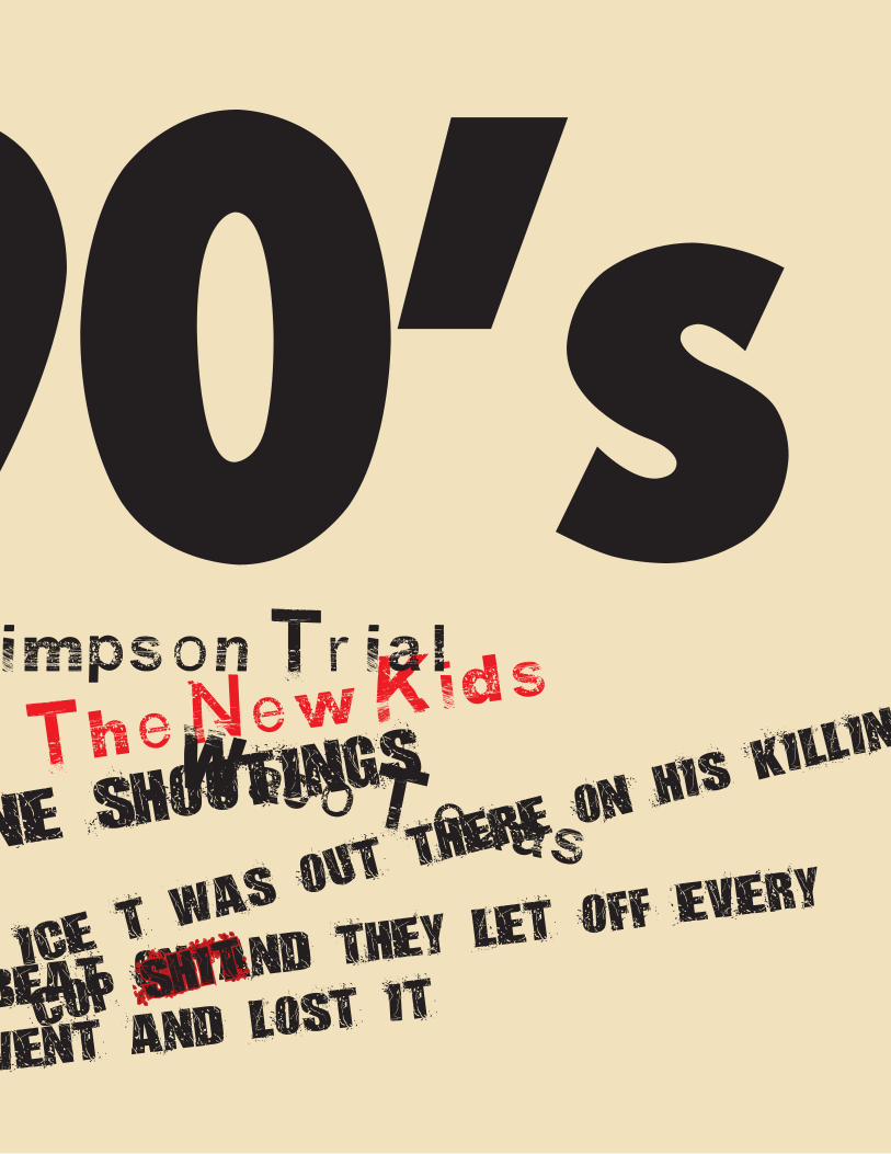
The Come Back kidsOJ Simps on Tr ial
Collapse of Soviet UnionEnd of
Cold War
UnaBomber Columbine Shootings
When Rodney king was Gettin
g Beat on And they
let off every
single officer and
Los Angles Went and L
ost it
1990’sThe New KidsOJ Simps on Tr ial
Waco Te xasCollapse of Soviet Union
Columbine Shootings
When Rodney king was Gettin
g Beat on And they
let off every
single officer and
Los Angles Went and L
ost itIce T
Was out the
re on His
killing
Cop ShIt

The 2000s! Bringing in the new millennium with style! With the new millennium come new fonts some good some bad along with this new millennium comes easier sharing of fonts and bigger stock font books.
2000s

The 2000’s or aughts as they have became brought in a new era of type and type sharing. Type became a bigger part of conveying a message most companies began to pay a designer to create their own personalized typeface. With the extra money in the market it became more competitive this yielded great results. Companies like Microsoft and Apple pay designers to fill there stock fontbooks which gives us more choices in the fonts we may use. We commonly recognize these fonts as the fonts we may use on word or Powerpoint. But we overlook the design of these fonts. Fonts of this era encompass a wide variety like serifs, sans serifs, and then we have the trending fonts, like tattoo typefaces, and graffiti fonts. This decade has yielded fonts that combine both form and function not just one of the other. The fonts from this decade pick up where the swiss modern typeface movement left off.

ShowCaseSans Serif
Serif
Trending Fonts
CalibriHelvetica
(Still Going Strong)
Arial(Also Still Going Strong)
Myriad(It’s Back!)
CambriaTimes New Roman
(Yep It’s Back!!! Again)
GRAFFITI
Bleeding Cowboys!
Tattoo
Century Gothic


Steve Matteson
Matteson is an American Type Designer who’s work covers several computer operating systems, video game consoles, and cell phones. Matteson’s work embodies what types designs from the aughts were actually doing, designing electronic fonts for multiple platforms. Matteson helped to design Cambria which was the replacement for Times New Roman in office suites from 2007 onward. Mattesons work also includes-Curlz-Cambria-Massif-Lindsey Pro-Open Sans

POPE
TAGGED UP
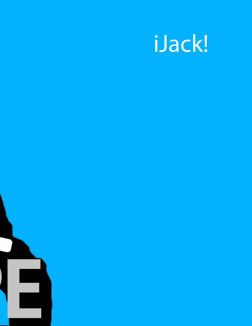
iJack!
POPE