Data Visualization…what it is and why it matters · Best Practices • The human visual system...
50
Data Visualization…what it is and why it matters Amanda Bissell, UNM Evaluation Lab
Transcript of Data Visualization…what it is and why it matters · Best Practices • The human visual system...

Data Visualization…what it is and why it matters
Amanda Bissell, UNM Evaluation Lab

Why Visualize Data?
Data Visualization is a tool that can help us explore complex patterns in large quantities
of data that cannot be directly perceived.

History of Data Visualization

Hx of Data Visualization: 17-1800’s
• Playfair was the first to use line, bar, area and pie charts as visual symbols to represent data
• Snow’s use of a dot map to show geographic densities of cholera victims lead to a new understanding of the spread of disease
John SnowWilliam Playfair
Figure 1 Graphical representation of the balance of trade between England and America. From J. Alonso, 2011 “A short visual history of charts and graphs.”
Figure 2 The map of all Cholera cases recorded by John Snow. From A. Kukaswadia, 2013 “John Snow – The First Epidemiologist.”

Hx of Data Visualization: 17-1800’s
• Minard’s depiction of Napoleon's advance and retreat on Moscow is one of the first data visualization dashboards
• It represents several types and dimensions of data in multiple, related charts.
Charles Joseph Minard
Figure 3 Statistical graph of Napoleon's March in the War of 1812. From E.Tufte, nd “Napoleon’s March.”

Hx of Data Visualization: 17-1800’s
Length, distance and time
Height=Temperature
Width=Number of Men

Data Visualization Today
• The complexity and variety of graphic symbols often rivals that of the data itself.
• Interactivity adds yet another dimension
• How are we able to perceive and synthesize so much information?
Figure 4 Information panels on several aspects of Malaria. From K.Cheng, 2013 “Scientific Data Visualization: Understanding Malaria.”

Human Perception of Visual Information
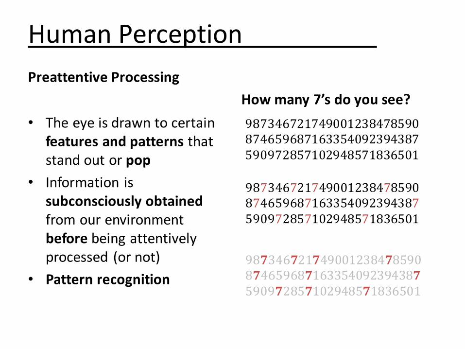
Human Perception
Preattentive Processing
• The eye is drawn to certain features and patterns that stand out or pop
• Information is subconsciously obtainedfrom our environment before being attentively processed (or not)
• Pattern recognition
How many 7’s do you see?
987346721749001238478590874659687163354092394387590972857102948571836501
987346721749001238478590874659687163354092394387590972857102948571836501
987346721749001238478590874659687163354092394387590972857102948571836501

Human PerceptionSaliency: Visual Features that Affect Preattentive Processing
Figure 5 Examples of salient display. From G. Fitzsimmons , 2012 “User Interface Design: How to get human visual attention.”
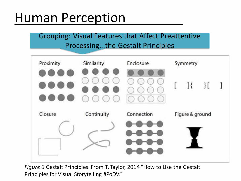
Human PerceptionGrouping: Visual Features that Affect Preattentive
Processing…the Gestalt Principles
Figure 6 Gestalt Principles. From T. Taylor, 2014 “How to Use the Gestalt Principles for Visual Storytelling #PoDV.”

Human Perception
Visual Memory

Selecting Visualizations

Selecting VisualizationsStep 1: Is a Visualization Necessary?
• Are you illustrating complex patterns and/or large quantities of data?
• Are you answering a question, making an argument or telling a story?
• Will a visualization be more informative than a simple table or text?
Selecting Visualizations
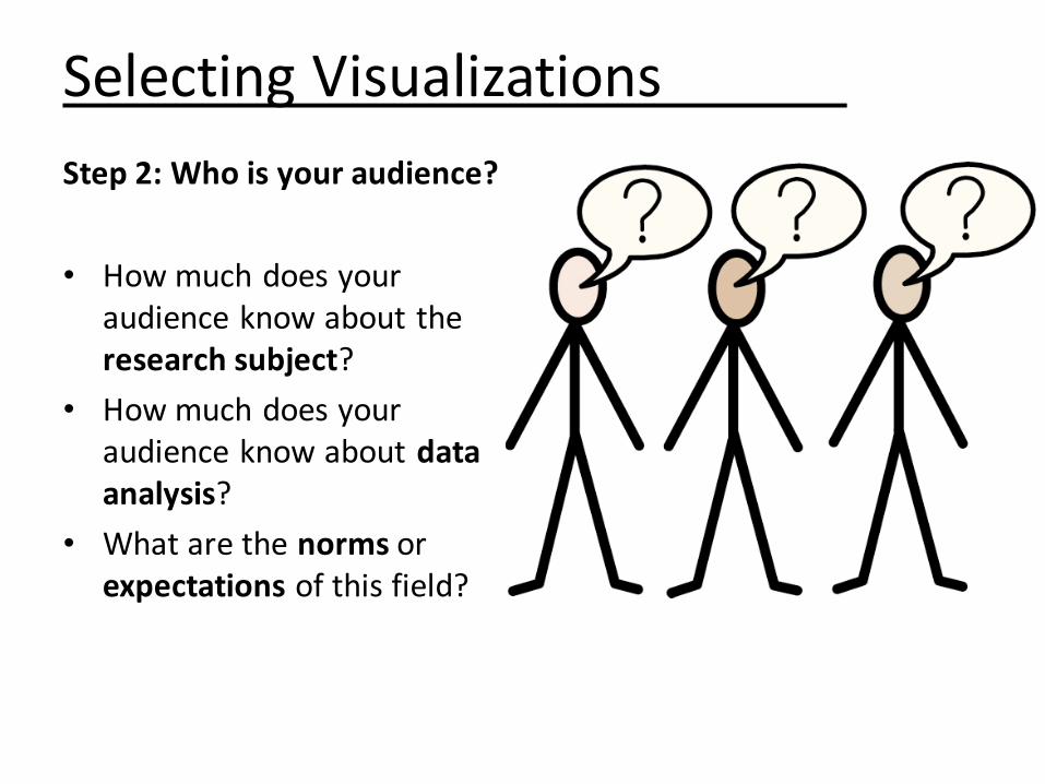
Step 2: Who is your audience?
• How much does your audience know about the research subject?
• How much does your audience know about data analysis?
• What are the norms or expectations of this field?

Selecting Visualizations
Step 3: What do you want to show your audience?
Want to? Solution
Compare Values Bar/Column Chart
Show distribution of values Scatter Plot
Show trends in distribution of values
Line Chart
Show a percentage or proportional data
Pie Chart; Stacked Bar Chart
Show three variables at once Bubble Chart
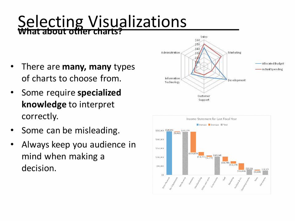
Selecting VisualizationsWhat about other charts?
• There are many, many types of charts to choose from.
• Some require specialized knowledge to interpret correctly.
• Some can be misleading.
• Always keep you audience in mind when making a decision.

Selecting VisualizationsSCENARIO 1You are a journalist for a national paper. You are writing an article about crime in the U.S.
Some believe that crime is on the rise, while others argue that it has diminished over the years.
The data tells a different story depending on the type of crime, geographic area and time period that is being studied.
SCENARIO 2You are a social media developer for an ad agency. You provide one of your clients a weekly report on brand activity.
Mentions of your client’s brand on Twitter have decreased by 32% since the previous week.
Sales have remained unchanged.
SCENARIO 3You are a researcher studying Parkinson’s disease.
You are publishing the results of a study that uses microarrays to measure gene expression levels in mice.
Your data set includes over 9,0000 genes.
1. Should a visualization be used in this scenario?
2. Given the audience and the data, what is the best visualization to use?
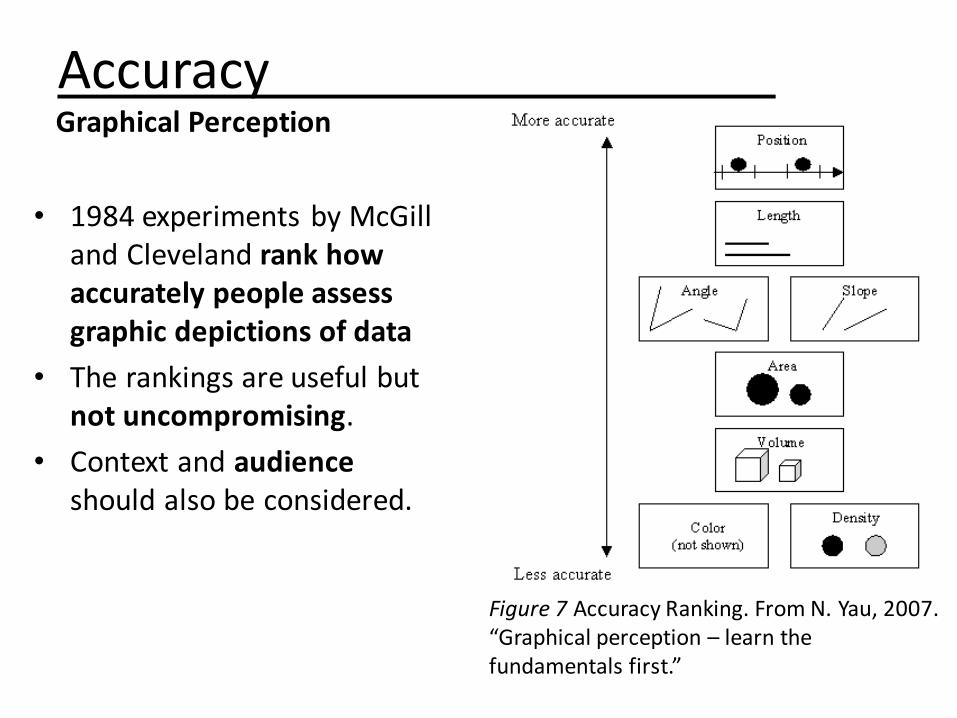
AccuracyGraphical Perception
• 1984 experiments by McGill and Cleveland rank how accurately people assess graphic depictions of data
• The rankings are useful but not uncompromising.
• Context and audience should also be considered.
Figure 7 Accuracy Ranking. From N. Yau, 2007. “Graphical perception – learn thefundamentals first.”

Selecting Visualizations
1. Which chart looks best to you?
2. Which chart makes it easier to judge the difference between B and C?
3. Which Chart is more effective at communicating accurately?
Best Practices

Best Practices
• The column for 1996 appears to be twice the height of the column for 1993.
• The axis labels tell us the difference between the two is only 2.5% (65% versus 62.5%).
• This is a common distortiontactic.
Figure 8 http://junkcharts.typepad.com/junk charts/2014/04/when-to-use-the-start-at-zero-rule-.html
When using column/bar charts, always start the scale at 0.

Best PracticesMake sure scale is consistent and honest.
Same data with three different scales
Different scales in one graph
Figure 9 Different Scales. From J. Camoes, 2013. “Chart redraw: Troops Vs. Cost (Time Magazine).”
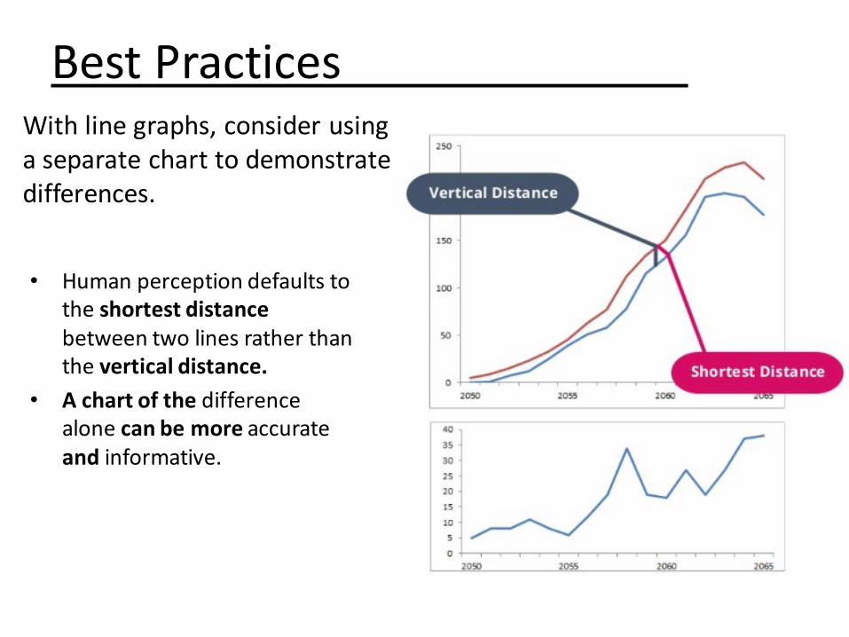
Best Practices
• Human perception defaults to the shortest distancebetween two lines rather than the vertical distance.
• A chart of the difference alone can be more accurateand informative.
With line graphs, consider using a separate chart to demonstrate differences.

Best Practices
• The human visual system naturally experiences a disk’s size in terms of its area. Thus bubbles should be scaled according to area, not diameter.
• If you aren’t showing three variables at one time, use a bar chart or scatter plot.
Use a bubble chart if your data has at least three data series that each contain a set of values.

Best Practices
Figure 10 Bubble Charts. http://plotly18.rssing.com/chan-55892197/all_p2.html
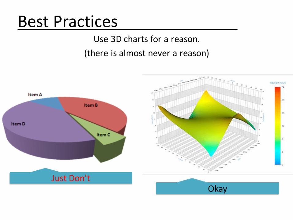
Best PracticesUse 3D charts for a reason.
(there is almost never a reason)
Just Don’tOkay

Best PracticesPay attention to text orientation

Best PracticesWatch your data to ink ratio:
Ink used to directly encode data values
Total ink used in the visualization
• Use only graphical elements hat are necessary for the chart to be easily read by your audience.
• Once you’ve completed a visualization, check to see if there’s anything that can be removed.

Best PracticesClassic Trick of the Trade: The Squint Test
Which elements pop out and catch your eye?
Are these the elements you want to draw attention to?
Figure 11 The Squint Test. https://blog.xlcubed.com/2008/08/the-dashbord-squint-test/

Best PracticesCreativity is good…but clarity is key
Figure 13 http://www.businessinsider.com/gun-deaths-in-florida-increased-with-stand-your-ground-2014-2
Figure 12 http://www.simonscarr.com/iraqs-bloody-toll/

For Comparison
Figure 14 How you present data https://www.infoworld.com/article/3088166/data-analytics/why-how-to-lie-with-statistics-did-us-a-disservice.html

Working With Color

ColorColor isn’t always necessary
• Many visualization tools add color by default.
• Often a label on its own is enough
• Color can be useful to distinguish groups or intervals.

ColorMany people are color blind.
• Many people affected by color blindness have diminished ability to differentiate red and green.
• Don’t use color schemes that involve both.
Figure 15 Color Blindness https://24ways.org/2012/colour-accessibility/
• Vary the lightness/darkness/saturationof colors as well. Check by printing or viewing in grayscale.

ColorResources for working with color
• Color Brewer (colorbrewer2.org) helps you select from a range of color scales that are friendly to color blindness, printers, etc.
• Coblis (http://www.color-blindness.com/coblis-color-blindness-simulator/) allows you to upload images and displays how they will appear to someone who is colorblind.
Figure 16 http://www.colourlovers.com/web/blog/2008/07/24/as-seen-by-the-color-blind
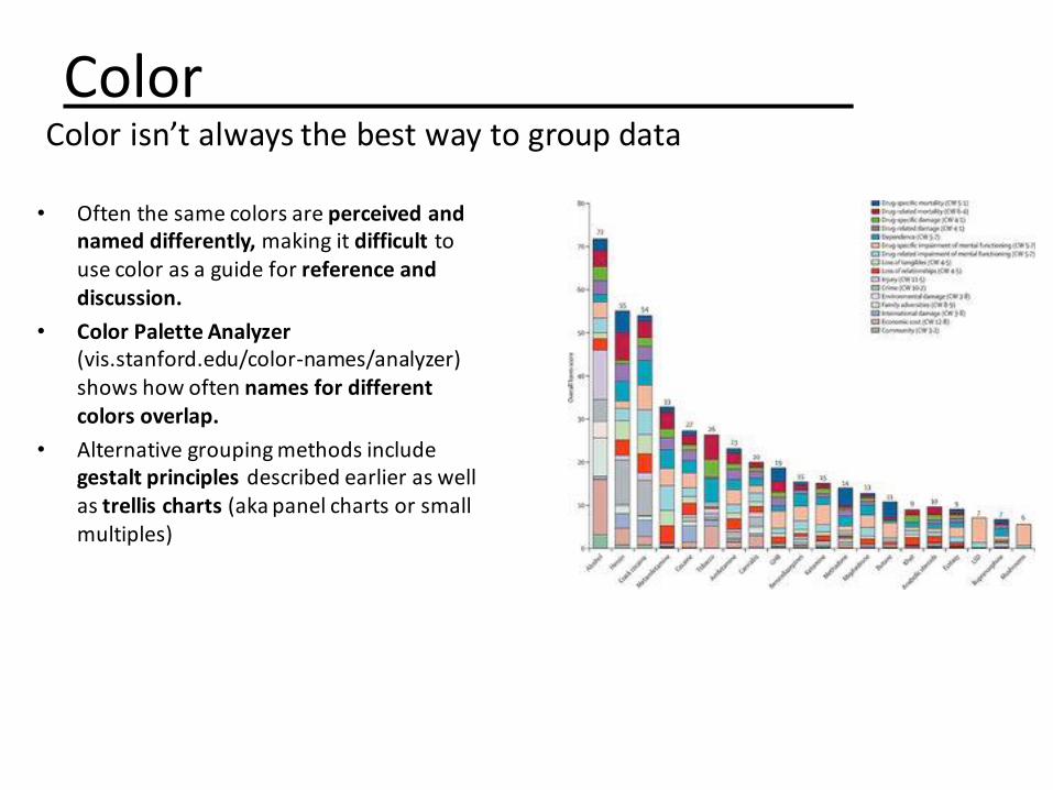
ColorColor isn’t always the best way to group data
• Often the same colors are perceived and named differently, making it difficult to use color as a guide for reference and discussion.
• Color Palette Analyzer(vis.stanford.edu/color-names/analyzer) shows how often names for different colors overlap.
• Alternative grouping methods include gestalt principles described earlier as well as trellis charts (aka panel charts or small multiples)

Trellis Charts

Trellis ChartsScatter Plot
VS

Trellis ChartsBar Charts
VS

Trellis ChartsLine Charts
VS

Improving Visualizations

How can this visualization be improved?
Figure 17 https://www.cbc.ca/radio/dnto/just-get-the-thing-done-and-let-them-howl-nellie-mcclung-1.3418924/which-incredible-canadian-woman-should-be-featured-on-the-20-bill-1.3419070

Which Incredible Canadian Woman Should Be Featured On The $20 Bill?
Poll Results
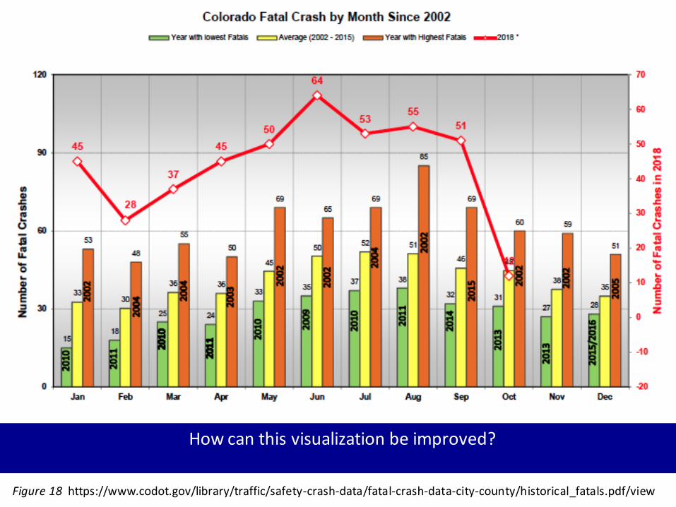
How can this visualization be improved?
Figure 18 https://www.codot.gov/library/traffic/safety-crash-data/fatal-crash-data-city-county/historical_fatals.pdf/view

LOWEST YEAR
HIGHEST YEAR
JAN 2010 2002
FEB 2011 2004
MAR 2010 2004
APR 2011 2003
MAY 2010 2002
JUN 2009 2002
JUL 2010 2004
AUG 2011 2002
SEP 2014 2015
OCT 2013 2002
NOV 2013 2002
DEC 2015/16 2005
0
30
60
90
Jan Feb Mar Apr May Jun Jul Aug Sep Oct Nov Dec
Colorado Fatal Crashes by Month since 2002
Max Average Min
0
10
20
30
40
50
60
70
Jan Feb Mar Apr May Jun Jul Aug Sep Oct
Colorado Fatal Crashes in 2018

Key Concepts
• Visualizations are most informative when complex data is used to tell a story.
• Consider your audience at all times
• Certain graphical elements can be more accurately perceived than others.
• Avoid mixing and manipulating scales. Be honest with your presentation.
• Consider which elements of your visualization “pop out” and attract the most attention.
• Avoid color schemes that conflict with red-green blindness.
• Consider whether multiple charts will be more informative or easier to read than a single chart.
• Clarity is key.

Resources
• Tableau
• Microsoft Excel
Desktop
• Plotly
• Highcharts Cloud
Web-Based
ReferencesAlonso, J. (2011, February). A short visual history of charts and graphs. Retrieved from
https://seeingcomplexity.wordpress.com/2011/02/03/a-short-visual-history-of-charts-and-graphs/
Camoes, J. (2013). Chart redraw: Troops Vs. Cost (Time Magazine). Retrieved from https://excelcharts.com/redraw-
troops-vs-cost-time-magazine/
CBC Radio (2016). Which incredible Canadian woman should be featured on the $20 bill? Retrieved from
https://www.cbc.ca/radio/dnto/just-get-the-thing-done-and-let-them-howl-nellie-mcclung-1.3418924/which-incredible-canadian-woman-should-be-featured-on-the-20-bill-1.3419070
Cheng, K. (2013, September). Scientific Data Visualization: Understanding Malaria. Retrieved from http://arcadenw.org/article/scientific-visualization
Coady, G. (2012). Colour Accessibility. Retrieved from https://24ways.org/2012/colour-accessibility/
Colorado Department of Transportation (2018). “Colorado Fatal Crashes since 2002
“https://www.codot.gov/library/traffic/safety-crash-data/fatal-crash-data-city-county/historical_fatals.pdf/view
Cotgrave, A. (2016). Living with Data. Retrieved from https://www.infoworld.com/article/3088166/data-
analytics/why-how-to-lie-with-statistics-did-us-a-disservice.html
Clement, D. (2006) – Spiderchart2. Own work by the original uploader, Public Domain,
https://commons.wikimedia.org/w/index.php?curid=37046625
Engel, P. (2014). “This Chart Shows An Alarming Rise In Florida Gun Deaths After 'Stand Your Ground' Was Enacted”.
Retrieved from https://www.businessinsider.com/gun-deaths-in-florida-increased-with-stand-your-ground-2014-2

References Continued
Evade (2008). As Seen By The Color Blind. Retrieved from http://www.colourlovers.com/web/blog/2008/07/24/as -
seen-by-the-color-blind
Fitzsimmons, G. (2013, May). User Interface Design: How to get human visual attention. Retrieved from
http://blog.soton.ac.uk/webbers/2012/05/06/user-interface-design-how-to-get-human-visual-attention-by-gemma-fitzsimmons/
Kukaswadia, A. (2013, March). John Snow – The First Epidemiologist. Retrieved from http://blogs.plos.org/publichealth/2013/03/11/john-snow-the-first-epidemiologist/
Plotly Blog (no date). Retrieved from http://plotly18.rssing.com/chan-55892197/all_p2.html
Scarr, S. (2011). Iraq’s bloody toll. Retrieved from http://www.simonscarr.com/iraqs-bloody-toll/
Taylor, T. (2014). How to Use the Gestalt Principles for Visual Storytelling #PoDV. Retrieved from http://www.fusioncharts.com/blog/2014/03/how-to-use-the-gestalt-principles-for-visual-storytelling-podv/
Tufte, E. (no date). Napoleon’s March. Retrieved from https://www.edwardtufte.com/tufte/posters
XLCubed Blog (2008). The Dashboard Squint Test. Retrieved from https://blog.xlcubed.com/2008/08/the-dashbord-squint-test/
Yau, N. (2010). “Graphical perception – learn the fundamentals first.” Retrieved from https://flowingdata.com/2010/03/20/graphical-perception-learn-the-fundamentals-first/