Big Data application to predict macroeconomic indicators – Statswork

1
KDD Project Thesis
Data Mining in Macroeconomic Data Sets
Ping Chen
Machine Learning Department
School of Computer Science
Carnegie Mellon University
5000 Forbes Avenue, Pittsburgh, PA 15213

2
Abstract
National Economic Input-Output (EIO) data describes the monetary transactions among
economic sectors. The monetary transactions among these sectors form a weighted bi-
directional network from a supply sector to a demand sector and the weight is equivalent
to the transaction value between them. In this research, we study the properties of this
network and identify patterns of inter-sector dependence evolution by investigating the
historical EIO data over the years 1947-1982. Here we make the following contributions:
The first is the discovery that economic transactions (the distribution of the weight) are
highly skewed, but follow the double Pareto-lognormal distribution (dPlN). The second
contribution is the design of a new method, “Multiple Steps of Pattern REcognition in
skewed DAta” (M-SPREAD) which identifies patterns and clusters despite the skewness
of the data set. We applied our methods on the EIO data and we found interesting and
explainable patterns, such as correlations among sectors, various evolution patterns
within different transaction scales, outlier sectors and outlier time-stamps.

3
Table of Content
Chapter 1 Research Question.............................................................................................. 4 Chapter 2 Data Description................................................................................................. 6 Chapter 3 Economy Network Property............................................................................... 8
3.1 Distribution of Transactions ............................................................................... 8 3.2 Survey ............................................................................................................... 10 3.3 Distribution Model Estimation ......................................................................... 14
Chapter 4 Economic Dependency Evolution Pattern........................................................ 18 4.1 Survey ............................................................................................................... 18
4.1.1 Singular Value Decomposition (SVD) ..................................................... 18 4.1.2 K-means .................................................................................................... 19
4.2 Pre-experiments ................................................................................................ 20 4.3 Proposed Procedure: Multiple Steps of Pattern REcognition in skewed DAta (M-SPREAD)................................................................................................................ 21 4.4 Experiments ...................................................................................................... 23 4.5 Results............................................................................................................... 25
4.5.1 Principal Components and Interpretation ................................................. 25 4.5.2 Cluster Outcome and Interpretation.......................................................... 26 4.5.3 Discovery of Correlated Industry.............................................................. 30
Chapter 5 Contribution ..................................................................................................... 33 Reference .......................................................................................................................... 34 Appendix – Oil Price Chronology .................................................................................... 35

4
Chapter 1 Research Question
The US Economic Input-Output (EIO) accounts [11] show how industries provide input
to, and use output from, other industries to produce Gross Domestic Product (GDP).
These accounts provide detailed information on the flows of the goods and services of
industries in US dollars, such as the purchase of coal from the coal mining sector by the
power generation sector. Graphically, these sectors form a weighted bi-directional
network through the economic transactions between them. Individual sectors become the
vertices of the network; the edges are generated by the economic transaction relationships
from the supply sector to the demand sector. The weight of the edges is measured by the
dollar amount of monetary transactions between them. Figure 1 shows an example of part
of the economy network composed by three economic sectors and the amount of
transactions between each pair of them. Learning the web properties of the economy
network, including the web structure, the distribution of the size of transactions as well as
the evolution of the network can benefit the understanding of the formation and
movement of the interconnections among these sectors and is therefore helpful for the
prediction of the change of the economic system in the future.
Figure 1 Economy Network Illustration
Monetary connections and commodity supply demand transactions determine the
interdependence among economic sectors. The existence of supply-demand connections
makes the dysfunction of one economic sector jeopardize for the normal operation of the
other sector. The disruption of any sector can potentially endanger the operability of the
entire economic system. Economic input output data records the amount of economic

5
transactions among these sectors and reflects the strength of dependence among them.
The dependence among these sectors is often reviewed by their direct monetary
transactions. For example, large supply and demand requirements normally imply tight
dependence of one sector on the other. However, indirect dependences or hidden
correlations based on a third party factor, such as competition for the same resources, etc.
are underestimated using this evaluation process. Understanding the indirect connections
and hidden connections can help comprehend the interdependence better. One way to
detect these hidden correlations is to identify sectors that have correlated performance
over time. Sectors which have a similar or opposite dependence evolution patterns are
thought to be correlated.
In this research, we are interested in answering the following questions: (a) Can we
describe the graph properties of the economy network? For example, are there any
distribution and growth patterns among the transactions of these sectors? (b) Can we
characterize the changes in the transactions over time and explain why? (c) Can we detect
outlier sectors effectively? (d) Can we spot correlated sectors effectively?
The research is presented in the following sections. Section 2 describes the data set and
the data integration processes. In the preliminary analysis part (Section 3), we discover
the features of the EIO data set: skewed distribution and asymmetric, hyperbolic-like log-
log density curve. Section 4 discusses the pattern recognition and trend analysis process,
where an effective pattern identification procedure, called Multiple Steps of Pattern
REcognition in skewed DAta (M-SPREAD), is introduced that utilizes both the skewed
distribution property of the data set and the effectiveness of classical clustering method to
identify refined clusters and patterns in a skewed data set. The clustering results from the
new method are then presented in Section 4. The results illustrate that growth patterns
related to the scale feature of the transactions are discovered in the refined clusters. In
Section 5, we summarize the major contributions and discuss the potential applications of
this method to data sets with skewed distributions.

6
Chapter 2 Data Description
The United States Economic Input-Output data are kept in a square table with economic
sectors listed in the row and column of the table. Each data cell entry shows the
transaction in US dollars processed from the row sector to the column sector, aggregated
during the year when the data was collected. Economic sectors are defined according to a
standard classification system developed by the US Department of Commerce to
categorize business activities. The Standard Industrial Classification (SIC) was originally
developed in the 1930s to classify and compare the establishments by the type of activity
in which they were primarily engaged [11]. The SIC was replaced by the North American
Industry Classification Standard (NAICS) in 1997. The EIO tables collected from
different years have varied levels of aggregation ranging from 65 sectors to more than
500 sectors. To make the data tables comparable from year to year, we have to select the
data levels that appear the most frequently over the given set of table series and choose
the sectors that are defined using the same classification scheme. The final decision is to
choose the transaction data at the industry level with around 100 sectors, among which 73
individual sectors are selected for the interdependence analysis because they have the
same sector categorization definitions. The inter-transaction data are selected from the
EIO table of year 1947, 1958, 1963, 1967, 1972, 1977 and 1982. Meanwhile, we also
collected the total industry output data from these years. The total industry output from
any sector is the sum of its direct transactions over all the sectors plus the final
consumptions on that sector.
Having seven input output tables in equal size square tables, we reorganized and
integrated the data so that they are arranged into one table and the transaction values from
the same year are represented as one dimension in the new table. Figure 2 illustrates the
storage of the EIO data and the formation of the new data tables. Specifically, each
transaction between any two sectors is presented as one record in the new table. The
transaction values over different years are listed as different attributes in the new table.
Since we reorganized the transaction data from seven different years, there are seven

7
attributes in the newly formed table. Considered as a missing data, transaction records
that have zero values in one or more years are removed from the table. There are around
2950 records in the resulting inter-industry transaction data table. The analysis conducted
in the following sections proceeds on this new table.
Figure 2 EIO Table Form (Matrix format of Economy Network) and Data Integration Process

8
Chapter 3 Economy Network Property
The National Economy Input Output System is an example of complex networks
describing the economic transactions among economic sectors at a given time. An
economy network can be defined as a directed weighted graph, which has a set of S
vertices representing S economic sectors and L directed links pointing from supply sector
to the demand sector. The weight attached to each link is equivalent to the dollar value of
transactions from the supply sector to the demand sector. This is a bi-directional graph
since the sector which produces supply for the other sectors might need also the services
or products from those sectors as a necessary part for its operation process. In this section,
we evaluate the property of this network with a major interest on the distribution of the
dollar transaction, which is also the weight distribution of the economy network.
3.1 Distribution of Transactions As the first step, the histograms of the data set, including the total industry output and
inter-industry transaction from each collected year, are plotted and it is obvious to see
that the data is highly skewed with only a few huge transactions or sector outputs. There
is a high density of small and middle-size transactions. The total industry output from
year 1947 to year 1987 ranges from $4.2 million to over $1,100 billion with a mean of
$43.5 billion and a median of $12.8 billion; the Industry-by-Industry transaction ranges
from $100 to $130 billion with a mean of $168.48 million and a median of $8.1 million.
Normally, highly skewed data needs further transformation, such as a logarithmic
transformation. We plot the combination of different distribution curves (Probability
Distribution Function (PDF), Cumulative Distribution Function (CDF), Negative
Cumulative Distribution Function (NCDF)), together with different transformation
schemes (linear-linear, log-linear, log-log), for the distribution of the total industry output,
inter-industry transaction from each year. Here, the log-linear transformation takes the
logarithm of the data value; log-log transformation takes the logarithm of both the data
values and the probabilities. Figure 3 (a) and (b) give the example of the log-linear PDF,

9
log-log PDF, log-log CDF and log-log NCDF distribution of the total industry output in
1963 and the industry-by-industry transactions in year 1982.
(a) Total Industry Output Distribution Summary (Year 1963)

10
(b) Inter-Industry Transaction Distribution Summary (Year 1982)
Figure 3 Example Distribution Plots (more plots)
Three major observations have been obtained from these distribution plots: (1) The log-
linear histograms approximate a normal distribution in most cases. However, one side of
the tail often exhibits as slightly skewed. (2) The log-log transformed density distribution
function (log-log, PDF) plots approximate a hyperbola shape but, are slightly asymmetric.
There is one transition point that separates the curve into two parts. (3) The log-log
transformation of the negative cumulative distribution function (log-log, NCDF) and log-
log CDF plots exhibit approximately two straight lines with one transition point in the
middle.
3.2 Survey
Power Law distributions (also refereed to as heavy-tail distributions, Pareto distributions,
Zipfian distributions, etc) are used to describe phenomena where large events are rare,
but small ones are quite common. For example, there are a few mega-cities, but many
small towns [1]. Power-laws of the Internet topology have been observed by Faloutsos,

11
et al. and several metrics have been defined in their literature [3]. The standard
expression of Power-law has the form y xα∝ or log( ) log( )y xα∝ , where α is a constant, x and
y are the measures of interest, and ∝ stands for “proportional to” [3]. This regularity or
'law' is sometimes also referred to as Zipf’s Law or Pareto’s Law. Zipf's law usually
refers to the size of an occurrence of an event relative to it's rank x: [ ]P X x xα= ∝ or log( [ ]) log( )P X x xα= ∝ , which shows a linear straight line in the log-log probability
distribution function (PDF) plot. Pareto was interested in the distribution of income and
asked how many people have an income greater than x. Pareto's law states that the
number of events larger than x is an inverse power of x: [ ]P X x xα> ∝ or log( [ ]) log( )P X x xα> ∝ , which shows a linear straight line in the log-log negative
probability distribution function (NCDF) plot. Another type of distribution, called
lognormal distribution, is natural for describing growth of organisms, growth in option
prices, and any processes. This distribution generates a normal distribution in the
histogram after logarithmic transformation of the data values. Based on this, Reed [10]
introduced another type of distribution called double Pareto lognormal distribution
(dPlN), which can be thought as the mixture of the lognormal distribution and Pareto
distribution. The distribution exhibits a lognormal distribution body and Paretian
behavior in both tails. When plotted on logarithmic axes, its density exhibits hyperbolic-
type behavior [9]. The probability distribution can be represented by the following with
four shape parameters:
2~ ( , , , )X dPlN α β υ τ
Here is the mathematical equation of the probability density distribution function of the
double Pareto log-normal distribution:
21 2 2
21 2 2
log( )( ) [ exp{ / 2} ( )
log( )exp{ / 2} ( )]
X
C
xf x x
xx
α
β
αβ ν αταν α τα β τ
ν βτβν β ττ
− −
−
− −= + Φ
+
− ++ − + Φ
where Φ and ΦC are the cumulative distribution function (cdf) and complementary
cumulative distribution function (ccdf) of a standard normal distribution.

12
Assuming ( )Y Log X= , we have
22 2
22 2
( ) [exp{( 1) / 2} ( )
exp{( 1) / 2} ( )]
Y
C
yf y y
yy
αβ ν ατα αν α τα β τ
ν βτβ βν β ττ
− −= − − + + Φ
+
− ++ − − + Φ
Therefore, the asymptotic distribution of Y has the following property:
' ( 1)1 1( ) ~ ( )Yf y k x k x xα α− − += → +∞
' ( 1)2 1( ) ~ ( )Yf y k x k x xβ β −= → −∞
The Cumulative Distribution Function F(x) and Negative Cumulative Distribution
Function S(x) = 1-F(x) also exhibit power law tail behavior with
' 11 1( ) ~ ( )SS x k x k x xα α− − += → +∞
' 11 1( ) ~ ( 0)FF x k x k x xβ β− += →
That is, we can monitor the slope of the tails at the CDF, log-log and NCDF, log-log plot.
The density distribution of this can be represented as a mixture of a right-handed and left-
handed Pareto distribution in both tails. It satisfies that 12( ) ~ ( 0)f x k x xβ − →
and 11( ) ~ ( )f x k x xα− − →∞ where f(x) is the PDF of the double Pareto lognormal
distribution. Figure 4 illustrates the meaning of each parameter in evaluating a double
Pareto lognormal distribution. The υ parameter is determined by the mean value of the
approximate lognormal distribution of the given data set. The α and β parameters
represent the slope that is in the log-log NCDF plot and log-log CDF plot, respectively.

13
Figure 4 dPlN Parameter Interpretation
Figure 5 shows the examples modeled by dPlN distribution in the paper of Reed [9]. Two
tails are observed in the log-log density distribution of the national household income
data set of several countries, including the Unites States, Sri Lanka and Canada, etc. To
derive the dPlN model, the derivation process starts from assuming that the distribution
of the initial salary is a lognormal distribution. After a period of gaining experience this is
modeled as a stochastic process, the salary increases as a consequence. At a specific year
of interest, the distribution of the average personal salary level is observed following the
characteristics of double Pareto lognormal distribution. Therefore, the distribution of the
nationwide household income follows the same dPlN distribution also.

14
Figure 5 Household Income Data for different Countries [Reed, 2002 2003]
summarizes the graphical characteristics of different distribution generation possess
discussed above.
Table 1 summarizes the graphical characteristics of different distribution generation
possess discussed above.
Table 1 Graphical Characteristics of typical Distributions
PDF(Log-Log) NCDF(Log-Log)
Log-Normal Parabola, Symmetric Stock price change
Power Law (Pareto Law and Zipf's Law) One straight line One straight line
Network growth, file size increase, frequency of English words, size of
city
Double Pareto Lognormal Distribution (dPlN)
Approximately hyperbola; lognormal body and
paretian tailApproximately two lines Income level
CategoryTypes of Distribution Curve with Transformation
Applications
3.3 Distribution Model Estimation
In this part, we fit the log-log PDF distribution of industry-by-industry transaction data
sets from collected years using a double Pareto-lognormal distribution model and
15
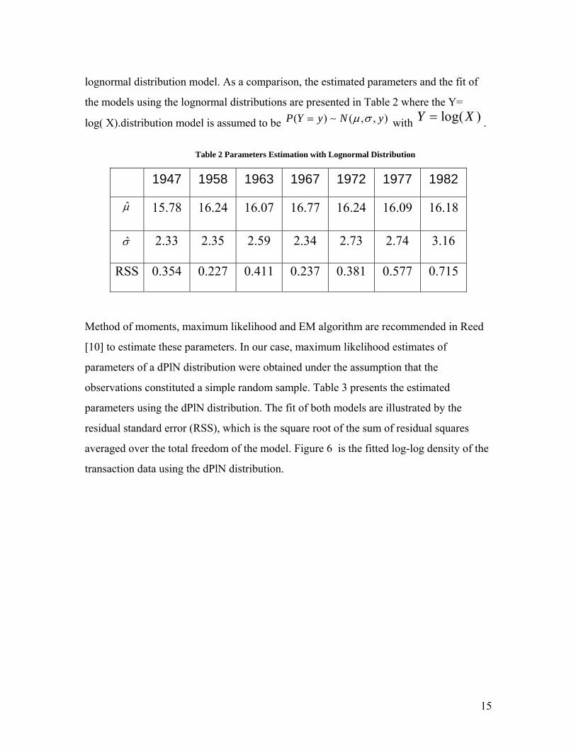
lognormal distribution model. As a comparison, the estimated parameters and the fit of
the models using the lognormal distributions are presented in Table 2 where the Y=
log( X).distribution model is assumed to be ( ) ( , , )P Y y N yµ σ= ∼ with log( )Y X= .
Table 2 Parameters Estimation with Lognormal Distribution
1947 1958 1963 1967 1972 1977 1982
µ̂ 15.78 16.24 16.07 16.77 16.24 16.09 16.18
σ̂ 2.33 2.35 2.59 2.34 2.73 2.74 3.16
RSS 0.354 0.227 0.411 0.237 0.381 0.577 0.715
Method of moments, maximum likelihood and EM algorithm are recommended in Reed
[10] to estimate these parameters. In our case, maximum likelihood estimates of
parameters of a dPlN distribution were obtained under the assumption that the
observations constituted a simple random sample. Table 3 presents the estimated
parameters using the dPlN distribution. The fit of both models are illustrated by the
residual standard error (RSS), which is the square root of the sum of residual squares
averaged over the total freedom of the model. Figure 6 is the fitted log-log density of the
transaction data using the dPlN distribution.

16
Table 3 Parameter Estimation with dPNl Distribution
1947 1958 1963 1967 1972 1977 1982
'α̂ 2.764 5.476 5.179 5.401 4.330 4.906 4.862
'β̂ 1.200 1.365 1.140 4.129 1.581 1.170 0.988
υ̂ 7.139 7.347 7.517 7.237 7.206 7.227 7.919
2τ̂ 0.494 0.797 0.807 1.013 1.071 1.062 0.976
RSS 0.015 0.015 0.018 0.038 0.019 0.010 0.022
Figure 6 Fit Log-log, PDF Transactions with dPlN
Comparing Table 2 and Table 3, we see that the distribution of transaction values doesn’t
change too much over the investigated periods of around 40 years. The double Pareto
lognormal distribution returns a lower residual standard error (RSS) over all the data

17
collection years. In addition, it can be seen from the fit shown in Figure 6 that the fitted
distribution curve has one straight tail line lying in the large transaction side and another
straight tail line lying in the small transaction side. Since one single straight tail in the
log-log PDF curve implies a Pareto distribution, the transaction data set presents double
Pareto properties.
As a summary, the major observations about the weight distribution of the economy
network from the above graphs and tables are (1) Overall, the shape parameters are pretty
stable over time; (2) Two tails and two slopes are observed in the density plot after
logarithm transformation; (3) The right side tail is slightly steeper than the left tail; (4)
Mode (υ) slightly increases over time (expect 1967-1977) which tells us that in general,
the economy keeps growing.

18
Chapter 4 Economic Dependency Evolution Pattern
The distribution test shows that the transaction data set is highly skewed. In this section,
we present the methodology for, and results of, finding patterns of change in the inter-
sector connections over several years. Pattern and trend analysis can be conducted using
clustering methods. Since each year’s transaction is treated as one dimension and there
are seven years of transaction data, the number of the dimensions for this problem is
seven. The way to discover the pattern of the development of inter-sector
interdependency is to conduct clustering analysis using these seven years transaction
attributes.
4.1 Survey
Clustering is unsupervised classification consisting of partitioning large sets of data
objects into homogeneous groups. From a machine learning perspective, clusters
correspond to hidden patterns; the search for clusters is unsupervised learning. From a
practical perspective, clustering plays an important role in data mining applications. Most
of the common approaches used for clustering build on non-parametric models. Here we
describe some of these clustering methods.
4.1.1 Singular Value Decomposition (SVD)
SVD utilizes a linear projection technique to discover clusters in a dataset. It projects the
original data points into a subspace that constitutes its best approximation and preserves
the character of the data [6]. The SVD of an n x m matrix X is the factorization of the
form
TX U V= Λ
Where U is an n x n orthogonal matrix, V is an m x m orthogonal matrix, and Λ is an n x
m diagonal matrix with 0ijλ = if i j≠ . The diagonal elements ijλ are the singular values of
X. The U matrix can be viewed as a similarity matrix among the rows of X. The V matrix
can be viewed as a similarity matrix among the columns of X. The Λmatrix gives a
measure of how much the data variance is kept in the new space. In the case where
19
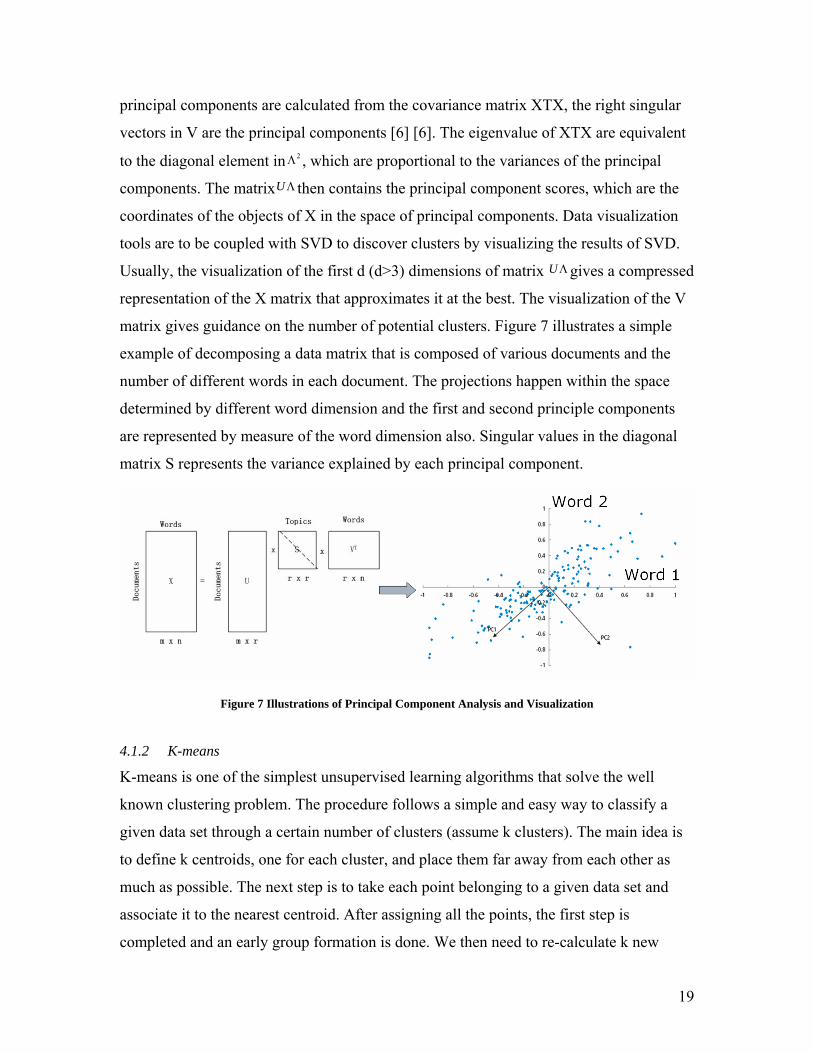
principal components are calculated from the covariance matrix XTX, the right singular
vectors in V are the principal components [6] [6]. The eigenvalue of XTX are equivalent
to the diagonal element in 2Λ , which are proportional to the variances of the principal
components. The matrixUΛ then contains the principal component scores, which are the
coordinates of the objects of X in the space of principal components. Data visualization
tools are to be coupled with SVD to discover clusters by visualizing the results of SVD.
Usually, the visualization of the first d (d>3) dimensions of matrix UΛgives a compressed
representation of the X matrix that approximates it at the best. The visualization of the V
matrix gives guidance on the number of potential clusters. Figure 7 illustrates a simple
example of decomposing a data matrix that is composed of various documents and the
number of different words in each document. The projections happen within the space
determined by different word dimension and the first and second principle components
are represented by measure of the word dimension also. Singular values in the diagonal
matrix S represents the variance explained by each principal component.
Figure 7 Illustrations of Principal Component Analysis and Visualization
4.1.2 K-means
K-means is one of the simplest unsupervised learning algorithms that solve the well
known clustering problem. The procedure follows a simple and easy way to classify a
given data set through a certain number of clusters (assume k clusters). The main idea is
to define k centroids, one for each cluster, and place them far away from each other as
much as possible. The next step is to take each point belonging to a given data set and
associate it to the nearest centroid. After assigning all the points, the first step is
completed and an early group formation is done. We then need to re-calculate k new

20
centroids as the center of the mass of the clusters resulted from the previous step. After
having these k new centroids, a new binding has to be done between the same data set
points and the nearest new centroid. We repeat this procedure until the centroids only
move within a smallest enough range. The data points that are assigned to the same and
nearest centroids are treated as one cluster [5].
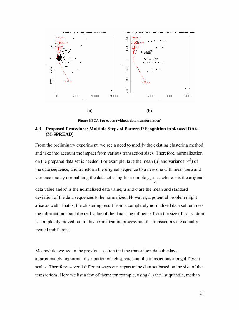
4.2 Pre-experiments As SVD method returns principal components which are weighted combinations of each
attribute, it helps to understand the trend of interdependence evolution over time. The
SVD method is adopted and applied to the prepared data set. Figure 8 shows the
projected PCA clustering results. We observed one cluster in the projected 2-d plane,
which is constituted by the first and second principal components (h1-h2 plane) of the
transformed EIO table (Figure 8). However, it turns out that this cluster is formed
because the size of transactions falling into this cluster is relatively small. The top 20
large inter-industry transactions are selected separately and plotted in the PCA projection
plane in Figure 8 (b). Compared with the clustering result for the entire data set, these
sectors have been isolated from the major clusters in the original PCA projection result in
Figure 8 (a) because of the magnitude of these data values is much higher than others.
Obviously, large transaction volumes dominate the clustering result in this data set by
using untreated clustering methods. Since there is a large amount of relatively small size
transactions, the specific characteristics of these small transactions become faded and
undiscovered from these clustering outcomes because of the dominance of large size
transactions.
21
(a) (b)
Figure 8 PCA Projection (without data transformation)
4.3 Proposed Procedure: Multiple Steps of Pattern REcognition in skewed DAta (M-SPREAD)
From the preliminary experiment, we see a need to modify the existing clustering method
and take into account the impact from various transaction sizes. Therefore, normalization
on the prepared data set is needed. For example, take the mean (u) and variance (σ2) of
the data sequence, and transform the original sequence to a new one with mean zero and
variance one by normalizing the data set using for example ' x uxσ−
= , where x is the original
data value and x’ is the normalized data value; u and σ are the mean and standard
deviation of the data sequences to be normalized. However, a potential problem might
arise as well. That is, the clustering result from a completely normalized data set removes
the information about the real value of the data. The influence from the size of transaction
is completely moved out in this normalization process and the transactions are actually
treated indifferent.
Meanwhile, we see in the previous section that the transaction data displays
approximately lognormal distribution which spreads out the transactions along different
scales. Therefore, several different ways can separate the data set based on the size of the
transactions. Here we list a few of them: for example, using (1) the 1st quantile, median

22
and 3rd quantile values; (2) Mean +/- Standard Deviation; (3) the transition point in the
log-log PDF curve as the threshold for splitting. We define these as the “feature values”
of a skewed distribution.
Conditional on these findings, we can utilize the properties of skewed distribution
interactively with the traditional clustering method to augment the clustering outcome by
maintaining the growth pattern over sequential attributes using normalization techniques
and at the same time taking into account the influence from various sizes of transaction
values appropriately. The methodology for improving the clustering result is to first
bucketize the amounts into quantiles (say, 4 quantiles). Then we can conduct traditional
clustering method, such as SVD, on the normalized data set, and find out dimension
reduction strategy that is appropriate for the entire data set. This factorization result is not
distorted by the scale of the data values. At last, applying the identified data reduction
strategy, we can recognize the refined clusters among each first level bucket. Basically,
we improve the traditional clustering method by adding one more level of buckets based
on the data scales to improve the accuracy and effectiveness of the final clustering results.
The overall procedure is named Multiple Steps of Pattern REcognition in skewed DAta
(M-SPREAD) and the formalized procedure is given in the following flow chart.

23
Flow Chart: Summary of M-SPREAD procedure
4.4 Experiments We used the same data set as the one used in the pre-experiment. The clustering
procedure follows the steps defined in the Flow Chart. Here we identified two sets of
feature values: (1) quantiles; and (2) mean+/-standard deviation to separate the entire
transactions data set into four buckets: (a) Very Small (VS); (b) Small (S); (c) Large (L)
and (d) Very Large (VL).
The transaction series data for each pair of interdependent sectors can be transformed
with different strategies: (1) no transformation; (2) applying logarithmic algorithms or (3)
applying Box-Cox method, i.e., fifth power transformation method on the data values. On
top of these three transformation methods, we can normalize the data by row using mean-
zero, variance-one method. An example of the transaction series before and after
transformation and normalization is presented in Figure 9.
Procedure M-SPREAD (data matrix=Am*n, #(data objects)=m, #(discrete time
stamps)=n)
Begin
1. Examine the skewed distribution property of Ai,j (i=1…m, j=1…n) and identify feature values of the skewed distribution;
2. Group the data set using the feature values of the distribution and obtain the first level buckets Gk (k=1…t) containing data groups of various data scale.
3. Normalize the data set by row so that data values in Ai,j can be spread out evenly along different time stamps, using normalization method, such as mean-zero, variance-one over the temporal dimensions;
4. Apply SVD factorization TU VΛ on the normalized data set to obtain the first d (d<=3) principal components h1,…, hd. The projection of entire data set on the lower dimension space determined by h1,…, hd is an M-Plane.
5. Separate projection of the first level data buckets obtained from Step2 onto the M- Plane generates M-Slices.
6. Identify clustering groups over each M-Slices generates refined clusters Gkl(k=1…t, l=1...nk) where t is the number of buckets and nk is the number of clusters within bucket k.
End

24
Figure 9 Transformation of Inter-Industry Transactions
In the next step, we conducted SVD factorization on the transformed data set and
estimated the linear projection model on it. At last, the linear projection model is applied
to each bucket identified in the first step and the clusters for each bucket are detected.
These are the refined clusters, the clustering outcome by incorporating complete data
information. The process of conducting PCA decomposition and projection are illustrated
in Figure 10. We started from the normalized transaction data table, each transaction pair
is projected onto a seven dimensional space, one dimension for each year. The first and
second principal components are represented by a vector in the seven-dimensional space
also and constitute a new plane in the high dimensional space. All the transaction pair
data set can therefore be projected onto this new plane. Acquiring only the plane formed
by the first and second principal components, we obtained a new plot that has all these
transaction pairs with new coordinates shown at the rightmost side of Figure 10.
Clustering information can therefore be obtained from this graph visually.

25
Figure 10 PCA Projection Process
4.5 Results
The following presents the pattern recognition results by using the Industry-by-Industry
Transaction data, after zero-mean, unit-variance normalization and using data quantiles as
feature values. In the following, the principal components after SVD factorization are
illustrated in the first part. The projection of the entire data set and clustering outcome are
presented in the second part. Identification of correlated sectors is presented after that.
4.5.1 Principal Components and Interpretation
SVD factorization using the complete inter-industry’s transaction time series data returns
the first and second principal component (h1 and h2), which constitute the linear
projection model that can project the transaction data set from seven dimensional space to
two dimensional space and still maintain the clustering properties of the original data set.
As principal component represents a vector in the original 7-d space where the data can
be projected, a higher weight assigned for one dimension (one data attribute) by principal
component represents higher data values along that dimension. Reversing the sign of
these two principal components (-h1 and -h2), we get two kinds of transaction
development pattern and they are plotted in Figure 11. In the reversed first principal
component (-h1), we see that the transaction value from the later years are assigned
higher weights. Thus, we can conclude that the positive growth trend represented by the
major transactions is captured in the reversed first principal component. Similarly, the

26
reversed second principal component (-h2) has captured the negative growth trend in the
transaction. The weight assigned for the year 1970’s in the reversed second principal
component (-h2) is surprisingly lower compared with the previous years and the values
went up again in the 1980s.
Figure 11 Reversed Principal Components
4.5.2 Cluster Outcome and Interpretation
Figure 12 shows the projection of the normalized industry–by-industry transactions
between each pair of sectors in the plane constructed by the first and second principal
component, named M-Plane here. Because of normalization, the projection of around
2950 data points produces a ball-like shape over the space of reduced dimensionality.
Each point represents a series of transaction between a pair of sectors. The positions of
these data points are determined by the growth pattern of their transactions and are
compared with the growth patterns represented by the two major principal components:
h1 and h2. Four single trend plots (+/-h1, +/-h2) represented by the principal components
are plotted outside the M-Plane. They represent the growth patterns of the transaction
series projected onto the middle of the perimeter.

27
Figure 12 M-Plane
Two clusters can be visually identified from Figure 12 and they are circled out in the M-
Plane. The left side cluster (Cluster I) sits at the minus sign side of the h1 axis and
parallel to the h2 axis. These data points represent sector pairs that possess a growth
pattern similar to the one represented by the reversed first principal component. That is,
the transactions between these sectors continuously grow over the past fifty years. The
other cluster (Cluster II) is close to the minus sign side of the h2 axis. These inter-sector
transactions have a similar growth pattern as the one represented by the reversed second
principal component. That is, their transactions kept growing during the first twenty years,
then diminished in the next ten years and got intensified again after another ten years.
28
The first trend detected in Cluster I is easy to understand, as we believe that in general the
economy sustains a positive growth trend over time. The trend identified in the second
cluster is a little bit surprising. However, as we search through history, we might want to
attribute this to the OPEC Oil Embargo in the 1970s when the world economy faced a
major crisis. This might be the major reason why the economic input output transaction
showed a decline at that time. A detailed examination of the transactions in the Cluster II
areas shows that 50 out of the total 73 sectors get involved into this growth pattern.
Among them, wholesale and retail, hotel service, manufacturing industry are typical
industries that are affected by the oil crisis in the 1970s.
In addition, we separate the M-Plane into sixteen regions of different growth pattern
using the threshold determined by the two identified clusters. The opposing areas in M-
Plane share opposing growth patterns. According to the findings from the clustering
outcome, we get eight regions which represent transactions of particular characteristics:
Region [X1] and [X2] – Growing transaction relations;
Region [X5] and [X6] – Shrinking transaction relations;
Region [X3] and [X4] – Oil sensitive transaction relations;
Region [X7] and [X8] – Oil hoisting transaction relations;
Following the M-SPREAD procedure defined in the previous section, we separate the
inter-industry transaction data into groups using the quantitile values of data distributions.
Four buckets are generated: (1) Very Small (VS); (2) Small (S); (3) Large (L) and (4)
Very Large (VL) transactions. The separation and plot of the projection of these data
points over the M-Plane space is given in Figure 13, named M-Slices here. We see that
different buckets are actually having different clustering patterns. For example, the VL
transaction group generally displays a continuous and un-interrupted growing pattern.
Most of these transactions are projected onto the minus sign side of the h1 axis which
means that most of these inter-sector transactions follow a growing trend over time and
they are less oil sensitive. The small and large transaction groups tend to have both kinds
of growth patterns (top right and bottom left of Figure 13). Except for the contiguous
growth pattern identified by Cluster I, the very small transactions overall have mixed
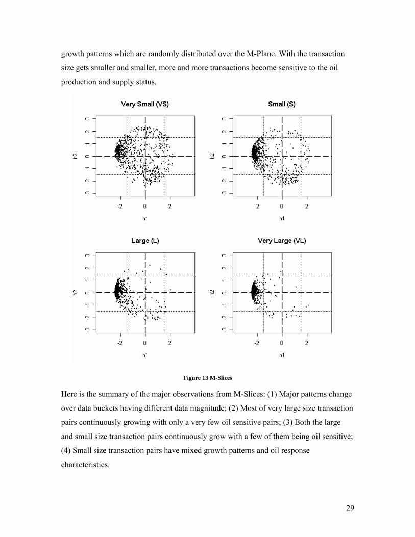
29
growth patterns which are randomly distributed over the M-Plane. With the transaction
size gets smaller and smaller, more and more transactions become sensitive to the oil
production and supply status.
Figure 13 M-Slices
Here is the summary of the major observations from M-Slices: (1) Major patterns change
over data buckets having different data magnitude; (2) Most of very large size transaction
pairs continuously growing with only a very few oil sensitive pairs; (3) Both the large
and small size transaction pairs continuously grow with a few of them being oil sensitive;
(4) Small size transaction pairs have mixed growth patterns and oil response
characteristics.

30
4.5.3 Discovery of Correlated Industry
As discussed in the first section, sectors that have constant dependence would exhibit
stable correlated growth pattern. Based on this, we group the transactions which have the
same demand sector as one column sub setting of the data set, and group the transactions
having the same supply sector as one row sub setting of the data set. We then projected
these grouped transactions onto the M-Plane. We get 73 individual supply sectors’
projection and 73 individual demand sectors’ projection. Interestingly, we see sectors that
have similar or opposing projected pattern. For example, Figure 14 has four sub settings
of the M-Plane, which includes two individual industry related supply transactions (Row
Sub Settings) and two individual industry related demand transactions (Column Sub
Settings). Each point in Figure 14 represents one pair of transactions. Each sector has
maximally 73 transactions with different sectors, including itself. Figure 14 (a) and (b)
exhibit the row sub settings for “Motor Vehicles and Equipment Industry” and “Aircraft
and Parts Supply Industry” as the supply sector. Figure 14 (c) and (d) exhibit the column
sub settings for the “Petroleum Refining and Related Industry” and “Transportation and
Warehousing Industry” as the demand sector.
We can see that a large part of transactions whose supply sectors are the “Motor
Equipment industry” or the “Aircraft industry” is projected onto the bottom part of the
M-Plane, which means that the supply from these sectors decreases in the 1970s. On the
contrary, a part of transactions whose demand sectors are the “Petroleum industry” or the
“Warehousing industry” is projected onto the top part of the M-Plane, which means that
the demand from these industries increased in the 1970. Recalling that oil crisis and the
economic depression in 1970s are mainly caused by the OPEC Oil embargo actions, it is
easy to understand that the reduction of production of transportation related facilities and
the increased production of the domestic petroleum products and building facilities for
warehousing that can reduce the demand of multiple shipments would be taken as the
necessary responses to the imported oil shortage during that time.

31
(a) Supply Sector 59: Motor Vehicle and Equipment Industry
(b) Supply Sector 60: Aircraft and parts
(c) Demand Sector 31: Petroleum refining and related industries
(d) Demand Sector 65: Transportation and Warehousing
Figure 14 Row Sub Settings and Column Sub Settings
In Figure 14(a), the observations from the “Motor Vehicle and Equipment Industry” M-
SubSetting plot are that overall “motor vehicle supply industry” related transactions are
within the two identified major cluster region (Cluster I, Cluster II).
In Figure 14(b), the observations from the “Air Craft and Parts Industry” M-SubSutting
plot are the following: (1) Similar to these identified in the motor vehicle M-SubSetting
plot, most of the air craft supply industry related transactions are within the two identified
cluster region (Cluster I, Cluster II) of the M-Plane; (2) A few outlier examples are

32
identified such as its transaction with the “Fabricated Textile Products” industry and it is
circled out in the plot. This transaction turns out to be around $3M averaged over these
given years and it is actually a very small transaction pairs which were shown to have
mixed growth patterns in Figure 13.
In Figure 14(c), the observations from the “Petroleum Refining and related Industry” M-
SubSetting plot are that overall the domestic petroleum production industry related
transactions are within the “growing", "oil benefiting” region of M-Plane.
In Figure 14(d), the observations from the “Transportation and Warehousing” industry
M-SubSetting plot are the following: a large number of the warehousing facility related
transactions are within the “growing” region of the M-Plane. There is no “oil suffering”
transaction being identified.
On top of this, we see that motor vehicle industry, aircraft part industry, etc are “oil
suffering” industries while domestic petroleum industry, warehousing industry, etc are
“oil benefiting” industries. The correlation between motor and aircraft industry and the
anti-correlation between the transportation facility and warehousing facility can be
revealed as well. Besides this, we can detect interesting phenomena of substitution
between services from different economic sectors, for example, access to the
transportation approach versus constructing warehousing facilities. This happens when
the oil shortage occurs; industries which require a lot shipment tend to stock up as many
goods as they can at one time to avoid multiple transportations.

33
Chapter 5 Contribution
With a main interest in understanding the properties of economy network and the pattern
of inter-sector transaction evolvement, this research discovers that the distribution of
economic transactions is highly skewed but follows the double Pareto lognormal
distribution. Moreover, it designs the procedure of Multiple Steps for Pattern Recognition
in Skewed DAta set (M-SPREAD) that can handle the skewness of the data set and
handle the effect of various magnitude of the data set. On top of this, the research has
designed effective visualization methods, such as M-Plane, M-Slice, M-SubSetting and
so on. Applying the M-SPREAD procedure and utilizing these visualization methods, we
discovered patterns of transaction evolution using the Economic Input Output data set,
which includes the effect of the various scale of the transaction on transaction evolution
pattern; finding correlated and anti-correlated sectors and identifying outlier sectors and
outlier time stamp.
Skewed data set appears quite often, for example, any network data set that follows
power law rules. In these cases, this methodology would be very helpful in terms of
handling both the skewness of the data set and the discovery of patterns that are related to
the skewness properties of the data set. The work in this research has broader
applicability. In addition, it can be applied to finance and business settings to help locate
correlated and anti-corrected entities, such as companies, products, stocks, etc that have
competing relationships or cooperation relationships.

34
Reference
[1] Adamic, L. A., Zipf, Power-laws, and Pareto - a ranking tutorial, Information Dynamics Lab, HP Labs [2] Crow, E.L., and Shimizu, K.,(editors), Lognormal Distributions: Theory and Applications, Markel Dekker, Inc.,
New York, 1988 [3] Faloutsos, M., Faloutsos, P., Faloutsos, C., On Power-law Relationships of the Internet Topology, ACM
SIGCOMN, Cambridge, MA, USA 1999. [4] Guilmi, C. D., Gaffeo, E., Gallegati, M., Power Law Scaling in the World Income Distribution, Economics
Bulletin,15,6 (2003),1-7 [5] MacQueen, J. B., (1967): "Some Methods for classification and Analysis of Multivariate Observations,
Proceedings of 5-th Berkeley Symposium on Mathematical Statistics and Probability", Berkeley, University of California Press, 1:281-297
[6] Maltseva, E., Pizzuti, C., Talia, D., Mining High-Dimensional Scientific Data Sets Using Singular Value Decomposition, Data Mining for Scientific and Engineering Applications, Kluwer, 2001.
[7] Mitzenmacher, M., A Brief History of Generative Models for Power Law and Lognormal Distributions, Internet Mathematics, 1, 2 (2003), 226-251
[8] Mitzenmacher, M., Dynamic Models for File Sizes and Double Pareto Distributions. Internet Mathematics,1,3 (2003), 305-333.
[9] Reed, W. J., The Pareto law of incomes – an explanation and an extension, PHYSICA A, 319 (2003) P469-486 [10] Reed, W. J., Jorgensen. M., The Double Pareto-Lognormal Distribution – A New Parametric Model for Size
Distributions, October, 2003 [11] [URL] Bureau of Economic Analysis. http://www.bea.gov/bea/dn2/home/benchmark.htm [12] [URL] What is its Relative Value in US Dollars? http://eh.net/hmit/compare/ [13] [URL] What was the GDP then? http://eh.net/hmit/gdp/GDPsource.2003.htm [14] [URL] Neural Networks for Time Series Prediction, Kornel Laskowski, 2004, Spring, lecture notes.
http://www.cs.cmu.edu/afs/cs/academic/class/15782-s04/slides/timeseries.pdf

35
Appendix – Oil Price Chronology