Data Journalism Playbook · 2019-01-08 · Data journalism adds the weight of evidence, not just...
46
1 Data Journalism Playbook With insight from the KING 5 Data Journalism Pilot
Transcript of Data Journalism Playbook · 2019-01-08 · Data journalism adds the weight of evidence, not just...

1
Data Journalism Playbook With insight from the KING 5
Data Journalism Pilot

2
Contents
Foreword by Steve Doig 3
Intent of this playbook 4
Data journalism as a repeatable process 5
Technology to enable the process 9
Idea and hypothesis generation 11
Data gathering 13
Data cleaning 16
Importing and modeling data 19
Data exploration 23
Storyboard and data visualization 26
Data visualization refinement 32
Publishing and sharing 38
Appendix 40

3
Foreword
When newsrooms began to discover the power of data journalism more than 50 years ago, finding
stories in data required then-rare skills of programming mainframe computers and training in social
science techniques like statistical analysis. Today, thanks to the development of powerful desktop
computers and versatile software tools like Microsoft Power BI, good data journalism work is within
reach of almost any newsroom — even yours.
This playbook is proof of that concept. Television newsrooms, with their limited staffing and tight time
constraints, have been slower over the years than their print counterparts to adopt the tools of data
journalism. However, forward-thinking station managers are realizing they need these skills in-house,
but the supply of data-savvy video journalists and news technicians is limited. This pilot project by
Seattle’s KING 5 reporters is an effort to meet that demand. Working with Microsoft’s Power BI team,
they developed a repeatable process for generating ideas for data stories, acquiring the raw data,
cleaning it, finding the interesting patterns in it, and then creating the graphics that would help tell the
story to station viewers and website users.
Data journalism adds the weight of evidence, not just anecdote, to make stories. As this playbook lays
out, the team discovered that even with great software tools, data journalism doesn’t mean that a few
taps on a computer keyboard will make good stories magically appear on television screens. Smart
analysis often is just the first step of telling a powerful data story, which also requires the traditional
skills of developing sources, reading documents, interviewing those affected, confronting those
responsible, and then integrating everything into a compelling visual package.
Power BI brings to data journalism an A-to-Z set of analysis and graphics functions that can help with
every phase of working with data. However, one lesson from this pilot project is that learning to use all
that power can be overwhelming, like trying to fly a Lear jet when all that is needed in the beginning,
at least, is to bicycle to the grocery store. Happily, novice data journalists don’t need to master all the
buttons and switches of Power BI in order to start doing good data stories. Microsoft’s Excel
spreadsheet, a close cousin to Power BI, is the easy-to-learn gateway drug to data journalism
addiction. Reporters who learn the basics of Excel sorts, filters, functions and pivot tables will have in
hand a multitool that will handle the majority of likely data journalism stories. And they’ll have a good
running start into adding Power BI skills when they start bumping into limitations of what Excel alone
can process.
So read this playbook and begin thinking about the data-sourced stories
you’d like to do for your viewers and readers. You — and they — will be
glad you did.
Steve Doig
Professor, Cronkite School of Journalism
Arizona State University

4
Intent of this playbook
This playbook aims to:
• Outline a data journalism process that can be adjusted for individual needs and gain efficiency over
time.
• Share real-world experiences from the KING 5 data journalism pilot project, including examples of
the people involved, processes followed and challenges overcome.
• Introduce Microsoft Excel and Microsoft Power BI as tools for data journalism.
• Provide suggested resources for deeper learning into each step of a project.
• Set guiding principles for journalists to uphold the Society of Professional Journalists’ Code of Ethics
and other industry standards.
The following data stories were created and
published with Microsoft Power BI during the KING
5 pilot:
“Where does Washington’s marijuana tax money go?”
Aired on August 8, 2018
“Washington congressional races on track to set fundraising records”
Aired on August 16, 2018
“Most Washington schools are failing to meet state's target for vaccinations”
Aired on Sept 5, 2018
“What will Seattle traffic look like without the viaduct?”
Aired on September 18, 2018

5
Data journalism as a
repeatable process
Data journalism is an effective way to capture complicated information into an engaging infographic-
style visualization that audiences can immediately grasp. Data by itself is just a collection of numbers,
but data journalism is the process of investigating, understanding and shaping that data to tell
compelling stories.
As with any reportage, data journalism does not follow a predetermined path. The diagram below
offers a series of recommended steps for journalists, analysts and visualizers as they work together as
a data journalism team. The process isn’t linear; in fact, steps are often revisited and repeated before
a story is complete. Each step, however, should be undertaken at least once.

6
Time investment
The time it takes to create a data journalism
story depends on many factors.
For example:
In the KING 5 pilot, one story aimed to
predict how a major traffic flow change
would impact morning commutes. Gathering
the data required multiple exchanges with
the Washington Department of
Transportation and the Seattle Department
of Transportation over a period of several
weeks.
Another project centered around the
marijuana excise tax revenue. The KING 5
team had to work through the data
exploration and the idea and hypothesis
generation steps several times, as the data
exploration results repeatedly disproved the
initial hypothesis. Eventually, we settled on
more of an informational story rather than a
deep investigation.
Lastly, the time to produce a story will
decrease, as journalists in the same group
share content, refine processes and gain
expertise.
Gain efficiency by building
reusable content
As the data journalism process is repeated
over time, groups will realize efficiencies by
maintaining datasets and developing
stories that can be reused in the future or
in other markets.
Repeatable story outlines:
Some story outlines are common and
repeatable, and it’s likely there is data available.
For example:
• Traffic accidents
• Spending on schools
• Health care cost rates
• Sports
• Crime patterns
• Seasonal weather (drought, floods, snow,
fires, hurricanes, cold snaps and heat
spells)
• National, state and local elections
• City demographics, including immigration,
homelessness and unemployment
Repositories of common and useful data
sources:
When repeatable story outlines are
developed, the data sources can be refreshed
with considerably less effort than the first time
the story is produced — not only is the origin
of the data known (i.e., the contact and/or
outlet who provided the data, the URL, etc.),
but also the steps to clean, model and
analyze the data.
The building blocks of an
efficient data journalism
model can include the
following:
• Defined workflows that map to the
repeatable process on the previous page
• Repeatable story outlines
• Repositories of common and useful data
sources
• Refined methods of data cleaning,
exploration and analysis
• Data visualization templates and style
guides
• Publishing processes

7
For example:
KING 5 produced a story on congressional
voting districts. Years later, the team was able
to pull new data, open the existing Power BI
data visualization, refresh the underlying
data, make minor adjustments and turn the
story around in less than two days.
Leveraging industry data sources is
also an effective way to scale data story
production. News organizations like the
Associated Press (AP) regularly release
data with a national story to AP member
organizations. Before release, a team of
data journalists collects, validates,
analyzes and models the data. By
leveraging clean and newsworthy data
like this, journalists can more quickly
build visualizations relevant to their
markets and viewers.
Refined methods of data cleaning and
exploration:
Over time, as journalists become versed in
technologies used for data journalism, like
Excel and Power BI, they’ll become more
skilled in data cleaning and data exploration.
If there are data experts on the team, it can
reduce the time to produce stories, as
journalists will be able to narrow in on their
story hypothesis faster.
Data visualization templates and style guide:
Storytelling often follows a recurring pattern.
Telling stories with data is no different. With
data visualization templates, discussed in
more detail in a later section, moving from
the data exploration step to storyboard and
data visualization development can be a
much easier transition.
Defining on-brand color palettes simplifies
creating data visualizations and reduces cycle
time in the data visualization refinement step.
Approved color palettes should already be
tested to be visible to people with
colorblindness, and to show up well on TV.
Establishing style guides can also reduce cycles
in the data visualization refinement step by
conforming to visual design best practices.
For example:
The KING 5 pilot project launched without a
style guide. The data visualizations on the
traffic forecasting story needed significant
tuning prior to being cleared for airing on TV
and publishing to the web. By the second
story, a data visualization template had been
put in place. The last story required just 20
percent of the time in the data visualization
refinement step compared with the traffic
forecasting story.
Maintaining a consistent look and feel will
help build the station and group brand, as
well as the audience’s familiarity with what to
expect with data stories.
Publishing process
Documenting a publishing process for every
broadcast and web story will reduce
confusion, help ensure steps are not missed
and keep team members on the same path.
“ Storytelling often
follows a recurring
pattern.
Telling stories with
data is no different.
“

8
Myths and misconceptions
KING 5 started with many myths and misconceptions about data journalism.
Data Journalism stories can be turned around in a couple days or less
Producing stories can take anywhere from a few days to several weeks. Even when a process has
been established, chasing the data trail can take up time.
Journalists can learn everything they need to know to be self-sufficient in producing
data journalism stories
This isn’t necessarily false, but the team quickly learned that the complexity involved in data
exploration and data visualization would leave journalists little to no time for the actual reporting.
Data delivered in the form of PDFs, PowerPoint, or in email is useful
Data in PDFs, PowerPoint or email aren’t useful in the context of data exploration because
information in these formats are not easily machine-readable. This will be discussed in greater
detail later in the playbook.
What you see on your screen when developing Power BI visualizations will be what the
audience sees on TV
It’s always important to do a dry run of your story in the studio on the Surface Hub to ensure that
your data visualizations will be readable by the TV audience. Even when station branding and
approved color palettes are used, there may be other unexpected issues that arise, from font size
to the type of data chart used.
The Data Journalism Handbook is used by students, researchers and practitioners learning about the
state of the ever-evolving field of data journalism. https://datajournalismhandbook.org/
The Data Journalism Den (The Den) is a global hub by the Global Editors Network, dedicated to
serving the data journalism community through the collaborative exchange of data, tools and
resources. https://www.globaleditorsnetwork.org/programmes/the-den/
The Global Investigative Journalism Network has resources for data journalists — everything from guides
on data mining to analysis, visualization, statistics, toolkits and more. https://helpdesk.gijn.org/support/solutions/articles/14000036505-data-journalism
Investigative Reporters and Editors (IRE) is a nonprofit organization that offer resources, conferences
and specializing training, including the Computer Assisted Reporting conference for data journalists.
www.ire.org
Learning resources

9
Technology to enable the process
When Excel and Power BI are used
together, you can follow steps in
the data journalism process to
discover, create and share powerful
data-driven stories.
Introduction to Microsoft Excel
The world’s most widely used data and
analytics tool, Excel can help anyone from
novice to pros turn data into insights.
You can use Excel to create simple or complex
spreadsheets from templates or from scratch.
Once the data is entered, Excel can apply
formulas to organize data and build powerful
models. Enhanced by intelligence, the app can
learn users’ patterns to auto-complete
information (such as dates or states) with
features like Flash Fill and Smart Fill, recognize
stock information or flow geographical
indicators like zip codes to a map.
Excel also makes it possible to connect, mash
up and clean data.
Excel offers a variety of charts and graphs such
as Waterfalls, Treemaps, map charts and pivot
tables to visualize your data in new ways. Bars,
colors and icons help highlight patterns or
trends in what would otherwise be a mass of
information.
Excel is offered through the Microsoft Office 365
suite to enable effective collaboration. Users can
share cloud-synched workbooks and always work
together on the latest version. Being a part of
Office 365 also provides a universal toolkit for
securely managing and sharing files. This
includes deep security and information
protection, robust version control and
auditing, and secure sharing and collaboration
both within and outside an organization.
Introduction to Microsoft Power BI
Power BI is a business intelligence technology
developed by Microsoft that’s used across
industries by organizations of all sizes. While
its main use is business intelligence, many
journalists and storytellers use Power BI to
discover, visualize and share interactive data
stories online and on TV.
At a high level, Power BI is a collection of
software services, apps and connectors that
work together to turn unrelated sources of
data into coherent, visually immersive and
interactive insights. Whether data is derived
from a simple Excel spreadsheet or a
collection of cloud-based and on-premises
hybrid data warehouses, Power BI easily
connects to data sources to enable users to
visualize (or discover) what’s important, and
share.
Power BI can be simple and fast – capable of
creating quick insights from an Excel
spreadsheet or a local database. But Power BI
is also robust and enterprise-grade, ready
”Excel is the easy-to-learn
gateway drug to data
journalism addiction.”
– Steve Doig, Arizona State University
10
for extensive modeling and real-time
analytics, as well as custom development. So,
it can be your personal report and
visualization tool, and can also serve as the
analytics and decision engine behind group
projects, divisions, or entire corporations.
Power BI consists of a Windows desktop
application called Power BI Desktop, an
online SaaS (Software as a Service) called the
Power BI Service, and mobile Power
BI apps for phones and tablets. These three
elements — desktop, service, mobile —
allow people to create, share and consume
business insights in the way that serves them,
and their audience, most effectively.
Typically, data journalists use the Power BI
Desktop application for all the steps defined
in the data journalism as a repeatable
process model, with the exception of the
publication and sharing of the content. The
Power BI Service enables users to publish the
reports built in desktop to the Microsoft
Cloud, making it easy to share the data
stories with audiences.
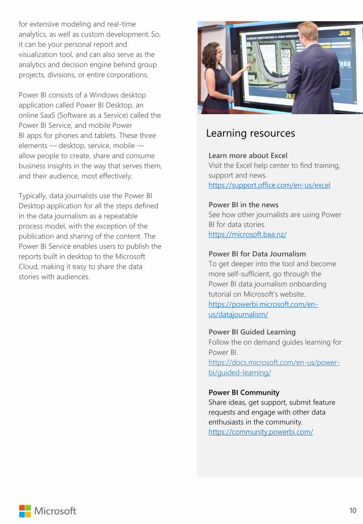
Learn more about Excel
Visit the Excel help center to find training,
support and news.
https://support.office.com/en-us/excel
Power BI in the news
See how other journalists are using Power
BI for data stories.
https://microsoft.baa.nz/
Power BI for Data Journalism
To get deeper into the tool and become
more self-sufficient, go through the
Power BI data journalism onboarding
tutorial on Microsoft’s website.
https://powerbi.microsoft.com/en-
us/datajournalism/
Power BI Guided Learning
Follow the on demand guides learning for
Power BI.
https://docs.microsoft.com/en-us/power-
bi/guided-learning/
Power BI Community
Share ideas, get support, submit feature
requests and engage with other data
enthusiasts in the community.
https://community.powerbi.com/
Learning resources

Idea and hypothesis generation
11
There are a lot of ideas that
lend themselves well to
data journalism and an
equal number of ideas
that don’t.
So, what works and what doesn’t?
A great online data journalism story invites
the community to interact with the data
itself, explore it visually and uncover insights
on their own terms. Many journalists we
work with find that this engagement builds
trust in the news, strengthens communities
and builds a personal and news outlet brand.
Perhaps the best way to frame your thinking
around idea and hypothesis generation is to
consider that by producing publicly available
data, we have the opportunity to lead the
narrative on stories of interest in our
communities, whether that’s locally,
regionally or nationally.
The following data stories were created and
published with Microsoft Power BI during the
KING 5 pilot:
“Where does Washington’s marijuana tax
money go?” Aired on August 8, 2018
“Washington congressional races on track to
set fundraising records” Aired on August 16,
2018
“Most Washington schools are failing to meet
state's target for vaccinations” Aired on Sept 5,
2018
“What will Seattle traffic look like without the
viaduct?” Aired on September 18, 2018
The team also researched the issue of
domestic migration but decided not to move
forward with the story when they discovered
the data available wasn’t up to date and didn’t
prove meaningful trends. This is a good
example of how working through the idea and
hypothesis generation stage can result in a
different outcome than expected.
These chosen stories represented four areas of
heavy public interest. For example, the station
received many calls from the community
asking where the marijuana tax money was
going — in particular, if the funds were paying
for schools or roads. The team showed that
marijuana excise tax revenue was allocated
mostly toward public health and substance
abuse prevention, and that it represented only
1.43% of all tax revenue and .49% of the total
budget.
“ ”… the idea and
hypothesis generation
stage can result in a
different outcome
than expected.”
“
https://www.king5.com/article/news/local/where-does-washingtons-marijuana-tax-money-go/281-581833195

Idea and hypothesis generation
12
Go deeper, and bring
your audience
Data journalism empowers people with the
tools to analyze large quantities of
information and visualize insights.
Visualizations can expose hidden
relationships, make the complex appear
simple and allow the audience to engage
with the data. Microsoft Power BI allows
stories to be shared with interactive data
visualizations viewable on any device. Rather
than just telling a story, good data
journalism starts a conversation.
When selecting an idea and formulating a
hypothesis to pursue for a data journalism
story, keep your audience and the data
available in mind to maximize your impact.
Learning resources
Data Journalism Award Winners
Get inspired by exploring what other
journalists have done.
https://www.datajournalismawards.org
Women in DataViz Twitter list
Keep up this open, evolving Twitter list of
the female talent working with, studying
and making dataviz.
https://twitter.com/sarahslo/lists/women-
in-dataviz
NYT Graphics Twitter
Keep up to date on data
visualization in journalism by following
one of the industry leaders.
https://twitter.com/nytgraphics
“ Visualizations can
expose hidden
relationships, make the
complex appear
simple, and allow the
audience to engage
with the data.
“

Data gathering
Once you have your idea
or test hypothesis, the next
step is finding and
gathering data.
Data can come from a variety of different
public and private sources and in a
dizzying variety of files and formats.
How to request data
If you’re requesting data from a public or private contact, be clear on what you mean by data:
1. Whenever possible, request the most granular level of information.
This means raw data that hasn’t yet been aggregated or transformed in any way. This is
important because having access to granular data allows you to uncover trends that might be
hidden and define the formulas of any transformations you apply to the data in the data
exploration step. You can also be completely transparent with your readers when sharing your
methodology.
2. Be sure to request data in a machine-readable, electronic format, and provide examples: Microsoft
Excel workbooks, comma-separated value (.csv) files, and .xml file formats are all great examples.
Scans of paper documents, microfiche, .pdf files, emails or Microsoft Word documents are
examples of file formats that can be incredibly difficult to work with for data exploration.
3. Always request a data dictionary or record layout.
This will help you understand the context of the data and should include things like
descriptions of fields and code values, how missing data is handled and formulas for any
aggregations applied.
4. Request that sensitive data, including personally identifiable information (PII), be removed before
sending it to you, unless you absolutely need this data for your story.
Be careful with datasets that include sensitive information. When in doubt, consult newsroom
management and newsroom counsel.
Whenever possible,
request the most granular
level of information
“
“
“
Data gathering
14
What worked well in the
KING 5 pilot?
The immunization story’s data was easy to
work with, as the state of Washington stored
almost everything the team needed online in
Excel spreadsheets, with documentation of
what data fields meant and how the data
was gathered.
What didn’t work well in the
KING 5 pilot?
The data delivered for the traffic forecasting
story was in a difficult format. The Seattle
Department of Transportation and
Washington Department of Transportation
did provide a lot of data in Excel, but a
considerable amount of other data was
delivered in more than 100 PDFs of scanned
printouts from traffic reader machines
formatted with COBOL output. To use this
data, significant time had to be invested to
copy out individual data points from the
scanned PDFs. Remember, it’s always best to
be clear with your contacts that you need
data that can be machine-readable and
communicate what this means if your
contact isn’t sure.
Public sources of data
Fortunately, many branches of federal, state
and local government; universities, research
institutions and even private companies
publish robust, publicly available datasets
that are well-documented and maintained
by professionals.
From the Seattle Department of
Transportation, to Zillow’s research on
housing markets, there’s an ocean of data to
be mined. Additionally, Non-Government
Organizations (NGOs) and non-profit
agencies also often make their data available
for use, and effective use of data can
support their missions. Lastly, with the
growing popularity of Data Science
competitions, many thousands of datasets
covering a vast number of subjects have
been created and shared around the world.
Leaked or hacked data
There are many risks that come with leaked
or hacked data. We recommend extreme
vigilance to avoid personally identifiable
information, viruses and malware. Be sure to
seek the advice of your station manager and
news director and refer to the AP’s Briefing
on Media Law before using any leaked or
hacked data.
Excel tip
When you are working with multiple data
files, the Get & Transform feature pulls
data into Excel, including other Excel files.
Interlinking data means that the
designated master Excel file can be
refreshed any time without the need to
copy and paste from other workbooks so
you can keep a single version of the
truth. Later all the queries, data models
and reports that were created in Excel
can transfer to an interactive dashboard
in Power BI. It is a common foundation
between the two apps.
Data gathering
15
Storing data
Establish detailed infrastructure and
processes when saving data projects to a
central location for your team or
organization, such as a SharePoint folder
stored under a Microsoft Teams site.
Establishing best practices, like file-naming
conventions and backup protocol, will
enable version control and help working
groups be more efficient. Files saved in
SharePoint can also be imported into Power
BI as a data source, making it easier for
multiple people to collaborate on data
exploration and the development of data
visualizations in Power BI.
If your data is considerably large (gigabytes
in size and hundreds of millions or billions of
records), it is best to store this data in a
cloud service, such as Azure SQL Data
Warehouse.
Before storing and using any data source,
take the time to assess how current the data
is, its accuracy and the reliability of its
producers. Additionally, determine if the
data source is free from any biases where
possible, or at least note what the bias is.
(See section on identifying bias in the
appendix.)
Always appropriately notate your data
sources in your published work.
Learning resources
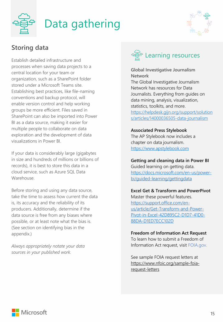
Global Investigative Journalism
Network
The Global Investigative Journalism
Network has resources for Data
Journalists. Everything from guides on
data mining, analysis, visualization,
statistics, toolkits, and more.
https://helpdesk.gijn.org/support/solution
s/articles/14000036505-data-journalism
Associated Press Stylebook
The AP Stylebook now includes a
chapter on data journalism.
https://www.apstylebook.com
Getting and cleaning data in Power BI
Guided learning on getting data.
https://docs.microsoft.com/en-us/power-
bi/guided-learning/gettingdata
Excel Get & Transform and PowerPivot
Master these powerful features.
https://support.office.com/en-
us/article/Get-Transform-and-Power-
Pivot-in-Excel-42D895C2-D1D7-41D0-
88DA-D1ED7ECC102D
Freedom of Information Act Request
To learn how to submit a Freedom of
Information Act request, visit FOIA.gov.
See sample FOIA request letters at
https://www.nfoic.org/sample-foia-
request-letters

Data cleaning
16
It’s a fact of life: messy data
is everywhere.
Fortunately, the tools and methods to “clean”
data are widely available, free or low-cost
and flexible enough to apply to almost all
data you’ll encounter. Journalists may choose
to partner with data specialists to ensure that
data is clean and accurate. The following five
principles underscore the core concepts of
data quality.
Uniqueness
The third principle refers to there being a
single view of the dataset and preventing
duplication in the data. For example, if your
aim is to measure total car accidents over
time in the state of Washington, if accidents
from Spokane are duplicated in a given year,
the resulting analysis will be erroneously
inflated.
Completeness
Are all relevant data items recorded? For
example, if you are attempting to explore
crime data for a major city, are all districts
present in the data? Check for null values and
be critical of omissions.
Consistency
Is the data formatted the same way across
the entire dataset? Was the way in which the
data was recorded kept consistent over
time? For example, if your data includes U.S.
state names, all state names should be
completely spelled out or abbreviated, not
both. Or, if your data includes a health index
score, and for 20 years it was recorded on a
scale of 1-100, and for the last three years it
was changed to a 1-500 scale, this will need
to be adjusted for in your data. Be very
careful with historical data, as measurement
methods (or, in the case of economic figures,
inflationary values) may have changed over
time.
“ Journalists may choose to
partner with data specialists
to ensure that data is clean
and accurate.
“

Data cleaning
17
Integrity and validity
Is the data unchanged from its source? Data
integrity is considered intact if the data is
whole and intact and has been unaltered since
its creation in any material way. Data is said to
be valid if it conforms to the format, type and
range of its syntax definition.
Accuracy
How well does the data describe the real-
world event or object being represented? For
example, if your story idea is to show post-
graduate education costs compared against
average income of 20- to 30-year-old working
professionals over the last 10 years, but your
data is sourced from 1955, your data is not
accurate. Consider another example,
identifying the gender pay gap simply by
comparing average pay of men and women is
an incomplete and inaccurate portrait; instead,
comparing pay within industries as well as
experience levels provides a more nuanced
and truer story.
Tech tip
Before importing data into Power BI,
depending on the nature of data
cleanliness issues, it often makes sense
to first clean the data in Excel. Power BI
offers tools to clean and transform data,
but for the most part, they are best
applied when the cleanliness issues
occur uniformly across the entire
dataset. For example, Excel is the best
tool to complete the following tasks:
• Change a column of data from a
decimal to a percentage or whole
number, or if you want to extract
data elements from a column of
dates.
• Remove duplicate records, replace
text values with different text
values, correct non-printable
characters or date and time values.
• Cleaning large datasets (from a few
thousand rows of data, up to a
million rows of data). For data with
more than one million rows, it is best
to use enterprise-grade data
engineering tools such as Microsoft
SSIS. These tasks are often
completed by data experts working
with the journalist writing the story.

Data cleaning
18
Tools like Microsoft Excel and Power BI can
dramatically decrease the time and effort needed to
clean data. Investing in learning technology or
hiring experts can have a profound impact on the
data literacy and data culture across an
organization.
For example, cleaning your data with reusable
steps in Power Query saves you time by splitting
columns, merging tables or removing duplicates.
Power Query is available in both Excel and
Power BI.
Once the data is cleaned and the models are
built, the Schedule Data Refresh automates data
updates. The data sources configured in Power
Pivot refresh in the background. When the
dashboard is opened, the right data will be there
— without requiring any action.
Remember to always back up the original data
files before making updates in Excel, and to keep
a record of the changes you’re making if you
expect to get an updated version of the data
with similar inconsistencies. Some central
storage solutions often have version histories,
but that should be relied upon only in the cases
of emergency.
At this point, you’ll likely be gaining insights into
your information that help you begin to discover
the story. As you continue through the data
journalism process, visualization tools in both
Excel and Power BI offer ways to explore and
present data.
Learning resources
Top 10 ways to clean your data in Excel
Microsoft’s top 10 ways to clean your data
in Excel will have you moving fast in no
time.
https://support.office.com/en-
us/article/Top-ten-ways-to-clean-your-
data-2844B620-677C-47A7-AC3E-
C2E157D1DB19
Power Query
Power Query, (also known as Get &
Transform) provides an intuitive and
consistent experience for discovering,
combining, and refining data across a
wide variety of sources in Excel and Power
BI.
https://support.office.com/en-
us/article/get-transform-in-excel-
881c63c6-37c5-4ca2-b616-59e18d75b4de

Importing and modeling
data
19
Getting data into Power BI is straightforward
This section serves as an introduction to 1) help you decide if you need or want to pursue to more
advanced training or 2) give you the basic tech fluency to work with experts. Either way, Microsoft
provides online guided learning to make the steps fast and easy to learn. Microsoft also hosts training
specifically for journalists.
Data modeling
Starting from square one.
The following are abstract concepts related to data modeling for analytics. While these ideas can
further empower tech-fluent journalists to be more self-sufficient in performing data analysis and
creating data visualizations, it’s more likely that all data modeling activities will be handled by data
specialists. If you are the type of person that likes to know how everything works, read on.
If you haven’t worked with data analysis or data visualization before, it might not be obvious what the
goal of data modeling is, or the power that’s gained once you begin working in a descriptive and
diagnostic analytics tool.
Think of a spreadsheet with columns and rows. This is a table of data, where the columns become
known as attributes, fields or features of the data (for now, these terms are interchangeable). Data
modeling allows you to define relationships among many different tables of data, and Power BI then
allows you to quickly explore the relationships within the data, find anomalies, see different slices of
the data, identify trends and communicate insights without needing to combine or slice the data
manually yourself. It’s much more than just visuals and graphs.
In data modeling for descriptive and diagnostic analytics, tables are generally categorized into
two types, dimension tables and fact tables:
• A dimension table contains descriptive attributes, values and special fields known as primary keys.
In the KING 5’s traffic projection story, the “Segment Order” table contained the names of all
available traffic segments and their order. The primary key in the “Segment” table was the field
named “Segment Name.”
• A fact table contains fields known as foreign keys, and facts or measures, which are numbers
that can be used in mathematical calculations. A simple way to think of a fact or measure is
asking the question, “Can I do arithmetic on this data?” An example of a fact table in the traffic
story is the “BeforeAfterVols,” which includes the measure attributes that have the volume of
traffic on all affected traffic routes before and after the tunnel opens.

Importing and modeling
data
20
Here is a screenshot of the data model from the KING 5 pilot traffic story:
A dimensional data model is often called a star schema, because generally there is a fact table at the
center of various dimension tables.
In the KING 5 pilot traffic story, the team experienced an interesting data modeling challenge: The
data visualization needed to show a map of all affected routes and provide the ability to select any
combination of routes. The challenge was that when any given combination of routes was selected,
and any slice of time was selected, all affected routes needed to be persistent on the map.
The first page without selecting anything looked like this:

Importing and modeling
data
21
When a route was selected, every visual on the page changed to reflect just the information for that
route:
The reporting team needed the report to show the entire route when a time was selected:
To refer back to the data model above, the team tied the map visual to the
‘LatLong_Segments” table, and the “Vehicle volume” and “Vehicle volume by segment” visuals to the
“BeforeAfterVols” and “TrafficVolTime” tables. Because the “LatLong_Segments,” “BeforeAfterVols,” and
“TrafficVolTime” tables were all joined together via the “SegmentNames” table, which only included the
dimensional key of “Segment” (the segment name of the traffic route), the data visualization
appropriately displayed the complete route on the map and the correct information on the other
visuals. In data modeling terminology, the “Segment” table is called a factless fact, as it’s a table that
only contains dimensional keys.

Importing and modeling
data
22
The power of relationships
Relationships have cardinalities, which are either one-to-one (1:1), one-to-many, or many-to-many.
For instance:
• one-to-one (1:1) relationship is a person to a social security number.
• one-to-many relationship is state to zip code, as a state could have many zip codes, but a
zip code should only have one state.
• a many-to-many relationship is a table of items for sale and a table of customers, as any
one customer can buy many items, and any one item can be purchased by many
customers.
For the most part, Power BI automatically detects the keys between your tables when the data is
imported and defines the cardinalities for you. Like the previous section, defining these relationships
may be the job of a data specialist, but knowing how relationships work can make it easier and more
efficient to work and communicate across roles.
Referring back to the data model above from the KING 5 traffic story, the relationships are shown by
the lines connecting all the tables, and the cardinalities of the relationships are shown between every
table by the arrows and 1 or * values. For reference, * means many. So, between Segment and
SegmentOrder, the relationship is 1:1.
Understanding the concepts of dimension and fact tables, primary and foreign keys, and relationship
cardinalities will help you gather and prepare data that’s usable in Power BI, and work more
efficiently with data specialists.
Learning resources
Power BI guided learning
Microsoft Power BI provides guided learning on modeling data, visualizations, and much more.
https://docs.microsoft.com/en-us/power-bi/guided-learning/
Create a data model in Excel
Follow the steps to integrate table from multiple tables.
https://support.office.com/en-us/article/Create-a-Data-Model-in-Excel-87E7A54C-87DC-488E-9410-
5C75DBCB0F7B

Data exploration
23
Prove or disprove your
hypothesis, develop your
story idea and unlock
insights buried in your data
The potential of Power BI for data journalists
is in its ability to be the tool that allows you
to create and share engaging data
visualizations, as well as to drive efficiency by
being a rapid data exploration tool.
Now that you’ve loaded your data into
Power BI Desktop, it’s ripe for exploration. By
playing with the data, you’ll be able to prove
or disprove your story hypothesis, realize the
need for additional supporting data or
discover hidden trends that may take your
story in a different direction altogether.
As you move through your data analysis and
exploration, you may want to work with a
data specialist to take notes of any
calculated metrics you create or data
transformations you employ as part of your
methodology documentation to be shared
upon publishing.
Additionally, keep in mind the list of biases
to avoid, shared in the appendix. The golden
rule is that all insights shared within a data
journalism story should be reproducible and
ideally, as straightforward as possible.
Examples of goals you may want to set
include providing transparency, making the
complex appear simple and initiating
conversations.
Exploring your data
A benefit of Power BI is that you can easily try
out many different visuals without coding.
Depending on your data and the analysis you
want to do, the first visual you bring into your
report canvas may be as straightforward as a
graph, table or map, or as unique as a ribbon
chart or waterfall. You can also add things like
slicers to slice the measures or facts tied to
your graphs, maps or tables. We’ll discuss
more about what visuals are available in the
next section.

Data exploration
24
By dragging a visual into your report canvas,
followed by dragging attributes from the
tables of data you have imported into Power
BI into the fields pane, you can start to
interact with your data. Note that selections
made to a visual in the report canvas affect
other visuals.
For example, imagine you want to create a
filled map visual of the United States the day
after the national elections. The map has two
characteristics: States are colored by the
prevailing political party, and a card visual
shows the total number of voters. By default,
the card visual will show the sum of all U.S.
voters. Select a state, and the card will
change to show the number of voters of that
state.
In addition to the visuals available by
default, Power BI is supported by an
enormous online community of developers
who create custom visuals. So if there is a
particular visual that you’d like to use but
don’t see in the default visuals library,
search the online marketplace for free visual
add-ons.
In some cases, you may commission a
developer to build a new custom visual for
your story.
To view custom visuals, visit:
https://appsource.microsoft.com/en-
us/marketplace/apps?product=power-bi-
visuals&page=1&src=office
Establish meaningful
comparisons, find anomalies
and report on trends
Data exploration and analysis are powerful
tools to help build the credibility of your
story and establish impartiality. During this
step, you prove or disprove your hypothesis
and uncover insight.
Comparisons
Meaningful comparisons will help your
viewers and readers understand the story.
For example, if your story is to show how
much state spending is allocated to K-12
education, providing an absolute dollar
figure by itself is not as meaningful as
including K-12 education spending as a ratio
of overall state spending. Even more
pertinent is to compare this figure to other
states, after normalizing for population size
differences and economic wealth.
Relationships
The strength of relationships, also called
the correlation, between variables can lead
to important stories. For instance, an x-y
scatterplot of the relationship between
poverty and school test scores generally
will show a strong negative relationship:
As poverty levels go up, test scores typically
are lower.
Correlation and Causation?
However, beware of assuming that a
correlation between two variables means
that one is causing the change in the other. It
makes some sense that the burdens of
poverty could be a cause of differences in
test scores. But lots of correlations are
spurious.

Data exploration
25
For instance, there is a strong
positive correlation between the number
of liquor stores and the annual number of
divorces in cities. Is alcohol causing divorce, or
are shaky marriages causing alcohol sales?
Actually, neither: The hidden variable affecting
both is the size of the population.
Anomalies
Finding anomalies is an important tool in
data analysis. For example, on a scatterplot
of school test scores from this year against
last year, there should be a very strong
positive correlation. Look for schools that
don’t follow the pattern, showing a large
improvement in scores from one year to the
next. Either there’s a good story about an
innovative teaching program being used – or
a good story about teachers pressured to
raise scores by cheating. The data won’t tell
you which, but it will lead you to where more
reporting will uncover the story.
Trends
Lastly, investigating where trends exist and
develop over time can be an effective
storytelling tool. If your story is on climate
change, for example, a clustered bar chart
visual showing ocean temperature, fish
population and carbon dioxide levels in the
atmosphere over time can help illustrate the
impact of climate change. As a best practice,
when showing change over time, use a
vertical bar graph, and use a horizontal bar
graph when showing absolute change.
For more information on understanding data
variable relationships, please see the
Appendix section entitled “Understanding
and preventing bias.”
“ …investigating where
trends exist and develop
over time can be an
effective storytelling tool.
“
Learning resources
edX Course on Excel
This free 6-week training course provides
advanced training on analyzing and
visualization data in Excel.
https://www.edx.org/course/analyzing-
visualizing-data-excel-2
Storyboard and data visualization
26
Crafting the narrative of your
story and selecting the best
visuals to aid in its telling
You’ve explored and analyzed the data,
gathered additional information from your
sources and uncovered your key insights. By
now, you should have locked in on your
findings and are ready to write the story. As
a journalist, this step is likely the most
familiar — and exciting.
To ensure you’re representing the data
component of the story, put yourself into the
shoes of a person who is brand new to your
subject and hasn’t yet been through the
journey you have. What are the most
important, logically sequenced steps needed
to arrive at your key insights? How would
you explain this to a close family member or
friend?
Just as you would for your other stories,
introduce the hypothesis or idea, the core
issue, and create tension by explaining why it
is important to the audience. Unfold the
storyline, in clear, succinct steps, and build to
the climax of the story. Consider what you
want the data visualizations to communicate
at first glance. Ensure your headline, visual
choices and supporting text or charts are
giving the viewers and readers the
information you want to share.
Sometimes, having spent a considerable
amount of time working up to this point, the
tendency is to want to include more details
than are necessary.
This detracts from the story, because data
overload can interfere with the storytelling.
Remember, you will share your complete
methodology in the story notes. In telling the
story itself, you must achieve just enough
detail to make each step lead to the next,
and no more.
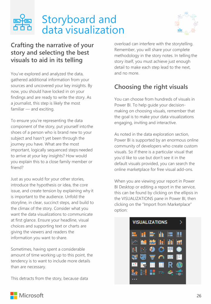
Choosing the right visuals
You can choose from hundreds of visuals in
Power BI. To help guide your decision-
making on choosing visuals, remember that
the goal is to make your data visualizations
engaging, inviting and interactive.
As noted in the data exploration section,
Power BI is supported by an enormous online
community of developers who create custom
visuals. So if there is a particular visual that
you’d like to use but don’t see it in the
default visuals provided, you can search the
online marketplace for free visual add-ons.
When you are viewing your report in Power
BI Desktop or editing a report in the service,
this can be found by clicking on the ellipsis in
the VISUALIZATIONS pane in Power BI, then
clicking on the “Import from Marketplace”
option:

Storyboard and data visualization
27
Within the marketplace, you can browse custom visuals by category or search for them by name:
For example, the KING 5 team wanted to show how traffic changed on particular routes in Seattle
after the tunnel opened: The team chose the “Route Map” custom visual to show the routes color-
coded on a map, “Enlighten Data Story” to display the changes in route volume at the bottom and
“Chiclet Slicers” to select routes and years:
The team also placed text boxes on the report canvas, encouraging users to click through specific
visuals. Users were prompted to click through “Chiclet Slicer” buttons to compare traffic volumes on
different routes of Seattle.
A navigation bar was included to create a familiar user experience. This prompted users to advance to the
next chapter of the story.
Chiclet
Slicer
Route
Map
Enlighten
data story
Navigation
Button

Storyboard and data visualization
28
To show how traffic flows changed once the tunnel was open and the viaduct was closed, the team
used a “Sankey diagram” as the main visualization on the second page of the story:
Note how clicking on a route segment dynamically changes the Enlighten Data Story visual text:
These design choices made the story easy for readers to interact with even if they don’t have prior
knowledge of analytics tools. When in doubt, choose visuals that are approachable rather than flashy.
Sankey
Diagram
When
the route
is clicked
The text
dynamically
changes

Storyboard and data visualization
29
Using pages
Breaking down your story into pages is an effective technique to unfold the major steps, or chapters,
of your story, particularly for broadcast.
To drive interaction for a web audience and make your data visualizations more approachable, try
these tips:
• Use buttons with bookmarks to create simple navigation for users to traverse your
data visualization.
• Prompt your audience to interact with the visualizations with your headline, text and visual cues.
• Include features that allow the audience to explore the data and generate new insights.
• As the web visuals won’t have live TV voiceover, include supporting text where needed.
For example, on the KING 5 immunization story, the team included the following key features on the
visuals:
Interactive
Pages
Call out
prompt
Navigation
Buttons
Supporting
text

Storyboard and data visualization
30
If you prefer to publish each page of your report as a separate asset, simply save and publish embed
codes of each page of your Power BI reports separately. This allows you to write out your story in text
and bring in your visualizations as it unfolds in written word. On the KING 5 immunization story,
reporter Taylor Mirfendereski decided this would be the best way to tell the story. For example:
Keep in mind, however, that including multiple iframes on your page can slow down page load times.
One way to improve page load times is to ensure each visualization file is saved separately to only
include the pages needed at that stage of the story. This way, when the page loads, if you have five
visualizations in your story, the page only loads five data visualization pages worth of data, as
opposed to 25 pages worth of data.
Callout
prompt

Storyboard and data visualization
31
Commonly used visuals in
data journalism
Some of the commonly used visuals used in
Power BI for data journalism that you
should familiarize yourself with are:
• Clustered bar chart
• Line chart
• Area chart
• Stacked bar chart
• Pie chart
• Treemap
• Filled map
• Table
• Card
• Slicer
• Chiclet Slicer
• Enlighten Data Story
• Sankey diagram
• Maps
Learning resources
From Data to Viz
An excellent resource to help you choose
the best graph or visual for your data.
https://www.data-to-viz.com/
Data visualization catalog
This handy site will help you select a chart
based on your communication needs.
https://datavizcatalogue.com/search.html
Gestalt Principles
Understand how humans typically see
objects to design more engaging
visualizations.
https://www.interaction-
design.org/literature/topics/gestalt-
principles
Gain efficiency with report themes
Creating predefined report themes and
color palette in Power BI can help you
reduce the cycle time of creating and
refining data visualizations.
https://docs.microsoft.com/en-us/power-
bi/desktop-report-themes
The Functional Art
Alberto Cairo’s blog on visualization,
infographics, and data journalism.
http://www.thefunctionalart.com
Steve Haroz’s research
Steve studies how the human brain
perceives and understands visually
displayed information.
http://steveharoz.com/research/
Cultural blind spots
Read up on cultural blind spots in UX.
https://medium.com/nasdaq-
design/cultural-blind-spots-in-ux-
840353aa3cdd
Using Maps in Power BI
Maps are a common way to visualize data.
Find out about options in Power BI.
https://docs.microsoft.com/en-us/power-
bi/guided-learning/visualizations?tutorial-
step=5#step-0

Data visualization refinement
32
At this point of the data journalism process, you’ve achieved a lot and you are likely in the final stages
of story development. By now, you should have your storyboard solidified, along with the draft data
visualizations to tell the complete story. Data visualization refinement can be an intensive step but
with the help of report templates, visual design guidelines, predefined color palettes, iconography
repositories and stock photography, cycle time for this step can be dramatically reduced, improving
overall efficiency.
Your data visualization should already employ interactive design and approachable visuals that
prompt users to click through slicers of common dimensions and move through pages using familiar
web navigation principles. Now, focus on defining the identity of your data visualization and making
every page conform to the same style.
Report canvas areas
The main areas of the report canvas should be broken up into the page/title area, insight area,
call-out area, navigation area and important notes.
These should be in the same place on every page of your data visualization.
The page/title area should be on the top as a header and can be one to two lines. Don’t let anything
else touch this area and make sure to use both lines to respect the proportions and symmetry.
Capital letters in the page/title area add impact.

Data visualization refinement
33
The insight area is below the title area and takes up most of the report canvas’s real estate canvas.
This area is reserved only for visuals (charts, tables, maps, diagrams, etc.). Show only one at a time.
Consider Miller’s Law. Use extra bookmarks to switch visuals if one page contains more than one.
The call-out area, ideally located below the insight area, highlights important information.
Considering using an Enlighten Data Story visual to call out important details: Have the text and
numbers be different sizes, bolding and increasing the size of the numbers. That said, remember to
use the same text and number sizes in all pages to keep consistency.

Data visualization refinement
34
The navigation area can be on the bottom or either side of the report canvas. Utilize buttons with
arrow icons to increase familiarity, and consider where you’ll be standing if you are using the report
on air to ensure you can easily navigate between pages without blocking the information.
Notice that all screenshots provided from the KING 5 pilot stories followed this same template, even
though their subject matter varied widely. By leveraging a repeatable template, you can be more
effective in building your brand, as well as reduce cycle time on building professional data
visualizations that provide clarity and consistency.
Adding icons, legends, indicators and other small elements in your pages will level up the quality of
your data visualizations and create a personal touch.
Don’t be afraid to add extra elements to emphasize your message, but be careful not to over-
saturate your pages. Remember, less is more. As a rule, use no more than two fonts and no more
than three colors (or tight groups of colors if you are skilled in defining color palettes), within a
given data visualization. Colors, and in particular images or icons, should be used to convey or
highlight information, not as decoration, as this has been shown to decrease how memorable and
impactful a data visualization can be.
As noted in an earlier section, provide meaningful comparisons in the form of ratios or percentages
whenever possible.

Data visualization refinement
35
Design checklist
You can use the following design checklist to help guide the final refinement of your story.
Layout
Is the design consistent? For example, are elements in a consistent order, of a consistent size,
and grouped logically to align to the template?
Do all relevant items appear?
Typography
Do your visualizations adhere to typography visual design guidelines?
Is your typography consistent and limited to no more than two fonts and three colors?
Is the hierarchy of the information presented clear?
Does your text have enough contrast, particularly in your call-out areas?
Do you employ good use of line height and paragraph spacing?
Color
Does your palette provide sufficient contrast to make content accessible?
Do you use no more than three colors (or tight groups of colors), based on an existing color
palette aligned to your organization’s branding guidelines?
Interaction
Is there a clear call to action to engage with the content — i.e., will the reader know it’s
interactive and which sections to click on? Use words, icons or both to encourage
engagement.
Are interaction elements like buttons and slicers obvious, and are the relationships clear?
Is the overall navigation easy to understand and use?
If there is more than one page, is the navigation to the second page clear?
Data visualization refinement
36
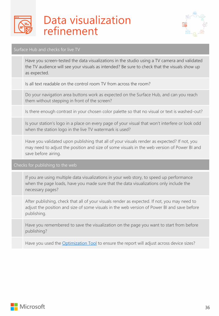
Surface Hub and checks for live TV
Have you screen-tested the data visualizations in the studio using a TV camera and validated
the TV audience will see your visuals as intended? Be sure to check that the visuals show up
as expected.
Is all text readable on the control room TV from across the room?
Do your navigation area buttons work as expected on the Surface Hub, and can you reach
them without stepping in front of the screen?
Is there enough contrast in your chosen color palette so that no visual or text is washed-out?
Is your station’s logo in a place on every page of your visual that won’t interfere or look odd
when the station logo in the live TV watermark is used?
Have you validated upon publishing that all of your visuals render as expected? If not, you
may need to adjust the position and size of some visuals in the web version of Power BI and
save before airing.
Checks for publishing to the web
If you are using multiple data visualizations in your web story, to speed up performance
when the page loads, have you made sure that the data visualizations only include the
necessary pages?
After publishing, check that all of your visuals render as expected. If not, you may need to
adjust the position and size of some visuals in the web version of Power BI and save before
publishing.
Have you remembered to save the visualization on the page you want to start from before
publishing?
Have you used the Optimization Tool to ensure the report will adjust across device sizes?

Data visualization refinement
37
General
Have you followed the AP Stylebook data journalism guidelines, or other industry standards?
If the report were shared without the page content, are the headline and story clear?
Are the page titles relevant and clear?
Have you checked for spelling, grammatical errors and general tidiness?
Are you using correct logos and conforming to brand guidelines?
Did you remember to include info about the data sources and your supporting
methodology?
Learning resources
The Color Oracle
Use this color-blindness simulator for all platforms.
http://colororacle.org
Color Palette
ColourLovers is a creative community where people from around the world create and share colors,
palettes and patterns.
https://www.colourlovers.com
Iconography
Over one million icons, free for use with attribution.
https://www.flaticon.com
Fonts free for commercial use
https://www.fontsquirrel.com

Publishing and sharing
sharing
38
The final step
By this point, you should have a:
• well-formulated hypothesis
• thorough, repeatable and defensible data
analysis free from bias
• a storyboard that takes the time to
progressively unravel the story one
slice at a time
• refined data visualizations to make the
experience inviting and interactive to
your audience regardless of their culture
or education.
The last step of publishing and sharing in the
data journalism process is, in many ways,
where the real journey begins.
Prior to publishing and sharing your story,
however, it is a good practice to first share
the key insights and methodology of your
story with your data providers, particularly if
you worked directly with contacts to source
data not publicly available, or if your key
insights may be controversial. This will create
an opportunity to receive critical feedback
and may even help you identify ways to
strengthen your story before releasing it.
For example, on the KING 5 traffic story, Jake
Whittenberg worked with contacts at
Washington Department of Transportation
to gather data. Before airing the story, Jake
reviewed the team’s findings with the
department before airing the story.
To maximize the potential impact of your
story and drive transparency, remember to
include the methodology used in your data
analysis along with citations of all your
sources.
Explain every decision made in your analysis.
Additionally, detail the limitations of your
analysis. Including your methodology can
either be done directly in Power BI as a final
page within your visualization, or as a
separate notes section included within the
published story online.
Power BI includes a feature to allow users
interacting with your data visualizations to
see the underlying data by right-clicking on
any page and selecting the “Show Data”
option. This makes the process of sharing
your underlying data automatic, if the data
used in Power BI was not transformed in any
way prior to importing into Power BI. If you
did transform your data in any material way
prior to importing, either in Excel or
otherwise, include a link in your story to
download the original dataset directly in a
machine-readable format, such as Excel or
.csv. Provide a data dictionary to describe all
attributes.
“ The last step of
publishing and sharing
in the Data Journalism
process is, in many
ways, where the real
journey begins.
“

Publishing and sharing
39
Publishing steps and live
television considerations
Publishing in Power BI is easy.
In Power BI Desktop, simply click the Publish
button in the top ribbon, and select the
Workspace you’d like to publish to. Then navigate
to Power BI in your browser, find and open your
report in the Workspace you published it to, and
click Publish to Web. You can select the size of
your report in this step and use the HTML code to
embed your visualizations into your story on your
blog or website. When sized correctly, your report
should fill the iframe without any grey borders.
Publishing your Power BI report for the web?
Lukasz Pawlowski’s tool can help. Simply copy
your Power BI embed URL into the tool, and
click to optimize https://lukaszpawlowski-
ms.github.io/Optimize-Publish-To-Web/#i
If you are planning to air your Power BI data
visualizations on live television in addition to
publishing online, particularly using a Surface
Hub on live TV where a camera is filming you
telling the story using the touchscreen interface, it
is a good idea to do a dry run in the studio and
validate that all visualizations show up as
expected in the control room. This is because
when a camera films a screen, visuals with higher
levels of brightness tend to not show up with the
same contrast as they do on a monitor. In
extreme cases, visuals do not appear at all. Doing
a dry run can help prevent unwanted on-air
distractions. Please refer to the Design Checklist
to ensure all design considerations are made
prior to airing on TV and publishing.
Learning resources
Publish to web with Power BI
Follow detailed instructions about how to
publish your report to the web.
https://docs.microsoft.com/en-us/power-
bi/service-publish-to-web
Optimize your report
Use this handy tool to make sure your
report fits to the iframe and page size.
https://lukaszpawlowski-
ms.github.io/Optimize-Publish-To-
Web/#i

40
Appendix
The learning resources
included in each section are
presented here for easy
reference
Contact Microsoft at
[email protected] for more
information about training and support.
Data journalism
The Data Journalism Handbook is used by
students, researchers and practitioners
learning about the state of the ever-evolving
field of data journalism.
https://datajournalismhandbook.org/
The Data Journalism Den (The Den) is
a global hub by the Global Editors
Network, dedicated to serving the data
journalism community through the
collaborative exchange of data, tools
and resources.
https://www.globaleditorsnetwork.org/
programmes/the-den/
The Global Investigative Journalism
Network has resources for data journalists —
everything from guides on data mining to
analysis, visualization, statistics, toolkits and
more. https://helpdesk.gijn.org/support/solutions/articles/14000036505-data-journalism
Investigative Reporters and Editors (IRE) is a
nonprofit organization that offer resources,
conferences and specializing training,
including the Computer Assisted Reporting
conference for data journalists. www.ire.org
Technology to enable the process
Learn more about Excel
Visit the Excel help center to find training,
support and news
https://support.office.com/en-us/excel
Power BI in the news
See how other journalists are using Power BI
for data stories.
https://microsoft.baa.nz/
Power BI for Data Journalism
To get deeper into the tool and become more
self-sufficient, set aside approximately two
hours to walk through the Data Power BI data
journalism onboarding tutorial on Microsoft’s
website.
https://powerbi.microsoft.com/en-
us/datajournalism/
Power BI Guided Learning
Follow the on demand guides learning for
Power BI.
https://docs.microsoft.com/en-us/power-
bi/guided-learning/
Power BI Community
Share ideas, get support and submit feature
requests and engage with other data
enthusiasts in the community.
https://community.powerbi.com/
Idea and hypothesis
generation
Data Journalism Award Winners
Get inspired by exploring what other
journalists have done.
https://www.datajournalismawards.org
Women in DataViz Twitter list
Keep up this open, evolving Twitter list of the

41
female talent working with, studying and
making dataviz.
https://twitter.com/sarahslo/lists/women-in-
dataviz
NYT Graphics Twitter
Keep up to date on data
visualization in journalism by following one of
the industry leaders.
https://twitter.com/nytgraphics
Data gathering
Global Investigative Journalism Network
The Global Investigative Journalism Network
has resources for Data Journalists. Everything
from guides on data mining, analysis,
visualization, statistics, toolkits, and more.
https://helpdesk.gijn.org/support/solutions/art
icles/14000036505-data-journalism
Associated Press Stylebook
The AP Stylebook now includes a
chapter on data journalism.
https://www.apstylebook.com
Getting and cleaning data in Power BI
Guided learning on getting data.
https://docs.microsoft.com/en-us/power-
bi/guided-learning/gettingdata
Excel Get & Transform and PowerPivot
Master these powerful features.
https://support.office.com/en-us/article/Get-
Transform-and-Power-Pivot-in-Excel-
42D895C2-D1D7-41D0-88DA-D1ED7ECC102D
Freedom of Information Act Request
To learn how to submit a Freedom of
Information Act request, visit FOIA.gov.
See sample FOIA request letters at
https://www.nfoic.org/sample-foia-request-
letters
Data cleaning
Top 10 ways to clean your data in Excel
Microsoft’s top 10 ways to clean your data in
Excel will have you moving fast in no time.
https://support.office.com/en-us/article/Top-
ten-ways-to-clean-your-data-2844B620-677C-
47A7-AC3E-C2E157D1DB19
Power Query
Power Query, (also known as Get & Transform)
provides an intuitive and consistent experience
for discovering, combining, and refining data
across a wide variety of sources in Excel and
Power BI.
https://support.office.com/en-us/article/get-
transform-in-excel-881c63c6-37c5-4ca2-b616-
59e18d75b4de
Importing and
modeling data
Power BI guided learning
Microsoft Power BI provides guided learning
on modeling data, visualizations, and much
more. https://docs.microsoft.com/en-
us/power-bi/guided-learning/
Create a data model in Excel
Follow the steps to integrate table from
multiple tables.
https://support.office.com/en-
us/article/Create-a-Data-Model-in-Excel-
87E7A54C-87DC-488E-9410-5C75DBCB0F7B
Data exploration
edX Course
This free 6-week training course provides
advanced training on analyzing and
visualization data in Excel.
https://www.edx.org/course/analyzing-
visualizing-data-excel-2

42
Storyboard and data
visualization
From Data to Viz
An excellent resource to help you choose the
best graph or visual for your data.
https://www.data-to-viz.com/
Data visualization catalog
This handy site will help you select a chart
based on your communication needs.
https://datavizcatalogue.com/search.html
Gestalt Principles
Understand how humans typically see objects
to design more engaging visualizations.
https://www.interaction-
design.org/literature/topics/gestalt-principles
Gain efficiency with report themes
Creating predefined report themes and color
palette in Power BI can help you reduce the
cycle time of creating and refining data
visualizations.
https://docs.microsoft.com/en-us/power-
bi/desktop-report-themes
The Functional Art
Alberto Cairo’s blog on visualization,
infographics, and data journalism.
http://www.thefunctionalart.com
Steve Haroz’s research
Steve studies how the human brain perceives
and understands visually displayed
information.
http://steveharoz.com/research/
Cultural blind spots
Read up on cultural blind spots in UX.
https://medium.com/nasdaq-design/cultural-
blind-spots-in-ux-840353aa3cdd
Data visualization
refinement
The Color Oracle
Use this color-blindness simulator for all
platforms.
http://colororacle.org
Color Palette
ColourLovers is a creative community where
people from around the world create and
share colors, palettes and patterns.
https://www.colourlovers.com
Iconography
Over one million icons, free for use with
attribution.
https://www.flaticon.com
Fonts free for commercial use
https://www.fontsquirrel.com
Publishing and sharing
Publish to web with Power BI
Follow detailed instructions about how to
publish your report to the web.
https://docs.microsoft.com/en-us/power-
bi/service-publish-to-web
Optimize your report
Use this handy tool to make sure your report
fits to the iframe and page size.
https://lukaszpawlowski-
ms.github.io/Optimize-Publish-To-Web/#i

43
Understanding and
preventing bias
There are many different biases that can affect
the impartiality of a story at every stage, from
the data gathering to the modeling to the
visualization. It is our responsibility to be
aware of and avoid these biases.
Confirmation bias
The purpose of data analysis is to explore the
data you’ve gathered, prove or disprove your
hypothesis and potentially find new insights
you haven’t yet imagined. Confirmation bias is
a departure from this spirit, and instead seeks
information that only supports the hypothesis.
In gathering data, be sure to find all data
necessary and available to fully represent the
reality of your situation and be careful not to
avoid data you deem irrelevant, when in truth
it might disprove your hypothesis.
Availability bias
Closely related to confirmation bias,
availability bias refers to only sourcing the
data that’s readily available to you. Be
prepared to dig for data, work with partners,
and be tenacious in pursuit of the truth.
Selection or sampling bias
This bias refers to the data being collected
from a sample of the population that is not
representative of the entire population. For
example, if your story idea is to show how
insurance premiums for drivers have
increased over time, but your sample is
limited to drivers between 16 and 25 years of
age, your data would suffer from sampling
bias.
Cherry-picking
In cherry-picking, the question is phrased in a
way to get the preferred answer. This is
different from confirmation bias, where the
answers have already been gathered, but only
the answers that support the hypothesis are
retained.
Cultural bias
This bias refers to the impulse to use familiar
phrases, idioms, colors and graphics, without
first considering that members of your
audience may be of different cultures, who
can sometimes have vastly different
interpretations of these elements.
Biased language
Already extremely familiar to traditional
journalists, biased language refers to using
language that takes sides in politics, using
politically charged words, or otherwise
degrading the principle of impartiality.
Issue bias
In data journalism, issue bias refers to
manipulation of how the data was surveyed
or gathered, or directly tampering the data or
analysis in a way that intentionally shifts
debates or perspectives in a specific direction
in a non-transparent way.

44
Technical bias
Meet your audience where they are. Put
yourself into their shoes and make your work
as approachable as possible, as opposed to
using the most complex or high-tech
visualizations because they’re interesting to
you. With data journalism, the opportunity
exists to communicate complex insights to
wide audiences. However, we must be careful
that the data visualizations are approachable
to a wide audience and easily understood,
and do not favor the more tech-fluent
sections of society.
Biased data narrative
In this bias, the narrative of a story is
formulated by choosing which data to
visualize or using particular visualizations in a
manner that pushes a specific issue or
agenda. To help prevent a biased data
narrative, share your methodology and seek
feedback from external users and your
audience.
Replication bias
Typically, replication refers to the ability to
reproduce the results of the analysis using
other data samples from the population the
initial sample was drawn from. Replication
ensures the validity and reliability of the data
analysis.
The Hawthorne Effect
This bias is most practically applied in data
journalism if you are collecting data yourself
or conducting surveys yourself. The
Hawthorne Effect is the phenomena that
people generally change their behavior when
they know they are being watched or
observed. To avoid it, researchers often begin
their observations and only begin recording
data once a period of time has elapsed and
it is believed that the subjects’ behavior has
returned to normal.
Miller’s Law
A person’s short-term memory can only store
five to nine units of information at a time; this,
for instance, is why telephone numbers have
been limited to seven digits. Thus, it is best to
automate the collection of data wherever
possible and design your data visualizations
to present no more than five to nine insights
at a time.

45
Local and regional data sources
Each organization will have a list of data sources relevant to its audiences. Please use this section to
fill out sources relevant to your reporting.
Data Source URL Description
City of Seattle Open Data Portal https://data.seattle.gov Portal where data generated by
the city is made public
Credits Many subject-matter experts contributed to the content in this document:
Miguel Angel Myers Macias, program manager, Microsoft / Steve Doig, professor, Cronkite School of Journalism, ASU /
Brandon Germer, decision science practice lead, Revel Consulting / Sheldon Lee, regional finance director, KING 5 / Taylor
Mirfendereski, reporter, KING 5 / Lukasz Pawlowski, senior program manager, data journalism, Microsoft / Corina Radovanovich,
senior communications manager, data journalism, Microsoft / Ben Rudolph, director, Microsoft / Kelly Sinclair, designer, Enlighten
Designs / Russ Walker, assistant news director, KING 5 / Jake Whittenberg, anchor and reporter, KING 5.

2017 Microsoft Corporation. All rights reserved.
This document is provided „as-is“. Information
and views expressed in this document, including
URL and other Internet Web site references, may
change without notice. You bear the risk of
using it.
This document does not provide you with any
legal rights to any intellectual property in any
Microsoft product. You may copy and use this
document for your internal, reference purposes. Ⓒ 2018 Microsoft Corporation. All rights reserved. This document is provided as is.. Information and views
expressed in this document, including URL and other internet website references, may change without notice. You
bear the risk of using it.
This document does not provide you with any legal rights to any intellectual property in any Microsoft product. You
may copy and use this document for your internal reference purposes.
LAST UPDATED NOVEMBER 2018. Questions? Email [email protected]