Dashboard confessional web analysis
1
An Introduction First I will start of by saying, the purpose of this website obviously differs from that of the other artists Patch Bawn and Ed Sheeran. The site has a completely different appearance, layout and even treats its audience fundamentally differently. Where the other two artists view their audience as interactive and try to keep the website engaging with the artist and other fans, this website very much limits this interaction and really pushes the business side of the group, their live performances. This further goes by the assumption that if you do go to this site, it’s in search of tickets for an upcoming gig, there’s no fluff, no personal interactions with the audience, not even social media links, just the list of dates and locations. The reason this site may be considered abnormal as an acoustic group, is because its stereotype for the members of the genre to be very social in their sharing of music and the audience is Colour scheme This is one of the parts of the site I have the biggest confusion over, the band themselves are not something I would associate a black and white colour scheme with, in fact their music videos are very bright and quite dynamic, the image of the band is reflected differently in the website. A possible reason for this may be as I mentioned in the introduction, to keep the business purpose in the website and make the purpose very clear to the viewers, black and white if you would; this site seeks to promote their ticket sales. The site uses black as a covering background, a potential reason for this may be to make any text stand out, but a black background also gives the Links This site utilizes to fulfil its core concept, selling tickets. Next to each date and location is the option for VIP or a normal ticket, which will take you to a sub-page with forms and such to fill out. All of the links are working and the colour scheme and layout are well synergized to make a Creativity At a first glance this website appears to lack creativity, the colour scheme is quite bland, there is only a small interaction with the audience and even that is very business orientated for the band. We do not even have pictures of the band that can create a visual link for the audience. There are no forum links, no contact pages and the use of an FAQ link almost makes the band look like they don’t have time to interact with the audience right now, this however, is probably the case. After further digging into the audience’s online opinions of the site I was struck with how well this site was actually designed and managed. At this point and time the band was on tour and as such giving pages for contact details, demos and pictures would be redundant of their tour. All of this could be achieved and is encouraged by buying a ticket to one of the performances listed on the main page. For a following fan this information would be known Interaction This band website is actually praised when described by fans, I was surprised when I found it catered to their needs. Upon further research I found this appearance for the site was only temporary as it was their tour locations and dates. This meant that for casual fans of the band it was not very friendly and easy to use for their needs, but for the more devoted fans it was exactly what they needed when they needed it. Further catering to the audience is shown by the notice at the top of the page informing the audience where VIP tickets must be purchased. The site has its core requested tickets advertised centrally on the page and a “sign up” link for updates and offers from the band. This however does sill mean that the band themselves do not interact much with the audience and contact is limited to demos and offers in Contact Information As previously mentioned there are however no contact links for the band present on their site, not even any social media. To me this means the band is missing out, they could’ve potentially been giving snap chat, Instagram and other visual updates to subscribed fans which would’ve pleased them greatly. The band does actually have an Instagram that was giving updates, however Layout The layout of the site is one of its strongest points, assisted by the colour scheme and audience demand, it fully caters to the needs and requests of the bigger fans. The white lines clearly divide each day and location making navigation easy, colour co-ordination makes VIP and regular tickets easy to differentiate and also easy to tell when a venue is sold out. The font is very spacious and uses abbreviated lettering to tell the fans which state in the USA the venue in located in; this may cause confusion for overseas fans, but to be honest if they are overseas these details are not really too important as its highly unlikely they would fly over just to tour with the band. The information the fans want is right in front
-
Upload
robert-norris -
Category
Education
-
view
63 -
download
4
Transcript of Dashboard confessional web analysis
An Introduction
First I will start of by saying, the purpose of this website obviously differs from that of the other artists Patch Bawn and Ed Sheeran. The site has a completely different appearance, layout and even treats its audience fundamentally differently. Where the other two artists view their audience as interactive and try to keep the website engaging with the artist and other fans, this website very much limits this interaction and really pushes the business side of the group, their live performances. This further goes by the assumption that if you do go to this site, it’s in search of tickets for an upcoming gig, there’s no fluff, no personal interactions with the audience, not even social media links, just the list of dates and locations. The reason this site may be considered abnormal as an acoustic group, is because its stereotype for the members of the genre to be very social in their sharing of music and the audience is known for their lack of money at times, so it seems to make little sense for an expensive product such as the tickets to be the biggest focus of the site.
This isn’t to say they’re the sole focus though, like the other websites, this one also has links to other subpages with details on the band members, and a sign-up feature that will update the subscribed members of the latest happenings and so forth.
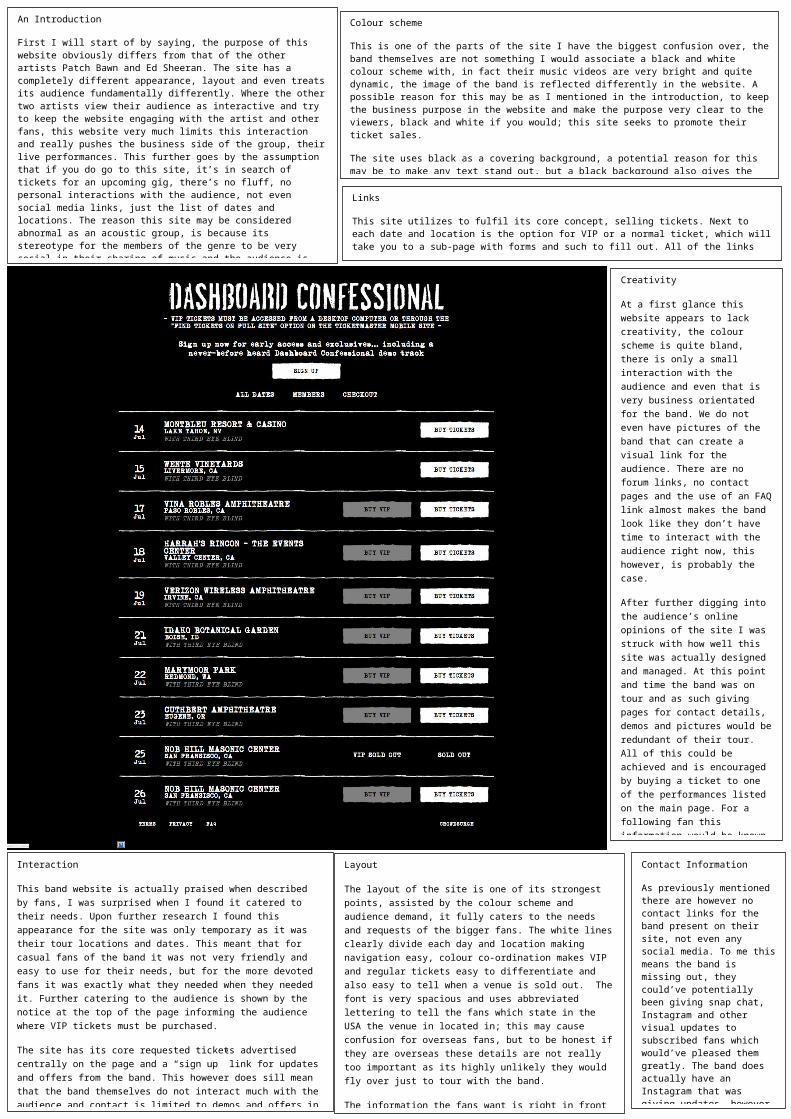
Colour scheme
This is one of the parts of the site I have the biggest confusion over, the band themselves are not something I would associate a black and white colour scheme with, in fact their music videos are very bright and quite dynamic, the image of the band is reflected differently in the website. A possible reason for this may be as I mentioned in the introduction, to keep the business purpose in the website and make the purpose very clear to the viewers, black and white if you would; this site seeks to promote their ticket sales.
The site uses black as a covering background, a potential reason for this may be to make any text stand out, but a black background also gives the deceptive appearance of a space being more occupied than if the space were filled with white instead. It’s also known that are eyes are drawn to bright colours rather than dark, and so by using a white central font, our focus is inherently drawn there. This device is then reversed at the biggest focal points of the site the “Sign up” and “buy tickets” buttons, by reversing the colour scheme for these, they appear abnormal and stand out even stronger against the full black background.
Links
This site utilizes to fulfil its core concept, selling tickets. Next to each date and location is the option for VIP or a normal ticket, which will take you to a sub-page with forms and such to fill out. All of the links are working and the colour scheme and layout are well synergized to make a link easy to notice and enticing to click.
Creativity
At a first glance this website appears to lack creativity, the colour scheme is quite bland, there is only a small interaction with the audience and even that is very business orientated for the band. We do not even have pictures of the band that can create a visual link for the audience. There are no forum links, no contact pages and the use of an FAQ link almost makes the band look like they don’t have time to interact with the audience right now, this however, is probably the case.
After further digging into the audience’s online opinions of the site I was struck with how well this site was actually designed and managed. At this point and time the band was on tour and as such giving pages for contact details, demos and pictures would be redundant of their tour. All of this could be achieved and is encouraged by buying a ticket to one of the performances listed on the main page. For a following fan this information would be known and the information present on the page would be all they need for the next couple of weeks as they would otherwise be at the touring performances. This change to the site shows just how much they cater to the audience and I expect the site will revert after the tour is complete.
Another great display of the band’s creativity is how they’ve used their signature font for the band throughout their website, truly giving it the authentic band appearance and is a pleasing aesthetic touch for any fans.
Interaction
This band website is actually praised when described by fans, I was surprised when I found it catered to their needs. Upon further research I found this appearance for the site was only temporary as it was their tour locations and dates. This meant that for casual fans of the band it was not very friendly and easy to use for their needs, but for the more devoted fans it was exactly what they needed when they needed it. Further catering to the audience is shown by the notice at the top of the page informing the audience where VIP tickets must be purchased.
The site has its core requested tickets advertised centrally on the page and a “sign up” link for updates and offers from the band. This however does sill mean that the band themselves do not interact much with the audience and contact is limited to demos and offers in their store, not what I’d typically expect of an acoustic band which are more known for their high interaction with their fans. No twitter feeds, no forums, no pictures, although this site is tailored to the tour, I feel there could be much more catering for the casual fans as this environment alienates them, when I first visited this site I had no indication this appearance was temporary and thought the bad were just always like this…
Contact Information
As previously mentioned there are however no contact links for the band present on their site, not even any social media. To me this means the band is missing out, they could’ve potentially been giving snap chat, Instagram and other visual updates to subscribed fans which would’ve pleased them greatly. The band does actually have an Instagram that was giving updates, however the website did not advertise this at all…
For the businesses that may have wanted to contact the group they also have no information to go by and this could mean a loss on a potential business partner or sponsor for them.
Layout
The layout of the site is one of its strongest points, assisted by the colour scheme and audience demand, it fully caters to the needs and requests of the bigger fans. The white lines clearly divide each day and location making navigation easy, colour co-ordination makes VIP and regular tickets easy to differentiate and also easy to tell when a venue is sold out. The font is very spacious and uses abbreviated lettering to tell the fans which state in the USA the venue in located in; this may cause confusion for overseas fans, but to be honest if they are overseas these details are not really too important as its highly unlikely they would fly over just to tour with the band.
The information the fans want is right in front of them in a simple format, the links for other information and to checkout are at the top of the list. At the very bottom of the page are further links such as an FAQ and TERMS link, these are associated with the tickets and ensure that any confusion in regards to ordering the tickets can be explained and that all the terms and conditions or obviously available and present to read.