Optimizing your layout for phones and tablets using viewport and media queries
CSS Layout Part 2
Web Development
Lab 07: Learn CSS Layout Part 2
2
CSS Layout Part 2• The clearfix hack• Float layout example• Percent width• Mobile Site Design• Media queries Inline-block• Viewport Meta Tag• Inline-block layout• Column• Flexbox• Further Reading
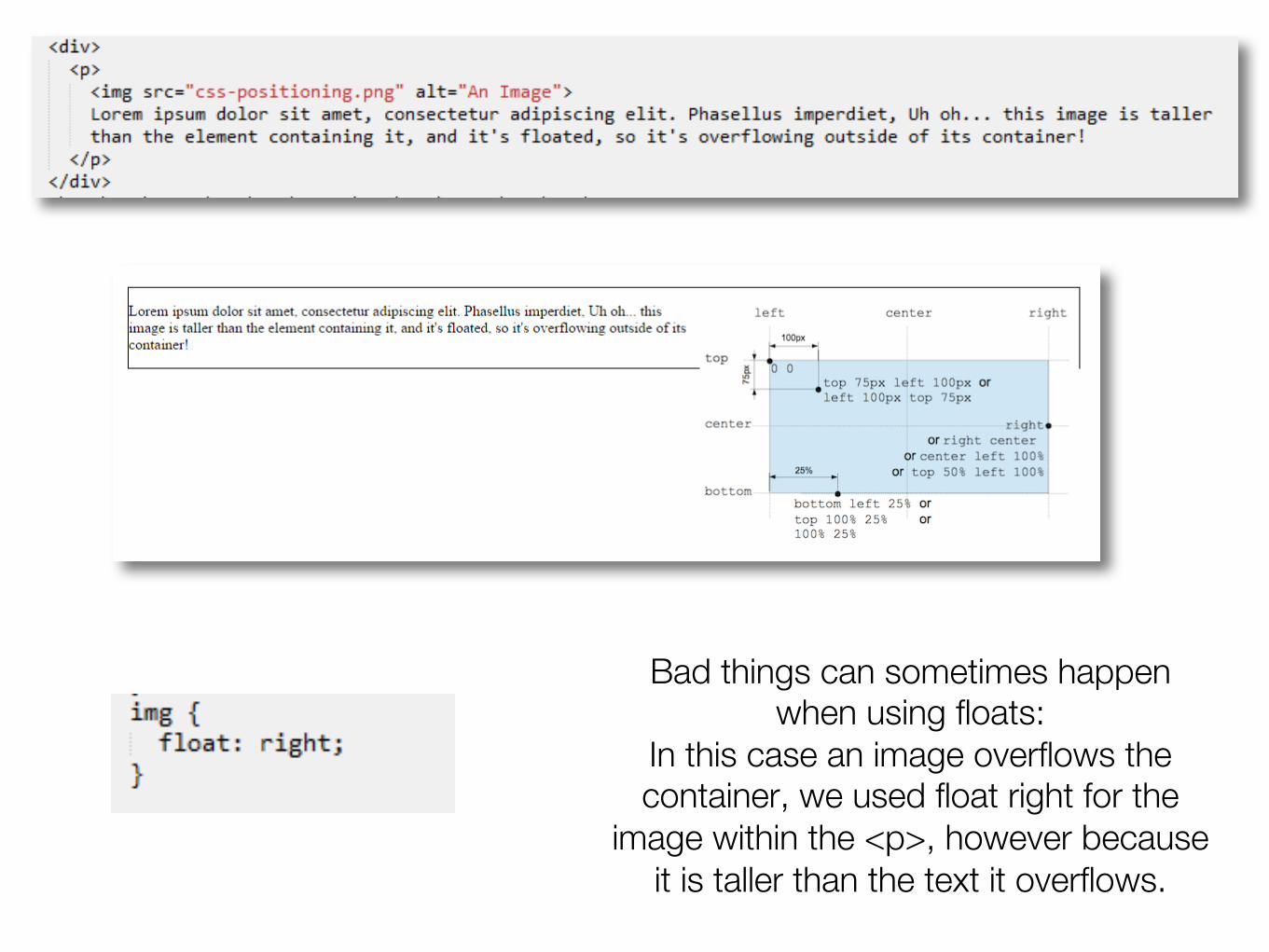
Clearfix hack
Bad things can sometimes happen when using floats:
In this case an image overflows the container, we used float right for the
image within the <p>, however because it is taller than the text it overflows.
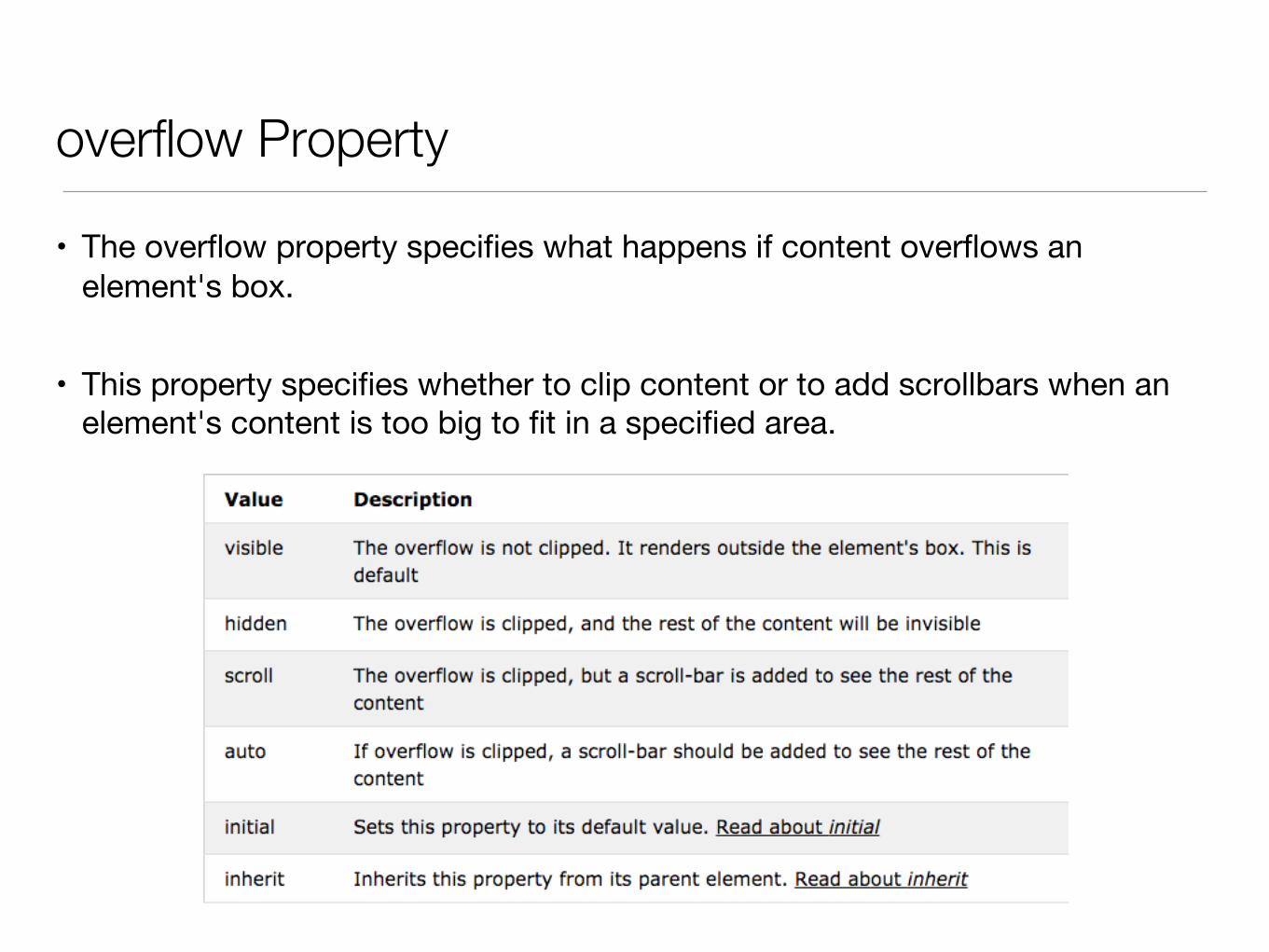
overflow Property
• The overflow property specifies what happens if content overflows an element's box.
• This property specifies whether to clip content or to add scrollbars when an element's content is too big to fit in a specified area.
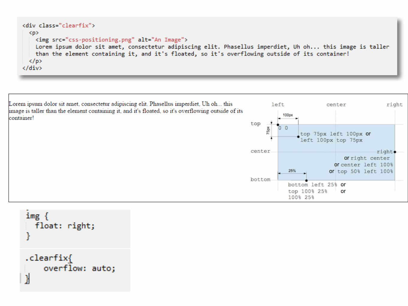
Clearfix hack
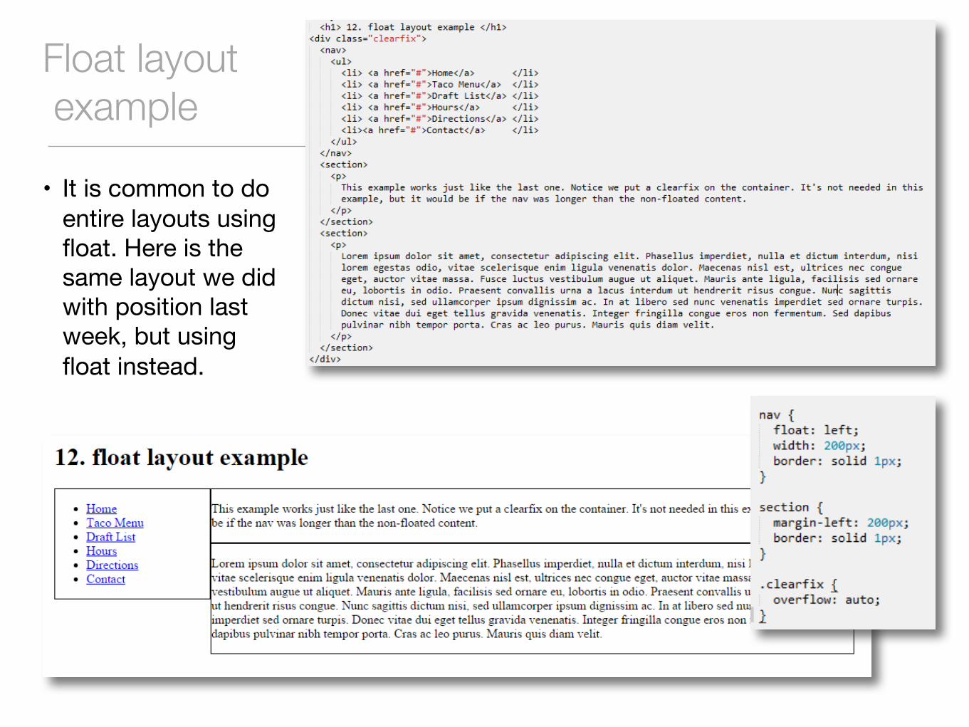
Float layoutexample
• It is common to do entire layouts using float. Here is the same layout we did with position last week, but using float instead.
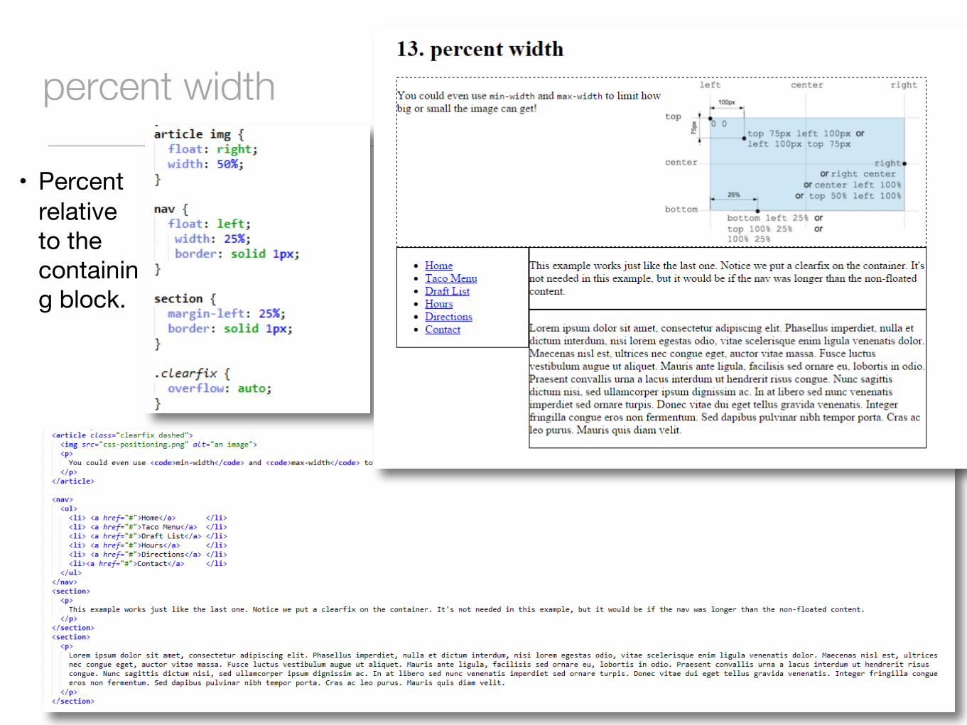
percent width
• Percent relative to the containing block.
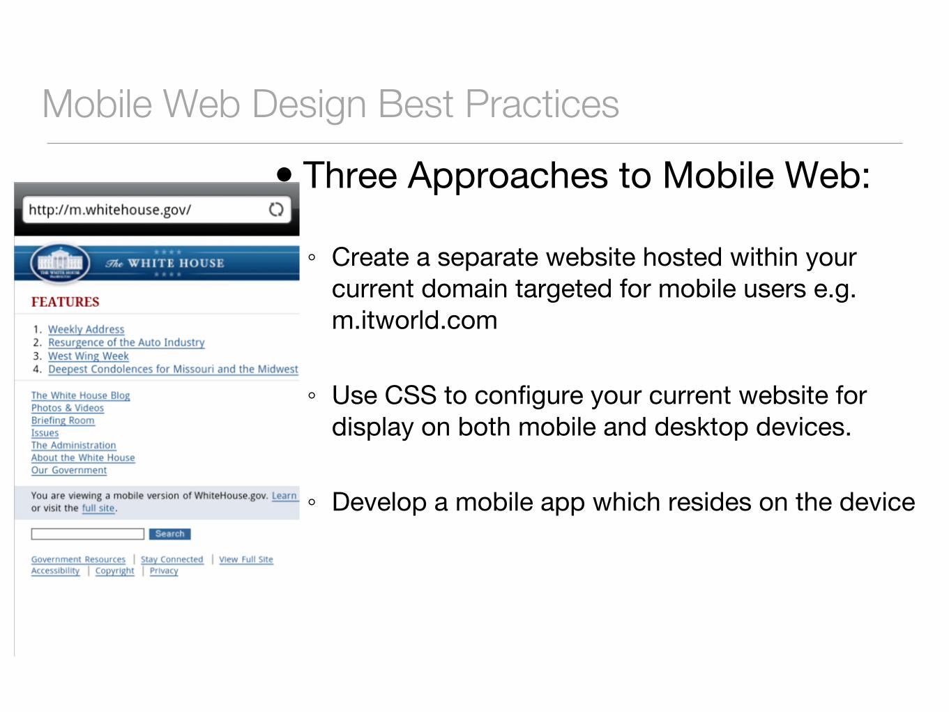
Mobile Web Design Best Practices� Three Approaches to Mobile Web:
◦ Create a separate website hosted within your current domain targeted for mobile users e.g. m.itworld.com
◦ Use CSS to configure your current website for display on both mobile and desktop devices.
◦ Develop a mobile app which resides on the device
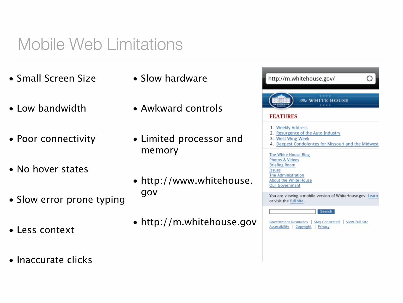
Mobile Web Limitations
• Small Screen Size
• Low bandwidth
• Poor connectivity
• No hover states
• Slow error prone typing
• Less context
• Inaccurate clicks
• Slow hardware
• Awkward controls
• Limited processor and memory
• http://www.whitehouse.gov
• http://m.whitehouse.gov
Approaches to mobile web• Make web sites that work well on a variety of screens (presentation)
• Adjust your content for mobile users (content)
• Give your users a smooth experience even on a slow connection (performance)
11
Design Techniques for Mobile Web
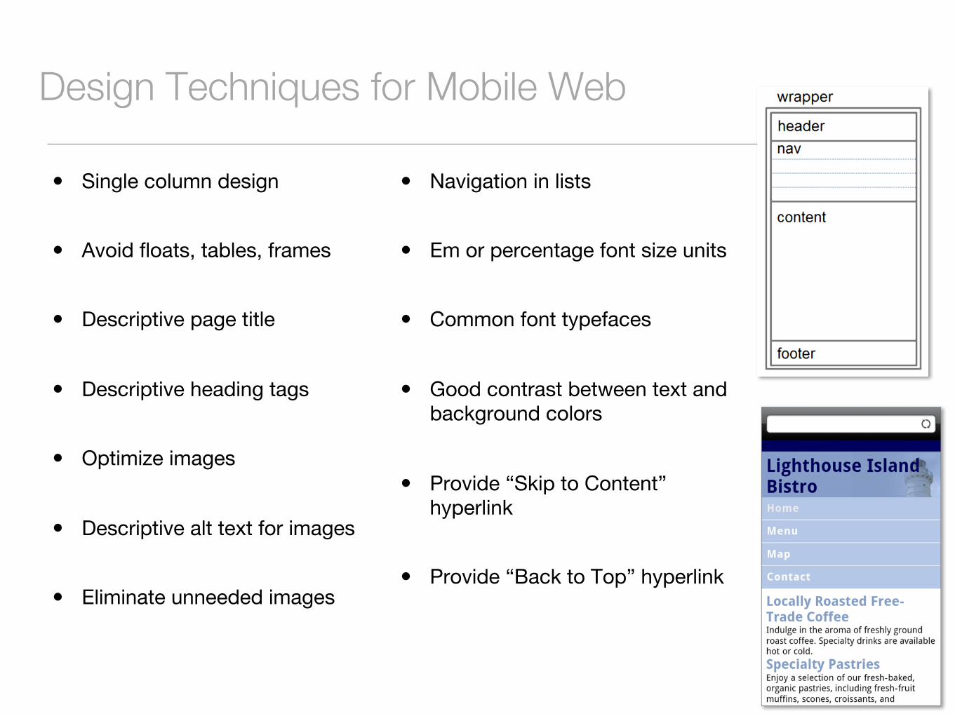
� Single column design
� Avoid floats, tables, frames
� Descriptive page title
� Descriptive heading tags
� Optimize images
� Descriptive alt text for images
� Eliminate unneeded images
� Navigation in lists
� Em or percentage font size units
� Common font typefaces
� Good contrast between text and background colors
� Provide “Skip to Content” hyperlink
� Provide “Back to Top” hyperlink
Design Techniques for Mobile Web
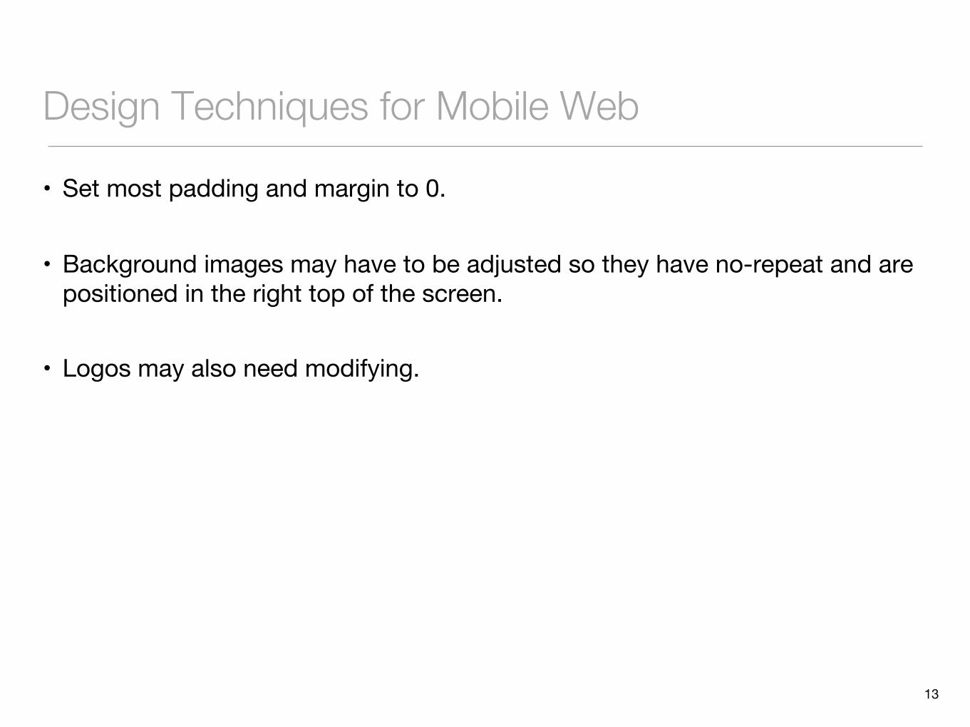
• Set most padding and margin to 0.
• Background images may have to be adjusted so they have no-repeat and are positioned in the right top of the screen.
• Logos may also need modifying.
13
Media queries• Responsive design is the strategy of making a site that “responds” to the
browser and device that it is being shown on so it is awesome no matter what.
• CSS3 media queries are the most powerful tool for doing this. Allow you to gather data about the site visitor and use it to conditionally apply CSS styles.
• A simple technique would be to consider the min-width media feature, which allows us to apply specific CSS styles if the browser window drops below a particular width that we can specify. Target these widths:
• 320px, 480px, 600px, 768px, 900px, 1200px
• These are sometimes called ’breakpoints’
14
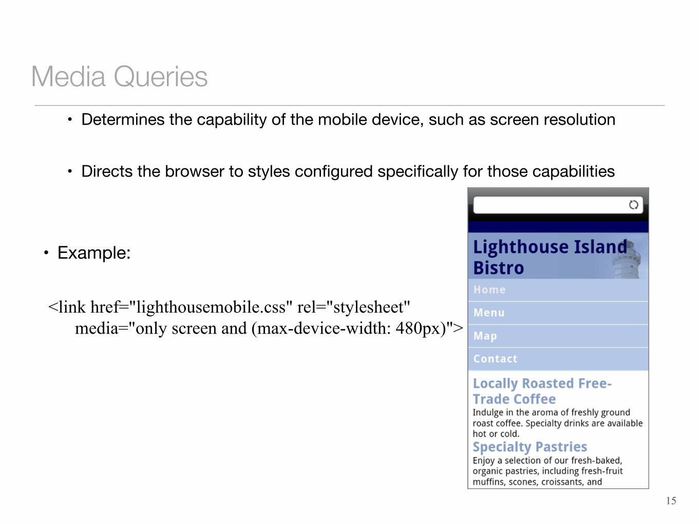
Media Queries• Determines the capability of the mobile device, such as screen resolution
• Directs the browser to styles configured specifically for those capabilities
• Example:
<link href="lighthousemobile.css" rel="stylesheet" media="only screen and (max-device-width: 480px)">
15

media queries
Viewport Meta Tag
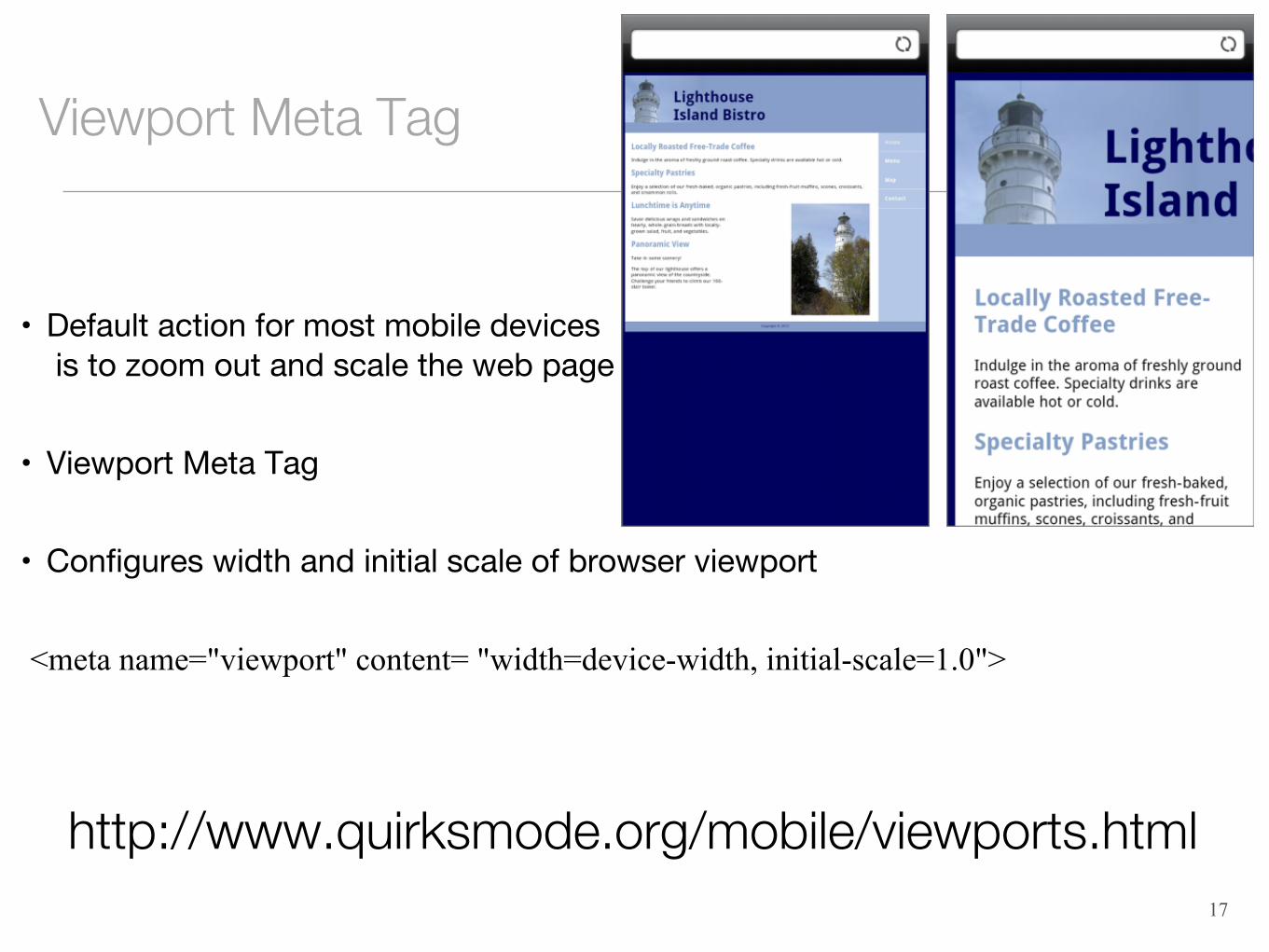
• Default action for most mobile devicesis to zoom out and scale the web page
• Viewport Meta Tag
• Configures width and initial scale of browser viewport
<meta name="viewport" content= "width=device-width, initial-scale=1.0">
17
http://www.quirksmode.org/mobile/viewports.html
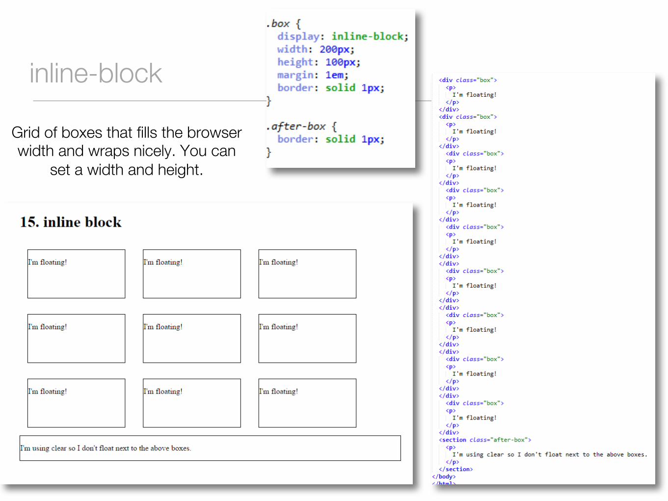
inline-block
Grid of boxes that fills the browser width and wraps nicely. You can
set a width and height.
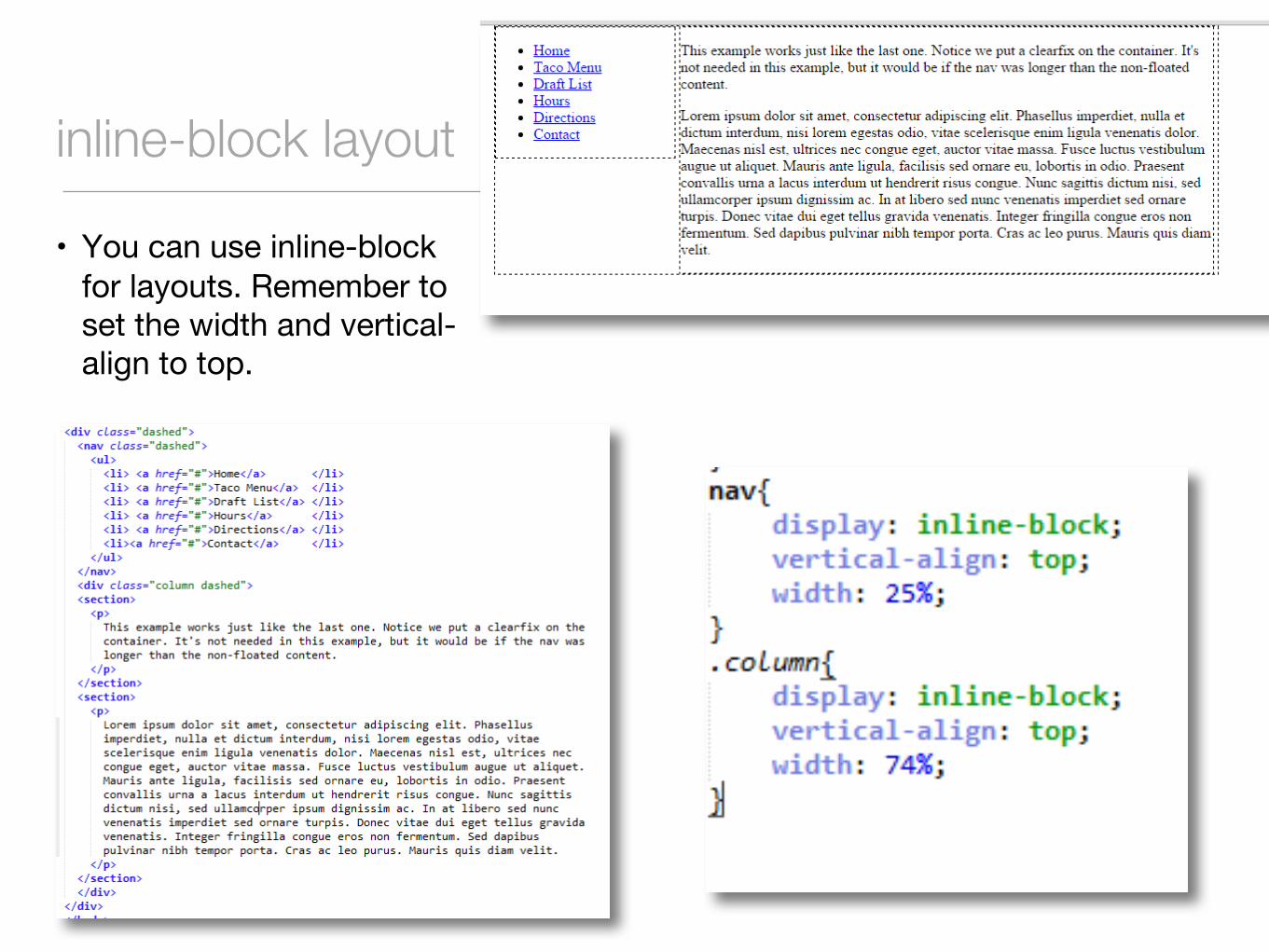
inline-block layout
• You can use inline-block for layouts. Remember to set the width and vertical-align to top.
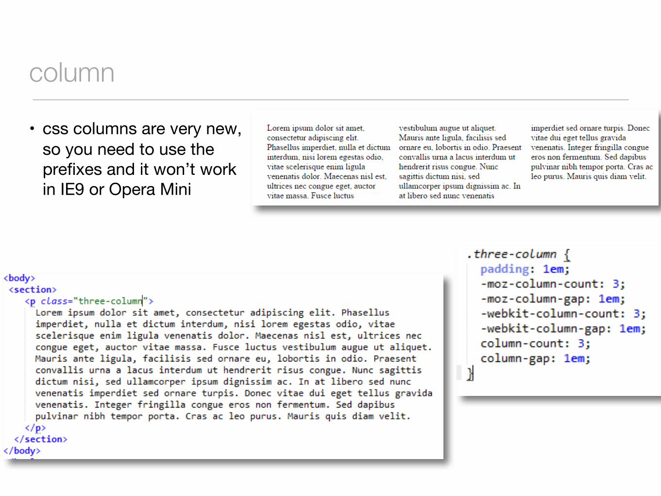
column
• css columns are very new, so you need to use the prefixes and it won’t work in IE9 or Opera Mini
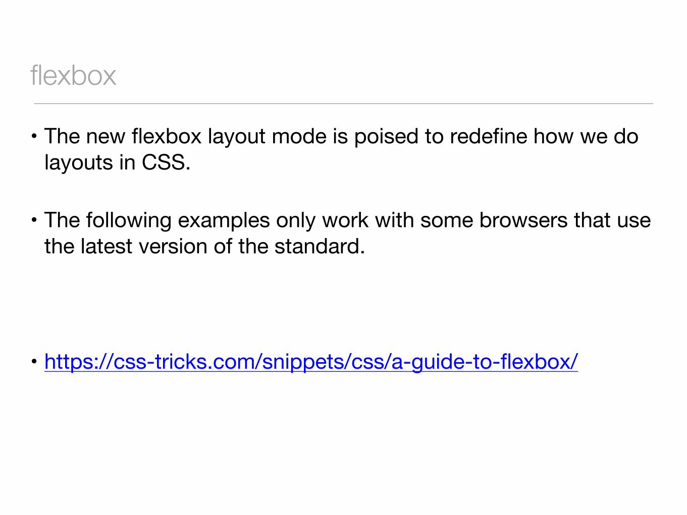
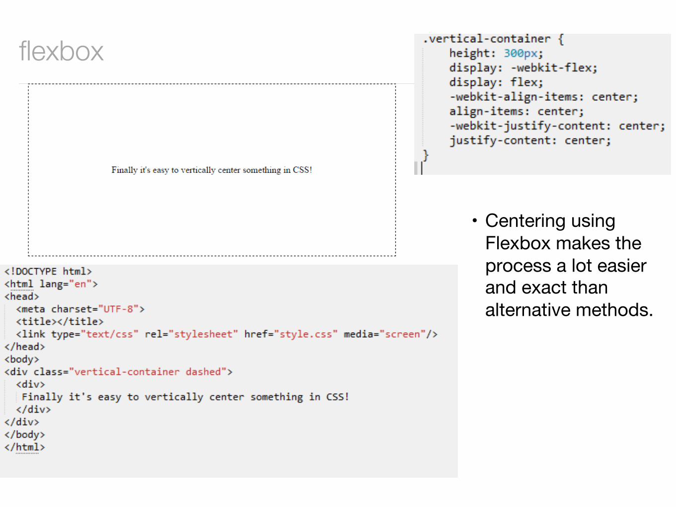
flexbox
• The new flexbox layout mode is poised to redefine how we do layouts in CSS.
• The following examples only work with some browsers that use the latest version of the standard.
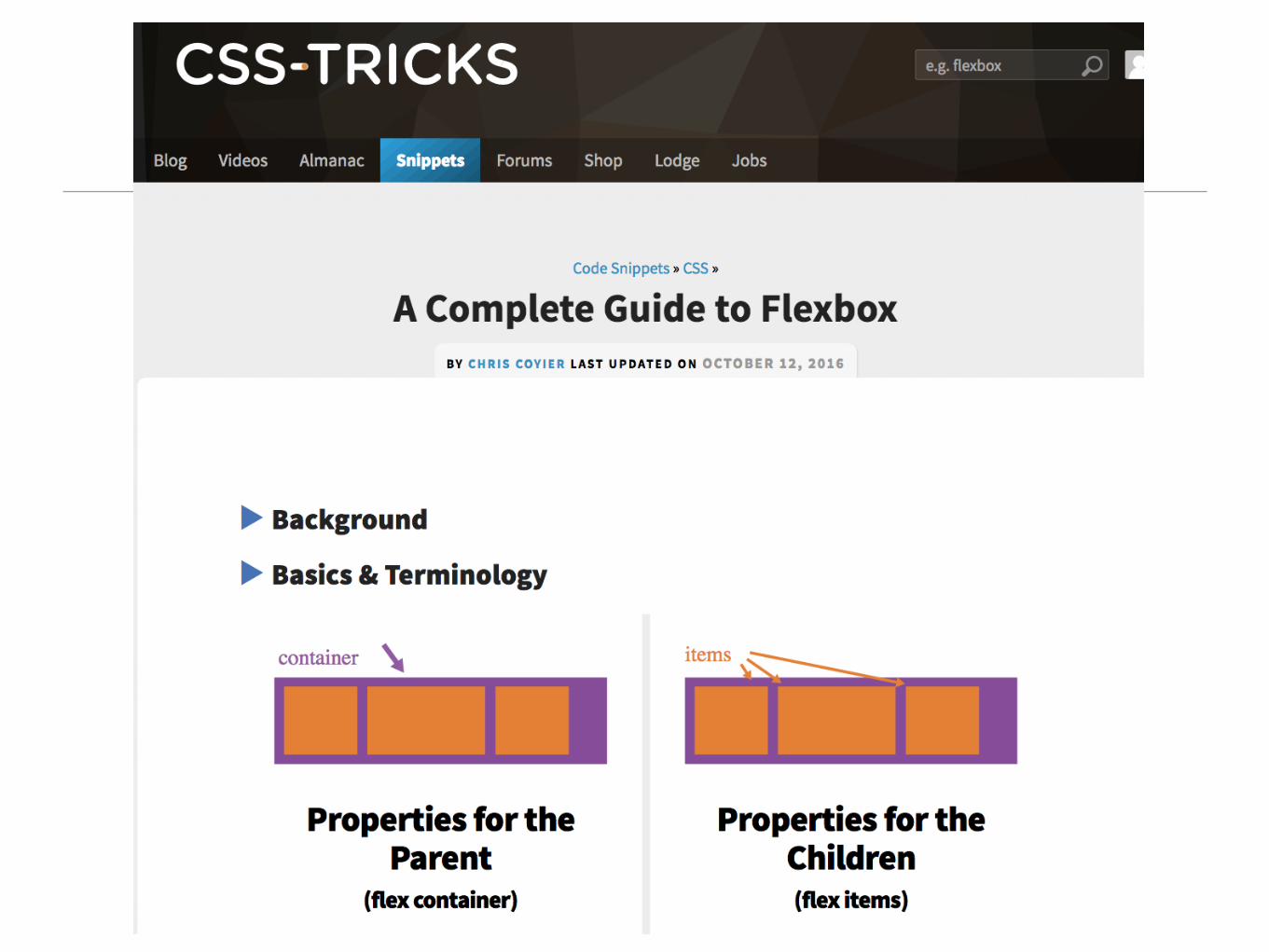
• https://css-tricks.com/snippets/css/a-guide-to-flexbox/
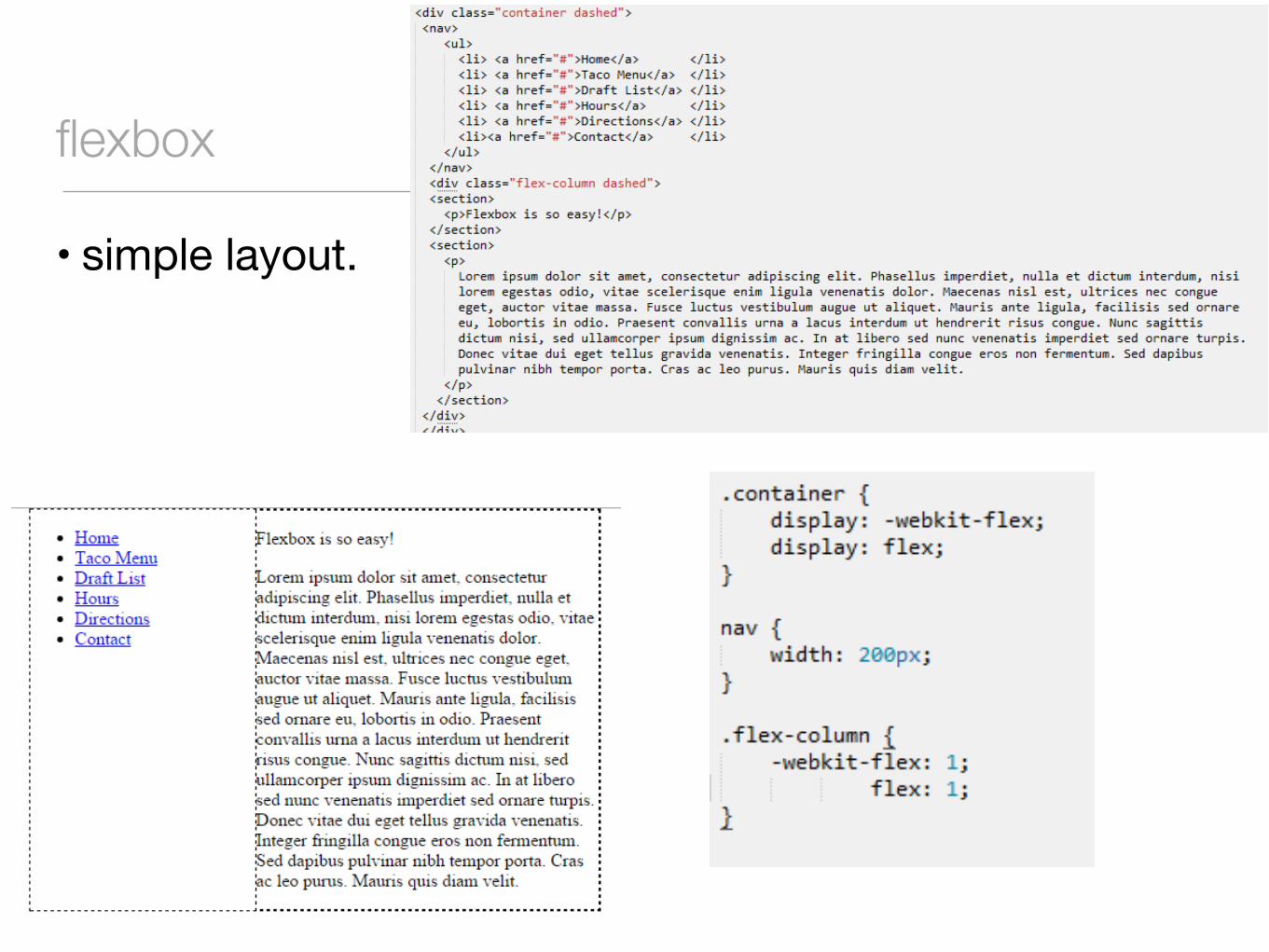
flexbox
• simple layout.
flexbox
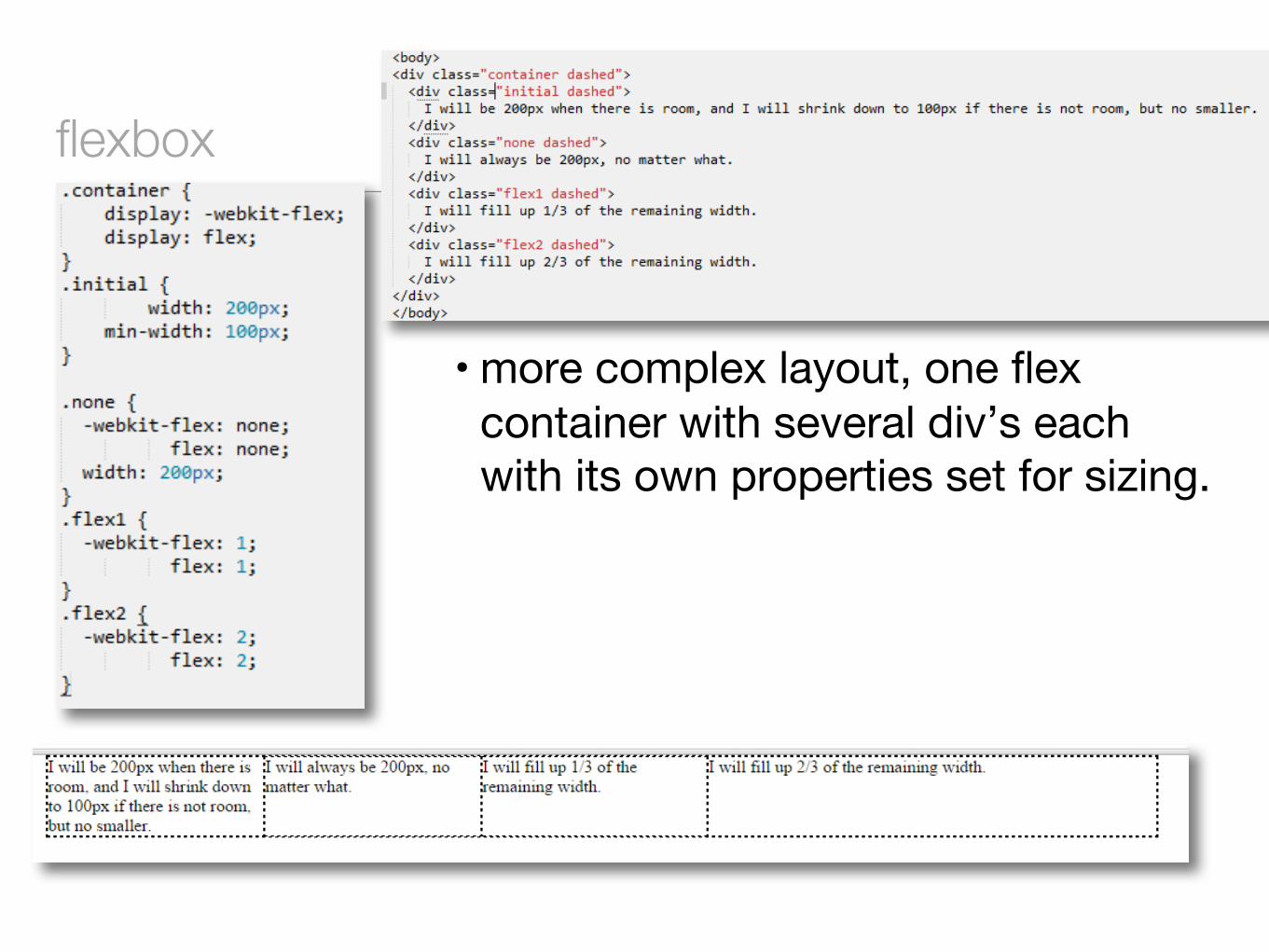
• more complex layout, one flex container with several div’s each with its own properties set for sizing.
flexbox
• Centering using Flexbox makes the process a lot easier and exact than alternative methods.
http://learnlayout.com