Creation of Digipak
4
Creation/Changes of Digipak
-
Upload
tjnr -
Category
Technology
-
view
6.926 -
download
0
Transcript of Creation of Digipak
Creation/Changes of Digipak
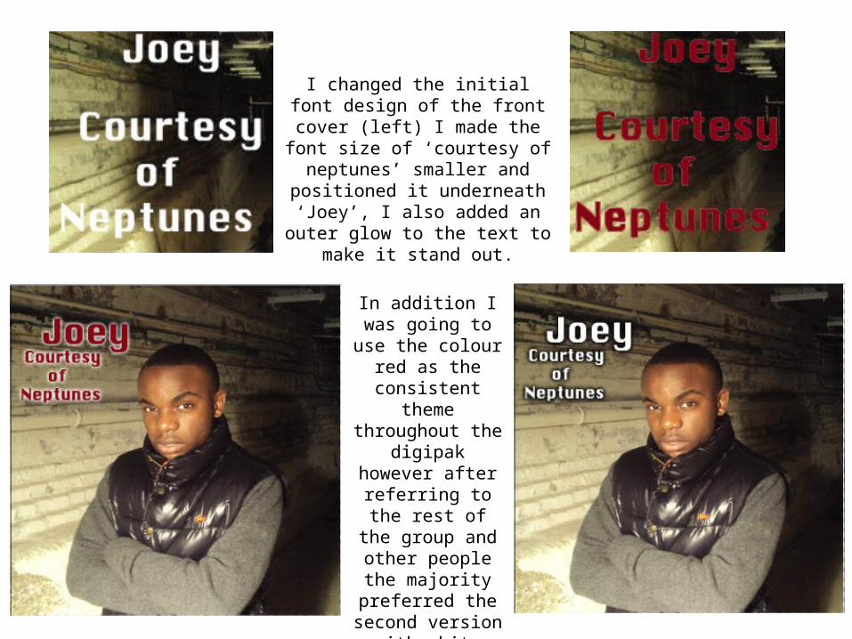
In addition I was going to use the colour red as the consistent theme throughout the
digipak however after referring to the rest of the group and
other people the majority preferred the second version with white fill and a black glow around
the outside edge of it.
I changed the initial font design of the front cover (left) I made the font size of ‘courtesy of neptunes’ smaller and positioned it underneath ‘Joey’, I also added an outer glow to the text
to make it stand out.
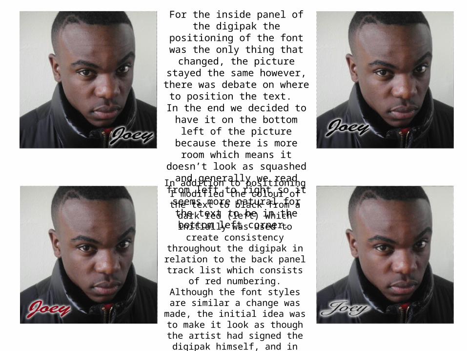
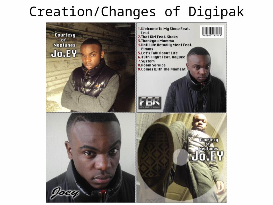
For the inside panel of the digipak the positioning of the font was the
only thing that changed, the picture stayed the same however, there was
debate on where to position the text. In the end we decided to have it on the bottom left of the picture because there is more room which means it doesn’t look as squashed and generally we read from left to right so it seems more natural for the text to be in the bottom left
corner.
In addition to positioning I modified the colour of the text to black from a dark red (left) which initially was used to create consistency throughout the digipak in relation to the back panel
track list which consists of red numbering.
Although the font styles are similar a change was made, the initial idea was
to make it look as though the artist had signed the digipak himself, and in the
end the font style Brush Script MT (above) was used simply because it was
decided that it looked better and was easier to read.
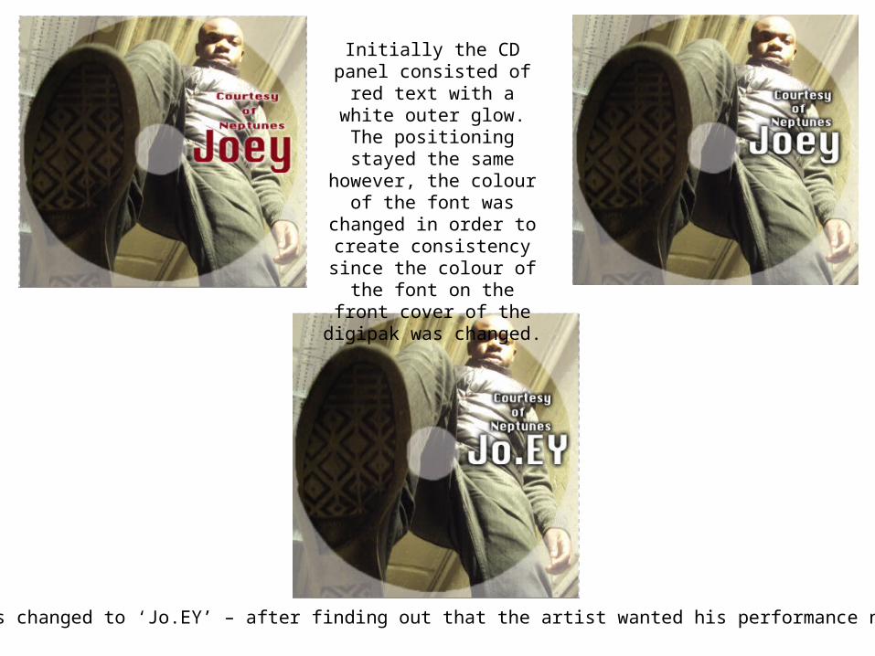
Initially the CD panel consisted of red text with a
white outer glow. The positioning stayed the same however, the colour of the
font was changed in order to create consistency since the
colour of the font on the front cover of the digipak was
changed.
Finally the text was changed to ‘Jo.EY’ – after finding out that the artist wanted his performance name spelt like this.