Creating a PivotChart 12 -...
16
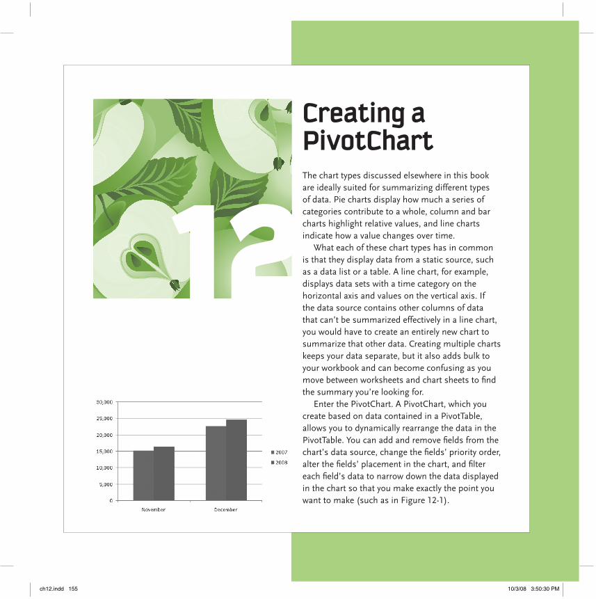
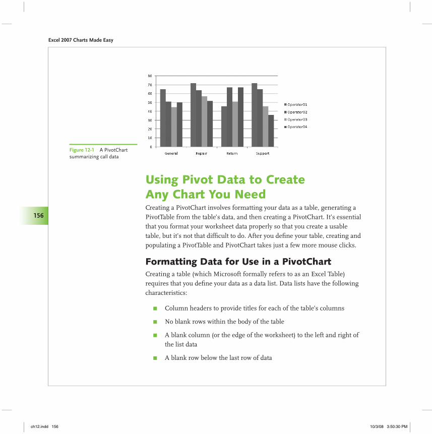
12 Creating a PivotChart The chart types discussed elsewhere in this book are ideally suited for summarizing different types of data. Pie charts display how much a series of categories contribute to a whole, column and bar charts highlight relative values, and line charts indicate how a value changes over time. What each of these chart types has in common is that they display data from a static source, such as a data list or a table. A line chart, for example, displays data sets with a time category on the horizontal axis and values on the vertical axis. If the data source contains other columns of data that can’t be summarized effectively in a line chart, you would have to create an entirely new chart to summarize that other data. Creating multiple charts keeps your data separate, but it also adds bulk to your workbook and can become confusing as you move between worksheets and chart sheets to find the summary you’re looking for. Enter the PivotChart. A PivotChart, which you create based on data contained in a PivotTable, allows you to dynamically rearrange the data in the PivotTable. You can add and remove fields from the chart’s data source, change the fields’ priority order, alter the fields’ placement in the chart, and filter each field’s data to narrow down the data displayed in the chart so that you make exactly the point you want to make (such as in Figure 12-1). ch12.indd 155 10/3/08 3:50:30 PM
-
Upload
hoangkhuong -
Category
Documents
-
view
230 -
download
1
Transcript of Creating a PivotChart 12 -...
12Creating a PivotChartThe chart types discussed elsewhere in this book are ideally suited for summarizing different types of data. Pie charts display how much a series of categories contribute to a whole, column and bar charts highlight relative values, and line charts indicate how a value changes over time.
What each of these chart types has in common is that they display data from a static source, such as a data list or a table. A line chart, for example, displays data sets with a time category on the horizontal axis and values on the vertical axis. If the data source contains other columns of data that can’t be summarized effectively in a line chart, you would have to create an entirely new chart to summarize that other data. Creating multiple charts keeps your data separate, but it also adds bulk to your workbook and can become confusing as you move between worksheets and chart sheets to find the summary you’re looking for.
Enter the PivotChart. A PivotChart, which you create based on data contained in a PivotTable, allows you to dynamically rearrange the data in the PivotTable. You can add and remove fields from the chart’s data source, change the fields’ priority order, alter the fields’ placement in the chart, and filter each field’s data to narrow down the data displayed in the chart so that you make exactly the point you want to make (such as in Figure 12-1).
ch12.indd 155 10/3/08 3:50:30 PM
Excel 2007 Charts Made Easy
156
Using Pivot Data to Create Any Chart You NeedCreating a PivotChart involves formatting your data as a table, generating a PivotTable from the table’s data, and then creating a PivotChart. It’s essential that you format your worksheet data properly so that you create a usable table, but it’s not that difficult to do. After you define your table, creating and populating a PivotTable and PivotChart takes just a few more mouse clicks.
Formatting Data for Use in a PivotChartCreating a table (which Microsoft formally refers to as an Excel Table) requires that you define your data as a data list. Data lists have the following characteristics:
Column headers to provide titles for each of the table’s columns π
No blank rows within the body of the table π
A blank column (or the edge of the worksheet) to the left and right of π
the list data
A blank row below the last row of data π
Figure 12-1 A PivotChart summarizing call data
ch12.indd 156 10/3/08 3:50:30 PM
Chapter 12 Creating a PivotChart
157
In previous versions, you created a data list by formatting the list’s column headers so that they stood out from the data in the list. One common formatting style was to make the headers bold and centered within their cells. You don’t have to format your column headers differently when you create a table in Excel 2007; instead, in the Format as Table dialog (which appears when you click the desired table style), select the My Table Has Headers check box to have Excel treat the first row in your data list as the column headers. Your table will look like the example shown in Figure 12-2.
To create the table shown in Figure 12-2, you select any cell in a data list, click a table style, verify that Excel will include the desired cell range in your table, indicate that your data list contains column headers, and create the table.
Open the Excel 2007 file Chap12CallTable.xlsx. 1. The first page of data contains a table that lists one week’s hourly call volumes for a fictitious company.
Select any cell that contains data, click Home | 2. Format as Table, and then click the table style you want to apply.
In the Format as Table dialog, verify that the data range $B$2:$D$38 3. appears in the Where Is the Data for Your Table field and that the My Table Has Headers check box is selected, and then click OK.
Creating a PivotTable and PivotChartOnce you have created a table, you can create a PivotTable and PivotChart using the table as the data source. Tables are ideally suited to serve as PivotTable data sources, so the process takes just a few steps. After you create the PivotTable and PivotChart, you can define their configurations by dragging the PivotTable field headers to the desired locations in the PivotTable Field List task pane (the results of which appear in Figure 12-3).
When you create a table in Excel 2007, the table style you click doesn’t replace any existing text or cell formatting. For example, if one cell has a yellow background color, applying a table style won’t get rid of the yellow, even though that color might clash with the rest of the table. To have the table style’s design override any existing formatting, right-click the table style, and then click Apply and Clear Formatting.
MeMo
Figure 12-2 An Excel 2007 table
ch12.indd 157 10/6/08 3:42:53 PM
Excel 2007 Charts Made Easy
158
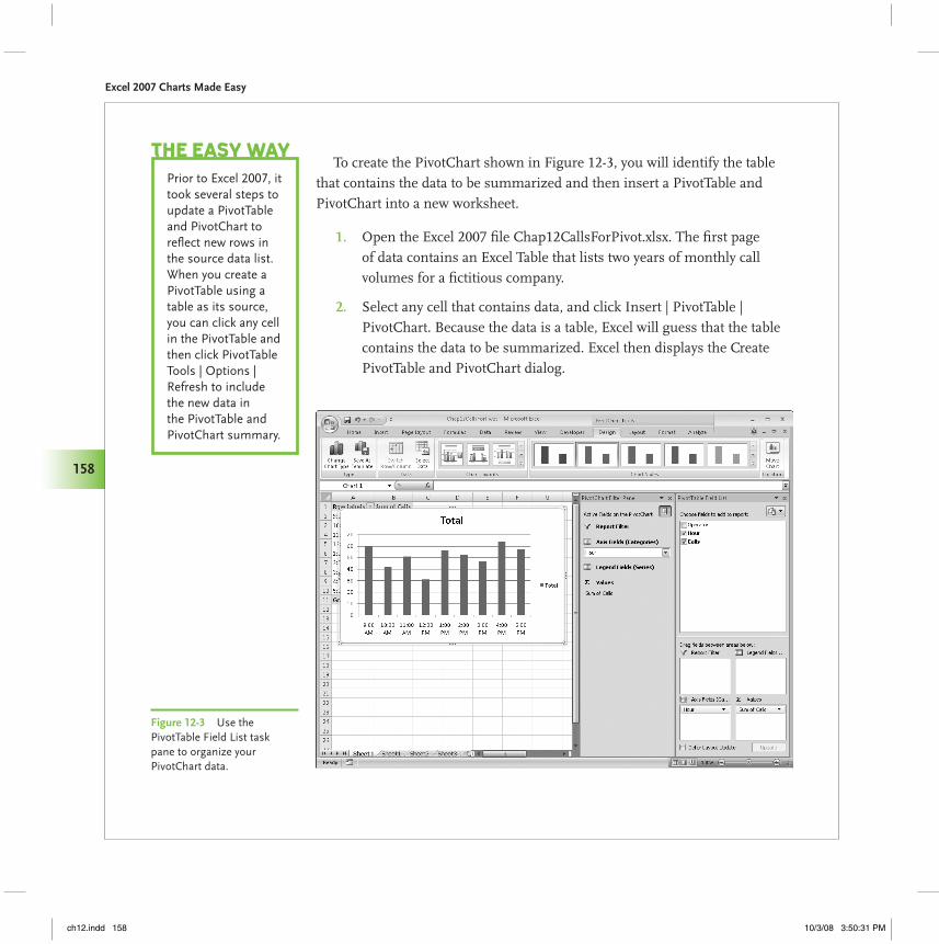
To create the PivotChart shown in Figure 12-3, you will identify the table that contains the data to be summarized and then insert a PivotTable and PivotChart into a new worksheet.
Open the Excel 2007 file Chap12CallsForPivot.xlsx. The first page 1. of data contains an Excel Table that lists two years of monthly call volumes for a fictitious company.
Select any cell that contains data, and click Insert | PivotTable | 2. PivotChart. Because the data is a table, Excel will guess that the table contains the data to be summarized. Excel then displays the Create PivotTable and PivotChart dialog.
Prior to Excel 2007, it took several steps to update a PivotTable and PivotChart to reflect new rows in the source data list. When you create a PivotTable using a table as its source, you can click any cell in the PivotTable and then click PivotTable Tools | Options | Refresh to include the new data in the PivotTable and PivotChart summary.
The easy Way
Figure 12-3 Use the PivotTable Field List task pane to organize your PivotChart data.
ch12.indd 158 10/3/08 3:50:31 PM
Chapter 12 Creating a PivotChart
159
Verify that the Calls table appears in the Table/Range field of the dialog 3. and that the New Worksheet option is selected, and then click OK.
In the PivotTable Field List task pane, drag the Hour field header to 4. the Axis Fields (Categories) area, and drag the Calls field header to the Values area.
When you created the PivotChart, four new tabs appeared on the ribbon: Design, Layout, Format, and Analyze. The following list details the capabilities enabled by each of the tabs.
PivotChart Tools | Design π This tab allows you to change the basic colors and design of the PivotChart. The buttons on this tab also enable you to change the PivotChart’s chart type, change the data displayed in the PivotChart, select a new color scheme for the PivotChart, and change the basic layout of the PivotChart.
PivotChart Tools | Layout π This tab allows you to fine-tune the layout of your PivotChart. You can hide or display the PivotChart’s elements (axes, gridlines, legend, and so on), add pictures or shapes to the PivotChart to help viewers interpret the PivotChart’s data, and add a trend line to see what your data will look like in the future if the current trend continues. You can also change the formatting of any part of the PivotChart by selecting it from the drop-down list in the Current Selection group at the far left side of the ribbon.
PivotChart Tools | Format π This tab lets you change the appearance of the fills, lines, and effects for the PivotChart, as well as the appearance of any text in the PivotChart.
PivotChart Tools | Analyze π This tab enables you to hide or display the PivotChart Filter Pane and the PivotTable Field List task pane, refresh the PivotChart’s connection to its data source, clear any formats or filters applied to the PivotChart, and change how the PivotChart data is organized.
If you create a PivotTable and later decide you want to create a PivotChart to go along with it, click any cell in the PivotTable and then use the ribbon controls on the Insert tab to create a new chart. Excel recognizes that you used a PivotTable as the data source, so it creates a PivotChart instead of a regular chart.
The easy Way
ch12.indd 159 10/3/08 3:50:31 PM
Excel 2007 Charts Made Easy
160
The default formatting Excel applies to a PivotChart presents your data in a highly usable and understandable manner. Of course, refining the appearance and composition of your PivotChart using the tools available on the Design, Layout, Format, and Analyze tabs enables you to match your organization’s preferred styles and color scheme while presenting your data most effectively.
Changing the Data That Shows in Your PivotChartPivotCharts summarize data stored in PivotTables, but you might not need to summarize all of the data in support of a particular analysis. For example, you might only want to display the calls your technical support line received on Mondays and Fridays in January, which are usually the busiest days of the week during the busiest support month of the year.
Excel 2007 enables you to create two kinds of filters: selection filters, which limit the data shown in a PivotChart to those items you select (e.g., the days Monday and Friday), and rule filters, where you define a rule by which Excel limits the data (e.g., only summarize the data for days where there were more than 100 calls).
Filtering a PivotChart by RuleAs the name implies, rule filters restrict the data summarized in a PivotChart by applying one or more criteria to decide which rows from the PivotTable to include in the PivotChart. You create a rule filter by clicking the down arrow to the right of a field header in the PivotChart Filter Pane or the PivotTable Field List task pane, clicking Value Filters, and then selecting the type of rule you want to create.
After you fill in the filter criteria and click OK, Excel redraws your PivotChart to reflect the new data set (as shown in Figure 12-4).
To create the PivotChart shown in Figure 12-4, you will define a filter that limits the data displayed in the PivotChart to the number of customer service calls completed from 11:00 a.m. to 1:59 p.m. (that is, during the hours between 11:00 a.m. and 1:00 p.m., inclusive).
The filter options that appear when you click a filter arrow in a PivotTable or one of the down arrows in the PivotChart Filter Pane change to reflect the type of data in the field. If the field contains a mix of data types, Excel displays the Number Filters menu item.
MeMo
ch12.indd 160 10/3/08 3:50:31 PM

Chapter 12 Creating a PivotChart
161
Open the Excel 2007 file Chap12CallsByHour.xlsx. The CVSummary 1. worksheet contains a PivotChart that summarizes one day’s hourly call volumes for four operators at a fictitious company.
If necessary, select the PivotChart to display the PivotChart Filter Pane. 2.
In the PivotChart Filter Pane, click the Axis Fields (Categories) box’s 3. down arrow, point to Date Filters, and then click Between to display the Date Filter (Hour) dialog.
Verify that the operator “is between” appears in the left-hand box, type 4. 11:00 am in the center box, and then type 1:00 pm in the right-hand box. Click OK when you’re done.
After you click OK, the PivotChart changes to display just the hourly call volumes for the hours starting from 11:00 a.m. to 1:00 p.m.
Filtering a PivotChart by SelectionNot every filter lends itself to a rule expressed in terms of values less than or greater than some other value, the first three months of the year, or sales representatives whose names begin with the letter “S.” For those cases where you want to display data for categories where the categories don’t follow a set rule, you can select the items you do want to display. When you click a filter arrow, Excel displays a list of the values in the PivotTable field. You can use
Figure 12-4 Filtering a PivotChart limits the data summarized by the chart.
ch12.indd 161 10/3/08 3:50:31 PM

Excel 2007 Charts Made Easy
162
the list to select which values you want to summarize, greatly simplifying a complex PivotChart into the much more easily understood example shown in Figure 12-5.
To create the PivotChart shown in Figure 12-5, you will define a selection filter that limits the data displayed in the PivotChart to the number of customer service calls received in November and December of the two years summarized in the data set.
Open the Excel 2007 file Chap12CallVolume.xlsx. The MonthlyCalls 1. worksheet contains a PivotChart that summarizes two years’ monthly call volumes for a fictitious company.
If necessary, select the PivotChart to display the PivotChart Filter Pane. 2.
Figure 12-5 Pick which values you want to summarize in your PivotChart.
ch12.indd 162 10/3/08 3:50:31 PM
Chapter 12 Creating a PivotChart
163
In the PivotChart filter pane, click the Axis Fields (Categories) box’s 3. down arrow to display a menu of sorting and filtering options. Click Select All to clear the check boxes in the filter pane, select the November and December check boxes, and then click OK.
After you click OK, the PivotChart changes to display just the hourly call volumes for November and December.
Assigning Fields to the Report Filter AreaPivotCharts enable you to summarize large volumes of data effectively, but you must manage that power and flexibility to ensure your charts remain understandable. It’s easy to create PivotCharts that contain enough subdivisions to make the chart more confusing than informative.
Rather than attempt to fit all of those subdivisions into a single chart, you can add fields to the Report Filter area of the PivotChart. Fields in the Report Filter area limit the data summarized in the chart without affecting the chart’s organization. As in the case of the PivotChart shown in Figure 12-6, you could move the Category field to the Report Filter area and use that field to limit the data shown in your PivotChart.
To create the PivotChart shown in Figure 12-6, you are going to create a filter that limits the data displayed in the PivotChart to the number of customer service calls relating to returns and repairs received during one business week.
Open the Excel 2007 file Chap12CallsByCategory.xlsx. The CVByCategory 1. worksheet contains a PivotChart that summarizes five days’ worth of call volumes, broken down by the reason for the call, for four operators at a fictitious company.
If necessary, select the PivotChart to display the PivotChart Filter Pane. 2.
In the PivotChart Filter Pane, click the Report Filter box’s down arrow, 3. and then select the Select Multiple Items check box.
In the list of items, clear the General and Support check boxes, and 4. then click OK.
ch12.indd 163 10/3/08 3:50:31 PM

Excel 2007 Charts Made Easy
164
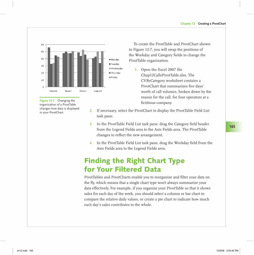
Changing What You See by Changing the PivotTablePivotCharts draw their data from PivotTables. While you can create filters to limit the data that appears in a PivotChart, you can’t rearrange the fields of the PivotTable to change the organization of the data from within the PivotChart. You can, however, change the appearance of the PivotChart by rearranging the fields in the PivotTable. The results of one such operation appear in Figure 12-7.
Figure 12-6 Fields in the Report Filter area don’t affect the PivotChart’s organization.
If your PivotTable and PivotChart draw their data from an external source, such as a database stored on another computer, you might find that it takes a long time for the PivotTable to update after you reconfigure its fields. You can avoid most of these delays by selecting the Defer Layout Update check box at the bottom of the PivotTable Field List task pane before you make the adjustments. When you’re done making your changes, click the Update button to have Excel update your PivotTable and PivotChart. Be sure to uncheck the Defer Layout Update check box if you want Excel to update your PivotTable whenever you change its fields’ arrangement.
The easy Way
ch12.indd 164 10/3/08 3:50:32 PM
Chapter 12 Creating a PivotChart
165
To create the PivotTable and PivotChart shown in Figure 12-7, you will swap the positions of the Weekday and Category fields to change the PivotTable organization.
Open the Excel 2007 file 1. Chap12CallsPivotTable.xlsx. The CVByCategory worksheet contains a PivotChart that summarizes five days’ worth of call volumes, broken down by the reason for the call, for four operators at a fictitious company.
If necessary, select the PivotChart to display the PivotTable Field List 2. task pane.
In the PivotTable Field List task pane, drag the Category field header 3. from the Legend Fields area to the Axis Fields area. The PivotTable changes to reflect the new arrangement.
In the PivotTable Field List task pane, drag the Weekday field from the 4. Axis Fields area to the Legend Fields area.
Finding the Right Chart Type for Your Filtered DataPivotTables and PivotCharts enable you to reorganize and filter your data on the fly, which means that a single chart type won’t always summarize your data effectively. For example, if you organize your PivotTable so that it shows sales for each day of the week, you should select a column or bar chart to compare the relative daily values, or create a pie chart to indicate how much each day’s sales contributes to the whole.
Figure 12-7 Changing the organization of a PivotTable changes how data is displayed in your PivotChart.
ch12.indd 165 10/3/08 3:50:32 PM
Excel 2007 Charts Made Easy
166
The following list summarizes the strengths of the chart types available to you in Excel 2007. Be sure to experiment with your data—you never know when you’ll find a combined chart type and PivotTable arrangement that makes a point clearly.
Column π charts best summarize the several categories of data. For example, you could use a column chart to compare monthly sales totals for a company’s salespeople.
Line π charts are most useful for summarizing data where one of the data series is a time component. Rather than comparing every sales representative’s totals for a particular month, you could create a line chart that displayed a single representative’s monthly sales totals for every month in the current year.
Pie π charts best illustrate the contribution each member of a data series makes to the whole. In the sales example, you could find each sales representative’s yearly total, and create a pie chart that displays each representative’s contribution to the whole.
Bar π charts are useful for comparing the relative magnitude of several values. Consider using a bar chart when the category labels are too large to fit on the horizontal axis of your chart.
Area π charts illustrate the differences of several sets of data over time. Unlike line charts, which show how individual data series change over time but don’t emphasize the relative values in the series, area charts clearly show which values are larger.
Scatter π charts let you summarize data sets that have two numerical data series. For example, if your company were testing how price changes affected a product’s unit sales, you could plot total revenue for sales at a particular price on the vertical axis, and plot the price points on the horizontal axis.
ch12.indd 166 10/3/08 3:50:32 PM
Chapter 12 Creating a PivotChart
167
Stock π charts, as the name implies, are often used to summarize daily stock price fluctuations.
Surface π charts plot three data series and, like a topographic map displays the highest point on a landscape, indicate where the values in two data series combine to generate the largest result. For example, you could create a surface chart that compared how the combination of product price changes and advertising dollars spent in a market affected overall sales revenue in that market.
Doughnut π charts are similar to pie charts in that they visually summarize how much individual values contribute to a whole. Doughnut charts, however, can summarize multiple data series, not just one.
Bubble π charts are like scatter charts, except that the size of the indicator in the body of the charts reflects the magnitude of a third value. For example, if a scatter chart plotted total sales revenue at a price point and the various unit prices, the third value could be the number of units sold at each price.
Radar π charts summarize data contained in a crosstab data table, which is a grid with two categories, such as month and product, and the sales values in the cells where the rows and columns intersect.
What Your PivotChart Can Tell YouPivotTables and PivotCharts enable you to emphasize various aspects of your data, whether by changing how the data is organized within the PivotTable, filtering the data using the controls in the PivotChart Filter Pane, selecting a new chart type with which to summarize your data, or by applying a combination of those techniques.
ch12.indd 167 10/3/08 3:50:32 PM
Excel 2007 Charts Made Easy
168
In the following procedure, you will work through a sequence of PivotChart and PivotTable positions that illustrate a potential business analysis scenario. During that analysis, you will display the total number of calls received over the course of a week, break out those calls by category, change the chart’s type to a pie chart to determine how much each category contributed to overall call volume, summarize one operator’s calls by category, and further break down that operator’s calls by day.
Open the Excel 2007 file Chap12CallsAnalysis.xlsx. The Week1Calls 1. worksheet contains a PivotChart that summarizes five days’ worth of call volumes, broken down by the reason for the call, for four operators at a fictitious company. The PivotChart will be blank at this point.
If necessary, select the PivotChart to display the PivotChart Filter 2. Pane. Then, in the PivotTable Field List task pane, drag the Calls field header from the Choose Fields to Add to Report area to the Values area. The PivotChart displays a single column indicating the total number of calls received during the week.
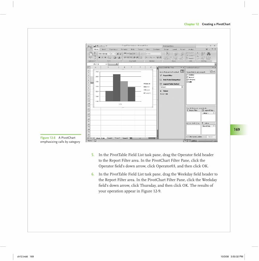
In the PivotTable Field List task pane, drag the Category field header 3. from the Choose Fields to Add to Report area to the Legend Fields area. The PivotChart displays four columns, indicating the total number of calls received for each support category during the week (as shown in Figure 12-8).
Click PivotChart Tools | Design | Change Chart Type to display the 4. Change Chart Type dialog. In the left-hand column of that dialog, click the Pie chart type. Verify that the first pie chart subtype is selected, and then click OK. Then, in the PivotTable Field List task pane, drag the Category field header from the Legend Fields area to the Axis Fields area.
ch12.indd 168 10/3/08 3:50:32 PM
Chapter 12 Creating a PivotChart
169
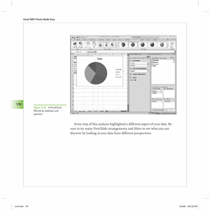
In the PivotTable Field List task pane, drag the Operator field header 5. to the Report Filter area. In the PivotChart Filter Pane, click the Operator field’s down arrow, click Operator03, and then click OK.
In the PivotTable Field List task pane, drag the Weekday field header to 6. the Report Filter area. In the PivotChart Filter Pane, click the Weekday field’s down arrow, click Thursday, and then click OK. The results of your operation appear in Figure 12-9.
Figure 12-8 A PivotChart emphasizing calls by category
ch12.indd 169 10/3/08 3:50:32 PM
Excel 2007 Charts Made Easy
170
Every step of this analysis highlighted a different aspect of your data. Be sure to try many PivotTable arrangements and filters to see what you can discover by looking at your data from different perspectives.
Figure 12-9 A PivotChart filtered by weekday and operator
ch12.indd 170 10/3/08 3:50:32 PM