CQ 11
21
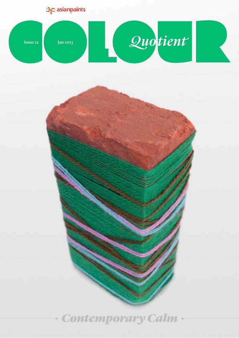
Contemporary Calm Jan 2013 Issue 11
-
Upload
asian-paints-limited -
Category
Documents
-
view
213 -
download
1
description
Colour Quaterly 11
Transcript of CQ 11
Contemporary Calm
Jan 2013Issue 11

Contemporary Calm
Jan 2013Issue 11
Colours of NavarasaThe continuing series on the Navarasa focuses on colour associations of Bhayanaka (Fear) and Shaanta (Calm).
Asian Paints Sharad Shamman 2012APSS celebrates the best decorated Durga Puja pandals in Kolkata in 2012.
16
25
Contemporary CalmThree leading design professionals provide insights into creating sophisticated colour palettes around the issue colour, Peace Meadow–9310.
INSPIRATION
ASK ASIAN PAINTS
IN FOCUS INDIA CONNECT
INSIGHT
INSIGHT
CQ 11
Future Forward with Colour A glimpse into the 10th edition of
Asian Paints' premier colour forecast—ColourNext 2013.
Italian Inspired Textures with Apex Duracast Venezio
Fine-grained textures for exterior and interior spaces from Asian Paints.
08
Colour for Healthcare SpacesThe strategic use of colour as a tool to support the goals of a healthcare organisation.
ON THE COVER
20
36
14
02
Niels Schoenfelder Jigisha Patel Madhav Raman
31
Colour Query
Ladakh: The Reserve of SolitudeExplore the contrasting colours of the
landscape and culture of Ladakh.
28 A Modern Approach to ArchitectureArchitect, Suman Sorg, on creating contextually relevant, sculptural, and modern spaces.
Contemporary Calm refers to the creation of a soothing oasis of colour in midst of chaotic urban spaces. The cover image is a colourful play on the most basic and natural building unit of these spaces—the brick. The calming green (Peace Meadow–9310) of the yarn brings a sense of softness that contrasts the mundane urban environment.
CONTENTS
COLOURMAP
GROWTH
CALM
LIGHT
SPROUT
TRANSFORM
REFLECTION
MELLOW
MINIMAL
GENTLE
EARTH
ORGANIC
HOPE
REVERIE
RELAX
ECO
LEISURE
PEACE MEADOW–9310
Gemstone–9333 | R 72 G 103 B 71Peace Meadow–9310 | R 88 G 154 B 108
Lemonade–7830 | R 233 G 217 B 89Jungle Leaf–9336 | R 156 G 189 B 154
Jade Green–2435 | R 31 G 125 B 67
Colours are rich in inspiration—each colour
carries with it a multitude of meanings,
associations, and connotations. Colour Map is
a visual map of ideas originating from our issue
colour Peace Meadow–9310, to inspire and kickstart
your creative process.
Mint Spray–9377 | R 212 G 215 B 160

VenezioITALIAN INSPIRED TEXTURES WITH
APEX DURACAST
2–3IN FOCUS
Italy is home to a unique range of textures and finishes that have characterised and made distinctive many of its architectural
structures. Inspired by the understated sophistication of such fine-grained Italian finishes, Asian Paints introduces
Apex Duracast Venezio to the Indian market—the latest addition to the Apex Duracast range of Premium Textures
available for exterior and interior surfaces.

1
2
1
2
Exterior application of Apex Duracast Venezio on a patio.
Application of Apex Duracast Venezio on a feature wall.
4–5IN FOCUS COLOUR QUOTIENT 11
The Italian Connect
The Mediterranean has widely been acknowledged as the fountainhead of
modern architecture—from the ancient Egyptians, whose pioneering architecture manifested in structures such as the pyramids, to the Greeks, whose contributions to architecture included structures such as the agoras (open spaces that were the center of the Greek civic life), as well as public buildings, stores, and temples. However, it is Italian architecture which has had, by far, the strongest influence on modern day archi- tecture. Path-breaking use of the principles of geometry by ancient Roman civilisations were used to design magnificent structures including colossal arches, vaults, and domes. The flourishing Roman civilisation, over the ages, fuelled architectural innovation in both design and materials.
Apex Duracast Venezio
Understanding the need to recreate limestone-inspired textures, Asian Paints presents Apex Duracast Venezio, a world-class product that provides the rustic charm of an Italian country home. This innovative product offers the sophisticated look of close-grained limestone surfaces coupled with unmatched performance. The product is the latest addition to the Apex Duracast range of Premium Textures and is imported directly from Italy. Apex Duracast Venezio uses Siloxane technology, available for the first time in India. Siloxane technology provides cutting-edge features to Apex Duracast Venezio finishes.
Apex Duracast Venezio is a 0.5mm–1mm thick film that is applied in a single coat using a good quality stainless steel trowel. Designed to be used on both exterior and interior surfaces, its usage is recommended with a topcoat of Apex Ultima or Apex Ultima Metallics for exterior surfaces and Royale or Royale Shyne for interior surfaces.
Textures shown in Colour Quotient are indicative only. Please refer to the product manual or order a texture sample. Apex Duracast Venezio textures should be coated with Apex Ultima or Apex Ultima Metallics for exterior surfaces and Royale or Royale Shyne for interior surfaces. Colours shown are indicative only, please refer to the Colour Spectra fandeck for exact colour reference.
Home to unique architectural structures, Venice in particular has been the epicenter of innovation in terms of architecture and material. Over the years, a wide variety of materials have been used for Venetian structures—the most versatile among them being limestone. Usage of limestone dates back to the pre-Renaissance era where solid blocks were used to protect and give a structure longevity. Over a period of time, limestone lent itself to intricate carvings and created for itself a quasi art form. The architectural revolution that sprang forth from the time of the Renaissance continues to inspire modern day architecture and usage of innovative materials. Modern buildings have adopted this understated sophistication of limestone and adapted its use to a variety of needs. Limestone-finished exteriors reflect the rustic charm of country homes whose architecture is characterised by a simplicity of layouts and open, flowing spaces.
Excellent Vapour PermeabilityApex Duracast Venezio has excellent vapour permeability, letting walls “breathe” by allowing water vapour to pass outward through its film.
Superior Water RepellenceThe superior water repellence to wind-driven rain and running water offered by Apex Duracast Venezio protects buildings for a longer time.
High Erosion ResistanceHigh erosion resistance enables the finish to resist the damaging effects of pollution, ensuring that the finish retains its subtle charm for years.
Anti-Mould Performance The anti-mould performance ensures the finish overcomes the negative impact of weather and mould.
Features
Apex Duracast VenezioTop Coat: Silver Ranch–M509
Apex Duracast VenezioTop Coat: Balsam Brown–8520

3
4
3
4
Understated elegance achieved using a textured finish.
Exposed wood complements the textured finish of the walls.
6–7
Interior Spaces• Use asymmetrical layouts to create
well-connected, airy living spaces that include porches and large windows.
• The use of exposed, semi-finished wood adds to the rustic appeal of the space.
• Decorate the space with artefacts and accessories made of natural materials.
• Use a palette of natural colours including browns, tans, greens, ochres, yellows, light blues, and pastels.
Exterior Spaces• Design the space to include open spaces,
sit-outs, and patios.• Add natural charm through use of a water
body or a garden.• Use natural stone to lay driveways. To
further enliven the space, use carefully chosen potted plants.
• Complement the space with a natural colour palette of browns, blues, greens, and reds.
TIPS oN CREATINg AN AuTHENTIC, RuSTIC ITALIAN AMbIENCE FoR ExTERIoR AND INTERIoR SPACES, uSINg APEx DuRACAST VENEzIo.
For more information T 1800 209 5678 E [email protected]
IN FOCUS COLOUR QUOTIENT 11
Textures shown in Colour Quotient are indicative only. Please refer to the product manual or order a texture sample. Apex Duracast Venezio textures should be coated with Apex Ultima or Apex Ultima Metallics for exterior surfaces and Royale or Royale Shyne for interior surfaces. Colours shown are indicative only, please refer to the Colour Spectra fandeck for exact colour reference.
COlOUR CODE CONNOISSEUR COllECTION—VENEzIO
The Colour Code Connoisseur Collection presents premium offerings from Asian Paints as a selection of expressive colour narratives. Through colour and texture combinations derived from images, Colour Code–Venezio helps you explore the endless possibilities of Apex Duracast Venezio. Inspired by Italy's landscapes, art, architecture, traditions, and style, this Colour Code set is knit together with a singular thread of La Bella Vita—the beautiful life.
To order a free set of Colour Code–Venezio, fill in the feedback form, or connect with our Colour Connect Relationship Officer, or visit www.asianpaints.com/pro/colouritup/colour_code.aspx
Apex Duracast VenezioTop Coat: Morning Glory–0765
Apex Duracast VenezioTop Coat: Cedar Path–8673

1 Colour Inspiration for Niels Schoenfelder's Colour Palette.
1
8–9INSIGHT
CoLouR INSPIRATIoN
My inspiration for the Contemporary Calm theme is derived from the onset of early spring in the winter forest—with frozen rivulets, and blankets of snow, and light occasionally reflecting off the fresh shoots of coniferous trees.
SPIRIT oF CoNTEMPoRARY CALM
Contemporary Calm is about simplifying—it is about concentrating on real life and issues. It encourages one to find his/her own way of being in the urban environment rather than buying into preset lifestyles. It inspires one to be honest with one’s own references and desires and use that honesty to create relevant spaces.
Contemporary Calm represents a soothing oasis of colour set amongst the hustle-bustle of urban life.
In its quest to rediscover balance and harmony in the modern way of life, the theme reflects a contemporary
urban Indian aesthetic.
In this issue of Colour Quotient we explore the soothing colour stories of Con-
temporary Calm through conversations with three design professionals representing three unique design practices based in India—Niels Schoenfelder (Mancini Enterprises), Jigisha Patel (Unnu) and Madhav Raman (Anagram Architects). Inspired by the issue theme colour (Peace Meadow–9310), the three design
professionals share their colour interpretations of Contemporary Calm. In “Spirit of Contem-porary Calm” and “Colour Inspiration”, each designer shares their interpretation of the theme and presents a custom colour palette for the same. In the section “Showcase”, each designer delves into their folio of work, and shares an instance of contemporary design work that represents the qualities of Contemporary Calm.
Education and travel led Niels Schoenfelder to start Mancini Enterprises—a firm for architecture, interiors, objects, furniture, and landscapes in India and abroad, in Chennai in 2004. Based on his experiences in Europe and his thorough understanding of Indian ground realities, he is a specialist in designing and guiding the technical implementation of ambitious projects in India. Niels heads a team of 28 professionals in Mancini Enterprises, catering to a wide variety of projects. It is the challenge of diversity which has proven to be the driving force for the firm’s understanding of the different building realities and their potential within the framework of contemporary architecture.
NIELS SCHoENFELDER
Architect
Principal
Mancini Enterprises
“In some instances, colour-space is first and everything—it becomes the lifeline of a project right from the beginning to end. In other instances, colour is the last little touch, just to fine-tune and accentuate the contrasts of a project.”
All shades are printed representations and may vary slightly from actual colours. Please refer to the Asian Paints Colour Spectra for exact shade reference.
Meadow Path–7541 | R 23 G 78 B 70
Fresh Mint–7516 | R 208 G 240 B 233
Peace Meadow–9310 | R 88 G 154 B 108
Niels SchoenfelderColour Palette

Colour Inspiration for Jigisha Patel's Colour Palette.
A felt rug inspired by sandstone architecture by Jigisha Patel.
3
4
2 Tanjore Hi, a heritage boutique hotel, by Mancini Enterprises.
10–11INSIGHT COLOUR QUOTIENT 11
NIELS SCHoENFELDER’S SHoWCASE
Tanjore Hi is a small hotel in the middle of the noisy little town of Tanjavur in Tamil Nadu, India. A heritage boutique hotel, Tanjore Hi is remarkable for its representation of the art and culture of South India in its contemporary and comfortable accommodation for trav-elers. The colour space for the hotel had to be calming and at the same time support the ambient photo art of artist Frederic Delangle. His concept of Daily Divine – Divine Daily is a contemporary take on the many gods, demons, and mythical beings who inhabit not only the main temple in Tanjore but also the everyday life in the town. Shades of dark blue create a space in which this concept can develop an atmospheric quality and thus go beyond mere decor.
SPIRIT oF CoNTEMPoRARY CALM
No two sunsets are the same and their beauty lies in the fact that they punctuate our lives creating oases of calm in the day. They are not static or colourless. Similarly, our crowded urban lives need to be punctuated. Not by the cold stasis of what we call minimalism but by something rich, varied, textured, and possessing the quality of agelessness. I like the tones and hues of natural fibres and the great variety within these—whether it is the colours of wool—the off-whites, browns, and greys, or the rich colours of silks like Muga, Eri, and Tussar. It is not just the colours, but the tex-ture, sheen, and feel which is unostentatious yet unique, because natural things cursorily look the same but never are. They hide a great variety within their sameness.
CoLouR INSPIRATIoN
My colours are selected intuitively—from layers of memories in the subconscious. The colours of Contemporary Calm are inspired by the skies and fields of Srinagar, Kashmir as I saw them from up above in a flight. When we landed and as the jeep moved across the roads of Srinagar, it was spring and the entire land-scape was very different from Gujarat where I come from.
SHoWCASE
The Rangoli Show by Conran was a selling exhibition of contemporary design featuring work by designers who live and produce work in India. The aesthetic of my rugs designed for the Rangoli Show emerged as an expression of the felting process. The designs were contemporary interpretations of surfaces seen in Mughal and Hindu architecture. I also looked at various traditional textiles like the Ralli quilts and Japenese Shibori. Felt is basically layers of wool fibres intermeshed to form a sheet. In the soft stage, felt almost feels like water-colour paper on which colour spreads and forms various tones of the same colour. I had used an ombre (shaded effect) of blue and Indian red colours for the rugs. Traditional indigo dye has been used routinely for resist dyeing techniques in India and Japan as the colour looks beautiful when it transitions from light to dark. Looking at various indigo dyed fabrics and the textural quality of felt inspired me to do an ombre in felt with blue colour. Similarly the Indian red colour was inspired by sandstone architecture and the various tones of it created by light.
After completing her BFA in Painting at the MS University in Baroda, Jigisha Patel joined the postgraduate programme in Textile Design, at the National Institute of Design (NID) in Ahmedabad. During her time at NID, Jigisha got interested in working with felt, which subsequently led to her designing various ranges of rugs, sold by Habitat and The Conran Store, and in the USA by Roost. Besides felt, her involvement in working with traditional Indian crafts like resist dyeing and silver foil printing has led her to develop garment collections which draw on India’s rich vocabulary of costumes. Jigisha’s work revolves primarily around process and craftsmanship. She draws upon the traditional techniques—the logic, form, and languages—of various crafts practiced in Kutchch and Gujarat; these blend with new materials and techniques through a process of experimentation. The idea is to always seamlessly integrate the traditional with the contemporary and create new expressions. Since this is above all an exchange of ideas between her and the craftsperson, it creates value for both.
JIgISHA PATEL
Textile Designer
Founder
Unnu
“Colour plays a very important role in my work even when I am not using “colour.” Colour is the primary element in ideating and sometimes it is the driving force in a project where the entire product revolves around the use of colour. I develop my colour palette in a very organic manner. The starting point is to choose my primary colour and this choice can be sponta-neous where the considerations of materials and context are less stringent; or can be dictated by the constraints of the project. I build an entire colour story around my primary selection. At times highly contrasting stories emerge and there is a intense process of integrating and coalescing these into a combination.”
2
4
3
All shades are printed representations and may vary slightly from actual colours. Please refer to the Asian Paints Colour Spectra for exact shade reference.
Cheeky Yellow–7902 | R 246 G 202 B 81
Satin Pink–8062 | R 243 G 119 B 115
Peace Meadow–9310 | R 88 G 154 B 108
Jigisha PatelColour Palette

5
6
Colour Inspiration for Madhav Raman's Colour Palette.
Gairola House, a residential stack by Anagram Architects.
12–13
CoLouR INSPIRATIoN
My colour palette is inspired by the electric calm that precedes the break of the monsoons. The turbulent skies churn but hold themselves echoing the bated anticipation of all that is liv-ing for that first reaffirming, revitalising spray. The gradually rising breeze sets the branches of mango trees a-quiver. The voluptuous fruit, hanging full of promise, and the underside of the leaves, flashing tremulously, are set off against the darkening skies. The aroma of wet earth saturates the senses and the ennui of the summer heat becomes a long-forgotten past.
SPIRIT oF CoNTEMPoRARY CALM
In today's world, progress is associated with speed and efficiency. A fast paced life does not necessarily lead to advancement. In fact it is often erosive to well being—to the extent that stillness is valued more for rest rather than repose. Peaceful repose is, however, an oppor-tunity for reflection and meditation. That is a state that possesses the latent energy of life, of dynamic movement. It is the seedbed for a pulsating future. Personally, Contemporary Calm evokes a promise of evolution through thought rather than a change through action.
SHoWCASE
We experimented with colour as a cadence at par with texture in the architectural language of Gairola House. The project is a multi-family residential stack in Gurgaon. It attempted to create sociopetal spaces between the residents to foster communal relationships. So while the multi-spatial clusters between volumes and voids create opportunities for relation-ships to form between neighbours, we used the juxtaposition of texture, material, and colour to heighten the play of volumes and voids that in turn expresses the vibrancy of these very relationships. The textures were anchored with earth colours through stone, bamboo, and terracotta and the colours on the plaster ranged from a resonant blue, through a reserved mauve, to a fresh white.
Madhav Raman founded Anagram Architects in 2001, an architectural practice in partnership with Vaibhav Dimri, that offers multi-disciplinary design consultancy with expertise in urban infrastructure planning, urban design, architecture, interior design, and research. Anagram Architects is internationally recognised as amongst the top emerging practices in the world with a commitment towards delivering innovative designs encouraging sustainable lifestyles. The practice has won numerous international awards including a nomination for the Aga Khan Award 2010 and an inclusion in Wallpaper* Magazine’s Architects Directory 2009. Its work has been premiated at international awards such as the Architectural Review’s World Emerging Architecture Awards 2007 and the Cityscape Architectural Awards 2008 & 2010, and the Holcim Award for Sustainable Construction 2011. Anagram Architects has also been featured in “Future 30”, an exhibition as part of the 4th International Architecture Biennale 2010 at the Chabot Museum in Rotterdam and Biennial of Design (BIO23) 2012 held in Ljubljana, Slovenia.
MADHAV RAMAN
Architect
Partner
Anagram Architects
“My partner Vaibhav and I do not segregate colour from the other aspects of a space when we think about its architecture. To us, it must be used in conjunction with other aspects of space such as volumetrics, assembly, material, light, and texture to create an architectural language. It is one amongst a chorus of spatial characteristics which would evoke a response from the user of the space. Colour is one of those things that allow architecture to transcend mere function. It can evoke memories as well as fuel aspirations. It allows the built structure to speak to the heart and not only the mind.”
EXPERT COlOUR PAlETTESColour palettes derived from the swatches chosen by Niels Schoenfelder, Jigisha Patel, & Madhav Raman reflect the spirit of Contemporary Calm with the colour Peace Meadow–9310.
The colours have been selected using Asian Paints' Colour Spectra PRO.
COlOUR SPECTRA PRO A Professional Fandeck
Colour Spectra PRO contains a range of 1800 colours from Asian Paints in large size swatches. These 3 x 5 inch colour swatches not only help you see the colour in a bigger spread but also make the process of trying various combinations easier.
Colour Spectra PRO comes as a set of 6 decks, each deck encased in a vibrant casing, which is designed to indicate the range of colours present in that deck. The kit includes two index books which help you search for colours by name or code.
To order Asian Paints Colour Spectra PRO visit www.asianpaints.com/pro/colouritup/colour_spectra_pro.aspx
For more information T 1800 209 5678 E [email protected]
INSIGHT COLOUR QUOTIENT 11
All shades are printed representations and may vary slightly from actual colours. Please refer to the Asian Paints Colour Spectra for exact shade reference.
5
6
Night Sky–9237 | R 59 G 78 B 82
Mango Mood–X109 | R 255 G 183 B 0
Peace Meadow–9310 | R 88 G 154 B 108
Madhav RamanColour Palette
Jigisha PatelColour Palette
Niels SchoenfelderColour Palette
Madhav RamanColour Palette

14–15
Look out for the unveiling of the forth- coming year’s colour journeys with ColourNext 2013 at India Design 2013 (15–17 February 2013, New Delhi) with Elle Decor.
Catch a preview of ColourNext 2013 in a special edition presentation from Colour Quotient in February 2013.
Asian Paints ColourNext is the outcome of a jour-ney across India to gauge changing dynamics of consumer behaviour that define a decor direction.
IN FOCUS
Asian Paints, along with a handpicked panel of designers, thinkers, and dreamers from a vibrant palette of design disciplines, brings you its signature colour forecast for each year through ColourNext. A true trendsetter, Asian Paints ColourNext was widely held as being ahead of its time when it was first introduced in 2003. In its 10th edition now, it is recognized across the design community for its inspiring, intuitive colour predictions for the upcoming year. Every year, Asian Paints brings together a select panel of design and marketing leaders around India to collectively study the dynamic Indian consumer and evolve, not just colour trends, but also expertly curated trend stories which the research unveils.
CREATIVE PRoFESSIoNALS AND PARTICIPANTS oF CoLouRNExT REFLECT oN THE SHIFT IN CoNSuMERS' CoLouR CHoICES oVER THE PAST DECADE IN INDIA.
Sahil bagga & Sarthak SenguptaInterior & Product DesignersDirector/Partner, Sarthak Sahil Design Co.
Nrupen MadhvaniPhotographer, Filmmaker, Educator, StudentOwner, Nrupen Madhvani Photography
Lipika SudInterior DesignerDirector, Lipika Sud Interiors Pvt. Ltd.
Harilein SabarwalTrend Forecast Consultancy & Trend BloggerThink Trend India
The last decade is important because we have seen an increase in the sense of personalisation, a feeling of pride and commitment in consumers for their homes and offices. This contemporary temperament is reflected in the use of bold, experimental palettes. Liberal attitudes and more disposable income are important factors influencing the shift in consumer approaches to colour. Also, I think it boils down to some people being more aware, more individualistic—accompanied by others with the copycat syndrome. Some people lead and some follow. That said, the availability of choice is a good thing because it means that we are raising the benchmark. There is more awareness towards aesthetics and a sense of ownership.
Standards of living have gone very high. People’s disposable incomes vis-à-vis savings have gone up. This results in people experimenting more with themselves—be it clothing or interiors, and therefore experimenting with colours too.
Many world events and affairs have rocked our world. We are living and will always live from one economic disaster to another ecological nightmare. Hence there is a shift towards colours that ease our stressful lives. Psychological trend forecasters use colours to uplift the mental state of people in turbulent times. With economic unrest people want a zen-like feel at home.
In the past decade, consumers have started treating their walls as a canvas and not just as a backdrop. They have started experimenting with its touch and feel and how it behaves with light and shade. This has encouraged the use of textures and accent shades. The Indian consumers have also become bolder with their colour choices as the market has provided them with a greater variety of furniture and lifestyle accessories than before.
Nuclear families seem to have a greater level of ownership towards their living spaces. They are more expressive about their individual style which they then represent in their homes. Nuclear family homes are usually smaller living spaces (apartments), thus the consumer can afford to be experi-mental in a pragmatic manner. The BPO boom and easy home financing options are leading to a generation of younger home owners who would rather pay EMIs than rent. These young home owners are more experimental and make unconventional colour choices.
“Research processes like ColourNext are a blend of science and art. It is complex because it is tied up—especially in a country like India—with a very diverse group from various backgrounds and social strata. It is relevant and important from the point of view of ascertaining future tastes and emerging trends. The benefit of the result ultimately goes to the consumer, as it should.”
— Nrupen Madhvani
To know more about ColourNext 2013 or to participate in the ColourNext 2014 workshops, write in to us at [email protected]

16–17INDIA CONNECT
Bhayanaka ShaantaColours of Navarasa
In the last issue, our series on the Colours of Navarasa explored the
two Rasas, Haasya (Joy) and Karuna
(Compassion), unravelling their contrasting and complex
nature through colour associations. The third article in this series will focus on the Rasas Bhayanaka (Fear) and Shaanta (Calm).

18–19
SHAANTA (CALM)
Calm or tranquility has most often been associated with nature. Waking up to green fields, or drinking tea with a view of the mountains, or a simple zen garden is the epitome of serenity for many people. Interestingly, associations with Calm are not as nature related as we would expect, although the colours might be. They are further explored through the two categories of archetypal and experiential associations.
Archetypal AssociationsPastels are important to the emotion of Calm. Baby blues, pale pinks, and light purples dominate this category. Blues are associated with healing, peace, sleep, childhood, and nostalgia. Pinks have very powerful association with maternal figures and comfort. Purples are dichotomous colours with undertones of reds and blues, which are opposite colour families. Tints of purple represent the energy of red and a resurgence of vitality, while the calmness of blue is associated with peace and sleep.
Experiential AssociationsThe presence of darker purples and saturated browns refer to the calmness of being in solitude. Private awareness, desires, and dreams can be used to define calm experi- ences within experiential associations. Many colours associated with Calm are described as pure or incorruptible colours.
While there are no direct references to nature, the colours themselves are resonant of the environment. For most of us, Calm is quite close to comfort, and therefore links to maternal figures and feminineness emerge innately. Dreams, childhood, sleep, and water are identifiable triggers that evoke feelings of peace. The mental associations with these colours would be healing, peaceful, and comforting.
bHAYANAkA (FEAR)
Fear, a negative emotion, being cross-cultural and universal is an important area of study. It is a fundamental emotion that is felt from a very early age across different species. It is not complex as it is effortlessly understood and easily identifiable. The linkage between colour and the emotion of Fear are explored through two categories, archetypal—which are biological, innate, or generic associations, and experiential—which are learned, acquired, or personal associations.
Archetypal AssociationsBlacks and greys are predominantly associ-ated with Fear. This can be attributed to the physiological reaction of “colour draining from one’s face when scared,” thus the phrase “turning ashen.” Black is a direct reference to darkness and a fear of the unknown. Strong, intense reds are also associated with Fear. Reds are attributed to the physiological phenomena of blood pumping fast and increased heart rates. It has been noticed that a higher saturation of red results in a higher degree and intensity of emotion.
Experiential AssociationsThe study of personal experiences of Fear in our research was extremely interesting. Many respondents picked up on the universality of this emotion and associated the colour white to it, referring to the whites of the eyes, where fear manifests and is most identifiable. As opposed to black, the colour white is also used to signify a fear of the unknown as seen from a spiritual perspective. There is a presence of inky blues in this category, which refers to a fear of dark nights and deep waters.
The emotion of Fear is not complex but is very intense. It evokes direct associations with concepts that people are scared of, for example, blood and darkness. The universality of this emotion and the subconscious associations of colours are very interesting.
Colour PlayMix the lead colours with the accents given to create a fearful mood. Due to the negative nature of Fear, the essential colours are not the lead colours.
Colour PlayMix the lead colours with the accents given to create peaceful and serene moods.Fear is associated
with colours that represent strength, purity, and intensity.
The characteristics of the colours that define Calm are cool, sweet, and light.
INDIA CONNECT COLOUR QUOTIENT 11
All shades are printed representations and may vary slightly from actual colours. Please refer to the Asian Paints Colour Spectra for exact shade reference.
lEAD COlOURS
ACCENT COlOURS
lEAD COlOURS
ACCENT COlOURS
Blooming Blue–9189 | R 38 G 72 B 114
Soft Glow–0952 | R 235 G 227 B 214
Waterstone–9477 | R 64 G 66 B 65
Cheerful Cherry–8693 | R 120 G 60 B 63
Misty Rose–8745 | R 189 G 169 B 165
Winter Morn–7228 | R 232 G 233 B 236
Pure Red–8093 | R 207 G 37 B 43
Surf–9194 | R 167 G 201 B 223
Grey Matter–8304 | R 131 G 133 B 132
Pink Serenade–9419 | R 231 G 208 B 221
Crystal Peak–l105 | R 245 G 243 B 234
Vintage Velvet–7190 | R 107 G 102 B 129
Please share your feedback by writing to us at [email protected]
ShaantaColour Palette
BhayanakaColour Palette

L A D A K H
20–21INSPIRATION
Set high in the Himalayas and isolated from the urban sprawls of civilisation, the pristine beauty of
Ladakh is a reserve of inspired colour palettes. Despite its remote terrain, Ladakh, being the meeting point of India, China, and Pakistan, lay on many important trade routes and was impacted by the diverse socio-cultural influences of her neighbours. From the scenic grandeur of the mountains to the prayer flags that dot the landscape, the colours of the region are rich with symbolism and meaning.
The Reserve of Solitude
22–23INSPIRATION COLOUR QUOTIENT 11
2 4
Please share your feedback by writing to us at [email protected]
4
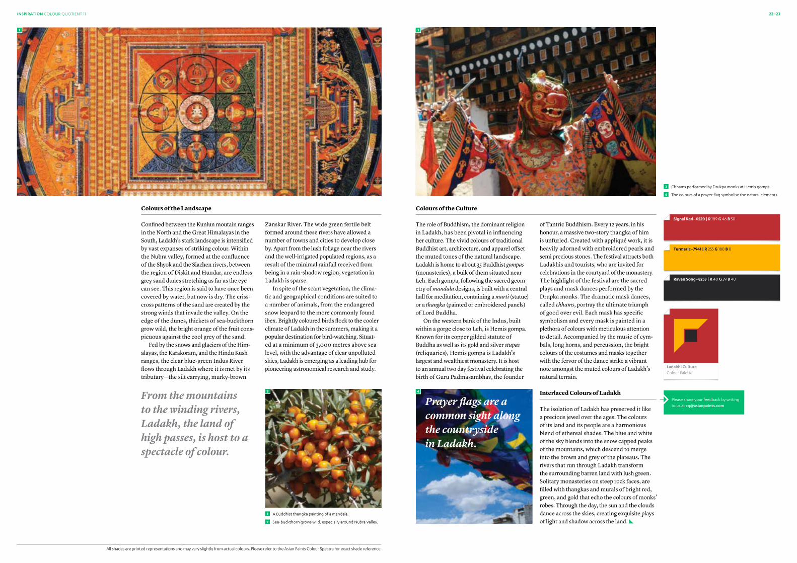
3 Chhams performed by Drukpa monks at Hemis gompa.
The colours of a prayer flag symbolise the natural elements.
Colours of the Culture
The role of Buddhism, the dominant religion in Ladakh, has been pivotal in influencing her culture. The vivid colours of traditional Buddhist art, architecture, and apparel offset the muted tones of the natural landscape. Ladakh is home to about 35 Buddhist gompas (monasteries), a bulk of them situated near Leh. Each gompa, following the sacred geom-etry of mandala designs, is built with a central hall for meditation, containing a murti (statue) or a thangka (painted or embroidered panels) of Lord Buddha.
On the western bank of the Indus, built within a gorge close to Leh, is Hemis gompa. Known for its copper gilded statute of Buddha as well as its gold and silver stupas (reliquaries), Hemis gompa is Ladakh’s largest and wealthiest monastery. It is host to an annual two day festival celebrating the birth of Guru Padmasambhav, the founder
Colours of the Landscape
Confined between the Kunlun moutain ranges in the North and the Great Himalayas in the South, Ladakh’s stark landscape is intensified by vast expanses of striking colour. Within the Nubra valley, formed at the confluence of the Shyok and the Siachen rivers, between the region of Diskit and Hundar, are endless grey sand dunes stretching as far as the eye can see. This region is said to have once been covered by water, but now is dry. The criss-cross patterns of the sand are created by the strong winds that invade the valley. On the edge of the dunes, thickets of sea-buckthorn grow wild, the bright orange of the fruit cons-picuous against the cool grey of the sand.
Fed by the snows and glaciers of the Him- alayas, the Karakoram, and the Hindu Kush ranges, the clear blue-green Indus River flows through Ladakh where it is met by its tributary—the silt carrying, murky-brown
of Tantric Buddhism. Every 12 years, in his honour, a massive two-story thangka of him is unfurled. Created with appliqué work, it is heavily adorned with embroidered pearls and semi precious stones. The festival attracts both Ladakhis and tourists, who are invited for celebrations in the courtyard of the monastery. The highlight of the festival are the sacred plays and mask dances performed by the Drupka monks. The dramatic mask dances, called chhams, portray the ultimate triumph of good over evil. Each mask has specific symbolism and every mask is painted in a plethora of colours with meticulous attention to detail. Accompanied by the music of cym-bals, long horns, and percussion, the bright colours of the costumes and masks together with the fervor of the dance strike a vibrant note amongst the muted colours of Ladakh’s natural terrain.
Interlaced Colours of Ladakh
The isolation of Ladakh has preserved it like a precious jewel over the ages. The colours of its land and its people are a harmonious blend of ethereal shades. The blue and white of the sky blends into the snow capped peaks of the mountains, which descend to merge into the brown and grey of the plateaus. The rivers that run through Ladakh transform the surrounding barren land with lush green.Solitary monasteries on steep rock faces, are filled with thangkas and murals of bright red, green, and gold that echo the colours of monks’ robes. Through the day, the sun and the clouds dance across the skies, creating exquisite plays of light and shadow across the land.
Zanskar River. The wide green fertile belt formed around these rivers have allowed a number of towns and cities to develop close by. Apart from the lush foliage near the rivers and the well-irrigated populated regions, as a result of the minimal rainfall received from being in a rain-shadow region, vegetation in Ladakh is sparse.
In spite of the scant vegetation, the clima-tic and geographical conditions are suited to a number of animals, from the endangered snow leopard to the more commonly found ibex. Brightly coloured birds flock to the cooler climate of Ladakh in the summers, making it a popular destination for bird-watching. Situat-ed at a minimum of 3,000 metres above sea level, with the advantage of clear unpolluted skies, Ladakh is emerging as a leading hub for pioneering astronomical research and study.
All shades are printed representations and may vary slightly from actual colours. Please refer to the Asian Paints Colour Spectra for exact shade reference.
1
2
A Buddhist thangka painting of a mandala.
Sea-buckthorn grows wild, especially around Nubra Valley.
Prayer flags are a common sight along the countryside in Ladakh.
From the mountains to the winding rivers, Ladakh , the land of high passes, is host to a spectacle of colour.
1 3
Signal Red–0520 | R 189 G 46 B 50
Raven Song–8253 | R 40 G 39 B 40
Turmeric–7941 | R 255 G 180 B 0
ladakhi CultureColour Palette

24–25
Asian Paints
SHARADSHAMMAN
2012
Since 1985, the annual Asian Paints Sharad Shamman (APSS) awards, spread across six categories, have been presented to the
best decorated Durga Puja pandals (fabricated structures for religious ceremonies) in the city of Kolkata. Durga Puja, a festival
that celebrates the worship of Goddess Durga is especially popular in Kolkata, where pandals of massive proportion are created every year.
This year as well, the city was engulfed in a riot of colour for the duration of the festival. The thought processes and craftsmanship of
the artists, based on inspirational themes, took tangible form as mesmerising pandals across the city. Out of the numerous pandals, twelve reached the
first level of short listing and, as always, only six pandals went on to become the winners of APSS 2012.
INDIA CONNECT
26–27INDIA CONNECT COLOUR QUOTIENT 11
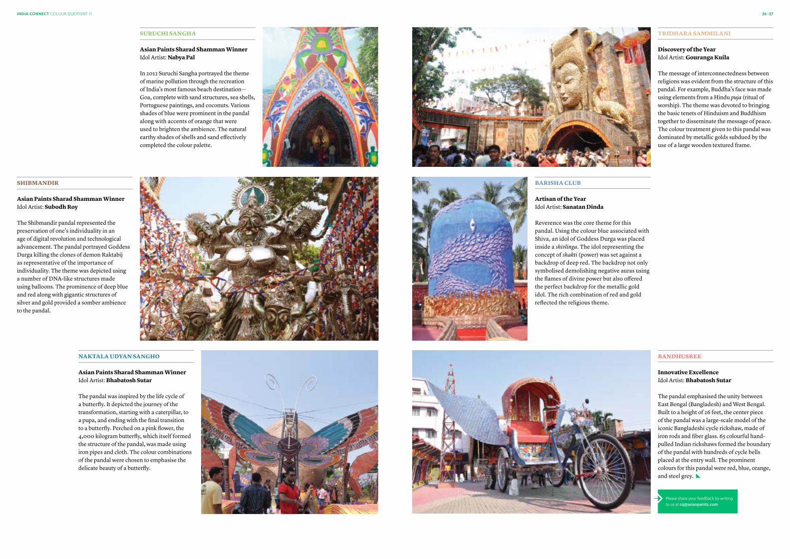
TRIDHARA SAMMILANI
Discovery of the Year Idol Artist: gouranga kuila
The message of interconnectedness between religions was evident from the structure of this pandal. For example, Buddha’s face was made using elements from a Hindu puja (ritual of worship). The theme was devoted to bringing the basic tenets of Hinduism and Buddhism together to disseminate the message of peace. The colour treatment given to this pandal was dominated by metallic golds subdued by the use of a large wooden textured frame.
bANDHuSREE Innovative Excellence Idol Artist: bhabatosh Sutar
The pandal emphasised the unity between East Bengal (Bangladesh) and West Bengal. Built to a height of 26 feet, the center piece of the pandal was a large-scale model of the iconic Bangladeshi cycle rickshaw, made of iron rods and fiber glass. 65 colourful hand-pulled Indian rickshaws formed the boundary of the pandal with hundreds of cycle bells placed at the entry wall. The prominent colours for this pandal were red, blue, orange, and steel grey.
bARISHA CLub Artisan of the Year Idol Artist: Sanatan Dinda
Reverence was the core theme for this pandal. Using the colour blue associated with Shiva, an idol of Goddess Durga was placed inside a shivlinga. The idol representing the concept of shakti (power) was set against a backdrop of deep red. The backdrop not only symbolised demolishing negative auras using the flames of divine power but also offered the perfect backdrop for the metallic gold idol. The rich combination of red and gold reflected the religious theme.
SuRuCHI SANgHA
Asian Paints Sharad Shamman Winner Idol Artist: Nabya Pal In 2012 Suruchi Sangha portrayed the theme of marine pollution through the recreation of India’s most famous beach destination—Goa, complete with sand structures, sea shells, Portuguese paintings, and coconuts. Various shades of blue were prominent in the pandal along with accents of orange that were used to brighten the ambience. The natural earthy shades of shells and sand effectively completed the colour palette.
SHIbMANDIR Asian Paints Sharad Shamman Winner Idol Artist: Subodh Roy
The Shibmandir pandal represented the preservation of one’s individuality in an age of digital revolution and technological advancement. The pandal portrayed Goddess Durga killing the clones of demon Raktabij as representative of the importance of individuality. The theme was depicted using a number of DNA-like structures made using balloons. The prominence of deep blue and red along with gigantic structures of silver and gold provided a somber ambience to the pandal.
NAkTALA uDYAN SANgHo Asian Paints Sharad Shamman Winner Idol Artist: bhabatosh Sutar The pandal was inspired by the life cycle of a butterfly. It depicted the journey of the transformation, starting with a caterpillar, to a pupa, and ending with the final transition to a butterfly. Perched on a pink flower, the 4,000 kilogram butterfly, which itself formed the structure of the pandal, was made using iron pipes and cloth. The colour combinations of the pandal were chosen to emphasise the delicate beauty of a butterfly.
Please share your feedback by writing to us at [email protected]

1
28–29INSIGHT
A Modern Approach to Architecture
SUMAN SORG
Suman Sorg is the Chief Designer of Sorg Architects, a full service, international design firm offering architectural design services, interior design, urban planning, historic preservation, and construction management, with offices in Washington and New Delhi. With a strong commitment to thoughtful contemporary architecture that explores spatial, material, and visual experiences, her work is contextually relevant, modern, and sculptural.
Suman Sorg was born in New Delhi, and came to live in the United States in
1968. Her father, a high-ranking official in the Indian government, had worked with legendary modernist architects Louis Kahn and Le Corbusier on university buildings in India. When she was in high school, he steered his daughter towards a career in architecture.
“I took it up and it turned out to be just the right thing,” said the architect who now operates offices in Washington and New Delhi. “I asked him later why he recommended archi- tecture, and he said that I was very artistic.”
She now has three new high-rise commercial and residential buildings under construction in India, all expected to be completed within the next year and a half. The Grand Arch, Sector 62, and Skyon—each uniquely suited to India’s natural and cultural climate—will bring high quality, contem-porary architecture to the burgeoning New Delhi satellite district of Gurgaon.
“We care a lot, and we do a great deal of research into scale, colour, and texture to determine what’s appropriate to climate and context.”
Established by Sorg in 1986, Sorg Architects is one of the largest woman-owned archi-tecture firms in the United States. Suman Sorg runs the firm with her 30 year old daughter, Nikki Sorg. “We’re a firm that’s always had a very strong sense of place, of roots, and of keeping that in view even as we look to the future in our design practice,” she said. “These three new commissions in India give us a chance to demonstrate both of these instincts.”
By J. Michael Welton
From left to right: The Grand Arch, Sector 62, Skyon1
“Our philosophy is one of designing for the site and its context—within its geological and urban fabric,” she said.

30–31INSIGHT COLOUR QUOTIENT 11
The grand Arch
The Grand Arch is a landscaped high-rise that offers more than 890 units of housing including a clubhouse, all contained within four corner towers that are 26 to 28 stories tall. It is inspired by the symmetrical Mughal architecture of India, for example, as seen in the Taj Mahal with its central structure surrounded by four minarets.
Sector 62
Sector 62 is a commercial office tower with a cool modern look and high energy efficient construction. A two story base houses high-end retail, with 14 floors and 2,50,000 square feet of office suites atop, clad in an irregularly gridded, curtain wall façade. The project is centred around a lush and tropical retail piazza, open to the sky. Adjacent outdoor terraces will be available for al fresco dining.
When she’s not engaged in designing high-rises in her native India, Sorg takes time to paint, on canvases both large and small. Eschewing brushes, she paints in oils with her bare hands. “I paint, or dream about painting, every day,” she said. “I like what it teaches me. It kind of has a mind of its own—it becomes a client, and actually controls what you do with it.”
Skyon
Skyon is a 22 acre landscaped residential development with a 44 story multi-unit tower with row housing, single family homes, a clubhouse, entertainment and leisure spaces, a healthcare centre, and a number of retail storefronts. Sorg Architects provided the design for the whole ensemble, as well as the master plan for an additional Phase II section of 500 acres for future development.
Please share your feedback by writing to us at [email protected]
A view of The Grand Arch at night.
The interior of a residential unit at The Grand Arch.
The central clubhouse at Skyon.
2
3
4
43
2INSIGHT
Colour for Healthcare
SpacesIn the field of healthcare design, colour is a tool that can be
used to support the role of a healthcare facility and its mission.
By Kate Smith CMG, CFyH

32–33
Colour And Mood
Today’s hospitals and medical buildings are typically complex state-of-the-art facilities designed to be sterile, functional, and precise. It is essential to create an environment that supports these technical aspects while addr- essing the needs of the patient. Basic colour psychology illustrates that human beings have both a conscious and a subconscious reaction to colour. Our reaction to colour is instantaneous and has a profound effect on the choices we make. For example, while a deep, clear shade of red may be stimulating, putting one on alert, a lighter, muted shade —such as pink or mauve, will appear softer, more calming, and restful. Innovative design achieved through the strategic use of colour will not only put patients at ease, it will also help support their ongoing emotional and physical wellbeing.
Selecting colours for healthcare spaces requires detailed and thoughtful analysis of a facility’s functions and its users. Design recommendations and material specification should be based on a plan that takes into account the effect of the colour environment and how it is influenced by the amount of chroma, colour proportion, dominant and
subdominant colours, and the location of coloured surfaces within each space. A successful and thorough colour plan will:
• Find the balance between over-stimulating and under-stimulating colour palettes, without being mundane or jarring
• Offer the right amount of contrast—neither too much nor too little
• Provide a variety of colour yet also remain cohesive and united
• Demonstrate continuity and decisiveness
Colour and Material Selection
While every organisation—and therefore every environment is unique, listed below are general guidelines that should be considered while designing for healthcare facilities.
Corridors and Patient Visiting AreasCorridors and waiting areas provide a respite for visitors and family members when they are not in the patient’s room. Corridors should use colour as a navigational aid and be designed to give staff and visitors visual cues to their location. Ideal waiting areas provide a sense of calm and offer a sense of privacy through the use of colour and material. People within waiting rooms often experience feelings of worry, trepidation, and hope. This requires rooms to be designed with visual stimuli that helps deflect attention from negative thoughts.
Intensive-Care unitsIn intensive-care units, colour provides cues for calming patients and reducing shock, as well as for providing visual signals to the loca- tion of equipment, operating rooms, supplies, etc. A peaceful environment can be created with aquas and lower chroma greens accompanied by accents in warm tones.
Patient RoomsRegardless of the length of hospital stay or seriousness of the illness, patient rooms share some basic design requirements. In these spaces, colour should be designed to comple-ment the architectural elements and provide a harmonising environment that supports and fosters the healing process. Patient rooms should feel friendly and comfortable and provide a calming effect. Care must be taken to avoid paint and material selections that might provide glaring reflections or overpowering casts of saturated colour that might interfere with the appearance of a patient.
Essential AreasUpon entering a facility, patients and their family or caregivers are looking for reassurance that they have chosen the right healthcare provider. The foyer and admissions area will determine the first impression visitors make of the facility’s interior and therefore should feel personal and welcoming, offering a sense of warmth and security while inspiring confidence. The design should harmonise and offer an easy transition to medical spaces.
Exterior Spaces Versus Interior SpacesInteriors usually garner the most attention in colour and architectural design, yet it should not be forgotten that it is the exterior that offers the first impression of a facility. Just as a bold red hue and oversized lettering may be used to direct people to an emergency entrance; more appealing exterior colours, shapes, and signage can draw people in by providing the first positive visual associations of the facility.
Paediatric WardsWhile a hospital stay is unsettling at any age, it can be a particularly traumatic experience for a child. As children often do not understand the reason for being there, the surrounding physical environment plays an important role. Ideally, a paediatric ward’s spatial and visual sphere of experience should be planned and executed with care to create a loving space. Consider choosing mainly bright, warm, clear colours to provide a friendly atmosphere, and select design elements that are playful, without being clichéd.
The Advocate Lutheran General Children's Hospital.
Intensive-care unit at a Parkway Health hospital.
1
All shades are printed representations and may vary slightly from actual colours. Please refer to the Asian Paints Colour Spectra for exact shade reference.
INSIGHT COLOUR QUOTIENT 11
Architectural spaces are widely known to have significant impact on human
health and behaviour. Different types of healthcare services require varying interior design solutions and specifically, unique colour palettes, for example:• Facilities, or specific areas of a facility,
focussed on recovery may benefit from softer, soothing tones.
• The energising benefits of bold, clear colours can bolster operations that seek to motivate and energise patients.
• Areas designed for patients have one set of requirements while staff and visitor areas would dictate a different set of requirements.
• Perhaps most importantly, colour provides directional and non-verbal cues that may assist patients, staff, and visitors.
Using colour, material, and light, designers have the opportunity to create an environment that supports a patient’s well-being throughout their interaction with the facility.
2
1
2
Soft Brown–9535 | R 137 G 96 B 88
Sonnet–l146 | R 247 G 243 B 235
Sahara Dream–l135 | R 234 G 227 B 209
Bali Blue–8266 | R 161 G 180 B 191

34–35
If you are planning to paint a healthcare space, email us at [email protected], or connect with our Colour Connect Relationship Officer, or visit www.asianpaints.com for more product information.
3
APEX UlTIMA» Colour Stay property makes walls look fresh for longer» Advanced anti-algal bio pack prevents formation of algae» 7 Year Performance Warranty*
*Conditions apply. Please refer to the Asian Paints Ultima Product and Warranty Guide for more details.
ROYAlE ASPIRA» The hydrophobic nature ensures easy to clean, smooth, and high durable painted surfaces» Aspira stretches to 400% covering up hairline cracks» 5-Year Performance Warranty*
*Conditions apply. Please refer to the Asian Paints Royale Product Information Sheet for more details.
AQUADUR PU» Low Toxic Metal Content» Quick Drying» Low VOC*
*Conditions apply. Please refer to the Aquadur PU Product Information Sheet for more details.
EXTERIOR
EMUlSION
INTERIOR
EMUlSION
WOOD
COATINGS
4
All shades are printed representations and may vary slightly from actual colours. Please refer to the Asian Paints Colour Spectra for exact shade reference.
Café latte–8549 | R 119 G 91 B 65light Coffee–0470 | R 190 G 168 B 147 Skimmed Cream–l122 | R 244 G 242 B 230 Dense Fog–9456 | R 139 G 135 B 135Pisces–8474 | R 211 G 203 B 191 Angel Cloud–l123 | R 245 G 241 B 228
3
4
Colour as the Connector
Colour is the common thread to a healthcare design plan. A facility’s colour plan starts at the exterior of the building and extends throughout the entire structure. To achieve a cohesive look, there should be only one master colour plan. Each unique area of the facility can be person-alised within that plan according to its needs.
Today’s designers are charged with selecting colour plans that are designed to last 20 to 25 years before being changed. This eliminates trendy or easily dated schemes and instead directs them to timeless choices, such as nature-based palettes. Lower-chroma shades
in the families of blue, green, and brown create a classic look that can be accented with deeper shades such as plum, russet, and gold. Materials with natural-based formulas, or those visually resembling the natural world, are more popular.
While facilities continue to evolve to accommodate the changing landscape, the role of good design remains. Regardless of the size, layout, or character of a facility, colour continues to have an integral role in design and can be used to help foster and support a healthcare organisation’s mission.
Asian Paints products for healthcare spaces:
INSIGHT COLOUR QUOTIENT 11
When chosen correctly, the right colours will advance and promote a healthcare organisation by engaging and guiding its visitors.
For more information T 1800 209 5678 E [email protected]
A warm colour palette for Asian Paints Project Sales site, CAIMS.
A cool colour palette for CAIMS in Andhra Pradesh.
Asian Paints offers best-in-class products* which are truly green and conform to the guidelines laid out as per the international GS–11 Standard.
*For more information, log on to www.asianpaints.com
CAIMS—Building 2Colour Palette
CAIMS—Building 1Colour Palette

Colour Code for Colour Inspiration
Created for design professionals, Asian Paints Colour Code is an inspiring series of images that relate to specific categories. These categories are Nature, Culture, Mood, Personality, and Connoisseur. Using engaging imagery to derive inspiring colour palettes, Colour Code cards give shape to stimulating colour stories. Our most recent sets include the themes Happiness Unbound and Venezio.
Colour Scheme PRo for Smartphones and Tablets
Asian Paints has launched a digital colour application which enables users to choose colour palettes at a touch. Begin by choosing a colour from the Asian Paints Colour Spectra fandeck, or by selecting a specific colour from an image. The app then allows you to pick complementary, analogous, or monochromatic colour combinations from over 1800 colours. The colour combinations selected can be saved and shared for later use. The Colour Scheme PRO app is available as a free download for smartphones and tablets on Android and iOS.
Imagine Exteriors Skyline for Exteriors
Painting exteriors of multiple story buildings has never been an easy task and hence, we at Asian Paints, have built a convenient tool that guides you towards choosing the best colour combinations for your exteriors. Apart from colour combinations, the tool also recommends various paint products for exteriors, as well as sharing Asian Paints’ professional service offerings.
Ask Asian Paints
Royale book of Colours for Interiors
Royale Book of Colours is an easy to follow styling guide that helps you choose suitable colour combinations for different spaces. Apart from the various colour families indi-cated in the book, you can preview over 200 colour combinations and textures within different room settings. All the colours mentioned in the book are available as part of Asian Paints Royale emulsions.
CoLouR QuERY
A. Asian Paints has developed various colour and texture combination guides for consumers and designers. A colour tool or product guide is defined as a guide used to showcase a range of colours and special effects, allowing users to choose combinations, as well as a medium
Q. What are the various colour and texture combination guides available at Asian Paints?
to share information on paints and processes. Each guide is designed with a team of experts to meet paint and colour requirements. Some of the key guides available are:
09JUly 2012
ISSUE
10OCTOBER 2012
ISSUE
36–37
‘Colour Quotient’ is Asian Paints’ initiative that reflects significance of colours in varied cultures & traditions, and contemporary trends in paints. The objective of Colour Quotient is to share customers’ penchant for colours with architects, interior designers and other creative people and not to solicit business. Views expressed by the authors are personal and photographs used in Colour Quotient are illustrative. For more information, visit: www.asianpaints.com/cq
INCoMINg
Royale AspiraRoyale Aspira is a paint ahead of its time. It represents a new wave in the world of architecture and design. Aspira's exclusive colour palette and colour tool introduces you to unlimited possibilities in colour. Its world-class performance stems from a perfect balance of revolutionary properties. Certified by global benchmarking institutions and endorsed by industry opinion leaders, Royale Aspira marks the future of paint.
REACH US
Let us know what you felt about this issue of Colour Quotient. What would you like to see featured? Have something interesting to share?
Write to us at » [email protected]
Asian Paints Helpline » Contact us at 1800 209 5678 for queries on products, colour tools, services
Asian Paints painting service » Available in Delhi, Chandigarh, Jaipur, Bangalore, Hyderabad, Coimbatore, Chennai, Cochin, Kolkata, Ahmedabad, Baroda, Mumbai, and Pune
IMAGE CREDITS
COLOUR CODE–VENEZIO• Steve Garry » flickr.com/photos/wakajawaka/1398660034CONTEMPORARY CALMNIElS SCHOENFElDERProfile Image and Showcase• Courtesy Mancini EnterprisesColour Inspiration• Nicholas A. Tonelli » flickr.com/photos/nicholas_t/6811744362/• Moyan Brenn » flickr.com/photos/aigle_dore/5481298041/• Daisy Ware-Jarrett » flickr.com/photos/58899178@
N07/8094770388/• Henrique Pinto » flickr.com/photos/henriquev/497372612/JIGISHA PATElProfile Image • Courtesy Mann SInghColour Inspiration • Besdaysz » flickr.com/photos/40334971@N07/3708694575/• Mopop » flickr.com/photos/mo-pop/6122918117/Showcase • Courtesy Jigisha PatelMADHAV RAMANProfile Image and Showcase• Courtesy Asim WaqifColour Inspiration • Lingaraj G J » flickr.com/photos/lingaraj/2800759272/
• Sean McGrath » flickr.com/photos/mcgraths/3597037843/COLOURS OF NAVARASA • Daniel R. Blume » flickr.com/photos/drb62/3104224796/• Tanaka Juuyoh » flickr.com/photos/tanaka_
juuyoh/4680217868/Dancer Images• All images courtesy Bhavna Vijai, disciple of Anupama Jayasimha LADAKH: THE RESERVE OF SOLITUDE• Prabhu B Doss » flickr.com/photos/kshathriya/851429608/• Mandala of Vajradhatu » This image is in the public domain
because its copyright has expired.• Karunakar Rayker » flickr.com/photos/krayker/2272400862/• Suzan Black » fr.fotopedia.com/items/jmhullot-128b99316d628
9484b9ba97e7c26f085• Prayudi Hartono » flickr.com/photos/pra-yudi/6272955020/COLOUR FOR HEALTHCARE SPACES• Chispita_666 » flickr.com/photos/gusilu/2656125539• Alin S Living with Autism » flickr.com/photos/alins-
site/6991473674/• Tareq Salahuddin » flickr.com/photos/tareqsalahud-
din/7272610736/A MODERN APPROACH TO ARCHITECTURE• All images courtesy Sorg ArchitectsPALETTE BUILDER• Scissors courtesy Monika Ciapala, from The Noun Project
Colour Quarterly 10October 2012
Colour Quarterly 09 July 2012
View current issue and archive at www.asianpaints.com/cq
‘No part of this material may be repro-duced or copied in any form or by any means (graphic, electronic or mechanical, including photocopying, recording, taping or information storage retrieval system) or reproduced in any disc, tape, perforated media or other information storage device etc. without the written permission of Asian Paints Ltd. All rights reserved. Copyright Asian Paints Ltd. All disputes are subject to Mumbai Jurisdiction only.’
Asian Paints offers best-in-class products* which are truly green and conform to the guidelines laid out as per the international GS–11 Standard.
*For more information, log on to www.asianpaints.com
For more information T 1800 209 5678 E [email protected] www.asianpaints.com
To order your set of colour tools please visit: www.asianpaints.com/world_of_colours/colour_shoppe .aspx For free download of colour tools please visit: www.asianpaints.com/pro/colouritup/colour_tool.aspx

Complementary Combination
Monochromatic Combination
Analogous Combination
The January palette is created using the Colour Scheme PRO app by Asian Paints—the easy way to create professional colour combinations. Pick a colour from over 1800 Asian Paints shades and allow the app to guide you to the perfect Mono-chromatic, Analogous, or Complemen-tary combinations. Available as a free download for Android and iOS smartphones and tablets.
Scan the QR code to download Colour Scheme PRO for free to your Android or iOS smartphone or tablet.
Fresh Leaf–9309
Forest Canopy–7608
Green Sprouts–7582
Peace Meadow–9310
Pink Water–9422
Frost Green–9294


![[XLS]s446aec1b0de51350.jimcontent.coms446aec1b0de51350.jimcontent.com/download/version/... · Web viewCQ 0765 RT CQ 0965 RT CQ 1265 RT CQ 1465 RT CQ 1565 RT CVA 2411 ORI CX 065 CX](https://static.fdocuments.in/doc/165x107/5af8be3d7f8b9ae92b8b7689/xls-viewcq-0765-rt-cq-0965-rt-cq-1265-rt-cq-1465-rt-cq-1565-rt-cva-2411-ori-cx.jpg)