Correlation and regression 1: Correlation Coefficient Friday 8th February 2013.
13
Correlation and regression 1: Correlation Coefficient Friday 8th February 2013
-
Upload
moris-farmer -
Category
Documents
-
view
226 -
download
1
Transcript of Correlation and regression 1: Correlation Coefficient Friday 8th February 2013.

Correlation and regression 1: Correlation Coefficient
Friday 8th February 2013
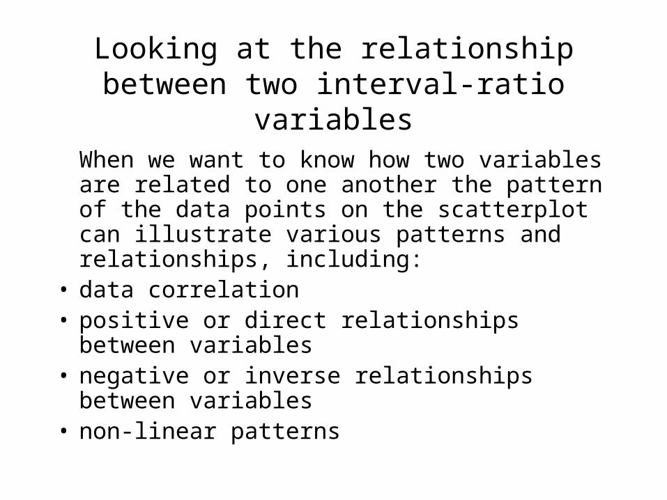
When we want to know how two variables are related to one another the pattern of the data points on the scatterplot can illustrate various patterns and relationships, including:
• data correlation • positive or direct relationships between
variables • negative or inverse relationships between
variables • non-linear patterns
Looking at the relationship between two interval-ratio variables

Thinking about lines…What can we measure?:
• Gradient – a measure of how the line slopes• Intercept – where the line cuts the y axis• Correlation – a measure of how well the line
fits the data
Equation for a line:
y = a + bx
a is the point at which the line crosses the y axis (when
x=0).
b is a measure of the slope (the amount of change in y
that occurs with a 1-unit change in x).
5
4
3
2
1
00 1 2 3 4 5
y = 1.5 + 0.5x

Linear relationship•The technique of line-fitting, known as regression is used to measure how well a line fits a scatter of plots.•When the data points form a straight line on the graph, the linear relationship between the variables is stronger and the correlation is higher. •The following scatterplot shows a strong linear relationship between the two variables. •We say that these two variables are highly correlated.

Positive and negative relationships
Positive or direct relationships • If the points cluster around a line
that runs from the lower left to upper right of the graph area, then the relationship between the two variables is positive or direct.
• An increase in the value of x is more likely to be associated with an increase in the value of y.
• The closer the points are to the line, the stronger the relationship.
Negative or inverse relationships
• If the points tend to cluster around a line that runs from the upper left to lower right of the graph, then the relationship between the two variables is negative or inverse.
• An increase in the value of x is more likely to be associated with a decrease in the value of y.

There are lots of online sites where you can explore this topic:
Three examples:
http://argyll.epsb.ca/jreed/math9/strand4/scatterPlot.htm
This site lets you produce your own scatter plot, produce a line of best fit, practice interpolating data points on the line, and look at the correlation coefficient.
http://www.stat.berkeley.edu/~stark/Java/Html/Correlation.htm
This site lets you alter a scatter plot and add your own points, see the point of averages, standard deviation lines, and correlation coefficient as well as plot the regression line and more.
http://www.stat.uiuc.edu/courses/stat100/java/GCApplet/GCAppletFrame.html
This site allows you to guess correlations.
You can also take a look at Chapter 8 of Statistics for the Terrified.

Working out the correlation coefficient (Pearson’s r)
• Pearson’s r tells us how much one variable changes as the values of another changes – their covariation.
• Variation is measured with the standard deviation. This measures average variation of each variable from the mean for that variable.
• Covariation is measured by calculating the amount by which each value of X varies from the mean of X, and the amount by which each value of Y varies from the mean of Y and multiplying the differences together and finding the average (by dividing by n-1).
• Pearson’s r is calculated by dividing this by (SD of x) x (SD of y) in order to standardize it.
1
x X y Y
n
( 1) x y
x X y Y
n s s

Working out the correlation coefficient (Pearson’s r)
• This can also be calculated as the average sum of the products of the standardized values of x and y:
• Because r is standardized it will always fall between +1 and -1.
• A correlation of either 1 or -1 means perfect association between the two variables.
• A correlation of 0 means that there is no association.• Note: correlation does not mean causation. We can
only investigate causation by reference to our theory. However (thinking about it the other way round) there is unlikely to be causation if there is not correlation.
( 1)x yz z
n

Worked Example:
x y
x in standardized units
y in standardized units
Product
1 5
3 9
4 7
5 1
7 13
Average of x = 4, SD = 2
Average of y = 7, SD = 4 Note: reminder of how to standardize scores:( )
x
x Xz
s

Worked Example:
x y
x in standardized units
y in standardized units
Product
1 5 -1.5 -0.5
3 9 -0.5 0.5
4 7 0.0 0.0
5 1 0.5 -1.5
7 13 1.5 1.5
Average of x = 4, SD = 2
Average of y = 7, SD = 4 Note: reminder of how to standardize scores:( )
x
x Xz
s

Worked Example:
x y
x in standardized units
y in standardized units
Product
1 5 -1.5 -0.5 0.75
3 9 -0.5 0.5 -0.25
4 7 0.0 0.0 0.00
5 1 0.5 -1.5 -0.75
7 13 1.5 1.5 2.25
Average of x = 4, SD = 2
Average of y = 7, SD = 4Average of the products: = 0.75 + -0.25 + 0 + -0.75 + 2.25= 2.00
Divide by n-1:
= 2.00/(5-1) = 2/4 = .5
Note: reminder of how to standardize scores:( )
x
x Xz
s

Explained Variation
• Pearson’s r measures strength of association between two variables. It does not tell you how much of variable y is explained by variable x. To get this you need to calculate r2. This is known as the coefficient of determination.
• In this example r2 = 0.5 x 0.5 = 0.25. Therefore 25% of the variation in y is explained by x.

Going back to the line…• The regression line for y on x estimates the
average value for y corresponding to each value of x
• Associated with each increase of one SD of x there is an increase of r SDs in y, on the average.
SDx
r x SDy
Point of averages
y
x
The regression estimate