Corporate Identity Guidelines Update - The Housing … · Corporate Identity Guidelines Welcome to...
16
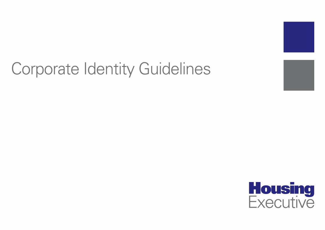
Corporate Identity Guidelines
Transcript of Corporate Identity Guidelines Update - The Housing … · Corporate Identity Guidelines Welcome to...
Corporate Identity Guidelines

Corporate Identity Guidelines
Welcome to our Corporate Identity Guidelines
The purpose of this guide is to provide guidance and assistance when producing visual communications across all media.
The Housing Executive uses a range of communication tools - letters, forms - including IT generated communications, advertising, publications, exhibitions and website.
It is important the Housing Executive’s logo is flexible for use in the range of communicationsbut incorporates the same elements.
A single logo has been developed which provides the visual identity of the Housing Executive in all its communications.
Contents
1.0 Logo elements
1.1 Logo colour
1.2 Reproduction size of logo
1.3 Logo variants
1.4 Which logo do I use?
1.5 Correct use of the logo
1.6 Incorrect use of the logo
1.7 Logo fonts
1.8 Logo branding

1 2
1
2 Housing
Executive
The principal logo is portrait, however, a landscape version has also been developed for certain communications (the website banner, for example). The logo formats are shown above.
The following guidelines will detail the correct use of the logo.
Logo elements
1.0 Logo elements - portrait and landscape versions
The principal logo - portrait version landscape version
1.0
1
2

Illustrated above is the principal portrait version of the logo. It uses two colours in solids. Below is a specification of the two colours (Pantone coated EURO, CMYK, RGB and web colours).
Pantone: 2756 EC C 100 M 100 Y0 K15 R 26 G 32 B109 Web: Midnight Blue Pantone: 424 EC C 30 M 20 Y 19 K60 R 108 G 111 B 112 Web: sgi lightgray
Logo colour
1.1 Logo colour
1.1

As a general rule when reproducing the logo, it should not appear any smaller than 12mm in height in principal portrait version or 60mm width in landscape version (Figure A, above) A clear (safe) zone should extend from the logo on all sides (Figure B, below) No other design element, including text, should intrude into this ‘safe’ area, with the exclusion of photographic backgrounds, in which case the logo can appear white out of background.
Reproduction size of logo
1.2 Reproduction size of logo
A
B
1.2

Spot Colour Colour components are:
• Blue: Pantone 2756 EC• Grey: Pantone 424 EC
Process Colour Colour components are:
• Blue: Cyan 100 Magenta 100 Yellow 0 Black 15• Grey: Cyan 30 Magenta 20 Yellow 19 Black 60
RGB ColourColour components are:
• Blue: R 26 G 32 B 109• Grey: R 108 G 111 B 112
MonoFor mono version use reverse white out of background or black (see correct use of logo 1.4 - 1.5)
Logo variants
1.3 Logo variants
1.3
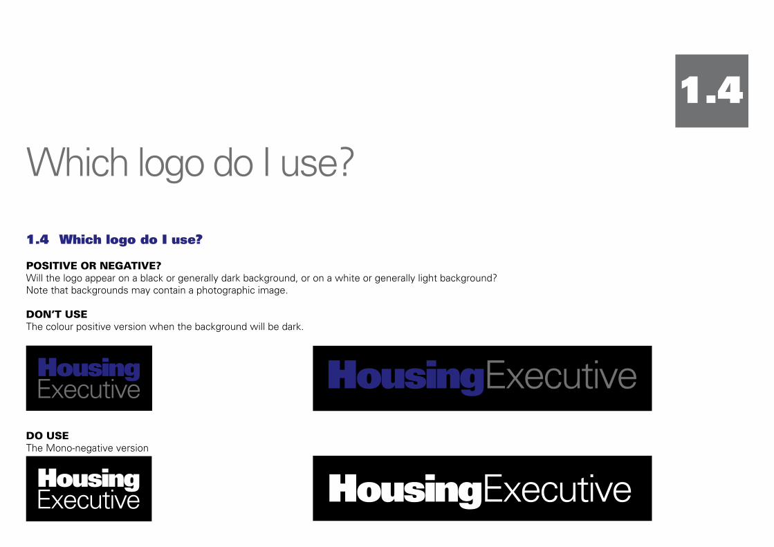
POSITIVE OR NEGATIVE?Will the logo appear on a black or generally dark background, or on a white or generally light background? Note that backgrounds may contain a photographic image.
DON’T USEThe colour positive version when the background will be dark.
DO USEThe Mono-negative version
Which logo do I use?
1.4 Which logo do I use?
1.4

SCREEN OR PRINT?Will the logo appear on screen (on a PowerPoint, website, email, TV ad, video presentation, etc.), or will it appear in print (stationery, documents, posters, press advertising, etc).
DON’T USEThe RGB or web version on printed materials.
DO USEThe full colour print version (300dpi).
IN COLOUR OR MONO?Will the logo appear in its correct colours, or is it limited to appearing in a single colour? (for instance, single-colour literature or stationery, mono press ads, faxing and photocopying).
DON’T USEThe mono version when it can appear in full colour.
DO USEThe full colour positive version where possible.
1.4

The Housing Executive logo has been designed to be as legible as possible on a wide variety of backgrounds. It is important that the correct version of the logo is used in each instance, Illustrated on the next page are examples of correct use in a variety of applications.
When preparing artwork note that the logo needs to be clearly read in the following instances:
• White or light backgrounds
• Black or dark backgrounds
• Photographic or patterned backgrounds
Care should also be taken to ensure that the Housing Executive logo appears in its correct colours wherever possible.
On literature which is printed in a single colour it is preferable that the colour used is black. Illustrated on the following page are examples of CORRECT applications of the Housing Executive logo.
Correct use of logo
1.5 Correct use of logo
1.5

2008GRANTSISSUE Ballyclare
2008GRANTSISSUEBallyclare
IN THIS ISSUE: Disabled Facilities Grant – Making a DifferenceModernising Services
4 CORRECT: Positive Colour logo on a light background
4 CORRECT: Positive Colour logo on a light photograph
4 CORRECT: Positive Mono logo on a white background
4 CORRECT: Negative Mono logo on a dark background
4 CORRECT: Positive Colour logo on a white background
1.5
2008GRANTSISSUE Ballyclare
2008GRANTSISSUEBallyclare
IN THIS ISSUE: Disabled Facilities Grant – Making a DifferenceModernising Services

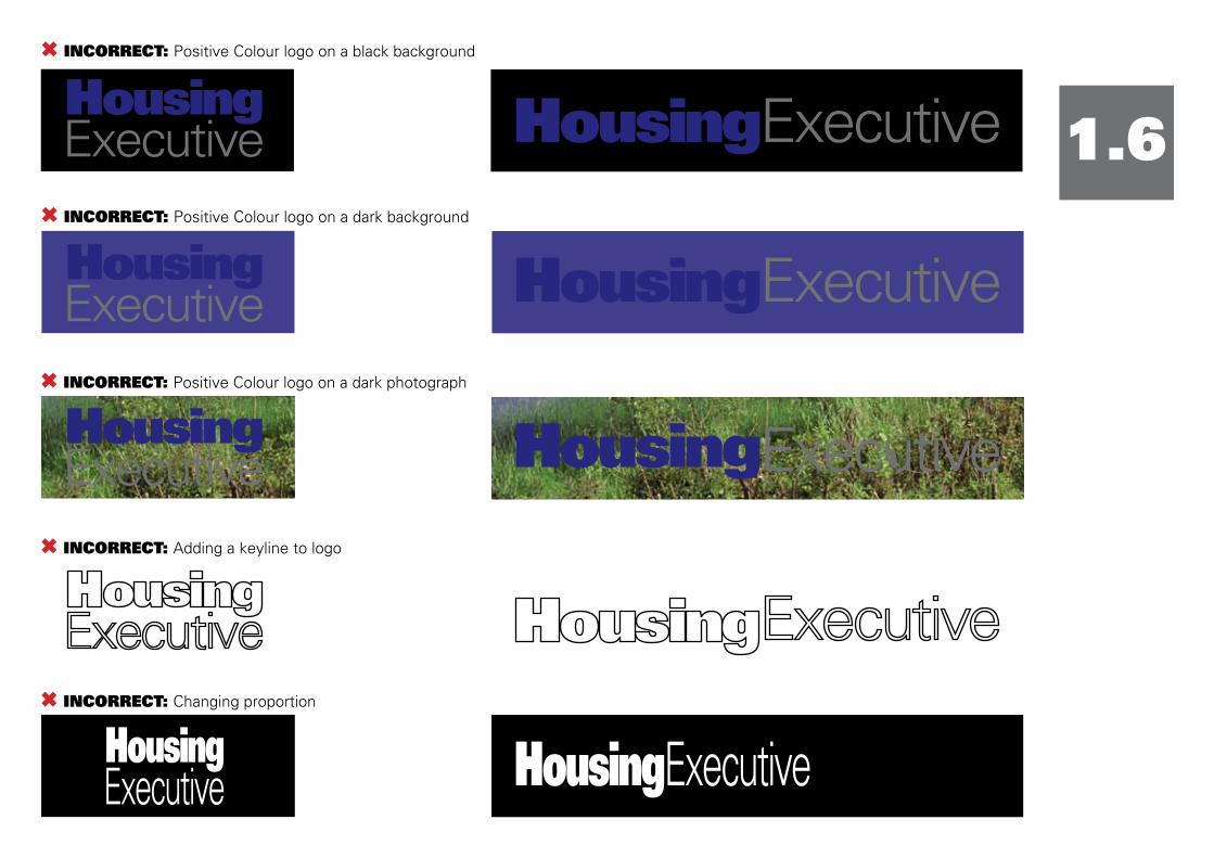
The logo should not be used in any way which degrades its legibility or integrity. Care should be taken to ensure that maximum visibility is maintained in all applications, and that none of its elements are difficult to see or are rendered invisible.
It is also important that the logo is not manipulated or modified in any way, including:
• Adding a keyline to any version of the logo
• Changing or altering any or all of the logo colours
• Altering the size or spacing of any of the logo elements
• Stretching, contracting or distorting the logo in any way
Illustrated on the following page are examples of INCORRECT applications of the logo.
Incorrect use of logo
1.6 Incorrect use of logo
1.6
Incorrect use of logo
2008GRANTSISSUE Ballyclare
2008GRANTSISSUEBallyclare
IN THIS ISSUE: Disabled Facilities Grant – Making a DifferenceModernising Services
6 INCORRECT: Positive Colour logo on a dark background
6 INCORRECT: Positive Colour logo on a dark photograph
6 INCORRECT: Adding a keyline to logo
6 INCORRECT: Changing proportion
6 INCORRECT: Positive Colour logo on a black background
2008GRANTSISSUE Ballyclare
2008GRANTSISSUEBallyclare
IN THIS ISSUE: Disabled Facilities Grant – Making a DifferenceModernising Services
1.6

6 INCORRECT: Negative Mono logo on a light background
2008GRANTSISSUE Ballyclare
2008GRANTSISSUEBallyclare
IN THIS ISSUE: Disabled Facilities Grant – Making a DifferenceModernising Services
6 INCORRECT: Distorting the logo elements in any way
6 INCORRECT: Changing any colour in the logo
6 INCORRECT: Reversing logo out of light background
1.620
08GRANTSISSUE Ballyclare
2008GRANTSISSUEBallyclare
IN THIS ISSUE: Disabled Facilities Grant – Making a DifferenceModernising Services

Logo fonts
1.7 Logo fonts
The primary font for all professionally printed visual communications is Univers, and the weights to be used are:
•UNIVERS85EXTRABLACK• UNIVERS 45 LIGHT
ThisisUnivers85ExtraBlack12ptABCDEFGHIGHIJKLMNOPQRSTUVWXYZabcdefghijklmnopqrstuvwxyz1234567890-=’{};’/!@£$%^&*():”<>?
This is Univers 45 Light 12ptABCDEFGHIGHIJKLMNOPQRSTUVWXYZabcdefghijklmnopqrstuvwxyz1234567890-=’{};’/!@£$%^&*():”<>?
For internally produced communications in Word documents it can be replaced with Arial for text.
1.7

Logo branding
1.8 Logobranding
Where the logo is required to produce branded items such as promotional products, it is vital that the logo identity should be prominently placed.
Please contact Visual Communications for all merchandising queries.
1.8

Updated by Visual Communications September 2011.