Copyright © 2014 Pearson Education, Inc. All rights reserved Chapter 3 Numerical Summaries of...
76
Copyright © 2014 Pearson Education, Inc. All rights reserved Chapter 3 Numerical Summaries of Center and Variation
-
Upload
rosalyn-carson -
Category
Documents
-
view
218 -
download
1
Transcript of Copyright © 2014 Pearson Education, Inc. All rights reserved Chapter 3 Numerical Summaries of...

Copyright © 2014 Pearson Education, Inc. All rights reserved
Chapter 3
Numerical Summaries of Center and Variation
3 - 2 Copyright © 2014 Pearson Education, Inc. All rights reserved
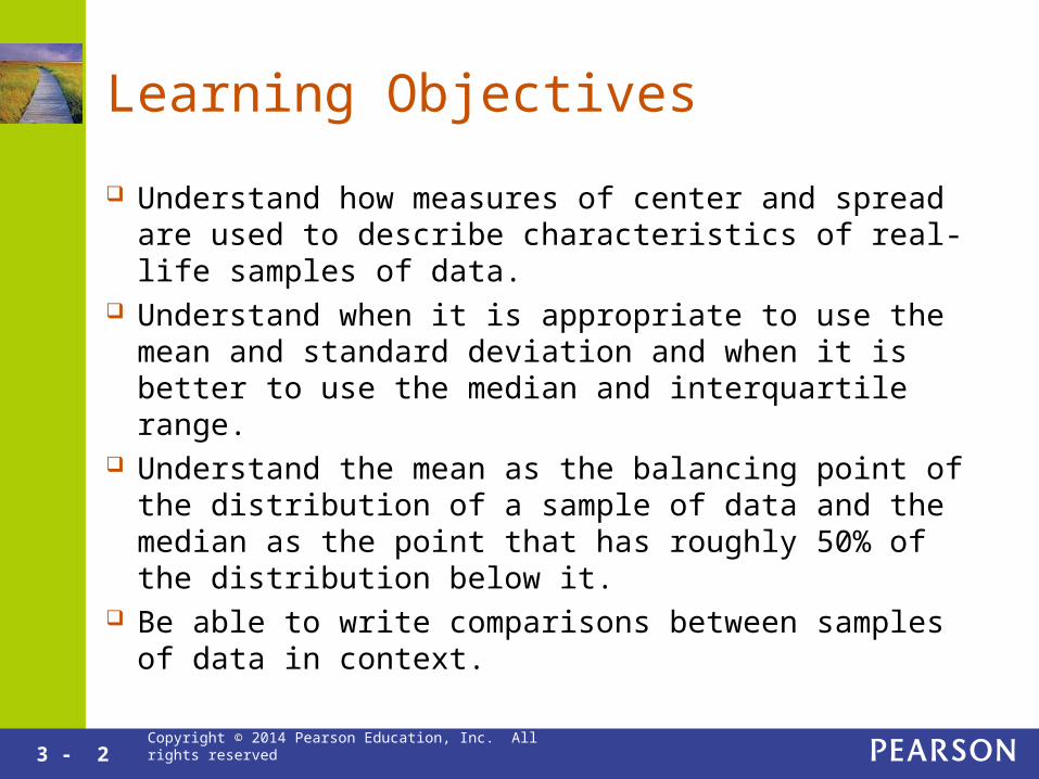
Learning Objectives
Understand how measures of center and spread are used to describe characteristics of real-life samples of data.
Understand when it is appropriate to use the mean and standard deviation and when it is better to use the median and interquartile range.
Understand the mean as the balancing point of the distribution of a sample of data and the median as the point that has roughly 50% of the distribution below it.
Be able to write comparisons between samples of data in context.

Copyright © 2014 Pearson Education, Inc. All rights reserved
3.1
Summaries for Symmetric
Distributions

3 - 4 Copyright © 2014 Pearson Education, Inc. All rights reserved
Summaries for Symmetric Distribution
The mean describes the center. A numerical summary. The balancing point for the distribution. Can be used as a typical value for symmetric mound
shaped distributions.
The standard deviation describes the spread. A numerical summary Measures a typical distance of the observations from the
mean. Measures the variability when the distribution is symmetric

3 - 5 Copyright © 2014 Pearson Education, Inc. All rights reserved
The Mean as a Balancing Point
If we place a finger at the mean, the histogram will balance perfectly.
Major League Baseball 2010

3 - 6 Copyright © 2014 Pearson Education, Inc. All rights reserved
Skewness and the Mean
For a skewed right histogram, the mean is to the right of the typical value.
Major League Baseball 2010

3 - 7 Copyright © 2014 Pearson Education, Inc. All rights reserved
Symmetric Distributions and the Mean
For a symmetric distribution, the mean is at the center.
3 - 8 Copyright © 2014 Pearson Education, Inc. All rights reserved
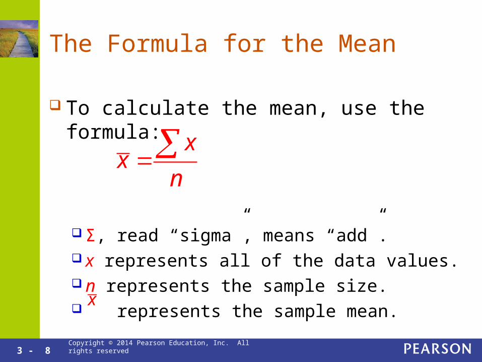
The Formula for the Mean
To calculate the mean, use the formula:
Σ, read “sigma”, means “add”. x represents all of the data values. n represents the sample size. represents the sample mean.
xx
n
x

3 - 9 Copyright © 2014 Pearson Education, Inc. All rights reserved
Calculating the Sample Mean
Find the mean of the number of siblings for the 8 students questioned: 3,2,2,1,2,3,5,2
The sample size: n = 8.
3 2 2 1 2 3 5 2
8
xx
n
2.5

3 - 10 Copyright © 2014 Pearson Education, Inc. All rights reserved
Standard Deviation
The Standard Deviation, s, is a measure of the spread.
It represents a typical distance from the mean of the observations.
For mound shaped distributions, the majority of the observations are less than one standard deviation from the mean.
The square of the standard deviation is called the variance.

3 - 11 Copyright © 2014 Pearson Education, Inc. All rights reserved
Put the Following in Order From Smallest Standard Deviation to Largest
Solution: (c), (b), (a)

3 - 12 Copyright © 2014 Pearson Education, Inc. All rights reserved
The Standard Deviation and the Mean
In San Francisco, the mean high temperature is 65 degrees and the standard deviation is 8 degrees. In Provo the mean is 67 and the standard deviation is 21. Is a high temperature of 52 rarer in San Francisco or in Provo?
SF: 65 – 8 = 57, Provo: 67 – 21 = 46 Since 52 degrees is within one standard deviation of
Provo’s mean and not of San Francisco’s mean, a temperature of 52 is rarer in San Francisco.

3 - 13 Copyright © 2014 Pearson Education, Inc. All rights reserved
Using StatCrunch to Find the Mean and Standard Deviation
Enter Data, then go to Stat →Summary Stats → Columns
Click on the variable name andhit Calculate.
This calculates the mean,standard deviation and other statistics that will be used later.

Copyright © 2014 Pearson Education, Inc. All rights reserved
3.2
What’s Unusual? The Empirical Rule
and z-Scores

3 - 15 Copyright © 2014 Pearson Education, Inc. All rights reserved
The Empirical Rule Graphically
3 - 16 Copyright © 2014 Pearson Education, Inc. All rights reserved
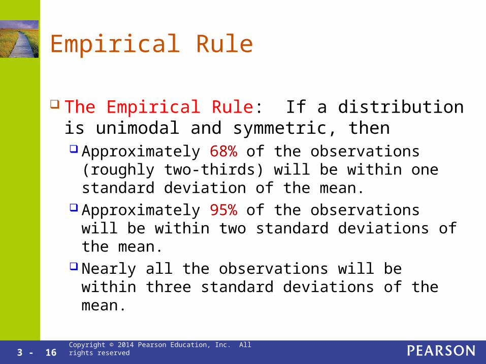
Empirical Rule
The Empirical Rule: If a distribution is unimodal and symmetric, then Approximately 68% of the observations (roughly
two-thirds) will be within one standard deviation of the mean.
Approximately 95% of the observations will be within two standard deviations of the mean.
Nearly all the observations will be within three standard deviations of the mean.

3 - 17 Copyright © 2014 Pearson Education, Inc. All rights reserved
Empirical Rule Example
The mean body weight for women between 18 and 25 years old is 134 lbs and the standard deviation is 26 lbs. Assume a mound shaped distribution.
134 – 26 = 108, 134 + 26 = 160 About 68% of women in this age group weigh
between 108 and 160 lbs. 134 – 2(26) = 82, 134 + 2(26) = 186 About 95% weigh between 82 and 186 lbs. Almost all weigh between 56 and 212 lbs.

3 - 18 Copyright © 2014 Pearson Education, Inc. All rights reserved
Using the Empirical Rule
High temperatures in San Francisco follow a unimodal and symmetric distribution with mean 65 degrees and standard deviation 8 degrees. Give a range of temperatures that includes the middle 95% of high temperature days in San Francisco.
65 – 2(8) = 49, 65 + 2(8) = 81 About 95% of all days in San Francisco have
high temperatures between 49 and 81 degrees.
3 - 19 Copyright © 2014 Pearson Education, Inc. All rights reserved
Empirical Rule Example
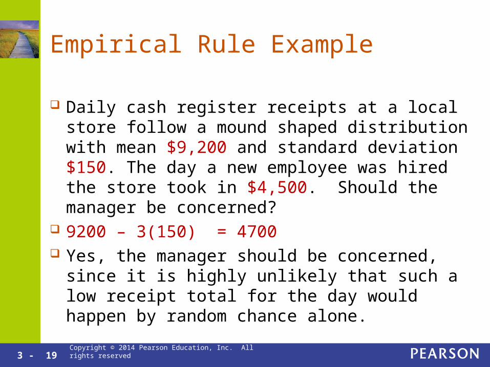
Daily cash register receipts at a local store follow a mound shaped distribution with mean $9,200 and standard deviation $150. The day a new employee was hired the store took in $4,500. Should the manager be concerned?
9200 – 3(150) = 4700 Yes, the manager should be concerned, since it is
highly unlikely that such a low receipt total for the day would happen by random chance alone.

3 - 20 Copyright © 2014 Pearson Education, Inc. All rights reserved
The Trouble With Evaluating if a Data Value is Unusual
Is 2 less than the mean male height short? 2 feet shorter is much shorter. 2 millimeters shorter is not much shorter. Instead, statisticians normalize the values by
citing the Z-Score.

3 - 21 Copyright © 2014 Pearson Education, Inc. All rights reserved
The Z-Score
The Z-Score measures the number of standard deviations the value is from the mean.
The resulting units are called Standard Units. The Z-Score is used to compare values
measured in different units such as feet and millimeters.

3 - 22 Copyright © 2014 Pearson Education, Inc. All rights reserved
The Z-Score Formula x xz
s
The mean price for a loaf of bread is $3.12 and the standard deviation is $0.89. Find the z-Score for a loaf of bread that costs $2.00.
The z-Score is about -1.26.
2.00 3.121.26
0.89z

3 - 23 Copyright © 2014 Pearson Education, Inc. All rights reserved
Comparing values
What is more unusual: a value of 0.26 from a distribution with mean 0.37 and standard deviation 0.03 or a value of 45 from a distribution with mean 38 and standard deviation 4?
0.26
0.26 0.373.67
0.03z
45
45 381.75
4z
The value of 0.26 is more unusual since it has a z-score that is farther from 0.

Copyright © 2014 Pearson Education, Inc. All rights reserved
3.3
Summaries for Skewed Distributions

3 - 25 Copyright © 2014 Pearson Education, Inc. All rights reserved
Skewness and the Trouble with the Mean
For a skewed distribution, the mean gets “pulled” towards the tail.
The mean is also “pulled” towards outliers. For a skewed distribution or a distribution
with only upper or only lower outliers, the mean does not represent a typical value.

3 - 26 Copyright © 2014 Pearson Education, Inc. All rights reserved
The Median to Represent the Center
The middle value, called the median is often a better representation of the center.
The median is defined by the middle number or the average of the two middle numbers if the sample size is even.
The median cuts the data in half. Typically half the values are below the median and half are above.

3 - 27 Copyright © 2014 Pearson Education, Inc. All rights reserved
Median vs. Mean
The median income of $18,000 better represents the typical income than much higher mean income.
The right tail greatly increases the mean but only slightly increases the median.

3 - 28 Copyright © 2014 Pearson Education, Inc. All rights reserved
Calculating the Median
Sort the data from largest to smallest. If the set contains an odd number of observed
values, the median is the middle observed value. If the set contains an even number of observed
values, the median is the average of the two middle observed values. This places the median precisely halfway between the two middle values.

3 - 29 Copyright © 2014 Pearson Education, Inc. All rights reserved
Example
The following data represent eight home prices in thousands of dollars. Find the median: 123, 457, 278, 184, 216, 336, 192, 184
First sort from smallest to largest: 123, 184, 184, 192, 216, 278, 336, 457
Since there are an even number of numbers take the average of the middle two: 192 216
2042
3 - 30 Copyright © 2014 Pearson Education, Inc. All rights reserved
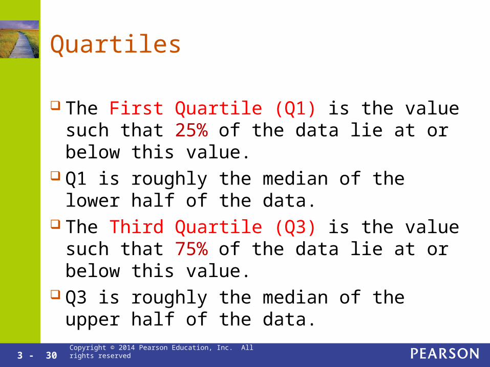
Quartiles
The First Quartile (Q1) is the value such that 25% of the data lie at or below this value.
Q1 is roughly the median of the lower half of the data.
The Third Quartile (Q3) is the value such that 75% of the data lie at or below this value.
Q3 is roughly the median of the upper half of the data.

3 - 31 Copyright © 2014 Pearson Education, Inc. All rights reserved
The Interquartile Range (IQR)
The Interquartile Range (IQR) represents the range of the middle 50% of the data.
Cut the ordered data into four equal parts. The distance taken up by the middle two parts is the interquartile range.
IQR = Q3 – Q1

3 - 32 Copyright © 2014 Pearson Education, Inc. All rights reserved
Interpreting Q1, Q3, and IQR
The first quartile for birth weights is 3.1 kg and the third quartile is 3.7 kg. Interpret Q1, Q3, and the IQR.
Q1 = 3.1. This means that 25% of all babies are born weighing at or below 3.1 kg.
Q3 = 3.7. This means that 75% of all babies are born weighing at or below 3.7 kg.
Q3 – Q1 = 0.6. The middle half of all birth weights has a range of 0.6 kg.

3 - 33 Copyright © 2014 Pearson Education, Inc. All rights reserved
How the Quartiles and IQR are Used
Quartiles and the IQR are primarily used when there are large data sets, for example: National Exam Scores Physical Measurements: Weight, Height
Cholesterol Levels, BMI, etc. Income of state residents Time to run one mile
3 - 34 Copyright © 2014 Pearson Education, Inc. All rights reserved
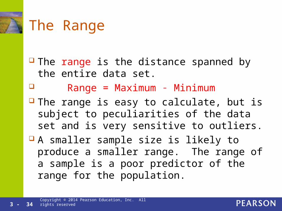
The Range
The range is the distance spanned by the entire data set.
Range = Maximum ˗ Minimum The range is easy to calculate, but is subject to
peculiarities of the data set and is very sensitive to outliers.
A smaller sample size is likely to produce a smaller range. The range of a sample is a poor predictor of the range for the population.
Copyright © 2014 Pearson Education, Inc. All rights reserved
3.4
Comparing Measures of Center

3 - 36 Copyright © 2014 Pearson Education, Inc. All rights reserved
Mean and Standard Deviation or Median and IQR?
Use the mean and standard deviation when the distribution is mound shaped.
Use the Median and IQR when the distribution is skewed left or skewed right.
If the distribution is not unimodal, it may be better to split the data.

3 - 37 Copyright © 2014 Pearson Education, Inc. All rights reserved
Song lengths
The mean is influenced greatly by the right tail. The median isn’t.
The median of 226 seconds better represents the typical song. The IQR of 117 seconds covers the high bars of the histogram.
Song lengths are skewed right because there are many short songs, no negative length songs, but a few long songs.
3 - 38 Copyright © 2014 Pearson Education, Inc. All rights reserved
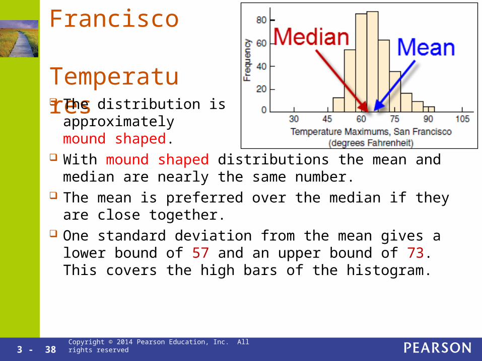
San Francisco
Temperatures The distribution is
approximately mound shaped.
With mound shaped distributions the mean and median are nearly the same number.
The mean is preferred over the median if they are close together. One standard deviation from the mean gives a lower bound of 57
and an upper bound of 73. This covers the high bars of the histogram.

3 - 39 Copyright © 2014 Pearson Education, Inc. All rights reserved
The Effect of Outliers
Number of employees at several businesses on main street: 6, 7, 14, 18, 23, 25, 26 Mean = 17 Median = 18
If the 26 employee business is turned into a Wal-Mart: 6, 7, 14, 18, 23, 25, 334 Mean = 61 Median = 18
Conclusion: The mean is strongly affected by outliers, while the median is not affected by outliers.

3 - 40 Copyright © 2014 Pearson Education, Inc. All rights reserved
Affected by Outliers?
Affected by Outliers: Mean Standard Deviation Range
Not Affected by Outliers: Median Interquartile Range (IQR)

3 - 41 Copyright © 2014 Pearson Education, Inc. All rights reserved
Bimodal Distributions
For most bimodal distributions, neither the mean nor the median represent typical values.
Investigate further to see if there are two separate sub-populations.
Consider separating the two populations and present their graphs and statistics individually.

3 - 42 Copyright © 2014 Pearson Education, Inc. All rights reserved
Trouble with Bimodal Distributions
There are two typical values. Neither the mean nor the median describe the typical values. The data should be separated out by lunch customers and
dinner customers.

3 - 43 Copyright © 2014 Pearson Education, Inc. All rights reserved
Separating Lunch and Dinner
Displaying the data with two histograms allows a comparison between lunch and dinner.

3 - 44 Copyright © 2014 Pearson Education, Inc. All rights reserved
Separating Lunch and Dinner
The Lunch distribution is mound shaped and the Dinner distribution is skewed right.
Do not compare the mean of one data set with the median of another. Use the medians for comparisons. Lunch median is $8 and Dinner
median is $22

Copyright © 2014 Pearson Education, Inc. All rights reserved
3.5
Using Boxplots for Displaying Summaries
3 - 46 Copyright © 2014 Pearson Education, Inc. All rights reserved
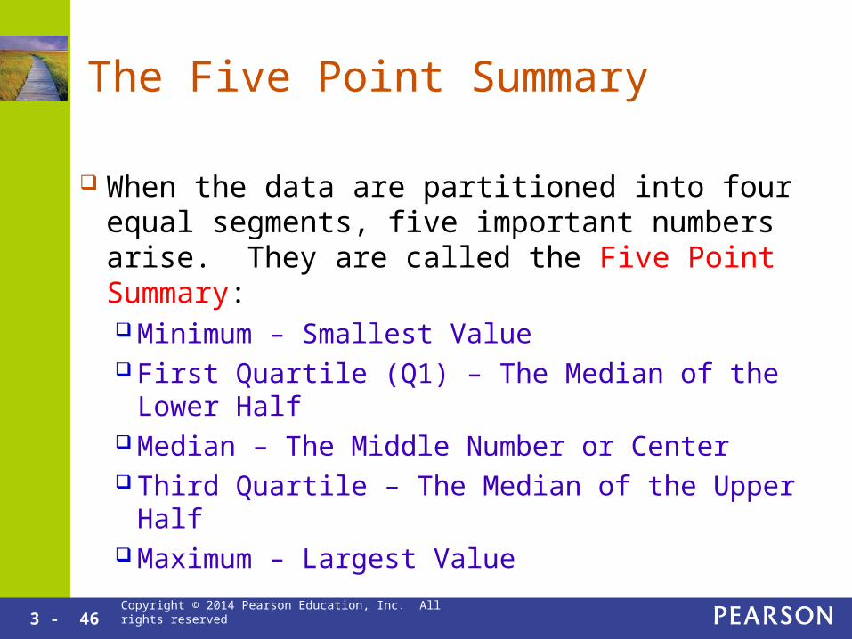
The Five Point Summary
When the data are partitioned into four equal segments, five important numbers arise. They are called the Five Point Summary: Minimum – Smallest Value First Quartile (Q1) – The Median of the Lower Half Median – The Middle Number or Center Third Quartile – The Median of the Upper Half Maximum – Largest Value

3 - 47 Copyright © 2014 Pearson Education, Inc. All rights reserved
How many Boyfriends/Girlfriends?
The results of a survey asking how many boyfriends/girlfriends people have had is shown below: 0, 1, 1, 2, 3, 4, 4, 5, 6, 8,10
The five point summary is: Minimum = 0 Median = 4 Maximum = 10
Q1 = 1 Q3 = 6
3 - 48 Copyright © 2014 Pearson Education, Inc. All rights reserved
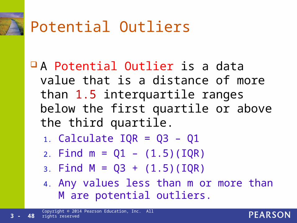
Potential Outliers
A Potential Outlier is a data value that is a distance of more than 1.5 interquartile ranges below the first quartile or above the third quartile.1. Calculate IQR = Q3 – Q1
2. Find m = Q1 – (1.5)(IQR)
3. Find M = Q3 + (1.5)(IQR)
4. Any values less than m or more than M are potential outliers.

3 - 49 Copyright © 2014 Pearson Education, Inc. All rights reserved
Finding Possible Outliers
The first quartile, Q1, for triglycerides is 109 mg/dL. The third quartile, Q2, is 150 mg/dL. Determine which if any of the following triglyceride readings are potential outliers:
38, 200, 225 IQR = 150 – 109 = 41 Q1 – (1.5)(IQR) = 109 – (1.5)(41) = 47.5 Q3 – (1.5)(IQR) = 150 + (1.5)(41) = 211.5
38 and 225 are potential Outliers since 38 < 47.5 and 225 > 211.5.
3 - 50 Copyright © 2014 Pearson Education, Inc. All rights reserved
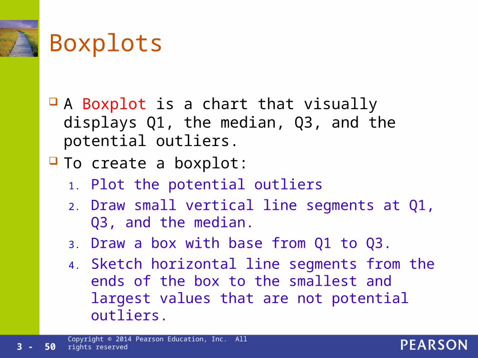
Boxplots
A Boxplot is a chart that visually displays Q1, the median, Q3, and the potential outliers.
To create a boxplot:1. Plot the potential outliers
2. Draw small vertical line segments at Q1, Q3, and the median.
3. Draw a box with base from Q1 to Q3.
4. Sketch horizontal line segments from the ends of the box to the smallest and largest values that are not potential outliers.

3 - 51 Copyright © 2014 Pearson Education, Inc. All rights reserved
Box Plot

3 - 52 Copyright © 2014 Pearson Education, Inc. All rights reserved
Interpreting a Boxplot
What percent of students scored below 83%? Answer: 25%
What percent of students scored between 83% and 92%? Answer: 50%

3 - 53 Copyright © 2014 Pearson Education, Inc. All rights reserved
Comparing Distributions with Boxplots
Both cities have similar typical temperatures. Both cities have fairly symmetric distributions. Provo has a much greater variation in
temperatures than San Francisco.
3 - 54 Copyright © 2014 Pearson Education, Inc. All rights reserved
What Boxplots Show and Don’t Show
Boxplots Show: Typical Range of Values Possible Outliers Variation
Boxplots Don’t Show: Modality Mean Anything for small data sets, especially < 5.

Copyright © 2014 Pearson Education, Inc. All rights reserved
Chapter 3
Case Study

3 - 56 Copyright © 2014 Pearson Education, Inc. All rights reserved
Perceived Risk

3 - 57 Copyright © 2014 Pearson Education, Inc. All rights reserved
Perceived Risk of Appliances
Skewed right for both men and women. Unimodal for both men and women. Women’s typical value slightly higher than men’s. Five Point Summary appropriate for both.
3 - 58 Copyright © 2014 Pearson Education, Inc. All rights reserved
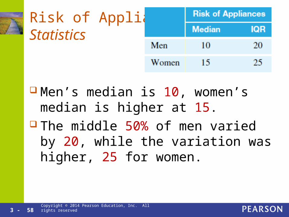
Risk of Appliance: Statistics
Men’s median is 10, women’s median is higher at 15.
The middle 50% of men varied by 20, while the variation was higher, 25 for women.

3 - 59 Copyright © 2014 Pearson Education, Inc. All rights reserved
Perceived Risk X-rays
Relatively symmetric for both men and women. Unimodal for both men and women. Women’s typical value close to men’s. Mean and standard deviation appropriate for both.

3 - 60 Copyright © 2014 Pearson Education, Inc. All rights reserved
Risk of X-rays: Statistics
Men and Women have similar mean and standard deviation risk perception for X-rays.
About 68% of men perceive a risk between 26.8 and 66.8.
About 68% of women perceive a risk between 27 and 68.6.
Mean Standard Deviation
Men 46.8 20
Women
47.8 20.8

Copyright © 2014 Pearson Education, Inc. All rights reserved
Chapter 3
Guided Exercise 1
3 - 62 Copyright © 2014 Pearson Education, Inc. All rights reserved
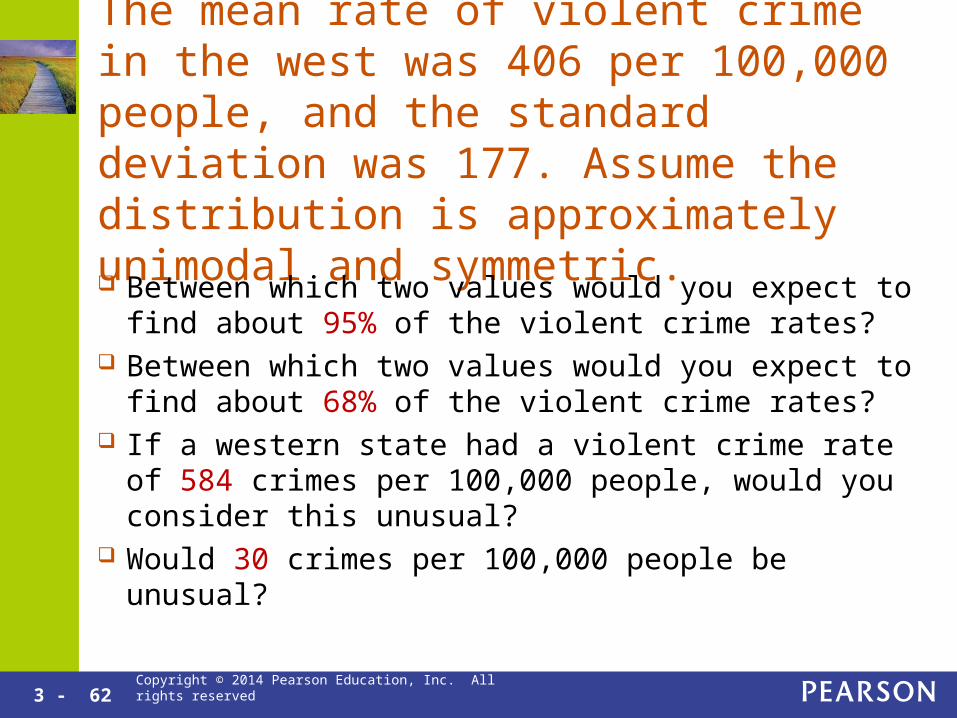
The mean rate of violent crime in the west was 406 per 100,000 people, and the standard deviation was 177. Assume the distribution is approximately unimodal and symmetric.
Between which two values would you expect to find about 95% of the violent crime rates?
Between which two values would you expect to find about 68% of the violent crime rates?
If a western state had a violent crime rate of 584 crimes per 100,000 people, would you consider this unusual?
Would 30 crimes per 100,000 people be unusual?

3 - 63 Copyright © 2014 Pearson Education, Inc. All rights reserved
The mean rate of violent crime in the west was 406 per 100,000 people, and the standard deviation was 177. Assume the distribution is approximately unimodal and symmetric.

3 - 64 Copyright © 2014 Pearson Education, Inc. All rights reserved
The mean rate of violent crime in the west was 406 per 100,000 people, and the standard deviation was 177. Assume the distribution is approximately unimodal and symmetric.
By the Empirical Rule, about 95% of the data is within two standard deviations of the mean.
This represents the green and blue areas together. The number 583 represents one standard deviation
more than the mean: 406 + 177 = 583.

3 - 65 Copyright © 2014 Pearson Education, Inc. All rights reserved
The mean rate of violent crime in the west was 406 per 100,000 people, and the standard deviation was 177. Assume the distribution is approximately unimodal and symmetric.
406 – 177 = 229 406 – 2(177) = 52 406 + 2(177) = 760

3 - 66 Copyright © 2014 Pearson Education, Inc. All rights reserved
The mean rate of violent crime in the west was 406 per 100,000 people, and the standard deviation was 177. Assume the distribution is approximately unimodal and symmetric.
Between which two values would you expect to find about 95% of the violent crime rates?
95% of the violent crime rates are between 52 and 760 crimes per 100,000 people.
Between which two values would you expect to find about 68% of the violent crime rates?
68% of the violent crime rates are between 229 and 583 crimes per 100,000 people.

3 - 67 Copyright © 2014 Pearson Education, Inc. All rights reserved
The mean rate of violent crime in the west was 406 per 100,000 people, and the standard deviation was 177. Assume the distribution is approximately unimodal and symmetric.
If a western state had a violent crime rate of 584 crimes per 100,000 people, would you consider this unusual?
No, since 584 is within 2standard deviations ofthe mean.
Would 30 crimes per 100,000 people be unusual? Yes, because less than 5% occur so far from the
mean.
Copyright © 2014 Pearson Education, Inc. All rights reserved
Chapter 3
Guided Exercise 2

3 - 69 Copyright © 2014 Pearson Education, Inc. All rights reserved
The head circumferences in centimetersfor some men and women in a statistics class are given. Men: 58, 60, 62.5, 63, 59.5, 59, 60, 57, 55 Women: 63, 55, 54.5, 53.5, 53, 58.5, 56,
54.5, 55, 56, 56, 54, 56,53, 51 Compare the circumferences of the men’s
and women’s heads.

3 - 70 Copyright © 2014 Pearson Education, Inc. All rights reserved
Histograms of the two sets of Data.

3 - 71 Copyright © 2014 Pearson Education, Inc. All rights reserved
Shapes
The distribution for men is unimodal and not too far from symmetric.
The distribution for women is unimodal and nearly symmetric except one possible outlier.Copyright © 2013 Pearson Education, Inc.. All rights reserved.

3 - 72 Copyright © 2014 Pearson Education, Inc. All rights reserved
Mean and Standard Deviation or Quartiles and IQR?
Since the women’s distribution has a possible outlier, the quartiles and IQR should be used for comparisons.

3 - 73 Copyright © 2014 Pearson Education, Inc. All rights reserved
Compare Centers
The median head circumference for the men was 59.5 cm, and the median head circumference for the women was 55 cm. This shows that the men tended to have larger heads.

3 - 74 Copyright © 2014 Pearson Education, Inc. All rights reserved
Compare Variances
The interquartile range for the head circumferences for the men was 2 cm, and the interquartile range for the women was 2.5 cm. This shows that the women tended to have more variation, as measured by the interquartile range.

3 - 75 Copyright © 2014 Pearson Education, Inc. All rights reserved
Outliers
Men: 58, 60, 62.5, 63, 59.5, 59, 60, 57, 55 Q1 – (1.5)(IQR) = 55, Q3 + (1.5)(IQR) = 63 No Possible outliers for the men.
Women: 63, 55, 54.5, 53.5, 53, 58.5, 56, 54.5, 55, 56, 56, 54, 56, 53, 51 Q1 – (1.5)(IQR) = 49.75, Q3 + (1.5)(IQR) = 59.75 63 is a possible outlier for the women.

3 - 76 Copyright © 2014 Pearson Education, Inc. All rights reserved
Final Comparison
The typical head circumference for men is about 4.5 cm larger than the head circumference for women. The women’s head circumference had slightly more variation than the men’s.


![· Median Mode Variance 58.4 - 56.8 54.2 = 21.16 Calculate the Pearson's Coefficient of Variation 2 Kira Pearson 's Coefficient of Variation 2 [4 marks] [4 markah] Determine the](https://static.fdocuments.in/doc/165x107/5e2a8b84b2b85f284b45c89f/median-mode-variance-584-568-542-2116-calculate-the-pearsons-coefficient.jpg)