Contents progress
5
Comments from target audience: “I think the clothes the singer is wearing are very bright and aye catching, also suit well with the white background” “I don’t like how the contents title is under lined” I made sure that the image is large on the page and fits well with the background as this is what I learnt to do through my research of other music magazines. I had to ensure to include features and every month in the contents page as these are what make the contents page
-
Upload
ij6182 -
Category
Technology
-
view
240 -
download
0
Transcript of Contents progress

Comments from target audience: “I think the clothes the singer is wearing are very bright and aye catching, also suit well with the white background”“I don’t like how the contents title is under lined”
I made sure that the image is large on the page and fits well with the background as this is what I learnt to do through my research of other music magazines.
I had to ensure to include features and every month in the contents page as these are what make the contents page attract the audience.

I have used the blue shape to support the alignment of my text so that I ensure that the text stays on one side of the contents page.
The artist is looking directly at the camera in order to address the audience clearly.
Like many music magazines I have included the name of the magazine in the contents page.


I made all the text black as any other colours which I use would clash with the clothes of the artist and the background.
To show the difference between other stories and my cover story I made my cover story of a bold colour for it to be noticeable by the target audience.
Comments from target audience: “The cover story is not obvious”“I can’t tell which is the cover story” “There is still blank space which should be filled at the bottom of the page as it looks empty”
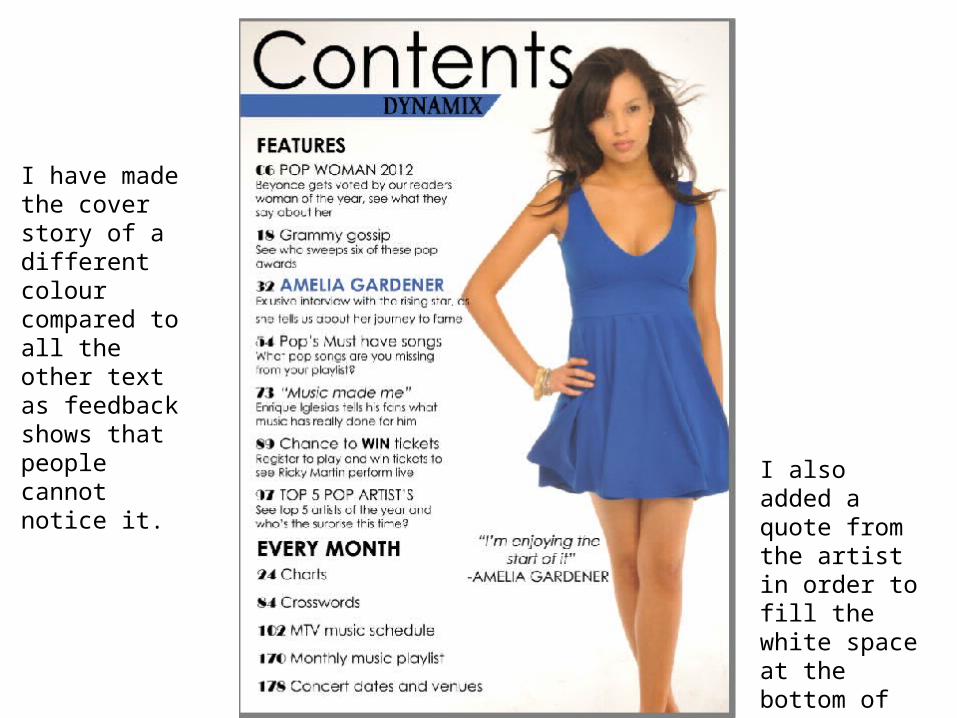
I have made the cover story of a different colour compared to all the other text as feedback shows that people cannot notice it.
I also added a quote from the artist in order to fill the white space at the bottom of the page .