Contents page analysis of other music magazines
6
Contents Page Analysis of other music magazines.
-
Upload
mollywellz -
Category
Law
-
view
44 -
download
2
Transcript of Contents page analysis of other music magazines
Contents Page Analysis of other music magazines.
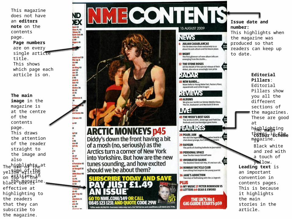
Editorial Pillars:Editorial Pillars show you all the different sections of the magazines. These are good at highlighting themes in the magazine.
Leading text is an important convention in contents pages. This is because it highlights the main stories in the article.
This magazine does not have an editors note on the contents page.
The main colour scheme is Black white and red with a touch of yellow.
The use of the yellow writing on top of the black box is effective at highlighting to the readers that they can subscribe to the magazine.
The main image in the magazine is at the centre of the contents page.This draws the attention of the reader straight to the image and also highlights at some of the articles in the magazine.
Issue date and number:This highlights when the magazine was produced so that readers can keep up to date.
Page numbers are on every single article title.This shows which page each article is on.
1. How is colour used?The main three colours for this contents page are red, black and white. However, there is also a pop of yellow in
the subscription box section. This is effective because it is automatically drawing the attention to the subscription box which is what the
magazine obviously wants the readers box.
2. What type of language is used in the contents page? Obviously, because it is a contents page there are only going to be short sentences or snippets of articles. There are also quotes in some of the leading text which is effective because it is giving the reader a sneak peek
as to what is in the inside of the magazine and some of the content of the articles.
3. How is the artist/band presented to the audience through the choice of images?NME in general, is a rock magazine.the main image used on the contents page is of a man looking as though he is singing into a microphone,
holding an electric guitar (stereotypical rock instrument) with dark features and clothes. He is being presented to the audience/readers as mysterious but also looks as though he could be a rock singer.The main image on the contents page links very to the theme of the article and the significant amount of black
also matches the editorial pillars and writing.
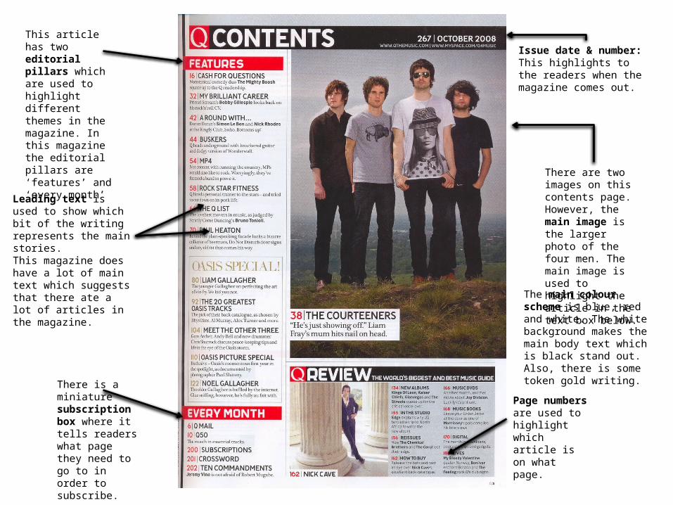
Page numbers are used to highlight which article is on what page.
This article has two editorial pillars which are used to highlight different themes in the magazine. In this magazine the editorial pillars are ‘features’ and ‘every month’
There is a miniature subscription box where it tells readers what page they need to go to in order to subscribe.
There are two images on this contents page. However, the main image is the larger photo of the four men. The main image is used to highlight the article in the text box below.
The main colour scheme is blue, red and white. The white background makes the main body text which is black stand out. Also, there is some token gold writing.
Issue date & number:This highlights to the readers when the magazine comes out.
Leading text is used to show which bit of the writing represents the main stories. This magazine does have a lot of main text which suggests that there ate a lot of articles in the magazine.
1. How is colour used?Like the previous contents page, the main three colours for this contents page are red, black and white. However, because the main image of this magazine also has a white background it makes the overall look of the
magazine look brighter than the other one.Also, although not in the main colour scheme there is also some gold writing which stands out against the white
background too.2. What type of language is used in the contents page?On this contents page there is minimal writing. This could mean one of two things: Firstly, there is a second contents page to this one because some magazines
choose to do that. Or, it could also mean that seeing as the photo is so big the writing is not the main focus of this contents page
but instead the image because it is huge and takes up a significant amount of space.
3. How is the artist/band presented to the audience through the choice of images?The artist in this picture is presented to the readers/audience in a very sexualised way. Firstly, she is showing minimal clothing which could be perceived as enticing to potential readers. She is posing in an extremely sensual way which could also come across very enticing. However, logistically
speaking because she is posing with her legs up and the word ‘Contents’ is placed so it looks as though she is holding them up, I think her choice of pose is tactical.
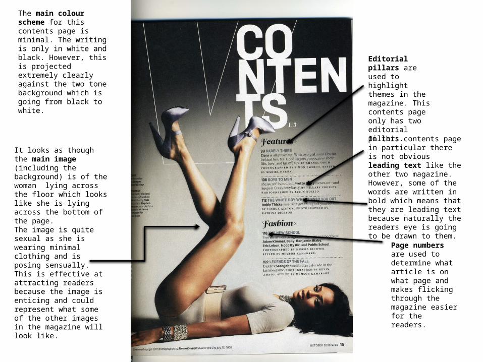
Editorial pillars are used to highlight themes in the magazine. This contents page only has two editorial pillars.
Page numbers are used to determine what article is on what page and makes flicking through the magazine easier for the readers.
The main colour scheme for this contents page is minimal. The writing is only in white and black. However, this is projected extremely clearly against the two tone background which is going from black to white.
It looks as though the main image (including the background) is of the woman lying across the floor which looks like she is lying across the bottom of the page. The image is quite sexual as she is wearing minimal clothing and is posing sensually. This is effective at attracting readers because the image is enticing and could represent what some of the other images in the magazine will look like.
In this contents page in particular there is not obvious leading text like the other two magazine. However, some of the words are written in bold which means that they are leading text because naturally the readers eye is going to be drawn to them.