Constructing Control Charts
73
© Lean Methods Group. All rights reserved. No portion may be copied, rewritten, reproduced, or published. Page 1 of 73 Constructing Control Charts Section 1: Xbar–R Charts Section 2: Xbar–R Charts in MINITAB Section 3: I-MR Charts Section 4: P charts Section 5: NP Charts Section 6: C Charts Section 7: U Charts
Transcript of Constructing Control Charts
© Lean Methods Group. All rights reserved. No portion may be copied, rewritten, reproduced, or published.
Page 1 of 73
Constructing Control Charts
Section 1: Xbar–R Charts Section 2: Xbar–R Charts in MINITAB Section 3: I-MR Charts Section 4: P charts Section 5: NP Charts Section 6: C Charts Section 7: U Charts

Constructing Control Charts
© Lean Methods Group. All rights reserved. No portion may be copied, rewritten, reproduced, or published.
Page 2 of 73
Module Objectives
In this module, we will: Learn to construct and interpret various types of control charts.
We will begin by explaining how to build an Xbar-R chart. Followed by a discussion of Individuals and Moving Range charts for variable data, P and NP charts for defectives, and finally U and C charts for defects.
Let’s begin.
Constructing Control Charts
© Lean Methods Group. All rights reserved. No portion may be copied, rewritten, reproduced, or published.
Page 3 of 73
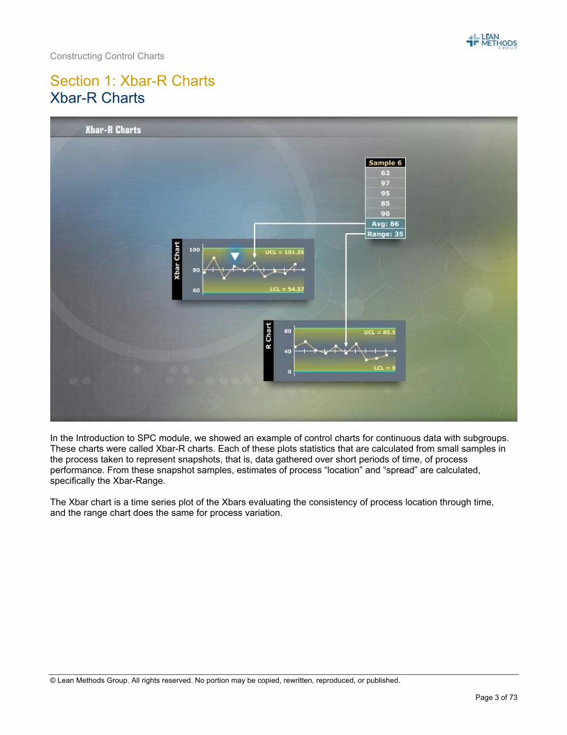
Section 1: Xbar-R Charts Xbar-R Charts
In the Introduction to SPC module, we showed an example of control charts for continuous data with subgroups. These charts were called Xbar-R charts. Each of these plots statistics that are calculated from small samples in the process taken to represent snapshots, that is, data gathered over short periods of time, of process performance. From these snapshot samples, estimates of process “location” and “spread” are calculated, specifically the Xbar-Range. The Xbar chart is a time series plot of the Xbars evaluating the consistency of process location through time, and the range chart does the same for process variation.
Constructing Control Charts
© Lean Methods Group. All rights reserved. No portion may be copied, rewritten, reproduced, or published.
Page 4 of 73
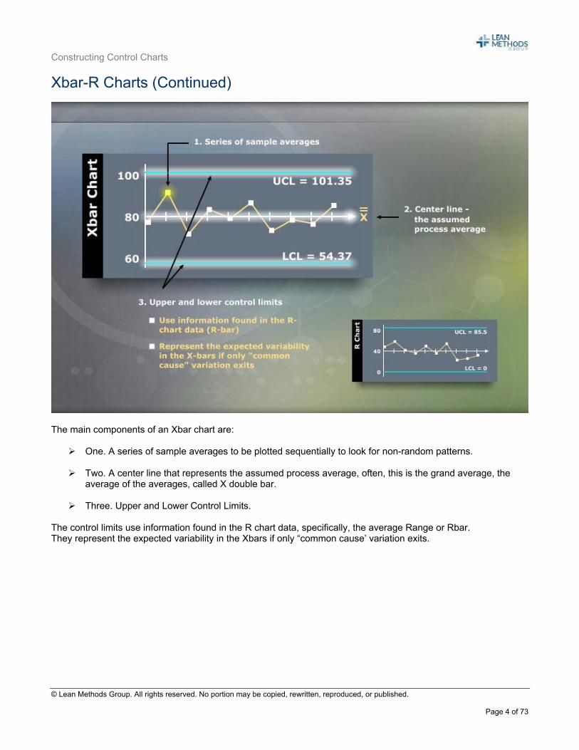
Xbar-R Charts (Continued)
The main components of an Xbar chart are:
One. A series of sample averages to be plotted sequentially to look for non-random patterns. Two. A center line that represents the assumed process average, often, this is the grand average, the
average of the averages, called X double bar.
Three. Upper and Lower Control Limits. The control limits use information found in the R chart data, specifically, the average Range or Rbar. They represent the expected variability in the Xbars if only “common cause’ variation exits.
Constructing Control Charts
© Lean Methods Group. All rights reserved. No portion may be copied, rewritten, reproduced, or published.
Page 5 of 73
Xbar – R Charts (Continued)
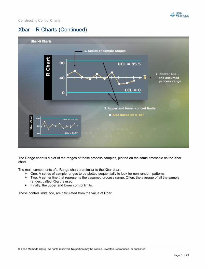
The Range chart is a plot of the ranges of these process samples, plotted on the same timescale as the Xbar chart. The main components of a Range chart are similar to the Xbar chart:
One. A series of sample ranges to be plotted sequentially to look for non-random patterns. Two. A center line that represents the assumed process range. Often, the average of all the sample
ranges, called Rbar, is used. Finally, the upper and lower control limits.
These control limits, too, are calculated from the value of Rbar.
Constructing Control Charts
© Lean Methods Group. All rights reserved. No portion may be copied, rewritten, reproduced, or published.
Page 6 of 73
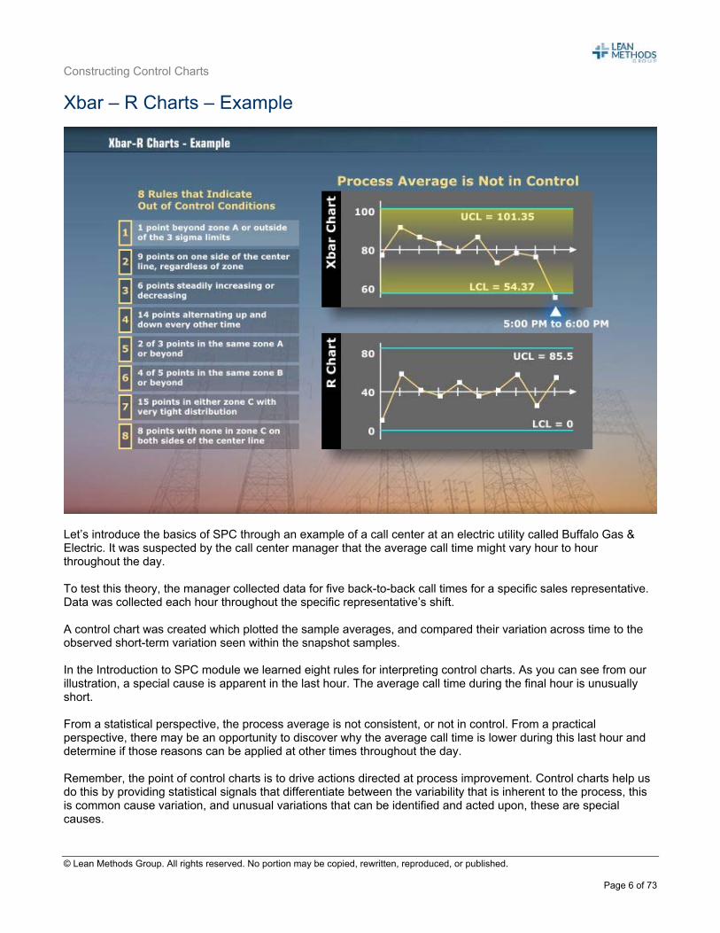
Xbar – R Charts – Example
Let’s introduce the basics of SPC through an example of a call center at an electric utility called Buffalo Gas & Electric. It was suspected by the call center manager that the average call time might vary hour to hour throughout the day. To test this theory, the manager collected data for five back-to-back call times for a specific sales representative. Data was collected each hour throughout the specific representative’s shift. A control chart was created which plotted the sample averages, and compared their variation across time to the observed short-term variation seen within the snapshot samples. In the Introduction to SPC module we learned eight rules for interpreting control charts. As you can see from our illustration, a special cause is apparent in the last hour. The average call time during the final hour is unusually short. From a statistical perspective, the process average is not consistent, or not in control. From a practical perspective, there may be an opportunity to discover why the average call time is lower during this last hour and determine if those reasons can be applied at other times throughout the day. Remember, the point of control charts is to drive actions directed at process improvement. Control charts help us do this by providing statistical signals that differentiate between the variability that is inherent to the process, this is common cause variation, and unusual variations that can be identified and acted upon, these are special causes.
Constructing Control Charts
© Lean Methods Group. All rights reserved. No portion may be copied, rewritten, reproduced, or published.
Page 7 of 73
These statistical signals are the result of comparing the plotted data to the control limits. Where do these limits come from? In the next few slides, we will show how to calculate Xbar-R Chart control limits. But first, let’s briefly discuss subgroups.
Constructing Control Charts
© Lean Methods Group. All rights reserved. No portion may be copied, rewritten, reproduced, or published.
Page 8 of 73
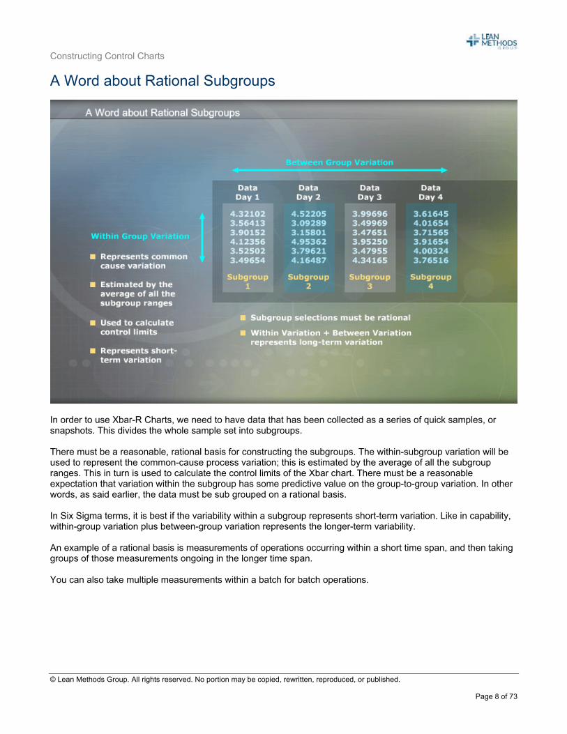
A Word about Rational Subgroups
In order to use Xbar-R Charts, we need to have data that has been collected as a series of quick samples, or snapshots. This divides the whole sample set into subgroups. There must be a reasonable, rational basis for constructing the subgroups. The within-subgroup variation will be used to represent the common-cause process variation; this is estimated by the average of all the subgroup ranges. This in turn is used to calculate the control limits of the Xbar chart. There must be a reasonable expectation that variation within the subgroup has some predictive value on the group-to-group variation. In other words, as said earlier, the data must be sub grouped on a rational basis. In Six Sigma terms, it is best if the variability within a subgroup represents short-term variation. Like in capability, within-group variation plus between-group variation represents the longer-term variability. An example of a rational basis is measurements of operations occurring within a short time span, and then taking groups of those measurements ongoing in the longer time span. You can also take multiple measurements within a batch for batch operations.
Constructing Control Charts
© Lean Methods Group. All rights reserved. No portion may be copied, rewritten, reproduced, or published.
Page 9 of 73
What if Subgrouping is Irrational?
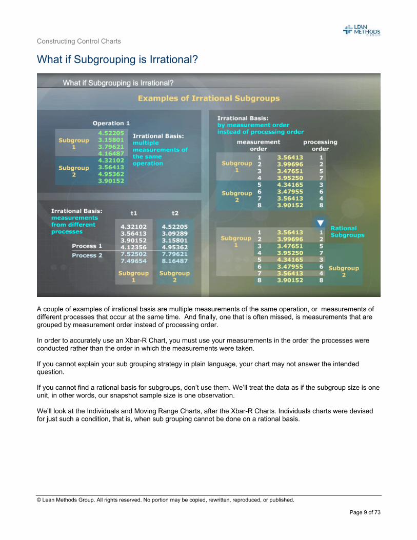
A couple of examples of irrational basis are multiple measurements of the same operation, or measurements of different processes that occur at the same time. And finally, one that is often missed, is measurements that are grouped by measurement order instead of processing order. In order to accurately use an Xbar-R Chart, you must use your measurements in the order the processes were conducted rather than the order in which the measurements were taken. If you cannot explain your sub grouping strategy in plain language, your chart may not answer the intended question. If you cannot find a rational basis for subgroups, don’t use them. We’ll treat the data as if the subgroup size is one unit, in other words, our snapshot sample size is one observation. We’ll look at the Individuals and Moving Range Charts, after the Xbar-R Charts. Individuals charts were devised for just such a condition, that is, when sub grouping cannot be done on a rational basis.

Constructing Control Charts
© Lean Methods Group. All rights reserved. No portion may be copied, rewritten, reproduced, or published.
Page 10 of 73
Constructing an Xbar-R Chart
Control charts are used to keep track of process tendencies: averages, variations, defect rates, and defective rates. They all have similar components:
A center line representing the assumed tendency, Control limits representing a range of variation expected from a statistic estimating that tendency, A series of statistics calculated from snapshot samples
The typical procedure for constructing an Xbar-R chart is to:
1. Gather the process performance data in a sequence of snapshot samples, 2. Calculate and plot the snapshot sample means and ranges, 3. Calculate the grand average and average range, 4. Calculate the control limits from those summary statistics, and finally to 5. Plot the centerline and limits.
In this case, we have added the details for the procedure for the Xbar-R-chart.
Constructing Control Charts
© Lean Methods Group. All rights reserved. No portion may be copied, rewritten, reproduced, or published.
Page 11 of 73
Gathering and Plotting Xbar-R Chart Data
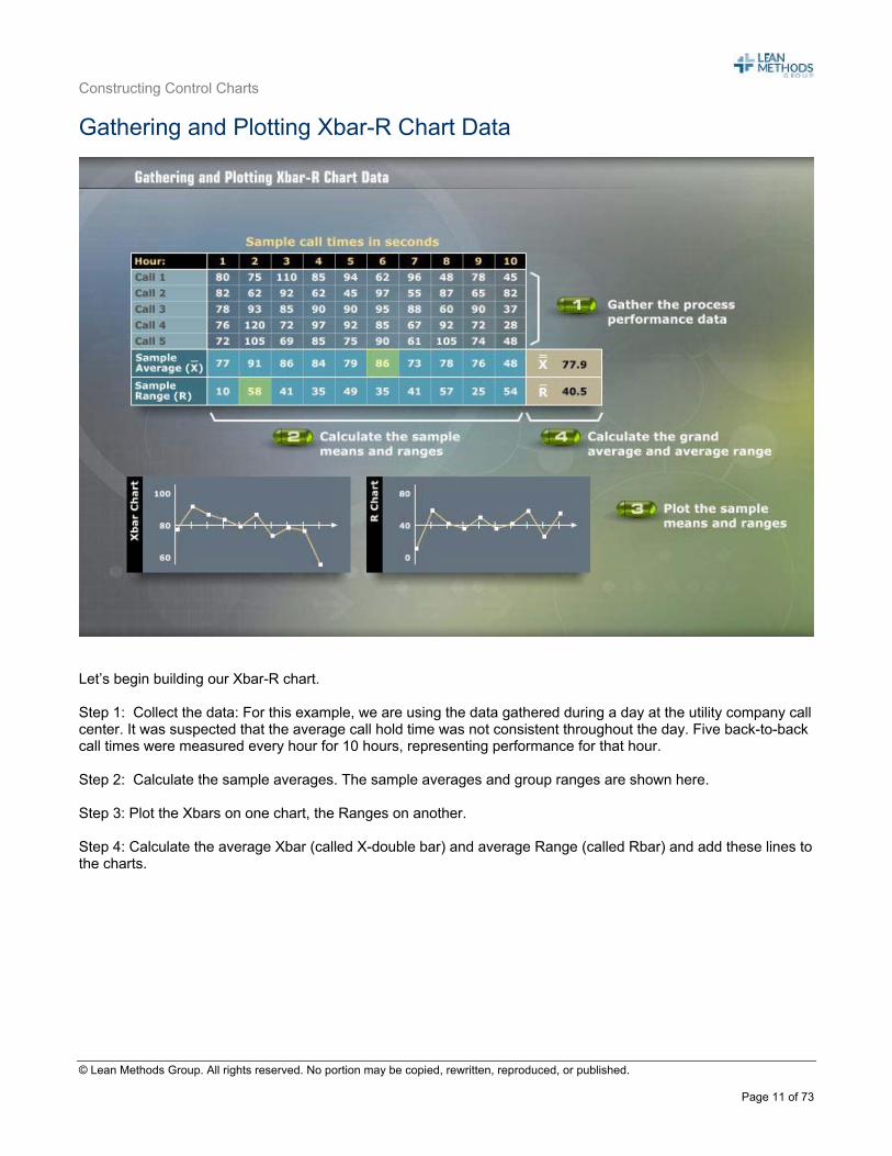
Let’s begin building our Xbar-R chart. Step 1: Collect the data: For this example, we are using the data gathered during a day at the utility company call center. It was suspected that the average call hold time was not consistent throughout the day. Five back-to-back call times were measured every hour for 10 hours, representing performance for that hour. Step 2: Calculate the sample averages. The sample averages and group ranges are shown here. Step 3: Plot the Xbars on one chart, the Ranges on another.
Step 4: Calculate the average Xbar (called X-double bar) and average Range (called Rbar) and add these lines to the charts.
Constructing Control Charts
© Lean Methods Group. All rights reserved. No portion may be copied, rewritten, reproduced, or published.
Page 12 of 73
Calculating the Control Limits for Xbar-R Charts
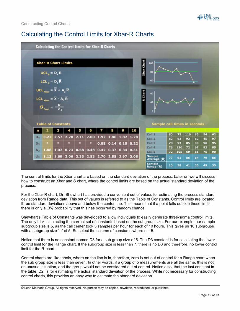
The control limits for the Xbar chart are based on the standard deviation of the process. Later on we will discuss how to construct an Xbar and S chart, where the control limits are based on the actual standard deviation of the process. For the Xbar-R chart, Dr. Shewhart has provided a convenient set of values for estimating the process standard deviation from Range data. This set of values is referred to as the Table of Constants. Control limits are located three standard deviations above and below the center line. This means that if a point falls outside these limits, there is only a .3% probability that this has occurred by random chance. Shewhart’s Table of Constants was developed to allow individuals to easily generate three-sigma control limits. The only trick is selecting the correct set of constants based on the subgroup size. For our example, our sample subgroup size is 5, as the call center took 5 samples per hour for each of 10 hours. This gives us 10 subgroups with a subgroup size “n” of 5. So select the column of constants where n = 5. Notice that there is no constant named D3 for a sub group size of 5. The D3 constant is for calculating the lower control limit for the Range chart. If the subgroup size is less than 7, there is no D3 and therefore, no lower control limit for the R-chart. Control charts are like tennis, where on the line is in, therefore, zero is not out of control for a Range chart when the sub group size is less than seven. In other words, if a group of 5 measurements are all the same, this is not an unusual situation, and the group would not be considered out of control. Notice also, that the last constant in the table, D2, is for estimating the actual standard deviation of the process. While not necessary for constructing control charts, this provides an easy way to estimate the standard deviation.
Constructing Control Charts
© Lean Methods Group. All rights reserved. No portion may be copied, rewritten, reproduced, or published.
Page 13 of 73
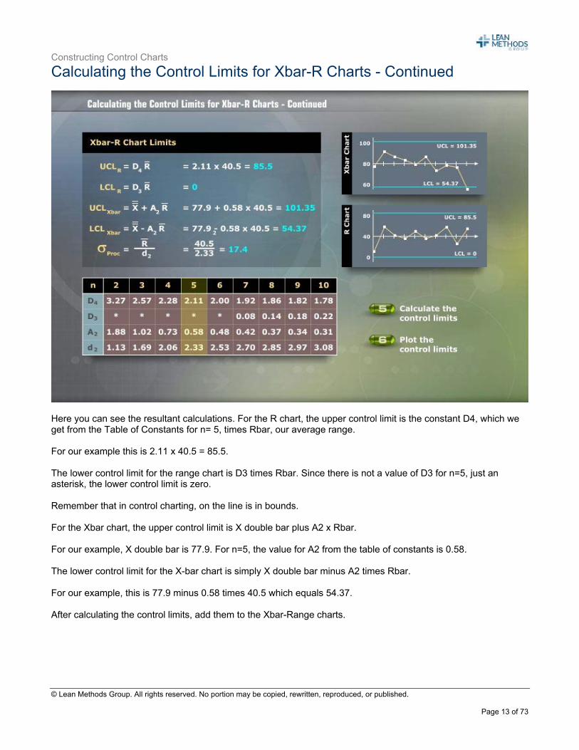
Calculating the Control Limits for Xbar-R Charts - Continued
Here you can see the resultant calculations. For the R chart, the upper control limit is the constant D4, which we get from the Table of Constants for n= 5, times Rbar, our average range. For our example this is 2.11 x 40.5 = 85.5. The lower control limit for the range chart is D3 times Rbar. Since there is not a value of D3 for n=5, just an asterisk, the lower control limit is zero. Remember that in control charting, on the line is in bounds. For the Xbar chart, the upper control limit is X double bar plus A2 x Rbar. For our example, X double bar is 77.9. For n=5, the value for A2 from the table of constants is 0.58. The lower control limit for the X-bar chart is simply X double bar minus A2 times Rbar. For our example, this is 77.9 minus 0.58 times 40.5 which equals 54.37. After calculating the control limits, add them to the Xbar-Range charts.
Constructing Control Charts
© Lean Methods Group. All rights reserved. No portion may be copied, rewritten, reproduced, or published.
Page 14 of 73
Interpreting Xbar-R Charts
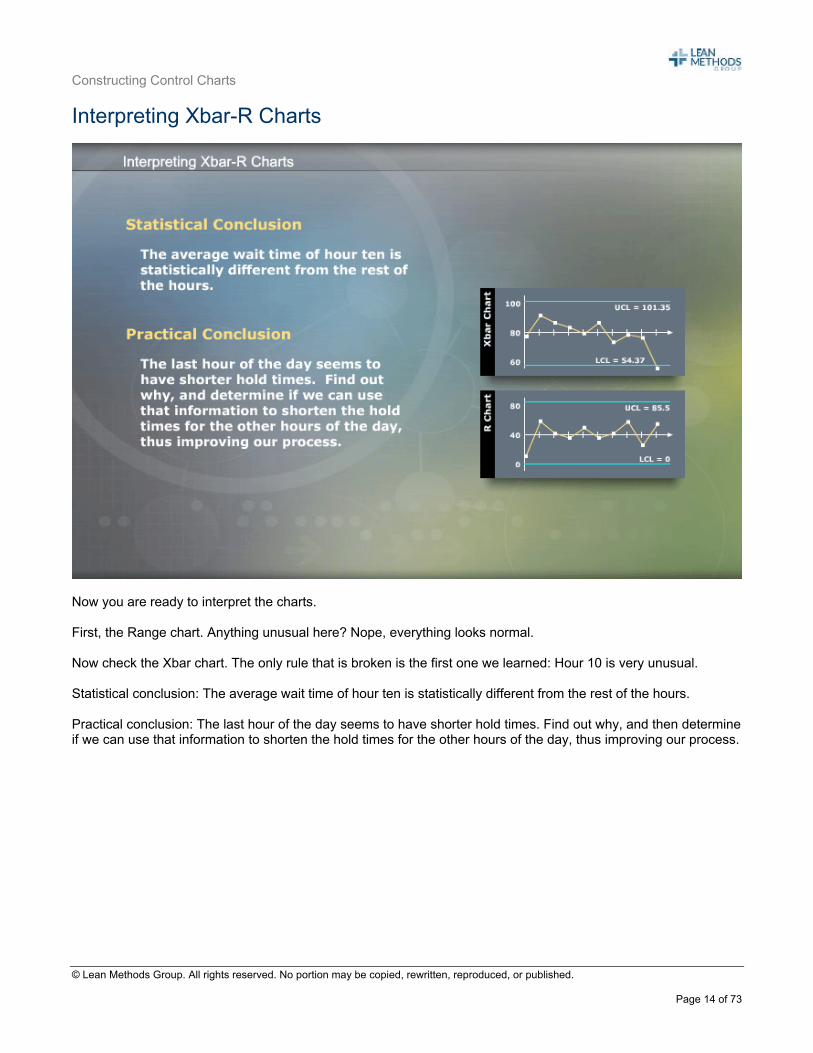
Now you are ready to interpret the charts. First, the Range chart. Anything unusual here? Nope, everything looks normal. Now check the Xbar chart. The only rule that is broken is the first one we learned: Hour 10 is very unusual. Statistical conclusion: The average wait time of hour ten is statistically different from the rest of the hours. Practical conclusion: The last hour of the day seems to have shorter hold times. Find out why, and then determine if we can use that information to shorten the hold times for the other hours of the day, thus improving our process.
Constructing Control Charts
© Lean Methods Group. All rights reserved. No portion may be copied, rewritten, reproduced, or published.
Page 15 of 73
Xbar-R Chart Summary
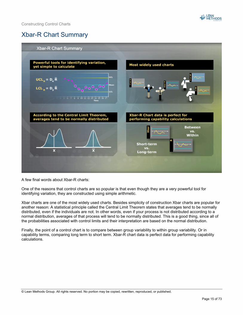
A few final words about Xbar-R charts: One of the reasons that control charts are so popular is that even though they are a very powerful tool for identifying variation, they are constructed using simple arithmetic. Xbar charts are one of the most widely used charts. Besides simplicity of construction Xbar charts are popular for another reason: A statistical principle called the Central Limit Theorem states that averages tend to be normally distributed, even if the individuals are not. In other words, even if your process is not distributed according to a normal distribution, averages of that process will tend to be normally distributed. This is a good thing, since all of the probabilities associated with control limits and their interpretation are based on the normal distribution. Finally, the point of a control chart is to compare between group variability to within group variability. Or in capability terms, comparing long term to short term. Xbar-R chart data is perfect data for performing capability calculations.
Constructing Control Charts
© Lean Methods Group. All rights reserved. No portion may be copied, rewritten, reproduced, or published.
Page 16 of 73
Section 2: Xbar – R Charts in MINITAB Xbar-R Charts in MINITAB
As you might expect, Minitab can do much, much more with control charts than simple construction and interpretation. Let’s look at another example from this call center to investigate some of the advanced control chart features in Minitab. In the next example we will:
Let Minitab interpret the control charts for us; Omit out-of-control data points from the calculations, once the causes have been identified and
eliminated; Evaluate current process data against historical process characteristics; Display interpretation zones to control charts to aid interpretation; Construct Control Charts with stacked data; and Display changes in a process with a control chart stages.
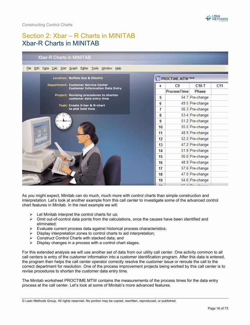
For this extended analysis we will use another set of data from our utility call center. One activity common to all call centers is entry of the customer information into a customer identification program. After this data is entered, the program then helps the call center operator correctly resolve the customer issue or reroute the call to the correct department for resolution. One of the process improvement projects being worked by this call center is to revise procedures to shorten the customer data entry time. The Minitab worksheet PROCTIME.MTW contains the measurements of the process times for the data entry process at the call center. Let’s look at some of Minitab’s more advanced features.
Constructing Control Charts
© Lean Methods Group. All rights reserved. No portion may be copied, rewritten, reproduced, or published.
Page 17 of 73
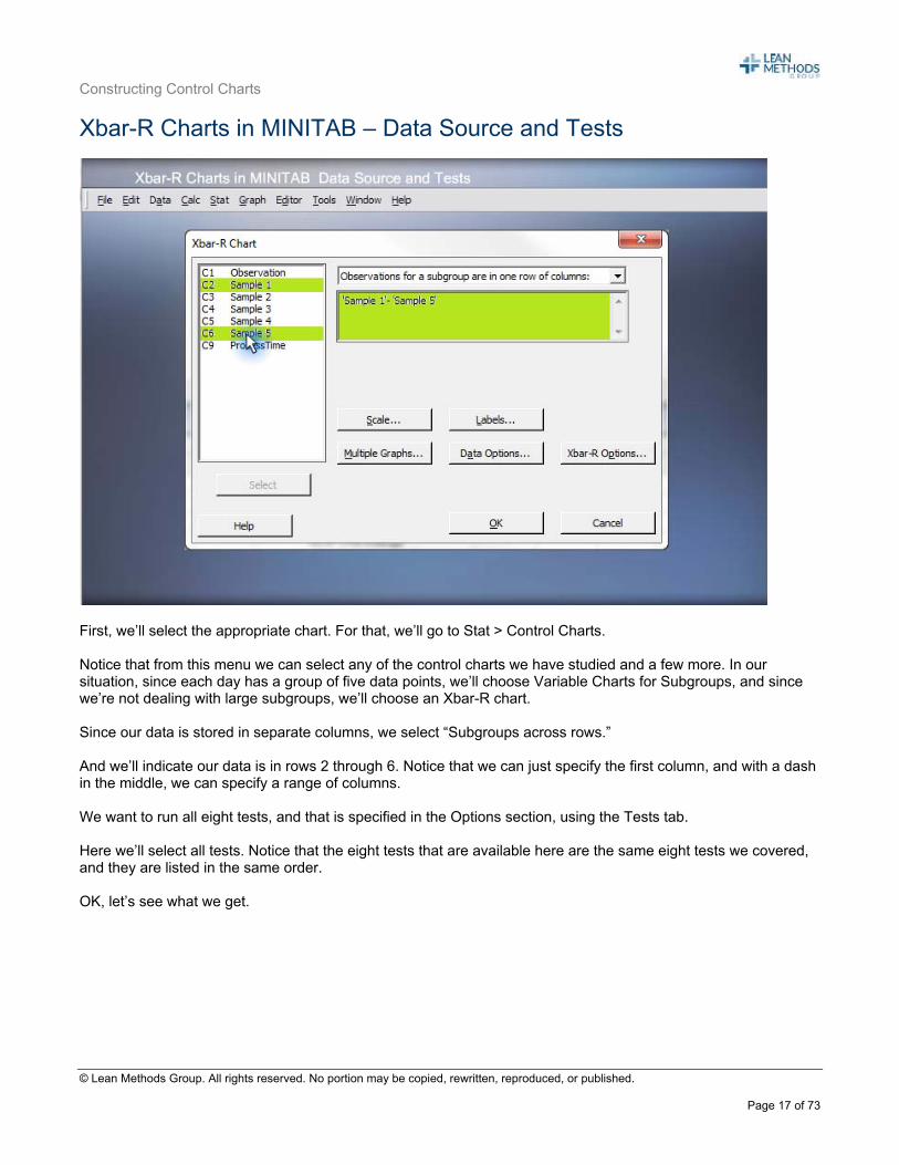
Xbar-R Charts in MINITAB – Data Source and Tests
First, we’ll select the appropriate chart. For that, we’ll go to Stat > Control Charts. Notice that from this menu we can select any of the control charts we have studied and a few more. In our situation, since each day has a group of five data points, we’ll choose Variable Charts for Subgroups, and since we’re not dealing with large subgroups, we’ll choose an Xbar-R chart. Since our data is stored in separate columns, we select “Subgroups across rows.” And we’ll indicate our data is in rows 2 through 6. Notice that we can just specify the first column, and with a dash in the middle, we can specify a range of columns. We want to run all eight tests, and that is specified in the Options section, using the Tests tab. Here we’ll select all tests. Notice that the eight tests that are available here are the same eight tests we covered, and they are listed in the same order. OK, let’s see what we get.
Constructing Control Charts
© Lean Methods Group. All rights reserved. No portion may be copied, rewritten, reproduced, or published.
Page 18 of 73
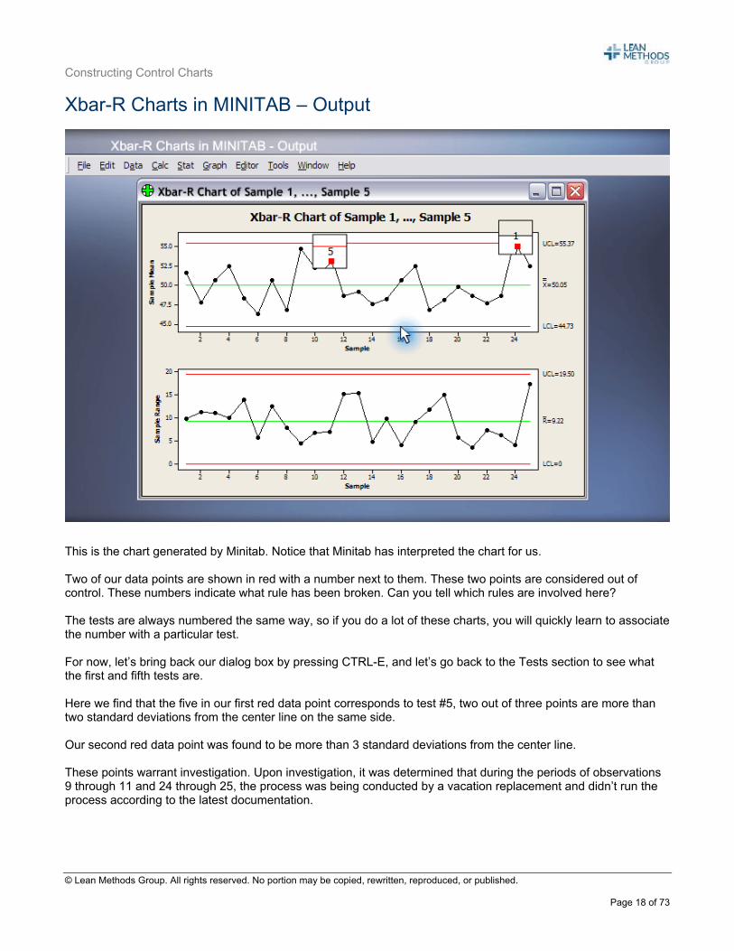
Xbar-R Charts in MINITAB – Output
This is the chart generated by Minitab. Notice that Minitab has interpreted the chart for us. Two of our data points are shown in red with a number next to them. These two points are considered out of control. These numbers indicate what rule has been broken. Can you tell which rules are involved here? The tests are always numbered the same way, so if you do a lot of these charts, you will quickly learn to associate the number with a particular test. For now, let’s bring back our dialog box by pressing CTRL-E, and let’s go back to the Tests section to see what the first and fifth tests are. Here we find that the five in our first red data point corresponds to test #5, two out of three points are more than two standard deviations from the center line on the same side. Our second red data point was found to be more than 3 standard deviations from the center line. These points warrant investigation. Upon investigation, it was determined that during the periods of observations 9 through 11 and 24 through 25, the process was being conducted by a vacation replacement and didn’t run the process according to the latest documentation.
Constructing Control Charts
© Lean Methods Group. All rights reserved. No portion may be copied, rewritten, reproduced, or published.
Page 19 of 73
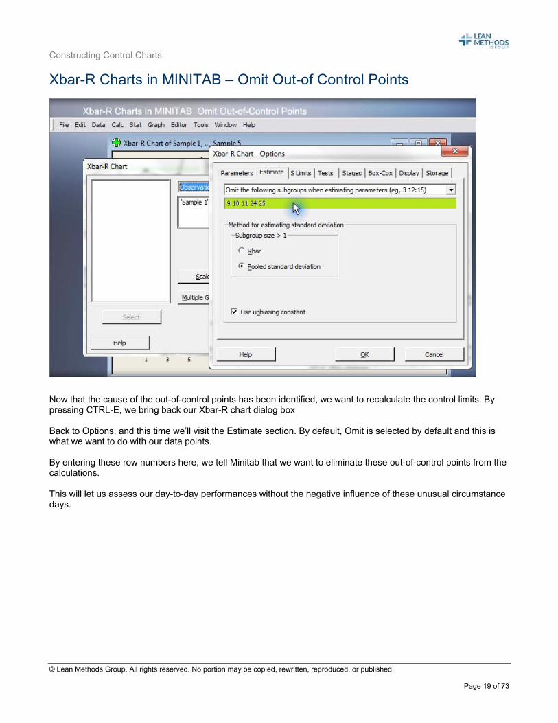
Xbar-R Charts in MINITAB – Omit Out-of Control Points
Now that the cause of the out-of-control points has been identified, we want to recalculate the control limits. By pressing CTRL-E, we bring back our Xbar-R chart dialog box Back to Options, and this time we’ll visit the Estimate section. By default, Omit is selected by default and this is what we want to do with our data points. By entering these row numbers here, we tell Minitab that we want to eliminate these out-of-control points from the calculations. This will let us assess our day-to-day performances without the negative influence of these unusual circumstance days.
Constructing Control Charts
© Lean Methods Group. All rights reserved. No portion may be copied, rewritten, reproduced, or published.
Page 20 of 73
Xbar-R Charts in MINITAB – Output Without Out-of-Control Points
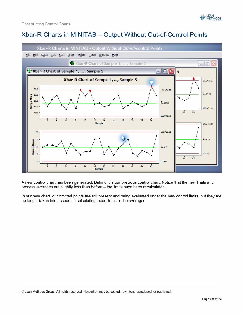
A new control chart has been generated. Behind it is our previous control chart. Notice that the new limits and process averages are slightly less than before – the limits have been recalculated. In our new chart, our omitted points are still present and being evaluated under the new control limits, but they are no longer taken into account in calculating these limits or the averages.
Constructing Control Charts
© Lean Methods Group. All rights reserved. No portion may be copied, rewritten, reproduced, or published.
Page 21 of 73
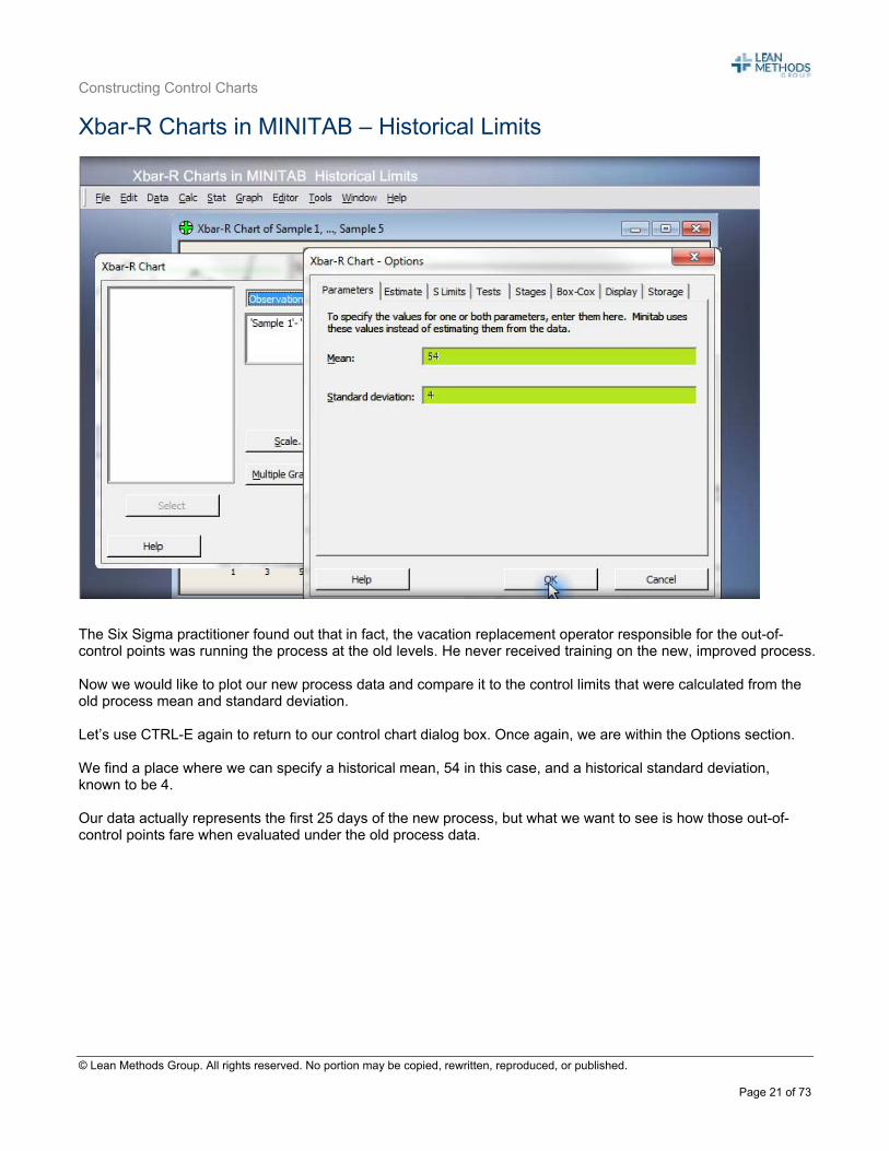
Xbar-R Charts in MINITAB – Historical Limits
The Six Sigma practitioner found out that in fact, the vacation replacement operator responsible for the out-of-control points was running the process at the old levels. He never received training on the new, improved process. Now we would like to plot our new process data and compare it to the control limits that were calculated from the old process mean and standard deviation. Let’s use CTRL-E again to return to our control chart dialog box. Once again, we are within the Options section. We find a place where we can specify a historical mean, 54 in this case, and a historical standard deviation, known to be 4. Our data actually represents the first 25 days of the new process, but what we want to see is how those out-of-control points fare when evaluated under the old process data.
Constructing Control Charts
© Lean Methods Group. All rights reserved. No portion may be copied, rewritten, reproduced, or published.
Page 22 of 73
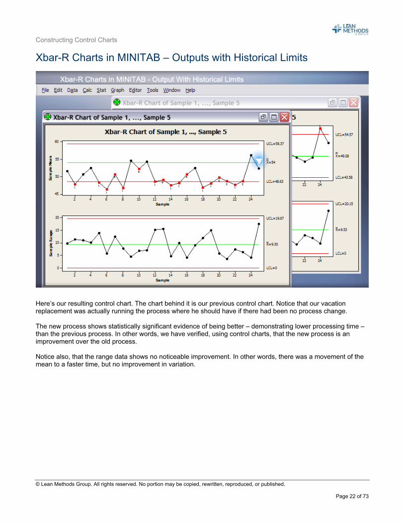
Xbar-R Charts in MINITAB – Outputs with Historical Limits
Here’s our resulting control chart. The chart behind it is our previous control chart. Notice that our vacation replacement was actually running the process where he should have if there had been no process change. The new process shows statistically significant evidence of being better – demonstrating lower processing time – than the previous process. In other words, we have verified, using control charts, that the new process is an improvement over the old process. Notice also, that the range data shows no noticeable improvement. In other words, there was a movement of the mean to a faster time, but no improvement in variation.
Constructing Control Charts
© Lean Methods Group. All rights reserved. No portion may be copied, rewritten, reproduced, or published.
Page 23 of 73
Xbar-R Charts in MINITAB – Interpretation Zones
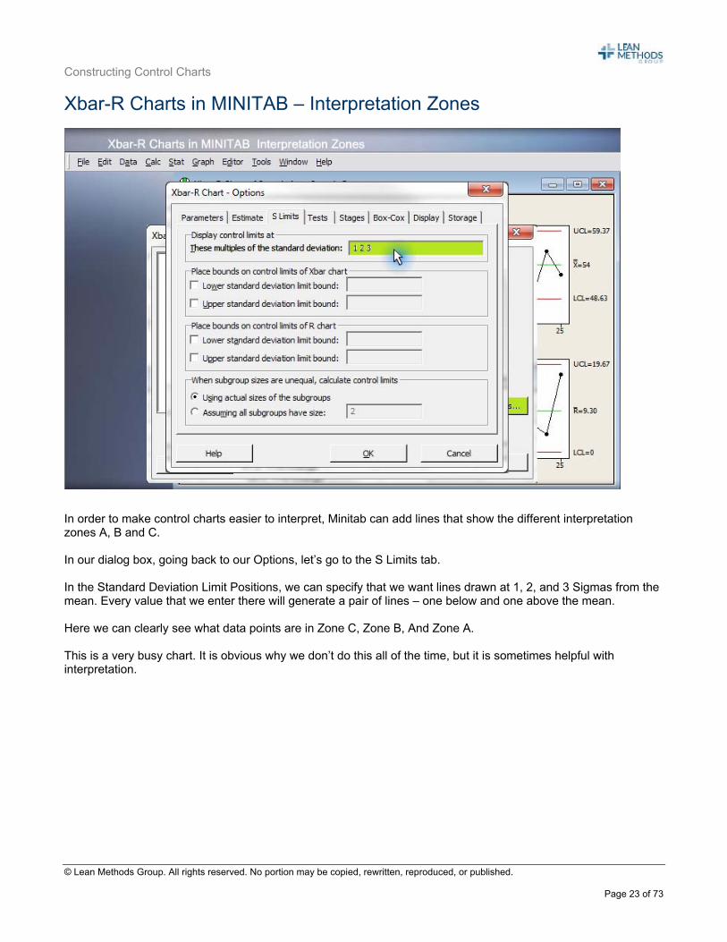
In order to make control charts easier to interpret, Minitab can add lines that show the different interpretation zones A, B and C. In our dialog box, going back to our Options, let’s go to the S Limits tab. In the Standard Deviation Limit Positions, we can specify that we want lines drawn at 1, 2, and 3 Sigmas from the mean. Every value that we enter there will generate a pair of lines – one below and one above the mean. Here we can clearly see what data points are in Zone C, Zone B, And Zone A. This is a very busy chart. It is obvious why we don’t do this all of the time, but it is sometimes helpful with interpretation.
Constructing Control Charts
© Lean Methods Group. All rights reserved. No portion may be copied, rewritten, reproduced, or published.
Page 24 of 73
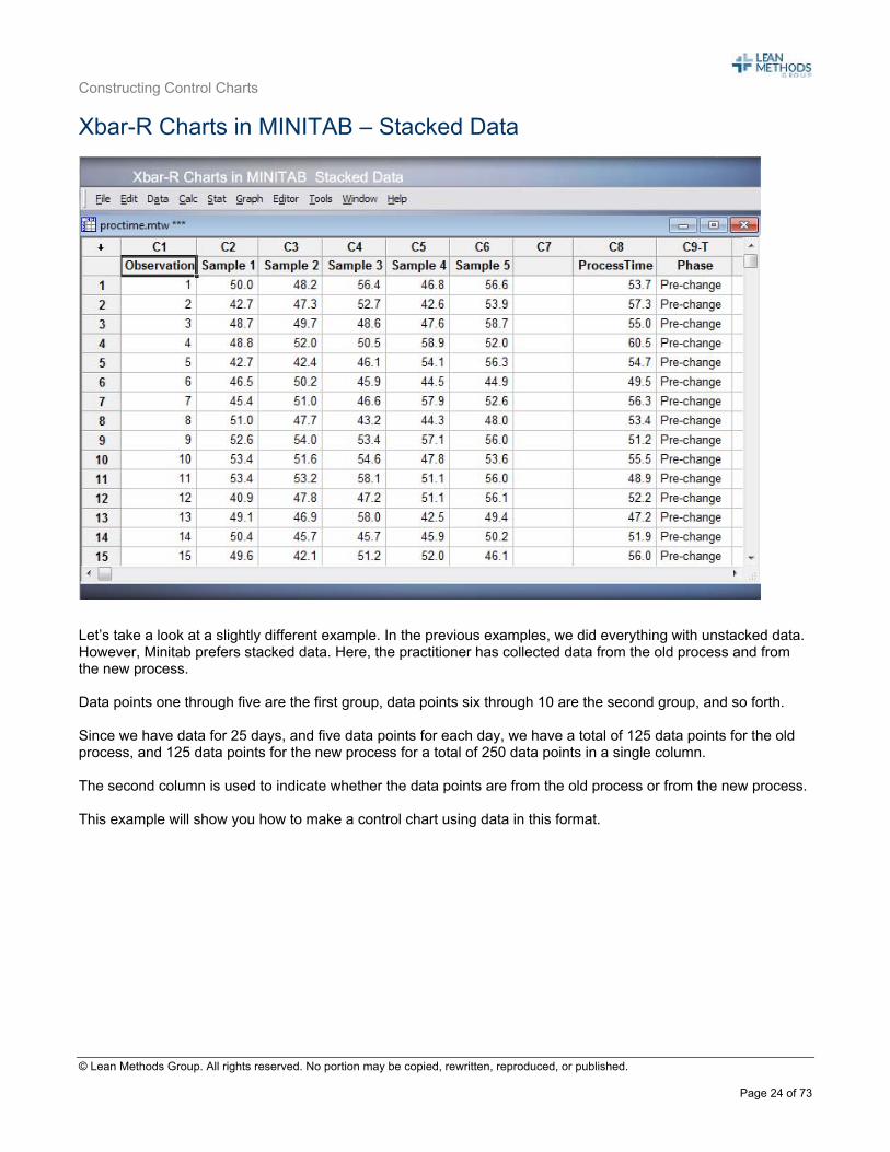
Xbar-R Charts in MINITAB – Stacked Data
Let’s take a look at a slightly different example. In the previous examples, we did everything with unstacked data. However, Minitab prefers stacked data. Here, the practitioner has collected data from the old process and from the new process. Data points one through five are the first group, data points six through 10 are the second group, and so forth. Since we have data for 25 days, and five data points for each day, we have a total of 125 data points for the old process, and 125 data points for the new process for a total of 250 data points in a single column. The second column is used to indicate whether the data points are from the old process or from the new process. This example will show you how to make a control chart using data in this format.
Constructing Control Charts
© Lean Methods Group. All rights reserved. No portion may be copied, rewritten, reproduced, or published.
Page 25 of 73
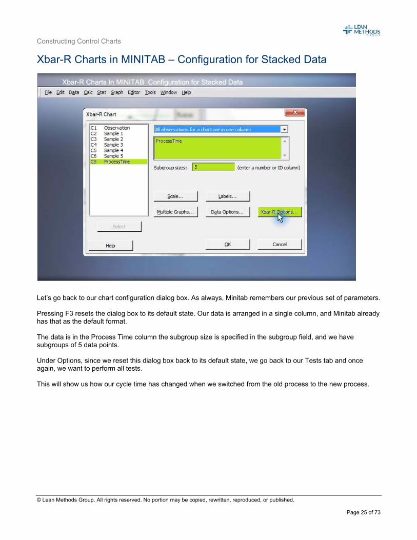
Xbar-R Charts in MINITAB – Configuration for Stacked Data
Let’s go back to our chart configuration dialog box. As always, Minitab remembers our previous set of parameters. Pressing F3 resets the dialog box to its default state. Our data is arranged in a single column, and Minitab already has that as the default format. The data is in the Process Time column the subgroup size is specified in the subgroup field, and we have subgroups of 5 data points. Under Options, since we reset this dialog box back to its default state, we go back to our Tests tab and once again, we want to perform all tests. This will show us how our cycle time has changed when we switched from the old process to the new process.
Constructing Control Charts
© Lean Methods Group. All rights reserved. No portion may be copied, rewritten, reproduced, or published.
Page 26 of 73
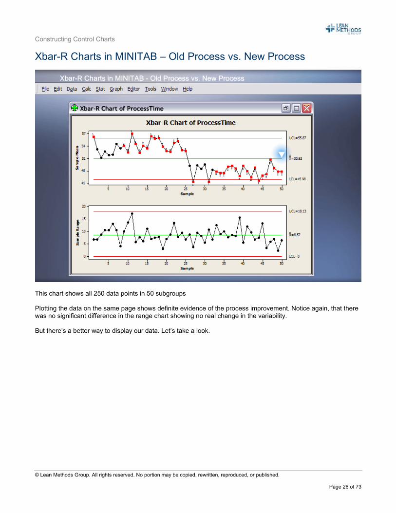
Xbar-R Charts in MINITAB – Old Process vs. New Process
This chart shows all 250 data points in 50 subgroups Plotting the data on the same page shows definite evidence of the process improvement. Notice again, that there was no significant difference in the range chart showing no real change in the variability. But there’s a better way to display our data. Let’s take a look.
Constructing Control Charts
© Lean Methods Group. All rights reserved. No portion may be copied, rewritten, reproduced, or published.
Page 27 of 73
Xbar-R Charts in MINITAB – Process Time by Phase
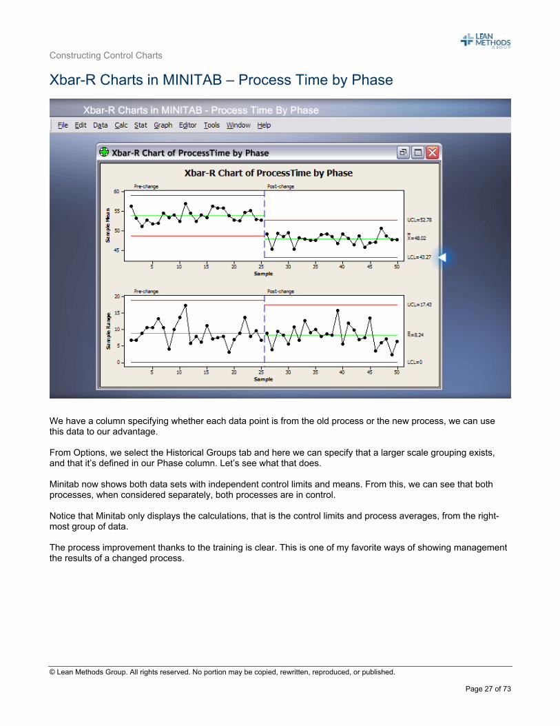
We have a column specifying whether each data point is from the old process or the new process, we can use this data to our advantage. From Options, we select the Historical Groups tab and here we can specify that a larger scale grouping exists, and that it’s defined in our Phase column. Let’s see what that does. Minitab now shows both data sets with independent control limits and means. From this, we can see that both processes, when considered separately, both processes are in control. Notice that Minitab only displays the calculations, that is the control limits and process averages, from the right-most group of data. The process improvement thanks to the training is clear. This is one of my favorite ways of showing management the results of a changed process.
Constructing Control Charts
© Lean Methods Group. All rights reserved. No portion may be copied, rewritten, reproduced, or published.
Page 28 of 73
Xbar-R Charts in MINITAB – Summary
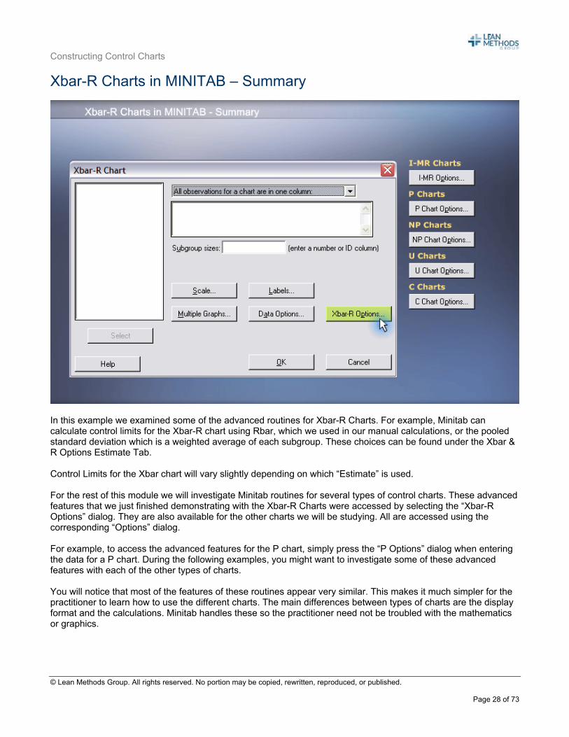
In this example we examined some of the advanced routines for Xbar-R Charts. For example, Minitab can calculate control limits for the Xbar-R chart using Rbar, which we used in our manual calculations, or the pooled standard deviation which is a weighted average of each subgroup. These choices can be found under the Xbar & R Options Estimate Tab. Control Limits for the Xbar chart will vary slightly depending on which “Estimate” is used. For the rest of this module we will investigate Minitab routines for several types of control charts. These advanced features that we just finished demonstrating with the Xbar-R Charts were accessed by selecting the “Xbar-R Options” dialog. They are also available for the other charts we will be studying. All are accessed using the corresponding “Options” dialog. For example, to access the advanced features for the P chart, simply press the “P Options” dialog when entering the data for a P chart. During the following examples, you might want to investigate some of these advanced features with each of the other types of charts. You will notice that most of the features of these routines appear very similar. This makes it much simpler for the practitioner to learn how to use the different charts. The main differences between types of charts are the display format and the calculations. Minitab handles these so the practitioner need not be troubled with the mathematics or graphics.
Constructing Control Charts
© Lean Methods Group. All rights reserved. No portion may be copied, rewritten, reproduced, or published.
Page 29 of 73
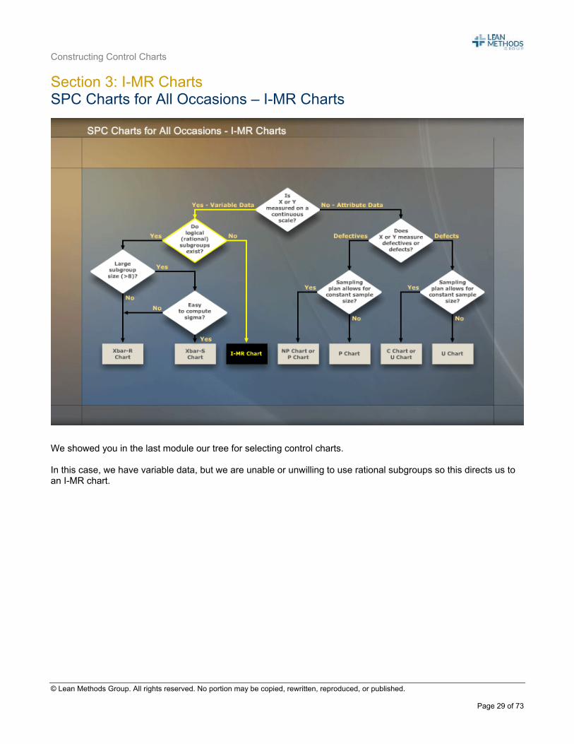
Section 3: I-MR Charts SPC Charts for All Occasions – I-MR Charts
We showed you in the last module our tree for selecting control charts. In this case, we have variable data, but we are unable or unwilling to use rational subgroups so this directs us to an I-MR chart.

Constructing Control Charts
© Lean Methods Group. All rights reserved. No portion may be copied, rewritten, reproduced, or published.
Page 30 of 73
I-MR Charts
Let’s work with a call center that is trying to reduce its total overtime hours. The call center recorded the total overtime hours put in by its associates each week for 25 weeks. Setting up the individuals and moving range chart, or I-MR chart, is very similar to the Xbar chart, in fact it is easier since the practitioner doesn’t have to worry about his or her subgrouping strategy. We showed you a procedure in the previous module for setting up a control chart. There is a slight difference in the calculations for this chart, which we will discuss in a minute, but otherwise, the construction and interpretation are the same. First, gather the data, and don’t forget you have to select the frequency of collecting data, then record the raw data. For the moving range chart, we’re going to calculate the differences between successive observations – these are the moving ranges. Then we plot the individual data points and moving ranges on the control charts. Then we calculate the control limits. First, we’re going to calculate the average moving range called Rbar, and the process average which is Xbar. Then we’re going to calculate the upper and lower control limits for both the individual and moving range charts.
We’ll demonstrate these in the next few slides.
Constructing Control Charts
© Lean Methods Group. All rights reserved. No portion may be copied, rewritten, reproduced, or published.
Page 31 of 73
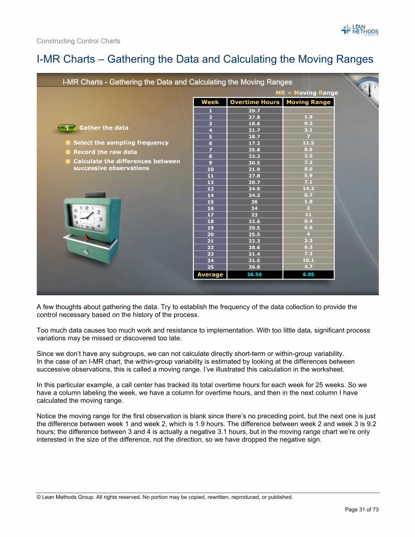
I-MR Charts – Gathering the Data and Calculating the Moving Ranges
A few thoughts about gathering the data. Try to establish the frequency of the data collection to provide the control necessary based on the history of the process. Too much data causes too much work and resistance to implementation. With too little data, significant process variations may be missed or discovered too late. Since we don’t have any subgroups, we can not calculate directly short-term or within-group variability. In the case of an I-MR chart, the within-group variability is estimated by looking at the differences between successive observations, this is called a moving range. I’ve illustrated this calculation in the worksheet. In this particular example, a call center has tracked its total overtime hours for each week for 25 weeks. So we have a column labeling the week, we have a column for overtime hours, and then in the next column I have calculated the moving range. Notice the moving range for the first observation is blank since there’s no preceding point, but the next one is just the difference between week 1 and week 2, which is 1.9 hours. The difference between week 2 and week 3 is 9.2 hours; the difference between 3 and 4 is actually a negative 3.1 hours, but in the moving range chart we’re only interested in the size of the difference, not the direction, so we have dropped the negative sign.
Constructing Control Charts
© Lean Methods Group. All rights reserved. No portion may be copied, rewritten, reproduced, or published.
Page 32 of 73
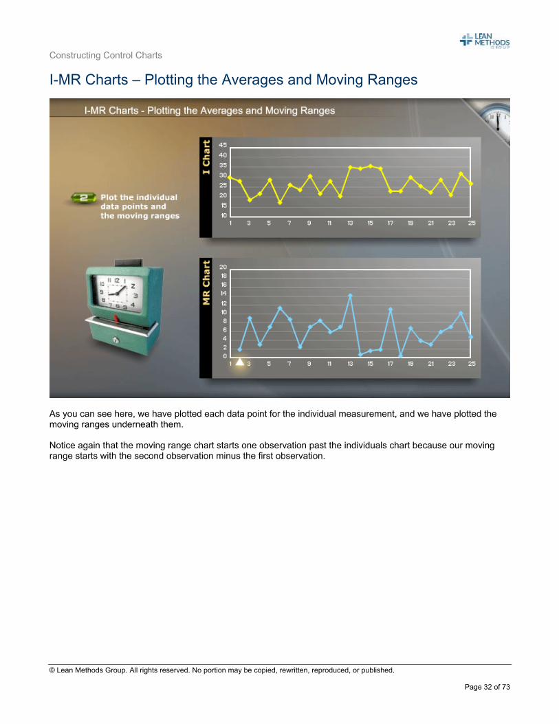
I-MR Charts – Plotting the Averages and Moving Ranges
As you can see here, we have plotted each data point for the individual measurement, and we have plotted the moving ranges underneath them. Notice again that the moving range chart starts one observation past the individuals chart because our moving range starts with the second observation minus the first observation.
Constructing Control Charts
© Lean Methods Group. All rights reserved. No portion may be copied, rewritten, reproduced, or published.
Page 33 of 73
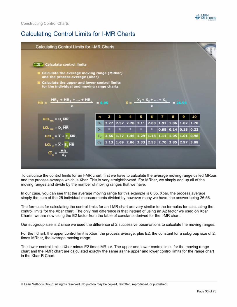
Calculating Control Limits for I-MR Charts
To calculate the control limits for an I-MR chart, first we have to calculate the average moving range called MRbar, and the process average which is Xbar. This is very straightforward. For MRbar, we simply add up all of the moving ranges and divide by the number of moving ranges that we have. In our case, you can see that the average moving range for this example is 6.05. Xbar, the process average simply the sum of the 25 individual measurements divided by however many we have, the answer being 26.56. The formulas for calculating the control limits for an I-MR chart are very similar to the formulas for calculating the control limits for the Xbar chart. The only real difference is that instead of using an A2 factor we used on Xbar Charts, we are now using the E2 factor from the table of constants derived for the I-MR chart. Our subgroup size is 2 since we used the difference of 2 successive observations to calculate the moving ranges. For the I chart, the upper control limit is Xbar, the process average, plus E2, the constant for a subgroup size of 2, times MRbar, the average moving range. The lower control limit is Xbar minus E2 times MRbar. The upper and lower control limits for the moving range chart and the I-MR chart are calculated exactly the same as the upper and lower control limits for the range chart in the Xbar-R Chart.
Constructing Control Charts
© Lean Methods Group. All rights reserved. No portion may be copied, rewritten, reproduced, or published.
Page 34 of 73
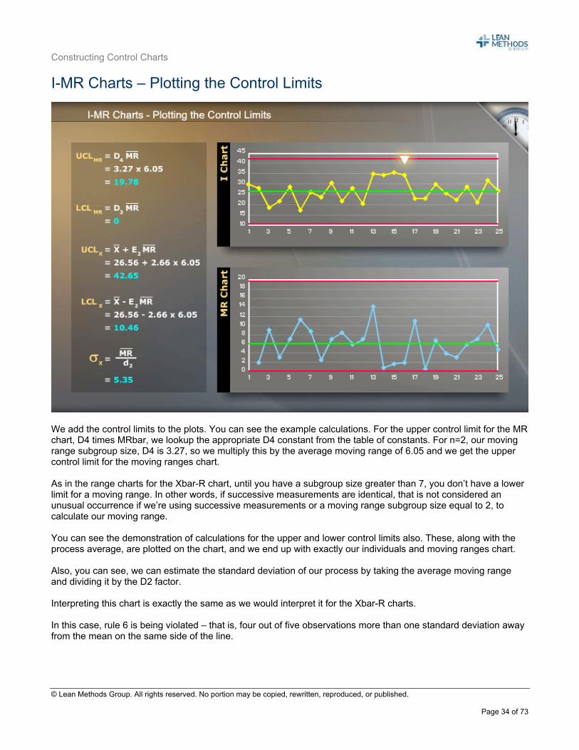
I-MR Charts – Plotting the Control Limits
We add the control limits to the plots. You can see the example calculations. For the upper control limit for the MR chart, D4 times MRbar, we lookup the appropriate D4 constant from the table of constants. For n=2, our moving range subgroup size, D4 is 3.27, so we multiply this by the average moving range of 6.05 and we get the upper control limit for the moving ranges chart. As in the range charts for the Xbar-R chart, until you have a subgroup size greater than 7, you don’t have a lower limit for a moving range. In other words, if successive measurements are identical, that is not considered an unusual occurrence if we’re using successive measurements or a moving range subgroup size equal to 2, to calculate our moving range. You can see the demonstration of calculations for the upper and lower control limits also. These, along with the process average, are plotted on the chart, and we end up with exactly our individuals and moving ranges chart. Also, you can see, we can estimate the standard deviation of our process by taking the average moving range and dividing it by the D2 factor. Interpreting this chart is exactly the same as we would interpret it for the Xbar-R charts. In this case, rule 6 is being violated – that is, four out of five observations more than one standard deviation away from the mean on the same side of the line.
Constructing Control Charts
© Lean Methods Group. All rights reserved. No portion may be copied, rewritten, reproduced, or published.
Page 35 of 73
Xbar – S Charts
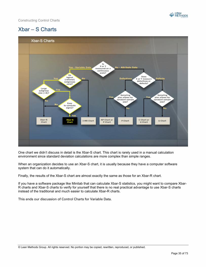
One chart we didn’t discuss in detail is the Xbar-S chart. This chart is rarely used in a manual calculation environment since standard deviation calculations are more complex than simple ranges. When an organization decides to use an Xbar-S chart, it is usually because they have a computer software system that can do it automatically. Finally, the results of the Xbar-S chart are almost exactly the same as those for an Xbar-R chart. If you have a software package like Minitab that can calculate Xbar-S statistics, you might want to compare Xbar-R charts and Xbar-S charts to verify for yourself that there is no real practical advantage to use Xbar-S charts instead of the traditional and much easier to calculate Xbar-R charts. This ends our discussion of Control Charts for Variable Data.
Constructing Control Charts
© Lean Methods Group. All rights reserved. No portion may be copied, rewritten, reproduced, or published.
Page 36 of 73
Section 4: P Charts Control Charts for Attribute Data
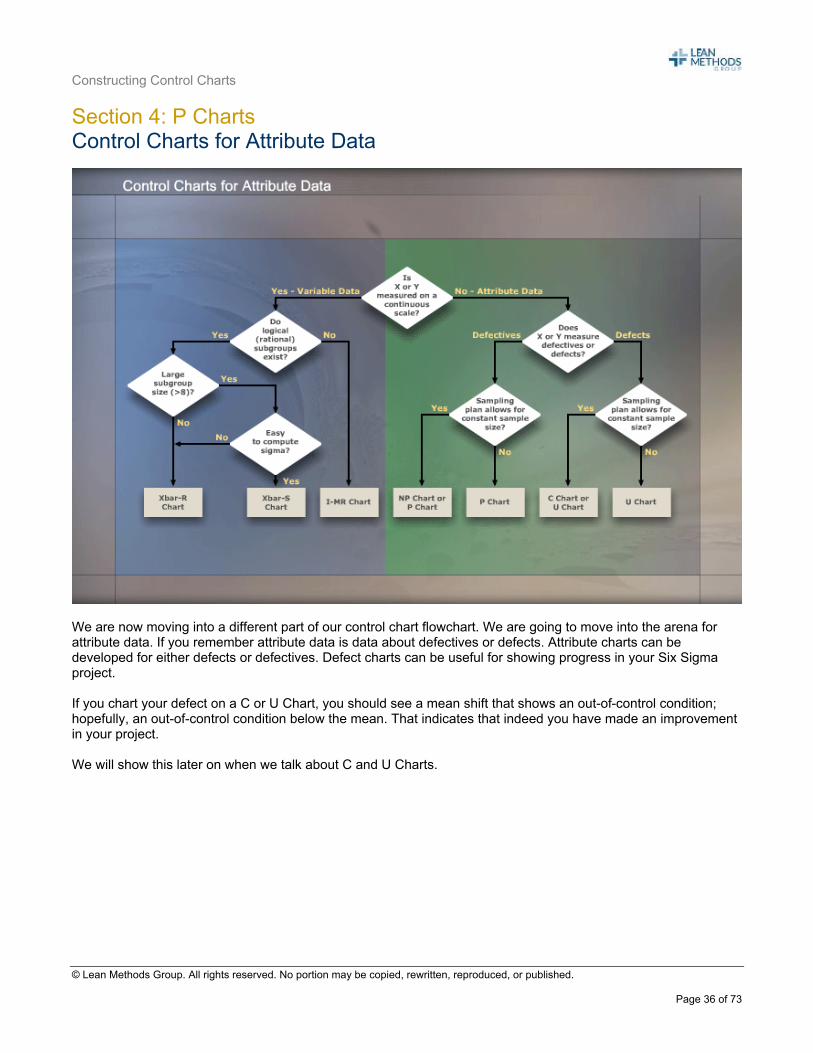
We are now moving into a different part of our control chart flowchart. We are going to move into the arena for attribute data. If you remember attribute data is data about defectives or defects. Attribute charts can be developed for either defects or defectives. Defect charts can be useful for showing progress in your Six Sigma project. If you chart your defect on a C or U Chart, you should see a mean shift that shows an out-of-control condition; hopefully, an out-of-control condition below the mean. That indicates that indeed you have made an improvement in your project. We will show this later on when we talk about C and U Charts.
Constructing Control Charts
© Lean Methods Group. All rights reserved. No portion may be copied, rewritten, reproduced, or published.
Page 37 of 73
Control Charts for Attribute Data (Continued)
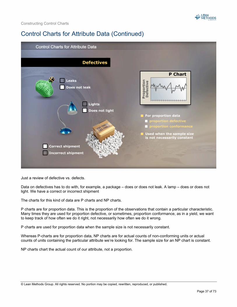
Just a review of defective vs. defects. Data on defectives has to do with, for example, a package – does or does not leak. A lamp – does or does not light. We have a correct or incorrect shipment The charts for this kind of data are P charts and NP charts. P charts are for proportion data. This is the proportion of the observations that contain a particular characteristic. Many times they are used for proportion defective, or sometimes, proportion conformance, as in a yield, we want to keep track of how often we do it right, not necessarily how often we do it wrong. P charts are used for proportion data when the sample size is not necessarily constant. Whereas P-charts are for proportion data, NP charts are for actual counts of non-conforming units or actual counts of units containing the particular attribute we’re looking for. The sample size for an NP chart is constant. NP charts chart the actual count of our attribute, not a proportion.
Constructing Control Charts
© Lean Methods Group. All rights reserved. No portion may be copied, rewritten, reproduced, or published.
Page 38 of 73
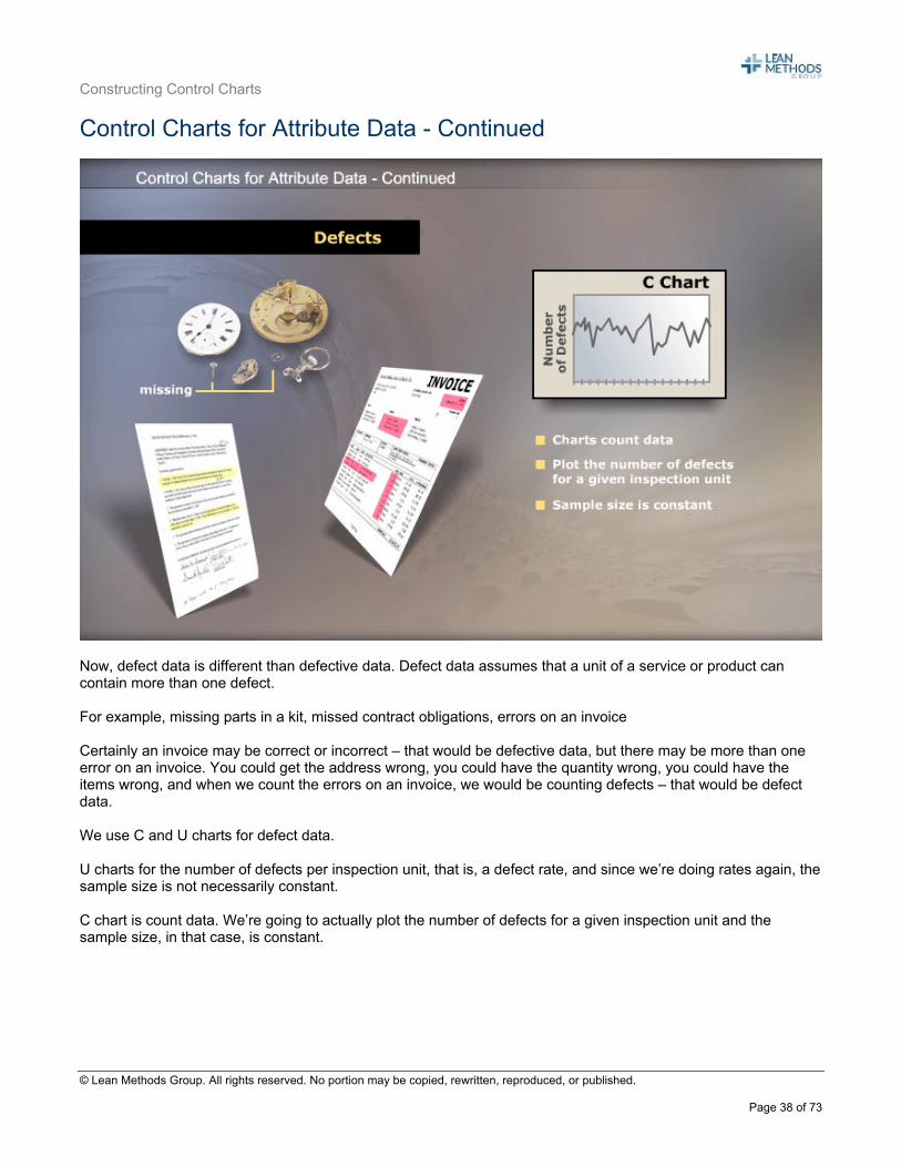
Control Charts for Attribute Data - Continued
Now, defect data is different than defective data. Defect data assumes that a unit of a service or product can contain more than one defect. For example, missing parts in a kit, missed contract obligations, errors on an invoice
Certainly an invoice may be correct or incorrect – that would be defective data, but there may be more than one error on an invoice. You could get the address wrong, you could have the quantity wrong, you could have the items wrong, and when we count the errors on an invoice, we would be counting defects – that would be defect data. We use C and U charts for defect data. U charts for the number of defects per inspection unit, that is, a defect rate, and since we’re doing rates again, the sample size is not necessarily constant. C chart is count data. We’re going to actually plot the number of defects for a given inspection unit and the sample size, in that case, is constant.
Constructing Control Charts
© Lean Methods Group. All rights reserved. No portion may be copied, rewritten, reproduced, or published.
Page 39 of 73
SPC Charts for All Occasions – P Charts
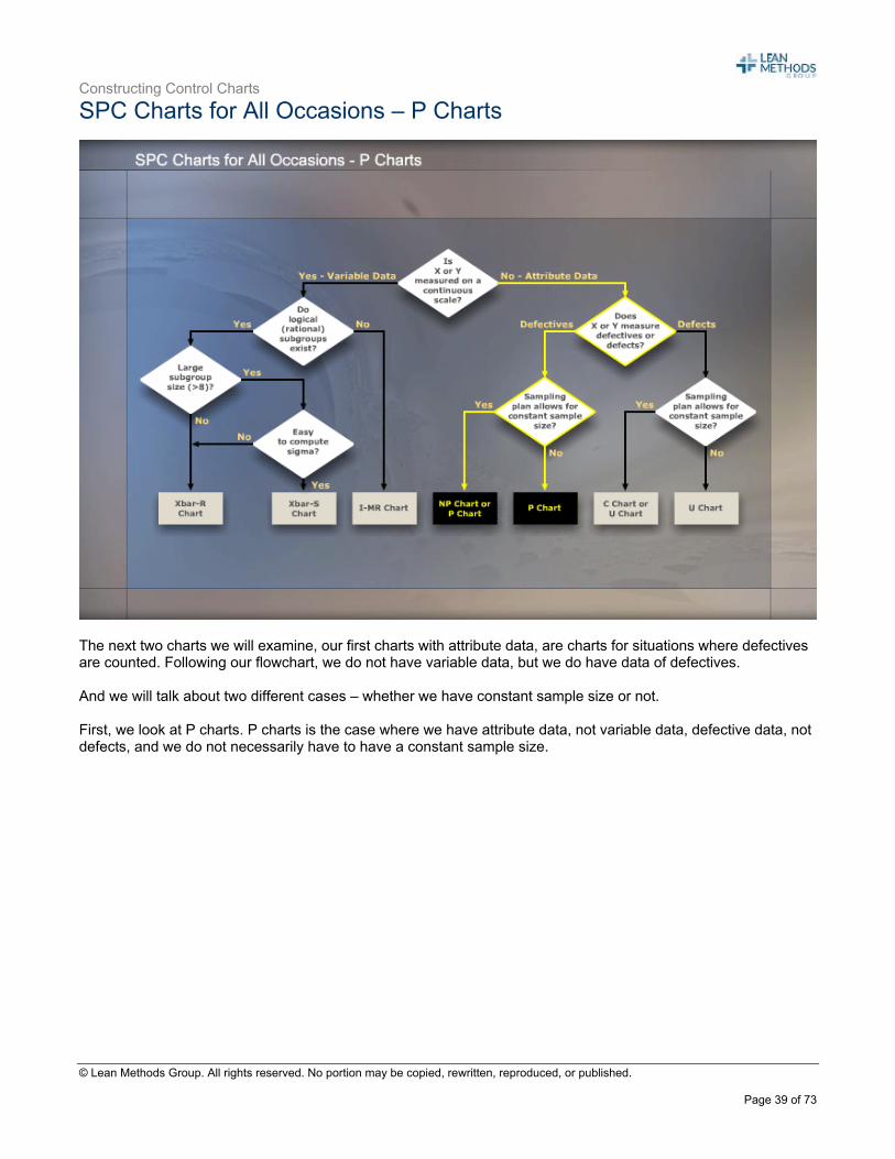
The next two charts we will examine, our first charts with attribute data, are charts for situations where defectives are counted. Following our flowchart, we do not have variable data, but we do have data of defectives. And we will talk about two different cases – whether we have constant sample size or not. First, we look at P charts. P charts is the case where we have attribute data, not variable data, defective data, not defects, and we do not necessarily have to have a constant sample size.
Constructing Control Charts
© Lean Methods Group. All rights reserved. No portion may be copied, rewritten, reproduced, or published.
Page 40 of 73
P Charts – Charts for Proportion Nonconforming
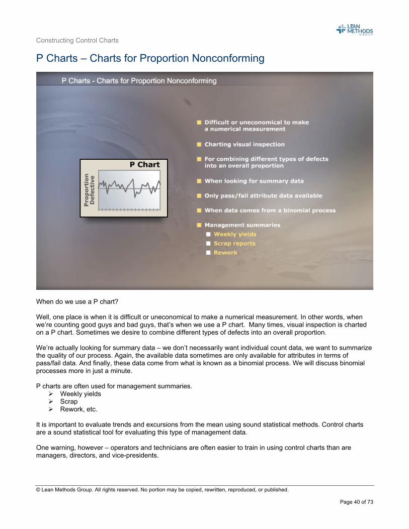
When do we use a P chart? Well, one place is when it is difficult or uneconomical to make a numerical measurement. In other words, when we’re counting good guys and bad guys, that’s when we use a P chart. Many times, visual inspection is charted on a P chart. Sometimes we desire to combine different types of defects into an overall proportion. We’re actually looking for summary data – we don’t necessarily want individual count data, we want to summarize the quality of our process. Again, the available data sometimes are only available for attributes in terms of pass/fail data. And finally, these data come from what is known as a binomial process. We will discuss binomial processes more in just a minute. P charts are often used for management summaries.
Weekly yields Scrap Rework, etc.
It is important to evaluate trends and excursions from the mean using sound statistical methods. Control charts are a sound statistical tool for evaluating this type of management data. One warning, however – operators and technicians are often easier to train in using control charts than are managers, directors, and vice-presidents.
Constructing Control Charts
© Lean Methods Group. All rights reserved. No portion may be copied, rewritten, reproduced, or published.
Page 41 of 73
Gathering P Chart Data
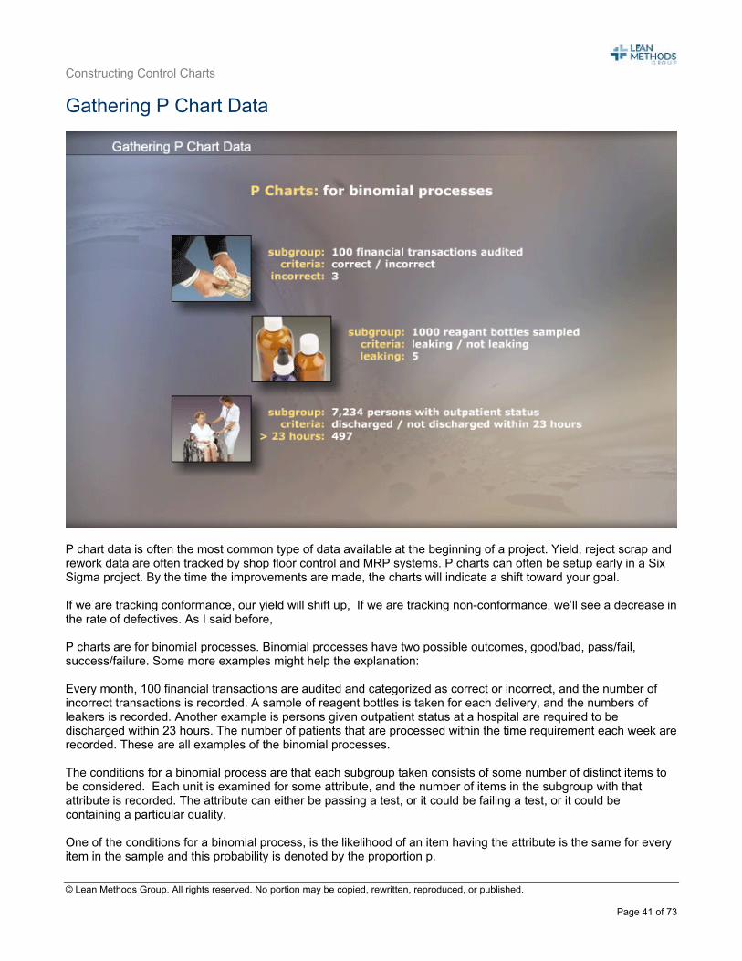
P chart data is often the most common type of data available at the beginning of a project. Yield, reject scrap and rework data are often tracked by shop floor control and MRP systems. P charts can often be setup early in a Six Sigma project. By the time the improvements are made, the charts will indicate a shift toward your goal. If we are tracking conformance, our yield will shift up, If we are tracking non-conformance, we’ll see a decrease in the rate of defectives. As I said before, P charts are for binomial processes. Binomial processes have two possible outcomes, good/bad, pass/fail, success/failure. Some more examples might help the explanation: Every month, 100 financial transactions are audited and categorized as correct or incorrect, and the number of incorrect transactions is recorded. A sample of reagent bottles is taken for each delivery, and the numbers of leakers is recorded. Another example is persons given outpatient status at a hospital are required to be discharged within 23 hours. The number of patients that are processed within the time requirement each week are recorded. These are all examples of the binomial processes. The conditions for a binomial process are that each subgroup taken consists of some number of distinct items to be considered. Each unit is examined for some attribute, and the number of items in the subgroup with that attribute is recorded. The attribute can either be passing a test, or it could be failing a test, or it could be containing a particular quality. One of the conditions for a binomial process, is the likelihood of an item having the attribute is the same for every item in the sample and this probability is denoted by the proportion p.
Constructing Control Charts
© Lean Methods Group. All rights reserved. No portion may be copied, rewritten, reproduced, or published.
Page 42 of 73
Finally, we have the independence assumption – that any unit, whether it has or does not have the particular attribute we’re looking for, is independent of whether or not any other item contains the attribute.
Constructing Control Charts
© Lean Methods Group. All rights reserved. No portion may be copied, rewritten, reproduced, or published.
Page 43 of 73
Subgroup Size for P Charts
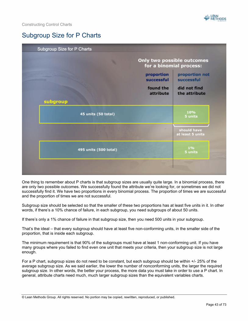
One thing to remember about P charts is that subgroup sizes are usually quite large. In a binomial process, there are only two possible outcomes. We successfully found the attribute we’re looking for, or sometimes we did not successfully find it. We have two proportions in every binomial process. The proportion of times we are successful and the proportion of times we are not successful. Subgroup size should be selected so that the smaller of these two proportions has at least five units in it. In other words, if there’s a 10% chance of failure, in each subgroup, you need subgroups of about 50 units. If there’s only a 1% chance of failure in that subgroup size, then you need 500 units in your subgroup. That’s the ideal – that every subgroup should have at least five non-conforming units, in the smaller side of the proportion, that is inside each subgroup. The minimum requirement is that 90% of the subgroups must have at least 1 non-conforming unit. If you have many groups where you failed to find even one unit that meets your criteria, then your subgroup size is not large enough. For a P chart, subgroup sizes do not need to be constant, but each subgroup should be within +/- 25% of the average subgroup size. As we said earlier, the lower the number of nonconforming units, the larger the required subgroup size. In other words, the better your process, the more data you must take in order to use a P chart. In general, attribute charts need much, much larger subgroup sizes than the equivalent variables charts.
Constructing Control Charts
© Lean Methods Group. All rights reserved. No portion may be copied, rewritten, reproduced, or published.
Page 44 of 73
Sample Frequency for P Charts
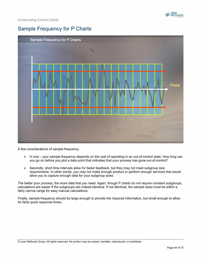
A few considerations of sample frequency:
In one – your sample frequency depends on the cost of operating in an out-of-control state. How long can you go on before you plot a data point that indicates that your process has gone out-of-control?
Secondly, short time intervals allow for faster feedback, but they may not meet subgroup size
requirements. In other words, you may not make enough product or perform enough services that would allow you to capture enough data for your subgroup sizes.
The better your process, the more data that you need. Again, though P charts do not require constant subgroups, calculations are easier if the subgroups are indeed identical. If not identical, the sample sizes must be within a fairly narrow range for easy manual calculations. Finally, sample frequency should be large enough to provide the required information, but small enough to allow for fairly quick response times.
Constructing Control Charts
© Lean Methods Group. All rights reserved. No portion may be copied, rewritten, reproduced, or published.
Page 45 of 73
Calculating Control Limits for P Charts
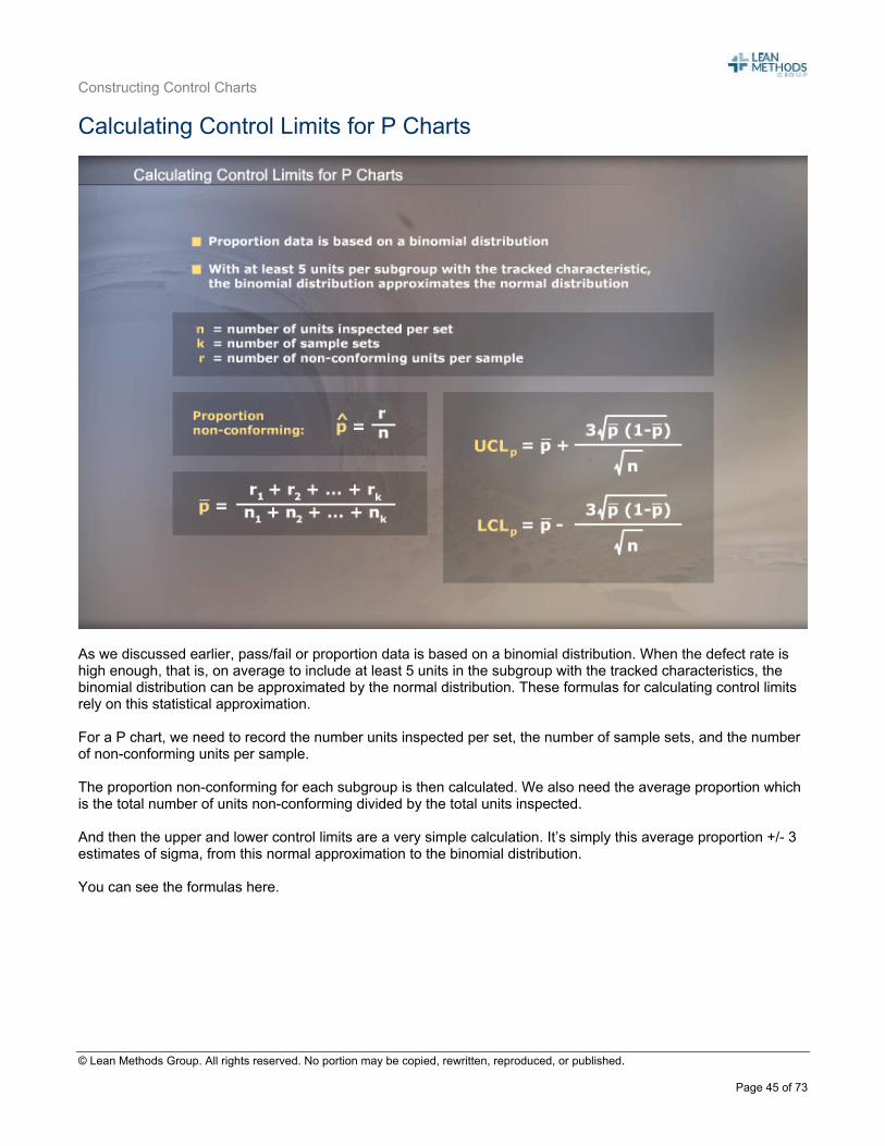
As we discussed earlier, pass/fail or proportion data is based on a binomial distribution. When the defect rate is high enough, that is, on average to include at least 5 units in the subgroup with the tracked characteristics, the binomial distribution can be approximated by the normal distribution. These formulas for calculating control limits rely on this statistical approximation. For a P chart, we need to record the number units inspected per set, the number of sample sets, and the number of non-conforming units per sample. The proportion non-conforming for each subgroup is then calculated. We also need the average proportion which is the total number of units non-conforming divided by the total units inspected. And then the upper and lower control limits are a very simple calculation. It’s simply this average proportion +/- 3 estimates of sigma, from this normal approximation to the binomial distribution. You can see the formulas here.
Constructing Control Charts
© Lean Methods Group. All rights reserved. No portion may be copied, rewritten, reproduced, or published.
Page 46 of 73
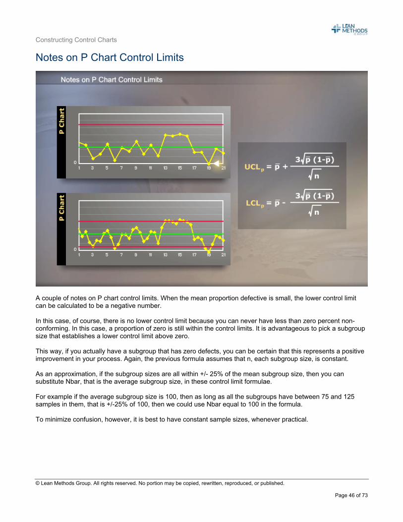
Notes on P Chart Control Limits
A couple of notes on P chart control limits. When the mean proportion defective is small, the lower control limit can be calculated to be a negative number. In this case, of course, there is no lower control limit because you can never have less than zero percent non-conforming. In this case, a proportion of zero is still within the control limits. It is advantageous to pick a subgroup size that establishes a lower control limit above zero. This way, if you actually have a subgroup that has zero defects, you can be certain that this represents a positive improvement in your process. Again, the previous formula assumes that n, each subgroup size, is constant. As an approximation, if the subgroup sizes are all within +/- 25% of the mean subgroup size, then you can substitute Nbar, that is the average subgroup size, in these control limit formulae. For example if the average subgroup size is 100, then as long as all the subgroups have between 75 and 125 samples in them, that is +/-25% of 100, then we could use Nbar equal to 100 in the formula. To minimize confusion, however, it is best to have constant sample sizes, whenever practical.
Constructing Control Charts
© Lean Methods Group. All rights reserved. No portion may be copied, rewritten, reproduced, or published.
Page 47 of 73
P Chart Example
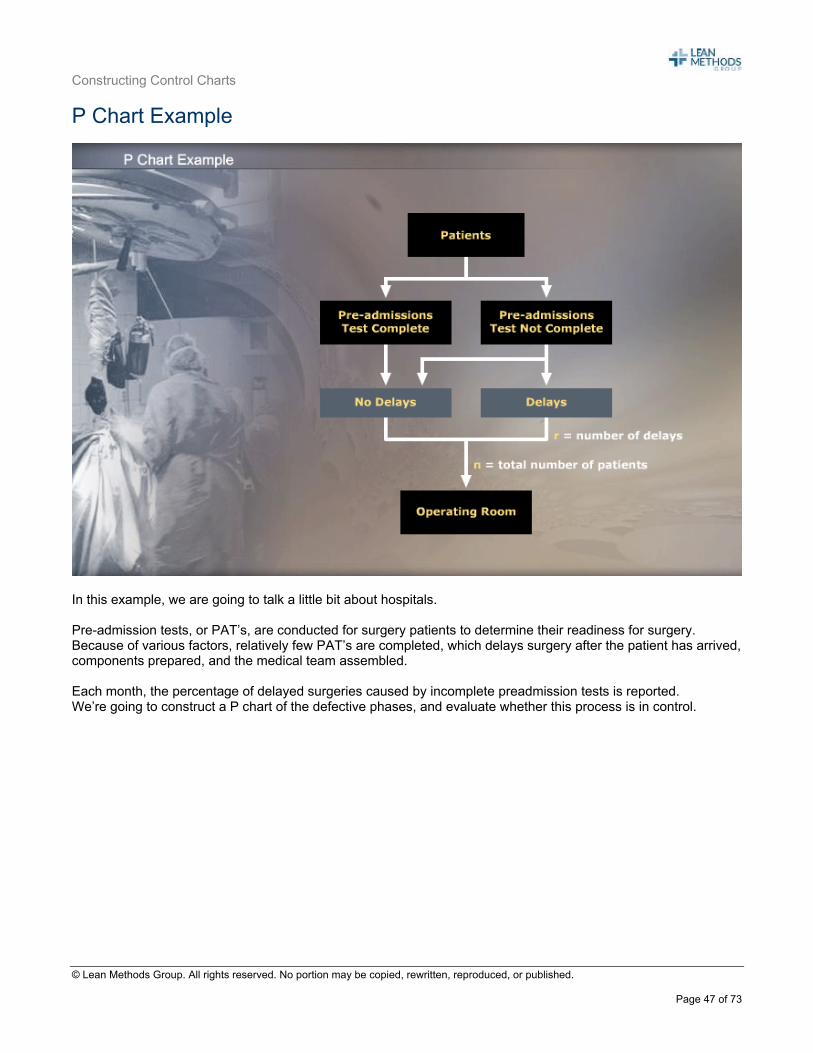
In this example, we are going to talk a little bit about hospitals. Pre-admission tests, or PAT’s, are conducted for surgery patients to determine their readiness for surgery. Because of various factors, relatively few PAT’s are completed, which delays surgery after the patient has arrived, components prepared, and the medical team assembled. Each month, the percentage of delayed surgeries caused by incomplete preadmission tests is reported. We’re going to construct a P chart of the defective phases, and evaluate whether this process is in control.
Constructing Control Charts
© Lean Methods Group. All rights reserved. No portion may be copied, rewritten, reproduced, or published.
Page 48 of 73
P Chart Calculations
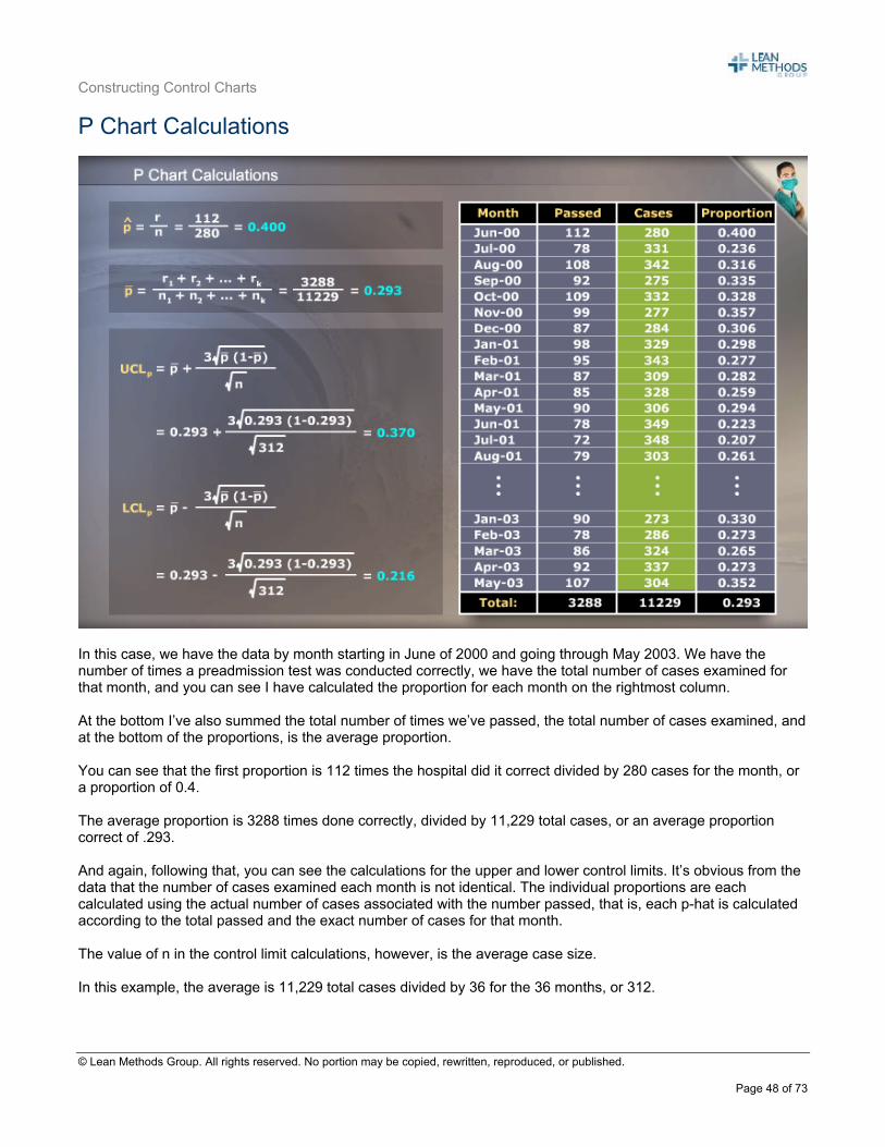
In this case, we have the data by month starting in June of 2000 and going through May 2003. We have the number of times a preadmission test was conducted correctly, we have the total number of cases examined for that month, and you can see I have calculated the proportion for each month on the rightmost column. At the bottom I’ve also summed the total number of times we’ve passed, the total number of cases examined, and at the bottom of the proportions, is the average proportion. You can see that the first proportion is 112 times the hospital did it correct divided by 280 cases for the month, or a proportion of 0.4. The average proportion is 3288 times done correctly, divided by 11,229 total cases, or an average proportion correct of .293. And again, following that, you can see the calculations for the upper and lower control limits. It’s obvious from the data that the number of cases examined each month is not identical. The individual proportions are each calculated using the actual number of cases associated with the number passed, that is, each p-hat is calculated according to the total passed and the exact number of cases for that month. The value of n in the control limit calculations, however, is the average case size. In this example, the average is 11,229 total cases divided by 36 for the 36 months, or 312.
Constructing Control Charts
© Lean Methods Group. All rights reserved. No portion may be copied, rewritten, reproduced, or published.
Page 49 of 73
P Charts – Plotting the Proportions and Control Limits
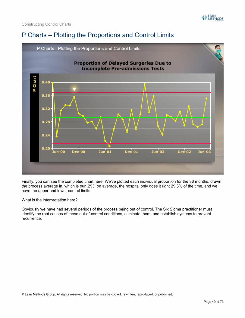
Finally, you can see the completed chart here. We’ve plotted each individual proportion for the 36 months, drawn the process average in, which is our .293, on average, the hospital only does it right 29.3% of the time, and we have the upper and lower control limits. What is the interpretation here? Obviously we have had several periods of the process being out of control. The Six Sigma practitioner must identify the root causes of these out-of-control conditions, eliminate them, and establish systems to prevent recurrence.
Constructing Control Charts
© Lean Methods Group. All rights reserved. No portion may be copied, rewritten, reproduced, or published.
Page 50 of 73
Attribute Charts – Subgroup Size
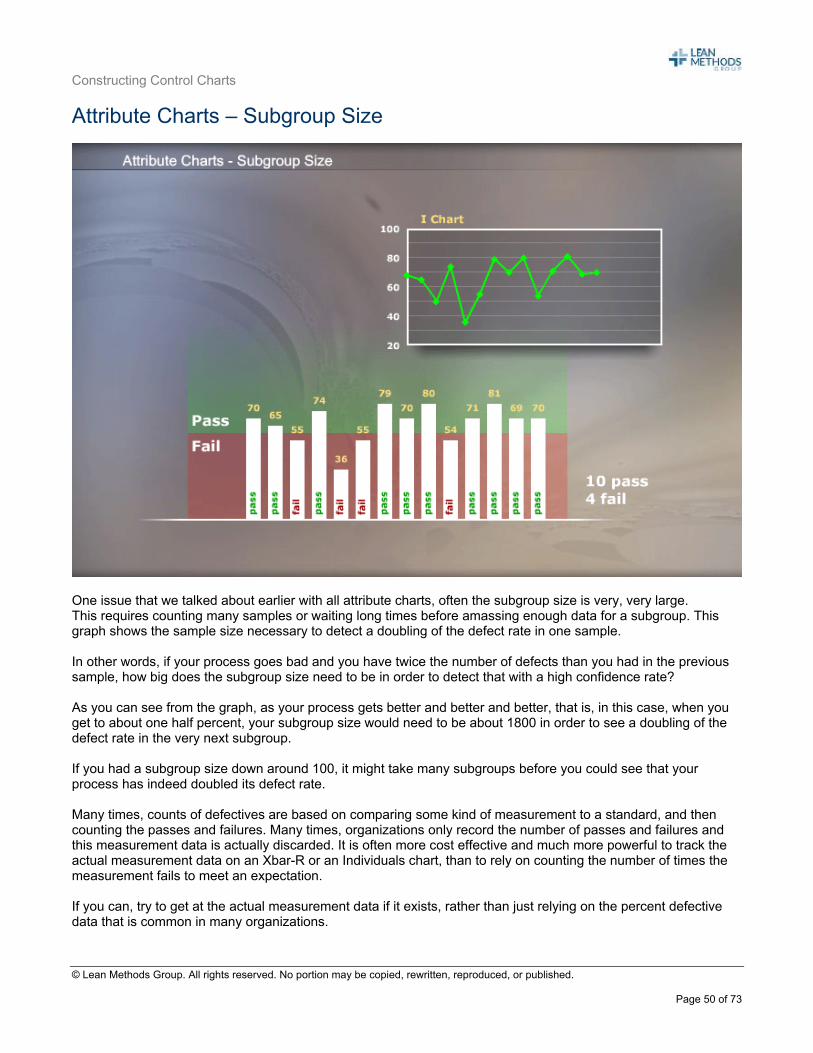
One issue that we talked about earlier with all attribute charts, often the subgroup size is very, very large. This requires counting many samples or waiting long times before amassing enough data for a subgroup. This graph shows the sample size necessary to detect a doubling of the defect rate in one sample. In other words, if your process goes bad and you have twice the number of defects than you had in the previous sample, how big does the subgroup size need to be in order to detect that with a high confidence rate? As you can see from the graph, as your process gets better and better and better, that is, in this case, when you get to about one half percent, your subgroup size would need to be about 1800 in order to see a doubling of the defect rate in the very next subgroup. If you had a subgroup size down around 100, it might take many subgroups before you could see that your process has indeed doubled its defect rate. Many times, counts of defectives are based on comparing some kind of measurement to a standard, and then counting the passes and failures. Many times, organizations only record the number of passes and failures and this measurement data is actually discarded. It is often more cost effective and much more powerful to track the actual measurement data on an Xbar-R or an Individuals chart, than to rely on counting the number of times the measurement fails to meet an expectation. If you can, try to get at the actual measurement data if it exists, rather than just relying on the percent defective data that is common in many organizations.
Constructing Control Charts
© Lean Methods Group. All rights reserved. No portion may be copied, rewritten, reproduced, or published.
Page 51 of 73
Subgroup Size and Binomial Distributions
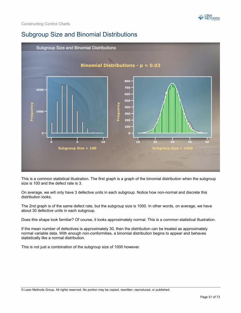
This is a common statistical illustration. The first graph is a graph of the binomial distribution when the subgroup size is 100 and the defect rate is 3. On average, we will only have 3 defective units in each subgroup. Notice how non-normal and discrete this distribution looks. The 2nd graph is of the same defect rate, but the subgroup size is 1000. In other words, on average, we have about 30 defective units in each subgroup. Does this shape look familiar? Of course, it looks approximately normal. This is a common statistical illustration. If the mean number of defectives is approximately 30, then the distribution can be treated as approximately normal variable data. With enough non-conformities, a binomial distribution begins to appear and behaves statistically like a normal distribution. This is not just a combination of the subgroup size of 1000 however.
Constructing Control Charts
© Lean Methods Group. All rights reserved. No portion may be copied, rewritten, reproduced, or published.
Page 52 of 73
More on Subgroup Sizes
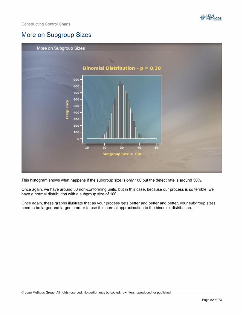
This histogram shows what happens if the subgroup size is only 100 but the defect rate is around 30%. Once again, we have around 30 non-conforming units, but in this case, because our process is so terrible, we have a normal distribution with a subgroup size of 100. Once again, these graphs illustrate that as your process gets better and better and better, your subgroup sizes need to be larger and larger in order to use this normal approximation to the binomial distribution.
Constructing Control Charts
© Lean Methods Group. All rights reserved. No portion may be copied, rewritten, reproduced, or published.
Page 53 of 73
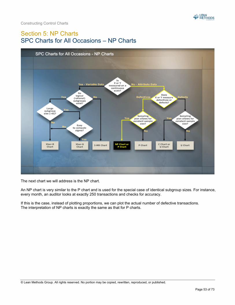
Section 5: NP Charts SPC Charts for All Occasions – NP Charts
The next chart we will address is the NP chart. An NP chart is very similar to the P chart and is used for the special case of identical subgroup sizes. For instance, every month, an auditor looks at exactly 250 transactions and checks for accuracy. If this is the case, instead of plotting proportions, we can plot the actual number of defective transactions. The interpretation of NP charts is exactly the same as that for P charts.
Constructing Control Charts
© Lean Methods Group. All rights reserved. No portion may be copied, rewritten, reproduced, or published.
Page 54 of 73
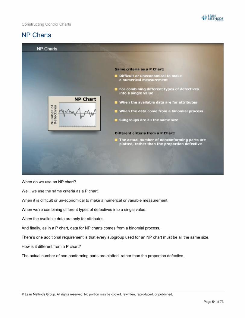
NP Charts
When do we use an NP chart? Well, we use the same criteria as a P chart. When it is difficult or un-economical to make a numerical or variable measurement. When we’re combining different types of defectives into a single value. When the available data are only for attributes. And finally, as in a P chart, data for NP charts comes from a binomial process. There’s one additional requirement is that every subgroup used for an NP chart must be all the same size. How is it different from a P chart? The actual number of non-conforming parts are plotted, rather than the proportion defective.
Constructing Control Charts
© Lean Methods Group. All rights reserved. No portion may be copied, rewritten, reproduced, or published.
Page 55 of 73
Calculating Control Limits for NP Charts
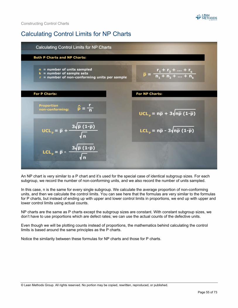
An NP chart is very similar to a P chart and it’s used for the special case of identical subgroup sizes. For each subgroup, we record the number of non-conforming units, and we also record the number of units sampled. In this case, n is the same for every single subgroup. We calculate the average proportion of non-conforming units, and then we calculate the control limits. You can see here that the formulas are very similar to the formulas for P charts, but instead of ending up with upper and lower control limits in proportions, we end up with upper and lower control limits using actual counts. NP charts are the same as P charts except the subgroup sizes are constant. With constant subgroup sizes, we don’t have to use proportions which are defect rates; we can use the actual counts of the defective units. Even though we will be plotting counts instead of proportions, the mathematics behind calculating the control limits is based around the same principles as the P charts. Notice the similarity between these formulas for NP charts and those for P charts.
Constructing Control Charts
© Lean Methods Group. All rights reserved. No portion may be copied, rewritten, reproduced, or published.
Page 56 of 73
NP Chart Example
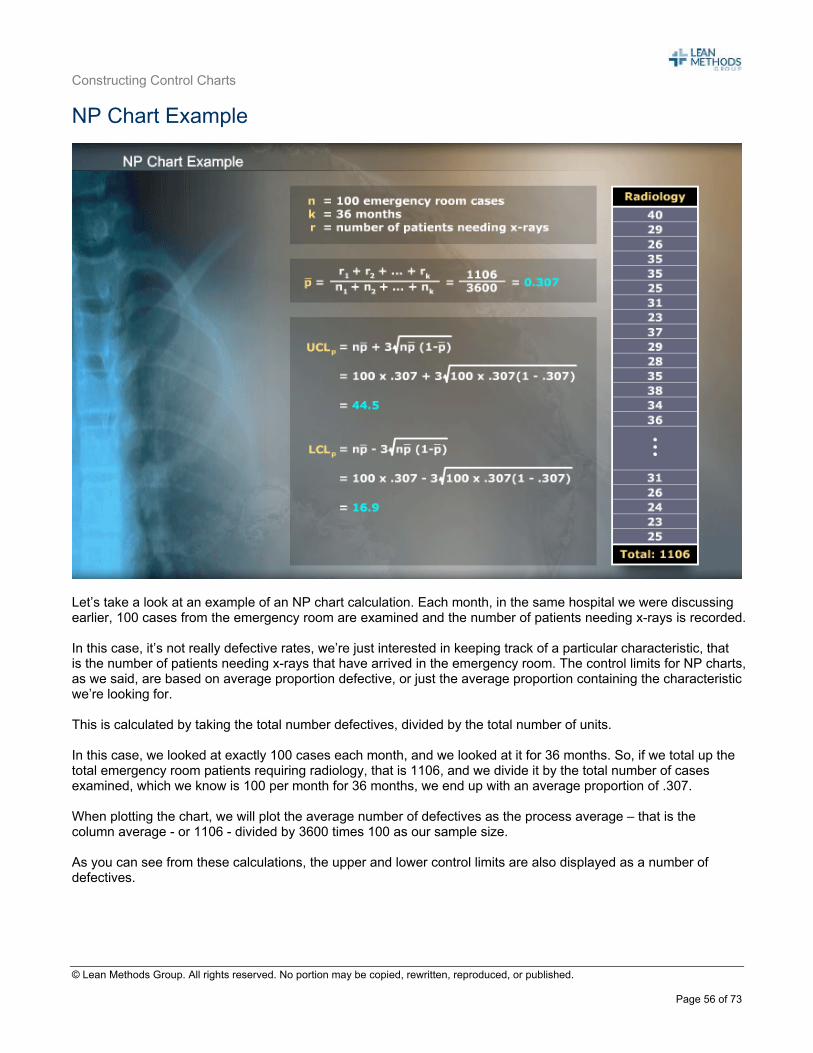
Let’s take a look at an example of an NP chart calculation. Each month, in the same hospital we were discussing earlier, 100 cases from the emergency room are examined and the number of patients needing x-rays is recorded. In this case, it’s not really defective rates, we’re just interested in keeping track of a particular characteristic, that is the number of patients needing x-rays that have arrived in the emergency room. The control limits for NP charts, as we said, are based on average proportion defective, or just the average proportion containing the characteristic we’re looking for. This is calculated by taking the total number defectives, divided by the total number of units. In this case, we looked at exactly 100 cases each month, and we looked at it for 36 months. So, if we total up the total emergency room patients requiring radiology, that is 1106, and we divide it by the total number of cases examined, which we know is 100 per month for 36 months, we end up with an average proportion of .307. When plotting the chart, we will plot the average number of defectives as the process average – that is the column average - or 1106 - divided by 3600 times 100 as our sample size. As you can see from these calculations, the upper and lower control limits are also displayed as a number of defectives.
Constructing Control Charts
© Lean Methods Group. All rights reserved. No portion may be copied, rewritten, reproduced, or published.
Page 57 of 73
NP Charts – Plotting the Results
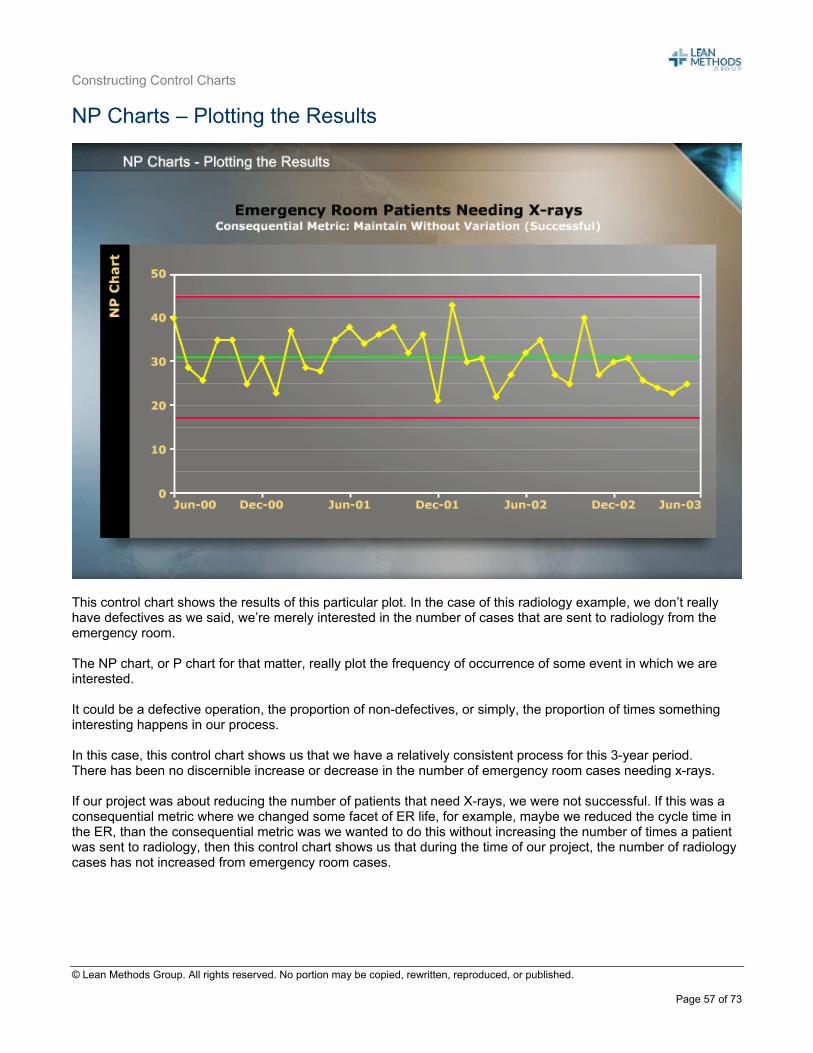
This control chart shows the results of this particular plot. In the case of this radiology example, we don’t really have defectives as we said, we’re merely interested in the number of cases that are sent to radiology from the emergency room. The NP chart, or P chart for that matter, really plot the frequency of occurrence of some event in which we are interested. It could be a defective operation, the proportion of non-defectives, or simply, the proportion of times something interesting happens in our process. In this case, this control chart shows us that we have a relatively consistent process for this 3-year period. There has been no discernible increase or decrease in the number of emergency room cases needing x-rays. If our project was about reducing the number of patients that need X-rays, we were not successful. If this was a consequential metric where we changed some facet of ER life, for example, maybe we reduced the cycle time in the ER, than the consequential metric was we wanted to do this without increasing the number of times a patient was sent to radiology, then this control chart shows us that during the time of our project, the number of radiology cases has not increased from emergency room cases.
Constructing Control Charts
© Lean Methods Group. All rights reserved. No portion may be copied, rewritten, reproduced, or published.
Page 58 of 73
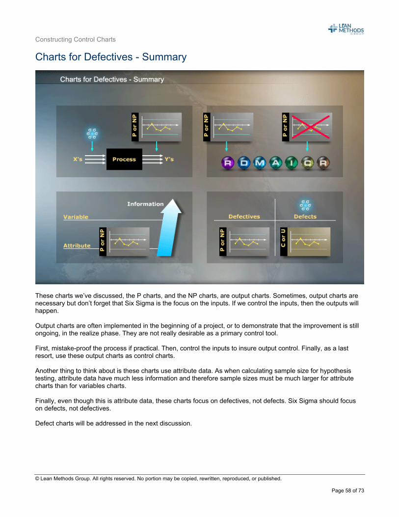
Charts for Defectives - Summary
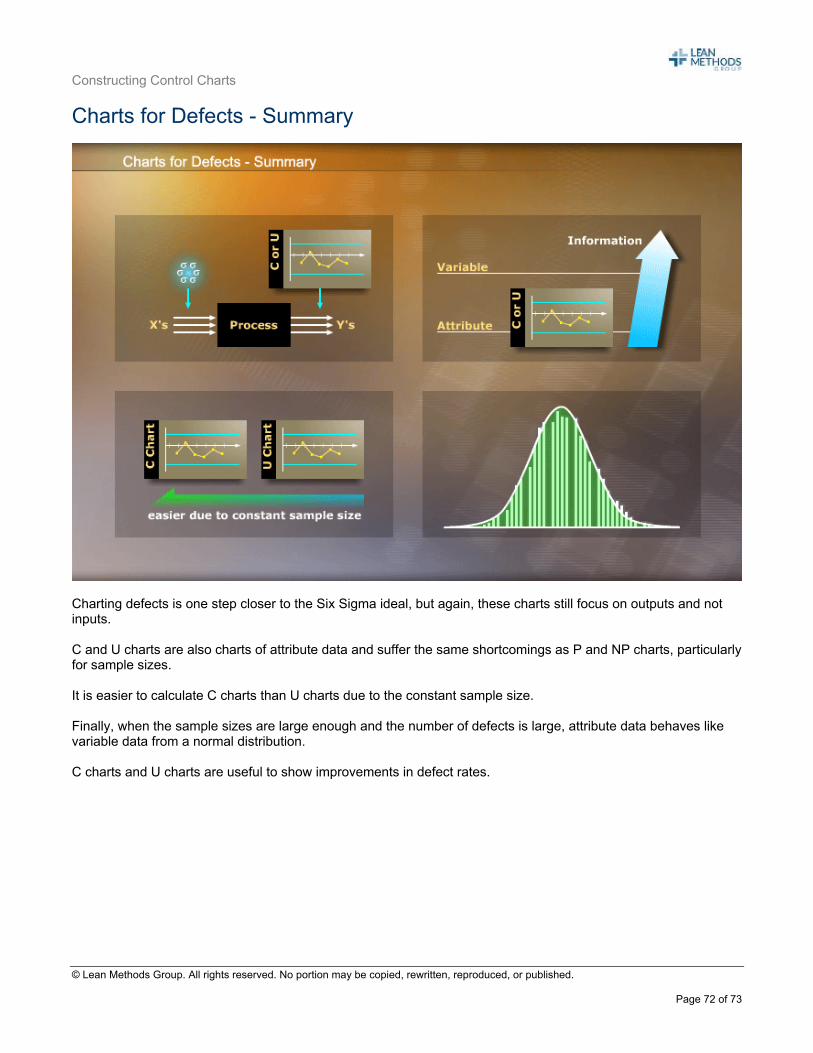
These charts we’ve discussed, the P charts, and the NP charts, are output charts. Sometimes, output charts are necessary but don’t forget that Six Sigma is the focus on the inputs. If we control the inputs, then the outputs will happen. Output charts are often implemented in the beginning of a project, or to demonstrate that the improvement is still ongoing, in the realize phase. They are not really desirable as a primary control tool. First, mistake-proof the process if practical. Then, control the inputs to insure output control. Finally, as a last resort, use these output charts as control charts. Another thing to think about is these charts use attribute data. As when calculating sample size for hypothesis testing, attribute data have much less information and therefore sample sizes must be much larger for attribute charts than for variables charts. Finally, even though this is attribute data, these charts focus on defectives, not defects. Six Sigma should focus on defects, not defectives. Defect charts will be addressed in the next discussion.
Constructing Control Charts
© Lean Methods Group. All rights reserved. No portion may be copied, rewritten, reproduced, or published.
Page 59 of 73
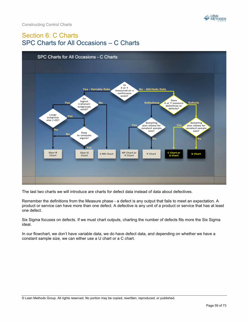
Section 6: C Charts SPC Charts for All Occasions – C Charts
The last two charts we will introduce are charts for defect data instead of data about defectives. Remember the definitions from the Measure phase - a defect is any output that fails to meet an expectation. A product or service can have more than one defect. A defective is any unit of a product or service that has at least one defect. Six Sigma focuses on defects. If we must chart outputs, charting the number of defects fits more the Six Sigma ideal. In our flowchart, we don’t have variable data, we do have defect data, and depending on whether we have a constant sample size, we can either use a U chart or a C chart.
Constructing Control Charts
© Lean Methods Group. All rights reserved. No portion may be copied, rewritten, reproduced, or published.
Page 60 of 73
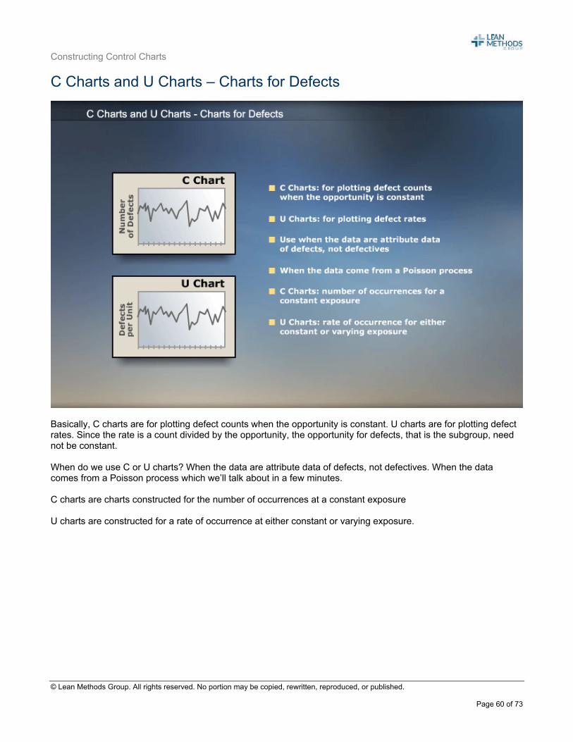
C Charts and U Charts – Charts for Defects
Basically, C charts are for plotting defect counts when the opportunity is constant. U charts are for plotting defect rates. Since the rate is a count divided by the opportunity, the opportunity for defects, that is the subgroup, need not be constant. When do we use C or U charts? When the data are attribute data of defects, not defectives. When the data comes from a Poisson process which we’ll talk about in a few minutes. C charts are charts constructed for the number of occurrences at a constant exposure U charts are constructed for a rate of occurrence at either constant or varying exposure.
Constructing Control Charts
© Lean Methods Group. All rights reserved. No portion may be copied, rewritten, reproduced, or published.
Page 61 of 73
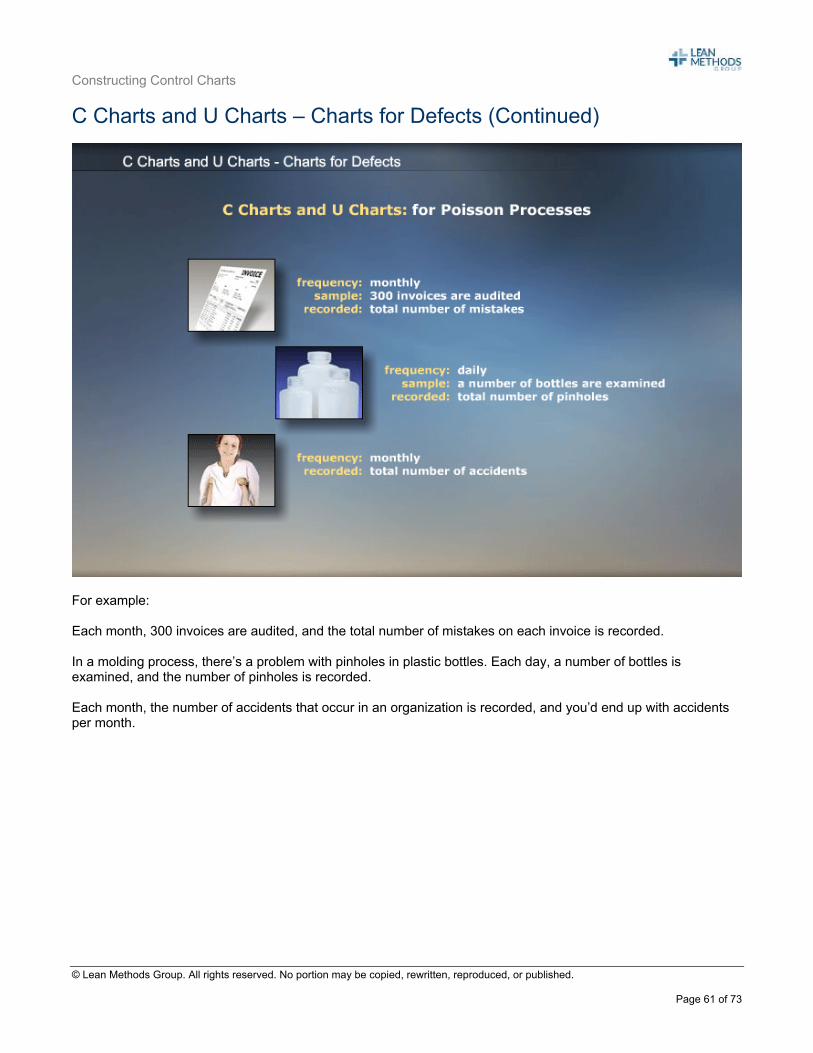
C Charts and U Charts – Charts for Defects (Continued)
For example: Each month, 300 invoices are audited, and the total number of mistakes on each invoice is recorded. In a molding process, there’s a problem with pinholes in plastic bottles. Each day, a number of bottles is examined, and the number of pinholes is recorded. Each month, the number of accidents that occur in an organization is recorded, and you’d end up with accidents per month.
Constructing Control Charts
© Lean Methods Group. All rights reserved. No portion may be copied, rewritten, reproduced, or published.
Page 62 of 73
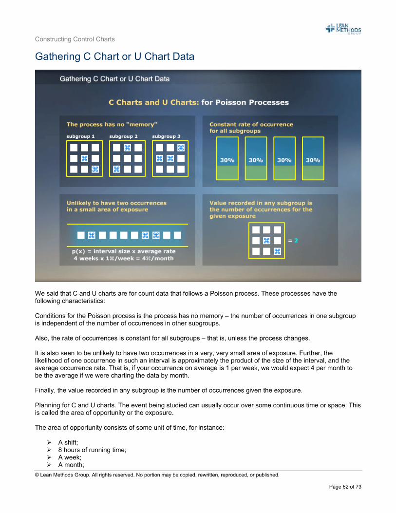
Gathering C Chart or U Chart Data
We said that C and U charts are for count data that follows a Poisson process. These processes have the following characteristics: Conditions for the Poisson process is the process has no memory – the number of occurrences in one subgroup is independent of the number of occurrences in other subgroups. Also, the rate of occurrences is constant for all subgroups – that is, unless the process changes. It is also seen to be unlikely to have two occurrences in a very, very small area of exposure. Further, the likelihood of one occurrence in such an interval is approximately the product of the size of the interval, and the average occurrence rate. That is, if your occurrence on average is 1 per week, we would expect 4 per month to be the average if we were charting the data by month. Finally, the value recorded in any subgroup is the number of occurrences given the exposure. Planning for C and U charts. The event being studied can usually occur over some continuous time or space. This is called the area of opportunity or the exposure. The area of opportunity consists of some unit of time, for instance:
A shift; 8 hours of running time; A week; A month;
Constructing Control Charts
© Lean Methods Group. All rights reserved. No portion may be copied, rewritten, reproduced, or published.
Page 63 of 73
Or an amount of material – for example the number of defects in two square feet of cloth Or a number of units – the number of defects in every 100 customer calls.
Constructing Control Charts
© Lean Methods Group. All rights reserved. No portion may be copied, rewritten, reproduced, or published.
Page 64 of 73
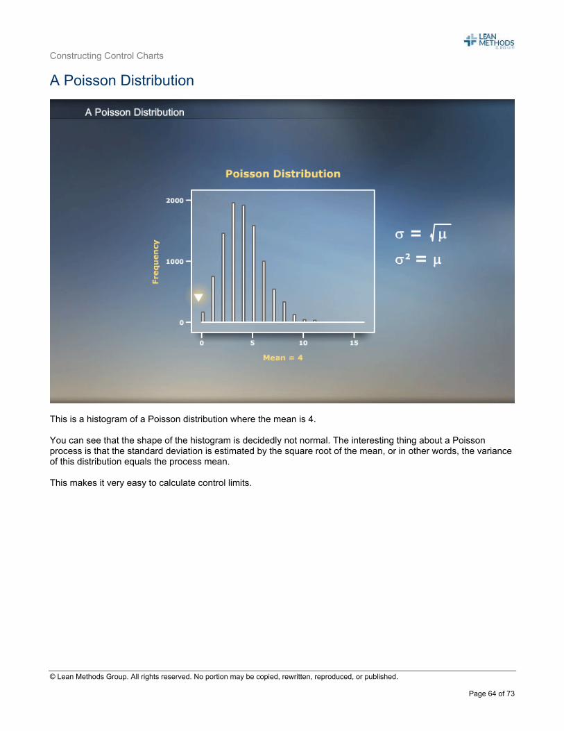
A Poisson Distribution
This is a histogram of a Poisson distribution where the mean is 4. You can see that the shape of the histogram is decidedly not normal. The interesting thing about a Poisson process is that the standard deviation is estimated by the square root of the mean, or in other words, the variance of this distribution equals the process mean. This makes it very easy to calculate control limits.
Constructing Control Charts
© Lean Methods Group. All rights reserved. No portion may be copied, rewritten, reproduced, or published.
Page 65 of 73
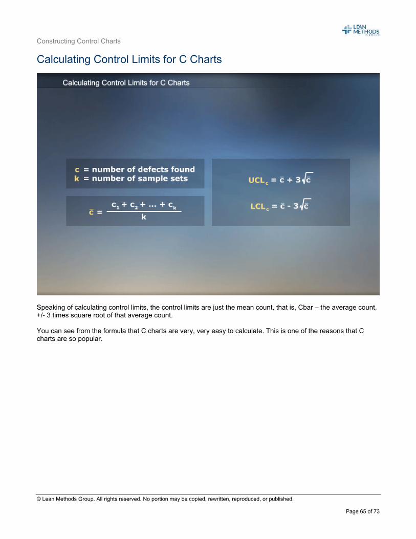
Calculating Control Limits for C Charts
Speaking of calculating control limits, the control limits are just the mean count, that is, Cbar – the average count, +/- 3 times square root of that average count. You can see from the formula that C charts are very, very easy to calculate. This is one of the reasons that C charts are so popular.
Constructing Control Charts
© Lean Methods Group. All rights reserved. No portion may be copied, rewritten, reproduced, or published.
Page 66 of 73
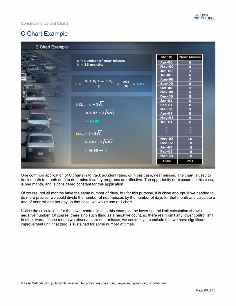
C Chart Example
One common application of C charts is to track accident rates, or in this case, near misses. The chart is used to track month to month data to determine if safety programs are effective. The opportunity or exposure in this case, is one month, and is considered constant for this application. Of course, not all months have the same number of days, but for this purpose, it is close enough. If we needed to be more precise, we could divide the number of near misses by the number of days for that month and calculate a rate of near misses per day, in that case, we would use a U chart. Notice the calculations for the lower control limit. In this example, the lower control limit calculation shows a negative number. Of course, there’s no such thing as a negative count, so there really isn’t any lower control limit. In other words, if one month we observe zero near misses, we couldn’t yet conclude that we have significant improvement until that zero is sustained for some number of times.
Constructing Control Charts
© Lean Methods Group. All rights reserved. No portion may be copied, rewritten, reproduced, or published.
Page 67 of 73
C Charts – Plotting the Results
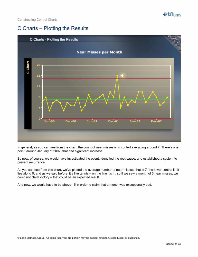
In general, as you can see from the chart, the count of near misses is in control averaging around 7. There’s one point, around January of 2002, that had significant increase. By now, of course, we would have investigated the event, identified the root cause, and established a system to prevent recurrence. As you can see from this chart, we’ve plotted the average number of near misses, that is 7, the lower control limit lies along 0, and as we said before, it’s like tennis – on the line it’s in, so if we saw a month of 0 near misses, we could not claim victory – that could be an expected result. And now, we would have to be above 15 in order to claim that a month was exceptionally bad.
Constructing Control Charts
© Lean Methods Group. All rights reserved. No portion may be copied, rewritten, reproduced, or published.
Page 68 of 73
Section 7: U Charts SPC Charts for All Occasions – U Charts
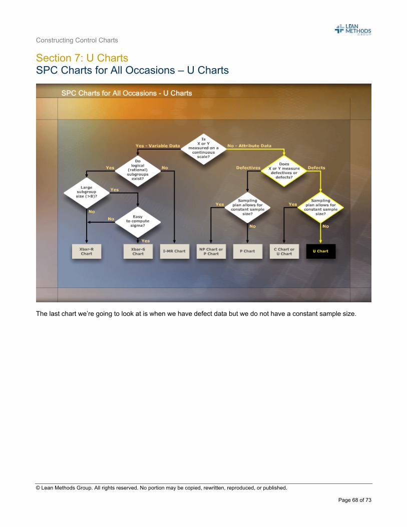
The last chart we’re going to look at is when we have defect data but we do not have a constant sample size.
Constructing Control Charts
© Lean Methods Group. All rights reserved. No portion may be copied, rewritten, reproduced, or published.
Page 69 of 73
Calculating the Control Limits for U Charts
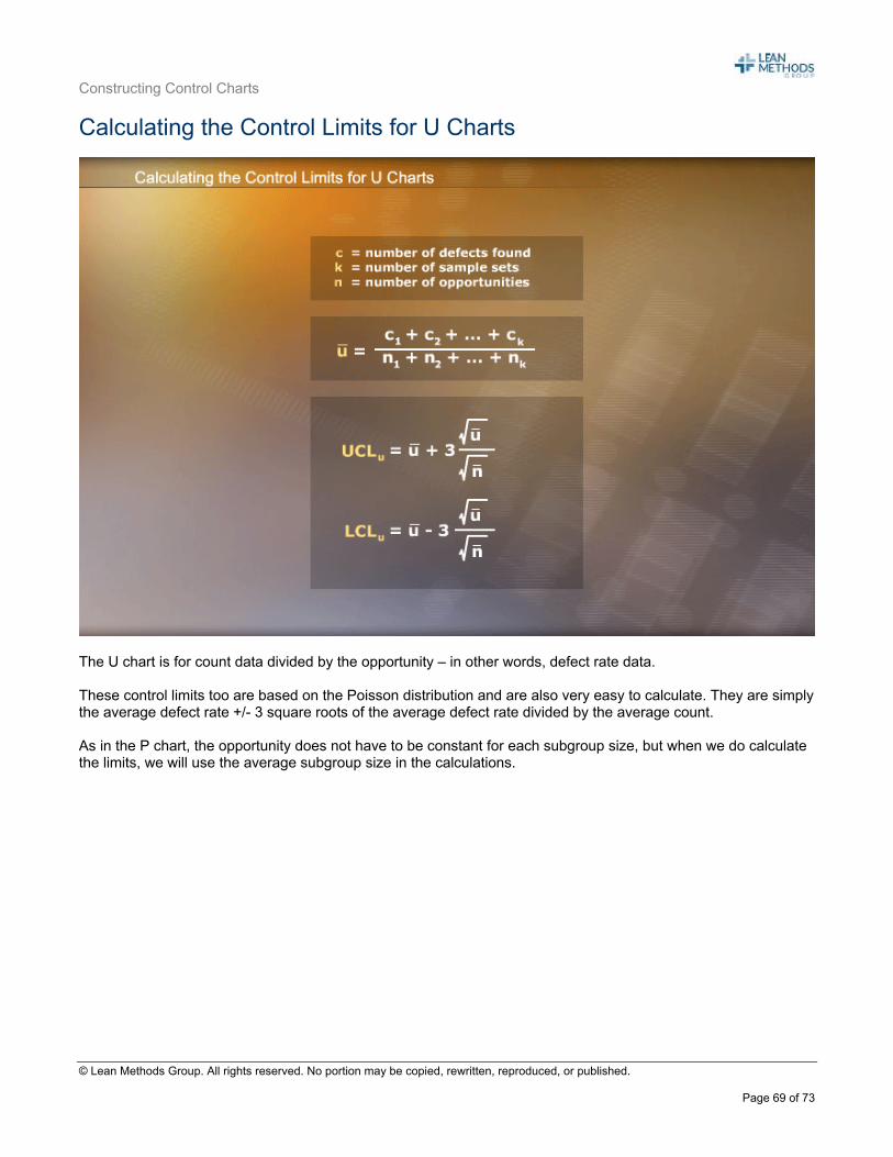
The U chart is for count data divided by the opportunity – in other words, defect rate data. These control limits too are based on the Poisson distribution and are also very easy to calculate. They are simply the average defect rate +/- 3 square roots of the average defect rate divided by the average count. As in the P chart, the opportunity does not have to be constant for each subgroup size, but when we do calculate the limits, we will use the average subgroup size in the calculations.
Constructing Control Charts
© Lean Methods Group. All rights reserved. No portion may be copied, rewritten, reproduced, or published.
Page 70 of 73
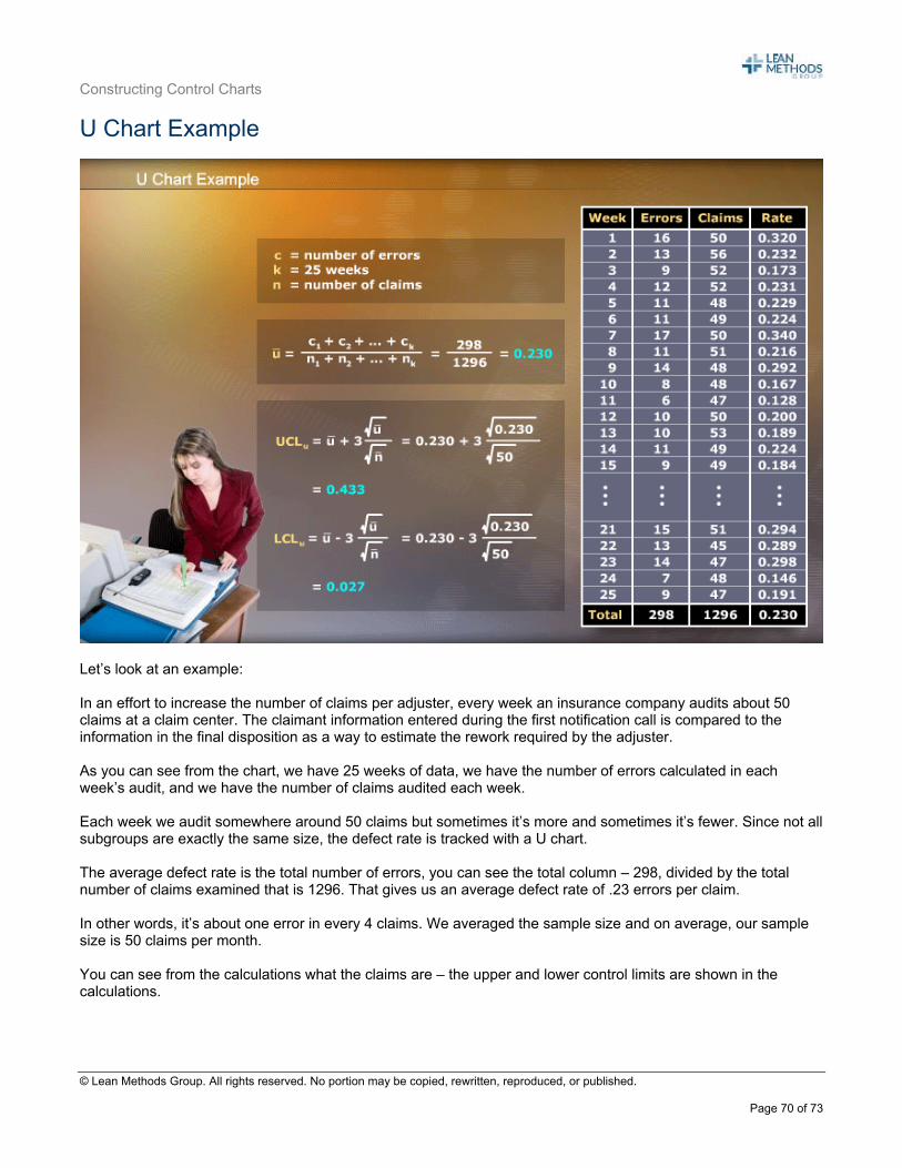
U Chart Example
Let’s look at an example: In an effort to increase the number of claims per adjuster, every week an insurance company audits about 50 claims at a claim center. The claimant information entered during the first notification call is compared to the information in the final disposition as a way to estimate the rework required by the adjuster. As you can see from the chart, we have 25 weeks of data, we have the number of errors calculated in each week’s audit, and we have the number of claims audited each week. Each week we audit somewhere around 50 claims but sometimes it’s more and sometimes it’s fewer. Since not all subgroups are exactly the same size, the defect rate is tracked with a U chart. The average defect rate is the total number of errors, you can see the total column – 298, divided by the total number of claims examined that is 1296. That gives us an average defect rate of .23 errors per claim. In other words, it’s about one error in every 4 claims. We averaged the sample size and on average, our sample size is 50 claims per month. You can see from the calculations what the claims are – the upper and lower control limits are shown in the calculations.
Constructing Control Charts
© Lean Methods Group. All rights reserved. No portion may be copied, rewritten, reproduced, or published.
Page 71 of 73
U Charts – Plotting the Results
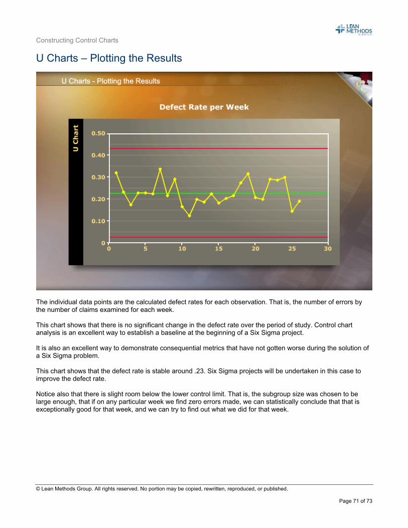
The individual data points are the calculated defect rates for each observation. That is, the number of errors by the number of claims examined for each week. This chart shows that there is no significant change in the defect rate over the period of study. Control chart analysis is an excellent way to establish a baseline at the beginning of a Six Sigma project. It is also an excellent way to demonstrate consequential metrics that have not gotten worse during the solution of a Six Sigma problem. This chart shows that the defect rate is stable around .23. Six Sigma projects will be undertaken in this case to improve the defect rate. Notice also that there is slight room below the lower control limit. That is, the subgroup size was chosen to be large enough, that if on any particular week we find zero errors made, we can statistically conclude that that is exceptionally good for that week, and we can try to find out what we did for that week.
Constructing Control Charts
© Lean Methods Group. All rights reserved. No portion may be copied, rewritten, reproduced, or published.
Page 72 of 73
Charts for Defects - Summary
Charting defects is one step closer to the Six Sigma ideal, but again, these charts still focus on outputs and not inputs. C and U charts are also charts of attribute data and suffer the same shortcomings as P and NP charts, particularly for sample sizes. It is easier to calculate C charts than U charts due to the constant sample size. Finally, when the sample sizes are large enough and the number of defects is large, attribute data behaves like variable data from a normal distribution. C charts and U charts are useful to show improvements in defect rates.

Constructing Control Charts
© Lean Methods Group. All rights reserved. No portion may be copied, rewritten, reproduced, or published.
Page 73 of 73
Module Review
In this module, we learned the basics of SPC and how to construct and interpret Xbar-R, and Individuals and Moving Range charts for variable data, which are used when you have processes with continuous measurements. For processes that use count data, we learned P and NP Charts for counting defectives, and U and C Charts for processes that count defect rates. Remember that the goal for any process is to run error-free or defect-free, but when you must control chart your performance, almost any process can be charted using one of these techniques.


![Control charts[1]](https://static.fdocuments.in/doc/165x107/559b746a1a28ab744f8b4634/control-charts1-559c077e1e7b6.jpg)