Company Logo Research
6
Company Logo Research ROBYN LANPHIER AND CRAIG NOUREYA
-
Upload
robynlanphier -
Category
Entertainment & Humor
-
view
47 -
download
0
Transcript of Company Logo Research
Company Logo ResearchROBYN LANPHIER AND CRAIG NOUREYA
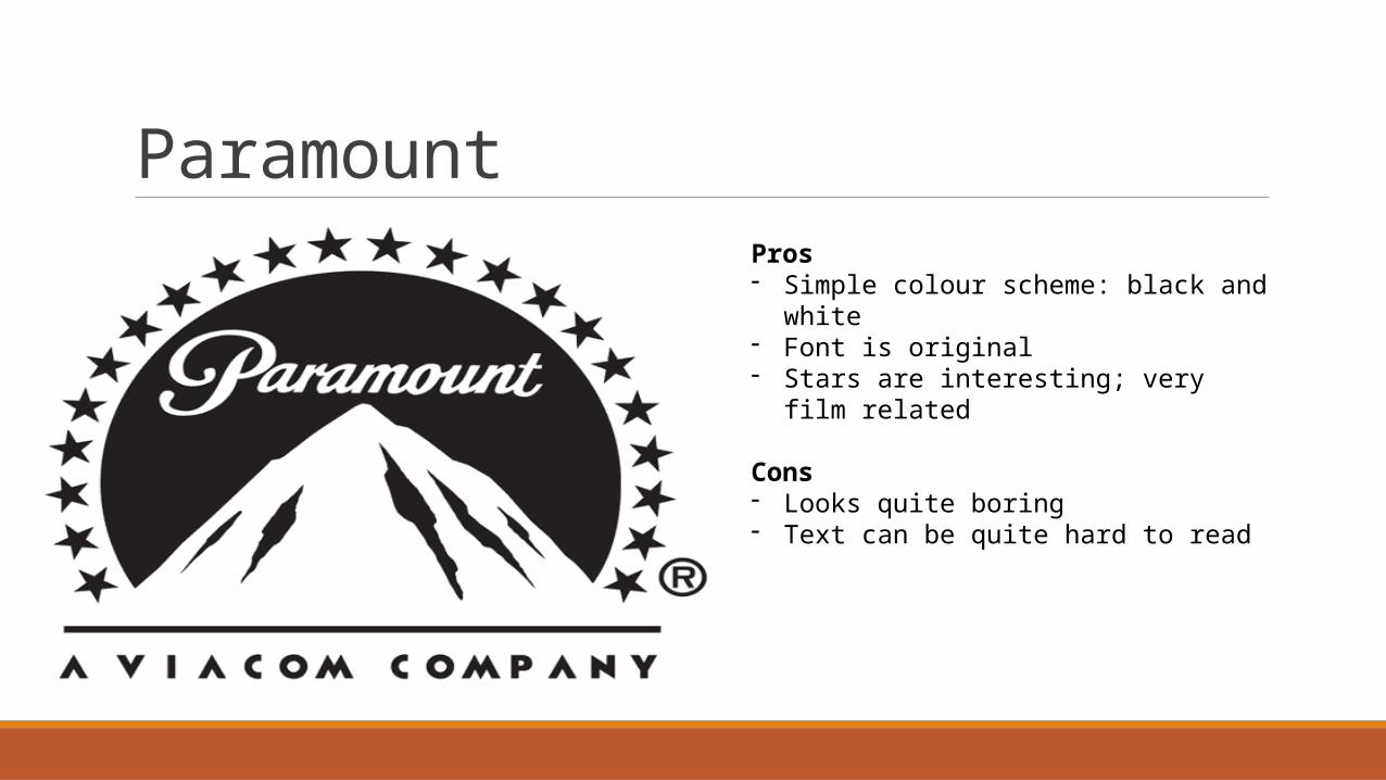
ParamountPros- Simple colour scheme: black and
white- Font is original- Stars are interesting; very film
related
Cons- Looks quite boring- Text can be quite hard to read
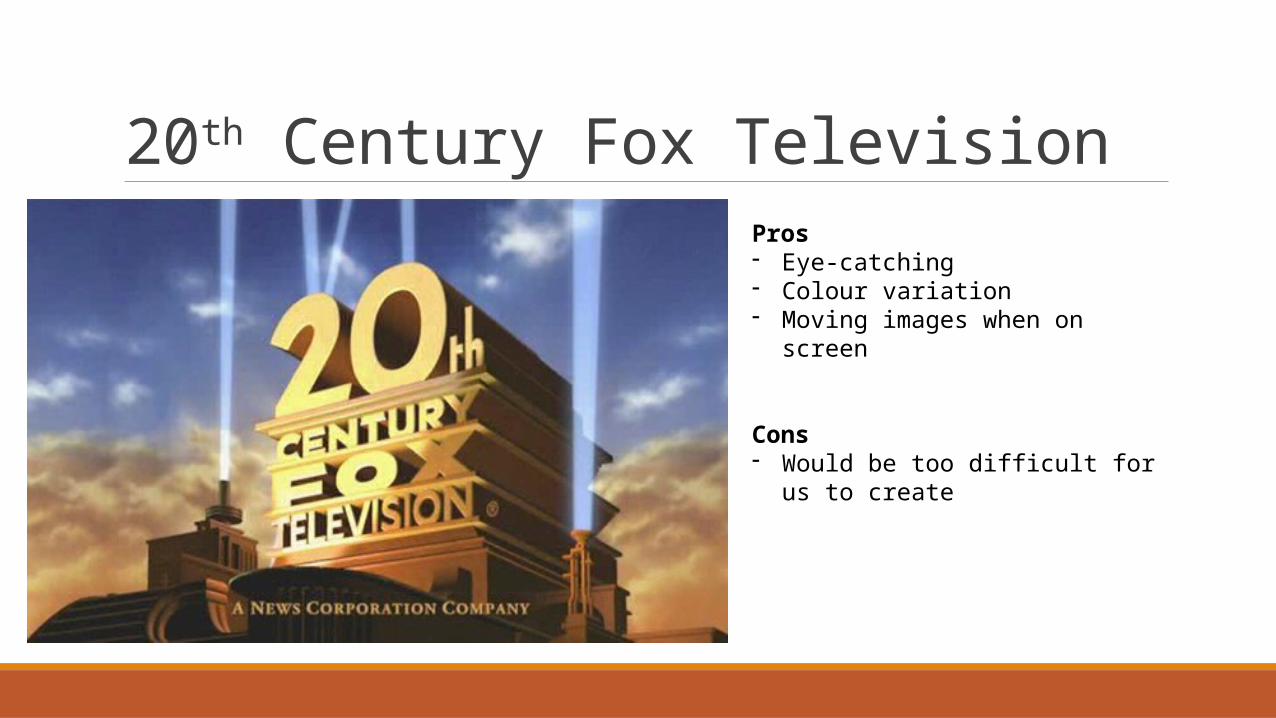
20th Century Fox TelevisionPros- Eye-catching- Colour variation- Moving images when on screen
Cons- Would be too difficult for us to
create
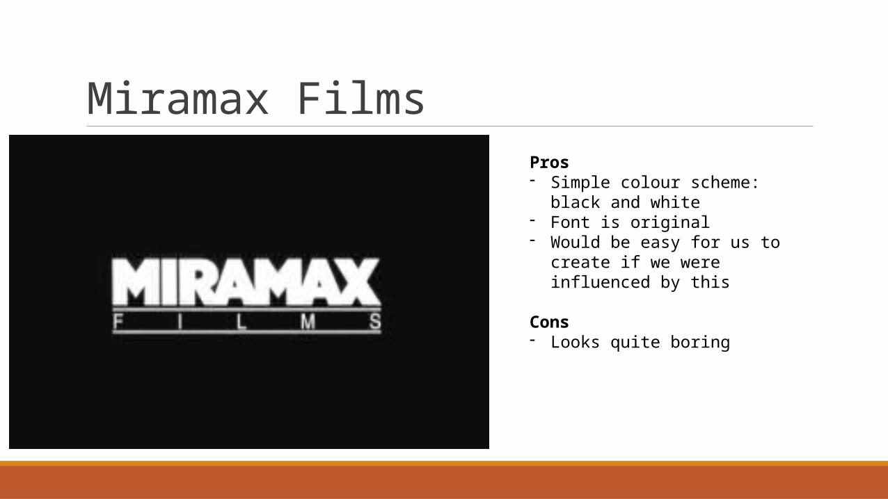
Miramax FilmsPros- Simple colour scheme: black
and white- Font is original- Would be easy for us to create
if we were influenced by this
Cons- Looks quite boring
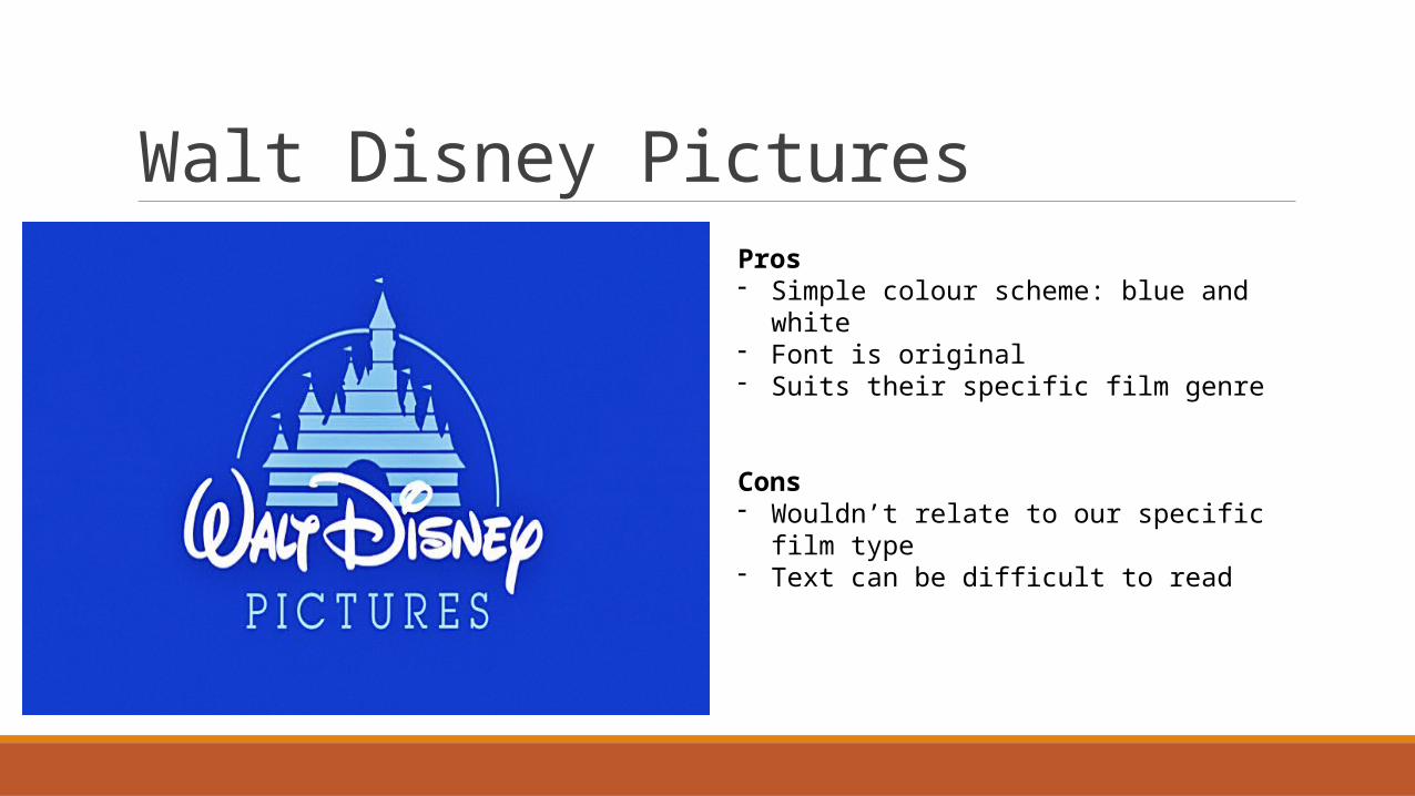
Walt Disney PicturesPros- Simple colour scheme: blue and white- Font is original- Suits their specific film genre
Cons- Wouldn’t relate to our specific film type- Text can be difficult to read
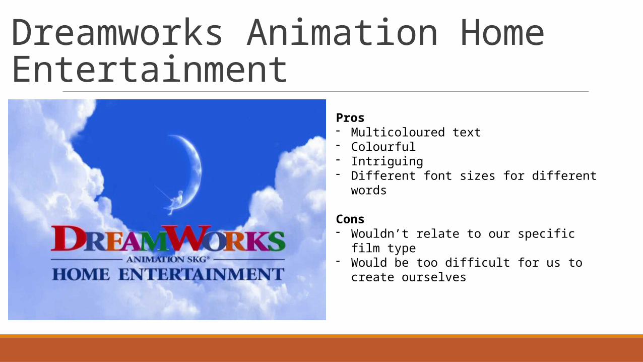
Dreamworks Animation Home Entertainment
Pros- Multicoloured text- Colourful- Intriguing- Different font sizes for different words
Cons- Wouldn’t relate to our specific film type- Would be too difficult for us to create
ourselves