Commodities at a glance - UNCTAD | Homeunctad.org/en/PublicationsLibrary/suc2012d3_en.pdf · ·...
60
UNITED NATIONS CONFERENCE ON TRADE AND DEVELOPMENT N°4 - July 2012 Special issue on food security COMMODITIES AT A GLANCE
Transcript of Commodities at a glance - UNCTAD | Homeunctad.org/en/PublicationsLibrary/suc2012d3_en.pdf · ·...

U n i t e d n at i o n s C o n f e r e n C e o n t r a d e a n d d e v e l o p m e n t
N°4 - July 2012
Special issue on food securityCOMMODITIES AT A GLANCE
Pho
to c
redi
t: ©
Ele
na S
chw
eitz
er -
Fot
olia
.com
Printed at United Nations, Geneva – GE.13-50252 – March 2013 – 881 – UNCTAD/SUC/2012/3

Commodities at a glanCe Special issue on food security
N°4 - July 2012
U n i t e d n a t i o n s C o n f e r e n C e o n t r a d e a n d d e v e l o p m e n t
New York and Geneva, 2012

ii Commodities at a glanCe
NOTES
This edition of the Commodities at a Glance has been prepared by the Special Unit on Commodities (SUC) of UNCTAD. The publication aims to collect, present and disseminate accurate and relevant statistical information linked to international primary commodity markets in a clear, concise and friendly format.
For further information about this publication, please contact the Special Unit on Commodities (SUC), UNCTAD, Palais des Nations, CH-1211 Geneva 10, Switzerland, tel. +41 22 917 5676, e-mail: [email protected].
STATISTICAL DATA SOURCES
All statistical data sources for this publication are indicated under each figure.
DISCLAIMER
The designations employed and the presentation of the material do not imply the expression of any opinion on the part of the United Nations concerning the legal status of any country, territory, city or area, or of authorities or concerning the delimitation of its frontiers or boundaries.
This publication has not been formally edited.
COPYRIGHT
Material in this publication may be freely quoted or reprinted, but full acknowledgement is requested (UNCTAD, Special Unit on Commodities, Commodities at a Glance). A copy of the publication containing the quotation or reprint should be sent to the UNCTAD secretariat at: Palais des Nations, CH-1211 Geneva 10, Switzerland, or by email to: [email protected].
FREE SUBSCRIPTION
The current publication is intended to be published on a six-monthly basis. If you are interested in receiving updated versions by e-mail on a regular basis, please send an e-mail to: [email protected].
UNCTAD/SUC/2012/3

iiicontents
CONTENTS
CLASSIFICATION OF COUNTRIES AND TERRITORIES ..................................................... v
1. DiStributioN bY couNtrY GroupiNGS ...........................................................................................................................................................v
2. DiStributioN bY GeoGraphical reGioN .......................................................................................................................................................vi
SOURCES AND DEFINITIONS ...................................................................................vIII
INTRODUCTION ....................................................................................................... IxFigure 1. Evolution of the world population in specific country groupings, 1961–2050 (million people) ................................................xFigure 2. Share of urban population in selected country groupings, 1961–2050 (percentage) .............................................................x
I. FOOD AvAILABILITY ............................................................................................ 1
Figure 3a. Evolution of world wheat production, 1990/91–2012/13 (million tons) ................................................................................. 4Figure 3b. World wheat production as a share of world total and regional total by region and main producers in the region,
2011–2012 (percentage) ................................................................................................................................................... 4Figure 4a. Evolution of world maize production, 1990/91–2012/13 (million tons) ................................................................................. 5Figure 4b. World maize production as a share of world total and regional total by region and main producers in the region,
2011–2012 (percentage) .................................................................................................................................................... 5Figure 5a. Evolution of world rice production, 1990/91–2012/13 (million tons) .................................................................................... 6Figure 5b. World rice production as a share of world total and regional total by region and main producers in the region,
2011–2012 (percentage) .................................................................................................................................................... 6Figure 6. Agricultural water withdrawal as a share of water withdrawal in selected country groupings, 1998–2012 .......................... 7Figure 7a. Evolution of world wheat demand, 1990/91–2012/13 (million tons) ................................................................................... 7Figure 7b. Evolution of world wheat production deficit, 1990/91–2012/13 (million tons) ..................................................................... 8Figure 7c. World wheat demand as a share of world total and regional total by region and main countries .......................................... 8Figure 7d. World wheat demand as a share of world total by type of use, 1990–1991 ......................................................................... 9Figure 7e. World wheat demand as a share of world total by type of use, 2011–2012 ......................................................................... 9Figure 8a. Evolution of world maize demand, 1990/91–2012/13 (million tons) .................................................................................. 10Figure 8b. Evolution of world maize production deficit, 1990/91–2012/13 (million tons) ................................................................... 10Figure 8c. World maize demand as a share of world total and regional total by region and main countries in the region,
2011–2012 (percentage) .................................................................................................................................................. 11Figure 8d. World maize demand as a share of world total by type of use, 1990–1991 ........................................................................ 11Figure 8e. World maize demand as a share of world total by type of use, 2011–2012 ....................................................................... 12Figure 9a. Evolution of world rice utilization, 1990/91–2011/12 (million tons) ................................................................................... 12Figure 9b. Evolution of world rice production deficit, 1990/91–2011/12 (million tons) ....................................................................... 13Figure 9c. World rice consumption as a share of world total by region and main consumers in the region, 2011–2012
(percentage)...................................................................................................................................................................... 13Figure 10a. Evolution of world wheat production yields, 1990–2010 (ton per hectare) ......................................................................... 14Figure 10b. Wheat production yields by region, 2010 (ton per hectare) ................................................................................................ 14Figure 11a. Evolution of world maize production yields, 1990–2010 (ton per hectare) .......................................................................... 15Figure 11b. Maize production yields by region, 2010 (ton per hectare) ................................................................................................. 15Figure 12a. Evolution of world rice (paddy) production yields, 1990–2010 (ton per hectare) ................................................................. 16Figure 12b. Rice (paddy) production yields by region, 2010 (ton per hectare) ....................................................................................... 16Figure 13. Evolution of world wheat, maize and rice (milled) exports, 1990–2009 (million tons) ......................................................... 17Figure 14. World exports of wheat, maize and rice (milled) as a share of world total production, 2008–2009 average
(percentage) ..................................................................................................................................................................... 17Figure 15a. Top five wheat exporters in volume as a share of world total exports, 2008–2009 average (percentage) ........................... 18Figure 15b. Top five maize exporters in volume as a share of world total exports, 2008–2009 average (percentage) ........................... 18Figure 15c. Top five rice (milled) exporters in volume as a share of world total exports, 2008–2009 average (percentage) ................. 19Figure 16a. Top five wheat importers in volume as a share of world total imports, 2008–2009 average (percentage) .......................... 19Figure 16b. Top five maize importers in volume as a share of world total imports, 2008–2009 average (percentage) ........................... 20Figure 16c. Top five rice (milled) importers in volume as a share of world total imports, 2008–2009 average (percentage) .................. 20
iv Commodities at a glanCe
Figure 17. Evolution of cereal price indices, 1960–2012 (base 2000 = 100) ...................................................................................... 24Figure 18a. Intra-annual volatility of Argentine wheat price indices, 1990–2011 (base 2000 = 100) .................................................... 24Figure 18b. Intra-annual volatility of United States wheat price indices, 1990–2011 (base 2000 = 100) .............................................. 25Figure 18c. Intra-annual volatility of Argentine maize price indices, 1990–2011 (base 2000 = 100) .................................................... 25Figure 18d. Intra-annual volatility of United States maize price indices, 1990–2011 (base 2000 = 100) .............................................. 26Figure 18e. Intra-annual volatility of Thai rice price indices, 1990–2011 (base 2000 = 100) ................................................................ 26Figure 19. Annual percentage change in wheat, maize and rice, world closing stocks, 1990/91–2011/12 .......................................... 27Figure 20. Annual percentage change in food aid shipments, 1995/96–2010/11 ............................................................................... 27Figure 21a. Number of disasters (drought) by region during the 2000s ................................................................................................ 28Figure 21b. Number of disasters (extreme temperature) by region during the 2000s ............................................................................ 28Figure 21c. Number of disasters (flood) by region during the 2000s ..................................................................................................... 29Figure 22a. United States: Distribution of agricultural domestic support (percentage) ............................................................................ 29Figure 22b. European Union: Distribution of agricultural domestic support (percentage) ........................................................................ 30
II. FOOD ACCESS ................................................................................................. 31
Map 4. Depth of hunger, average food deficit of undernourished population in kilocalories per person per day, 2006–2008 average ........................................................................................................................................................ 34
Figure 23b. Share of the main food groups in total dietary energy consumption, 2005–2007 average: Sub-Saharan African countries and North African countries (percentage) ........................................................................................................... 35
Figure 23c. Share of the main food groups in total dietary energy consumption, 2005–2007 average: Developing Asia, Latin America and Oceania (percentage) ........................................................................................................................... 36
Figure 23d. Share of the main food groups in total dietary energy consumption, 2005–2007 average: Selected developed economies (percentage) .................................................................................................................................................... 36
Figure 24. Evolution of the diet diversification index in selected country groupings, 1990–1992 and 2005–2007 averages ............. 37Figure 25. Share of food consumption expenditure in total consumption expenditure in selected ....................................................... 37 countries and country groupings, latest available year (percentage) .................................................................................. 37Figure 26a. Consumer price index, 1980s, 1990s, 2000s, 2010: Net food-importing developing countries (base 2005 = 100) ............. 38Figure 26b. Consumer price index, 1980s, 1990s, 2000s, 2010: Least developed countries (base 2005 = 100) ................................... 38Figure 26c. Consumer price index, 1980s, 1990s, 2000s, 2010: Sub-Saharan African countries (base 2005 = 100) ............................ 39Figure 26d. Consumer price index, 1980s, 1990s, 2000s, 2010: North African countries (base 2005 = 100) ........................................ 39Figure 26e. Consumer price index, 1980s, 1990s, 2000s, 2010: Developing Asia (base 2005 = 100) ................................................... 40Figure 26f. Consumer price index, 1980s, 1990s, 2000s, 2010: Latin America (base 2005 = 100) ...................................................... 40Figure 26g. Consumer price index, 1980s, 1990s, 2000s, 2010: Oceania (base 2005 = 100) ............................................................... 41
III. FOOD UTILIzATION ............................................................................................ 43
Figure 27. Number of undernourished people in selected country groupings, percentage change between 1990/92–2000/02 and 2000/02–2006/08 (percentage) ................................................................................................................................ 45
Figure 28. Malnutrition prevalence in children under 5, weight for age .............................................................................................. 45Figure 29. Malnutrition prevalence of children under 5, underweight (percentage) ............................................................................. 46Figure 30. Malnutrition prevalence of children under 5, by gender and region, as a share of total under 5 malnourished ................................46Figure 31. Cause of death as a share of total number of deaths, by communicable diseases and maternal,
prenatal and nutrition conditions, 2008 (percentage) ......................................................................................................... 47Figure 32. Birth rate, 1980s, 1990s, 2000s, 2010 (1,000 people) ....................................................................................................... 47Figure 33. Low-birthweight babies as a share of births, last available year (percentage) .................................................................... 48

v
CLASSIFICATION OF COUNTRIES AND TERRITORIES
1. DISTRIBUTION BY COUNTRY GROUPINGS
NET FOOD-IMPORTING DEVELOPING COUNTRIESAfghanistan
Angola
Bangladesh
Barbados
Benin
Bhutan
Botswana
Burkina Faso
Burundi
Cambodia
Cape Verde
Central African Republic
Chad
Comoros
Côte d’Ivoire
Cuba
Democratic Republic of the Congo
Djibouti
Dominica
Dominican Republic
Egypt
Equatorial Guinea
Eritrea
Ethiopia
Gabon
Gambia
Guinea
Guinea-Bissau
Haiti
Honduras
Jamaica
Jordan
Kenya
Kiribati
Lao People’s Democratic Republic
Lesotho
Liberia
Madagascar
Malawi
Maldives
Mali
Mauritania
Mauritius
Mongolia
Morocco
Mozambique
Myanmar
Namibia
Nepal
Niger
Pakistan
Peru
Rwanda
Saint Kitts and Nevis
Saint Lucia
Saint Vincent and the Grenadines
Samoa
Sao Tome and Principe
Senegal
Sierra Leone
Solomon Islands
Somalia
Sri Lanka
Sudan
Timor-Leste
Togo
Trinidad and Tobago
Tunisia
Tuvalu
Uganda
United Republic of Tanzania
Vanuatu
Venezuela (Bolivarian Republic of)
Yemen
Zambia
LEAST DEVELOPED COUNTRIES
Afghanistan
Angola
Bangladesh
Benin
Bhutan
Burkina Faso
Burundi
Cambodia
Central African Republic
Chad
Comoros
Democratic Republic of the Congo
Djibouti
Equatorial Guinea
Eritrea
Ethiopia
Gambia
Guinea
Guinea-Bissau
Haiti
Kiribati
Lao People’s Democratic Republic
Lesotho
Liberia
Madagascar
Malawi
Mali
Mauritania
Mozambique
Myanmar
Nepal
Niger
Rwanda
Samoa
Sao Tome and Principe
Senegal
Sierra Leone
Solomon Islands
Somalia
Sudan
Timor-Leste
Togo
Tuvalu
Uganda
United Republic of Tanzania
Vanuatu
Yemen
Zambia
classification of countries and territories
vi Commodities at a glanCe
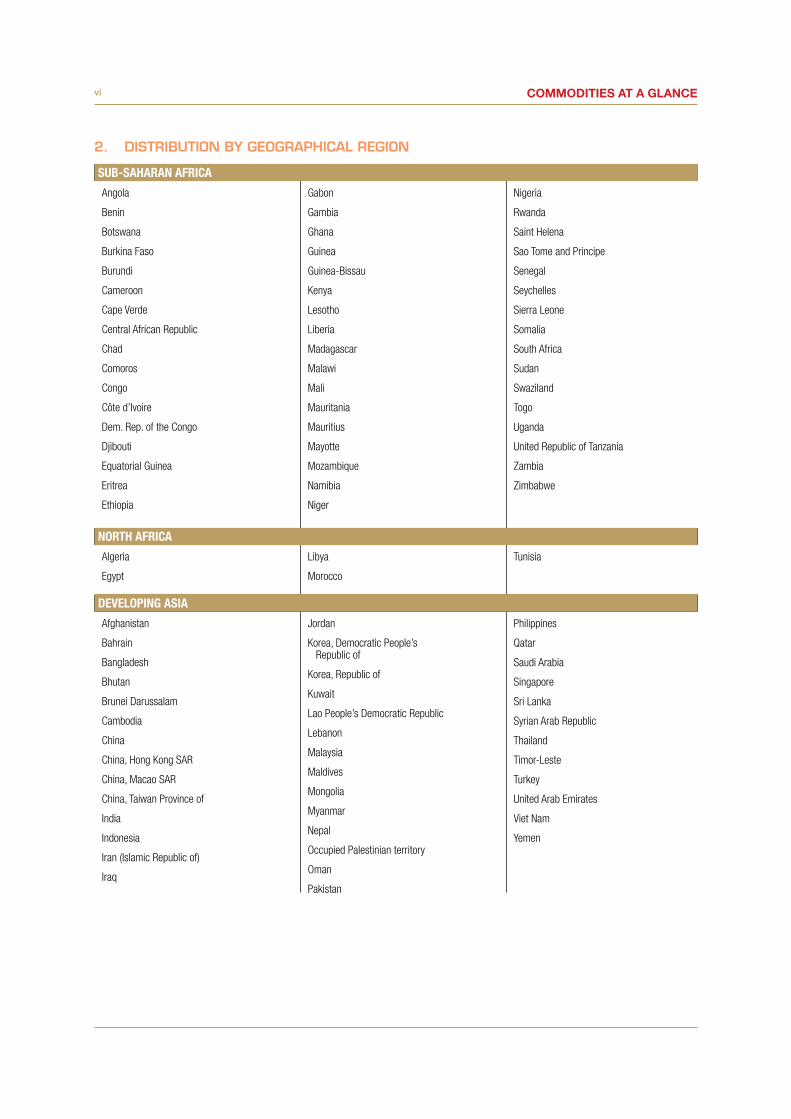
2. DISTRIBUTION BY GEOGRAPHICAL REGION
SUB-SAHARAN AFRICA
Angola
Benin
Botswana
Burkina Faso
Burundi
Cameroon
Cape Verde
Central African Republic
Chad
Comoros
Congo
Côte d’Ivoire
Dem. Rep. of the Congo
Djibouti
Equatorial Guinea
Eritrea
Ethiopia
Gabon
Gambia
Ghana
Guinea
Guinea-Bissau
Kenya
Lesotho
Liberia
Madagascar
Malawi
Mali
Mauritania
Mauritius
Mayotte
Mozambique
Namibia
Niger
Nigeria
Rwanda
Saint Helena
Sao Tome and Principe
Senegal
Seychelles
Sierra Leone
Somalia
South Africa
Sudan
Swaziland
Togo
Uganda
United Republic of Tanzania
Zambia
Zimbabwe
NORTH AFRICA
Algeria
Egypt
Libya
Morocco
Tunisia
DEVELOPING ASIA
Afghanistan
Bahrain
Bangladesh
Bhutan
Brunei Darussalam
Cambodia
China
China, Hong Kong SAR
China, Macao SAR
China, Taiwan Province of
India
Indonesia
Iran (Islamic Republic of)
Iraq
Jordan
Korea, Democratic People’s Republic of
Korea, Republic of
Kuwait
Lao People’s Democratic Republic
Lebanon
Malaysia
Maldives
Mongolia
Myanmar
Nepal
Occupied Palestinian territory
Oman
Pakistan
Philippines
Qatar
Saudi Arabia
Singapore
Sri Lanka
Syrian Arab Republic
Thailand
Timor-Leste
Turkey
United Arab Emirates
Viet Nam
Yemen

vii
LATIN AMERICA
Anguilla
Antigua and Barbuda
Argentina
Aruba
Bahamas
Barbados
Belize
Bolivia (Plurinational State of)
Bonaire, Sint Eustatius and Saba
Brazil
British Virgin Islands
Cayman Islands
Chile
Colombia
Costa Rica
Cuba
Curaçao
Dominica
Dominican Republic
Ecuador
El Salvador
Falkland Islands (Malvinas)
Grenada
Guatemala
Guyana
Haiti
Honduras
Jamaica
Mexico
Montserrat
Nicaragua
Panama
Paraguay
Peru
Saint Kitts and Nevis
Saint Lucia
Saint Vincent and the Grenadines
Sint Maarten (Dutch part)
Suriname
Trinidad and Tobago
Turks and Caicos Islands
Uruguay
Venezuela (Bolivarian Republic of
OCEANIA
American Samoa
Cook Islands
Fiji
French Polynesia
Guam
Kiribati
Marshall Islands
Micronesia (Federated States of)
Nauru
New Caledonia
Niue
Northern Mariana Islands
Palau
Papua New Guinea
Samoa
Solomon Islands
Tokelau
Tonga
Tuvalu
Vanuatu
Wallis and Futuna Islands
classification of countries and territories
viii Commodities at a glanCeviii
SOURCES AND DEFINITIONS
Sources
All statistical data sources for this publication are indicated under each figure. The term “source” indicates the source of the data series. However, figures are produced by UNCTAD with data revised when necessary.
The third revision of the Standard International Trade Classification has been used throughout this document for trade statistics.
Definitions
Figure 6: Agricultural water withdrawal: Annual quantity of water withdrawn for irrigation, livestock and aquaculture purposes. It includes renewable freshwater resources as well as overabstraction of renewable groundwater or withdrawal of fossil groundwater, use of agricultural drainage water, (treated) wastewater and desalinated water.
Total water withdrawal: Annual quantity of water withdrawn for agricultural, industrial and municipal purposes. It includes renewable freshwater resources as well as potential overabstraction of renewable groundwater or withdrawal of fossil groundwater and potential use of desalinated water or treated wastewater. It does not include in- stream uses, which are characterized by a very low net consumption rate, such as recreation, navigation, hydropower and inland capture fisheries.
Figures 23a, 23b, 23c, 23d: Food groups – Share in total dietary energy consumption
Main food groups – Food groups providing at least 90 per cent of total dietary energy supply based on the last three-year period.
Figure 24: Diet diversification index: Contribution of non-starchy foods (all but cereals, roots and tubers) to total dietary energy consumption (share in total dietary energy consumption).
Figure 25: Food consumption expenditure refers to the monetary value of acquired food, purchased and non- purchased, including non-alcoholic and alcoholic beverages as well as food expenses on away-from-home consumption in bars, restaurants, food courts, work canteens and street vendors.
Total consumption expenditure refers to the monetary value of acquired goods for consumption, food and non-food items, consumed by members of household.
(Excludes non-consumption expenses such as direct taxes, subscription and insurance premiums.)
Figure 27: Undernourishment refers to the condition of people whose dietary energy consumption is continuously below a minimum dietary energy requirement for maintaining a healthy life and carrying out a light physical activity with an acceptable minimum body weight for attained height.
Figure 28: Malnutrition prevalence is the percentage of children under age 5 whose weight for age is more than two standard deviations below the median for the international reference population, ages 0–59 months.
The data are based on new child growth standards released in 2006 by the World Health Organization (WHO).
Figure 31: Cause of death, by communicable diseases and maternal, prenatal and nutrition conditions – Cause of death refers to the share of all deaths for all ages by underlying causes. Communicable diseases and maternal, prenatal and nutrition conditions include infectious and parasitic diseases, respiratory infections, and nutritional deficiencies such as underweight and stunting.
Figure 33: Low-birthweight babies are newborns weighing less than 2,500 grams, with the measurement taken within the first hours of life, before significant postnatal weight loss has occurred.
ix
INTRODUCTION
This issue of Commodities at a Glance focuses on the global food security, price volatility and continuing high food prices. According to the 1996 World Food Summit, “food security, at the individual, household, national, regional and global levels is achieved when all people, at all times, have physical and economic access to sufficient, safe and nutritious food to meet their dietary needs and food preferences for an active and healthy life”.1 From this definition emerge four major dimensions of food security, which are food availability, food access and stability of such access and food utilization. Moreover, there is a distinction between transitory food insecurity (seasonal discrepancy between supply and demand to food) and chronic food insecurity (persistent or long-term food insecurity). Although the definition of food security undergoes continual review, its multidimensional aspect and the duration have remained at its core. Indeed, the definition of food security has evolved from mere availability of food and stability of prices (1974) to its current definition that encompasses other dimensions such as access and utilization as suggested by Sen in his seminal study of 1981.2 According to him, food insecurity is not only the lack of food availability but more importantly an issue of “entitlements”.
The 2007–2008 food crisis was very damaging for food security, and was interpreted as a wake-up call by many observers to refocus attention on food commodities. Before the crisis, only developing countries were seriously concerned about the problem of food security and agricultural markets. Today, the issue of food security has become topical, and even developed countries are engaging in or thinking of strategies to ensure the food security of their people. Two recent developments are important to recall in this regard. The first is the High-Level Task Force on Global Food Crisis3 (HLTF) set up by the Secretary-General of the United Nations in the immediate aftermaths of the 2008 food crisis. The second is the initiative of Agricultural Market Information Systems (AMIS), which is being implemented by G20 members’ countries plus Spain. This initiative also involves the main food producing, exporting and/or importing countries of four major crops (wheat, maize, rice and soybeans) such as Egypt, Kazakhstan, Nigeria, the Philippines, Thailand, Ukraine and Viet Nam.4
This report discusses the different indicators of food security as a means of contributing to the debate and offers tools to practitioners to enable them to analyse food security more judiciously and pragmatically. Part I analyses the availability of food through supply side variables such as production, yields, imports, exports, food aid and stocks. Part II deals with access mainly using indicators related to consumption. Food stability is then assessed through these two dimensions by comparison with factors affecting production and consumption, among which we have population growth as well as extreme weather conditions and other shocks. The last part analyses indicators of malnutrition in children, and weight for age as proxies for food utilization.
1 Rome Declaration on World Food Security and World Food Summit Plan of Action, World Food Summit 13–17 November 1996, Rome. FAO 2 A. Sen, Poverty and Famines: An Essay on Entitlement and Deprivation (Oxford: Clarendon Press, 1981).3 For more information, visit http://www.un-foodsecurity.org/.4 For more information, visit http://www.amis-outlook.org/amis-about/en/.
introduction

x Commodities at a glanCe
Figure 1. Evolution of the world population in specific country groupings, 1961–2050 (million people)
Source: FAO, FAOSTAT Population.Notes: Marshall Islands, Micronesia (Federated States of), Northern Mariana Islands and Palau data series starts in 1991.
Up to 2050, the largest population growth would be recorded by sub-Saharan Africa (+123 per cent), the least developed countries group (+103 per cent) and the net food-importing developing countries group (+85 per cent).
Figure 2. Share of urban population in selected country groupings, 1961–2050 (percentage)
Source: FAO, FAOSTAT Population.Notes: Marshall Islands, Micronesia (Federated States of), Northern Mariana Islands and Palau data series starts in 1991.
In 2050, about 60 per cent of those living in sub-Saharan Africa, as well as those in the least developed countries and the net food-importing developing countries will live in urban areas, compared with one third in 2011.
0
1 000
2 000
3 000
4 000
5 000
6 00019
61
1966
1971
1976
1981
1986
1991
1996
2001
2006
2011
2016
2021
2026
2031
2036
2041
2046
Net food-importing developing countries Least Developed CountriesSub Saharan Africa Northern AfricaDeveloping Asia Latin AmericaOceania
0
10
20
30
40
50
60
70
80
90
100
1961
1966
1971
1976
1981
1986
1991
1996
2001
2006
2011
2016
2021
2026
2031
2036
2041
2046
World Net food-importing developing countriesLeast Developed Countries Sub Saharan AfricaNorthern Africa Developing AsiaLatin America Oceania
FOOD AvAILABILITYI.
2 Commodities at a glanCe
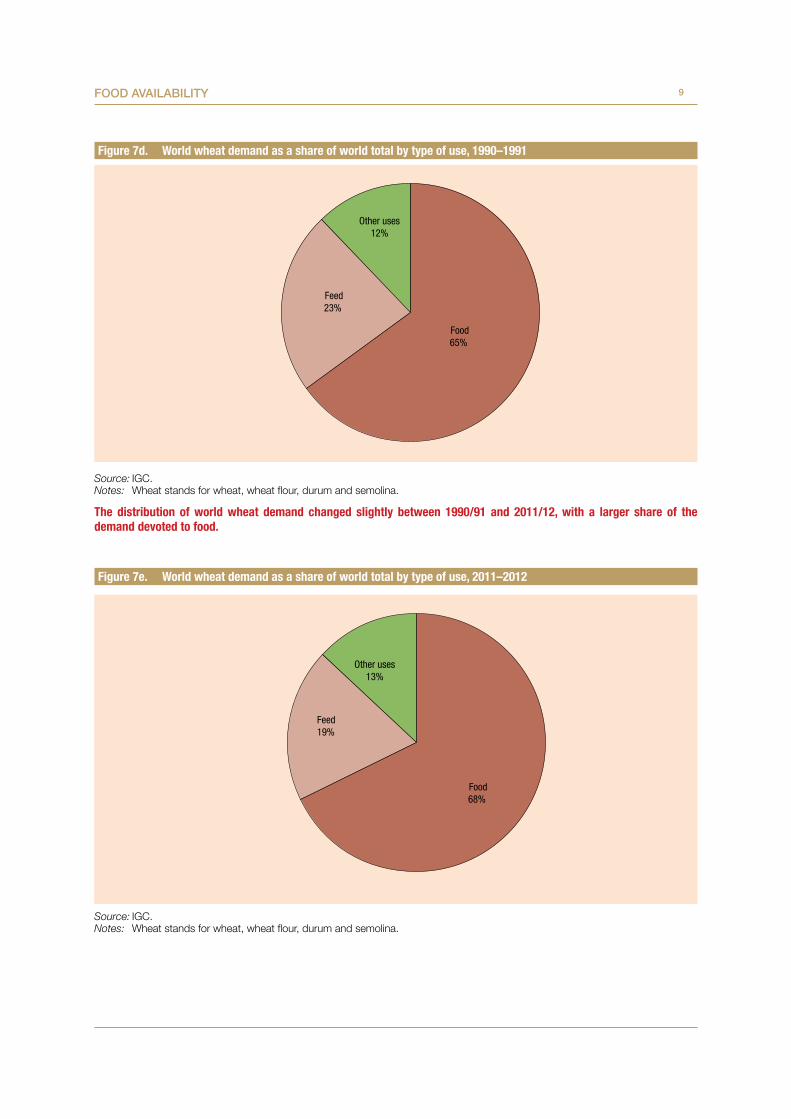
Utilizing the framework of Sen (1981), chronic food insecurity witnessed in some countries before the 2008 food crisis and transitory food insecurity experienced by developed countries during this period are not related to food availability as much as to access to food. For example, the percentage of wheat available for food purposes increased from 65 per cent to 68 per cent between 1990–1991 and 2011–2112 (see figures 7d and 7e). Moreover, production of commodities such as wheat, maize and rice exhibit an increasing trend over the last three decades. More precisely, wheat production grew on average at 0.8 per cent per annum from 1990–1991 to 2012–2013, while maize production increased by 3.8 per cent per annum over the same period. Only rice exhibited mixed patterns as its production decreased between 1999–2000 and 2002–2003, but increased from 1990–1991 to 2011–2012.
Despite increasing yields for the above-mentioned food commodities, one of the major threats to food availability is the development of competitive uses for crops like maize. For example, maize production yields rose by 42 per cent between 1990 and 2010. However, the proportion of maize available for food consumption did not enjoy the same amplitude of growth. Maize available for food purposes experienced a growth of 32 per cent; that is, up from 74.1 million tons in 1990–1991 to only 98 million tons in 2011–2012. On the other hand, maize used for industrial purposes rose by 343 per cent; that is, from 56 million tons to 248 million tons over the same period.
In addition to the competitive uses of food items, food availability is also skewed due to the fact that food production is mainly concentrated in Asia, Europe, and North America, and to some extent, the Russian Federation. Although trade could serve to redistribute food across the globe, its effects are less clear than expected, even among developing countries. For example, for few food items such as wheat, maize and rice, markets are dominated by a limited number of countries.5 Exports of wheat are mainly undertaken by Europe, North America and the Russian Federation, while importers are concentrated in Europe, with the exception of few countries such as Algeria, Egypt, Brazil and Japan. For rice, the situation is worse; exports are highly concentrated in Asia, as this region is at the same time the main producing and consuming
5 See Using Trade Policy to Overcome Food Insecurity, in: Global Monitoring Report, 2012: Food Prices, Nutrition, and the Millennium Development Goals, World Bank.
one. In 2008–2009, only 7 per cent of the milled rice produced was exported, the main importing countries being the Philippines, Nigeria and the European Union (EU) (see figures 14, 15a to 15c and 16a to 16c).
Food availability has almost certainly been reinforced by imports of relatively cheap food such as, poultry, rice and dairy products from developed countries, the outcome of subsidies provided by these countries in the form of the so-called “domestic supports”.6
Each country has to notify its domestic supports to the WTO. These notifications show that from 1995 to 2009, supports to farmers in both the EU and the United States have shifted to the Green Box (they have been “greened”); that is both these countries have been notifying their domestic support increasingly as permissible “non-trade distorting supports”.
In the case of the EU, total domestic supports notified as non-trade distorting measures have increased from about 20 per cent to 80 per cent of total domestic supports. Thus, while total domestic supports for agriculture have been reduced from €90.6 billion in 1995 to about €80 billion in 2009, total “green support” has more than tripled from €19 billion to about €64 billion. Similarly, in the United States, total green support increased almost threefold between 1999 and 2010 to $120 billion, thus reversing its earlier decline between 1996 and 1999. (See figures 22a and 22b).
Combined with the lowering of tariff rates by several developing countries and the dismantling of domestic agricultural sector support for a variety of reasons, but within the context of trade liberalization, cheaper food imports have increased significantly in food-importing developing countries, thus making matters worse. In this new environment, domestic producers, in particular smallholders, were unable to compete with these cheaper food imports, and in several cases, have moved out of food production, leading to a loss of production capacities in a range of developing countries, thereby exacerbating food insecurity particularly in a context of sharp and unexpected rises in global food
6 The WTO’s Agreement on Agriculture divides “domestic supports” into four main categories: the Amber box, de minimis subsidies, the Blue Box and the Green Box. The Amber Box encompasses agricultural subsidies that by definition distort trade and are not permitted by WTO. Blue Box subsidies aim at limiting agricultural production (this type of subsidies has been mainly used by the EU). De minimis subsidies may distort trade but are permissible below a certain level. Green Box supports encompass agricultural subsidies considered not to distort trade and therefore can be increased without limits. A wide range of policy measures are covered by the Green Box, including environmental programmes, payments for relief from natural disasters and the provision of subsidies based on historical rather than current production (decoupled income support).

3Food availability
prices coupled with export restrictions. In a context of a medium-term developmental framework, these imports have had a negative impact on agricultural development in the food-importing countries.
The fragile state of food stability is demonstrated by the high volatility of food prices (See figures 17 and 18a to 18e). In the past decade or so, volatility was coupled with the increase of prices of the main crops covered in this report. The underlying factors seem to be more frequent food deficits and depleted closing stocks during the period as well as climatic adverse conditions such as drought and extreme temperatures. For instance, between 2000–2001
and 2011–2012, stocks of wheat, maize and rice depleted more frequently than during previous periods. Moreover, the depth of depletion measured by the annual percentage change reached the highest levels during the last decade (See figure 19). Food stocks are often considered as contributing to food availability, especially to help smooth prices during periods of tight balance between supply and demand. Therefore, their depletion was rightly mentioned as one of the complex set of factors, including financialization of the commodity markets (see section 2 below), that underscored the food crisis experienced in 2007–2008.
4 Commodities at a glanCe
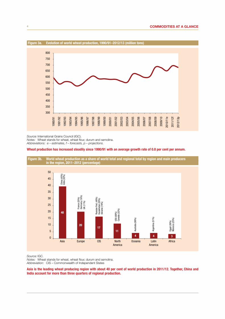
Figure 3a. Evolution of world wheat production, 1990/91–2012/13 (million tons)
Source: International Grains Council (IGC).Notes: Wheat stands for wheat, wheat flour, durum and semolina. Abbreviations: e – estimates, f – forecasts, p – projections.
Wheat production has increased steadily since 1990/91 with an average growth rate of 0.8 per cent per annum.
Figure 3b. World wheat production as a share of world total and regional total by region and main producers in the region, 2011–2012 (percentage)
Source: IGC.Notes: Wheat stands for wheat, wheat flour, durum and semolina. Abbreviation: CIS – Commonwealth of Independent States
Asia is the leading wheat producing region with about 40 per cent of world production in 2011/12. Together, China and India account for more than three quarters of regional production.
0
5
10
15
20
25
30
35
40
45
50
Asia Europe CIS NorthAmerica
Oceania LatinAmerica
Africa
Fran
ce (2
5%)
Germ
any
(16%
)UK
(11%
)
Chin
a (4
3%)
Indi
a (3
2%)
Russ
ian
Fed.
(48%
)Ka
zakh
stan
(20%
)Uk
rain
e (1
9%)
USA
(68%
)Ca
nada
(32%
)
Aust
ralia
(99%
)
Arge
ntin
a (5
1%)
Egyp
t (36
%)
Mor
occo
(25%
)
300
350
400
450
500
550
600
650
700
750
80019
90/9
1
1991
/92
1992
/93
1993
/94
1994
/95
1995
/96
1996
/97
1997
/98
1998
/99
1999
/00
2000
/01
2001
/02
2002
/03
2003
/04
2004
/05
2005
/06
2006
/07
2007
/08
2008
/09
2009
/10
2010
/11e
2011
/12f
2012
/13p
5Food availability
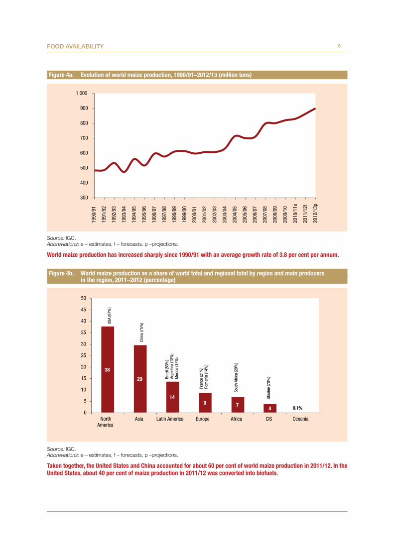
Figure 4a. Evolution of world maize production, 1990/91–2012/13 (million tons)
Source: IGC.Abbreviations: e – estimates, f – forecasts, p –projections.
World maize production has increased sharply since 1990/91 with an average growth rate of 3.8 per cent per annum.
Figure 4b. World maize production as a share of world total and regional total by region and main producers in the region, 2011–2012 (percentage)
Source: IGC.Abbreviations: e – estimates, f – forecasts, p –projections.
Taken together, the United States and China accounted for about 60 per cent of world maize production in 2011/12. In the United States, about 40 per cent of maize production in 2011/12 was converted into biofuels.
38
29
149 7
40
5
10
15
20
25
30
35
40
45
50
NorthAmerica
Asia Latin America Europe Africa CIS Oceania
Chin
a (7
5%)US
A (9
7%)
Braz
il (5
3%)
Arge
ntin
a (1
8%)
Mex
ico
(17%
)
Fran
ce (2
1%)
Rom
ania
(14%
)
Sout
h Af
rica
(20%
)
Ukra
ine
(70%
)
0.1%
300
400
500
600
700
800
900
1 00019
90/9
1
1991
/92
1992
/93
1993
/94
1994
/95
1995
/96
1996
/97
1997
/98
1998
/99
1999
/00
2000
/01
2001
/02
2002
/03
2003
/04
2004
/05
2005
/06
2006
/07
2007
/08
2008
/09
2009
/10
2010
/11e
2011
/12f
2012
/13p

6 Commodities at a glanCe
Figure 5a. Evolution of world rice production, 1990/91–2012/13 (million tons)
Source: USDA, Rice Yearbook 2011 (table 22 – World rice supply and utilization).Notes: For the period 2003/04 – 2011/12 (under review by IGC, data used for other figures regarding wheat and maize production) IGC and
USDA data are similar. As a consequence, USDA ones have been selected in order to enable us to present a longer series for rice.Abbreviation: f – Forecast as of May 11, 2011.
Despite a slowdown between 1999/00 and 2002/03, world rice production recorded an average growth rate of 1.3 per cent per annum over the 1990/91–2011/12 period.
Figure 5b. World rice production as a share of world total and regional total by region and main producers in the region, 2011–2012 (percentage)
Source: USDA, Rice Yearbook 2011 (table 22 – World rice supply and utilization).
Asia largely dominates world rice production with 91 per cent of the world production in 2011–2012.
90.8
3.5 3.5 1.4 0.4 0.3 0
10
20
30
40
50
60
70
80
90
100
Asia Africa LatinAmerica
NorthAmerica
Europe CIS Oceania
Egyp
t (26
%)
Mad
agas
car (
17%
)Ni
geria
(16%
)M
ali (
10%
)
Chin
a (3
3%)
Indi
a (2
4%)
Braz
il (4
7%)
Peru
(10%
)
USA
(92%
)
Russ
ian
Fed.
(56%
)Ka
zakh
stan
(18%
)Uz
beki
stan
(11%
)
0.1
Aust
ralia
(100
%)
300
325
350
375
400
425
450
475
500
1990
/91
1991
/92
1992
/93
1993
/94
1994
/95
1995
/96
1996
/97
1997
/98
1998
/99
1999
/00
2000
/01
2001
/02
2002
/03
2003
/04
2004
/05
2005
/06
2006
/07
2007
/08
2008
/09
2009
/10
2010
/11
2011
/12f
7Food availability
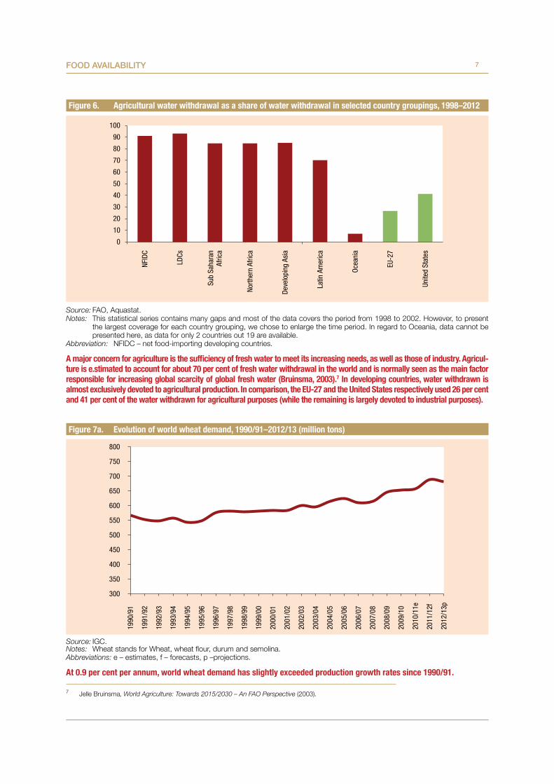
Figure 6. Agricultural water withdrawal as a share of water withdrawal in selected country groupings, 1998–2012
Source: FAO, Aquastat.Notes: This statistical series contains many gaps and most of the data covers the period from 1998 to 2002. However, to present
the largest coverage for each country grouping, we chose to enlarge the time period. In regard to Oceania, data cannot be presented here, as data for only 2 countries out 19 are available.
Abbreviation: NFIDC – net food-importing developing countries.
A major concern for agriculture is the sufficiency of fresh water to meet its increasing needs, as well as those of industry. Agricul-ture is e.stimated to account for about 70 per cent of fresh water withdrawal in the world and is normally seen as the main factor responsible for increasing global scarcity of global fresh water (Bruinsma, 2003).7 In developing countries, water withdrawn is almost exclusively devoted to agricultural production. In comparison, the EU-27 and the United States respectively used 26 per cent and 41 per cent of the water withdrawn for agricultural purposes (while the remaining is largely devoted to industrial purposes).
Figure 7a. Evolution of world wheat demand, 1990/91–2012/13 (million tons)
Source: IGC.Notes: Wheat stands for Wheat, wheat flour, durum and semolina. Abbreviations: e – estimates, f – forecasts, p –projections.
At 0.9 per cent per annum, world wheat demand has slightly exceeded production growth rates since 1990/91.
7 Jelle Bruinsma, World Agriculture: Towards 2015/2030 – An FAO Perspective (2003).
0
10
20
30
40
50
60
70
80
90
100
NFID
C
LDCs
Sub
Saha
ran
Afric
a
North
ern
Afric
a
Deve
lopi
ng A
sia
Latin
Am
eric
a
Ocea
nia
EU-2
7
Unite
d St
ates
300
350
400
450
500
550
600
650
700
750
800
1990
/91
1991
/92
1992
/93
1993
/94
1994
/95
1995
/96
1996
/97
1997
/98
1998
/99
1999
/00
2000
/01
2001
/02
2002
/03
2003
/04
2004
/05
2005
/06
2006
/07
2007
/08
2008
/09
2009
/10
2010
/11e
2011
/12f
2012
/13p
8 Commodities at a glanCe
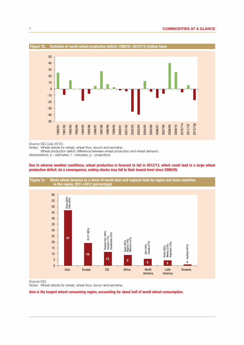
Figure 7b. Evolution of world wheat production deficit, 1990/91–2012/13 (million tons)
Source: IGC (July 2012).Notes: Wheat stands for wheat, wheat flour, durum and semolina.
Wheat production deficit: difference between wheat production and wheat demand.Abbreviations: e – estimates, f – forecasts, p – projections
Due to adverse weather conditions, wheat production is forecast to fall in 2012/13, which could lead to a large wheat production deficit. As a consequence, ending stocks may fall to their lowest level since 2008/09.
Figure 7c. World wheat demand as a share of world total and regional total by region and main countries in the region, 2011–2012 (percentage)
Source: IGC.Notes: Wheat stands for wheat, wheat flour, durum and semolina.
Asia is the largest wheat-consuming region, accounting for about half of world wheat consumption.
-50
-40
-30
-20
-10
0
10
20
30
40
5019
90/9
1
1991
/92
1992
/93
1993
/94
1994
/95
1995
/96
1996
/97
1997
/98
1998
/99
1999
/00
2000
/01
2001
/02
2002
/03
2003
/04
2004
/05
2005
/06
2006
/07
2007
/08
2008
/09
2009
/10
2010
/11e
2011
/12f
2012
/13p
47
1912 9 6 5 1
0
5
10
15
20
25
30
35
40
45
50
55
60
Asia Europe CIS Africa NorthAmerica
LatinAmerica
Oceania
Chin
a (3
6%)
Indi
a (2
6%)
Russ
ian
Fed.
(48%
)Uk
rain
e (1
7%)
Kaza
khst
an (1
0%)
Egyp
t (30
%)
Alge
ria (1
4%)
Mor
occo
(14%
)
USA
(79%
)Ca
nada
(21%
)
Braz
il (3
6%)
Mex
ico
(22%
)Ar
gent
ina
(15%
)
Aust
ralia
(87%
)
EU 2
7 (9
6%)
9Food availability
Figure 7d. World wheat demand as a share of world total by type of use, 1990–1991
Source: IGC.Notes: Wheat stands for wheat, wheat flour, durum and semolina.
The distribution of world wheat demand changed slightly between 1990/91 and 2011/12, with a larger share of the demand devoted to food.
Figure 7e. World wheat demand as a share of world total by type of use, 2011–2012
Source: IGC.Notes: Wheat stands for wheat, wheat flour, durum and semolina.
Food65%
Feed23%
Other uses12%
Food68%
Feed19%
Other uses13%
10 Commodities at a glanCe
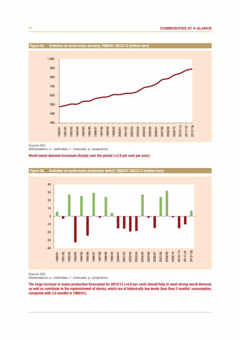
Figure 8a. Evolution of world maize demand, 1990/91–2012/13 (million tons)
Source: IGC. Abbreviations: e – estimates, f – forecasts, p –projections.
World maize demand increased sharply over the period (+2.9 per cent per year).
Figure 8b. Evolution of world maize production deficit, 1990/91–2012/13 (million tons)
Source: IGC. Abbreviations: e – estimates, f – forecasts, p –projections.
The large increase in maize production forecasted for 2012/13 (+5.6 per cent) should help to meet strong world demand, as well as contribute to the replenishment of stocks, which are at historically low levels (less than 2 months’ consumption, compared with 3.5 months in 1990/91).
300
400
500
600
700
800
900
1 00019
90/9
1
1991
/92
1992
/93
1993
/94
1994
/95
1995
/96
1996
/97
1997
/98
1998
/99
1999
/00
2000
/01
2001
/02
2002
/03
2003
/04
2004
/05
2005
/06
2006
/07
2007
/08
2008
/09
2009
/10
2010
/11e
2011
/12f
2012
/13p
-40
-30
-20
-10
0
10
20
30
40
1990
/91
1991
/92
1992
/93
1993
/94
1994
/95
1995
/96
1996
/97
1997
/98
1998
/99
1999
/00
2000
/01
2001
/02
2002
/03
2003
/04
2004
/05
2005
/06
2006
/07
2007
/08
2008
/09
2009
/10
2010
/11e
2011
/12f
2012
/13p

11Food availability
Figure 8c. World maize demand as a share of world total and regional total by region and main countries in the region, 2011–2012 (percentage)
Source: IGC.
Taken together, the United States and China account for 54 per cent of world maize demand.
Figure 8d. World maize demand as a share of world total by type of use, 1990–1991
Source: IGC.
While feed uses largely dominated maize demand in 1990/91, its share declined to 56 per cent in 2011/12. At the same time, the share for industrial use increased sharply. This situation may be due to the biofuel industry. In the United States, the main source of maize demand, 44 per cent of demand emanates from the industry (and more than 90 per cent of it from biofuels). World feed demand is mainly supported by China, where feed accounts for two thirds of the country’s demand.
0.10
5
10
15
20
25
30
35
40
45
50
NorthAmerica
Asia Latin America Europe Africa CIS Oceania
USA
(93%
)Ca
nada
(4%
)
Braz
il (4
8%)
Mex
ico
(28%
)
EU 2
7 (8
9%)
Egyp
t (18
%)
Sout
h Af
rica
(14%
)Ni
geria
(12%
)
Ukra
ine
(51%
)Ru
ssia
n Fe
d (3
0%)
Aust
ralia
(67%
)
Chin
a (6
5%)
Food15%
Feed67%
Industrial12%
Otheruses6%

12 Commodities at a glanCe
Figure 8e. World maize demand as a share of world total by type of use, 2011–2012
Source: IGC.
Figure 9a. Evolution of world rice utilization, 1990/91–2011/12 (million tons)
Source: USDA, Rice Yearbook 2011 (table 22 – World rice supply and utilization).Notes: For the period 2003/04–2011/12 (under review by IGC, data used for other figures regarding wheat and maize production) IGC
and USDA data are similar. Therefore, USDA ones have been selected in order to enable us to present a longer series for rice.Abbreviation: f – Forecast as of 11 May 2011.
World rice demand has grown at a stronger pace (1.4 per cent) than production since the beginning of the 1990s.
Food11%
Feed56%
Industrial29%
Otheruses4%
300
325
350
375
400
425
450
475
500
1990
/91
1991
/92
1992
/93
1993
/94
1994
/95
1995
/96
1996
/97
1997
/98
1998
/99
1999
/00
2000
/01
2001
/02
2002
/03
2003
/04
2004
/05
2005
/06
2006
/07
2007
/08
2008
/09
2009
/10
2010
/11
2011
/12f
13Food availability
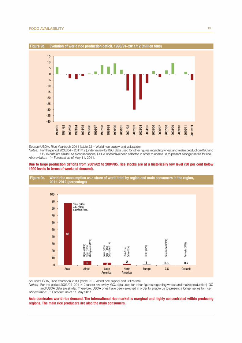
Figure 9b. Evolution of world rice production deficit, 1990/91–2011/12 (million tons)
Source: USDA, Rice Yearbook 2011 (table 22 – World rice supply and utilization).Notes: For the period 2003/04 – 2011/12 (under review by IGC, data used for other figures regarding wheat and maize production) IGC and
USDA data are similar. As a consequence, USDA ones have been selected in order to enable us to present a longer series for rice.Abbreviation: f – Forecast as of May 11, 2011.
Due to large production deficits from 2001/02 to 2004/05, rice stocks are at a historically low level (30 per cent below 1990 levels in terms of weeks of demand).
Figure 9c. World rice consumption as a share of world total by region and main consumers in the region, 2011–2012 (percentage)
Source: USDA, Rice Yearbook 2011 (table 22 – World rice supply and utilization).Notes: For the period 2003/04–2011/12 (under review by IGC, data used for other figures regarding wheat and maize production) IGC
and USDA data are similar. Therefore, USDA ones have been selected in order to enable us to present a longer series for rice.Abbreviation: f: Forecast as of 11 May 2011.
Asia dominates world rice demand. The international rice market is marginal and highly concentrated within producing regions. The main rice producers are also the main consumers.
-40
-35
-30
-25
-20
-15
-10
-5
0
5
10
1519
90/9
1
1991
/92
1992
/93
1993
/94
1994
/95
1995
/96
1996
/97
1997
/98
1998
/99
1999
/00
2000
/01
2001
/02
2002
/03
2003
/04
2004
/05
2005
/06
2006
/07
2007
/08
2008
/09
2009
/10
2010
/11
2011
/12f
88
6 32 1 0.3 0.20
10
20
30
40
50
60
70
80
90
100
Asia Africa LatinAmerica
NorthAmerica
Europe CIS Oceania
China (34%)India (24%)Indonesia (10%)
Braz
il (5
2%)
Peru
(13%
)Co
lom
bia
(11%
)
USA
(51%
)Cu
ba (1
2%)
EU 2
7 (9
4%)
Russ
ian
Fed
(50%
)
Aust
ralia
(57%
)
Nige
ria (2
0%)
Egyp
t (15
%)
Mad
agas
car (
11%
)
14 Commodities at a glanCe
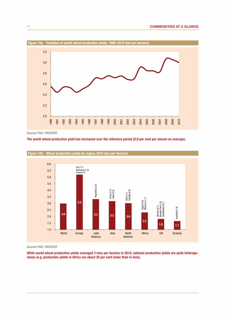
Figure 10a. Evolution of world wheat production yields, 1990–2010 (ton per hectare)
Source: FAO, FAOSTAT.
The world wheat production yield has increased over the reference period (0.8 per cent per annum on average).
Figure 10b. Wheat production yields by region, 2010 (ton per hectare)
Source: FAO, FAOSTAT.
While world wheat production yields averaged 3 tons per hectare in 2010, national production yields are quite heteroge-neous (e.g. production yields in Africa are about 30 per cent lower than in Asia).
2.0
2.2
2.4
2.6
2.8
3.0
3.219
90
1991
1992
1993
1994
1995
1996
1997
1998
1999
2000
2001
2002
2003
2004
2005
2006
2007
2008
2009
2010
3.0
5.2
3.3 3.2 3.0
2.3 1.8 1.7
1.0
1.5
2.0
2.5
3.0
3.5
4.0
4.5
5.0
5.5
6.0
World Europe LatinAmerica
Asia NorthAmerica
Africa CIS Oceania
Chin
a (4
.7)
Indi
a (2
.8)
USA
(3.1
)Ca
nada
(2.8
)
Egyp
t (5.
6)M
oroc
co (1
.7)
Ukra
ine
(2.7
)Ru
ssia
n Fe
d (1
.9)
Kaza
khst
an (0
.7)
UK (7.7)Germany (7.3)France (7)
Arge
ntin
a (3
.4)
Aust
ralia
(1.6
)

15Food availability
Figure 11a. Evolution of world maize production yields, 1990–2010 (ton per hectare)
Source: FAO, FAOSTAT.
Despite erratic annual changes, world production yields largely improved over the period (+42 per cent between 1990 and 2010).
Figure 11b. Maize production yields by region, 2010 (ton per hectare)
Source: FAO, FAOSTAT.
World maize production yields exceeded 5 tons per hectare in 2010, with large productivity gaps between North America and other producing regions. The gap is especially significant between North America and Africa, but it is also big be-tween the United States and the EU-27.
3.0
3.2
3.4
3.6
3.8
4.0
4.2
4.4
4.6
4.8
5.0
5.2
5.419
90
1991
1992
1993
1994
1995
1996
1997
1998
1999
2000
2001
2002
2003
2004
2005
2006
2007
2008
2009
2010
5.2
9.6
6.9 6.5
4.6 4.1 4.1
2.1 2
3
4
5
6
7
8
9
10
World NorthAmerica
Europe Oceania Asia LatinAmerica
CIS Africa
Cana
da (9
.7)
USA
(9.6
)
Fran
ce (8
.9)
EU 2
7 (7
.1)
Rom
ania
(4.3
)
Chin
a (5
.5)
Indi
a (2
)
Arge
ntin
a (7
.8)
Braz
il (4
.4)
Mex
ico
(3.3
)
Ukra
ine
Sout
h Af
rica
(4.7
)

16 Commodities at a glanCe
Figure 12a. Evolution of world rice (paddy) production yields, 1990–2010 (ton per hectare)
Source: FAO, FAOSTAT.
World rice production yields have significantly increased over the last 20 years.
Figure 12b. Rice (paddy) production yields by region, 2010 (ton per hectare)
Source: FAO, FAOSTAT.
Australia is the leading producing country in terms of productivity, far beyond China or India, the two largest rice- producing countries.
3.2
3.4
3.6
3.8
4.0
4.2
4.4
4.619
90
1991
1992
1993
1994
1995
1996
1997
1998
1999
2000
2001
2002
2003
2004
2005
2006
2007
2008
2009
2010
4.4
9.3
7.5 6.6
4.5 4.4 4.3
2.5 2.0 2.5 3.0 3.5 4.0 4.5 5.0 5.5 6.0 6.5 7.0 7.5 8.0 8.5 9.0 9.5
10.0
World Oceania NorthAmerica
Europe LatinAmerica
Asia CIS Africa
Australia (10.8)
USA
(7.5
)
Braz
il (4
.2)
Peru
(7.3
)
Chin
a (6
.5)
Indi
a (3
.3)
Russ
ian
Fed.
(5.3
)Ka
zakh
stan
(4)
Uzbe
kist
an (3
.4)
Egyp
t (9.
4)M
adag
asca
r (3.
5)M
ali (
3.4)
Nige
ria (1
.8)

17Food availability
Figure 13. Evolution of world wheat, maize and rice (milled) exports, 1990–2009 (million tons)
Source: FAO, FAOSTAT (for maize and wheat data statistics) and USDA, Rice Yearbooks (for rice data statistics).
With 6 per cent average annual growth over the 1990–2009 period, rice exports recorded the most significant growth of all cereals exports.
Figure 14. World exports of wheat, maize and rice (milled) as a share of world total production, 2008–2009 average (percentage)
Source: FAO, FAOSTAT (for maize and wheat data statistics) and USDA, Rice Yearbook 2011 (for rice data statistics).
The share of rice exports is low, as the main producing countries are also the main consumers.
–
5
10
15
20
25
30
35
0
20
40
60
80
100
120
140
16019
90
1991
1992
1993
1994
1995
1996
1997
1998
1999
2000
2001
2002
2003
2004
2005
2006
2007
2008
2009
Rice
exp
orts
(mill
ion
tons
)
Mai
ze a
nd w
heat
exp
orts
(mill
ion
tons
)
Maize Wheat Rice, milled
20
12
7
0
5
10
15
20
25
Wheat Maize Rice, milled

18 Commodities at a glanCe
Figure 15a. Top five wheat exporters in volume as a share of world total exports, 2008–2009 average (percentage)
Source: FAO, FAOSTAT.
Together the EU-27 and the United States contributed to half of the world’s wheat exports in 2008–2009.
Figure 15b. Top five maize exporters in volume as a share of world total exports, 2008–2009 average (percentage)
Source: FAO, FAOSTAT.
The United States is the main maize exporting country with half of the world exports. Together with the EU-27, they contribute to the two thirds of total world exports.
31
19
13 10 9
18
0
5
10
15
20
25
30
35
EuropeanUnion (27)
United States Canada RussianFederation
Australia Rest of theworld
50
15 12 7 5
11
0
10
20
30
40
50
60
United States EuropeanUnion (27)
Argentina Brazil Ukraine Rest of theworld
19Food availability
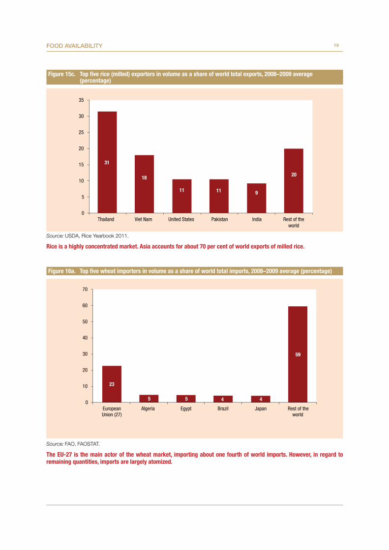
Figure 15c. Top five rice (milled) exporters in volume as a share of world total exports, 2008–2009 average (percentage)
Source: USDA, Rice Yearbook 2011.
Rice is a highly concentrated market. Asia accounts for about 70 per cent of world exports of milled rice.
Figure 16a. Top five wheat importers in volume as a share of world total imports, 2008–2009 average (percentage)
Source: FAO, FAOSTAT.
The EU-27 is the main actor of the wheat market, importing about one fourth of world imports. However, in regard to remaining quantities, imports are largely atomized.
31
18
11 11 9
20
0
5
10
15
20
25
30
35
Thailand Viet Nam United States Pakistan India Rest of theworld
23
5 5 4 4
59
0
10
20
30
40
50
60
70
EuropeanUnion (27)
Algeria Egypt Brazil Japan Rest of theworld

20 Commodities at a glanCe
Figure 16b. Top five maize importers in volume as a share of world total imports, 2008–2009 average (percentage)
Source: FAO, FAOSTAT.
The degree of import concentration for maize with five countries, which account for 56 per cent of global imports, is much lower than for maize exports, where five countries account for 90 per cent of the trade.
Figure 16c. Top five rice (milled) importers in volume as a share of world total imports, 2008–2009 average (percentage)
Source: USDA, Rice Yearbook 2011. Note: The European Union (27) does not consider intra-trade.
In regard to imports, the rice market is the most diversified of the three main grain markets. The EU-27 plays a marginal role in this market, while it is the major stakeholder in regard to maize and wheat imports.
20
8 8
43
16
4 0
10
20
30
40
50
60
70
EuropeanUnion (27)
Japan Mexico Republic ofKorea
China Rest of theworld
8 6 5 5 4
72
0
10
20
30
40
50
60
70
80
Philippines Nigeria EuropeanUnion (27)
Iran Saudi Arabia Rest of theworld

21Food availabilityM
ap 1
. Le
adin
g w
heat
-exp
ortin
g co
untr
ies
and
thei
r mai
n tr
adin
g pa
rtne
rs, 2
008–
2009
ave
rage
(tra
de v
alue
) (pe
rcen
tage
)
Sou
rce:
UN
CTA
D, U
NC
TAD
stat
.N
ote:
W
heat
(inc
ludi
ng s
pelt)
and
mes
lin, u
nmille
d (S
ITC
rev
3 –
041)
.
1
To 1 To
1
23
4
5
67
89
1011
12
13
14
15 16
1718
19
Mai
n tr
adin
g pa
rtne
r (>
10%
of e
xpor
t val
ue re
gard
ing
this
spe
ci�c
com
mod
ity c
ode)
Trad
ing
part
ner
(> 5
% o
f exp
ort v
alue
rega
rdin
g th
is s
peci
�c c
omm
odity
cod
e)
Uni
ted
Stat
esCa
nada
Euro
pean
Uni
on (2
7)Ru
ssia
n Fe
dera
tion
Aust
ralia
(1)
Jap
an(2
) P
hilip
pine
s(3
) V
iet N
am(4
) M
alay
sia
(5)
Ind
ones
ia
(16)
Nig
eria
(17)
EU
(27)
(18)
Uni
ted
Stat
es(1
9) M
exic
o
(6)
Pak
ista
n (7
) A
zerb
aija
n(8
) S
yria
n Ar
ab R
ep.
(9)
Tur
key
(10)
Egy
pt(1
1) I
raq
(12)
Ira
n (Is
lam
ic R
ep. o
f)(1
3) S
audi
Ara
bia
(14)
Mor
occo
(15)
Alg
eria

22 Commodities at a glanCeM
ap 2
. Le
adin
g m
aize
-exp
ortin
g co
untr
ies
and
thei
r mai
n tr
adin
g pa
rtne
rs, 2
008–
2009
ave
rage
(tra
de v
alue
) (pe
rcen
tage
)
Sou
rce:
UN
CTA
D, U
NC
TAD
stat
.N
ote:
M
aize
(not
incl
udin
g sw
eet c
orn)
, unm
illed
(SIT
C re
v 3
– 04
4).
1
2
3
4
5
6 7
8910
1112
1314
15
16
17
18
(1)
Japa
n(2
)Re
p. o
f Kor
ea(3
)Ta
iwan
(Pro
v. o
f Chi
na)
(4)
Mal
aysi
a(5
)Ru
ssia
n Fe
dera
tion
(6)
Ira
n (Is
lam
ic R
ep. o
f)(7
) S
audi
Ara
bia
(8)
Syr
ian
Arab
Rep
. (9
) I
srae
l(1
0) T
urke
y(1
1) E
gypt
(12)
Alg
eria
(13)
Mor
occo
(14)
Eur
opea
n Un
ion
(27)
(15)
Mex
ico
Mai
n tr
adin
g pa
rtne
r(>
10%
of e
xpor
tva
lue
rega
rdin
gth
is s
peci
�cco
mm
odity
cod
e)
Trad
ing
part
ner
(> 5
% o
f exp
ort
valu
e re
gard
ing
this
spe
ci�c
com
mod
ity c
ode)
To 1
, 2, 3
To 2
, 3, 4
(16)
Col
ombi
a(1
7) P
eru
(18)
Chi
le
Unite
d St
ates
Braz
ilAr
gent
ina
Euro
pean
Uni
on (2
7)Uk
rain
e
23Food availabilityM
ap 3
. Le
adin
g ric
e-ex
port
ing
coun
trie
s an
d th
eir m
ain
trad
ing
part
ners
, 200
8–20
09 a
vera
ge (t
rade
val
ue) (
perc
enta
ge)
Sou
rce:
UN
CTA
D, U
NC
TAD
stat
.N
ote:
R
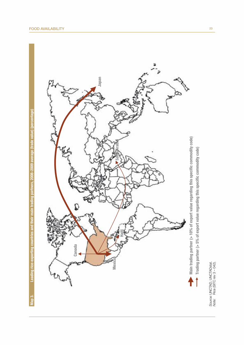
ice
(SIT
C re
v 3
– 04
2).
Mex
ico
Japa
n
Haiti
Cana
da
Saud
i Ara
bia
Mai
n tr
adin
g pa
rtne
r (>
10%
of e
xpor
t val
ue re
gard
ing
this
spe
ci�c
com
mod
ity c
ode)
Trad
ing
part
ner (
> 5
% o
f exp
ort v
alue
rega
rdin
g th
is s
peci
�c c
omm
odity
cod
e)

24 Commodities at a glanCe
Figure 17. Evolution of cereal price indices, 1960–2012 (base 2000 = 100)
Source: UNCTAD, UNCTADstat.Notes: Wheat, Argentina, Trigo Pan Upriver, FOB ; Wheat, United States, No. 2 Hard Red Winter (ordinary), FOB Gulf ; Maize,
Argentina, Rosario, FOB ; Maize, United States, yellow No. 3, FOB Gulf ; Rice, Thailand, white milled, 5 per cent broken, nominal price quotes, FOB Bangkok. 2012: Average includes data from January to May 2012.
The 2008 food crisis may largely be observed in this figure. Many factors contributed to the food price crisis. A general context of long-term increase in demand for food (as a result of the population growth, urbanization, and rapid economic development in East and South-East Asia in particular) has contributed to market imbalances, aggravated by droughts, slow supply response, the fall in the dollar, high energy prices as well as concerns over increased demand for biofuels, government export restrictions and market speculation.
Figure 18a. Intra-annual volatility of Argentine wheat price indices, 1990–2011 (base 2000 = 100)
Source: UNCTAD, UNCTADstat.Notes: Wheat, Argentina, Trigo Pan Upriver, FOB. Figures 18a to 18e show minimum (lowest point of the black line), maximum (highest point of the black line) and average (pink
arrow) monthly price index.
0
50
100
150
200
250
300
350
40019
90
1991
1992
1993
1994
1995
1996
1997
1998
1999
2000
2001
2002
2003
2004
2005
2006
2007
2008
2009
2010
2011
2012
*
Wheat (Argentina) Wheat (United States) Maize (Argentina)Maize (United States) Rice (Thailand)
0
50
100
150
200
250
300
350
1990
1991
1992
1993
1994
1995
1996
1997
1998
1999
2000
2001
2002
2003
2004
2005
2006
2007
2008
2009
2010
2011

25Food availability
The intra-annual volatility was particularly high in 2007–2008, namely the 2008 food crisis. However, put in historical con-text, the volatility of wheat prices remained significant in 2010 and 2011 for wheat from Argentina and the United States.
Figure 18b. Intra-annual volatility of United States wheat price indices, 1990–2011 (base 2000 = 100)
Source: UNCTAD, UNCTADstat.Notes: Wheat, United States, No. 2 Hard Red Winter (ordinary), FOB Gulf Figures 18a to 18e show minimum (lowest point of the black line), maximum (highest point of the black line) and average (pink
arrow) monthly price index.
Figure 18c. Intra-annual volatility of Argentine maize price indices, 1990–2011 (base 2000 = 100)
Source: UNCTAD, UNCTADstat.Notes: Maize, Argentina, Rosario, FOB. Figures 18a to 18e show minimum (lowest point of the black line), maximum (highest point of the black line) and average (pink
arrow) monthly price index.
Maize prices rose sharply in 2008. After a moderate decline in 2009, prices of maize from Argentina and the United States returned to the historical highs of 2008 in 2010 and 2011, and volatility increased.
0
50
100
150
200
250
300
350
400
450
1990
1991
1992
1993
1994
1995
1996
1997
1998
1999
2000
2001
2002
2003
2004
2005
2006
2007
2008
2009
2010
2011
0
50
100
150
200
250
300
350
400
1990
1991
1992
1993
1994
1995
1996
1997
1998
1999
2000
2001
2002
2003
2004
2005
2006
2007
2008
2009
2010
2011

26 Commodities at a glanCe
Figure 18d. Intra-annual volatility of United States maize price indices, 1990–2011 (base 2000 = 100)
Source: UNCTAD, UNCTADstat.Notes: Maize, United States, yellow No. 3, FOB Gulf. Figures 18a to 18e show minimum (lowest point of the black line), maximum (highest point of the black line) and average (pink
arrow) monthly price index.
Figure 18e. Intra-annual volatility of Thai rice price indices, 1990–2011 (base 2000 = 100)
Source: UNCTAD, UNCTADstatNotes: Rice, Thailand, white milled, 5 per cent broken, nominal price quotes, FOB Bangkok Figures 18a to 18e show minimum (lowest point of the black line), maximum (highest point of the black line) and average (pink
arrow) monthly price index.
Rice prices dramatically increased in 2008. Rice prices remain at historical price highs since then.
0
50
100
150
200
250
300
350
40019
90
1991
1992
1993
1994
1995
1996
1997
1998
1999
2000
2001
2002
2003
2004
2005
2006
2007
2008
2009
2010
2011
0
50
100
150
200
250
300
350
400
450
500
550
1990
1991
1992
1993
1994
1995
1996
1997
1998
1999
2000
2001
2002
2003
2004
2005
2006
2007
2008
2009
2010
2011
27Food availability
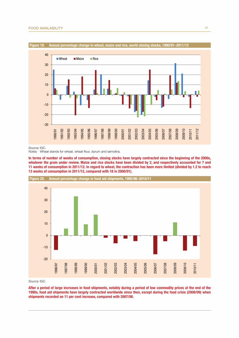
Figure 19. Annual percentage change in wheat, maize and rice, world closing stocks, 1990/91–2011/12
Source: IGC.Notes: Wheat stands for wheat, wheat flour, durum and semolina.
In terms of number of weeks of consumption, closing stocks have largely contracted since the beginning of the 2000s, whatever the grain under review. Maize and rice stocks have been divided by 2, and respectively accounted for 7 and 11 weeks of consumption in 2011/12. In regard to wheat, the contraction has been more limited (divided by 1.2 to reach 13 weeks of consumption in 2011/12, compared with 18 in 2000/01).
Figure 20. Annual percentage change in food aid shipments, 1995/96–2010/11
Source: IGC.
After a period of large increases in food shipments, notably during a period of low commodity prices at the end of the 1990s, food aid shipments have largely contracted worldwide since then, except during the food crisis (2008/09) when shipments recorded an 11 per cent increase, compared with 2007/08.
-30
-20
-10
0
10
20
30
4019
90/9
1
1991
/92
1992
/93
1993
/94
1994
/95
1995
/96
1996
/97
1997
/98
1998
/99
1999
/00
2000
/01
2001
/02
2002
/03
2003
/04
2004
/05
2005
/06
2006
/07
2007
/08
2008
/09
2009
/10
2010
/11
2011
/12
Wheat Maize Rice
-20
-10
0
10
20
30
40
1996
/97
1997
/98
1998
/99
1999
/00
2000
/01
2001
/02
2002
/03
2003
/04
2004
/05
2005
/06
2006
/07
2007
/08
2008
/09
2009
/10
2010
/11

28 Commodities at a glanCe
Figure 21a. Number of disasters (drought) by region during the 2000s
Source: EM-DAT, Centre for Research on the Epidemiology of Disasters, Université catholique de Louvain.
Net food-importing developing countries, LDCs and sub-Saharan African countries are the regions that have been most affected by droughts since 2000.
Figure 21b. Number of disasters (extreme temperature) by region during the 2000s
Source: EM-DAT, Centre for Research on the Epidemiology of Disasters, Université Catholique de Louvain.
Developing countries in Africa and Oceania appear to be less frequently affected by extreme temperatures than Asian countries.
0
20
40
60
80
100
120
140
160
180
200
World NFIDC LDCs SubSaharanAfrica
NorthernAfrica
DevelopingAsia
LatinAmerica
Oceania
Num
ber o
f dro
ught
s
0
50
100
150
200
250
World NFIDC LDCs SubSaharanAfrica
NorthernAfrica
DevelopingAsia
LatinAmerica
Oceania
Num
ber o
f eve
nts

29Food availability
Figure 21c. Number of disasters (flood) by region during the 2000s
Source: EM-DAT, Centre for Research on the Epidemiology of Disasters, Université catholique de Louvain.
Except for Northern Africa and Oceania, which seem to be less affected by flood, these events are recurrent in other developing countries.
Figure 22a. United States: Distribution of agricultural domestic support (percentage)
Source: South Centre, based on WTO notifications.Notes: The current bound level of overall trade-distorting domestic support (OTDS) in the United States is $48.3 billion. The 60 per cent
cut it is asked to undertake (para. 3b, Rev.4) will bring the bound OTDS level to $14.5 billion. However, the applied OTDS was only $9.78 billion in 2010. In the meantime, total domestic support soared from $60.9 billion to $130.3 billion between 1995 and 2010. See also South Centre Analytical Note, Present Situation of the WTO Doha Talks and Comments on the 21 April Documents, April 2011.
0
10
20
30
40
50
60
70
80
90
100
1995 1996 1997 1998 1999 2000 2001 2002 2003 2004 2005 2006 2007 2008 2009 2010
Total Green Box Total Blue Box Total Amber Box Total de minimis
0
200
400
600
800
1 000
1 200
1 400
1 600
1 800
2 000
World NFIDC LDCs SubSaharanAfrica
NorthernAfrica
DevelopingAsia
LatinAmerica
Oceania
Num
ber o
f floo
ds
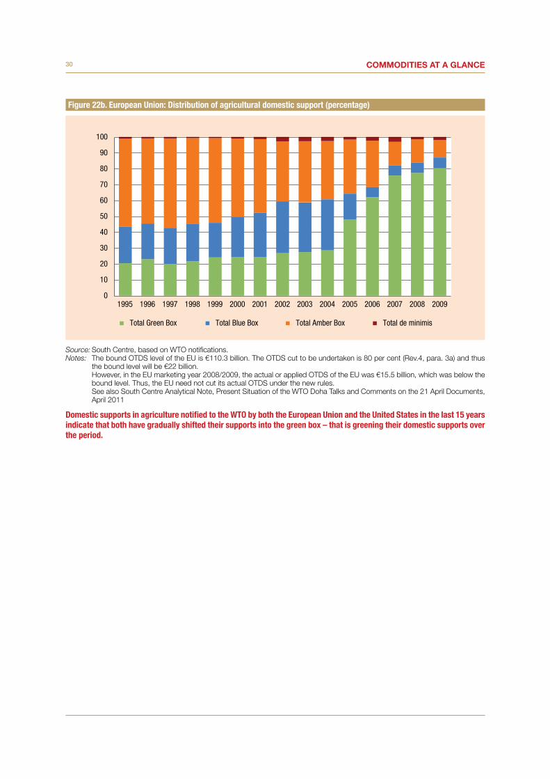
30 Commodities at a glanCe
Figure 22b. European Union: Distribution of agricultural domestic support (percentage)
Source: South Centre, based on WTO notifications.Notes: The bound OTDS level of the EU is €110.3 billion. The OTDS cut to be undertaken is 80 per cent (Rev.4, para. 3a) and thus
the bound level will be €22 billion. However, in the EU marketing year 2008/2009, the actual or applied OTDS of the EU was €15.5 billion, which was below the
bound level. Thus, the EU need not cut its actual OTDS under the new rules. See also South Centre Analytical Note, Present Situation of the WTO Doha Talks and Comments on the 21 April Documents,
April 2011
Domestic supports in agriculture notified to the WTO by both the European Union and the United States in the last 15 years indicate that both have gradually shifted their supports into the green box – that is greening their domestic supports over the period.
0
10
20
30
40
50
60
70
80
90
100
1995 1996 1997 1998 1999 2000 2001 2002 2003 2004 2005 2006 2007 2008 2009
Total Green Box Total Blue Box Total Amber Box Total de minimis

FOOD ACCESSII.

32 Commodities at a glanCe
As mentioned in the definition of food security, access is not only physical but economic as well. As stated earlier, the 2007–2008 food crisis had damaging effects on food security, in particular by eroding its access. In terms of physical access, we have already mentioned the skewness of food availability and the depletion of stocks. As for economic access, the fact that the last food price hikes were compounded by financial crisis gives an idea of their combined disastrous effects. Although FAO revised its malnutrition figures downwards, it was estimated in the aftermath of the food and financial crises that together, these crises brought an additional 115 million people into hunger.8 Indeed, food prices have been high and volatile since the food crisis due to a number of other factors including the financialization of commodity markets, whereby food commodities (as well as others) are treated as an asset class by financial investors.
Initially, marketing mechanisms such as commodity exchanges were designed to link buyers and sellers for price discovery, enhance access to commodity finance and serve as a hedging tool. However, they are now flooded with investors that are profit-motivated and which use commodities as a new asset class in their portfolio diversification strategy. Citing a Commodities Future Trading Commission report, Tang and Xiong (2011)9 noted that the total value of various commodity index-related instruments purchased by institutional investors grew from an estimated amount of $15 billion in 2003 to a minimum of $200 billion in the midst of the food crisis of 2008. They also explained that the growth observed, coincides with the introduction of new types of instruments such as exchange traded funds designed to reflect the value of a specified commodity index. While volumes and prices of futures contracts have increased, this new type of investor sometimes uses these financial instruments to speculate on commodity prices without having any interest in the underlying commodities. Financial markets are thus believed to have exacerbated or amplified price movements by distorting the link between
8 Responding to the Food Crisis: Synthesis of Medium-term Measures Proposed in Inter-agency Assessments (FAO, 2009).
9 Tang and Xiong, Index Investment and Financialization of Commodities, Working Paper (2011).
market fundamentals and price formation.10 This situation endangers food security in its access dimension by making food items more expensive and therefore less affordable.
These higher prices appeared to have changed the food preferences and to have slightly modified dietary habits in some regions of the developing world. For example, in sub-Saharan Africa, consumers increased the proportion of vegetables in their diet between 2000–2002 and 2005–2007. They also increased their energy intake from sugars and sweeteners as well as the contribution of meat to total dietary energy consumption during the same period. While these developments are somewhat difficult to explain because of the number of complex changes taking place in the region in the period under review, two major factors offer a plausible explanation. First, sub-Saharan Africa enjoyed steady economic growth during the last decade, which, according to the estimates of the African Development Bank, led to an increase in the size of its middle class, from 27 per cent in 2000 to 34 per cent of the African population currently.11 Second, although sub-Saharan Africa was considered insulated from the financial crisis that hit the world economy due to its limited integration in the global financial sector, the food crisis did not spare the region. Therefore, while adjustments in diet may be expected, which of these factors impacted more on the above-mentioned dietary changes is difficult to tell. Moreover, there may be a lag in the impact of the food crisis on dietary habits, which would require more recent data for a more robust analysis.
Beyond the 2007–2008 food crisis, stability in food access is likely to be more and more compromised due to demographic and economic factors. Population growth and rapid urbanization will increase demand for food items and if the supply does not respond, food prices will maintain their upward trends. An early sign of this possible trend is that some countries are strategically investing in land and food production in locations where arable land is available and underutilized. This so-called “land grab” exposes many complex and difficult socioeconomic issues. However, the fact that
10 This report does not discuss the issue of the financialization of commodity markets, which can be found in UNCTAD (2011): Price Formation in Financialized Commodity Markets: The Role of Information.
11 Figures cited by The Economist,18 August 2012.

33Food access
arable lands are underutilized is also a positive sign that there is room for food production to expand to match the increasing trend in food demand due to demographic and economic developments given the right policy environment. This balance may be
reflected in stable prices. Moreover, the existing potential for irrigation, especially in Africa where only 6 per cent of cultivated land is irrigated, also constitutes a legitimate reason for positive food supply response to increasing demand.12
12 Figure cited by Liangzhi et al (2011) with reference to Svendsen (2009).
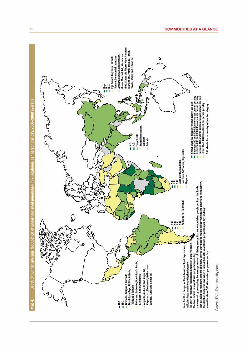
34 Commodities at a glanCeM
ap 4
. De
pth
of h
unge
r, av
erag
e fo
od d
efici
t of u
nder
nour
ishe
d po
pula
tion
in k
iloca
lorie
s pe
r per
son
per d
ay, 2
006–
2008
ave
rage
Sou
rce:
FA
O, F
ood
secu
rity
data
.
Angu
illa,
Aru
ba, B
ritis
h Vi
rgin
Isl.,
Ca
yman
Isl.,
Mon
tser
rat,
Neth
erla
nds
Antil
les,
Tur
ks a
nd C
aico
s Is
l.
Gren
ada,
Ant
igua
& B
arbu
daDo
min
ican
Rep
., St
Kitt
s &
Nev
is,
Trin
idad
& T
obag
oBa
ham
as, B
arba
dos,
Dom
inic
a,St
Luc
ia,
St V
ince
nt &
the
Gren
adin
es
Falk
land
Isl.
(Mal
vina
s)Ca
pe V
erde
, Mau
ritiu
s,Sa
o To
me
& P
rinci
pe, S
eych
elle
sM
ayot
te
Bahr
ain
Tim
or L
este
Brun
ei D
arus
sala
m,
Mal
dive
s
Amer
ican
Sam
oa, C
ook
Isla
nds,
Guam
, Mar
shal
l Isl
., M
icro
nesi
a(F
ed. S
tate
s of
), Na
uru,
Niu
e, N
orth
ern
Mar
iana
Isl.,
Pal
au, T
okel
au, T
onga
,Tu
valu
, Wal
lis a
nd F
utun
a Is
l.
Fiji,
Fre
nch
Poly
nesi
a, K
iriba
ti,Sa
moa
, Sol
omon
Isl.,
Van
uatu
N.C.
N.C.
N.C.
N.C.
N.C.
N.C.
N.C.
N.C.
N.C.
Note
: Dep
th o
f hun
ger o
r the
inte
nsity
of f
ood
depr
ivat
ion,
indi
cate
s ho
w m
uch
food
-dep
rived
peo
ple
fall
shor
t of m
inim
um fo
od n
eeds
in te
rms
of d
ieta
ry e
nerg
y.Th
e fo
od d
e�ci
t, in
kilo
calo
ries
per p
erso
n pe
r day
, is
mea
sure
d by
com
parin
g th
e av
erag
e am
ount
of d
ieta
ry e
nerg
y th
at u
nder
nour
ishe
d pe
ople
get
from
the
food
s th
ey e
at w
ith th
e m
inim
um a
mou
nt o
f die
tary
ene
rgy
they
nee
d to
mai
ntai
n bo
dy w
eigh
t and
und
erta
ke li
ght a
ctiv
ity.
The
dept
h of
hun
ger i
s lo
w: w
hen
it is
less
than
200
kilo
calo
ries
per p
erso
n pe
r day
, and
hig
hw
hen
it is
abo
ve 3
00 k
iloca
lorie
s pe
r per
son
per d
ay.
N.C.
N.C.
N.C.
N.C.
N.C.
High
er th
an 4
00 k
iloca
lorie
s pe
r per
son
per d
ayBe
twee
n 30
0 an
d 40
0 ki
loca
lorie
s pe
r per
son
per d
ayBe
twee
n 20
0 an
d 30
0 ki
loca
lorie
s pe
r per
son
per d
ayBe
twee
n 10
0 an
d 20
0 ki
loca
lorie
s pe
r per
son
per d
ayLo
wer
than
100
kilo
calo
ries
per p
erso
n pe
r day
N.C.
sta
nds
for n
o co
untr
y w
ithin
the
cate
gory

35Food access
Figure 23a. Share of the main food groups in total dietary energy consumption, 2005–2007 average: Net food-importing developing countries and least developed countries (percentage)
Source: FAO, Food security data.
In the net food-importing developing countries, LDCs and sub-Saharan Africa (see below), the food diet is mainly based on the consumption of cereals, starchy roots, sugar and sweeteners as well as vegetable oils.
Figure 23b. Share of the main food groups in total dietary energy consumption, 2005–2007 average: Sub-Saharan African countries and North African countries (percentage)
Source: FAO, Food security data.
In North Africa, the consumption of starchy roots is largely replaced by the consumption of cereals.
0 10 20 30 40 50 60 70
Alcoholic beverages
Animal fats
Cereals - Excluding Beer
Fish, Seafood
Fruits - Excluding Wine
Meat
Milk - Excluding Butter
Oil crops
Pulses
Starchy Roots
Sugar & Sweeteners
Vegetable Oils
Vegetables Net Food-Importing Developing Countries
Least Developed Countries
0 10 20 30 40 50 60 70
Sub Saharan AfricaNorth Africa
Alcoholic beverages
Animal fats
Cereals - Excluding Beer
Fish, Seafood
Fruits - Excluding Wine
Meat
Milk - Excluding Butter
Oil crops
Pulses
Starchy Roots
Sugar & Sweeteners
Vegetable Oils
Vegetables

36 Commodities at a glanCe
Figure 23c. Share of the main food groups in total dietary energy consumption, 2005–2007 average: Developing Asia, Latin America and Oceania (percentage)
Source: FAO, Food security data.
In developing Asia, Latin America and Oceania, cereals remain the mainstay of dietary energy consumption, with the high-est share observed for developing Asia. The main differences may be observed for sugar and sweeteners, which are more commonly consumed in Latin America as well as oil crops and starchy roots, which largely contribute to the diet in Oceania.
Figure 23d. Share of the main food groups in total dietary energy consumption, 2005–2007 average: Selected developed economies (percentage)
Source: FAO, Food security data.
In developed countries, cereals are also the main contributor to the food diet. However, except for Japan, where the share exceeds 40 per cent, other developed countries recorded a share below 30 per cent in 2005–2007. In developed countries, the consumption of meat and milk is more widespread (except in Japan), as well as the one of vegetable oils and sugar and sweeteners.
0 10 20 30 40 50 60 70
Developing AsiaLatin AmericaOceania
Alcoholic beverages
Animal fats
Cereals - Excluding Beer
Fish, Seafood
Fruits - Excluding Wine
Meat
Milk - Excluding Butter
Oil crops
Pulses
Starchy Roots
Sugar & Sweeteners
Vegetable Oils
Vegetables
0 10 20 30 40 50 60 70
FranceJapanCanadaUnited States
Alcoholic beverages
Animal fats
Cereals - Excluding Beer
Fish, Seafood
Fruits - Excluding Wine
Meat
Milk - Excluding Butter
Oil crops
Pulses
Starchy Roots
Sugar & Sweeteners
Vegetable Oils
Vegetables
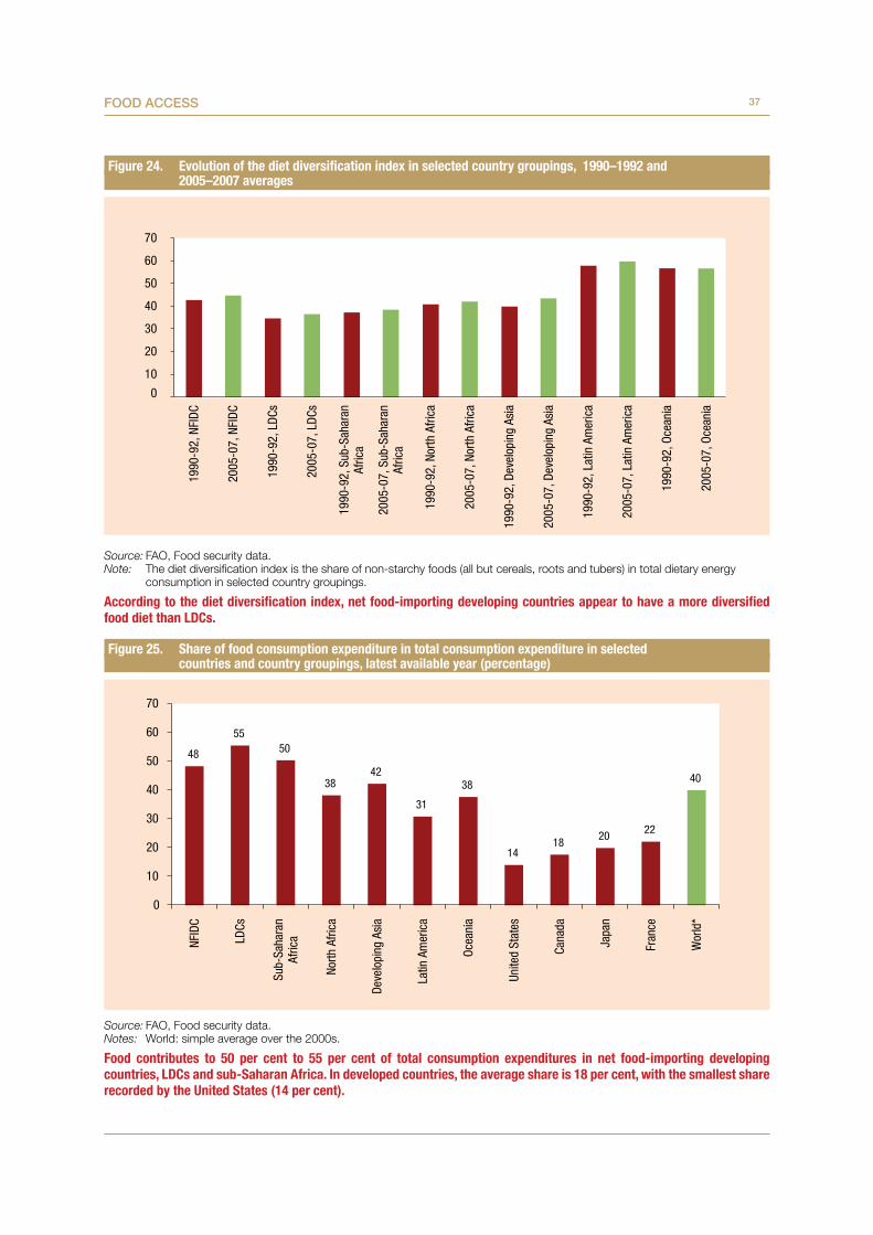
37Food access
Figure 24. Evolution of the diet diversification index in selected country groupings, 1990–1992 and 2005–2007 averages
Source: FAO, Food security data.Note: The diet diversification index is the share of non-starchy foods (all but cereals, roots and tubers) in total dietary energy
consumption in selected country groupings.
According to the diet diversification index, net food-importing developing countries appear to have a more diversified food diet than LDCs.
Figure 25. Share of food consumption expenditure in total consumption expenditure in selected countries and country groupings, latest available year (percentage)
Source: FAO, Food security data.Notes: World: simple average over the 2000s.
Food contributes to 50 per cent to 55 per cent of total consumption expenditures in net food-importing developing countries, LDCs and sub-Saharan Africa. In developed countries, the average share is 18 per cent, with the smallest share recorded by the United States (14 per cent).
10
20
30
40
50
60
70
1990
-92,
NFI
DC
2005
-07,
NFI
DC
1990
-92,
LDC
s
2005
-07,
LDC
s
1990
-92,
Sub
-Sah
aran
Afric
a
2005
-07,
Sub
-Sah
aran
Afric
a
1990
-92,
Nor
th A
frica
2005
-07,
Nor
th A
frica
1990
-92,
Dev
elop
ing
Asia
2005
-07,
Dev
elop
ing
Asia
1990
-92,
Lat
in A
mer
ica
2005
-07,
Lat
in A
mer
ica
1990
-92,
Oce
ania
2005
-07,
Oce
ania
0
48
5550
3842
31
38
1418 20 22
40
0
10
20
30
40
50
60
70
NFID
C
LDCs
Sub-
Saha
ran
Afric
a
North
Afri
ca
Deve
lopi
ng A
sia
Latin
Am
eric
a
Ocea
nia
Unite
d St
ates
Cana
da
Japa
n
Fran
ce
Wor
ld*
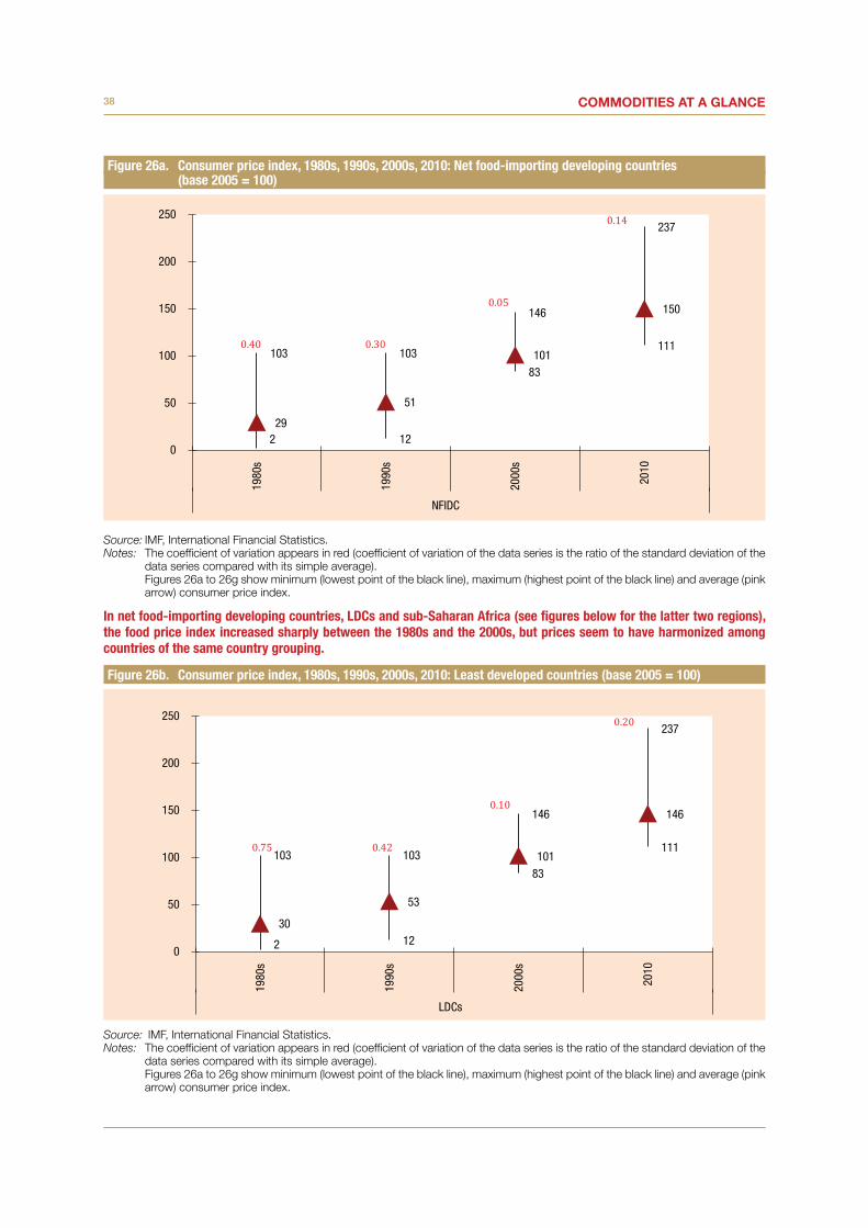
38 Commodities at a glanCe
Figure 26a. Consumer price index, 1980s, 1990s, 2000s, 2010: Net food-importing developing countries (base 2005 = 100)
Source: IMF, International Financial Statistics.Notes: The coefficient of variation appears in red (coefficient of variation of the data series is the ratio of the standard deviation of the
data series compared with its simple average). Figures 26a to 26g show minimum (lowest point of the black line), maximum (highest point of the black line) and average (pink
arrow) consumer price index.
In net food-importing developing countries, LDCs and sub-Saharan Africa (see figures below for the latter two regions), the food price index increased sharply between the 1980s and the 2000s, but prices seem to have harmonized among countries of the same country grouping.
Figure 26b. Consumer price index, 1980s, 1990s, 2000s, 2010: Least developed countries (base 2005 = 100)
Source: IMF, International Financial Statistics.Notes: The coefficient of variation appears in red (coefficient of variation of the data series is the ratio of the standard deviation of the
data series compared with its simple average). Figures 26a to 26g show minimum (lowest point of the black line), maximum (highest point of the black line) and average (pink
arrow) consumer price index.
103 103
146
237
2 12
83
111
29
51
101
150
0
50
100
150
200
250
1980
s
1990
s
2000
s
2010
NFIDC
103 103
146
237
2 12
83
111
30
53
101
146
0
50
100
150
200
250
1980
s
1990
s
2000
s
2010
LDCs

39Food access
Figure 26c. Consumer price index, 1980s, 1990s, 2000s, 2010: Sub-Saharan African countries (base 2005 = 100)
Source: IMF, International Financial Statistics.Notes: The coefficient of variation appears in red (coefficient of variation of the data series is the ratio of the standard deviation of the
data series compared with its simple average). Figures 26a to 26g show minimum (lowest point of the black line), maximum (highest point of the black line) and average (pink
arrow) consumer price index.
Figure 26d. Consumer price index, 1980s, 1990s, 2000s, 2010: North African countries (base 2005 = 100)
Source: IMF, International Financial Statistics.Notes: The coefficient of variation appears in red (coefficient of variation of the data series is the ratio of the standard deviation of the
data series compared with its simple average). Figures 26a to 26g show minimum (lowest point of the black line), maximum (highest point of the black line) and average (pink
arrow) consumer price index.
In North Africa, individual consumer price indices tended to trend towards the higher price levels recorded during the 1990s and 2000s.
103 103
146
237
1 12
83
113
32
55
101
146
0
50
100
150
200
250
1980
s
1990
s
2000
s
2010
SSA
53
104
109
173
12
55
100
111
34
74
103
131
0
50
100
150
200
250
1980
s
1990
s
2000
s
2010
North Africa

40 Commodities at a glanCe
Figure 26e. Consumer price index, 1980s, 1990s, 2000s, 2010: Developing Asia (base 2005 = 100)
Source: IMF, International Financial Statistics.Notes: The coefficient of variation appears in red (coefficient of variation of the data series is the ratio of the standard deviation of the
data series compared with its simple average). Figures 26a to 26g show minimum (lowest point of the black line), maximum (highest point of the black line) and average (pink
arrow) consumer price index.
In developing Asia, Latin America and Oceania (see figures below), the ceiling consumer price index increased drastically between the 1990s and the 2000s (+20 per cent for Asia, +16 per cent for Latin America, +31 per cent for Oceania), but appears to be more homogeneous within each region.
Figure 26f. Consumer price index, 1980s, 1990s, 2000s, 2010: Latin America (base 2005 = 100)
Source: IMF, International Financial Statistics.Notes: The coefficient of variation appears in red (coefficient of variation of the data series is the ratio of the standard deviation of the
data series compared with its simple average). Figures 26a to 26g show minimum (lowest point of the black line), maximum (highest point of the black line) and average (pink
arrow) consumer price index.
91 98
117
225
2 4
92 105
36
59
102
142
0
50
100
150
200
250
1980
s
1990
s
2000
s
2010
Developing Asia
81 89
103
179
3 8
88
113
32
56
99
133
0
50
100
150
200
250
1980
s
1990
s
2000
s
2010
Latin America

41Food access
Figure 26g. Consumer price index, 1980s, 1990s, 2000s, 2010: Oceania (base 2005 = 100)
Source: IMF, International Financial Statistics.Notes: The coefficient of variation appears in red (coefficient of variation of the data series is the ratio of the standard deviation of the
data series compared with its simple average). Figures 26a to 26g show minimum (lowest point of the black line), maximum (highest point of the black line) and average (pink
arrow) consumer price index.
46
78
102
152
14
39
95
119
31
58
99
132
0
50
100
150
200
250
1980
s
1990
s
2000
s
2010
Oceania


FOOD UTILIzATIONIII.

44 Commodities at a glanCe
Food utilization is usually defined as the way our body uses the food energy intake. This encompasses a number of non-food factors such as cultural practices in food preparation, feeding practices as well as intra-household allocation of food. One of the detrimental effects of the 2007–2008 food crisis is the increase in the number of undernourished people, especially in sub-Saharan Africa.13 Even the latest FAO publication on the State of Food Insecurity in the World 2012 noted the stark contrast between Africa (including North Africa) and other developing regions. According to that report, some parts of Asia and Latin America have seen their number of undernourished people decline between 1990–92 and 2010–12. But sub-Saharan Africa registered an increase in the percentage of undernourished people from 17 to 27 per cent of the total undernourished people in the world.
As usual, the increase of the proportion of undernourished people does not result in uniform consequences for age groups in the population. One of the most vulnerable groups is children under 5: for this group, malnutrition prevalence is higher for males than females (see figure 30) which maybe due to cultural practices such as breastfeeding as corroborated by a study in Ghana by Van de Poel et al (2007)14. On the
13 This appears surprising, given that consumers increased the proportion of vegetables in their diet. They also increased their energy intake from sugars and sweeteners as well as the contribution of meat to total dietary energy consumption. Moreover, sub-Saharan Africa enjoyed steady economic growth during the last decade, which led to an increase in the size of its middle class. FAO explained this apparent contradiction by the fact that high food prices might have resulted in an adverse impact on access to health and education. It also acknowledged the weakness of undernourishment as an indicator of food security, as it does not take into account other dimensions of food insecurity, such as the quality of food, especially micronutrients and food utilization, and is taking measures to address this.
14 Van de Poel et al., Malnutrition and the disproportional burden on the poor: the case of Ghana International Journal for Equity in Health, 6:21; 2007.
other hand, FAO (2001) acknowledges unequal attention and care between the two sexes; however, its research suggests that the general tendency is to favour boy-children.15
In summary, food utilization depends not only on food but on a number of external factors such as access to clean water and hygiene conditions. On both of these indicators, LDCs, and sub-Saharan Africa rank low. It is thus no wonder that in 2008 about 60 per cent of deaths in sub-Saharan Africa were attributed to communicable diseases (figure 31). One policy implication is that despite good progress on food availability and food access, non-food factors could impair food utilization. Unlike developed countries where food security is more of a mismatch between demand and supply, developing countries face a more complex situation that goes beyond a mere balance sheet and entails the critical issue of entitlements. Therefore, policies to ensure food security in developing countries need to adopt a more holistic approach that takes into account its multifaceted dimensions, including social protection, the right to food, and human rights, as well as broader developmental concerns such as the role that smallholders can play in agricultural development and their access to international markets.
15 Agricultural Censuses and Gender Considerations, chapter 2 on gender perspective (FAO, 2001).

45Food utilization
Figure 27. Number of undernourished people in selected country groupings, percentage change between 1990/92–2000/02 and 2000/02–2006/08 (percentage)
Source: FAO, Food security data.Note: Given that data statistics regarding North Africa and Oceania were not significant in statistical terms and presented a large
number of gaps, these country groupings could not be presented in this figure.
The number of undernourished people increased in net food-importing developing countries, LDCs and sub-Saharan Africa between the beginning of the 1990s and 2006/08, while it fell sharply in Latin America.
Figure 28. Malnutrition prevalence in children under 5, weight for age
Source: World Bank, Databank.Notes: Size of bubbles: share of malnourished population aged 0–4 to the respective group population. These computations are based on latest available data for each country; this information must be considered as a proxy, as
the last year available (census) may be different between countries of the same region. Malnutrition prevalence is the percentage of children under 5 whose weight for age is more than two standard deviations
below the median for the international reference population ages 0–59 months. The data are based on the new child growth standards released in 2006 by WHO.
10 8 8
-8 -10
3 1
-2
2
-9
-15
-10
-5
0
5
10
15
Net Food-Importing
DevelopingCountries
Least DevelopedCountries
Sub SaharanAfrica
Developing Asia Latin America
1990/92-2000/02 2000/02-2006/08
0
5
10
15
20
25
100 200 300 400 500 600 700
Shar
e of
pop
ulat
ion
aged
0-4
in to
tal
popu
latio
n
Size of population, aged 0–4 (in million)
Sub SaharanAfrica
NFIDC
LDCsNorth Africa
Latin America
Developing Asia
Developingcountries
Oceania
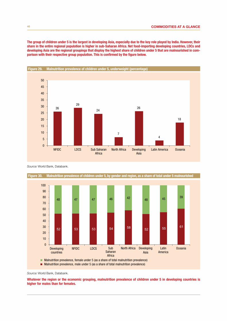
46 Commodities at a glanCe
The group of children under 5 is the largest in developing Asia, especially due to the key role played by India. However, their share in the entire regional population is higher in sub-Saharan Africa. Net food-importing developing countries, LDCs and developing Asia are the regional groupings that display the highest share of children under 5 that are malnourished in com-parison with their respective group population. This is confirmed by the figure below.
Figure 29. Malnutrition prevalence of children under 5, underweight (percentage)
Source: World Bank, Databank.
Figure 30. Malnutrition prevalence of children under 5, by gender and region, as a share of total under 5 malnourished
Source: World Bank, Databank.
Whatever the region or the economic grouping, malnutrition prevalence of children under 5 in developing countries is higher for males than for females.
2629
24
7
26
4
18
0
5
10
15
20
25
30
35
40
45
50
NFIDC LDCS Sub SaharanAfrica
North Africa DevelopingAsia
Latin America Oceania
48 47 47 46 42 48 45 39
0
10
20
30
40
50
60
70
80
90
100
Developingcountries
NFIDC LDCS SubSaharanAfrica
North Africa DevelopingAsia
LatinAmerica
Oceania
Malnutrition prevalence, female under 5 (as a share of total malnutrition prevalence)Malnutrition prevalence, male under 5 (as a share of total malnutrition prevalence)
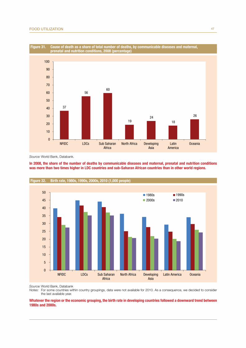
47Food utilization
Figure 31. Cause of death as a share of total number of deaths, by communicable diseases and maternal, prenatal and nutrition conditions, 2008 (percentage)
Source: World Bank, Databank.
In 2008, the share of the number of deaths by communicable diseases and maternal, prenatal and nutrition conditions was more than two times higher in LDC countries and sub-Saharan African countries than in other world regions.
Figure 32. Birth rate, 1980s, 1990s, 2000s, 2010 (1,000 people)
Source: World Bank, DatabankNotes: For some countries within country groupings, data were not available for 2010. As a consequence, we decided to consider
the last available year.
Whatever the region or the economic grouping, the birth rate in developing countries followed a downward trend between 1980s and 2000s.
37
56 60
19 24
18
26
0
10
20
30
40
50
60
70
80
90
100
NFIDC LDCs Sub SaharanAfrica
North Africa DevelopingAsia
LatinAmerica
Oceania
0
5
10
15
20
25
30
35
40
45
50
NFIDC LDCs Sub SaharanAfrica
North Africa DevelopingAsia
Latin America Oceania
1980s 1990s
2000s 2010

48 Commodities at a glanCe
Figure 33. Low-birthweight babies as a share of births, last available year (percentage)
Source: World Bank, Databank.Note: Given the lack of coherence in years available from one country to another, we decided to propose the computation of a proxy
for country groupings based on the last available year for each country part of the grouping (after 2000).
The share of babies born with low weight was higher in LDCs and sub-Saharan Africa during the 2000s than in other developing regions or economic groupings in developing countries. As a reference, this share was 7–8 per cent in the United States, the European Union, Japan and Australia over the same period.
12
14 14
10
11
10 10
0
2
4
6
8
10
12
14
16
18
20NF
IDC
LDCs
Sub
Saha
ran
Afric
a
North
Afri
ca
Deve
lopi
ngAs
ia
Latin
Am
eric
a
Ocea
nia
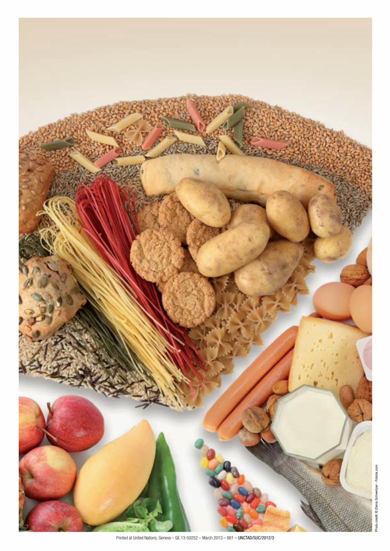
U n i t e d n at i o n s C o n f e r e n C e o n t r a d e a n d d e v e l o p m e n t
N°4 - July 2012
Special issue on food securityCOMMODITIES AT A GLANCE
Pho
to c
redi
t: ©
Ele
na S
chw
eitz
er -
Fot
olia
.com
Printed at United Nations, Geneva – GE.13-50252 – March 2013 – 881 – UNCTAD/SUC/2012/3