
Comic Relief Enquiry Project What Development Indicators can we use to find out those African...
14
Comic Relief Enquiry Project What Development Indicators can we use to find out those African countries in most need of Aid?
-
Upload
virginia-wells -
Category
Documents
-
view
220 -
download
2
Transcript of Comic Relief Enquiry Project What Development Indicators can we use to find out those African...

Comic Relief Enquiry Project
What Development Indicators can we use to find out those African
countries in most need of Aid?
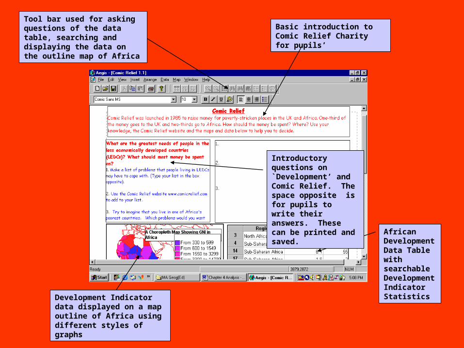
Basic introduction to Comic Relief Charity for pupils’
Tool bar used for asking questions of the data table, searching and displaying the data on the outline map of Africa
African Development Data Table with searchable Development Indicator Statistics
Development Indicator data displayed on a map outline of Africa using different styles of graphs
Introductory questions on `Development’ and Comic Relief. The space opposite is for pupils to write their answers. These can be printed and saved.
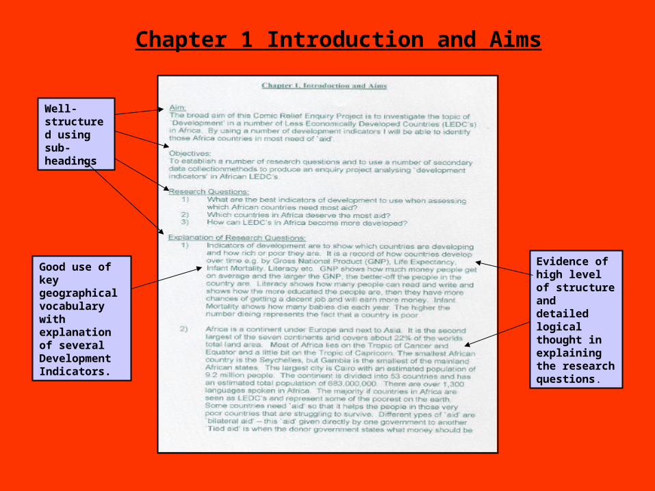
Chapter 1 Introduction and Aims
Well-structured using sub-headings
Evidence of high level of structure and detailed logical thought in explaining the research questions.
Good use of key geographical vocabulary with explanation of several Development Indicators.
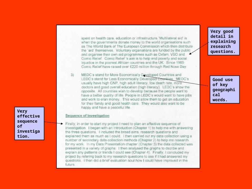
Very effective sequence of investigation.
Good use of key geographical words.
Very good detail in explaining research questions.
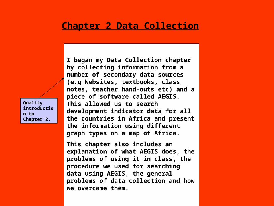
Chapter 2 Data Collection
I began my Data Collection chapter by collecting information from a number of secondary data sources (e.g Websites, textbooks, class notes, teacher hand-outs etc) and a piece of software called AEGIS. This allowed us to search development indicator data for all the countries in Africa and present the information using different graph types on a map of Africa.
This chapter also includes an explanation of what AEGIS does, the problems of using it in class, the procedure we used for searching data using AEGIS, the general problems of data collection and how we overcame them.
Quality introduction to Chapter 2.
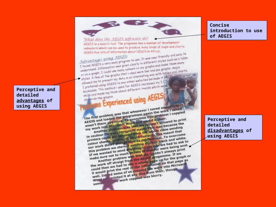
Concise introduction to use of AEGIS
Perceptive and detailed advantages of using AEGIS
Perceptive and detailed disadvantages of using AEGIS
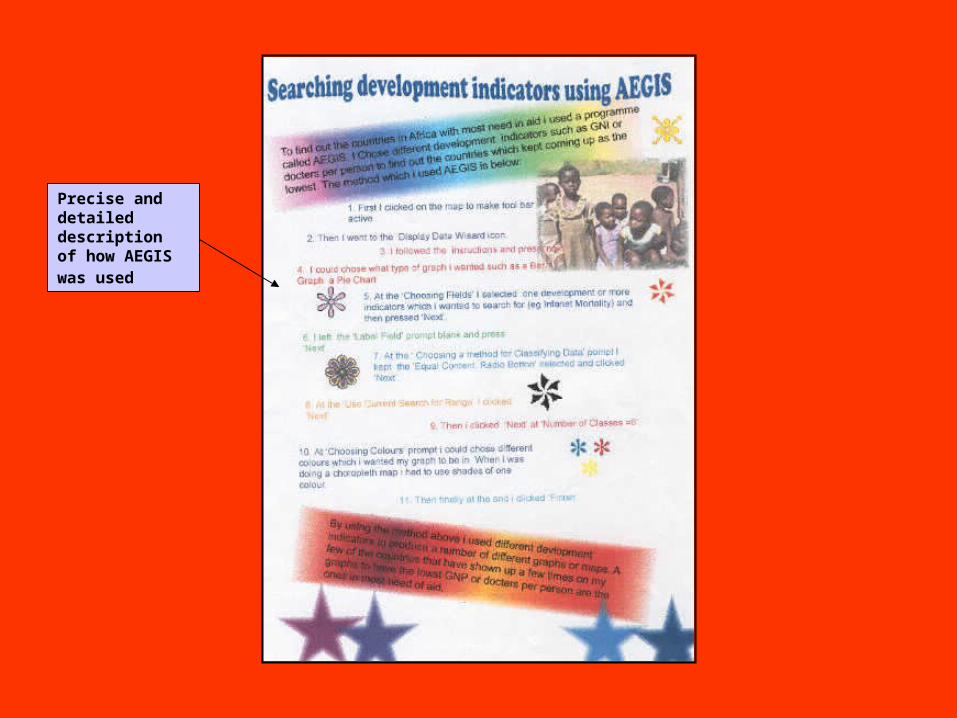
Precise and detailed description of how AEGIS was used
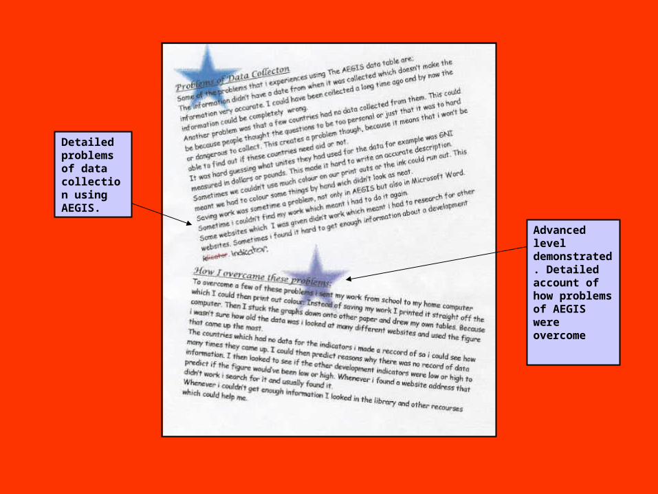
Detailed problems of data collection using AEGIS.
Advanced level demonstrated. Detailed account of how problems of AEGIS were overcome
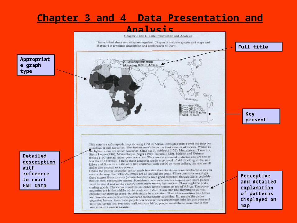
Chapter 3 and 4 Data Presentation and Analysis
Full title
Key present
Perceptive and detailed explanation of patterns displayed on map
Detailed description with reference to exact GNI data
Appropriate graph type
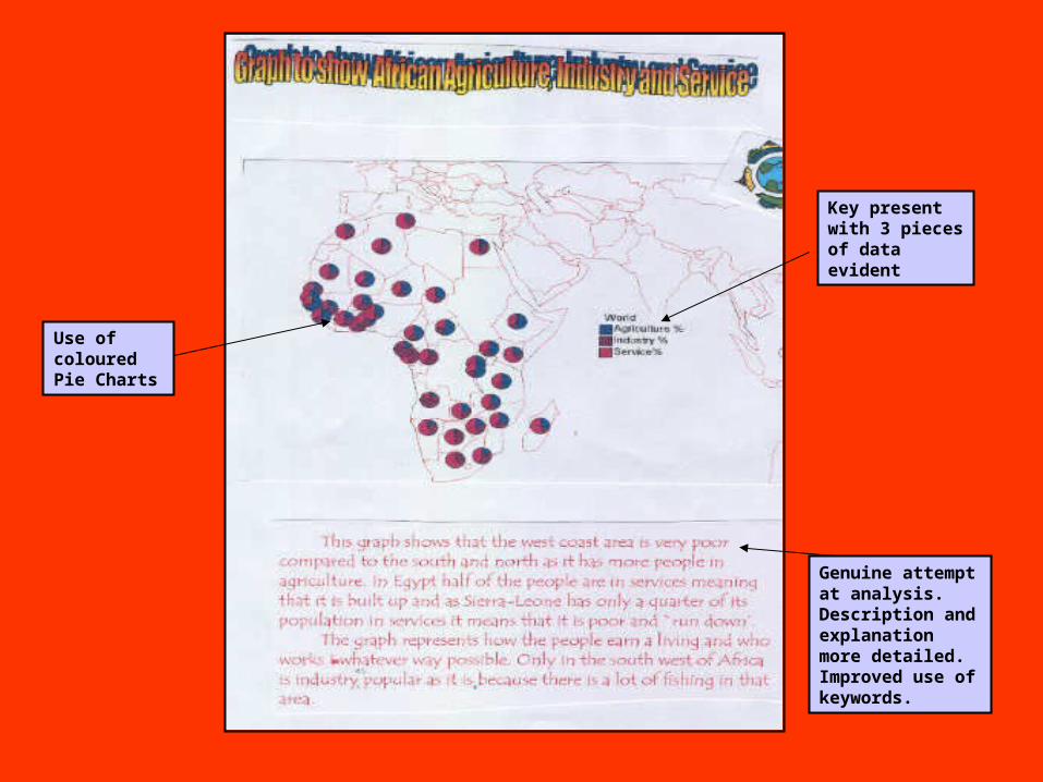
Use of coloured Pie Charts
Genuine attempt at analysis. Description and explanation more detailed. Improved use of keywords.
Key present with 3 pieces of data evident
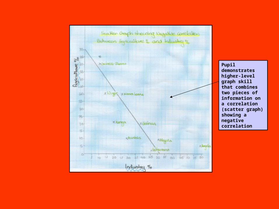
Pupil demonstrates higher-level graph skill that combines two pieces of information on a correlation (scatter graph) showing a negative correlation

Detailed analysis of correlation graph
Includes data from the actual correlation graph in the description. There is also an attempts to explain some of the reasons why the graph appears as it does using key geographical words.
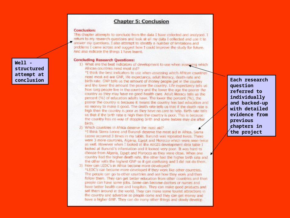
Well -structured attempt at conclusion Each research
question referred to individually and backed-up with detailed evidence from previous chapters in the project
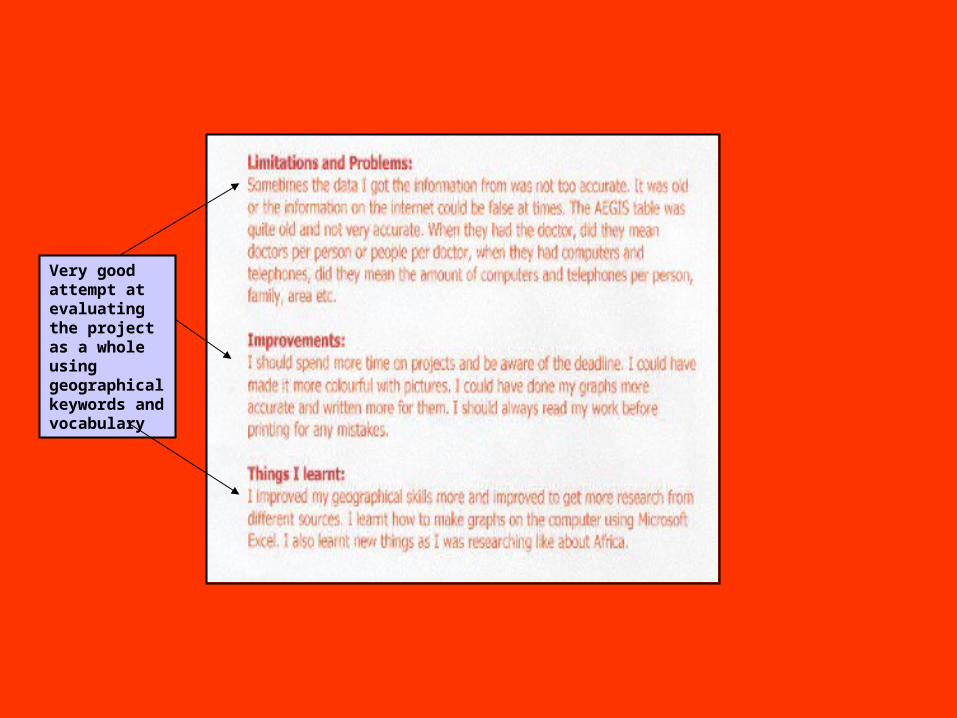
Very good attempt at evaluating the project as a whole using geographical keywords and vocabulary