COLOUR THEORY PROJECT. The Science Of Colour Newton 1676 Newton proved his theory that light...
24
COLOUR THEORY PROJECT
-
Upload
loraine-willis -
Category
Documents
-
view
215 -
download
1
Transcript of COLOUR THEORY PROJECT. The Science Of Colour Newton 1676 Newton proved his theory that light...
COLOUR THEORY
PROJECT
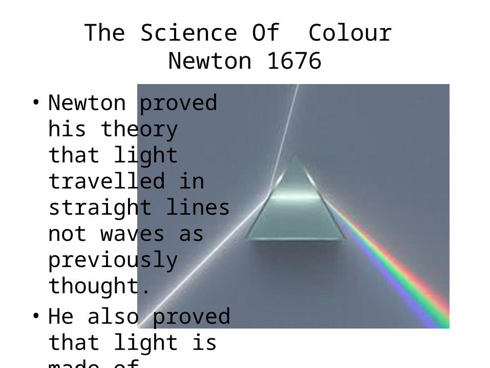
The Science Of Colour Newton 1676
• Newton proved his theory that light travelled in straight lines not waves as previously thought.
• He also proved that light is made of particles not waves.
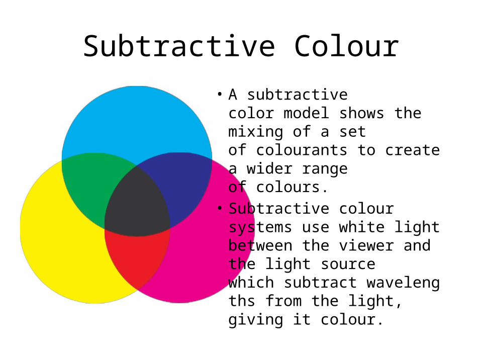
Subtractive Colour
• A subtractive color model shows the mixing of a set of colourants to create a wider range of colours.
• Subtractive colour systems use white light between the viewer and the light source which subtract wavelengths from the light, giving it colour.
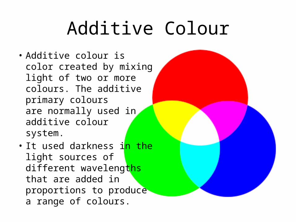
Additive Colour• Additive colour is color
created by mixing light of two or more colours. The additive primary colours are normally used in additive colour system.
• It used darkness in the light sources of different wavelengths that are added in proportions to produce a range of colours.
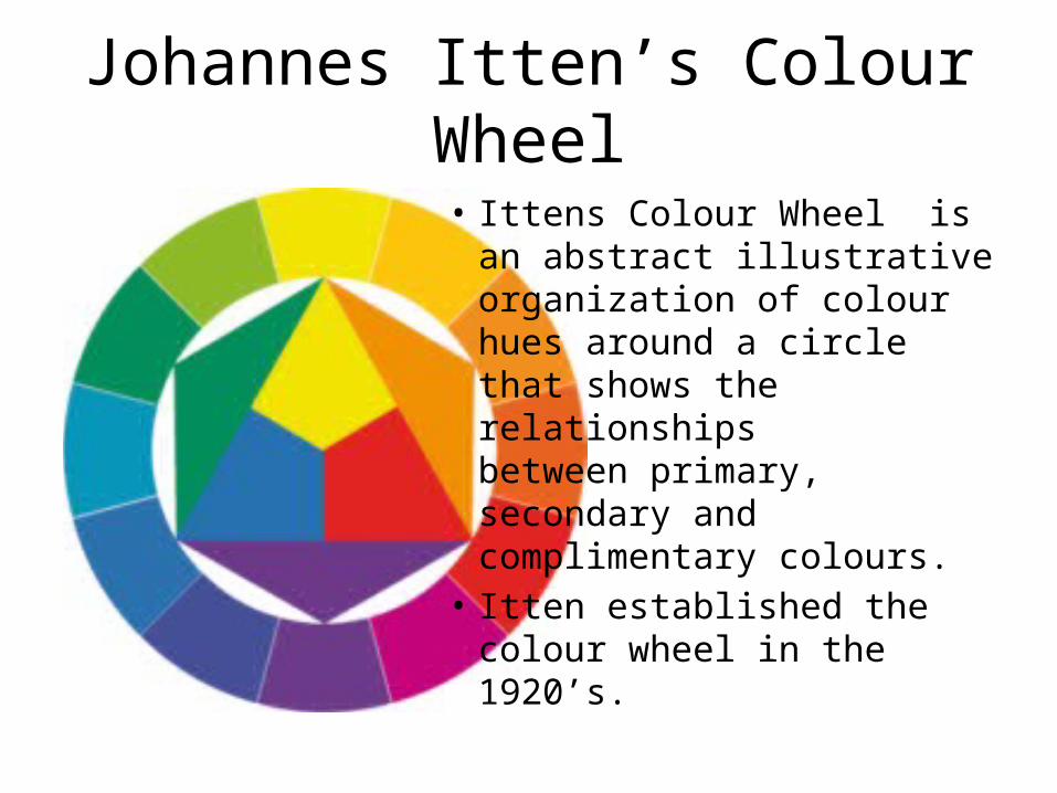
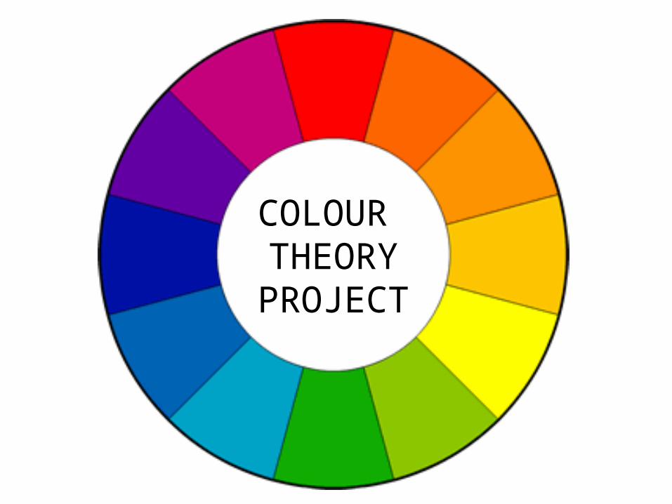
Johannes Itten’s Colour Wheel
• Ittens Colour Wheel is an abstract illustrative organization of colour hues around a circle that shows the relationships between primary, secondary and complimentary colours.
• Itten established the colour wheel in the 1920’s.
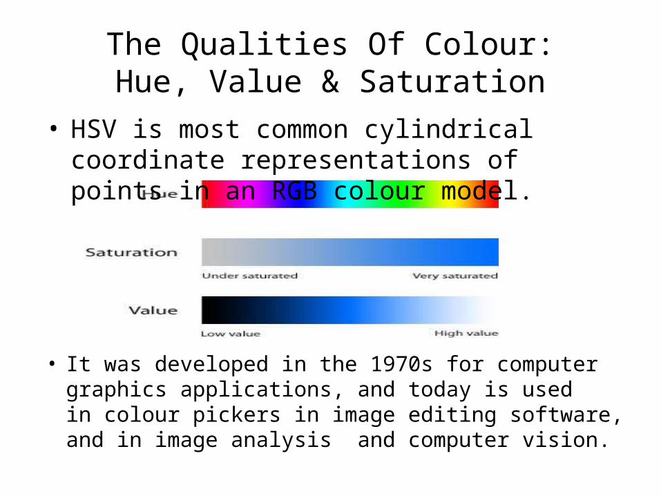
The Qualities Of Colour:Hue, Value & Saturation
• HSV is most common cylindrical coordinate representations of points in an RGB colour model.
• It was developed in the 1970s for computer graphics applications, and today is used in colour pickers in image editing software, and in image analysis and computer vision.
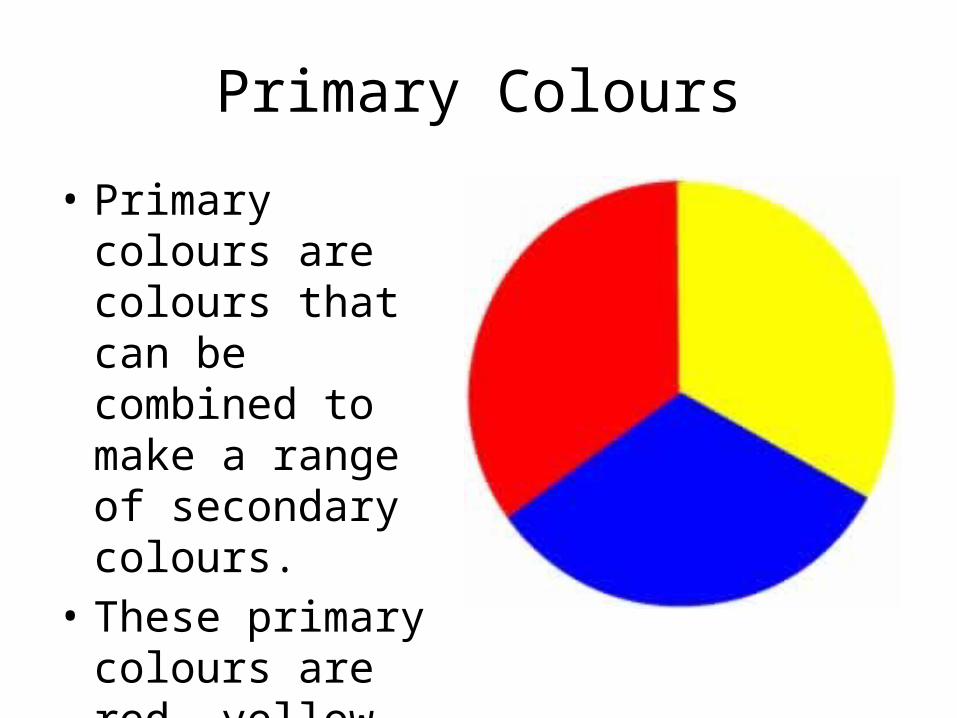
Primary Colours
• Primary colours are colours that can be combined to make a range of secondary colours.
• These primary colours are red, yellow and blue.
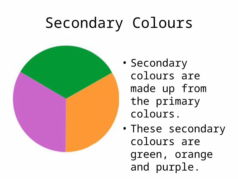
Secondary Colours
• Secondary colours are made up from the primary colours.
• These secondary colours are green, orange and purple.
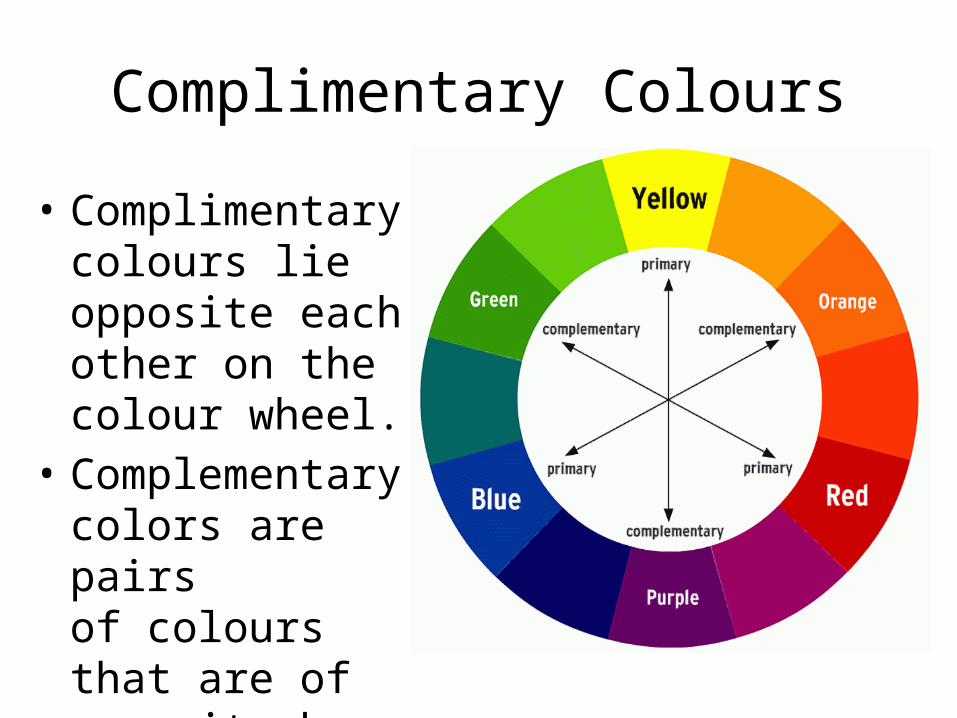
Complimentary Colours
• Complimentary colours lie opposite each other on the colour wheel.
• Complementary colors are pairs of colours that are of opposite hue.
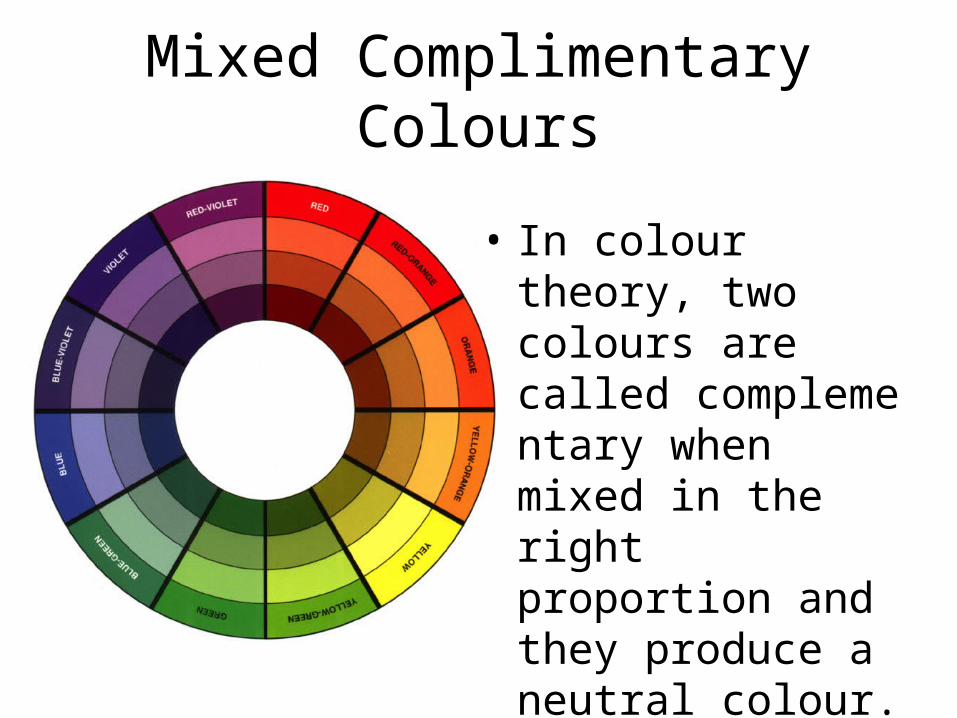
Mixed Complimentary Colours
• In colour theory, two colours are called complementary when mixed in the right proportion and they produce a neutral colour.
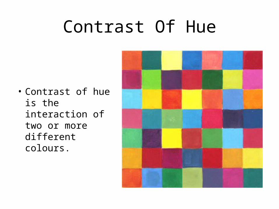
Contrast Of Hue
• Contrast of hue is the interaction of two or more different colours.
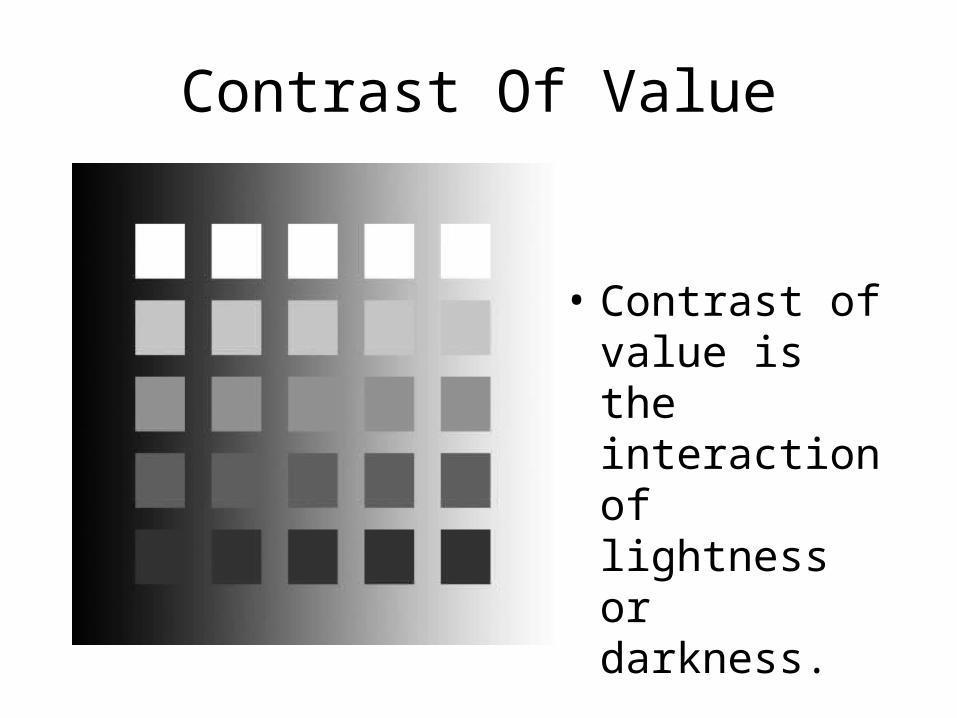
Contrast Of Value
• Contrast of value is the interaction of lightness or darkness.
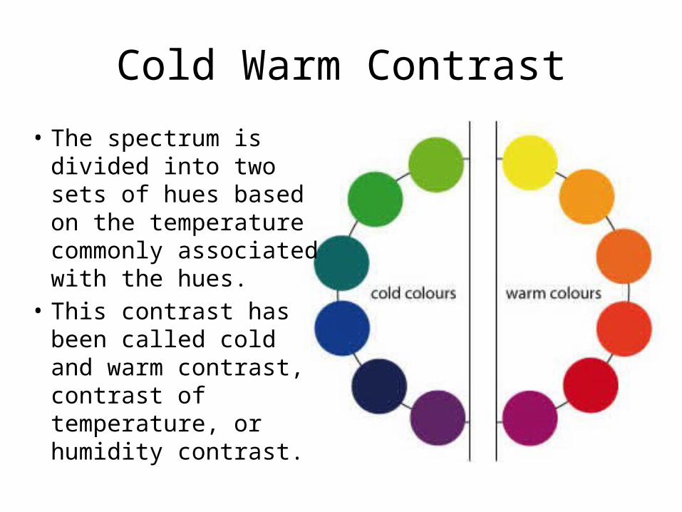
Cold Warm Contrast
• The spectrum is divided into two sets of hues based on the temperature commonly associated with the hues.
• This contrast has been called cold and warm contrast, contrast of temperature, or humidity contrast.
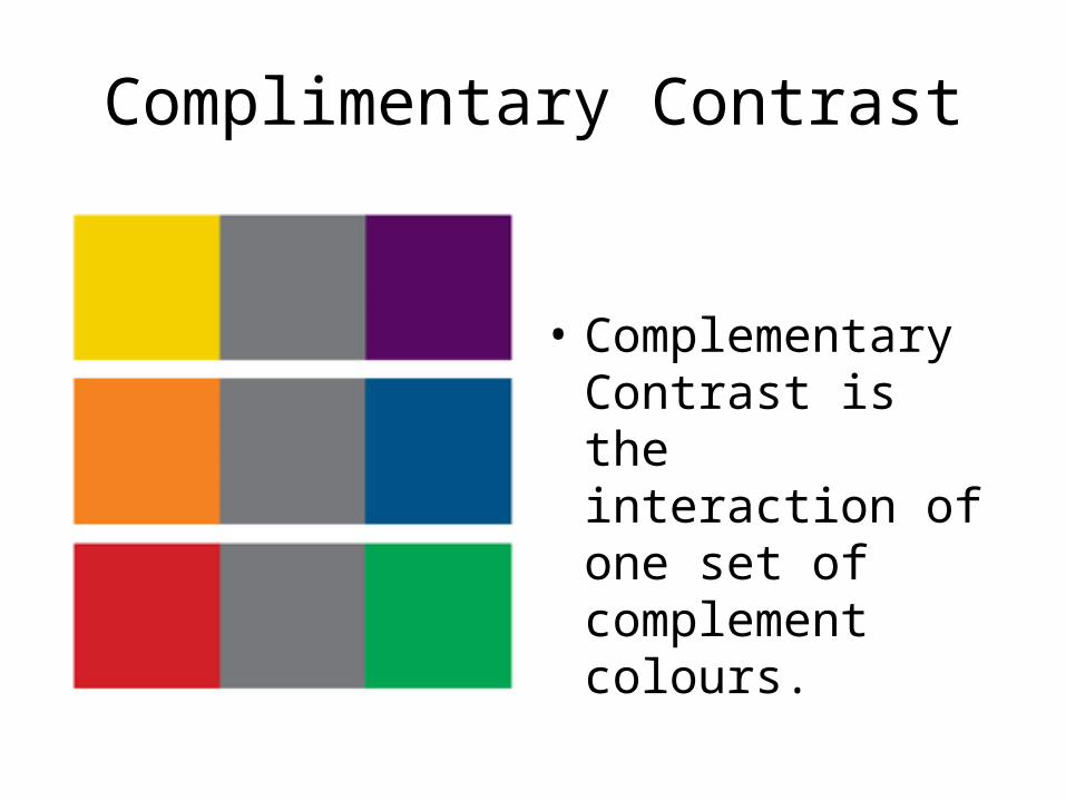
Complimentary Contrast
• Complementary Contrast is the interaction of one set of complement colours.
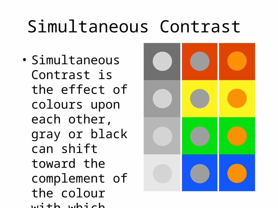
Simultaneous Contrast
• Simultaneous Contrast is the effect of colours upon each other, gray or black can shift toward the complement of the colour with which they're placed.
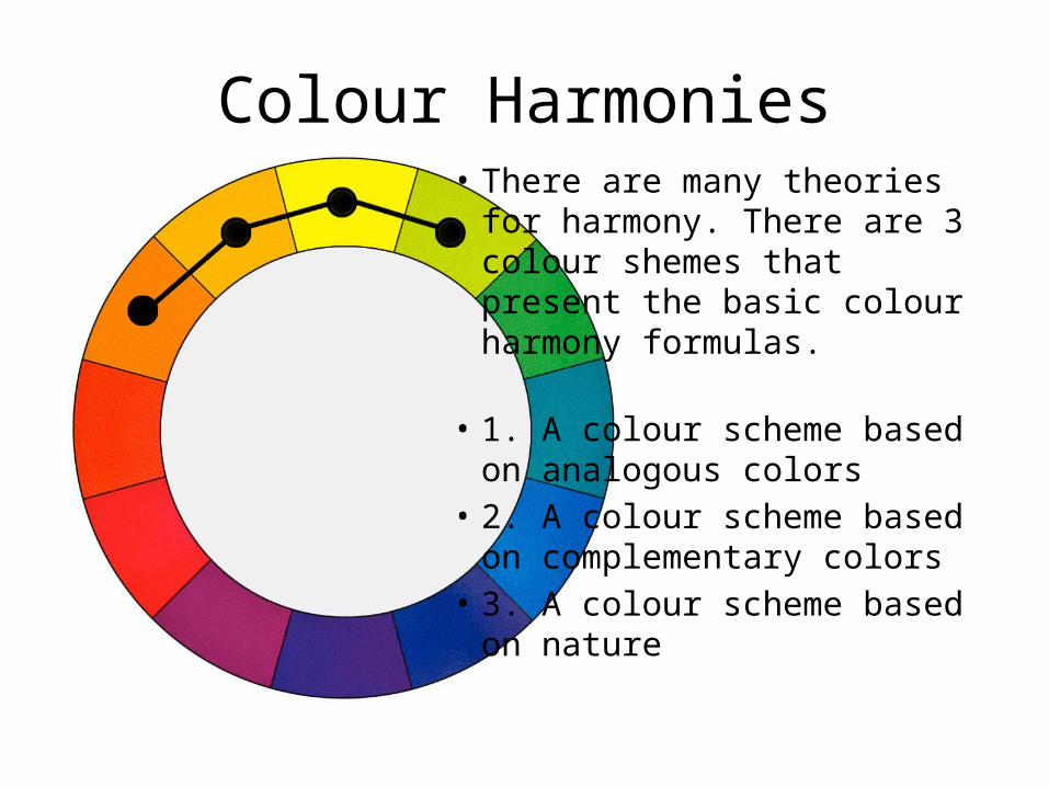
Colour Harmonies• There are many theories for
harmony. There are 3 colour shemes that present the basic colour harmony formulas.
• 1. A colour scheme based on analogous colors
• 2. A colour scheme based on complementary colors
• 3. A colour scheme based on nature
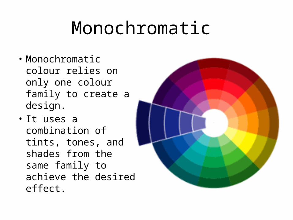
Monochromatic
• Monochromatic colour relies on only one colour family to create a design.
• It uses a combination of tints, tones, and shades from the same family to achieve the desired effect.
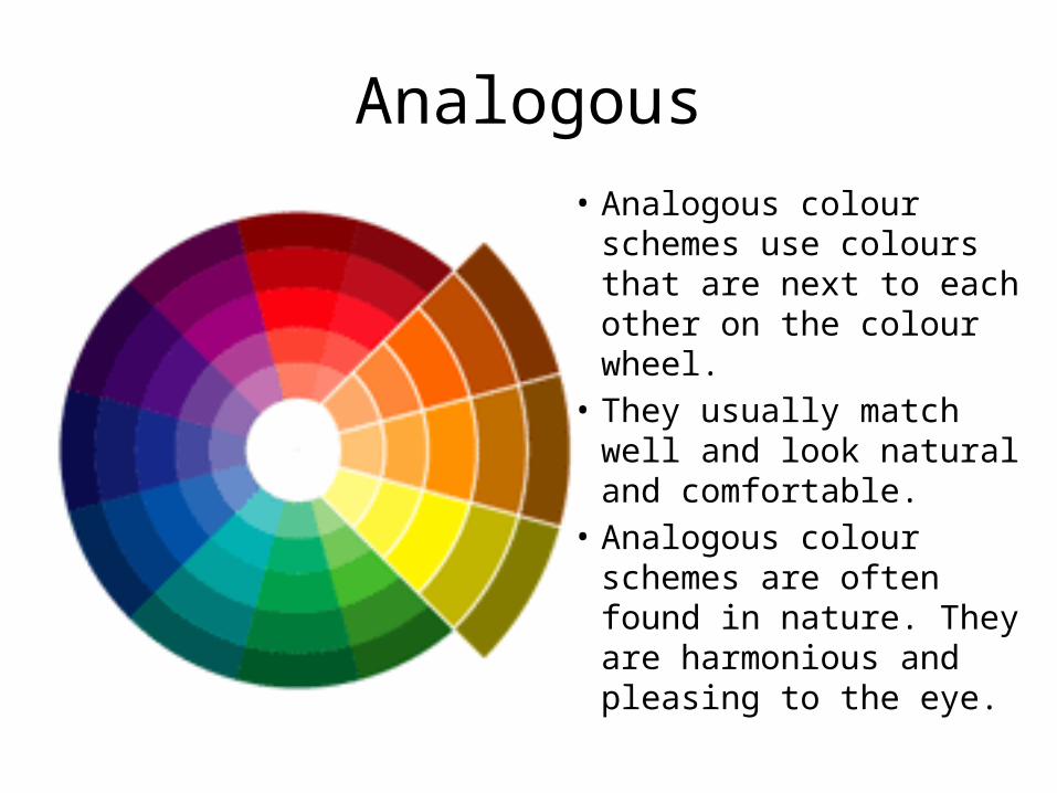
Analogous• Analogous colour
schemes use colours that are next to each other on the colour wheel.
• They usually match well and look natural and comfortable.
• Analogous colour schemes are often found in nature. They are harmonious and pleasing to the eye.
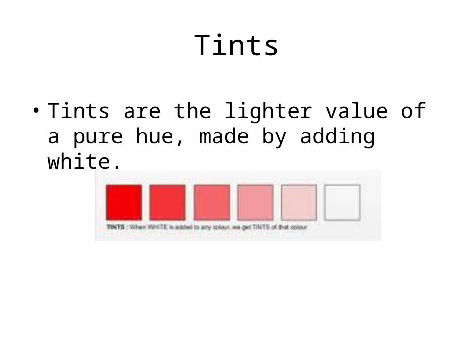
Tints
• Tints are the lighter value of a pure hue, made by adding white.
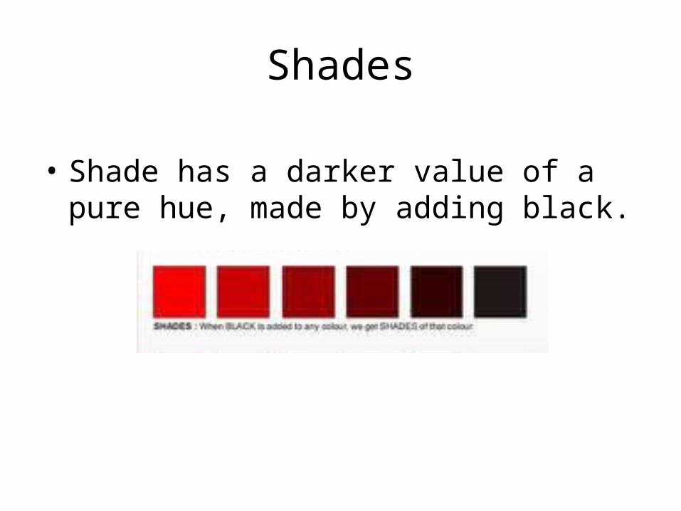
Shades
• Shade has a darker value of a pure hue, made by adding black.
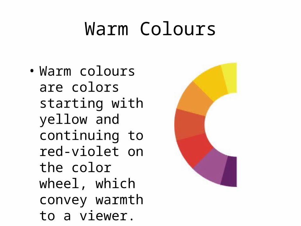
Warm Colours
• Warm colours are colors starting with yellow and continuing to red-violet on the color wheel, which convey warmth to a viewer.
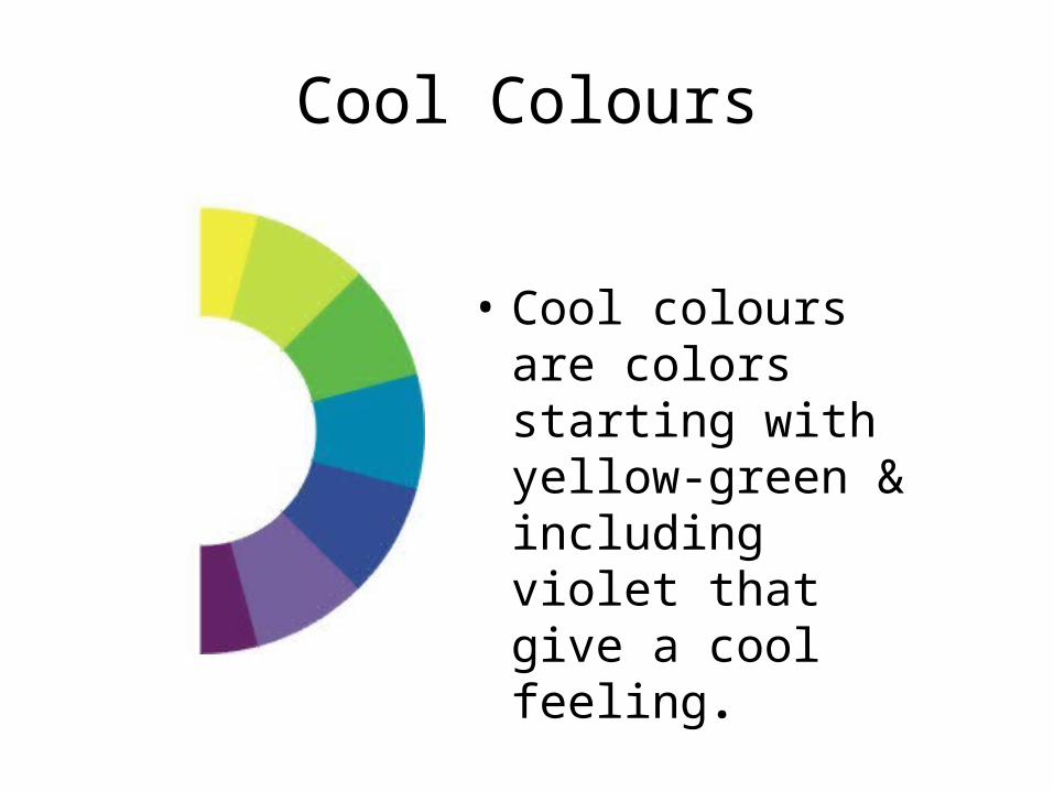
Cool Colours
• Cool colours are colors starting with yellow-green & including violet that give a cool feeling.
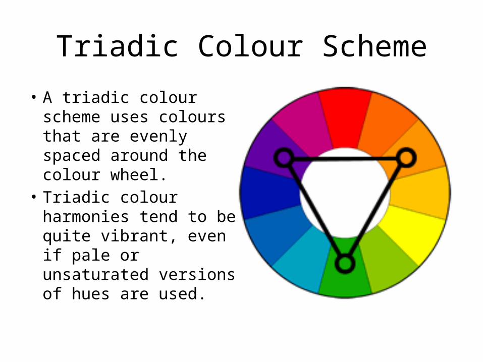
Triadic Colour Scheme
• A triadic colour scheme uses colours that are evenly spaced around the colour wheel.
• Triadic colour harmonies tend to be quite vibrant, even if pale or unsaturated versions of hues are used.
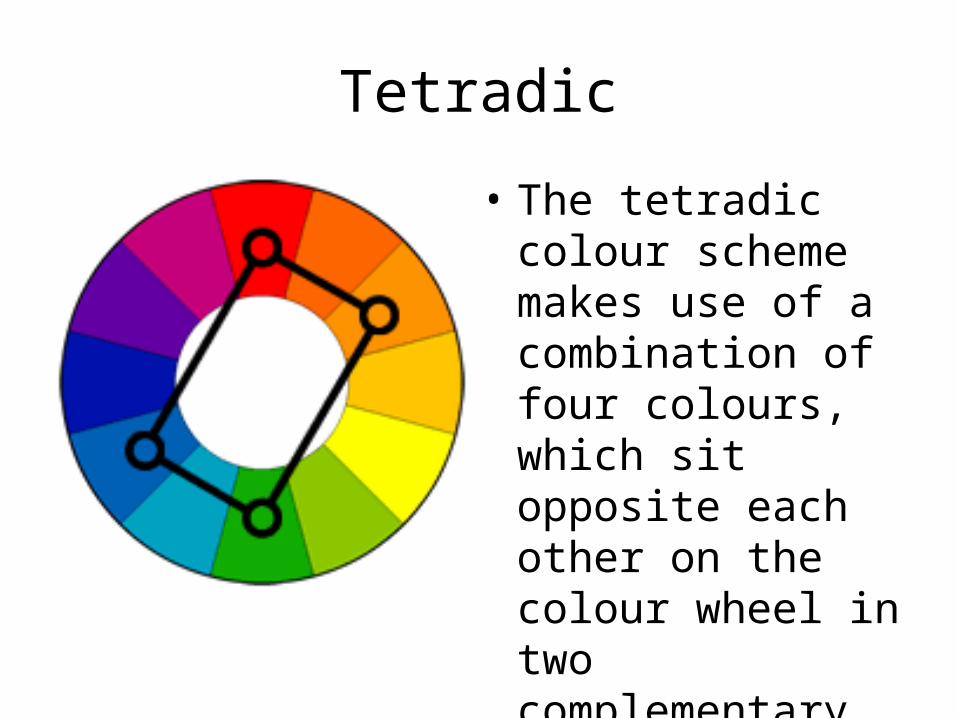
Tetradic
• The tetradic colour scheme makes use of a combination of four colours, which sit opposite each other on the colour wheel in two complementary pairs.